
Search results for "Generic" in Home Design Ideas
 Drewett Works
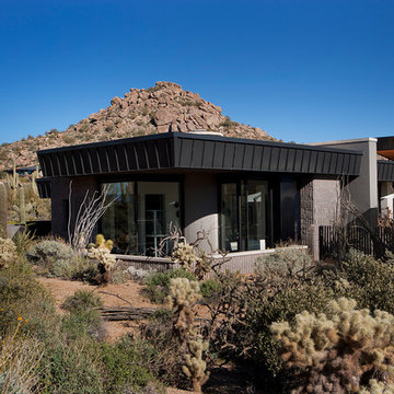
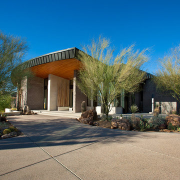
Believe it or not, this award-winning home began as a speculative project. Typically speculative projects involve a rather generic design that would appeal to many in a style that might be loved by the masses. But the project’s developer loved modern architecture and his personal residence was the first project designed by architect C.P. Drewett when Drewett Works launched in 2001. Together, the architect and developer envisioned a fictitious art collector who would one day purchase this stunning piece of desert modern architecture to showcase their magnificent collection.
The primary views from the site were southwest. Therefore, protecting the interior spaces from the southwest sun while making the primary views available was the greatest challenge. The views were very calculated and carefully managed. Every room needed to not only capture the vistas of the surrounding desert, but also provide viewing spaces for the potential collection to be housed within its walls.
The core of the material palette is utilitarian including exposed masonry and locally quarried cantera stone. An organic nature was added to the project through millwork selections including walnut and red gum veneers.
The eventual owners saw immediately that this could indeed become a home for them as well as their magnificent collection, of which pieces are loaned out to museums around the world. Their decision to purchase the home was based on the dimensions of one particular wall in the dining room which was EXACTLY large enough for one particular painting not yet displayed due to its size. The owners and this home were, as the saying goes, a perfect match!
Project Details | Desert Modern for the Magnificent Collection, Estancia, Scottsdale, AZ
Architecture: C.P. Drewett, Jr., AIA, NCARB | Drewett Works, Scottsdale, AZ
Builder: Shannon Construction | Phoenix, AZ
Interior Selections: Janet Bilotti, NCIDQ, ASID | Naples, FL
Custom Millwork: Linear Fine Woodworking | Scottsdale, AZ
Photography: Dino Tonn | Scottsdale, AZ
Awards: 2014 Gold Nugget Award of Merit
Feature Article: Luxe. Interiors and Design. Winter 2015, “Lofty Exposure”
 Drewett Works
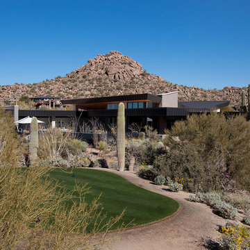
Believe it or not, this award-winning home began as a speculative project. Typically speculative projects involve a rather generic design that would appeal to many in a style that might be loved by the masses. But the project’s developer loved modern architecture and his personal residence was the first project designed by architect C.P. Drewett when Drewett Works launched in 2001. Together, the architect and developer envisioned a fictitious art collector who would one day purchase this stunning piece of desert modern architecture to showcase their magnificent collection.
The primary views from the site were southwest. Therefore, protecting the interior spaces from the southwest sun while making the primary views available was the greatest challenge. The views were very calculated and carefully managed. Every room needed to not only capture the vistas of the surrounding desert, but also provide viewing spaces for the potential collection to be housed within its walls.
The core of the material palette is utilitarian including exposed masonry and locally quarried cantera stone. An organic nature was added to the project through millwork selections including walnut and red gum veneers.
The eventual owners saw immediately that this could indeed become a home for them as well as their magnificent collection, of which pieces are loaned out to museums around the world. Their decision to purchase the home was based on the dimensions of one particular wall in the dining room which was EXACTLY large enough for one particular painting not yet displayed due to its size. The owners and this home were, as the saying goes, a perfect match!
Project Details | Desert Modern for the Magnificent Collection, Estancia, Scottsdale, AZ
Architecture: C.P. Drewett, Jr., AIA, NCARB | Drewett Works, Scottsdale, AZ
Builder: Shannon Construction | Phoenix, AZ
Interior Selections: Janet Bilotti, NCIDQ, ASID | Naples, FL
Custom Millwork: Linear Fine Woodworking | Scottsdale, AZ
Photography: Dino Tonn | Scottsdale, AZ
Awards: 2014 Gold Nugget Award of Merit
Feature Article: Luxe. Interiors and Design. Winter 2015, “Lofty Exposure”
 Rande Leaman Interior Design
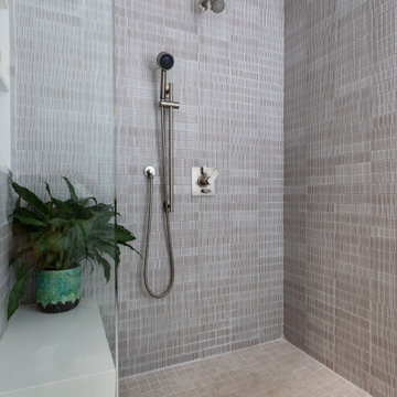
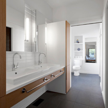
The primary bathroom is open to the bedroom and has a custom wood vanity with white quartz countertops. The backsplash tile is a textured wall tile that also was used in the shower.
Find the right local pro for your project
 AK Design
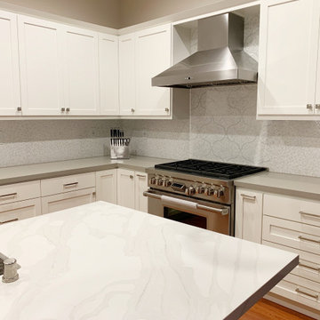
Custom kitchen design with high end Wolf and Subzero appliances, white shaker cabinets, white and gray quartz countertops, and Porcelanosa white backsplash.
 Drewett Works
Believe it or not, this award-winning home began as a speculative project. Typically speculative projects involve a rather generic design that would appeal to many in a style that might be loved by the masses. But the project’s developer loved modern architecture and his personal residence was the first project designed by architect C.P. Drewett when Drewett Works launched in 2001. Together, the architect and developer envisioned a fictitious art collector who would one day purchase this stunning piece of desert modern architecture to showcase their magnificent collection.
The primary views from the site were southwest. Therefore, protecting the interior spaces from the southwest sun while making the primary views available was the greatest challenge. The views were very calculated and carefully managed. Every room needed to not only capture the vistas of the surrounding desert, but also provide viewing spaces for the potential collection to be housed within its walls.
The core of the material palette is utilitarian including exposed masonry and locally quarried cantera stone. An organic nature was added to the project through millwork selections including walnut and red gum veneers.
The eventual owners saw immediately that this could indeed become a home for them as well as their magnificent collection, of which pieces are loaned out to museums around the world. Their decision to purchase the home was based on the dimensions of one particular wall in the dining room which was EXACTLY large enough for one particular painting not yet displayed due to its size. The owners and this home were, as the saying goes, a perfect match!
Project Details | Desert Modern for the Magnificent Collection, Estancia, Scottsdale, AZ
Architecture: C.P. Drewett, Jr., AIA, NCARB | Drewett Works, Scottsdale, AZ
Builder: Shannon Construction | Phoenix, AZ
Interior Selections: Janet Bilotti, NCIDQ, ASID | Naples, FL
Custom Millwork: Linear Fine Woodworking | Scottsdale, AZ
Photography: Dino Tonn | Scottsdale, AZ
Awards: 2014 Gold Nugget Award of Merit
Feature Article: Luxe. Interiors and Design. Winter 2015, “Lofty Exposure”
 WERK | Building Modern
Master Bathroom flows from bedroom with double vanity across from master closet alcove, then private toilet/shower room with hidden sliding doors - Architecture/Interior Design/Renderings/Photography: HAUS | Architecture - Construction Management: WERK | Building Modern
 Robin's Nest Interiors
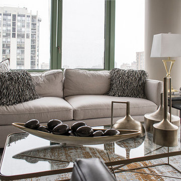
One of our Louisville clients showed her sister what we had done for her Great Room with our Personal Shopper Service, and her sister said, “Do they travel?” The answer is “Absolutely!” When we arrived in the Windy City, we were absolutely blown away by the view and were excited to put the finishing touches on this High Rise condo. We worked with the homeowner’s existing furniture pieces (sofa, club chairs, and media console with towers) and added personality with accent furniture, accessories, lighting, and artwork.
We opened up the seating area and made their beautiful rug more visible by selecting a sleek glass-topped coffee table.
Accessories in a range of metal tones complement the existing furniture and rug. Oil canisters in pewter tones look fantastic on the coffee table.
We added this concrete base lamp with square shade in between the club chairs. The white marble-topped two-tiered side table breaks up the dark leather of the club chairs.
The countertops in the small galley kitchen are a grey blue, so we pulled that color into living space by selecting these great nesting tables with a blue soapstone top. We topped it with a metal lamp and organic white vases to soften the edges.
The hallway prints and this beautiful blue watercolor pull the colors from the living space into the Entry.
The homeowner was not fond of the existing media cabinet, but not anymore! We accessorized with varying metal tones and lots of texture that bring interest to an otherwise generic furniture piece.

With limited space, we made the most of views by placing our favorite marble writing desk in the bay window. We plan to add upholstered arm chairs on either end that can serve as dining chairs or extra seating for the living area. The important thing is to keep that view as open as possible.
A big thanks to our Chicago client for having us up there to make her condo more of a home. Maybe we should change our motto to “Have paint deck & measuring tape, Will Travel!” Enjoy!
 Rocky Tops Granite & Marble LLC
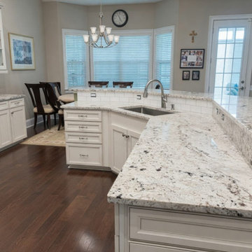
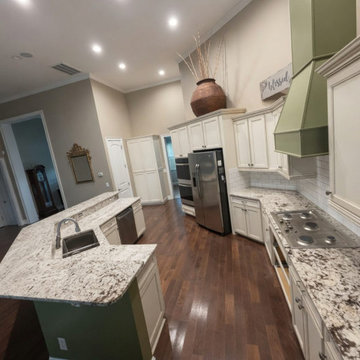
This kitchen in Lexington came together in BSI Zurich granite, and it's the kind of stone that does a lot of the work in a room just by sitting there. Zurich has a cool gray background with movement that breaks up into darker flecks and softer crystal patches, so it reads calm from across the room but keeps your eye busy up close. That range makes it easy to live with next to most cabinet colors, whether the boxes are painted white, a soft gray, or a warmer wood tone.
Granite like this is quarried in big blocks and cut into slabs, and no two slabs come out exactly the same. That's part of why we template each kitchen on site instead of working off a generic plan. We measure the actual cabinets, account for the sink and cooktop cutouts, and lay out the slabs so the veining and pattern flow the way they should across the island and the runs of counter, especially where two pieces meet at a seam. Getting that seam tight and matched so it disappears into the pattern takes a steady hand and slabs picked with the layout in mind from the start.
Granite is one of the toughest countertop materials you can put in a kitchen. It shrugs off hot pans, resists scratching from everyday knife work, and holds up to the kind of daily traffic a real kitchen sees, dishes, coffee, kids doing homework at the island, all of it. It does need to be sealed, and staying on top of that keeps it looking like day one for years. We finished this one with an eased edge, clean and simple, which is the right call for a stone with this much going on in the surface. It doesn't need extra shaping to look finished.
Lexington's seen a lot of kitchens go through updates like this one, and granite remains a favorite around the Midlands because it holds up to how people actually cook and live. This Zurich kitchen is a good example of why: a stone with real character, installed tight and clean, that's going to keep earning its keep for a long time.
 Rocky Tops Granite & Marble LLC
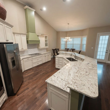
This kitchen in Lexington came together in BSI Zurich granite, and it's the kind of stone that does a lot of the work in a room just by sitting there. Zurich has a cool gray background with movement that breaks up into darker flecks and softer crystal patches, so it reads calm from across the room but keeps your eye busy up close. That range makes it easy to live with next to most cabinet colors, whether the boxes are painted white, a soft gray, or a warmer wood tone.
Granite like this is quarried in big blocks and cut into slabs, and no two slabs come out exactly the same. That's part of why we template each kitchen on site instead of working off a generic plan. We measure the actual cabinets, account for the sink and cooktop cutouts, and lay out the slabs so the veining and pattern flow the way they should across the island and the runs of counter, especially where two pieces meet at a seam. Getting that seam tight and matched so it disappears into the pattern takes a steady hand and slabs picked with the layout in mind from the start.
Granite is one of the toughest countertop materials you can put in a kitchen. It shrugs off hot pans, resists scratching from everyday knife work, and holds up to the kind of daily traffic a real kitchen sees, dishes, coffee, kids doing homework at the island, all of it. It does need to be sealed, and staying on top of that keeps it looking like day one for years. We finished this one with an eased edge, clean and simple, which is the right call for a stone with this much going on in the surface. It doesn't need extra shaping to look finished.
Lexington's seen a lot of kitchens go through updates like this one, and granite remains a favorite around the Midlands because it holds up to how people actually cook and live. This Zurich kitchen is a good example of why: a stone with real character, installed tight and clean, that's going to keep earning its keep for a long time.
 Rocky Tops Granite & Marble LLC
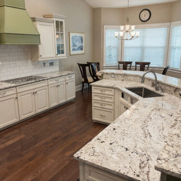
This kitchen in Lexington came together in BSI Zurich granite, and it's the kind of stone that does a lot of the work in a room just by sitting there. Zurich has a cool gray background with movement that breaks up into darker flecks and softer crystal patches, so it reads calm from across the room but keeps your eye busy up close. That range makes it easy to live with next to most cabinet colors, whether the boxes are painted white, a soft gray, or a warmer wood tone.
Granite like this is quarried in big blocks and cut into slabs, and no two slabs come out exactly the same. That's part of why we template each kitchen on site instead of working off a generic plan. We measure the actual cabinets, account for the sink and cooktop cutouts, and lay out the slabs so the veining and pattern flow the way they should across the island and the runs of counter, especially where two pieces meet at a seam. Getting that seam tight and matched so it disappears into the pattern takes a steady hand and slabs picked with the layout in mind from the start.
Granite is one of the toughest countertop materials you can put in a kitchen. It shrugs off hot pans, resists scratching from everyday knife work, and holds up to the kind of daily traffic a real kitchen sees, dishes, coffee, kids doing homework at the island, all of it. It does need to be sealed, and staying on top of that keeps it looking like day one for years. We finished this one with an eased edge, clean and simple, which is the right call for a stone with this much going on in the surface. It doesn't need extra shaping to look finished.
Lexington's seen a lot of kitchens go through updates like this one, and granite remains a favorite around the Midlands because it holds up to how people actually cook and live. This Zurich kitchen is a good example of why: a stone with real character, installed tight and clean, that's going to keep earning its keep for a long time.
 Rocky Tops Granite & Marble LLC
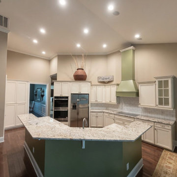
This kitchen in Lexington came together in BSI Zurich granite, and it's the kind of stone that does a lot of the work in a room just by sitting there. Zurich has a cool gray background with movement that breaks up into darker flecks and softer crystal patches, so it reads calm from across the room but keeps your eye busy up close. That range makes it easy to live with next to most cabinet colors, whether the boxes are painted white, a soft gray, or a warmer wood tone.
Granite like this is quarried in big blocks and cut into slabs, and no two slabs come out exactly the same. That's part of why we template each kitchen on site instead of working off a generic plan. We measure the actual cabinets, account for the sink and cooktop cutouts, and lay out the slabs so the veining and pattern flow the way they should across the island and the runs of counter, especially where two pieces meet at a seam. Getting that seam tight and matched so it disappears into the pattern takes a steady hand and slabs picked with the layout in mind from the start.
Granite is one of the toughest countertop materials you can put in a kitchen. It shrugs off hot pans, resists scratching from everyday knife work, and holds up to the kind of daily traffic a real kitchen sees, dishes, coffee, kids doing homework at the island, all of it. It does need to be sealed, and staying on top of that keeps it looking like day one for years. We finished this one with an eased edge, clean and simple, which is the right call for a stone with this much going on in the surface. It doesn't need extra shaping to look finished.
Lexington's seen a lot of kitchens go through updates like this one, and granite remains a favorite around the Midlands because it holds up to how people actually cook and live. This Zurich kitchen is a good example of why: a stone with real character, installed tight and clean, that's going to keep earning its keep for a long time.
 Rocky Tops Granite & Marble LLC
This kitchen in Lexington came together in BSI Zurich granite, and it's the kind of stone that does a lot of the work in a room just by sitting there. Zurich has a cool gray background with movement that breaks up into darker flecks and softer crystal patches, so it reads calm from across the room but keeps your eye busy up close. That range makes it easy to live with next to most cabinet colors, whether the boxes are painted white, a soft gray, or a warmer wood tone.
Granite like this is quarried in big blocks and cut into slabs, and no two slabs come out exactly the same. That's part of why we template each kitchen on site instead of working off a generic plan. We measure the actual cabinets, account for the sink and cooktop cutouts, and lay out the slabs so the veining and pattern flow the way they should across the island and the runs of counter, especially where two pieces meet at a seam. Getting that seam tight and matched so it disappears into the pattern takes a steady hand and slabs picked with the layout in mind from the start.
Granite is one of the toughest countertop materials you can put in a kitchen. It shrugs off hot pans, resists scratching from everyday knife work, and holds up to the kind of daily traffic a real kitchen sees, dishes, coffee, kids doing homework at the island, all of it. It does need to be sealed, and staying on top of that keeps it looking like day one for years. We finished this one with an eased edge, clean and simple, which is the right call for a stone with this much going on in the surface. It doesn't need extra shaping to look finished.
Lexington's seen a lot of kitchens go through updates like this one, and granite remains a favorite around the Midlands because it holds up to how people actually cook and live. This Zurich kitchen is a good example of why: a stone with real character, installed tight and clean, that's going to keep earning its keep for a long time.
 Drewett Works
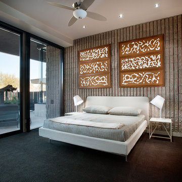
Believe it or not, this award-winning home began as a speculative project. Typically speculative projects involve a rather generic design that would appeal to many in a style that might be loved by the masses. But the project’s developer loved modern architecture and his personal residence was the first project designed by architect C.P. Drewett when Drewett Works launched in 2001. Together, the architect and developer envisioned a fictitious art collector who would one day purchase this stunning piece of desert modern architecture to showcase their magnificent collection.
The primary views from the site were southwest. Therefore, protecting the interior spaces from the southwest sun while making the primary views available was the greatest challenge. The views were very calculated and carefully managed. Every room needed to not only capture the vistas of the surrounding desert, but also provide viewing spaces for the potential collection to be housed within its walls.
The core of the material palette is utilitarian including exposed masonry and locally quarried cantera stone. An organic nature was added to the project through millwork selections including walnut and red gum veneers.
The eventual owners saw immediately that this could indeed become a home for them as well as their magnificent collection, of which pieces are loaned out to museums around the world. Their decision to purchase the home was based on the dimensions of one particular wall in the dining room which was EXACTLY large enough for one particular painting not yet displayed due to its size. The owners and this home were, as the saying goes, a perfect match!
Project Details | Desert Modern for the Magnificent Collection, Estancia, Scottsdale, AZ
Architecture: C.P. Drewett, Jr., AIA, NCARB | Drewett Works, Scottsdale, AZ
Builder: Shannon Construction | Phoenix, AZ
Interior Selections: Janet Bilotti, NCIDQ, ASID | Naples, FL
Custom Millwork: Linear Fine Woodworking | Scottsdale, AZ
Photography: Dino Tonn | Scottsdale, AZ
Awards: 2014 Gold Nugget Award of Merit
Feature Article: Luxe. Interiors and Design. Winter 2015, “Lofty Exposure”
 Décor Aid
And though the one-bedroom apartment is small in size, our client needed a second convertible bedroom in her apartment for her parents when they visit from Japan. Frosted glass sliding doors were cleverly added to the end of the living room to divide the space to allow for a second bedroom and a home office, without taking any daylight away from the living room. In the guest area, Ashley introduced a round graphic black and white patterned rug for added personality, while minimal floating iron and glass shelves provide both extra surfaces and added visual interest.
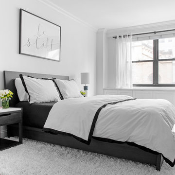
A gallery wall featuring rows of carefully installed personal and family photos line the petite hallway that leads to the master suite. Our client requested a crisp black and white bedroom so Ashley used a wide variety of materials to give the room warmth through material instead of color. Ashley also once again brought in a textured white rug to work as a focal point and to make the room appear as large as possible. She kept furnishings timeless and pared back but full of strength thanks to their moody matte gray tones and symmetrical setup. A single armed sturdy clothing rack was also brought in to help our client better prepare for the day ahead every morning.
 Rocky Tops Granite & Marble LLC
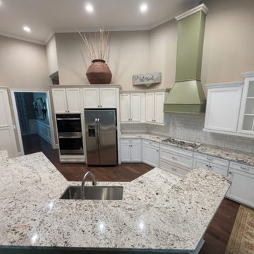
This kitchen in Lexington came together in BSI Zurich granite, and it's the kind of stone that does a lot of the work in a room just by sitting there. Zurich has a cool gray background with movement that breaks up into darker flecks and softer crystal patches, so it reads calm from across the room but keeps your eye busy up close. That range makes it easy to live with next to most cabinet colors, whether the boxes are painted white, a soft gray, or a warmer wood tone.
Granite like this is quarried in big blocks and cut into slabs, and no two slabs come out exactly the same. That's part of why we template each kitchen on site instead of working off a generic plan. We measure the actual cabinets, account for the sink and cooktop cutouts, and lay out the slabs so the veining and pattern flow the way they should across the island and the runs of counter, especially where two pieces meet at a seam. Getting that seam tight and matched so it disappears into the pattern takes a steady hand and slabs picked with the layout in mind from the start.
Granite is one of the toughest countertop materials you can put in a kitchen. It shrugs off hot pans, resists scratching from everyday knife work, and holds up to the kind of daily traffic a real kitchen sees, dishes, coffee, kids doing homework at the island, all of it. It does need to be sealed, and staying on top of that keeps it looking like day one for years. We finished this one with an eased edge, clean and simple, which is the right call for a stone with this much going on in the surface. It doesn't need extra shaping to look finished.
Lexington's seen a lot of kitchens go through updates like this one, and granite remains a favorite around the Midlands because it holds up to how people actually cook and live. This Zurich kitchen is a good example of why: a stone with real character, installed tight and clean, that's going to keep earning its keep for a long time.
 Rocky Tops Granite & Marble LLC
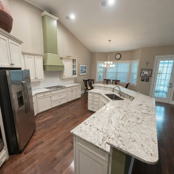
This kitchen in Lexington came together in BSI Zurich granite, and it's the kind of stone that does a lot of the work in a room just by sitting there. Zurich has a cool gray background with movement that breaks up into darker flecks and softer crystal patches, so it reads calm from across the room but keeps your eye busy up close. That range makes it easy to live with next to most cabinet colors, whether the boxes are painted white, a soft gray, or a warmer wood tone.
Granite like this is quarried in big blocks and cut into slabs, and no two slabs come out exactly the same. That's part of why we template each kitchen on site instead of working off a generic plan. We measure the actual cabinets, account for the sink and cooktop cutouts, and lay out the slabs so the veining and pattern flow the way they should across the island and the runs of counter, especially where two pieces meet at a seam. Getting that seam tight and matched so it disappears into the pattern takes a steady hand and slabs picked with the layout in mind from the start.
Granite is one of the toughest countertop materials you can put in a kitchen. It shrugs off hot pans, resists scratching from everyday knife work, and holds up to the kind of daily traffic a real kitchen sees, dishes, coffee, kids doing homework at the island, all of it. It does need to be sealed, and staying on top of that keeps it looking like day one for years. We finished this one with an eased edge, clean and simple, which is the right call for a stone with this much going on in the surface. It doesn't need extra shaping to look finished.
Lexington's seen a lot of kitchens go through updates like this one, and granite remains a favorite around the Midlands because it holds up to how people actually cook and live. This Zurich kitchen is a good example of why: a stone with real character, installed tight and clean, that's going to keep earning its keep for a long time.
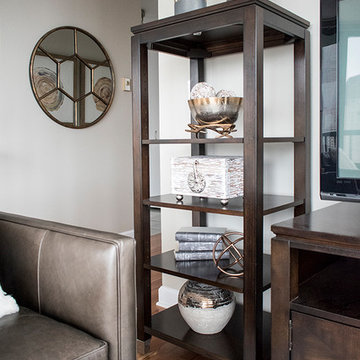 Robin's Nest Interiors
One of our Louisville clients showed her sister what we had done for her Great Room with our Personal Shopper Service, and her sister said, “Do they travel?” The answer is “Absolutely!” When we arrived in the Windy City, we were absolutely blown away by the view and were excited to put the finishing touches on this High Rise condo. We worked with the homeowner’s existing furniture pieces (sofa, club chairs, and media console with towers) and added personality with accent furniture, accessories, lighting, and artwork.
We opened up the seating area and made their beautiful rug more visible by selecting a sleek glass-topped coffee table.
Accessories in a range of metal tones complement the existing furniture and rug. Oil canisters in pewter tones look fantastic on the coffee table.
We added this concrete base lamp with square shade in between the club chairs. The white marble-topped two-tiered side table breaks up the dark leather of the club chairs.
The countertops in the small galley kitchen are a grey blue, so we pulled that color into living space by selecting these great nesting tables with a blue soapstone top. We topped it with a metal lamp and organic white vases to soften the edges.
The hallway prints and this beautiful blue watercolor pull the colors from the living space into the Entry.
The homeowner was not fond of the existing media cabinet, but not anymore! We accessorized with varying metal tones and lots of texture that bring interest to an otherwise generic furniture piece.

With limited space, we made the most of views by placing our favorite marble writing desk in the bay window. We plan to add upholstered arm chairs on either end that can serve as dining chairs or extra seating for the living area. The important thing is to keep that view as open as possible.
A big thanks to our Chicago client for having us up there to make her condo more of a home. Maybe we should change our motto to “Have paint deck & measuring tape, Will Travel!” Enjoy!
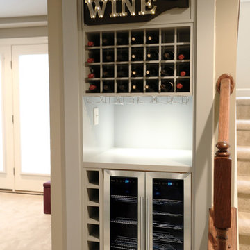
 Pierre Jean-Baptiste Interiors
The custom wine closet and bar area is a perfect component in this entertainment area. The space holds 53 bottles of wine including the dual zone wine refrigerator. There is a space to hang glasses under the cabinet with LED accent lighting to compliment the counter and backsplash. Please inquire to see how Pierre Jean-Baptiste Interiors custom cabinetry solutions can work in your home.
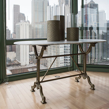 Robin's Nest Interiors
One of our Louisville clients showed her sister what we had done for her Great Room with our Personal Shopper Service, and her sister said, “Do they travel?” The answer is “Absolutely!” When we arrived in the Windy City, we were absolutely blown away by the view and were excited to put the finishing touches on this High Rise condo. We worked with the homeowner’s existing furniture pieces (sofa, club chairs, and media console with towers) and added personality with accent furniture, accessories, lighting, and artwork.
We opened up the seating area and made their beautiful rug more visible by selecting a sleek glass-topped coffee table.
Accessories in a range of metal tones complement the existing furniture and rug. Oil canisters in pewter tones look fantastic on the coffee table.
We added this concrete base lamp with square shade in between the club chairs. The white marble-topped two-tiered side table breaks up the dark leather of the club chairs.
The countertops in the small galley kitchen are a grey blue, so we pulled that color into living space by selecting these great nesting tables with a blue soapstone top. We topped it with a metal lamp and organic white vases to soften the edges.
The hallway prints and this beautiful blue watercolor pull the colors from the living space into the Entry.
The homeowner was not fond of the existing media cabinet, but not anymore! We accessorized with varying metal tones and lots of texture that bring interest to an otherwise generic furniture piece.

With limited space, we made the most of views by placing our favorite marble writing desk in the bay window. We plan to add upholstered arm chairs on either end that can serve as dining chairs or extra seating for the living area. The important thing is to keep that view as open as possible.
A big thanks to our Chicago client for having us up there to make her condo more of a home. Maybe we should change our motto to “Have paint deck & measuring tape, Will Travel!” Enjoy!
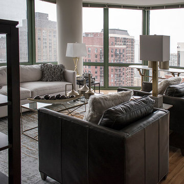 Robin's Nest Interiors
One of our Louisville clients showed her sister what we had done for her Great Room with our Personal Shopper Service, and her sister said, “Do they travel?” The answer is “Absolutely!” When we arrived in the Windy City, we were absolutely blown away by the view and were excited to put the finishing touches on this High Rise condo. We worked with the homeowner’s existing furniture pieces (sofa, club chairs, and media console with towers) and added personality with accent furniture, accessories, lighting, and artwork.
We opened up the seating area and made their beautiful rug more visible by selecting a sleek glass-topped coffee table.
Accessories in a range of metal tones complement the existing furniture and rug. Oil canisters in pewter tones look fantastic on the coffee table.
We added this concrete base lamp with square shade in between the club chairs. The white marble-topped two-tiered side table breaks up the dark leather of the club chairs.
The countertops in the small galley kitchen are a grey blue, so we pulled that color into living space by selecting these great nesting tables with a blue soapstone top. We topped it with a metal lamp and organic white vases to soften the edges.
The hallway prints and this beautiful blue watercolor pull the colors from the living space into the Entry.
The homeowner was not fond of the existing media cabinet, but not anymore! We accessorized with varying metal tones and lots of texture that bring interest to an otherwise generic furniture piece.

With limited space, we made the most of views by placing our favorite marble writing desk in the bay window. We plan to add upholstered arm chairs on either end that can serve as dining chairs or extra seating for the living area. The important thing is to keep that view as open as possible.
A big thanks to our Chicago client for having us up there to make her condo more of a home. Maybe we should change our motto to “Have paint deck & measuring tape, Will Travel!” Enjoy!
59