
Search results for "Half hearted platforms" in Home Design Ideas
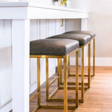
 TVL Creative Ltd.
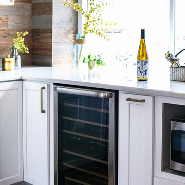
This kitchen took a tired, 80’s builder kitchen and revamped it into a personalized gathering space for our wonderful client. The existing space was split up by the dated configuration of eat-in kitchen table area to one side and cramped workspace on the other. It didn’t just under-serve our client’s needs; it flat out discouraged them from using the space. Our client desired an open kitchen with a central gathering space where family and friends could connect. To open things up, we removed the half wall separating the kitchen from the dining room and the wall that blocked sight lines to the family room and created a narrow hallway to the kitchen. The old oak cabinets weren't maximizing storage and were dated and dark. We used Waypoint Living Spaces cabinets in linen white to brighten up the room. On the east wall, we created a hutch-like stack that features an appliance garage that keeps often used countertop appliance on hand but out of sight. The hutch also acts as a transition from the cooking zone to the coffee and wine area. We eliminated the north window that looked onto the entry walkway and activated this wall as storage with refrigerator enclosure and pantry. We opted to leave the east window as-is and incorporated it into the new kitchen layout by creating a window well for growing plants and herbs. The countertops are Pental Quartz in Carrara. The sleek cabinet hardware is from our friends at Amerock in a gorgeous satin champagne bronze. One of the most striking features in the space is the pattern encaustic tile from Tile Shop. The pop of blue in the backsplash adds personality and contrast to the champagne accents. The reclaimed wood cladding surrounding the large east-facing window introduces a quintessential Colorado vibe, and the natural texture balances the crisp white cabinetry and geometric patterned tile. Minimalist modern lighting fixtures from Mitzi by Hudson Valley Lighting provide task lighting over the sink and at the wine/ coffee station. The visual lightness of the sink pendants maintains the openness and visual connection between the kitchen and dining room. Together the elements make for a sophisticated yet casual vibe-- a comfortable chic kitchen. We love the way this space turned out and are so happy that our clients now have such a bright and welcoming gathering space as the heart of their home!
 TVL Creative Ltd.
This kitchen took a tired, 80’s builder kitchen and revamped it into a personalized gathering space for our wonderful client. The existing space was split up by the dated configuration of eat-in kitchen table area to one side and cramped workspace on the other. It didn’t just under-serve our client’s needs; it flat out discouraged them from using the space. Our client desired an open kitchen with a central gathering space where family and friends could connect. To open things up, we removed the half wall separating the kitchen from the dining room and the wall that blocked sight lines to the family room and created a narrow hallway to the kitchen. The old oak cabinets weren't maximizing storage and were dated and dark. We used Waypoint Living Spaces cabinets in linen white to brighten up the room. On the east wall, we created a hutch-like stack that features an appliance garage that keeps often used countertop appliance on hand but out of sight. The hutch also acts as a transition from the cooking zone to the coffee and wine area. We eliminated the north window that looked onto the entry walkway and activated this wall as storage with refrigerator enclosure and pantry. We opted to leave the east window as-is and incorporated it into the new kitchen layout by creating a window well for growing plants and herbs. The countertops are Pental Quartz in Carrara. The sleek cabinet hardware is from our friends at Amerock in a gorgeous satin champagne bronze. One of the most striking features in the space is the pattern encaustic tile from Tile Shop. The pop of blue in the backsplash adds personality and contrast to the champagne accents. The reclaimed wood cladding surrounding the large east-facing window introduces a quintessential Colorado vibe, and the natural texture balances the crisp white cabinetry and geometric patterned tile. Minimalist modern lighting fixtures from Mitzi by Hudson Valley Lighting provide task lighting over the sink and at the wine/ coffee station. The visual lightness of the sink pendants maintains the openness and visual connection between the kitchen and dining room. Together the elements make for a sophisticated yet casual vibe-- a comfortable chic kitchen. We love the way this space turned out and are so happy that our clients now have such a bright and welcoming gathering space as the heart of their home!
 Anlon
AnlonHOME FACTS
Square Feet: 5,132 | Bedrooms: 4 | Bathrooms: 4 | Half Bath: 1
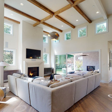
Anlon Custom Homes welcomes you to Hygge (pronounced hue-guh) a term that perfectly describes the home which makes you feel welcomed and comfortable. Duett Interiors accomplished this with the rustic, woodsy charm of simple Swedish and Danish decor and the down-to-earth, practical feel of an American style farmhouse. The blend of these two aesthetics results in a home that is as comfortable as it is beautiful.
A Modern Farmhouse in the heart of Happy Valley built for a wonderful family of four. Hygge was designed for generational living, it’s inspired by and grounded from this family’s international travel, along with the Danish and Norwegian lifestyles. Come inside and experience feelings of wellness and contentment throughout. Anlon Custom Homes has built this 5,200 sq. ft. custom home as a cozy sanctuary for this well-travelled family.
A Grand Entry welcomes you with its traditional farmhouse charm, a cobblestone inspired floor pattern that leads you to a rustic diagonal wood pattern floor, that flows throughout the home. Hygge’s kitchen and open living area are an entertainer’s dream that leads directly to a spacious patio and backyard oasis. There is a large owner's and guest room on the main level, making this multigenerational home as practical as it is gracious. Adventure and whimsy await around every corner, with a contemporary media room adorned with futbol fandom and a powder room inspired by Chefchaouen, Morocco.
Up half a flight of beautiful wood stairs you will be led to a spacious bonus room complete with a hidden door leading to the exercise room and climbing wall. Venture up another half flight of stairs, and you are greeted by bright and colorful children’s bedrooms and bathrooms. This lovely home is full of warm surprises and lives up to the Hygge name.
Find the right local pro for your project
 Skill Construction & Design, LLC
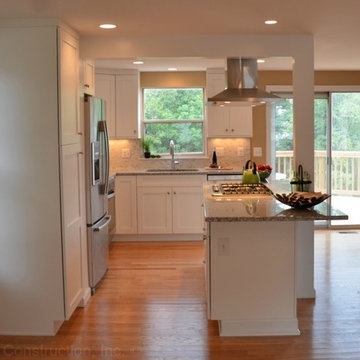
There are so many design elements to this kitchen, I almost don’t know where to start. Bright and airy with crisp clean white cabinets, the kitchen is open and welcoming. Still crisp but gently contrasting, the stainless steel appliance add depth amid the white. To keep this kitchen warm, natural oak covers the floors and a toasted wheat color washes the walls. And then there is the architectural elements. You know. That post and beam in the middle of the room. It’s the center of attention.
When you walk into a room your eyes roam around, establishing the size and shape of the room as your feet take you forward. From the front door of this home straight ahead you encountered this wall. The dining area to the right gives you a glimpse of things to come. Where there is a dining room you will usually find a kitchen.
The architecture of years gone by consistently hides the kitchen, the heart of the home, behind walls. I sympathize with my Mom, and all the other Moms, who have had to spend so much time tucked into a tight kitchen, away from the family. This wall had to go, but it was structural. We needed its support but not its bulk.
So we got rid of the bulk and only the bulk. Instead of a wall we have a post and beam, offering all of the structure we need. We could have installed a huge steel beam and reconfigure the joists to upset the beam, but why? The small beam and post add an incredible architectural element. It’s turning lemons into lemon, we simply made the most of what we had. It may be functional but it’s so fantastic. It looks like we created the effect just for the drama.
The original kitchen may have had a working triangle and some counter space, but it was fairly small, with each area only a step or two away. The dark cabinets made the space feel even smaller and the butcher block patterned laminate counter tops were very dated. The appliances were feeling their age as well, from a coil burner electric stove to a top freezer refrigerator. To keep this kitchen within its space, a half wall separated it from the dining area.
With the wall gone we borrowed some space from the living room and extended what was a U shaped kitchen into an L. At the living room window we start our new kitchen. We kept a small part of the wall to support the other end of our decorative beam. Sandwiched between a large pantry and our new French door refrigerator, the wall disappears. With our new open floor plan a sizable island was in order.
We split our cooking areas and installed a continuous grill gas cooktop into the island. A sleek island hood takes care of exhaust and adds an extra element to our architectural feature. Under the cooktop we added over-sized drawers for pots and pan storage. The frameless cabinets from New River Cabinetry are maple, painted white, with the Herndon door style. With the cooktop safely nestled into our island, we still had to add an oven.
We used the space where the old range sat for a large single oven of stainless steel and glass. If it worked for one, why not two? We created a home for a microwave in the wall cabinets. It’s perfect for heating leftovers so close to the refrigerator.
An important consideration for hot spots in your kitchen is landing zones. Each of our cooking areas have generous landing zones, one on each side of the cooktop and an entire counter area above or below the ovens, depending on which one you’re using.
We wanted to give the sink area more room so the half wall had to come out. We moved the trash and recycle cans into a cabinet, removed the heavy soffits and kept the sink under the window.
With that little bit of extra space we were able to add a larger cabinet above the dishwasher and slide it all down. This used to be where the carpeting met the vinyl floor, but all of it is gone. Long oak planks eliminate that final divide between the kitchen and the dining area, while adding visual length to the area. White wall cabinets on each side of the window reflect the sunlight for a brighter view.
With all of the darker cabinetry the backsplash walls had been painted white. Even still, there was a darkness in the corners and it wasn’t very exciting. We wanted to add visual interest and reflect the new under-cabinet lighting, eliminating the shadows in this corner.
With 1″x 2″ Arabescato Honed marble mosaics and those under-cabinet lights, we achieved the perfect balance. The marble has subtle swirls in gray and beige on a clean white background, but with the honed finish the light is softly reflected instead of glaring. For granite, we chose the soft gray tones of Luna Pearl. The speckles of gray and beige are a gentle contrast to the white cabinets and emulate the color of the stainless steel.
Between the carpet, red half wall, dark railing and dated light fixture, the dining area felt tired. Since the kitchen lacked sufficient storage, a large utility cabinet crowded the table space without adding any decorate elements.
Although it didn’t get any bigger, our dining area feels fresher and more open too. With the oak flooring joining the area to the rest of our space and the toasted wheat on the walls, the white table and chairs compliment the cabinetry while contrasting the warmer colors. We replaced the chandelier with recessed lighting and changed that railing too.
With our new open floor plan, we ended up with a fairly open area in between our foyer closet and the living room window. Not one to miss an opportunity, we filled the space with a multi-functional work space.
With the sunlight streaming in this bright corner works for anything this family needs.
There’s plenty of space for a chair under this large desk drawer. A closed cabinet below, glass doors above and lots of open shelving let you store and or showcase your belongings. We added a lite area at the top to keep away the darker corners.
The transformation is complete. This kitchen and all of its features are truly the center of attention in this home.
http://www.designsbyskill.com/
http://www.rjkconstructioninc.com/
 AV Architects + Builders
AV Architects + Builders
Forest Villa House - Mclean, VA
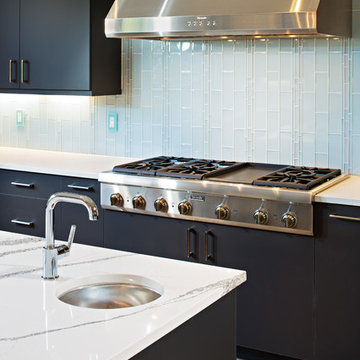
Open Kitchen/Breakfast area with commercial grade appliances and European style cabinets.
Large entertaining kitchen island with second dishwasher, sink and microwave drawer.
One bar- seating island with waterfall counter detail.
Large walk-in Pantry with pocket doors and custom shelving.
1528 Forrest Villa is situated in the heart of McLean, VA in a well-established neighborhood. This unique site is perfect for this modern house design because it sits at the top of a hill and has a grand view of the landscape.
We have designed a home that feels like a retreat but offers all the amenities a family needs to keep up with the fast pace of Northern VA. The house offers over 8,200 sqft of luxury living area on three finished levels.
The main level is an open-concept floor plan designed to entertain. The central area is the great room and the kitchen separated by a two-sided fireplace, but it’s surrounded by a very generous dining room, a study with custom built-ins and an outdoor covered patio with another gas fireplace. We also have a functional mudroom with a powder room right-off the 3-car garage with plenty of storage. The open stair case anchors the front elevation of the home to the front porch and the site.
The materials used for the home are of the highest quality. From the aluminum clad oversized windows, to the unique roofing structure, the Nichiha rectangular siding and stacked veneer stone, we have hand-picked materials that stand the test of time and complement the modern design of the home.
In total this 8200 sqft home has 6 bedrooms, 7 bathrooms, 2 half-baths and a 3-car garage.
Sean O'Rourke Photography. A one-of-a-kind modern home in the heart of McLean, Virginia.
 Anlon
AnlonHOME FACTS
Square Feet: 5,132 | Bedrooms: 4 | Bathrooms: 4 | Half Bath: 1
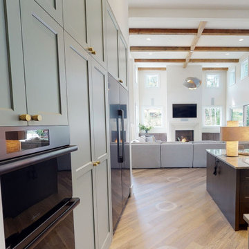
Anlon Custom Homes welcomes you to Hygge (pronounced hue-guh) a term that perfectly describes the home which makes you feel welcomed and comfortable. Duett Interiors accomplished this with the rustic, woodsy charm of simple Swedish and Danish decor and the down-to-earth, practical feel of an American style farmhouse. The blend of these two aesthetics results in a home that is as comfortable as it is beautiful.
A Modern Farmhouse in the heart of Happy Valley built for a wonderful family of four. Hygge was designed for generational living, it’s inspired by and grounded from this family’s international travel, along with the Danish and Norwegian lifestyles. Come inside and experience feelings of wellness and contentment throughout. Anlon Custom Homes has built this 5,200 sq. ft. custom home as a cozy sanctuary for this well-travelled family.
A Grand Entry welcomes you with its traditional farmhouse charm, a cobblestone inspired floor pattern that leads you to a rustic diagonal wood pattern floor, that flows throughout the home. Hygge’s kitchen and open living area are an entertainer’s dream that leads directly to a spacious patio and backyard oasis. There is a large owner's and guest room on the main level, making this multigenerational home as practical as it is gracious. Adventure and whimsy await around every corner, with a contemporary media room adorned with futbol fandom and a powder room inspired by Chefchaouen, Morocco.
Up half a flight of beautiful wood stairs you will be led to a spacious bonus room complete with a hidden door leading to the exercise room and climbing wall. Venture up another half flight of stairs, and you are greeted by bright and colorful children’s bedrooms and bathrooms. This lovely home is full of warm surprises and lives up to the Hygge name.
 Anlon
AnlonHOME FACTS
Square Feet: 5,132 | Bedrooms: 4 | Bathrooms: 4 | Half Bath: 1
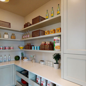
Anlon Custom Homes welcomes you to Hygge (pronounced hue-guh) a term that perfectly describes the home which makes you feel welcomed and comfortable. Duett Interiors accomplished this with the rustic, woodsy charm of simple Swedish and Danish decor and the down-to-earth, practical feel of an American style farmhouse. The blend of these two aesthetics results in a home that is as comfortable as it is beautiful.
A Modern Farmhouse in the heart of Happy Valley built for a wonderful family of four. Hygge was designed for generational living, it’s inspired by and grounded from this family’s international travel, along with the Danish and Norwegian lifestyles. Come inside and experience feelings of wellness and contentment throughout. Anlon Custom Homes has built this 5,200 sq. ft. custom home as a cozy sanctuary for this well-travelled family.
A Grand Entry welcomes you with its traditional farmhouse charm, a cobblestone inspired floor pattern that leads you to a rustic diagonal wood pattern floor, that flows throughout the home. Hygge’s kitchen and open living area are an entertainer’s dream that leads directly to a spacious patio and backyard oasis. There is a large owner's and guest room on the main level, making this multigenerational home as practical as it is gracious. Adventure and whimsy await around every corner, with a contemporary media room adorned with futbol fandom and a powder room inspired by Chefchaouen, Morocco.
Up half a flight of beautiful wood stairs you will be led to a spacious bonus room complete with a hidden door leading to the exercise room and climbing wall. Venture up another half flight of stairs, and you are greeted by bright and colorful children’s bedrooms and bathrooms. This lovely home is full of warm surprises and lives up to the Hygge name.

 CKC Custom Homes
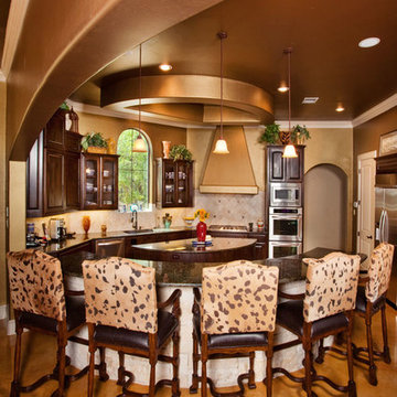
The custom coffered ceiling adds interest, and mimics the shape of the half-moon island below, while a curved granite bar ensures that this kitchen is truly the heart of the home.
 Sierra Living Concepts Inc
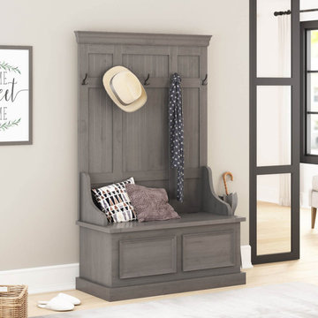
Dimension:
40" L X 18" D X 64" H
Effuse your home hallways and foyers with a classy rustic ambiance by furnishing with our Redvale Solid Mahogany Wood Grey Hall Tree Bench with Storage!
The simple looks of this piece are complemented by a sleek design and a stylish visual grace that can make any entryway, foyer, or hallway look absolutely stunning. The rustic accents and hand-rubbed finish give the solid mahogany wood hand craftsmanship a lot more nuance and couple well with its great heirloom quality.
The design of this hall tree itself is elegantly plain, with only the necessary functional elements acting as an embellishment. With its cornice-like top frame and a stylishly tall middle, it’s perfectly suitable to become the centerpiece of any mudroom. The five 3 prong hooks have been strategically installed at an adequate height so you can easily hang your hats, coats, etc.
The bottom half is connected to this back-frame with simple corbel-style extensions. It’s actually pretty unique – instead of featuring the typical drawer-style look, it has an extended top-frame that opens like a trunk, has a beveled wainscot-like embellishment at the front, and is supported by a platform base.
The beautiful natural finish of this solid mahogany wood hall tree bench is complemented by a great visual versatility. You can easily pair it up with all sorts of interior design ambiances, including but not limited to rustic, contemporary, transitional and more.
Special Features:
• 100% Handcrafted
• Solid Mahogany wood craftsmanship
• Cornice-like top
• Wainscot-style framing and hanging hooks on the tall back-panel
• Simple corbel-like connectors between the bottom and top halves
• Unconventional trunk-style storage at the bottom
• Five 3 prong hooks
• Platform base
• Sleek designing
• Stunning hand-rubbed finish
• Heirloom quality
• Visually versatile
• Easy maintenance
Note: Our furniture is made of solid wood (not wood veneer over plywood). It is handcrafted by Master Artisans. Real wood is a product of nature, and as such, no two pieces are alike. Variations in solid wood grain patterns are to be expected and make each furniture uniquely beautiful, just like us humans.
 Anlon
AnlonHOME FACTS
Square Feet: 5,132 | Bedrooms: 4 | Bathrooms: 4 | Half Bath: 1
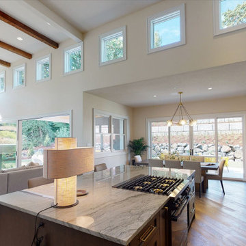
Anlon Custom Homes welcomes you to Hygge (pronounced hue-guh) a term that perfectly describes the home which makes you feel welcomed and comfortable. Duett Interiors accomplished this with the rustic, woodsy charm of simple Swedish and Danish decor and the down-to-earth, practical feel of an American style farmhouse. The blend of these two aesthetics results in a home that is as comfortable as it is beautiful.
A Modern Farmhouse in the heart of Happy Valley built for a wonderful family of four. Hygge was designed for generational living, it’s inspired by and grounded from this family’s international travel, along with the Danish and Norwegian lifestyles. Come inside and experience feelings of wellness and contentment throughout. Anlon Custom Homes has built this 5,200 sq. ft. custom home as a cozy sanctuary for this well-travelled family.
A Grand Entry welcomes you with its traditional farmhouse charm, a cobblestone inspired floor pattern that leads you to a rustic diagonal wood pattern floor, that flows throughout the home. Hygge’s kitchen and open living area are an entertainer’s dream that leads directly to a spacious patio and backyard oasis. There is a large owner's and guest room on the main level, making this multigenerational home as practical as it is gracious. Adventure and whimsy await around every corner, with a contemporary media room adorned with futbol fandom and a powder room inspired by Chefchaouen, Morocco.
Up half a flight of beautiful wood stairs you will be led to a spacious bonus room complete with a hidden door leading to the exercise room and climbing wall. Venture up another half flight of stairs, and you are greeted by bright and colorful children’s bedrooms and bathrooms. This lovely home is full of warm surprises and lives up to the Hygge name.
 Skill Construction & Design, LLC
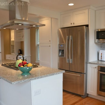
There are so many design elements to this kitchen, I almost don’t know where to start. Bright and airy with crisp clean white cabinets, the kitchen is open and welcoming. Still crisp but gently contrasting, the stainless steel appliance add depth amid the white. To keep this kitchen warm, natural oak covers the floors and a toasted wheat color washes the walls. And then there is the architectural elements. You know. That post and beam in the middle of the room. It’s the center of attention.
When you walk into a room your eyes roam around, establishing the size and shape of the room as your feet take you forward. From the front door of this home straight ahead you encountered this wall. The dining area to the right gives you a glimpse of things to come. Where there is a dining room you will usually find a kitchen.
The architecture of years gone by consistently hides the kitchen, the heart of the home, behind walls. I sympathize with my Mom, and all the other Moms, who have had to spend so much time tucked into a tight kitchen, away from the family. This wall had to go, but it was structural. We needed its support but not its bulk.
So we got rid of the bulk and only the bulk. Instead of a wall we have a post and beam, offering all of the structure we need. We could have installed a huge steel beam and reconfigure the joists to upset the beam, but why? The small beam and post add an incredible architectural element. It’s turning lemons into lemon, we simply made the most of what we had. It may be functional but it’s so fantastic. It looks like we created the effect just for the drama.
The original kitchen may have had a working triangle and some counter space, but it was fairly small, with each area only a step or two away. The dark cabinets made the space feel even smaller and the butcher block patterned laminate counter tops were very dated. The appliances were feeling their age as well, from a coil burner electric stove to a top freezer refrigerator. To keep this kitchen within its space, a half wall separated it from the dining area.
With the wall gone we borrowed some space from the living room and extended what was a U shaped kitchen into an L. At the living room window we start our new kitchen. We kept a small part of the wall to support the other end of our decorative beam. Sandwiched between a large pantry and our new French door refrigerator, the wall disappears. With our new open floor plan a sizable island was in order.
We split our cooking areas and installed a continuous grill gas cooktop into the island. A sleek island hood takes care of exhaust and adds an extra element to our architectural feature. Under the cooktop we added over-sized drawers for pots and pan storage. The frameless cabinets from New River Cabinetry are maple, painted white, with the Herndon door style. With the cooktop safely nestled into our island, we still had to add an oven.
We used the space where the old range sat for a large single oven of stainless steel and glass. If it worked for one, why not two? We created a home for a microwave in the wall cabinets. It’s perfect for heating leftovers so close to the refrigerator.
An important consideration for hot spots in your kitchen is landing zones. Each of our cooking areas have generous landing zones, one on each side of the cooktop and an entire counter area above or below the ovens, depending on which one you’re using.
We wanted to give the sink area more room so the half wall had to come out. We moved the trash and recycle cans into a cabinet, removed the heavy soffits and kept the sink under the window.
With that little bit of extra space we were able to add a larger cabinet above the dishwasher and slide it all down. This used to be where the carpeting met the vinyl floor, but all of it is gone. Long oak planks eliminate that final divide between the kitchen and the dining area, while adding visual length to the area. White wall cabinets on each side of the window reflect the sunlight for a brighter view.
With all of the darker cabinetry the backsplash walls had been painted white. Even still, there was a darkness in the corners and it wasn’t very exciting. We wanted to add visual interest and reflect the new under-cabinet lighting, eliminating the shadows in this corner.
With 1″x 2″ Arabescato Honed marble mosaics and those under-cabinet lights, we achieved the perfect balance. The marble has subtle swirls in gray and beige on a clean white background, but with the honed finish the light is softly reflected instead of glaring. For granite, we chose the soft gray tones of Luna Pearl. The speckles of gray and beige are a gentle contrast to the white cabinets and emulate the color of the stainless steel.
Between the carpet, red half wall, dark railing and dated light fixture, the dining area felt tired. Since the kitchen lacked sufficient storage, a large utility cabinet crowded the table space without adding any decorate elements.
Although it didn’t get any bigger, our dining area feels fresher and more open too. With the oak flooring joining the area to the rest of our space and the toasted wheat on the walls, the white table and chairs compliment the cabinetry while contrasting the warmer colors. We replaced the chandelier with recessed lighting and changed that railing too.
With our new open floor plan, we ended up with a fairly open area in between our foyer closet and the living room window. Not one to miss an opportunity, we filled the space with a multi-functional work space.
With the sunlight streaming in this bright corner works for anything this family needs.
There’s plenty of space for a chair under this large desk drawer. A closed cabinet below, glass doors above and lots of open shelving let you store and or showcase your belongings. We added a lite area at the top to keep away the darker corners.
The transformation is complete. This kitchen and all of its features are truly the center of attention in this home.
http://www.designsbyskill.com/
http://www.rjkconstructioninc.com/
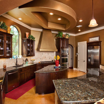 CKC Custom Homes
The custom coffered ceiling adds interest, and mimics the shape of the half-moon island below, while a curved granite bar ensures that this kitchen is truly the heart of the home.
 Skill Construction & Design, LLC
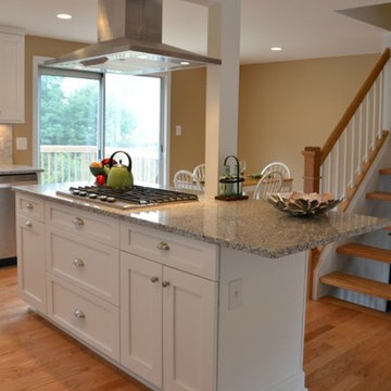
There are so many design elements to this kitchen, I almost don’t know where to start. Bright and airy with crisp clean white cabinets, the kitchen is open and welcoming. Still crisp but gently contrasting, the stainless steel appliance add depth amid the white. To keep this kitchen warm, natural oak covers the floors and a toasted wheat color washes the walls. And then there is the architectural elements. You know. That post and beam in the middle of the room. It’s the center of attention.
When you walk into a room your eyes roam around, establishing the size and shape of the room as your feet take you forward. From the front door of this home straight ahead you encountered this wall. The dining area to the right gives you a glimpse of things to come. Where there is a dining room you will usually find a kitchen.
The architecture of years gone by consistently hides the kitchen, the heart of the home, behind walls. I sympathize with my Mom, and all the other Moms, who have had to spend so much time tucked into a tight kitchen, away from the family. This wall had to go, but it was structural. We needed its support but not its bulk.
So we got rid of the bulk and only the bulk. Instead of a wall we have a post and beam, offering all of the structure we need. We could have installed a huge steel beam and reconfigure the joists to upset the beam, but why? The small beam and post add an incredible architectural element. It’s turning lemons into lemon, we simply made the most of what we had. It may be functional but it’s so fantastic. It looks like we created the effect just for the drama.
The original kitchen may have had a working triangle and some counter space, but it was fairly small, with each area only a step or two away. The dark cabinets made the space feel even smaller and the butcher block patterned laminate counter tops were very dated. The appliances were feeling their age as well, from a coil burner electric stove to a top freezer refrigerator. To keep this kitchen within its space, a half wall separated it from the dining area.
With the wall gone we borrowed some space from the living room and extended what was a U shaped kitchen into an L. At the living room window we start our new kitchen. We kept a small part of the wall to support the other end of our decorative beam. Sandwiched between a large pantry and our new French door refrigerator, the wall disappears. With our new open floor plan a sizable island was in order.
We split our cooking areas and installed a continuous grill gas cooktop into the island. A sleek island hood takes care of exhaust and adds an extra element to our architectural feature. Under the cooktop we added over-sized drawers for pots and pan storage. The frameless cabinets from New River Cabinetry are maple, painted white, with the Herndon door style. With the cooktop safely nestled into our island, we still had to add an oven.
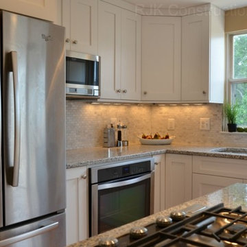
We used the space where the old range sat for a large single oven of stainless steel and glass. If it worked for one, why not two? We created a home for a microwave in the wall cabinets. It’s perfect for heating leftovers so close to the refrigerator.
An important consideration for hot spots in your kitchen is landing zones. Each of our cooking areas have generous landing zones, one on each side of the cooktop and an entire counter area above or below the ovens, depending on which one you’re using.
We wanted to give the sink area more room so the half wall had to come out. We moved the trash and recycle cans into a cabinet, removed the heavy soffits and kept the sink under the window.
With that little bit of extra space we were able to add a larger cabinet above the dishwasher and slide it all down. This used to be where the carpeting met the vinyl floor, but all of it is gone. Long oak planks eliminate that final divide between the kitchen and the dining area, while adding visual length to the area. White wall cabinets on each side of the window reflect the sunlight for a brighter view.
With all of the darker cabinetry the backsplash walls had been painted white. Even still, there was a darkness in the corners and it wasn’t very exciting. We wanted to add visual interest and reflect the new under-cabinet lighting, eliminating the shadows in this corner.
With 1″x 2″ Arabescato Honed marble mosaics and those under-cabinet lights, we achieved the perfect balance. The marble has subtle swirls in gray and beige on a clean white background, but with the honed finish the light is softly reflected instead of glaring. For granite, we chose the soft gray tones of Luna Pearl. The speckles of gray and beige are a gentle contrast to the white cabinets and emulate the color of the stainless steel.
Between the carpet, red half wall, dark railing and dated light fixture, the dining area felt tired. Since the kitchen lacked sufficient storage, a large utility cabinet crowded the table space without adding any decorate elements.
Although it didn’t get any bigger, our dining area feels fresher and more open too. With the oak flooring joining the area to the rest of our space and the toasted wheat on the walls, the white table and chairs compliment the cabinetry while contrasting the warmer colors. We replaced the chandelier with recessed lighting and changed that railing too.
With our new open floor plan, we ended up with a fairly open area in between our foyer closet and the living room window. Not one to miss an opportunity, we filled the space with a multi-functional work space.
With the sunlight streaming in this bright corner works for anything this family needs.
There’s plenty of space for a chair under this large desk drawer. A closed cabinet below, glass doors above and lots of open shelving let you store and or showcase your belongings. We added a lite area at the top to keep away the darker corners.
The transformation is complete. This kitchen and all of its features are truly the center of attention in this home.
http://www.designsbyskill.com/
http://www.rjkconstructioninc.com/
 Skill Construction & Design, LLC
There are so many design elements to this kitchen, I almost don’t know where to start. Bright and airy with crisp clean white cabinets, the kitchen is open and welcoming. Still crisp but gently contrasting, the stainless steel appliance add depth amid the white. To keep this kitchen warm, natural oak covers the floors and a toasted wheat color washes the walls. And then there is the architectural elements. You know. That post and beam in the middle of the room. It’s the center of attention.
When you walk into a room your eyes roam around, establishing the size and shape of the room as your feet take you forward. From the front door of this home straight ahead you encountered this wall. The dining area to the right gives you a glimpse of things to come. Where there is a dining room you will usually find a kitchen.
The architecture of years gone by consistently hides the kitchen, the heart of the home, behind walls. I sympathize with my Mom, and all the other Moms, who have had to spend so much time tucked into a tight kitchen, away from the family. This wall had to go, but it was structural. We needed its support but not its bulk.
So we got rid of the bulk and only the bulk. Instead of a wall we have a post and beam, offering all of the structure we need. We could have installed a huge steel beam and reconfigure the joists to upset the beam, but why? The small beam and post add an incredible architectural element. It’s turning lemons into lemon, we simply made the most of what we had. It may be functional but it’s so fantastic. It looks like we created the effect just for the drama.
The original kitchen may have had a working triangle and some counter space, but it was fairly small, with each area only a step or two away. The dark cabinets made the space feel even smaller and the butcher block patterned laminate counter tops were very dated. The appliances were feeling their age as well, from a coil burner electric stove to a top freezer refrigerator. To keep this kitchen within its space, a half wall separated it from the dining area.
With the wall gone we borrowed some space from the living room and extended what was a U shaped kitchen into an L. At the living room window we start our new kitchen. We kept a small part of the wall to support the other end of our decorative beam. Sandwiched between a large pantry and our new French door refrigerator, the wall disappears. With our new open floor plan a sizable island was in order.
We split our cooking areas and installed a continuous grill gas cooktop into the island. A sleek island hood takes care of exhaust and adds an extra element to our architectural feature. Under the cooktop we added over-sized drawers for pots and pan storage. The frameless cabinets from New River Cabinetry are maple, painted white, with the Herndon door style. With the cooktop safely nestled into our island, we still had to add an oven.
We used the space where the old range sat for a large single oven of stainless steel and glass. If it worked for one, why not two? We created a home for a microwave in the wall cabinets. It’s perfect for heating leftovers so close to the refrigerator.
An important consideration for hot spots in your kitchen is landing zones. Each of our cooking areas have generous landing zones, one on each side of the cooktop and an entire counter area above or below the ovens, depending on which one you’re using.
We wanted to give the sink area more room so the half wall had to come out. We moved the trash and recycle cans into a cabinet, removed the heavy soffits and kept the sink under the window.
With that little bit of extra space we were able to add a larger cabinet above the dishwasher and slide it all down. This used to be where the carpeting met the vinyl floor, but all of it is gone. Long oak planks eliminate that final divide between the kitchen and the dining area, while adding visual length to the area. White wall cabinets on each side of the window reflect the sunlight for a brighter view.
With all of the darker cabinetry the backsplash walls had been painted white. Even still, there was a darkness in the corners and it wasn’t very exciting. We wanted to add visual interest and reflect the new under-cabinet lighting, eliminating the shadows in this corner.
With 1″x 2″ Arabescato Honed marble mosaics and those under-cabinet lights, we achieved the perfect balance. The marble has subtle swirls in gray and beige on a clean white background, but with the honed finish the light is softly reflected instead of glaring. For granite, we chose the soft gray tones of Luna Pearl. The speckles of gray and beige are a gentle contrast to the white cabinets and emulate the color of the stainless steel.
Between the carpet, red half wall, dark railing and dated light fixture, the dining area felt tired. Since the kitchen lacked sufficient storage, a large utility cabinet crowded the table space without adding any decorate elements.
Although it didn’t get any bigger, our dining area feels fresher and more open too. With the oak flooring joining the area to the rest of our space and the toasted wheat on the walls, the white table and chairs compliment the cabinetry while contrasting the warmer colors. We replaced the chandelier with recessed lighting and changed that railing too.
With our new open floor plan, we ended up with a fairly open area in between our foyer closet and the living room window. Not one to miss an opportunity, we filled the space with a multi-functional work space.
With the sunlight streaming in this bright corner works for anything this family needs.
There’s plenty of space for a chair under this large desk drawer. A closed cabinet below, glass doors above and lots of open shelving let you store and or showcase your belongings. We added a lite area at the top to keep away the darker corners.
The transformation is complete. This kitchen and all of its features are truly the center of attention in this home.
http://www.designsbyskill.com/
http://www.rjkconstructioninc.com/
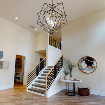 Anlon
AnlonHOME FACTS
Square Feet: 5,132 | Bedrooms: 4 | Bathrooms: 4 | Half Bath: 1
Anlon Custom Homes welcomes you to Hygge (pronounced hue-guh) a term that perfectly describes the home which makes you feel welcomed and comfortable. Duett Interiors accomplished this with the rustic, woodsy charm of simple Swedish and Danish decor and the down-to-earth, practical feel of an American style farmhouse. The blend of these two aesthetics results in a home that is as comfortable as it is beautiful.
A Modern Farmhouse in the heart of Happy Valley built for a wonderful family of four. Hygge was designed for generational living, it’s inspired by and grounded from this family’s international travel, along with the Danish and Norwegian lifestyles. Come inside and experience feelings of wellness and contentment throughout. Anlon Custom Homes has built this 5,200 sq. ft. custom home as a cozy sanctuary for this well-travelled family.
A Grand Entry welcomes you with its traditional farmhouse charm, a cobblestone inspired floor pattern that leads you to a rustic diagonal wood pattern floor, that flows throughout the home. Hygge’s kitchen and open living area are an entertainer’s dream that leads directly to a spacious patio and backyard oasis. There is a large owner's and guest room on the main level, making this multigenerational home as practical as it is gracious. Adventure and whimsy await around every corner, with a contemporary media room adorned with futbol fandom and a powder room inspired by Chefchaouen, Morocco.
Up half a flight of beautiful wood stairs you will be led to a spacious bonus room complete with a hidden door leading to the exercise room and climbing wall. Venture up another half flight of stairs, and you are greeted by bright and colorful children’s bedrooms and bathrooms. This lovely home is full of warm surprises and lives up to the Hygge name.
 Skill Construction & Design, LLC
There are so many design elements to this kitchen, I almost don’t know where to start. Bright and airy with crisp clean white cabinets, the kitchen is open and welcoming. Still crisp but gently contrasting, the stainless steel appliance add depth amid the white. To keep this kitchen warm, natural oak covers the floors and a toasted wheat color washes the walls. And then there is the architectural elements. You know. That post and beam in the middle of the room. It’s the center of attention.
When you walk into a room your eyes roam around, establishing the size and shape of the room as your feet take you forward. From the front door of this home straight ahead you encountered this wall. The dining area to the right gives you a glimpse of things to come. Where there is a dining room you will usually find a kitchen.
The architecture of years gone by consistently hides the kitchen, the heart of the home, behind walls. I sympathize with my Mom, and all the other Moms, who have had to spend so much time tucked into a tight kitchen, away from the family. This wall had to go, but it was structural. We needed its support but not its bulk.
So we got rid of the bulk and only the bulk. Instead of a wall we have a post and beam, offering all of the structure we need. We could have installed a huge steel beam and reconfigure the joists to upset the beam, but why? The small beam and post add an incredible architectural element. It’s turning lemons into lemon, we simply made the most of what we had. It may be functional but it’s so fantastic. It looks like we created the effect just for the drama.
The original kitchen may have had a working triangle and some counter space, but it was fairly small, with each area only a step or two away. The dark cabinets made the space feel even smaller and the butcher block patterned laminate counter tops were very dated. The appliances were feeling their age as well, from a coil burner electric stove to a top freezer refrigerator. To keep this kitchen within its space, a half wall separated it from the dining area.
With the wall gone we borrowed some space from the living room and extended what was a U shaped kitchen into an L. At the living room window we start our new kitchen. We kept a small part of the wall to support the other end of our decorative beam. Sandwiched between a large pantry and our new French door refrigerator, the wall disappears. With our new open floor plan a sizable island was in order.
We split our cooking areas and installed a continuous grill gas cooktop into the island. A sleek island hood takes care of exhaust and adds an extra element to our architectural feature. Under the cooktop we added over-sized drawers for pots and pan storage. The frameless cabinets from New River Cabinetry are maple, painted white, with the Herndon door style. With the cooktop safely nestled into our island, we still had to add an oven.
We used the space where the old range sat for a large single oven of stainless steel and glass. If it worked for one, why not two? We created a home for a microwave in the wall cabinets. It’s perfect for heating leftovers so close to the refrigerator.
An important consideration for hot spots in your kitchen is landing zones. Each of our cooking areas have generous landing zones, one on each side of the cooktop and an entire counter area above or below the ovens, depending on which one you’re using.
We wanted to give the sink area more room so the half wall had to come out. We moved the trash and recycle cans into a cabinet, removed the heavy soffits and kept the sink under the window.
With that little bit of extra space we were able to add a larger cabinet above the dishwasher and slide it all down. This used to be where the carpeting met the vinyl floor, but all of it is gone. Long oak planks eliminate that final divide between the kitchen and the dining area, while adding visual length to the area. White wall cabinets on each side of the window reflect the sunlight for a brighter view.
With all of the darker cabinetry the backsplash walls had been painted white. Even still, there was a darkness in the corners and it wasn’t very exciting. We wanted to add visual interest and reflect the new under-cabinet lighting, eliminating the shadows in this corner.
With 1″x 2″ Arabescato Honed marble mosaics and those under-cabinet lights, we achieved the perfect balance. The marble has subtle swirls in gray and beige on a clean white background, but with the honed finish the light is softly reflected instead of glaring. For granite, we chose the soft gray tones of Luna Pearl. The speckles of gray and beige are a gentle contrast to the white cabinets and emulate the color of the stainless steel.
Between the carpet, red half wall, dark railing and dated light fixture, the dining area felt tired. Since the kitchen lacked sufficient storage, a large utility cabinet crowded the table space without adding any decorate elements.
Although it didn’t get any bigger, our dining area feels fresher and more open too. With the oak flooring joining the area to the rest of our space and the toasted wheat on the walls, the white table and chairs compliment the cabinetry while contrasting the warmer colors. We replaced the chandelier with recessed lighting and changed that railing too.
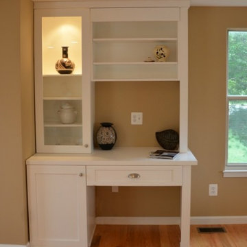
With our new open floor plan, we ended up with a fairly open area in between our foyer closet and the living room window. Not one to miss an opportunity, we filled the space with a multi-functional work space.
With the sunlight streaming in this bright corner works for anything this family needs.
There’s plenty of space for a chair under this large desk drawer. A closed cabinet below, glass doors above and lots of open shelving let you store and or showcase your belongings. We added a lite area at the top to keep away the darker corners.
The transformation is complete. This kitchen and all of its features are truly the center of attention in this home.
http://www.designsbyskill.com/
http://www.rjkconstructioninc.com/
 Marie Burgos Design
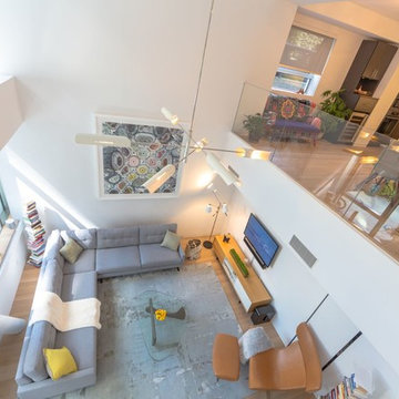
Modern Duplex in the heart of Chelsea hosts a family with a love for art.
The open kitchen and dining area reside on the upper level, and overlook the square living room with double-height ceilings, a wall of glass, a half bathroom, and access to the private 711 sq foot out door patio.a double height 19' ceiling in the living room, shows off oil-finished, custom stained, solid oak flooring, Aprilaire temperature sensors with remote thermostat, recessed base moldings and Nanz hardware throughout.Kitchen custom-designed and built Poliform cabinetry, Corian countertops and Miele appliances
Photo Credit: Francis Augustine

Sponsored
Sunbury, OH

J.Holderby - Renovations
Franklin County's Leading General Contractors - 2X Best of Houzz!
 R. B. Schwarz, Inc.
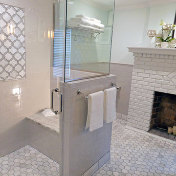
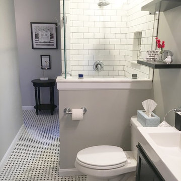
To meet my client’s needs, we divided the sitting room in half. One half was used for the master closet and the other half for the bathroom. We built a large shower stall with a niche bench and multiple shower heads. We added a vanity with his-and-her sinks and mirrors. The bathroom includes a floor to ceiling medicine cabinet. The floors have radiant heat under the hexagon tile flooring.
 Regency Design + Build
Heather McCarren
Mid-sized elegant corner shower photo in Cleveland with recessed-panel cabinets, black cabinets, a two-piece toilet, gray walls and an integrated sink
Mid-sized elegant corner shower photo in Cleveland with recessed-panel cabinets, black cabinets, a two-piece toilet, gray walls and an integrated sink
 safe ZOnea
In 2026, DIY home design and renovation will become easier than ever. Free mobile apps like Houzz, Homestyler, and Planner 5D will put professional tools in everyone’s pocket, letting users visualize layouts, test colors, and estimate costs before buying materials. Experts predict that over 50% of homeowners will use apps to plan upgrades. It will save money and reduce costly mistakes. Even now, about 54% prefer mobile tools.
Why Mobile Apps are Changing Home Renovation
DIY renovation has changed a lot in recent years. Homeowners don’t have to rely on sketches or guesswork anymore. Thanks to AR, AI, and 3D renderings, apps can show exactly how furniture and cabinets will fit. By 2026, many of these tools will be free - and packed with features that rival expensive software. With just a smartphone, anyone can try out layouts, test colors, and even create detailed floor plans.
The Tech Behind Modern Design Apps
Most renovation apps now leverage AI to generate design suggestions. They are based on your space and preferences. Upload a photo of your room. The algorithms will check the sizes, lighting, and features. Then, they’ll suggest furniture layouts or color schemes. Some apps use your phone’s camera and sensor. They make accurate measurements, so you won’t need tape measures or notepads.
Top Free Apps Transforming DIY Projects
Houzz continues to lead the pack with its massive photo library and ability to connect users with local contractors. The platform now gives AI design suggestions. It looks at your style preferences across millions of professional spaces.
For anyone serious about planning their next project, exploring comprehensive resources helps narrow down what works. It’s just like in iGaming, where review platforms like Slotzilla help gamblers to find casinos with user-friendly tools, bonus rounds, and progressive jackpots that will work for them.
Planner 5D shines with realistic 3D renderings and a huge furniture catalog, letting you switch between 2D plans and 3D walkthroughs - even in VR. Room Planner helps you design practical layouts. You can easily arrange furniture and check dimensions. It offers real-time 3D views and features items from real brands.
Apps for Specific Renovation Tasks
Not every project needs full 3D renderings - sometimes you just want to try paint colors or test tile patterns. ColorSnap by Sherwin-Williams uses AR to show colors on your actual walls and even matches shades from photos. Magicplan makes creating floor plans easy by measuring rooms with your phone as you walk around. Both apps help plan renovations and communicate ideas without the guesswork.
Budget Tracking and Project Management
Renovation apps do more than make spaces look good - managing budgets and timelines is just as important. HomeZada even uses AI to predict your budget and track material prices, so DIYers don’t get hit with surprise costs. Trello is a lifesaver - set deadlines, track progress, and share updates with anyone helping on the project.
How Apps Reflect 2026 Design Trends
This year’s popular apps reflect the largest home design trends. Colorful rooms are on the rise. Zillow shows a 149% increase in listings. Plus, apps like Houzz let users test bold shades before making a choice. Cozy reading nooks are also on the rise, showing up in nearly half of listings. Renovation apps now provide templates. They include tips for shelves and lighting. This helps create cozy, thoughtful spaces.
Here’s a quick comparison of what different free apps offer:
App name
Best feature
Learning curve
Platform
Houzz
25M+ inspiration photos
Easy
iOS, Android
Planner 5D
Photorealistic 3D renders
Moderate
iOS, Android, Web
Room Planner
Accurate measurements
Easy
iOS, Android
Magicplan
Auto floor plan creation
Easy
iOS, Android
Natural materials and earthy tones will lead design trends in 2026. Warm neutrals will take over from the grey-and-white minimalism of the last ten years.
The AI Revolution in Home Design
AI is no longer just a gimmick in renovation apps. Chat features can suggest furniture layouts, color palettes, and materials for your budget. It’s like having a designer on call. Renovate AI turns photos of your room into multiple style ideas in seconds, from mid-century to rustic farmhouse. It’s great for brainstorming and getting past the “I don’t know what I want” stage.
Practical Tips for Using Renovation Apps
Getting the most from design apps requires a strategic approach. Here are essential steps every DIYer should follow:
Start by gathering inspiration. Look through photo libraries on Houzz or Pinterest. Then, dive into detailed planning.
Don’t rely solely on screen colors; get actual paint chips and fabric swatches.
Save multiple design versions. Create variations of your plan to compare options side-by-side.
This workflow helps you avoid common mistakes. It leads to better design choices before you buy anything.
When Apps Aren’t Enough
Digital tools can’t do everything. Big structural changes, electrical work, or plumbing always need a pro. Apps are great for planning and talking with contractors, but they can’t replace expertise. And always check textures in real life - that sofa might look perfect on screen, but feel different.
The Future of DIY Renovation
In 2026, renovation apps will become smarter. They’ll have voice control and better AR. Improved AI will make DIY design feel more like professional services. Creating beautiful, functional spaces is easier than ever. For homeowners, it’s important to use apps that match local materials and building codes. The biggest benefit is confidence - seeing your design in 3D makes projects far less intimidating.
16