
Search results for "Heart shaped" in Home Design Ideas

 Vintage Cellars & Saunas
This gorgeous custom wine cellar acts as a dramatic entrypiece as you walk into this beautiful home in San Juan Capistrano, Orange County, California. San Juan Capistrano is a lovely community located slightly inland, tucked within Orange County near cities like Newport Beach, Lake Forest, Huntington Beach, Costa Mesa, Dana Point, Laguna Niguel, Laguna Hills, and Irvine.
This fantastically designed wine cellar, courtesy of the master wine cellar builders at Vintage Cellars, is a unique representation of fun and bespoke features that can be incorporated into a traditional redwood, yet modern and bright wine cellar like this. The wine room draws you in from across the house, with its warm redwood tones and interesting wrought iron and glass door. Wine Cellar doors are often overlooked, but proper knowledge of door materials, glass specifications, threshold placement and hanging procedures are key to creating that perfect airtight room. Additionally, based on the location of your room within your home, the amount of glass in your wine cellar, and your location in the world, levels of cooling capacity need to be seriously considered.
Glass is a naturally poor insulator. Because there has been a very heavy push for "wine cellar art," "wine cellars as art," and wine cellars as a main design component within high end homes, glass wine cellars are often incorporated in high trafficked areas or spaces where each homeowner can show off their prized wines to friends in an almost showcase like display.
When you first enter this large custom wine cellar in Orange County, Southern California, standing out first immediately on your left is a unique work station with a scanner, label-maker, and table top - perfect for inventorying the 3,500 bottles that this rustic wine cellar holds. The e-Sommelier system integrated allows this homeowner to catalog each and every wine within his collection, first letting the program know he owns it, how many bottles, which vintages, and with the click of a button - custom wine labels each with a bar code. Accompanied with the bar code scanner, the e-sommelier system has become a great companion for wine cellars and wine collectors alike, allowing a somewhat seamless and straightforward process in inventorying wines.
Directly past the wine inventory station is a vertical row of large format bottle coved trays, displaying some of the owner's favorite wines in the most coveted vintages.
This large walk in custom wine cellar in all heart redwood wine racking fills most of its capacity utilizing double deep, individual bottle storage. At waist height spanning the entire circumference of the wine room is a high reveal display row, highlighted with LED lighting and more single deep storage behind.
The back wall, in addition to the high reveal display row and double deep individual bottle storage, incorporates a rectangular wine work center with glass rack above - perfect for decanting, storing uniquely shaped bottles, and opening your favorite bottles with friends. Directly below this countertop are two drawers. A unique feature throughout this wooden traditional large walk in wine cellar in San Juan Capistrano, Orange County, California is the incorporation of wine barrel into the room's corner walls, work stations, countertops, and center custom table.
This custom wine cellar near Newport Beach, Dana Point, Laguna Beach, Laguna Hills, Coto De Caza, Laguna Niguel, Huntington Beach, and other gorgeous beach communities in Orange County, also incorporates wine case storage throughout the bottom, and a small area above the wine inventory system for split bottles.
Vintage Cellars, as well as the homeowner, are very happy with the way this beautiful project turned out, and we would love the opportunity to help you with you wine cellar projects!
Please contact us today to speak with one of our wine cellar specialists and begin building your wine cellar dreams today!

 Icon Custom Pools
Pool fountain - mid-sized backyard concrete paver and custom-shaped pool fountain idea in DC Metro
 Klopf Architecture
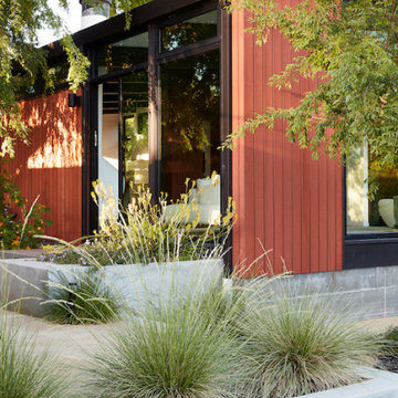
The Roger Lee designed house from 1962 was purchased by the current homeowners in almost original condition, as the previous owners elected to defer most maintenance projects over the years. The clients were able to see beyond the dated materials and finishes, single-paned glass and uninsulated walls and they approached Klopf Architecture to help them expand and update the entire home, one the family could settle into and enjoy for years to come. It was important that the new designs were aligned with Lee's original intent not only because of the client's appreciation for mid-century modern architecture, but also because the house was deemed historical. The Stanford Real Estate Office requires a stringent design review which safeguards the integrity of the community, which Klopf Architecture was happy to oblige going into their updated designs.
As with many original mid-century modern homes, the house was scaled to the 1960s lifestyle where rooms were smaller and openings to views were limited and tightly framed. The original conditions defined the direction the family of four would take in updating the house and making it comfortable for their modern lifestyle. Klopf designed a full gut remodel and major addition to bring the house into the 21st century and provide the living area needed for the client's family. The newly expanded house added just about 1,100 sf to create an airy, comfortable and family friendly house, taking full advantage of the beautiful southwestern views that extend out to the hills beyond. The enclosed garage created an additional 240 sf of covered space for long-term storage.
A cracked swimming pool created an eyesore taking up a majority of the backyard landscape, so it was one of the first elements to go during the transformation. Working with Outer Space Landscape Architects, the family asked for a mix of relaxing outdoor patio spaces that eventually blend into the native landscaping, extending their views outward toward the natural greenery of the trees beyond their property. Filling in the old pool was a smart way to expand the living spaces outward. The orientation of the house was designed to enjoy the views, but the original architecture provided the first homeowners with mere glimpses of the landscape outside.
Klopf was able to broaden those views, continuing and extending on the original architecture to take full advantage of the unobstructed natural views across the rear facade of the house. Small horizontal openings in the primary bedroom and office were replaced with much taller windows that now follow the angled roof line upward, extending across almost all of the facade. We worked with Western Windows, whose designs included an oblique-shaped, operable casement that allowed our design to rise with the slope. A new corner office added to the primary suite, offers a bright and functional work-from-home solution that looks out at the distant views and added natural light from the expanded window configuration that now wraps around the corner.
The existing lower level was designed by Lee as a utilitarian space, serving as a wet pool room with a drain in the center of the floor, bathroom, laundry and storage areas. Without the need for a pool room, Klopf was able to convert the area into a much more comfortable and functional living space with a new family room and guest suite. The new spaces enjoy easy access to a new outdoor patio through floor to ceiling, full-width glass sliders.
Continuing along the rear facade, a previously exposed deck extending from the living room and hallway provided access to the backyard through a single set of stairs leading toward the side of the house which made sense when the pool was in place. The new deck was re-envisioned as an extension of the main living room and now serves as a second outdoor living room. A new slatted pergola above provides the homeowners welcome relief from the hot afternoon sun. A second set of stairs now creates a better connection to the redesigned lower level. Klopf was able to reconfigure the spaces, extending the living room outward toward the views, where the family now claims it as the heart of the home, spending a large majority of their time outdoors.
Back inside, the original wood-burning Malm fireplace was beautifully restored and a gas burner installed to comply with California's strict air standards. It now rests in front of a wall of Heath accent tiles where a dated red brick wall used to stand. A new taller window brings more light and views into the refreshed interior living room. The original glass doors opposite the fireplace were replaced by larger sliders that when fully opened, create a seamless transition to the new outdoor living area so the two spaces feel like one connected space. The original utilitarian kitchen was needlessly tucked into the far back corner and closed-off, out of sight from the living room, so the clients asked Klopf to open it up and expand the kitchen forward so it felt more connected. Today the much larger kitchen is connected to the living area where a short wall with a cutout offers a visual glimpse into the kitchen and a handy pass-through counter for serving guests. A new breakfast nook was also added to create another spot where the family can gather for casual meals. Just outside, a new built-in outdoor grill and prep area extends the kitchen outside and connects to a new outdoor dining spot nestled amongst the trees, taking advantage of the views out back.
Klopf was able to expand the other two bedrooms, add a new laundry room and half-bath and convert the carport to an enclosed garage to add more storage areas which was lost when the pool house was converted to the family and guest room.
To maintain a historical connection to the original designs, the exterior siding was repeated on all exterior walls, a full-height stained glass window at the front entryway restored, and an interior slatted screen element repeated outside at the exterior entry courtyard and over the new outdoor living room to create a shade trellis. The new house stands proudly and shines against it's new landscaping features, while respecting and expanding on the original intent of Roger Lee's designs epitomizing the comforts of indoor-outdoor living in Northern California.
Completion year: 2020
Klopf Architecture project team: John Klopf, Klara Kevane, Noel Andrade
Contractor: ORB Construction, Brendan O'Reilly
Structural engineer: Sezen and Moon
Landscape architect: Outer space
Furnishings and decoration: Urbanism Designs
Photographer: Mariko Reed
Find the right local pro for your project

 Skill Construction & Design, LLC
There are so many design elements to this kitchen, I almost don’t know where to start. Bright and airy with crisp clean white cabinets, the kitchen is open and welcoming. Still crisp but gently contrasting, the stainless steel appliance add depth amid the white. To keep this kitchen warm, natural oak covers the floors and a toasted wheat color washes the walls. And then there is the architectural elements. You know. That post and beam in the middle of the room. It’s the center of attention.
When you walk into a room your eyes roam around, establishing the size and shape of the room as your feet take you forward. From the front door of this home straight ahead you encountered this wall. The dining area to the right gives you a glimpse of things to come. Where there is a dining room you will usually find a kitchen.
The architecture of years gone by consistently hides the kitchen, the heart of the home, behind walls. I sympathize with my Mom, and all the other Moms, who have had to spend so much time tucked into a tight kitchen, away from the family. This wall had to go, but it was structural. We needed its support but not its bulk.
So we got rid of the bulk and only the bulk. Instead of a wall we have a post and beam, offering all of the structure we need. We could have installed a huge steel beam and reconfigure the joists to upset the beam, but why? The small beam and post add an incredible architectural element. It’s turning lemons into lemon, we simply made the most of what we had. It may be functional but it’s so fantastic. It looks like we created the effect just for the drama.
The original kitchen may have had a working triangle and some counter space, but it was fairly small, with each area only a step or two away. The dark cabinets made the space feel even smaller and the butcher block patterned laminate counter tops were very dated. The appliances were feeling their age as well, from a coil burner electric stove to a top freezer refrigerator. To keep this kitchen within its space, a half wall separated it from the dining area.
With the wall gone we borrowed some space from the living room and extended what was a U shaped kitchen into an L. At the living room window we start our new kitchen. We kept a small part of the wall to support the other end of our decorative beam. Sandwiched between a large pantry and our new French door refrigerator, the wall disappears. With our new open floor plan a sizable island was in order.
We split our cooking areas and installed a continuous grill gas cooktop into the island. A sleek island hood takes care of exhaust and adds an extra element to our architectural feature. Under the cooktop we added over-sized drawers for pots and pan storage. The frameless cabinets from New River Cabinetry are maple, painted white, with the Herndon door style. With the cooktop safely nestled into our island, we still had to add an oven.
We used the space where the old range sat for a large single oven of stainless steel and glass. If it worked for one, why not two? We created a home for a microwave in the wall cabinets. It’s perfect for heating leftovers so close to the refrigerator.
An important consideration for hot spots in your kitchen is landing zones. Each of our cooking areas have generous landing zones, one on each side of the cooktop and an entire counter area above or below the ovens, depending on which one you’re using.
We wanted to give the sink area more room so the half wall had to come out. We moved the trash and recycle cans into a cabinet, removed the heavy soffits and kept the sink under the window.
With that little bit of extra space we were able to add a larger cabinet above the dishwasher and slide it all down. This used to be where the carpeting met the vinyl floor, but all of it is gone. Long oak planks eliminate that final divide between the kitchen and the dining area, while adding visual length to the area. White wall cabinets on each side of the window reflect the sunlight for a brighter view.
With all of the darker cabinetry the backsplash walls had been painted white. Even still, there was a darkness in the corners and it wasn’t very exciting. We wanted to add visual interest and reflect the new under-cabinet lighting, eliminating the shadows in this corner.
With 1″x 2″ Arabescato Honed marble mosaics and those under-cabinet lights, we achieved the perfect balance. The marble has subtle swirls in gray and beige on a clean white background, but with the honed finish the light is softly reflected instead of glaring. For granite, we chose the soft gray tones of Luna Pearl. The speckles of gray and beige are a gentle contrast to the white cabinets and emulate the color of the stainless steel.
Between the carpet, red half wall, dark railing and dated light fixture, the dining area felt tired. Since the kitchen lacked sufficient storage, a large utility cabinet crowded the table space without adding any decorate elements.
Although it didn’t get any bigger, our dining area feels fresher and more open too. With the oak flooring joining the area to the rest of our space and the toasted wheat on the walls, the white table and chairs compliment the cabinetry while contrasting the warmer colors. We replaced the chandelier with recessed lighting and changed that railing too.
With our new open floor plan, we ended up with a fairly open area in between our foyer closet and the living room window. Not one to miss an opportunity, we filled the space with a multi-functional work space.
With the sunlight streaming in this bright corner works for anything this family needs.
There’s plenty of space for a chair under this large desk drawer. A closed cabinet below, glass doors above and lots of open shelving let you store and or showcase your belongings. We added a lite area at the top to keep away the darker corners.
The transformation is complete. This kitchen and all of its features are truly the center of attention in this home.
http://www.designsbyskill.com/
http://www.rjkconstructioninc.com/

 The POOL ARTIST | Brian T. Stratton
Award winning pool designer Brian T. Stratton | The Pool Artist designed this beautiful custom concrete / gunite swimming pool. Luxury pool designer nj, international pool design, new jersey swimming pool designer, pool artist, swimming pool engineer, swimming pool architect nj, water designer, eleuthera Bahamas pool designer, infinity edge pool design, custom spa design, California pool designer, Mississippi pool designer, south Carolina pool designer, new York pool designer, Pennsylvania pool designer

 Tile Trends, Inc.
Subway Tile-Herringbone
Inspiration for a mid-sized rustic l-shaped dark wood floor and brown floor eat-in kitchen remodel with a farmhouse sink, raised-panel cabinets, dark wood cabinets, quartz countertops, white backsplash, subway tile backsplash, stainless steel appliances, an island and beige countertops
Inspiration for a mid-sized rustic l-shaped dark wood floor and brown floor eat-in kitchen remodel with a farmhouse sink, raised-panel cabinets, dark wood cabinets, quartz countertops, white backsplash, subway tile backsplash, stainless steel appliances, an island and beige countertops



 Vintage Cellars & Saunas
This gorgeous custom wine cellar acts as a dramatic entrypiece as you walk into this beautiful home in San Juan Capistrano, Orange County, California. San Juan Capistrano is a lovely community located slightly inland, tucked within Orange County near cities like Newport Beach, Lake Forest, Huntington Beach, Costa Mesa, Dana Point, Laguna Niguel, Laguna Hills, and Irvine.
This fantastically designed wine cellar, courtesy of the master wine cellar builders at Vintage Cellars, is a unique representation of fun and bespoke features that can be incorporated into a traditional redwood, yet modern and bright wine cellar like this. The wine room draws you in from across the house, with its warm redwood tones and interesting wrought iron and glass door. Wine Cellar doors are often overlooked, but proper knowledge of door materials, glass specifications, threshold placement and hanging procedures are key to creating that perfect airtight room. Additionally, based on the location of your room within your home, the amount of glass in your wine cellar, and your location in the world, levels of cooling capacity need to be seriously considered.
Glass is a naturally poor insulator. Because there has been a very heavy push for "wine cellar art," "wine cellars as art," and wine cellars as a main design component within high end homes, glass wine cellars are often incorporated in high trafficked areas or spaces where each homeowner can show off their prized wines to friends in an almost showcase like display.
When you first enter this large custom wine cellar in Orange County, Southern California, standing out first immediately on your left is a unique work station with a scanner, label-maker, and table top - perfect for inventorying the 3,500 bottles that this rustic wine cellar holds. The e-Sommelier system integrated allows this homeowner to catalog each and every wine within his collection, first letting the program know he owns it, how many bottles, which vintages, and with the click of a button - custom wine labels each with a bar code. Accompanied with the bar code scanner, the e-sommelier system has become a great companion for wine cellars and wine collectors alike, allowing a somewhat seamless and straightforward process in inventorying wines.
Directly past the wine inventory station is a vertical row of large format bottle coved trays, displaying some of the owner's favorite wines in the most coveted vintages.
This large walk in custom wine cellar in all heart redwood wine racking fills most of its capacity utilizing double deep, individual bottle storage. At waist height spanning the entire circumference of the wine room is a high reveal display row, highlighted with LED lighting and more single deep storage behind.
The back wall, in addition to the high reveal display row and double deep individual bottle storage, incorporates a rectangular wine work center with glass rack above - perfect for decanting, storing uniquely shaped bottles, and opening your favorite bottles with friends. Directly below this countertop are two drawers. A unique feature throughout this wooden traditional large walk in wine cellar in San Juan Capistrano, Orange County, California is the incorporation of wine barrel into the room's corner walls, work stations, countertops, and center custom table.
This custom wine cellar near Newport Beach, Dana Point, Laguna Beach, Laguna Hills, Coto De Caza, Laguna Niguel, Huntington Beach, and other gorgeous beach communities in Orange County, also incorporates wine case storage throughout the bottom, and a small area above the wine inventory system for split bottles.
Vintage Cellars, as well as the homeowner, are very happy with the way this beautiful project turned out, and we would love the opportunity to help you with you wine cellar projects!
Please contact us today to speak with one of our wine cellar specialists and begin building your wine cellar dreams today!
 Skill Construction & Design, LLC
There are so many design elements to this kitchen, I almost don’t know where to start. Bright and airy with crisp clean white cabinets, the kitchen is open and welcoming. Still crisp but gently contrasting, the stainless steel appliance add depth amid the white. To keep this kitchen warm, natural oak covers the floors and a toasted wheat color washes the walls. And then there is the architectural elements. You know. That post and beam in the middle of the room. It’s the center of attention.
When you walk into a room your eyes roam around, establishing the size and shape of the room as your feet take you forward. From the front door of this home straight ahead you encountered this wall. The dining area to the right gives you a glimpse of things to come. Where there is a dining room you will usually find a kitchen.
The architecture of years gone by consistently hides the kitchen, the heart of the home, behind walls. I sympathize with my Mom, and all the other Moms, who have had to spend so much time tucked into a tight kitchen, away from the family. This wall had to go, but it was structural. We needed its support but not its bulk.
So we got rid of the bulk and only the bulk. Instead of a wall we have a post and beam, offering all of the structure we need. We could have installed a huge steel beam and reconfigure the joists to upset the beam, but why? The small beam and post add an incredible architectural element. It’s turning lemons into lemon, we simply made the most of what we had. It may be functional but it’s so fantastic. It looks like we created the effect just for the drama.
The original kitchen may have had a working triangle and some counter space, but it was fairly small, with each area only a step or two away. The dark cabinets made the space feel even smaller and the butcher block patterned laminate counter tops were very dated. The appliances were feeling their age as well, from a coil burner electric stove to a top freezer refrigerator. To keep this kitchen within its space, a half wall separated it from the dining area.
With the wall gone we borrowed some space from the living room and extended what was a U shaped kitchen into an L. At the living room window we start our new kitchen. We kept a small part of the wall to support the other end of our decorative beam. Sandwiched between a large pantry and our new French door refrigerator, the wall disappears. With our new open floor plan a sizable island was in order.
We split our cooking areas and installed a continuous grill gas cooktop into the island. A sleek island hood takes care of exhaust and adds an extra element to our architectural feature. Under the cooktop we added over-sized drawers for pots and pan storage. The frameless cabinets from New River Cabinetry are maple, painted white, with the Herndon door style. With the cooktop safely nestled into our island, we still had to add an oven.
We used the space where the old range sat for a large single oven of stainless steel and glass. If it worked for one, why not two? We created a home for a microwave in the wall cabinets. It’s perfect for heating leftovers so close to the refrigerator.
An important consideration for hot spots in your kitchen is landing zones. Each of our cooking areas have generous landing zones, one on each side of the cooktop and an entire counter area above or below the ovens, depending on which one you’re using.
We wanted to give the sink area more room so the half wall had to come out. We moved the trash and recycle cans into a cabinet, removed the heavy soffits and kept the sink under the window.
With that little bit of extra space we were able to add a larger cabinet above the dishwasher and slide it all down. This used to be where the carpeting met the vinyl floor, but all of it is gone. Long oak planks eliminate that final divide between the kitchen and the dining area, while adding visual length to the area. White wall cabinets on each side of the window reflect the sunlight for a brighter view.
With all of the darker cabinetry the backsplash walls had been painted white. Even still, there was a darkness in the corners and it wasn’t very exciting. We wanted to add visual interest and reflect the new under-cabinet lighting, eliminating the shadows in this corner.
With 1″x 2″ Arabescato Honed marble mosaics and those under-cabinet lights, we achieved the perfect balance. The marble has subtle swirls in gray and beige on a clean white background, but with the honed finish the light is softly reflected instead of glaring. For granite, we chose the soft gray tones of Luna Pearl. The speckles of gray and beige are a gentle contrast to the white cabinets and emulate the color of the stainless steel.
Between the carpet, red half wall, dark railing and dated light fixture, the dining area felt tired. Since the kitchen lacked sufficient storage, a large utility cabinet crowded the table space without adding any decorate elements.
Although it didn’t get any bigger, our dining area feels fresher and more open too. With the oak flooring joining the area to the rest of our space and the toasted wheat on the walls, the white table and chairs compliment the cabinetry while contrasting the warmer colors. We replaced the chandelier with recessed lighting and changed that railing too.
With our new open floor plan, we ended up with a fairly open area in between our foyer closet and the living room window. Not one to miss an opportunity, we filled the space with a multi-functional work space.
With the sunlight streaming in this bright corner works for anything this family needs.
There’s plenty of space for a chair under this large desk drawer. A closed cabinet below, glass doors above and lots of open shelving let you store and or showcase your belongings. We added a lite area at the top to keep away the darker corners.
The transformation is complete. This kitchen and all of its features are truly the center of attention in this home.
http://www.designsbyskill.com/
http://www.rjkconstructioninc.com/
 Skill Construction & Design, LLC
There are so many design elements to this kitchen, I almost don’t know where to start. Bright and airy with crisp clean white cabinets, the kitchen is open and welcoming. Still crisp but gently contrasting, the stainless steel appliance add depth amid the white. To keep this kitchen warm, natural oak covers the floors and a toasted wheat color washes the walls. And then there is the architectural elements. You know. That post and beam in the middle of the room. It’s the center of attention.
When you walk into a room your eyes roam around, establishing the size and shape of the room as your feet take you forward. From the front door of this home straight ahead you encountered this wall. The dining area to the right gives you a glimpse of things to come. Where there is a dining room you will usually find a kitchen.
The architecture of years gone by consistently hides the kitchen, the heart of the home, behind walls. I sympathize with my Mom, and all the other Moms, who have had to spend so much time tucked into a tight kitchen, away from the family. This wall had to go, but it was structural. We needed its support but not its bulk.
So we got rid of the bulk and only the bulk. Instead of a wall we have a post and beam, offering all of the structure we need. We could have installed a huge steel beam and reconfigure the joists to upset the beam, but why? The small beam and post add an incredible architectural element. It’s turning lemons into lemon, we simply made the most of what we had. It may be functional but it’s so fantastic. It looks like we created the effect just for the drama.
The original kitchen may have had a working triangle and some counter space, but it was fairly small, with each area only a step or two away. The dark cabinets made the space feel even smaller and the butcher block patterned laminate counter tops were very dated. The appliances were feeling their age as well, from a coil burner electric stove to a top freezer refrigerator. To keep this kitchen within its space, a half wall separated it from the dining area.
With the wall gone we borrowed some space from the living room and extended what was a U shaped kitchen into an L. At the living room window we start our new kitchen. We kept a small part of the wall to support the other end of our decorative beam. Sandwiched between a large pantry and our new French door refrigerator, the wall disappears. With our new open floor plan a sizable island was in order.
We split our cooking areas and installed a continuous grill gas cooktop into the island. A sleek island hood takes care of exhaust and adds an extra element to our architectural feature. Under the cooktop we added over-sized drawers for pots and pan storage. The frameless cabinets from New River Cabinetry are maple, painted white, with the Herndon door style. With the cooktop safely nestled into our island, we still had to add an oven.
We used the space where the old range sat for a large single oven of stainless steel and glass. If it worked for one, why not two? We created a home for a microwave in the wall cabinets. It’s perfect for heating leftovers so close to the refrigerator.
An important consideration for hot spots in your kitchen is landing zones. Each of our cooking areas have generous landing zones, one on each side of the cooktop and an entire counter area above or below the ovens, depending on which one you’re using.
We wanted to give the sink area more room so the half wall had to come out. We moved the trash and recycle cans into a cabinet, removed the heavy soffits and kept the sink under the window.
With that little bit of extra space we were able to add a larger cabinet above the dishwasher and slide it all down. This used to be where the carpeting met the vinyl floor, but all of it is gone. Long oak planks eliminate that final divide between the kitchen and the dining area, while adding visual length to the area. White wall cabinets on each side of the window reflect the sunlight for a brighter view.
With all of the darker cabinetry the backsplash walls had been painted white. Even still, there was a darkness in the corners and it wasn’t very exciting. We wanted to add visual interest and reflect the new under-cabinet lighting, eliminating the shadows in this corner.
With 1″x 2″ Arabescato Honed marble mosaics and those under-cabinet lights, we achieved the perfect balance. The marble has subtle swirls in gray and beige on a clean white background, but with the honed finish the light is softly reflected instead of glaring. For granite, we chose the soft gray tones of Luna Pearl. The speckles of gray and beige are a gentle contrast to the white cabinets and emulate the color of the stainless steel.
Between the carpet, red half wall, dark railing and dated light fixture, the dining area felt tired. Since the kitchen lacked sufficient storage, a large utility cabinet crowded the table space without adding any decorate elements.
Although it didn’t get any bigger, our dining area feels fresher and more open too. With the oak flooring joining the area to the rest of our space and the toasted wheat on the walls, the white table and chairs compliment the cabinetry while contrasting the warmer colors. We replaced the chandelier with recessed lighting and changed that railing too.
With our new open floor plan, we ended up with a fairly open area in between our foyer closet and the living room window. Not one to miss an opportunity, we filled the space with a multi-functional work space.
With the sunlight streaming in this bright corner works for anything this family needs.
There’s plenty of space for a chair under this large desk drawer. A closed cabinet below, glass doors above and lots of open shelving let you store and or showcase your belongings. We added a lite area at the top to keep away the darker corners.
The transformation is complete. This kitchen and all of its features are truly the center of attention in this home.
http://www.designsbyskill.com/
http://www.rjkconstructioninc.com/
 Vintage Cellars & Saunas
This gorgeous custom wine cellar acts as a dramatic entrypiece as you walk into this beautiful home in San Juan Capistrano, Orange County, California. San Juan Capistrano is a lovely community located slightly inland, tucked within Orange County near cities like Newport Beach, Lake Forest, Huntington Beach, Costa Mesa, Dana Point, Laguna Niguel, Laguna Hills, and Irvine.
This fantastically designed wine cellar, courtesy of the master wine cellar builders at Vintage Cellars, is a unique representation of fun and bespoke features that can be incorporated into a traditional redwood, yet modern and bright wine cellar like this. The wine room draws you in from across the house, with its warm redwood tones and interesting wrought iron and glass door. Wine Cellar doors are often overlooked, but proper knowledge of door materials, glass specifications, threshold placement and hanging procedures are key to creating that perfect airtight room. Additionally, based on the location of your room within your home, the amount of glass in your wine cellar, and your location in the world, levels of cooling capacity need to be seriously considered.
Glass is a naturally poor insulator. Because there has been a very heavy push for "wine cellar art," "wine cellars as art," and wine cellars as a main design component within high end homes, glass wine cellars are often incorporated in high trafficked areas or spaces where each homeowner can show off their prized wines to friends in an almost showcase like display.
When you first enter this large custom wine cellar in Orange County, Southern California, standing out first immediately on your left is a unique work station with a scanner, label-maker, and table top - perfect for inventorying the 3,500 bottles that this rustic wine cellar holds. The e-Sommelier system integrated allows this homeowner to catalog each and every wine within his collection, first letting the program know he owns it, how many bottles, which vintages, and with the click of a button - custom wine labels each with a bar code. Accompanied with the bar code scanner, the e-sommelier system has become a great companion for wine cellars and wine collectors alike, allowing a somewhat seamless and straightforward process in inventorying wines.
Directly past the wine inventory station is a vertical row of large format bottle coved trays, displaying some of the owner's favorite wines in the most coveted vintages.
This large walk in custom wine cellar in all heart redwood wine racking fills most of its capacity utilizing double deep, individual bottle storage. At waist height spanning the entire circumference of the wine room is a high reveal display row, highlighted with LED lighting and more single deep storage behind.
The back wall, in addition to the high reveal display row and double deep individual bottle storage, incorporates a rectangular wine work center with glass rack above - perfect for decanting, storing uniquely shaped bottles, and opening your favorite bottles with friends. Directly below this countertop are two drawers. A unique feature throughout this wooden traditional large walk in wine cellar in San Juan Capistrano, Orange County, California is the incorporation of wine barrel into the room's corner walls, work stations, countertops, and center custom table.
This custom wine cellar near Newport Beach, Dana Point, Laguna Beach, Laguna Hills, Coto De Caza, Laguna Niguel, Huntington Beach, and other gorgeous beach communities in Orange County, also incorporates wine case storage throughout the bottom, and a small area above the wine inventory system for split bottles.
Vintage Cellars, as well as the homeowner, are very happy with the way this beautiful project turned out, and we would love the opportunity to help you with you wine cellar projects!
Please contact us today to speak with one of our wine cellar specialists and begin building your wine cellar dreams today!
 Skill Construction & Design, LLC
There are so many design elements to this kitchen, I almost don’t know where to start. Bright and airy with crisp clean white cabinets, the kitchen is open and welcoming. Still crisp but gently contrasting, the stainless steel appliance add depth amid the white. To keep this kitchen warm, natural oak covers the floors and a toasted wheat color washes the walls. And then there is the architectural elements. You know. That post and beam in the middle of the room. It’s the center of attention.
When you walk into a room your eyes roam around, establishing the size and shape of the room as your feet take you forward. From the front door of this home straight ahead you encountered this wall. The dining area to the right gives you a glimpse of things to come. Where there is a dining room you will usually find a kitchen.
The architecture of years gone by consistently hides the kitchen, the heart of the home, behind walls. I sympathize with my Mom, and all the other Moms, who have had to spend so much time tucked into a tight kitchen, away from the family. This wall had to go, but it was structural. We needed its support but not its bulk.
So we got rid of the bulk and only the bulk. Instead of a wall we have a post and beam, offering all of the structure we need. We could have installed a huge steel beam and reconfigure the joists to upset the beam, but why? The small beam and post add an incredible architectural element. It’s turning lemons into lemon, we simply made the most of what we had. It may be functional but it’s so fantastic. It looks like we created the effect just for the drama.
The original kitchen may have had a working triangle and some counter space, but it was fairly small, with each area only a step or two away. The dark cabinets made the space feel even smaller and the butcher block patterned laminate counter tops were very dated. The appliances were feeling their age as well, from a coil burner electric stove to a top freezer refrigerator. To keep this kitchen within its space, a half wall separated it from the dining area.
With the wall gone we borrowed some space from the living room and extended what was a U shaped kitchen into an L. At the living room window we start our new kitchen. We kept a small part of the wall to support the other end of our decorative beam. Sandwiched between a large pantry and our new French door refrigerator, the wall disappears. With our new open floor plan a sizable island was in order.
We split our cooking areas and installed a continuous grill gas cooktop into the island. A sleek island hood takes care of exhaust and adds an extra element to our architectural feature. Under the cooktop we added over-sized drawers for pots and pan storage. The frameless cabinets from New River Cabinetry are maple, painted white, with the Herndon door style. With the cooktop safely nestled into our island, we still had to add an oven.
We used the space where the old range sat for a large single oven of stainless steel and glass. If it worked for one, why not two? We created a home for a microwave in the wall cabinets. It’s perfect for heating leftovers so close to the refrigerator.
An important consideration for hot spots in your kitchen is landing zones. Each of our cooking areas have generous landing zones, one on each side of the cooktop and an entire counter area above or below the ovens, depending on which one you’re using.
We wanted to give the sink area more room so the half wall had to come out. We moved the trash and recycle cans into a cabinet, removed the heavy soffits and kept the sink under the window.
With that little bit of extra space we were able to add a larger cabinet above the dishwasher and slide it all down. This used to be where the carpeting met the vinyl floor, but all of it is gone. Long oak planks eliminate that final divide between the kitchen and the dining area, while adding visual length to the area. White wall cabinets on each side of the window reflect the sunlight for a brighter view.
With all of the darker cabinetry the backsplash walls had been painted white. Even still, there was a darkness in the corners and it wasn’t very exciting. We wanted to add visual interest and reflect the new under-cabinet lighting, eliminating the shadows in this corner.
With 1″x 2″ Arabescato Honed marble mosaics and those under-cabinet lights, we achieved the perfect balance. The marble has subtle swirls in gray and beige on a clean white background, but with the honed finish the light is softly reflected instead of glaring. For granite, we chose the soft gray tones of Luna Pearl. The speckles of gray and beige are a gentle contrast to the white cabinets and emulate the color of the stainless steel.
Between the carpet, red half wall, dark railing and dated light fixture, the dining area felt tired. Since the kitchen lacked sufficient storage, a large utility cabinet crowded the table space without adding any decorate elements.
Although it didn’t get any bigger, our dining area feels fresher and more open too. With the oak flooring joining the area to the rest of our space and the toasted wheat on the walls, the white table and chairs compliment the cabinetry while contrasting the warmer colors. We replaced the chandelier with recessed lighting and changed that railing too.
With our new open floor plan, we ended up with a fairly open area in between our foyer closet and the living room window. Not one to miss an opportunity, we filled the space with a multi-functional work space.
With the sunlight streaming in this bright corner works for anything this family needs.
There’s plenty of space for a chair under this large desk drawer. A closed cabinet below, glass doors above and lots of open shelving let you store and or showcase your belongings. We added a lite area at the top to keep away the darker corners.
The transformation is complete. This kitchen and all of its features are truly the center of attention in this home.
http://www.designsbyskill.com/
http://www.rjkconstructioninc.com/
 Skill Construction & Design, LLC
There are so many design elements to this kitchen, I almost don’t know where to start. Bright and airy with crisp clean white cabinets, the kitchen is open and welcoming. Still crisp but gently contrasting, the stainless steel appliance add depth amid the white. To keep this kitchen warm, natural oak covers the floors and a toasted wheat color washes the walls. And then there is the architectural elements. You know. That post and beam in the middle of the room. It’s the center of attention.
When you walk into a room your eyes roam around, establishing the size and shape of the room as your feet take you forward. From the front door of this home straight ahead you encountered this wall. The dining area to the right gives you a glimpse of things to come. Where there is a dining room you will usually find a kitchen.
The architecture of years gone by consistently hides the kitchen, the heart of the home, behind walls. I sympathize with my Mom, and all the other Moms, who have had to spend so much time tucked into a tight kitchen, away from the family. This wall had to go, but it was structural. We needed its support but not its bulk.
So we got rid of the bulk and only the bulk. Instead of a wall we have a post and beam, offering all of the structure we need. We could have installed a huge steel beam and reconfigure the joists to upset the beam, but why? The small beam and post add an incredible architectural element. It’s turning lemons into lemon, we simply made the most of what we had. It may be functional but it’s so fantastic. It looks like we created the effect just for the drama.
The original kitchen may have had a working triangle and some counter space, but it was fairly small, with each area only a step or two away. The dark cabinets made the space feel even smaller and the butcher block patterned laminate counter tops were very dated. The appliances were feeling their age as well, from a coil burner electric stove to a top freezer refrigerator. To keep this kitchen within its space, a half wall separated it from the dining area.
With the wall gone we borrowed some space from the living room and extended what was a U shaped kitchen into an L. At the living room window we start our new kitchen. We kept a small part of the wall to support the other end of our decorative beam. Sandwiched between a large pantry and our new French door refrigerator, the wall disappears. With our new open floor plan a sizable island was in order.
We split our cooking areas and installed a continuous grill gas cooktop into the island. A sleek island hood takes care of exhaust and adds an extra element to our architectural feature. Under the cooktop we added over-sized drawers for pots and pan storage. The frameless cabinets from New River Cabinetry are maple, painted white, with the Herndon door style. With the cooktop safely nestled into our island, we still had to add an oven.
We used the space where the old range sat for a large single oven of stainless steel and glass. If it worked for one, why not two? We created a home for a microwave in the wall cabinets. It’s perfect for heating leftovers so close to the refrigerator.
An important consideration for hot spots in your kitchen is landing zones. Each of our cooking areas have generous landing zones, one on each side of the cooktop and an entire counter area above or below the ovens, depending on which one you’re using.
We wanted to give the sink area more room so the half wall had to come out. We moved the trash and recycle cans into a cabinet, removed the heavy soffits and kept the sink under the window.
With that little bit of extra space we were able to add a larger cabinet above the dishwasher and slide it all down. This used to be where the carpeting met the vinyl floor, but all of it is gone. Long oak planks eliminate that final divide between the kitchen and the dining area, while adding visual length to the area. White wall cabinets on each side of the window reflect the sunlight for a brighter view.
With all of the darker cabinetry the backsplash walls had been painted white. Even still, there was a darkness in the corners and it wasn’t very exciting. We wanted to add visual interest and reflect the new under-cabinet lighting, eliminating the shadows in this corner.
With 1″x 2″ Arabescato Honed marble mosaics and those under-cabinet lights, we achieved the perfect balance. The marble has subtle swirls in gray and beige on a clean white background, but with the honed finish the light is softly reflected instead of glaring. For granite, we chose the soft gray tones of Luna Pearl. The speckles of gray and beige are a gentle contrast to the white cabinets and emulate the color of the stainless steel.
Between the carpet, red half wall, dark railing and dated light fixture, the dining area felt tired. Since the kitchen lacked sufficient storage, a large utility cabinet crowded the table space without adding any decorate elements.
Although it didn’t get any bigger, our dining area feels fresher and more open too. With the oak flooring joining the area to the rest of our space and the toasted wheat on the walls, the white table and chairs compliment the cabinetry while contrasting the warmer colors. We replaced the chandelier with recessed lighting and changed that railing too.
With our new open floor plan, we ended up with a fairly open area in between our foyer closet and the living room window. Not one to miss an opportunity, we filled the space with a multi-functional work space.
With the sunlight streaming in this bright corner works for anything this family needs.
There’s plenty of space for a chair under this large desk drawer. A closed cabinet below, glass doors above and lots of open shelving let you store and or showcase your belongings. We added a lite area at the top to keep away the darker corners.
The transformation is complete. This kitchen and all of its features are truly the center of attention in this home.
http://www.designsbyskill.com/
http://www.rjkconstructioninc.com/
Sponsored
Fredericksburg, OH

High Point Cabinets
Columbus' Experienced Custom Cabinet Builder | 4x Best of Houzz Winner
 STUDIO KONDE | Konrad Idaszewski Architect
Visit our page: https://conde.pl/architekt-wnetrz-poznan/ . Techplan house interior designed by STUDIO KONDE Konrad Idaszewski Architekt, creating a sophisticated contemporary home where clean architectural lines, natural materials and carefully selected furnishings shape a comfortable everyday environment. Techplan is part of the Modelowedomy collection of three individually configurable houses, distinguished by its modern flat-roof form and an open-plan arrangement connecting the living room, dining area and kitchen. The concept creates a generous shared space in which each functional zone remains visually connected.
Soft neutral upholstery, warm timber and expansive glazing establish a calm and refined character throughout the living area. A restrained palette of cream, beige, white and natural wood is contrasted by darker furniture and a sculptural fireplace, while the generous proportions of the room allow the architecture and individual furnishings to remain clearly defined. The carefully composed interior reflects the work of an interior architect in Poznań, with emphasis on proportion, materiality and practical comfort.
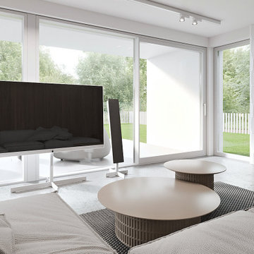
A large light-beige sectional sofa forms the heart of the lounge, with its broad chaise sections and deep upholstered seats creating a generous area for relaxation. Several loose cushions and a softly textured throw add a more informal layer to the otherwise precise composition. In front of the sofa, two round coffee tables overlap slightly, combining pale smooth tops with vertically fluted cylindrical bases. Their different diameters and textured supports create a subtle sculptural arrangement against the large woven rug.
The television stands freely in front of the extensive glazing, supported by a slim white structure rather than mounted directly onto a wall. Two tall floor-standing speakers flank the screen, introducing narrow black vertical accents that contrast with the bright surroundings. The open media arrangement keeps the glazed façade unobstructed, allowing daylight and views of the garden to remain an important part of the interior.
On the opposite side of the room, a freestanding black wood-burning stove provides a strong architectural counterpoint to the light furniture. Its cylindrical flue extends vertically towards the ceiling, while the visible fire brings a warm glow into the neutral setting. Behind the stove, the wall is covered with three-dimensional white geometric panels with a faceted surface, creating a distinctive textured backdrop. Light falling across the relief produces subtle variations of shadow and gives the fireplace zone considerable visual depth.
Beneath the seating group, a large textured rug defines the lounge area and adds softness to the pale timber flooring. Its woven surface contrasts with the smooth coffee-table tops and the clean upholstery of the sofa, while the natural wood elements introduce additional warmth. The combination of tactile fabrics, ribbed furniture bases, timber and sculptural wall cladding gives the restrained colour palette a richer, layered character.
Full-height glazing stretches across the rear of the living space, opening the interior towards mature greenery, lawn and a white vertical garden fence. Natural daylight fills the room and emphasizes the generous proportions of the open-plan architecture, while the garden provides a calm green backdrop to the carefully controlled interior palette. Through the combination of flat-roof modern architecture, open living space, freestanding furniture, textured wall finishes and natural materials, Techplan presents a distinctive contemporary home created within the Modelowedomy collection by STUDIO KONDE in Poznań.
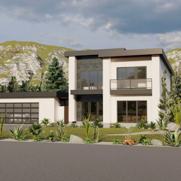
 RWH Architect PLLC
RWH Architect presents the Whistle Hill Lot 8 Residence, a statement home that reflects a bold shift toward modern, refined design. This contemporary residence is defined by its clean lines, dramatic vertical expressions, and a sophisticated mix of architectural forms that culminate in a truly forward-thinking home. From the moment visitors step into the central courtyard that connects the detached garage to the main house, the project introduces a new level of architectural intention rarely seen in the region.
The detached garage, featuring an expansive 18' x 8' door, creates a strong street presence and anchors the courtyard entry sequence. Passing through the courtyard leads to a welcoming entry foyer designed with built-in hooks and a bench, creating a comfortable—and functional—moment of arrival. Just beyond the entry is a private study with custom built-in bookshelves, a space tailored for work, reading, or quiet focus. The main floor unfolds into a sophisticated open-concept layout where the kitchen, great room, and dining areas flow effortlessly together. The kitchen includes a walk-in pantry, a pot filler for convenience, and a dedicated dog-feeding station that integrates seamlessly into the cabinetry. The great room stands as the heart of the home, featuring a built-in wood-burning fireplace and oversized sliding doors that extend the living space out to a covered patio. A centrally located half bath near the kitchen completes the first-floor program.
All bedrooms are located on the second floor to preserve privacy and capitalize on natural light. The master suite is designed as a luxurious retreat, offering a screened-in porch, a spacious walk-in closet, and a unique bathroom where the walk-in shower wraps around a freestanding tub, creating a spa-like environment that blends innovation with comfort. The laundry room is conveniently positioned on the same floor. Two additional bedrooms share a well-appointed bathroom, completing the second-floor layout.
Several design challenges shaped the evolution of this project and ultimately elevated its architectural clarity. One of the primary challenges was organizing the home around a detached garage while maintaining a cohesive architectural experience. RWH resolved this by creating a courtyard that acts as a transitional outdoor room, visually linking the structures and providing a dramatic yet functional entry sequence. Another challenge involved balancing large modern window systems with the bold vertical elements that define the façade. By carefully proportioning the glazing and framing it within thoughtful material changes, RWH maintained a strong contemporary identity while ensuring visual harmony. Integrating the built-in fireplace, open-concept layout, and large patio openings required complex structural solutions; RWH overcame this by using discreetly integrated structural steel that allowed for wide spans without compromising the home’s clean, minimalist interior aesthetic. Designing the master bathroom’s combined shower-and-tub layout also presented a unique challenge, requiring careful grading, waterproofing, and spatial planning. Through strategic detailing and 3D modeling, RWH delivered a seamless spa-like experience that feels both inventive and intuitively functional.
The Whistle Hill Lot 8 Residence stands as a testament to a new architectural direction in the area—one that embraces innovative forms, curated materials, and a lifestyle-driven floor plan. With its modern massing, intentional interior flow, and elevated details, this home reflects RWH Architect’s commitment to pushing residential design into its next era.
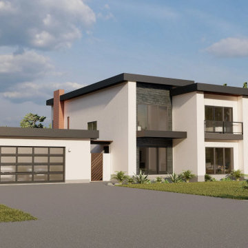 RWH Architect PLLC
RWH Architect presents the Whistle Hill Lot 8 Residence, a statement home that reflects a bold shift toward modern, refined design. This contemporary residence is defined by its clean lines, dramatic vertical expressions, and a sophisticated mix of architectural forms that culminate in a truly forward-thinking home. From the moment visitors step into the central courtyard that connects the detached garage to the main house, the project introduces a new level of architectural intention rarely seen in the region.
The detached garage, featuring an expansive 18' x 8' door, creates a strong street presence and anchors the courtyard entry sequence. Passing through the courtyard leads to a welcoming entry foyer designed with built-in hooks and a bench, creating a comfortable—and functional—moment of arrival. Just beyond the entry is a private study with custom built-in bookshelves, a space tailored for work, reading, or quiet focus. The main floor unfolds into a sophisticated open-concept layout where the kitchen, great room, and dining areas flow effortlessly together. The kitchen includes a walk-in pantry, a pot filler for convenience, and a dedicated dog-feeding station that integrates seamlessly into the cabinetry. The great room stands as the heart of the home, featuring a built-in wood-burning fireplace and oversized sliding doors that extend the living space out to a covered patio. A centrally located half bath near the kitchen completes the first-floor program.
All bedrooms are located on the second floor to preserve privacy and capitalize on natural light. The master suite is designed as a luxurious retreat, offering a screened-in porch, a spacious walk-in closet, and a unique bathroom where the walk-in shower wraps around a freestanding tub, creating a spa-like environment that blends innovation with comfort. The laundry room is conveniently positioned on the same floor. Two additional bedrooms share a well-appointed bathroom, completing the second-floor layout.
Several design challenges shaped the evolution of this project and ultimately elevated its architectural clarity. One of the primary challenges was organizing the home around a detached garage while maintaining a cohesive architectural experience. RWH resolved this by creating a courtyard that acts as a transitional outdoor room, visually linking the structures and providing a dramatic yet functional entry sequence. Another challenge involved balancing large modern window systems with the bold vertical elements that define the façade. By carefully proportioning the glazing and framing it within thoughtful material changes, RWH maintained a strong contemporary identity while ensuring visual harmony. Integrating the built-in fireplace, open-concept layout, and large patio openings required complex structural solutions; RWH overcame this by using discreetly integrated structural steel that allowed for wide spans without compromising the home’s clean, minimalist interior aesthetic. Designing the master bathroom’s combined shower-and-tub layout also presented a unique challenge, requiring careful grading, waterproofing, and spatial planning. Through strategic detailing and 3D modeling, RWH delivered a seamless spa-like experience that feels both inventive and intuitively functional.
The Whistle Hill Lot 8 Residence stands as a testament to a new architectural direction in the area—one that embraces innovative forms, curated materials, and a lifestyle-driven floor plan. With its modern massing, intentional interior flow, and elevated details, this home reflects RWH Architect’s commitment to pushing residential design into its next era.

 FormLA Landscaping
Succulents, including Paddle Plants and Pork and Beans, mix well with sun-loving California native foliage.
Design ideas for a small mediterranean drought-tolerant and shade front yard gravel flower bed in Los Angeles for spring.
Design ideas for a small mediterranean drought-tolerant and shade front yard gravel flower bed in Los Angeles for spring.
Sponsored
Plain City, OH

The Creative Kitchen Company
Columbus Area Kitchen Remodeling and Refacing Professional
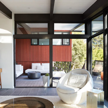 Klopf Architecture
The Roger Lee designed house from 1962 was purchased by the current homeowners in almost original condition, as the previous owners elected to defer most maintenance projects over the years. The clients were able to see beyond the dated materials and finishes, single-paned glass and uninsulated walls and they approached Klopf Architecture to help them expand and update the entire home, one the family could settle into and enjoy for years to come. It was important that the new designs were aligned with Lee's original intent not only because of the client's appreciation for mid-century modern architecture, but also because the house was deemed historical. The Stanford Real Estate Office requires a stringent design review which safeguards the integrity of the community, which Klopf Architecture was happy to oblige going into their updated designs.
As with many original mid-century modern homes, the house was scaled to the 1960s lifestyle where rooms were smaller and openings to views were limited and tightly framed. The original conditions defined the direction the family of four would take in updating the house and making it comfortable for their modern lifestyle. Klopf designed a full gut remodel and major addition to bring the house into the 21st century and provide the living area needed for the client's family. The newly expanded house added just about 1,100 sf to create an airy, comfortable and family friendly house, taking full advantage of the beautiful southwestern views that extend out to the hills beyond. The enclosed garage created an additional 240 sf of covered space for long-term storage.
A cracked swimming pool created an eyesore taking up a majority of the backyard landscape, so it was one of the first elements to go during the transformation. Working with Outer Space Landscape Architects, the family asked for a mix of relaxing outdoor patio spaces that eventually blend into the native landscaping, extending their views outward toward the natural greenery of the trees beyond their property. Filling in the old pool was a smart way to expand the living spaces outward. The orientation of the house was designed to enjoy the views, but the original architecture provided the first homeowners with mere glimpses of the landscape outside.
Klopf was able to broaden those views, continuing and extending on the original architecture to take full advantage of the unobstructed natural views across the rear facade of the house. Small horizontal openings in the primary bedroom and office were replaced with much taller windows that now follow the angled roof line upward, extending across almost all of the facade. We worked with Western Windows, whose designs included an oblique-shaped, operable casement that allowed our design to rise with the slope. A new corner office added to the primary suite, offers a bright and functional work-from-home solution that looks out at the distant views and added natural light from the expanded window configuration that now wraps around the corner.
The existing lower level was designed by Lee as a utilitarian space, serving as a wet pool room with a drain in the center of the floor, bathroom, laundry and storage areas. Without the need for a pool room, Klopf was able to convert the area into a much more comfortable and functional living space with a new family room and guest suite. The new spaces enjoy easy access to a new outdoor patio through floor to ceiling, full-width glass sliders.
Continuing along the rear facade, a previously exposed deck extending from the living room and hallway provided access to the backyard through a single set of stairs leading toward the side of the house which made sense when the pool was in place. The new deck was re-envisioned as an extension of the main living room and now serves as a second outdoor living room. A new slatted pergola above provides the homeowners welcome relief from the hot afternoon sun. A second set of stairs now creates a better connection to the redesigned lower level. Klopf was able to reconfigure the spaces, extending the living room outward toward the views, where the family now claims it as the heart of the home, spending a large majority of their time outdoors.
Back inside, the original wood-burning Malm fireplace was beautifully restored and a gas burner installed to comply with California's strict air standards. It now rests in front of a wall of Heath accent tiles where a dated red brick wall used to stand. A new taller window brings more light and views into the refreshed interior living room. The original glass doors opposite the fireplace were replaced by larger sliders that when fully opened, create a seamless transition to the new outdoor living area so the two spaces feel like one connected space. The original utilitarian kitchen was needlessly tucked into the far back corner and closed-off, out of sight from the living room, so the clients asked Klopf to open it up and expand the kitchen forward so it felt more connected. Today the much larger kitchen is connected to the living area where a short wall with a cutout offers a visual glimpse into the kitchen and a handy pass-through counter for serving guests. A new breakfast nook was also added to create another spot where the family can gather for casual meals. Just outside, a new built-in outdoor grill and prep area extends the kitchen outside and connects to a new outdoor dining spot nestled amongst the trees, taking advantage of the views out back.
Klopf was able to expand the other two bedrooms, add a new laundry room and half-bath and convert the carport to an enclosed garage to add more storage areas which was lost when the pool house was converted to the family and guest room.
To maintain a historical connection to the original designs, the exterior siding was repeated on all exterior walls, a full-height stained glass window at the front entryway restored, and an interior slatted screen element repeated outside at the exterior entry courtyard and over the new outdoor living room to create a shade trellis. The new house stands proudly and shines against it's new landscaping features, while respecting and expanding on the original intent of Roger Lee's designs epitomizing the comforts of indoor-outdoor living in Northern California.
Completion year: 2020
Klopf Architecture project team: John Klopf, Klara Kevane, Noel Andrade
Contractor: ORB Construction, Brendan O'Reilly
Structural engineer: Sezen and Moon
Landscape architect: Outer space
Furnishings and decoration: Urbanism Designs
Photographer: Mariko Reed

 Story Barns
Inspiration for a mid-sized rustic carpeted straight cable railing staircase remodel in Denver with carpeted risers

 Coral Pool's
Inspiration for a mid-sized backyard stone and custom-shaped hot tub remodel in San Francisco
151