
Search results for "I'vealso" in Home Design Ideas
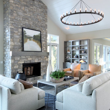
 Rock Kauffman Design
2014 Fall Parade Cascade Springs I Chad Gould Architecture I BDR Custom Homes I Rock Kauffman Design I M-Buck Studios
Large transitional open concept medium tone wood floor living room photo in Grand Rapids with beige walls and a stone fireplace
Large transitional open concept medium tone wood floor living room photo in Grand Rapids with beige walls and a stone fireplace
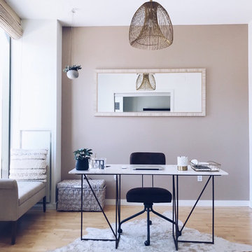
 Paintzen, Inc.
When it comes to finding inspiration for your house or apartment design, there are a variety of routes you can take. For some, it is important to dive into the latest trends in fashion and art, using only the most popular decor pieces and embracing the color palettes seen on runways or in home and garden magazines. But for others, it’s simply about discovering what feels most like “home.”
Ashley Steele, the creator of A Styled Affair, was part of the latter group. “Since my husband and I were moving into a space that was previously owned, I needed a way to make it feel like it was truly ours, and unique to us,” she told our team.
A Styled Affair sprang from Ashley’s passion for fashion, and need for a creative outlet. But it soon became more than that. She developed a following, and it quickly became a place where she could share her personal style, travel adventures, and lifestyle tips. “While the blogging industry has become overwhelmed with people sharing their favorite home decor or make-up tips, I think what sets A Styled Affair apart is my commitment to stay true to my unique taste. I have always marched to the beat of my own drum – and that carries through in the clothes I wear, the decor I select for our home, and the travels I plan.”
Paintzen connected with Ashley as she was settling into her new home in Boston’s Seaport District. Although she and her husband have lived in Boston for almost 8 years, they were used to smaller, more traditional spaces. Their new home is much bigger, and more modern, than any place they lived before. “I wanted to select colors of comfort, simplicity, and sophistication so we could elevate the space and make it feel more like a home.” Ashley also accurately pointed out that new construction can sometimes feel a little cold and sterile, almost industrial. “I wanted our home to feel like a peaceful oasis after coming in from the bustling city.”
Ashley chose soft white paint for her walls to bring a sense of comfort and zen. With lots of wall decor, art work and carefully selected furniture, the walls serve as a clean and comfortable palette, and allowed her more freedom when making her other design decisions throughout the space. Ashley kept the overall palette fairly neutral, and incorporated “modern bohemian” inspired decor throughout the home; the final product was clean and simple, and catered to her style.
We asked Ashley what she was most excited for now. “I’m most excited to continue to find new decor pieces to compliment the paint colors and decor we’ve already found for the space. We have been really patient with decorating and selected each piece really careful to make sure it is cohesive and flows from room to room. I’m looking forward to enjoying the space with my husband and dog, and entertaining friends and family in the spring and summer!”
A few final questions for Ashley on her experience with Paintzen:
“I would highly recommend Paintzen to anyone, especially those that live in the city. There are so many different paint companies and contractors to choose from but going through Paintzen simplified the process and made me feel comfortable that we had the right team working on our space. Their platform for booking services and choosing paint colors made the process seamless and was a great way to keep track of what we booked and chose for colors. Most importantly, the customer service team was outstanding whenever we had a question or needed to make an adjustment.”
And advice she would give someone repainting their home:
“Patience. I would recommend taking your time and doing your research before selecting paint colors. Lighting changes every color so make sure to bring paint swatches and samples into the space and look at it throughout the day to see the different tones that the light will pick up. I would also recommend researching color trends and recommendations for colors in the family you are looking for. We found our living room color through a blog post listing top-used colors by interior designers and it looks amazing.”
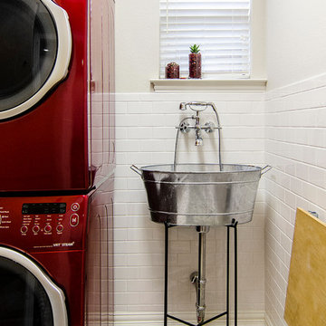
 Williams Drake: Custom Homes I Renovation I Design
Lauren Brown: www.versatileimaging.com
Inspiration for a timeless ceramic tile and white floor laundry room remodel in Dallas with an utility sink, a stacked washer/dryer and white walls
Inspiration for a timeless ceramic tile and white floor laundry room remodel in Dallas with an utility sink, a stacked washer/dryer and white walls
Find the right local pro for your project
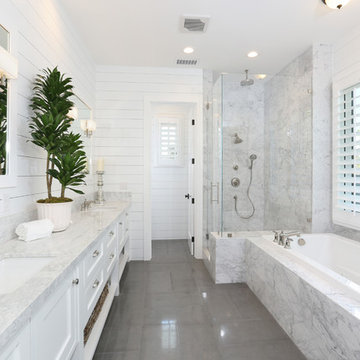
 V.I.Photography & Design
Vincent Ivicevic
Large transitional master white tile ceramic tile and gray floor bathroom photo in Orange County with an undermount sink, recessed-panel cabinets, white cabinets, marble countertops and white walls
Large transitional master white tile ceramic tile and gray floor bathroom photo in Orange County with an undermount sink, recessed-panel cabinets, white cabinets, marble countertops and white walls
 Tarkus Tile, Inc.
Scott Davis Photography
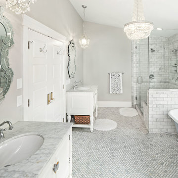
Elegant white tile and stone tile bathroom photo in Salt Lake City with an undermount sink, white cabinets, marble countertops and recessed-panel cabinets
Elegant white tile and stone tile bathroom photo in Salt Lake City with an undermount sink, white cabinets, marble countertops and recessed-panel cabinets
 Kurtz Homes Naples
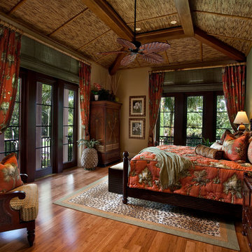
Guest Bedroom. Perfect themed room for a beach house.
Photo Credit: CJ Walker
Bedroom - tropical bedroom idea in Miami with green walls
Bedroom - tropical bedroom idea in Miami with green walls
 Grand Home Solutions, Inc
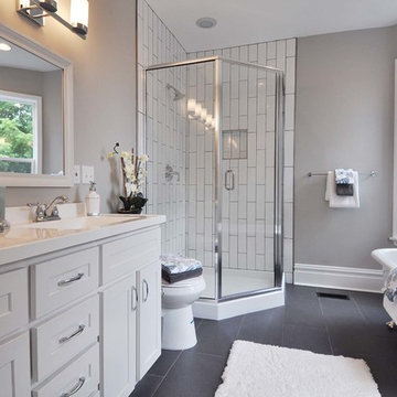
This Master Bathroom has large gray porcelain tile on the floor and large white tile ran vertically from floor to ceiling. A shower niche is also tiled so that it blends in with the wall.


 Mina Brinkey
Photo: Mina Brinkey © 2013 Houzz
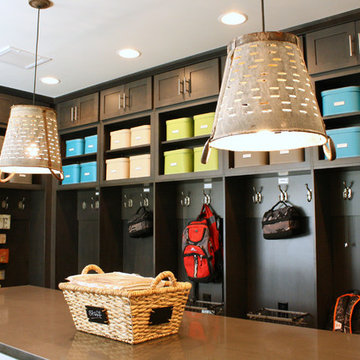
Mudroom - transitional mudroom idea in Tampa with gray walls
Mudroom - transitional mudroom idea in Tampa with gray walls

 KitchenLab Interiors
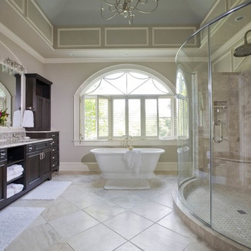
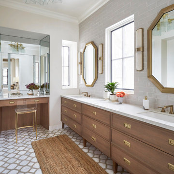
KitchenLab Interiors’ first, entirely new construction project in collaboration with GTH architects who designed the residence. KLI was responsible for all interior finishes, fixtures, furnishings, and design including the stairs, casework, interior doors, moldings and millwork. KLI also worked with the client on selecting the roof, exterior stucco and paint colors, stone, windows, and doors. The homeowners had purchased the existing home on a lakefront lot of the Valley Lo community in Glenview, thinking that it would be a gut renovation, but when they discovered a host of issues including mold, they decided to tear it down and start from scratch. The minute you look out the living room windows, you feel as though you're on a lakeside vacation in Wisconsin or Michigan. We wanted to help the homeowners achieve this feeling throughout the house - merging the causal vibe of a vacation home with the elegance desired for a primary residence. This project is unique and personal in many ways - Rebekah and the homeowner, Lorie, had grown up together in a small suburb of Columbus, Ohio. Lorie had been Rebekah's babysitter and was like an older sister growing up. They were both heavily influenced by the style of the late 70's and early 80's boho/hippy meets disco and 80's glam, and both credit their moms for an early interest in anything related to art, design, and style. One of the biggest challenges of doing a new construction project is that it takes so much longer to plan and execute and by the time tile and lighting is installed, you might be bored by the selections of feel like you've seen them everywhere already. “I really tried to pull myself, our team and the client away from the echo-chamber of Pinterest and Instagram. We fell in love with counter stools 3 years ago that I couldn't bring myself to pull the trigger on, thank god, because then they started showing up literally everywhere", Rebekah recalls. Lots of one of a kind vintage rugs and furnishings make the home feel less brand-spanking new. The best projects come from a team slightly outside their comfort zone. One of the funniest things Lorie says to Rebekah, "I gave you everything you wanted", which is pretty hilarious coming from a client to a designer.
 FineLine Kitchens, Inc.
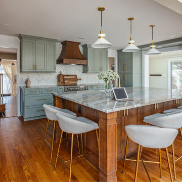
Hi everyone, I'm Sarah and Ogun we are here with fine line kitchens. So we are a couple working together. I do the interior design and remodeling of the space material selection meeting with the clients. And I handled operations outside, you know meaning all the construction work that is taking place the inside. The houses that we work in. I handle all the aspects of the construction, so today's project is very special. We're in Vienna and the client had a very big family. It's a family of seven that lives here. So we had a few aspects that we needed to keep in mind while designing this one. Having everybody be able to sit on the island. So we wanted plenty of seating all the way around. We didn't want anybody standing or anything like that. So what we did is we maximize the space. The center island is the biggest part of the kitchen. We use a natural stone to kind of give it a beautiful texture versus quartz. It's kind of standard white or kind of fabricated, so I wanted something very natural. We did this because I took my inspiration from the outside, so the inspiration if you look at the view right in front of me is there are so many greens there's a lot of brass accents and I wanted to bring this. Into this kitchen while designing it for my clients. She is very warm very. She wanted a very homey, comfy kind of look for the kitchen. So that's what we did today. As you can see, the cabinets are sage green, very light, so I still think it's a neutral, but it's a lighter color that again brings the outside in and we combine that with the oak right behind me so it's a slightly warm oak. It's not very dark. It's not very light. It's a medium brown and the same color went on the island. To kind of tie these two in and the backsplash, my favorite part is where you can see a little bit of design. It is, in my opinion still classic, but includes a pattern so the outside part is as we said in the beginning, is handled by my husband. I'd like him to speak a little bit about that. Thanks, Sarah, I want to talk to you guys a little bit about the construction part of this project. Originally this kitchen was located mostly in this area. They had their stove there sing. It was more of a peninsula layout in Sarah's and the customer vision they wanted. They wanted to get rid of the peninsula and they want to be able to have a huge island that can at least sit seven people because they're familiar with seven. So we wanted to make sure that we can achieve this design and bring it to life so that they can be happy with this layout. Some of the challenges we had, the house, the home being, you know, old home. There were a lot of you know the older electrical and plumbing that had to be replaced. We had to relocate the stove from here to this area. Over here we had put a nice foot fan that we had to relocate all the ductwork and the plumbing. Was being on the peninsula area. We had to relocate it to the center islands. So we achieved all this and kind of like bring it to bring in this kitchen up to date it looks beautiful. That's true, so yes, the old layout did not function for my clients because everything was kind of gathered on one side of the kitchen. So there was like a peninsula right there. So the end of this island kind of continued straight. And that was just the L shape. Kind of where everything was and there used to be another big table here, so they were using only kind of half of the space. So like I said at the beginning, our vision was to kind of feed everybody at the island, create some symmetry. 'cause I love that. So as you can see behind me, this is kind of the focal point symmetrical. Everything is kind of even we wanted to also panel the fridge here so it mimics the pantry and another size. So when you're looking at it, it is bringing again that symmetry back again. I hope you enjoyed this kitchen and this video and I'll see you soon. So how do you think this project turned out? It's nice. I like the color. I think it turned out nice. It's kind of like a little bit different color than what we always do. So I realize. Are you giving me a little bit of credit here that I did something different? Are you proud? I'm so proud of you. Other than that I like it. That they have kind of like a two sink. So if this was our kitchen, if we ever like you can have your own. I can have mine if we ever get into a fight then this can be like my own kitchen. Why are we gonna bring in a fight right now? So I'm cooking anyway. You're grilling most of the time, So what are you even talking about? My kitchen? That's my kitchen. You can just take the small sink. That's fine. It's always good to have your own space right there, so anyways. Thank you guys for watching. We hope to see you soon and if you have any questions please click the link below. It'll lead you to our website, house, YouTube and all of the social media is so nice to have you guys. We'll see you soon. Thanks bye bye-bye.
 Melton Design Build
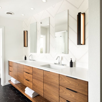
The goal of this project was to update the outdated master bathroom to better meet the homeowners design tastes and the style of the rest of this foothills home, as well as update all the doors on the first floor, and create a contemporary mud room and staircase to the basement.
The homeowners wanted a master suite that had a masculine feel, incorporated elements of black steel, wood, and contrast with clean white tiles and counter-tops and helped their long and skinny layout feel larger/ make better use of the space they have. They also wanted a more spacious and luxurious shower with water temperature control. A large window that existed above the original soaking tub offered spectacular views down into Boulder valley and it was important to keep this element in the updated design. However, privacy was also very important. Therefore, a custom-built powder coated steel shelf, was created to provide privacy blocking, add storage, and add a contrasting design element to the white wall tiles. Black honeycomb floor tiles, new black walnut cabinetry, contemporary wall paper, a floor to ceiling glass shower wall, and updated fixtures elevated the space and gave the clients exactly the look and feel that they wanted.
Unique custom metal design elements can be found throughout the new spaces (shower, mud room bench and shelving, and staircase railings and guardrails), and give this home the contemporary feel that the homeowners desired.
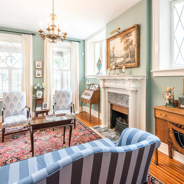
 Modern Traditions Interior Design LLC
This room just needed a fresh coat of paint to update it. Located immediately to the left of the new bright entryway and within eyesight of the rich blue dining room. We selected a green from the oriental rug that also highlights the painting over the fireplace.
Sara E. Eastman Photography

Sponsored
Fredericksburg, OH

High Point Cabinets
Columbus' Experienced Custom Cabinet Builder | 4x Best of Houzz Winner
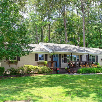
 Sweet Home of Mine
This 1960s Ranch was taken from it's original red/yellow brick and painted a light grey tan color. I added a new roof and the red/maroon bleached out shutters were changed out for stained board and batten shutters. I also added a new garage door with accent pieces, exterior lighting was changed out and I extended the original front porch out by an additional 4 feet making it a true sitting porch. We also put in a tree swing in front to show the tranquility of the home and neighborhood and give the home a new young feel since the neighborhood was becoming a new hub for first time buyers with children. Photo Credit: Kimberly Schneider
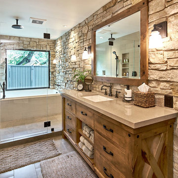
 Ammirato Construction, Inc.
Client Testimonial from project:
John just completed my master bathroom gut as well as refinishing my hardwood floors and powder bath remodel. I can't say enough about John and his team. He is quick to respond, trustworthy, organized, timely, and does beautiful work. I'm an interior designer, so I know exactly how I want the finished project to look and John delivered exactly what I wanted down to the tiniest detail.
My master bath was a complicated project with lots of custom details and he came up with creative ways to implement such a design. It was nice to leave on several week long vacations and not only trust that my house and belongings were safe and watched after, but also to be able to see the progress that he documented daily with photos and notes on BuilderTrend - a website that he uses to communicate with clients.
I will most certainly use Ammirato Construction in the future, and well as recommend them to clients and friends.
Virtual Imagery 360 Photography
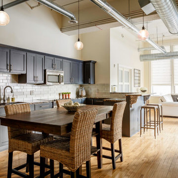
 Jenny Sutherland Designs
I was hired to update this condo, working around the existing countertops as they were something the owner didn't want to replace. I selected a paint color for the cabinetry, feeling like the cherry cabinets just didn't fit in this space, nor did they seem to be the right compliment to the existing granite. I hired Haven Finishing Studio to work their magic and transform the cabinets into what looks like a brand new kitchen! They did beautiful work!!! Removed the outdated backsplash and replaced it with a metallic back painted glass subway tile. Removed track lighting in the kitchen and living room and replaced with vintage industrial modern lighting. So excited to have this opportunity in downtown GR, hoping for a lot more opportunities like this!!!
Photo Credit: Ben Perfect Photo

 Studio Pumarejo
Contemporary Bedroom
Photo by Casey Dunn
Kids' room - large contemporary girl medium tone wood floor kids' room idea in Austin with white walls
Kids' room - large contemporary girl medium tone wood floor kids' room idea in Austin with white walls

Sponsored
Sunbury, OH

J.Holderby - Renovations
Franklin County's Leading General Contractors - 2X Best of Houzz!
 Plain & Posh
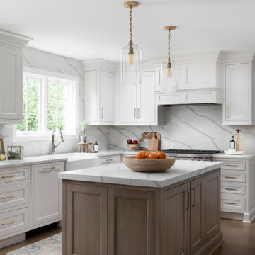
Thse clients came to me for a kitchen refresh. Keeping the existing floor plan but updating as much as possible. After explaining my thoughts, they chose to go with a much larger project. The wall to the garage wash pushed bach 12" to allow for the island to happen. This almost couldn't happen as there is a support post in the garage we had to keep. I designed the last pantry area as on 10" deep, allowing us to conceal that behind the cabinets. Then, we opend up the wall to the dining room to make the rooms one large space. The wall to the family room was also openend up, leaving the half wall to allow for the kitchen eating area. They wanted to incorporate a bar area, without it feeling like a "bar" The fabulous tall custom unit houses their wine collection and then half of the dining room buffet area holds glassware and other bar items. I helped the clients with all of the design choices.We all wanted to keep the space classic, war, functional and with mixed materials. I chose to use the same countertop material for the backsplash, to keep the space feeling as large as possible.
 Design Harmony
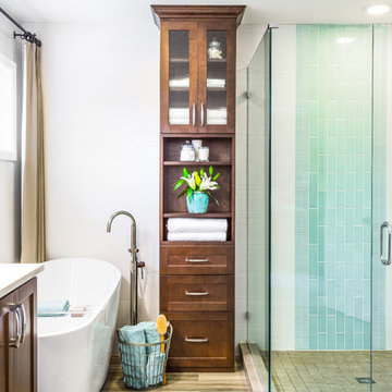
Two different accent tiles make a statement and add a pop of color against the large white wall tiles in the custom shower. Frameless glass creates a custom and modern feel to the space.
This small powder bath lacked interest and was quite dark despite having a window.
We added white horizontal tongue & groove on the lower portion of the room with a warm graphic wallpaper above.
A custom white cabinet with a waterfall grey and white granite counter gave the vanity some personality.
New crown molding, window casings, taller baseboards and white wood blinds made impact to the small room.
We also installed a modern pendant light and a rustic oval mirror which adds character to the space.
BEFORE
Though this bathroom had a good layout, everything was just really outdated. We added tile from floor to ceiling for a spa like feel. We kept the color palette neutral and timeless. The dark cheery cabinet was elegantly finished with crystal knobs and a cararra marble countertop.
AFTER
AFTER
BEFORE
There was an underutilized corner between the vanity and the shower that was basically wasted space.
To give the corner a purpose, we added a make-up vanity in white with a custom made stool.
Oversized subway tiles were added to the shower, along with a rain shower head, for a clean and timeless look. We also added a new frosted glass door to the walk-in closet to let the light in.
BEFORE
These beautiful oval pivot mirrors are not only functional but also showcase the cararra marble on the wall. Unique glass pendants are a dramatic addition to the space as is the ikat wallpaper in the WC. To finish out the vanity space we added a shallow white upper cabinet for additional storage.
BEFORE
AFTER
AFTER
The best part of this remodel? Tearing out the awful, dated carpet! We chose porcelain tile with the look of hardwoods for a more functional and modern space.
Curtains soften the corner while creating privacy and framing the soaking tub.
Photo Credit: Holland Photography - Cory Holland - HollandPhotography.biz
 Isla Homes
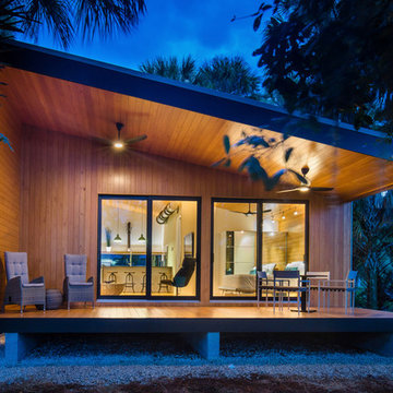
I built this on my property for my aging father who has some health issues. Handicap accessibility was a factor in design. His dream has always been to try retire to a cabin in the woods. This is what he got.
It is a 1 bedroom, 1 bath with a great room. It is 600 sqft of AC space. The footprint is 40' x 26' overall.
The site was the former home of our pig pen. I only had to take 1 tree to make this work and I planted 3 in its place. The axis is set from root ball to root ball. The rear center is aligned with mean sunset and is visible across a wetland.
The goal was to make the home feel like it was floating in the palms. The geometry had to simple and I didn't want it feeling heavy on the land so I cantilevered the structure beyond exposed foundation walls. My barn is nearby and it features old 1950's "S" corrugated metal panel walls. I used the same panel profile for my siding. I ran it vertical to match the barn, but also to balance the length of the structure and stretch the high point into the canopy, visually. The wood is all Southern Yellow Pine. This material came from clearing at the Babcock Ranch Development site. I ran it through the structure, end to end and horizontally, to create a seamless feel and to stretch the space. It worked. It feels MUCH bigger than it is.
I milled the material to specific sizes in specific areas to create precise alignments. Floor starters align with base. Wall tops adjoin ceiling starters to create the illusion of a seamless board. All light fixtures, HVAC supports, cabinets, switches, outlets, are set specifically to wood joints. The front and rear porch wood has three different milling profiles so the hypotenuse on the ceilings, align with the walls, and yield an aligned deck board below. Yes, I over did it. It is spectacular in its detailing. That's the benefit of small spaces.
Concrete counters and IKEA cabinets round out the conversation.
For those who cannot live tiny, I offer the Tiny-ish House.
Photos by Ryan Gamma
Staging by iStage Homes
Design Assistance Jimmy Thornton
1