
Search results for "Implementation" in Home Design Ideas

 Michael Nash Design, Build & Homes
When the homeowners purchased this traditional colonial in Vienna, Virginia, they were already planning on making some serious changes. The home’s original floor plan was boxy and closed in, making traffic flow from one room to the next virtually non-existent. Additionally, the existing décor left a lot to be desired. Their vision was to open up the layout and create a more contemporary look using lots of light, soft colors and high end materials.
They decided to add a two-story addition to the back of the home’s existing breakfast room and the small upstairs bedroom above it. The old breakfast area was too small for their daily meals and their teenage son needed more space in his bedroom. They also decided to add a sunroom/family room to the left side of their old family room. This new room offers a vaulted ceiling with four skylights and lots of windows with a better view of the side and backyard.
To create a more open floor plan, the team at Michael Nash Design, Build & Homes removed the load bearing wall between the kitchen and family room and installed a large beam to handle the second floor load. Not only did this open up the space, but it allowed for the addition of a breakfast bar.
The right side bearing wall of the old family room was also removed and replaced with structural beams. This action created a continuous flow between the new sunroom and old family room. Separated by a double-sided stone fireplace, this new sunroom is connected to a new outside sun deck built using a maintenance-free decking material. The old family room with new lighting now serves as a casual seating area. It also features an eight-foot long built-in desk.
The newly updated kitchen features granite countertops with matching tile backsplash, professional-quality appliances, a porcelain tile floor and custom cabinets, including a large pantry. The new breakfast room is more spacious and gets daylight from three different angles.
Upstairs, a new 12’ x 20’ bedroom is a great place for this teenage football fan to hang out. It provides significantly more closet space than the old room and lets in more sunlight as well.
The old laundry room was converted to a new mudroom with locker style cabinetry and a place for kids to store their bag packs. New plumbing and electrical were implemented in a new closet in an upper hallway to facilitate the new washer and dryer.
In this remodel, form and function have come together in an open concept design that meets the needs of the entire family.

 Living Gardens Landscape Design
Inspiration for a small contemporary full sun front yard gravel landscaping in Orange County for spring.

 Rose T Bien-Aime
My client wanted a room that exuded the luxury of a five-star hotel, “an environment that made her feels like a queen at night and even more glamorous in the morning.” I did it with Hollywood-inspired metallic wallpaper, wall-to-wall silk drapery panels in charcoal gray, and an oversized crystal Whitney chandelier over the bed. Gideon chairs complement the upholstered Charlton Bed. The finishing touch: All that reflected light!
www.kbr.photography.com
Find the right local pro for your project
 Michael Nash Design, Build & Homes
When the homeowners purchased this traditional colonial in Vienna, Virginia, they were already planning on making some serious changes. The home’s original floor plan was boxy and closed in, making traffic flow from one room to the next virtually non-existent. Additionally, the existing décor left a lot to be desired. Their vision was to open up the layout and create a more contemporary look using lots of light, soft colors and high end materials.
They decided to add a two-story addition to the back of the home’s existing breakfast room and the small upstairs bedroom above it. The old breakfast area was too small for their daily meals and their teenage son needed more space in his bedroom. They also decided to add a sunroom/family room to the left side of their old family room. This new room offers a vaulted ceiling with four skylights and lots of windows with a better view of the side and backyard.
To create a more open floor plan, the team at Michael Nash Design, Build & Homes removed the load bearing wall between the kitchen and family room and installed a large beam to handle the second floor load. Not only did this open up the space, but it allowed for the addition of a breakfast bar.
The right side bearing wall of the old family room was also removed and replaced with structural beams. This action created a continuous flow between the new sunroom and old family room. Separated by a double-sided stone fireplace, this new sunroom is connected to a new outside sun deck built using a maintenance-free decking material. The old family room with new lighting now serves as a casual seating area. It also features an eight-foot long built-in desk.
The newly updated kitchen features granite countertops with matching tile backsplash, professional-quality appliances, a porcelain tile floor and custom cabinets, including a large pantry. The new breakfast room is more spacious and gets daylight from three different angles.
Upstairs, a new 12’ x 20’ bedroom is a great place for this teenage football fan to hang out. It provides significantly more closet space than the old room and lets in more sunlight as well.
The old laundry room was converted to a new mudroom with locker style cabinetry and a place for kids to store their bag packs. New plumbing and electrical were implemented in a new closet in an upper hallway to facilitate the new washer and dryer.
In this remodel, form and function have come together in an open concept design that meets the needs of the entire family.
 Michael Nash Design, Build & Homes
When the homeowners purchased this traditional colonial in Vienna, Virginia, they were already planning on making some serious changes. The home’s original floor plan was boxy and closed in, making traffic flow from one room to the next virtually non-existent. Additionally, the existing décor left a lot to be desired. Their vision was to open up the layout and create a more contemporary look using lots of light, soft colors and high end materials.
They decided to add a two-story addition to the back of the home’s existing breakfast room and the small upstairs bedroom above it. The old breakfast area was too small for their daily meals and their teenage son needed more space in his bedroom. They also decided to add a sunroom/family room to the left side of their old family room. This new room offers a vaulted ceiling with four skylights and lots of windows with a better view of the side and backyard.
To create a more open floor plan, the team at Michael Nash Design, Build & Homes removed the load bearing wall between the kitchen and family room and installed a large beam to handle the second floor load. Not only did this open up the space, but it allowed for the addition of a breakfast bar.
The right side bearing wall of the old family room was also removed and replaced with structural beams. This action created a continuous flow between the new sunroom and old family room. Separated by a double-sided stone fireplace, this new sunroom is connected to a new outside sun deck built using a maintenance-free decking material. The old family room with new lighting now serves as a casual seating area. It also features an eight-foot long built-in desk.
The newly updated kitchen features granite countertops with matching tile backsplash, professional-quality appliances, a porcelain tile floor and custom cabinets, including a large pantry. The new breakfast room is more spacious and gets daylight from three different angles.
Upstairs, a new 12’ x 20’ bedroom is a great place for this teenage football fan to hang out. It provides significantly more closet space than the old room and lets in more sunlight as well.
The old laundry room was converted to a new mudroom with locker style cabinetry and a place for kids to store their bag packs. New plumbing and electrical were implemented in a new closet in an upper hallway to facilitate the new washer and dryer.
In this remodel, form and function have come together in an open concept design that meets the needs of the entire family.
 Michael Nash Design, Build & Homes
Kitchen Over 150K
If you ever found yourself shopping for a new home, finding a model home, falling in love with this model home and immediately signing on the dotted line. Yet after a few months of moving into your new home you realize that the kitchen and the layout of main level will not work out for your lifestyle. The model home you fell in love with was furnished with beautiful furniture distracting you from concentrating on what is really important to you. This is what happened to this couple in Ashburn, VA, after purchasing their dream home.
The kitchen lacked natural light, while its location was not ideal and was disrupting their daily routine. After a careful review of the kitchen design, a plan was formed to upgrade the kitchen.
Their kitchen was moved to a location between the two-story family room and front dining room. To the left of the family room there was a breakfast eating area that was not serving any purpose.
Our design incorporated the breakfast area placed along a couple feet from an adjacent pantry space to create this new dream kitchen.
By knocking down a few bearing walls, we have placed the main sink area under large backside windows. Now the kitchen can look into their beautiful backyard. A major load bearing wall between the old breakfast room and adjacent two-story family was taken down and a big steel beam took the place of that, creating a large seamless connection between the new kitchen and the rest of the home.
A large island was implemented with a prep sink, microwave, and with lots of seating space around it. Large scale professional appliances along with stunning mosaic backsplash tiles complement this amazing kitchen design.
Double barn style door in front of the pantry area sets off this storage space tucked away from rest of the kitchen. All the old tile was removed and a matching wide plank distressed wood floor was installed to create a seamless connection to rest of the home. A matching butler pantry cabinet area just outside of dining room and a wine station/drink serving area between family room and main foyer were added to better utilize the multi-function needs of the family.
The custom inset cabinetry with double layers and exotic stone counter top, distressed ceiling beams, and other amenities are just a few standouts of this project.

 Housetrends Magazine
Since moving into her Dublin home two and a half years ago, Nancy Sanford has been peeling off the decades—quite literally. Built in the 1980s, the home was “very well-maintained, but very little had been done to it” in terms of updating the finishes or style, Sanford says. Plush white carpet ran from wall-to-wall-to-wall, almond-colored laminate coated the kitchen cabinets and wallpaper ran rampant—even covering some ceilings.
Despite her efforts, Sanford knew it was going to take more than cosmetic editing to shake the ‘80s and make the home her own. Although she lives in the traditional-leaning Muirfield community, Sanford adores a minimalist, contemporary style—and admits to devouring design magazines “ad nauseam.”
To implement her thoroughly modern vision, Sanford turned to Brigid Norton, an interior designer and family friend, and Kristi Youles, a kitchen designer with The JAE Company. Working together, the trio created a carefully considered contemporary design that’s easy on the eyes, and the body.
In addition to improving the flow of the kitchen—by removing a V-shaped peninsula that angled out into the room—and adding appliances like a stainless steel refrigerator, Sanford’s short list of must-haves included clean, uncluttered lines and no wall cabinets over the countertops. “I’ve found as I’ve aged, I’ve gotten shorter and just don’t use the upper cabinets,” Sanford explains.
Easy-access, smooth-slide drawers with clean slab fronts were the answer—resulting in strong visual lines, an open, airy feel and enhanced ergonomics. Starting with a “needs assessment,” Youles and Norton designed the space quite literally around Nancy. By looking at factors such as her height and which items she uses most frequently, they were able to determine the optimum placement for everything from canned goods in the pantry to cutlery, pans and plates in the customized drawers, all of which helped to achieve the ultimate kitchen organization.
But there’s more to the kitchen cabinets smooth façade than clean-lined storage. Walnut drawer fronts—found on the oven and the base of the island—are book-matched, allowing the grain to continue from drawer to drawer. And even in spaces where drawers weren’t feasible, beneath the sink and in a desk area, the designers continued the look with cabinet doors crafted to resemble drawers.
The visual continuity of these lines might not be as impactful if it weren’t for the careful selection of contrasting finishes. The designers filled the space with pure, glossy white—using a specific type of quartz, White Cliff by Cambria, to accent the bold rectangular design of the island. Then, to break up the expanse of accompanying white painted drawers, walnut was selected to bring the contrasting warmth and grain of wood without red undertones. It is commonly found in modern furniture design, as well as current productions of mid-century designs like the iconic Eames Lounge Chair from Herman Miller, Youles says.


 TaylorPro Design and Remodeling, Inc.
"TaylorPro remodeled our kitchen, replacing cabinets, countertops and appliances. Keeping with the same footprint of our original kitchen and keeping our original travertine floors, Kerry Taylor helped us select a palette of rich, natural colors and materials--mocha-maple glazed cabinets, handsome granite and polished travertine backsplash tiles--to create a warm and beautiful new kitchen. He offered excellent design suggestions for placements of cabinetry and appliances. He recommended and implemented window trim enhancements as well as paint color and lighting design that brought the kitchen and attached family room together with a modern and very warm look. He created a rich, textured backsplash behind the stovetop that enhances the modern stainless steel vent hood. We couldn't be more pleased with the character and design of the kitchen and family room suite.
To begin with, Kerry gave us a detailed estimate covering the likely costs of labor, cabinetry, granite, tile backsplash, construction materials and appliances. His estimate for labor, granite and tile turned out to be ""spot-on"" accurate. Much to our surprise, for example, the granite slabs we selected from Daltile turned out to be exactly the price Kerry had estimated when evaluating the level of materials we would likely install in our kitchen. Kerry kept to his original labor costs, to the penny. Each week, he provided us with an invoice that showed, in percentages, exactly how much labor had been performed that week and how much remained to be done in future weeks. The amounts he charged each week for his labor were exact percentages of the amount of labor his crew had performed to that point. Though these invoices invited us to do a little math to confirm the accuracy of these percentages, Kerry's figures were consistently accurate.
The only categories in which Kerry's original estimate did not conform to the actual costs were in the areas of supplies from Home Depot (needed for the remodeling) and supplies from paint and hardware stores (needed for painting). These materials ended up costing somewhat more that Kerry had estimated. However, Kerry did provide us with receipts for all of these supplies.
Kerry's cabinet man, Jerry, made a very workable design using pre-fabricated cabinets; he then customized the sizes of at least half of these cabinets to conform to the requirements of the center island, cooktop and pantry spaces. We are very happy with the quality of the cabinets. We found the installation expertise of Jerry's installer, Gil, to be top-rate. His installation achieved a custom look and all the cupboards and drawers worked flawlessly.
Kerry's crew, Jake, Randall and Kevin, were great guys to have on site. They respected our property (and our dog) and possessed both skill and integrity. They arrived daily at the time they specified and worked tirelessly to achieve what they set out to do. We couldn't have been happier with their work. Kerry was on site frequently to supervise and coordinate their work and the work of subcontractors.
The project went quickly and efficiently, and the final result was outstanding. We recommend TaylorPro very highly."
~ Judy & Ron C, Clients
Photo By: Kerry W. Taylor
 Michael Nash Design, Build & Homes
When the homeowners purchased this traditional colonial in Vienna, Virginia, they were already planning on making some serious changes. The home’s original floor plan was boxy and closed in, making traffic flow from one room to the next virtually non-existent. Additionally, the existing décor left a lot to be desired. Their vision was to open up the layout and create a more contemporary look using lots of light, soft colors and high end materials.
They decided to add a two-story addition to the back of the home’s existing breakfast room and the small upstairs bedroom above it. The old breakfast area was too small for their daily meals and their teenage son needed more space in his bedroom. They also decided to add a sunroom/family room to the left side of their old family room. This new room offers a vaulted ceiling with four skylights and lots of windows with a better view of the side and backyard.
To create a more open floor plan, the team at Michael Nash Design, Build & Homes removed the load bearing wall between the kitchen and family room and installed a large beam to handle the second floor load. Not only did this open up the space, but it allowed for the addition of a breakfast bar.
The right side bearing wall of the old family room was also removed and replaced with structural beams. This action created a continuous flow between the new sunroom and old family room. Separated by a double-sided stone fireplace, this new sunroom is connected to a new outside sun deck built using a maintenance-free decking material. The old family room with new lighting now serves as a casual seating area. It also features an eight-foot long built-in desk.
The newly updated kitchen features granite countertops with matching tile backsplash, professional-quality appliances, a porcelain tile floor and custom cabinets, including a large pantry. The new breakfast room is more spacious and gets daylight from three different angles.
Upstairs, a new 12’ x 20’ bedroom is a great place for this teenage football fan to hang out. It provides significantly more closet space than the old room and lets in more sunlight as well.
The old laundry room was converted to a new mudroom with locker style cabinetry and a place for kids to store their bag packs. New plumbing and electrical were implemented in a new closet in an upper hallway to facilitate the new washer and dryer.
In this remodel, form and function have come together in an open concept design that meets the needs of the entire family.

 Nicholas Moriarty Interiors (NMI, LLC.)
Mieke Zuiderweg
Large minimalist open concept cork floor living room library photo in Chicago with white walls, no fireplace and no tv
Large minimalist open concept cork floor living room library photo in Chicago with white walls, no fireplace and no tv
 Michael Nash Design, Build & Homes
2012 NARI Capital CotY, Merit Award Winner, Residential Basement Interior
Newer home in suburb of Ashburn, VA was a home to this military couple. With their growing family and their daughter moving back, they wanted more space. The basement was delivered unfinished from the original builder. The owners could not come up with a desirable floor plan for the space due to stairway that builder put in place and locations of Furnace and hot water heater.
After our design staff consulted this couple, we put in a plan in place that they never imagined it to be possible and even affordable.
The moved the hot water heater and relocated a stack of return duct to allow more floor space. Then we have redesigned couple of headers to make room for stairway to be redirected. Now the new stairway comes directly from upper level family room and got an open glass door to allow light down the stair path. Just to the left of the stairs we have square off an area for Mechanical and storage room. This confined all ducts, hot water heater and furnace to be in their dedicated area as well as offer storage shelving for additional seasonal packages.
The primary goal was to have a home office, full bathroom, guest bedroom and a large entertaining area for their large Texan relatives to visit.
We have removed couple of bearing walls by the way of recess structural beams and decorative columns to make the entertaining area as large as to can be. Now we has an 35’x35’ area covered in Exotic Tigerwood and decorated with paneled walls, multi layer crown molding, chair rail, shadow boxing and columns .
Just as you come down the steps we have dark cherry built ins to show off her prized possessions, to the right of it double French doors lead us to their home office/library.
We have more built-ins along the wide hallway leading into entertaining area. A full bath with double entry to main area and adjacent bedroom furnished with full large walk in shower covered with porcelain decorative tiles and furniture style vanity.
We have excavated and created an e-grass window to allow a Bedroom in the left of this basement.
A large bar was implemented on the far walls of this basement filled in with cherry custom cabinetry, exotic stone top, tile floors and decorative pendent lights was a place to watch football games and hang out.
Focal point of this basement was placement of a new gas fireplace embedded in ledge stone and a large LED TV just above it. This assembly was placed across a sectional piece of furniture and was popping out as you enter the room.
By carefully selecting the wood tones of built ins and bar cabinetry complimenting the Exotic wood floors and stone top this place was now the home to our their family events.

 SDM Design, Inc.
This house was designed for a couple and their son. One of the design program requirements was to have two master suites on the main level. They enjoy cooking and entertaining so the public and food prep. areas are functional, attractive and conducive to people gathering around. Consequently, the square footage of the main level is large.
The house is also on a very steep slope which didn't help with the required footprint. In order to minimize the related costs of building with this site condition, the footprint of the house is long and not deep as it reaches down the slope.
The scale of the existing homes in the neighborhood are unimposing. In order to play down the size as viewed from the street, the facade is broken up into several different masses with low sloping roofs.
Once you're inside, the house opens up with 14 foot ceilings in the entry and living areas. The ceiling height of other spaces on the main level are 10 feet. Universal design was implemented on the main level to provide inherent accessibility for everyone.
The lower level accommodates several guest rooms and baths, an exercise room, a guest den with wet bar and a man cave.
Another design program requirement was to make the house as maintenance-free as possible. Exterior materials include stucco, Pennsylvania Blue Stone and a new aluminum siding product called Longboard. The siding comes in many wood grain finishes and to everyone that has seen it, they think it's real wood. It's also made from heavy gauge aluminum so it doesn't ding like traditional aluminum siding. The roofs are metal standing seam.
The house is energy efficient. It's fully insulated with spray foam insulation-lots of it. The exterior walls were designed with 2x6 studs and roof rafters are 2x12 to provide plenty of space for the insulation, exceeding the required R-values. Windows and doors of course are energy efficient as well. All lighting is LED.
The decking around the exterior is locust, a very hard native wood which is naturally insect and rot resistant.
The best part of the whole project are the owners who love their new home. They initially had plans to live in this house during the summer months and Florida during the winter. They are now seriously considering living here full-time.
 Drury Design
THE SETUP
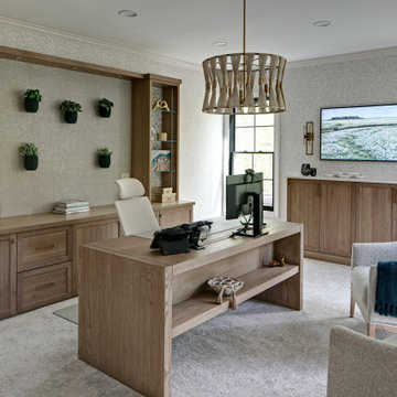
Originally an empty front living room, this space offered a blank canvas for transformation. Alicia’s client — a financial wealth management professional facing a career shift towards more home-based work — was excited to make it her new office. Capitalizing on the space’s abundant natural light, perfect for on-camera meetings, Alicia helped convert the area into a primary workspace.
Design Objectives:
- Create a functional and professional home office
Cultivate an aesthetic that is both comfortable and feminine
- Optimize the office for the space’s ideal lighting and provide an appealing background for virtual meetings
Design Challenges:
- Transforming a large, undefined space into a structured, functional office
- Selecting a color palette that enhances focus and professionalism, balanced with a feminine touch
- Strategically placing the desk to maximize functionality and aesthetics within the large area
Incorporating solutions for effective real-time stock trade tracking and analog task management
THE RENEWED SPACE
Design Solutions:
Workspace Configuration: Centered the desk to utilize indirect light, ideal for video calls, while providing a commanding view of the office, the outdoors and the entrance. A floor-installed power outlet under the desk ensures a clean, cord-free setup.
Aesthetic and Palette: Anchored by a striking wallpaper chosen by the client, Alicia developed a soft, neutral color scheme that complements the room’s black window frames and maintains a feminine touch.
Digital Integration: Included a screen dedicated to monitoring daily stock trends, positioned for easy viewing. The energy efficient monitor doubles as artwork when not in use, seamlessly blending functionality with style.
Organizational Features: Implemented dual large bulletin boards for task and project tracking, integrating them aesthetically with custom cabinetry and interesting, yet subdued, fabric backing.
Our client is thrilled with her new home office, which not only meets her professional needs but also adds comfort and style to her daily work routine. The space is highly functional for both solo work and client appointments, providing a perfect blend of business professionalism and personal comfort. It embodies the essence of a #girlboss, combining a professional atmosphere with feminine elegance, making every workday enjoyable and productive.

 Kitchen Magic
Some remodeling customers are uncertain about the best way to change the look of their space, and turn to us at Kitchen Magic for guidance; other homeowners already have a clear idea of what they want, and ask us to make their vision a reality. The latter was very much the case in a recent remodeling project we completed in Milford, New Jersey.
The home had been designed by the homeowner, who was clearly accustomed to creating and implementing an artistic vision for their living space. By the time Kitchen Magic arrived on the scene, the homeowner already had clear ideas about the colors and materials that would go into creating the look of their new kitchen. Cabinet refacing was the perfect solution for staying within budget, yet still having the kitchen they had always dreamed of.
Building on the Existing Decor is Key
The sleek, black appliances already in place demanded a bold complement, and the rich, deep hue of Cordovan on Cherry stain fit the bill perfectly. The arched cabinet doors add a classic touch of elegance, but one that blends seamlessly with the modern feel of the other design elements. The clean lines and chrome finish of the cabinet hardware serve to unite the vivid cherry cabinetry with the gray toned counters and backsplash.
That backsplash, a custom design envisioned by the homeowner, brings both unity and contrast to the entire space. The splashes of lighter values brighten the deep red tones of the cabinets, keeping the room from feeling too dark. The use of texture and varied tonal values create a unique piece that adds dimension to the kitchen's personality and reflects the creative energy of the homeowners.
The luxury of the deep cherry-red cabinets and the sleekly modern lines of the furnishings create a timeless and bold back drop for the counters, and only one stone perfectly fits that bill: granite! The black Uba Tuba granite countertops chosen by the homeowners have the visual weight and richness to pair with the Cordovan on Cherry, and the marbling of lighter and darker values echo of the custom-designed backsplash over the range, completing the new design.
Taken together, the effect of the homeowners' choices create a striking, elegant, and almost decadent feel without any heavy or dark characters. The sleek lines and organic look created by the arched cabinet doors give the room a sense of grace and motion that is entirely appropriate to the homeowners' aesthetic, given their fondness for the adventure of hot-air ballooning and active life style.
David Glasofer
 Michael Nash Design, Build & Homes
Kitchen Over 150K
If you ever found yourself shopping for a new home, finding a model home, falling in love with this model home and immediately signing on the dotted line. Yet after a few months of moving into your new home you realize that the kitchen and the layout of main level will not work out for your lifestyle. The model home you fell in love with was furnished with beautiful furniture distracting you from concentrating on what is really important to you. This is what happened to this couple in Ashburn, VA, after purchasing their dream home.
The kitchen lacked natural light, while its location was not ideal and was disrupting their daily routine. After a careful review of the kitchen design, a plan was formed to upgrade the kitchen.
Their kitchen was moved to a location between the two-story family room and front dining room. To the left of the family room there was a breakfast eating area that was not serving any purpose.
Our design incorporated the breakfast area placed along a couple feet from an adjacent pantry space to create this new dream kitchen.
By knocking down a few bearing walls, we have placed the main sink area under large backside windows. Now the kitchen can look into their beautiful backyard. A major load bearing wall between the old breakfast room and adjacent two-story family was taken down and a big steel beam took the place of that, creating a large seamless connection between the new kitchen and the rest of the home.
A large island was implemented with a prep sink, microwave, and with lots of seating space around it. Large scale professional appliances along with stunning mosaic backsplash tiles complement this amazing kitchen design.
Double barn style door in front of the pantry area sets off this storage space tucked away from rest of the kitchen. All the old tile was removed and a matching wide plank distressed wood floor was installed to create a seamless connection to rest of the home. A matching butler pantry cabinet area just outside of dining room and a wine station/drink serving area between family room and main foyer were added to better utilize the multi-function needs of the family.
The custom inset cabinetry with double layers and exotic stone counter top, distressed ceiling beams, and other amenities are just a few standouts of this project.
 Michael Nash Design, Build & Homes
When the homeowners purchased this traditional colonial in Vienna, Virginia, they were already planning on making some serious changes. The home’s original floor plan was boxy and closed in, making traffic flow from one room to the next virtually non-existent. Additionally, the existing décor left a lot to be desired. Their vision was to open up the layout and create a more contemporary look using lots of light, soft colors and high end materials.
They decided to add a two-story addition to the back of the home’s existing breakfast room and the small upstairs bedroom above it. The old breakfast area was too small for their daily meals and their teenage son needed more space in his bedroom. They also decided to add a sunroom/family room to the left side of their old family room. This new room offers a vaulted ceiling with four skylights and lots of windows with a better view of the side and backyard.
To create a more open floor plan, the team at Michael Nash Design, Build & Homes removed the load bearing wall between the kitchen and family room and installed a large beam to handle the second floor load. Not only did this open up the space, but it allowed for the addition of a breakfast bar.
The right side bearing wall of the old family room was also removed and replaced with structural beams. This action created a continuous flow between the new sunroom and old family room. Separated by a double-sided stone fireplace, this new sunroom is connected to a new outside sun deck built using a maintenance-free decking material. The old family room with new lighting now serves as a casual seating area. It also features an eight-foot long built-in desk.
The newly updated kitchen features granite countertops with matching tile backsplash, professional-quality appliances, a porcelain tile floor and custom cabinets, including a large pantry. The new breakfast room is more spacious and gets daylight from three different angles.
Upstairs, a new 12’ x 20’ bedroom is a great place for this teenage football fan to hang out. It provides significantly more closet space than the old room and lets in more sunlight as well.
The old laundry room was converted to a new mudroom with locker style cabinetry and a place for kids to store their bag packs. New plumbing and electrical were implemented in a new closet in an upper hallway to facilitate the new washer and dryer.
In this remodel, form and function have come together in an open concept design that meets the needs of the entire family.

 Progressive Design Build
This home in Bonita Bay, Florida is located in a development designed with a tropical, entertaining-friendly courtyard floor plan, barrel tile roofs, and arched windows. The only thing missing was a modern, elegant and functional kitchen where two chefs could work simultaneously and have better flow among the surrounding spaces.
Having worked with Progressive Design before on three prior renovations, all in less than one year, Progressive was the obvious choice for their fourth major remodel—this masterful kitchen renovation.
Challenge
Ultimately, Progressive Design Build was tasked with transforming a closed-off kitchen into an open concept floor plan. The design and production team began working on a solution to the structural beam support—confirming its adequacy for supporting the loft above after cutting a few holes in the drywall. Secondly, the size of the current marble tile flooring was no longer available. We needed a solution that would seamlessly blend the new flooring with the old. Thirdly, the existing lighting plan was inefficient and would need to be updated to accommodate the new island location and kitchen layout.
Solution
Since the existing marble flooring tile size was no longer available, we designed a beautiful stone border between the new kitchen and the existing living space to create a small break in the two-floor patterns, minimizing the noticeable difference in the tile sizes. Once installed, we re-polished and sealed the entire floor creating a beautiful sheen and natural flow throughout the space.
The new location of the kitchen island, as well as additional perimeter lighting, necessitated the need to move electrical outlets and light switches to a more convenient and intuitive location. This was implemented strategically using a well-thought-out lighting plan.
The clients were thrilled when we suggested removing a sink from their existing wet bar (which was rarely used) and moved the wet bar drain to the new laundry room, located on the backside of the wet bar.
Special features include custom-designed Dura Supreme cabinets painted in a white finish, for the kitchen, wet bar, and laundry room; Wolf and Sub-Zero appliances, and an impressive gas range with downdraft at the cooktop.
Results
Not only was this Bonita Bay couple thrilled to receive all of their remodel wish list items, but Progressive Design Build was able to complete their project ahead of schedule and on budget.
 Michael Nash Design, Build & Homes
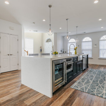
The new owner of this Centex complex townhomes was about to overhaul there entire first floor. Having a building industries background, he wanted to explore taking all interior walls out and create a much-desired open floor plan with a massive kitchen.
The current home had a front living room followed by a small boxed out dining room. A structure wall separating the back of the house kitchen from the front living space. It was all to chopped up for their daily lives. The floor is concrete slab. the partition wall was bearing. The HVAC system is located on second floor and the supply and return ducts were all boxed in columns in living spaces.
Challenges:
• Eliminating bearing partition walls
• Relocating all supply and return ducts from box columns
• Run 1” gas line from exterior meter for new 48” stove
• Cutting slab concrete to relocate all plumbing and electrical for new island
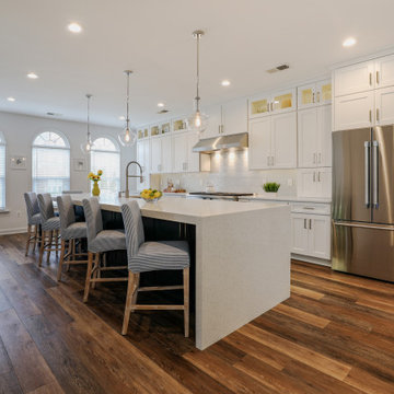
The plan was to combine the entire first level and create an open space floor-plan, with locating the new large kitchen in front of this town house, implementing a large island in middle of the space which accommodate big group seating.
The old kitchen converted to a casual family room seating space facing a wall coved with linear fireplace and sheep-lap barded wall and embedded Tv.
The old glued down floor was removed and replaced with a more contemporary LVT flooring,
The entire space covered with new LED lighting, floor to ceiling cabinetry on south wall with upgraded appliances and inside lighting cabinetry.
A gorgeous quartz counter top coving the dark blue island with water falls on one end stand tall in middle this amazing kitchen. Three pendent lights over this massive Island brighten up this new space.
This new living space reveals what an amazing total overhaul has been accomplished and how happy this family is spending all their time on this floor.
The design team spent a lot of time with the couple for details such as color scheme, backsplash design, counter top slab and floor design to bring what they desired their new space to look like
 Michael Nash Design, Build & Homes
The new owner of this Centex complex townhomes was about to overhaul there entire first floor. Having a building industries background, he wanted to explore taking all interior walls out and create a much-desired open floor plan with a massive kitchen.
The current home had a front living room followed by a small boxed out dining room. A structure wall separating the back of the house kitchen from the front living space. It was all to chopped up for their daily lives. The floor is concrete slab. the partition wall was bearing. The HVAC system is located on second floor and the supply and return ducts were all boxed in columns in living spaces.
Challenges:
• Eliminating bearing partition walls
• Relocating all supply and return ducts from box columns
• Run 1” gas line from exterior meter for new 48” stove
• Cutting slab concrete to relocate all plumbing and electrical for new island
The plan was to combine the entire first level and create an open space floor-plan, with locating the new large kitchen in front of this town house, implementing a large island in middle of the space which accommodate big group seating.
The old kitchen converted to a casual family room seating space facing a wall coved with linear fireplace and sheep-lap barded wall and embedded Tv.
The old glued down floor was removed and replaced with a more contemporary LVT flooring,
The entire space covered with new LED lighting, floor to ceiling cabinetry on south wall with upgraded appliances and inside lighting cabinetry.
A gorgeous quartz counter top coving the dark blue island with water falls on one end stand tall in middle this amazing kitchen. Three pendent lights over this massive Island brighten up this new space.
This new living space reveals what an amazing total overhaul has been accomplished and how happy this family is spending all their time on this floor.
The design team spent a lot of time with the couple for details such as color scheme, backsplash design, counter top slab and floor design to bring what they desired their new space to look like
231