
Search results for "Implementing plans" in Home Design Ideas

 Ernest M. Ferizi
German Embassy in Pristina - Kosovo, contracted the architecture office “Ferizi + Ferizi Architects” to plan and implement an Annex Office building for their purposes. As detached part of this building is designed the waiting area, as alone standing structure.
This Office Building is constructed by assembling of Eight used office containers that were delivered on trucks and set up after only a few hours on the basis of the LEGO principle, according to the planning on strip foundations.
By removing the flexible exterior wall panels, a large room of 115 m² was created, with the counter wall as a room partition between two office spaces, each with seven workstations as well as three counters for agents on one side and a room for visitors on the other side.
With this system, room solutions can be easily implemented in all dimensions.
The container, seen as a geometric shape, is a simple, octagonal, solid box.
The standardized perfection of its dimensions is striking: 2.44 meters wide, 2.59 meters high and 6.06 meters or 12.19 meters long.
Since its introduction in 1956 by the American transport entrepreneur Malcom McLean, the container has become a standardized transport module worldwide, whether on ships, trucks or construction sites.
The shipping containers have additionally revolutionized the transport industry, pushed the globalization noticeably, and thus directly or indirectly influenced all our lives.
But after only a few years, when the first overseas containers wore out, many engineers recognized the positive properties of used shipping containers for building houses, especially since they are robust, flexible, multifunctional and second-hand relatively inexpensive to purchase. The time has long passed by to treat containers exclusively as transport objects.
As a "measure of all things", containers can hardly be ignored in construction.
Their use is no longer limited to temporary use since school containers, information containers, office containers or entire residential buildings are now part of our everyday life in the construction industry.
However, current examples of the container architecture prove that even the most demanding solutions for container building are feasible. For their specific aesthetic and spatial qualities, containers also serve as design parameters for the development of new forms of architecture and urbanity.
The office building as an extension of the visa section, characterized by modern materials and contemporary aesthetics has been designed and built mainly as a low-energy building.
Extensive insulation to achieve a comfortable and sustainable constant temperature in the interior, high window quality and low energy consumption make the building energy-efficient.
The sophisticated lighting technology, networks, heating systems and air-conditioning systems are also components of this equipment.
It creates an overall harmonic picture and guarantees the highest standard in sustainable construction, taking into consideration the fact that environmentally friendly recycling and reutilization have become an increasingly important issue in our society.
West and East side of the wooden facade is compact and has few openings, while the southern facade is completely open with lot of glass. Its spatial openness ensures a transparent, friendly work environment, which allows a lot of light into the space.
This openness allows an uninterrupted, pleasant and close-to-nature view from interior spaces into the beautiful garden. During the installation of sophisticated light sources in the garden, emphasis was not only put on functionality and security, but also on the beauty of the garden shown through the illumination in the evening.
Large, horizontal white “brisole” serve as external sun protection systems, mounted on the canopies of the entrance areas of the modular construction and the enclosure, adeptly cast shade on these areas and at the same time shape the entire architectural language.
While on one hand, the two quadratic ledges suspended in the air, are docked with steel stairs and match the wooden façade, lead the staff to their office space, the artful modern interior, on the other hand, perfectly unites the functionality, innovative technology, culture and positive effects on the employees' efficiency and wellbeing.
A lot of white, interjected by warm wooden and colored accents, determines the ambience.
In the case of the lighting solution, the mainly linear ceiling lighting is used as the overlapping design element both for the offices of the visa section as well as for the counters and the waiting area for the visitors.
They underline the puristic design in order to create a pleasant light for a desired general illumination and ensure optimal light conditions without causing disturbing reflections on the computer screens.
In addition, precisely positioned pendant luminaires are installed at the workstations, which ensure pleasant room brightness.
In the entrance area, the harmonic and uniform lighting effect from the ground highlights the integration of photography and architecture.
Photographs of landscapes, people, places, expressing unforgettable, impressive moments and memories have been lovingly engraved on 8 x 8cm square oak blocks.
The idea of an effective, impressive environment that stimulates and inspires the work was the premiss on which the whole design concept was based. Consequently, the modular construction was no longer viewed through its history of utilization and scars, but rather as a structure of work ambiance, art and elegance.
FERIZI + FERIZI Architects
Photo: Arben Llapashtica
 Michael Nash Design, Build & Homes
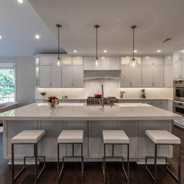
This couple have been living in their single-family Ashburn home for a wile and getting ready to update their home one step at the time.
Their kitchen was very small & dated. They would like to add sunroom. After talking to our designer, they come to conclusion to add sunroom/ Breakfast area to extend the kitchen & kill two birds with one stone.
Also, they decide to renovate two bathrooms upstairs. (Master bathroom & Hall bathroom)
Master bathroom was too small & after meeting with designer they agreed to take couple feet from bedroom & enlarge master bathroom.
She felt cramped and out dated in her old kitchen. A big pantry closet was taking way too much real estate out of her kitchen space.
We have taken down bearing wall to adjacent family room to expand kitchen and implement 10’ feet long Island with sink, dishwasher and microwave into it.
The gas line and new 48” professional stove was relocated to west wall and now home for a long run of floor to ceiling cabinetry.
Display glass front lit cabinetry is place for her color full china’s
The north wall where closet used to be now is place for large scale refrigerator and freezer towers and pantry space. A tall unit of secondary oven and steam one is now placed in this wall
Installing matching wide plank espresso hardwood flooring has expanded this kitchen into all adjacent rooms.
New lighting plans, gorgeous pendent lighting make this center island to stand tall.
The traffic flow has been improved a lot allowing large gathering and entertainment much more than ever before.
She has carefully selected a soft tone backsplash to compliment the soapstone counter tops.
On the end they decided to have a stone patio right next to sunroom & enjoy their outdoor gathering as well.

 Lisa Tharp Design
Governor's House Entry by Lisa Tharp. 2019 Bulfinch Award - Interior Design. Photo by Michael J. Lee
Transitional painted wood floor foyer photo with white walls and a black front door
Transitional painted wood floor foyer photo with white walls and a black front door
Find the right local pro for your project
 Michael Nash Design, Build & Homes
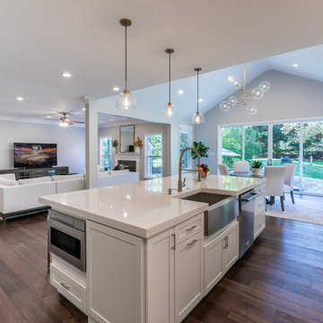
This couple have been living in their single-family Ashburn home for a wile and getting ready to update their home one step at the time.
Their kitchen was very small & dated. They would like to add sunroom. After talking to our designer, they come to conclusion to add sunroom/ Breakfast area to extend the kitchen & kill two birds with one stone.
Also, they decide to renovate two bathrooms upstairs. (Master bathroom & Hall bathroom)
Master bathroom was too small & after meeting with designer they agreed to take couple feet from bedroom & enlarge master bathroom.
She felt cramped and out dated in her old kitchen. A big pantry closet was taking way too much real estate out of her kitchen space.
We have taken down bearing wall to adjacent family room to expand kitchen and implement 10’ feet long Island with sink, dishwasher and microwave into it.
The gas line and new 48” professional stove was relocated to west wall and now home for a long run of floor to ceiling cabinetry.
Display glass front lit cabinetry is place for her color full china’s
The north wall where closet used to be now is place for large scale refrigerator and freezer towers and pantry space. A tall unit of secondary oven and steam one is now placed in this wall
Installing matching wide plank espresso hardwood flooring has expanded this kitchen into all adjacent rooms.
New lighting plans, gorgeous pendent lighting make this center island to stand tall.
The traffic flow has been improved a lot allowing large gathering and entertainment much more than ever before.
She has carefully selected a soft tone backsplash to compliment the soapstone counter tops.
On the end they decided to have a stone patio right next to sunroom & enjoy their outdoor gathering as well.
 Michael Nash Design, Build & Homes
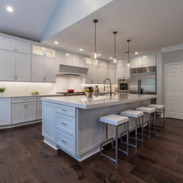
This couple have been living in their single-family Ashburn home for a wile and getting ready to update their home one step at the time.
Their kitchen was very small & dated. They would like to add sunroom. After talking to our designer, they come to conclusion to add sunroom/ Breakfast area to extend the kitchen & kill two birds with one stone.
Also, they decide to renovate two bathrooms upstairs. (Master bathroom & Hall bathroom)
Master bathroom was too small & after meeting with designer they agreed to take couple feet from bedroom & enlarge master bathroom.
She felt cramped and out dated in her old kitchen. A big pantry closet was taking way too much real estate out of her kitchen space.
We have taken down bearing wall to adjacent family room to expand kitchen and implement 10’ feet long Island with sink, dishwasher and microwave into it.
The gas line and new 48” professional stove was relocated to west wall and now home for a long run of floor to ceiling cabinetry.
Display glass front lit cabinetry is place for her color full china’s
The north wall where closet used to be now is place for large scale refrigerator and freezer towers and pantry space. A tall unit of secondary oven and steam one is now placed in this wall
Installing matching wide plank espresso hardwood flooring has expanded this kitchen into all adjacent rooms.
New lighting plans, gorgeous pendent lighting make this center island to stand tall.
The traffic flow has been improved a lot allowing large gathering and entertainment much more than ever before.
She has carefully selected a soft tone backsplash to compliment the soapstone counter tops.
On the end they decided to have a stone patio right next to sunroom & enjoy their outdoor gathering as well.

 SDM Design, Inc.
This house was designed for a couple and their son. One of the design program requirements was to have two master suites on the main level. They enjoy cooking and entertaining so the public and food prep. areas are functional, attractive and conducive to people gathering around. Consequently, the square footage of the main level is large.
The house is also on a very steep slope which didn't help with the required footprint. In order to minimize the related costs of building with this site condition, the footprint of the house is long and not deep as it reaches down the slope.
The scale of the existing homes in the neighborhood are unimposing. In order to play down the size as viewed from the street, the facade is broken up into several different masses with low sloping roofs.
Once you're inside, the house opens up with 14 foot ceilings in the entry and living areas. The ceiling height of other spaces on the main level are 10 feet. Universal design was implemented on the main level to provide inherent accessibility for everyone.
The lower level accommodates several guest rooms and baths, an exercise room, a guest den with wet bar and a man cave.
Another design program requirement was to make the house as maintenance-free as possible. Exterior materials include stucco, Pennsylvania Blue Stone and a new aluminum siding product called Longboard. The siding comes in many wood grain finishes and to everyone that has seen it, they think it's real wood. It's also made from heavy gauge aluminum so it doesn't ding like traditional aluminum siding. The roofs are metal standing seam.
The house is energy efficient. It's fully insulated with spray foam insulation-lots of it. The exterior walls were designed with 2x6 studs and roof rafters are 2x12 to provide plenty of space for the insulation, exceeding the required R-values. Windows and doors of course are energy efficient as well. All lighting is LED.
The decking around the exterior is locust, a very hard native wood which is naturally insect and rot resistant.
The best part of the whole project are the owners who love their new home. They initially had plans to live in this house during the summer months and Florida during the winter. They are now seriously considering living here full-time.
 Michael Nash Design, Build & Homes
2010 REGIONAL AWARD WINNER
Built in 2000, this center hall colonial in Fairfax Station, Virginia had a kitchen that was neither functional nor aesthetically pleasing.
First, the floor plan was poorly rationalized. The work triangle was inefficient, a large pantry took up too much floor space, and a series of railings between the kitchen and family room obstructed traffic flow.
Aesthetically, the space was dated. Dutch cabinetry, floral wallpaper and a faux Victorian chandelier all cried for an update. Additionally, the homeowners wanted to incorporate high-end appliances and other amenities like a wine cooler and steam cooker.
Overall, the owners were seeking to replace worn out-of-style kitchen with a substantially upgraded “open” facility that combines traditional and contemporary features configured to support multiple social and culinary needs.
Working with Michael Nash Design, Build & Homes, they decided to implement a series of strategic revisions that would support their new use goals.
First, they removed an obstructive bearing wall between the existing kitchen and mudroom, creating a recessed niche for a new 48” gas range with custom hood. An unused desk taken out provided a spot for the new 48” two-drawer refrigerator/freezer.
A custom-designed L-shaped granite-surfaced island with bar sink, icemaker and mini-drawer refrigerator takes center stage in the space and offers seating for six. Now the chef can entertain guests while preparing the meal.
From an aesthetic point of view, the interior features are nothing less than stunning. Softly painted walls, decorative ceramic tile backsplashes and granite surfaces combine with custom made cabinets to create an elegant space. Antiqued soft-opaque cabinet facings, wood panel refrigerator door inserts, glass-facing display cabinets and a custom mantle range hood are true works of craftsmanship. Fine detail is expressed with flutes and corbels. Beauty is truly in the details of this award-winning kitchen.

Sponsored
Sunbury, OH

J.Holderby - Renovations
Franklin County's Leading General Contractors - 2X Best of Houzz!
 SDM Design, Inc.
This house was designed for a couple and their son. One of the design program requirements was to have two master suites on the main level. They enjoy cooking and entertaining so the public and food prep. areas are functional, attractive and conducive to people gathering around. Consequently, the square footage of the main level is large.
The house is also on a very steep slope which didn't help with the required footprint. In order to minimize the related costs of building with this site condition, the footprint of the house is long and not deep as it reaches down the slope.
The scale of the existing homes in the neighborhood are unimposing. In order to play down the size as viewed from the street, the facade is broken up into several different masses with low sloping roofs.
Once you're inside, the house opens up with 14 foot ceilings in the entry and living areas. The ceiling height of other spaces on the main level are 10 feet. Universal design was implemented on the main level to provide inherent accessibility for everyone.
The lower level accommodates several guest rooms and baths, an exercise room, a guest den with wet bar and a man cave.
Another design program requirement was to make the house as maintenance-free as possible. Exterior materials include stucco, Pennsylvania Blue Stone and a new aluminum siding product called Longboard. The siding comes in many wood grain finishes and to everyone that has seen it, they think it's real wood. It's also made from heavy gauge aluminum so it doesn't ding like traditional aluminum siding. The roofs are metal standing seam.
The house is energy efficient. It's fully insulated with spray foam insulation-lots of it. The exterior walls were designed with 2x6 studs and roof rafters are 2x12 to provide plenty of space for the insulation, exceeding the required R-values. Windows and doors of course are energy efficient as well. All lighting is LED.
The decking around the exterior is locust, a very hard native wood which is naturally insect and rot resistant.
The best part of the whole project are the owners who love their new home. They initially had plans to live in this house during the summer months and Florida during the winter. They are now seriously considering living here full-time.
 Michael Nash Design, Build & Homes
2010 REGIONAL AWARD WINNER
Built in 2000, this center hall colonial in Fairfax Station, Virginia had a kitchen that was neither functional nor aesthetically pleasing.
First, the floor plan was poorly rationalized. The work triangle was inefficient, a large pantry took up too much floor space, and a series of railings between the kitchen and family room obstructed traffic flow.
Aesthetically, the space was dated. Dutch cabinetry, floral wallpaper and a faux Victorian chandelier all cried for an update. Additionally, the homeowners wanted to incorporate high-end appliances and other amenities like a wine cooler and steam cooker.
Overall, the owners were seeking to replace worn out-of-style kitchen with a substantially upgraded “open” facility that combines traditional and contemporary features configured to support multiple social and culinary needs.
Working with Michael Nash Design, Build & Homes, they decided to implement a series of strategic revisions that would support their new use goals.
First, they removed an obstructive bearing wall between the existing kitchen and mudroom, creating a recessed niche for a new 48” gas range with custom hood. An unused desk taken out provided a spot for the new 48” two-drawer refrigerator/freezer.
A custom-designed L-shaped granite-surfaced island with bar sink, icemaker and mini-drawer refrigerator takes center stage in the space and offers seating for six. Now the chef can entertain guests while preparing the meal.
From an aesthetic point of view, the interior features are nothing less than stunning. Softly painted walls, decorative ceramic tile backsplashes and granite surfaces combine with custom made cabinets to create an elegant space. Antiqued soft-opaque cabinet facings, wood panel refrigerator door inserts, glass-facing display cabinets and a custom mantle range hood are true works of craftsmanship. Fine detail is expressed with flutes and corbels. Beauty is truly in the details of this award-winning kitchen.

 ZeroEnergy Design
This renovated brick rowhome in Boston’s South End offers a modern aesthetic within a historic structure, creative use of space, exceptional thermal comfort, a reduced carbon footprint, and a passive stream of income.
DESIGN PRIORITIES. The goals for the project were clear - design the primary unit to accommodate the family’s modern lifestyle, rework the layout to create a desirable rental unit, improve thermal comfort and introduce a modern aesthetic. We designed the street-level entry as a shared entrance for both the primary and rental unit. The family uses it as their everyday entrance - we planned for bike storage and an open mudroom with bench and shoe storage to facilitate the change from shoes to slippers or bare feet as they enter their home. On the main level, we expanded the kitchen into the dining room to create an eat-in space with generous counter space and storage, as well as a comfortable connection to the living space. The second floor serves as master suite for the couple - a bedroom with a walk-in-closet and ensuite bathroom, and an adjacent study, with refinished original pumpkin pine floors. The upper floor, aside from a guest bedroom, is the child's domain with interconnected spaces for sleeping, work and play. In the play space, which can be separated from the work space with new translucent sliding doors, we incorporated recreational features inspired by adventurous and competitive television shows, at their son’s request.
MODERN MEETS TRADITIONAL. We left the historic front facade of the building largely unchanged - the security bars were removed from the windows and the single pane windows were replaced with higher performing historic replicas. We designed the interior and rear facade with a vision of warm modernism, weaving in the notable period features. Each element was either restored or reinterpreted to blend with the modern aesthetic. The detailed ceiling in the living space, for example, has a new matte monochromatic finish, and the wood stairs are covered in a dark grey floor paint, whereas the mahogany doors were simply refinished. New wide plank wood flooring with a neutral finish, floor-to-ceiling casework, and bold splashes of color in wall paint and tile, and oversized high-performance windows (on the rear facade) round out the modern aesthetic.
RENTAL INCOME. The existing rowhome was zoned for a 2-family dwelling but included an undesirable, single-floor studio apartment at the garden level with low ceiling heights and questionable emergency egress. In order to increase the quality and quantity of space in the rental unit, we reimagined it as a two-floor, 1 or 2 bedroom, 2 bathroom apartment with a modern aesthetic, increased ceiling height on the lowest level and provided an in-unit washer/dryer. The apartment was listed with Jackie O'Connor Real Estate and rented immediately, providing the owners with a source of passive income.
ENCLOSURE WITH BENEFITS. The homeowners sought a minimal carbon footprint, enabled by their urban location and lifestyle decisions, paired with the benefits of a high-performance home. The extent of the renovation allowed us to implement a deep energy retrofit (DER) to address air tightness, insulation, and high-performance windows. The historic front facade is insulated from the interior, while the rear facade is insulated on the exterior. Together with these building enclosure improvements, we designed an HVAC system comprised of continuous fresh air ventilation, and an efficient, all-electric heating and cooling system to decouple the house from natural gas. This strategy provides optimal thermal comfort and indoor air quality, improved acoustic isolation from street noise and neighbors, as well as a further reduced carbon footprint. We also took measures to prepare the roof for future solar panels, for when the South End neighborhood’s aging electrical infrastructure is upgraded to allow them.
URBAN LIVING. The desirable neighborhood location allows the both the homeowners and tenant to walk, bike, and use public transportation to access the city, while each charging their respective plug-in electric cars behind the building to travel greater distances.
OVERALL. The understated rowhouse is now ready for another century of urban living, offering the owners comfort and convenience as they live life as an expression of their values.
Eric Roth Photo
 Michael Nash Design, Build & Homes
2010 REGIONAL AWARD WINNER
Built in 2000, this center hall colonial in Fairfax Station, Virginia had a kitchen that was neither functional nor aesthetically pleasing.
First, the floor plan was poorly rationalized. The work triangle was inefficient, a large pantry took up too much floor space, and a series of railings between the kitchen and family room obstructed traffic flow.
Aesthetically, the space was dated. Dutch cabinetry, floral wallpaper and a faux Victorian chandelier all cried for an update. Additionally, the homeowners wanted to incorporate high-end appliances and other amenities like a wine cooler and steam cooker.
Overall, the owners were seeking to replace worn out-of-style kitchen with a substantially upgraded “open” facility that combines traditional and contemporary features configured to support multiple social and culinary needs.
Working with Michael Nash Design, Build & Homes, they decided to implement a series of strategic revisions that would support their new use goals.
First, they removed an obstructive bearing wall between the existing kitchen and mudroom, creating a recessed niche for a new 48” gas range with custom hood. An unused desk taken out provided a spot for the new 48” two-drawer refrigerator/freezer.
A custom-designed L-shaped granite-surfaced island with bar sink, icemaker and mini-drawer refrigerator takes center stage in the space and offers seating for six. Now the chef can entertain guests while preparing the meal.
From an aesthetic point of view, the interior features are nothing less than stunning. Softly painted walls, decorative ceramic tile backsplashes and granite surfaces combine with custom made cabinets to create an elegant space. Antiqued soft-opaque cabinet facings, wood panel refrigerator door inserts, glass-facing display cabinets and a custom mantle range hood are true works of craftsmanship. Fine detail is expressed with flutes and corbels. Beauty is truly in the details of this award-winning kitchen.
 SDM Design, Inc.
This house was designed for a couple and their son. One of the design program requirements was to have two master suites on the main level. They enjoy cooking and entertaining so the public and food prep. areas are functional, attractive and conducive to people gathering around. Consequently, the square footage of the main level is large.
The house is also on a very steep slope which didn't help with the required footprint. In order to minimize the related costs of building with this site condition, the footprint of the house is long and not deep as it reaches down the slope.
The scale of the existing homes in the neighborhood are unimposing. In order to play down the size as viewed from the street, the facade is broken up into several different masses with low sloping roofs.
Once you're inside, the house opens up with 14 foot ceilings in the entry and living areas. The ceiling height of other spaces on the main level are 10 feet. Universal design was implemented on the main level to provide inherent accessibility for everyone.
The lower level accommodates several guest rooms and baths, an exercise room, a guest den with wet bar and a man cave.
Another design program requirement was to make the house as maintenance-free as possible. Exterior materials include stucco, Pennsylvania Blue Stone and a new aluminum siding product called Longboard. The siding comes in many wood grain finishes and to everyone that has seen it, they think it's real wood. It's also made from heavy gauge aluminum so it doesn't ding like traditional aluminum siding. The roofs are metal standing seam.
The house is energy efficient. It's fully insulated with spray foam insulation-lots of it. The exterior walls were designed with 2x6 studs and roof rafters are 2x12 to provide plenty of space for the insulation, exceeding the required R-values. Windows and doors of course are energy efficient as well. All lighting is LED.
The decking around the exterior is locust, a very hard native wood which is naturally insect and rot resistant.
The best part of the whole project are the owners who love their new home. They initially had plans to live in this house during the summer months and Florida during the winter. They are now seriously considering living here full-time.
 Michael Nash Design, Build & Homes
Kitchen Over 150K
If you ever found yourself shopping for a new home, finding a model home, falling in love with this model home and immediately signing on the dotted line. Yet after a few months of moving into your new home you realize that the kitchen and the layout of main level will not work out for your lifestyle. The model home you fell in love with was furnished with beautiful furniture distracting you from concentrating on what is really important to you. This is what happened to this couple in Ashburn, VA, after purchasing their dream home.
The kitchen lacked natural light, while its location was not ideal and was disrupting their daily routine. After a careful review of the kitchen design, a plan was formed to upgrade the kitchen.
Their kitchen was moved to a location between the two-story family room and front dining room. To the left of the family room there was a breakfast eating area that was not serving any purpose.
Our design incorporated the breakfast area placed along a couple feet from an adjacent pantry space to create this new dream kitchen.
By knocking down a few bearing walls, we have placed the main sink area under large backside windows. Now the kitchen can look into their beautiful backyard. A major load bearing wall between the old breakfast room and adjacent two-story family was taken down and a big steel beam took the place of that, creating a large seamless connection between the new kitchen and the rest of the home.
A large island was implemented with a prep sink, microwave, and with lots of seating space around it. Large scale professional appliances along with stunning mosaic backsplash tiles complement this amazing kitchen design.
Double barn style door in front of the pantry area sets off this storage space tucked away from rest of the kitchen. All the old tile was removed and a matching wide plank distressed wood floor was installed to create a seamless connection to rest of the home. A matching butler pantry cabinet area just outside of dining room and a wine station/drink serving area between family room and main foyer were added to better utilize the multi-function needs of the family.
The custom inset cabinetry with double layers and exotic stone counter top, distressed ceiling beams, and other amenities are just a few standouts of this project.

 SDM Design, Inc.
This house was designed for a couple and their son. One of the design program requirements was to have two master suites on the main level. They enjoy cooking and entertaining so the public and food prep. areas are functional, attractive and conducive to people gathering around. Consequently, the square footage of the main level is large.
The house is also on a very steep slope which didn't help with the required footprint. In order to minimize the related costs of building with this site condition, the footprint of the house is long and not deep as it reaches down the slope.
The scale of the existing homes in the neighborhood are unimposing. In order to play down the size as viewed from the street, the facade is broken up into several different masses with low sloping roofs.
Once you're inside, the house opens up with 14 foot ceilings in the entry and living areas. The ceiling height of other spaces on the main level are 10 feet. Universal design was implemented on the main level to provide inherent accessibility for everyone.
The lower level accommodates several guest rooms and baths, an exercise room, a guest den with wet bar and a man cave.
Another design program requirement was to make the house as maintenance-free as possible. Exterior materials include stucco, Pennsylvania Blue Stone and a new aluminum siding product called Longboard. The siding comes in many wood grain finishes and to everyone that has seen it, they think it's real wood. It's also made from heavy gauge aluminum so it doesn't ding like traditional aluminum siding. The roofs are metal standing seam.
The house is energy efficient. It's fully insulated with spray foam insulation-lots of it. The exterior walls were designed with 2x6 studs and roof rafters are 2x12 to provide plenty of space for the insulation, exceeding the required R-values. Windows and doors of course are energy efficient as well. All lighting is LED.
The decking around the exterior is locust, a very hard native wood which is naturally insect and rot resistant.
The best part of the whole project are the owners who love their new home. They initially had plans to live in this house during the summer months and Florida during the winter. They are now seriously considering living here full-time.

 KINGDOM WOODWORKS
Collaboration with Canonbury Homes and Frank Neely Design Associates.
Inspiration for a timeless open concept kitchen remodel in Atlanta with beaded inset cabinets and two islands
Inspiration for a timeless open concept kitchen remodel in Atlanta with beaded inset cabinets and two islands
 Michael Nash Design, Build & Homes
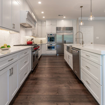
This couple have been living in their single-family Ashburn home for a wile and getting ready to update their home one step at the time.
Their kitchen was very small & dated. They would like to add sunroom. After talking to our designer, they come to conclusion to add sunroom/ Breakfast area to extend the kitchen & kill two birds with one stone.
Also, they decide to renovate two bathrooms upstairs. (Master bathroom & Hall bathroom)
Master bathroom was too small & after meeting with designer they agreed to take couple feet from bedroom & enlarge master bathroom.
She felt cramped and out dated in her old kitchen. A big pantry closet was taking way too much real estate out of her kitchen space.
We have taken down bearing wall to adjacent family room to expand kitchen and implement 10’ feet long Island with sink, dishwasher and microwave into it.
The gas line and new 48” professional stove was relocated to west wall and now home for a long run of floor to ceiling cabinetry.
Display glass front lit cabinetry is place for her color full china’s
The north wall where closet used to be now is place for large scale refrigerator and freezer towers and pantry space. A tall unit of secondary oven and steam one is now placed in this wall
Installing matching wide plank espresso hardwood flooring has expanded this kitchen into all adjacent rooms.
New lighting plans, gorgeous pendent lighting make this center island to stand tall.
The traffic flow has been improved a lot allowing large gathering and entertainment much more than ever before.
She has carefully selected a soft tone backsplash to compliment the soapstone counter tops.
On the end they decided to have a stone patio right next to sunroom & enjoy their outdoor gathering as well.
 Michael Nash Design, Build & Homes
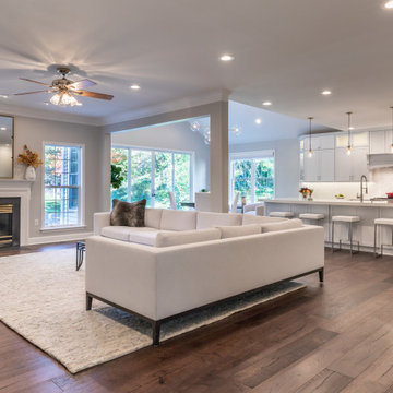
This couple have been living in their single-family Ashburn home for a wile and getting ready to update their home one step at the time.
Their kitchen was very small & dated. They would like to add sunroom. After talking to our designer, they come to conclusion to add sunroom/ Breakfast area to extend the kitchen & kill two birds with one stone.
Also, they decide to renovate two bathrooms upstairs. (Master bathroom & Hall bathroom)
Master bathroom was too small & after meeting with designer they agreed to take couple feet from bedroom & enlarge master bathroom.
She felt cramped and out dated in her old kitchen. A big pantry closet was taking way too much real estate out of her kitchen space.
We have taken down bearing wall to adjacent family room to expand kitchen and implement 10’ feet long Island with sink, dishwasher and microwave into it.
The gas line and new 48” professional stove was relocated to west wall and now home for a long run of floor to ceiling cabinetry.
Display glass front lit cabinetry is place for her color full china’s
The north wall where closet used to be now is place for large scale refrigerator and freezer towers and pantry space. A tall unit of secondary oven and steam one is now placed in this wall
Installing matching wide plank espresso hardwood flooring has expanded this kitchen into all adjacent rooms.
New lighting plans, gorgeous pendent lighting make this center island to stand tall.
The traffic flow has been improved a lot allowing large gathering and entertainment much more than ever before.
She has carefully selected a soft tone backsplash to compliment the soapstone counter tops.
On the end they decided to have a stone patio right next to sunroom & enjoy their outdoor gathering as well.

Sponsored
Columbus, OH

Hope Restoration & General Contracting
Columbus Design-Build, Kitchen & Bath Remodeling, Historic Renovations
 TELFORD+BROWN STUDIO ARCHITECTURE
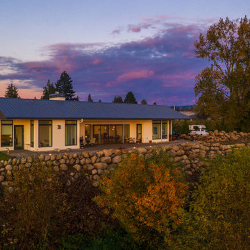
This home sits at a dramatic juncture between a state highway and the Columbia River, adjacent to the Lewis and Clark Scenic Byway. Steps away from its namesake, Steamboat Landing Park, the home has dramatic 180 degree views of the river, Mount Hood, and Oregon beyond. Creating a connection and celebrating this stunning natural setting while keeping highway noise at bay was one of this project's primary goals. Equally as important was the goal to design a high-performance building. These goals were met by implementing an energy-efficient heat pump system, radiant floor heating, 10" thick super-insulated concrete walls, closed-cell spray foam insulation in the attic, and triple-pane windows throughout. The sustainable attributes were balanced with durable and long-lasting materials, including standing seam metal roofing, stucco, and cedar siding to create a home that will stand for generations. Honoring the homeowner's request to design an age-in-place, one-level home, the plan is a simple sequence of bars with the two largest capped by gable roofs. The tallest of the bars closest to the highway is a garage, which houses the couple's much-loved Airstream. A smaller flat-roofed bar acts as a connector between the gabled forms and serves as the home's entry with the kitchen functions beyond. The largest of the bars, and the one closest to the river, includes an open concept great room flanked by two-bedroom suites on either side. A water-front deck spans the entire living and dining area, with a twenty-foot wide multi-slide panel door offering a seamless connection to an outdoor covered entertainment area. Inside, smooth concrete floors, walnut casework, and multiple skylights combine to create a truly inviting space.
Photographer: Matt Swain Photography
 Michael Nash Design, Build & Homes
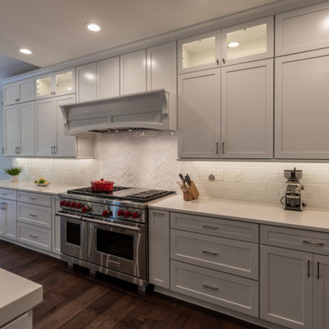
This couple have been living in their single-family Ashburn home for a wile and getting ready to update their home one step at the time.
Their kitchen was very small & dated. They would like to add sunroom. After talking to our designer, they come to conclusion to add sunroom/ Breakfast area to extend the kitchen & kill two birds with one stone.
Also, they decide to renovate two bathrooms upstairs. (Master bathroom & Hall bathroom)
Master bathroom was too small & after meeting with designer they agreed to take couple feet from bedroom & enlarge master bathroom.
She felt cramped and out dated in her old kitchen. A big pantry closet was taking way too much real estate out of her kitchen space.
We have taken down bearing wall to adjacent family room to expand kitchen and implement 10’ feet long Island with sink, dishwasher and microwave into it.
The gas line and new 48” professional stove was relocated to west wall and now home for a long run of floor to ceiling cabinetry.
Display glass front lit cabinetry is place for her color full china’s
The north wall where closet used to be now is place for large scale refrigerator and freezer towers and pantry space. A tall unit of secondary oven and steam one is now placed in this wall
Installing matching wide plank espresso hardwood flooring has expanded this kitchen into all adjacent rooms.
New lighting plans, gorgeous pendent lighting make this center island to stand tall.
The traffic flow has been improved a lot allowing large gathering and entertainment much more than ever before.
She has carefully selected a soft tone backsplash to compliment the soapstone counter tops.
On the end they decided to have a stone patio right next to sunroom & enjoy their outdoor gathering as well.
 Michael Nash Design, Build & Homes
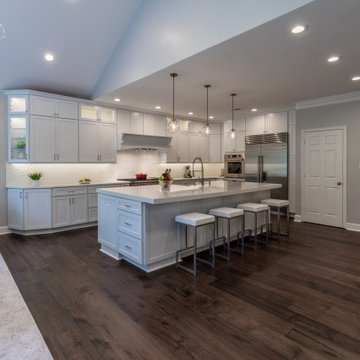
This couple have been living in their single-family Ashburn home for a wile and getting ready to update their home one step at the time.
Their kitchen was very small & dated. They would like to add sunroom. After talking to our designer, they come to conclusion to add sunroom/ Breakfast area to extend the kitchen & kill two birds with one stone.
Also, they decide to renovate two bathrooms upstairs. (Master bathroom & Hall bathroom)
Master bathroom was too small & after meeting with designer they agreed to take couple feet from bedroom & enlarge master bathroom.
She felt cramped and out dated in her old kitchen. A big pantry closet was taking way too much real estate out of her kitchen space.
We have taken down bearing wall to adjacent family room to expand kitchen and implement 10’ feet long Island with sink, dishwasher and microwave into it.
The gas line and new 48” professional stove was relocated to west wall and now home for a long run of floor to ceiling cabinetry.
Display glass front lit cabinetry is place for her color full china’s
The north wall where closet used to be now is place for large scale refrigerator and freezer towers and pantry space. A tall unit of secondary oven and steam one is now placed in this wall
Installing matching wide plank espresso hardwood flooring has expanded this kitchen into all adjacent rooms.
New lighting plans, gorgeous pendent lighting make this center island to stand tall.
The traffic flow has been improved a lot allowing large gathering and entertainment much more than ever before.
She has carefully selected a soft tone backsplash to compliment the soapstone counter tops.
On the end they decided to have a stone patio right next to sunroom & enjoy their outdoor gathering as well.
50