
Search results for "Inadequately" in Home Design Ideas
 Judy Mozen
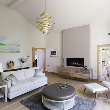
Maple hardwood and trim add warmth to this modern aesthetic.
Originally, there was a large, heavy chandelier in the middle of the room that provided inadequate lighting. The room now has an interesting modern chandelier, sconces, and recessed cans.

 Paradise Found Construction
The homes in Heritage Hills in Chapel Hill, NC are representative of the popularity and explosive growth of American Home Ownership that occurred during the economic expansion that followed the end of WW II. They were designed and built to foster the benefits and sense of “community”, where families could come together and share theirs and their children’s lives. They are typically in very desirable locations within their larger communities, and remodeling them with modern amenities, increasing the performance and efficiency of them, and having them Green Certified (independent third-party verified) makes them extremely attractive to buyers, and helps to raise other property values within the neighborhood.
Green Certified Remodeled Homes offer significant value and advantage in the marketplace over similar homes in their area, which is especially important as a new, younger era of home buyers enter the market. Current trends suggest that younger (as well as many “seasoned”) homeowners are interested in smaller, more efficient (and thus affordable) homes situated closer to shopping, their work, entertainment opportunities, and access to the economic and environmental benefits of mass transit.
These older homes also offer an additional value that is continuing to gain visibility and appreciation in the market place. They were built from lumber from slower-growth trees (denser and harder wood), and as such offer superior structural support compared to the same home built using lumber from today’s faster-growing (softer and less-dense wood) trees.
Robin and Kent had lived in their 2-story Gambrel Roof home in Heritage Hills since 1994. The house was structurally sound, due in large part to the old-growth (and denser) yellow pine that was used in its framing. They loved the quiet neighborhood, its sense of community and amenities, and their home. It suited their life-style and needs; and they had decided that they would remain in the home. It was showing its age, and was in need of general repairs and maintenance, and its energy, water, and indoor air quality performance was continuing to increase their ongoing cost of ownership.
Robin loved the screen porch that looked out on their private and nicely landscaped back yard, but she wanted to be able to use it in the colder months of the year. She was unsatisfied with the kitchen and the mud room / laundry room, and the darkness of other living spaces. A previous water leak in the laundry room had resulted in a large patch of mold that had compromised flooring, wall board, and insulation and contributed to the homes reduced indoor air quality.
The home lacked insulation in the crawl, and inadequate insulation in the attic. The single HVAC unit had been replaced a few years earlier with a more efficient unit, but with a single programmable thermostat control on the first floor and aging and un-insulated ducting, the second floor was often over-heated in the summer months.
The original wood windows had begun to deteriorate and were drafty and inefficient, and the original wood-burning fireplace was an open conduit for escaping conditioned air as well as an inlet for wood-smoke smelling air being pulled into the home. The siding had been replaced a few years earlier with a cement-fiber product, but the exterior wood trim was compromised and beginning to look unsightly. Its original architecture had been altered over the years in ways that presented ongoing maintenance and durability issues, as well as disrupting the elegance of the original design.
Kent has worked for over 30 years in the Environmental Sciences field, and is considered to be a national expert in understanding the sources of, and human exposure to pollutants in indoor environments. He had always been very conscious and cautious about the effects on indoor air quality that the construction, furnishings, and products used in home had on him and his family.
Project Goals
Increase the performance of their home by improving energy efficiency by at least 40% and lowering their natural gas and electric utility costs.
Increase the performance of their home by reducing water usage by at least 40% and lowering the water utility costs.
Increase the comfort of their home that was being compromised by an inadequate HVAC design, inadequate insulation, inefficient and compromised wood windows, and copious air intrusions and drafts.
Improve the healthiness of the homes indoor air quality that was being compromised by an open wood-burning fireplace, and prior water intrusion that had allowed colonies of mold to thrive.
Create a new Kitchen, Family Room, Home Office, Mudroom, and Laundry Room that featured some of the latest designs and trends and harmonized with the rest of the homes charm.
Increase the usefulness and aesthetics of the screened porch by creating a warm and inviting semi-conditioned 3-Season Room that extended the times during the year that it was comfortable.
Introduce day-lighting into areas of the home that were dark and uninviting.
Brighten and harmonize all of the interior finishes.
Protect and restore the exterior of the home with superior-performing products and finishes.
Achieve Gold Level Green Home Certification in conformance with the ICC 700-2012 National Green Building Standards (NGBS).
 Renovisions
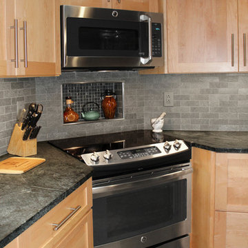
This kitchen had not been renovated since the salt box colonial house was built in the 1960’s. The new owner felt it was time for a complete refresh with some traditional details and adding in the owner’s contemporary tastes.
At initial observation, we determined the house had good bones; including high ceilings and abundant natural light from a double-hung window and three skylights overhead recently installed by our client. Mixing the homeowners desires required the skillful eyes of Cathy and Ed from Renovisions. The original kitchen had dark stained, worn cabinets, in-adequate lighting and a non-functional coat closet off the kitchen space. In order to achieve a true transitional look, Renovisions incorporated classic details with subtle, simple and cleaner line touches. For example, the backsplash mix of honed and polished 2” x 3” stone-look subway tile is outlined in brushed stainless steel strips creating an edgy feel, especially at the niche above the range. Removing the existing wall that shared the coat closet opened up the kitchen to allow adding an island for seating and entertaining guests.
We chose natural maple, shaker style flat panel cabinetry with longer stainless steel pulls instead of knobs, keeping in line with the clients desire for a sleeker design. This kitchen had to be gutted to accommodate the new layout featuring an island with pull-out trash and recycling and deeper drawers for utensils. Spatial constraints were top of mind and incorporating a convection microwave above the slide-in range made the most sense. Our client was thrilled with the ability to bake, broil and microwave from GE’s advantium oven – how convenient! A custom pull-out cabinet was built for his extensive array of spices and oils. The sink base cabinet provides plenty of area for the large rectangular stainless steel sink, single-lever multi-sprayer faucet and matching filtered water dispenser faucet. The natural, yet sleek green soapstone countertop with distinct white veining created a dynamic visual and principal focal point for the now open space.
While oak wood flooring existed in the entire first floor, as an added element of color and interest we installed multi-color slate-look porcelain tiles in the kitchen area. We also installed a fully programmable floor heating system for those chilly New England days. Overall, out client was thrilled with his Mission Transition.
Find the right local pro for your project
 MainStreet Design Build
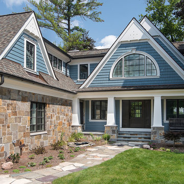
Originally built in the early twentieth century, this Orchard Lake cottage was purchased almost 10 years ago by a wonderful couple—empty nesters with an appreciation for stunning views, modern amenities and quality craftsmanship. They hired MainStreet Design Build to design and remodel their home to fit their needs exactly.
Upon initial inspection, it was apparent that the original home had been modified over the years, sustaining multiple room additions. Consequently, this mid-size cottage home had little character or cohesiveness. Even more concerning, after conducting a thorough inspection, it became apparent that the structure was inadequate to sustain major modifications. As a result, a plan was formulated to take the existing structure down to its original floor deck.
The clients’ needs that fueled the design plan included:
-Preserving and capitalizing on the lake view
-A large, welcoming entry from the street
-A warm, inviting space for entertaining guests and family
-A large, open kitchen with room for multiple cooks
-Built-ins for the homeowner’s book collection
-An in-law suite for the couple’s aging parents
The space was redesigned with the clients needs in mind. Building a completely new structure gave us the opportunity to create a large, welcoming main entrance. The dining and kitchen areas are now open and spacious for large family gatherings. A custom Grabill kitchen was designed with professional grade Wolf and Thermador appliances for an enjoyable cooking and dining experience. The homeowners loved the Grabill cabinetry so much that they decided to use it throughout the home in the powder room, (2) guest suite bathrooms and the laundry room, complete with dog wash. Most breathtaking; however, might be the luxury master bathroom which included extensive use of marble, a 2-person Maax whirlpool tub, an oversized walk-in-shower with steam and bench seating for two, and gorgeous custom-built inset cherry cabinetry.
The new wide plank oak flooring continues throughout the entire first and second floors with a lovely open staircase lit by a chandelier, skylights and flush in-wall step lighting. Plenty of custom built-ins were added on walls and seating areas to accommodate the client’s sizeable book collection. Fitting right in to the gorgeous lakefront lot, the home’s exterior is reminiscent of East Coast “beachy” shingle-style that includes an attached, oversized garage with Mahogany carriage style garage doors that leads directly into a mud room and first floor laundry.
These Orchard Lake property homeowners love their new home, with a combined first and second floor living space totaling 4,429 sq. ft. To further add to the amenities of this home, MainStreet Design Build is currently under design contract for another major lower-level / basement renovation in the fall of 2017.
Kate Benjamin Photography
 New England Design & Construction
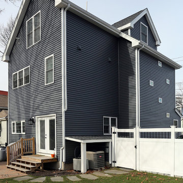
This project enabled the client to stay in a thriving neighborhood that they loved by growing the size their 1836 home to accommodate the needs of a modern family. NEDC accomplished this by razing an existing inadequate second story that housed two bedrooms and constructing one and a half new stories above the existing first floor -- creating a four bedroom + Office/2.5 bath home from a 2 bedroom/1 bath home.
Photography by Jay Groccia at OnSite Studios
 Renovisions
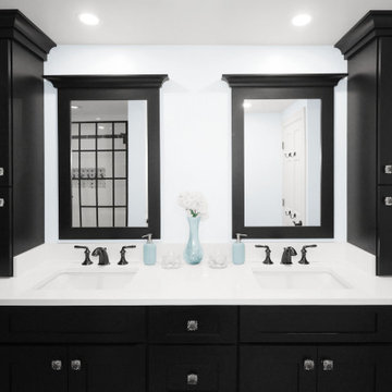
Perectly balanced, this dramatic black and white bathroom is a stunner. Thoughtful design was top of mind for these clients as they approached the Renovisions team to help narrow down their choices and bring it to life. Finding balance while mixing darker, heavier black finishes and lighter, white finishes was the task at hand and the goal was to create a modern look with an industrial/rustic feel.
The challenge on this project was incorporating all the desired elements and products in a tight spatial constraint of 9’ x 7.5’. The clients biggest concern in the old bathroom was inadequate storage, tired and under-utilized bathtub and they also needed an additional sink for their two daughters who often share this space. Renovisions recommended removing the wall between the shower and closet to gain additional floor space as you enter the bath, while providing wall space for the three towel bars.
Collaborating with the clients and searching to find the right fixtures paid off nicely. This newly remodeled Renovision accommodated two rectangular sinks, a walk-in shower with hand-held shower, wall-mounted shower head and two soft spray body jets. The oil-rubbed bronze fixtures not only provided a luxurious spa experience, but also added warmth and softness to the vintage feel. The glass shower enclosure is trimmed in a matte black grid that boasts an industrial aesthetic with retro feel while delivering modernistic function. It’s unique in appearance while allowing the chic white subway and black and white diamond tile to peek through.
The beautifully designed cabinetry in a matte black painted finish provides plenty of storage. This smart configuration included two banks of three drawers for toiletries and accessories, two towers with adjustable shelves for towels and two ‘garage’ doors for hair dryers.
Another unique design detail to capture attention was the black and white curvy geometric floor tile which plays off the straight lines of the cabinets and square grids of the shower enclosure.
The clients are thrilled with the results and their modern, high-contrast styled digs – a true customized relaxation sanctuary for the entire family.
 Renovisions
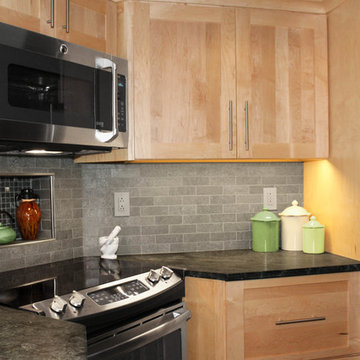
This kitchen had not been renovated since the salt box colonial house was built in the 1960’s. The new owner felt it was time for a complete refresh with some traditional details and adding in the owner’s contemporary tastes.
At initial observation, we determined the house had good bones; including high ceilings and abundant natural light from a double-hung window and three skylights overhead recently installed by our client. Mixing the homeowners desires required the skillful eyes of Cathy and Ed from Renovisions. The original kitchen had dark stained, worn cabinets, in-adequate lighting and a non-functional coat closet off the kitchen space. In order to achieve a true transitional look, Renovisions incorporated classic details with subtle, simple and cleaner line touches. For example, the backsplash mix of honed and polished 2” x 3” stone-look subway tile is outlined in brushed stainless steel strips creating an edgy feel, especially at the niche above the range. Removing the existing wall that shared the coat closet opened up the kitchen to allow adding an island for seating and entertaining guests.
We chose natural maple, shaker style flat panel cabinetry with longer stainless steel pulls instead of knobs, keeping in line with the clients desire for a sleeker design. This kitchen had to be gutted to accommodate the new layout featuring an island with pull-out trash and recycling and deeper drawers for utensils. Spatial constraints were top of mind and incorporating a convection microwave above the slide-in range made the most sense. Our client was thrilled with the ability to bake, broil and microwave from GE’s advantium oven – how convenient! A custom pull-out cabinet was built for his extensive array of spices and oils. The sink base cabinet provides plenty of area for the large rectangular stainless steel sink, single-lever multi-sprayer faucet and matching filtered water dispenser faucet. The natural, yet sleek green soapstone countertop with distinct white veining created a dynamic visual and principal focal point for the now open space.
While oak wood flooring existed in the entire first floor, as an added element of color and interest we installed multi-color slate-look porcelain tiles in the kitchen area. We also installed a fully programmable floor heating system for those chilly New England days. Overall, out client was thrilled with his Mission Transition.
 Murphy Bros. Design | Build | Remodel
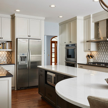
At 30 years of age honey oak trim and cabinetry easily goes from dated to unsightly. Such was the case with these homeowners who had wanted to chuck the traditional look of oak for more years than they care to think about.
“It wasn’t just about the honey oak,” explains Murphy Bros. design/build consultant Courtney Cartee, “Although that was a big part of it. The overall end goal was a lighter, brighter ambiance, better workflow and a complete rethink on dinning space.”
Most kitchens of that 90’s era featured inadequate lighting and small islands or peninsulas. In this particular case, the homeowners even wanted to eliminate the traditional family breakfast table.
 Rolf Schroeder General Contractors, Inc.
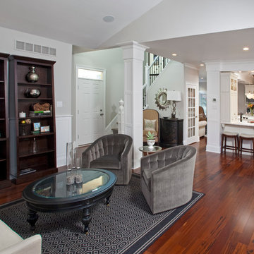
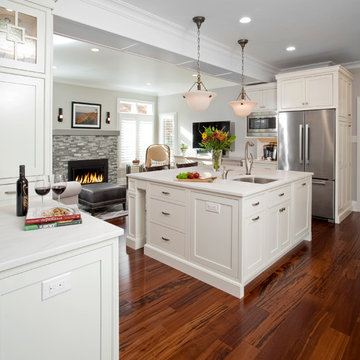
The layout of this early 90’s home was adequate for the husband when he was just living there. However, now the family of three and their loving cat live there together; the space quickly became confined and inadequate. The Clients contacted us to discuss what their options may be to help the home feel more spacious. After a few weeks of design and engineering, we went to work on opening up the first floor to increase the size of the rooms while creating continuity with the adjoining rooms. A once tired and confined layout became a spacious, comfortable, & aesthetically pleasing space to live and entertain.
 Rolf Schroeder General Contractors, Inc.
The layout of this early 90’s home was adequate for the husband when he was just living there. However, now the family of three and their loving cat live there together; the space quickly became confined and inadequate. The Clients contacted us to discuss what their options may be to help the home feel more spacious. After a few weeks of design and engineering, we went to work on opening up the first floor to increase the size of the rooms while creating continuity with the adjoining rooms. A once tired and confined layout became a spacious, comfortable, & aesthetically pleasing space to live and entertain.
 Margot Hartford Photography
Photo: Margot Hartford © 2017 Houzz
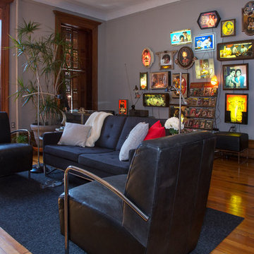
Living room - eclectic living room idea in New York
Living room - eclectic living room idea in New York
 Irena Spencer Interiors Inc.
Pavel Bendov Photography
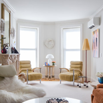
Example of an eclectic enclosed living room design in New York with white walls, a standard fireplace, a stone fireplace and no tv
Example of an eclectic enclosed living room design in New York with white walls, a standard fireplace, a stone fireplace and no tv
 Rolf Schroeder General Contractors, Inc.
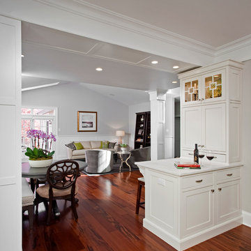
The layout of this early 90’s home was adequate for the husband when he was just living there. However, now the family of three and their loving cat live there together; the space quickly became confined and inadequate. The Clients contacted us to discuss what their options may be to help the home feel more spacious. After a few weeks of design and engineering, we went to work on opening up the first floor to increase the size of the rooms while creating continuity with the adjoining rooms. A once tired and confined layout became a spacious, comfortable, & aesthetically pleasing space to live and entertain.
 Renovisions
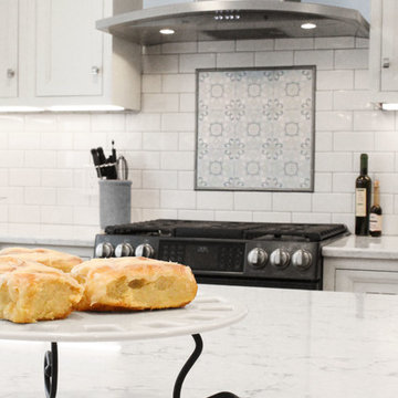
This client requested that we design her new kitchen space to look and function with her and her family’s usage in mind. She was not happy with her existing kitchen due to builder-grade ceramic flooring, lack of countertop space, poor lighting, inadequate and unorganized storage and the closed off feel of the area. Renovisions resolved all of these issues by designing and building an impressive, transitional styled kitchen; delivering a beautifully well thought-out space that provides a multi-functional approach and meets the needs of this busy and dynamic household.
Typically, we encounter challenges in every project, and this was no different. The upstairs bathroom plumbing ran across the entire length of the kitchen sink wall and it was necessary to work with it by moving the plumbing as far up as possible and then building a soffit to hide it.
Creating a space that has a more open feel was top of mind for our client. Installing a new wood floor that matched the existing dining room floor helped with this and in addition, warmed up the room. By relocating the refrigerator to the opposite wall and adding a bar area at the end toward the family room, the flow of traffic for family members and guests became more managed.
The open floor plan allowed for additional island cabinets to accommodate smart storage and better functionality when prepping meals, sitting to eat or gathering with friends and family. We believe having ample countertop surface space is a critical improvement in any renovation and this particular project now boasts a large countertop area with a stunning wide vein pattern that accentuates the design instead of overpowering it. The soft look of the Blanco Arabescato quartz enhances the space and looks lovely with the white inset styled cabinetry.
Beauty and function go hand-in-hand in this kitchen with several exceptional elements such as under-cabinet lighting with dimmers to control the mood light. Glass doors were added to the wall cabinets which flank the wine rack for displaying their decorative glassware and a beverage cooler below provided added convenience and access to cold beverages. The GE Café line of appliances in ‘Slate’ and ‘Stainless Steel’ finishes are a stunning contrast here.
The sensational looking decorative marble 6”x6” backsplash tile over the gas range and in the bar area creates nice focal points by creating a unique look for her that family and guests love.
Convenient and functional elements were added such as a blind corner pull-out for easier pot/pan storage, a sweep-o-vac under cabinet vacuum system for those constant quick clean-ups, a pull-out caddy under the sink base for storage of cleaning products and a protective mat to collect potential spills.
Our client let us know it was time for a change and we listened. She shared a few pictures she loved from a home magazine, we shared our insight and then designed/built the kitchen of her dreams! … A fabulous and functional space.
 Rolf Schroeder General Contractors, Inc.
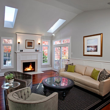
The layout of this early 90’s home was adequate for the husband when he was just living there. However, now the family of three and their loving cat live there together; the space quickly became confined and inadequate. The Clients contacted us to discuss what their options may be to help the home feel more spacious. After a few weeks of design and engineering, we went to work on opening up the first floor to increase the size of the rooms while creating continuity with the adjoining rooms. A once tired and confined layout became a spacious, comfortable, & aesthetically pleasing space to live and entertain.
 Rolf Schroeder General Contractors, Inc.
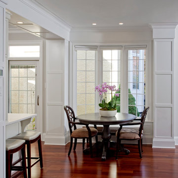
The layout of this early 90’s home was adequate for the husband when he was just living there. However, now the family of three and their loving cat live there together; the space quickly became confined and inadequate. The Clients contacted us to discuss what their options may be to help the home feel more spacious. After a few weeks of design and engineering, we went to work on opening up the first floor to increase the size of the rooms while creating continuity with the adjoining rooms. A once tired and confined layout became a spacious, comfortable, & aesthetically pleasing space to live and entertain.
 Design Connection, Inc.
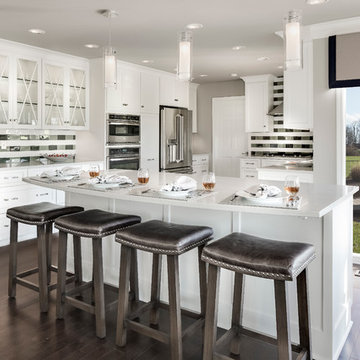
Overland Park Interior Designer, Arlene Ladegaard of Design Connection, Inc., was brought into this remodeling project by the client who wanted to update his 1980’s home which sits on a beautiful property, but which had an interior that was severely dated.
Prior to the remodel, this kitchen had dated oak cabinets, old counters, antiquated appliances, and inadequate storage. Ladegaard considered the client’s desire to lighten the kitchen, and transformed the space with the aid of Brackman Construction. A load bearing wall was removed to open the space to the great room, and a new large island was added… perfect for entertaining.
Aside from the beautiful aesthetics of gray glass staggered tile on the back splash, new quartz counters, gorgeous new appliances, and updated modern lighting, one of Ladegaard’s main considerations in planning this kitchen, was the client’s need for more storage. Cabinets were designed in both the kitchen, and the adjoining laundry/pantry area, where storage was highly customized and made to suit the specific needs of the client. Upon completion of the project, the client is thrilled with the major updates to this functional space.
Design Connection Inc. of Overland Park provided: Kitchen plans and elevations, material selections, appliances selections, detailed materials key for the contractor and project management.
 Renovisions
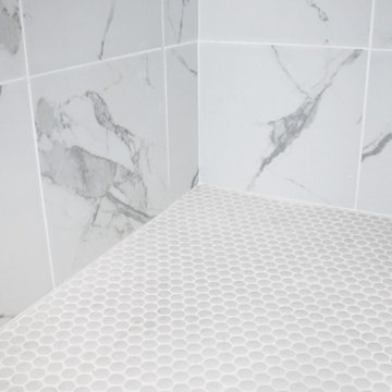
This South Shore of Boston client approached the team of Renovisions to remodel her existing basement bathroom. This bath, with an outdated fiberglass shower stall was cracked and leaking into the concrete floor below. The room had inadequate storage, was dark and did not boost this home’s overall market value.
It was definitely time for a Renovision and the client was excited to get started! She was looking forward to sharing the new space with guests that stay at her home and use the bathroom often.
Working alongside this client was fun and productive as great design and product choices were selected together. In the design process, Renovisions presented a unique idea; using the basement foundation ledge for a shelf that ran into the shower area, gaining extra space for shampoos and soaps, eliminating the need for a niche. Another great idea was to implement a Grohe Smart Control valve which brings this shower experience to another level; they can choose ways to spray with the right degree of warmth. The stunning stream-lined shower trims in brushed nickel finish match the style and finish on the single-lever vanity faucet.
The contrasting dark grey, large format porcelain floor tile’s texture resembles a linen-look pattern the client requested while complimenting the darker veining in the quartz curb, shelf and vanity countertop.
The Carrera-look porcelain shower wall tiles boast no-maintenance and provides a clean, brighter appeal seen through the beautiful custom shower glass enclosure. We lightened up the bath with a light blue paint color which added a fresh look, giving the illusion of a bigger space.
As you can see, with the right colors, textures and accessories, we transformed this basement bath from Drab to Fab. The client was thrilled with her basement Renovision, a true Breath of Fresh Flair’!
 Renovisions
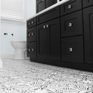
Perectly balanced, this dramatic black and white bathroom is a stunner. Thoughtful design was top of mind for these clients as they approached the Renovisions team to help narrow down their choices and bring it to life. Finding balance while mixing darker, heavier black finishes and lighter, white finishes was the task at hand and the goal was to create a modern look with an industrial/rustic feel.
The challenge on this project was incorporating all the desired elements and products in a tight spatial constraint of 9’ x 7.5’. The clients biggest concern in the old bathroom was inadequate storage, tired and under-utilized bathtub and they also needed an additional sink for their two daughters who often share this space. Renovisions recommended removing the wall between the shower and closet to gain additional floor space as you enter the bath, while providing wall space for the three towel bars.
Collaborating with the clients and searching to find the right fixtures paid off nicely. This newly remodeled Renovision accommodated two rectangular sinks, a walk-in shower with hand-held shower, wall-mounted shower head and two soft spray body jets. The oil-rubbed bronze fixtures not only provided a luxurious spa experience, but also added warmth and softness to the vintage feel. The glass shower enclosure is trimmed in a matte black grid that boasts an industrial aesthetic with retro feel while delivering modernistic function. It’s unique in appearance while allowing the chic white subway and black and white diamond tile to peek through.
The beautifully designed cabinetry in a matte black painted finish provides plenty of storage. This smart configuration included two banks of three drawers for toiletries and accessories, two towers with adjustable shelves for towels and two ‘garage’ doors for hair dryers.
Another unique design detail to capture attention was the black and white curvy geometric floor tile which plays off the straight lines of the cabinets and square grids of the shower enclosure.
The clients are thrilled with the results and their modern, high-contrast styled digs – a true customized relaxation sanctuary for the entire family.
 HUDSON DESIGN Architecture & Construction Mgmt
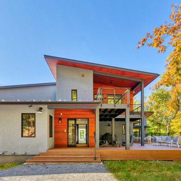
Mid-sized gray two-story stucco house exterior photo in New York with a shed roof, a metal roof and a black roof
4