Search results for "Inadvertently" in Home Design Ideas

Eat-in kitchen - large contemporary l-shaped light wood floor and beige floor eat-in kitchen idea in Seattle with an undermount sink, flat-panel cabinets, light wood cabinets, quartzite countertops, green backsplash, ceramic backsplash, stainless steel appliances, an island and gray countertops

shower is a great focal point with an entire wall of the mosaic tile that is used as a border on the adjacent wall
Example of a mid-sized classic master ceramic tile alcove shower design in St Louis with shaker cabinets, dark wood cabinets and an integrated sink

This huge sectional from West Elm (it’s 13 feet long!!) gives plenty of seating and fills the space. It turned out that the cats liked the new sofa as much as the humans… not good. So the homeowner brilliantly layered a few Mexican blankets and a sheepskin over the cushions and arms of the sofa to protect it from the cats, and inadvertently added a level of bohemian texture and pattern to the room that is absolutely fantastic!
Find the right local pro for your project

MillerRoodell Architects // Gordon Gregory Photography
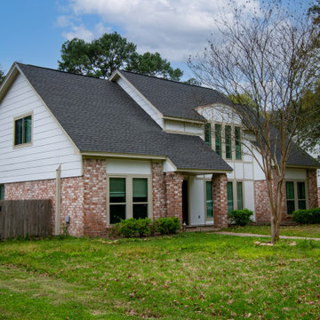
Mountain style brown one-story wood gable roof photo in Other with a shingle roof

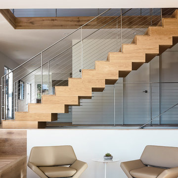
Clear Vertical grain douglas fir walls and ceiling. Custom walnut railcap with reveal tops the pony wall down the stairs to the great room.
Flooring is European oak in a UV oil finish by Amazon wood flooring - Modani series

DILLON KYLE ARCHITECTS OFFICE BUILDING GIVES THE WOW FACTOR WITH ACCOYA
PROJECT DETAILS
Building Type: Office Building
Completed: 2018
Architect: Dillon Kyle Architects
Supplier: Universal Forest Products
Millwork Shop: S&S Constructors
Installer: Arista Construction
Over the years, the Houston Museum District located in the Montrose neighborhood has morphed from a residential area into a lively art district, home to art galleries, museums, and aesthetically distinct buildings. When Dillon Kyle Architects set out to design their new office space across the street from the Houston Center for Photography, they needed creative solutions to fit a 5,000 square foot building plus parking on the lot’s small unique space.
The three-story building takes the form of an inverted L, a configuration that allows for maximized parking on the narrow corner lot. The cantilever space was built to shade the cars from the hot Texas sun, while also creating a semi-public place that invites pedestrians to interact with the space and peer inside as they walk through the neighborhood.
The interior design includes open ceilings, concrete walls, wood floors, residential scale furnishings and rugs and warm, neutral colors for a more industrial tone. The exterior has a commercial boxy look, so the team looked for creative cladding finishes to wrap the building and also serve as a rainscreen. After dismissing glass and papier-mâché options, the team settled on wood – Accoya® wood. “The idea was to use a material where you couldn’t tell where the patterns started and stopped, just one big continuous object,” said Peter Klein, architect at DKA.
An abstract leaf-like pattern is carved into 2,500 eight-foot long by eight-inches tall and 11/16-inches in depth, Accoya wood boards wrapping the entire building. The leaf pattern serves as a gentle reference to the live oak trees that line the neighborhood. The rainscreen is made of G80 galvanized steel sheets offset from the building with the Accoya leaf boards attached to it. “We settled on wood, and specifically Accoya wood, because it is easy to mill, and we knew we were going to leave it unsealed,” said Klein.
Because DKA had time, they inadvertantly put Accoya wood to the test by installing a four foot by eight foot sample wall on site. They watched the sample weather to a nice gray patina, which was the desired result. “Even left untreated, it didn’t warp or mildew or mold, and that let us know we were on the right path,” added Klein. The neutral gray tones coupled with its longterm durability, resistance to rot and insects made Accoya wood the ideal material for this project.
The Accoya wood pieces were milled using a CNC machine, which programmed the patterns. Arista Construction and its crew installed the pieces and they “knocked it out of the park,” according to DKA Architects

DILLON KYLE ARCHITECTS OFFICE BUILDING GIVES THE WOW FACTOR WITH ACCOYA
PROJECT DETAILS
Building Type: Office Building
Completed: 2018
Architect: Dillon Kyle Architects
Supplier: Universal Forest Products
Millwork Shop: S&S Constructors
Installer: Arista Construction
Over the years, the Houston Museum District located in the Montrose neighborhood has morphed from a residential area into a lively art district, home to art galleries, museums, and aesthetically distinct buildings. When Dillon Kyle Architects set out to design their new office space across the street from the Houston Center for Photography, they needed creative solutions to fit a 5,000 square foot building plus parking on the lot’s small unique space.
The three-story building takes the form of an inverted L, a configuration that allows for maximized parking on the narrow corner lot. The cantilever space was built to shade the cars from the hot Texas sun, while also creating a semi-public place that invites pedestrians to interact with the space and peer inside as they walk through the neighborhood.
The interior design includes open ceilings, concrete walls, wood floors, residential scale furnishings and rugs and warm, neutral colors for a more industrial tone. The exterior has a commercial boxy look, so the team looked for creative cladding finishes to wrap the building and also serve as a rainscreen. After dismissing glass and papier-mâché options, the team settled on wood – Accoya® wood. “The idea was to use a material where you couldn’t tell where the patterns started and stopped, just one big continuous object,” said Peter Klein, architect at DKA.
An abstract leaf-like pattern is carved into 2,500 eight-foot long by eight-inches tall and 11/16-inches in depth, Accoya wood boards wrapping the entire building. The leaf pattern serves as a gentle reference to the live oak trees that line the neighborhood. The rainscreen is made of G80 galvanized steel sheets offset from the building with the Accoya leaf boards attached to it. “We settled on wood, and specifically Accoya wood, because it is easy to mill, and we knew we were going to leave it unsealed,” said Klein.
Because DKA had time, they inadvertantly put Accoya wood to the test by installing a four foot by eight foot sample wall on site. They watched the sample weather to a nice gray patina, which was the desired result. “Even left untreated, it didn’t warp or mildew or mold, and that let us know we were on the right path,” added Klein. The neutral gray tones coupled with its longterm durability, resistance to rot and insects made Accoya wood the ideal material for this project.
The Accoya wood pieces were milled using a CNC machine, which programmed the patterns. Arista Construction and its crew installed the pieces and they “knocked it out of the park,” according to DKA Architects

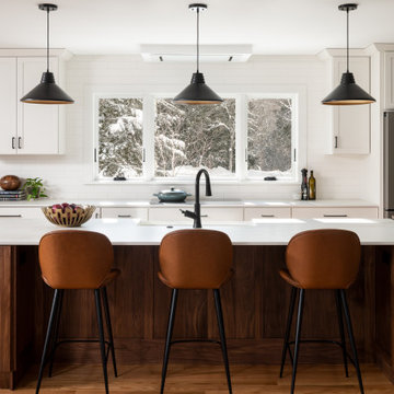
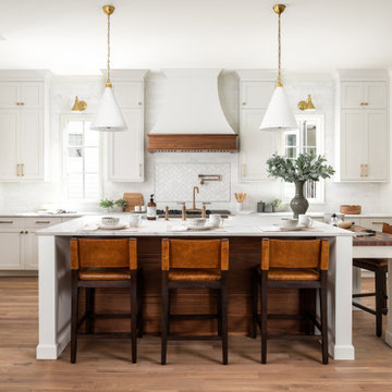
Frosted glass triple sliding door pantry room. Island is 13 feet long. Custom walnut cabinetry and floating shelves. Island features sleek electric Jenn Air cooktop with a telescoping downdraft ventilation system.
Jenn Air JJW2830WS double convection oven
EPCO aluminum drawer pulls, Quartz countertops from ONE Quartz SIMPLY WHITE
NQ76. Minimal backsplash with simple a 1" quartz curb.
Flooring is European oak in a UV oil finish by Amazon wood flooring - Modani series

When you love something and you realize after years, you’ve inadvertently put that away, a good designer will help you bring that back out. That was Turnstyle’s responsibility here with this recent client project: bring back the joy of spending time in a home library. This space is precious to me, because I’ve known it for all the many years I’ve been working on this home. It sits proudly in the center of the house, greeting people upon entry, and, in my opinion, was a jewel box ready to receive its shine. We blew through a wall to allow it a more spacious entrance, helping anyone who visits to immediately see the stunning on-the-lake view. I applied custom wall to wall antique glass to each wall, floor to ceiling, to enhance the view, make the walls feel like they fall away, and also reflect all the now beautiful art and furniture pieces as part of its new design. Influences from things gathered, stunning reworked furniture from the 1970s and all around functional hero items, allow for better working. The main push residing in really enabling quality time there. This space is open is now refreshing and full of beautiful objects and memorabilia. An inspiring place to contemplate, one is surrounded, and influenced, by a strong, fully fleshed out space through my extensive love of pattern, color and unusual combinations.

What had been the family summer “camp” on the lake for many years was to become a summer “home” for the owners in their retirement years. After meeting the requirements for rebuilding at waters edge, the couple focused on their next big requirement: a wonderful kitchen. This kitchen would be part of a single living space that combines the kitchen, dining and sitting areas. They wanted a beautiful, warm, inviting kitchen where they could enjoy their family, a kitchen that would take advantage of views of the lake, a kitchen that would be especially functional for one or more cooks and helpers -- and make it the perfect shade of yellow, please!
While they thought they wanted a kitchen with an island that overlooked the rest of the living space, their designer suggested a U-shaped design. A peninsula would minimize the concern that someone would inadvertently miss the edge of the two steps down to the lower living/dining area. It would also give them a kitchen that would allow for things on their wish list: a mantle style hood, a large window at the back of the house, countertop seating and lots of storage.
Placing the stove and mantle hood in the corner of the room created space for the large window, and opened up space for high quality storage with uninterrupted lengths of countertop. Rather than competing with the windows and the views, the high style of the mantle hood complements and balances the entire space. Glass was added to the upper section of the wall cabinets. They continue the effect of the transom windows and provide for display of pottery that had been collected over the years.
The sink was strategically positioned on the peninsula so that during food preparation or clean up there are views to the lake -- and the opportunity to socialize with people gathered at the countertop or in the living/dining area! Countertop seating was created by angling the extended Shivakashi granite countertop back into the kitchen and away from the steps. A third chair pulls up to the end of the countertop. It’s the favorite seat in the house!
The kitchen in this rebuilt lakeside home is being enjoyed and loved in its perfect shade of yellow – magically named “Full Moon”.

When you love something and you realize after years, you’ve inadvertently put that away, a good designer will help you bring that back out. That was Turnstyle’s responsibility here with this recent client project: bring back the joy of spending time in a home library. This space is precious to me, because I’ve known it for all the many years I’ve been working on this home. It sits proudly in the center of the house, greeting people upon entry, and, in my opinion, was a jewel box ready to receive its shine. We blew through a wall to allow it a more spacious entrance, helping anyone who visits to immediately see the stunning on-the-lake view. I applied custom wall to wall antique glass to each wall, floor to ceiling, to enhance the view, make the walls feel like they fall away, and also reflect all the now beautiful art and furniture pieces as part of its new design. Influences from things gathered, stunning reworked furniture from the 1970s and all around functional hero items, allow for better working. The main push residing in really enabling quality time there. This space is open is now refreshing and full of beautiful objects and memorabilia. An inspiring place to contemplate, one is surrounded, and influenced, by a strong, fully fleshed out space through my extensive love of pattern, color and unusual combinations.

What had been the family summer “camp” on the lake for many years was to become a summer “home” for the owners in their retirement years. After meeting the requirements for rebuilding at waters edge, the couple focused on their next big requirement: a wonderful kitchen. This kitchen would be part of a single living space that combines the kitchen, dining and sitting areas. They wanted a beautiful, warm, inviting kitchen where they could enjoy their family, a kitchen that would take advantage of views of the lake, a kitchen that would be especially functional for one or more cooks and helpers -- and make it the perfect shade of yellow, please!
While they thought they wanted a kitchen with an island that overlooked the rest of the living space, their designer suggested a U-shaped design. A peninsula would minimize the concern that someone would inadvertently miss the edge of the two steps down to the lower living/dining area. It would also give them a kitchen that would allow for things on their wish list: a mantle style hood, a large window at the back of the house, countertop seating and lots of storage.
Placing the stove and mantle hood in the corner of the room created space for the large window, and opened up space for high quality storage with uninterrupted lengths of countertop. Rather than competing with the windows and the views, the high style of the mantle hood complements and balances the entire space. Glass was added to the upper section of the wall cabinets. They continue the effect of the transom windows and provide for display of pottery that had been collected over the years.
The sink was strategically positioned on the peninsula so that during food preparation or clean up there are views to the lake -- and the opportunity to socialize with people gathered at the countertop or in the living/dining area! Countertop seating was created by angling the extended Shivakashi granite countertop back into the kitchen and away from the steps. A third chair pulls up to the end of the countertop. It’s the favorite seat in the house!
The kitchen in this rebuilt lakeside home is being enjoyed and loved in its perfect shade of yellow – magically named “Full Moon”.

When you love something and you realize after years, you’ve inadvertently put that away, a good designer will help you bring that back out. That was Turnstyle’s responsibility here with this recent client project: bring back the joy of spending time in a home library. This space is precious to me, because I’ve known it for all the many years I’ve been working on this home. It sits proudly in the center of the house, greeting people upon entry, and, in my opinion, was a jewel box ready to receive its shine. We blew through a wall to allow it a more spacious entrance, helping anyone who visits to immediately see the stunning on-the-lake view. I applied custom wall to wall antique glass to each wall, floor to ceiling, to enhance the view, make the walls feel like they fall away, and also reflect all the now beautiful art and furniture pieces as part of its new design. Influences from things gathered, stunning reworked furniture from the 1970s and all around functional hero items, allow for better working. The main push residing in really enabling quality time there. This space is open is now refreshing and full of beautiful objects and memorabilia. An inspiring place to contemplate, one is surrounded, and influenced, by a strong, fully fleshed out space through my extensive love of pattern, color and unusual combinations.

When you love something and you realize after years, you’ve inadvertently put that away, a good designer will help you bring that back out. That was Turnstyle’s responsibility here with this recent client project: bring back the joy of spending time in a home library. This space is precious to me, because I’ve known it for all the many years I’ve been working on this home. It sits proudly in the center of the house, greeting people upon entry, and, in my opinion, was a jewel box ready to receive its shine. We blew through a wall to allow it a more spacious entrance, helping anyone who visits to immediately see the stunning on-the-lake view. I applied custom wall to wall antique glass to each wall, floor to ceiling, to enhance the view, make the walls feel like they fall away, and also reflect all the now beautiful art and furniture pieces as part of its new design. Influences from things gathered, stunning reworked furniture from the 1970s and all around functional hero items, allow for better working. The main push residing in really enabling quality time there. This space is open is now refreshing and full of beautiful objects and memorabilia. An inspiring place to contemplate, one is surrounded, and influenced, by a strong, fully fleshed out space through my extensive love of pattern, color and unusual combinations.
1