
Search results for "Incidence" in Home Design Ideas

 Legendary Escapes Pools
This project began as a wilderness retreat for the homeowners at their rural estate. They already had a large outdoor area complete with a pond, and detached garage in the perfect location to tie into an outdoor entertaining area/kitchen for the swimming pool. The homeowners were hoping that the design team at Legendary Escapes could create something magical for their small grandchildren, and for the grownups to enjoy for summertime relaxation.
When the discussion turned to themes, the cartoon SpongeBob came up, and our team found a direction to go, either to the homeowners delight, possibly mixed with a bit of apprehension at the thought of a cartoony theme as a result. We promised subtle surprise and delight - and the homeowner decided to let the team go with their vision. The pool is a very abundant sized swimming pool, much larger than the average residential swimming pool. The sunledge was also made larger after the pool layout, providing even more space for chairs and play area for small children.
The waterfall/slide combination also features a large grotto - themed and decorated with elements that remind visitors to the space of the lessons and themes of the cartoon. The castle is solid, carved concrete - mixed and sculpted on site and hand placed. As the waterfall began to take shape, the outside was created as a sand castle, providing the perfect whimsical backdrop for the slide, and accents including a pair of flipper outfitted legs of what we can only think is mermaid man.
One of the biggest surprises on this project came when Al found an old wooden boat at an auction, which he bought, took back to the job and cut it in half - creating the tail end of a boating incident, much like SpongeBob would have had when he missed the direction of the curve sign while out boating. (The joke in the show is that he can't ever get his drivers license because he doesn't know how to steer.) The other end of the boat became a vertical storage space for firewood or other pool side needs. The two parts of the boat became anchor pieces for what became the "wharf wall" which is the perfect area to lead people into the swimming pool retreat.
The pool has three different entertaining patio levels, including the lower wharf level, swim up bar and raised concrete counter at the deep end of the pool. The middle section of patio is perfect for relaxing and watching kids play in the pool with the deck jets and sun ledge, and the upper area is adjacent to the outdoor kitchen area, also designed and created out of concrete (carved timbers) as the cabinetry and under bar areas.
The pool was completed with ecoFinish on the sun ledge, interior of the spa, grotto and the slide. The main swimming area of the pool was vinyl liner, constructed in the special hybrid way of the team.
With the project complete, the homeowners and family thoroughly enjoyed their backyard retreat. Any hesitation at the initial theme ideas were fully appreciated as they developed along the way, with the final project a subtle blend of function and whimsy, meeting everything that they could have asked for in a backyard entertaining retreat. Their advice is to just trust Al and the team through the process, because the results will be more than you would ever hope for. If our team can help you create a backyard or custom retreat, which includes a pool and plenty of outdoor entertaining options to surprise and delight you and your family, please reach out to start your design discussions.
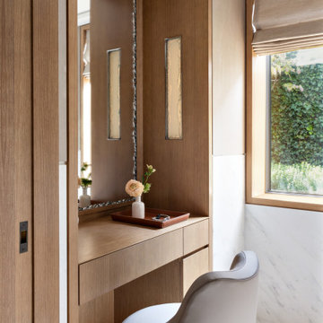
 Neumann & Rudy Architecture
**Spatial Composition & Architectural Volume**
This is an exercise in the architecture of the alcove — a vanity niche carved from a continuous run of full-height oak joinery, its recess reading less as furniture placed against a wall than as volume subtracted from mass. The composition is governed by a strict orthogonal discipline: the reveal-jointed cabinet stiles establish a vertical rhythm that the photographer's oblique sightline compresses into layered planes, while the cantilevered vanity slab introduces a single decisive horizontal that arrests the vertical drift. The niche is capped by a soffited overhead panel, giving the recess a deliberate lintel and lending the aperture the proportional gravitas of a doorway. Depth is orchestrated through nested framing: the pocketed sliding door in the foreground crops the scene, the joinery reveal frames the alcove, and the full-height mirror frames a reflected secondary volume — a window, a Roman shade, a second bloom — extending the room's apparent envelope well beyond its physical bounds. To the right, the plane pivots into a marble-clad wall and a deeply reveal-set casement whose broad oak jamb and stool are detailed with the same tectonic logic as the millwork, unifying opening and cabinetry into a single architectural grammar. Above, a recessed perimeter shadow-gap ceiling floats the plaster plane free of the wall, dematerializing the junction and heightening the sense of contained, cabin-like intimacy.
**Materiality, Color & Texture**
The palette is narrow, warm, and rigorously controlled — a study in tonal adjacency rather than contrast. Rift-sawn white oak dominates, its cathedral and straight-grain figure deliberately book-matched and run vertically to accentuate height, finished in a matte, low-sheen sealer that reads as raw yet refined; note the subtle chromatic modulation between the honeyed door leaves, the slightly cooler carcass panels, and the pale, almost bleached drawer fronts, a gradient that provides articulation without resorting to hue shift. Against this, the Calacatta- or Carrara-type marble wainscot introduces a cool, silvery counterpoint, its soft grey veining offering the only real graphic incident in the field. The mirror surround — a hand-cast, rope-twist metal frame in polished nickel or silvered bronze — supplies a jewel-like glint and a moment of organic, almost baroque relief against the sobriety of the flat panels, echoed in the pair of églomisé or reverse-painted glass insets set flush into the alcove wall like recessed cabochons. Textiles are handled with restraint: a raw-silk or textured linen Roman shade in a tobacco-taupe stacks in generous, softly rumpled folds, while the swivel chair is upholstered in a taut, sueded greige leather whose sculpted, scrolled back offers the room's most sensuous curve. The tan saddle-leather tray and the milk-glazed ceramic bud vase complete a haptic register that moves from cool stone to warm hide to matte ceramic to silken wood.
**Lighting, Atmosphere & Style Profile**
Illumination is almost entirely daylit and side-cast, with the diffused southern wash filtered through the linen shade to produce a luminous, shadowless bloom across the marble and a raking, grain-revealing light along the oak. The design conspicuously withholds decorative fixtures; instead, light is architecturalized — the églomisé panels flanking the mirror function as concealed backlit apertures, glowing softly to provide flattering vertical face-lighting at the vanity, while the perimeter ceiling reveal implies a cove source for ambient wash. This suppression of visible hardware is central to the atmosphere: serene, hushed, and hotel-like in its precision, yet domesticated by the flowers and the intimate scale of the nook. Stylistically the project synthesizes into a refined **Soft Minimalism with a couture-modernist inflection** — the reductive planarity and reveal-detailing of contemporary minimalism warmed by mid-century Scandinavian wood craft and elevated by discreet Art Deco–adjacent flourishes in the metalwork and glass. It is a vocabulary of quiet luxury, where value is signaled not through ornament but through the tolerances of the joinery, the calibration of tone-on-tone, and the confidence to let a single ranunculus carry the room's only note of chroma.
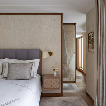 Neumann & Rudy Architecture
## I. Spatial Composition & Architectural Volume
This bedroom operates as an exercise in controlled asymmetry, its plan organized around a freestanding headboard wall that reads less as partition than as inhabited architecture. Framed in a crisp oak reveal that traces its full perimeter, the wall detaches from the ceiling plane and terminates short of the right-hand elevation, generating a threshold that draws the eye into a secondary corridor volume beyond. This device — the *poché* wall as spatial pivot — establishes a layered enfilade: the intimate sleeping zone in the foreground, a transitional dressing passage in the middle distance, and a slot of daylight at the terminus. The ceiling is articulated with a shallow recessed tray and delicate stepped cornice, a restrained gesture toward classical Parisian *moulure* that regulates the room's proportion without ornamental excess. Sightlines are deliberately choreographed: the bed sits low and horizontal, the joinery plinth of the nightstand cantilevers from the wall to preserve floor-plane continuity, and the herringbone parquet visible beyond the threshold introduces a directional pull that animates what would otherwise be a static rectilinear volume. The result is a composition of nested frames — millwork within millwork — that lends considerable depth to a comparatively compact footprint.
## II. Materiality, Color & Texture
The palette is tonal rather than chromatic, calibrated within a narrow band of oatmeal, greige, and pale putty, and enlivened almost entirely through surface incident. The dominant wallcovering — a vertically striated, marquetry-like textile of tessellated ivory and taupe fibers — supplies a subtle warp-and-weft rhythm that shifts under raking light, functioning as texture masquerading as pattern. Against this, rift-sawn white oak framing introduces a honeyed, gently reddish undertone, while the bespoke bedside cabinet deploys a radiating sunburst veneer in a blush-tinged walnut or eucalyptus, its book-matched geometry providing the room's single moment of overt figuration. Textiles carry the tonal counterweight: the channel-tufted headboard in a muted heather-aubergine linen offers the deepest saturation in the frame, cooling the prevailing warmth, while cotton percale with contrast tape borders, a slubbed lumbar cushion, and a hand-stitched matelassé coverlet with tambour scrollwork build a gradient of tactility from crisp to plush. The doorway's parchment-and-verdigris art panel — appearing as a gilded, oxidized *gessoed* screen — supplies a patinated, almost frescoed counterpoint, while unlacquered brass at the sconce introduces the only metallic warmth, deliberately restrained.
## III. Lighting, Atmosphere & Style Profile
Illumination is handled with notable discretion. Natural light enters obliquely from an off-frame source at right, filtered through a floor-to-ceiling striated linen drapery that diffuses rather than admits, producing an even, shadowless wash consistent with northern European daylight. A secondary aperture — the narrow vertical slot glimpsed down the corridor — acts as a luminous punctuation mark, terminating the sightline with a slender bar of brightness that draws the occupant forward. Artificial lighting is intentionally sparse and task-oriented: a brass scissor-arm sconce with an unbleached linen shade, adjustable and near-vernacular in its mechanism, provides articulated reading light while contributing a note of atelier informality against the otherwise refined joinery. The absence of visible downlights or decorative pendants reinforces the room's quietude. Stylistically, the scheme resolves into a sophisticated **Soft Minimalism** inflected with contemporary Parisian classicism — the restraint and tonal discipline of the former, the millwork rigor and proportional literacy of the latter, warmed by a *wabi*-adjacent appreciation for patina and handwork. It is a room that eschews statement in favor of atmosphere, achieving luxury through material intelligence and the calibrated withholding of contrast.
Find the right local pro for your project

 Lands End Development - Designers & Builders
Corner shower - mid-sized rustic 3/4 metal tile ceramic tile and brown floor corner shower idea in Minneapolis with flat-panel cabinets, medium tone wood cabinets, a two-piece toilet, orange walls, a console sink and white countertops

 Sidetex Company
Shake Siding Close Up A Cape Cod style house with Alside Pelican Bay cedar shake siding, Color: Cape Cod Gray. Installed by Sidetex in North Haven CT 06473
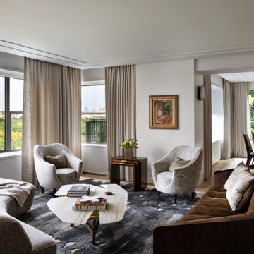 Neumann & Rudy Architecture
This is a quintessentially urban prewar-into-modern hybrid: a broad, laterally organized reception room whose principal architectural gesture is the corner glazing that dissolves two walls into a panoramic register of treetops and distant skyline. The plan reads as a series of soft, overlapping conversational precincts rather than a single axial arrangement — a pair of swivel-capable lounge chairs anchoring the window wall, a facing pair of high-backed tub chairs, and a deep tuxedo-profile sofa closing the composition toward the viewer — all orbiting an organically contoured cocktail table that performs as the room's centrifugal keystone. The ceiling is treated with a recessed reveal and shallow soffit that traces the perimeter, a device that both conceals drapery hardware and lifts the plane visually, granting the low-slung modern floor plate an unexpected sense of loft. A blade wall carrying a single framed canvas performs critical spatial work, terminating the living volume while permitting an enfilade sightline through to a secondary dining zone beyond, where a glazed wall of ivy-clad courtyard reads as a green tapestry. The geometry throughout is deliberately curvilinear — barrel-backed seating, amoeboid tabletops, splayed tapered legs — set against the orthogonal discipline of window mullions, drapery pleats, and rectilinear millwork, producing a productive tension between architectural rigor and furnishings that behave sculpturally.
**II. Materiality, Color & Texture**
The palette is a study in tonal restraint calibrated for maximum textural incident. Walls are finished in a matte, faintly striated plaster or grasscloth with a warm ecru undertone that absorbs rather than reflects light, establishing a neutral field against which every surface differential registers. Seating is upholstered in a lustrous chenille or crushed velvet of pale greige, whose short pile catches raking daylight and reads almost pearlescent, while the foreground sofa introduces a coarser boucle in an oatmeal register and the opposing sofa shifts decisively into a saturated tobacco-and-umber channel-tufted chenille, its French-polished rosewood or macassar ebony frame supplying the room's darkest, most reflective note. Stone is deployed with connoisseurial precision: the cocktail tables are honed alabaster or backlit-quality onyx, their translucent creamy strata and honey veining offering a warm mineral counterpoint to the cool, ink-washed abstraction of the hand-knotted area rug, which functions as a painterly ground — a gestural silver-and-charcoal wash pooling beneath the furniture. Bronze, patinated brass, and stainless accents appear in table bases, the vessel-form vase, and the sconce, providing metallic punctuation without gleam. Drapery in a heavy sand-toned linen, edged in a beaded or embroidered tape, softens the glazing perimeter and reinforces the room's tactile vocabulary of nap, weave, slub, and polish.
**III. Lighting, Atmosphere & Style Profile**
Natural light is the dominant luminous strategy: the corner glazing admits a soft, diffuse northern wash under overcast conditions, which the designer has intelligently accepted rather than resisted — the flat, shadowless quality flatters the velvet piles and plaster walls, and the drapery is stacked to admit maximum daylight while modulating glare at the jambs. Artificial sources are almost entirely concealed or decorative: a slim architectural sconce on the blade wall, a sculptural biomorphic table lamp in white lacquer or ceramic in the dining zone, and an extraordinary petal-form pendant in patinated metal that reads as an art object first and a fixture second. The resulting atmosphere is hushed, cerebral, and quietly patrician — a room of low chroma and high material intelligence, where drama is supplied by silhouette and surface rather than by color or ornament. Stylistically, the project synthesizes into what might best be termed **Modernist Salon** or **Warm Continental Minimalism**: the DNA of mid-century French decorative arts — Royère, Frank, Adnet — filtered through a contemporary sensibility of tonal layering and soft geometry, with an Art Deco undertow in the ebonized woods and channel tufting. It is a scheme of curatorial discipline: nothing is decorative for its own sake, the view is treated as the primary artwork, and every material is selected for how it behaves in light.
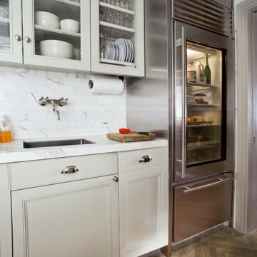 Neumann & Rudy Architecture
**I. Spatial Composition & Architectural Volume**
This is a galley-adjacent service zone — most likely a scullery or butler's pantry annexed to a primary kitchen — and its power derives from compression rather than expanse. The composition is organized along a single working wall that terminates abruptly in a full-height stainless volume, creating a deliberate collision of cabinetry rhythm and monolithic mass. The upper millwork establishes the governing geometry: a run of glazed-front wall cabinets with recessed shaker-profile stiles and rails, capped by a substantial crown assembly that reads as architectural cornice rather than applied trim. Within the second bay, the designer has inserted a period-correct plate rack with fluted vertical dividers and open glassware shelving, converting storage into ordered display and introducing a fine-grain vertical striation that counterpoints the broader panel field below. The base run answers with inset drawer fronts and applied-molding door panels, its cabinetry set on a shallow toe recess that lets the volume appear to float rather than plinth. The sightline is intentionally foreshortened: the eye travels the countertop plane eastward, is arrested by the refrigerator's tall stainless slab, then released through a sliver of hallway and door casing at the far right — a compressed reveal that implies circulation beyond and prevents the corridor from reading as a dead end. Ceiling height is inferred rather than shown, the cabinetry's soffit-scaled crown suggesting generous vertical proportion held in check by the room's narrow footprint.
**II. Materiality, Color & Texture**
The palette is a study in achromatic warmth, restrained to four principal materials and disciplined in its saturation. Cabinetry is finished in a soft greige-white — a putty-leaning off-white with faint green-grey undertone — applied in a low-sheen eggshell that absorbs rather than reflects, allowing the millwork profiles to be read through shadow rather than gloss. The backsplash is a honed marble subway field, laid in running bond with tight joints; its veining is delicate, feathered, and grey-toned, providing textural incident without pattern assertion. This continues seamlessly into the countertop, a thick marble slab with a squared eased edge and an integrated undermount trough sink, the material continuity from horizontal to vertical plane reinforcing the wall as a single stone-clad surface. Against this cool mineral field, the stainless steel refrigerator introduces an industrial register — brushed, directional, faintly grey-violet in its reflected light — while polished nickel hardware (bin pulls, cup pulls, knobs, and a wall-mounted bridge faucet with cross handles) supplies punctuating specular highlights at a consistent scale. The floor is the room's tonal anchor: white oak in a herringbone lay, fumed or grey-washed to a driftwood tone that reveals open grain and medullary ray figure. Small warm accents — a butcher-block cutting board with worn patina, amber glass bottles, a persimmon-toned bowl, the pale green of a champagne label — function as chromatic acupuncture within an otherwise desaturated field.
**III. Lighting, Atmosphere & Style Profile**
Illumination is layered and largely concealed. Ambient daylight enters obliquely from the left, raking across the marble backsplash at a low angle that mobilizes the honed surface's subtle relief and casts the cabinet door profiles into legible shadow. Undercabinet linear lighting washes the countertop and backsplash with a warm, low-kelvin pool, while the refrigerator's interior glazing performs as an unexpected internal lantern — a glowing vitrine that punctures the stainless slab and becomes the composition's focal luminance. This device is the image's most sophisticated gesture: it recasts a utilitarian appliance as an illuminated cabinet of curiosities, echoing the glass-front upper millwork on the opposite wall and completing a diagonal dialogue of lit transparency across the room. The resulting atmosphere is quiet, tempered, and quietly bourgeois — an interior of custodial calm rather than spectacle. Stylistically, the project synthesizes as a **contemporary Anglo-American scullery vernacular**: classical inset millwork and plate-rack joinery inherited from the pre-war service kitchen, reinterpreted through professional-grade stainless equipment, honed rather than polished stone, and a wire-brushed herringbone floor. Call it Refined Utilitarianism — a design position in which historical typology supplies the grammar, industrial hardware supplies the punctuation, and the near-monochrome palette allows craft, profile, and light to carry the entire expressive burden.

 Hueber Industries
This railing was the first planned update of the Fort Collins, CO couples home renovation. The wavy lines give the room a natural feel. Design and fabrication by Hueber Industries LLC. Photo: Rory Schaar.


 Neumann & Rudy Architecture
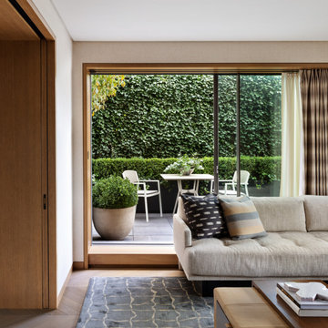
**I. Spatial Composition & Architectural Volume**
This interior operates on a strategy of framed extension, in which the room's perceived volume is borrowed from the garden beyond rather than asserted through internal grandeur. The composition is governed by a rigorous orthogonal discipline: a full-height sliding glazing system, set within a deep oak-lined reveal, functions as both aperture and proscenium, its slender mullions dividing the exterior into a triptych of vegetal planes. The generous depth of that reveal — expressed as a substantial threshold plinth and continuous jamb casing — reads less as trim than as tectonic gesture, giving weight and thickness to the enclosure and reinforcing the sense of a pavilion pressed against a green wall. To the left, a floor-to-ceiling pocketing door of book-matched, quarter-sawn oak establishes a monolithic vertical counterpoint, its recessed flush pull the only interruption of an otherwise uninflected plane; the shallow return of the wall beyond it creates a compressed entry sequence that releases into the primary volume. The flat, shadowless plaster ceiling maintains a neutral lid over the composition, while the furniture plan is deliberately low-slung and horizontal — a deep sectional set parallel to the glazing, a leather-topped ottoman, and a low occasional table — so that no element rises to compete with the sightline. Circulation is implied along the wall's edge, funnelling toward the terrace and its al fresco dining vignette, which acts as the room's terminal focal point and extends the interior axis outward.
**II. Materiality, Color & Texture**
The palette is a study in low-contrast tonal layering, calibrated within a narrow band of warm neutrals and animated almost entirely by the saturated chlorophyll green of the ivy screen. Rift-cut white oak, finished in a matte oil that reveals rather than glosses its medullary figure, provides the room's structural warmth — appearing in the joinery, the window surround, and the herringbone parquet, whose fine chevron rhythm introduces a subtle graphic pattern at foot level. Walls are treated in what appears to be a woven grasscloth or linen-effect wallcovering in a pale oatmeal tone, its faint horizontal striation catching raking light and lending textile softness to the perimeter. Against this, the seating is upholstered in a tightly woven, undyed linen-cotton blend with a biscuit-tufted seat platform, its slubbed irregularity a deliberate foil to the precision of the millwork. The cushion program provides the composition's only chromatic incident: an indigo-ground ikat or *kasuri* resist-dyed weave, with its blurred weft-broken banding, paired with a heavier blanket-stitched wool in glaucous blue-grey and buff stripes. Underfoot, a hand-knotted silk-and-wool rug in slate and mineral grey carries an attenuated ogee lattice, its lustrous pile providing cool relief beneath the warmer wood tones. The plinth-mounted travertine or reconstituted-stone planter — matte, porous, faintly chalky — and the honed grey stone paving beyond introduce lithic gravity, balancing the prevailing softness with a mineral edge.
**III. Lighting, Atmosphere & Style Profile**
Illumination here is almost entirely diurnal and indirect: north-oriented or hedge-filtered daylight arrives diffuse and green-cast, washing the space in a soft, even luminance that suppresses hard shadow and privileges texture over drama. The ivory sheer, hung on a discreet recessed track, tempers glare while retaining silhouette legibility, and the adjacent pinch-pleated overdrape in a taupe-bronze silk-blend — with its subtle vertical striation and slight sheen — offers the option of full blackout while contributing a note of drapery-weight formality. Artificial sources are conspicuously concealed; no decorative fixture interrupts the ceiling plane, implying a scheme of recessed low-glare downlights or perimeter cove washing designed to sustain the daytime ambience after dusk. The resulting atmosphere is one of composed reticence — quiet, tactile, and deeply oriented toward the garden. Stylistically, the project synthesises Japandi restraint (the pocketing timber plane, the shadow-gap detailing, the reverence for the framed view) with the material sensuality and drapery conventions of European Soft Modernism, yielding a warm minimalism in which luxury is communicated through joinery tolerance, textile hand, and the disciplined editing of the palette rather than through ornament or statement furniture. It is an interior conceived as a calm neutral ground — an armature for light, landscape, and the slow accretion of daily life.

 Mayita Dinos Garden Design
mayitadinosphotography.com
Design ideas for a tropical landscaping in Los Angeles.
Design ideas for a tropical landscaping in Los Angeles.

 Ehrlich Yanai Rhee Chaney Architects
The ground floor volumes wrapped in an elongated hand-fired brick, emphasizing the horizontality of the architecture that lays solidly on the land.
(Photography by: Matthew Millman)

 Caela McKeever
Photo: Caela McKeever © 2017 Houzz
Inspiration for an eclectic home design remodel in Seattle
Inspiration for an eclectic home design remodel in Seattle

 Stonelace Designs
Originally, the exterior of the Napa ranch residence was a standard knocked down stucco finish. We covered over the entire exterior of the house with a natural plaster product that has been made in Italy for centuries, known as Rialto or Vero. This product is a combination of slaked lime mixed with 60% reconstituted crushed marble dust. Quarried from the legendary Carrara marble mines. The finish itself is a vertically combed striated texture embedded into the plaster. While it cures, a transparent group of patinas are applied to the stone-like plaster substance to create a look of an aged villa.




 T.A. French - Custom Builder
Example of a mid-sized transitional dark wood floor and brown floor double front door design in Austin with gray walls and a black front door

 Charlen's Abstracts
This 30" x 24" abstract acrylic painting has been done in shades of cobalt blue, sky blue, citrine, chartreuse, white, soft sea green, and royal blue. Finished in gloss varnish to protect the piece from dust and UV light for years to come. Can be hung vertically or horizontally. Gorgeous vivid rich colors in a great contemporary style.
5