
Search results for "Including processes" in Home Design Ideas
 b9 architects
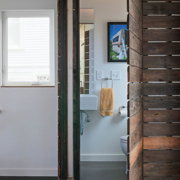
Our client’s goal was to create a small, high-performance, healthy home for herself and her teenage son while providing a place for her father to age in place. An attached private accessory dwelling provides a space for him as well as flexibility in the future. The new home was designed to minimize its footprint on site, made smaller than the original 1930’s house.
Embracing adaptability and efficiency, the residence includes two dwellings: a one-bedroom 795 square-foot accessory dwelling at the lower grade and a two-story 1330 square-foot primary dwelling located above. Involved in all aspects of project execution, our client oversaw the process by living in a used trailer parked in the backyard throughout the project’s construction. Family-Share focused on maximizing the footprint’s performance, access to natural light and the health of the occupants. Sustainable features include high-performance glazing, solar preheat for domestic and hot water in-floor heating and reclaimed fir car decking rainscreen siding.
 b9 architects
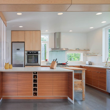
Our client’s goal was to create a small, high-performance, healthy home for herself and her teenage son while providing a place for her father to age in place. An attached private accessory dwelling provides a space for him as well as flexibility in the future. The new home was designed to minimize its footprint on site, made smaller than the original 1930’s house.
Embracing adaptability and efficiency, the residence includes two dwellings: a one-bedroom 795 square-foot accessory dwelling at the lower grade and a two-story 1330 square-foot primary dwelling located above. Involved in all aspects of project execution, our client oversaw the process by living in a used trailer parked in the backyard throughout the project’s construction. Family-Share focused on maximizing the footprint’s performance, access to natural light and the health of the occupants. Sustainable features include high-performance glazing, solar preheat for domestic and hot water in-floor heating and reclaimed fir car decking rainscreen siding.
 Alair Homes Chilliwack
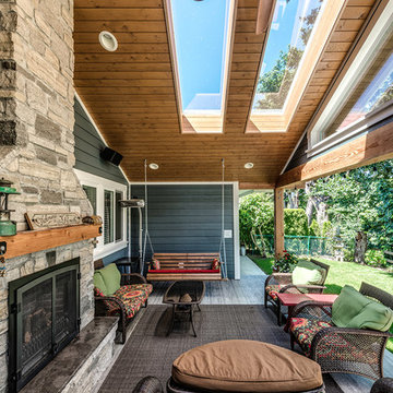
This was a challenging project for very discerning clients. The home was originally owned by the client’s father, and she inherited it when he passed. Care was taken to preserve the history in the home while upgrading it for the current owners. This home exceeds current energy codes, and all mechanical and electrical systems have been completely replaced. The clients remained in the home for the duration of the reno, so it was completed in two phases. Phase 1 involved gutting the basement, removing all asbestos containing materials (flooring, plaster), and replacing all mechanical and electrical systems, new spray foam insulation, and complete new finishing.
The clients lived upstairs while we did the basement, and in the basement while we did the main floor. They left on a vacation while we did the asbestos work.
Phase 2 involved a rock retaining wall on the rear of the property that required a lengthy approval process including municipal, fisheries, First Nations, and environmental authorities. The home had a new rear covered deck, garage, new roofline, all new interior and exterior finishing, new mechanical and electrical systems, new insulation and drywall. Phase 2 also involved an extensive asbestos abatement to remove Asbestos-containing materials in the flooring, plaster, insulation, and mastics.
Photography by Carsten Arnold Photography.
Find the right local pro for your project
 Alicia Torosian Design
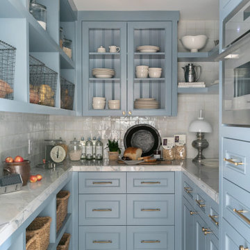
Windover project is a coastal traditional home located in Corona del Mar, California. The design process involved significant transformations, including moving walls and opening up the downstairs space. We turned what was the dining room into a Butler's pantry and office and took the formal living room and made in the new formal dining space. This home was such a special project to work on and we're so happy our clients love it as much as we do!
 Randy Angell Designs
The planning phase of this modern retreat was an intense collaboration that took place over the course of more than two years. While the initial design concept exceeded the clients' expectations, it also exceeded their budget beyond the point of comfort.
The next several months were spent modifying the design, in attempts to lower the budget. Ultimately, the decision was made that they would hold off on the project until they could budget for the original design, rather than compromising the vision.
About a year later, we repeated that same process, which resulted in the same outcome. After another year-long hiatus, we met once again. We revisited design thoughts, each of us bringing to the table new ideas and options.
Each thought simply solidified the fact that the initial vision was absolutely what we all wanted to see come to fruition, and the decision was finally made to move forward.
The main challenge of the site was elevation. The Southeast corner of the lot stands 5'6" above the threshold of the rear door, while the Northeast corner dropped a full 2' below the threshold of the door.
The backyard was also long and narrow, sloping side-to-side and toward the house. The key to the design concept was to deftly place the project into the slope and utilize the elevation changes, without allowing them to dominate the yard, or overwhelm the senses.
The unseen challenge on this project came in the form of hitting every underground issue possible. We had to relocate the sewer main, the gas line, and the electrical service; and since rock was sitting about 6" below the surface, all of these had to be chiseled through many feet of dense rock, adding to our projected timeline and budget.
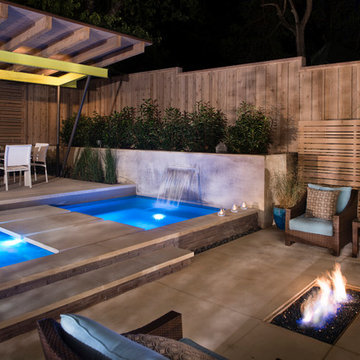
As you enter the space, your first stop is an outdoor living area. Smooth finished concrete, colored to match the 'Leuder' limestone coping, has a subtle saw-cut pattern aligned with the edges of the recessed fire pit.
In small spaces, it is important to consider a multi-purpose approach. So, the recessed fire pit has been fitted with an aluminum cover that allows our client to set up tables and chairs for entertaining, right over the top of the fire pit.
From here, it;s two steps up to the pool elevation, and the floating 'Leuder' limestone stepper pads that lead across the pool and hide the dam wall of the flush spa.
The main retaining wall to the Southeast is a poured concrete wall with an integrated sheer descent waterfall into the spa. To bring in some depth and texture, a 'Brownstone' ledgestone was used to face both the dropped beam on the pool, and the raised beam of the water feature wall.
The main water feature is comprised of five custom made stainless steel scuppers, supplied by a dedicated booster pump.
Colored concrete stepper pads lead to the 'Ipe' wood deck at the far end of the pool. The placement of this wood deck allowed us to minimize our use of retaining walls on the Northeast end of the yard, since it drops off over three feet below the elevation of the pool beam.
One of the most unique features on this project has to be the structure over the dining area. With a unique combination of steel and wood, the clean modern aesthetic of this structure creates a visual stamp in the space that standard structure could not accomplish.
4" steel posts, painted charcoal grey, are set on an angle, 4' into the bedrock, to anchor the structure. Steel I-beams painted in green-yellow color--aptly called "frolic"--act as the base to the hefty cedar rafters of the roof structure, which has a slight pitch toward the rear.
A hidden gutter on the back of the roof sends water down a copper rain chain, and into the drainage system. The backdrop for both this dining area , as well as the living area, is the horizontal screen panel, created with alternating sizes of cedar planks, stained to a calm hue of dove grey.
 Talon Construction Inc.
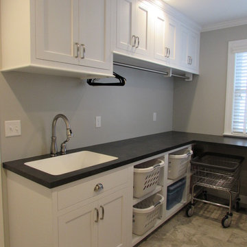
Talon Construction residential whole house remodeling project in Frederick, MD 21702 with a new kitchen and fully functional laundry room
Mid-sized transitional single-wall ceramic tile dedicated laundry room photo in DC Metro with an undermount sink, recessed-panel cabinets, white cabinets, solid surface countertops, white walls, a side-by-side washer/dryer and black countertops
Mid-sized transitional single-wall ceramic tile dedicated laundry room photo in DC Metro with an undermount sink, recessed-panel cabinets, white cabinets, solid surface countertops, white walls, a side-by-side washer/dryer and black countertops
 Edgewater Design Group
As written in Northern Home & Cottage by Elizabeth Edwards
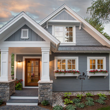
In general, Bryan and Connie Rellinger loved the charm of the old cottage they purchased on a Crooked Lake peninsula, north of Petoskey. Specifically, however, the presence of a live-well in the kitchen (a huge cement basin with running water for keeping fish alive was right in the kitchen entryway, seriously), rickety staircase and green shag carpet, not so much. An extreme renovation was the only solution. The downside? The rebuild would have to fit into the smallish nonconforming footprint. The upside? That footprint was built when folks could place a building close enough to the water to feel like they could dive in from the house. Ahhh...
Stephanie Baldwin of Edgewater Design helped the Rellingers come up with a timeless cottage design that breathes efficiency into every nook and cranny. It also expresses the synergy of Bryan, Connie and Stephanie, who emailed each other links to products they liked throughout the building process. That teamwork resulted in an interior that sports a young take on classic cottage. Highlights include a brass sink and light fixtures, coffered ceilings with wide beadboard planks, leathered granite kitchen counters and a way-cool floor made of American chestnut planks from an old barn.
Thanks to an abundant use of windows that deliver a grand view of Crooked Lake, the home feels airy and much larger than it is. Bryan and Connie also love how well the layout functions for their family - especially when they are entertaining. The kids' bedrooms are off a large landing at the top of the stairs - roomy enough to double as an entertainment room. When the adults are enjoying cocktail hour or a dinner party downstairs, they can pull a sliding door across the kitchen/great room area to seal it off from the kids' ruckus upstairs (or vice versa!).
From its gray-shingled dormers to its sweet white window boxes, this charmer on Crooked Lake is packed with ideas!
- Jacqueline Southby Photography

Sponsored
Delaware, OH

Buckeye Basements, Inc.
Central Ohio's Basement Finishing ExpertsBest Of Houzz '13-'21
 HOBBS INC
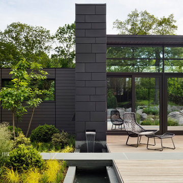
Architect: Amanda Martocchio Architecture & Design
Photography: Michael Moran
Project Year:2016
This LEED-certified project was a substantial rebuild of a 1960's home, preserving the original foundation to the extent possible, with a small amount of new area, a reconfigured floor plan, and newly envisioned massing. The design is simple and modern, with floor to ceiling glazing along the rear, connecting the interior living spaces to the landscape. The design process was informed by building science best practices, including solar orientation, triple glazing, rain-screen exterior cladding, and a thermal envelope that far exceeds code requirements.

 In Site Designs
Elegant l-shaped medium tone wood floor eat-in kitchen photo with glass-front cabinets, stainless steel appliances, an island, gray cabinets, gray backsplash, subway tile backsplash and white countertops

 Twelve Stones Designs, LLC
The owners of this kitchen had spent the money to upgrade the finishes in their kitchen upon building the home 12 years ago, but after living in the space for several years they realized how nonfunctional the layout really was. The (then) two preschool aged children had grown into busy, hungry teenagers with many friends who also liked to hang out at the house. So the family needed a more functional kitchen with better traffic flow, space for daily activities revolving around the kitchen at different times of day, and a kitchen that could accommodate cooking for and serving large groups. Furthermore, the dark, traditional finishes no longer reflected the homeowners’ style. They requested a brighter, more relaxed, coastal style that reflected their love of the seaside cities they like to visit.
Originally, the kitchen was U-shaped with a narrow island in the middle. The island created narrow aisles that bottle-necked at the dishwasher, refrigerator, and cooktop areas. There was a pass-through from the foyer into the kitchen, but the owners never liked that the pass-through was also located so close to the powder room. The awkward proximity was unappealing and made guests feel uncomfortable.
The kitchen’s storage was made up of lots of narrow cabinets, apothecary drawers, clipped corner units, and very few drawers. It lacked useful storage for the larger items the family used on a daily basis. And the kitchen’s only pantry was small closet that had only builder-grade, narrow shelving with no illumination to be able to see the contents inside.
Overall, the kitchen’s lighting plan was poorly executed. Only six recessed cans illuminated the entire kitchen and nook areas. The under cabinet lighting was not evenly distributed either. In fact, the builder had mis-placed the under cabinet lighting around the decorative pilasters which made for choppy, dark cubbies. Further, the builder didn’t include any lighting over the sink or the bar area, which meant whoever was doing the dishes was always in their own shadow. That, coupled with the steep overhang of the game room above made the bar area feel like a dim, cavernous space that wasn’t inviting or task oriented. The kitchen looked out into the main living space, but the raised bar and a narrow wall (which held the only large cabinet in the kitchen) created more of a barrier than a relationship to the living room or breakfast nook. In fact, one couldn’t even see the breakfast nook from the cooktop or sink areas due to its orientation. The raised bar top was too narrow to comfortably sit to either dine at or chat from due to the lack of knee space. The the homeowners confided that the kitchen felt more like a dark, dirty prison than place where the family, or their guests, wanted to gather and commune.
The clients' needs and desires were:
➢ to create a kitchen that would be a space the family loved to be in; to relate to the adjacent spaces all around, and to have better flow for entertaining large groups
➢ to remove the walls between the breakfast nook and living area and to be able to utilize the natural light from the windows in both those areas
➢ to incorporate a functional chopping block for prepping fresh food for home cooked meals, an island with a large sink and drain board, 2 pull out trash cans, and seating for at least the 2 teens to eat or do homework
➢ to design a kitchen and breakfast nook with an airy, coastal, relaxed vibe that blended with the rest of the house's coastal theme
➢ to integrate a layered lighting plan which would include ample general illumination, specific task lighting, decorative lighting, and lots of illuminated storage
➢ to design a kitchen with not only more storage for all the husband’s kitchen gadgets and collection of oils and spices, but smart storage, including a coffee/breakfast bar and a place to store and conceal the toaster oven and microwave
➢ to find a way to utilize the large open space between the kitchen, pantry area, and breakfast nook
Twelve Stones Designs achieved the owner's goals by:
➢ removing the walls between the kitchen and living room to allow the natural light to filter in from the adjacent rooms and to create a connection between the kitchen, nook, and living spaces for a sense of unity and communion
➢ removing the existing pantry and designing 3 large pantry style cabinets with LED tape lights and rollout drawers to house lots of kitchen appliances, gadgets, and tons of groceries. We also took the cabinets all the way up to the 9’ ceiling for additional storage for seasonal items and bulk storage.
➢ designing 2 islands - 1 with a gorgeous black walnut chopping block that houses a drawer for chopping and carving knives and a custom double pull out trash unit for point of use utilization - and 1 that houses the dishwasher, a large Blanco Gourmet sink with integrated drain board, woven baskets for fresh root vegetables and kitchen towels, plenty of drawer storage for kitchen items, and bar seating for up to 4 diners.
➢ closing off the space between the kitchen and the powder room to create a beautiful new private alcove for the powder room as well as adding some decorative storage. This also gave us space to include more tall storage near the new range for precision placement of the husband’s extensive oil and spice collection as well as a location for a combo-steam oven the wife wanted for baking and cooking healthy meals.
The project is enhanced functionally by:
➢ incorporated USB and standard receptacles for the kids’ laptops and phone charging in the large island
➢ designing the small island to include additional open shelving for items used on a daily basis such as a variety of bowls, plates, and colanders. This set up also works well for the husband who prefers to “plate” his dinners in restaurant-style fashion before presenting them to the table.
➢ the integration of specific storage units, such as double stacked cutlery drawers, a custom spice pull-out, a Kuerig coffee and tea pod drawer, and custom double stacked utensil drawers
➢ moving the refrigerator to the old oven location - this eliminated the bottle neck as well as created a better relationship to the eating table. It also utilizes the floor space between the pantry, nook, and kitchen
➢ creating a banquet style breakfast nook - this banquette seating not only doubles the amount of seating for large gatherings but it better utilizes the odd space between the kitchen and the previous nook area. It also helps to create a distinct pathway from the mudroom room through the pantry area, kitchen, nook, and living room.
➢ the coffee/breakfast bar area which includes the perfect location for the concealed microwave and toaster oven, convenient storage for the coffee pods and tea accoutrements. Roll-out drawers below also house the smoothie maker, hot water kettle, and a plethora of smoothie-making ingredients such as protein powders, smoothie additives, etc. Furthermore, the drawers below the Keurig house measuring utensil, cutlery, baking supplies and tupperware storage.
➢ incorporating lots of wide drawers and pullouts to accommodate large cookware.
➢ utilizing as much vertical space as possible by building storage to the ceiling which accommodates the family’s abundant amount of serving platters, baking sheets, bakeware, casserole dishes, and additional cutting boards.
The project is enhanced aesthetically by:
➢ new 5-piece Versailles pattern porcelain tile that now seamlessly joins the entire down stairs area together creating a bright, cohesiveness feeling instead of choppy separated spaces - it also adds a coastal feeling
➢ designing a cabinet to conceal the microwave and toaster oven
➢ the coastal influenced light fixtures over the nook table and island
➢ the sandy colors of the Langdon Cambria countertops. The swirling pattern and sparkling quartz pieces remind the homeowner of black-and-tan sandy beaches
➢ the striped banquet seating whose creamy white background and blue-green stripes were the inspiration for the cabinet and wall colors.
➢ All the interior doors were painted black to coordinate with the blacks and grays in the backsplash tile and countertop. This also adds a hint of tailored formality to an otherwise casual space.
➢ the use of WAC's Oculux small aperture LED units for the overhead lighting complimented with Diode LED strips for task lighting under the cabinets and inside the pantry and glass wall cabinets. All of the lighting applications are on separate dimmer switches.
Innovative uses of materials or construction methods by Realty Restoration LLC:
➢ Each 1-1/2” x 3” block of reclaimed end-grain black walnut that makes up the center island chopping block was hand milled and built in the shop. It was designed to look substantial and proportional to the surrounding elements, executed by creating the 4 inch tall top with a solid wood chamfered edge band.
➢ The metal doors on either side of the vent hood were also custom designed for this project and built in the Realty Restoration LLC shop. They are made 1x2, 11-gauge mild steel with ribbed glass. Weighing 60 lbs a piece, heavy duty cabinet hinges were added to support the weight of the door and keep them from sagging.
➢ Under-cabinet receptacles were added along the range wall in order to have a clean, uninterrupted backsplash.
Design obstacles to overcome:
➢ Because we were removing the demising walls between the kitchen and living room, we had to find a way to plumb and vent the new island. We did this by tunneling through the slab (the slab had post tension cables which prevented us from just trenching) to run a new wet vent through a nearby structural wall. We pulled the existing hot and cold lines between upper floor joists and ran them down the structural wall as well and up through a conduit in the tunnel.
➢ Since we were converting from wall overs to a gas range it allowed us to utilize the 220 feed for the wall ovens to provide a new sub panel for all the new kitchen circuits
➢ Due to framing deficiencies inherited from the original build there was a 1-1/2” differential in the floor-to-ceiling height over a 20 foot span; by utilizing the process of cutting and furring coupled with the crown moulding details on the cabinet elevations we were able to mask the problem and provide seamless transitions between the cabinet components.
Evidence of superior craftsmanship:
➢ uniquely designed, one-of-a-kind metal “X” end panels on the large island. The end panels were custom made in the Realty Restoration LLC shop and fitted to the exact dimensions of the island. The welding seams are completely indistinguishable - the posts look like they are cut from a single sheet of metal
➢ square metal posts on the small island were also custom made and designed to compliment and carry through the metal element s throughout the kitchen
➢ the beautiful, oversized end panels on the pantry cabinets which give the breakfast nook a tailored look
➢ integrating a large format 5 piece Versailles tile pattern to seamlessly flow from the existing spaces into the new kitchen space
➢ By constructing a custom cabinet that jogged around a corner we could not remodel (housing the entry way coat closet) we were able to camouflage the adjacent wall offset within the upper and lower cabinets. By designing around the existing jog in the structural walls we accomplished a few things: we were able to find the space to house, and hide, the microwave and toaster oven yet still have a clean cohesive appearance from the kitchen side. Additionally, the owners were able to keep their much needed coat closet and we didn’t have to increase the budget with unnecessary structural work.
 MXMA Architecture & Design
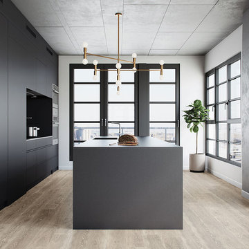
The kitchen has shades of dark grey, charcoal for its countertops, kithchen island, and cabinets. The charcoal glass backsplash completes the dark look. Equipments, devices and food products are ingeniously hidden behind the charcoal lacquered panels. All the appliances are integrated and the fridge is panel-ready. The countertop wraps the kitchen island, creating one distinctive element in the middle of the space.
Image credits: Francis Raymond
 Valentini Kids Furniture Brooklyn NY
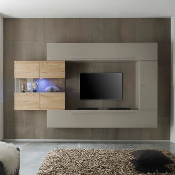
Italian Wall Unit Line 2 by LC Mobili
Made in Italy
Line by LC Mobili is a collection of modern Italian wall units and entertainment centers manufactured with care and sense of style to furnish your modern home. Wall unit from the Line Collection can be a perfect design and functional solution for any contemporary or modern interior: living room, family room and even office. It is a modular line that consists of a selection of individual units: Cube Vitrine, TV Stand, Sideboard, Wall Shelf, Shelving units (three version: A, B, C), and hanging horizontal and vertical cabinets. The individual pieces can be arranged as you want, giving you complete flexibility in designing the entertainment center you need. Being modular, Line Collection allows to build a wall unit both for tight apartments and spacious houses. Feel free to choose from our pre-design wall unit compositions as well as remove or add the units to create your own entertainment center. See addition images of other units from Line Collection and finishes available!
Please contact our office if some customization is needed!
Features:
E1-Class ecological panels, which are made exclusively through a wood recycling process
The lacquered structures and front are made of REAL POLISH SCRATCH PROOF LACQUERING, which is both non toxic and non allergenic
Light (optional): RGB multicolor LED light is supplied with a remote control
The starting price is for the Wall Unit Composition Line 2 as shown in the main picture in Matt Beige and Honey finishes. (Consists of: Two Large Horizontal Unis, Small Vertical Unit and Hanging Cube Vitrine). The Lights are not included in the price.
Dimensions:
Wall Unit: W102" x D14.2" x H75"

 Middlefork Luxury Home Builders
Rising amidst the grand homes of North Howe Street, this stately house has more than 6,600 SF. In total, the home has seven bedrooms, six full bathrooms and three powder rooms. Designed with an extra-wide floor plan (21'-2"), achieved through side-yard relief, and an attached garage achieved through rear-yard relief, it is a truly unique home in a truly stunning environment.
The centerpiece of the home is its dramatic, 11-foot-diameter circular stair that ascends four floors from the lower level to the roof decks where panoramic windows (and views) infuse the staircase and lower levels with natural light. Public areas include classically-proportioned living and dining rooms, designed in an open-plan concept with architectural distinction enabling them to function individually. A gourmet, eat-in kitchen opens to the home's great room and rear gardens and is connected via its own staircase to the lower level family room, mud room and attached 2-1/2 car, heated garage.
The second floor is a dedicated master floor, accessed by the main stair or the home's elevator. Features include a groin-vaulted ceiling; attached sun-room; private balcony; lavishly appointed master bath; tremendous closet space, including a 120 SF walk-in closet, and; an en-suite office. Four family bedrooms and three bathrooms are located on the third floor.
This home was sold early in its construction process.
Nathan Kirkman
 Edgewater Design Group
As written in Northern Home & Cottage by Elizabeth Edwards
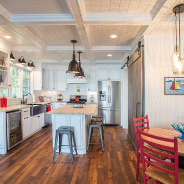
In general, Bryan and Connie Rellinger loved the charm of the old cottage they purchased on a Crooked Lake peninsula, north of Petoskey. Specifically, however, the presence of a live-well in the kitchen (a huge cement basin with running water for keeping fish alive was right in the kitchen entryway, seriously), rickety staircase and green shag carpet, not so much. An extreme renovation was the only solution. The downside? The rebuild would have to fit into the smallish nonconforming footprint. The upside? That footprint was built when folks could place a building close enough to the water to feel like they could dive in from the house. Ahhh...
Stephanie Baldwin of Edgewater Design helped the Rellingers come up with a timeless cottage design that breathes efficiency into every nook and cranny. It also expresses the synergy of Bryan, Connie and Stephanie, who emailed each other links to products they liked throughout the building process. That teamwork resulted in an interior that sports a young take on classic cottage. Highlights include a brass sink and light fixtures, coffered ceilings with wide beadboard planks, leathered granite kitchen counters and a way-cool floor made of American chestnut planks from an old barn.
Thanks to an abundant use of windows that deliver a grand view of Crooked Lake, the home feels airy and much larger than it is. Bryan and Connie also love how well the layout functions for their family - especially when they are entertaining. The kids' bedrooms are off a large landing at the top of the stairs - roomy enough to double as an entertainment room. When the adults are enjoying cocktail hour or a dinner party downstairs, they can pull a sliding door across the kitchen/great room area to seal it off from the kids' ruckus upstairs (or vice versa!).
From its gray-shingled dormers to its sweet white window boxes, this charmer on Crooked Lake is packed with ideas!
- Jacqueline Southby Photography

 Encircle Design and Build
22 pages photography
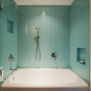
Inspiration for a mid-sized transitional blue tile and glass tile porcelain tile alcove bathtub remodel in Portland with an undermount sink, flat-panel cabinets, medium tone wood cabinets, quartz countertops, a two-piece toilet and white walls
Inspiration for a mid-sized transitional blue tile and glass tile porcelain tile alcove bathtub remodel in Portland with an undermount sink, flat-panel cabinets, medium tone wood cabinets, quartz countertops, a two-piece toilet and white walls
 Herron Horton Architects, Inc.
Nancy Nolan Photography
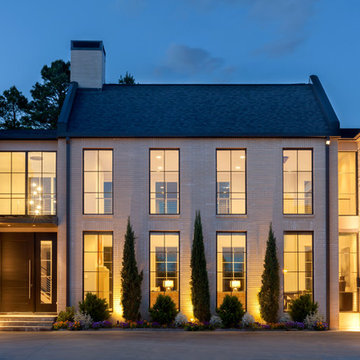
Huge transitional beige two-story brick gable roof photo in Little Rock with a shingle roof and a gray roof
Huge transitional beige two-story brick gable roof photo in Little Rock with a shingle roof and a gray roof
 Rice Residential Design
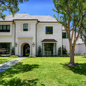
Example of a transitional white two-story brick house exterior design in Houston with a hip roof and a shingle roof
 Guggenheim Architecture + Design Studio
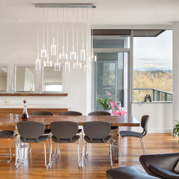
With sweeping views of the Willamette river and Mt. Hood, this Atwater Place condo was designed with a balance of minimalism and livability in mind. A complete kitchen remodel brought a dark interior kitchen to the light and a full furnishings package welcomed Los Angeles transplants home to their new modern and bright residence. Our clients, a retired camera operator for both feature films and television and a producer/production manager on numerous television series including Weeds and The Middle, relocated from their traditionally-styled LA bungalow to Portland in the Summer of 2014. The couple sought a design departure from their long-term California residence and a fresh start for their new life in the South Waterfront.
With only two pieces of sentimental furniture and a handful of artwork included in the plan, we set out to create a comfortable and clean-lined furnishings package complimenting the broad southeast views. Organically shaped upholstery pieces juxtaposed with angular steel and wood tables create a soft balance in the open floor plan. Several custom pieces, including a dining table designed by our studio and a custom hand-blown glass chandelier crafted by Scott Schiesel with Lightlite compliment timeless pieces from Knoll, Herman Miller, and B&B Italia.
The kitchen is designed to reflect light and create brilliance in a space that is otherwise naturally dark. A material balance of stainless steel, back painted glass, quartz composite, lacquer, and mirror all play their part in creating a vibrant cooking environment. We collectively decided to forgo the traditional island pendant for a linear commercial fixture that provides tremendous light to the prep surface and creates an unexpected architectural element. The mirrored prep island creates the illusion of open space while concealing casework and wine storage on the working side of the kitchen.
It is worth noting that this project was designed and installed almost entirely while our clients were still living in LA and wrapping up professional obligations and selling their home. This afforded us the tremendous opportunity to send our clients to showrooms not available in Portland to view key pieces before final specification. Textiles and finish samples were approved via mail and communication took place over e-mail, telephone, and an occasional office visit. This unique process lead to a successful result and a beautifully balanced living environment.
Josh Partee Photography
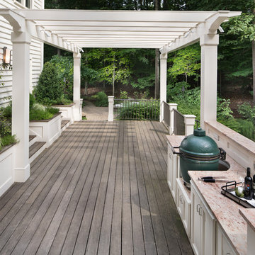
 SURROUNDS Landscape Architecture + Construction
Our client desired a functional, tasteful, and improved environment to compliment their home. The overall goal was to create a landscape that was subtle and not overdone. The client was highly focused on their deck environment that would span across the rear of the house with an area for a Jacuzzi as well. A portion of the deck has a screened in porch due to the naturally buggy environment since the home is situated in the woods and a low area. A mosquito repellent injection system was incorporated into the irrigation system to help with the bug issue. We improved circulation of the driveway, increased the overall curb appeal of the entrance of the home, and created a scaled and proportional outdoor living environment for the clients to enjoy. The client has religious guidelines that needed to be adhered to with the overall function and design of the landscape, which included an arbor over the deck to support a Sukkah and a Green Egg smoker to cook Kosher foods. Two columns were added at the driveway entrance with lights to help define their driveway entrance since it's the end of a long pipe-stem. New light fixtures were also added to the rear of the house.
Our client desired multiple amenities with a limited budget, so everything had to be value engineered through the design and construction process. There is heavy deer pressure on the site, a mosquito issue, low site elevations, flat topography, poor soil, and overall poor drainage of the site. The original driveway was not sized appropriately and the front porch had structural issues, as well as leaked water onto the landing below. The septic tank was also situated close to the rear of the house and had to be contemplated during the design process.
Photography: Morgan Howarth. Landscape Architect: Howard Cohen, Surrounds Inc.
9