
Search results for "Increased connectivity" in Home Design Ideas

 The Jack + Mare | Portland Design & Build
The Jack + Mare worked with the homeowners of this cool mid-century inspired kitchen from schematic design all the way through construction.
The existing kitchen was demolished all the way to studs, subfloor and ceiling joists and completely rebuilt with custom cabinets, solid oak flooring, task and ambient lighting, new electrical/plumbing, counter-to-ceiling wall tile, new beam (took down wall between living/kitchen), new window and colorful barn door.
The final design maximized storage, increased counter space, improved traffic flow, connected kitchen to adjacent living room (by removing existing wall), and improved the social aspect of the kitchen.
The kitchen is now efficient, beautiful, full of light and a happy place to call home!
Features: custom walnut cabinets (designed by The J+M), tile backsplash, new lighting plan (LED can lights, under-cabinet LED lights, Cedar+Moss pendants with LED bulbs), quartz countertops, new Marvin window with new trim, pantry with pull out shelves, glass upper cabinet (with puck LED) to feature antique glass-ware, island with microwave under counter, island seating.
photo credit: Jason Quigley
 The Jack + Mare | Portland Design & Build
The Jack + Mare worked with the homeowners of this cool mid-century inspired kitchen from schematic design all the way through construction.
The existing kitchen was demolished all the way to studs, subfloor and ceiling joists and completely rebuilt with custom cabinets, solid oak flooring, task and ambient lighting, new electrical/plumbing, counter-to-ceiling wall tile, new beam (took down wall between living/kitchen), new window and colorful barn door.
The final design maximized storage, increased counter space, improved traffic flow, connected kitchen to adjacent living room (by removing existing wall), and improved the social aspect of the kitchen.
The kitchen is now efficient, beautiful, full of light and a happy place to call home!
Features: custom walnut cabinets (designed by The J+M), tile backsplash, new lighting plan (LED can lights, under-cabinet LED lights, Cedar+Moss pendants with LED bulbs), quartz countertops, new Marvin window with new trim, pantry with pull out shelves, glass upper cabinet (with puck LED) to feature antique glass-ware, island with microwave under counter, island seating.
photo credit: Jason Quigley

 Charlie Allen Renovations, Inc.
For a small family in the Boston suburbs, their modest sized home was just the right size. But with some smart changes, they wondered if it could be more enjoyable. Working with architect Joseph S. Artley, we came up with a number of solutions:
• To make the kitchen a more comfortable work and gathering space, a bay window was removed and the kitchen itself bumped out slightly to allow for the introduction of an expansive island, as well as additional countertop and cabinetry.
• The first floor half-bathroom was relocated to the end of the entry hall. This allowed us to connect the kitchen with what had been a three-season porch.
• That three-season porch was properly heated and remodeled as a sunny breakfast nook: the perfect spot for the family to gather in the mornings.
• Near the entry to the breakfast nook, an existing electrical box could not be moved. To conceal it, we suggested an oversized family bulletin board, which we provided as a gift to the homeowners. Now, it offers a great spot to catch up on the day’s activities and enjoy some family artwork while heading in for breakfast.
• This family loves to read and they asked for custom built in bookshelves in the living room that would look original to the home and match existing shelving on the other side of the room.
• The den is a favorite spot for the family to watch movies and play games, but the room, which had also been a three season porch prior to an earlier renovation, was drafty in the winter and hot in the summer. We introduced new, energy efficient windows and insulation throughout, resulting in a much more inviting and cozy room.
Today, after barely increasing the footprint of the home, the family has a new breakfast room, a usable den, a larger and more inviting kitchen, and a better-situated first-floor bath. Lots of simple fixes = a much happier space for the whole family.
Photos by Shelly Harrison
Find the right local pro for your project

 sonnemanlighting
"Suspenders™ LED system is a delicately scaled, modular system of interconnected elements and suspended LED components. It can be configured as individual lighting sculptures or as a tiered web of infinite scope and variety. Using today’s leadingedge technology, Robert Sonneman has reimagined and greatly expanded his original Suspenders concept from the late 1980s with a lighter scale, increased capability, and wider range of precisely scaled luminaires.
Because of the extensive range of possibilities offered by Suspenders, we have preconfigured a collection of arrangements that you can select as shown. You can also modify these arrangements using our configuration tables, or use them as inspiration to create your own completely custom configurations.
We will continue to build upon and expand Suspenders as an openframed illumination system of innovative possibilities as we move forward.
Five 36” Power Bars are positioned in a perpendicular zig-zag pattern. The three upper Power Bars are ceiling mounted with two 18” field-cuttable rod Ceiling Hangers. The two lower Power Bars are connected to the upper ones by two 6” Power Bar Hangers. Luminaires hang, three to a bar, in an alternating pattern. Includes Power Feed with surface mounted transformer for Ball and Crystal Oval Luminaires. Power Feed with remote mounted transformer is available for special order."
 JRP Design & Remodel
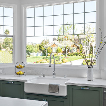
This timeless kitchen is the perfect example of how rich color sets the mood. Inspired by Sherwin-Williams’ Dried Thyme, the green cabinetry brings a warm and contemporary look. The kitchen’s original layout is what attracted the owners to this home so with a few changes, the space now better fits the owners’ needs.
Straightening out a wall by the large bay window provided space to move the dishwasher, and gave room to build a tall cabinet with organized pullout drawers next to the stove for easy access and storage. This also created room to build a hidden appliance garage and flipping the location of the island sink provided more accessibility to the stove.
The bow front stove hood provides visual relief for the linear nature of the cabinets. Green ceramic tiles surround the porcelain herringbone tile in the contrasting niche dedicated to spices and oils, and the adjacent pot filler provides convenience.
The island was increased in size to provide for more storage and metal domed pendants provide lighting for both prepping and eating. Double-wall ovens have side handles for easy opening and convenience and provide easy access in a busy kitchen area.
Separating the dining room from the kitchen with the addition of a butler door, created space to easily connect and move between the two rooms while minimizing noise.
Photographer: Andrew Orozco

 User
Every design decision for this Caribbean beach residence was guided by the desire to maximize the views of the property’s breathtaking natural surroundings.
To connect the spaces and reveal the views from every vantage point, the team reconfigured the layout to create vistas, and installed window film to reduce solar heat gain. These modifications increased efficiencies, reused 90% of the interior envelope and did not impact the exterior structure of the building. In addition to providing incredible views, opening up the plan allows cross ventilation, maximizing the use of ocean breezes to cool the interior. The result is an effortless flow and maximization of space.
Throughout the interior, dark materials express the concept of respite in the shade, and emphasize the sweeping views of the Caribbean Sea. Millwork crafted by local artisans from local materials establishes hierarchy – providing a clear understanding of the layout – and filters light to create privacy and drama. Screens help define the spaces and create suspense.
Varying screen opacities serve specific functions: nearly opaque screens build suspense, translucent screens provide privacy, and reflective screens – as seen in the kitchen ceiling – create mystery in the core where light and views
are challenged. Referencing the seaside location, the baseboards create a sense of being in a deep shallow. The 16” tall baseboards create a pool effect, engaging the walls with Cradle to Cradle certified Mosa tile flooring. The irregular height also conceals power and data cabling. The resulting space is a contemporary oasis that offers a high-level of comfort and functionality.
Anne Rausch Photography
 User
Every design decision for this Caribbean beach residence was guided by the desire to maximize the views of the property’s breathtaking natural surroundings.
To connect the spaces and reveal the views from every vantage point, the team reconfigured the layout to create vistas, and installed window film to reduce solar heat gain. These modifications increased efficiencies, reused 90% of the interior envelope and did not impact the exterior structure of the building. In addition to providing incredible views, opening up the plan allows cross ventilation, maximizing the use of ocean breezes to cool the interior. The result is an effortless flow and maximization of space.
Throughout the interior, dark materials express the concept of respite in the shade, and emphasize the sweeping views of the Caribbean Sea. Millwork crafted by local artisans from local materials establishes hierarchy – providing a clear understanding of the layout – and filters light to create privacy and drama. Screens help define the spaces and create suspense.
Varying screen opacities serve specific functions: nearly opaque screens build suspense, translucent screens provide privacy, and reflective screens – as seen in the kitchen ceiling – create mystery in the core where light and views
are challenged. Referencing the seaside location, the baseboards create a sense of being in a deep shallow. The 16” tall baseboards create a pool effect, engaging the walls with Cradle to Cradle certified Mosa tile flooring. The irregular height also conceals power and data cabling. The resulting space is a contemporary oasis that offers a high-level of comfort and functionality.
Anne Rausch Photography

 Klopf Architecture
, Outer Space Landscape Architects, Sezen & Moon Structural Engineer and Flegels Construction updated a classic Eichler open, indoor-outdoor home.
Everyone loved the classic, original bones of this house, but it was in need of a major facelift both inside and out. The owners also wanted to remove the barriers between the kitchen and great room, and increase the size of the master bathroom as well as make other layout changes. No addition to the house was contemplated.
The owners worked with Klopf Architecture in part because of Klopf’s extensive mid-century modern / Eichler design portfolio, and in part because one of their neighbors who had worked with Klopf on their Eichler home remodel referred them. The Klopf team knew how to update the worn finishes to make a more sophisticated, higher quality home that both looks better and functions better.
In conjunction with the atrium and the landscaped rear yard / patio, the glassy living room feels open on both sides and allows an indoor / outdoor flow throughout. The new, natural wood exterior siding runs through the house from inside to outside to inside again, updating one of the classic design features of the Eichler homes.
Picking up on the wood siding, walnut vanities and cabinets offset the white walls. Gray porcelain tiles evoke the concrete slab floors and flow from interior to exterior to make the spaces appear to flow together. Similarly the ceiling decking has the same white-washed finish from inside to out. The continuity of materials and space enhances the sense of flow.
The large kitchen, perfect for entertaining, has a wall of built-ins and an oversized island. There’s plenty of storage and space for the whole group to prep and cook together.
One unique approach to the master bedroom is the bed wall. The head of the bed is tucked within a line of built-in wardrobes with a high window above. Replacing the master closet with this wall of wardrobes allowed for both a larger bathroom and a larger bedroom.
This 1,953 square foot, 4 bedroom, 2 bathroom Double Gable Eichler remodeled single-family house is located in Mountain View in the heart of the Silicon Valley.
Klopf Architecture Project Team: John Klopf, AIA, Klara Kevane, and Yegvenia Torres-Zavala
Landscape Architect: Outer Space Landscape Architects
Structural Engineer: Sezen & Moon
Contractor: Flegels Construction
Landscape Contractor: Roco's Gardening & Arroyo Vista Landscaping, Inc.
Photography ©2016 Mariko Reed
Location: Mountain View, CA
Year completed: 2015

 Etheredge Design Associates, Inc.
Converting a home office into a nursery for a growing family presented some interesting challenges because of the spatial limitations. Originally, the space housed an enclosed side porch in this small 1940's post war cottage style home. During the planning stage, the decision was made that the design elements of the nursery would be consistent with those previously used in the refurbished home…a soft, sophisticated mix of traditional furnishings accented with contemporary styled pieces and elements set within a monochromatic color scheme. Knowing that the expected child was a girl enabled the exploration of a full range of feminine options. To maximize style, unify the space, and preserve the impression of childlike innocence a decision was reached to use minimalist colors. Winter Morning coats the walls with just a hint of pink as seen in the sky at sunrise. Texture is introduced in a blush linen; its hue was chosen to increase spatial perception within this compact nursery. The same linen covers the crib bumper pads and upholsters the small scale glider. Blush is repeated in the chenille braid on the bumper pads, the pleat closures for the tailored striped silk crib skirt and, again, on the trim of the stripped silk drapery panels which are hung to the ceiling adding visual height and providing yards of gentle softness to the area. Antique botanicals from the owner's childhood provide femininity and a connection to the past. Mounted from the ceiling is a small glazed chandelier with clear crystal and rose quartz pendants perfectly suited for the little charmer who will occupy this room. The space may be small in size, but it is large in style, functionality, and filled with love.
 User
Every design decision for this Caribbean beach residence was guided by the desire to maximize the views of the property’s breathtaking natural surroundings.
To connect the spaces and reveal the views from every vantage point, the team reconfigured the layout to create vistas, and installed window film to reduce solar heat gain. These modifications increased efficiencies, reused 90% of the interior envelope and did not impact the exterior structure of the building. In addition to providing incredible views, opening up the plan allows cross ventilation, maximizing the use of ocean breezes to cool the interior. The result is an effortless flow and maximization of space.
Throughout the interior, dark materials express the concept of respite in the shade, and emphasize the sweeping views of the Caribbean Sea. Millwork crafted by local artisans from local materials establishes hierarchy – providing a clear understanding of the layout – and filters light to create privacy and drama. Screens help define the spaces and create suspense.
Varying screen opacities serve specific functions: nearly opaque screens build suspense, translucent screens provide privacy, and reflective screens – as seen in the kitchen ceiling – create mystery in the core where light and views
are challenged. Referencing the seaside location, the baseboards create a sense of being in a deep shallow. The 16” tall baseboards create a pool effect, engaging the walls with Cradle to Cradle certified Mosa tile flooring. The irregular height also conceals power and data cabling. The resulting space is a contemporary oasis that offers a high-level of comfort and functionality.
Anne Rausch Photography
 The Jack + Mare | Portland Design & Build
The Jack + Mare worked with the homeowners of this cool mid-century inspired kitchen from schematic design all the way through construction.
The existing kitchen was demolished all the way to studs, subfloor and ceiling joists and completely rebuilt with custom cabinets, solid oak flooring, task and ambient lighting, new electrical/plumbing, counter-to-ceiling wall tile, new beam (took down wall between living/kitchen), new window and colorful barn door.
The final design maximized storage, increased counter space, improved traffic flow, connected kitchen to adjacent living room (by removing existing wall), and improved the social aspect of the kitchen.
The kitchen is now efficient, beautiful, full of light and a happy place to call home!
Features: custom walnut cabinets (designed by The J+M), tile backsplash, new lighting plan (LED can lights, under-cabinet LED lights, Cedar+Moss pendants with LED bulbs), quartz countertops, new Marvin window with new trim, pantry with pull out shelves, glass upper cabinet (with puck LED) to feature antique glass-ware, island with microwave under counter, island seating.
photo credit: Jason Quigley

 Quax
Quax loves contemporary design and with the Havana room the sleek line and solid wood get a place in the range, confirming its place on the international design scene. Tested by internationally recognized bodies on EN-716 for the beds and EN-12221 for the changing tables and with long-term use in mind.
The metal base is finished with a black powder coating. The upper structures are a mix of lacquered and solid wood panels. The charm of solid wood is reflected in its pristine patina and is the guarantee of a natural product that over time becomes increasingly unique and valuable. A contribution that should not be underestimated to the natural and the cozy interior, a caress for the senses. Depending on the tree’s habitat, color differences are possible and proof of its essence.
At Quax we use sustainable materials. All the furniture boards meet the strict E1 standard on formaldehyde emissions. We support durable forestry and ask our suppliers to submit the PEFC and FSC certificates. Special care also goes to the furniture fittings. Only reputable suppliers provide us with, among others, quality sliders for the drawers and reliable connecting techniques. The paint finish is another point of attention, we only work with international quality supplierssuch as Akzo Nobel and no local producers. All producers are responsible for the certificates of their products, for example EN 71-3 with attention for the migration of harmful elements.
Design also plays an important role in the business philosophy of Quax. In the Havana room the bars are milled out in the Mdf board, which does not only contribute to the fancy nature of this range but also to the sturdiness of the sideframes, not comparable to traditional bars.
The range includes beds 120x60 cm, 140x70 cm with optional bedrail, a chest of four drawers with optional changing extension and a two or three-door wardrobe.
Kris Van Damme for Quax

 Michael Nash Design, Build & Homes
2013 NARI CAPITAL COTY, FINALIST AWARD WINNER, RESIDENTIAL BATH UNDER $30,000
A colonial home recently built in the suburb of Leesburg had a run of the mill 10’x11’ bathroom connected to the seating room of the master suite.
The clients disliked both the builder grade soaking tub and small shower, in fact, preferring to sacrifice the tub for a much bigger spa-like shower stall. In general, they wanted more space and more storage. To increase the footprint for the remodel, a decision was made to “steal” some space from the seating room.
The new layout features a large, walk-in shower with a frameless glass enclosure. A rain shower, body sprays and bench seating meet all of the homeowners’ desires.
Large linen cabinets surround a large new vanity, touting a granite top, vessel sinks and wall-mounted faucets. Mirrored, embedded medicine cabinets are wrapped in glass tile and illuminated by hanging lights. The opposite wall features floating dressing cabinets which serve as a new make-up area.
Smart use of lighting, such as pendants, sconces, and recess lights has made the space brighter than ever. Designers at Michael Nash Design, Build & Homes used large, light color porcelain tiles and enhanced the look with complementary glass tiles on accents walls, niches and other areas.
 Charlie Allen Renovations, Inc.
For a small family in the Boston suburbs, their modest sized home was just the right size. But with some smart changes, they wondered if it could be more enjoyable. Working with architect Joseph S. Artley, we came up with a number of solutions:
• To make the kitchen a more comfortable work and gathering space, a bay window was removed and the kitchen itself bumped out slightly to allow for the introduction of an expansive island, as well as additional countertop and cabinetry.
• The first floor half-bathroom was relocated to the end of the entry hall. This allowed us to connect the kitchen with what had been a three-season porch.
• That three-season porch was properly heated and remodeled as a sunny breakfast nook: the perfect spot for the family to gather in the mornings.
• Near the entry to the breakfast nook, an existing electrical box could not be moved. To conceal it, we suggested an oversized family bulletin board, which we provided as a gift to the homeowners. Now, it offers a great spot to catch up on the day’s activities and enjoy some family artwork while heading in for breakfast.
• This family loves to read and they asked for custom built in bookshelves in the living room that would look original to the home and match existing shelving on the other side of the room.
• The den is a favorite spot for the family to watch movies and play games, but the room, which had also been a three season porch prior to an earlier renovation, was drafty in the winter and hot in the summer. We introduced new, energy efficient windows and insulation throughout, resulting in a much more inviting and cozy room.
Today, after barely increasing the footprint of the home, the family has a new breakfast room, a usable den, a larger and more inviting kitchen, and a better-situated first-floor bath. Lots of simple fixes = a much happier space for the whole family.
Photos by Shelly Harrison
 Michael Nash Design, Build & Homes
2013 NARI CAPITAL COTY, FINALIST AWARD WINNER, RESIDENTIAL BATH UNDER $30,000
A colonial home recently built in the suburb of Leesburg had a run of the mill 10’x11’ bathroom connected to the seating room of the master suite.
The clients disliked both the builder grade soaking tub and small shower, in fact, preferring to sacrifice the tub for a much bigger spa-like shower stall. In general, they wanted more space and more storage. To increase the footprint for the remodel, a decision was made to “steal” some space from the seating room.
The new layout features a large, walk-in shower with a frameless glass enclosure. A rain shower, body sprays and bench seating meet all of the homeowners’ desires.
Large linen cabinets surround a large new vanity, touting a granite top, vessel sinks and wall-mounted faucets. Mirrored, embedded medicine cabinets are wrapped in glass tile and illuminated by hanging lights. The opposite wall features floating dressing cabinets which serve as a new make-up area.
Smart use of lighting, such as pendants, sconces, and recess lights has made the space brighter than ever. Designers at Michael Nash Design, Build & Homes used large, light color porcelain tiles and enhanced the look with complementary glass tiles on accents walls, niches and other areas.
 Twelve Stones Designs, LLC
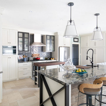
The owners of this kitchen had spent the money to upgrade the finishes in their kitchen upon building the home 12 years ago, but after living in the space for several years they realized how nonfunctional the layout really was. The (then) two preschool aged children had grown into busy, hungry teenagers with many friends who also liked to hang out at the house. So the family needed a more functional kitchen with better traffic flow, space for daily activities revolving around the kitchen at different times of day, and a kitchen that could accommodate cooking for and serving large groups. Furthermore, the dark, traditional finishes no longer reflected the homeowners’ style. They requested a brighter, more relaxed, coastal style that reflected their love of the seaside cities they like to visit.
Originally, the kitchen was U-shaped with a narrow island in the middle. The island created narrow aisles that bottle-necked at the dishwasher, refrigerator, and cooktop areas. There was a pass-through from the foyer into the kitchen, but the owners never liked that the pass-through was also located so close to the powder room. The awkward proximity was unappealing and made guests feel uncomfortable.
The kitchen’s storage was made up of lots of narrow cabinets, apothecary drawers, clipped corner units, and very few drawers. It lacked useful storage for the larger items the family used on a daily basis. And the kitchen’s only pantry was small closet that had only builder-grade, narrow shelving with no illumination to be able to see the contents inside.
Overall, the kitchen’s lighting plan was poorly executed. Only six recessed cans illuminated the entire kitchen and nook areas. The under cabinet lighting was not evenly distributed either. In fact, the builder had mis-placed the under cabinet lighting around the decorative pilasters which made for choppy, dark cubbies. Further, the builder didn’t include any lighting over the sink or the bar area, which meant whoever was doing the dishes was always in their own shadow. That, coupled with the steep overhang of the game room above made the bar area feel like a dim, cavernous space that wasn’t inviting or task oriented. The kitchen looked out into the main living space, but the raised bar and a narrow wall (which held the only large cabinet in the kitchen) created more of a barrier than a relationship to the living room or breakfast nook. In fact, one couldn’t even see the breakfast nook from the cooktop or sink areas due to its orientation. The raised bar top was too narrow to comfortably sit to either dine at or chat from due to the lack of knee space. The the homeowners confided that the kitchen felt more like a dark, dirty prison than place where the family, or their guests, wanted to gather and commune.
The clients' needs and desires were:
➢ to create a kitchen that would be a space the family loved to be in; to relate to the adjacent spaces all around, and to have better flow for entertaining large groups
➢ to remove the walls between the breakfast nook and living area and to be able to utilize the natural light from the windows in both those areas
➢ to incorporate a functional chopping block for prepping fresh food for home cooked meals, an island with a large sink and drain board, 2 pull out trash cans, and seating for at least the 2 teens to eat or do homework
➢ to design a kitchen and breakfast nook with an airy, coastal, relaxed vibe that blended with the rest of the house's coastal theme
➢ to integrate a layered lighting plan which would include ample general illumination, specific task lighting, decorative lighting, and lots of illuminated storage
➢ to design a kitchen with not only more storage for all the husband’s kitchen gadgets and collection of oils and spices, but smart storage, including a coffee/breakfast bar and a place to store and conceal the toaster oven and microwave
➢ to find a way to utilize the large open space between the kitchen, pantry area, and breakfast nook
Twelve Stones Designs achieved the owner's goals by:
➢ removing the walls between the kitchen and living room to allow the natural light to filter in from the adjacent rooms and to create a connection between the kitchen, nook, and living spaces for a sense of unity and communion
➢ removing the existing pantry and designing 3 large pantry style cabinets with LED tape lights and rollout drawers to house lots of kitchen appliances, gadgets, and tons of groceries. We also took the cabinets all the way up to the 9’ ceiling for additional storage for seasonal items and bulk storage.
➢ designing 2 islands - 1 with a gorgeous black walnut chopping block that houses a drawer for chopping and carving knives and a custom double pull out trash unit for point of use utilization - and 1 that houses the dishwasher, a large Blanco Gourmet sink with integrated drain board, woven baskets for fresh root vegetables and kitchen towels, plenty of drawer storage for kitchen items, and bar seating for up to 4 diners.
➢ closing off the space between the kitchen and the powder room to create a beautiful new private alcove for the powder room as well as adding some decorative storage. This also gave us space to include more tall storage near the new range for precision placement of the husband’s extensive oil and spice collection as well as a location for a combo-steam oven the wife wanted for baking and cooking healthy meals.
The project is enhanced functionally by:
➢ incorporated USB and standard receptacles for the kids’ laptops and phone charging in the large island
➢ designing the small island to include additional open shelving for items used on a daily basis such as a variety of bowls, plates, and colanders. This set up also works well for the husband who prefers to “plate” his dinners in restaurant-style fashion before presenting them to the table.
➢ the integration of specific storage units, such as double stacked cutlery drawers, a custom spice pull-out, a Kuerig coffee and tea pod drawer, and custom double stacked utensil drawers
➢ moving the refrigerator to the old oven location - this eliminated the bottle neck as well as created a better relationship to the eating table. It also utilizes the floor space between the pantry, nook, and kitchen
➢ creating a banquet style breakfast nook - this banquette seating not only doubles the amount of seating for large gatherings but it better utilizes the odd space between the kitchen and the previous nook area. It also helps to create a distinct pathway from the mudroom room through the pantry area, kitchen, nook, and living room.
➢ the coffee/breakfast bar area which includes the perfect location for the concealed microwave and toaster oven, convenient storage for the coffee pods and tea accoutrements. Roll-out drawers below also house the smoothie maker, hot water kettle, and a plethora of smoothie-making ingredients such as protein powders, smoothie additives, etc. Furthermore, the drawers below the Keurig house measuring utensil, cutlery, baking supplies and tupperware storage.
➢ incorporating lots of wide drawers and pullouts to accommodate large cookware.
➢ utilizing as much vertical space as possible by building storage to the ceiling which accommodates the family’s abundant amount of serving platters, baking sheets, bakeware, casserole dishes, and additional cutting boards.
The project is enhanced aesthetically by:
➢ new 5-piece Versailles pattern porcelain tile that now seamlessly joins the entire down stairs area together creating a bright, cohesiveness feeling instead of choppy separated spaces - it also adds a coastal feeling
➢ designing a cabinet to conceal the microwave and toaster oven
➢ the coastal influenced light fixtures over the nook table and island
➢ the sandy colors of the Langdon Cambria countertops. The swirling pattern and sparkling quartz pieces remind the homeowner of black-and-tan sandy beaches
➢ the striped banquet seating whose creamy white background and blue-green stripes were the inspiration for the cabinet and wall colors.
➢ All the interior doors were painted black to coordinate with the blacks and grays in the backsplash tile and countertop. This also adds a hint of tailored formality to an otherwise casual space.
➢ the use of WAC's Oculux small aperture LED units for the overhead lighting complimented with Diode LED strips for task lighting under the cabinets and inside the pantry and glass wall cabinets. All of the lighting applications are on separate dimmer switches.
Innovative uses of materials or construction methods by Realty Restoration LLC:
➢ Each 1-1/2” x 3” block of reclaimed end-grain black walnut that makes up the center island chopping block was hand milled and built in the shop. It was designed to look substantial and proportional to the surrounding elements, executed by creating the 4 inch tall top with a solid wood chamfered edge band.
➢ The metal doors on either side of the vent hood were also custom designed for this project and built in the Realty Restoration LLC shop. They are made 1x2, 11-gauge mild steel with ribbed glass. Weighing 60 lbs a piece, heavy duty cabinet hinges were added to support the weight of the door and keep them from sagging.
➢ Under-cabinet receptacles were added along the range wall in order to have a clean, uninterrupted backsplash.
Design obstacles to overcome:
➢ Because we were removing the demising walls between the kitchen and living room, we had to find a way to plumb and vent the new island. We did this by tunneling through the slab (the slab had post tension cables which prevented us from just trenching) to run a new wet vent through a nearby structural wall. We pulled the existing hot and cold lines between upper floor joists and ran them down the structural wall as well and up through a conduit in the tunnel.
➢ Since we were converting from wall overs to a gas range it allowed us to utilize the 220 feed for the wall ovens to provide a new sub panel for all the new kitchen circuits
➢ Due to framing deficiencies inherited from the original build there was a 1-1/2” differential in the floor-to-ceiling height over a 20 foot span; by utilizing the process of cutting and furring coupled with the crown moulding details on the cabinet elevations we were able to mask the problem and provide seamless transitions between the cabinet components.
Evidence of superior craftsmanship:
➢ uniquely designed, one-of-a-kind metal “X” end panels on the large island. The end panels were custom made in the Realty Restoration LLC shop and fitted to the exact dimensions of the island. The welding seams are completely indistinguishable - the posts look like they are cut from a single sheet of metal
➢ square metal posts on the small island were also custom made and designed to compliment and carry through the metal element s throughout the kitchen
➢ the beautiful, oversized end panels on the pantry cabinets which give the breakfast nook a tailored look
➢ integrating a large format 5 piece Versailles tile pattern to seamlessly flow from the existing spaces into the new kitchen space
➢ By constructing a custom cabinet that jogged around a corner we could not remodel (housing the entry way coat closet) we were able to camouflage the adjacent wall offset within the upper and lower cabinets. By designing around the existing jog in the structural walls we accomplished a few things: we were able to find the space to house, and hide, the microwave and toaster oven yet still have a clean cohesive appearance from the kitchen side. Additionally, the owners were able to keep their much needed coat closet and we didn’t have to increase the budget with unnecessary structural work.
 JRP Design & Remodel
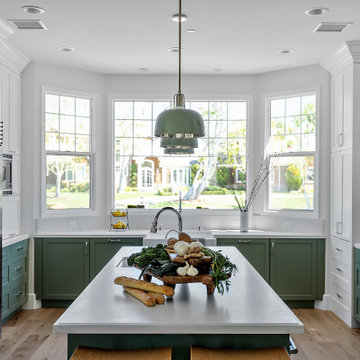
This timeless kitchen is the perfect example of how rich color sets the mood. Inspired by Sherwin-Williams’ Dried Thyme, the green cabinetry brings a warm and contemporary look. The kitchen’s original layout is what attracted the owners to this home so with a few changes, the space now better fits the owners’ needs.
Straightening out a wall by the large bay window provided space to move the dishwasher, and gave room to build a tall cabinet with organized pullout drawers next to the stove for easy access and storage. This also created room to build a hidden appliance garage and flipping the location of the island sink provided more accessibility to the stove.
The bow front stove hood provides visual relief for the linear nature of the cabinets. Green ceramic tiles surround the porcelain herringbone tile in the contrasting niche dedicated to spices and oils, and the adjacent pot filler provides convenience.
The island was increased in size to provide for more storage and metal domed pendants provide lighting for both prepping and eating. Double-wall ovens have side handles for easy opening and convenience and provide easy access in a busy kitchen area.
Separating the dining room from the kitchen with the addition of a butler door, created space to easily connect and move between the two rooms while minimizing noise.
Photographer: Andrew Orozco
 The Jack + Mare | Portland Design & Build
The Jack + Mare worked with the homeowners of this cool mid-century inspired kitchen from schematic design all the way through construction.
The existing kitchen was demolished all the way to studs, subfloor and ceiling joists and completely rebuilt with custom cabinets, solid oak flooring, task and ambient lighting, new electrical/plumbing, counter-to-ceiling wall tile, new beam (took down wall between living/kitchen), new window and colorful barn door.
The final design maximized storage, increased counter space, improved traffic flow, connected kitchen to adjacent living room (by removing existing wall), and improved the social aspect of the kitchen.
The kitchen is now efficient, beautiful, full of light and a happy place to call home!
Features: custom walnut cabinets (designed by The J+M), tile backsplash, new lighting plan (LED can lights, under-cabinet LED lights, Cedar+Moss pendants with LED bulbs), quartz countertops, new Marvin window with new trim, pantry with pull out shelves, glass upper cabinet (with puck LED) to feature antique glass-ware, island with microwave under counter, island seating.
photo credit: Jason Quigley

 THE EDEN GROUP
The Rancho Estate provides a level of luxury that sets it apart from any residence in Los Angeles, breaking the record for the most expensive home ever sold in the Encino area. The Eden Group worked with the client to achieve all their development goals by providing integrated design and engineering services which developed concurrently achieving project milestones while staying within the construction budget. Our residential design team used modern aesthetics which entailed of design elements tailored to provide spacious and unparalleled views of the San Fernando Valley. Attracting a dream buyer is the most important aspect in the eyes of any real estate developer and that is why we chose two words to describe the amenities we incorporated into the design: Vast & Spectacular. The estate allows you to swim with infinite views, get your work out on at the indoor gym, shoot hoops with your friends in the indoor basketball court, go for a round of bowling with your child, chomp on popcorn in your theater, get a massage after the steam room at your private spa, putt a couple hole-in-ones, and if you get bored you can always choose to go for a ride from the collection inside your 16-car garage. Majestic high ceilings mixed wide span openings created a challenge for our engineers given the strict rules in the Baseline Hillside Ordinance and the California Building Code. Our structural engineers prepared innovative design plans which entailed of 150 deep pile foundations mixed with steel and laminated timber framing members. We also used permanent shoring techniques to reduce construction cost by eliminating the need for temporary shoring plans for both the structure foundation and on-site retaining walls. Given that California has some of the strictest stormwater management requirements and the total amount of non-permeable areas on this project, the client was required to construct a 35,000-gallon rain harvesting tank per the Low Impact Development Plan Best Management Practice (BMP’s) standards. Our specialized drainage design team captured all on-site stormwater through trench drains, area drains, and downspouts which routed water to a mechanical sump pump that connected to the storage tank for irrigation use later. Innovative design engineering techniques used on this project allowed for increased safety and sustainability making the Rancho Estate a masterpiece of contemporary construction.

 Rudloff Custom Builders
The owners of this colonial-style house wanted to renovate their home to increase space and improve flow. We built a two-story addition that included a dining room and bar on the first floor (off of the family room) and a new master bathroom (creating a master suite).
RUDLOFF Custom Builders has won Best of Houzz for Customer Service in 2014, 2015 2016 and 2017. We also were voted Best of Design in 2016, 2017 and 2018, which only 2% of professionals receive. Rudloff Custom Builders has been featured on Houzz in their Kitchen of the Week, What to Know About Using Reclaimed Wood in the Kitchen as well as included in their Bathroom WorkBook article. We are a full service, certified remodeling company that covers all of the Philadelphia suburban area. This business, like most others, developed from a friendship of young entrepreneurs who wanted to make a difference in their clients’ lives, one household at a time. This relationship between partners is much more than a friendship. Edward and Stephen Rudloff are brothers who have renovated and built custom homes together paying close attention to detail. They are carpenters by trade and understand concept and execution. RUDLOFF CUSTOM BUILDERS will provide services for you with the highest level of professionalism, quality, detail, punctuality and craftsmanship, every step of the way along our journey together.
Specializing in residential construction allows us to connect with our clients early on in the design phase to ensure that every detail is captured as you imagined. One stop shopping is essentially what you will receive with RUDLOFF CUSTOM BUILDERS from design of your project to the construction of your dreams, executed by on-site project managers and skilled craftsmen. Our concept, envision our client’s ideas and make them a reality. Our mission; CREATING LIFETIME RELATIONSHIPS BUILT ON TRUST AND INTEGRITY.
Photo Credit: JMB Photoworks
45