
Search results for "Increased connectivity" in Home Design Ideas

 Sweet Smiling Landscape Design
When I came to this property not only was the landscape a scrappy mess the property also had some very real grading and drainage issues that were jeopardizing the safety of this house. As recent transplants from New Jerseys to Southern California these clients were in awe of all the plants they were seeing in their neighborhood. Living on the water at the Ventura harbor they wanted to be able to take full advantage or the outdoor lifestyle and cool ocean breeze. Being environmentally conscious citizens, these clients were very concerned that their garden was designed with sustainability as a leading factor. As they said in our initial consultation, “Would want or garden be part of the solution not part of the problem.”
This property is the last house on the bottom of a gently sloping street. All the water from the neighbor’s houses drain onto this property. When I came into this project the back yard sloped into the house. When it would rain the water would pool up against the house causing water damage. To address the drainage we employed several tactics. Firstly, we had to invert the slope in the back yard so that water would not pool against the house. We created a very minor slope going away from the house so that water drains away but so the patio area feels flat.
The back of the back yard had an existing retaining wall made out of shabby looking slump stone. In front of that retaining wall we created a beautiful natural stone retaining wall. This retain wall severs many purposes. One it works as a place to put some of the soil removed from the grading giving this project a smaller carbon foot print (moving soil of a site burns a lot of fossil fuel). The retaining wall also helps obscure the shabby existing retaining wall and allows for planting space above the footing from the existing retaining wall. The soil behind the ne retaining wall is slightly lower than the top of the wall so that when the run on water on from the neighbor’s property flows it is slowed down and absorbed before it has a chance to get near the house. Finally, the wall is at a height designed to serve as overflow seating as these clients intend to have occasional large parties and gatherings.
Other efforts made to help keep the house safe and dry are that we used permeable paving. With the hardscape being comprised of flag stone with gravel in-between water has a chance to soak into the ground so it does not flow into spots where it will pool up.
The final element to help keep the house dry is the addition of infiltration swales. Infiltration swales are depressions in the landscape that capture rain water. The down spouts on the sides of the houses are connected to pipe that goes under the ground and conveys the water to the swales. In this project it helps move rain water away from the house. In general, these Infiltration swales are a powerful element in creating sustainable landscapes. These swales capture pollutants that accumulate on the roof and in the landscape. Biology in the soil in the swales can break down these pollutants. When run of watered is not captured by soil on a property the dirty water flows into water ways and then the ocean were the biology that breaks down the pollutants is not as prolific. This is particularly important in this project as it drains directly into the harbor. The water that is absorbed in to the swales can replenish aquafers as well as increasing the water available to the plants planted in that area recusing the amount of water that is needed from irrigation.
When it came to the planting we went with a California friendly tropical theme. Using lots of succulents and plants with colorful foliage we created vibrant lush landscape that will have year around color. We planted densely (the images in the picture were taken only a month after installation). Taller drought tolerant plants to help regulate the temperature and loss of water from the plants below them. The dense plantings will help keep the garden, the house and even the neighborhood cooler on hot days, will provide spaces for birds to enjoy and will create an illusion of depth in a somewhat narrow space.
Today this garden is a space these homeowners can fully enjoy while having the peace of mind that their house is protected from flooding and they are helping the environment.
 Robert M. Cain, Architect
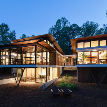
Holly Hill, a retirement home, whose owner's hobbies are gardening and restoration of classic cars, is nestled into the site contours to maximize views of the lake and minimize impact on the site.
Holly Hill is comprised of three wings joined by bridges: A wing facing a master garden to the east, another wing with workshop and a central activity, living, dining wing. Similar to a radiator the design increases the amount of exterior wall maximizing opportunities for natural ventilation during temperate months.
Other passive solar design features will include extensive eaves, sheltering porches and high-albedo roofs, as strategies for considerably reducing solar heat gain.
Daylighting with clerestories and solar tubes reduce daytime lighting requirements. Ground source geothermal heat pumps and superior to code insulation ensure minimal space conditioning costs. Corten steel siding and concrete foundation walls satisfy client requirements for low maintenance and durability. All light fixtures are LEDs.
Open and screened porches are strategically located to allow pleasant outdoor use at any time of day, particular season or, if necessary, insect challenge. Dramatic cantilevers allow the porches to project into the site’s beautiful mixed hardwood tree canopy without damaging root systems.
Guest arrive by vehicle with glimpses of the house and grounds through penetrations in the concrete wall enclosing the garden. One parked they are led through a garden composed of pavers, a fountain, benches, sculpture and plants. Views of the lake can be seen through and below the bridges.
Primary client goals were a sustainable low-maintenance house, primarily single floor living, orientation to views, natural light to interiors, maximization of individual privacy, creation of a formal outdoor space for gardening, incorporation of a full workshop for cars, generous indoor and outdoor social space for guests and parties.
 Lotus Gardenscapes & Bloom Garden Center
We were lucky to be contacted by a client who designed their own dream home directly abutting a stunning nature preserve. When the homeowners were considering making some adjustments to their property, maintaining the connection between the home and its natural surroundings was of the utmost importance.
The couple wanted to create a space where they could drink in the beauty of the preserve. But what spurred the project was the need to make functional improvements. There was erosion on a hill sloping away from the house that needed to be addressed. Poor drainage saw rainwater was threatening the driveway and deck access on the side of the house.
As careful thinkers, they came into this project brimming with creative ideas for how to transform the space into something functional and worthy of its surroundings. They called us to help tie the project together and execute it.
Initial ideas were for a 3 or 4 season porch that would provide unmatched views of the surroundings, but with the functional aspects of the project, the dream porch was out of budget and still did not address the eroding hillside.
Not to worry the team at Lotus was able to take inspiration from the couples’ ideas, and together, we developed a stunning space truly worthy of the nature preserve around it.
PRACTICAL SOLUTIONS
In landscaping, the importance of water management cannot be overstated. Our first job in the landscape design process was to improve the drainage for the site. Improved drainage protects not just the landscaping, but the home itself. In fact, estimates indicate that water problems are responsible for 85% of home repair expenses in the US annually. To ensure the drainage problems were fixed permanently, Lotus constructed a retaining wall to protect the foundation of the house.
Once we fixed the broken drainage, we moved on to the slope at the side of the house. The hillside was badly eroding, making it another area of concern for the homeowners. Almost immediately, our team of experts saw the eroding hillside not as a problem, but as an opportunity. We fixed some grading issues and then planted the slope with native plants. These served a number of different functions:
Native plants tied the home and its landscape to the nature preserve. The Ann Arbor area features a diverse and beautiful array of plant life and this was something the Lotus team and the homeowners were excited to celebrate.
The plants’ root structure protects the integrity of the hillside. Plant roots act as anchors, gripping the earth and making the soil much more resistant to erosion. Native plants are especially good for this because they evolved alongside the native soil.
Plants on the hillside provided privacy from the neighbors. Look, we love our neighbors. But sometimes, in those quiet moments life affords us all too infrequently, it is nice to have a bit of peace and quiet. While a fence could do the job just as well, a fence isn’t suited to every environment. When your backyard is a nature preserve, you want to feel as connected to the land as possible. Tall native plants add to the feeling of connectedness in a way a fence simply can’t.
BEAUTIFUL RESULTS
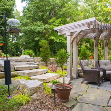
The couple had a deck and a walkout patio, but these spaces felt disconnected. Many of the solutions they put forward were attempts to address this separation. Working with our designers, we created a beautiful, tiered walkway that connected the deck and the walkout using modern bluestone from Rock Bottom Stone Supply, right here in Michigan. We added lighting features that would increase the feeling of connectivity between these spaces.
We set out to create a space that would hover between the patio and the deck. This space would make our homeowners feel connected to the nature preserve around them while allowing them to feel creative and comfortable.
To start, we made benches, stairs, and a built-in table. From there we finished with a cedar pergola that would give them shade in the summer months. We ended up making the pergola curved so it would relax into the space and provide a bit of the wow factor. We connected the deck and the walkout and paid homage to the slope and the preserve by installing still more native plants.
All in all, the space completely rejuvenated the couple’s yard. It proved an elegant solution to a number of practical problems and served as a connection between the house and the stunning property onto which the house was built.
At Lotus, we have proven our ability to provide similar solutions for many properties like this, but this one stands out. If for no other reason than to remind us, again and again, that nature and natural beauty are truly worth celebrating.
Designer: Traven Pelletier
Location: Brighton, Mi
Materials: Limestone outcrop, bluestone patio, cedar pergola, all natural stone
Vendors: Rock Bottom Stone supply in Burton, Michigan, Hobart stone in New York is bluestone supplier
Find the right local pro for your project

 ZeroEnergy Design
This renovated brick rowhome in Boston’s South End offers a modern aesthetic within a historic structure, creative use of space, exceptional thermal comfort, a reduced carbon footprint, and a passive stream of income.
DESIGN PRIORITIES. The goals for the project were clear - design the primary unit to accommodate the family’s modern lifestyle, rework the layout to create a desirable rental unit, improve thermal comfort and introduce a modern aesthetic. We designed the street-level entry as a shared entrance for both the primary and rental unit. The family uses it as their everyday entrance - we planned for bike storage and an open mudroom with bench and shoe storage to facilitate the change from shoes to slippers or bare feet as they enter their home. On the main level, we expanded the kitchen into the dining room to create an eat-in space with generous counter space and storage, as well as a comfortable connection to the living space. The second floor serves as master suite for the couple - a bedroom with a walk-in-closet and ensuite bathroom, and an adjacent study, with refinished original pumpkin pine floors. The upper floor, aside from a guest bedroom, is the child's domain with interconnected spaces for sleeping, work and play. In the play space, which can be separated from the work space with new translucent sliding doors, we incorporated recreational features inspired by adventurous and competitive television shows, at their son’s request.
MODERN MEETS TRADITIONAL. We left the historic front facade of the building largely unchanged - the security bars were removed from the windows and the single pane windows were replaced with higher performing historic replicas. We designed the interior and rear facade with a vision of warm modernism, weaving in the notable period features. Each element was either restored or reinterpreted to blend with the modern aesthetic. The detailed ceiling in the living space, for example, has a new matte monochromatic finish, and the wood stairs are covered in a dark grey floor paint, whereas the mahogany doors were simply refinished. New wide plank wood flooring with a neutral finish, floor-to-ceiling casework, and bold splashes of color in wall paint and tile, and oversized high-performance windows (on the rear facade) round out the modern aesthetic.
RENTAL INCOME. The existing rowhome was zoned for a 2-family dwelling but included an undesirable, single-floor studio apartment at the garden level with low ceiling heights and questionable emergency egress. In order to increase the quality and quantity of space in the rental unit, we reimagined it as a two-floor, 1 or 2 bedroom, 2 bathroom apartment with a modern aesthetic, increased ceiling height on the lowest level and provided an in-unit washer/dryer. The apartment was listed with Jackie O'Connor Real Estate and rented immediately, providing the owners with a source of passive income.
ENCLOSURE WITH BENEFITS. The homeowners sought a minimal carbon footprint, enabled by their urban location and lifestyle decisions, paired with the benefits of a high-performance home. The extent of the renovation allowed us to implement a deep energy retrofit (DER) to address air tightness, insulation, and high-performance windows. The historic front facade is insulated from the interior, while the rear facade is insulated on the exterior. Together with these building enclosure improvements, we designed an HVAC system comprised of continuous fresh air ventilation, and an efficient, all-electric heating and cooling system to decouple the house from natural gas. This strategy provides optimal thermal comfort and indoor air quality, improved acoustic isolation from street noise and neighbors, as well as a further reduced carbon footprint. We also took measures to prepare the roof for future solar panels, for when the South End neighborhood’s aging electrical infrastructure is upgraded to allow them.
URBAN LIVING. The desirable neighborhood location allows the both the homeowners and tenant to walk, bike, and use public transportation to access the city, while each charging their respective plug-in electric cars behind the building to travel greater distances.
OVERALL. The understated rowhouse is now ready for another century of urban living, offering the owners comfort and convenience as they live life as an expression of their values.
Eric Roth Photo
 JRP Design & Remodel
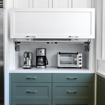
This timeless kitchen is the perfect example of how rich color sets the mood. Inspired by Sherwin-Williams’ Dried Thyme, the green cabinetry brings a warm and contemporary look. The kitchen’s original layout is what attracted the owners to this home so with a few changes, the space now better fits the owners’ needs.
Straightening out a wall by the large bay window provided space to move the dishwasher, and gave room to build a tall cabinet with organized pullout drawers next to the stove for easy access and storage. This also created room to build a hidden appliance garage and flipping the location of the island sink provided more accessibility to the stove.
The bow front stove hood provides visual relief for the linear nature of the cabinets. Green ceramic tiles surround the porcelain herringbone tile in the contrasting niche dedicated to spices and oils, and the adjacent pot filler provides convenience.
The island was increased in size to provide for more storage and metal domed pendants provide lighting for both prepping and eating. Double-wall ovens have side handles for easy opening and convenience and provide easy access in a busy kitchen area.
Separating the dining room from the kitchen with the addition of a butler door, created space to easily connect and move between the two rooms while minimizing noise.
Photographer: Andrew Orozco

 The Rinfret Group
Example of a mid-sized transitional freestanding desk dark wood floor and brown floor study room design in New York with beige walls and no fireplace

 Charlie Allen Renovations, Inc.
For a small family in the Boston suburbs, their modest sized home was just the right size. But with some smart changes, they wondered if it could be more enjoyable. Working with architect Joseph S. Artley, we came up with a number of solutions:
• To make the kitchen a more comfortable work and gathering space, a bay window was removed and the kitchen itself bumped out slightly to allow for the introduction of an expansive island, as well as additional countertop and cabinetry.
• The first floor half-bathroom was relocated to the end of the entry hall. This allowed us to connect the kitchen with what had been a three-season porch.
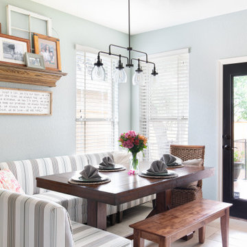
• That three-season porch was properly heated and remodeled as a sunny breakfast nook: the perfect spot for the family to gather in the mornings.
• Near the entry to the breakfast nook, an existing electrical box could not be moved. To conceal it, we suggested an oversized family bulletin board, which we provided as a gift to the homeowners. Now, it offers a great spot to catch up on the day’s activities and enjoy some family artwork while heading in for breakfast.
• This family loves to read and they asked for custom built in bookshelves in the living room that would look original to the home and match existing shelving on the other side of the room.
• The den is a favorite spot for the family to watch movies and play games, but the room, which had also been a three season porch prior to an earlier renovation, was drafty in the winter and hot in the summer. We introduced new, energy efficient windows and insulation throughout, resulting in a much more inviting and cozy room.
Today, after barely increasing the footprint of the home, the family has a new breakfast room, a usable den, a larger and more inviting kitchen, and a better-situated first-floor bath. Lots of simple fixes = a much happier space for the whole family.
Photos by Shelly Harrison
 Twelve Stones Designs, LLC
The owners of this kitchen had spent the money to upgrade the finishes in their kitchen upon building the home 12 years ago, but after living in the space for several years they realized how nonfunctional the layout really was. The (then) two preschool aged children had grown into busy, hungry teenagers with many friends who also liked to hang out at the house. So the family needed a more functional kitchen with better traffic flow, space for daily activities revolving around the kitchen at different times of day, and a kitchen that could accommodate cooking for and serving large groups. Furthermore, the dark, traditional finishes no longer reflected the homeowners’ style. They requested a brighter, more relaxed, coastal style that reflected their love of the seaside cities they like to visit.
Originally, the kitchen was U-shaped with a narrow island in the middle. The island created narrow aisles that bottle-necked at the dishwasher, refrigerator, and cooktop areas. There was a pass-through from the foyer into the kitchen, but the owners never liked that the pass-through was also located so close to the powder room. The awkward proximity was unappealing and made guests feel uncomfortable.
The kitchen’s storage was made up of lots of narrow cabinets, apothecary drawers, clipped corner units, and very few drawers. It lacked useful storage for the larger items the family used on a daily basis. And the kitchen’s only pantry was small closet that had only builder-grade, narrow shelving with no illumination to be able to see the contents inside.
Overall, the kitchen’s lighting plan was poorly executed. Only six recessed cans illuminated the entire kitchen and nook areas. The under cabinet lighting was not evenly distributed either. In fact, the builder had mis-placed the under cabinet lighting around the decorative pilasters which made for choppy, dark cubbies. Further, the builder didn’t include any lighting over the sink or the bar area, which meant whoever was doing the dishes was always in their own shadow. That, coupled with the steep overhang of the game room above made the bar area feel like a dim, cavernous space that wasn’t inviting or task oriented. The kitchen looked out into the main living space, but the raised bar and a narrow wall (which held the only large cabinet in the kitchen) created more of a barrier than a relationship to the living room or breakfast nook. In fact, one couldn’t even see the breakfast nook from the cooktop or sink areas due to its orientation. The raised bar top was too narrow to comfortably sit to either dine at or chat from due to the lack of knee space. The the homeowners confided that the kitchen felt more like a dark, dirty prison than place where the family, or their guests, wanted to gather and commune.
The clients' needs and desires were:
➢ to create a kitchen that would be a space the family loved to be in; to relate to the adjacent spaces all around, and to have better flow for entertaining large groups
➢ to remove the walls between the breakfast nook and living area and to be able to utilize the natural light from the windows in both those areas
➢ to incorporate a functional chopping block for prepping fresh food for home cooked meals, an island with a large sink and drain board, 2 pull out trash cans, and seating for at least the 2 teens to eat or do homework
➢ to design a kitchen and breakfast nook with an airy, coastal, relaxed vibe that blended with the rest of the house's coastal theme
➢ to integrate a layered lighting plan which would include ample general illumination, specific task lighting, decorative lighting, and lots of illuminated storage
➢ to design a kitchen with not only more storage for all the husband’s kitchen gadgets and collection of oils and spices, but smart storage, including a coffee/breakfast bar and a place to store and conceal the toaster oven and microwave
➢ to find a way to utilize the large open space between the kitchen, pantry area, and breakfast nook
Twelve Stones Designs achieved the owner's goals by:
➢ removing the walls between the kitchen and living room to allow the natural light to filter in from the adjacent rooms and to create a connection between the kitchen, nook, and living spaces for a sense of unity and communion
➢ removing the existing pantry and designing 3 large pantry style cabinets with LED tape lights and rollout drawers to house lots of kitchen appliances, gadgets, and tons of groceries. We also took the cabinets all the way up to the 9’ ceiling for additional storage for seasonal items and bulk storage.
➢ designing 2 islands - 1 with a gorgeous black walnut chopping block that houses a drawer for chopping and carving knives and a custom double pull out trash unit for point of use utilization - and 1 that houses the dishwasher, a large Blanco Gourmet sink with integrated drain board, woven baskets for fresh root vegetables and kitchen towels, plenty of drawer storage for kitchen items, and bar seating for up to 4 diners.
➢ closing off the space between the kitchen and the powder room to create a beautiful new private alcove for the powder room as well as adding some decorative storage. This also gave us space to include more tall storage near the new range for precision placement of the husband’s extensive oil and spice collection as well as a location for a combo-steam oven the wife wanted for baking and cooking healthy meals.
The project is enhanced functionally by:
➢ incorporated USB and standard receptacles for the kids’ laptops and phone charging in the large island
➢ designing the small island to include additional open shelving for items used on a daily basis such as a variety of bowls, plates, and colanders. This set up also works well for the husband who prefers to “plate” his dinners in restaurant-style fashion before presenting them to the table.
➢ the integration of specific storage units, such as double stacked cutlery drawers, a custom spice pull-out, a Kuerig coffee and tea pod drawer, and custom double stacked utensil drawers
➢ moving the refrigerator to the old oven location - this eliminated the bottle neck as well as created a better relationship to the eating table. It also utilizes the floor space between the pantry, nook, and kitchen
➢ creating a banquet style breakfast nook - this banquette seating not only doubles the amount of seating for large gatherings but it better utilizes the odd space between the kitchen and the previous nook area. It also helps to create a distinct pathway from the mudroom room through the pantry area, kitchen, nook, and living room.
➢ the coffee/breakfast bar area which includes the perfect location for the concealed microwave and toaster oven, convenient storage for the coffee pods and tea accoutrements. Roll-out drawers below also house the smoothie maker, hot water kettle, and a plethora of smoothie-making ingredients such as protein powders, smoothie additives, etc. Furthermore, the drawers below the Keurig house measuring utensil, cutlery, baking supplies and tupperware storage.
➢ incorporating lots of wide drawers and pullouts to accommodate large cookware.
➢ utilizing as much vertical space as possible by building storage to the ceiling which accommodates the family’s abundant amount of serving platters, baking sheets, bakeware, casserole dishes, and additional cutting boards.
The project is enhanced aesthetically by:
➢ new 5-piece Versailles pattern porcelain tile that now seamlessly joins the entire down stairs area together creating a bright, cohesiveness feeling instead of choppy separated spaces - it also adds a coastal feeling
➢ designing a cabinet to conceal the microwave and toaster oven
➢ the coastal influenced light fixtures over the nook table and island
➢ the sandy colors of the Langdon Cambria countertops. The swirling pattern and sparkling quartz pieces remind the homeowner of black-and-tan sandy beaches
➢ the striped banquet seating whose creamy white background and blue-green stripes were the inspiration for the cabinet and wall colors.
➢ All the interior doors were painted black to coordinate with the blacks and grays in the backsplash tile and countertop. This also adds a hint of tailored formality to an otherwise casual space.
➢ the use of WAC's Oculux small aperture LED units for the overhead lighting complimented with Diode LED strips for task lighting under the cabinets and inside the pantry and glass wall cabinets. All of the lighting applications are on separate dimmer switches.
Innovative uses of materials or construction methods by Realty Restoration LLC:
➢ Each 1-1/2” x 3” block of reclaimed end-grain black walnut that makes up the center island chopping block was hand milled and built in the shop. It was designed to look substantial and proportional to the surrounding elements, executed by creating the 4 inch tall top with a solid wood chamfered edge band.
➢ The metal doors on either side of the vent hood were also custom designed for this project and built in the Realty Restoration LLC shop. They are made 1x2, 11-gauge mild steel with ribbed glass. Weighing 60 lbs a piece, heavy duty cabinet hinges were added to support the weight of the door and keep them from sagging.
➢ Under-cabinet receptacles were added along the range wall in order to have a clean, uninterrupted backsplash.
Design obstacles to overcome:
➢ Because we were removing the demising walls between the kitchen and living room, we had to find a way to plumb and vent the new island. We did this by tunneling through the slab (the slab had post tension cables which prevented us from just trenching) to run a new wet vent through a nearby structural wall. We pulled the existing hot and cold lines between upper floor joists and ran them down the structural wall as well and up through a conduit in the tunnel.
➢ Since we were converting from wall overs to a gas range it allowed us to utilize the 220 feed for the wall ovens to provide a new sub panel for all the new kitchen circuits
➢ Due to framing deficiencies inherited from the original build there was a 1-1/2” differential in the floor-to-ceiling height over a 20 foot span; by utilizing the process of cutting and furring coupled with the crown moulding details on the cabinet elevations we were able to mask the problem and provide seamless transitions between the cabinet components.
Evidence of superior craftsmanship:
➢ uniquely designed, one-of-a-kind metal “X” end panels on the large island. The end panels were custom made in the Realty Restoration LLC shop and fitted to the exact dimensions of the island. The welding seams are completely indistinguishable - the posts look like they are cut from a single sheet of metal
➢ square metal posts on the small island were also custom made and designed to compliment and carry through the metal element s throughout the kitchen
➢ the beautiful, oversized end panels on the pantry cabinets which give the breakfast nook a tailored look
➢ integrating a large format 5 piece Versailles tile pattern to seamlessly flow from the existing spaces into the new kitchen space
➢ By constructing a custom cabinet that jogged around a corner we could not remodel (housing the entry way coat closet) we were able to camouflage the adjacent wall offset within the upper and lower cabinets. By designing around the existing jog in the structural walls we accomplished a few things: we were able to find the space to house, and hide, the microwave and toaster oven yet still have a clean cohesive appearance from the kitchen side. Additionally, the owners were able to keep their much needed coat closet and we didn’t have to increase the budget with unnecessary structural work.

 The Jack + Mare | Portland Design & Build
The Jack + Mare worked with the homeowners of this cool mid-century inspired kitchen from schematic design all the way through construction.
The existing kitchen was demolished all the way to studs, subfloor and ceiling joists and completely rebuilt with custom cabinets, solid oak flooring, task and ambient lighting, new electrical/plumbing, counter-to-ceiling wall tile, new beam (took down wall between living/kitchen), new window and colorful barn door.
The final design maximized storage, increased counter space, improved traffic flow, connected kitchen to adjacent living room (by removing existing wall), and improved the social aspect of the kitchen.
The kitchen is now efficient, beautiful, full of light and a happy place to call home!
Features: custom walnut cabinets (designed by The J+M), tile backsplash, new lighting plan (LED can lights, under-cabinet LED lights, Cedar+Moss pendants with LED bulbs), quartz countertops, new Marvin window with new trim, pantry with pull out shelves, glass upper cabinet (with puck LED) to feature antique glass-ware, island with microwave under counter, island seating.
photo credit: Jason Quigley
 The Jack + Mare | Portland Design & Build
The Jack + Mare worked with the homeowners of this cool mid-century inspired kitchen from schematic design all the way through construction.
The existing kitchen was demolished all the way to studs, subfloor and ceiling joists and completely rebuilt with custom cabinets, solid oak flooring, task and ambient lighting, new electrical/plumbing, counter-to-ceiling wall tile, new beam (took down wall between living/kitchen), new window and colorful barn door.
The final design maximized storage, increased counter space, improved traffic flow, connected kitchen to adjacent living room (by removing existing wall), and improved the social aspect of the kitchen.
The kitchen is now efficient, beautiful, full of light and a happy place to call home!
Features: custom walnut cabinets (designed by The J+M), tile backsplash, new lighting plan (LED can lights, under-cabinet LED lights, Cedar+Moss pendants with LED bulbs), quartz countertops, new Marvin window with new trim, pantry with pull out shelves, glass upper cabinet (with puck LED) to feature antique glass-ware, island with microwave under counter, island seating.
photo credit: Jason Quigley

 Balbes Custom Builders
Inspiration for a modern kitchen remodel in Detroit with granite countertops, gray backsplash and ceramic backsplash

 Michael Nash Design, Build & Homes
2013 NARI CAPITAL COTY, FINALIST AWARD WINNER, RESIDENTIAL BATH UNDER $30,000
A colonial home recently built in the suburb of Leesburg had a run of the mill 10’x11’ bathroom connected to the seating room of the master suite.
The clients disliked both the builder grade soaking tub and small shower, in fact, preferring to sacrifice the tub for a much bigger spa-like shower stall. In general, they wanted more space and more storage. To increase the footprint for the remodel, a decision was made to “steal” some space from the seating room.
The new layout features a large, walk-in shower with a frameless glass enclosure. A rain shower, body sprays and bench seating meet all of the homeowners’ desires.
Large linen cabinets surround a large new vanity, touting a granite top, vessel sinks and wall-mounted faucets. Mirrored, embedded medicine cabinets are wrapped in glass tile and illuminated by hanging lights. The opposite wall features floating dressing cabinets which serve as a new make-up area.
Smart use of lighting, such as pendants, sconces, and recess lights has made the space brighter than ever. Designers at Michael Nash Design, Build & Homes used large, light color porcelain tiles and enhanced the look with complementary glass tiles on accents walls, niches and other areas.
 The Jack + Mare | Portland Design & Build
The Jack + Mare worked with the homeowners of this cool mid-century inspired kitchen from schematic design all the way through construction.
The existing kitchen was demolished all the way to studs, subfloor and ceiling joists and completely rebuilt with custom cabinets, solid oak flooring, task and ambient lighting, new electrical/plumbing, counter-to-ceiling wall tile, new beam (took down wall between living/kitchen), new window and colorful barn door.
The final design maximized storage, increased counter space, improved traffic flow, connected kitchen to adjacent living room (by removing existing wall), and improved the social aspect of the kitchen.
The kitchen is now efficient, beautiful, full of light and a happy place to call home!
Features: custom walnut cabinets (designed by The J+M), tile backsplash, new lighting plan (LED can lights, under-cabinet LED lights, Cedar+Moss pendants with LED bulbs), quartz countertops, new Marvin window with new trim, pantry with pull out shelves, glass upper cabinet (with puck LED) to feature antique glass-ware, island with microwave under counter, island seating.
photo credit: Jason Quigley

 The Brooklyn Studio
This residence was a complete gut renovation of a 4-story row house in Park Slope, and included a new rear extension and penthouse addition. The owners wished to create a warm, family home using a modern language that would act as a clean canvas to feature rich textiles and items from their world travels. As with most Brooklyn row houses, the existing house suffered from a lack of natural light and connection to exterior spaces, an issue that Principal Brendan Coburn is acutely aware of from his experience re-imagining historic structures in the New York area. The resulting architecture is designed around moments featuring natural light and views to the exterior, of both the private garden and the sky, throughout the house, and a stripped-down language of detailing and finishes allows for the concept of the modern-natural to shine.
Upon entering the home, the kitchen and dining space draw you in with views beyond through the large glazed opening at the rear of the house. An extension was built to allow for a large sunken living room that provides a family gathering space connected to the kitchen and dining room, but remains distinctly separate, with a strong visual connection to the rear garden. The open sculptural stair tower was designed to function like that of a traditional row house stair, but with a smaller footprint. By extending it up past the original roof level into the new penthouse, the stair becomes an atmospheric shaft for the spaces surrounding the core. All types of weather – sunshine, rain, lightning, can be sensed throughout the home through this unifying vertical environment. The stair space also strives to foster family communication, making open living spaces visible between floors. At the upper-most level, a free-form bench sits suspended over the stair, just by the new roof deck, which provides at-ease entertaining. Oak was used throughout the home as a unifying material element. As one travels upwards within the house, the oak finishes are bleached to further degrees as a nod to how light enters the home.
The owners worked with CWB to add their own personality to the project. The meter of a white oak and blackened steel stair screen was designed by the family to read “I love you” in Morse Code, and tile was selected throughout to reference places that hold special significance to the family. To support the owners’ comfort, the architectural design engages passive house technologies to reduce energy use, while increasing air quality within the home – a strategy which aims to respect the environment while providing a refuge from the harsh elements of urban living.
This project was published by Wendy Goodman as her Space of the Week, part of New York Magazine’s Design Hunting on The Cut.
Photography by Kevin Kunstadt
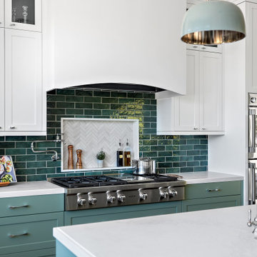 JRP Design & Remodel
This timeless kitchen is the perfect example of how rich color sets the mood. Inspired by Sherwin-Williams’ Dried Thyme, the green cabinetry brings a warm and contemporary look. The kitchen’s original layout is what attracted the owners to this home so with a few changes, the space now better fits the owners’ needs.
Straightening out a wall by the large bay window provided space to move the dishwasher, and gave room to build a tall cabinet with organized pullout drawers next to the stove for easy access and storage. This also created room to build a hidden appliance garage and flipping the location of the island sink provided more accessibility to the stove.
The bow front stove hood provides visual relief for the linear nature of the cabinets. Green ceramic tiles surround the porcelain herringbone tile in the contrasting niche dedicated to spices and oils, and the adjacent pot filler provides convenience.
The island was increased in size to provide for more storage and metal domed pendants provide lighting for both prepping and eating. Double-wall ovens have side handles for easy opening and convenience and provide easy access in a busy kitchen area.
Separating the dining room from the kitchen with the addition of a butler door, created space to easily connect and move between the two rooms while minimizing noise.
Photographer: Andrew Orozco

 Astria Fireplaces
The Craftsman fireplace sets a new standard for wood burning beauty, performance and convenience. The bedrock of the Astria wood burning family, the Craftsman features the industry’s finest, most realistic textured refractory brick liners. Hidden screen pockets maximize the viewing area of the fireplace. An easy access damper handle and position lock outside air controls support consistent performance. The Craftsman is designed with gas line knockouts to allow homeowners the option of installing an Astria gas log set, with all gas connections and controls hidden out of sight.
Aesthetics
Realistic textured refractory brick liner
Clean face and louvered models available.
Screens retract into hidden screen pockets for a clean elegant look.
Heavy duty log grate.
Glass doors available with black, Brushed brass or platinum trim.
Comfort
Radiant heat delivers relaxing warmth in the room environment.
Outside combustion air kit available.
Performance
Fully insulated firebox (on select models) for increased performance in colder climates.
Easy access damper with position lock outside air controls.
8” double wall wood-burning chimney.
Durable textured powder coat finish.
Fan kit available (for circulating models only).
Gas log ready.
Available with PureFire Technology
The Craftsman CAT comes with all of the great features of the Craftsman and the added benefits of PureFire technology! PureFire is a passive catalyst system that reduces particulate emissions by approximately 75%. PureFire virtually eliminates carbon monoxide (including CO from gas logs) and is maintenance free, no cleaning or special care required!
 ZeroEnergy Design
This renovated brick rowhome in Boston’s South End offers a modern aesthetic within a historic structure, creative use of space, exceptional thermal comfort, a reduced carbon footprint, and a passive stream of income.
DESIGN PRIORITIES. The goals for the project were clear - design the primary unit to accommodate the family’s modern lifestyle, rework the layout to create a desirable rental unit, improve thermal comfort and introduce a modern aesthetic. We designed the street-level entry as a shared entrance for both the primary and rental unit. The family uses it as their everyday entrance - we planned for bike storage and an open mudroom with bench and shoe storage to facilitate the change from shoes to slippers or bare feet as they enter their home. On the main level, we expanded the kitchen into the dining room to create an eat-in space with generous counter space and storage, as well as a comfortable connection to the living space. The second floor serves as master suite for the couple - a bedroom with a walk-in-closet and ensuite bathroom, and an adjacent study, with refinished original pumpkin pine floors. The upper floor, aside from a guest bedroom, is the child's domain with interconnected spaces for sleeping, work and play. In the play space, which can be separated from the work space with new translucent sliding doors, we incorporated recreational features inspired by adventurous and competitive television shows, at their son’s request.
MODERN MEETS TRADITIONAL. We left the historic front facade of the building largely unchanged - the security bars were removed from the windows and the single pane windows were replaced with higher performing historic replicas. We designed the interior and rear facade with a vision of warm modernism, weaving in the notable period features. Each element was either restored or reinterpreted to blend with the modern aesthetic. The detailed ceiling in the living space, for example, has a new matte monochromatic finish, and the wood stairs are covered in a dark grey floor paint, whereas the mahogany doors were simply refinished. New wide plank wood flooring with a neutral finish, floor-to-ceiling casework, and bold splashes of color in wall paint and tile, and oversized high-performance windows (on the rear facade) round out the modern aesthetic.
RENTAL INCOME. The existing rowhome was zoned for a 2-family dwelling but included an undesirable, single-floor studio apartment at the garden level with low ceiling heights and questionable emergency egress. In order to increase the quality and quantity of space in the rental unit, we reimagined it as a two-floor, 1 or 2 bedroom, 2 bathroom apartment with a modern aesthetic, increased ceiling height on the lowest level and provided an in-unit washer/dryer. The apartment was listed with Jackie O'Connor Real Estate and rented immediately, providing the owners with a source of passive income.
ENCLOSURE WITH BENEFITS. The homeowners sought a minimal carbon footprint, enabled by their urban location and lifestyle decisions, paired with the benefits of a high-performance home. The extent of the renovation allowed us to implement a deep energy retrofit (DER) to address air tightness, insulation, and high-performance windows. The historic front facade is insulated from the interior, while the rear facade is insulated on the exterior. Together with these building enclosure improvements, we designed an HVAC system comprised of continuous fresh air ventilation, and an efficient, all-electric heating and cooling system to decouple the house from natural gas. This strategy provides optimal thermal comfort and indoor air quality, improved acoustic isolation from street noise and neighbors, as well as a further reduced carbon footprint. We also took measures to prepare the roof for future solar panels, for when the South End neighborhood’s aging electrical infrastructure is upgraded to allow them.
URBAN LIVING. The desirable neighborhood location allows the both the homeowners and tenant to walk, bike, and use public transportation to access the city, while each charging their respective plug-in electric cars behind the building to travel greater distances.
OVERALL. The understated rowhouse is now ready for another century of urban living, offering the owners comfort and convenience as they live life as an expression of their values.
Eric Roth Photo
 The Jack + Mare | Portland Design & Build
The Jack + Mare worked with the homeowners of this cool mid-century inspired kitchen from schematic design all the way through construction.
The existing kitchen was demolished all the way to studs, subfloor and ceiling joists and completely rebuilt with custom cabinets, solid oak flooring, task and ambient lighting, new electrical/plumbing, counter-to-ceiling wall tile, new beam (took down wall between living/kitchen), new window and colorful barn door.
The final design maximized storage, increased counter space, improved traffic flow, connected kitchen to adjacent living room (by removing existing wall), and improved the social aspect of the kitchen.
The kitchen is now efficient, beautiful, full of light and a happy place to call home!
Features: custom walnut cabinets (designed by The J+M), tile backsplash, new lighting plan (LED can lights, under-cabinet LED lights, Cedar+Moss pendants with LED bulbs), quartz countertops, new Marvin window with new trim, pantry with pull out shelves, glass upper cabinet (with puck LED) to feature antique glass-ware, island with microwave under counter, island seating.
photo credit: Jason Quigley

 User
Every design decision for this Caribbean beach residence was guided by the desire to maximize the views of the property’s breathtaking natural surroundings.
To connect the spaces and reveal the views from every vantage point, the team reconfigured the layout to create vistas, and installed window film to reduce solar heat gain. These modifications increased efficiencies, reused 90% of the interior envelope and did not impact the exterior structure of the building. In addition to providing incredible views, opening up the plan allows cross ventilation, maximizing the use of ocean breezes to cool the interior. The result is an effortless flow and maximization of space.
Throughout the interior, dark materials express the concept of respite in the shade, and emphasize the sweeping views of the Caribbean Sea. Millwork crafted by local artisans from local materials establishes hierarchy – providing a clear understanding of the layout – and filters light to create privacy and drama. Screens help define the spaces and create suspense.
Varying screen opacities serve specific functions: nearly opaque screens build suspense, translucent screens provide privacy, and reflective screens – as seen in the kitchen ceiling – create mystery in the core where light and views
are challenged. Referencing the seaside location, the baseboards create a sense of being in a deep shallow. The 16” tall baseboards create a pool effect, engaging the walls with Cradle to Cradle certified Mosa tile flooring. The irregular height also conceals power and data cabling. The resulting space is a contemporary oasis that offers a high-level of comfort and functionality.
Anne Rausch Photography
 The Brooklyn Studio
This residence was a complete gut renovation of a 4-story row house in Park Slope, and included a new rear extension and penthouse addition. The owners wished to create a warm, family home using a modern language that would act as a clean canvas to feature rich textiles and items from their world travels. As with most Brooklyn row houses, the existing house suffered from a lack of natural light and connection to exterior spaces, an issue that Principal Brendan Coburn is acutely aware of from his experience re-imagining historic structures in the New York area. The resulting architecture is designed around moments featuring natural light and views to the exterior, of both the private garden and the sky, throughout the house, and a stripped-down language of detailing and finishes allows for the concept of the modern-natural to shine.
Upon entering the home, the kitchen and dining space draw you in with views beyond through the large glazed opening at the rear of the house. An extension was built to allow for a large sunken living room that provides a family gathering space connected to the kitchen and dining room, but remains distinctly separate, with a strong visual connection to the rear garden. The open sculptural stair tower was designed to function like that of a traditional row house stair, but with a smaller footprint. By extending it up past the original roof level into the new penthouse, the stair becomes an atmospheric shaft for the spaces surrounding the core. All types of weather – sunshine, rain, lightning, can be sensed throughout the home through this unifying vertical environment. The stair space also strives to foster family communication, making open living spaces visible between floors. At the upper-most level, a free-form bench sits suspended over the stair, just by the new roof deck, which provides at-ease entertaining. Oak was used throughout the home as a unifying material element. As one travels upwards within the house, the oak finishes are bleached to further degrees as a nod to how light enters the home.
The owners worked with CWB to add their own personality to the project. The meter of a white oak and blackened steel stair screen was designed by the family to read “I love you” in Morse Code, and tile was selected throughout to reference places that hold special significance to the family. To support the owners’ comfort, the architectural design engages passive house technologies to reduce energy use, while increasing air quality within the home – a strategy which aims to respect the environment while providing a refuge from the harsh elements of urban living.
This project was published by Wendy Goodman as her Space of the Week, part of New York Magazine’s Design Hunting on The Cut.
Photography by Kevin Kunstadt
44