
Search results for "Intervention originating" in Home Design Ideas
 down2earth Interior Design, LLC.
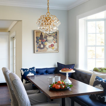
Our energetic client came to us with a design challenge – take a broken-up layout, make it flow, and add a French flair. And, it was imperative that we maximize storage and make the whole space kid and dog friendly.
This interior design project was a true collaboration. When we began, the kitchen and the dining room were completely separate spaces. Our down2earth interior design team proposed layouts that ranged from modest interventions (retaining the wall that divided the dining room and kitchen), to moderate interventions that left a partial wall in place, to major realignments that opened the space wide up. By creating design drawings for these different levels of intervention, the homeowners were able to view the pros and cons and price the different options. Happily, after having engineers verify that it was doable, they chose a wide open layout, which allows these party people to have a fabulous entertaining space.
Once the layouts for the kitchen and dining room were established, it was time to collaborate with the builder on lighting placement and with the woodworker to get all the little details right, such as dog dishes in the blue island and specialized storage at the perimeter. The wood fumehood was part of the homeowners’ original vision and is the focal point of the back wall. The brass and glass shelves over the bar cabinets were sourced by the homeowners as well, and we worked within the company’s offerings to get the proportions just right. A brass bar was added to the toe-kick area of the custom designed breakfast nook to match the brass bar shelf brackets and support little feet. Lighting, furniture, upholstered bench cushions, and drapery all soften the space and provide that desired French flair. Counter tops are super white leather granite.
 down2earth Interior Design, LLC.
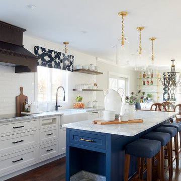
Our energetic client came to us with a design challenge – take a broken-up layout, make it flow, and add a French flair. And, it was imperative that we maximize storage and make the whole space kid and dog friendly.
This interior design project was a true collaboration. When we began, the kitchen and the dining room were completely separate spaces. Our down2earth interior design team proposed layouts that ranged from modest interventions (retaining the wall that divided the dining room and kitchen), to moderate interventions that left a partial wall in place, to major realignments that opened the space wide up. By creating design drawings for these different levels of intervention, the homeowners were able to view the pros and cons and price the different options. Happily, after having engineers verify that it was doable, they chose a wide open layout, which allows these party people to have a fabulous entertaining space.
Once the layouts for the kitchen and dining room were established, it was time to collaborate with the builder on lighting placement and with the woodworker to get all the little details right, such as dog dishes in the blue island and specialized storage at the perimeter. The wood fumehood was part of the homeowners’ original vision and is the focal point of the back wall. The brass and glass shelves over the bar cabinets were sourced by the homeowners as well, and we worked within the company’s offerings to get the proportions just right. A brass bar was added to the toe-kick area of the custom designed breakfast nook to match the brass bar shelf brackets and support little feet. Lighting, furniture, upholstered bench cushions, and drapery all soften the space and provide that desired French flair. Counter tops are super white leather granite.
 Penza Bailey Architects
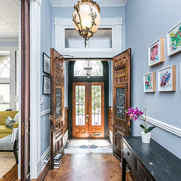
This 6-bedroom Baltimore row home's grand exterior overlooks a tree lined street in the historic Bolton Hill neighborhood. The original large pocket doors in the first floor allows for uninterrupted views from the front parlor through the sitting room and into the rear dining room bay window.
Penza Bailey Architects provided a complete transformation of the walk out garden level. The entire level was renovated to include a new kitchen, family room, mudroom, playroom, full bathroom and a gracious new stair leading to the upper level. The painted brick and exposed structure expresses the original "bones" of the home, while clearly modern interventions stand in contrast to suit the homeowner’s lifestyle. An alcove on the 1st floor was also renovated to provide a serving pantry and bar.
The exterior received restored front and vestibule doors, select window replacements, and new rear french doors, all receiving historical approval.
Find the right local pro for your project
 Design Intervention
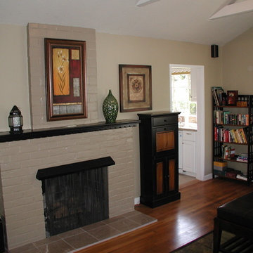
family room update with original wood floors and great affordable art work give this room warmth and charm.
Example of a small arts and crafts enclosed medium tone wood floor living room library design in Orange County with a tv stand, beige walls, a standard fireplace and a brick fireplace
Example of a small arts and crafts enclosed medium tone wood floor living room library design in Orange County with a tv stand, beige walls, a standard fireplace and a brick fireplace
 Bushman Dreyfus Architects
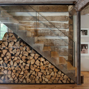
Virginia AIA Merit Award for Excellence in Residential Design | What appeared to be a simple, worn-out, early 20th century stucco cottage was to be modestly renovated as a weekend retreat. But when the contractor and architects began pulling away the interior wall finishes, they discovered a log cabin at its core (believed to date as far back as the 1780’s) and a newer addition (circa 1920’s) at the rear where the site slopes down. Initial plans were scrapped, and a new project was born that honors the original construction while accommodating new infrastructure and the clients’ modern tastes.
The attic stair enclosure was removed in deference to – and in order to visually expand – the original one-room log cabin. Wood floors, partially ravaged by termites, were repaired and refinished. The interventions of new steel structure, simple black iron handrail and glass stair guard provide a distinct counterpoint to the rusticity of the original construction, while the color palette of warm, natural tones harmonizes the composition.
 Design Intervention
After picture of living room expansion and remodel
Example of a large trendy open concept light wood floor and gray floor living room design in San Diego with a music area, gray walls, a standard fireplace, a stone fireplace and a media wall
Example of a large trendy open concept light wood floor and gray floor living room design in San Diego with a music area, gray walls, a standard fireplace, a stone fireplace and a media wall
 Katie Hutchison Studio
The new owners of this house in Harvard, Massachusetts loved its location and authentic Shaker characteristics, but weren’t fans of its curious layout. A dated first-floor full bathroom could only be accessed by going up a few steps to a landing, opening the bathroom door and then going down the same number of steps to enter the room. The dark kitchen faced the driveway to the north, rather than the bucolic backyard fields to the south. The dining space felt more like an enlarged hall and could only comfortably seat four. Upstairs, a den/office had a woefully low ceiling; the master bedroom had limited storage, and a sad full bathroom featured a cramped shower.
KHS proposed a number of changes to create an updated home where the owners could enjoy cooking, entertaining, and being connected to the outdoors from the first-floor living spaces, while also experiencing more inviting and more functional private spaces upstairs.
On the first floor, the primary change was to capture space that had been part of an upper-level screen porch and convert it to interior space. To make the interior expansion seamless, we raised the floor of the area that had been the upper-level porch, so it aligns with the main living level, and made sure there would be no soffits in the planes of the walls we removed. We also raised the floor of the remaining lower-level porch to reduce the number of steps required to circulate from it to the newly expanded interior. New patio door systems now fill the arched openings that used to be infilled with screen. The exterior interventions (which also included some new casement windows in the dining area) were designed to be subtle, while affording significant improvements on the interior. Additionally, the first-floor bathroom was reconfigured, shifting one of its walls to widen the dining space, and moving the entrance to the bathroom from the stair landing to the kitchen instead.
These changes (which involved significant structural interventions) resulted in a much more open space to accommodate a new kitchen with a view of the lush backyard and a new dining space defined by a new built-in banquette that comfortably seats six, and -- with the addition of a table extension -- up to eight people.
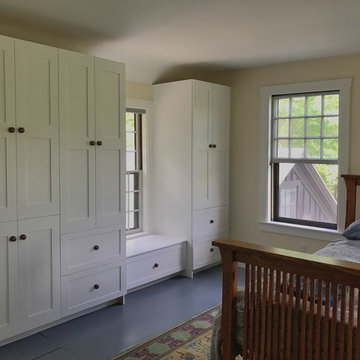
Upstairs in the den/office, replacing the low, board ceiling with a raised, plaster, tray ceiling that springs from above the original board-finish walls – newly painted a light color -- created a much more inviting, bright, and expansive space. Re-configuring the master bath to accommodate a larger shower and adding built-in storage cabinets in the master bedroom improved comfort and function. A new whole-house color palette rounds out the improvements.
Photos by Katie Hutchison

Sponsored
Columbus, OH

Wannemacher Interiors
Customized Award-Winning Interior Design Solutions in Franklin Cnty OH
 Katie Hutchison Studio
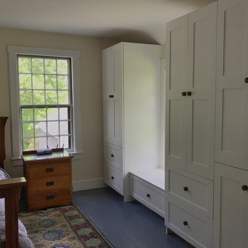
The new owners of this house in Harvard, Massachusetts loved its location and authentic Shaker characteristics, but weren’t fans of its curious layout. A dated first-floor full bathroom could only be accessed by going up a few steps to a landing, opening the bathroom door and then going down the same number of steps to enter the room. The dark kitchen faced the driveway to the north, rather than the bucolic backyard fields to the south. The dining space felt more like an enlarged hall and could only comfortably seat four. Upstairs, a den/office had a woefully low ceiling; the master bedroom had limited storage, and a sad full bathroom featured a cramped shower.
KHS proposed a number of changes to create an updated home where the owners could enjoy cooking, entertaining, and being connected to the outdoors from the first-floor living spaces, while also experiencing more inviting and more functional private spaces upstairs.
On the first floor, the primary change was to capture space that had been part of an upper-level screen porch and convert it to interior space. To make the interior expansion seamless, we raised the floor of the area that had been the upper-level porch, so it aligns with the main living level, and made sure there would be no soffits in the planes of the walls we removed. We also raised the floor of the remaining lower-level porch to reduce the number of steps required to circulate from it to the newly expanded interior. New patio door systems now fill the arched openings that used to be infilled with screen. The exterior interventions (which also included some new casement windows in the dining area) were designed to be subtle, while affording significant improvements on the interior. Additionally, the first-floor bathroom was reconfigured, shifting one of its walls to widen the dining space, and moving the entrance to the bathroom from the stair landing to the kitchen instead.
These changes (which involved significant structural interventions) resulted in a much more open space to accommodate a new kitchen with a view of the lush backyard and a new dining space defined by a new built-in banquette that comfortably seats six, and -- with the addition of a table extension -- up to eight people.
Upstairs in the den/office, replacing the low, board ceiling with a raised, plaster, tray ceiling that springs from above the original board-finish walls – newly painted a light color -- created a much more inviting, bright, and expansive space. Re-configuring the master bath to accommodate a larger shower and adding built-in storage cabinets in the master bedroom improved comfort and function. A new whole-house color palette rounds out the improvements.
Photos by Katie Hutchison
 down2earth Interior Design, LLC.
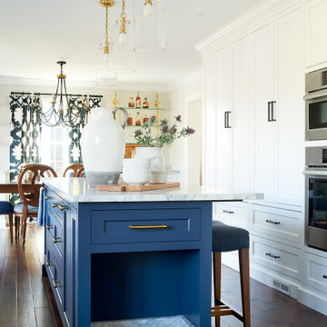
Our energetic client came to us with a design challenge – take a broken-up layout, make it flow, and add a French flair. And, it was imperative that we maximize storage and make the whole space kid and dog friendly.
This interior design project was a true collaboration. When we began, the kitchen and the dining room were completely separate spaces. Our down2earth interior design team proposed layouts that ranged from modest interventions (retaining the wall that divided the dining room and kitchen), to moderate interventions that left a partial wall in place, to major realignments that opened the space wide up. By creating design drawings for these different levels of intervention, the homeowners were able to view the pros and cons and price the different options. Happily, after having engineers verify that it was doable, they chose a wide open layout, which allows these party people to have a fabulous entertaining space.
Once the layouts for the kitchen and dining room were established, it was time to collaborate with the builder on lighting placement and with the woodworker to get all the little details right, such as dog dishes in the blue island and specialized storage at the perimeter. The wood fumehood was part of the homeowners’ original vision and is the focal point of the back wall. The brass and glass shelves over the bar cabinets were sourced by the homeowners as well, and we worked within the company’s offerings to get the proportions just right. A brass bar was added to the toe-kick area of the custom designed breakfast nook to match the brass bar shelf brackets and support little feet. Lighting, furniture, upholstered bench cushions, and drapery all soften the space and provide that desired French flair. Counter tops are super white leather granite.
 Charles Di Piazza Architecture
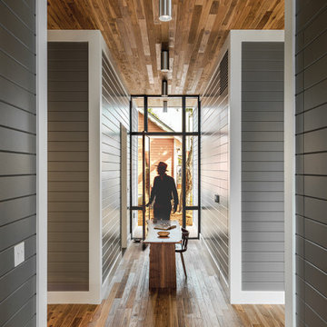
A Dog-Trot is a vernacular Texan architecture, where a central passage, the "Trot", separates two cabins. When researching this project, it was found that the original cottage was this type of structure. Here, this vernacular form is given a contemporary intervention, where four "cabins" containing bedrooms, kitchen, and living room are separated by two intersecting "trots". This treatment is emphasized by the material palette: shiplap walls match the exterior treatment of the house, while floors and ceilings create a continuous surface between inside and out.
 Bushman Dreyfus Architects
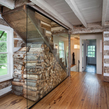
Virginia AIA Merit Award for Excellence in Residential Design | What appeared to be a simple, worn-out, early 20th century stucco cottage was to be modestly renovated as a weekend retreat. But when the contractor and architects began pulling away the interior wall finishes, they discovered a log cabin at its core (believed to date as far back as the 1780’s) and a newer addition (circa 1920’s) at the rear where the site slopes down. Initial plans were scrapped, and a new project was born that honors the original construction while accommodating new infrastructure and the clients’ modern tastes.
The attic stair enclosure was removed in deference to – and in order to visually expand – the original one-room log cabin. Wood floors, partially ravaged by termites, were repaired and refinished. The interventions of new steel structure, simple black iron handrail and glass stair guard provide a distinct counterpoint to the rusticity of the original construction, while the color palette of warm, natural tones harmonizes the composition.
 Katie Hutchison Studio
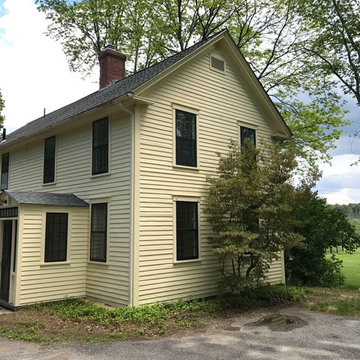
The new owners of this house in Harvard, Massachusetts loved its location and authentic Shaker characteristics, but weren’t fans of its curious layout. A dated first-floor full bathroom could only be accessed by going up a few steps to a landing, opening the bathroom door and then going down the same number of steps to enter the room. The dark kitchen faced the driveway to the north, rather than the bucolic backyard fields to the south. The dining space felt more like an enlarged hall and could only comfortably seat four. Upstairs, a den/office had a woefully low ceiling; the master bedroom had limited storage, and a sad full bathroom featured a cramped shower.
KHS proposed a number of changes to create an updated home where the owners could enjoy cooking, entertaining, and being connected to the outdoors from the first-floor living spaces, while also experiencing more inviting and more functional private spaces upstairs.
On the first floor, the primary change was to capture space that had been part of an upper-level screen porch and convert it to interior space. To make the interior expansion seamless, we raised the floor of the area that had been the upper-level porch, so it aligns with the main living level, and made sure there would be no soffits in the planes of the walls we removed. We also raised the floor of the remaining lower-level porch to reduce the number of steps required to circulate from it to the newly expanded interior. New patio door systems now fill the arched openings that used to be infilled with screen. The exterior interventions (which also included some new casement windows in the dining area) were designed to be subtle, while affording significant improvements on the interior. Additionally, the first-floor bathroom was reconfigured, shifting one of its walls to widen the dining space, and moving the entrance to the bathroom from the stair landing to the kitchen instead.
These changes (which involved significant structural interventions) resulted in a much more open space to accommodate a new kitchen with a view of the lush backyard and a new dining space defined by a new built-in banquette that comfortably seats six, and -- with the addition of a table extension -- up to eight people.
Upstairs in the den/office, replacing the low, board ceiling with a raised, plaster, tray ceiling that springs from above the original board-finish walls – newly painted a light color -- created a much more inviting, bright, and expansive space. Re-configuring the master bath to accommodate a larger shower and adding built-in storage cabinets in the master bedroom improved comfort and function. A new whole-house color palette rounds out the improvements.
Photos by Katie Hutchison
 Katie Hutchison Studio
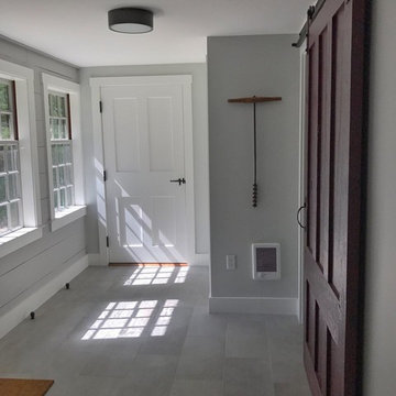
The new owners of this house in Harvard, Massachusetts loved its location and authentic Shaker characteristics, but weren’t fans of its curious layout. A dated first-floor full bathroom could only be accessed by going up a few steps to a landing, opening the bathroom door and then going down the same number of steps to enter the room. The dark kitchen faced the driveway to the north, rather than the bucolic backyard fields to the south. The dining space felt more like an enlarged hall and could only comfortably seat four. Upstairs, a den/office had a woefully low ceiling; the master bedroom had limited storage, and a sad full bathroom featured a cramped shower.
KHS proposed a number of changes to create an updated home where the owners could enjoy cooking, entertaining, and being connected to the outdoors from the first-floor living spaces, while also experiencing more inviting and more functional private spaces upstairs.
On the first floor, the primary change was to capture space that had been part of an upper-level screen porch and convert it to interior space. To make the interior expansion seamless, we raised the floor of the area that had been the upper-level porch, so it aligns with the main living level, and made sure there would be no soffits in the planes of the walls we removed. We also raised the floor of the remaining lower-level porch to reduce the number of steps required to circulate from it to the newly expanded interior. New patio door systems now fill the arched openings that used to be infilled with screen. The exterior interventions (which also included some new casement windows in the dining area) were designed to be subtle, while affording significant improvements on the interior. Additionally, the first-floor bathroom was reconfigured, shifting one of its walls to widen the dining space, and moving the entrance to the bathroom from the stair landing to the kitchen instead.
These changes (which involved significant structural interventions) resulted in a much more open space to accommodate a new kitchen with a view of the lush backyard and a new dining space defined by a new built-in banquette that comfortably seats six, and -- with the addition of a table extension -- up to eight people.
Upstairs in the den/office, replacing the low, board ceiling with a raised, plaster, tray ceiling that springs from above the original board-finish walls – newly painted a light color -- created a much more inviting, bright, and expansive space. Re-configuring the master bath to accommodate a larger shower and adding built-in storage cabinets in the master bedroom improved comfort and function. A new whole-house color palette rounds out the improvements.
Photos by Katie Hutchison

Sponsored
Columbus, OH
Wannemacher Interiors
Customized Award-Winning Interior Design Solutions in Franklin Cnty OH
 Jacobsen Architecture, LLC
Photo Credit: Robert C. Lautman (Originally published in Architectural Digest 2012)
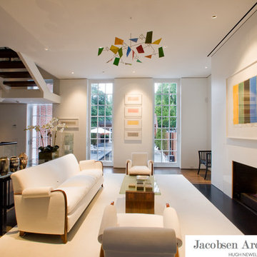
Large trendy formal and open concept dark wood floor living room photo in DC Metro with white walls and a stone fireplace
Large trendy formal and open concept dark wood floor living room photo in DC Metro with white walls and a stone fireplace
 Katie Hutchison Studio
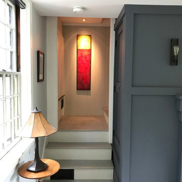
The new owners of this house in Harvard, Massachusetts loved its location and authentic Shaker characteristics, but weren’t fans of its curious layout. A dated first-floor full bathroom could only be accessed by going up a few steps to a landing, opening the bathroom door and then going down the same number of steps to enter the room. The dark kitchen faced the driveway to the north, rather than the bucolic backyard fields to the south. The dining space felt more like an enlarged hall and could only comfortably seat four. Upstairs, a den/office had a woefully low ceiling; the master bedroom had limited storage, and a sad full bathroom featured a cramped shower.
KHS proposed a number of changes to create an updated home where the owners could enjoy cooking, entertaining, and being connected to the outdoors from the first-floor living spaces, while also experiencing more inviting and more functional private spaces upstairs.
On the first floor, the primary change was to capture space that had been part of an upper-level screen porch and convert it to interior space. To make the interior expansion seamless, we raised the floor of the area that had been the upper-level porch, so it aligns with the main living level, and made sure there would be no soffits in the planes of the walls we removed. We also raised the floor of the remaining lower-level porch to reduce the number of steps required to circulate from it to the newly expanded interior. New patio door systems now fill the arched openings that used to be infilled with screen. The exterior interventions (which also included some new casement windows in the dining area) were designed to be subtle, while affording significant improvements on the interior. Additionally, the first-floor bathroom was reconfigured, shifting one of its walls to widen the dining space, and moving the entrance to the bathroom from the stair landing to the kitchen instead.
These changes (which involved significant structural interventions) resulted in a much more open space to accommodate a new kitchen with a view of the lush backyard and a new dining space defined by a new built-in banquette that comfortably seats six, and -- with the addition of a table extension -- up to eight people.
Upstairs in the den/office, replacing the low, board ceiling with a raised, plaster, tray ceiling that springs from above the original board-finish walls – newly painted a light color -- created a much more inviting, bright, and expansive space. Re-configuring the master bath to accommodate a larger shower and adding built-in storage cabinets in the master bedroom improved comfort and function. A new whole-house color palette rounds out the improvements.
Photos by Katie Hutchison
 Penza Bailey Architects
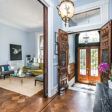
This 6-bedroom Baltimore row home's grand exterior overlooks a tree lined street in the historic Bolton Hill neighborhood. The original large pocket doors in the first floor allows for uninterrupted views from the front parlor through the sitting room and into the rear dining room bay window.
Penza Bailey Architects provided a complete transformation of the walk out garden level. The entire level was renovated to include a new kitchen, family room, mudroom, playroom, full bathroom and a gracious new stair leading to the upper level. The painted brick and exposed structure expresses the original "bones" of the home, while clearly modern interventions stand in contrast to suit the homeowner’s lifestyle. An alcove on the 1st floor was also renovated to provide a serving pantry and bar.
The exterior received restored front and vestibule doors, select window replacements, and new rear french doors, all receiving historical approval.
 down2earth Interior Design, LLC.
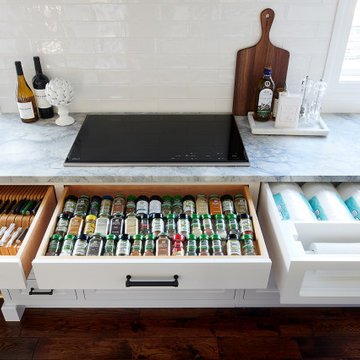
Our energetic client came to us with a design challenge – take a broken-up layout, make it flow, and add a French flair. And, it was imperative that we maximize storage and make the whole space kid and dog friendly.
This interior design project was a true collaboration. When we began, the kitchen and the dining room were completely separate spaces. Our down2earth interior design team proposed layouts that ranged from modest interventions (retaining the wall that divided the dining room and kitchen), to moderate interventions that left a partial wall in place, to major realignments that opened the space wide up. By creating design drawings for these different levels of intervention, the homeowners were able to view the pros and cons and price the different options. Happily, after having engineers verify that it was doable, they chose a wide open layout, which allows these party people to have a fabulous entertaining space.
Once the layouts for the kitchen and dining room were established, it was time to collaborate with the builder on lighting placement and with the woodworker to get all the little details right, such as dog dishes in the blue island and specialized storage at the perimeter. The wood fumehood was part of the homeowners’ original vision and is the focal point of the back wall. The brass and glass shelves over the bar cabinets were sourced by the homeowners as well, and we worked within the company’s offerings to get the proportions just right. A brass bar was added to the toe-kick area of the custom designed breakfast nook to match the brass bar shelf brackets and support little feet. Lighting, furniture, upholstered bench cushions, and drapery all soften the space and provide that desired French flair. Counter tops are super white leather granite.

Sponsored
Columbus, OH
Wannemacher Interiors
Customized Award-Winning Interior Design Solutions in Franklin Cnty OH
 Katie Hutchison Studio
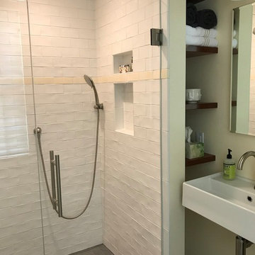
The new owners of this house in Harvard, Massachusetts loved its location and authentic Shaker characteristics, but weren’t fans of its curious layout. A dated first-floor full bathroom could only be accessed by going up a few steps to a landing, opening the bathroom door and then going down the same number of steps to enter the room. The dark kitchen faced the driveway to the north, rather than the bucolic backyard fields to the south. The dining space felt more like an enlarged hall and could only comfortably seat four. Upstairs, a den/office had a woefully low ceiling; the master bedroom had limited storage, and a sad full bathroom featured a cramped shower.
KHS proposed a number of changes to create an updated home where the owners could enjoy cooking, entertaining, and being connected to the outdoors from the first-floor living spaces, while also experiencing more inviting and more functional private spaces upstairs.
On the first floor, the primary change was to capture space that had been part of an upper-level screen porch and convert it to interior space. To make the interior expansion seamless, we raised the floor of the area that had been the upper-level porch, so it aligns with the main living level, and made sure there would be no soffits in the planes of the walls we removed. We also raised the floor of the remaining lower-level porch to reduce the number of steps required to circulate from it to the newly expanded interior. New patio door systems now fill the arched openings that used to be infilled with screen. The exterior interventions (which also included some new casement windows in the dining area) were designed to be subtle, while affording significant improvements on the interior. Additionally, the first-floor bathroom was reconfigured, shifting one of its walls to widen the dining space, and moving the entrance to the bathroom from the stair landing to the kitchen instead.
These changes (which involved significant structural interventions) resulted in a much more open space to accommodate a new kitchen with a view of the lush backyard and a new dining space defined by a new built-in banquette that comfortably seats six, and -- with the addition of a table extension -- up to eight people.
Upstairs in the den/office, replacing the low, board ceiling with a raised, plaster, tray ceiling that springs from above the original board-finish walls – newly painted a light color -- created a much more inviting, bright, and expansive space. Re-configuring the master bath to accommodate a larger shower and adding built-in storage cabinets in the master bedroom improved comfort and function. A new whole-house color palette rounds out the improvements.
Photos by Katie Hutchison
 Katie Hutchison Studio
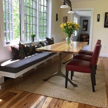
The new owners of this house in Harvard, Massachusetts loved its location and authentic Shaker characteristics, but weren’t fans of its curious layout. A dated first-floor full bathroom could only be accessed by going up a few steps to a landing, opening the bathroom door and then going down the same number of steps to enter the room. The dark kitchen faced the driveway to the north, rather than the bucolic backyard fields to the south. The dining space felt more like an enlarged hall and could only comfortably seat four. Upstairs, a den/office had a woefully low ceiling; the master bedroom had limited storage, and a sad full bathroom featured a cramped shower.
KHS proposed a number of changes to create an updated home where the owners could enjoy cooking, entertaining, and being connected to the outdoors from the first-floor living spaces, while also experiencing more inviting and more functional private spaces upstairs.
On the first floor, the primary change was to capture space that had been part of an upper-level screen porch and convert it to interior space. To make the interior expansion seamless, we raised the floor of the area that had been the upper-level porch, so it aligns with the main living level, and made sure there would be no soffits in the planes of the walls we removed. We also raised the floor of the remaining lower-level porch to reduce the number of steps required to circulate from it to the newly expanded interior. New patio door systems now fill the arched openings that used to be infilled with screen. The exterior interventions (which also included some new casement windows in the dining area) were designed to be subtle, while affording significant improvements on the interior. Additionally, the first-floor bathroom was reconfigured, shifting one of its walls to widen the dining space, and moving the entrance to the bathroom from the stair landing to the kitchen instead.
These changes (which involved significant structural interventions) resulted in a much more open space to accommodate a new kitchen with a view of the lush backyard and a new dining space defined by a new built-in banquette that comfortably seats six, and -- with the addition of a table extension -- up to eight people.
Upstairs in the den/office, replacing the low, board ceiling with a raised, plaster, tray ceiling that springs from above the original board-finish walls – newly painted a light color -- created a much more inviting, bright, and expansive space. Re-configuring the master bath to accommodate a larger shower and adding built-in storage cabinets in the master bedroom improved comfort and function. A new whole-house color palette rounds out the improvements.
Photos by Katie Hutchison
 Katie Hutchison Studio
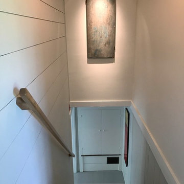
The new owners of this house in Harvard, Massachusetts loved its location and authentic Shaker characteristics, but weren’t fans of its curious layout. A dated first-floor full bathroom could only be accessed by going up a few steps to a landing, opening the bathroom door and then going down the same number of steps to enter the room. The dark kitchen faced the driveway to the north, rather than the bucolic backyard fields to the south. The dining space felt more like an enlarged hall and could only comfortably seat four. Upstairs, a den/office had a woefully low ceiling; the master bedroom had limited storage, and a sad full bathroom featured a cramped shower.
KHS proposed a number of changes to create an updated home where the owners could enjoy cooking, entertaining, and being connected to the outdoors from the first-floor living spaces, while also experiencing more inviting and more functional private spaces upstairs.
On the first floor, the primary change was to capture space that had been part of an upper-level screen porch and convert it to interior space. To make the interior expansion seamless, we raised the floor of the area that had been the upper-level porch, so it aligns with the main living level, and made sure there would be no soffits in the planes of the walls we removed. We also raised the floor of the remaining lower-level porch to reduce the number of steps required to circulate from it to the newly expanded interior. New patio door systems now fill the arched openings that used to be infilled with screen. The exterior interventions (which also included some new casement windows in the dining area) were designed to be subtle, while affording significant improvements on the interior. Additionally, the first-floor bathroom was reconfigured, shifting one of its walls to widen the dining space, and moving the entrance to the bathroom from the stair landing to the kitchen instead.
These changes (which involved significant structural interventions) resulted in a much more open space to accommodate a new kitchen with a view of the lush backyard and a new dining space defined by a new built-in banquette that comfortably seats six, and -- with the addition of a table extension -- up to eight people.
Upstairs in the den/office, replacing the low, board ceiling with a raised, plaster, tray ceiling that springs from above the original board-finish walls – newly painted a light color -- created a much more inviting, bright, and expansive space. Re-configuring the master bath to accommodate a larger shower and adding built-in storage cabinets in the master bedroom improved comfort and function. A new whole-house color palette rounds out the improvements.
Photos by Katie Hutchison
3