
Search results for "Intimidating" in Home Design Ideas
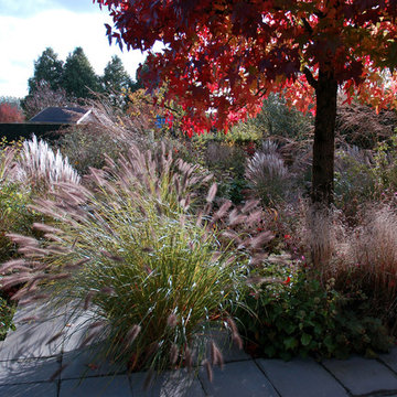
 Studio TOOP
design: Carrie Preston (Studio TOOP) and Jasper Helmantel (Cruydt Hoeck), 2011
location: Appeltern, NL
status: built in 2012 by Appeltern Model Garden Complex
photos: Olga van Saane, October 2013
Designed as assignment from both the Dutch gardening magazine Groei & Bloei and the television and radio nature program Vara's Vroege Vogels, this garden serves as a model of how homeowners can incorporate lots of plant life and wildlife into the design but without sacrificing practicality or aesthetics. The garden is deliberately contemporary in its style to emphasize that nature-rich gardens need not look a certain way - insects and birds don't care if the lines are straight or curved.
At the same time the garden makes use of affordable, simple, no-nonsense materials. The 40x60 cm paving stones are one of the most common and affordable paving options in the Netherlands, available en masse for free on the Internet. Conceptually we imagined a garden completely paved with the tiles (as to many gardens are) and what would happen if took out some of these stones, used them to build benches and structure and added plants where the tiles had been. In the construction of the benches we include other materials such as bamboo sticks and insulation bricks that create habitat for insects such as solitary bees.
The plant palette is based on a selection of native and host plants in combination with the 26 plants plan set up by Groei & Boei -- a list of plants aimed at making the use of more plants in gardens accessible and less intimidating. The choice for the number 26 corresponds with the number of letters in the alphabet in line with the famous Dutch garden designer Mien Ruy's comment that if we only need 26 letters to create a whole language, we should be able to combine and mix 26 plants to express far more than we think.
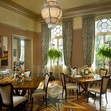
 Soucie Horner, Ltd.
From its English-style conservatory to its wealth of French doors, this impressive family home - at once stately, yet welcoming - ushers the vitality of its premiere urban setting into historically-inspired interiors. Here, soaring ceilings, inlaid floors, and marble-wrapped, walnut-paneled, and mirror-clad walls honor the luxurious traditions of classic European interior architecture. Naturally, symmetry is its muse, evinced through a striking collection of fine furnishings, splendid rugs, art, and accessories - augmented, all, by unexpectedly fresh bursts of color and playfully retro silhouettes. Formal without intimidation -or apology- it personifies the very finest in gracious city living.
Photos by Nathan Kirkman http://nathankirkman.com/
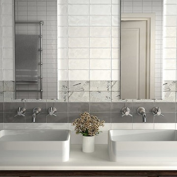
 Tile-Stones
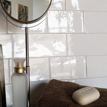
The white base is not an overpowering or intimidating white; this is because the sporadic crackled effect softens up the face of the tile, creating a softer white. From far away these tiles seem to have an underlying movement, but do not contain harsh or brash veins. The veins are thin, and offer continual movement when up close. The veins are not discolored; they are merely what you would see if a glass shattered, but the bottle did not fall apart. The veining pattern is different on each tile, but not noticeably enough that it takes away from the combined look of the tiles. The polished finish of the tiles creates a smooth touch and a sheen finish. These 3 x 6 field tiles are the perfect size to add to any commercial or residential installation. These tiles are ceramic.
Find the right local pro for your project

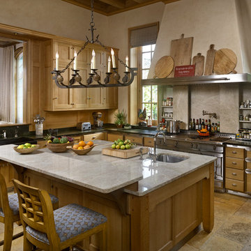 Soucie Horner, Ltd.
From its English-style conservatory to its wealth of French doors, this impressive family home - at once stately, yet welcoming - ushers the vitality of its premiere urban setting into historically-inspired interiors. Here, soaring ceilings, inlaid floors, and marble-wrapped, walnut-paneled, and mirror-clad walls honor the luxurious traditions of classic European interior architecture. Naturally, symmetry is its muse, evinced through a striking collection of fine furnishings, splendid rugs, art, and accessories - augmented, all, by unexpectedly fresh bursts of color and playfully retro silhouettes. Formal without intimidation -or apology- it personifies the very finest in gracious city living.
Photos by Nathan Kirkman http://nathankirkman.com/
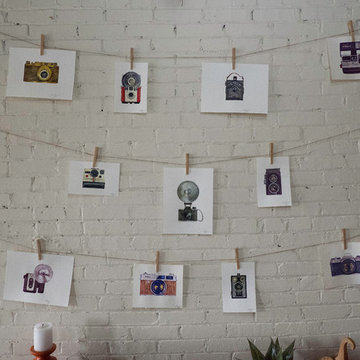
 The Phoenix Photography
Photo: the phoenix photography © 2015 Houzz
Example of an eclectic living room design in Louisville
Example of an eclectic living room design in Louisville
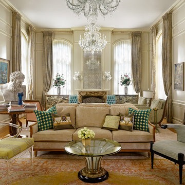 Soucie Horner, Ltd.
From its English-style conservatory to its wealth of French doors, this impressive family home - at once stately, yet welcoming - ushers the vitality of its premiere urban setting into historically-inspired interiors. Here, soaring ceilings, inlaid floors, and marble-wrapped, walnut-paneled, and mirror-clad walls honor the luxurious traditions of classic European interior architecture. Naturally, symmetry is its muse, evinced through a striking collection of fine furnishings, splendid rugs, art, and accessories - augmented, all, by unexpectedly fresh bursts of color and playfully retro silhouettes. Formal without intimidation -or apology- it personifies the very finest in gracious city living.
Photos by Nathan Kirkman http://nathankirkman.com/
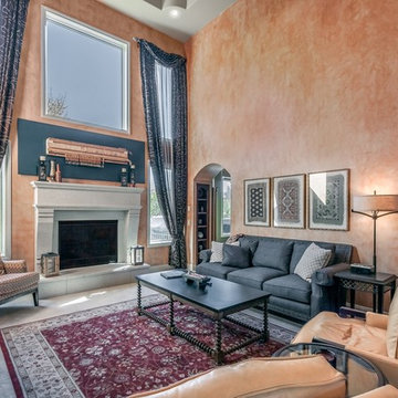
 The Iconic Space
The owners wished to make better use of their formal living room, so we set out make guests move on past the comfortable kitchen. For this to happen, the living room had to feel just as relaxed. For example, it had to be easy to set down a drink from every seat in the room. We traded all-white upholstery for colors and textures which would feel less intimidating to a guest who might be eating or drinking. We phased the changes by moving existing furniture, and then buying new pieces.
I’m happy to report that this comfortable, formal living room now is in regular use.
DaubmanPhotography@Cox.net
 Tile-Stones
The first image featured is the Masia Blanco Crackle 3 x 6. The white base is not an overpowering or intimidating white; this is because the sporadic crackled effect softens up the face of the tile, creating a softer white. From far away these tiles seem to have an underlying movement, but do not contain harsh or brash veins. The veins are thin, and offer continual movement when up close. The veins are not discolored; they are merely what you would see if a glass shattered, but the bottle did not fall apart. The veining pattern is different on each tile, but not noticeably enough that it takes away from the combined look of the tiles. The polished finish of the tiles creates a smooth touch and a sheen finish. These 3 x 6 field tiles are the perfect size to add to any commercial or residential installation. These tiles are ceramic.
 Thompson Construction
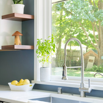
Example of a large transitional l-shaped vinyl floor eat-in kitchen design in Minneapolis with an undermount sink, shaker cabinets, white cabinets, quartz countertops, stainless steel appliances, an island and white countertops

 Soucie Horner, Ltd.
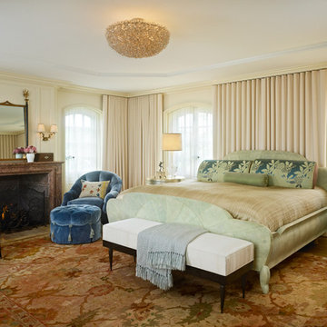
From its English-style conservatory to its wealth of French doors, this impressive family home - at once stately, yet welcoming - ushers the vitality of its premiere urban setting into historically-inspired interiors. Here, soaring ceilings, inlaid floors, and marble-wrapped, walnut-paneled, and mirror-clad walls honor the luxurious traditions of classic European interior architecture. Naturally, symmetry is its muse, evinced through a striking collection of fine furnishings, splendid rugs, art, and accessories - augmented, all, by unexpectedly fresh bursts of color and playfully retro silhouettes. Formal without intimidation -or apology- it personifies the very finest in gracious city living.
Photos by Nathan Kirkman http://nathankirkman.com/

 Jay Sifford
Tree frog napping on a ceramic sculpture by Marcia Donahue. He must know that it's not a real carnivorous plant!
Photo by Jay Sifford
Example of an eclectic home design design in Charlotte
Example of an eclectic home design design in Charlotte


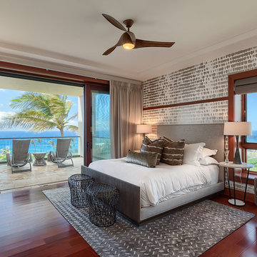
 Bassman Blaine Home
Example of a large trendy master dark wood floor and brown floor bedroom design in Hawaii with beige walls and no fireplace


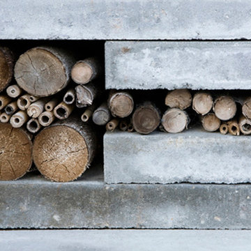 Studio TOOP
design: Carrie Preston (Studio TOOP) and Jasper Helmantel (Cruydt Hoeck), 2011
location: Appeltern, NL
status: built in 2012 by Appeltern Model Garden Complex
photos: Jolanthe Lalkens, October 2012
Designed as assignment from both the Dutch gardening magazine Groei & Bloei and the television and radio nature program Vara's Vroege Vogels, this garden serves as a model of how homeowners can incorporate lots of plant life and wildlife into the design but without sacrificing practicality or aesthetics. The garden is deliberately contemporary in its style to emphasize that nature-rich gardens need not look a certain way - insects and birds don't care if the lines are straight or curved.
At the same time the garden makes use of affordable, simple, no-nonsense materials. The 40x60 cm paving stones are one of the most common and affordable paving options in the Netherlands, available en masse for free on the Internet. Conceptually we imagined a garden completely paved with the tiles (as to many gardens are) and what would happen if took out some of these stones, used them to build benches and structure and added plants where the tiles had been. In the construction of the benches we include other materials such as bamboo sticks and insulation bricks that create habitat for insects such as solitary bees.
The plant palette is based on a selection of native and host plants in combination with the 26 plants plan set up by Groei & Boei -- a list of plants aimed at making the use of more plants in gardens accessible and less intimidating. The choice for the number 26 corresponds with the number of letters in the alphabet in line with the famous Dutch garden designer Mien Ruy's comment that if we only need 26 letters to create a whole language, we should be able to combine and mix 26 plants to express far more than we think.
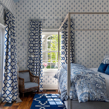
 Crisp Architects
Example of a classic medium tone wood floor and brown floor bedroom design in New York with white walls
 User
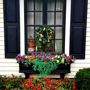
UserEvery home improvement project can feel like going into battle, but the sweet taste of victory is enough to make it worthwhile. If you ever feel intimidated by homes and gardens in magazines, don’t fret – you can turn your home into a beautiful beacon with easy curb appeal updates! Kevin and Annette Klingel are some of our favorite weekend warriors, and their latest project proves that anything is possible when it comes to dressing up your front garden. The Klingels recently gave their home and front garden a major renovation and entered their photos in the Window Box Contest. When we saw the gorgeous before and after pictures, we knew we had to get the inside scoop on their process and uncover their best curb appeal ideas.
Curb Appeal – Before and After
Before the renovation, the Klingels had a charming South Bend, Indiana rambler that was tidy and traditional, if a little unassuming. Deciding it was time for a much-needed update, the Klingels replaced their old green roof with a black barrel roof to match the style of their home. They also made a needed replacement and changed out the sidewalk and front stoop to a new version in classic black.
After those dramatic changes, the Klingels just couldn’t stop! Loving the contrast between the new black roof and stoop and their cream house, they painted their shutters black. And here’s where we come in – Annette wanted to incorporate her love of flowers into the new home design and found the perfect planters and window boxes to match the shutters. They purchased ten black window boxes in a classic and chic design to put around their outside windows. The Klingels also used tall black planters around the entrance to the house. The window boxes and planters each received the same plant treatment – red, yellow, and orange impatiens with flowing ferns for a bright punch of color. Paired with hanging baskets and a few other accents, the Klingels house is now a masterpiece.
From Drab to Fab
The Klingels love their warm and inviting new front entrance, and the neighbors do too. Instead of getting overlooked, their house now stands out and is the star of their busy street, where it is seen by lots of people everyday. They have received tons of compliments about their new look – a crisp and clean front garden that stays true to the style of the home and neighborhood.
The Klingels’ curb appeal update wasn’t without its challenges, but the end product is amazing, and as Annette says, definitely worth the time. The Klingels recommend starting with the necessary replacements and finding beautiful matching pieces to add curb appeal. With a little patience, elbow grease, and the help of a great garden supply store like Hooks & Lattice, you too can have the home of your dreams.
Photos: Kevin & Annette Klingel
 RLH Studio
Architect and Builder: London Bay Homes
Photo credit: © Advanced Photography Specialists
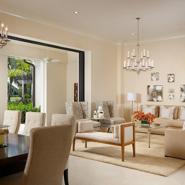
Living room - transitional open concept living room idea in Miami with beige walls
Living room - transitional open concept living room idea in Miami with beige walls
8