
Search results for "Intrusion" in Home Design Ideas

 Crystal Kitchen + Bath
Infusing this once, drab 80’s kitchen with light and color was one goal in this extensive remodel. By removing the wall separating the dining room from the kitchen, the space doubled in size and allowed natural light to flood it.
Creating a design that filled the space yet remained very functional to the homeowner was extremely important. By implementing the two working triangles, one homeowner can be using the sink, cooktop and refrigerator while the other uses the secondary island for food prep as it has an additional sink.
A large soffit housing HVAC runs through the middle of the townhome and seemed intrusive to the space at first. After embracing it in the design, it’s as if it were meant to be. Three aluminum framed cabinets hang below, one directly underneath the soffit to create an asymmetrical design.
On a budget but still wanting a beautiful design, Crystal’s semi-custom line of cabinetry came into play. Simply White and Light Grey provide the perfect backdrop for natural maple, brushed gold hardware and accessories that infuse the space with color. Inside the cabinetry, the best storage solutions make for an extremely functional kitchen!
What a dream it is to have a kitchen that boasts quality, functionality and makes a person feel inspired within it.
Photography: Paige Kilgore

 Castle Building & Remodeling
This modern home, near Cedar Lake, built in 1900, was originally a corner store. A massive conversion transformed the home into a spacious, multi-level residence in the 1990’s.
However, the home’s lot was unusually steep and overgrown with vegetation. In addition, there were concerns about soil erosion and water intrusion to the house. The homeowners wanted to resolve these issues and create a much more useable outdoor area for family and pets.
Castle, in conjunction with Field Outdoor Spaces, designed and built a large deck area in the back yard of the home, which includes a detached screen porch and a bar & grill area under a cedar pergola.
The previous, small deck was demolished and the sliding door replaced with a window. A new glass sliding door was inserted along a perpendicular wall to connect the home’s interior kitchen to the backyard oasis.
The screen house doors are made from six custom screen panels, attached to a top mount, soft-close track. Inside the screen porch, a patio heater allows the family to enjoy this space much of the year.
Concrete was the material chosen for the outdoor countertops, to ensure it lasts several years in Minnesota’s always-changing climate.
Trex decking was used throughout, along with red cedar porch, pergola and privacy lattice detailing.
The front entry of the home was also updated to include a large, open porch with access to the newly landscaped yard. Cable railings from Loftus Iron add to the contemporary style of the home, including a gate feature at the top of the front steps to contain the family pets when they’re let out into the yard.
Tour this project in person, September 28 – 29, during the 2019 Castle Home Tour!
 Crystal Kitchen + Bath
Infusing this once, drab 80’s kitchen with light and color was one goal in this extensive remodel. By removing the wall separating the dining room from the kitchen, the space doubled in size and allowed natural light to flood it.
Creating a design that filled the space yet remained very functional to the homeowner was extremely important. By implementing the two working triangles, one homeowner can be using the sink, cooktop and refrigerator while the other uses the secondary island for food prep as it has an additional sink.
A large soffit housing HVAC runs through the middle of the townhome and seemed intrusive to the space at first. After embracing it in the design, it’s as if it were meant to be. Three aluminum framed cabinets hang below, one directly underneath the soffit to create an asymmetrical design.
On a budget but still wanting a beautiful design, Crystal’s semi-custom line of cabinetry came into play. Simply White and Light Grey provide the perfect backdrop for natural maple, brushed gold hardware and accessories that infuse the space with color. Inside the cabinetry, the best storage solutions make for an extremely functional kitchen!
What a dream it is to have a kitchen that boasts quality, functionality and makes a person feel inspired within it.
Photography: Paige Kilgore
Find the right local pro for your project
 Deskins Group LLC
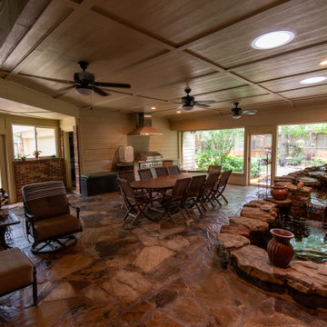
This project began with a beautiful Koi pond under a large patio cover, but the homeowner struggled with two major issues:
• Lack of privacy between the driveway and patio
• A breezeway roofline that didn’t align with the exterior brick, causing rainwater to pour into the gap and flood the patio during storms
As part of our exterior remodeling and water‑management correction, we redesigned the entire connection between the breezeway, patio, and driveway.
? Phase 1: Structural Fixes & Weather Protection
• Converted the original 4' brick wall and gate into a full‑height privacy wall with an exterior door, creating a secure, enclosed patio space.
• Extended and realigned the breezeway roofline to properly tie into the home’s brick, eliminating water intrusion and preventing patio flooding.
• Installed a solar tube to bring natural daylight into the pond area without adding heat — a perfect upgrade for shaded patios.
? Phase 2: Creating a Backyard Oasis
After seeing the transformation, the homeowner invited us back to complete the space with a custom screen wall across the backside of the patio. This addition created a private, breezy, bug‑free outdoor retreat, ideal for relaxing around the Koi pond.
? Serving Cypress, Tomball, Champions & Northwest Houston
This project is a great example of how we solve privacy issues, roofline and drainage problems, and patio enclosure upgrades to help homeowners get more out of their outdoor spaces.
 C&N Decorative Concrete
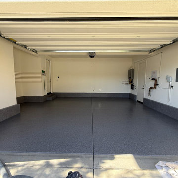
This residential garage transformation in Ventura, California, showcases the impact of comprehensive mechanical surface prep paired with seamless perimeter stem wall protection. To guarantee a permanent bond, the entire slab and high vertical concrete curbs were mechanically profiled using a rotary diamond grinder and hand edge grinders paired directly to a commercial HEPA dust-containment vacuum system. We applied an industrial high-solids epoxy base coat across the floor and wrapped the tall stem walls, creating a watertight barrier that guards adjacent drywall against wash-downs, moisture intrusion, and daily wear. The wet base was saturated with a 100% full broadcast of decorative charcoal-blend vinyl flakes to build a durable, slip-resistant impact layer, then locked down with a UV-stable clear protective topcoat engineered to permanently repel hot-tire pickup, beach sand abrasion, and automotive fluids. The result is a showroom-grade floor installed by C&N Decorative Concrete (CSLB #908395) that delivers commercial-grade durability and effortless daily maintenance.
 Castle Building & Remodeling
This modern home, near Cedar Lake, built in 1900, was originally a corner store. A massive conversion transformed the home into a spacious, multi-level residence in the 1990’s.
However, the home’s lot was unusually steep and overgrown with vegetation. In addition, there were concerns about soil erosion and water intrusion to the house. The homeowners wanted to resolve these issues and create a much more useable outdoor area for family and pets.
Castle, in conjunction with Field Outdoor Spaces, designed and built a large deck area in the back yard of the home, which includes a detached screen porch and a bar & grill area under a cedar pergola.
The previous, small deck was demolished and the sliding door replaced with a window. A new glass sliding door was inserted along a perpendicular wall to connect the home’s interior kitchen to the backyard oasis.
The screen house doors are made from six custom screen panels, attached to a top mount, soft-close track. Inside the screen porch, a patio heater allows the family to enjoy this space much of the year.
Concrete was the material chosen for the outdoor countertops, to ensure it lasts several years in Minnesota’s always-changing climate.
Trex decking was used throughout, along with red cedar porch, pergola and privacy lattice detailing.
The front entry of the home was also updated to include a large, open porch with access to the newly landscaped yard. Cable railings from Loftus Iron add to the contemporary style of the home, including a gate feature at the top of the front steps to contain the family pets when they’re let out into the yard.
Tour this project in person, September 28 – 29, during the 2019 Castle Home Tour!
 Decorations Lucullus
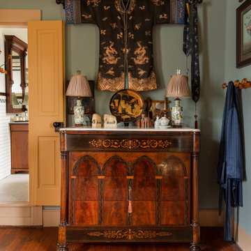
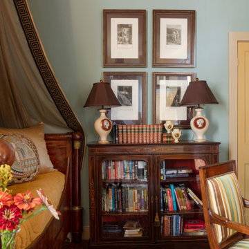
It’s about a shoemaker sometimes having no shoes. One day our own interior designer, Nathan Drewes, took a hard look at the guest suite in the dependency of his hundred-sixty-year-old house. What he saw made him aesthetically tank. While there may have been a few pieces of beloved family furniture, everything else looked dowdy, dusty, even drab. Tout suite he went right to the cobbler’s bench to reimagine the rooms.
Clearly a few random patches weren’t going to be enough. The space needed total transformation. He realized a slick minimalist look would never work in those old rooms or make sense with the rest of the house. To be honest, it really didn’t reflect his taste anyway. Nathan happened to have a budding neo-classical collection, begun while still in college. For some time he had been itching to reassemble it in an appropriate setting. Despite being a millennial, his instincts led him to evoke a reverie of a luxury-loving 19th century New Orleans gentleman. Inspired by strong palettes of the past and textured interiors, he salvaged curtains and carpets from a former apartment in Lyon, found a local artisan to frame a batch of early 19th century engravings, selected rich feeling fabrics, and splurged on interesting lighting.
The results are anything but drab. With rooms that conjure a shaded feeling against the intrusive tropic sun, the effect is dense with polished woods, lush with fabrics. One is enveloped in shadows and dreams.
Photography by Sara Essex Bradley
 Decorations Lucullus
It’s about a shoemaker sometimes having no shoes. One day our own interior designer, Nathan Drewes, took a hard look at the guest suite in the dependency of his hundred-sixty-year-old house. What he saw made him aesthetically tank. While there may have been a few pieces of beloved family furniture, everything else looked dowdy, dusty, even drab. Tout suite he went right to the cobbler’s bench to reimagine the rooms.
Clearly a few random patches weren’t going to be enough. The space needed total transformation. He realized a slick minimalist look would never work in those old rooms or make sense with the rest of the house. To be honest, it really didn’t reflect his taste anyway. Nathan happened to have a budding neo-classical collection, begun while still in college. For some time he had been itching to reassemble it in an appropriate setting. Despite being a millennial, his instincts led him to evoke a reverie of a luxury-loving 19th century New Orleans gentleman. Inspired by strong palettes of the past and textured interiors, he salvaged curtains and carpets from a former apartment in Lyon, found a local artisan to frame a batch of early 19th century engravings, selected rich feeling fabrics, and splurged on interesting lighting.
The results are anything but drab. With rooms that conjure a shaded feeling against the intrusive tropic sun, the effect is dense with polished woods, lush with fabrics. One is enveloped in shadows and dreams.
Photography by Sara Essex Bradley
 Crystal Kitchen + Bath
Infusing this once, drab 80’s kitchen with light and color was one goal in this extensive remodel. By removing the wall separating the dining room from the kitchen, the space doubled in size and allowed natural light to flood it.
Creating a design that filled the space yet remained very functional to the homeowner was extremely important. By implementing the two working triangles, one homeowner can be using the sink, cooktop and refrigerator while the other uses the secondary island for food prep as it has an additional sink.
A large soffit housing HVAC runs through the middle of the townhome and seemed intrusive to the space at first. After embracing it in the design, it’s as if it were meant to be. Three aluminum framed cabinets hang below, one directly underneath the soffit to create an asymmetrical design.
On a budget but still wanting a beautiful design, Crystal’s semi-custom line of cabinetry came into play. Simply White and Light Grey provide the perfect backdrop for natural maple, brushed gold hardware and accessories that infuse the space with color. Inside the cabinetry, the best storage solutions make for an extremely functional kitchen!
What a dream it is to have a kitchen that boasts quality, functionality and makes a person feel inspired within it.
Photography: Paige Kilgore
 Decorations Lucullus
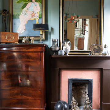
It’s about a shoemaker sometimes having no shoes. One day our own interior designer, Nathan Drewes, took a hard look at the guest suite in the dependency of his hundred-sixty-year-old house. What he saw made him aesthetically tank. While there may have been a few pieces of beloved family furniture, everything else looked dowdy, dusty, even drab. Tout suite he went right to the cobbler’s bench to reimagine the rooms.
Clearly a few random patches weren’t going to be enough. The space needed total transformation. He realized a slick minimalist look would never work in those old rooms or make sense with the rest of the house. To be honest, it really didn’t reflect his taste anyway. Nathan happened to have a budding neo-classical collection, begun while still in college. For some time he had been itching to reassemble it in an appropriate setting. Despite being a millennial, his instincts led him to evoke a reverie of a luxury-loving 19th century New Orleans gentleman. Inspired by strong palettes of the past and textured interiors, he salvaged curtains and carpets from a former apartment in Lyon, found a local artisan to frame a batch of early 19th century engravings, selected rich feeling fabrics, and splurged on interesting lighting.
The results are anything but drab. With rooms that conjure a shaded feeling against the intrusive tropic sun, the effect is dense with polished woods, lush with fabrics. One is enveloped in shadows and dreams.
Photography by Sara Essex Bradley
 Decorations Lucullus
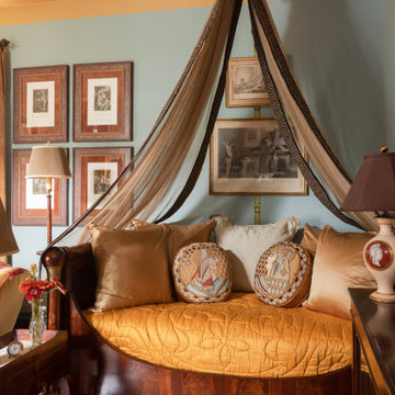
It’s about a shoemaker sometimes having no shoes. One day our own interior designer, Nathan Drewes, took a hard look at the guest suite in the dependency of his hundred-sixty-year-old house. What he saw made him aesthetically tank. While there may have been a few pieces of beloved family furniture, everything else looked dowdy, dusty, even drab. Tout suite he went right to the cobbler’s bench to reimagine the rooms.
Clearly a few random patches weren’t going to be enough. The space needed total transformation. He realized a slick minimalist look would never work in those old rooms or make sense with the rest of the house. To be honest, it really didn’t reflect his taste anyway. Nathan happened to have a budding neo-classical collection, begun while still in college. For some time he had been itching to reassemble it in an appropriate setting. Despite being a millennial, his instincts led him to evoke a reverie of a luxury-loving 19th century New Orleans gentleman. Inspired by strong palettes of the past and textured interiors, he salvaged curtains and carpets from a former apartment in Lyon, found a local artisan to frame a batch of early 19th century engravings, selected rich feeling fabrics, and splurged on interesting lighting.
The results are anything but drab. With rooms that conjure a shaded feeling against the intrusive tropic sun, the effect is dense with polished woods, lush with fabrics. One is enveloped in shadows and dreams.
Photography by Sara Essex Bradley
 Sixth Sense Studio
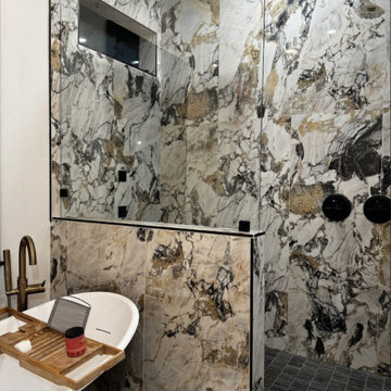
This bathroom is a perfect example of modern minimalism. It prioritizes clean lines, functionality, and a light and airy feel, creating a serene and spa-like atmosphere.
Modern and Minimalist: Clean lines, a focus on functionality, and the absence of clutter define the overall aesthetic.
Light and Airy: The light gray color scheme and ample natural light from the window contribute to a spacious and bright feel.
Bathtub: The bathtub is a focal point, positioned directly under a window for a spa-like experience.
Shower Stall: A glass-enclosed shower stall in the corner keeps the shower area separate while maintaining an open feel.
Floating Vanity: A minimalist floating vanity with two drawers maximizes space and keeps the bathroom floor uncluttered.
Rectangular Sink: The rectangular sink on the vanity complements the clean lines of the design.
Large Mirror: A large mirror with a rounded edge adds functionality and helps create a sense of spaciousness.
Light Gray Tiles: Large format, light gray tiles cover the walls and floor, creating a cohesive and waterproof surface. This is a common choice for modern bathrooms due to its practicality and easy maintenance.
Flat Ceiling: The flat ceiling with possible recessed lighting adds to the clean lines and minimalist feel. Recessed lighting provides good illumination without any visually intrusive fixtures.
 Decorations Lucullus
It’s about a shoemaker sometimes having no shoes. One day our own interior designer, Nathan Drewes, took a hard look at the guest suite in the dependency of his hundred-sixty-year-old house. What he saw made him aesthetically tank. While there may have been a few pieces of beloved family furniture, everything else looked dowdy, dusty, even drab. Tout suite he went right to the cobbler’s bench to reimagine the rooms.
Clearly a few random patches weren’t going to be enough. The space needed total transformation. He realized a slick minimalist look would never work in those old rooms or make sense with the rest of the house. To be honest, it really didn’t reflect his taste anyway. Nathan happened to have a budding neo-classical collection, begun while still in college. For some time he had been itching to reassemble it in an appropriate setting. Despite being a millennial, his instincts led him to evoke a reverie of a luxury-loving 19th century New Orleans gentleman. Inspired by strong palettes of the past and textured interiors, he salvaged curtains and carpets from a former apartment in Lyon, found a local artisan to frame a batch of early 19th century engravings, selected rich feeling fabrics, and splurged on interesting lighting.
The results are anything but drab. With rooms that conjure a shaded feeling against the intrusive tropic sun, the effect is dense with polished woods, lush with fabrics. One is enveloped in shadows and dreams.
Photography by Sara Essex Bradley
 Jaeger & Ernst Custom Cabinetmakers
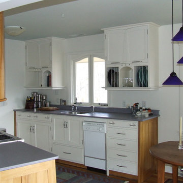
Maximize the space and enhance the utilitarian aspect of any kitchen but always do so in the small kitchen. Restrained kitchen spaces demand attention to detail. The owner switched the dishwasher at the last minute in the project from one that incorporated a wood panel to one which did not! The lines would have been more seamless and the space perceived larger had the intrusiveness of color and line not occurred! The window is custom designed to mimic the pattern of the doors. Cabinets rise to the ceiling height with a small unobtrusive crown to incorporate as much functional space as possible. Raising the cabinets to the ceiling affects the room by minimizing distractions of the eye's flow making the space seem much larger. Plate racks make for easy access and functionality for a busy cook. Large drawers enhance the working of the kitchen. Instead of searching for items behind doors access is immediate. The use of quartered sycamore enhances the visual space by framing the cabinets and melding with the color of the wood floor. Jaeger & Ernst cabinetmakers seek custom work: call 434-973-7018


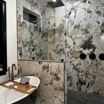 Sixth Sense Studio
This bathroom is a perfect example of modern minimalism. It prioritizes clean lines, functionality, and a light and airy feel, creating a serene and spa-like atmosphere.
Modern and Minimalist: Clean lines, a focus on functionality, and the absence of clutter define the overall aesthetic.
Light and Airy: The light gray color scheme and ample natural light from the window contribute to a spacious and bright feel.
Bathtub: The bathtub is a focal point, positioned directly under a window for a spa-like experience.
Shower Stall: A glass-enclosed shower stall in the corner keeps the shower area separate while maintaining an open feel.
Floating Vanity: A minimalist floating vanity with two drawers maximizes space and keeps the bathroom floor uncluttered.
Rectangular Sink: The rectangular sink on the vanity complements the clean lines of the design.
Large Mirror: A large mirror with a rounded edge adds functionality and helps create a sense of spaciousness.
Light Gray Tiles: Large format, light gray tiles cover the walls and floor, creating a cohesive and waterproof surface. This is a common choice for modern bathrooms due to its practicality and easy maintenance.
Flat Ceiling: The flat ceiling with possible recessed lighting adds to the clean lines and minimalist feel. Recessed lighting provides good illumination without any visually intrusive fixtures.

 TriplePoint Design Build
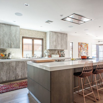
Flawless craftsmanship, creative storage solutions, angled cabinets, efficient work triangle, elevated ceilings and lots of natural light bring this contemporary kitchen to life.
 Crystal Kitchen + Bath
Infusing this once, drab 80’s kitchen with light and color was one goal in this extensive remodel. By removing the wall separating the dining room from the kitchen, the space doubled in size and allowed natural light to flood it.
Creating a design that filled the space yet remained very functional to the homeowner was extremely important. By implementing the two working triangles, one homeowner can be using the sink, cooktop and refrigerator while the other uses the secondary island for food prep as it has an additional sink.
A large soffit housing HVAC runs through the middle of the townhome and seemed intrusive to the space at first. After embracing it in the design, it’s as if it were meant to be. Three aluminum framed cabinets hang below, one directly underneath the soffit to create an asymmetrical design.
On a budget but still wanting a beautiful design, Crystal’s semi-custom line of cabinetry came into play. Simply White and Light Grey provide the perfect backdrop for natural maple, brushed gold hardware and accessories that infuse the space with color. Inside the cabinetry, the best storage solutions make for an extremely functional kitchen!
What a dream it is to have a kitchen that boasts quality, functionality and makes a person feel inspired within it.
Photography: Paige Kilgore

 Castle Building & Remodeling
This modern home, near Cedar Lake, built in 1900, was originally a corner store. A massive conversion transformed the home into a spacious, multi-level residence in the 1990’s.
However, the home’s lot was unusually steep and overgrown with vegetation. In addition, there were concerns about soil erosion and water intrusion to the house. The homeowners wanted to resolve these issues and create a much more useable outdoor area for family and pets.
Castle, in conjunction with Field Outdoor Spaces, designed and built a large deck area in the back yard of the home, which includes a detached screen porch and a bar & grill area under a cedar pergola.
The previous, small deck was demolished and the sliding door replaced with a window. A new glass sliding door was inserted along a perpendicular wall to connect the home’s interior kitchen to the backyard oasis.
The screen house doors are made from six custom screen panels, attached to a top mount, soft-close track. Inside the screen porch, a patio heater allows the family to enjoy this space much of the year.
Concrete was the material chosen for the outdoor countertops, to ensure it lasts several years in Minnesota’s always-changing climate.
Trex decking was used throughout, along with red cedar porch, pergola and privacy lattice detailing.
The front entry of the home was also updated to include a large, open porch with access to the newly landscaped yard. Cable railings from Loftus Iron add to the contemporary style of the home, including a gate feature at the top of the front steps to contain the family pets when they’re let out into the yard.
Tour this project in person, September 28 – 29, during the 2019 Castle Home Tour!
38