
Search results for "Investigators" in Home Design Ideas
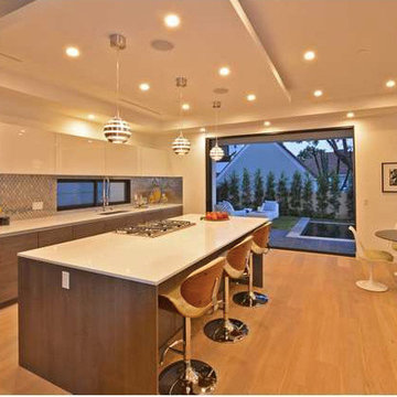
 Kitchen Works-Leicht Los Angeles
Example of a large minimalist l-shaped light wood floor enclosed kitchen design in Los Angeles with an undermount sink, flat-panel cabinets, gray cabinets, quartz countertops, metallic backsplash, metal backsplash, stainless steel appliances and an island
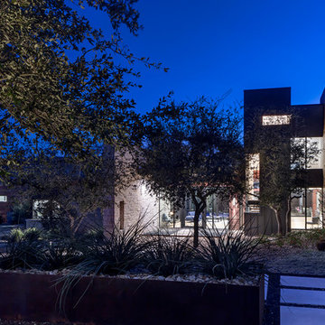
 Matt Fajkus Architecture
The Control/Shift House is perched on the high side of the site which takes advantage of the view to the southeast. A gradual descending path navigates the change in terrain from the street to the entry of the house. A series of low retaining walls/planter beds gather and release the earth upon the descent resulting in a fairly flat level for the house to sit on the top one third of the site. The entry axis is aligned with the celebrated stair volume and then re-centers on the actual entry axis once you approach the forecourt of the house.
The initial desire was for an “H” scheme house with common entertaining spaces bridging the gap between the more private spaces. After an investigation considering the site, program, and view, a key move was made: unfold the east wing of the “H” scheme to open all rooms to the southeast view resulting in a “T” scheme. The new derivation allows for both a swim pool which is on axis with the entry and main gathering space and a lap pool which occurs on the cross axis extending along the lengthy edge of the master suite, providing direct access for morning exercise and a view of the water throughout the day.
The Control/Shift House was derived from a clever way of following the “rules.” Strict HOA guidelines required very specific exterior massing restrictions which limits the lengths of unbroken elevations and promotes varying sizes of masses. The solution most often used in this neighborhood is one of addition - an aggregation of masses and program randomly attached to the inner core of the house which often results in a parasitic plan. The approach taken with the Control/Shift House was to push and pull program/massing to delineate and define the layout of the house. Massing is intentional and reiterated by the careful selection of materiality that tracks through the house. Voids and relief in the plan are a natural result of this method and allow for light and air to circulate throughout every space of the house, even into the most inner core.
Photography: Charles Davis Smith
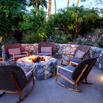
 Alexis King Interiors
This project was a ton of fun. I have been working with these clients, now dear friends, for several years on their various properties and we work really well together. For their desert home, my goal was to create a new experience with each space while maintaining flow. This required striking a balance between organic light/airy spaces and glam dark/moody spaces. The finishes specified ranged from blackened steel, walnut, polished brass, rubbed plaster, digital wallcovering and back lit quartz to name a few. When a space draws you in closer to investigate there is a moment of discovery that elicits an emotional response. These spaces do just that. From sublime light fixtures to cozy seating vignettes, this home is a beautiful sanctuary - a place to entertain friends and family both indoors and out. It is a poised exercise in effortless, relaxed, edgy luxe design.
Find the right local pro for your project
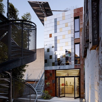
 American Institute of Architects, San Francisco
Zero Cottage is an investigation of compact, sustainable urban development and a contemporary approach to living and working. The cottage is composed of a 712 sq. ft. living space set over a 430 sq. ft workshop. It pairs with an existing building to complete a mixed-use compound that also includes a two-bedroom flat, studio apartment and storefront. Image by Matthew Millman.
 Sosna Inc
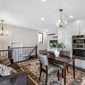
After serving as a rental for some time, this home was ready to be reclaimed by its owner and her son.
Gutting “back to the studs” was an understatement for this one. This transformation involved replanning everything; including the roof, the HVAC system, the entire plumbing system, and relocating the side entrance and staircase to the back of the house. Only the subfloors, the exterior framing structure, and the brick remains from this original 1940’s-built bungalow.
When we’re renovating an old structure, we’re bound to find some surprises. This renovation did not disappoint! From basement to roof, we found more than a few, shall we say, potentially catastrophic surprises along the way.
Let’s start with the basement. The homeowner wanted to update the basement and make it a usable living space for her adult son as well as a spa with a sauna for her. This required bringing the 6 foot ceiling height up to code at 7 feet. To do this, we had to re-think the HVAC system that was in the basement ceiling. When we opened up the basement ceiling to remove the HVAC supply and return trunks, we discovered asbestos! The asbestos had to be removed before we could dismantle and remove the HVAC system.
For the main floor, when we were replanning the existing 2-bedroom layout to create two master bedrooms each with their own ensuites, we looked at the possibility of removing the main load-bearing wall. But our investigations led to the discovery that the load bearing wall was not lined up with the roof or the basement load points, so the load of the house was not continuous throughout. This was a disaster waiting to happen. And as we found out, this lack of alignment was causing major issues with the roof when we went to replace the shingles. We discovered portions of the roof truss in very poor condition, literally moments away from giving out. These were replaced and other truss components were fortified before we went on to re-shingle the roof and replace all the soffits and eavestroughs.
Once the structural and space planning elements were sorted out, we could turn our focus to helping this homeowner select the finishes she and her son wanted for their new spaces. She wanted white all the way, and he wanted bold colours. You will see these color choices reflected in their private bathrooms as well as in the upper kitchen and living area that she will mostly use, and the basement entertainment area that he will mostly use.
To round out the personalization of this made-new-again home, we converted the basement into an entertainment center with a bar for her son, and a sauna and third full bathroom with a jacuzzi tub for a spa-like feel for her.
Without having to build from scratch, this homeowner got the custom home of her dreams.
While you “can’t teach an old dog new tricks”, the sky’s the limit on how you can transform an old home into the home of your dreams. When your “old dog” needs some new tricks, we are the Renovator You Can Count On.

 Alexis King Interiors
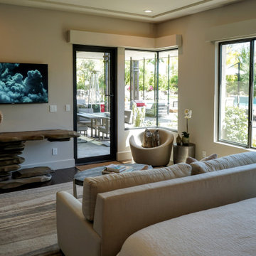
This project was a ton of fun. I have been working with these clients, now dear friends, for several years on their various properties and we work really well together. For their desert home, my goal was to create a new experience with each space while maintaining flow. This required striking a balance between organic light/airy spaces and glam dark/moody spaces. The finishes specified ranged from blackened steel, walnut, polished brass, rubbed plaster, digital wallcovering and back lit quartz to name a few. When a space draws you in closer to investigate there is a moment of discovery that elicits an emotional response. These spaces do just that. From sublime light fixtures to cozy seating vignettes, this home is a beautiful sanctuary - a place to entertain friends and family both indoors and out. It is a poised exercise in effortless, relaxed, edgy luxe design.
 Sosna Inc
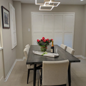
Our clients, a lovely couple with two kids, asked us to renovate their dated Kitchen. Although they were happy with its existing layout, the cupboards were worn out, and did not provide optimal storage.
Through detailed investigation and design, we created an updated space, tailored to their needs. New custom-built cabinets with modern contemporary finishes not only provided optimal storage solutions, but a fresh, update to the Kitchen. Larger countertops provided a more functional preparation area and were complimented beautifully with a matching backsplash.
Re-grouting the floor tiles throughout the Kitchen and Main Floor made the floors look like new again. Updated lighting and paint with soft undertones provide a warm, welcoming feeling.
Overall, the personalized details and updates increased both the functionality and comfort for our clients, creating a home that is unmistakably theirs.
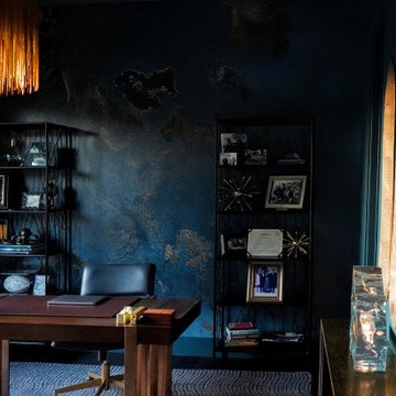 Alexis King Interiors
This project was a ton of fun. I have been working with these clients, now dear friends, for several years on their various properties and we work really well together. For their desert home, my goal was to create a new experience with each space while maintaining flow. This required striking a balance between organic light/airy spaces and glam dark/moody spaces. The finishes specified ranged from blackened steel, walnut, polished brass, rubbed plaster, digital wallcovering and back lit quartz to name a few. When a space draws you in closer to investigate there is a moment of discovery that elicits an emotional response. These spaces do just that. From sublime light fixtures to cozy seating vignettes, this home is a beautiful sanctuary - a place to entertain friends and family both indoors and out. It is a poised exercise in effortless, relaxed, edgy luxe design.
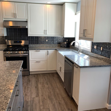
 INSPIRED KITCHEN DESIGN
Now as an experienced DIYer, Adam shares some important advice for other IKEA customers.
“Remodeling your kitchen is hard under any circumstances. IKEA does present remodelers with an option for higher-end remodels that can be done by oneself, but it is not an easy road. There are plenty of tutorials online, but you will also run into situations that will not have a tutorial somewhere,” he says.
To that end, he advises that as you go through the process, you will develop more confidence in how to manage these challenges.
“Make sure you know what your limits are and know that once you start it can be impossible to stop with half a kitchen built. Take your time to investigate this project and make the best-informed decision for your home,” he adds.
He concludes: “Installation was definitely challenging for a first-time installer, but it got easier as we progressed. I certainly could install another kitchen much faster right now!”

 Rain Garden Nursery LandscapeMakeoverDesignStaging
Scott & Catherine Buley, HTT&T, High Tech Turf & Trees, LandscapeMakeover.biz, Rain Garden Nursey. Client's dog "Jazzy" came out frequently to investigate our progress. Here's she's befriending Catherine.
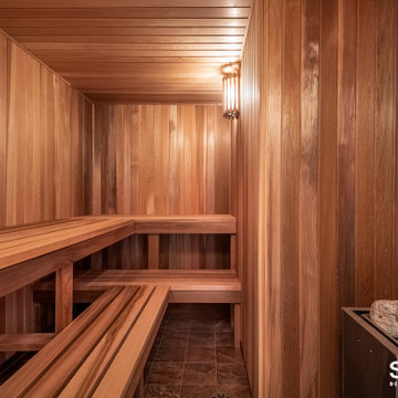 Sosna Inc
After serving as a rental for some time, this home was ready to be reclaimed by its owner and her son.
Gutting “back to the studs” was an understatement for this one. This transformation involved replanning everything; including the roof, the HVAC system, the entire plumbing system, and relocating the side entrance and staircase to the back of the house. Only the subfloors, the exterior framing structure, and the brick remains from this original 1940’s-built bungalow.
When we’re renovating an old structure, we’re bound to find some surprises. This renovation did not disappoint! From basement to roof, we found more than a few, shall we say, potentially catastrophic surprises along the way.
Let’s start with the basement. The homeowner wanted to update the basement and make it a usable living space for her adult son as well as a spa with a sauna for her. This required bringing the 6 foot ceiling height up to code at 7 feet. To do this, we had to re-think the HVAC system that was in the basement ceiling. When we opened up the basement ceiling to remove the HVAC supply and return trunks, we discovered asbestos! The asbestos had to be removed before we could dismantle and remove the HVAC system.
For the main floor, when we were replanning the existing 2-bedroom layout to create two master bedrooms each with their own ensuites, we looked at the possibility of removing the main load-bearing wall. But our investigations led to the discovery that the load bearing wall was not lined up with the roof or the basement load points, so the load of the house was not continuous throughout. This was a disaster waiting to happen. And as we found out, this lack of alignment was causing major issues with the roof when we went to replace the shingles. We discovered portions of the roof truss in very poor condition, literally moments away from giving out. These were replaced and other truss components were fortified before we went on to re-shingle the roof and replace all the soffits and eavestroughs.
Once the structural and space planning elements were sorted out, we could turn our focus to helping this homeowner select the finishes she and her son wanted for their new spaces. She wanted white all the way, and he wanted bold colours. You will see these color choices reflected in their private bathrooms as well as in the upper kitchen and living area that she will mostly use, and the basement entertainment area that he will mostly use.
To round out the personalization of this made-new-again home, we converted the basement into an entertainment center with a bar for her son, and a sauna and third full bathroom with a jacuzzi tub for a spa-like feel for her.
Without having to build from scratch, this homeowner got the custom home of her dreams.
While you “can’t teach an old dog new tricks”, the sky’s the limit on how you can transform an old home into the home of your dreams. When your “old dog” needs some new tricks, we are the Renovator You Can Count On.
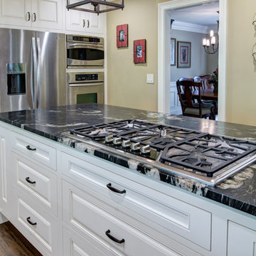
 Weidmann Remodeling
As needs have changed, new home construction in Atlanta has trended towards more open floor plans. Weidmann helps owners of older residences to investigate and achieve these same open objectives by consolidating and reconfiguring the available space on both levels. This home was opened up with a little creative organization, which included relocating the powder room, changing traffic patterns and repurposing rooms for a renewed lifetime of living.
FotoGrafik Arts
 Riddle Construction & Design
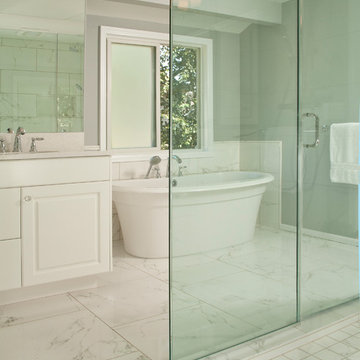
Master bathroom with free standing Maax tub, frameless shower enclosure, dual white vanity and porcelain tile.
Inspiration for a large timeless master white tile and porcelain tile porcelain tile bathroom remodel in Seattle with an undermount sink, raised-panel cabinets, white cabinets, quartz countertops, a two-piece toilet and gray walls
Inspiration for a large timeless master white tile and porcelain tile porcelain tile bathroom remodel in Seattle with an undermount sink, raised-panel cabinets, white cabinets, quartz countertops, a two-piece toilet and gray walls

 safe ZOnea
If you’re active on GardenWeb sharing plant photos, asking for advice, tracking seasonal progress you already understand how much detail goes into gardening. Soil pH, rainfall, emerging leaves, bloom counts, fertilizer schedules it adds up fast. But all that rich information often remains buried in posts, lists or memory. What if you could visualize that data and turn it into clear quick insights? That’s where a graph maker becomes a game-changer for your gardening workflow.
1. Why garden data belongs on a graph
On GardenWeb, you’ll find forums for everything from perennial care, vegetable gardening, patios, herbs, even cooking and craft projects. While plant lovers share observations and ask questions, many track progress manually in spreadsheets or memory. A graph maker flips that around:
Instead of a list of numbers (e.g., “Soil test: pH 6.4 in May, 6.1 in October”), you get a line graph showing the decline over time.
Instead of guessing which plant bloomed most, you see a bar chart comparing counts across plants.
Instead of manually calculating average rainfall effect, you plot scatter points of bloom count vs. rainfall.
By turning your data into visuals, you’re not just recording—you’re analysing, learning and improving. For GardenWeb users this means smarter decisions: Which fertilizer actually improves bloom count? Which shady spot recovers slower? A graph maker gives clarity.
2. What is a graph maker and how to use one
A graph maker is a web tool or software that lets you input raw data (numbers, dates, categories) and output visual charts like line graphs, bar charts, scatter plots, etc. It might allow you to import a spreadsheet, select chart type, customize colours, label axes, and export the image for your blog, forum post or personal log.
Here’s how you could apply it for gardening:
Log blooms per week for each rose plant.
Using the graph maker, choose line graph to track changes over weeks.
Label your y-axis “Number of Blooms”, x-axis “Week of Year”.
Add colour lines for each plant for easy comparison.
Export as PNG and embed it in a GardenWeb forum post: “See bloom trend for my ‘Peace’ vs ‘Knock Out’ roses”.
This isn’t just pretty-to-look-at: it makes the trend obvious, invites discussion (“Hey, your ‘Knock Out’ line dips after week 28—what changed?”) and helps you refine your routine.
3. Use these specific scenarios on GardenWeb
A. Soil pH and plant health tracking
After multiple tests you have pH values over time and bloom results. Upload both datasets into the graph maker, produce a dual-axis line graph: soil pH on one axis, bloom count on the other. Post your findings in the “Soil, Fertility & Nutrients” forum and get feedback.
B. Seasonal pest or disease appearance
Record number of aphids spotted each month and whether you used treatment. A bar chart via the graph maker can show pre- and post-treatment figures. Then ask the “Insect & Disease Control” forum for advice based on your visual data.
C. Yield comparison between varieties
You grow two zucchini varieties. You keep weekly yield in pounds. Use the graph maker for a side-by-side bar chart. Share in the “Vegetable Gardening” forum: “Which was better this year? See the chart”.
D. Rainfall vs growth rate
You log weekly rainfall and growth (in cm) of your tomato plants. Use scatter plot in graph maker. If a pattern emerges, you’re ready to post: “Is my growth plateau due to drought? Chart shows a clear correlation.”
4. Why this elevates your GardenWeb contributions
When you post with a chart made by a graph maker, you’re doing more than asking or showing off. You’re investigating. You’re analysing. You invite the community to give feedback on data, not just anecdotes. That elevates the discussion. Instead of “My plant died, any ideas?” you post “See this graph of pH drop and bloom count—what might be the limiting factor?” High-quality visuals raise your post’s value and garner more thoughtful responses.
Plus, your posts become useful references for others: someone else can say, “Cool graphic, can you share your data sheet?” You build credibility and help the forum become a learning hub—not just a Q&A board.
5. Tips for using a graph maker effectively in the GardenWeb context
Keep it simple: One chart, one insight. Don’t overcrowd.
Label clearly: Titles, axis labels, units (e.g., cm/week, mg/L, °F).
Use readable colours: Avoid faint tones that vanish on mobile.
Annotate when needed: Add notes like “Fertiliser switched week 12” or “Shade cloth added”.
Provide context in your post: Don’t leave the chart alone—write a few sentences explaining what it shows and what you’re seeking.
Embed carefully: Make sure your image displays properly in GardenWeb; check mobile view.
Share raw data: If possible link to your spreadsheet so others can replicate or comment.
Be open to feedback: The chart invites questions; embrace them.
6. Possible pitfalls and how to avoid them
Bad data = bad chart: If your measurements aren’t consistent, your graph will mislead. Use standardized data collection.
Too much complexity: Multi-axis charts, too many variables—confusing. Stick to one or two variables.
Overlooking mobile viewers: Many GardenWeb users browse via phones. Use large fonts and simple visuals.
Ignoring the narrative: Chart alone won’t answer. Explain what it means and what you need.
Outdated charts: If you update your data annually, keep your visuals current or label them clearly as “2024 data”.
7. Final thoughts
On GardenWeb you’ll find a vibrant community of gardeners, DIYers, cooks and design lovers.Using a graph maker for your posts and progress turns your experience from casual hobby-logging into smart data-driven gardening. You’ll not only learn more—your peers will learn more, too.
So next time you log your plant growth, record your yield, test your soil or track pests—don’t just note it. Plot it. Use a graph maker. Share it in the forum. Let your garden tell the story, and let the community help you write the next chapter.
 Klassen Remodeling & Design, Inc.
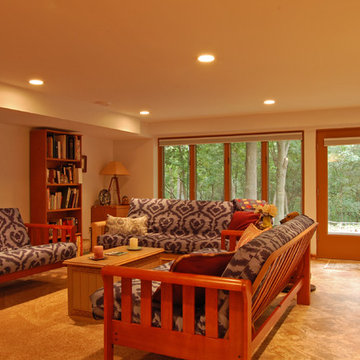
Example of a mid-sized 1960s underground ceramic tile basement design in Milwaukee with beige walls
 Field Architecture
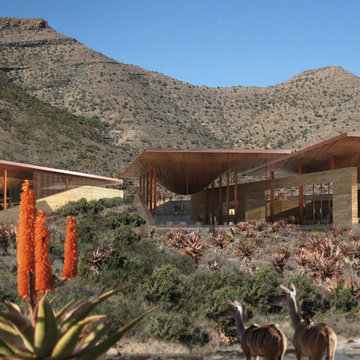
The architecture of the Karoo Wilderness Center is a result of a thorough process of investigation into the origins and character of the Karoo landscape and the flora and fauna that result from its particular qualities. The tectonic events that produced the specific topography of the site, trajectories of water runoff, wind movement, soil composition, and effects of plant and animal species on the landscape have converged to create the conditions of the site chosen for the Center. Each of these factors have in turn been subject to the impact of human inhabitation and vernacular building practices, amplified in recent generations to a harmful degree by shortsighted agricultural strategies and their associated effects of overgrazing, water over-manipulation and erosion.
Fundamental to the architectural response is the premise that the human species is an inherent part of the conditions that comprise and affect the landscape. The significance of the Center, enhanced and informed by the activities that occur within and as an extension of it, lies in the co-dependence of the Center and the ecosystem as inherently bound entities. The architecture of the Center is intended to make evident the natural processes of the Karoo and establish a new precedent for building within and through an ecosystem defined by dynamic flux.
 Hush House
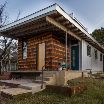
Careful use of intriguing materials and expansive daylighting create a warm, yet modern structure. Investigations in traditional material treatments leads to a blending, artfully-textured experience. Truly modern and clearly organized spaces become inviting, through this process.
East Austin, Texas.
 Alexis King Interiors
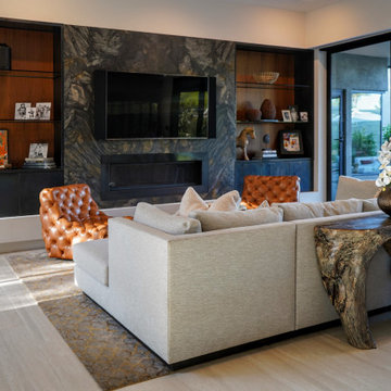
This project was a ton of fun. I have been working with these clients, now dear friends, for several years on their various properties and we work really well together. For their desert home, my goal was to create a new experience with each space while maintaining flow. This required striking a balance between organic light/airy spaces and glam dark/moody spaces. The finishes specified ranged from blackened steel, walnut, polished brass, rubbed plaster, digital wallcovering and back lit quartz to name a few. When a space draws you in closer to investigate there is a moment of discovery that elicits an emotional response. These spaces do just that. From sublime light fixtures to cozy seating vignettes, this home is a beautiful sanctuary - a place to entertain friends and family both indoors and out. It is a poised exercise in effortless, relaxed, edgy luxe design.
 Alexis King Interiors
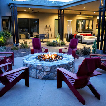
This project was a ton of fun. I have been working with these clients, now dear friends, for several years on their various properties and we work really well together. For their desert home, my goal was to create a new experience with each space while maintaining flow. This required striking a balance between organic light/airy spaces and glam dark/moody spaces. The finishes specified ranged from blackened steel, walnut, polished brass, rubbed plaster, digital wallcovering and back lit quartz to name a few. When a space draws you in closer to investigate there is a moment of discovery that elicits an emotional response. These spaces do just that. From sublime light fixtures to cozy seating vignettes, this home is a beautiful sanctuary - a place to entertain friends and family both indoors and out. It is a poised exercise in effortless, relaxed, edgy luxe design.
21