
Search results for "Jamming" in Home Design Ideas
 Story Homes
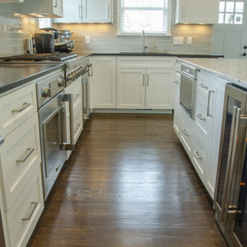
The best kitchen design begins with the goal of enhancing functionality. We were looking for the shortest distance from fridge to stove to sink. This is known as the “golden triangle” of kitchen design. We also wanted the food preparation process to flow in one direction: From food storage to preparation to cooking to cleaning. This is the ideal kitchen flow because it eliminates traffic jams and keeps fresh food safer by moving from cold to warm.
One side of the island allows comfortable seating for four, while the other side boasts spacious storage with 2 deep drawers and 5 cabinets, as well as two key appliances. The photo above shows how food preparation traffic moves from the fridge to island to range and finally sink and dishwasher. The golden triangle in action!
An Avallon beverage center is located on the “cold foods” side of the island. This stainless-steel under-counter split-zone refrigerator is sure to please every wine and beer enthusiast. The left side is cooled to 58 degrees for wine, while the right side cools down to 34 degrees for beer. Both sides feature pull-out shelves, and each side is lockable for safety.
Moving down to the “warm foods” side of the island is a Thermador microwave drawer, which has easy access from above. We also chose Thermador for our fridge, ovens, gas range and dishwasher.
 Rebekah Nicole Interiors
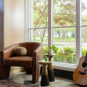
One of the most exciting transformations was the conversion of the third garage bay into a second home office and music jam room. Partnering with JC’s Remodeling, we reimagined this space to include: Custom white oak cabinetry with custom storage built for amps, cords, and other equipment. A mini dry bar featuring a smoked mirrored glass backsplash and a honed marble countertop. Soundproof wood slat acoustic panels for a modern, yet functional accent wall. A curved bookcase detail that integrates beautifully with the cabinetry and wood slat wall, creating an intentional focal point. Curated furnishings like a comfortable tufted sofa (a take on the modern classic library sofa with distressed velvet), and a vintage-inspipred performance rug brought warmth and comfort. I also selected a curvy armless chair which is ideal for guitar sessions.
This swanky retreat reflects a speakeasy lounge vibe, offering both a practical workspace and an inspiring creative haven. The client told me after it was all said and done that his kids love to pile onto the sofa and just hang out in the room as a family. Together, they build memories and learn new songs. That’s what good design should do—it brings people together.
 birdRock Project Studio Inc.
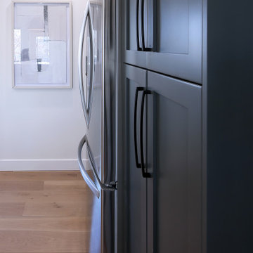
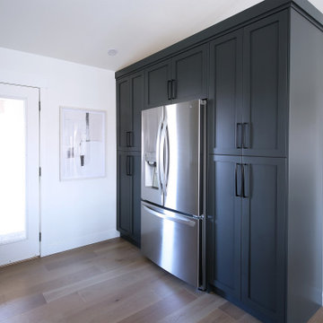
Right from the start, these clients had a very specific wish list: A spot for all the things!
The existing Kitchen was really lacking in storage space for everyday life. There just wasn’t enough room for things like Water Bottles, Lunch Boxes, Spices, Toaster, Coffee Machine, Kitchen Aid Mixer, and Containers - which left everything feeling jam packed and chaotic.
Embracing function was first priority - we looked for ways to create a hard working and streamlined Kitchen. That came to life by incorporating as many Kitchen organization accessories as possible: A Blind corner pullout, Cutlery and Utensil Organizers, Drawers galore, Pantry Rollout shelving, A Recycling station pullout, moved the Microwave to the Peninsula, and added a Beverage Fridge.
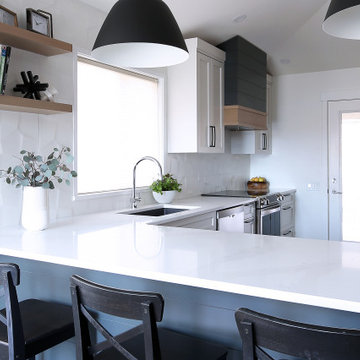
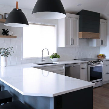
One of the favourite wins was doing away with the corner sink and redesigning the Kitchen to feature the sink area centred to the Window. We also extended the usable counter space of the Island and to allow for seating for 3 at the Peninsula.
To keep things light but also add some interesting layers - we used a unique geometric 3 dimensional wall tile as the backsplash across the entire length of the range wall and right into the nook area. This textured wall tile was a pivotal element for durability but also for the aesthetic - which the clients say is one of their favourite parts of the new space.
Find the right local pro for your project
 birdRock Project Studio Inc.
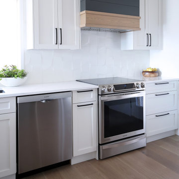
Right from the start, these clients had a very specific wish list: A spot for all the things!
The existing Kitchen was really lacking in storage space for everyday life. There just wasn’t enough room for things like Water Bottles, Lunch Boxes, Spices, Toaster, Coffee Machine, Kitchen Aid Mixer, and Containers - which left everything feeling jam packed and chaotic.
Embracing function was first priority - we looked for ways to create a hard working and streamlined Kitchen. That came to life by incorporating as many Kitchen organization accessories as possible: A Blind corner pullout, Cutlery and Utensil Organizers, Drawers galore, Pantry Rollout shelving, A Recycling station pullout, moved the Microwave to the Peninsula, and added a Beverage Fridge.
One of the favourite wins was doing away with the corner sink and redesigning the Kitchen to feature the sink area centred to the Window. We also extended the usable counter space of the Island and to allow for seating for 3 at the Peninsula.
To keep things light but also add some interesting layers - we used a unique geometric 3 dimensional wall tile as the backsplash across the entire length of the range wall and right into the nook area. This textured wall tile was a pivotal element for durability but also for the aesthetic - which the clients say is one of their favourite parts of the new space.
 birdRock Project Studio Inc.
Right from the start, these clients had a very specific wish list: A spot for all the things!
The existing Kitchen was really lacking in storage space for everyday life. There just wasn’t enough room for things like Water Bottles, Lunch Boxes, Spices, Toaster, Coffee Machine, Kitchen Aid Mixer, and Containers - which left everything feeling jam packed and chaotic.
Embracing function was first priority - we looked for ways to create a hard working and streamlined Kitchen. That came to life by incorporating as many Kitchen organization accessories as possible: A Blind corner pullout, Cutlery and Utensil Organizers, Drawers galore, Pantry Rollout shelving, A Recycling station pullout, moved the Microwave to the Peninsula, and added a Beverage Fridge.
One of the favourite wins was doing away with the corner sink and redesigning the Kitchen to feature the sink area centred to the Window. We also extended the usable counter space of the Island and to allow for seating for 3 at the Peninsula.
To keep things light but also add some interesting layers - we used a unique geometric 3 dimensional wall tile as the backsplash across the entire length of the range wall and right into the nook area. This textured wall tile was a pivotal element for durability but also for the aesthetic - which the clients say is one of their favourite parts of the new space.
 birdRock Project Studio Inc.
Right from the start, these clients had a very specific wish list: A spot for all the things!
The existing Kitchen was really lacking in storage space for everyday life. There just wasn’t enough room for things like Water Bottles, Lunch Boxes, Spices, Toaster, Coffee Machine, Kitchen Aid Mixer, and Containers - which left everything feeling jam packed and chaotic.
Embracing function was first priority - we looked for ways to create a hard working and streamlined Kitchen. That came to life by incorporating as many Kitchen organization accessories as possible: A Blind corner pullout, Cutlery and Utensil Organizers, Drawers galore, Pantry Rollout shelving, A Recycling station pullout, moved the Microwave to the Peninsula, and added a Beverage Fridge.
One of the favourite wins was doing away with the corner sink and redesigning the Kitchen to feature the sink area centred to the Window. We also extended the usable counter space of the Island and to allow for seating for 3 at the Peninsula.
To keep things light but also add some interesting layers - we used a unique geometric 3 dimensional wall tile as the backsplash across the entire length of the range wall and right into the nook area. This textured wall tile was a pivotal element for durability but also for the aesthetic - which the clients say is one of their favourite parts of the new space.
 birdRock Project Studio Inc.
Right from the start, these clients had a very specific wish list: A spot for all the things!
The existing Kitchen was really lacking in storage space for everyday life. There just wasn’t enough room for things like Water Bottles, Lunch Boxes, Spices, Toaster, Coffee Machine, Kitchen Aid Mixer, and Containers - which left everything feeling jam packed and chaotic.
Embracing function was first priority - we looked for ways to create a hard working and streamlined Kitchen. That came to life by incorporating as many Kitchen organization accessories as possible: A Blind corner pullout, Cutlery and Utensil Organizers, Drawers galore, Pantry Rollout shelving, A Recycling station pullout, moved the Microwave to the Peninsula, and added a Beverage Fridge.
One of the favourite wins was doing away with the corner sink and redesigning the Kitchen to feature the sink area centred to the Window. We also extended the usable counter space of the Island and to allow for seating for 3 at the Peninsula.
To keep things light but also add some interesting layers - we used a unique geometric 3 dimensional wall tile as the backsplash across the entire length of the range wall and right into the nook area. This textured wall tile was a pivotal element for durability but also for the aesthetic - which the clients say is one of their favourite parts of the new space.

 Edgewater Design Group
Our clients already had the beautiful lot on Burt Lake, all they needed was the home. We were hired to create an inviting home that had a "craftsman" style of the exterior and a "cottage" style for the interior. They desired to capture a casual, warm, and inviting feeling. The home was to have as much natural light and to take advantage of the amazing lake views. The open concept plan was desired to facilitate lots of family and visitors. The finished design and home is exactly what they hoped for. To quote the owner "Thanks to the expertise and creativity of the design team at Edgewater, we were able to get exactly what we wanted."
-Jacqueline Southby Photography

 Kristin Hoaglund Design
This beautiful French Provincial home is set on 10 acres, nestled perfectly in the oak trees. The original home was built in 1974 and had two large additions added; a great room in 1990 and a main floor master suite in 2001. This was my dream project: a full gut renovation of the entire 4,300 square foot home! I contracted the project myself, and we finished the interior remodel in just six months. The exterior received complete attention as well. The 1970s mottled brown brick went white to completely transform the look from dated to classic French. Inside, walls were removed and doorways widened to create an open floor plan that functions so well for everyday living as well as entertaining. The white walls and white trim make everything new, fresh and bright. It is so rewarding to see something old transformed into something new, more beautiful and more functional.


 Girasole Sonoma
Quince- Cydonia oblonga.
Has a fragrant "apple" aroma.
Classic farmhouse shrub.
Beautiful spring blossoms.
Girasole Sonoma
Photo of a farmhouse landscaping in San Francisco.
Photo of a farmhouse landscaping in San Francisco.

 ATeam Realty
Corner bathtub - mid-sized craftsman master beige tile and cement tile ceramic tile corner bathtub idea in Salt Lake City with raised-panel cabinets, medium tone wood cabinets and quartzite countertops

 Harth Builders
Example of a mid-sized farmhouse l-shaped medium tone wood floor and brown floor enclosed kitchen design in Philadelphia with a farmhouse sink, shaker cabinets, green cabinets, quartz countertops, white backsplash, subway tile backsplash, stainless steel appliances, an island and white countertops


 DESIGNLUSH
photo: Luis Gomez
YO MIAMI…HOLLAAAAH!! It’s Pit Bull power jams, all night dance parties and some of the best beaches in the world. But after all of that you do need some down time and that’s when we come in. As much as we love a good beach day we also love the social times with friends, gathering on the terrace to watch a spectacular sunset or just chilling by the pool. This Miami get-away was designed as an escape from NY – the client wanted a calm and comfortable respite from the big apple. The space is designed to accommodate the occasional house guests or an impromptu long week-end get-away for the owners with a calm and sophisticated color palette.
DL featured product:
custom ella sofa sectional, Hal dining table, solid walnut dining chairs, custom capiz chandelier, stanhope floor lamp, galaxy silk rug, buffo wool rug, pello alpaca rug, solid walnut daybeds, solid walnut + croc. embossed petis fours platform bed, slabwood coffee table, clear acrylic coffee table, rosewood media case with legs, tipping point saddle leather chaise lounge, powder-filled acrylic writing desk, coral series jesse harris photography, special commission nino painting, hand-blown glass antler candlesticks, mica stone wallpaper.


 Siding & Windows Group Ltd
HardiePlank Iron Gray Lap and Shingle Straight Edge (Dormer) Siding, HardieTrim Arctic White, ProVia Entry Door Signet remodeled front entry Portico.
Front door - mid-sized victorian three-story concrete fiberboard gray, concrete floor and beige floor front door idea in Chicago with gray walls and a dark wood front door
Front door - mid-sized victorian three-story concrete fiberboard gray, concrete floor and beige floor front door idea in Chicago with gray walls and a dark wood front door
 Cathie Hong Interiors
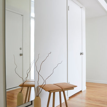
This 1956 John Calder Mackay home had been poorly renovated in years past. We kept the 1400 sqft footprint of the home, but re-oriented and re-imagined the bland white kitchen to a midcentury olive green kitchen that opened up the sight lines to the wall of glass facing the rear yard. We chose materials that felt authentic and appropriate for the house: handmade glazed ceramics, bricks inspired by the California coast, natural white oaks heavy in grain, and honed marbles in complementary hues to the earth tones we peppered throughout the hard and soft finishes. This project was featured in the Wall Street Journal in April 2022.

 J D J R e m o d e l
Photography by J.P. Chen, Phoenix Media
Family room - large traditional light wood floor family room idea in Milwaukee with a music area, beige walls, no fireplace and no tv
Family room - large traditional light wood floor family room idea in Milwaukee with a music area, beige walls, no fireplace and no tv

 User
Who doesn't love empire dressers? Can't you just picture getting primped for prom or your wedding? We thought this would be the perfect piece to be used for this dining room's buffet table.
Photo Credit: N. Leonard
93