
Search results for "Które daje" in Home Design Ideas
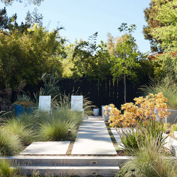
 Klopf Architecture
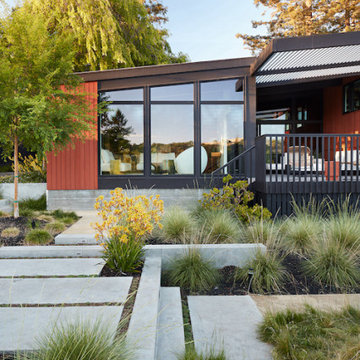
The Roger Lee designed house from 1962 was purchased by the current homeowners in almost original condition, as the previous owners elected to defer most maintenance projects over the years. The clients were able to see beyond the dated materials and finishes, single-paned glass and uninsulated walls and they approached Klopf Architecture to help them expand and update the entire home, one the family could settle into and enjoy for years to come. It was important that the new designs were aligned with Lee's original intent not only because of the client's appreciation for mid-century modern architecture, but also because the house was deemed historical. The Stanford Real Estate Office requires a stringent design review which safeguards the integrity of the community, which Klopf Architecture was happy to oblige going into their updated designs.
As with many original mid-century modern homes, the house was scaled to the 1960s lifestyle where rooms were smaller and openings to views were limited and tightly framed. The original conditions defined the direction the family of four would take in updating the house and making it comfortable for their modern lifestyle. Klopf designed a full gut remodel and major addition to bring the house into the 21st century and provide the living area needed for the client's family. The newly expanded house added just about 1,100 sf to create an airy, comfortable and family friendly house, taking full advantage of the beautiful southwestern views that extend out to the hills beyond. The enclosed garage created an additional 240 sf of covered space for long-term storage.
A cracked swimming pool created an eyesore taking up a majority of the backyard landscape, so it was one of the first elements to go during the transformation. Working with Outer Space Landscape Architects, the family asked for a mix of relaxing outdoor patio spaces that eventually blend into the native landscaping, extending their views outward toward the natural greenery of the trees beyond their property. Filling in the old pool was a smart way to expand the living spaces outward. The orientation of the house was designed to enjoy the views, but the original architecture provided the first homeowners with mere glimpses of the landscape outside.
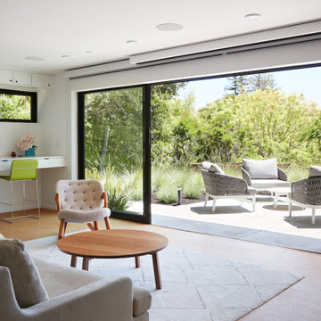
Klopf was able to broaden those views, continuing and extending on the original architecture to take full advantage of the unobstructed natural views across the rear facade of the house. Small horizontal openings in the primary bedroom and office were replaced with much taller windows that now follow the angled roof line upward, extending across almost all of the facade. We worked with Western Windows, whose designs included an oblique-shaped, operable casement that allowed our design to rise with the slope. A new corner office added to the primary suite, offers a bright and functional work-from-home solution that looks out at the distant views and added natural light from the expanded window configuration that now wraps around the corner.
The existing lower level was designed by Lee as a utilitarian space, serving as a wet pool room with a drain in the center of the floor, bathroom, laundry and storage areas. Without the need for a pool room, Klopf was able to convert the area into a much more comfortable and functional living space with a new family room and guest suite. The new spaces enjoy easy access to a new outdoor patio through floor to ceiling, full-width glass sliders.
Continuing along the rear facade, a previously exposed deck extending from the living room and hallway provided access to the backyard through a single set of stairs leading toward the side of the house which made sense when the pool was in place. The new deck was re-envisioned as an extension of the main living room and now serves as a second outdoor living room. A new slatted pergola above provides the homeowners welcome relief from the hot afternoon sun. A second set of stairs now creates a better connection to the redesigned lower level. Klopf was able to reconfigure the spaces, extending the living room outward toward the views, where the family now claims it as the heart of the home, spending a large majority of their time outdoors.
Back inside, the original wood-burning Malm fireplace was beautifully restored and a gas burner installed to comply with California's strict air standards. It now rests in front of a wall of Heath accent tiles where a dated red brick wall used to stand. A new taller window brings more light and views into the refreshed interior living room. The original glass doors opposite the fireplace were replaced by larger sliders that when fully opened, create a seamless transition to the new outdoor living area so the two spaces feel like one connected space. The original utilitarian kitchen was needlessly tucked into the far back corner and closed-off, out of sight from the living room, so the clients asked Klopf to open it up and expand the kitchen forward so it felt more connected. Today the much larger kitchen is connected to the living area where a short wall with a cutout offers a visual glimpse into the kitchen and a handy pass-through counter for serving guests. A new breakfast nook was also added to create another spot where the family can gather for casual meals. Just outside, a new built-in outdoor grill and prep area extends the kitchen outside and connects to a new outdoor dining spot nestled amongst the trees, taking advantage of the views out back.
Klopf was able to expand the other two bedrooms, add a new laundry room and half-bath and convert the carport to an enclosed garage to add more storage areas which was lost when the pool house was converted to the family and guest room.
To maintain a historical connection to the original designs, the exterior siding was repeated on all exterior walls, a full-height stained glass window at the front entryway restored, and an interior slatted screen element repeated outside at the exterior entry courtyard and over the new outdoor living room to create a shade trellis. The new house stands proudly and shines against it's new landscaping features, while respecting and expanding on the original intent of Roger Lee's designs epitomizing the comforts of indoor-outdoor living in Northern California.
Completion year: 2020
Klopf Architecture project team: John Klopf, Klara Kevane, Noel Andrade
Contractor: ORB Construction, Brendan O'Reilly
Structural engineer: Sezen and Moon
Landscape architect: Outer space
Furnishings and decoration: Urbanism Designs
Photographer: Mariko Reed
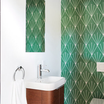 Klopf Architecture
The Roger Lee designed house from 1962 was purchased by the current homeowners in almost original condition, as the previous owners elected to defer most maintenance projects over the years. The clients were able to see beyond the dated materials and finishes, single-paned glass and uninsulated walls and they approached Klopf Architecture to help them expand and update the entire home, one the family could settle into and enjoy for years to come. It was important that the new designs were aligned with Lee's original intent not only because of the client's appreciation for mid-century modern architecture, but also because the house was deemed historical. The Stanford Real Estate Office requires a stringent design review which safeguards the integrity of the community, which Klopf Architecture was happy to oblige going into their updated designs.
As with many original mid-century modern homes, the house was scaled to the 1960s lifestyle where rooms were smaller and openings to views were limited and tightly framed. The original conditions defined the direction the family of four would take in updating the house and making it comfortable for their modern lifestyle. Klopf designed a full gut remodel and major addition to bring the house into the 21st century and provide the living area needed for the client's family. The newly expanded house added just about 1,100 sf to create an airy, comfortable and family friendly house, taking full advantage of the beautiful southwestern views that extend out to the hills beyond. The enclosed garage created an additional 240 sf of covered space for long-term storage.
A cracked swimming pool created an eyesore taking up a majority of the backyard landscape, so it was one of the first elements to go during the transformation. Working with Outer Space Landscape Architects, the family asked for a mix of relaxing outdoor patio spaces that eventually blend into the native landscaping, extending their views outward toward the natural greenery of the trees beyond their property. Filling in the old pool was a smart way to expand the living spaces outward. The orientation of the house was designed to enjoy the views, but the original architecture provided the first homeowners with mere glimpses of the landscape outside.
Klopf was able to broaden those views, continuing and extending on the original architecture to take full advantage of the unobstructed natural views across the rear facade of the house. Small horizontal openings in the primary bedroom and office were replaced with much taller windows that now follow the angled roof line upward, extending across almost all of the facade. We worked with Western Windows, whose designs included an oblique-shaped, operable casement that allowed our design to rise with the slope. A new corner office added to the primary suite, offers a bright and functional work-from-home solution that looks out at the distant views and added natural light from the expanded window configuration that now wraps around the corner.
The existing lower level was designed by Lee as a utilitarian space, serving as a wet pool room with a drain in the center of the floor, bathroom, laundry and storage areas. Without the need for a pool room, Klopf was able to convert the area into a much more comfortable and functional living space with a new family room and guest suite. The new spaces enjoy easy access to a new outdoor patio through floor to ceiling, full-width glass sliders.
Continuing along the rear facade, a previously exposed deck extending from the living room and hallway provided access to the backyard through a single set of stairs leading toward the side of the house which made sense when the pool was in place. The new deck was re-envisioned as an extension of the main living room and now serves as a second outdoor living room. A new slatted pergola above provides the homeowners welcome relief from the hot afternoon sun. A second set of stairs now creates a better connection to the redesigned lower level. Klopf was able to reconfigure the spaces, extending the living room outward toward the views, where the family now claims it as the heart of the home, spending a large majority of their time outdoors.
Back inside, the original wood-burning Malm fireplace was beautifully restored and a gas burner installed to comply with California's strict air standards. It now rests in front of a wall of Heath accent tiles where a dated red brick wall used to stand. A new taller window brings more light and views into the refreshed interior living room. The original glass doors opposite the fireplace were replaced by larger sliders that when fully opened, create a seamless transition to the new outdoor living area so the two spaces feel like one connected space. The original utilitarian kitchen was needlessly tucked into the far back corner and closed-off, out of sight from the living room, so the clients asked Klopf to open it up and expand the kitchen forward so it felt more connected. Today the much larger kitchen is connected to the living area where a short wall with a cutout offers a visual glimpse into the kitchen and a handy pass-through counter for serving guests. A new breakfast nook was also added to create another spot where the family can gather for casual meals. Just outside, a new built-in outdoor grill and prep area extends the kitchen outside and connects to a new outdoor dining spot nestled amongst the trees, taking advantage of the views out back.
Klopf was able to expand the other two bedrooms, add a new laundry room and half-bath and convert the carport to an enclosed garage to add more storage areas which was lost when the pool house was converted to the family and guest room.
To maintain a historical connection to the original designs, the exterior siding was repeated on all exterior walls, a full-height stained glass window at the front entryway restored, and an interior slatted screen element repeated outside at the exterior entry courtyard and over the new outdoor living room to create a shade trellis. The new house stands proudly and shines against it's new landscaping features, while respecting and expanding on the original intent of Roger Lee's designs epitomizing the comforts of indoor-outdoor living in Northern California.
Completion year: 2020
Klopf Architecture project team: John Klopf, Klara Kevane, Noel Andrade
Contractor: ORB Construction, Brendan O'Reilly
Structural engineer: Sezen and Moon
Landscape architect: Outer space
Furnishings and decoration: Urbanism Designs
Photographer: Mariko Reed
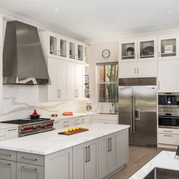
 Kitchen & Bath Concepts
This dark and dated feeling kitchen and bar were completely renovated for this multi-generational global family. By re-configuring the space and incorporating the bar, removing several heavy columns and a wall, it made the kitchen open and accessible to the adjacent rooms and visible from the front door. Everything was lightened and brightened with new cabinetry, counter tops, appliances, flooring, paint, better windows, electrical and lighting. The old range top and down draft were enclosed in a massive brick structure, with no prep space, by removing it and centering the new range on the wall with a custom hood and full height stone back splash, a stunning focal point was created. The position of other key appliances and plumbing were moved or added to create several work stations throughout the large space, such as the refrigeration, full prep sink, coffee bar, baking station, cocktail bar and clean up island. Another special feature of this kitchen was roll out table from the end of the serving island.
Specialty features include:
A roll out table for eating, prep or serving; coffee bar and drink service area with beverage center; full size prep sink adjacent to refrigeration and cooking areas; steam oven and baking station; microwave/warming drawer; dual fuel range with double ovens, 6 burners and a griddle top; two separate islands, one for serving large family meals, one for clean up; specialty spice storage inserts and pull outs; corner turn outs for large items; two double pull outs for trash and recycling; stacked cabinetry with glass display at the top to take advantage of the 14' ceilings.
Find the right local pro for your project
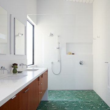 Klopf Architecture
The Roger Lee designed house from 1962 was purchased by the current homeowners in almost original condition, as the previous owners elected to defer most maintenance projects over the years. The clients were able to see beyond the dated materials and finishes, single-paned glass and uninsulated walls and they approached Klopf Architecture to help them expand and update the entire home, one the family could settle into and enjoy for years to come. It was important that the new designs were aligned with Lee's original intent not only because of the client's appreciation for mid-century modern architecture, but also because the house was deemed historical. The Stanford Real Estate Office requires a stringent design review which safeguards the integrity of the community, which Klopf Architecture was happy to oblige going into their updated designs.
As with many original mid-century modern homes, the house was scaled to the 1960s lifestyle where rooms were smaller and openings to views were limited and tightly framed. The original conditions defined the direction the family of four would take in updating the house and making it comfortable for their modern lifestyle. Klopf designed a full gut remodel and major addition to bring the house into the 21st century and provide the living area needed for the client's family. The newly expanded house added just about 1,100 sf to create an airy, comfortable and family friendly house, taking full advantage of the beautiful southwestern views that extend out to the hills beyond. The enclosed garage created an additional 240 sf of covered space for long-term storage.
A cracked swimming pool created an eyesore taking up a majority of the backyard landscape, so it was one of the first elements to go during the transformation. Working with Outer Space Landscape Architects, the family asked for a mix of relaxing outdoor patio spaces that eventually blend into the native landscaping, extending their views outward toward the natural greenery of the trees beyond their property. Filling in the old pool was a smart way to expand the living spaces outward. The orientation of the house was designed to enjoy the views, but the original architecture provided the first homeowners with mere glimpses of the landscape outside.
Klopf was able to broaden those views, continuing and extending on the original architecture to take full advantage of the unobstructed natural views across the rear facade of the house. Small horizontal openings in the primary bedroom and office were replaced with much taller windows that now follow the angled roof line upward, extending across almost all of the facade. We worked with Western Windows, whose designs included an oblique-shaped, operable casement that allowed our design to rise with the slope. A new corner office added to the primary suite, offers a bright and functional work-from-home solution that looks out at the distant views and added natural light from the expanded window configuration that now wraps around the corner.
The existing lower level was designed by Lee as a utilitarian space, serving as a wet pool room with a drain in the center of the floor, bathroom, laundry and storage areas. Without the need for a pool room, Klopf was able to convert the area into a much more comfortable and functional living space with a new family room and guest suite. The new spaces enjoy easy access to a new outdoor patio through floor to ceiling, full-width glass sliders.
Continuing along the rear facade, a previously exposed deck extending from the living room and hallway provided access to the backyard through a single set of stairs leading toward the side of the house which made sense when the pool was in place. The new deck was re-envisioned as an extension of the main living room and now serves as a second outdoor living room. A new slatted pergola above provides the homeowners welcome relief from the hot afternoon sun. A second set of stairs now creates a better connection to the redesigned lower level. Klopf was able to reconfigure the spaces, extending the living room outward toward the views, where the family now claims it as the heart of the home, spending a large majority of their time outdoors.
Back inside, the original wood-burning Malm fireplace was beautifully restored and a gas burner installed to comply with California's strict air standards. It now rests in front of a wall of Heath accent tiles where a dated red brick wall used to stand. A new taller window brings more light and views into the refreshed interior living room. The original glass doors opposite the fireplace were replaced by larger sliders that when fully opened, create a seamless transition to the new outdoor living area so the two spaces feel like one connected space. The original utilitarian kitchen was needlessly tucked into the far back corner and closed-off, out of sight from the living room, so the clients asked Klopf to open it up and expand the kitchen forward so it felt more connected. Today the much larger kitchen is connected to the living area where a short wall with a cutout offers a visual glimpse into the kitchen and a handy pass-through counter for serving guests. A new breakfast nook was also added to create another spot where the family can gather for casual meals. Just outside, a new built-in outdoor grill and prep area extends the kitchen outside and connects to a new outdoor dining spot nestled amongst the trees, taking advantage of the views out back.
Klopf was able to expand the other two bedrooms, add a new laundry room and half-bath and convert the carport to an enclosed garage to add more storage areas which was lost when the pool house was converted to the family and guest room.
To maintain a historical connection to the original designs, the exterior siding was repeated on all exterior walls, a full-height stained glass window at the front entryway restored, and an interior slatted screen element repeated outside at the exterior entry courtyard and over the new outdoor living room to create a shade trellis. The new house stands proudly and shines against it's new landscaping features, while respecting and expanding on the original intent of Roger Lee's designs epitomizing the comforts of indoor-outdoor living in Northern California.
Completion year: 2020
Klopf Architecture project team: John Klopf, Klara Kevane, Noel Andrade
Contractor: ORB Construction, Brendan O'Reilly
Structural engineer: Sezen and Moon
Landscape architect: Outer space
Furnishings and decoration: Urbanism Designs
Photographer: Mariko Reed
 Klopf Architecture
The Roger Lee designed house from 1962 was purchased by the current homeowners in almost original condition, as the previous owners elected to defer most maintenance projects over the years. The clients were able to see beyond the dated materials and finishes, single-paned glass and uninsulated walls and they approached Klopf Architecture to help them expand and update the entire home, one the family could settle into and enjoy for years to come. It was important that the new designs were aligned with Lee's original intent not only because of the client's appreciation for mid-century modern architecture, but also because the house was deemed historical. The Stanford Real Estate Office requires a stringent design review which safeguards the integrity of the community, which Klopf Architecture was happy to oblige going into their updated designs.
As with many original mid-century modern homes, the house was scaled to the 1960s lifestyle where rooms were smaller and openings to views were limited and tightly framed. The original conditions defined the direction the family of four would take in updating the house and making it comfortable for their modern lifestyle. Klopf designed a full gut remodel and major addition to bring the house into the 21st century and provide the living area needed for the client's family. The newly expanded house added just about 1,100 sf to create an airy, comfortable and family friendly house, taking full advantage of the beautiful southwestern views that extend out to the hills beyond. The enclosed garage created an additional 240 sf of covered space for long-term storage.
A cracked swimming pool created an eyesore taking up a majority of the backyard landscape, so it was one of the first elements to go during the transformation. Working with Outer Space Landscape Architects, the family asked for a mix of relaxing outdoor patio spaces that eventually blend into the native landscaping, extending their views outward toward the natural greenery of the trees beyond their property. Filling in the old pool was a smart way to expand the living spaces outward. The orientation of the house was designed to enjoy the views, but the original architecture provided the first homeowners with mere glimpses of the landscape outside.
Klopf was able to broaden those views, continuing and extending on the original architecture to take full advantage of the unobstructed natural views across the rear facade of the house. Small horizontal openings in the primary bedroom and office were replaced with much taller windows that now follow the angled roof line upward, extending across almost all of the facade. We worked with Western Windows, whose designs included an oblique-shaped, operable casement that allowed our design to rise with the slope. A new corner office added to the primary suite, offers a bright and functional work-from-home solution that looks out at the distant views and added natural light from the expanded window configuration that now wraps around the corner.
The existing lower level was designed by Lee as a utilitarian space, serving as a wet pool room with a drain in the center of the floor, bathroom, laundry and storage areas. Without the need for a pool room, Klopf was able to convert the area into a much more comfortable and functional living space with a new family room and guest suite. The new spaces enjoy easy access to a new outdoor patio through floor to ceiling, full-width glass sliders.
Continuing along the rear facade, a previously exposed deck extending from the living room and hallway provided access to the backyard through a single set of stairs leading toward the side of the house which made sense when the pool was in place. The new deck was re-envisioned as an extension of the main living room and now serves as a second outdoor living room. A new slatted pergola above provides the homeowners welcome relief from the hot afternoon sun. A second set of stairs now creates a better connection to the redesigned lower level. Klopf was able to reconfigure the spaces, extending the living room outward toward the views, where the family now claims it as the heart of the home, spending a large majority of their time outdoors.
Back inside, the original wood-burning Malm fireplace was beautifully restored and a gas burner installed to comply with California's strict air standards. It now rests in front of a wall of Heath accent tiles where a dated red brick wall used to stand. A new taller window brings more light and views into the refreshed interior living room. The original glass doors opposite the fireplace were replaced by larger sliders that when fully opened, create a seamless transition to the new outdoor living area so the two spaces feel like one connected space. The original utilitarian kitchen was needlessly tucked into the far back corner and closed-off, out of sight from the living room, so the clients asked Klopf to open it up and expand the kitchen forward so it felt more connected. Today the much larger kitchen is connected to the living area where a short wall with a cutout offers a visual glimpse into the kitchen and a handy pass-through counter for serving guests. A new breakfast nook was also added to create another spot where the family can gather for casual meals. Just outside, a new built-in outdoor grill and prep area extends the kitchen outside and connects to a new outdoor dining spot nestled amongst the trees, taking advantage of the views out back.
Klopf was able to expand the other two bedrooms, add a new laundry room and half-bath and convert the carport to an enclosed garage to add more storage areas which was lost when the pool house was converted to the family and guest room.
To maintain a historical connection to the original designs, the exterior siding was repeated on all exterior walls, a full-height stained glass window at the front entryway restored, and an interior slatted screen element repeated outside at the exterior entry courtyard and over the new outdoor living room to create a shade trellis. The new house stands proudly and shines against it's new landscaping features, while respecting and expanding on the original intent of Roger Lee's designs epitomizing the comforts of indoor-outdoor living in Northern California.
Completion year: 2020
Klopf Architecture project team: John Klopf, Klara Kevane, Noel Andrade
Contractor: ORB Construction, Brendan O'Reilly
Structural engineer: Sezen and Moon
Landscape architect: Outer space
Furnishings and decoration: Urbanism Designs
Photographer: Mariko Reed
 InnovationLand
Houston Interior Designer Lisha Maxey took this Museum District condo from the dated, mirrored walls of the 1980s to Mid Century Modern with a gallery look featuring the client's art collection.
"The place was covered with glued-down, floor-to-ceiling mirrors," says Lisha Maxey, senior designer for Homescapes of Houston and principal at LGH Design Services in Houston. "When we took them off the walls, the walls came apart. We ended up taking them down to the studs."
The makeover took six months to complete, primarily because of strict condo association rules that only gave the Houston interior designers very limited access to the elevator - through which all materials and team members had to go.
"Monday through Friday, we could only be noisy from 10 a.m. to 2 p.m., and if we had to do something extra loud, like sawing or drilling, we had to schedule it with the management and they had to communicate that to the condo owners. So it was just a lot of coordination. But a lot of Inner City Loopers live in these kinds of buildings, so we're used to handling that kind of thing."
The client, a child psychiatrist in her 60s, recently moved to Houston from northeast Texas to be with friends. After being widowed three years ago, she decided it was time to let go of the traditionally styled estate that wasn't really her style anyway. An avid diver who has traveled around the world to pursue her passion, she has amassed a large collection of art from her travels. Downsizing to 1,600 feet and wanting to go more contemporary, she wanted the display - and the look - more streamlined.
"She wanted clean lines and muted colors, with the main focus being her artwork," says Maxey. "So we made the space a palette for that."
Enter the white, gallery-grade paint she chose for the walls: "It's halfway between satin and flat," explains Maxey. "It's not glossy and it's not chalky - just very smooth and clean."
Adding to the gallery theme is the satin nickel track lighting with lamps aimed to highlight pieces of art. "This lighting has no wires," notes Maxey. "It's powered by a positive and negative conduit."
The new flooring throughout is a blended-grey porcelain tile that looks like wood planks. "It's gorgeous, natural-looking and combines all the beauty of wood with the durability of tile," says Maxey. "We used it throughout the condo to unify the space."
After Maxey started looking at the client's bright, vibrant, colorful artwork, she felt the palette couldn't stay as muted anymore. Hence the Mid Century Modern orange leather sofas from West Elm and bright green chairs from Joybird, plus the throw pillows in different textures, patterns and shades of gold, orange and green.
The concave lines of the Danish-inspired chairs, she notes, help them look beautiful from all the way around - a key to designing spaces for loft living.
"The table in the living room is very interesting," notes Maxey. "It was handmade for the client in 1974 and has a signature on it from the artist. She was adamant about including the piece, which has all these hand-painted black-and-white art tiles on the top. I took one look at it and said 'It's not really going to go.'"
However, after cutting 6 inches off the bottom and making it look a little distressed, the table ended up being the perfect complement to the sofas.
The dining room table - from Design Within Reach - is a solid piece of mahogany, the chair upholstery a mix of grey velvet and leather and the legs a shiny brass. "The side chairs are leather and the end ones are velvet," says Maxey. "It's a nice textural mix that lends depth and texture."
The galley kitchen, meanwhile, has been lightened and brightened, with white quartz countertops and backsplashes mimicking the look of Carrara marble, stainless steel appliances and a velvet green bench seat for a punch of color. The cabinets are painted a cool grey color called "Silverplate."
The two bathrooms have been updated with contemporary white vanities and vessel sinks and the master bath now features a walk-in shower tiled in Dolomite white marble (the floor is Bianco Carrara marble mosaic, done in a herringbone pattern.
In the master bedroom, Homescapes of Houston knocked down a wall between two smaller closets with swing doors to make one large walk-in closet with pocket doors. The closet in the guest bedroom also came out 13 more inches.
The client's artwork throughout personalizes the space and tells the story of a life. There's a huge bowl of shells from the client's diving adventures, framed art from her child psychiatry patients and a 16th century wood carving from a monastery that's been in her family forever.
"Her collection is quite impressive," says Maxey. "There's even a framed piece of autographed songs written by John Lennon." (You can see this black-framed piece of art on the wall in the photo above of two green chairs).
"We're extremely happy with how the project turned out, and so is the client," says Maxey. "No expense was spared for her. It was a labor of love and we were excited to do it."
 Associate Interiors
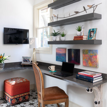
When our client requested a cozy retreat for her study, we re-configured a narrow 6’ x 12’ space off the Master Bedroom hall. By combining 2 separate rooms, a dated wet bar and a stackable washer/dryer area, we captured the square footage needed for the Study. As someone who likes to spread out and have multiple projects going on at the same time, we designed the L-shaped work surface and created the functionality she longed for. A tall storage cabinet just wide enough to house her files and printer, anchors one end while an oversized ‘found’ vintage bracket adorns the other, giving openness to an otherwise tight space. Previously separated by a wall, the 2 windows now bring cheerful natural light into the singular space. Thick floating shelves above the work surface feature LED strip lighting which is especially enticing at night. A sliding metal chalkboard opposite of the worksurface is easily accessible and provides a fun way to keep track of daily activities. The black and cream “star” patterned floor tile adds a bit of whimsy to the Study and compliments the rustic charm of the family’s antique cowhide chair. What is not to love about the compact yet inviting space?

Sponsored
Columbus, OH

Hope Restoration & General Contracting
Columbus Design-Build, Kitchen & Bath Remodeling, Historic Renovations

 TKS Design Group
Download our free ebook, Creating the Ideal Kitchen. DOWNLOAD NOW
For many, extra time at home during COVID left them wanting more from their homes. Whether you realized the shortcomings of your space or simply wanted to combat boredom, a well-designed and functional home was no longer a want, it became a need. Tina found herself wanting more from her Old Irving Park home and reached out to The Kitchen Studio about adding function to her kitchen to make the most of the available real estate.
At the end of the day, there is nothing better than returning home to a bright and happy space you love. And this kitchen wasn’t that for Tina. Dark and dated, with a palette from the past and features that didn’t make the most of the available square footage, this remodel required vision and a fresh approach to the space. Lead designer, Stephanie Cole’s main design goal was better flow, while adding greater functionality with organized storage, accessible open shelving, and an overall sense of cohesion with the adjoining family room.
The original kitchen featured a large pizza oven, which was rarely used, yet its footprint limited storage space. The nearby pantry had become a catch-all, lacking the organization needed in the home. The initial plan was to keep the pizza oven, but eventually Tina realized she preferred the design possibilities that came from removing this cumbersome feature, with the goal of adding function throughout the upgraded and elevated space. Eliminating the pantry added square footage and length to the kitchen for greater function and more storage. This redesigned space reflects how she lives and uses her home, as well as her love for entertaining.
The kitchen features a classic, clean, and timeless palette. White cabinetry, with brass and bronze finishes, contrasts with rich wood flooring, and lets the large, deep blue island in Woodland’s custom color Harbor – a neutral, yet statement color – draw your eye.
The kitchen was the main priority. In addition to updating and elevating this space, Tina wanted to maximize what her home had to offer. From moving the location of the patio door and eliminating a window to removing an existing closet in the mudroom and the cluttered pantry, the kitchen footprint grew. Once the floorplan was set, it was time to bring cohesion to her home, creating connection between the kitchen and surrounding spaces.
The color palette carries into the mudroom, where we added beautiful new cabinetry, practical bench seating, and accessible hooks, perfect for guests and everyday living. The nearby bar continues the aesthetic, with stunning Carrara marble subway tile, hints of brass and bronze, and a design that further captures the vibe of the kitchen.
Every home has its unique design challenges. But with a fresh perspective and a bit of creativity, there is always a way to give the client exactly what they want [and need]. In this particular kitchen, the existing soffits and high slanted ceilings added a layer of complexity to the lighting layout and upper perimeter cabinets.
While a space needs to look good, it also needs to function well. This meant making the most of the height of the room and accounting for the varied ceiling features, while also giving Tina everything she wanted and more. Pendants and task lighting paired with an abundance of natural light amplify the bright aesthetic. The cabinetry layout and design compliments the soffits with subtle profile details that bring everything together. The tile selections add visual interest, drawing the eye to the focal area above the range. Glass-doored cabinets further customize the space and give the illusion of even more height within the room.
While her family may be grown and out of the house, Tina was focused on adding function without sacrificing a stunning aesthetic and dreamy finishes that make the kitchen the gathering place of any home. It was time to love her kitchen again, and if you’re wondering what she loves most, it’s the niche with glass door cabinetry and open shelving for display paired with the marble mosaic backsplash over the range and complimenting hood. Each of these features is a stunning point of interest within the kitchen – both brag-worthy additions to a perimeter layout that previously felt limited and lacking.
Whether your remodel is the result of special needs in your home or simply the excitement of focusing your energy on creating a fun new aesthetic, we are here for it. We love a good challenge because there is always a way to make a space better – adding function and beauty simultaneously.
 Thomas J. Pearson, Inc.
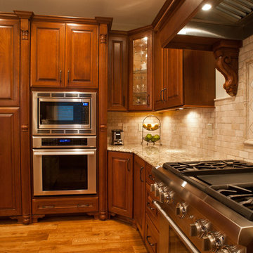
The owners of this traditional home sought to update and expand their somewhat dated and crowded kitchen. The former kitchen had a corner sink and a modified U-shape, but with the only entry intersecting the refrigerator and bar passage, it did not allow for multiple cooks in the kitchen. The existing kitchen was separated from the family room by a wall which included a see-through fireplace, but in reality the two areas were distinctly separate. As this family enjoys cooking and entertaining, they sought to open the space to accommodate a large island in the kitchen and opening the space to the adjoining family room. Additionally, they wanted the cooking surfaces and appliances to be state of the art, but with a style reminiscent of Tuscany.
To achieve the effect, color groups and materials were selected to create the Tuscan region’s theme. Round shapes were included throughout the space including the island top and the custom archway opening to the family room. The owners selected cherry cabinetry with a dark brown stain, granite counters with some hues of blue-green, and a natural stone tumbled subway tile backsplash. The island color is fossil beige, and the owners re-purposed their existing bar stools using the same color. With the serious emphasis on cooking, the range selected is a 36” gas Thermador® with custom exhaust hood. A separate Thermador® baking oven and microwave are built-in on the adjoining wall. Bela Cera® hand-scraped hardwood flooring ties together the kitchen, eating area, and family room.
The existing stone fireplace was taken down and set aside for re-installation at project completion. As the wall separating the kitchen and family room was eliminated, the stone fireplace has been reinstalled at its new location on the home’s east-wall. Windows and built-in cabinetry flank the fireplace, with the flat screen mounted above it. With added windows, additional can lighting, and antique white trim, the rooms are bright and airy.
 Design Connection, Inc.
The homeowner of this new build came to us for help with the design of their new home. They wanted a more contemporary look than what they're used to.
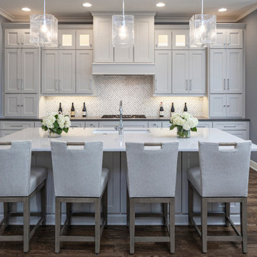
The large island is a great gathering point with in the open concept of the dining/kitchen/living space. Using two different colors of quartz countertops added contrast that highlights the marble backsplash. The backsplash adds texture and richness to the space. Shaker style cabinets help modernize the space with the clean lines. Function was key to this kitchen working with utensil pullouts, spice racks, rollouts, hidden storage and a knife block.
Design Connection, Inc. Kansas City interior designer provided space planning, architectural drawings, barstools, tile, plumbing fixtures, countertops, cabinets and hardware, lighting, paint colors, coordination with the builder and project management to ensure that the high standards of Design Connection, Inc. were maintained.
 Thomas J. Pearson, Inc.
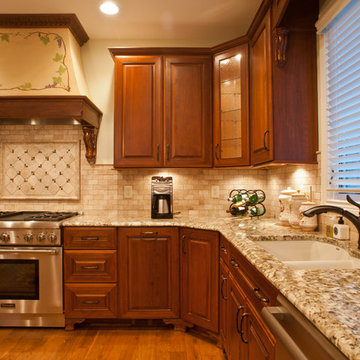
The owners of this traditional home sought to update and expand their somewhat dated and crowded kitchen. The former kitchen had a corner sink and a modified U-shape, but with the only entry intersecting the refrigerator and bar passage, it did not allow for multiple cooks in the kitchen. The existing kitchen was separated from the family room by a wall which included a see-through fireplace, but in reality the two areas were distinctly separate. As this family enjoys cooking and entertaining, they sought to open the space to accommodate a large island in the kitchen and opening the space to the adjoining family room. Additionally, they wanted the cooking surfaces and appliances to be state of the art, but with a style reminiscent of Tuscany.
To achieve the effect, color groups and materials were selected to create the Tuscan region’s theme. Round shapes were included throughout the space including the island top and the custom archway opening to the family room. The owners selected cherry cabinetry with a dark brown stain, granite counters with some hues of blue-green, and a natural stone tumbled subway tile backsplash. The island color is fossil beige, and the owners re-purposed their existing bar stools using the same color. With the serious emphasis on cooking, the range selected is a 36” gas Thermador® with custom exhaust hood. A separate Thermador® baking oven and microwave are built-in on the adjoining wall. Bela Cera® hand-scraped hardwood flooring ties together the kitchen, eating area, and family room.
The existing stone fireplace was taken down and set aside for re-installation at project completion. As the wall separating the kitchen and family room was eliminated, the stone fireplace has been reinstalled at its new location on the home’s east-wall. Windows and built-in cabinetry flank the fireplace, with the flat screen mounted above it. With added windows, additional can lighting, and antique white trim, the rooms are bright and airy.
 Thomas J. Pearson, Inc.
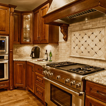
The owners of this traditional home sought to update and expand their somewhat dated and crowded kitchen. The former kitchen had a corner sink and a modified U-shape, but with the only entry intersecting the refrigerator and bar passage, it did not allow for multiple cooks in the kitchen. The existing kitchen was separated from the family room by a wall which included a see-through fireplace, but in reality the two areas were distinctly separate. As this family enjoys cooking and entertaining, they sought to open the space to accommodate a large island in the kitchen and opening the space to the adjoining family room. Additionally, they wanted the cooking surfaces and appliances to be state of the art, but with a style reminiscent of Tuscany.
To achieve the effect, color groups and materials were selected to create the Tuscan region’s theme. Round shapes were included throughout the space including the island top and the custom archway opening to the family room. The owners selected cherry cabinetry with a dark brown stain, granite counters with some hues of blue-green, and a natural stone tumbled subway tile backsplash. The island color is fossil beige, and the owners re-purposed their existing bar stools using the same color. With the serious emphasis on cooking, the range selected is a 36” gas Thermador® with custom exhaust hood. A separate Thermador® baking oven and microwave are built-in on the adjoining wall. Bela Cera® hand-scraped hardwood flooring ties together the kitchen, eating area, and family room.
The existing stone fireplace was taken down and set aside for re-installation at project completion. As the wall separating the kitchen and family room was eliminated, the stone fireplace has been reinstalled at its new location on the home’s east-wall. Windows and built-in cabinetry flank the fireplace, with the flat screen mounted above it. With added windows, additional can lighting, and antique white trim, the rooms are bright and airy.
 Design Manifest
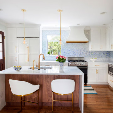
High end, highly custom complete kitchen remodel with amazing details.
THE KEY FEATURES
- Dining Room Wall removed
- Island w/ sink, dishwasher and trash/recycling; eating area that seats 2-3 people on the other side
- Full height Pantry next to refrigerator
- 36″ paneled refrigerator
- 3 Work Zones: the island, left of the range, right of the range
- Snack Zone: a place away from the work zone to house the toaster, coffeemaker and microwave
- Dish/ Cutlery Storage: Two sets of dishes and cutlery also store in the cabinets on the snack zone wall.
- Ample Cooking storage: Two 45″ and 33″ base cabinets with adjustable roll-out shelves provide ample space for pots/ pans / cooking supplies
- Garden Window Relocated and Re-sized.
.
Photo by Courtney Apple
Sponsored
Columbus, OH
Hope Restoration & General Contracting
Columbus Design-Build, Kitchen & Bath Remodeling, Historic Renovations
 Klopf Architecture
The Roger Lee designed house from 1962 was purchased by the current homeowners in almost original condition, as the previous owners elected to defer most maintenance projects over the years. The clients were able to see beyond the dated materials and finishes, single-paned glass and uninsulated walls and they approached Klopf Architecture to help them expand and update the entire home, one the family could settle into and enjoy for years to come. It was important that the new designs were aligned with Lee's original intent not only because of the client's appreciation for mid-century modern architecture, but also because the house was deemed historical. The Stanford Real Estate Office requires a stringent design review which safeguards the integrity of the community, which Klopf Architecture was happy to oblige going into their updated designs.
As with many original mid-century modern homes, the house was scaled to the 1960s lifestyle where rooms were smaller and openings to views were limited and tightly framed. The original conditions defined the direction the family of four would take in updating the house and making it comfortable for their modern lifestyle. Klopf designed a full gut remodel and major addition to bring the house into the 21st century and provide the living area needed for the client's family. The newly expanded house added just about 1,100 sf to create an airy, comfortable and family friendly house, taking full advantage of the beautiful southwestern views that extend out to the hills beyond. The enclosed garage created an additional 240 sf of covered space for long-term storage.
A cracked swimming pool created an eyesore taking up a majority of the backyard landscape, so it was one of the first elements to go during the transformation. Working with Outer Space Landscape Architects, the family asked for a mix of relaxing outdoor patio spaces that eventually blend into the native landscaping, extending their views outward toward the natural greenery of the trees beyond their property. Filling in the old pool was a smart way to expand the living spaces outward. The orientation of the house was designed to enjoy the views, but the original architecture provided the first homeowners with mere glimpses of the landscape outside.
Klopf was able to broaden those views, continuing and extending on the original architecture to take full advantage of the unobstructed natural views across the rear facade of the house. Small horizontal openings in the primary bedroom and office were replaced with much taller windows that now follow the angled roof line upward, extending across almost all of the facade. We worked with Western Windows, whose designs included an oblique-shaped, operable casement that allowed our design to rise with the slope. A new corner office added to the primary suite, offers a bright and functional work-from-home solution that looks out at the distant views and added natural light from the expanded window configuration that now wraps around the corner.
The existing lower level was designed by Lee as a utilitarian space, serving as a wet pool room with a drain in the center of the floor, bathroom, laundry and storage areas. Without the need for a pool room, Klopf was able to convert the area into a much more comfortable and functional living space with a new family room and guest suite. The new spaces enjoy easy access to a new outdoor patio through floor to ceiling, full-width glass sliders.
Continuing along the rear facade, a previously exposed deck extending from the living room and hallway provided access to the backyard through a single set of stairs leading toward the side of the house which made sense when the pool was in place. The new deck was re-envisioned as an extension of the main living room and now serves as a second outdoor living room. A new slatted pergola above provides the homeowners welcome relief from the hot afternoon sun. A second set of stairs now creates a better connection to the redesigned lower level. Klopf was able to reconfigure the spaces, extending the living room outward toward the views, where the family now claims it as the heart of the home, spending a large majority of their time outdoors.
Back inside, the original wood-burning Malm fireplace was beautifully restored and a gas burner installed to comply with California's strict air standards. It now rests in front of a wall of Heath accent tiles where a dated red brick wall used to stand. A new taller window brings more light and views into the refreshed interior living room. The original glass doors opposite the fireplace were replaced by larger sliders that when fully opened, create a seamless transition to the new outdoor living area so the two spaces feel like one connected space. The original utilitarian kitchen was needlessly tucked into the far back corner and closed-off, out of sight from the living room, so the clients asked Klopf to open it up and expand the kitchen forward so it felt more connected. Today the much larger kitchen is connected to the living area where a short wall with a cutout offers a visual glimpse into the kitchen and a handy pass-through counter for serving guests. A new breakfast nook was also added to create another spot where the family can gather for casual meals. Just outside, a new built-in outdoor grill and prep area extends the kitchen outside and connects to a new outdoor dining spot nestled amongst the trees, taking advantage of the views out back.
Klopf was able to expand the other two bedrooms, add a new laundry room and half-bath and convert the carport to an enclosed garage to add more storage areas which was lost when the pool house was converted to the family and guest room.
To maintain a historical connection to the original designs, the exterior siding was repeated on all exterior walls, a full-height stained glass window at the front entryway restored, and an interior slatted screen element repeated outside at the exterior entry courtyard and over the new outdoor living room to create a shade trellis. The new house stands proudly and shines against it's new landscaping features, while respecting and expanding on the original intent of Roger Lee's designs epitomizing the comforts of indoor-outdoor living in Northern California.
Completion year: 2020
Klopf Architecture project team: John Klopf, Klara Kevane, Noel Andrade
Contractor: ORB Construction, Brendan O'Reilly
Structural engineer: Sezen and Moon
Landscape architect: Outer space
Furnishings and decoration: Urbanism Designs
Photographer: Mariko Reed
 Dura Supreme Cabinetry
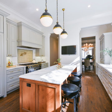
With an ideal location in the Pacific Heights neighborhood of San Francisco, this dated Victorian residence had "beautiful bones" but had been sitting on the market for a year before being purchased with plans to revitalize the interior. Interior designer, Noel Han, explained, "Historical Victorian homes in this area often have beautiful architectural elements that I aim to preserve, but the floor plan and layout tend to be stuffy, not live-able and not light filled. Modern families want bright, light-filled, spacious rooms that take advantage of outdoor views and living spaces, and function well for storage, meals and entertaining."
Preserving the architectural integrity and special features of the home was one of Han's goals but at the same time, she re-designed the space, moving walls and adding windows to create an open floorplan that flowed easily between the kitchen and outdoor living spaces. Where the range once stood in the original design, now an entire wall of windows provides panoramic views of the outdoors and fills the kitchen with light. Below the windows, Han designed a long bank of base cabinets with drawers to provide plenty of storage and work surface. Light now pours into the space even on foggy days. The range was moved to the opposite wall so that beautiful window views could be added to the kitchen.
Han selected a palette of finishes with an eye toward creating a "soft color aesthetic". "White painted finishes are very popular right now but would have felt stark and cold in this space," she explained. "The French grey paint from Dura Supreme was a perfect complement for this vintage Victorian home, to create a classic color scheme".
"This beautiful home already had hardware elements with a vintage brass finish, so I carefully selected antiqued, brushed brass hardware, plumbing and metal finishes to blend with the original elements," said Han. She continued, "The La Cornue French Range adds modern function with a French antique look."
"I appreciate working with Dura Supreme cabinetry because of the quality of the cabinetry, fast delivery and the custom options. I'm able to create beautiful architectural details like the pull-out columns on both sides of the range and the curved mullion doors on the furniture hutch, and they offer a stunning palette of finishes and styles," explained Han. For the bath cabinetry, Han created a similar palette of finishes and styles to create a complementary look throughout the entire home.
Product Details:
Perimeter: Dura Supreme Cabinetry shown in the St. Augustine door style and Mullion Pattern #15 door style with a “Zinc” painted finish.
Kitchen Island: Dura Supreme Cabinetry shown in the St. Augustine door style with a Clove stain and Black Accent finish on Cherry wood.
For more information about Noel Han, Interior Designer, click to her website here www.atelnoel.com.
For more information about Gilmans Kitchens and Baths, click to their website here www.gkandb.com.
Photography by: Ned Bonzi www.nedbonzi.com.
Request a FREE Dura Supreme Brochure Packet:
http://www.durasupreme.com/request-brochure
 Kitchen & Bath Concepts
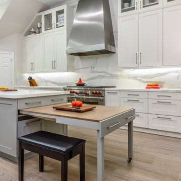
This dark and dated feeling kitchen and bar were completely renovated for this multi-generational global family. By re-configuring the space and incorporating the bar, removing several heavy columns and a wall, it made the kitchen open and accessible to the adjacent rooms and visible from the front door. Everything was lightened and brightened with new cabinetry, counter tops, appliances, flooring, paint, better windows, electrical and lighting. The old range top and down draft were enclosed in a massive brick structure, with no prep space, by removing it and centering the new range on the wall with a custom hood and full height stone back splash, a stunning focal point was created. The position of other key appliances and plumbing were moved or added to create several work stations throughout the large space, such as the refrigeration, full prep sink, coffee bar, baking station, cocktail bar and clean up island. Another special feature of this kitchen was roll out table from the end of the serving island.
Specialty features include:
A roll out table for eating, prep or serving; coffee bar and drink service area with beverage center; full size prep sink adjacent to refrigeration and cooking areas; steam oven and baking station; microwave/warming drawer; dual fuel range with double ovens, 6 burners and a griddle top; two separate islands, one for serving large family meals, one for clean up; specialty spice storage inserts and pull outs; corner turn outs for large items; two double pull outs for trash and recycling; stacked cabinetry with glass display at the top to take advantage of the 14' ceilings.
 CAP Carpet & Flooring
CAP Carpet & Flooring is the leading provider of flooring & area rugs in the Twin Cities. CAP Carpet & Flooring is a locally owned and operated company, and we pride ourselves on helping our customers feel welcome from the moment they walk in the door. We are your neighbors. We work and live in your community and understand your needs. You can expect the very best personal service on every visit to CAP Carpet & Flooring and value and warranties on every flooring purchase. Our design team has worked with homeowners, contractors and builders who expect the best. With over 30 years combined experience in the design industry, Angela, Sandy, Sunnie,Maria, Caryn and Megan will be able to help whether you are in the process of building, remodeling, or re-doing. Our design team prides itself on being well versed and knowledgeable on all the up to date products and trends in the floor covering industry as well as countertops, paint and window treatments. Their passion and knowledge is abundant, and we're confident you'll be nothing short of impressed with their expertise and professionalism. When you love your job, it shows: the enthusiasm and energy our design team has harnessed will bring out the best in your project. Make CAP Carpet & Flooring your first stop when considering any type of home improvement project- we are happy to help you every single step of the way.

 CAP Carpet & Flooring
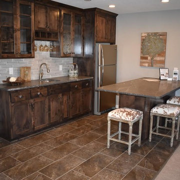
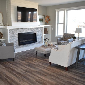
Add elegance and natural warmth to your space with beautiful hardwood floors from CAP. The earthy tones within the wood help to finish off the transitioanl design.
CAP Carpet & Flooring is the leading provider of flooring & area rugs in the Twin Cities. CAP Carpet & Flooring is a locally owned and operated company, and we pride ourselves on helping our customers feel welcome from the moment they walk in the door. We are your neighbors. We work and live in your community and understand your needs. You can expect the very best personal service on every visit to CAP Carpet & Flooring and value and warranties on every flooring purchase. Our design team has worked with homeowners, contractors and builders who expect the best. With over 30 years combined experience in the design industry, Angela, Sandy, Sunnie,Maria, Caryn and Megan will be able to help whether you are in the process of building, remodeling, or re-doing. Our design team prides itself on being well versed and knowledgeable on all the up to date products and trends in the floor covering industry as well as countertops, paint and window treatments. Their passion and knowledge is abundant, and we're confident you'll be nothing short of impressed with their expertise and professionalism. When you love your job, it shows: the enthusiasm and energy our design team has harnessed will bring out the best in your project. Make CAP Carpet & Flooring your first stop when considering any type of home improvement project- we are happy to help you every single step of the way.
 Rodwin Architecture & Skycastle Construction
Rodwin Architecture & Skycastle Homes
Location: Boulder, CO USA
Our clients asked us to breathe new life into a dark and chopped up 1990’s home, that had a solid shell but a dysfunctional floor plan and dated finishes. We took down all the walls and created an open concept, sunny plan where all the public social spaces connected. We added a Dutch front door and created both a foyer and proper mud-room for the first time, so guests now had a sense of arrival and a place to hang their jackets. The odd dated kitchen that was the heart of the home was rebuilt from scratch with a simple white and blue palette. We opened up the south wall of the main floor with large windows and doors to help BBQ’s and parties flow from inside to the patio. The sagging and faded wrap-around porch was rebuilt from scratch. We re-arranged the interior spaces to create a dream kid’s playroom packed with organized storage and just far enough away from the grown-ups so that everyone can co-exist peacefully. We redid the finishes & fixtures throughout, and opened up the staircase to be an elegant path through this 4 storey house.
Built by Skycastle Construction.
 TKS Design Group
Free ebook, Creating the Ideal Kitchen. DOWNLOAD NOW
This project started out as a kitchen remodel but ended up as so much more. As the original plan started to take shape, some water damage provided the impetus to remodel a small upstairs hall bath. Once this bath was complete, the homeowners enjoyed the result so much that they decided to set aside the kitchen and complete a large master bath remodel. Once that was completed, we started planning for the kitchen!
The original kitchen was just large enough to accommodate an island and a separate pantry but felt a little cramped, especially during the weekends when the couple likes to entertain. The primary goal was to maintain the functionality of the current space, but to add some breathing room as well as to provide a view to the homeowner’s side yard and substantial Hosta garden.
The solution was to bump out the space about 10 feet which provided ample room for large pro appliances, a large island for gathering and an upgraded pantry space. It was important to the homeowners to create a space that felt like it belonged in their historic 1866 home. Details such as matching new trim to the existing large custom profiles in the original home and re-purposing an existing door to be used for the new pantry, provided these touches. A large window at the main sink provides that view into the yard and a beautiful focal point for the room.
A mix of painted wood and stained cabinetry gives the new kitchen a sense of belonging in the older home, as do the Super White quartzite that has the look of marble, subway tile backsplash, polished nickel lanterns and glass and mirrored doors. The large pantry, filled with custom shelving built to the homeowner’s specifications, stainless steel appliances and the two Galley Workstations – sinks that do double duty as prep space – ensure that not only does the kitchen look great, but also functions in a personalized manner that works perfectly for the occupants.
Doing the bump out also allowed the opportunity for a small mudroom and powder room right off the kitchen as well as re-arranging some openings to allow for better traffic flow throughout the entire first floor. The result is a comfortable up-to-date home that feels both steeped in history yet allows for today’s style of living.
Designed by: Susan Klimala, CKD, CBD
Photography by: Michael Alan Kaskel
For more information on kitchen and bath design ideas go to: www.kitchenstudio-ge.com
1