
Search results for "Larger goals" in Home Design Ideas

 Corinthian Fine Homes
This couple approached us to design and renovate their existing master suite on their adorable Broad Ripple area home. Their goals were to update, open up and improve the function of their space. The ceilings were very low and the space was tight with an inefficient master bath and separate closet. We began by removing the ceiling and providing a high cathedral space for an expanded feel in the bedroom. We removed a side door and picture window and installed a sliding glass door to improve the natural lighting of the space and allow access to their landscaped patio on the back of the home. We stole space from the large master bedroom and eliminated the door that led into the closet, to allow for a larger bathroom and walk-in master closet with dressing area. This permitted a larger shower with a bench and the addition of a make-up vanity area. We also enlarged the window in the bathroom to allow more natural light into the space. The final design element was a floating step outside the sliding door onto their patio which is clean, modern and enhances the entrance to their serene master suite from the exterior.

 Landmark Building Contractors LLC
Inspiration for a transitional carpeted bedroom remodel in Minneapolis with beige walls and no fireplace

 Dannielle Albrecht Designs
Eat-in kitchen - mid-sized transitional open concept and u-shaped medium tone wood floor eat-in kitchen idea in Los Angeles with gray walls, a farmhouse sink, shaker cabinets, white cabinets, quartz countertops, gray backsplash, stone tile backsplash, stainless steel appliances and a peninsula
Find the right local pro for your project

 Attention to Detail Home Remodeling
The driving force for the design of the new bathrooms was to completely reinvent the space to stylishly meet the clients’ current and future needs.
Re-working the entire layout of the space was needed to achieve the goal. With a transitional style, we brought it rustic finished and modern colors to the space to reflect the character and style of the clients.
The new placement of the shower and tub opened up the space allowing natural light penetrate throughout the entire room, making the space feel larger than before.
With the addition of a custom frameless glass walk-in shower, a drop in tub under the window with tile surround, custom cabinetry with His and Her side, the couple is now enjoying their new master bath custom designed for their unique needs.
Cindi with an eye Photography
 Corinthian Fine Homes
This couple approached us to design and renovate their existing master suite on their adorable Broad Ripple area home. Their goals were to update, open up and improve the function of their space. The ceilings were very low and the space was tight with an inefficient master bath and separate closet. We began by removing the ceiling and providing a high cathedral space for an expanded feel in the bedroom. We removed a side door and picture window and installed a sliding glass door to improve the natural lighting of the space and allow access to their landscaped patio on the back of the home. We stole space from the large master bedroom and eliminated the door that led into the closet, to allow for a larger bathroom and walk-in master closet with dressing area. This permitted a larger shower with a bench and the addition of a make-up vanity area. We also enlarged the window in the bathroom to allow more natural light into the space. The final design element was a floating step outside the sliding door onto their patio which is clean, modern and enhances the entrance to their serene master suite from the exterior.

 Melton Design Build
The goal of this project was to update the outdated master bathroom to better meet the homeowners design tastes and the style of the rest of this foothills home, as well as update all the doors on the first floor, and create a contemporary mud room and staircase to the basement.
The homeowners wanted a master suite that had a masculine feel, incorporated elements of black steel, wood, and contrast with clean white tiles and counter-tops and helped their long and skinny layout feel larger/ make better use of the space they have. They also wanted a more spacious and luxurious shower with water temperature control. A large window that existed above the original soaking tub offered spectacular views down into Boulder valley and it was important to keep this element in the updated design. However, privacy was also very important. Therefore, a custom-built powder coated steel shelf, was created to provide privacy blocking, add storage, and add a contrasting design element to the white wall tiles. Black honeycomb floor tiles, new black walnut cabinetry, contemporary wall paper, a floor to ceiling glass shower wall, and updated fixtures elevated the space and gave the clients exactly the look and feel that they wanted.
Unique custom metal design elements can be found throughout the new spaces (shower, mud room bench and shelving, and staircase railings and guardrails), and give this home the contemporary feel that the homeowners desired.
 BathHaus Studio
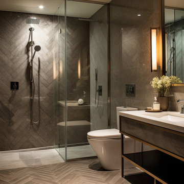
BathHaus' goal was to maximize a small bathroom in an urban space. The client wanted a masculine bathroom for his new apartment. We added mirrors to make the space seem larger and opted for multifunctional vanity that combines a sink with storage allowing for more efficient use of the available area. The hanging hooks save space while adding an element of design.


 Denise Fogarty Interiors
Alise O'Brien Photography
Example of a bedroom and mid-sized trendy girl medium tone wood floor kids' bedroom design with multicolored walls
Example of a bedroom and mid-sized trendy girl medium tone wood floor kids' bedroom design with multicolored walls

 Costa Bella Builders
Aptos Addition and Major Remodel.
Our goal on this project was to provide the owners with the larger kitchen and additional bedrooms they needed for their growing family of five. The existing house was small, but they had a good sized lot in the Cliff Drive neighborhood along the ocean bluffs in Rio Del Mar which we were able to utilize.. Our team designed an extension of the existing house into the rear yard area, allowing for a new master suite and creating separate bedrooms for the children. The old kitchen was expanded and reconceived to create an inviting and open family room area with commercial appliances to support the client’s passion for great Italian cooking. Her decorating concept combining Modern Farmhouse themes with contemporary fixtures and finishes resulted in the beautiful, light, and comfortable home you see in these photographs.
 Jeffery Poss Architect, PLLC
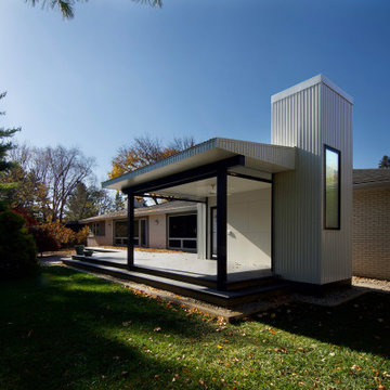
An academic couple, a renown materials scientist and a respected artist, wanted an outdoor space for entertainment and contemplation in their elegantly designed garden. We determined during the initial meeting that the design goal was “…to give them a reason to use the garden.” After several iterations, we developed the new space as an extension of the existing deck, creating a framed, optimal view of the garden and landscape that was previously de-emphasized. The pavilion can serve both as a stand-alone insect-protected space for a small group, or a covered deck expansion for larger gatherings.
The repetition of patterns is a theme throughout the space. The corrugated white metal exterior is conceived as a textural complement to the pale horizontal face brick of the adjacent ranch house. The decking planks become the floor of the pavilion. Wall and ceiling panels align with lights and fixtures. Temporal patterns result from rainwater channelled across the correlated roof surface, as well as scalloped shadows cast onto the deck and wall surfaces. The “light chimney” to the North reflects the house fireplace chimney to the South, and draws south light into the pavilion serving area. All of the pavilion's openings are carefully arranged to frame the existing plant compositions.
Since completion, the clients have entertained extensively in the pavilion. It has also become a favorite place for morning coffee, writing, and contemplation, thus fulfilling the initial goal of the project.

 Tiffany Brooks, HGTV Host & Interior Designer
Inquire About Our Design Services
When we first started talking in the spring of 2015, I was impressed. She was witty, realistic, and understood that as much as she loves my shows on HGTV, design does not does not happen in 43 minutes! She told me about her space, and how she felt that her bedroom seemed “blah” to her. She had no retreat. Molly desperately longed for a place that she could spend time in, read in, play in and above all, relax in.
What we did:
Many people are terrified of hiring a designer. Rightfully so, they are investing a pretty penny in their homes. They want to make sure that everything, down to the last floral arrangement, is to their liking, because they will have to live it (and pay for it). Unfortunately, a client can unintentionally stifle a designer’s creativity through micro-management. This can produce lackluster results and ultimately cause more time (and money) to be spent on a project than is really necessary.
With Molly, that was never an issue. Before she even showed me the room in question, she said that I could have full creative license to do what I needed to do to her bedroom. SAY WHAAH!?
With Molly giving me complete creative freedom, I planned everything out and got down to business. The result: Bite-your-bottom-lip sexy. I don’t get jealous of too many of my clients’ spaces, but this one still takes my breath away every time I look at the pics!
The craziest part was that by adding more furniture, it actually made the space feel larger.
Molly and her husband Patrick loved the finished space, and promised me I will be back to finish the rest of the house!
Here’s the highlights of the rest of the project:
I came up with a space plan with three options.
Next, we reviewed mood boards and fabric schemes that would work for both Molly and her hubby Patrick.
We started with the bed. My goal was to add edge to its otherwise traditional style.
We decided to spice things up by painting the trim work in the room black.
We built in layers of lighting with dimmers. In a bedroom everything should be on dimmers, right? Right.
We designed and customized bedding, chairs and window treatments.
Together with Molly, we selected the most perfect wallpaper. This geometric “grasscloth” adds so much depth and dimension that was just missing before.
What I love:
That light fixture. I mean it is really, really amazing in person.
The porcupine mirror. This thing came packaged like it was the hope diamond, and everyone was terrified to handle it. But it really became a highlight of the room.
 Studio 76 Kitchens and Baths
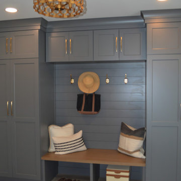
An existing laundry area and an existing office, which had become a “catch all” space, were combined with the goal of creating a beautiful, functional, larger mudroom / laundry room!
Several concepts were considered, but this design best met the client’s needs.
Finishes and textures complete the design providing the room with warmth and character. The dark grey adds contrast to the natural wood-tile plank floor and coordinate with the wood shelves and bench. A beautiful semi-flush decorative ceiling light fixture with a gold finish was added to coordinate with the cabinet hardware and faucet. A simple square undulated backsplash tile and white countertop lighten the space. All were brought together with a unifying wallcovering. The result is a bright, updated, beautiful and spacious room that is inviting and extremely functional.

 Western Window Systems
Featuring ocean views aplenty courtesy of Western Window Systems, this mid-century coastal residence in Santa Barbara, California, is a remodel from Allen Associates Construction. In addition to adding more square footage and making the home more energy efficient, Allen Associates Construction utilized custom door and window systems from Western to support one of the project’s key goals: “creating ocean views from every space both inside and out.”
Photo by Western Window Systems
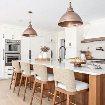
 Simply Home Decorating
When our clients approached us to renovate their 1950s Newfoundland home, their goal was to modernize while reflecting both their West Coast roots and current East Coast lifestyle. What began as a simple ensuite repair expanded into a full home transformation, completed in two thoughtfully phased renovations. Drawing from our cross-coastal experience—and a personal connection to the home’s past—we blended classic East Coast charm with West Coast simplicity. From reworking the layout and finishes to integrating their art collection and layering in warm, tactile materials, every detail was designed to feel cohesive, inviting, and deeply personal.

 Klopf Architecture
, Arterra Landscape Architects and Henry Calvert of Calvert Ventures Designed and built a new warm, modern, Eichler-inspired, open, indoor-outdoor home on a deeper-than-usual San Mateo Highlands property where an original Eichler house had burned to the ground.
The owners wanted multi-generational living and larger spaces than the original home offered, but all parties agreed that the house should respect the neighborhood and blend in stylistically with the other Eichlers. At first the Klopf team considered re-using what little was left of the original home and expanding on it. But after discussions with the owner and builder, all parties agreed that the last few remaining elements of the house were not practical to re-use, so Klopf Architecture designed a new home that pushes the Eichler approach in new directions.
One disadvantage of Eichler production homes is that the house designs were not optimized for each specific lot. A new custom home offered the team a chance to start over. In this case, a longer house that opens up sideways to the south fit the lot better than the original square-ish house that used to open to the rear (west). Accordingly, the Klopf team designed an L-shaped “bar” house with a large glass wall with large sliding glass doors that faces sideways instead of to the rear like a typical Eichler. This glass wall opens to a pool and landscaped yard designed by Arterra Landscape Architects.
Driving by the house, one might assume at first glance it is an Eichler because of the horizontality, the overhanging flat roof eaves, the dark gray vertical siding, and orange solid panel front door, but the house is designed for the 21st Century and is not meant to be a “Likeler.” You won't see any posts and beams in this home. Instead, the ceiling decking is a western red cedar that covers over all the beams. Like Eichlers, this cedar runs continuously from inside to out, enhancing the indoor / outdoor feeling of the house, but unlike Eichlers it conceals a cavity for lighting, wiring, and insulation. Ceilings are higher, rooms are larger and more open, the master bathroom is light-filled and more generous, with a separate tub and shower and a separate toilet compartment, and there is plenty of storage. The garage even easily fits two of today's vehicles with room to spare.
A massive 49-foot by 12-foot wall of glass and the continuity of materials from inside to outside enhance the inside-outside living concept, so the owners and their guests can flow freely from house to pool deck to BBQ to pool and back.
During construction in the rough framing stage, Klopf thought the front of the house appeared too tall even though the house had looked right in the design renderings (probably because the house is uphill from the street). So Klopf Architecture paid the framer to change the roofline from how we had designed it to be lower along the front, allowing the home to blend in better with the neighborhood. One project goal was for people driving up the street to pass the home without immediately noticing there is an "imposter" on this lot, and making that change was essential to achieve that goal.
This 2,606 square foot, 3 bedroom, 3 bathroom Eichler-inspired new house is located in San Mateo in the heart of the Silicon Valley.
Klopf Architecture Project Team: John Klopf, AIA, Klara Kevane
Landscape Architect: Arterra Landscape Architects
Contractor: Henry Calvert of Calvert Ventures
Photography ©2016 Mariko Reed
Location: San Mateo, CA
Year completed: 2016

 Renovisions
When our client purchased his mother’s home, the house he grew up in, he knew it was time to update while incorporating his preferred contemporary style. Enter remodeling specialists, Renovisions, who were hired to customize his new look.
The main challenge came with creating a more open floor plan. The kitchen was part of one large room, so making this new space unique and awe-inspiring while differentiating from the surrounding dining room was the goal in mind.
Renovisions accomplished this goal by first removing the walls between the dining room and kitchen to open up the space The idea was to draw your eye into the room with some interesting elements such as a 2-tier island, a functional and creative pull-out storage cabinet, sleek looking stainless steel GE appliances and glass mosaic tiles with stunning stainless steel backsplash in a Harlequin pattern. Cement colored quartz countertops in a suede finish and 12” x 24” larger format textured porcelain floor tile in a varied pattern completed the modern look.
Contemporary designs boast simplicity by focusing on clean lines and an uncluttered look. This is exactly what our client wanted and the contemporary styled frameless cherry cabinetry with a medium dark stain infused a masculine vibe.
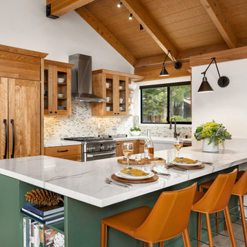
 Talie Jane Interiors & Construction
Full kitchen remodel. Main goal = open the space (removed overhead wooden structure). New configuration, cabinetry, countertops, backsplash, panel-ready appliances (GE Monogram), farmhouse sink, faucet, oil-rubbed bronze hardware, track and sconce lighting, paint, bar stools, accessories.
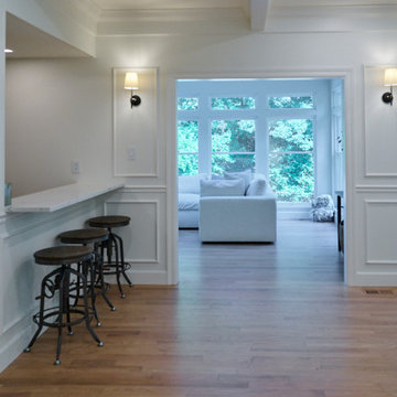
 Aptitude Design & Build
When the Aptitude team met with this family, we determined that our most important goal was to more efficiently use space in the kitchen, bathroom and laundry room so we could make room for features that better fit the family’s needs. On the kitchen remodel, Aptitude put in a butcher block topped island and created a large space to both prep and serve food. Aptitude also put in a much larger range which doubled the family’s cooking capacity for food to cook at the same time. The master bath was a total redesign - we gave them a larger shower and opened up the space with glass. Aptitude utilized the bathroom footprint differently so we could take the same amount of space but make it feel a lot bigger. On the laundry room remodel Aptitude made changes so the room is much more usable and efficient. Aptitude also added places to sit down and take off their shoes with individual cubby holes for the family members. Aptitude also made their laundry room an extension of the overall design of the house because it was important for this family to enjoy the look and feel of the laundry room in addition to making it function better.
 Corinthian Fine Homes
This couple approached us to design and renovate their existing master suite on their adorable Broad Ripple area home. Their goals were to update, open up and improve the function of their space. The ceilings were very low and the space was tight with an inefficient master bath and separate closet. We began by removing the ceiling and providing a high cathedral space for an expanded feel in the bedroom. We removed a side door and picture window and installed a sliding glass door to improve the natural lighting of the space and allow access to their landscaped patio on the back of the home. We stole space from the large master bedroom and eliminated the door that led into the closet, to allow for a larger bathroom and walk-in master closet with dressing area. This permitted a larger shower with a bench and the addition of a make-up vanity area. We also enlarged the window in the bathroom to allow more natural light into the space. The final design element was a floating step outside the sliding door onto their patio which is clean, modern and enhances the entrance to their serene master suite from the exterior.

 Charlie & Co. Design, Ltd
Corey Gaffer
Example of a minimalist wooden u-shaped metal railing staircase design in Minneapolis with wooden risers
Example of a minimalist wooden u-shaped metal railing staircase design in Minneapolis with wooden risers
33