
Search results for "Larger goals" in Home Design Ideas
 Drury Design
THE SETUP
Sam’s clients wanted to update their hall bathroom used by their three children. The goal was to create a space that is both kid-friendly and elegant, ensuring it remains functional and stylish as the children grow. The original bathroom felt confined due to dark materials and a single-sink vanity. The challenge was to find a design that looks great now and in the future.
Design objectives:
Create a sense of spaciousness
Increase storage for bathroom necessities and daily routines
Enhance lighting
THE REMODEL
Design challenges to be solved:
No structural changes – must keep the tub and wall structure
Transforming a small, dark space into a bright, open one without adding a new window
Multi-user-minded – Improving functionality for multiple users simultaneously
Timeless & kid-friendly – create a comfy kid-friendly look that won’t appear dated as the kids grow older
THE RENEWED SPACE
Design solutions:
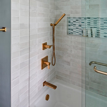
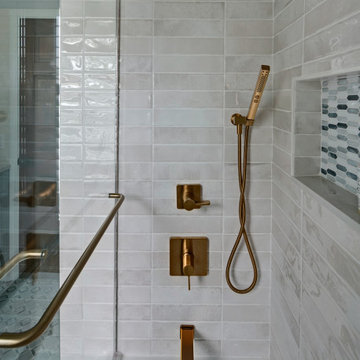
Slimmer Tub and Sliding Shower Door installed to free up functional space, making the bathroom feel larger.
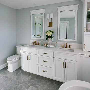
Lighter Materials used to reflect more light and add a vibrant feel. Open shelves above the toilet provide storage without making the space feel cramped, while allowing light from the existing window to permeate.
Dual Sink Vanity added, and split the mirror into two, creating individual stations for the kids and enhancing usability during busy routines.
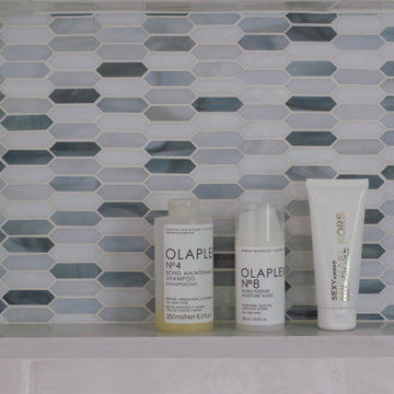
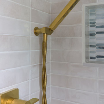
Kid-Friendly Features – Incorporated toe-kick lighting that works as a nightlight, a lower-mounted shower handheld, and a large, accessible shower niche. The geometric shapes and blue color palette contribute to a fun yet sophisticated look.
The clients are thrilled with the transformation. The bathroom is now fun and elegant, providing a timeless look that will grow with the kids. They appreciate the increased functionality and the bright, open feel of the space.
This remodel successfully blends practical solutions with stylish design, ensuring the hall bathroom meets the needs of a busy family while maintaining a sophisticated look.
 Phoenix Home Remodeling
After meeting with Mark, we determined that the goal of his remodel was that he wanted to convert his typical 2000s master bath into a transitional and functional area and get more storage. The standard cultured marble walls and soaking tub wasn’t exactly what he wanted any longer.
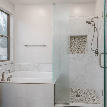
After learning about his style, we determined a large format tile and larger base cabinets would do the trick. From the white cabinetry, and striking vein large format tile and deep soaking tub.
The white shaker cabinets are for Sollid Cabinetry. We minimized the sink bases so that Mark could control what is under those cabinets, however do you see those drawer bases? They are large enough to hold anything you desire.
The two-toned shower and tub deck tile feature a striking vein that appears to go on for days. The wall tiles size is a large format tile measuring at 24X48.
This size allows for two great design elements. The first, allowing the vein to be continuous. Second, less wall grout. A total of 9 tiles used on the walls. To accentuate this vein we installed an oversized niche allows for a spotlight for the pebble mosaic to be a feature on the wall and the shower pan.
The tub deck and curb tiles are from Arizona Tile as well. It is the Cemento Rasato – Bianco 12X24. By pairing these tiles together, it supports the wall tile and allows that to be the star of the show.
The bathroom floor is Frassino, from the collection of Porta Nouva from Arizona Tile. Laid in a horizontal random offset. This selection pops the whites and grounds the elements.
This bathroom features a Calcatta quartz countertops that showcase a slight vein that supports the wall tile. The bathroom accessories, lighting fixtures and faucets are all brushed nickel.
 Drury Design
THE SETUP
Sam’s clients wanted to update their hall bathroom used by their three children. The goal was to create a space that is both kid-friendly and elegant, ensuring it remains functional and stylish as the children grow. The original bathroom felt confined due to dark materials and a single-sink vanity. The challenge was to find a design that looks great now and in the future.
Design objectives:
Create a sense of spaciousness
Increase storage for bathroom necessities and daily routines
Enhance lighting
THE REMODEL
Design challenges to be solved:
No structural changes – must keep the tub and wall structure
Transforming a small, dark space into a bright, open one without adding a new window
Multi-user-minded – Improving functionality for multiple users simultaneously
Timeless & kid-friendly – create a comfy kid-friendly look that won’t appear dated as the kids grow older
THE RENEWED SPACE
Design solutions:
Slimmer Tub and Sliding Shower Door installed to free up functional space, making the bathroom feel larger.
Lighter Materials used to reflect more light and add a vibrant feel. Open shelves above the toilet provide storage without making the space feel cramped, while allowing light from the existing window to permeate.
Dual Sink Vanity added, and split the mirror into two, creating individual stations for the kids and enhancing usability during busy routines.
Kid-Friendly Features – Incorporated toe-kick lighting that works as a nightlight, a lower-mounted shower handheld, and a large, accessible shower niche. The geometric shapes and blue color palette contribute to a fun yet sophisticated look.
The clients are thrilled with the transformation. The bathroom is now fun and elegant, providing a timeless look that will grow with the kids. They appreciate the increased functionality and the bright, open feel of the space.
This remodel successfully blends practical solutions with stylish design, ensuring the hall bathroom meets the needs of a busy family while maintaining a sophisticated look.
Find the right local pro for your project
 Drury Design
The Setup
For this primary bathroom project, the homeowners sought to transform their outdated, beige-toned space into a bright, functional sanctuary. The existing bathroom felt cramped and lifeless, with a small shower and limited storage options. The goal was to create a fresh, updated bathroom that maximizes the existing footprint while addressing specific desires for a more open, organized space with timeless materials.
Design objectives:
Brighten the bathroom and eliminate the dated beige color scheme
Install a freestanding tub in a compact space
Create a larger, more open shower without encroaching on the existing foot print too much
Incorporate hidden storage solutions
Maintain the existing bathroom layout while improving functionality
Update lighting and fixtures to create a contemporary feel
The Remodel
Design challenges to be solved:
- Compact Space Utilization – The small bathroom required careful planning to accommodate a freestanding tub while maintaining functionality and avoiding overcrowding.
- Hidden Storage Integration – The clients wanted a discreet hamper solution that wouldn’t clutter the limited floor space.
- Shower Niche Placement – With plumbing limitations and the clients’ desire to preserve their wavy accent tile wall, finding the perfect niche spot became a creative puzzle.
- Tile and Finish Coordination – Selecting complementary white tile and floor materials that worked harmoniously together.
- Larger Shower Space – Make the shower feel more open and brighter
The Renewed Space
Design solutions:
- Strategic Tub Placement – The freestanding tub was carefully positioned to maximize space, with its faucet strategically placed to allow easy access while preserving walking room. We reduced the counter depth just a bit by the tub, allowing more room for hamper cabinet and window access.
- Concealed Hamper Storage – A custom pull-out hamper was integrated into the vanity (right side, by tub), providing discreet storage within an 18-inch depth constraint.
- Shower Plumbing Wall Niche – We shifted the niche left, just enough to work around the plumbing infrastructure and still score a roomy storage spot that looks intentional.
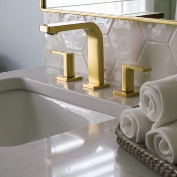
- Sophisticated Selections – Porcelanosa curvy white tile, Kohler brushed gold fixtures, and a neutral grey tile floor created a simple, timeless aesthetic that will be loved years to come.
- Open Shower – Replacing the side wall with a clear glass surround, continuing the tile on the ceiling and extending the footprint opened up this area to the room while allowing more natural lighting into the shower space.
This bathroom transformation shows how thoughtful design turns challenges into opportunities. Brushed gold fixtures add warmth to the fresh white palette, while the perfectly balanced floor tile brings just the right depth. A partially glass-fronted vanity introduces subtle charm, giving the space a unique edge. Once cramped and outdated, this bathroom now feels bright, spacious, and serene—a testament to how every design detail makes a difference.
 Drury Design
THE SETUP
Sam’s clients wanted to update their hall bathroom used by their three children. The goal was to create a space that is both kid-friendly and elegant, ensuring it remains functional and stylish as the children grow. The original bathroom felt confined due to dark materials and a single-sink vanity. The challenge was to find a design that looks great now and in the future.
Design objectives:
Create a sense of spaciousness
Increase storage for bathroom necessities and daily routines
Enhance lighting
THE REMODEL
Design challenges to be solved:
No structural changes – must keep the tub and wall structure
Transforming a small, dark space into a bright, open one without adding a new window
Multi-user-minded – Improving functionality for multiple users simultaneously
Timeless & kid-friendly – create a comfy kid-friendly look that won’t appear dated as the kids grow older
THE RENEWED SPACE
Design solutions:
Slimmer Tub and Sliding Shower Door installed to free up functional space, making the bathroom feel larger.
Lighter Materials used to reflect more light and add a vibrant feel. Open shelves above the toilet provide storage without making the space feel cramped, while allowing light from the existing window to permeate.
Dual Sink Vanity added, and split the mirror into two, creating individual stations for the kids and enhancing usability during busy routines.
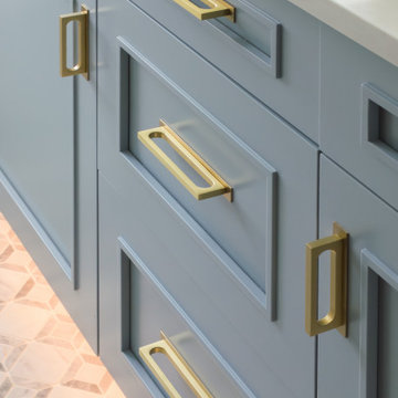
Kid-Friendly Features – Incorporated toe-kick lighting that works as a nightlight, a lower-mounted shower handheld, and a large, accessible shower niche. The geometric shapes and blue color palette contribute to a fun yet sophisticated look.
The clients are thrilled with the transformation. The bathroom is now fun and elegant, providing a timeless look that will grow with the kids. They appreciate the increased functionality and the bright, open feel of the space.
This remodel successfully blends practical solutions with stylish design, ensuring the hall bathroom meets the needs of a busy family while maintaining a sophisticated look.
 Drury Design
THE SETUP
Sam’s clients wanted to update their hall bathroom used by their three children. The goal was to create a space that is both kid-friendly and elegant, ensuring it remains functional and stylish as the children grow. The original bathroom felt confined due to dark materials and a single-sink vanity. The challenge was to find a design that looks great now and in the future.
Design objectives:
Create a sense of spaciousness
Increase storage for bathroom necessities and daily routines
Enhance lighting
THE REMODEL
Design challenges to be solved:
No structural changes – must keep the tub and wall structure
Transforming a small, dark space into a bright, open one without adding a new window
Multi-user-minded – Improving functionality for multiple users simultaneously
Timeless & kid-friendly – create a comfy kid-friendly look that won’t appear dated as the kids grow older
THE RENEWED SPACE
Design solutions:
Slimmer Tub and Sliding Shower Door installed to free up functional space, making the bathroom feel larger.
Lighter Materials used to reflect more light and add a vibrant feel. Open shelves above the toilet provide storage without making the space feel cramped, while allowing light from the existing window to permeate.
Dual Sink Vanity added, and split the mirror into two, creating individual stations for the kids and enhancing usability during busy routines.
Kid-Friendly Features – Incorporated toe-kick lighting that works as a nightlight, a lower-mounted shower handheld, and a large, accessible shower niche. The geometric shapes and blue color palette contribute to a fun yet sophisticated look.
The clients are thrilled with the transformation. The bathroom is now fun and elegant, providing a timeless look that will grow with the kids. They appreciate the increased functionality and the bright, open feel of the space.
This remodel successfully blends practical solutions with stylish design, ensuring the hall bathroom meets the needs of a busy family while maintaining a sophisticated look.

 Klopf Architecture
Joseph Eichler developed his moderately priced houses for the mass-market starting in 1949. His homes were designed using affordable materials and simple construction techniques. Nearly 70 years later these homes are in need of updating and remodeling an Eichler home today can become an imposing and costly project if you’re not careful. For this project the clients, who had undergone several previous house renovations, were determined to stick with an established budget from the beginning. Klopf Architecture helped them modernize their Eichler with a premium appearance on a reasonable budget.
The clients challenged the Klopf team to create a design that had a high-end feel and nicely done while adhering to their budget. That meant not all of the initial project scope could be built. Like many other Eichler homes, the original floor plan did not meet the family’s needs leaving them feeling disconnected from one room to another. While an early goal was to expand the house into a carport and create a larger garage, it did not survive the contractor pricing phase of the project.
The goals that did survive through to the end of the project included blurring some of the boundaries and opening up some of the spaces, making them more functional and creating a smoother flow in the house. The Klopf team joined the former separate kitchen and formal living room into one large space and shift the dining room where it is now connected to the kitchen. Klopf swapped the family room to the front alongside the living room, so the spaces feel more cohesive and are now better suited for family activities. The functional layout of the master bathroom was changed to include a large, curbless shower.
Installing a complete IKEA kitchen including cabinets, countertops, appliances, light fixtures, and furnishings was key to staying within budget. Bath fixtures in this house are also exclusively IKEA. Klopf Architecture has designed many homes using IKEA products, which are quite compatible offering an affordable, contemporary take on Eichler homes. The clients saved additional money from the simplicity and availability of IKEA products and by orchestrating the orders and purchases themselves. Following each construction meeting, the clients would make a run to IKEA and purchase items, pick up needed spare parts, and bring them back right away to stay ahead of the contractor’s schedule and minimize the chance of delays and bottlenecks.
Klopf balanced material selections by retaining some of the original woodwork and simply refinishing the mahogany paneling. They were able to retain the original windows and sliding doors which were still in good shape, avoiding some of the most costly replacement expenses. Additionally interior doors were simply refinished and the exterior siding cleaned up and repainted. Formerly dark interiors are now illuminated with new slimmer semi-recessed lighting eliminating the need for costly roof work.
Attention to design details allowed the Klopf team to ensure the house ended up with a high quality feel. Key visual elements were strictly aligned and Klopf worked with the clients to select a unified materials palette throughout the spaces so the house flows seamlessly together. Aligning the tile layout with the trusses and keeping it level with the concrete slab outside allowed them to achieve a level of quality that may otherwise be missed.
The clients were able to keep their budget on track by determining clear goals and making critical decisions upfront, choosing materials and furnishings wisely, working with the right design and construction teams in place and to a large part, their willingness to participate throughout the process. In the end the clients were much happier with their reconfigured Eichler home and Klopf Architecture managed to keep their remodeling costs to about $325/sf – a good amount below the average Bay Area Eichler remodel.
Project Team: John Klopf, Angela Todorova, Sherry Tan
Contractor: Keycon Construction
Structural Engineer: Sezen & Moon
Photography: Sabrina Huang
Year Completed: 2020


 Highland Design+Build
Built in the 1990’s by the homeowner, this kitchen design was rushed to be finished and was never their dream kitchen. Now, with the ability to accomplish their goals, the design team worked closely with the homeowner to create the kitchen they always wanted. The new kitchen was designed to be more conducive to entertaining and more enjoyable while meeting the homeowner’s day to day family needs.
The existing pantry closet sat on an awkward angled wall that it shared with a built-in desk area. By removing that pantry closet wall, the new design allowed for two pantries, buffet space with glass display as well as enough room for a larger island.
With the abundance of cabinetry, we chose to brighten the room with Alabaster perimeter cabinets while contrasting the island with a java stain and vintage glaze. The custom wood hood was an important detail for completing the owners vision. The banquet seat allowed the table to permanently live closer to the wall relaxing traffic flow as well as adding warmth and coziness to the space. Winter Storm granite countertops, beige travertine 3 x 6 backsplash kept the room light. A dark mocha decorative framed accent behind the cooktop and perimeter border adds visual interest and compliments the warms of the island.
The clients had a need for an abundance of storage in their kitchen redesign. By reconfiguring the existing pantry and desk wall, we were able to rework the island size and pantry storage. The new layout also allowed for a small buffet space for ease of entertaining guests in the adjacent dining room.
Working around an existing return vent posed a challenge. Forced to be creative, we added depth to one of the pantry units and enclosed the air return in the lower portion allowing a fully functional upper cabinet.
205 Photography
 Drury Design
THE SETUP
Sam’s clients wanted to update their hall bathroom used by their three children. The goal was to create a space that is both kid-friendly and elegant, ensuring it remains functional and stylish as the children grow. The original bathroom felt confined due to dark materials and a single-sink vanity. The challenge was to find a design that looks great now and in the future.
Design objectives:
Create a sense of spaciousness
Increase storage for bathroom necessities and daily routines
Enhance lighting
THE REMODEL
Design challenges to be solved:
No structural changes – must keep the tub and wall structure
Transforming a small, dark space into a bright, open one without adding a new window
Multi-user-minded – Improving functionality for multiple users simultaneously
Timeless & kid-friendly – create a comfy kid-friendly look that won’t appear dated as the kids grow older
THE RENEWED SPACE
Design solutions:
Slimmer Tub and Sliding Shower Door installed to free up functional space, making the bathroom feel larger.
Lighter Materials used to reflect more light and add a vibrant feel. Open shelves above the toilet provide storage without making the space feel cramped, while allowing light from the existing window to permeate.
Dual Sink Vanity added, and split the mirror into two, creating individual stations for the kids and enhancing usability during busy routines.
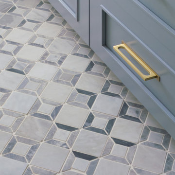
Kid-Friendly Features – Incorporated toe-kick lighting that works as a nightlight, a lower-mounted shower handheld, and a large, accessible shower niche. The geometric shapes and blue color palette contribute to a fun yet sophisticated look.
The clients are thrilled with the transformation. The bathroom is now fun and elegant, providing a timeless look that will grow with the kids. They appreciate the increased functionality and the bright, open feel of the space.
This remodel successfully blends practical solutions with stylish design, ensuring the hall bathroom meets the needs of a busy family while maintaining a sophisticated look.
 Drury Design
THE SETUP
Sam’s clients wanted to update their hall bathroom used by their three children. The goal was to create a space that is both kid-friendly and elegant, ensuring it remains functional and stylish as the children grow. The original bathroom felt confined due to dark materials and a single-sink vanity. The challenge was to find a design that looks great now and in the future.
Design objectives:
Create a sense of spaciousness
Increase storage for bathroom necessities and daily routines
Enhance lighting
THE REMODEL
Design challenges to be solved:
No structural changes – must keep the tub and wall structure
Transforming a small, dark space into a bright, open one without adding a new window
Multi-user-minded – Improving functionality for multiple users simultaneously
Timeless & kid-friendly – create a comfy kid-friendly look that won’t appear dated as the kids grow older
THE RENEWED SPACE
Design solutions:
Slimmer Tub and Sliding Shower Door installed to free up functional space, making the bathroom feel larger.
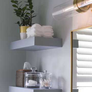
Lighter Materials used to reflect more light and add a vibrant feel. Open shelves above the toilet provide storage without making the space feel cramped, while allowing light from the existing window to permeate.
Dual Sink Vanity added, and split the mirror into two, creating individual stations for the kids and enhancing usability during busy routines.
Kid-Friendly Features – Incorporated toe-kick lighting that works as a nightlight, a lower-mounted shower handheld, and a large, accessible shower niche. The geometric shapes and blue color palette contribute to a fun yet sophisticated look.
The clients are thrilled with the transformation. The bathroom is now fun and elegant, providing a timeless look that will grow with the kids. They appreciate the increased functionality and the bright, open feel of the space.
This remodel successfully blends practical solutions with stylish design, ensuring the hall bathroom meets the needs of a busy family while maintaining a sophisticated look.

 Leanne Michael L U X E lifestyle design
This coastal kitchen was designed with modern simplicity in mind to compliment my clients Baja lifestyle. The goal was to make the kitchen space feel larger for their daily use and entertaining purposes. Therefore, we designed the refrigerator to be positioned in the corner of the L shape custom cabinetry plan. Doing so opened the space up for even better interior access into the fridge as the French doors can now open fully. Within the custom cabinet plan, we specifically added a pair of hidden storage garage cubbies on both sides of the refrigerator compartment which gives my clients the ability to capture additional would-be wasted space perfect for hiding items typically left on the counters such as their toaster, coffee maker, bottles of vitamins, etc..
The duel material island with waterfall edges has even more character by adding a solid alder wood counter surface that marries into the quartz utility area surface. The island also has tons of hidden storage space on the front side hidden behind touch release cabinet doors to store items not used as often. Hanging above the island are a pair of glazed clay planters found locally that were transformed into really interesting light pendants through the assistance of our sister company, iron | clay | wood, for all things custom!
Adding a bank of custom floating shelves in the same alder wood as the island also gave continuity and balance to the space perfect for displaying my clients collection of everyday dishes and stemware found in Rosarito.
 Phoenix Home Remodeling
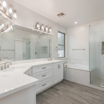
After meeting with Mark, we determined that the goal of his remodel was that he wanted to convert his typical 2000s master bath into a transitional and functional area and get more storage. The standard cultured marble walls and soaking tub wasn’t exactly what he wanted any longer.
After learning about his style, we determined a large format tile and larger base cabinets would do the trick. From the white cabinetry, and striking vein large format tile and deep soaking tub.
The white shaker cabinets are for Sollid Cabinetry. We minimized the sink bases so that Mark could control what is under those cabinets, however do you see those drawer bases? They are large enough to hold anything you desire.
The two-toned shower and tub deck tile feature a striking vein that appears to go on for days. The wall tiles size is a large format tile measuring at 24X48.
This size allows for two great design elements. The first, allowing the vein to be continuous. Second, less wall grout. A total of 9 tiles used on the walls. To accentuate this vein we installed an oversized niche allows for a spotlight for the pebble mosaic to be a feature on the wall and the shower pan.
The tub deck and curb tiles are from Arizona Tile as well. It is the Cemento Rasato – Bianco 12X24. By pairing these tiles together, it supports the wall tile and allows that to be the star of the show.
The bathroom floor is Frassino, from the collection of Porta Nouva from Arizona Tile. Laid in a horizontal random offset. This selection pops the whites and grounds the elements.
This bathroom features a Calcatta quartz countertops that showcase a slight vein that supports the wall tile. The bathroom accessories, lighting fixtures and faucets are all brushed nickel.
 Brooklyn City Furniture
Design: Jens Juul Eilersen
Quick ship : FABRIC: PLINDY 0016
Compare Tub to a cloud of down or a foamy mug of beer.
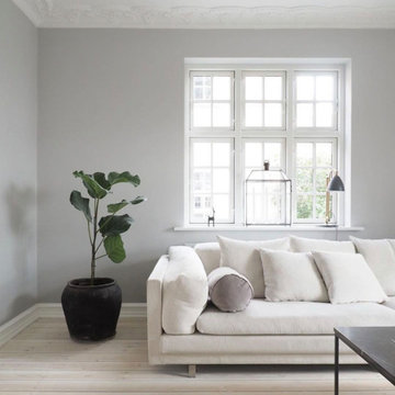
Jens Juul Eilersen has created a gigantic "sofa bathtub", which is an orgy of soft foam, down and pillows. Tub is the coolest and softest sofa yet in the Eilersen universe of floaters. And the contrast between the slim, tight outer shell and the interior heaven of foam and down creates dynamism in the language of form.
Like sitting on a soft bed.
"My goal was to create a well-being sofa where you can sit as if on a soft bed. And I succeeded! I actually fell asleep the first time I leaned back into the prototype, which was the deepest version," tells Jens Juul Eilersen. "When I woke up, I could certainly see that I had to develop a variation of the model in which people could stay awake". This resulted in a further 2 different depths where you sit more upright but still comfortably. Compared to Eilersen's other floater, Tub differentiates itself by the frame. Tub does not have a heavy frame, which is part of the comfort. But on the other hand a thin shell, which keeps the large, soft pillows in place. Externally, the lines are straight and tight and internally, the upholstery and pillows result in organic lines.
"The entire sitting comfort in Tub lies in the foam, which seems softer due to the large depth. This provides a feeling of elevation and larger submersion than in any of our other sofas. It is actually just like sitting in a large mug of foaming beer or on a cloud of down" says Jens Juul Eilersen who promises that even though Tub is soft, inviting and provoking, it cannot become flat. Tub is available in three depths and the series contains corner, end and centre sections, which can be combined as desired.
Quick ship : FABRIC: PLINDY 0016
For other fabric choices Email : info@cityfurnitureshop.com * Difference in shipping will vary
 Drury Design
THE SETUP
Sam’s clients wanted to update their hall bathroom used by their three children. The goal was to create a space that is both kid-friendly and elegant, ensuring it remains functional and stylish as the children grow. The original bathroom felt confined due to dark materials and a single-sink vanity. The challenge was to find a design that looks great now and in the future.
Design objectives:
Create a sense of spaciousness
Increase storage for bathroom necessities and daily routines
Enhance lighting
THE REMODEL
Design challenges to be solved:
No structural changes – must keep the tub and wall structure
Transforming a small, dark space into a bright, open one without adding a new window
Multi-user-minded – Improving functionality for multiple users simultaneously
Timeless & kid-friendly – create a comfy kid-friendly look that won’t appear dated as the kids grow older
THE RENEWED SPACE
Design solutions:
Slimmer Tub and Sliding Shower Door installed to free up functional space, making the bathroom feel larger.
Lighter Materials used to reflect more light and add a vibrant feel. Open shelves above the toilet provide storage without making the space feel cramped, while allowing light from the existing window to permeate.
Dual Sink Vanity added, and split the mirror into two, creating individual stations for the kids and enhancing usability during busy routines.
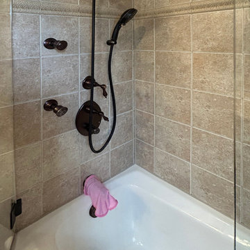
Kid-Friendly Features – Incorporated toe-kick lighting that works as a nightlight, a lower-mounted shower handheld, and a large, accessible shower niche. The geometric shapes and blue color palette contribute to a fun yet sophisticated look.
The clients are thrilled with the transformation. The bathroom is now fun and elegant, providing a timeless look that will grow with the kids. They appreciate the increased functionality and the bright, open feel of the space.
This remodel successfully blends practical solutions with stylish design, ensuring the hall bathroom meets the needs of a busy family while maintaining a sophisticated look.
 Drury Design
THE SETUP
Sam’s clients wanted to update their hall bathroom used by their three children. The goal was to create a space that is both kid-friendly and elegant, ensuring it remains functional and stylish as the children grow. The original bathroom felt confined due to dark materials and a single-sink vanity. The challenge was to find a design that looks great now and in the future.
Design objectives:
Create a sense of spaciousness
Increase storage for bathroom necessities and daily routines
Enhance lighting
THE REMODEL
Design challenges to be solved:
No structural changes – must keep the tub and wall structure
Transforming a small, dark space into a bright, open one without adding a new window
Multi-user-minded – Improving functionality for multiple users simultaneously
Timeless & kid-friendly – create a comfy kid-friendly look that won’t appear dated as the kids grow older
THE RENEWED SPACE
Design solutions:
Slimmer Tub and Sliding Shower Door installed to free up functional space, making the bathroom feel larger.
Lighter Materials used to reflect more light and add a vibrant feel. Open shelves above the toilet provide storage without making the space feel cramped, while allowing light from the existing window to permeate.
Dual Sink Vanity added, and split the mirror into two, creating individual stations for the kids and enhancing usability during busy routines.
Kid-Friendly Features – Incorporated toe-kick lighting that works as a nightlight, a lower-mounted shower handheld, and a large, accessible shower niche. The geometric shapes and blue color palette contribute to a fun yet sophisticated look.
The clients are thrilled with the transformation. The bathroom is now fun and elegant, providing a timeless look that will grow with the kids. They appreciate the increased functionality and the bright, open feel of the space.
This remodel successfully blends practical solutions with stylish design, ensuring the hall bathroom meets the needs of a busy family while maintaining a sophisticated look.
 Drury Design
THE SETUP
Sam’s clients wanted to update their hall bathroom used by their three children. The goal was to create a space that is both kid-friendly and elegant, ensuring it remains functional and stylish as the children grow. The original bathroom felt confined due to dark materials and a single-sink vanity. The challenge was to find a design that looks great now and in the future.
Design objectives:
Create a sense of spaciousness
Increase storage for bathroom necessities and daily routines
Enhance lighting
THE REMODEL
Design challenges to be solved:
No structural changes – must keep the tub and wall structure
Transforming a small, dark space into a bright, open one without adding a new window
Multi-user-minded – Improving functionality for multiple users simultaneously
Timeless & kid-friendly – create a comfy kid-friendly look that won’t appear dated as the kids grow older
THE RENEWED SPACE
Design solutions:
Slimmer Tub and Sliding Shower Door installed to free up functional space, making the bathroom feel larger.
Lighter Materials used to reflect more light and add a vibrant feel. Open shelves above the toilet provide storage without making the space feel cramped, while allowing light from the existing window to permeate.
Dual Sink Vanity added, and split the mirror into two, creating individual stations for the kids and enhancing usability during busy routines.
Kid-Friendly Features – Incorporated toe-kick lighting that works as a nightlight, a lower-mounted shower handheld, and a large, accessible shower niche. The geometric shapes and blue color palette contribute to a fun yet sophisticated look.
The clients are thrilled with the transformation. The bathroom is now fun and elegant, providing a timeless look that will grow with the kids. They appreciate the increased functionality and the bright, open feel of the space.
This remodel successfully blends practical solutions with stylish design, ensuring the hall bathroom meets the needs of a busy family while maintaining a sophisticated look.
 Drury Design
THE SETUP
Sam’s clients wanted to update their hall bathroom used by their three children. The goal was to create a space that is both kid-friendly and elegant, ensuring it remains functional and stylish as the children grow. The original bathroom felt confined due to dark materials and a single-sink vanity. The challenge was to find a design that looks great now and in the future.
Design objectives:
Create a sense of spaciousness
Increase storage for bathroom necessities and daily routines
Enhance lighting
THE REMODEL
Design challenges to be solved:
No structural changes – must keep the tub and wall structure
Transforming a small, dark space into a bright, open one without adding a new window
Multi-user-minded – Improving functionality for multiple users simultaneously
Timeless & kid-friendly – create a comfy kid-friendly look that won’t appear dated as the kids grow older
THE RENEWED SPACE
Design solutions:
Slimmer Tub and Sliding Shower Door installed to free up functional space, making the bathroom feel larger.
Lighter Materials used to reflect more light and add a vibrant feel. Open shelves above the toilet provide storage without making the space feel cramped, while allowing light from the existing window to permeate.
Dual Sink Vanity added, and split the mirror into two, creating individual stations for the kids and enhancing usability during busy routines.
Kid-Friendly Features – Incorporated toe-kick lighting that works as a nightlight, a lower-mounted shower handheld, and a large, accessible shower niche. The geometric shapes and blue color palette contribute to a fun yet sophisticated look.
The clients are thrilled with the transformation. The bathroom is now fun and elegant, providing a timeless look that will grow with the kids. They appreciate the increased functionality and the bright, open feel of the space.
This remodel successfully blends practical solutions with stylish design, ensuring the hall bathroom meets the needs of a busy family while maintaining a sophisticated look.
 Highland Design+Build
Built in the 1990’s by the homeowner, this kitchen design was rushed to be finished and was never their dream kitchen. Now, with the ability to accomplish their goals, the design team worked closely with the homeowner to create the kitchen they always wanted. The new kitchen was designed to be more conducive to entertaining and more enjoyable while meeting the homeowner’s day to day family needs.
The existing pantry closet sat on an awkward angled wall that it shared with a built-in desk area. By removing that pantry closet wall, the new design allowed for two pantries, buffet space with glass display as well as enough room for a larger island.
With the abundance of cabinetry, we chose to brighten the room with Alabaster perimeter cabinets while contrasting the island with a java stain and vintage glaze. The custom wood hood was an important detail for completing the owners vision. The banquet seat allowed the table to permanently live closer to the wall relaxing traffic flow as well as adding warmth and coziness to the space. Winter Storm granite countertops, beige travertine 3 x 6 backsplash kept the room light. A dark mocha decorative framed accent behind the cooktop and perimeter border adds visual interest and compliments the warms of the island.
The clients had a need for an abundance of storage in their kitchen redesign. By reconfiguring the existing pantry and desk wall, we were able to rework the island size and pantry storage. The new layout also allowed for a small buffet space for ease of entertaining guests in the adjacent dining room.
Working around an existing return vent posed a challenge. Forced to be creative, we added depth to one of the pantry units and enclosed the air return in the lower portion allowing a fully functional upper cabinet.
205 Photography
 Brooklyn City Furniture
Design: Jens Juul Eilersen
Quick ship : FABRIC: PLINDY 0016
Compare Tub to a cloud of down or a foamy mug of beer.
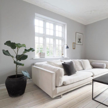
Jens Juul Eilersen has created a gigantic "sofa bathtub", which is an orgy of soft foam, down and pillows. Tub is the coolest and softest sofa yet in the Eilersen universe of floaters. And the contrast between the slim, tight outer shell and the interior heaven of foam and down creates dynamism in the language of form.
Like sitting on a soft bed.
"My goal was to create a well-being sofa where you can sit as if on a soft bed. And I succeeded! I actually fell asleep the first time I leaned back into the prototype, which was the deepest version," tells Jens Juul Eilersen. "When I woke up, I could certainly see that I had to develop a variation of the model in which people could stay awake". This resulted in a further 2 different depths where you sit more upright but still comfortably. Compared to Eilersen's other floater, Tub differentiates itself by the frame. Tub does not have a heavy frame, which is part of the comfort. But on the other hand a thin shell, which keeps the large, soft pillows in place. Externally, the lines are straight and tight and internally, the upholstery and pillows result in organic lines.
"The entire sitting comfort in Tub lies in the foam, which seems softer due to the large depth. This provides a feeling of elevation and larger submersion than in any of our other sofas. It is actually just like sitting in a large mug of foaming beer or on a cloud of down" says Jens Juul Eilersen who promises that even though Tub is soft, inviting and provoking, it cannot become flat. Tub is available in three depths and the series contains corner, end and centre sections, which can be combined as desired.
Quick ship : FABRIC: PLINDY 0016
For other fabric choices Email : info@cityfurnitureshop.com * Difference in shipping will vary

 Tiffany Brooks, HGTV Host & Interior Designer
Inquire About Our Design Services
When we first started talking in the spring of 2015, I was impressed. She was witty, realistic, and understood that as much as she loves my shows on HGTV, design does not does not happen in 43 minutes! She told me about her space, and how she felt that her bedroom seemed “blah” to her. She had no retreat. Molly desperately longed for a place that she could spend time in, read in, play in and above all, relax in.
What we did:
Many people are terrified of hiring a designer. Rightfully so, they are investing a pretty penny in their homes. They want to make sure that everything, down to the last floral arrangement, is to their liking, because they will have to live it (and pay for it). Unfortunately, a client can unintentionally stifle a designer’s creativity through micro-management. This can produce lackluster results and ultimately cause more time (and money) to be spent on a project than is really necessary.
With Molly, that was never an issue. Before she even showed me the room in question, she said that I could have full creative license to do what I needed to do to her bedroom. SAY WHAAH!?
With Molly giving me complete creative freedom, I planned everything out and got down to business. The result: Bite-your-bottom-lip sexy. I don’t get jealous of too many of my clients’ spaces, but this one still takes my breath away every time I look at the pics!
The craziest part was that by adding more furniture, it actually made the space feel larger.
Molly and her husband Patrick loved the finished space, and promised me I will be back to finish the rest of the house!
Here’s the highlights of the rest of the project:
I came up with a space plan with three options.
Next, we reviewed mood boards and fabric schemes that would work for both Molly and her hubby Patrick.
We started with the bed. My goal was to add edge to its otherwise traditional style.
We decided to spice things up by painting the trim work in the room black.
We built in layers of lighting with dimmers. In a bedroom everything should be on dimmers, right? Right.
We designed and customized bedding, chairs and window treatments.
Together with Molly, we selected the most perfect wallpaper. This geometric “grasscloth” adds so much depth and dimension that was just missing before.
What I love:
That light fixture. I mean it is really, really amazing in person.
The porcupine mirror. This thing came packaged like it was the hope diamond, and everyone was terrified to handle it. But it really became a highlight of the room.
76