
Search results for "Larger goals" in Home Design Ideas

 Klopf Architecture
Joseph Eichler developed his moderately priced houses for the mass-market starting in 1949. His homes were designed using affordable materials and simple construction techniques. Nearly 70 years later these homes are in need of updating and remodeling an Eichler home today can become an imposing and costly project if you’re not careful. For this project the clients, who had undergone several previous house renovations, were determined to stick with an established budget from the beginning. Klopf Architecture helped them modernize their Eichler with a premium appearance on a reasonable budget.
The clients challenged the Klopf team to create a design that had a high-end feel and nicely done while adhering to their budget. That meant not all of the initial project scope could be built. Like many other Eichler homes, the original floor plan did not meet the family’s needs leaving them feeling disconnected from one room to another. While an early goal was to expand the house into a carport and create a larger garage, it did not survive the contractor pricing phase of the project.
The goals that did survive through to the end of the project included blurring some of the boundaries and opening up some of the spaces, making them more functional and creating a smoother flow in the house. The Klopf team joined the former separate kitchen and formal living room into one large space and shift the dining room where it is now connected to the kitchen. Klopf swapped the family room to the front alongside the living room, so the spaces feel more cohesive and are now better suited for family activities. The functional layout of the master bathroom was changed to include a large, curbless shower.
Installing a complete IKEA kitchen including cabinets, countertops, appliances, light fixtures, and furnishings was key to staying within budget. Bath fixtures in this house are also exclusively IKEA. Klopf Architecture has designed many homes using IKEA products, which are quite compatible offering an affordable, contemporary take on Eichler homes. The clients saved additional money from the simplicity and availability of IKEA products and by orchestrating the orders and purchases themselves. Following each construction meeting, the clients would make a run to IKEA and purchase items, pick up needed spare parts, and bring them back right away to stay ahead of the contractor’s schedule and minimize the chance of delays and bottlenecks.
Klopf balanced material selections by retaining some of the original woodwork and simply refinishing the mahogany paneling. They were able to retain the original windows and sliding doors which were still in good shape, avoiding some of the most costly replacement expenses. Additionally interior doors were simply refinished and the exterior siding cleaned up and repainted. Formerly dark interiors are now illuminated with new slimmer semi-recessed lighting eliminating the need for costly roof work.
Attention to design details allowed the Klopf team to ensure the house ended up with a high quality feel. Key visual elements were strictly aligned and Klopf worked with the clients to select a unified materials palette throughout the spaces so the house flows seamlessly together. Aligning the tile layout with the trusses and keeping it level with the concrete slab outside allowed them to achieve a level of quality that may otherwise be missed.
The clients were able to keep their budget on track by determining clear goals and making critical decisions upfront, choosing materials and furnishings wisely, working with the right design and construction teams in place and to a large part, their willingness to participate throughout the process. In the end the clients were much happier with their reconfigured Eichler home and Klopf Architecture managed to keep their remodeling costs to about $325/sf – a good amount below the average Bay Area Eichler remodel.
Project Team: John Klopf, Angela Todorova, Sherry Tan
Contractor: Keycon Construction
Structural Engineer: Sezen & Moon
Photography: Sabrina Huang
Year Completed: 2020

 River Valley Landscapes
The property is one of the original farm houses located on the main street of a small town. It has been in the family for many years and our client just inherited the property. They were trying to have balance of preserving the old while realizing modern day living has its benefits too. The house had a large addition added using mostly old style materials, but designed with function and modern day luxuries. Our goal was to carry that theme to the outside.
Our first problem we had to address was how to transition between the first floor elevation changes. The lower room was the husband’s office. He stated in the future he may have clients over and it would be nice to have an area to sit outside. The wife’s main concern was to renew the four corner garden. She also felt it was very important to be able to see it from the kitchen area. Finally there was an old wishing well stuck right outside the kitchen. They both felt it would be neat to be able to incorporate this in some how. They wanted a patio area with a built in grill to accommodate there family and friends. They also wanted to keep a large play area for the kids.
We were able to pull this off successfully. We addressed the first issue by having a small lower level flagstone area. This area is large enough for 1 to 2 people to sit comfortably. It also provides a transition from his office to the larger patio area. We installed a simple small gravel sitting area opposite of the main patio. This provides our client a secluded place to relax or do business. Mrs.... told me she is amazed how much her and her husband enjoys this area. It is so peaceful looking at the small creek over a glass of wine.
We built a natural limestone retaining wall to create the patio terrace. The stone was chosen to extend the houses architectural elements into the landscape. Irregular broken flagstone was used to give it a more casual feel. We installed three Serviceberries into the patio terrace to replace some trees that were taken down during the remodeling. She was very concern that they would block the view of the four corner garden. We new they were crucial to nestle in the terrace, so we placed them for a couple days for her to decide. Fortunately she agreed they not only kept the view open, but helped frame the garden.
The four corner garden was designed to be viewed from afar and experienced up close. We wanted the space to have some formal structure while keeping with the casual farm house feel. Another natural limestone retaining wall was created. This leveled the garden terrace and helped associate it with the rest of the property. The four corner garden is nestled into the existing woods edge. This provides three distinct experiences to entering the garden; a more formal from the driveway, an open feel from the lower lawn, and a more natural / casual experience from the wooded area. The Plymouth brown gravel was used for the center of the garden. This helped highlight the stone post that was found during construction. The gravel also brings the sense of sound into the garden space. Lamb’s ear was chosen as a fun way to get kids interest in horticulture.
The balance of using the new to create the old feel is what makes this project a success. The property has already hosted a local historical society event and won an award for its preservation efforts. When Mrs.... can’t find her husband, she knows he is either reading the newspaper by the grill or resting in the hammock along the wood’s path.
 Klopf Architecture
Joseph Eichler developed his moderately priced houses for the mass-market starting in 1949. His homes were designed using affordable materials and simple construction techniques. Nearly 70 years later these homes are in need of updating and remodeling an Eichler home today can become an imposing and costly project if you’re not careful. For this project the clients, who had undergone several previous house renovations, were determined to stick with an established budget from the beginning. Klopf Architecture helped them modernize their Eichler with a premium appearance on a reasonable budget.
The clients challenged the Klopf team to create a design that had a high-end feel and nicely done while adhering to their budget. That meant not all of the initial project scope could be built. Like many other Eichler homes, the original floor plan did not meet the family’s needs leaving them feeling disconnected from one room to another. While an early goal was to expand the house into a carport and create a larger garage, it did not survive the contractor pricing phase of the project.
The goals that did survive through to the end of the project included blurring some of the boundaries and opening up some of the spaces, making them more functional and creating a smoother flow in the house. The Klopf team joined the former separate kitchen and formal living room into one large space and shift the dining room where it is now connected to the kitchen. Klopf swapped the family room to the front alongside the living room, so the spaces feel more cohesive and are now better suited for family activities. The functional layout of the master bathroom was changed to include a large, curbless shower.
Installing a complete IKEA kitchen including cabinets, countertops, appliances, light fixtures, and furnishings was key to staying within budget. Bath fixtures in this house are also exclusively IKEA. Klopf Architecture has designed many homes using IKEA products, which are quite compatible offering an affordable, contemporary take on Eichler homes. The clients saved additional money from the simplicity and availability of IKEA products and by orchestrating the orders and purchases themselves. Following each construction meeting, the clients would make a run to IKEA and purchase items, pick up needed spare parts, and bring them back right away to stay ahead of the contractor’s schedule and minimize the chance of delays and bottlenecks.
Klopf balanced material selections by retaining some of the original woodwork and simply refinishing the mahogany paneling. They were able to retain the original windows and sliding doors which were still in good shape, avoiding some of the most costly replacement expenses. Additionally interior doors were simply refinished and the exterior siding cleaned up and repainted. Formerly dark interiors are now illuminated with new slimmer semi-recessed lighting eliminating the need for costly roof work.
Attention to design details allowed the Klopf team to ensure the house ended up with a high quality feel. Key visual elements were strictly aligned and Klopf worked with the clients to select a unified materials palette throughout the spaces so the house flows seamlessly together. Aligning the tile layout with the trusses and keeping it level with the concrete slab outside allowed them to achieve a level of quality that may otherwise be missed.
The clients were able to keep their budget on track by determining clear goals and making critical decisions upfront, choosing materials and furnishings wisely, working with the right design and construction teams in place and to a large part, their willingness to participate throughout the process. In the end the clients were much happier with their reconfigured Eichler home and Klopf Architecture managed to keep their remodeling costs to about $325/sf – a good amount below the average Bay Area Eichler remodel.
Project Team: John Klopf, Angela Todorova, Sherry Tan
Contractor: Keycon Construction
Structural Engineer: Sezen & Moon
Photography: Sabrina Huang
Year Completed: 2020
Find the right local pro for your project
 Kitchen Design Concepts
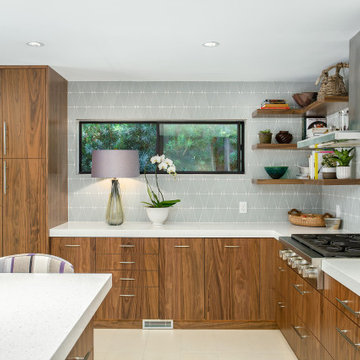
This 1950's kitchen hindered our client's cooking and bi-weekly entertaining and was inconsistent with the home's mid-century architecture. Additional key goals were to improve function for cooking and entertaining 6 to 12 people on a regular basis. Originally with only two entry points to the kitchen (from the entry/foyer and from the dining room) the kitchen wasn’t very open to the remainder of the home, or the living room at all. The door to the carport was never used and created a conflict with seating in the breakfast area. The new plans created larger openings to both rooms, and a third entry point directly into the living room. The “peninsula” manages the sight line between the kitchen and a large, brick fireplace while still creating an “island” effect in the kitchen and allowing seating on both sides. The television was also a “must have” utilizing it to watch cooking shows while prepping food, for news while getting ready for the day, and for background when entertaining.
Meticulously designed cabinets provide ample storage and ergonomically friendly appliance placement. Cabinets were previously laid out into two L-shaped spaces. On the “top” was the cooking area with a narrow pantry (read: scarce storage) and a water heater in the corner. On the “bottom” was a single 36” refrigerator/freezer, and sink. A peninsula separated the kitchen and breakfast room, truncating the entire space. We have now a clearly defined cool storage space spanning 60” width (over 150% more storage) and have separated the ovens and cooking surface to spread out prep/clean zones. True pantry storage was added, and a massive “peninsula” keeps seating for up to 6 comfortably, while still expanding the kitchen and gaining storage. The newly designed, oversized peninsula provides plentiful space for prepping and entertaining. Walnut paneling wraps the room making the kitchen a stunning showpiece.

 Studio 804
The 722 Ash Street residence consists of a 1500 sf primary house with a contiguous 500 sf accessory dwelling. The project is set in the rich culture of North Lawrence, its rear property line abuts the Lawrence levee trail which runs for nine miles along the north bank of the Kansas River.
North Lawrence is known for its quality soil, large trees, curbless streets and random size parcels before it breaks into larger farms further from the urban center. It is built on the typical orthogonal grid of American development, but it represents the older growth of the city prior to urban planners and zoning regulations. The rumble of freight trains and farm trucks in the shadows of the towering grain elevators are only blocks away. It is home to many who enjoy being only a bridge crossing away from Lawrence’s vibrant downtown but are far enough away to maintain their independence from many of the restrictions on living near the historic district. They can work in their large gardens and toiling in their garages and shops in a manner more rural than urban.
The house on 722 Ash St. is imbued with the character of North Lawrence and the Levee Trail area. The design was inspired by the Midwestern farmstead vernacular of the region. These timeless vernacular qualities house all the accommodations necessary for modern, sustainable living. A unique feature of this house is the Accessory Dwelling Unit permitted in the zoning district. It is a small separate residence on the same lot that can be used for income property or for extended family members. It also supports the city of Lawrence’s goals of increased density close to downtown rather than continued sprawl into the countryside.
The buildings use technology and common-sense design to reduce the building’s footprint and assure the owners low energy use and costs. A 4.9 Kw solar collection system is located on the only south facing gable and the super insulated envelopes (r-62 roof and r-35 walls) of all three forms easily exceeds the standards. Studio 804 continues their long standing pattern of maintaining the highest level of sustainable design while remaining contextually sensitive to the surrounding community. This house, like every Studio 804 project since 2008, is USGBC LEED Platinum Certified.
 Klopf Architecture
Joseph Eichler developed his moderately priced houses for the mass-market starting in 1949. His homes were designed using affordable materials and simple construction techniques. Nearly 70 years later these homes are in need of updating and remodeling an Eichler home today can become an imposing and costly project if you’re not careful. For this project the clients, who had undergone several previous house renovations, were determined to stick with an established budget from the beginning. Klopf Architecture helped them modernize their Eichler with a premium appearance on a reasonable budget.
The clients challenged the Klopf team to create a design that had a high-end feel and nicely done while adhering to their budget. That meant not all of the initial project scope could be built. Like many other Eichler homes, the original floor plan did not meet the family’s needs leaving them feeling disconnected from one room to another. While an early goal was to expand the house into a carport and create a larger garage, it did not survive the contractor pricing phase of the project.
The goals that did survive through to the end of the project included blurring some of the boundaries and opening up some of the spaces, making them more functional and creating a smoother flow in the house. The Klopf team joined the former separate kitchen and formal living room into one large space and shift the dining room where it is now connected to the kitchen. Klopf swapped the family room to the front alongside the living room, so the spaces feel more cohesive and are now better suited for family activities. The functional layout of the master bathroom was changed to include a large, curbless shower.
Installing a complete IKEA kitchen including cabinets, countertops, appliances, light fixtures, and furnishings was key to staying within budget. Bath fixtures in this house are also exclusively IKEA. Klopf Architecture has designed many homes using IKEA products, which are quite compatible offering an affordable, contemporary take on Eichler homes. The clients saved additional money from the simplicity and availability of IKEA products and by orchestrating the orders and purchases themselves. Following each construction meeting, the clients would make a run to IKEA and purchase items, pick up needed spare parts, and bring them back right away to stay ahead of the contractor’s schedule and minimize the chance of delays and bottlenecks.
Klopf balanced material selections by retaining some of the original woodwork and simply refinishing the mahogany paneling. They were able to retain the original windows and sliding doors which were still in good shape, avoiding some of the most costly replacement expenses. Additionally interior doors were simply refinished and the exterior siding cleaned up and repainted. Formerly dark interiors are now illuminated with new slimmer semi-recessed lighting eliminating the need for costly roof work.
Attention to design details allowed the Klopf team to ensure the house ended up with a high quality feel. Key visual elements were strictly aligned and Klopf worked with the clients to select a unified materials palette throughout the spaces so the house flows seamlessly together. Aligning the tile layout with the trusses and keeping it level with the concrete slab outside allowed them to achieve a level of quality that may otherwise be missed.
The clients were able to keep their budget on track by determining clear goals and making critical decisions upfront, choosing materials and furnishings wisely, working with the right design and construction teams in place and to a large part, their willingness to participate throughout the process. In the end the clients were much happier with their reconfigured Eichler home and Klopf Architecture managed to keep their remodeling costs to about $325/sf – a good amount below the average Bay Area Eichler remodel.
Project Team: John Klopf, Angela Todorova, Sherry Tan
Contractor: Keycon Construction
Structural Engineer: Sezen & Moon
Photography: Sabrina Huang
Year Completed: 2020

 Dynamic Garage Door
Custom Garage Doors & Gates in Los Agneles, CA - Improving the curb appeal of your home doesn't have to break the bank or require excessive and extensive remodeling. Take a look at this Los Angeles home we gave a face lift with our world-class modern garage doors and entry gates.
This LA home features a unique custom designed garage door in a minimalistic modern style. Gorgeous solid wood horizontal mahogany planks run from side to side while the accent windows with their silver metal frames and white laminate glass pane in an asymmetrical group of three add interest, beauty and a stunning appearance to the exterior while bathing the interior of the garage door in natural day light.
Moving along to the courtyard entryway, the custom gate was a unique designed created in collaboration with the client and our in-house designers. The ultimate goal was to create an architectural element at the front of the house that defined the true entrance and made an unmistakable statement. The silver finished metal frame and white laminate glass make a beautiful material combination which accentuates the newly redefined, modern style of the home.
As you look at the exterior landscaping of this home, notice how nothing was done except upgrading the garage door and entry gate. That alone, made a phenomenal difference and at the level of investment, it gave the client a larger and immediate investment gratification not only in looks but property value.
Speak to one of our in-house designer today and learn how we can do the same for your home with our high-end, custom-designed garage door and gates!
Design Center: (855) 343-3667
- We ship our products nationwide and abroad -


 Tiffany Brooks, HGTV Host & Interior Designer
Inquire About Our Design Services
When we first started talking in the spring of 2015, I was impressed. She was witty, realistic, and understood that as much as she loves my shows on HGTV, design does not does not happen in 43 minutes! She told me about her space, and how she felt that her bedroom seemed “blah” to her. She had no retreat. Molly desperately longed for a place that she could spend time in, read in, play in and above all, relax in.
What we did:
Many people are terrified of hiring a designer. Rightfully so, they are investing a pretty penny in their homes. They want to make sure that everything, down to the last floral arrangement, is to their liking, because they will have to live it (and pay for it). Unfortunately, a client can unintentionally stifle a designer’s creativity through micro-management. This can produce lackluster results and ultimately cause more time (and money) to be spent on a project than is really necessary.
With Molly, that was never an issue. Before she even showed me the room in question, she said that I could have full creative license to do what I needed to do to her bedroom. SAY WHAAH!?
With Molly giving me complete creative freedom, I planned everything out and got down to business. The result: Bite-your-bottom-lip sexy. I don’t get jealous of too many of my clients’ spaces, but this one still takes my breath away every time I look at the pics!
The craziest part was that by adding more furniture, it actually made the space feel larger.
Molly and her husband Patrick loved the finished space, and promised me I will be back to finish the rest of the house!
Here’s the highlights of the rest of the project:
I came up with a space plan with three options.
Next, we reviewed mood boards and fabric schemes that would work for both Molly and her hubby Patrick.
We started with the bed. My goal was to add edge to its otherwise traditional style.
We decided to spice things up by painting the trim work in the room black.
We built in layers of lighting with dimmers. In a bedroom everything should be on dimmers, right? Right.
We designed and customized bedding, chairs and window treatments.
Together with Molly, we selected the most perfect wallpaper. This geometric “grasscloth” adds so much depth and dimension that was just missing before.
What I love:
That light fixture. I mean it is really, really amazing in person.
The porcupine mirror. This thing came packaged like it was the hope diamond, and everyone was terrified to handle it. But it really became a highlight of the room.
 Kitchen Design Concepts
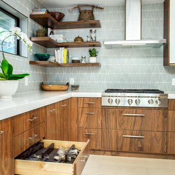
This 1950's kitchen hindered our client's cooking and bi-weekly entertaining and was inconsistent with the home's mid-century architecture. Additional key goals were to improve function for cooking and entertaining 6 to 12 people on a regular basis. Originally with only two entry points to the kitchen (from the entry/foyer and from the dining room) the kitchen wasn’t very open to the remainder of the home, or the living room at all. The door to the carport was never used and created a conflict with seating in the breakfast area. The new plans created larger openings to both rooms, and a third entry point directly into the living room. The “peninsula” manages the sight line between the kitchen and a large, brick fireplace while still creating an “island” effect in the kitchen and allowing seating on both sides. The television was also a “must have” utilizing it to watch cooking shows while prepping food, for news while getting ready for the day, and for background when entertaining.
Meticulously designed cabinets provide ample storage and ergonomically friendly appliance placement. Cabinets were previously laid out into two L-shaped spaces. On the “top” was the cooking area with a narrow pantry (read: scarce storage) and a water heater in the corner. On the “bottom” was a single 36” refrigerator/freezer, and sink. A peninsula separated the kitchen and breakfast room, truncating the entire space. We have now a clearly defined cool storage space spanning 60” width (over 150% more storage) and have separated the ovens and cooking surface to spread out prep/clean zones. True pantry storage was added, and a massive “peninsula” keeps seating for up to 6 comfortably, while still expanding the kitchen and gaining storage. The newly designed, oversized peninsula provides plentiful space for prepping and entertaining. Walnut paneling wraps the room making the kitchen a stunning showpiece.
 Kitchen Design Concepts
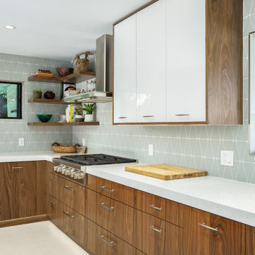
This 1950's kitchen hindered our client's cooking and bi-weekly entertaining and was inconsistent with the home's mid-century architecture. Additional key goals were to improve function for cooking and entertaining 6 to 12 people on a regular basis. Originally with only two entry points to the kitchen (from the entry/foyer and from the dining room) the kitchen wasn’t very open to the remainder of the home, or the living room at all. The door to the carport was never used and created a conflict with seating in the breakfast area. The new plans created larger openings to both rooms, and a third entry point directly into the living room. The “peninsula” manages the sight line between the kitchen and a large, brick fireplace while still creating an “island” effect in the kitchen and allowing seating on both sides. The television was also a “must have” utilizing it to watch cooking shows while prepping food, for news while getting ready for the day, and for background when entertaining.
Meticulously designed cabinets provide ample storage and ergonomically friendly appliance placement. Cabinets were previously laid out into two L-shaped spaces. On the “top” was the cooking area with a narrow pantry (read: scarce storage) and a water heater in the corner. On the “bottom” was a single 36” refrigerator/freezer, and sink. A peninsula separated the kitchen and breakfast room, truncating the entire space. We have now a clearly defined cool storage space spanning 60” width (over 150% more storage) and have separated the ovens and cooking surface to spread out prep/clean zones. True pantry storage was added, and a massive “peninsula” keeps seating for up to 6 comfortably, while still expanding the kitchen and gaining storage. The newly designed, oversized peninsula provides plentiful space for prepping and entertaining. Walnut paneling wraps the room making the kitchen a stunning showpiece.
 Studio 804
The 722 Ash Street residence consists of a 1500 sf primary house with a contiguous 500 sf accessory dwelling. The project is set in the rich culture of North Lawrence, its rear property line abuts the Lawrence levee trail which runs for nine miles along the north bank of the Kansas River.
North Lawrence is known for its quality soil, large trees, curbless streets and random size parcels before it breaks into larger farms further from the urban center. It is built on the typical orthogonal grid of American development, but it represents the older growth of the city prior to urban planners and zoning regulations. The rumble of freight trains and farm trucks in the shadows of the towering grain elevators are only blocks away. It is home to many who enjoy being only a bridge crossing away from Lawrence’s vibrant downtown but are far enough away to maintain their independence from many of the restrictions on living near the historic district. They can work in their large gardens and toiling in their garages and shops in a manner more rural than urban.
The house on 722 Ash St. is imbued with the character of North Lawrence and the Levee Trail area. The design was inspired by the Midwestern farmstead vernacular of the region. These timeless vernacular qualities house all the accommodations necessary for modern, sustainable living. A unique feature of this house is the Accessory Dwelling Unit permitted in the zoning district. It is a small separate residence on the same lot that can be used for income property or for extended family members. It also supports the city of Lawrence’s goals of increased density close to downtown rather than continued sprawl into the countryside.
The buildings use technology and common-sense design to reduce the building’s footprint and assure the owners low energy use and costs. A 4.9 Kw solar collection system is located on the only south facing gable and the super insulated envelopes (r-62 roof and r-35 walls) of all three forms easily exceeds the standards. Studio 804 continues their long standing pattern of maintaining the highest level of sustainable design while remaining contextually sensitive to the surrounding community. This house, like every Studio 804 project since 2008, is USGBC LEED Platinum Certified.
 Metke Remodeling & Luxury Homes
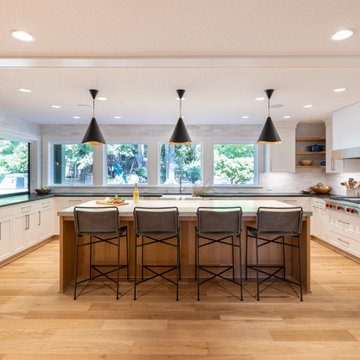
This spacious entertainer's kitchen is part of a whole house remodel and 2-story addition. Our clients' goal was to create a larger, more functional kitchen with a strong connection to the outdoors. The unique flip up window allows for a complete connection to the outdoor covered space.
No expense was spared in this design as the clients' desire for all natural materials drove the selections. The quartzite island in Opus White provides a textural and colorful element that grounds the space and complements the soapstone perimeter counters. The flip out window is a unique feature that bridges indoor and outdoor, and provides unique entertaining element. The focal point of the kitchen are the large windows looking into their greenspace, in order to preserve the view there were very few upper cabinets planned. To compensate with this direction, the lower cabinets were outfitted with top-of-the line interior accessories to provide the most functional and efficient storage. High-end, Wolf and Sub Zero appliance and the addition of a walk-in pantry completed the wish list!
Steel beams were the solution to creating the large open connection between existing structure and new kitchen addition. We had to incorporate a shallow steel beam spanning the whole width of the kitchen to not impede the existing 8' ceiling height, yet allow for the master bedroom addition directly above the new kitchen addition. In order to bridge interior and exterior spaces, a custom, flip-out window was selected. This sits on the finished counter slab, which extended into the adjacent covered entertaining patio. This allowed no room for error, all the components had to fit together exactly to insure the extended countertop would function as the sill.
The value provided our clients was in helping select high quality materials and install them with exceptional quality. Our team did an outstanding job of keeping our client on track and avoiding costly mistakes. This project was not delivered within the original budget due to several client driven change orders.

 Marula Landscape & Design
Our goal on this was to leave the area with as much open space as possible.
This was because our client loves the view of the lake and property & wanted as much area for family & grand kids to be able to run around & enjoy. We met this challenge by installing large space of beautiful St. Augustine lawn grass.
One request was to hide the view of neighbors property by utilizing native vegetation. This was achieved by varying different species of native trees (including 6 Oak species). The staggered placement & size of the trees resembled a native wooded barrier increasing solitude & bliss of privacy.
Most trees used were hand picked specimens. Some trees were triple trunk & others were clusters of different trees. The largest was about a 1,200 Gallon container made up of Cypress, Red Oaks & Monterrey Oaks.

 Landis Architects | Builders
We worked with a corporation and their out-of-town architect on this residential condominium construction in Washington D.C. The company uses the apartment for executive housing and meetings. Its goal was to create a flexible space to be used for both purposes. We renovated the kitchen, two bathrooms, and one bedroom. The central focus is the sleek new open kitchen, though we worked on the entire 1200 square foot apartment.
The client provided the architectural design for the kitchen and the rest of the apartment. The biggest layout changes were:
*Removing the walls of the existing kitchen to create a dramatic open kitchen that runs all the way to the window on one side and an island with a waterfall countertop on the other side.
*A layout that provided space for a large conference table
*Closing off one door of the bedroom and creating a larger opening from the living room side and installing pocket doors
These changes required extensive systems work throughout the apartment, including redoing all the ductwork, modifying the sprinkler system and relocating sprinkler heads to meet fire code. We didn’t run into any surprises with the systems because our team had investigated the structure in the pre-construction stage and cut holes in the drywall to locate the plumbing pipes, columns, and wiring. We had to turn and move the existing HVAC system so we could hide it in one of the kitchen cabinets.
We built the structure that anchors one end of the kitchen. It hides a refrigerator (with flush panel doors), electrical panel, and writing for the flat screen television. A soffit above the kitchen hides all the ductwork, and is fitted with recessed lights and LED cove lighting above.
The client supplied the kitchen cabinetry. The countertops are quartz by Caesarstone in Haze. We installed the flooring material on the base of one side of the island.
Backsplash. The dramatic backsplash is made of thin sheets of porcelain. The 5 mm thick material by Fiandre comes in 5-foot by 10-foot sheets that comes in a continuous pattern or can be book-matched. A fabricator measured the layout and cuts for the wall outlets, cut the material and installed it. Our team delivered three sheets of the material up the stairwell of the building. Though they created a template of the material out of wood to make sure it would fit, the actual material was more rigid and it took them a while to maneuver it.
The new wide opening at the end of the living room has pocket doors. We closed off the original hallway door to the bedroom.
Michael K. Wilkinson
 Kitchen Design Concepts
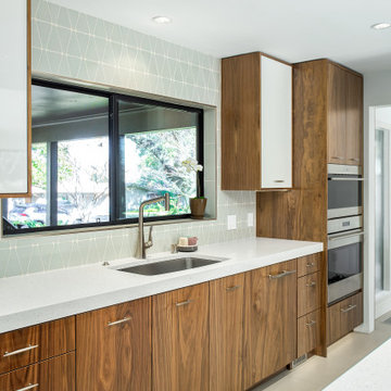
This 1950's kitchen hindered our client's cooking and bi-weekly entertaining and was inconsistent with the home's mid-century architecture. Additional key goals were to improve function for cooking and entertaining 6 to 12 people on a regular basis. Originally with only two entry points to the kitchen (from the entry/foyer and from the dining room) the kitchen wasn’t very open to the remainder of the home, or the living room at all. The door to the carport was never used and created a conflict with seating in the breakfast area. The new plans created larger openings to both rooms, and a third entry point directly into the living room. The “peninsula” manages the sight line between the kitchen and a large, brick fireplace while still creating an “island” effect in the kitchen and allowing seating on both sides. The television was also a “must have” utilizing it to watch cooking shows while prepping food, for news while getting ready for the day, and for background when entertaining.
Meticulously designed cabinets provide ample storage and ergonomically friendly appliance placement. Cabinets were previously laid out into two L-shaped spaces. On the “top” was the cooking area with a narrow pantry (read: scarce storage) and a water heater in the corner. On the “bottom” was a single 36” refrigerator/freezer, and sink. A peninsula separated the kitchen and breakfast room, truncating the entire space. We have now a clearly defined cool storage space spanning 60” width (over 150% more storage) and have separated the ovens and cooking surface to spread out prep/clean zones. True pantry storage was added, and a massive “peninsula” keeps seating for up to 6 comfortably, while still expanding the kitchen and gaining storage. The newly designed, oversized peninsula provides plentiful space for prepping and entertaining. Walnut paneling wraps the room making the kitchen a stunning showpiece.
 Kitchen Design Concepts
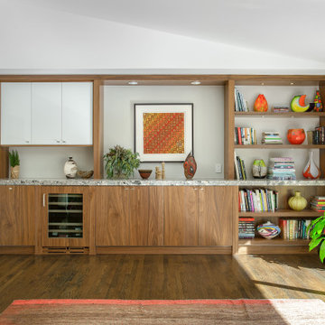
This 1950's kitchen hindered our client's cooking and bi-weekly entertaining and was inconsistent with the home's mid-century architecture. Additional key goals were to improve function for cooking and entertaining 6 to 12 people on a regular basis. Originally with only two entry points to the kitchen (from the entry/foyer and from the dining room) the kitchen wasn’t very open to the remainder of the home, or the living room at all. The door to the carport was never used and created a conflict with seating in the breakfast area. The new plans created larger openings to both rooms, and a third entry point directly into the living room. The “peninsula” manages the sight line between the kitchen and a large, brick fireplace while still creating an “island” effect in the kitchen and allowing seating on both sides. The television was also a “must have” utilizing it to watch cooking shows while prepping food, for news while getting ready for the day, and for background when entertaining.
Meticulously designed cabinets provide ample storage and ergonomically friendly appliance placement. Cabinets were previously laid out into two L-shaped spaces. On the “top” was the cooking area with a narrow pantry (read: scarce storage) and a water heater in the corner. On the “bottom” was a single 36” refrigerator/freezer, and sink. A peninsula separated the kitchen and breakfast room, truncating the entire space. We have now a clearly defined cool storage space spanning 60” width (over 150% more storage) and have separated the ovens and cooking surface to spread out prep/clean zones. True pantry storage was added, and a massive “peninsula” keeps seating for up to 6 comfortably, while still expanding the kitchen and gaining storage. The newly designed, oversized peninsula provides plentiful space for prepping and entertaining. Walnut paneling wraps the room making the kitchen a stunning showpiece.
 Studio 804
The 722 Ash Street residence consists of a 1500 sf primary house with a contiguous 500 sf accessory dwelling. The project is set in the rich culture of North Lawrence, its rear property line abuts the Lawrence levee trail which runs for nine miles along the north bank of the Kansas River.
North Lawrence is known for its quality soil, large trees, curbless streets and random size parcels before it breaks into larger farms further from the urban center. It is built on the typical orthogonal grid of American development, but it represents the older growth of the city prior to urban planners and zoning regulations. The rumble of freight trains and farm trucks in the shadows of the towering grain elevators are only blocks away. It is home to many who enjoy being only a bridge crossing away from Lawrence’s vibrant downtown but are far enough away to maintain their independence from many of the restrictions on living near the historic district. They can work in their large gardens and toiling in their garages and shops in a manner more rural than urban.
The house on 722 Ash St. is imbued with the character of North Lawrence and the Levee Trail area. The design was inspired by the Midwestern farmstead vernacular of the region. These timeless vernacular qualities house all the accommodations necessary for modern, sustainable living. A unique feature of this house is the Accessory Dwelling Unit permitted in the zoning district. It is a small separate residence on the same lot that can be used for income property or for extended family members. It also supports the city of Lawrence’s goals of increased density close to downtown rather than continued sprawl into the countryside.
The buildings use technology and common-sense design to reduce the building’s footprint and assure the owners low energy use and costs. A 4.9 Kw solar collection system is located on the only south facing gable and the super insulated envelopes (r-62 roof and r-35 walls) of all three forms easily exceeds the standards. Studio 804 continues their long standing pattern of maintaining the highest level of sustainable design while remaining contextually sensitive to the surrounding community. This house, like every Studio 804 project since 2008, is USGBC LEED Platinum Certified.
 Landis Architects | Builders
We worked with a corporation and their out-of-town architect on this residential condominium construction in Washington D.C. The company uses the apartment for executive housing and meetings. Its goal was to create a flexible space to be used for both purposes. We renovated the kitchen, two bathrooms, and one bedroom. The central focus is the sleek new open kitchen, though we worked on the entire 1200 square foot apartment.
The client provided the architectural design for the kitchen and the rest of the apartment. The biggest layout changes were:
*Removing the walls of the existing kitchen to create a dramatic open kitchen that runs all the way to the window on one side and an island with a waterfall countertop on the other side.
*A layout that provided space for a large conference table
*Closing off one door of the bedroom and creating a larger opening from the living room side and installing pocket doors
These changes required extensive systems work throughout the apartment, including redoing all the ductwork, modifying the sprinkler system and relocating sprinkler heads to meet fire code. We didn’t run into any surprises with the systems because our team had investigated the structure in the pre-construction stage and cut holes in the drywall to locate the plumbing pipes, columns, and wiring. We had to turn and move the existing HVAC system so we could hide it in one of the kitchen cabinets.
We built the structure that anchors one end of the kitchen. It hides a refrigerator (with flush panel doors), electrical panel, and writing for the flat screen television. A soffit above the kitchen hides all the ductwork, and is fitted with recessed lights and LED cove lighting above.
The client supplied the kitchen cabinetry. The countertops are quartz by Caesarstone in Haze. We installed the flooring material on the base of one side of the island.
Backsplash. The dramatic backsplash is made of thin sheets of porcelain. The 5 mm thick material by Fiandre comes in 5-foot by 10-foot sheets that comes in a continuous pattern or can be book-matched. A fabricator measured the layout and cuts for the wall outlets, cut the material and installed it. Our team delivered three sheets of the material up the stairwell of the building. Though they created a template of the material out of wood to make sure it would fit, the actual material was more rigid and it took them a while to maneuver it.
The new wide opening at the end of the living room has pocket doors. We closed off the original hallway door to the bedroom.
Michael K. Wilkinson
 Kitchen Design Concepts
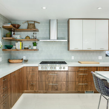
This 1950's kitchen hindered our client's cooking and bi-weekly entertaining and was inconsistent with the home's mid-century architecture. Additional key goals were to improve function for cooking and entertaining 6 to 12 people on a regular basis. Originally with only two entry points to the kitchen (from the entry/foyer and from the dining room) the kitchen wasn’t very open to the remainder of the home, or the living room at all. The door to the carport was never used and created a conflict with seating in the breakfast area. The new plans created larger openings to both rooms, and a third entry point directly into the living room. The “peninsula” manages the sight line between the kitchen and a large, brick fireplace while still creating an “island” effect in the kitchen and allowing seating on both sides. The television was also a “must have” utilizing it to watch cooking shows while prepping food, for news while getting ready for the day, and for background when entertaining.
Meticulously designed cabinets provide ample storage and ergonomically friendly appliance placement. Cabinets were previously laid out into two L-shaped spaces. On the “top” was the cooking area with a narrow pantry (read: scarce storage) and a water heater in the corner. On the “bottom” was a single 36” refrigerator/freezer, and sink. A peninsula separated the kitchen and breakfast room, truncating the entire space. We have now a clearly defined cool storage space spanning 60” width (over 150% more storage) and have separated the ovens and cooking surface to spread out prep/clean zones. True pantry storage was added, and a massive “peninsula” keeps seating for up to 6 comfortably, while still expanding the kitchen and gaining storage. The newly designed, oversized peninsula provides plentiful space for prepping and entertaining. Walnut paneling wraps the room making the kitchen a stunning showpiece.

 JRP Design & Remodel
This home had a kitchen that wasn’t meeting the family’s needs, nor did it fit with the coastal Mediterranean theme throughout the rest of the house. The goals for this remodel were to create more storage space and add natural light. The biggest item on the wish list was a larger kitchen island that could fit a family of four. They also wished for the backyard to transform from an unsightly mess that the clients rarely used to a beautiful oasis with function and style.
One design challenge was incorporating the client’s desire for a white kitchen with the warm tones of the travertine flooring. The rich walnut tone in the island cabinetry helped to tie in the tile flooring. This added contrast, warmth, and cohesiveness to the overall design and complemented the transitional coastal theme in the adjacent spaces. Rooms alight with sunshine, sheathed in soft, watery hues are indicative of coastal decorating. A few essential style elements will conjure the coastal look with its casual beach attitude and renewing seaside energy, even if the shoreline is only in your mind's eye.
By adding two new windows, all-white cabinets, and light quartzite countertops, the kitchen is now open and bright. Brass accents on the hood, cabinet hardware and pendant lighting added warmth to the design. Blue accent rugs and chairs complete the vision, complementing the subtle grey ceramic backsplash and coastal blues in the living and dining rooms. Finally, the added sliding doors lead to the best part of the home: the dreamy outdoor oasis!
Every day is a vacation in this Mediterranean-style backyard paradise. The outdoor living space emphasizes the natural beauty of the surrounding area while offering all of the advantages and comfort of indoor amenities.
The swimming pool received a significant makeover that turned this backyard space into one that the whole family will enjoy. JRP changed out the stones and tiles, bringing a new life to it. The overall look of the backyard went from hazardous to harmonious. After finishing the pool, a custom gazebo was built for the perfect spot to relax day or night.
It’s an entertainer’s dream to have a gorgeous pool and an outdoor kitchen. This kitchen includes stainless-steel appliances, a custom beverage fridge, and a wood-burning fireplace. Whether you want to entertain or relax with a good book, this coastal Mediterranean-style outdoor living remodel has you covered.
Photographer: Andrew - OpenHouse VC
78