
Search results for "Larger residence" in Home Design Ideas

 Mark Brand Architecture
We were approached by a San Francisco firefighter to design a place for him and his girlfriend to live while also creating additional units he could sell to finance the project. He grew up in the house that was built on this site in approximately 1886. It had been remodeled repeatedly since it was first built so that there was only one window remaining that showed any sign of its Victorian heritage. The house had become so dilapidated over the years that it was a legitimate candidate for demolition. Furthermore, the house straddled two legal parcels, so there was an opportunity to build several new units in its place. At our client’s suggestion, we developed the left building as a duplex of which they could occupy the larger, upper unit and the right building as a large single-family residence. In addition to design, we handled permitting, including gathering support by reaching out to the surrounding neighbors and shepherding the project through the Planning Commission Discretionary Review process. The Planning Department insisted that we develop the two buildings so they had different characters and could not be mistaken for an apartment complex. The duplex design was inspired by Albert Frey’s Palm Springs modernism but clad in fibre cement panels and the house design was to be clad in wood. Because the site was steeply upsloping, the design required tall, thick retaining walls that we incorporated into the design creating sunken patios in the rear yards. All floors feature generous 10 foot ceilings and large windows with the upper, bedroom floors featuring 11 and 12 foot ceilings. Open plans are complemented by sleek, modern finishes throughout.

 Reflections Water Gardens
After two years of fighting with a failing pond liner, the resident decided to replace the liner in the pond. This 150’ x 115’pond sat above and flowed into a larger pond which was lined with PVC liner. We were replacing this with a 45 mil epdm fishsafe rubber liner. This presented a problem: there is no way to adhere the new rubber liner to the existing PVC liner in the lower pond. The solution was to pour a cement 18” wide x 2’ deep footing next to the wier damn between the two ponds in order to connect the two liners together. The old liner was placed on the top of the footing and a water-block sealant was used. The new rubber liner was placed on top and another layer of sealant along with stainless steel bars were laid atop the two materials in order to press them together to maintain a water-tight junction. A drain tile system was installed beneath the liner to relieve ground water pressure and vent off any gasses. Water tight seals also had to be provided for multiple plumbing penetrations through the liner. Non-woven geotextile planting media bags were used to prevent erosion around the perimeter of the pond. As the pond was landscaped with lawn and perennials, these had to be removed and preserved and maintained throughout the project in order to return them upon completion of the lining. All trenching work and removal of plant material was done by hand in order to maintain the surrounding landscape; great care was taken throughout the project in order to protect existing hard and softscape, so that upon completion, the area appeared almost exactly as it had been before work began.
Photo by Larry Carnes
 Reflections Water Gardens
After two years of fighting with a failing pond liner, the resident decided to replace the liner in the pond. This 150’ x 115’pond sat above and flowed into a larger pond which was lined with PVC liner. We were replacing this with a 45 mil epdm fishsafe rubber liner. This presented a problem: there is no way to adhere the new rubber liner to the existing PVC liner in the lower pond. The solution was to pour a cement 18” wide x 2’ deep footing next to the wier damn between the two ponds in order to connect the two liners together. The old liner was placed on the top of the footing and a water-block sealant was used. The new rubber liner was placed on top and another layer of sealant along with stainless steel bars were laid atop the two materials in order to press them together to maintain a water-tight junction. A drain tile system was installed beneath the liner to relieve ground water pressure and vent off any gasses. Water tight seals also had to be provided for multiple plumbing penetrations through the liner. Non-woven geotextile planting media bags were used to prevent erosion around the perimeter of the pond. As the pond was landscaped with lawn and perennials, these had to be removed and preserved and maintained throughout the project in order to return them upon completion of the lining. All trenching work and removal of plant material was done by hand in order to maintain the surrounding landscape; great care was taken throughout the project in order to protect existing hard and softscape, so that upon completion, the area appeared almost exactly as it had been before work began.
Photo by Larry Carnes
Find the right local pro for your project
 Mark Brand Architecture
We were approached by a San Francisco firefighter to design a place for him and his girlfriend to live while also creating additional units he could sell to finance the project. He grew up in the house that was built on this site in approximately 1886. It had been remodeled repeatedly since it was first built so that there was only one window remaining that showed any sign of its Victorian heritage. The house had become so dilapidated over the years that it was a legitimate candidate for demolition. Furthermore, the house straddled two legal parcels, so there was an opportunity to build several new units in its place. At our client’s suggestion, we developed the left building as a duplex of which they could occupy the larger, upper unit and the right building as a large single-family residence. In addition to design, we handled permitting, including gathering support by reaching out to the surrounding neighbors and shepherding the project through the Planning Commission Discretionary Review process. The Planning Department insisted that we develop the two buildings so they had different characters and could not be mistaken for an apartment complex. The duplex design was inspired by Albert Frey’s Palm Springs modernism but clad in fibre cement panels and the house design was to be clad in wood. Because the site was steeply upsloping, the design required tall, thick retaining walls that we incorporated into the design creating sunken patios in the rear yards. All floors feature generous 10 foot ceilings and large windows with the upper, bedroom floors featuring 11 and 12 foot ceilings. Open plans are complemented by sleek, modern finishes throughout.
 Mark Brand Architecture
We were approached by a San Francisco firefighter to design a place for him and his girlfriend to live while also creating additional units he could sell to finance the project. He grew up in the house that was built on this site in approximately 1886. It had been remodeled repeatedly since it was first built so that there was only one window remaining that showed any sign of its Victorian heritage. The house had become so dilapidated over the years that it was a legitimate candidate for demolition. Furthermore, the house straddled two legal parcels, so there was an opportunity to build several new units in its place. At our client’s suggestion, we developed the left building as a duplex of which they could occupy the larger, upper unit and the right building as a large single-family residence. In addition to design, we handled permitting, including gathering support by reaching out to the surrounding neighbors and shepherding the project through the Planning Commission Discretionary Review process. The Planning Department insisted that we develop the two buildings so they had different characters and could not be mistaken for an apartment complex. The duplex design was inspired by Albert Frey’s Palm Springs modernism but clad in fibre cement panels and the house design was to be clad in wood. Because the site was steeply upsloping, the design required tall, thick retaining walls that we incorporated into the design creating sunken patios in the rear yards. All floors feature generous 10 foot ceilings and large windows with the upper, bedroom floors featuring 11 and 12 foot ceilings. Open plans are complemented by sleek, modern finishes throughout.
 Mark Brand Architecture
We were approached by a San Francisco firefighter to design a place for him and his girlfriend to live while also creating additional units he could sell to finance the project. He grew up in the house that was built on this site in approximately 1886. It had been remodeled repeatedly since it was first built so that there was only one window remaining that showed any sign of its Victorian heritage. The house had become so dilapidated over the years that it was a legitimate candidate for demolition. Furthermore, the house straddled two legal parcels, so there was an opportunity to build several new units in its place. At our client’s suggestion, we developed the left building as a duplex of which they could occupy the larger, upper unit and the right building as a large single-family residence. In addition to design, we handled permitting, including gathering support by reaching out to the surrounding neighbors and shepherding the project through the Planning Commission Discretionary Review process. The Planning Department insisted that we develop the two buildings so they had different characters and could not be mistaken for an apartment complex. The duplex design was inspired by Albert Frey’s Palm Springs modernism but clad in fibre cement panels and the house design was to be clad in wood. Because the sie was steeply upsloping, the design required tall, thick retaining walls that we incorporated into the design creating sunken patios in the rear yards. All floors feature generous 10 foot ceilings and large windows with the upper, bedroom floors featuring 11 and 12 foot ceilings. Open plans are complemented by sleek, modern finishes throughout.
 Reflections Water Gardens
After two years of fighting with a failing pond liner, the resident decided to replace the liner in the pond. This 150’ x 115’pond sat above and flowed into a larger pond which was lined with PVC liner. We were replacing this with a 45 mil epdm fishsafe rubber liner. This presented a problem: there is no way to adhere the new rubber liner to the existing PVC liner in the lower pond. The solution was to pour a cement 18” wide x 2’ deep footing next to the wier damn between the two ponds in order to connect the two liners together. The old liner was placed on the top of the footing and a water-block sealant was used. The new rubber liner was placed on top and another layer of sealant along with stainless steel bars were laid atop the two materials in order to press them together to maintain a water-tight junction. A drain tile system was installed beneath the liner to relieve ground water pressure and vent off any gasses. Water tight seals also had to be provided for multiple plumbing penetrations through the liner. Non-woven geotextile planting media bags were used to prevent erosion around the perimeter of the pond. As the pond was landscaped with lawn and perennials, these had to be removed and preserved and maintained throughout the project in order to return them upon completion of the lining. All trenching work and removal of plant material was done by hand in order to maintain the surrounding landscape; great care was taken throughout the project in order to protect existing hard and softscape, so that upon completion, the area appeared almost exactly as it had been before work began.
Photo by Larry Carnes
Sponsored
Columbus, OH

Wannemacher Interiors
Customized Award-Winning Interior Design Solutions in Franklin Cnty OH
 Reflections Water Gardens
After two years of fighting with a failing pond liner, the resident decided to replace the liner in the pond. This 150’ x 115’pond sat above and flowed into a larger pond which was lined with PVC liner. We were replacing this with a 45 mil epdm fishsafe rubber liner. This presented a problem: there is no way to adhere the new rubber liner to the existing PVC liner in the lower pond. The solution was to pour a cement 18” wide x 2’ deep footing next to the wier damn between the two ponds in order to connect the two liners together. The old liner was placed on the top of the footing and a water-block sealant was used. The new rubber liner was placed on top and another layer of sealant along with stainless steel bars were laid atop the two materials in order to press them together to maintain a water-tight junction. A drain tile system was installed beneath the liner to relieve ground water pressure and vent off any gasses. Water tight seals also had to be provided for multiple plumbing penetrations through the liner. Non-woven geotextile planting media bags were used to prevent erosion around the perimeter of the pond. As the pond was landscaped with lawn and perennials, these had to be removed and preserved and maintained throughout the project in order to return them upon completion of the lining. All trenching work and removal of plant material was done by hand in order to maintain the surrounding landscape; great care was taken throughout the project in order to protect existing hard and softscape, so that upon completion, the area appeared almost exactly as it had been before work began.
Photo by Larry Carnes
 Reflections Water Gardens
After two years of fighting with a failing pond liner, the resident decided to replace the liner in the pond. This 150’ x 115’pond sat above and flowed into a larger pond which was lined with PVC liner. We were replacing this with a 45 mil epdm fishsafe rubber liner. This presented a problem: there is no way to adhere the new rubber liner to the existing PVC liner in the lower pond. The solution was to pour a cement 18” wide x 2’ deep footing next to the wier damn between the two ponds in order to connect the two liners together. The old liner was placed on the top of the footing and a water-block sealant was used. The new rubber liner was placed on top and another layer of sealant along with stainless steel bars were laid atop the two materials in order to press them together to maintain a water-tight junction. A drain tile system was installed beneath the liner to relieve ground water pressure and vent off any gasses. Water tight seals also had to be provided for multiple plumbing penetrations through the liner. Non-woven geotextile planting media bags were used to prevent erosion around the perimeter of the pond. As the pond was landscaped with lawn and perennials, these had to be removed and preserved and maintained throughout the project in order to return them upon completion of the lining. All trenching work and removal of plant material was done by hand in order to maintain the surrounding landscape; great care was taken throughout the project in order to protect existing hard and softscape, so that upon completion, the area appeared almost exactly as it had been before work began.
Photo by Larry Carnes
 Reflections Water Gardens
After two years of fighting with a failing pond liner, the resident decided to replace the liner in the pond. This 150’ x 115’pond sat above and flowed into a larger pond which was lined with PVC liner. We were replacing this with a 45 mil epdm fishsafe rubber liner. This presented a problem: there is no way to adhere the new rubber liner to the existing PVC liner in the lower pond. The solution was to pour a cement 18” wide x 2’ deep footing next to the wier damn between the two ponds in order to connect the two liners together. The old liner was placed on the top of the footing and a water-block sealant was used. The new rubber liner was placed on top and another layer of sealant along with stainless steel bars were laid atop the two materials in order to press them together to maintain a water-tight junction. A drain tile system was installed beneath the liner to relieve ground water pressure and vent off any gasses. Water tight seals also had to be provided for multiple plumbing penetrations through the liner. Non-woven geotextile planting media bags were used to prevent erosion around the perimeter of the pond. As the pond was landscaped with lawn and perennials, these had to be removed and preserved and maintained throughout the project in order to return them upon completion of the lining. All trenching work and removal of plant material was done by hand in order to maintain the surrounding landscape; great care was taken throughout the project in order to protect existing hard and softscape, so that upon completion, the area appeared almost exactly as it had been before work began.
Photo by Larry Carnes
 Mark Brand Architecture
We were approached by a San Francisco firefighter to design a place for him and his girlfriend to live while also creating additional units he could sell to finance the project. He grew up in the house that was built on this site in approximately 1886. It had been remodeled repeatedly since it was first built so that there was only one window remaining that showed any sign of its Victorian heritage. The house had become so dilapidated over the years that it was a legitimate candidate for demolition. Furthermore, the house straddled two legal parcels, so there was an opportunity to build several new units in its place. At our client’s suggestion, we developed the left building as a duplex of which they could occupy the larger, upper unit and the right building as a large single-family residence. In addition to design, we handled permitting, including gathering support by reaching out to the surrounding neighbors and shepherding the project through the Planning Commission Discretionary Review process. The Planning Department insisted that we develop the two buildings so they had different characters and could not be mistaken for an apartment complex. The duplex design was inspired by Albert Frey’s Palm Springs modernism but clad in fibre cement panels and the house design was to be clad in wood. Because the site was steeply upsloping, the design required tall, thick retaining walls that we incorporated into the design creating sunken patios in the rear yards. All floors feature generous 10 foot ceilings and large windows with the upper, bedroom floors featuring 11 and 12 foot ceilings. Open plans are complemented by sleek, modern finishes throughout.
 Sovereign
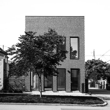
THE SHADOW HOUSE IS A PRODUCT OF THE CONTEXT IT SITS WITHIN, YET IT SUBVERTS IT AT THE SAME TIME. IT’S IMPOSSIBLE TO IGNORE IT UP CLOSE, YET FROM AFAR IT DISAPPEARS INTO THE ETHER. A TINY LOT, A LARGE PROGRAM, RESTRICTIVE ZONING REGULATIONS AND AN INVOLVED NEIGHBORHOOD INTEREST GROUP WERE THE CONSTANT AND UNRELENTING PRESSURES THAT CREATED THIS HOUSE — AND THE RESULT IS BETTER OFF FOR IT.
THE SCALLOPED SHINGLES ARE A COMMON ELEMENT ACROSS THE NEIGHBORHOOD, BUT ARE OFTEN RESERVED FOR DETAIL AREAS UNDER EAVES, AS THE MATERIAL WAS VERY EXPENSIVE ONE HUNDRED YEARS AGO. WE TOOK THAT HIGHLY-SPECIALIZED, VERY EXCLUSIVE MATERIAL AND APPLIED IT AS A BROAD, MASS-PRODUCED TEXTURE ACROSS THE ENTIRE RESIDENCE — TAKING SOMETHING FROM HIGHLIGHT TO BACKGROUND TEXTURE. THE SILHOUETTE DIRECTLY ECHOES THE ITALIANATE HOMES IN THE LARGER NEIGHBORHOOD — BUT WE STRIPPED THE TYPICAL ORNATE, DECORATED FAÇADE BACK TO UTTER MINIMALISM. WE ENLARGED THE TYPICAL WINDOW SIZE TO EXAGGERATE THE RIGID SYMMETRY OF THE STYLE, AND BROUGHT THEM TO THE FLOOR AND THE CEILING TO PROVIDE AS MUCH LIGHT AS POSSIBLE — AND THEN RECESSED THEM DEEP INTO THE FAÇADE TO MIMIC THE HEAVY BRICK AND STONE LINTELS OF THE PAST.
THE HOUSE IS BLACK — THE ONLY COLOR IT COULD BE. IF WE’D PAINTED IT UP LIKE ITS VICTORIAN SISTERS, IT WOULD’VE COMPETED FOR ATTENTION. BLACK CAUSES THE HOUSE TO SIMULTANEOUSLY DISAPPEAR AND STAND OUT — IT IS IMPOSSIBLE TO IGNORE WHILE YOU’RE WALKING PAST, BUT A FEW BLOCKS AWAY IT BECOMES IMPOSSIBLE TO DISCERN AGAINST THE BACKGROUND.
TWO BEDROOMS WITH EN-SUITE BATHS, FLOOR-TO-CEILING WINDOWS, AN AIRY AND OPEN STAIRCASE AND A MASSIVE GLASS ROOF DOOR MAKE THE SHADOW HOUSE IMPOSSIBLY LIGHT AND OPEN — YET IT’S ONLY 1,400 SQUARE FEET ON A 30’ X 50’ LOT.

 Studioteka Design, LLC
Studioteka was asked to transform a dark, and very dated kitchen and dining area for a professional couple residing in New York’s sought after Riverdale neighborhood, just a stone’s throw from Van Cortlandt Park. The couple like to cook and entertain, and wanted a space where they’d be able to host dinner parties that could also spill onto their beautiful back deck and yard. The design team removed the old kitchen cabinets and the wall which had previously separated both spaces, allowing for the creation of an oversized island that also contained cabinetry and space for a breakfast bar. Old ductwork which had been contained in the wall was rerouted, and cleverly hidden within the new island’s custom drawers and cabinetry. The gas range was relocated to the far wall, and the dishwasher was moved from the window side to the island side of the kitchen, allowing for a better kitchen workflow. New recessed and pendant lighting illuminate the space, and highlight the island. The Brazilian Bajkal Quartzite countertops provide a light contrast to the dark wood of the cabinetry below, while white subway tile and cabinets above provide openness, making the space appear larger and light filled. The kitchen window and French doors leading to the outdoor space in back were replaced, and side lights were added around the door, allowing for the creation of a new and light filled and beautiful entertainment space in the home.
Sponsored
Columbus, OH
Wannemacher Interiors
Customized Award-Winning Interior Design Solutions in Franklin Cnty OH
 Studioteka Design, LLC
Studioteka was asked to transform a dark, and very dated kitchen and dining area for a professional couple residing in New York’s sought after Riverdale neighborhood, just a stone’s throw from Van Cortlandt Park. The couple like to cook and entertain, and wanted a space where they’d be able to host dinner parties that could also spill onto their beautiful back deck and yard. The design team removed the old kitchen cabinets and the wall which had previously separated both spaces, allowing for the creation of an oversized island that also contained cabinetry and space for a breakfast bar. Old ductwork which had been contained in the wall was rerouted, and cleverly hidden within the new island’s custom drawers and cabinetry. The gas range was relocated to the far wall, and the dishwasher was moved from the window side to the island side of the kitchen, allowing for a better kitchen workflow. New recessed and pendant lighting illuminate the space, and highlight the island. The Brazilian Bajkal Quartzite countertops provide a light contrast to the dark wood of the cabinetry below, while white subway tile and cabinets above provide openness, making the space appear larger and light filled. The kitchen window and French doors leading to the outdoor space in back were replaced, and side lights were added around the door, allowing for the creation of a new and light filled and beautiful entertainment space in the home.
 Sovereign
THE SHADOW HOUSE IS A PRODUCT OF THE CONTEXT IT SITS WITHIN, YET IT SUBVERTS IT AT THE SAME TIME. IT’S IMPOSSIBLE TO IGNORE IT UP CLOSE, YET FROM AFAR IT DISAPPEARS INTO THE ETHER. A TINY LOT, A LARGE PROGRAM, RESTRICTIVE ZONING REGULATIONS AND AN INVOLVED NEIGHBORHOOD INTEREST GROUP WERE THE CONSTANT AND UNRELENTING PRESSURES THAT CREATED THIS HOUSE — AND THE RESULT IS BETTER OFF FOR IT.
THE SCALLOPED SHINGLES ARE A COMMON ELEMENT ACROSS THE NEIGHBORHOOD, BUT ARE OFTEN RESERVED FOR DETAIL AREAS UNDER EAVES, AS THE MATERIAL WAS VERY EXPENSIVE ONE HUNDRED YEARS AGO. WE TOOK THAT HIGHLY-SPECIALIZED, VERY EXCLUSIVE MATERIAL AND APPLIED IT AS A BROAD, MASS-PRODUCED TEXTURE ACROSS THE ENTIRE RESIDENCE — TAKING SOMETHING FROM HIGHLIGHT TO BACKGROUND TEXTURE. THE SILHOUETTE DIRECTLY ECHOES THE ITALIANATE HOMES IN THE LARGER NEIGHBORHOOD — BUT WE STRIPPED THE TYPICAL ORNATE, DECORATED FAÇADE BACK TO UTTER MINIMALISM. WE ENLARGED THE TYPICAL WINDOW SIZE TO EXAGGERATE THE RIGID SYMMETRY OF THE STYLE, AND BROUGHT THEM TO THE FLOOR AND THE CEILING TO PROVIDE AS MUCH LIGHT AS POSSIBLE — AND THEN RECESSED THEM DEEP INTO THE FAÇADE TO MIMIC THE HEAVY BRICK AND STONE LINTELS OF THE PAST.
THE HOUSE IS BLACK — THE ONLY COLOR IT COULD BE. IF WE’D PAINTED IT UP LIKE ITS VICTORIAN SISTERS, IT WOULD’VE COMPETED FOR ATTENTION. BLACK CAUSES THE HOUSE TO SIMULTANEOUSLY DISAPPEAR AND STAND OUT — IT IS IMPOSSIBLE TO IGNORE WHILE YOU’RE WALKING PAST, BUT A FEW BLOCKS AWAY IT BECOMES IMPOSSIBLE TO DISCERN AGAINST THE BACKGROUND.
TWO BEDROOMS WITH EN-SUITE BATHS, FLOOR-TO-CEILING WINDOWS, AN AIRY AND OPEN STAIRCASE AND A MASSIVE GLASS ROOF DOOR MAKE THE SHADOW HOUSE IMPOSSIBLY LIGHT AND OPEN — YET IT’S ONLY 1,400 SQUARE FEET ON A 30’ X 50’ LOT.
 Mark Brand Architecture
We were approached by a San Francisco firefighter to design a place for him and his girlfriend to live while also creating additional units he could sell to finance the project. He grew up in the house that was built on this site in approximately 1886. It had been remodeled repeatedly since it was first built so that there was only one window remaining that showed any sign of its Victorian heritage. The house had become so dilapidated over the years that it was a legitimate candidate for demolition. Furthermore, the house straddled two legal parcels, so there was an opportunity to build several new units in its place. At our client’s suggestion, we developed the left building as a duplex of which they could occupy the larger, upper unit and the right building as a large single-family residence. In addition to design, we handled permitting, including gathering support by reaching out to the surrounding neighbors and shepherding the project through the Planning Commission Discretionary Review process. The Planning Department insisted that we develop the two buildings so they had different characters and could not be mistaken for an apartment complex. The duplex design was inspired by Albert Frey’s Palm Springs modernism but clad in fibre cement panels and the house design was to be clad in wood. Because the site was steeply upsloping, the design required tall, thick retaining walls that we incorporated into the design creating sunken patios in the rear yards. All floors feature generous 10 foot ceilings and large windows with the upper, bedroom floors featuring 11 and 12 foot ceilings. Open plans are complemented by sleek, modern finishes throughout.
 Sovereign
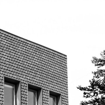
THE SHADOW HOUSE IS A PRODUCT OF THE CONTEXT IT SITS WITHIN, YET IT SUBVERTS IT AT THE SAME TIME. IT’S IMPOSSIBLE TO IGNORE IT UP CLOSE, YET FROM AFAR IT DISAPPEARS INTO THE ETHER. A TINY LOT, A LARGE PROGRAM, RESTRICTIVE ZONING REGULATIONS AND AN INVOLVED NEIGHBORHOOD INTEREST GROUP WERE THE CONSTANT AND UNRELENTING PRESSURES THAT CREATED THIS HOUSE — AND THE RESULT IS BETTER OFF FOR IT.
THE SCALLOPED SHINGLES ARE A COMMON ELEMENT ACROSS THE NEIGHBORHOOD, BUT ARE OFTEN RESERVED FOR DETAIL AREAS UNDER EAVES, AS THE MATERIAL WAS VERY EXPENSIVE ONE HUNDRED YEARS AGO. WE TOOK THAT HIGHLY-SPECIALIZED, VERY EXCLUSIVE MATERIAL AND APPLIED IT AS A BROAD, MASS-PRODUCED TEXTURE ACROSS THE ENTIRE RESIDENCE — TAKING SOMETHING FROM HIGHLIGHT TO BACKGROUND TEXTURE. THE SILHOUETTE DIRECTLY ECHOES THE ITALIANATE HOMES IN THE LARGER NEIGHBORHOOD — BUT WE STRIPPED THE TYPICAL ORNATE, DECORATED FAÇADE BACK TO UTTER MINIMALISM. WE ENLARGED THE TYPICAL WINDOW SIZE TO EXAGGERATE THE RIGID SYMMETRY OF THE STYLE, AND BROUGHT THEM TO THE FLOOR AND THE CEILING TO PROVIDE AS MUCH LIGHT AS POSSIBLE — AND THEN RECESSED THEM DEEP INTO THE FAÇADE TO MIMIC THE HEAVY BRICK AND STONE LINTELS OF THE PAST.
THE HOUSE IS BLACK — THE ONLY COLOR IT COULD BE. IF WE’D PAINTED IT UP LIKE ITS VICTORIAN SISTERS, IT WOULD’VE COMPETED FOR ATTENTION. BLACK CAUSES THE HOUSE TO SIMULTANEOUSLY DISAPPEAR AND STAND OUT — IT IS IMPOSSIBLE TO IGNORE WHILE YOU’RE WALKING PAST, BUT A FEW BLOCKS AWAY IT BECOMES IMPOSSIBLE TO DISCERN AGAINST THE BACKGROUND.
TWO BEDROOMS WITH EN-SUITE BATHS, FLOOR-TO-CEILING WINDOWS, AN AIRY AND OPEN STAIRCASE AND A MASSIVE GLASS ROOF DOOR MAKE THE SHADOW HOUSE IMPOSSIBLY LIGHT AND OPEN — YET IT’S ONLY 1,400 SQUARE FEET ON A 30’ X 50’ LOT.
Sponsored
Columbus, OH
Wannemacher Interiors
Customized Award-Winning Interior Design Solutions in Franklin Cnty OH
 Sovereign
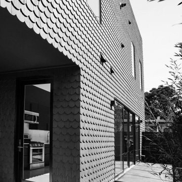
THE SHADOW HOUSE IS A PRODUCT OF THE CONTEXT IT SITS WITHIN, YET IT SUBVERTS IT AT THE SAME TIME. IT’S IMPOSSIBLE TO IGNORE IT UP CLOSE, YET FROM AFAR IT DISAPPEARS INTO THE ETHER. A TINY LOT, A LARGE PROGRAM, RESTRICTIVE ZONING REGULATIONS AND AN INVOLVED NEIGHBORHOOD INTEREST GROUP WERE THE CONSTANT AND UNRELENTING PRESSURES THAT CREATED THIS HOUSE — AND THE RESULT IS BETTER OFF FOR IT.
THE SCALLOPED SHINGLES ARE A COMMON ELEMENT ACROSS THE NEIGHBORHOOD, BUT ARE OFTEN RESERVED FOR DETAIL AREAS UNDER EAVES, AS THE MATERIAL WAS VERY EXPENSIVE ONE HUNDRED YEARS AGO. WE TOOK THAT HIGHLY-SPECIALIZED, VERY EXCLUSIVE MATERIAL AND APPLIED IT AS A BROAD, MASS-PRODUCED TEXTURE ACROSS THE ENTIRE RESIDENCE — TAKING SOMETHING FROM HIGHLIGHT TO BACKGROUND TEXTURE. THE SILHOUETTE DIRECTLY ECHOES THE ITALIANATE HOMES IN THE LARGER NEIGHBORHOOD — BUT WE STRIPPED THE TYPICAL ORNATE, DECORATED FAÇADE BACK TO UTTER MINIMALISM. WE ENLARGED THE TYPICAL WINDOW SIZE TO EXAGGERATE THE RIGID SYMMETRY OF THE STYLE, AND BROUGHT THEM TO THE FLOOR AND THE CEILING TO PROVIDE AS MUCH LIGHT AS POSSIBLE — AND THEN RECESSED THEM DEEP INTO THE FAÇADE TO MIMIC THE HEAVY BRICK AND STONE LINTELS OF THE PAST.
THE HOUSE IS BLACK — THE ONLY COLOR IT COULD BE. IF WE’D PAINTED IT UP LIKE ITS VICTORIAN SISTERS, IT WOULD’VE COMPETED FOR ATTENTION. BLACK CAUSES THE HOUSE TO SIMULTANEOUSLY DISAPPEAR AND STAND OUT — IT IS IMPOSSIBLE TO IGNORE WHILE YOU’RE WALKING PAST, BUT A FEW BLOCKS AWAY IT BECOMES IMPOSSIBLE TO DISCERN AGAINST THE BACKGROUND.
TWO BEDROOMS WITH EN-SUITE BATHS, FLOOR-TO-CEILING WINDOWS, AN AIRY AND OPEN STAIRCASE AND A MASSIVE GLASS ROOF DOOR MAKE THE SHADOW HOUSE IMPOSSIBLY LIGHT AND OPEN — YET IT’S ONLY 1,400 SQUARE FEET ON A 30’ X 50’ LOT.
 Studioteka Design, LLC
Studioteka was asked to transform a dark, and very dated kitchen and dining area for a professional couple residing in New York’s sought after Riverdale neighborhood, just a stone’s throw from Van Cortlandt Park. The couple like to cook and entertain, and wanted a space where they’d be able to host dinner parties that could also spill onto their beautiful back deck and yard. The design team removed the old kitchen cabinets and the wall which had previously separated both spaces, allowing for the creation of an oversized island that also contained cabinetry and space for a breakfast bar. Old ductwork which had been contained in the wall was rerouted, and cleverly hidden within the new island’s custom drawers and cabinetry. The gas range was relocated to the far wall, and the dishwasher was moved from the window side to the island side of the kitchen, allowing for a better kitchen workflow. New recessed and pendant lighting illuminate the space, and highlight the island. The Brazilian Bajkal Quartzite countertops provide a light contrast to the dark wood of the cabinetry below, while white subway tile and cabinets above provide openness, making the space appear larger and light filled. The kitchen window and French doors leading to the outdoor space in back were replaced, and side lights were added around the door, allowing for the creation of a new and light filled and beautiful entertainment space in the home.
 Sovereign
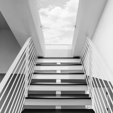
THE SHADOW HOUSE IS A PRODUCT OF THE CONTEXT IT SITS WITHIN, YET IT SUBVERTS IT AT THE SAME TIME. IT’S IMPOSSIBLE TO IGNORE IT UP CLOSE, YET FROM AFAR IT DISAPPEARS INTO THE ETHER. A TINY LOT, A LARGE PROGRAM, RESTRICTIVE ZONING REGULATIONS AND AN INVOLVED NEIGHBORHOOD INTEREST GROUP WERE THE CONSTANT AND UNRELENTING PRESSURES THAT CREATED THIS HOUSE — AND THE RESULT IS BETTER OFF FOR IT.
THE SCALLOPED SHINGLES ARE A COMMON ELEMENT ACROSS THE NEIGHBORHOOD, BUT ARE OFTEN RESERVED FOR DETAIL AREAS UNDER EAVES, AS THE MATERIAL WAS VERY EXPENSIVE ONE HUNDRED YEARS AGO. WE TOOK THAT HIGHLY-SPECIALIZED, VERY EXCLUSIVE MATERIAL AND APPLIED IT AS A BROAD, MASS-PRODUCED TEXTURE ACROSS THE ENTIRE RESIDENCE — TAKING SOMETHING FROM HIGHLIGHT TO BACKGROUND TEXTURE. THE SILHOUETTE DIRECTLY ECHOES THE ITALIANATE HOMES IN THE LARGER NEIGHBORHOOD — BUT WE STRIPPED THE TYPICAL ORNATE, DECORATED FAÇADE BACK TO UTTER MINIMALISM. WE ENLARGED THE TYPICAL WINDOW SIZE TO EXAGGERATE THE RIGID SYMMETRY OF THE STYLE, AND BROUGHT THEM TO THE FLOOR AND THE CEILING TO PROVIDE AS MUCH LIGHT AS POSSIBLE — AND THEN RECESSED THEM DEEP INTO THE FAÇADE TO MIMIC THE HEAVY BRICK AND STONE LINTELS OF THE PAST.
THE HOUSE IS BLACK — THE ONLY COLOR IT COULD BE. IF WE’D PAINTED IT UP LIKE ITS VICTORIAN SISTERS, IT WOULD’VE COMPETED FOR ATTENTION. BLACK CAUSES THE HOUSE TO SIMULTANEOUSLY DISAPPEAR AND STAND OUT — IT IS IMPOSSIBLE TO IGNORE WHILE YOU’RE WALKING PAST, BUT A FEW BLOCKS AWAY IT BECOMES IMPOSSIBLE TO DISCERN AGAINST THE BACKGROUND.
TWO BEDROOMS WITH EN-SUITE BATHS, FLOOR-TO-CEILING WINDOWS, AN AIRY AND OPEN STAIRCASE AND A MASSIVE GLASS ROOF DOOR MAKE THE SHADOW HOUSE IMPOSSIBLY LIGHT AND OPEN — YET IT’S ONLY 1,400 SQUARE FEET ON A 30’ X 50’ LOT.
52