
Search results for "Larger residence" in Home Design Ideas

 Brooks + Scarpa Architects
Located in a neighborhood characterized by traditional bungalow style single-family residences, Orange Grove is a new landmark for the City of West Hollywood. The building is sensitively designed and compatible with the neighborhood, but differs in material palette and scale from its neighbors. Referencing architectural conventions of modernism rather than the pitched roof forms of traditional domesticity, the project presents a characteristic that is consistent with the eclectic and often unconventional demographic of West Hollywood. Distinct from neighboring structures, the building creates a strong relationship to the street by virtue of its large amount of highly usable balcony area in the front façade.
While there are dramatic and larger scale elements that define the building, it is also broken down into comprehensible human scale parts, and is itself broken down into two different buildings. Orange Grove displays a similar kind of iconoclasm as the Schindler House, an icon of California modernism, located a short distance away. Like the Schindler House, the conventional architectural elements of windows and porches become part of an abstract sculptural ensemble. At the Schindler House, windows are found in the gaps between structural concrete wall panels. At Orange Grove, windows are inserted in gaps between different sections of the building.
The design of Orange Grove is generated by a subtle balance of tensions. Building volumes and the placement of windows, doors and balconies are not static but rather constitute an active three-dimensional composition in motion. Each piece of the building is a strong and clearly defined shape, such as the corrugated metal surround that encloses the second story balcony in the east and north facades. Another example of this clear delineation is the use of two square profile balcony surrounds in the front façade that set up a dialogue between them—one is small, the other large, one is open at the front, the other is veiled with stainless steel slats. At the same time each balcony is balanced and related to other elements in the building, the smaller one to the driveway gate below and the other to the roll-up door and first floor balcony. Each building element is intended to read as an abstract form in itself—such as a window becoming a slit or windows becoming a framed box, while also becoming part of a larger whole. Although this building may not mirror the status quo it answers to the desires of consumers in a burgeoning niche market who want large, simple interior volumes of space, and a paradigm based on space, light and industrial materials of the loft rather than the bungalow.

 Arciform
This gracious residence on the National Register of Historic Places created an opportunity to indulge in historically accurate details while creating a sunny space for a family's day-to-day living. The renovation expanded the kitchen into the home's former mud room and butler's pantry, creating an expansive space inspired by french bakery styling and incorporating salvaged historic decorative tile, mahogany cabinets and Carrara marble counter tops alongside restored upper cabinets and a custom butcher block island with zinc-lined flour bins. Photos by Photo Art Portraits

 Mark Brand Architecture
We were approached by a San Francisco firefighter to design a place for him and his girlfriend to live while also creating additional units he could sell to finance the project. He grew up in the house that was built on this site in approximately 1886. It had been remodeled repeatedly since it was first built so that there was only one window remaining that showed any sign of its Victorian heritage. The house had become so dilapidated over the years that it was a legitimate candidate for demolition. Furthermore, the house straddled two legal parcels, so there was an opportunity to build several new units in its place. At our client’s suggestion, we developed the left building as a duplex of which they could occupy the larger, upper unit and the right building as a large single-family residence. In addition to design, we handled permitting, including gathering support by reaching out to the surrounding neighbors and shepherding the project through the Planning Commission Discretionary Review process. The Planning Department insisted that we develop the two buildings so they had different characters and could not be mistaken for an apartment complex. The duplex design was inspired by Albert Frey’s Palm Springs modernism but clad in fibre cement panels and the house design was to be clad in wood. Because the site was steeply upsloping, the design required tall, thick retaining walls that we incorporated into the design creating sunken patios in the rear yards. All floors feature generous 10 foot ceilings and large windows with the upper, bedroom floors featuring 11 and 12 foot ceilings. Open plans are complemented by sleek, modern finishes throughout.
Find the right local pro for your project
 Fergus Garber Architects
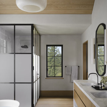
Where collaboration and craft converge, a luminous contemporary home near San Francisco emerges.
This new residence is the result of a deeply collaborative design process between client, architect, interior designer, and builder – a team unified by a shared commitment to craft and precision. Set on a site carefully selected for its ideal solar orientation, the home’s layout balances humility and elegance: a single-story street presence conceals a more private two-story wing that opens to garden views. The design evolved through thoughtful iterations, each element studied and refined, from the sculptural plaster stair handcrafted on site to the interplay between light, material, and landscape. Long white Roman bricks and custom stucco ground the home in its Northern California setting, while Venetian plaster and oak inlays create a tactile, luminous interior that shifts with the seasons. Designed to support both intimate family life and larger public gatherings, the home reflects a thoughtful approach to luxury residential architecture in the San Francisco Bay Area: site-responsive, craft-driven, and built to endure.
 Fergus Garber Architects
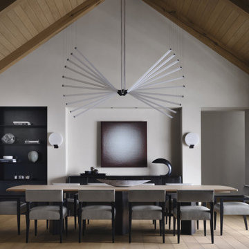
Where collaboration and craft converge, a luminous contemporary home near San Francisco emerges.
This new residence is the result of a deeply collaborative design process between client, architect, interior designer, and builder – a team unified by a shared commitment to craft and precision. Set on a site carefully selected for its ideal solar orientation, the home’s layout balances humility and elegance: a single-story street presence conceals a more private two-story wing that opens to garden views. The design evolved through thoughtful iterations, each element studied and refined, from the sculptural plaster stair handcrafted on site to the interplay between light, material, and landscape. Long white Roman bricks and custom stucco ground the home in its Northern California setting, while Venetian plaster and oak inlays create a tactile, luminous interior that shifts with the seasons. Designed to support both intimate family life and larger public gatherings, the home reflects a thoughtful approach to luxury residential architecture in the San Francisco Bay Area: site-responsive, craft-driven, and built to endure.
 USI Design & Remodeling
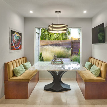
This Fort Worth residence, originally built in 1983, was reimagined for homeowners who wanted to remain in a home they loved while elevating it for the way they live today. Designed and built by USI Design & Remodeling, the project unfolded in three phases over an 8yr period, beginning with a complete primary bath reconfiguration that removed an oversized corner tub, reset the toilet location, and created a larger shower, improved circulation, and dedicated his-and-hers storage.
The second and third phases expanded the soft contemporary design language throughout the home, including a second primary-level bath, kitchen, breakfast area, family room, laundry, dining spaces, flooring, doors, trim, cabinetry, and architectural detailing. Natural stone, maple millwork, curated lighting, garden views, and gallery-like focal points were used to create a cohesive interior that feels lighter, more personal, and more refined while honoring the home’s original character.
 USI Design & Remodeling
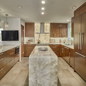
This Fort Worth residence, originally built in 1983, was reimagined for homeowners who wanted to remain in a home they loved while elevating it for the way they live today. Designed and built by USI Design & Remodeling, the project unfolded in three phases over an 8yr period, beginning with a complete primary bath reconfiguration that removed an oversized corner tub, reset the toilet location, and created a larger shower, improved circulation, and dedicated his-and-hers storage.
The second and third phases expanded the soft contemporary design language throughout the home, including a second primary-level bath, kitchen, breakfast area, family room, laundry, dining spaces, flooring, doors, trim, cabinetry, and architectural detailing. Natural stone, maple millwork, curated lighting, garden views, and gallery-like focal points were used to create a cohesive interior that feels lighter, more personal, and more refined while honoring the home’s original character.

 Fergus Garber Architects
Where collaboration and craft converge, a luminous contemporary home near San Francisco emerges.
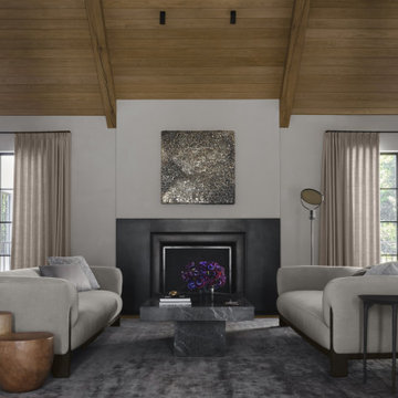
This new residence is the result of a deeply collaborative design process between client, architect, interior designer, and builder – a team unified by a shared commitment to craft and precision. Set on a site carefully selected for its ideal solar orientation, the home’s layout balances humility and elegance: a single-story street presence conceals a more private two-story wing that opens to garden views. The design evolved through thoughtful iterations, each element studied and refined, from the sculptural plaster stair handcrafted on site to the interplay between light, material, and landscape. Long white Roman bricks and custom stucco ground the home in its Northern California setting, while Venetian plaster and oak inlays create a tactile, luminous interior that shifts with the seasons. Designed to support both intimate family life and larger public gatherings, the home reflects a thoughtful approach to luxury residential architecture in the San Francisco Bay Area: site-responsive, craft-driven, and built to endure.
 USI Design & Remodeling
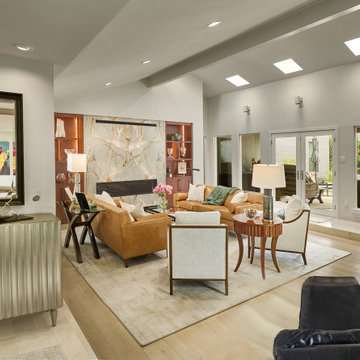
This Fort Worth residence, originally built in 1983, was reimagined for homeowners who wanted to remain in a home they loved while elevating it for the way they live today. Designed and built by USI Design & Remodeling, the project unfolded in three phases over an 8yr period, beginning with a complete primary bath reconfiguration that removed an oversized corner tub, reset the toilet location, and created a larger shower, improved circulation, and dedicated his-and-hers storage.
The second and third phases expanded the soft contemporary design language throughout the home, including a second primary-level bath, kitchen, breakfast area, family room, laundry, dining spaces, flooring, doors, trim, cabinetry, and architectural detailing. Natural stone, maple millwork, curated lighting, garden views, and gallery-like focal points were used to create a cohesive interior that feels lighter, more personal, and more refined while honoring the home’s original character.
 USI Design & Remodeling
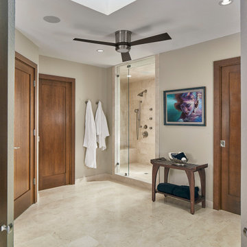
This Fort Worth residence, originally built in 1983, was reimagined for homeowners who wanted to remain in a home they loved while elevating it for the way they live today. Designed and built by USI Design & Remodeling, the project unfolded in three phases over an 8yr period, beginning with a complete primary bath reconfiguration that removed an oversized corner tub, reset the toilet location, and created a larger shower, improved circulation, and dedicated his-and-hers storage.
The second and third phases expanded the soft contemporary design language throughout the home, including a second primary-level bath, kitchen, breakfast area, family room, laundry, dining spaces, flooring, doors, trim, cabinetry, and architectural detailing. Natural stone, maple millwork, curated lighting, garden views, and gallery-like focal points were used to create a cohesive interior that feels lighter, more personal, and more refined while honoring the home’s original character.
 USI Design & Remodeling
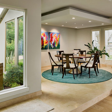
This Fort Worth residence, originally built in 1983, was reimagined for homeowners who wanted to remain in a home they loved while elevating it for the way they live today. Designed and built by USI Design & Remodeling, the project unfolded in three phases over an 8yr period, beginning with a complete primary bath reconfiguration that removed an oversized corner tub, reset the toilet location, and created a larger shower, improved circulation, and dedicated his-and-hers storage.
The second and third phases expanded the soft contemporary design language throughout the home, including a second primary-level bath, kitchen, breakfast area, family room, laundry, dining spaces, flooring, doors, trim, cabinetry, and architectural detailing. Natural stone, maple millwork, curated lighting, garden views, and gallery-like focal points were used to create a cohesive interior that feels lighter, more personal, and more refined while honoring the home’s original character.
 USI Design & Remodeling
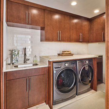
This Fort Worth residence, originally built in 1983, was reimagined for homeowners who wanted to remain in a home they loved while elevating it for the way they live today. Designed and built by USI Design & Remodeling, the project unfolded in three phases over an 8yr period, beginning with a complete primary bath reconfiguration that removed an oversized corner tub, reset the toilet location, and created a larger shower, improved circulation, and dedicated his-and-hers storage.
The second and third phases expanded the soft contemporary design language throughout the home, including a second primary-level bath, kitchen, breakfast area, family room, laundry, dining spaces, flooring, doors, trim, cabinetry, and architectural detailing. Natural stone, maple millwork, curated lighting, garden views, and gallery-like focal points were used to create a cohesive interior that feels lighter, more personal, and more refined while honoring the home’s original character.
 Fergus Garber Architects
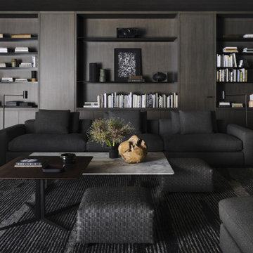
Where collaboration and craft converge, a luminous contemporary home near San Francisco emerges.
This new residence is the result of a deeply collaborative design process between client, architect, interior designer, and builder – a team unified by a shared commitment to craft and precision. Set on a site carefully selected for its ideal solar orientation, the home’s layout balances humility and elegance: a single-story street presence conceals a more private two-story wing that opens to garden views. The design evolved through thoughtful iterations, each element studied and refined, from the sculptural plaster stair handcrafted on site to the interplay between light, material, and landscape. Long white Roman bricks and custom stucco ground the home in its Northern California setting, while Venetian plaster and oak inlays create a tactile, luminous interior that shifts with the seasons. Designed to support both intimate family life and larger public gatherings, the home reflects a thoughtful approach to luxury residential architecture in the San Francisco Bay Area: site-responsive, craft-driven, and built to endure.
Sponsored
Columbus, OH

Wannemacher Interiors
Customized Award-Winning Interior Design Solutions in Franklin Cnty OH
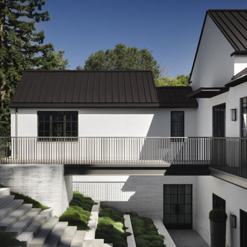 Fergus Garber Architects
Where collaboration and craft converge, a luminous contemporary home near San Francisco emerges.
This new residence is the result of a deeply collaborative design process between client, architect, interior designer, and builder – a team unified by a shared commitment to craft and precision. Set on a site carefully selected for its ideal solar orientation, the home’s layout balances humility and elegance: a single-story street presence conceals a more private two-story wing that opens to garden views. The design evolved through thoughtful iterations, each element studied and refined, from the sculptural plaster stair handcrafted on site to the interplay between light, material, and landscape. Long white Roman bricks and custom stucco ground the home in its Northern California setting, while Venetian plaster and oak inlays create a tactile, luminous interior that shifts with the seasons. Designed to support both intimate family life and larger public gatherings, the home reflects a thoughtful approach to luxury residential architecture in the San Francisco Bay Area: site-responsive, craft-driven, and built to endure.
 Mark Brand Architecture
We were approached by a San Francisco firefighter to design a place for him and his girlfriend to live while also creating additional units he could sell to finance the project. He grew up in the house that was built on this site in approximately 1886. It had been remodeled repeatedly since it was first built so that there was only one window remaining that showed any sign of its Victorian heritage. The house had become so dilapidated over the years that it was a legitimate candidate for demolition. Furthermore, the house straddled two legal parcels, so there was an opportunity to build several new units in its place. At our client’s suggestion, we developed the left building as a duplex of which they could occupy the larger, upper unit and the right building as a large single-family residence. In addition to design, we handled permitting, including gathering support by reaching out to the surrounding neighbors and shepherding the project through the Planning Commission Discretionary Review process. The Planning Department insisted that we develop the two buildings so they had different characters and could not be mistaken for an apartment complex. The duplex design was inspired by Albert Frey’s Palm Springs modernism but clad in fibre cement panels and the house design was to be clad in wood. Because the site was steeply upsloping, the design required tall, thick retaining walls that we incorporated into the design creating sunken patios in the rear yards. All floors feature generous 10 foot ceilings and large windows with the upper, bedroom floors featuring 11 and 12 foot ceilings. Open plans are complemented by sleek, modern finishes throughout.

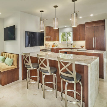
 Dream Kitchens
The kitchen in this contemporary style home seemed to be an afterthought. While the rest of the house is open and expansive, the kitchen was small and detached, especially for a couple who loves to entertain. The very large and adjacent dining room seemed a more likely location for a kitchen, but they resisted the thought of swapping the two spaces. So their designer created a layout that allowed for a second – and larger – opening to the dining room and the expansive, light-filled living space beyond.
A peninsula attaches to the wall that remained between the two openings. There the sink is located so that during food preparation or cleanup there is a view through the windows and the opportunity to socialize with people gathered at the countertop. The seating area is curved to encourage people to gather and chat. The granite countertop choice was a case of love at first sight for this homeowner since it brought his favorite shade of blue into the kitchen.
The cooking center is spread out along the wall at the back of the house. There the eye-catching stainless steel hood creates a focal point above the sleek, low-profile cooktop. Glass tile pulls color from the countertops onto the wall where it glimmers in the light. One oven combined with a microwave/convection oven meet their cooking needs and the stainless steel adds brightness to the room.
The stainless steel refrigerator is just a few steps away from the work center and the seating area and is easily accessible from other parts of the house. The original kitchen featured only one small window in addition to the sliding glass doors. Since it was almost new and the house had been resided, a second window was joined to the first, and cabinetry beneath them anchors them in the space. A tall pantry cabinet completes the kitchen, providing high quality storage and visual balance in this redesign.
Sleek cherry cabinets give this kitchen a decidedly contemporary style. They were stained just enough to add warmth and color and are enhanced with oversized stainless steel pulls.
From this redesigned space you can see into the main house and see out through the many windows there. When combined with a new layout that provides better traffic flow, there’s a new feeling of spaciousness to the kitchen. It’s no longer an afterthought. It’s an integral part of this home’s living space, enhancing the home and the lifestyle of its owners.
Photography By Scott Sherman
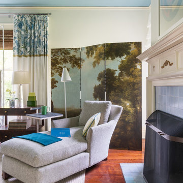
 USI Design & Remodeling
This Fort Worth residence, originally built in 1983, was reimagined for homeowners who wanted to remain in a home they loved while elevating it for the way they live today. Designed and built by USI Design & Remodeling, the project unfolded in three phases over an 8yr period, beginning with a complete primary bath reconfiguration that removed an oversized corner tub, reset the toilet location, and created a larger shower, improved circulation, and dedicated his-and-hers storage.
The second and third phases expanded the soft contemporary design language throughout the home, including a second primary-level bath, kitchen, breakfast area, family room, laundry, dining spaces, flooring, doors, trim, cabinetry, and architectural detailing. Natural stone, maple millwork, curated lighting, garden views, and gallery-like focal points were used to create a cohesive interior that feels lighter, more personal, and more refined while honoring the home’s original character.
Sponsored
Columbus, OH
Wannemacher Interiors
Customized Award-Winning Interior Design Solutions in Franklin Cnty OH

 Buchanan Kitchen Curators
These engaging homeowners are fortuitous enough to reside in a three level townhouse on a quiet street in
downtown Minneapolis. This couple loves to entertain and host family holidays. Spaces are tight in most
urban areas. This townhome is no exception. There was nothing horribly wrong with the way the home
was laid out, it just did not serve the needs of the family. The kitchen was tucked up front and forced into
a small space, making it difficult for multiple people to be in the space at the same time. The homeowners
also wished to upgrade to professional appliances. Due to size and mechanical code restrictions, this was just
not possible in the existing space. The back of the townhome had a large living room and good sized dining
room. Off this space is a shaded deck and swimming pool, which are used all the time. Traffic always ran from
the outdoor entertaining space directly to the kitchen in the front. Not only was this inconvenient, a mess was
dragged in from wet swimmers.
To alleviate these challenges, we moved the kitchen from the smaller space at the front of the home to the
larger space the under utilized living room furniture occupied. This allowed us to curate a large kitchen that
fits all their needs, wants, and aesthetic desires. Now there is plenty of room to cook, relax, and bustle about.
We also added a wet bar next to the patio door in the dining room. Right by the door is a beverage cooler from
which guests may grab beverages and snacks without dragging the outside in with them.
Being the homeowners and designer are all members of the creative community in the Twin Cities, it was important
to incorporate the work of local artists. This kitchen is fully curated with all Minnesota products (with the exception
of the appliances, which are manufactured in Wisconsin). The cabinets and countertops are from larger local
companies, while all the other features are hand made by near by artists. These artisan products include a custom
stainless steel range hood, black powder coated table base and fireplace mantel, hand made tile for the backsplash
and fireplace surround, wood elevated island table, and wood panel backsplash at the bar. Hand made tiles had
previously been installed in the existing kitchen. The color of these tiles is no longer available. It was the home-
owners desire to preserve these tiles somehow. We cut the tile off the walls and soaked the drywall from them.
We then installed them in the powder room as a feature behind the vanity and mirror.

 MRF Construction, Inc.
This stately lumber baron home, built in 1890, was updated to match the historic nature of the home and to create a kitchen the homeowners could entertain in more easily. The kitchen’s previous update was in 1960, and the space was cut up leaving it feeling disjointed and small. Almost half the space in the kitchen was used as a large butler’s pantry, and was further confined by a poor layout. By removing the wall separating the pantry, we were able to make a much larger, more comfortable space.
The kitchen is outfitted with custom cabinets in a traditional inset shaker style door to fit the age of the home. Honed black granite countertops and handmade blue subway tile complete the period look. The kitchen has all of the modern conveniences, with high end appliances, including a built-in Miele coffee-maker in the area where the pantry once resided. Along the same wall, there is a desk with compartments for mail, bills and homework, which is a must for this busy family!
 Mark Brand Architecture
We were approached by a San Francisco firefighter to design a place for him and his girlfriend to live while also creating additional units he could sell to finance the project. He grew up in the house that was built on this site in approximately 1886. It had been remodeled repeatedly since it was first built so that there was only one window remaining that showed any sign of its Victorian heritage. The house had become so dilapidated over the years that it was a legitimate candidate for demolition. Furthermore, the house straddled two legal parcels, so there was an opportunity to build several new units in its place. At our client’s suggestion, we developed the left building as a duplex of which they could occupy the larger, upper unit and the right building as a large single-family residence. In addition to design, we handled permitting, including gathering support by reaching out to the surrounding neighbors and shepherding the project through the Planning Commission Discretionary Review process. The Planning Department insisted that we develop the two buildings so they had different characters and could not be mistaken for an apartment complex. The duplex design was inspired by Albert Frey’s Palm Springs modernism but clad in fibre cement panels and the house design was to be clad in wood. Because the site was steeply upsloping, the design required tall, thick retaining walls that we incorporated into the design creating sunken patios in the rear yards. All floors feature generous 10 foot ceilings and large windows with the upper, bedroom floors featuring 11 and 12 foot ceilings. Open plans are complemented by sleek, modern finishes throughout.
48