
Search results for "Larger sectionals" in Home Design Ideas
 Bilotta Kitchen & Home
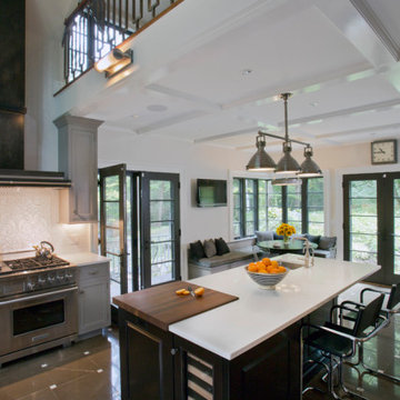
This two-toned kitchen was designed by Paula Greer, CKD of Bilotta Kitchens with Robin Zahn of Robin Prince Zahn Architecture. The u-shaped space has perimeter cabinets in Bilotta’s own line, the Bilotta Collection in a custom gray paint. The island is Wood-Mode Cabinetry in cherry with a stain. Countertops are Caesarstone’s London Grey with a built-in walnut cutting board on one corner of the island from Brooks Custom. The custom Madison Hood by Rangecraft is in a Dark Antique Steel finish and extends up accentuating the high ceiling above the cooking triangle. Two of the most interesting elements of this space are the banquette area and the coffered ceilings. By far, the most frequent installation of banquettes is tucking them into a corner of the room, regardless of how much seating is available at the island. In this kitchen, the island provides enough space for four to five stools. But because the space is separated from the rest of the house, the client wanted to ensure there was sufficient seating for their frequent entertaining. Also, the house is situated in a secluded wooded area; the new kitchen includes an abundance of unobstructed windows to fully experience the beautiful outdoor surroundings. The corner banquette (under more windows!) makes it feel like you’re dining in the trees. The bonus feature is that there’s extra storage below for table linens or seldom-used serving pieces. This really functions like a couch, complete with throw pillows and a TV, where the empty-nesters love spending time even when it isn’t mealtime. As for the ceiling, coffers don’t necessarily have to be large and intricately detailed with layers of moldings in order to be effective. This kitchen features two different ceiling heights: a small section of an addition contains a vaulted ceiling, while the larger island and eating area are tucked under a 2nd floor balcony and bedrooms. The client wanted to distinguish the lower area from the vaulted section, but in a subtle manner. The architect chose to implement shallow coffers with minimal trim for a softer result. The geometric pattern also reflects the floor tile and other lines within the room. The most interesting aspect, though, is that the vaulted area is actually concealed from view when you’re standing in the breakfast area; but as you approach the sink and window, the ceiling explodes above you for a visual surprise. And lastly, of course during this time of “work from home” the desk tucked in a nook opposite the banquette creates the perfect space for Zoom meetings, email checking and just the day-to-day activities we used to go into the office to do. The kitchen is an all-around perfect space for cooking, entertaining, relaxing or working!
Bilotta Designer: Paula Greer
Photographer: Philip Jensen-Carter
Architect: Robin Prince Zahn Architecture
 Design 5 Seventy-One
Photographer: Chris Laplante
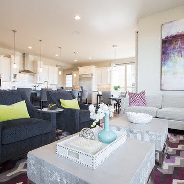
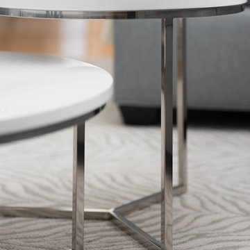
This colorful family room mixes plum, lime green and a touch of sea glass blue. The sea glass blue is seen here in the multi-sized ceramic wall hung chargers by Global Views. The geometric area rug from Surya gives the room a bold pop of color. The two matching concrete & steel coffee tables avoid feeling "too cold" by being surrounded by the mix of colors and textures in the room.
 Olamar Interiors
These Northern Virginia residents have owned this vacation home for about ten years. With retirement imminent, they decided to give the entire home an over-haul. With it’s great bones and amazing location, this seemed like a very sound investment for their future. Paola McDonald from Olamar Interiors had been working with the clients for the past three years, helping them to renovate their Sterling, VA condominium and their Moorefield, WV weekend home. It seemed fitting that they would also hire her to help them renovate this home as well.
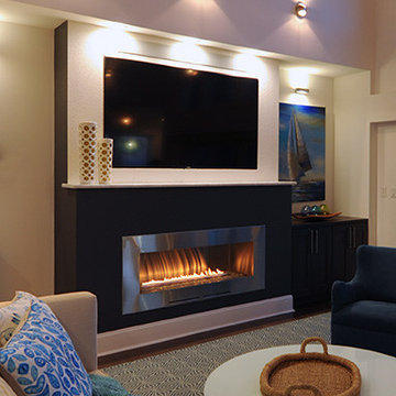
For this project we took the home down to the studs and practically rebuilt it. The renovation includes an addition to the basement level and main floor to create a new fitness room, additional guest bedroom and larger kitchen and dining area. It also included a renovation of the facade of the home. The exterior of the home was completely re-sided and painted, and we added the tall windows at the stairs. The lower entry deck was expanded and an upper deck was added just off the kitchen in order for the homeowner to keep his grill away from the strong ocean winds. A new deck was also added off of the master bedroom. New stainless steel railings were added to all the decks. We opened the homes stairwells, adding custom glass railings and new lighting to create a much more open feel and allow for natural light to flood the entire main living area. The original, tiny kitchen was expanded substantially, adding a large custom eat in bar, wine storage area and plenty of storage. We utilized Decora’s Marquis Cabinetry in an espresso finish to give the kitchen a very clean, contemporary feel. Carrara marble countertops paired with a grey quartz, single slap marble backsplash, and stainless appliances create a clean look. In the new dining area, a simple Modloft dining table was paired with a Regina Andrew bubbles chandelier and Jessica Charles dining chairs for a sophisticated feel accentuated perfectly by beachy colors and textures that tie in the beautiful views of the Ocean. A custom chandelier from John Pomp is the highlight of the family room, particularly at night when it is reminiscent to fireflies in the sky. A new custom designed, custom made sectional, cozy newly added Spark Modern Fires gas fireplace, custom rug by Julie Dasher and Lee Industries chairs create a cozy place to lounge and watch television after a long day at the beach. Guests feel like they are in a luxurious boutique hotel complete with spectacular views, comfortable Ann Gish linens and beautiful and unique lighting fixtures. All three full baths and the powder room received complete facelifts with new glass, marble and ceramic tiles, Decora cabinetry, new lighting fixtures, quartz countertops and unique features that make unique statements in each one. Phillip Jeffries mica wallpaper are used in the entryway and family room fireplace walls to add a sandy texture to each space. Phillip Jeffries grasscloth was added to the master bedroom accent wall to create a delicate feature. New flooring throughout includes gorgeous dark stained hardwood floors, ceramic tile and Karastan carpeting in the bedrooms. The crisp white and grey walls are accentuated throughout the home by beach inspired turquoises, navies and lime greens. Perfectly appointed furnishings, artwork, accessories and custom made window treatments complete the look and feel of this gorgeous vacation home.
Photography by Tinius Photography
Find the right local pro for your project
 Stacey Kocevar Designs, LLC
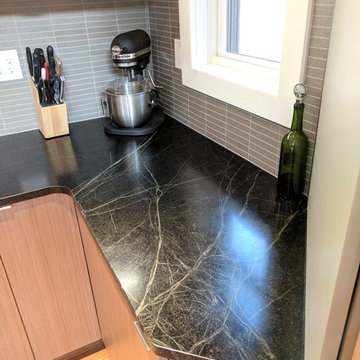
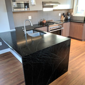
This space was an addition off of an existing small living space, which was designed by an architect who created a beautifully dramatic, two-story, living space by angling walls and making the living room area 2 stories high, with an overlook at the top of the spiral staircase to the second floor. The appliances were already set in place, and the homeowners did not want to move the existing plumbing, electrical, or venting, so I had to work within those parameters. They wanted a contemporary, industrial, feel for the kitchen, which I believe is described as Midcentry Modern, was acheived by using slab-style doors and drawers, mixing painted with walnut veneered finishes, along with other custom and unique items. The soapstone was a must-have for the homeowners, providing a source for the painted cabinetry color, which draws out the beautiful veins in the countertop. They needed pantry space, and as much usable storage as possible for the space, which included the angled wall that the refrigerator was on, along with not crowding the walk space between that wall and the necessary column adjacent to it. By building in the refrigerator with panels on either side to conceal the refrigerator "box", I was able to create a storage section which included a 2-drawer base for storage of larger items, with 2 pantries flanking either end, with contrasting walnut floating shelves in between. along with that custom section, in order to provide additional storage, and counter space, I created a free-standing piece, which had to feel like a part of the kitchen, yet also feel like a furniture piece, when viewed from the living room. In order to achieve that look, I used 3" wide columns to frame the piece, which I also repeated as floating shelves in the middle, to house their crockpot, but most importantly, a "home" for their roomba. The island also provided the space for separate pull-out trash and recycling bins, which I did not have space for elsewhere. Collaborating with the homeowners on this project enabled me to design a kitchen that was in a style that I hadn't had the opportunity to design in before, and I now appreciate and love this style myself!
 Stacey Kocevar Designs, LLC
This space was an addition off of an existing small living space, which was designed by an architect who created a beautifully dramatic, two-story, living space by angling walls and making the living room area 2 stories high, with an overlook at the top of the spiral staircase to the second floor. The appliances were already set in place, and the homeowners did not want to move the existing plumbing, electrical, or venting, so I had to work within those parameters. They wanted a contemporary, industrial, feel for the kitchen, which I believe is described as Midcentry Modern, was acheived by using slab-style doors and drawers, mixing painted with walnut veneered finishes, along with other custom and unique items. The soapstone was a must-have for the homeowners, providing a source for the painted cabinetry color, which draws out the beautiful veins in the countertop. They needed pantry space, and as much usable storage as possible for the space, which included the angled wall that the refrigerator was on, along with not crowding the walk space between that wall and the necessary column adjacent to it. By building in the refrigerator with panels on either side to conceal the refrigerator "box", I was able to create a storage section which included a 2-drawer base for storage of larger items, with 2 pantries flanking either end, with contrasting walnut floating shelves in between. along with that custom section, in order to provide additional storage, and counter space, I created a free-standing piece, which had to feel like a part of the kitchen, yet also feel like a furniture piece, when viewed from the living room. In order to achieve that look, I used 3" wide columns to frame the piece, which I also repeated as floating shelves in the middle, to house their crockpot, but most importantly, a "home" for their roomba. The island also provided the space for separate pull-out trash and recycling bins, which I did not have space for elsewhere. Collaborating with the homeowners on this project enabled me to design a kitchen that was in a style that I hadn't had the opportunity to design in before, and I now appreciate and love this style myself!
 Bilotta Kitchen & Home
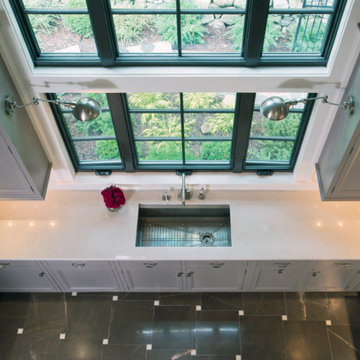
This two-toned kitchen was designed by Paula Greer, CKD of Bilotta Kitchens with Robin Zahn of Robin Prince Zahn Architecture. The u-shaped space has perimeter cabinets in Bilotta’s own line, the Bilotta Collection in a custom gray paint. The island is Wood-Mode Cabinetry in cherry with a stain. Countertops are Caesarstone’s London Grey with a built-in walnut cutting board on one corner of the island from Brooks Custom. The custom Madison Hood by Rangecraft is in a Dark Antique Steel finish and extends up accentuating the high ceiling above the cooking triangle. Two of the most interesting elements of this space are the banquette area and the coffered ceilings. By far, the most frequent installation of banquettes is tucking them into a corner of the room, regardless of how much seating is available at the island. In this kitchen, the island provides enough space for four to five stools. But because the space is separated from the rest of the house, the client wanted to ensure there was sufficient seating for their frequent entertaining. Also, the house is situated in a secluded wooded area; the new kitchen includes an abundance of unobstructed windows to fully experience the beautiful outdoor surroundings. The corner banquette (under more windows!) makes it feel like you’re dining in the trees. The bonus feature is that there’s extra storage below for table linens or seldom-used serving pieces. This really functions like a couch, complete with throw pillows and a TV, where the empty-nesters love spending time even when it isn’t mealtime. As for the ceiling, coffers don’t necessarily have to be large and intricately detailed with layers of moldings in order to be effective. This kitchen features two different ceiling heights: a small section of an addition contains a vaulted ceiling, while the larger island and eating area are tucked under a 2nd floor balcony and bedrooms. The client wanted to distinguish the lower area from the vaulted section, but in a subtle manner. The architect chose to implement shallow coffers with minimal trim for a softer result. The geometric pattern also reflects the floor tile and other lines within the room. The most interesting aspect, though, is that the vaulted area is actually concealed from view when you’re standing in the breakfast area; but as you approach the sink and window, the ceiling explodes above you for a visual surprise. And lastly, of course during this time of “work from home” the desk tucked in a nook opposite the banquette creates the perfect space for Zoom meetings, email checking and just the day-to-day activities we used to go into the office to do. The kitchen is an all-around perfect space for cooking, entertaining, relaxing or working!
Bilotta Designer: Paula Greer
Photographer: Philip Jensen-Carter
Architect: Robin Prince Zahn Architecture
 Stacey Kocevar Designs, LLC
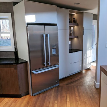
This space was an addition off of an existing small living space, which was designed by an architect who created a beautifully dramatic, two-story, living space by angling walls and making the living room area 2 stories high, with an overlook at the top of the spiral staircase to the second floor. The appliances were already set in place, and the homeowners did not want to move the existing plumbing, electrical, or venting, so I had to work within those parameters. They wanted a contemporary, industrial, feel for the kitchen, which I believe is described as Midcentry Modern, was acheived by using slab-style doors and drawers, mixing painted with walnut veneered finishes, along with other custom and unique items. The soapstone was a must-have for the homeowners, providing a source for the painted cabinetry color, which draws out the beautiful veins in the countertop. They needed pantry space, and as much usable storage as possible for the space, which included the angled wall that the refrigerator was on, along with not crowding the walk space between that wall and the necessary column adjacent to it. By building in the refrigerator with panels on either side to conceal the refrigerator "box", I was able to create a storage section which included a 2-drawer base for storage of larger items, with 2 pantries flanking either end, with contrasting walnut floating shelves in between. along with that custom section, in order to provide additional storage, and counter space, I created a free-standing piece, which had to feel like a part of the kitchen, yet also feel like a furniture piece, when viewed from the living room. In order to achieve that look, I used 3" wide columns to frame the piece, which I also repeated as floating shelves in the middle, to house their crockpot, but most importantly, a "home" for their roomba. The island also provided the space for separate pull-out trash and recycling bins, which I did not have space for elsewhere. Collaborating with the homeowners on this project enabled me to design a kitchen that was in a style that I hadn't had the opportunity to design in before, and I now appreciate and love this style myself!

Sponsored
Sunbury, OH

J.Holderby - Renovations
Franklin County's Leading General Contractors - 2X Best of Houzz!
 Sosna Inc
Our clients approached us to renovate their loved family home. The Main Floor needed a fresh update, and better functionality and storage to fit the needs of their growing family.
The existing Kitchen felt closed off from the rest of the Main Floor, and the layout did not allow for enough countertop or storage space. Each of their Bathrooms also needed an update and better storage.
Due to a previously bad experience with another contractor previously, it was important for our clients to work with a contractor who they could build trust with, and feel respected by and comfortable with.
Using space from an extra stairway in the side entry of the house, we were able to create a spacious mudroom, perfect for taking a seat to put on or take off coats and boots, and unique, hidden storage for seasonal and outdoor items.
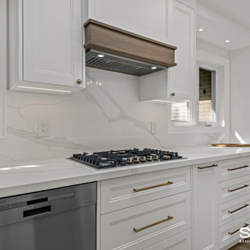
We were able to create a more open concept Main Floor, by removing the walls between the Kitchen and Family Room. This allowed for a larger, more functional Kitchen. The new Kitchen is bright and welcoming with white quartz countertops that run seamlessly into a matching backsplash. Beautiful white cabinetry is complemented by brushed bronze pulls and faucets, and durable, contemporary flooring.
We transformed the Kitchen and Family Room areas with a vaulted ceiling, and a repaired and modernized Kitchen skylight. We also integrated a patio door entrance, which combined with both sloped and flat sections of the vaulted ceiling, proved to be quite a challenge!
This project involved skilled welding, roofing, and structural work, and it was important to maintain the structural integrity of the ceiling. As any mistakes could result in serious issues, communication between everyone involved was key! Regular team meetings, updates on progress, and addressing concerns promptly kept everyone on the same page and avoided misunderstandings. In the end, the raised ceiling, skylight, and patio door were well worth the work, as together they enhanced the airiness and visual spaciousness of the space.
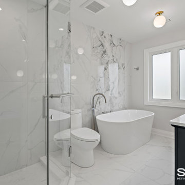
On the Second Floor, we created a larger Master Ensuite by borrowing room from existing closet space. This allowed for a spacious walk-in shower, and separate bathtub. A prefabricated stylish vanity not only adds a pop of colour, but also provides plenty of useful storage. New marble tiling on the floor extends to the wall behind the bathtub, creating a luxurious accent wall.
The Shared Bathroom was updated to include a new walk-in shower, and a separate bathtub, surrounded by modern geometric wall tiles.
The removal of popcorn ceilings, an updated the Front Door, and a refinished Main Staircase with metal railings completed tying the home together, creating a fresh, updated space that this family can enjoy for years to come.

 Landscape By Diane
Design ideas for a large contemporary partial sun backyard gravel vegetable garden landscape in Los Angeles for summer.
 Michael SolariCompany
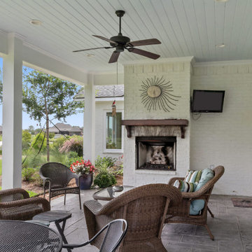
The Rear Porch is divided into 2 sections. This side is for entertaining and the smaller section is for cooking. The cook area ceiling is vaulted with an open end for BBQ smoke to exit, and the larger entertaining area, shown here, has a tall flat ceiling.
 Brooks + Scarpa Architects
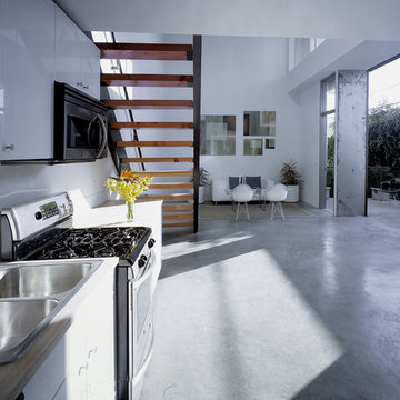
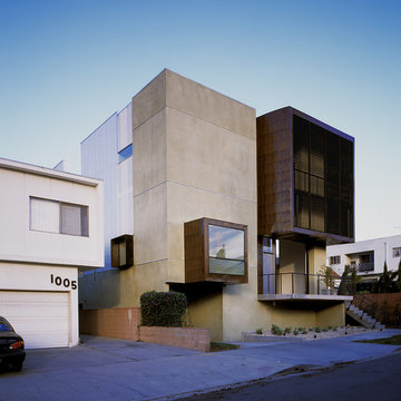
Located in a neighborhood characterized by traditional bungalow style single-family residences, Orange Grove is a new landmark for the City of West Hollywood. The building is sensitively designed and compatible with the neighborhood, but differs in material palette and scale from its neighbors. Referencing architectural conventions of modernism rather than the pitched roof forms of traditional domesticity, the project presents a characteristic that is consistent with the eclectic and often unconventional demographic of West Hollywood. Distinct from neighboring structures, the building creates a strong relationship to the street by virtue of its large amount of highly usable balcony area in the front façade.
While there are dramatic and larger scale elements that define the building, it is also broken down into comprehensible human scale parts, and is itself broken down into two different buildings. Orange Grove displays a similar kind of iconoclasm as the Schindler House, an icon of California modernism, located a short distance away. Like the Schindler House, the conventional architectural elements of windows and porches become part of an abstract sculptural ensemble. At the Schindler House, windows are found in the gaps between structural concrete wall panels. At Orange Grove, windows are inserted in gaps between different sections of the building.
The design of Orange Grove is generated by a subtle balance of tensions. Building volumes and the placement of windows, doors and balconies are not static but rather constitute an active three-dimensional composition in motion. Each piece of the building is a strong and clearly defined shape, such as the corrugated metal surround that encloses the second story balcony in the east and north facades. Another example of this clear delineation is the use of two square profile balcony surrounds in the front façade that set up a dialogue between them—one is small, the other large, one is open at the front, the other is veiled with stainless steel slats. At the same time each balcony is balanced and related to other elements in the building, the smaller one to the driveway gate below and the other to the roll-up door and first floor balcony. Each building element is intended to read as an abstract form in itself—such as a window becoming a slit or windows becoming a framed box, while also becoming part of a larger whole. Although this building may not mirror the status quo it answers to the desires of consumers in a burgeoning niche market who want large, simple interior volumes of space, and a paradigm based on space, light and industrial materials of the loft rather than the bungalow.
 Barrie Renovations
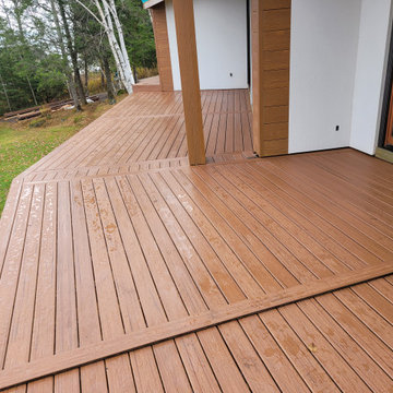
This is an older house on the water with the customer wanting to refurbish and enlarge a new deck.
It had support structure issues because of rotting wood and required new piers, posts, beams, joists, top, and railings in addition to making the footprint of the deck a little larger, removing some of the angles and tight access points between sections and add usable living space.
To accomplish this, we used pressure treated beams and post supports, for strength, a new deck top with a stylish engineered top deck, and metal railings, to help increase safety and visibility. We have also created a new larger facia design feature so it can be seen from the water and to give the deck a much more robust depth for style.
 A. Klein Interior Design LLC
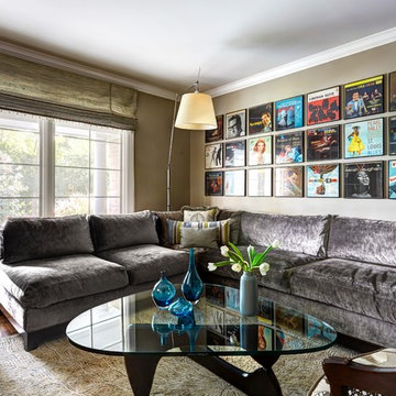
This is a small living room right off the entry to a larger home. The clients wanted this space to set the tone for the home as one that is sophisticated and fun. The simple clean lines of the sectional sofa allow the other pieces in the room to play starring roles. We blended the styles of an antique chair, a classic mid-century table and several other quirky pieces to make a cohesive design statement. Kaskel Photo
Sponsored
Sunbury, OH
J.Holderby - Renovations
Franklin County's Leading General Contractors - 2X Best of Houzz!
 Brooks + Scarpa Architects
Located in a neighborhood characterized by traditional bungalow style single-family residences, Orange Grove is a new landmark for the City of West Hollywood. The building is sensitively designed and compatible with the neighborhood, but differs in material palette and scale from its neighbors. Referencing architectural conventions of modernism rather than the pitched roof forms of traditional domesticity, the project presents a characteristic that is consistent with the eclectic and often unconventional demographic of West Hollywood. Distinct from neighboring structures, the building creates a strong relationship to the street by virtue of its large amount of highly usable balcony area in the front façade.
While there are dramatic and larger scale elements that define the building, it is also broken down into comprehensible human scale parts, and is itself broken down into two different buildings. Orange Grove displays a similar kind of iconoclasm as the Schindler House, an icon of California modernism, located a short distance away. Like the Schindler House, the conventional architectural elements of windows and porches become part of an abstract sculptural ensemble. At the Schindler House, windows are found in the gaps between structural concrete wall panels. At Orange Grove, windows are inserted in gaps between different sections of the building.
The design of Orange Grove is generated by a subtle balance of tensions. Building volumes and the placement of windows, doors and balconies are not static but rather constitute an active three-dimensional composition in motion. Each piece of the building is a strong and clearly defined shape, such as the corrugated metal surround that encloses the second story balcony in the east and north facades. Another example of this clear delineation is the use of two square profile balcony surrounds in the front façade that set up a dialogue between them—one is small, the other large, one is open at the front, the other is veiled with stainless steel slats. At the same time each balcony is balanced and related to other elements in the building, the smaller one to the driveway gate below and the other to the roll-up door and first floor balcony. Each building element is intended to read as an abstract form in itself—such as a window becoming a slit or windows becoming a framed box, while also becoming part of a larger whole. Although this building may not mirror the status quo it answers to the desires of consumers in a burgeoning niche market who want large, simple interior volumes of space, and a paradigm based on space, light and industrial materials of the loft rather than the bungalow.
 Legendary Escapes Pools
This project began as a wilderness retreat for the homeowners at their rural estate. They already had a large outdoor area complete with a pond, and detached garage in the perfect location to tie into an outdoor entertaining area/kitchen for the swimming pool. The homeowners were hoping that the design team at Legendary Escapes could create something magical for their small grandchildren, and for the grownups to enjoy for summertime relaxation.
When the discussion turned to themes, the cartoon SpongeBob came up, and our team found a direction to go, either to the homeowners delight, possibly mixed with a bit of apprehension at the thought of a cartoony theme as a result. We promised subtle surprise and delight - and the homeowner decided to let the team go with their vision. The pool is a very abundant sized swimming pool, much larger than the average residential swimming pool. The sunledge was also made larger after the pool layout, providing even more space for chairs and play area for small children. One of the special surprises the owners didn't even know about until after they were in were the secret port holes that were re-seated with magnifying glass - and showcased miniature characters behind them, that when viewed through the glass looked giant in size.
The waterfall/slide combination also features a large grotto - themed and decorated with elements that remind visitors to the space of the lessons and themes of the cartoon. The castle is solid, carved concrete - mixed and sculpted on site and hand placed. As the waterfall began to take shape, the outside was created as a sand castle, providing the perfect whimsical backdrop for the slide, and accents including a pair of flipper outfitted legs of what we can only think is mermaid man.
One of the biggest surprises on this project came when Al found an old wooden boat at an auction, which he bought, took back to the job and cut it in half - creating the tail end of a boating incident, much like SpongeBob would have had when he missed the direction of the curve sign while out boating. (The joke in the show is that he can't ever get his drivers license because he doesn't know how to steer.) The other end of the boat became a vertical storage space for firewood or other pool side needs. The two parts of the boat became anchor pieces for what became the "wharf wall" which is the perfect area to lead people into the swimming pool retreat.
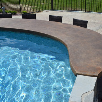
The pool has three different entertaining patio levels, including the lower wharf level, swim up bar and raised concrete counter at the deep end of the pool. The middle section of patio is perfect for relaxing and watching kids play in the pool with the deck jets and sun ledge, and the upper area is adjacent to the outdoor kitchen area, also designed and created out of concrete (carved timbers) as the cabinetry and under bar areas.
The pool was completed with ecoFinish on the sun ledge, interior of the spa, grotto and the slide. The main swimming area of the pool was vinyl liner, constructed in the special hybrid way of the team.
With the project complete, the homeowners and family thoroughly enjoyed their backyard retreat. Any hesitation at the initial theme ideas were fully appreciated as they developed along the way, with the final project a subtle blend of function and whimsy, meeting everything that they could have asked for in a backyard entertaining retreat. Their advice is to just trust Al and the team through the process, because the results will be more than you would ever hope for. If our team can help you create a backyard or custom retreat, which includes a pool and plenty of outdoor entertaining options to surprise and delight you and your family, please reach out to start your design discussions.
 User
UserSight & Sound
This clean modern south Oakville Ontario remodel proves you don’t need to move
to a condo to completely update your surroundings.
These Oakville empty nesters with an active social life aren't interested in “fuddy-duddy” decor.
On the contrary, they are interested in the latest design trends, as well as the most current audio/visual components.
The original stone fireplace was updated with a custom designed mantle and a new gas insert. The updated warm grey
colour palette balances the natural stone making it an inviting focal point. The interior design included reconfiguring the room layout. Originally a smaller TV was located in-between the window and the fireplace and the sofa was where the current cabinet is now.
Our new layout opens up the room taking full advantage of it’s size. The sumptuous sectional allows for relaxed tete a tete
evenings as well as seating for larger groups. The additional leather occasional chair completes the conversation circle too. We naturally selected fabrics that are family friendly to ensure the grandchildren and adults can all be at ease. The flexibility of the 3
piece coffee table is both practical and adds an element of modern artistry. Grounding the room is a carpet graphic grey animal
skin custom sized into an area rug. Components as well as miscellaneous items are easily stored in the customised wood cabinet.
Stephani Buchman Photography
 Say Yes to the Dresser
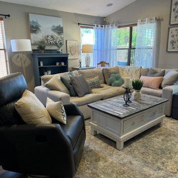
This is after the space was designed and new items were placed. Much better utilization of the space. Lighter and brighter, and very inviting. There is added lighting through lamps, a larger area rug and an overall more cohesive feel to the color scheme and room. Pictured is the new modular sofa, armchair, coffee table, bookcase and additional furniture.
Sponsored
Columbus, OH

Hope Restoration & General Contracting
Columbus Design-Build, Kitchen & Bath Remodeling, Historic Renovations
 Say Yes to the Dresser
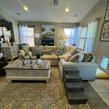
This is after the space was designed and new items were placed. Much better utilization of the space. Lighter and brighter, and very inviting. There is added lighting through lamps, a larger area rug and an overall more cohesive feel to the color scheme and room. Pictured is the new modular sofa, armchair, coffee table, bookcase and additional furniture.
 Donna Livingston Design
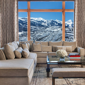
Dramatic settings make this home renovation in Colorado’s Rocky Mountains a stellar project in every way. Rooms were transformed through the clever use of scale, light and furnishings.
All the furniture for this project was custom-made in Los Angeles and shipped all at once creating a turnkey project. Floors and wood trim were refinished in the living/dining room and new window coverings give the appearance of the windows being larger in scale simply by removing the overhead beams to give a more spacious effect overall.
Also, a custom sectional designed by Donna Livingston Design, is upholstered with Rose Tarlow fabric and is trimmed with a dark blue leather cord welt by Samuel & Son. The end result – lots of good vibes and good energy.
 Sosna Inc
Our clients approached us to renovate their loved family home. The Main Floor needed a fresh update, and better functionality and storage to fit the needs of their growing family.
The existing Kitchen felt closed off from the rest of the Main Floor, and the layout did not allow for enough countertop or storage space. Each of their Bathrooms also needed an update and better storage.
Due to a previously bad experience with another contractor previously, it was important for our clients to work with a contractor who they could build trust with, and feel respected by and comfortable with.
Using space from an extra stairway in the side entry of the house, we were able to create a spacious mudroom, perfect for taking a seat to put on or take off coats and boots, and unique, hidden storage for seasonal and outdoor items.
We were able to create a more open concept Main Floor, by removing the walls between the Kitchen and Family Room. This allowed for a larger, more functional Kitchen. The new Kitchen is bright and welcoming with white quartz countertops that run seamlessly into a matching backsplash. Beautiful white cabinetry is complemented by brushed bronze pulls and faucets, and durable, contemporary flooring.
We transformed the Kitchen and Family Room areas with a vaulted ceiling, and a repaired and modernized Kitchen skylight. We also integrated a patio door entrance, which combined with both sloped and flat sections of the vaulted ceiling, proved to be quite a challenge!
This project involved skilled welding, roofing, and structural work, and it was important to maintain the structural integrity of the ceiling. As any mistakes could result in serious issues, communication between everyone involved was key! Regular team meetings, updates on progress, and addressing concerns promptly kept everyone on the same page and avoided misunderstandings. In the end, the raised ceiling, skylight, and patio door were well worth the work, as together they enhanced the airiness and visual spaciousness of the space.
On the Second Floor, we created a larger Master Ensuite by borrowing room from existing closet space. This allowed for a spacious walk-in shower, and separate bathtub. A prefabricated stylish vanity not only adds a pop of colour, but also provides plenty of useful storage. New marble tiling on the floor extends to the wall behind the bathtub, creating a luxurious accent wall.
The Shared Bathroom was updated to include a new walk-in shower, and a separate bathtub, surrounded by modern geometric wall tiles.
The removal of popcorn ceilings, an updated the Front Door, and a refinished Main Staircase with metal railings completed tying the home together, creating a fresh, updated space that this family can enjoy for years to come.
33