
Search results for "Limited practice" in Home Design Ideas
 Rocky Tops Granite & Marble LLC
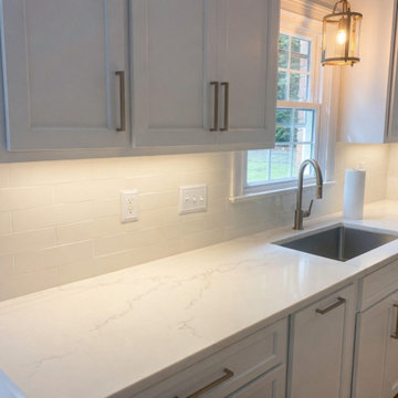
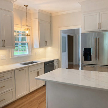
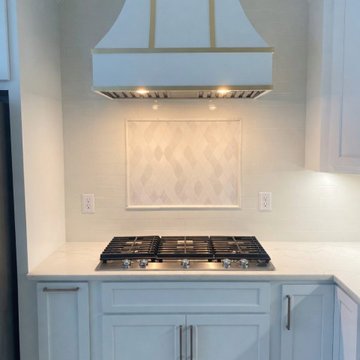
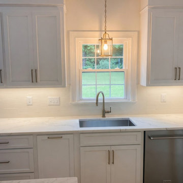
Spectrums Indulgence quartz, manufactured right here in Latta South Carolina, went into this kitchen in Columbia, and it's the kind of stone that works quietly hard in a room people actually cook and live in. It's engineered quartz, so what you're looking at is a mix of ground quartz and resin, blended and pressed to give a background that stays consistent slab to slab. That matters more than people think when you're trying to keep a kitchen looking pulled together across a run of cabinets, an island, and a backsplash.
The color reads as a soft, workable background with movement in it, enough character to give the room some depth without turning into something that fights with the cabinets or the floor. That's the appeal of a pattern like this one. It's not a plain solid, but it's not so busy that it limits what else goes in the space. Kitchens live a long time with the same countertop, and a stone that holds up visually over the years is worth choosing over something flashier that gets tiring.
Quartz like this is also just practical for a working kitchen. It doesn't need sealing the way natural stone does, it resists staining from wine, oil, and citrus, and it shrugs off the daily scratches from knives and pans that would show on a softer stone. Heat is the one thing we tell people to respect, a hot pan straight off the stove can shock the resin, so a trivet is the smart habit to build. Otherwise it's about as low-maintenance a surface as you can put in a kitchen.
We set the edge as eased, which is the clean, simple choice that lets the stone itself do the talking instead of the profile. Templating and fabrication on a job like this comes down to getting the seams tight and matching the pattern across the island and the runs so it reads as one continuous piece even where the slabs meet.
Jobs like this are what we like doing around Columbia and the rest of the Midlands, where a kitchen remodel means getting the material, the layout, and the fit all right in a space a family's going to use every single day.
 Rocky Tops Granite & Marble LLC
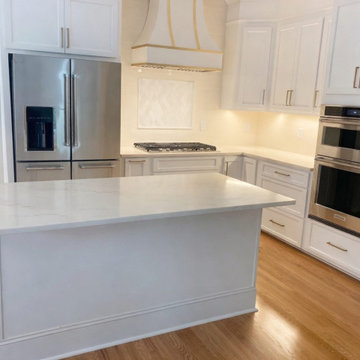
Spectrums Indulgence quartz, manufactured right here in Latta South Carolina, went into this kitchen in Columbia, and it's the kind of stone that works quietly hard in a room people actually cook and live in. It's engineered quartz, so what you're looking at is a mix of ground quartz and resin, blended and pressed to give a background that stays consistent slab to slab. That matters more than people think when you're trying to keep a kitchen looking pulled together across a run of cabinets, an island, and a backsplash.
The color reads as a soft, workable background with movement in it, enough character to give the room some depth without turning into something that fights with the cabinets or the floor. That's the appeal of a pattern like this one. It's not a plain solid, but it's not so busy that it limits what else goes in the space. Kitchens live a long time with the same countertop, and a stone that holds up visually over the years is worth choosing over something flashier that gets tiring.
Quartz like this is also just practical for a working kitchen. It doesn't need sealing the way natural stone does, it resists staining from wine, oil, and citrus, and it shrugs off the daily scratches from knives and pans that would show on a softer stone. Heat is the one thing we tell people to respect, a hot pan straight off the stove can shock the resin, so a trivet is the smart habit to build. Otherwise it's about as low-maintenance a surface as you can put in a kitchen.
We set the edge as eased, which is the clean, simple choice that lets the stone itself do the talking instead of the profile. Templating and fabrication on a job like this comes down to getting the seams tight and matching the pattern across the island and the runs so it reads as one continuous piece even where the slabs meet.
Jobs like this are what we like doing around Columbia and the rest of the Midlands, where a kitchen remodel means getting the material, the layout, and the fit all right in a space a family's going to use every single day.
 Rocky Tops Granite & Marble LLC
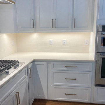
Spectrums Indulgence quartz, manufactured right here in Latta South Carolina, went into this kitchen in Columbia, and it's the kind of stone that works quietly hard in a room people actually cook and live in. It's engineered quartz, so what you're looking at is a mix of ground quartz and resin, blended and pressed to give a background that stays consistent slab to slab. That matters more than people think when you're trying to keep a kitchen looking pulled together across a run of cabinets, an island, and a backsplash.
The color reads as a soft, workable background with movement in it, enough character to give the room some depth without turning into something that fights with the cabinets or the floor. That's the appeal of a pattern like this one. It's not a plain solid, but it's not so busy that it limits what else goes in the space. Kitchens live a long time with the same countertop, and a stone that holds up visually over the years is worth choosing over something flashier that gets tiring.
Quartz like this is also just practical for a working kitchen. It doesn't need sealing the way natural stone does, it resists staining from wine, oil, and citrus, and it shrugs off the daily scratches from knives and pans that would show on a softer stone. Heat is the one thing we tell people to respect, a hot pan straight off the stove can shock the resin, so a trivet is the smart habit to build. Otherwise it's about as low-maintenance a surface as you can put in a kitchen.
We set the edge as eased, which is the clean, simple choice that lets the stone itself do the talking instead of the profile. Templating and fabrication on a job like this comes down to getting the seams tight and matching the pattern across the island and the runs so it reads as one continuous piece even where the slabs meet.
Jobs like this are what we like doing around Columbia and the rest of the Midlands, where a kitchen remodel means getting the material, the layout, and the fit all right in a space a family's going to use every single day.
Find the right local pro for your project

 ASR DESIGN STUDIO
Our mission was to create an ocean and California lifestyle-inspired space that would invite consistent clicks, bookings and five-star reviews.
To make the most of the great location, we designed Project 11 for travelling singles and couples searching for a cozy and welcoming condo within walking distance to downtown San Diego.
Project 11 would also be used by our clients when it was unoccupied, so it had to be practical, functional and beautiful, too.
Our clients had a limited budget, so we got thrifty and sourced furnishings from Target, Ikea, Amazon and Etsy.
The oversized art prints – which set the tone for our relaxing and soothing beachy theme – were hunted down and found at Etsy of California Lifestyle.
We made the most of layers, colors and texture to create spaces that conjured calming ocean vibes and felt wholeheartedly welcoming.
We couldn’t repaint the walls, but they gave us a neutral color palette to work with. We built on it by adding in pops of color while maintaining a minimalist approach to understated style.
Then we had some fun and added in cute touches like Cali and San Diego inspired mugs, an adorable Kerig to tie in the colors of the ocean again, a swivel chair to view the sunrise and sunset and a totally pimped-out kitchen with all the cooking accessories a guest would need to feel at home in Project 11.
By the time we were done, we were tempted to scoop up the first available booking for ourselves!
Finally, we invested our energy in designing for effortless functionality so our client’s guests had everything they needed during their stay.
Photography: Meg Marie
 Rocky Tops Granite & Marble LLC
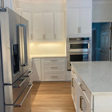
Spectrums Indulgence quartz, manufactured right here in Latta South Carolina, went into this kitchen in Columbia, and it's the kind of stone that works quietly hard in a room people actually cook and live in. It's engineered quartz, so what you're looking at is a mix of ground quartz and resin, blended and pressed to give a background that stays consistent slab to slab. That matters more than people think when you're trying to keep a kitchen looking pulled together across a run of cabinets, an island, and a backsplash.
The color reads as a soft, workable background with movement in it, enough character to give the room some depth without turning into something that fights with the cabinets or the floor. That's the appeal of a pattern like this one. It's not a plain solid, but it's not so busy that it limits what else goes in the space. Kitchens live a long time with the same countertop, and a stone that holds up visually over the years is worth choosing over something flashier that gets tiring.
Quartz like this is also just practical for a working kitchen. It doesn't need sealing the way natural stone does, it resists staining from wine, oil, and citrus, and it shrugs off the daily scratches from knives and pans that would show on a softer stone. Heat is the one thing we tell people to respect, a hot pan straight off the stove can shock the resin, so a trivet is the smart habit to build. Otherwise it's about as low-maintenance a surface as you can put in a kitchen.
We set the edge as eased, which is the clean, simple choice that lets the stone itself do the talking instead of the profile. Templating and fabrication on a job like this comes down to getting the seams tight and matching the pattern across the island and the runs so it reads as one continuous piece even where the slabs meet.
Jobs like this are what we like doing around Columbia and the rest of the Midlands, where a kitchen remodel means getting the material, the layout, and the fit all right in a space a family's going to use every single day.
 ASR DESIGN STUDIO
Our mission was to create an ocean and California lifestyle-inspired space that would invite consistent clicks, bookings and five-star reviews.
To make the most of the great location, we designed Project 11 for travelling singles and couples searching for a cozy and welcoming condo within walking distance to downtown San Diego.
Project 11 would also be used by our clients when it was unoccupied, so it had to be practical, functional and beautiful, too.
Our clients had a limited budget, so we got thrifty and sourced furnishings from Target, Ikea, Amazon and Etsy.
The oversized art prints – which set the tone for our relaxing and soothing beachy theme – were hunted down and found at Etsy of California Lifestyle.
We made the most of layers, colors and texture to create spaces that conjured calming ocean vibes and felt wholeheartedly welcoming.
We couldn’t repaint the walls, but they gave us a neutral color palette to work with. We built on it by adding in pops of color while maintaining a minimalist approach to understated style.
Then we had some fun and added in cute touches like Cali and San Diego inspired mugs, an adorable Kerig to tie in the colors of the ocean again, a swivel chair to view the sunrise and sunset and a totally pimped-out kitchen with all the cooking accessories a guest would need to feel at home in Project 11.
By the time we were done, we were tempted to scoop up the first available booking for ourselves!
Finally, we invested our energy in designing for effortless functionality so our client’s guests had everything they needed during their stay.
Photography: Meg Marie
 Rocky Tops Granite & Marble LLC
Spectrums Indulgence quartz, manufactured right here in Latta South Carolina, went into this kitchen in Columbia, and it's the kind of stone that works quietly hard in a room people actually cook and live in. It's engineered quartz, so what you're looking at is a mix of ground quartz and resin, blended and pressed to give a background that stays consistent slab to slab. That matters more than people think when you're trying to keep a kitchen looking pulled together across a run of cabinets, an island, and a backsplash.
The color reads as a soft, workable background with movement in it, enough character to give the room some depth without turning into something that fights with the cabinets or the floor. That's the appeal of a pattern like this one. It's not a plain solid, but it's not so busy that it limits what else goes in the space. Kitchens live a long time with the same countertop, and a stone that holds up visually over the years is worth choosing over something flashier that gets tiring.
Quartz like this is also just practical for a working kitchen. It doesn't need sealing the way natural stone does, it resists staining from wine, oil, and citrus, and it shrugs off the daily scratches from knives and pans that would show on a softer stone. Heat is the one thing we tell people to respect, a hot pan straight off the stove can shock the resin, so a trivet is the smart habit to build. Otherwise it's about as low-maintenance a surface as you can put in a kitchen.
We set the edge as eased, which is the clean, simple choice that lets the stone itself do the talking instead of the profile. Templating and fabrication on a job like this comes down to getting the seams tight and matching the pattern across the island and the runs so it reads as one continuous piece even where the slabs meet.
Jobs like this are what we like doing around Columbia and the rest of the Midlands, where a kitchen remodel means getting the material, the layout, and the fit all right in a space a family's going to use every single day.

Sponsored
Delaware, OH

Buckeye Basements, Inc.
Central Ohio's Basement Finishing ExpertsBest Of Houzz '13-'21
 Rocky Tops Granite & Marble LLC
Spectrums Indulgence quartz, manufactured right here in Latta South Carolina, went into this kitchen in Columbia, and it's the kind of stone that works quietly hard in a room people actually cook and live in. It's engineered quartz, so what you're looking at is a mix of ground quartz and resin, blended and pressed to give a background that stays consistent slab to slab. That matters more than people think when you're trying to keep a kitchen looking pulled together across a run of cabinets, an island, and a backsplash.
The color reads as a soft, workable background with movement in it, enough character to give the room some depth without turning into something that fights with the cabinets or the floor. That's the appeal of a pattern like this one. It's not a plain solid, but it's not so busy that it limits what else goes in the space. Kitchens live a long time with the same countertop, and a stone that holds up visually over the years is worth choosing over something flashier that gets tiring.
Quartz like this is also just practical for a working kitchen. It doesn't need sealing the way natural stone does, it resists staining from wine, oil, and citrus, and it shrugs off the daily scratches from knives and pans that would show on a softer stone. Heat is the one thing we tell people to respect, a hot pan straight off the stove can shock the resin, so a trivet is the smart habit to build. Otherwise it's about as low-maintenance a surface as you can put in a kitchen.
We set the edge as eased, which is the clean, simple choice that lets the stone itself do the talking instead of the profile. Templating and fabrication on a job like this comes down to getting the seams tight and matching the pattern across the island and the runs so it reads as one continuous piece even where the slabs meet.
Jobs like this are what we like doing around Columbia and the rest of the Midlands, where a kitchen remodel means getting the material, the layout, and the fit all right in a space a family's going to use every single day.
 ASR DESIGN STUDIO
Our mission was to create an ocean and California lifestyle-inspired space that would invite consistent clicks, bookings and five-star reviews.
To make the most of the great location, we designed Project 11 for travelling singles and couples searching for a cozy and welcoming condo within walking distance to downtown San Diego.
Project 11 would also be used by our clients when it was unoccupied, so it had to be practical, functional and beautiful, too.
Our clients had a limited budget, so we got thrifty and sourced furnishings from Target, Ikea, Amazon and Etsy.
The oversized art prints – which set the tone for our relaxing and soothing beachy theme – were hunted down and found at Etsy of California Lifestyle.
We made the most of layers, colors and texture to create spaces that conjured calming ocean vibes and felt wholeheartedly welcoming.
We couldn’t repaint the walls, but they gave us a neutral color palette to work with. We built on it by adding in pops of color while maintaining a minimalist approach to understated style.
Then we had some fun and added in cute touches like Cali and San Diego inspired mugs, an adorable Kerig to tie in the colors of the ocean again, a swivel chair to view the sunrise and sunset and a totally pimped-out kitchen with all the cooking accessories a guest would need to feel at home in Project 11.
By the time we were done, we were tempted to scoop up the first available booking for ourselves!
Finally, we invested our energy in designing for effortless functionality so our client’s guests had everything they needed during their stay.
Photography: Meg Marie
 Rocky Tops Granite & Marble LLC
Spectrums Indulgence quartz, manufactured right here in Latta South Carolina, went into this kitchen in Columbia, and it's the kind of stone that works quietly hard in a room people actually cook and live in. It's engineered quartz, so what you're looking at is a mix of ground quartz and resin, blended and pressed to give a background that stays consistent slab to slab. That matters more than people think when you're trying to keep a kitchen looking pulled together across a run of cabinets, an island, and a backsplash.
The color reads as a soft, workable background with movement in it, enough character to give the room some depth without turning into something that fights with the cabinets or the floor. That's the appeal of a pattern like this one. It's not a plain solid, but it's not so busy that it limits what else goes in the space. Kitchens live a long time with the same countertop, and a stone that holds up visually over the years is worth choosing over something flashier that gets tiring.
Quartz like this is also just practical for a working kitchen. It doesn't need sealing the way natural stone does, it resists staining from wine, oil, and citrus, and it shrugs off the daily scratches from knives and pans that would show on a softer stone. Heat is the one thing we tell people to respect, a hot pan straight off the stove can shock the resin, so a trivet is the smart habit to build. Otherwise it's about as low-maintenance a surface as you can put in a kitchen.
We set the edge as eased, which is the clean, simple choice that lets the stone itself do the talking instead of the profile. Templating and fabrication on a job like this comes down to getting the seams tight and matching the pattern across the island and the runs so it reads as one continuous piece even where the slabs meet.
Jobs like this are what we like doing around Columbia and the rest of the Midlands, where a kitchen remodel means getting the material, the layout, and the fit all right in a space a family's going to use every single day.
 W. S. Feldt General Contractor, Inc.
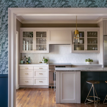
When only one or two people can reasonably be in the kitchen at a given time in a household that is full of people, it’s time to think about possibilities for creating a space where everyone has a spot to fit in. The kitchen in this 1920s Tudor home was dark, constrained, and cut off from the rest of the house. These aspects made for limited functionality when entertaining guests. The goal of this renovation, designed by Kasa Architecture and K&L Interiors, sought to eliminate those characteristics while keeping in the period of the home.
One of the first things completed was to widen the opening which connects the dining room and kitchen. This created more space for the movement of people during a gathering and brightened up both rooms. The fixtures, hardware, and wallpaper were thoughtfully chosen by K&L Interiors to unite the spaces in a style reminiscent of the 1920s. The crown molding throughout the kitchen and the entryway was custom made to match the original.
Next, an extended island was added to the kitchen to provide versatile counter space for entertaining as well as a casual seating area. The island was designed to accommodate a beverage fridge at one end which in turn saves room in the main refrigerator for other things.
Additionally, the doorway at the back of the kitchen was widened and new French doors were installed. This enhanced the kitchen by adding light and easier access to the back deck. In order to widen the back door, the original exterior brick had to be removed. To keep the house looking true to its original appearance, the brick had to be matched and replaced once the doors were installed.
In a small kitchen maximizing space is essential. The design of this renovation accomplished this by re-purposing an existing coat closet. One of the walls in the closet was extended into the entryway of the home and then that space was turned into a walk-in pantry. Other ways storage was generated and counter space maximized was to put a knife block and coffee station enclosed behind cabinet doors.
The end result of this renovation is a bright and open space defined by the period and style of the 1920s with added functionality and practicality of modern times which encompasses casual and formal gatherings.
 ASR DESIGN STUDIO
Our mission was to create an ocean and California lifestyle-inspired space that would invite consistent clicks, bookings and five-star reviews.
To make the most of the great location, we designed Project 11 for travelling singles and couples searching for a cozy and welcoming condo within walking distance to downtown San Diego.
Project 11 would also be used by our clients when it was unoccupied, so it had to be practical, functional and beautiful, too.
Our clients had a limited budget, so we got thrifty and sourced furnishings from Target, Ikea, Amazon and Etsy.
The oversized art prints – which set the tone for our relaxing and soothing beachy theme – were hunted down and found at Etsy of California Lifestyle.
We made the most of layers, colors and texture to create spaces that conjured calming ocean vibes and felt wholeheartedly welcoming.
We couldn’t repaint the walls, but they gave us a neutral color palette to work with. We built on it by adding in pops of color while maintaining a minimalist approach to understated style.
Then we had some fun and added in cute touches like Cali and San Diego inspired mugs, an adorable Kerig to tie in the colors of the ocean again, a swivel chair to view the sunrise and sunset and a totally pimped-out kitchen with all the cooking accessories a guest would need to feel at home in Project 11.
By the time we were done, we were tempted to scoop up the first available booking for ourselves!
Finally, we invested our energy in designing for effortless functionality so our client’s guests had everything they needed during their stay.
Photography: Meg Marie
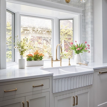
 TKS Design Group
Download our free ebook, Creating the Ideal Kitchen. DOWNLOAD NOW
For many, extra time at home during COVID left them wanting more from their homes. Whether you realized the shortcomings of your space or simply wanted to combat boredom, a well-designed and functional home was no longer a want, it became a need. Tina found herself wanting more from her Old Irving Park home and reached out to The Kitchen Studio about adding function to her kitchen to make the most of the available real estate.
At the end of the day, there is nothing better than returning home to a bright and happy space you love. And this kitchen wasn’t that for Tina. Dark and dated, with a palette from the past and features that didn’t make the most of the available square footage, this remodel required vision and a fresh approach to the space. Lead designer, Stephanie Cole’s main design goal was better flow, while adding greater functionality with organized storage, accessible open shelving, and an overall sense of cohesion with the adjoining family room.
The original kitchen featured a large pizza oven, which was rarely used, yet its footprint limited storage space. The nearby pantry had become a catch-all, lacking the organization needed in the home. The initial plan was to keep the pizza oven, but eventually Tina realized she preferred the design possibilities that came from removing this cumbersome feature, with the goal of adding function throughout the upgraded and elevated space. Eliminating the pantry added square footage and length to the kitchen for greater function and more storage. This redesigned space reflects how she lives and uses her home, as well as her love for entertaining.
The kitchen features a classic, clean, and timeless palette. White cabinetry, with brass and bronze finishes, contrasts with rich wood flooring, and lets the large, deep blue island in Woodland’s custom color Harbor – a neutral, yet statement color – draw your eye.
The kitchen was the main priority. In addition to updating and elevating this space, Tina wanted to maximize what her home had to offer. From moving the location of the patio door and eliminating a window to removing an existing closet in the mudroom and the cluttered pantry, the kitchen footprint grew. Once the floorplan was set, it was time to bring cohesion to her home, creating connection between the kitchen and surrounding spaces.
The color palette carries into the mudroom, where we added beautiful new cabinetry, practical bench seating, and accessible hooks, perfect for guests and everyday living. The nearby bar continues the aesthetic, with stunning Carrara marble subway tile, hints of brass and bronze, and a design that further captures the vibe of the kitchen.
Every home has its unique design challenges. But with a fresh perspective and a bit of creativity, there is always a way to give the client exactly what they want [and need]. In this particular kitchen, the existing soffits and high slanted ceilings added a layer of complexity to the lighting layout and upper perimeter cabinets.
While a space needs to look good, it also needs to function well. This meant making the most of the height of the room and accounting for the varied ceiling features, while also giving Tina everything she wanted and more. Pendants and task lighting paired with an abundance of natural light amplify the bright aesthetic. The cabinetry layout and design compliments the soffits with subtle profile details that bring everything together. The tile selections add visual interest, drawing the eye to the focal area above the range. Glass-doored cabinets further customize the space and give the illusion of even more height within the room.
While her family may be grown and out of the house, Tina was focused on adding function without sacrificing a stunning aesthetic and dreamy finishes that make the kitchen the gathering place of any home. It was time to love her kitchen again, and if you’re wondering what she loves most, it’s the niche with glass door cabinetry and open shelving for display paired with the marble mosaic backsplash over the range and complimenting hood. Each of these features is a stunning point of interest within the kitchen – both brag-worthy additions to a perimeter layout that previously felt limited and lacking.
Whether your remodel is the result of special needs in your home or simply the excitement of focusing your energy on creating a fun new aesthetic, we are here for it. We love a good challenge because there is always a way to make a space better – adding function and beauty simultaneously.

Sponsored
Columbus, OH

Hope Restoration & General Contracting
Columbus Design-Build, Kitchen & Bath Remodeling, Historic Renovations

 Kent Hicks Construction Co.
Inspiration for a mid-sized transitional l-shaped light wood floor eat-in kitchen remodel in Boston with an undermount sink, recessed-panel cabinets, white cabinets, soapstone countertops, stainless steel appliances and an island

 Montana Timber Products
Where: South Dakota
What: Private residence
Product: ranchwood™ colors: Tackroom, Eastern, Southern
Solution: Prefinished, kiln dried, Circle Sawn, ship lap, Douglas fir rough #2 siding
Today's highlight features Montana Timber Products prefinished and refined ranchwood™ siding as applied to this gorgeous private residence located in South Dakota.
ranchwood's™ beautiful, environmentally friendly, rustic natural wood siding adds class and character to an already splendid home.
As for the long, harsh South Dakota winters? Kept in check by ranchwood's™ Seal-Once technology. All of Montana Timber Products natural wood reclaimed barn wood and reclaimed barn wood alternatives are sealed with Seal-Once, a 100% NO VOC waterproofer with a 10 year limited warranty against water ingress and safe for interior and exterior use, pets and children.
ranchwood kiln dried, circle saw, ship lap, tackroom, douglas fir rough #2
This fine example utilizes Montana Timber Products prefinished ranchwood™ rustic, reclaimed barn wood alternative siding, our flagship product. ranchwood™ is a reclaimed barn wood alternative that it is milled from new, rough stock, kiln dried, chemical free wood.
ranchwood™ is put through a texturizing and coloring process to create the aesthetic beauty of vintage, rustic wood siding. Authentic reclaimed barn wood and reclaimed barn wood alternatives are both great choices for your next home project.
Typically less expensive than authentic reclaimed barn wood, ranchwood™ offers an uncompromising rustic wood beauty.
ranchwood kiln dried, circle saw, ship lap, tackroom, douglas fir rough #2
Vintage wood, reclaimed barn wood and reclaimed barn wood alternatives are very popular building materials due to their aesthetic beauty, traditional look, and chemical free finish.
If the environmentally friendly and renewable aspect of natural wood siding is important to you, be sure to do your homework when choosing your siding, interior accents, trim, timbers, or other wood siding products. Some companies choose to use degenerative chemicals to achieve the desired look and texture of rustic wood siding. This is not the case with Montana Timber Products.
Montana Timber Products' most commonly seen rustic siding texture options are Circle Sawn and Wire Brushed.
The Circle Sawn texture commonly seen on rustic reclaimed barn wood is created from the large circular saw blades used in more traditional milling practices. The Wire Brushed option, like the Circle Sawn, adds physical and aesthetic depth to the wood grain. In addition to the aesthetic beauty added from the texturing process, greater surface area is created, which allows the Seal-Once, 100% NO VOC waterproofer to more effectively penetrate the wood.
ranchwood kiln dried, circle saw, ship lap, tackroom, douglas fir rough #2
Whether you are looking for siding, beams, flooring, or interior accents, Montana Timber Products offers a solution for your rustic needs. All Montana Timber Products’ prefinished wood siding utilizes Seal-Once, a 100% NO VOC waterproofer with a 10 year limited warranty against water ingress.
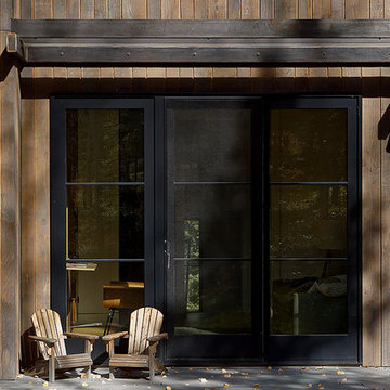 Montana Timber Products
here: Colorado
What: Residential
Product: ranchwood™ color: Southern
Solution: Wire Brushed, Shiplap, fascia, soffit
This Colorado home feature's Montana Timber Products prefinished rustic ranchwood™ siding, featuring Wire Brushed texture in the color Southern, applied as fascia and soffit.
ranchwood™ is Montana Timber Products' flagship rustic natural wood siding, a reclaimed barn wood alternative that is milled from new, rough stock, kiln dried, chemical free wood.
ranchwood™ is put through a texturizing and coloring process that creates aesthetically beautiful rustic wood siding and authentic reclaimed barn wood and reclaimed lumber alternatives.
Typically less expensive than authentic reclaimed barn wood, ranchwood™ offers uncompromising rustic wood beauty.
Circle Sawn and Wire Brushed are Montana Timber Products' common cedar siding texturizing options.
The Circle Sawn texture commonly seen on rustic reclaimed barn wood is created from the large circular saw blades used in more traditional milling practices.
The Wire Brushed option adds physical and aesthetic depth to the wood grain.
In addition to the aesthetic beauty added from the texturing process, greater surface area is created, which allows the Seal-Once, a 100% NO VOC waterproofer with a 10 year limited warranty against water ingress and safe for interior and exterior use, pets and children.
If environmentally friendly and the renewable aspect of natural wood siding is important to you, be sure to do your homework when choosing your siding, flooring, interior accents, trim, beams, timbers, or other wood siding products. Some companies choose to use degenerative chemicals to achieve the desired look and texture of rustic wood siding. This is not the case with Montana Timber Products.
Vintage wood, reclaimed barn wood and reclaimed barn wood alternatives are very popular building materials due to their aesthetic beauty, traditional look, and chemical free finish.
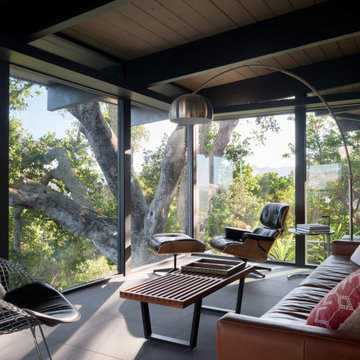
 Klopf Architecture
Set in a quiet neighborhood and framed by mature trees, this residence presented a unique opportunity: to thoughtfully evolve a custom mid-century modern home into a space that supports the everyday rhythms of a growing family. With a deep respect for the home’s original architecture, Klopf Architecture reimagined the house to better meet the needs of its owners—introducing functional improvements while preserving the spirit and character of its mid-century roots.
The clients approached Klopf Architecture with a clear vision: refresh their home while seamlessly integrating new programmatic elements. Key goals included clarifying and enhancing the entry sequence; connecting the detached garage to the main house with a practical yet architecturally intentional intervention; adding functional spaces such as a mudroom and laundry room; expanding and remodeling the primary suite’s bathroom and closet; and creating a more engaging outdoor space that capitalized on the site’s impressive views, featuring a fire pit and outdoor kitchen.
As a couple with distinct yet complementary perspectives—one focused on modern functionality and technology, and the other dedicated to preserving the home’s architectural integrity—their collaboration with Klopf Architecture resulted in a solution that harmonized both ideals. Their shared commitment to improving the livability of their home led to a design dialogue rooted in balance. This dynamic partnership shaped the direction of the renovation, ensuring that every decision honored the spirit of the original home while aligning with the practical needs of their growing family.
Designing within the constraints of the sloped site posed one of the project’s central challenges. The detached garage sat at a higher elevation than the main house, requiring a solution that ensured architectural and geometric compatibility between the two structures. Rather than create a purely utilitarian link, Klopf Architecture introduced an intentional connection that contributes to the overall architectural language. A notable pinch point in the plan—where differing geometries converged—was treated as a hinge point, turning a potentially awkward juncture into an architectural feature. This area now functions as both a transition and a moment of design interest that unifies the overall plan.
The design also addressed the underutilized outdoor area, which was located in a shadowed portion of the site with geometrical limitations. A new connection to the rear deck was created in this same area, making the outdoor space more useful and inviting. Klopf Architecture introduced carefully positioned openings and spatial improvements that forged a strong visual and functional connection between indoor and outdoor spaces. The outdoor area now reads as a deliberate extension of the home, embracing natural light and emphasizing the dramatic views.
Working through multiple design iterations, Klopf Architecture crafted a solution that preserved the architectural language of the original home while supporting the functional needs of modern life. The garage-to-house connection became more than a passage—it evolved into an architectural moment of transition. A new mudroom and laundry space enhanced convenience without compromising the clean lines of the design. The primary suite was expanded to create a private, serene retreat. The reimagined backyard, complete with fire pit and kitchen, now plays a vital role in the family’s daily routine and social life.
Outcomes and Lasting Impact
The result is a home that balances heritage with contemporary design, technical precision with design sensibility. The redesign not only met the clients’ initial goals but also exceeded expectations in its ability to seamlessly blend past and present, function and beauty, making the outdoor kitchen a favorite gathering place.
Beyond aesthetics, the renovation has significantly improved daily life for the family. The newly integrated garage connection has streamlined routines, providing a seamless transition between arriving home, storing belongings, and entering the main living spaces. The expanded primary suite offers a retreat-like atmosphere, creating a private space to unwind at the end of the day. The redesigned outdoor areas have also become an extension of their lifestyle—whether it's casual family dinners around the fire pit, entertaining friends in the outdoor kitchen, or simply enjoying the view from the reimagined backyard.
Through a thoughtful and strategic approach, the house has been successfully evolved into a home that remains true to its mid-century modern roots while enhancing livability, functionality, and the overall quality of life for the modern-day owners.
Klopf Architecture Team: Geoffrey Campen, Fernanda Bernardes
Architectural Interior Design: Klopf Architecture
Structural Engineer: Base Design Inc.
Contractor: Golden Snail Builders
Photography: Mariko Reed
Year Completed:2022
Sponsored
Columbus, OH
Hope Restoration & General Contracting
Columbus Design-Build, Kitchen & Bath Remodeling, Historic Renovations
 ASR DESIGN STUDIO
Our mission was to create an ocean and California lifestyle-inspired space that would invite consistent clicks, bookings and five-star reviews.
To make the most of the great location, we designed Project 11 for travelling singles and couples searching for a cozy and welcoming condo within walking distance to downtown San Diego.
Project 11 would also be used by our clients when it was unoccupied, so it had to be practical, functional and beautiful, too.
Our clients had a limited budget, so we got thrifty and sourced furnishings from Target, Ikea, Amazon and Etsy.
The oversized art prints – which set the tone for our relaxing and soothing beachy theme – were hunted down and found at Etsy of California Lifestyle.
We made the most of layers, colors and texture to create spaces that conjured calming ocean vibes and felt wholeheartedly welcoming.
We couldn’t repaint the walls, but they gave us a neutral color palette to work with. We built on it by adding in pops of color while maintaining a minimalist approach to understated style.
Then we had some fun and added in cute touches like Cali and San Diego inspired mugs, an adorable Kerig to tie in the colors of the ocean again, a swivel chair to view the sunrise and sunset and a totally pimped-out kitchen with all the cooking accessories a guest would need to feel at home in Project 11.
By the time we were done, we were tempted to scoop up the first available booking for ourselves!
Finally, we invested our energy in designing for effortless functionality so our client’s guests had everything they needed during their stay.
Photography: Meg Marie

 Western DuPage Landscaping, Inc.
After years of enjoying their backyard, the clients of this property enlisted our firm to improve the original landscape we had completed over ten years ago. Our goal was to update the patio and further develop their backyard by creating a garden with a variety of color and texture.
Over time the existing patio had settled, plantings grew, and an existing Oak thrived. During the initial home and landscape construction our clients were particularly concerned about the health of the mature Oak located just off the home. Special care was given when the patio was first built. Precautions were again taken in working around the Oak as the existing patio was removed and replaced. Surrounding trees and shrubs had grown and enclosed the backyard limiting access. This required almost all work and transport of material to be done by hand.
The old concrete paver patio was replaced with bluestone. Existing mortared limestone around the edges of the patio levels were cleaned and tuck-pointed. A new stoop was constructed with mortared limestone risers and bluestone treads. A built-in grill and fireplace further updated the backyard space. The fireplace was designed to follow the organic curve of the patio. Mortared limestone and bluestone material were repeated on all elements, tying them together.
Along with the updated patio, many additions were made in transforming the modest backyard into a lush garden. Masses of annuals, ornamental grasses, and perennials along with mixed shrubs created sweeps of color and texture in front of a new arborvitae hedge and other existing trees and shrubs.
After careful planning and execution the completed landscape gave our clients the updated landscape they desired. The completion of the project was a rewarding and fulfilling experience as we transformed a good past project into a fantastic new project.

 User
UserMadeline Tolle
Design by Tandem Designs
Living room - 1950s living room idea in Los Angeles with brown walls, a standard fireplace and a stone fireplace
Living room - 1950s living room idea in Los Angeles with brown walls, a standard fireplace and a stone fireplace
34