Search results for "Literally nicely" in Home Design Ideas
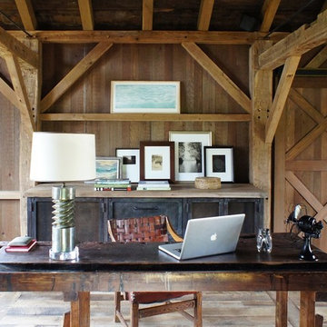
Elizabeth Strianese Interiors and Meredith Heuer photography.
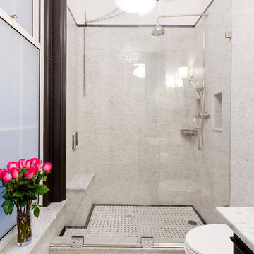
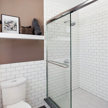
We opted for a classic inspired bathroom with literally "splashes" of fun for these little girls. The triple laundry sink serves the 3 children nicely with it's deep basin and built in soap holders. Simplicity was key when selecting a class marble hex floor tile and white subway tile for the bulk of the room - but then we had a little fun with the colorful glass mosaic tile in the tub niche. Handblown locally made light fixtures from Dan Spitzer over the sink keep my signature of "local and handmade" alive.

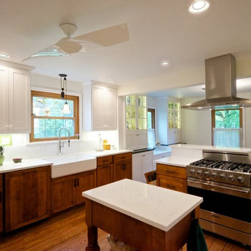
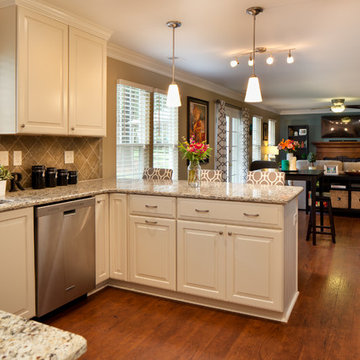
Inspiration for a contemporary galley medium tone wood floor eat-in kitchen remodel in San Francisco with an undermount sink, flat-panel cabinets, white cabinets, white backsplash, stainless steel appliances and no island
Find the right local pro for your project
 
Free ebook, Creating the Ideal Kitchen. DOWNLOAD NOW
 
One of my favorite things to work on is older homes with a bit of history because I find it an interesting challenge to marry the historical architectural features of a home with modern design elements that work well for my client’s current lifestyle.
This home was particularly fun because it was the second kitchen we had done for this family and was quite a departure from the style of the first kitchen.
The before shot of the kitchen shows a view from the family room. See the dropped ceiling? We were curious, was this just part of the design or was the dropped ceiling there to hide mechanicals? Well we soon found out that it was mostly decorative (yay!), and with the exception of a little bit of work to some plumbing from an upstairs bathroom and rerouting of the ventilation system within the original floor joists, we were in the clear, phew! The shot of the completed kitchen from roughly the same vantage point shows how much taller the ceilings are. It makes a huge difference in the feel of the space. Dark and gloomy turned fresh and light!
Another serious consideration was what do we do with the skinny transom window above the refrigerator. After much back and forth, we decided to eliminate it and do some open shelving instead. This ended up being one of the nicest areas in the room. I am calling it the “fun zone” because it houses all the barware, wine cubbies and a bar fridge — the perfect little buffet spot for entertaining. It is flanked on either side by pull out pantries that I’m sure will get a ton of use. Since the neighboring room has literally three walls of almost full height windows, the kitchen gets plenty of light.
The gold shelving brackets, large pendant fixtures over the island and the tile mural behind the range all pay subtle homage to the home’s prairie style architecture and bring a bit of sparkle to the room.
Even though the room is quite large, the work triangle is very tight with the large Subzero fridge, sink and range all nearby for easy maneuvering during meal prep. There is seating for four at the island, and work aisles are generous.
Designed by: Susan Klimala, CKD, CBD
Photography by: LOMA Studios
For more information on kitchen and bath design ideas go to: www.kitchenstudio-ge.com

Example of a small minimalist l-shaped ceramic tile enclosed kitchen design in New York with an undermount sink, glass-front cabinets, light wood cabinets, granite countertops, multicolored backsplash, glass tile backsplash, stainless steel appliances and no island

Quinn and Paige, residents of this tired 1960’s tri-level home hated their kitchen. As a matter of fact, prior to making plans to renovate the first floor - they considered selling the home, but were reluctant because of its enviable location near the heart of downtown Barrington which was within walking distance to local stores and all their favorite places. So instead they contacted Advance Design Studio after hearing about them from a neighbor, to rescue their tired home and give it new life.
The very first plan was to remove the constricting walls surrounding the original kitchen, and open the expansive first floor living room and dining area to the new heart of the space; a stunning state of the art coastal designed kitchen. Exposing attractive beams in the vaulted ceiling created an interesting structural detail that suits the open plan and salutes the original architecture of the home, further emphasizing the height of the new space enjoyed now by the family as a great room.
The stage was set for the seaside feel of this kitchen by pairing crisp white painted maple cabinets with Dura Supreme’s one of kind hand weathered finish on the island in soft blue-green finish. But the authentic feeling of being on your favorite beach was supremely achieved by the matching of unique Mt. Claire marble on the island and the specialty Wareham acid washed stone on the perimeter counter tops. Pictures don’t do justice to the feel of this stone under your hand; its water-washed texture reminds instantly of summer vacations collecting rocks softly etched by hundreds of waves.
Stainless steel appliances and satin nickel hardware shine brightly against the backdrop of bright white subway tiles accentuated by subtle grey grout lines contributing to the nautical feel of this comfortable kitchen. Seeded glass door cabinetry reminiscent of beach grasses dress up the space just enough, and a proud 6” stacked crown molding extends above 36” wall cabinets into the expanse of the now taller space; balancing this kitchen nicely within its newly integrated home.
Features in this kitchen include a built in standard depth refrigerator, pull out spice racks, tall tray dividers and wood super Susan with double pull out trash and recycling. A cutlery divider holds sharp knives, and an angled cabinet was customized to hold a secret USB charging station. The bright white Kohler farm sink is graced by an elegant bridge faucet in brushed nickel. This now airy and spacious kitchen has room for guest and family to congregate around the large island, complete with stools and attractive hidden storage for seldom used entertainment pieces.
“I was sold when I saw the drawings. My designer nailed it, down to every last storage idea and coastal detail I envisioned, it was all in there. It was unbelievable how accurate her interpretation was of what was in my head; working with her made my kitchen renovation so easy, it’s as if she literally read my mind”, said Paige enthusiastically.
The woman of the house expressed upon completion not only her love for her fantastic new cooking space, but how renovating her kitchen has given new life to the entire home. Talk of moving has been relegated to the recycling bin, and instead the family is discussing plans to renovate the master bath now that they’ve decided to stay for the long term. Friends who visit the home do a double-take as they recognize the new space’s dramatic transformation from original cramped and closed spaces - to the now amazingly fresh open kitchen that has become the center of every gathering and family meal.
Designer: Nicole Ryan
Photographer: Joe Nowak

THE SETUP
This client lives in a great high-rise condo in downtown Chicago. Alicia has already remodeled a few areas of her home, including her kitchen and home office. The bathroom is one of the last big places the client wanted to update. The existing bathroom had a large, outdated whirlpool tub in the corner. It was a darker space that had a lack of natural light. There are no windows (due to the bathroom’s location within the high-rise building). So, the idea was to brighten up the space and give the client an updated, elegant primary bathroom that is more her style and tailor-made for her routines.
Design Objectives:
- Make the space brighter.
- Create different daily routine stations to maximize functionality while keeping things clutter-free – a makeup station, a blow-dry station, and a sink-needs station.
- Achieve the client’s specific style and function needs while also keeping the look and design open to future possibilities: different users of the space/resale clients.
Design Challenges:
- Toilet cannot be moved. (In a high-rise, you can’t really move plumbing around too much when reimagining a space)
- Existing bathroom had a soffit that hid a lot of electrical wiring, so completely removing the soffit wasn’t an option.
- The blow-dry station needs to accommodate the client’s preference for standing up.
- Finding a place for the make-up station, which the client wants oriented for sitting.
- Create storage within the shower that can eliminate the clutter of personal care products that are actually needed every day. Do this, while keeping the client’s favorite things about the existing shower: the shower bench, a tub filler faucet (for rinsing shaving cream when shaving legs) and a low niche for placing her foot when shaving her legs.
THE RENEWED SPACE
Design Solutions:
- Extended a bit of wall near the toilet to give the commode its own area within the space, but without closing it off into a claustrophobic WC.
- Worked within the reality of the existing soffit situation, reshaping it to align with the new shower. Can lights were also added. Installed a beautiful ceiling light fixture that works within the new soffit shape, commanding attention and adding light, as if the sofit shape was chosen for it.
- Created a nice, furniture-looking 42”-high cabinet with pullout drawers to be the blow-dry station, complete with a mirror and a nice top. The pullout drawers are all powered, concealing a Dyson dryer and curling iron (and all the accoutrements) while keeping them plugged in, which is ideal for easy usage and put away. A stylish mirror on the wall above the cabinet, and proper lighting, make this the perfect blow-dry station. The top has a grommet that can accommodate a power cord should the client ever want to have a powered device on top of the cabinet.
- Put the sit-down makeup station where the tub used to be, putting the mirror back into a new recessed wall just a bit, allowing the area to have more room.
- Created a niche in the shower’s inner wall so that you can’t see it unless you are literally inside the shower. At the client’s request, it also has a hook so she can hang her loofa. Hiding the utility niche in this way allowed us to use the full main wall of the shower as a canvas for a beautiful accent stripe of raised decorative tile. The new shower has her old favorites, too: the tub filler, foot niche and bench.
Alicia’s client loves her new primary bathroom, especially the blow dry area. It is very accommodating for her, as a tall lady, while being very easy to use. The drawers store everything. Being powered, they make using already-plugged in appliances very easy to use and put away.
Her previous makeup station was a freestanding vanity with a single drawer, so beauty products were all over the surface top. With her new makeup station, everything is nicely tucked away and organized in drawers.
The new lighting is fantastic and the colors are light and soft. The clients loves the overall look and feel of her new bathroom and raves about how well the functionality-minded design makes her morning routine – and her life – easier and enjoyable!

Sponsored
Columbus, OH
Free consultation for landscape design!
Peabody Landscape Group
Columbus' Reliable Landscape Design & Contracting

Quinn and Paige, residents of this tired 1960’s tri-level home hated their kitchen. As a matter of fact, prior to making plans to renovate the first floor - they considered selling the home, but were reluctant because of its enviable location near the heart of downtown Barrington which was within walking distance to local stores and all their favorite places. So instead they contacted Advance Design Studio after hearing about them from a neighbor, to rescue their tired home and give it new life.
The very first plan was to remove the constricting walls surrounding the original kitchen, and open the expansive first floor living room and dining area to the new heart of the space; a stunning state of the art coastal designed kitchen. Exposing attractive beams in the vaulted ceiling created an interesting structural detail that suits the open plan and salutes the original architecture of the home, further emphasizing the height of the new space enjoyed now by the family as a great room.
The stage was set for the seaside feel of this kitchen by pairing crisp white painted maple cabinets with Dura Supreme’s one of kind hand weathered finish on the island in soft blue-green finish. But the authentic feeling of being on your favorite beach was supremely achieved by the matching of unique Mt. Claire marble on the island and the specialty Wareham acid washed stone on the perimeter counter tops. Pictures don’t do justice to the feel of this stone under your hand; its water-washed texture reminds instantly of summer vacations collecting rocks softly etched by hundreds of waves.
Stainless steel appliances and satin nickel hardware shine brightly against the backdrop of bright white subway tiles accentuated by subtle grey grout lines contributing to the nautical feel of this comfortable kitchen. Seeded glass door cabinetry reminiscent of beach grasses dress up the space just enough, and a proud 6” stacked crown molding extends above 36” wall cabinets into the expanse of the now taller space; balancing this kitchen nicely within its newly integrated home.
Features in this kitchen include a built in standard depth refrigerator, pull out spice racks, tall tray dividers and wood super Susan with double pull out trash and recycling. A cutlery divider holds sharp knives, and an angled cabinet was customized to hold a secret USB charging station. The bright white Kohler farm sink is graced by an elegant bridge faucet in brushed nickel. This now airy and spacious kitchen has room for guest and family to congregate around the large island, complete with stools and attractive hidden storage for seldom used entertainment pieces.
“I was sold when I saw the drawings. My designer nailed it, down to every last storage idea and coastal detail I envisioned, it was all in there. It was unbelievable how accurate her interpretation was of what was in my head; working with her made my kitchen renovation so easy, it’s as if she literally read my mind”, said Paige enthusiastically.
The woman of the house expressed upon completion not only her love for her fantastic new cooking space, but how renovating her kitchen has given new life to the entire home. Talk of moving has been relegated to the recycling bin, and instead the family is discussing plans to renovate the master bath now that they’ve decided to stay for the long term. Friends who visit the home do a double-take as they recognize the new space’s dramatic transformation from original cramped and closed spaces - to the now amazingly fresh open kitchen that has become the center of every gathering and family meal.
Designer: Nicole Ryan
Photographer: Joe Nowak

Beautiful piano and art work balance this elegant living area.
Ross Miller Photography
Example of a classic carpeted family room design in Los Angeles with a music area, beige walls and a standard fireplace

THE SETUP
This client lives in a great high-rise condo in downtown Chicago. Alicia has already remodeled a few areas of her home, including her kitchen and home office. The bathroom is one of the last big places the client wanted to update. The existing bathroom had a large, outdated whirlpool tub in the corner. It was a darker space that had a lack of natural light. There are no windows (due to the bathroom’s location within the high-rise building). So, the idea was to brighten up the space and give the client an updated, elegant primary bathroom that is more her style and tailor-made for her routines.
Design Objectives:
- Make the space brighter.
- Create different daily routine stations to maximize functionality while keeping things clutter-free – a makeup station, a blow-dry station, and a sink-needs station.
- Achieve the client’s specific style and function needs while also keeping the look and design open to future possibilities: different users of the space/resale clients.
Design Challenges:
- Toilet cannot be moved. (In a high-rise, you can’t really move plumbing around too much when reimagining a space)
- Existing bathroom had a soffit that hid a lot of electrical wiring, so completely removing the soffit wasn’t an option.
- The blow-dry station needs to accommodate the client’s preference for standing up.
- Finding a place for the make-up station, which the client wants oriented for sitting.
- Create storage within the shower that can eliminate the clutter of personal care products that are actually needed every day. Do this, while keeping the client’s favorite things about the existing shower: the shower bench, a tub filler faucet (for rinsing shaving cream when shaving legs) and a low niche for placing her foot when shaving her legs.
THE RENEWED SPACE
Design Solutions:
- Extended a bit of wall near the toilet to give the commode its own area within the space, but without closing it off into a claustrophobic WC.
- Worked within the reality of the existing soffit situation, reshaping it to align with the new shower. Can lights were also added. Installed a beautiful ceiling light fixture that works within the new soffit shape, commanding attention and adding light, as if the sofit shape was chosen for it.
- Created a nice, furniture-looking 42”-high cabinet with pullout drawers to be the blow-dry station, complete with a mirror and a nice top. The pullout drawers are all powered, concealing a Dyson dryer and curling iron (and all the accoutrements) while keeping them plugged in, which is ideal for easy usage and put away. A stylish mirror on the wall above the cabinet, and proper lighting, make this the perfect blow-dry station. The top has a grommet that can accommodate a power cord should the client ever want to have a powered device on top of the cabinet.
- Put the sit-down makeup station where the tub used to be, putting the mirror back into a new recessed wall just a bit, allowing the area to have more room.
- Created a niche in the shower’s inner wall so that you can’t see it unless you are literally inside the shower. At the client’s request, it also has a hook so she can hang her loofa. Hiding the utility niche in this way allowed us to use the full main wall of the shower as a canvas for a beautiful accent stripe of raised decorative tile. The new shower has her old favorites, too: the tub filler, foot niche and bench.
Alicia’s client loves her new primary bathroom, especially the blow dry area. It is very accommodating for her, as a tall lady, while being very easy to use. The drawers store everything. Being powered, they make using already-plugged in appliances very easy to use and put away.
Her previous makeup station was a freestanding vanity with a single drawer, so beauty products were all over the surface top. With her new makeup station, everything is nicely tucked away and organized in drawers.
The new lighting is fantastic and the colors are light and soft. The clients loves the overall look and feel of her new bathroom and raves about how well the functionality-minded design makes her morning routine – and her life – easier and enjoyable!

2011 CAPITAL COTY AWARD HONORABLE MENTION AWARD WINNER
Built circa 1980, a young couple with three children originally purchased this home for their growing family. After four years of karate, soccer, piano and other activities, however, the home was becoming too small to meet their needs.
Problems started upon entering the front foyer. A 25-foot long dark hallway separated the family room and the kitchen, ending in a tiny powder room stuck in the middle of the layout. The kitchen was especially isolated, a cramped L-shaped design with a box bay breakfast bump out that was literally falling apart.
The new design started with the core of the problem—the maze and separation created by the long hallways.
First, the 25’ load bearing wall separating the foyer from family room was totally taken out and replaced with a long supporting beam. A French door replaced a small door and window leading to a screen porch . This action allowed lots of light to get into family and foyer. Then, the powder room was removed and the partition wall between the kitchen and family room was taken down. This created a large open concept design and greatly increased the size of the kitchen.
The box bay was demolished and replaced with new walls and a large window. The plumbing for main sink and dishwasher got relocated into this box bay allowing a total transformation of the space. Now there are cabinets and counters on all sides.
The doorway to the dining room was reconfigured to allow a butler area on its left. While the right side was occupied with new 36” gas range top with a decorative wood hood above it. The refrigerator, microwave/oven and pantries—the space’s tall elements—occupy one wall..
A large Island with a prep sink and beverage center for the kids occupies the center of the layout. Capable of seating up to four, family and friends can now keep the cook company. A large built-in desk area lets the kids do their homework so the parents can supervise while they prepare meals.
Light cabinetry with a touch of caramel glazing and exotic granite countertops by our designers contributed to this kitchen’s elegant design. The contrasting distressed island’s darker finish matches the dinette set and other furnishings.
New hardwood floors were installed throughout the first floor for a seamless look, while recess, pendant and task lighting make the space even brighter. Importantly, there’s plenty of space for parents and kids to hang out together. The kitchen is truly the heart of their home.

THE SETUP
This client lives in a great high-rise condo in downtown Chicago. Alicia has already remodeled a few areas of her home, including her kitchen and home office. The bathroom is one of the last big places the client wanted to update. The existing bathroom had a large, outdated whirlpool tub in the corner. It was a darker space that had a lack of natural light. There are no windows (due to the bathroom’s location within the high-rise building). So, the idea was to brighten up the space and give the client an updated, elegant primary bathroom that is more her style and tailor-made for her routines.
Design Objectives:
- Make the space brighter.
- Create different daily routine stations to maximize functionality while keeping things clutter-free – a makeup station, a blow-dry station, and a sink-needs station.
- Achieve the client’s specific style and function needs while also keeping the look and design open to future possibilities: different users of the space/resale clients.
Design Challenges:
- Toilet cannot be moved. (In a high-rise, you can’t really move plumbing around too much when reimagining a space)
- Existing bathroom had a soffit that hid a lot of electrical wiring, so completely removing the soffit wasn’t an option.
- The blow-dry station needs to accommodate the client’s preference for standing up.
- Finding a place for the make-up station, which the client wants oriented for sitting.
- Create storage within the shower that can eliminate the clutter of personal care products that are actually needed every day. Do this, while keeping the client’s favorite things about the existing shower: the shower bench, a tub filler faucet (for rinsing shaving cream when shaving legs) and a low niche for placing her foot when shaving her legs.
THE RENEWED SPACE
Design Solutions:
- Extended a bit of wall near the toilet to give the commode its own area within the space, but without closing it off into a claustrophobic WC.
- Worked within the reality of the existing soffit situation, reshaping it to align with the new shower. Can lights were also added. Installed a beautiful ceiling light fixture that works within the new soffit shape, commanding attention and adding light, as if the sofit shape was chosen for it.
- Created a nice, furniture-looking 42”-high cabinet with pullout drawers to be the blow-dry station, complete with a mirror and a nice top. The pullout drawers are all powered, concealing a Dyson dryer and curling iron (and all the accoutrements) while keeping them plugged in, which is ideal for easy usage and put away. A stylish mirror on the wall above the cabinet, and proper lighting, make this the perfect blow-dry station. The top has a grommet that can accommodate a power cord should the client ever want to have a powered device on top of the cabinet.
- Put the sit-down makeup station where the tub used to be, putting the mirror back into a new recessed wall just a bit, allowing the area to have more room.
- Created a niche in the shower’s inner wall so that you can’t see it unless you are literally inside the shower. At the client’s request, it also has a hook so she can hang her loofa. Hiding the utility niche in this way allowed us to use the full main wall of the shower as a canvas for a beautiful accent stripe of raised decorative tile. The new shower has her old favorites, too: the tub filler, foot niche and bench.
Alicia’s client loves her new primary bathroom, especially the blow dry area. It is very accommodating for her, as a tall lady, while being very easy to use. The drawers store everything. Being powered, they make using already-plugged in appliances very easy to use and put away.
Her previous makeup station was a freestanding vanity with a single drawer, so beauty products were all over the surface top. With her new makeup station, everything is nicely tucked away and organized in drawers.
The new lighting is fantastic and the colors are light and soft. The clients loves the overall look and feel of her new bathroom and raves about how well the functionality-minded design makes her morning routine – and her life – easier and enjoyable!

THE SETUP
This client lives in a great high-rise condo in downtown Chicago. Alicia has already remodeled a few areas of her home, including her kitchen and home office. The bathroom is one of the last big places the client wanted to update. The existing bathroom had a large, outdated whirlpool tub in the corner. It was a darker space that had a lack of natural light. There are no windows (due to the bathroom’s location within the high-rise building). So, the idea was to brighten up the space and give the client an updated, elegant primary bathroom that is more her style and tailor-made for her routines.
Design Objectives:
- Make the space brighter.
- Create different daily routine stations to maximize functionality while keeping things clutter-free – a makeup station, a blow-dry station, and a sink-needs station.
- Achieve the client’s specific style and function needs while also keeping the look and design open to future possibilities: different users of the space/resale clients.
Design Challenges:
- Toilet cannot be moved. (In a high-rise, you can’t really move plumbing around too much when reimagining a space)
- Existing bathroom had a soffit that hid a lot of electrical wiring, so completely removing the soffit wasn’t an option.
- The blow-dry station needs to accommodate the client’s preference for standing up.
- Finding a place for the make-up station, which the client wants oriented for sitting.
- Create storage within the shower that can eliminate the clutter of personal care products that are actually needed every day. Do this, while keeping the client’s favorite things about the existing shower: the shower bench, a tub filler faucet (for rinsing shaving cream when shaving legs) and a low niche for placing her foot when shaving her legs.
THE RENEWED SPACE
Design Solutions:
- Extended a bit of wall near the toilet to give the commode its own area within the space, but without closing it off into a claustrophobic WC.
- Worked within the reality of the existing soffit situation, reshaping it to align with the new shower. Can lights were also added. Installed a beautiful ceiling light fixture that works within the new soffit shape, commanding attention and adding light, as if the sofit shape was chosen for it.
- Created a nice, furniture-looking 42”-high cabinet with pullout drawers to be the blow-dry station, complete with a mirror and a nice top. The pullout drawers are all powered, concealing a Dyson dryer and curling iron (and all the accoutrements) while keeping them plugged in, which is ideal for easy usage and put away. A stylish mirror on the wall above the cabinet, and proper lighting, make this the perfect blow-dry station. The top has a grommet that can accommodate a power cord should the client ever want to have a powered device on top of the cabinet.
- Put the sit-down makeup station where the tub used to be, putting the mirror back into a new recessed wall just a bit, allowing the area to have more room.
- Created a niche in the shower’s inner wall so that you can’t see it unless you are literally inside the shower. At the client’s request, it also has a hook so she can hang her loofa. Hiding the utility niche in this way allowed us to use the full main wall of the shower as a canvas for a beautiful accent stripe of raised decorative tile. The new shower has her old favorites, too: the tub filler, foot niche and bench.
Alicia’s client loves her new primary bathroom, especially the blow dry area. It is very accommodating for her, as a tall lady, while being very easy to use. The drawers store everything. Being powered, they make using already-plugged in appliances very easy to use and put away.
Her previous makeup station was a freestanding vanity with a single drawer, so beauty products were all over the surface top. With her new makeup station, everything is nicely tucked away and organized in drawers.
The new lighting is fantastic and the colors are light and soft. The clients loves the overall look and feel of her new bathroom and raves about how well the functionality-minded design makes her morning routine – and her life – easier and enjoyable!

David Duncan Livingston
Example of a transitional living room design in Los Angeles with white walls

Quinn and Paige, residents of this tired 1960’s tri-level home hated their kitchen. As a matter of fact, prior to making plans to renovate the first floor - they considered selling the home, but were reluctant because of its enviable location near the heart of downtown Barrington which was within walking distance to local stores and all their favorite places. So instead they contacted Advance Design Studio after hearing about them from a neighbor, to rescue their tired home and give it new life.
The very first plan was to remove the constricting walls surrounding the original kitchen, and open the expansive first floor living room and dining area to the new heart of the space; a stunning state of the art coastal designed kitchen. Exposing attractive beams in the vaulted ceiling created an interesting structural detail that suits the open plan and salutes the original architecture of the home, further emphasizing the height of the new space enjoyed now by the family as a great room.
The stage was set for the seaside feel of this kitchen by pairing crisp white painted maple cabinets with Dura Supreme’s one of kind hand weathered finish on the island in soft blue-green finish. But the authentic feeling of being on your favorite beach was supremely achieved by the matching of unique Mt. Claire marble on the island and the specialty Wareham acid washed stone on the perimeter counter tops. Pictures don’t do justice to the feel of this stone under your hand; its water-washed texture reminds instantly of summer vacations collecting rocks softly etched by hundreds of waves.
Stainless steel appliances and satin nickel hardware shine brightly against the backdrop of bright white subway tiles accentuated by subtle grey grout lines contributing to the nautical feel of this comfortable kitchen. Seeded glass door cabinetry reminiscent of beach grasses dress up the space just enough, and a proud 6” stacked crown molding extends above 36” wall cabinets into the expanse of the now taller space; balancing this kitchen nicely within its newly integrated home.
Features in this kitchen include a built in standard depth refrigerator, pull out spice racks, tall tray dividers and wood super Susan with double pull out trash and recycling. A cutlery divider holds sharp knives, and an angled cabinet was customized to hold a secret USB charging station. The bright white Kohler farm sink is graced by an elegant bridge faucet in brushed nickel. This now airy and spacious kitchen has room for guest and family to congregate around the large island, complete with stools and attractive hidden storage for seldom used entertainment pieces.
“I was sold when I saw the drawings. My designer nailed it, down to every last storage idea and coastal detail I envisioned, it was all in there. It was unbelievable how accurate her interpretation was of what was in my head; working with her made my kitchen renovation so easy, it’s as if she literally read my mind”, said Paige enthusiastically.
The woman of the house expressed upon completion not only her love for her fantastic new cooking space, but how renovating her kitchen has given new life to the entire home. Talk of moving has been relegated to the recycling bin, and instead the family is discussing plans to renovate the master bath now that they’ve decided to stay for the long term. Friends who visit the home do a double-take as they recognize the new space’s dramatic transformation from original cramped and closed spaces - to the now amazingly fresh open kitchen that has become the center of every gathering and family meal.
Designer: Nicole Ryan
Photographer: Joe Nowak

THE SETUP
This client lives in a great high-rise condo in downtown Chicago. Alicia has already remodeled a few areas of her home, including her kitchen and home office. The bathroom is one of the last big places the client wanted to update. The existing bathroom had a large, outdated whirlpool tub in the corner. It was a darker space that had a lack of natural light. There are no windows (due to the bathroom’s location within the high-rise building). So, the idea was to brighten up the space and give the client an updated, elegant primary bathroom that is more her style and tailor-made for her routines.
Design Objectives:
- Make the space brighter.
- Create different daily routine stations to maximize functionality while keeping things clutter-free – a makeup station, a blow-dry station, and a sink-needs station.
- Achieve the client’s specific style and function needs while also keeping the look and design open to future possibilities: different users of the space/resale clients.
Design Challenges:
- Toilet cannot be moved. (In a high-rise, you can’t really move plumbing around too much when reimagining a space)
- Existing bathroom had a soffit that hid a lot of electrical wiring, so completely removing the soffit wasn’t an option.
- The blow-dry station needs to accommodate the client’s preference for standing up.
- Finding a place for the make-up station, which the client wants oriented for sitting.
- Create storage within the shower that can eliminate the clutter of personal care products that are actually needed every day. Do this, while keeping the client’s favorite things about the existing shower: the shower bench, a tub filler faucet (for rinsing shaving cream when shaving legs) and a low niche for placing her foot when shaving her legs.
THE RENEWED SPACE
Design Solutions:
- Extended a bit of wall near the toilet to give the commode its own area within the space, but without closing it off into a claustrophobic WC.
- Worked within the reality of the existing soffit situation, reshaping it to align with the new shower. Can lights were also added. Installed a beautiful ceiling light fixture that works within the new soffit shape, commanding attention and adding light, as if the sofit shape was chosen for it.
- Created a nice, furniture-looking 42”-high cabinet with pullout drawers to be the blow-dry station, complete with a mirror and a nice top. The pullout drawers are all powered, concealing a Dyson dryer and curling iron (and all the accoutrements) while keeping them plugged in, which is ideal for easy usage and put away. A stylish mirror on the wall above the cabinet, and proper lighting, make this the perfect blow-dry station. The top has a grommet that can accommodate a power cord should the client ever want to have a powered device on top of the cabinet.
- Put the sit-down makeup station where the tub used to be, putting the mirror back into a new recessed wall just a bit, allowing the area to have more room.
- Created a niche in the shower’s inner wall so that you can’t see it unless you are literally inside the shower. At the client’s request, it also has a hook so she can hang her loofa. Hiding the utility niche in this way allowed us to use the full main wall of the shower as a canvas for a beautiful accent stripe of raised decorative tile. The new shower has her old favorites, too: the tub filler, foot niche and bench.
Alicia’s client loves her new primary bathroom, especially the blow dry area. It is very accommodating for her, as a tall lady, while being very easy to use. The drawers store everything. Being powered, they make using already-plugged in appliances very easy to use and put away.
Her previous makeup station was a freestanding vanity with a single drawer, so beauty products were all over the surface top. With her new makeup station, everything is nicely tucked away and organized in drawers.
The new lighting is fantastic and the colors are light and soft. The clients loves the overall look and feel of her new bathroom and raves about how well the functionality-minded design makes her morning routine – and her life – easier and enjoyable!

Sponsored
Sunbury, OH
J.Holderby - Renovations
Franklin County's Leading General Contractors - 2X Best of Houzz!

Quinn and Paige, residents of this tired 1960’s tri-level home hated their kitchen. As a matter of fact, prior to making plans to renovate the first floor - they considered selling the home, but were reluctant because of its enviable location near the heart of downtown Barrington which was within walking distance to local stores and all their favorite places. So instead they contacted Advance Design Studio after hearing about them from a neighbor, to rescue their tired home and give it new life.
The very first plan was to remove the constricting walls surrounding the original kitchen, and open the expansive first floor living room and dining area to the new heart of the space; a stunning state of the art coastal designed kitchen. Exposing attractive beams in the vaulted ceiling created an interesting structural detail that suits the open plan and salutes the original architecture of the home, further emphasizing the height of the new space enjoyed now by the family as a great room.
The stage was set for the seaside feel of this kitchen by pairing crisp white painted maple cabinets with Dura Supreme’s one of kind hand weathered finish on the island in soft blue-green finish. But the authentic feeling of being on your favorite beach was supremely achieved by the matching of unique Mt. Claire marble on the island and the specialty Wareham acid washed stone on the perimeter counter tops. Pictures don’t do justice to the feel of this stone under your hand; its water-washed texture reminds instantly of summer vacations collecting rocks softly etched by hundreds of waves.
Stainless steel appliances and satin nickel hardware shine brightly against the backdrop of bright white subway tiles accentuated by subtle grey grout lines contributing to the nautical feel of this comfortable kitchen. Seeded glass door cabinetry reminiscent of beach grasses dress up the space just enough, and a proud 6” stacked crown molding extends above 36” wall cabinets into the expanse of the now taller space; balancing this kitchen nicely within its newly integrated home.
Features in this kitchen include a built in standard depth refrigerator, pull out spice racks, tall tray dividers and wood super Susan with double pull out trash and recycling. A cutlery divider holds sharp knives, and an angled cabinet was customized to hold a secret USB charging station. The bright white Kohler farm sink is graced by an elegant bridge faucet in brushed nickel. This now airy and spacious kitchen has room for guest and family to congregate around the large island, complete with stools and attractive hidden storage for seldom used entertainment pieces.
“I was sold when I saw the drawings. My designer nailed it, down to every last storage idea and coastal detail I envisioned, it was all in there. It was unbelievable how accurate her interpretation was of what was in my head; working with her made my kitchen renovation so easy, it’s as if she literally read my mind”, said Paige enthusiastically.
The woman of the house expressed upon completion not only her love for her fantastic new cooking space, but how renovating her kitchen has given new life to the entire home. Talk of moving has been relegated to the recycling bin, and instead the family is discussing plans to renovate the master bath now that they’ve decided to stay for the long term. Friends who visit the home do a double-take as they recognize the new space’s dramatic transformation from original cramped and closed spaces - to the now amazingly fresh open kitchen that has become the center of every gathering and family meal.
Designer: Nicole Ryan
Photographer: Joe Nowak

THE SETUP
This client lives in a great high-rise condo in downtown Chicago. Alicia has already remodeled a few areas of her home, including her kitchen and home office. The bathroom is one of the last big places the client wanted to update. The existing bathroom had a large, outdated whirlpool tub in the corner. It was a darker space that had a lack of natural light. There are no windows (due to the bathroom’s location within the high-rise building). So, the idea was to brighten up the space and give the client an updated, elegant primary bathroom that is more her style and tailor-made for her routines.
Design Objectives:
- Make the space brighter.
- Create different daily routine stations to maximize functionality while keeping things clutter-free – a makeup station, a blow-dry station, and a sink-needs station.
- Achieve the client’s specific style and function needs while also keeping the look and design open to future possibilities: different users of the space/resale clients.
Design Challenges:
- Toilet cannot be moved. (In a high-rise, you can’t really move plumbing around too much when reimagining a space)
- Existing bathroom had a soffit that hid a lot of electrical wiring, so completely removing the soffit wasn’t an option.
- The blow-dry station needs to accommodate the client’s preference for standing up.
- Finding a place for the make-up station, which the client wants oriented for sitting.
- Create storage within the shower that can eliminate the clutter of personal care products that are actually needed every day. Do this, while keeping the client’s favorite things about the existing shower: the shower bench, a tub filler faucet (for rinsing shaving cream when shaving legs) and a low niche for placing her foot when shaving her legs.
THE RENEWED SPACE
Design Solutions:
- Extended a bit of wall near the toilet to give the commode its own area within the space, but without closing it off into a claustrophobic WC.
- Worked within the reality of the existing soffit situation, reshaping it to align with the new shower. Can lights were also added. Installed a beautiful ceiling light fixture that works within the new soffit shape, commanding attention and adding light, as if the sofit shape was chosen for it.
- Created a nice, furniture-looking 42”-high cabinet with pullout drawers to be the blow-dry station, complete with a mirror and a nice top. The pullout drawers are all powered, concealing a Dyson dryer and curling iron (and all the accoutrements) while keeping them plugged in, which is ideal for easy usage and put away. A stylish mirror on the wall above the cabinet, and proper lighting, make this the perfect blow-dry station. The top has a grommet that can accommodate a power cord should the client ever want to have a powered device on top of the cabinet.
- Put the sit-down makeup station where the tub used to be, putting the mirror back into a new recessed wall just a bit, allowing the area to have more room.
- Created a niche in the shower’s inner wall so that you can’t see it unless you are literally inside the shower. At the client’s request, it also has a hook so she can hang her loofa. Hiding the utility niche in this way allowed us to use the full main wall of the shower as a canvas for a beautiful accent stripe of raised decorative tile. The new shower has her old favorites, too: the tub filler, foot niche and bench.
Alicia’s client loves her new primary bathroom, especially the blow dry area. It is very accommodating for her, as a tall lady, while being very easy to use. The drawers store everything. Being powered, they make using already-plugged in appliances very easy to use and put away.
Her previous makeup station was a freestanding vanity with a single drawer, so beauty products were all over the surface top. With her new makeup station, everything is nicely tucked away and organized in drawers.
The new lighting is fantastic and the colors are light and soft. The clients loves the overall look and feel of her new bathroom and raves about how well the functionality-minded design makes her morning routine – and her life – easier and enjoyable!

Quinn and Paige, residents of this tired 1960’s tri-level home hated their kitchen. As a matter of fact, prior to making plans to renovate the first floor - they considered selling the home, but were reluctant because of its enviable location near the heart of downtown Barrington which was within walking distance to local stores and all their favorite places. So instead they contacted Advance Design Studio after hearing about them from a neighbor, to rescue their tired home and give it new life.
The very first plan was to remove the constricting walls surrounding the original kitchen, and open the expansive first floor living room and dining area to the new heart of the space; a stunning state of the art coastal designed kitchen. Exposing attractive beams in the vaulted ceiling created an interesting structural detail that suits the open plan and salutes the original architecture of the home, further emphasizing the height of the new space enjoyed now by the family as a great room.
The stage was set for the seaside feel of this kitchen by pairing crisp white painted maple cabinets with Dura Supreme’s one of kind hand weathered finish on the island in soft blue-green finish. But the authentic feeling of being on your favorite beach was supremely achieved by the matching of unique Mt. Claire marble on the island and the specialty Wareham acid washed stone on the perimeter counter tops. Pictures don’t do justice to the feel of this stone under your hand; its water-washed texture reminds instantly of summer vacations collecting rocks softly etched by hundreds of waves.
Stainless steel appliances and satin nickel hardware shine brightly against the backdrop of bright white subway tiles accentuated by subtle grey grout lines contributing to the nautical feel of this comfortable kitchen. Seeded glass door cabinetry reminiscent of beach grasses dress up the space just enough, and a proud 6” stacked crown molding extends above 36” wall cabinets into the expanse of the now taller space; balancing this kitchen nicely within its newly integrated home.
Features in this kitchen include a built in standard depth refrigerator, pull out spice racks, tall tray dividers and wood super Susan with double pull out trash and recycling. A cutlery divider holds sharp knives, and an angled cabinet was customized to hold a secret USB charging station. The bright white Kohler farm sink is graced by an elegant bridge faucet in brushed nickel. This now airy and spacious kitchen has room for guest and family to congregate around the large island, complete with stools and attractive hidden storage for seldom used entertainment pieces.
“I was sold when I saw the drawings. My designer nailed it, down to every last storage idea and coastal detail I envisioned, it was all in there. It was unbelievable how accurate her interpretation was of what was in my head; working with her made my kitchen renovation so easy, it’s as if she literally read my mind”, said Paige enthusiastically.
The woman of the house expressed upon completion not only her love for her fantastic new cooking space, but how renovating her kitchen has given new life to the entire home. Talk of moving has been relegated to the recycling bin, and instead the family is discussing plans to renovate the master bath now that they’ve decided to stay for the long term. Friends who visit the home do a double-take as they recognize the new space’s dramatic transformation from original cramped and closed spaces - to the now amazingly fresh open kitchen that has become the center of every gathering and family meal.
Designer: Nicole Ryan
Photographer: Joe Nowak
8