
Search results for "Location prints" in Home Design Ideas

 Revival by Design
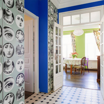
We just love it when a client comes to us and says “I’ve come to you because I want something different, I don’t want a standard bathroom companies design and layout.” For us this is brilliant, because it means we have some creative freedom to design something special.
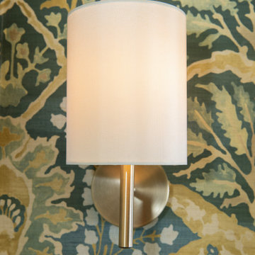
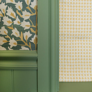
Having worked with this client before, we knew she liked pattern and colour, specifically William Morris. Keen not to overdo it on William Morris print we considered other designs that might be of a similar look and feel, so we used Lewis and Wood for the powder room and Christopher Farr for the family bathroom, both wonderful wallpapers that offer more of a mural feel.
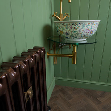
With the powder room we considered the adjoining rooms, the rural location and also the size of the space. When it comes to small spaces I think more really is more, so we went for it, we know our client loved green and also the London Basin Company, so those were our starting points.
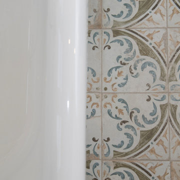
The family bathroom, located in a completely different part of the house, has a more serene feel, although still embraces pattern and colour. The Christopher Farr wallpaper was finished in decorators varnish to ensure a good moisture barrier and the baked tile company tiles continue the muted colour palette.
Our client tells us that they have received lots of complements already :)
 Revival by Design
We just love it when a client comes to us and says “I’ve come to you because I want something different, I don’t want a standard bathroom companies design and layout.” For us this is brilliant, because it means we have some creative freedom to design something special.
Having worked with this client before, we knew she liked pattern and colour, specifically William Morris. Keen not to overdo it on William Morris print we considered other designs that might be of a similar look and feel, so we used Lewis and Wood for the powder room and Christopher Farr for the family bathroom, both wonderful wallpapers that offer more of a mural feel.
With the powder room we considered the adjoining rooms, the rural location and also the size of the space. When it comes to small spaces I think more really is more, so we went for it, we know our client loved green and also the London Basin Company, so those were our starting points.
The family bathroom, located in a completely different part of the house, has a more serene feel, although still embraces pattern and colour. The Christopher Farr wallpaper was finished in decorators varnish to ensure a good moisture barrier and the baked tile company tiles continue the muted colour palette.
Our client tells us that they have received lots of complements already :)
Find the right local pro for your project

 Ferrarini & Co. Kitchens & Interiors
This client initially retained us to design & build an addition but after an in-depth review of the house and the family's need we were able to create the ideal space by simply re-configuring the existing square footage. The dining room was over-sized and underused, which allowed us to relocate a primary wall in the kitchen to create a much larger foot print. Additionally we added an extra window to allow more natural light in. Once that was complete, the client felt the elegance we had in mind and enjoyed what felt like a completely new home
 Revival by Design
We just love it when a client comes to us and says “I’ve come to you because I want something different, I don’t want a standard bathroom companies design and layout.” For us this is brilliant, because it means we have some creative freedom to design something special.
Having worked with this client before, we knew she liked pattern and colour, specifically William Morris. Keen not to overdo it on William Morris print we considered other designs that might be of a similar look and feel, so we used Lewis and Wood for the powder room and Christopher Farr for the family bathroom, both wonderful wallpapers that offer more of a mural feel.
With the powder room we considered the adjoining rooms, the rural location and also the size of the space. When it comes to small spaces I think more really is more, so we went for it, we know our client loved green and also the London Basin Company, so those were our starting points.
The family bathroom, located in a completely different part of the house, has a more serene feel, although still embraces pattern and colour. The Christopher Farr wallpaper was finished in decorators varnish to ensure a good moisture barrier and the baked tile company tiles continue the muted colour palette.
Our client tells us that they have received lots of complements already :)
 Revival by Design
We just love it when a client comes to us and says “I’ve come to you because I want something different, I don’t want a standard bathroom companies design and layout.” For us this is brilliant, because it means we have some creative freedom to design something special.
Having worked with this client before, we knew she liked pattern and colour, specifically William Morris. Keen not to overdo it on William Morris print we considered other designs that might be of a similar look and feel, so we used Lewis and Wood for the powder room and Christopher Farr for the family bathroom, both wonderful wallpapers that offer more of a mural feel.
With the powder room we considered the adjoining rooms, the rural location and also the size of the space. When it comes to small spaces I think more really is more, so we went for it, we know our client loved green and also the London Basin Company, so those were our starting points.
The family bathroom, located in a completely different part of the house, has a more serene feel, although still embraces pattern and colour. The Christopher Farr wallpaper was finished in decorators varnish to ensure a good moisture barrier and the baked tile company tiles continue the muted colour palette.
Our client tells us that they have received lots of complements already :)
 Revival by Design
We just love it when a client comes to us and says “I’ve come to you because I want something different, I don’t want a standard bathroom companies design and layout.” For us this is brilliant, because it means we have some creative freedom to design something special.
Having worked with this client before, we knew she liked pattern and colour, specifically William Morris. Keen not to overdo it on William Morris print we considered other designs that might be of a similar look and feel, so we used Lewis and Wood for the powder room and Christopher Farr for the family bathroom, both wonderful wallpapers that offer more of a mural feel.
With the powder room we considered the adjoining rooms, the rural location and also the size of the space. When it comes to small spaces I think more really is more, so we went for it, we know our client loved green and also the London Basin Company, so those were our starting points.
The family bathroom, located in a completely different part of the house, has a more serene feel, although still embraces pattern and colour. The Christopher Farr wallpaper was finished in decorators varnish to ensure a good moisture barrier and the baked tile company tiles continue the muted colour palette.
Our client tells us that they have received lots of complements already :)
Sponsored
Columbus, OH
Free consultation for landscape design!

Peabody Landscape Group
Columbus' Reliable Landscape Design & Contracting
 Revival by Design
We just love it when a client comes to us and says “I’ve come to you because I want something different, I don’t want a standard bathroom companies design and layout.” For us this is brilliant, because it means we have some creative freedom to design something special.
Having worked with this client before, we knew she liked pattern and colour, specifically William Morris. Keen not to overdo it on William Morris print we considered other designs that might be of a similar look and feel, so we used Lewis and Wood for the powder room and Christopher Farr for the family bathroom, both wonderful wallpapers that offer more of a mural feel.
With the powder room we considered the adjoining rooms, the rural location and also the size of the space. When it comes to small spaces I think more really is more, so we went for it, we know our client loved green and also the London Basin Company, so those were our starting points.
The family bathroom, located in a completely different part of the house, has a more serene feel, although still embraces pattern and colour. The Christopher Farr wallpaper was finished in decorators varnish to ensure a good moisture barrier and the baked tile company tiles continue the muted colour palette.
Our client tells us that they have received lots of complements already :)

 Tileshop
Photo Credit: Target Studios Italy
This Italian porcelain mosaic tile - terra cotta with blue and white detailing - is based on old hand-painted Italian
cotto designs. It is screen-printed by hand so that each piece has its own unique character. Interior wall and floor tiles suitable as accents or by itself in bathrooms, kitchens, living rooms or bedrooms.
Tileshop
1005 Harrison Street
Berkeley, CA 94710
Tileshop
480 E. Brokaw Road
San Jose, CA 95112
Tileshop
16216 Raymer Street
Van Nuys, CA 91406
Other California Locations: Berkeley and San Jose and Van Nuys (Los Angeles)
 Revival by Design
We just love it when a client comes to us and says “I’ve come to you because I want something different, I don’t want a standard bathroom companies design and layout.” For us this is brilliant, because it means we have some creative freedom to design something special.
Having worked with this client before, we knew she liked pattern and colour, specifically William Morris. Keen not to overdo it on William Morris print we considered other designs that might be of a similar look and feel, so we used Lewis and Wood for the powder room and Christopher Farr for the family bathroom, both wonderful wallpapers that offer more of a mural feel.
With the powder room we considered the adjoining rooms, the rural location and also the size of the space. When it comes to small spaces I think more really is more, so we went for it, we know our client loved green and also the London Basin Company, so those were our starting points.
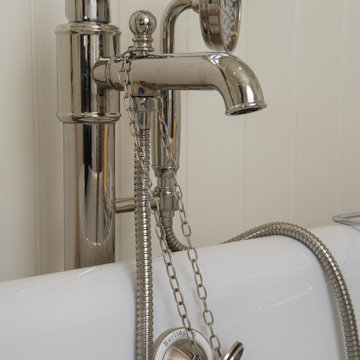
The family bathroom, located in a completely different part of the house, has a more serene feel, although still embraces pattern and colour. The Christopher Farr wallpaper was finished in decorators varnish to ensure a good moisture barrier and the baked tile company tiles continue the muted colour palette.
Our client tells us that they have received lots of complements already :)
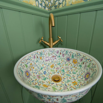 Revival by Design
We just love it when a client comes to us and says “I’ve come to you because I want something different, I don’t want a standard bathroom companies design and layout.” For us this is brilliant, because it means we have some creative freedom to design something special.
Having worked with this client before, we knew she liked pattern and colour, specifically William Morris. Keen not to overdo it on William Morris print we considered other designs that might be of a similar look and feel, so we used Lewis and Wood for the powder room and Christopher Farr for the family bathroom, both wonderful wallpapers that offer more of a mural feel.
With the powder room we considered the adjoining rooms, the rural location and also the size of the space. When it comes to small spaces I think more really is more, so we went for it, we know our client loved green and also the London Basin Company, so those were our starting points.
The family bathroom, located in a completely different part of the house, has a more serene feel, although still embraces pattern and colour. The Christopher Farr wallpaper was finished in decorators varnish to ensure a good moisture barrier and the baked tile company tiles continue the muted colour palette.
Our client tells us that they have received lots of complements already :)
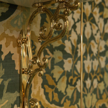 Revival by Design
We just love it when a client comes to us and says “I’ve come to you because I want something different, I don’t want a standard bathroom companies design and layout.” For us this is brilliant, because it means we have some creative freedom to design something special.
Having worked with this client before, we knew she liked pattern and colour, specifically William Morris. Keen not to overdo it on William Morris print we considered other designs that might be of a similar look and feel, so we used Lewis and Wood for the powder room and Christopher Farr for the family bathroom, both wonderful wallpapers that offer more of a mural feel.
With the powder room we considered the adjoining rooms, the rural location and also the size of the space. When it comes to small spaces I think more really is more, so we went for it, we know our client loved green and also the London Basin Company, so those were our starting points.
The family bathroom, located in a completely different part of the house, has a more serene feel, although still embraces pattern and colour. The Christopher Farr wallpaper was finished in decorators varnish to ensure a good moisture barrier and the baked tile company tiles continue the muted colour palette.
Our client tells us that they have received lots of complements already :)

 Mollie Bigley Design & Architecture
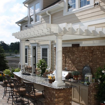
The owners loved the location and views from their original 2 bedroom, 1 bath home perched over looking the beautiful ocean shoreline. The problem was the size, layout and overall look of the house did not work for their growing family. The challenge was to take the existing multi-level, disjointed house and turn it into a larger, comfortably-elegant family home all within the existing foot print.
The existing loft-style home was completely gutted and transformed into a four bedroom, 4.5 bath home. Every room in the house boasts fantastic views of the ocean. High on the Owners' list was a stronger street presence. Vistors never could find the front door! The front of the house was given a complete face-lift, leaving no question where to enter the new home.
The Owners also wanted to create usable outdoor space, which on the steep site, was tricky. Instead of taking the material from demolished east side of the house (which was rebuilt) and hauling it off to the landfill, it was used to create a new raised patio off the lower level.
The scale and overall proportions of the house are what the owners love. Each room is comfortable while still having a sense of grace and detail…the perfect mix for this family.
Sponsored
Columbus, OH
Free consultation for landscape design!
Peabody Landscape Group
Columbus' Reliable Landscape Design & Contracting


 User
Original bath of historic 1904 Home in Franklin, TN gets new look by taking in a large hallway that had been made from the original back porch. The original bath of the home was located on the back porch, accessible through the original kitchen and a back door off the hallway between the kitchen and breakfast rooms.
In an earlier remodel, the back porch was taken in to for a hallway leading to a new kitchen addition leaving the original kitchen to become a bedroom. The bathroom was small, there were no closets and no access to the original breakfast room. The new floor plan has solved all of the problems by making the original bath foot print into walk-in closets. Supplying natural light by leaving the original window to the bathroom between the closets and taking in the back hall for the new shower, tub vanities and toilet. Built-in medicine cabinets and storage over the toilet solve storage issues and the original exterior door to the porch was utilized to make the decorative niche over the tub.

 Aloha Pools & Spas
Jason Aldridge Photography
Large island style backyard stamped concrete and custom-shaped pool fountain photo in Chicago
Large island style backyard stamped concrete and custom-shaped pool fountain photo in Chicago
 Thyme & Place Design LLC
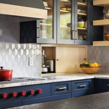
The client requested a kitchen that would not only provide a great space to cook and enjoy family meals but one that would fit in with her unique design sense. An avid collector of contemporary art, she wanted something unexpected in her 100-year-old home in both color and finishes but still providing a great layout with improved lighting, storage, and superior cooking abilities. The existing kitchen was in a closed off space trapped between the family room and the living. If you were in the kitchen, you were isolated from the rest of the house. Making the kitchen an integrated part of the home was a paramount request.
Step one, remove the wall separating the kitchen from the other rooms in the home which allowed the new kitchen to become an integrated space instead of an isolation room for the cook. Next, we relocated the pantry access which was in the family room to the kitchen integrating a poorly used recess which had become a catch all area which did not provide any usable space for storage or working area. To add valuable function in the kitchen we began by capturing unused "cubbies", adding a walk-in pantry from the kitchen, increasing the storage lost to un-needed drop ceilings and bring light and design to the space with a new large awning window, improved lighting, and combining interesting finishes and colors to reflect the artistic attitude of the client.
A bathroom located above the kitchen had been leaking into the plaster ceiling for several years. That along with knob and tube wiring, rotted beams and a brick wall from the back of the fireplace in the adjacent living room all needed to be brought to code. The walls, ceiling and floors in this 100+ year old home were completely out of level and the room’s foot print could not be increased.
The choice of a Sub-Zero wolf product is a standard in my kitchen designs. The quality of the product, its manufacturing and commitment to food preservation is the reason I specify Sub Zero Wolf. For the cook top, the integrated line of the contemporary cooktop and the signature red knobs against the navy blue of the cabinets added to the design vibe of the kitchen. The cooking performance and the large continuous grate on the cooktop makes it an obvious choice for a cook looking for a great cook top with professional results in a more streamlined profile. We selected a Sharp microwave drawer for the island, an XO wine refrigerator, Bosch dishwasher and Kitchen Aid double convection wall ovens to round out the appliance package.
A recess created by the fireplace was outfitted with a cabinet which now holds small appliances within easy reach of my very petite client. Natural maple accents were used inside all the wall cabinets and repeated on the front of the hood and for the sliding door appliance cabinet and the floating shelves. This allows a brighter interior for the painted cabinets instead of the traditional same interior as exterior finish choice. The was an amazing transformation from the old to the new.
The final touches are the honey bronze hardware from Top Knobs, Mitzi pendants from Hudson Valley Lighting group,
a fabulous faucet from Brizo. To eliminate the old freestanding bottled water cooler, we specified a matching water filter faucet.
Sponsored
Columbus, OH

Hope Restoration & General Contracting
Columbus Design-Build, Kitchen & Bath Remodeling, Historic Renovations


 Stone Barn Furnishings Inc
Transitional family space with neutral decors all available in our store located in Ohio's Amish Country. Space was designed and styled by our in-house interior design team.

 threshold interiors
Location: New York, NY, USA
This stunning loft in the heart of Tribeca has retained the details and history associated with the building's original commercial function. The decor features a blend of artisan, natural and metallic accents creating a softer industrial setting.
Photographed by: Kerry Perchaluk
82