
Search results for "Longer time" in Home Design Ideas

 Patio Lane
Located in the heart of Downtown St. Petersburg, the Vinoy Renaissance Resort & Golf Club is one of the city's most iconic hotels. This downtown gem can easily be distinguished by its salmon color and Mediterranean Revival style architecture. Situated right on the bay, this luxury resort is just a short walk from all of the area’s major attractions such as the Dali Museum, Beach Drive, and the Mahaffey Theater.
The Vinoy was constructed in 1925 and has been through a long history of renovations and construction within its lifetime. Efforts are constantly being made to preserve the hotel’s historic past while still providing guests with a unique, comfortable, and luxurious experience. With that being said, it was recently announced that the hotel will undergo a three-year $50 million plan to improve several aspects of the property.
Patio Lane took part in these upgrades by designing and producing custom cushions for two locations on the property: the veranda and smoking area seating. We fabricated a total of 187 custom cushions with 13 different configurations for the hotel: dining chair seat, lounge chair, love seat, center sectional, end sectionals, as well as ottomans. Patio Lane directly competed with the original furniture and cushion manufacturer for this project. However, being an essential part of St. Petersburg, the resort appreciated a local vendor with strong initiative to earn their business.
As far as the project requirements, the Vinoy needed something that will hold up through the harsh sun and storms of Central Florida. Typically, cushions in a commercial setting will last a few years depending on the human traffic. For a luxury hotel, such as the Vinoy, these cushions should have been replaced within 3 years.
To ensure that they would have high performing seating for their guests, they chose cushions fabricated with Sunbrella Rain performance fabric. This fabric is 100% waterproof and specifically made for outdoor spaces that endure heavy rainfall or any kind of moisture. Sunbrella Rain eliminates drying time after wet weather. Resort staff can simply wipe the cushions down and their guests are ready to continue lounging and relaxing.
The Vinoy’s original cushions used a polyurethane foam that had since lost its strength and was no longer providing a comfortable seat. (When we initially surveyed the Vinoy, we witnessed many customers doubling up on cushions to place behind their backs!) Numerous cushions had ripped at the seams and the zippers were non-functional. Dry-fast foam, the preferred option for cushions fabricated with Sunbrella Rain, was the perfect choice with the 4 in. thick seats & 5 in. thick backs because it will provide a firm seat and support for years to come.
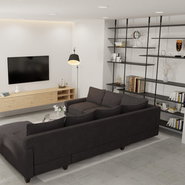
 Ferriss - Architectural Renderings
Here are some practical tips for creating a beautiful, comfortable and thoughtful living room design.
The living room in the house is the place where, as the name suggests, receives guests. However, the owners themselves relax here, spending time in front of the TV or a book, with drinks, pleasant conversation and other activities. Therefore, the living room should be the most comfortable place in your home.
The place of the sofa in the design of the living room
The sofa does not need to be placed in a draft. This means that it should not be on an imaginary line from window to door - if you drew a floor plan, it will just be easy to trace.
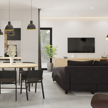
1. The sofa in front of the TV, diagonally from the door, is a great location. As if inviting you to sit down :)
2. Sofa near the door. A good solution if you often have overnight guests.
3. Corner sofa in the living room. Best placed in the farthest corner from the door. This will make the room look more spacious.
Correct opening of the door in the living room. Inward or outward?
Open inward or outward? There is no clear rule here, because everything depends on the layout and on the furniture placed. The main thing is that the door leaf opens freely and does not interfere with entering and exiting the room. Also, the door should not interfere with free access to the closet or dressing room.
TV in living room size and location. Location.
The TV is placed on the wall opposite to the sofa - this is the most logical and reasonable place for it in the living room. Moreover, the distance to it does not really matter: modern TV models can be placed close to the sofa.
Cabinet or bracket? To your taste. The main thing is that the television zone looks neat and presentable. Provide in advance a cable channel in which all the wires and numerous sockets for the receiver, modem, set-top box, sound bar will hide. Nothing spoils a design like sticking wires!
Height from the floor. It is optimal to place the TV 1 m from the floor to the middle of the screen - this is exactly the level of the eyes of a seated person.
Diagonal size. If there is a financial opportunity, consider options from 50 inches - smaller screens look lonely and lonely on an empty wall.
Living room furniture.
Armchair. Often the chair becomes an accent item in the interior, then its shade, and sometimes its shape, differ from the rest of the furniture. When choosing a chair, be guided also by your habits: for example, it will be more convenient to climb up with your feet and read a book in an armchair with dimensions of 90x90 cm, and you can “just sit comfortably” in a fireplace chair with a high back, comfortable armrests and with a seat 80x80 cm.
TV stand. Large TV stands are no longer as relevant as they used to be, when it was necessary to store a player, cassettes and discs there. For now, a console table or a narrow elegant pedestal is enough.
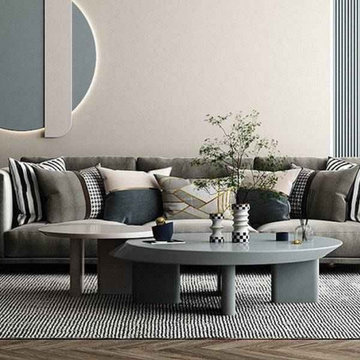
Coffee table. Nice piece of furniture that creates a cozy atmosphere. Some models, if necessary, can be transformed into a more spacious table for receiving guests - however, finding comfortable and beautiful specimens is not easy, plus they usually cost a lot.
Rack. An extremely useful type of furniture. :) Firstly, a large number of decor items can be beautifully placed on the rack. And secondly, it can also play the role of a light through partition, which divides the room into zones and does not select light at the same time. This is a very big plus for small apartments.
Fireplace. Here we are talking about electric fireplaces. Some of them come with a humidifier and heated, so 3-in-1 models can be very helpful. Fireplace portals have different styles: classic, antique, modern. Inconsistency with the general style of the living room can greatly spoil the impression of the room, so be careful with creativity. Sizing is an important issue. A large wall with a high ceiling also needs a proportionate fireplace; in horror, a small portal will look lonely and ridiculous.
What do you think about our new living room project?
https://www.ferriss.co
#ferriss #We_bring_objects_to_life #3drendering #architecture #San_Francisco
 Save home
There are a lot of different materials used in making a roof. In the past, roofs were made out of wood and shingles. Now, they are made out of a variety of different materials like steel and plastic. But, no matter what material your roof uses, it needs to be durable and waterproof. The new roof system that was developed by GM Systems Inc. combines different materials to make a sturdy and durable roof that is also very easy to install.
This new roof is designed to keep the elements away from your home. It will also protect you from the heat of the sun. This means that you won't have to worry about the roof causing you problems. You will be able to enjoy the comfort of your home while using a product that works great. This is something that you can't say for many other products. The roof that GM Systems Inc. created has been tested and approved by many experts in the industry. So, you can rest assured that you are using a quality product.
1. What is GM Systems Inc.?
GM Systems Inc. is a company that is dedicated to providing top-quality roofing systems. They provide quality roofing materials and services that exceed all expectations. They offer an extensive line of products that are durable and energy-efficient. In fact, the company was able to produce a great product because it invested heavily in research and development. The company invested thousands of dollars to create a unique product. It is because of this that the company can claim that it has the best product on the market.
2. Features of GM Systems Inc. Roof system
GM Systems Inc. Roof system is a new type of material that can protect the roof of your home. It is very versatile, and you can use it for any type of roof, including flat and curved roofs. If you need a new roof, GM Systems Inc. can help you to replace the old one. You can either repair the old roof or completely replace it with this new roof. The new roof is a great solution because it protects your home. It will keep the rain and wind out. It will also reduce your monthly bills. In addition, it helps you to reduce the chances of your home getting damaged by the weather. The new roof can help you to get a longer lifespan for your roof. You can also use the roof to save energy. It will help you to lower your utility bills.
3. Types of roofing system
Many companies make roofing systems. They provide different types of roofs. They can be categorized into three types: flat roofs, sloped roofs, and steel roofs.
Flat roofs: A flat roof has a smooth surface. This is because the roof is made of asphalt or tar. They are easy to maintain. They can last for a long time and they are usually affordable. They are usually found in houses.
Slope roofs: A sloping roof has a steep incline. They can be made of clay tiles, cement tiles, or a combination of materials. They can withstand heavy winds.
Steel roofs: Steel roofs are available in different sizes. The size is dependent on the amount of space you need to be covered. The larger the size, the more you pay for the roof. Steel roofs are also easy to repair. They are very simple to put together and take apart. They have an open structure and they don't require any kind of insulation. A steel roof doesn't require much maintenance either. The main issue with steel roofs is that they can get too hot in certain weather conditions.
4. How is it different from the conventional roofing system?
You can buy a steel roof for many reasons. It is easier to install than a conventional roof and it is also less expensive to install. It's a durable roof that lasts for years. It requires less maintenance than conventional roofs and is easy to repair.
5. GM Systems Inc. Roofing material
GM Systems Inc.. is used to protect building materials and it keeps the rain away. Steel roofs are made of metal and aluminum. They are lightweight and durable. They can withstand wind and rain. They don't rust. Steel roofs can be bought in many colors. They can also be designed according to your taste. Steel roofs are known to be one of the best roofing systems.
6. The installation process of the new roof system
The installation process of the new roof system is simple. It is the best way to ensure that your roof lasts for a long time. You should hire the best roof installation company to install the new roof system. Steel roofs are the best for you if you want to protect your house from the elements. They will also protect your house from moisture and snow. These roofs can last a lifetime. It is recommended to buy steel roofs because they can withstand extreme weather conditions.
7. What are the benefits of the new roof system from GM Systems Inc.?
The benefits of the new roof system from GM Systems Inc. include being able to install the new roof easily. You can just call them and ask for a quote. You will get a price estimate immediately. There is no need to pay for an installation person first. It's time-consuming, and you may have to wait around for them. You will not have to go through the hassle of having to hire a different contractor for the roof repair. If you are not sure about your options, then you can always call the company. They will provide you with the right information. It is also easy to find the new roof system. It is located in the roofing section.
Find the right local pro for your project
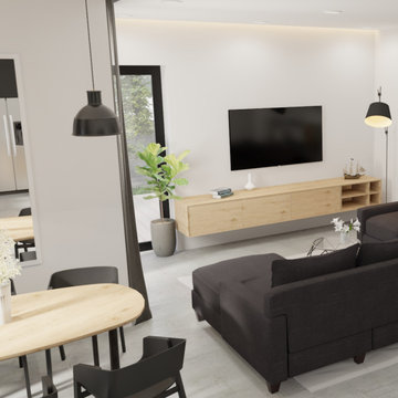 Ferriss - Architectural Renderings
Here are some practical tips for creating a beautiful, comfortable and thoughtful living room design.
The living room in the house is the place where, as the name suggests, receives guests. However, the owners themselves relax here, spending time in front of the TV or a book, with drinks, pleasant conversation and other activities. Therefore, the living room should be the most comfortable place in your home.
The place of the sofa in the design of the living room
The sofa does not need to be placed in a draft. This means that it should not be on an imaginary line from window to door - if you drew a floor plan, it will just be easy to trace.
1. The sofa in front of the TV, diagonally from the door, is a great location. As if inviting you to sit down :)
2. Sofa near the door. A good solution if you often have overnight guests.
3. Corner sofa in the living room. Best placed in the farthest corner from the door. This will make the room look more spacious.
Correct opening of the door in the living room. Inward or outward?
Open inward or outward? There is no clear rule here, because everything depends on the layout and on the furniture placed. The main thing is that the door leaf opens freely and does not interfere with entering and exiting the room. Also, the door should not interfere with free access to the closet or dressing room.
TV in living room size and location. Location.
The TV is placed on the wall opposite to the sofa - this is the most logical and reasonable place for it in the living room. Moreover, the distance to it does not really matter: modern TV models can be placed close to the sofa.
Cabinet or bracket? To your taste. The main thing is that the television zone looks neat and presentable. Provide in advance a cable channel in which all the wires and numerous sockets for the receiver, modem, set-top box, sound bar will hide. Nothing spoils a design like sticking wires!
Height from the floor. It is optimal to place the TV 1 m from the floor to the middle of the screen - this is exactly the level of the eyes of a seated person.
Diagonal size. If there is a financial opportunity, consider options from 50 inches - smaller screens look lonely and lonely on an empty wall.
Living room furniture.
Armchair. Often the chair becomes an accent item in the interior, then its shade, and sometimes its shape, differ from the rest of the furniture. When choosing a chair, be guided also by your habits: for example, it will be more convenient to climb up with your feet and read a book in an armchair with dimensions of 90x90 cm, and you can “just sit comfortably” in a fireplace chair with a high back, comfortable armrests and with a seat 80x80 cm.
TV stand. Large TV stands are no longer as relevant as they used to be, when it was necessary to store a player, cassettes and discs there. For now, a console table or a narrow elegant pedestal is enough.
Coffee table. Nice piece of furniture that creates a cozy atmosphere. Some models, if necessary, can be transformed into a more spacious table for receiving guests - however, finding comfortable and beautiful specimens is not easy, plus they usually cost a lot.
Rack. An extremely useful type of furniture. :) Firstly, a large number of decor items can be beautifully placed on the rack. And secondly, it can also play the role of a light through partition, which divides the room into zones and does not select light at the same time. This is a very big plus for small apartments.
Fireplace. Here we are talking about electric fireplaces. Some of them come with a humidifier and heated, so 3-in-1 models can be very helpful. Fireplace portals have different styles: classic, antique, modern. Inconsistency with the general style of the living room can greatly spoil the impression of the room, so be careful with creativity. Sizing is an important issue. A large wall with a high ceiling also needs a proportionate fireplace; in horror, a small portal will look lonely and ridiculous.
What do you think about our new living room project?
https://www.ferriss.co
#ferriss #We_bring_objects_to_life #3drendering #architecture #San_Francisco


 Pennsylvania Landscape & Nursery Association
u2014 ALE: Wayne Rain Garden
Pennsylvania Landscape & Nursery Association
u2014 ALE: Wayne Rain Garden
Terren Landscapes http://www.terrenlandscapes.com
2014 PLNA Awards for Landscape Excellence winner
Category: Residential Up to $15,000
Award Level: Gold
Project Description:
Our company was contracted by the client to provide a creative solution to an ongoing drainage problem. Their property is located within 30 feet of a local stream that collects storm water from the surrounding area. The nearby stream and high water table caused the lawn area at the side of their home to flood and to remain waterlogged for a few days after each storm. The client not only had difficulty growing plants in the existing conditions, but also had a problem with mosquitoes due to standing water.
Our goal was to design a self-contained, naturalistic rain garden that slowed storm water runoff, allowed for percolation, and promoted infiltration while permitting excess clean water to enter the nearby stream with diminished force. As designed, the rain garden allows the earth to slowly and more naturally
absorb excess storm water while filtering out toxins such as excess nitrogen and phosphorous which are frequently found in the landscape, therefore reducing the contaminants entering the stream.
A percolation test was conducted with criteria of absorbing a one-inch rainstorm within four hours without overflow. The one-inch storm calculation included an existing downspout from the home, which would be piped into the rain garden to reduce roof runoff. The first test failed due to a deep layer of high clay-content soil. Excavation continued until a layer of sandy loam was reached, the percolation test was repeated, and a successful test result was achieved. Next, the entire rain garden basin was excavated to the sandy loam layer and the soil amended with compost and sand to create a highly porous planting media.
Geotextile fabric was placed to help reduce migration of the surface stone into the soil and allow for minimal maintenance. Gravel, river stone and small boulders were carefully placed to achieve the look of a natural streambed.
A palette of mostly native plants with a few non-invasive ornamentals were chosen for their ability to survive in extreme conditions ranging from floods to drought and were placed according to their specific preferences.
Wetland plants were chosen for the lowest portion of the rain garden as that area remains saturated for longer periods of time, with a Chionanthus virginicus as a focal point surrounded by irises and ferns at the lowest depth.
Plants tolerant of drier conditions were chosen for the upper edges of the garden. The beautiful colors of Monarda, Ligularia, Eupatorium, Solidago, Chelone, and Rudbeckia were scattered within the upper edge, while movement and softness were incorporated by use of the graceful Nassella that lines the border. Finally, winter interest was provided with a backdrop of Cornus sericea.
As built, this small rain garden creates tremendous impact by decreasing the amount of storm water runoff not only on our client's property, but also in the neighboring stream. It serves as a means of slowing the water and providing an area for infiltration back into the earth. The plants provide a habitat for birds, butterflies, and insects, working in harmony with nature and providing beautiful visual interest year-round.
Photo Credit:
Lisa C. Falls
 Ferriss - Architectural Renderings
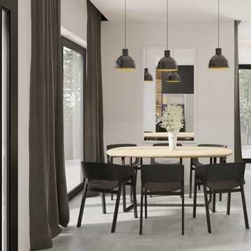
Here are some practical tips for creating a beautiful, comfortable and thoughtful living room design.
The living room in the house is the place where, as the name suggests, receives guests. However, the owners themselves relax here, spending time in front of the TV or a book, with drinks, pleasant conversation and other activities. Therefore, the living room should be the most comfortable place in your home.
The place of the sofa in the design of the living room
The sofa does not need to be placed in a draft. This means that it should not be on an imaginary line from window to door - if you drew a floor plan, it will just be easy to trace.
1. The sofa in front of the TV, diagonally from the door, is a great location. As if inviting you to sit down :)
2. Sofa near the door. A good solution if you often have overnight guests.
3. Corner sofa in the living room. Best placed in the farthest corner from the door. This will make the room look more spacious.
Correct opening of the door in the living room. Inward or outward?
Open inward or outward? There is no clear rule here, because everything depends on the layout and on the furniture placed. The main thing is that the door leaf opens freely and does not interfere with entering and exiting the room. Also, the door should not interfere with free access to the closet or dressing room.
TV in living room size and location. Location.
The TV is placed on the wall opposite to the sofa - this is the most logical and reasonable place for it in the living room. Moreover, the distance to it does not really matter: modern TV models can be placed close to the sofa.
Cabinet or bracket? To your taste. The main thing is that the television zone looks neat and presentable. Provide in advance a cable channel in which all the wires and numerous sockets for the receiver, modem, set-top box, sound bar will hide. Nothing spoils a design like sticking wires!
Height from the floor. It is optimal to place the TV 1 m from the floor to the middle of the screen - this is exactly the level of the eyes of a seated person.
Diagonal size. If there is a financial opportunity, consider options from 50 inches - smaller screens look lonely and lonely on an empty wall.
Living room furniture.
Armchair. Often the chair becomes an accent item in the interior, then its shade, and sometimes its shape, differ from the rest of the furniture. When choosing a chair, be guided also by your habits: for example, it will be more convenient to climb up with your feet and read a book in an armchair with dimensions of 90x90 cm, and you can “just sit comfortably” in a fireplace chair with a high back, comfortable armrests and with a seat 80x80 cm.
TV stand. Large TV stands are no longer as relevant as they used to be, when it was necessary to store a player, cassettes and discs there. For now, a console table or a narrow elegant pedestal is enough.
Coffee table. Nice piece of furniture that creates a cozy atmosphere. Some models, if necessary, can be transformed into a more spacious table for receiving guests - however, finding comfortable and beautiful specimens is not easy, plus they usually cost a lot.
Rack. An extremely useful type of furniture. :) Firstly, a large number of decor items can be beautifully placed on the rack. And secondly, it can also play the role of a light through partition, which divides the room into zones and does not select light at the same time. This is a very big plus for small apartments.
Fireplace. Here we are talking about electric fireplaces. Some of them come with a humidifier and heated, so 3-in-1 models can be very helpful. Fireplace portals have different styles: classic, antique, modern. Inconsistency with the general style of the living room can greatly spoil the impression of the room, so be careful with creativity. Sizing is an important issue. A large wall with a high ceiling also needs a proportionate fireplace; in horror, a small portal will look lonely and ridiculous.
What do you think about our new living room project?
https://www.ferriss.co
#ferriss #We_bring_objects_to_life #3drendering #architecture #San_Francisco

 Ferriss - Architectural Renderings
Here are some practical tips for creating a beautiful, comfortable and thoughtful living room design.
The living room in the house is the place where, as the name suggests, receives guests. However, the owners themselves relax here, spending time in front of the TV or a book, with drinks, pleasant conversation and other activities. Therefore, the living room should be the most comfortable place in your home.
The place of the sofa in the design of the living room
The sofa does not need to be placed in a draft. This means that it should not be on an imaginary line from window to door - if you drew a floor plan, it will just be easy to trace.
1. The sofa in front of the TV, diagonally from the door, is a great location. As if inviting you to sit down :)
2. Sofa near the door. A good solution if you often have overnight guests.
3. Corner sofa in the living room. Best placed in the farthest corner from the door. This will make the room look more spacious.
Correct opening of the door in the living room. Inward or outward?
Open inward or outward? There is no clear rule here, because everything depends on the layout and on the furniture placed. The main thing is that the door leaf opens freely and does not interfere with entering and exiting the room. Also, the door should not interfere with free access to the closet or dressing room.
TV in living room size and location. Location.
The TV is placed on the wall opposite to the sofa - this is the most logical and reasonable place for it in the living room. Moreover, the distance to it does not really matter: modern TV models can be placed close to the sofa.
Cabinet or bracket? To your taste. The main thing is that the television zone looks neat and presentable. Provide in advance a cable channel in which all the wires and numerous sockets for the receiver, modem, set-top box, sound bar will hide. Nothing spoils a design like sticking wires!
Height from the floor. It is optimal to place the TV 1 m from the floor to the middle of the screen - this is exactly the level of the eyes of a seated person.
Diagonal size. If there is a financial opportunity, consider options from 50 inches - smaller screens look lonely and lonely on an empty wall.
Living room furniture.
Armchair. Often the chair becomes an accent item in the interior, then its shade, and sometimes its shape, differ from the rest of the furniture. When choosing a chair, be guided also by your habits: for example, it will be more convenient to climb up with your feet and read a book in an armchair with dimensions of 90x90 cm, and you can “just sit comfortably” in a fireplace chair with a high back, comfortable armrests and with a seat 80x80 cm.
TV stand. Large TV stands are no longer as relevant as they used to be, when it was necessary to store a player, cassettes and discs there. For now, a console table or a narrow elegant pedestal is enough.
Coffee table. Nice piece of furniture that creates a cozy atmosphere. Some models, if necessary, can be transformed into a more spacious table for receiving guests - however, finding comfortable and beautiful specimens is not easy, plus they usually cost a lot.
Rack. An extremely useful type of furniture. :) Firstly, a large number of decor items can be beautifully placed on the rack. And secondly, it can also play the role of a light through partition, which divides the room into zones and does not select light at the same time. This is a very big plus for small apartments.
Fireplace. Here we are talking about electric fireplaces. Some of them come with a humidifier and heated, so 3-in-1 models can be very helpful. Fireplace portals have different styles: classic, antique, modern. Inconsistency with the general style of the living room can greatly spoil the impression of the room, so be careful with creativity. Sizing is an important issue. A large wall with a high ceiling also needs a proportionate fireplace; in horror, a small portal will look lonely and ridiculous.
What do you think about our new living room project?
https://www.ferriss.co
#ferriss #We_bring_objects_to_life #3drendering #architecture #San_Francisco

 Envision Web
Stuart Wade, Envision Virtual Tours
The second-largest and most developed of Georgia's barrier islands, St. Simons is approximately twelve miles long and nearly three miles wide at its widest stretch (roughly the size of Manhattan Island in New York). The island is located in Glynn County on Georgia's coast and lies east of Brunswick (the seat of Glynn County), south of Little St. Simons Island and the Hampton River, and north of Jekyll Island. The resort community of Sea Island is separated from St. Simons on the east by the Black Banks River. Known for its oak tree canopies and historic landmarks, St. Simons is both a tourist destination and, according to the 2010 U.S. census, home to 12,743 residents.
Early History
The earliest
St. Simons Island Village
record of human habitation on the island dates to the Late Archaic Period, about 5,000 to 3,000 years ago. Remnants of shell rings left behind by Native Americans from this era survive on many of the barrier islands, including St. Simons. Centuries later, during the period known by historians as the chiefdom era, the Guale Indians established a chiefdom centered on St. Catherines Island and used St. Simons as their hunting and fishing grounds. By 1500 the Guale had established a permanent village of about 200 people on St. Simons, which they called Guadalquini.
Beginning in 1568, the Spanish attempted to create missions along the Georgia coast. Catholic missions were the primary means by which Georgia's indigenous Native American chiefdoms were assimilated into the Spanish colonial system along the northern frontier of greater Spanish Florida. In the 1600s St. Simons became home to two Spanish missions: San Buenaventura de Guadalquini, on the southern tip of the island, and Santo Domingo de Asao (or Asajo), on the northern tip. Located on the inland side of the island were the pagan refugee villages of San Simón, the island's namesake, and Ocotonico. In 1684 pirate raids left the missions and villages largely abandoned.
Colonial History
As
Fort Frederica
early as 1670, with Great Britain's establishment of the colony of Carolina and its expansion into Georgia territory, Spanish rule was threatened by the English. The Georgia coast was considered "debatable land" by England and Spain, even though Spain had fully retreated from St. Simons by 1702. Thirty-one years later General James Edward Oglethorpe founded the English settlement of Savannah. In 1736 he established Fort Frederica, named after the heir to the British throne, Frederick Louis, prince of Wales, on the west side of St. Simons Island to protect Savannah and the Carolinas from the Spanish threat.
Between 1736 and 1749 Fort Frederica was the hub of British military operations along the Georgia frontier. A town of the same name grew up around the fort and was of great importance to the new colony. By 1740 Frederica's population was 1,000. In 1736 the congregation of what would become Christ Church was organized within Fort Frederica as a mission of the Church of England. Charles Wesley led the first services. In 1742 Britain's decisive victory over Spain in the Battle of Bloody Marsh, during the War of Jenkins' Ear, ended the Spanish threat to the Georgia coast. When the British regimen disbanded in 1749, most of the townspeople relocated to the mainland. Fort Frederica went into decline and, except for a short time of prosperity during the 1760s and 1770s under the leadership of merchant James Spalding, never fully recovered. Today the historic citadel's tabby ruins are maintained by the National Park Service.
Plantation Era
By the start of the American Revolution (1775-83), Fort Frederica was obsolete, and St. Simons was left largely uninhabited as most of its residents joined the patriot army. Besides hosting a small Georgia naval victory on the Fort Frederica River, providing guns from its famous fort for use at Fort Morris in Sunbury, and serving as an arena for pillaging by privateers and British soldiers, the island played almost no role in the war.
Following the war, many of the townspeople, their businesses destroyed, turned to agriculture. The island was transformed into fourteen cotton plantations after acres of live oak trees were cleared for farm land and used for building American warships, including the famous USS Constitution, or "Old Ironsides." Although rice was the predominant crop along the neighboring Altamaha River, St. Simons was known for its production of long-staple cotton, which soon came to be known as Sea Island cotton.
Between
Ebos Landing
the 1780s and the outbreak of the Civil War (1861-65), St. Simons's plantation culture flourished. The saline atmosphere and the availability of cheap slave labor proved an ideal combination for the cultivation of Sea Island cotton. In 1803 a group of Ebo slaves who survived the Middle Passage and arrived on the west side of St. Simons staged a rebellion and drowned themselves. The sacred site is known today as Ebos Landing.
One of the largest owners of land and slaves on St. Simons was Pierce Butler, master of Hampton Point Plantation, located on the northern end of the island. By 1793 Butler owned more than 500 slaves, who cultivated 800 acres of cotton on St. Simons and 300 acres of rice on Butler's Island in the Altamaha River delta. Butler's grandson, Pierce Mease Butler, who at the age of sixteen inherited a share of his grandfather's estate in 1826, was responsible for the largest sale of human beings in the history of the United States: in 1859, to restore his squandered fortune, he sold 429 slaves in Savannah for more than $300,000. The British actress and writer Fanny Kemble, whose tumultuous marriage to Pierce ended in divorce in 1849, published an eyewitness account of the evils of slavery on St. Simons in her book Journal of a Residence on a Georgian Plantation in 1838-1839 (1863).
Another
Retreat Plantation
large owner of land and slaves on St. Simons was Major William Page, a friend and employee of Pierce Butler Sr. Before purchasing Retreat Plantation on the southwestern tip of the island in 1804, Page managed the Hampton plantation and Butler's Island. Upon Page's death in 1827, Thomas Butler King inherited the land together with his wife, Page's daughter, Anna Matilda Page King. King expanded his father-in-law's planting empire on St. Simons as well as on the mainland, and by 1835 Retreat Plantation alone was home to as many as 355 slaves.
The center of life during the island's plantation era was Christ Church, Frederica. Organized in 1807 by a group of island planters, the Episcopal church is the second oldest in the Diocese of Georgia. Embargoes imposed by the War of 1812 (1812-15) prevented the parishioners from building a church structure, so they worshiped in the home of John Beck, which stood on the site of Oglethorpe's only St. Simons residence, Orange Hall.
The first Christ Church building, finished on the present site in 1820, was ruined by occupying Union troops during the Civil War. In 1884 the Reverend Anson Dodge Jr. rebuilt the church as a memorial to his first wife, Ellen. The cruciform building with a trussed gothic roof and stained-glass windows remains active today as Christ Church.
Civil War and Beyond
The
St. Simons Island Lighthouse
outbreak of the Civil War in 1861 put a sudden end to St. Simons's lucrative plantation era. In January of that year, Confederate troops were stationed at the south end of the island to guard the entrance to Brunswick Harbor. Slaves from Retreat Plantation, owned by Thomas Butler King, built earthworks and batteries. Plantation residents were scattered—the men joined the Confederate army and their families moved to the mainland. Cannon fire was heard on the island in December 1861, and Confederate troops retreated in February 1862, after dynamiting the lighthouse to keep its beacon from aiding Union troops. Soon thereafter, Union troops occupied the island, which was used as a camp for freed slaves. By August 1862 more than 500 former slaves lived on St. Simons, including Susie King Taylor, who organized a school for freed slave children. But in November the ex-slaves were taken to Hilton Head, South Carolina, and Fernandina, Florida, leaving the island abandoned.
After the Civil War the island never returned to its status as an agricultural community. The plantations lay dormant because there were no slaves to work the fields. After Union general William T. Sherman's January 1865 Special Field Order No. 15 —a demand that former plantations be divided and distributed to former slaves—was overturned by U.S. president Andrew Johnson less than a year later, freedmen and women were forced to work as sharecroppers on the small farms that dotted the land previously occupied by the sprawling plantations.
By
St. Simons Lumber Mills
1870 real economic recovery began with the reestablishment of the timber industry. Norman Dodge and Titus G. Meigs of New York set up lumber mill operations at Gascoigne Bluff, formerly Hamilton Plantation. The lumber mills provided welcome employment for both blacks and whites and also provided mail and passenger boats to the mainland. Such water traffic, together with the construction of a new lighthouse in 1872, designed by architect Charles B. Cluskey, marked the beginning of St. Simons's tourism industry. The keeper of the lighthouse created a small amusement park, which drew many visitors, as did the seemingly miraculous light that traveled from the top of the lighthouse tower to the bottom. The island became a summer retreat for families from the mainland, particularly from Baxley, Brunswick, and Waycross.
The island's resort industry was thriving by the 1880s. Beachfront structures, such as a new pier and grand hotel, were built on the southeastern end of the island and could be accessed by ferry. Around this time wealthy northerners began vacationing on the island.
Twentieth Century
The
St. Simons Island Pier and Village
opening in 1924 of the Brunswick–St. Simons Highway, today known as the Torras Causeway, was a milestone in the development of resorts in the area. St. Simons's beaches were now easily accessible to locals and tourists alike. More than 5,000 automobiles took the short drive from Brunswick to St. Simons via the causeway on its opening day, paving the way for convenient residential and resort development.
In 1926 automotive pioneer Howard Coffin of Detroit, Michigan, bought large tracts of land on St. Simons, including the former Retreat Plantation, and constructed a golf course, yacht club, paved roads, and a residential subdivision. Although the causeway had brought large numbers of summer people to the island, St. Simons remained a small community with only a few hundred permanent residents until the 1940s.
The
St. Simons Island
outbreak of World War II (1941-45) brought more visitors and residents to St. Simons. Troops stationed at Jacksonville, Florida; Savannah; and nearby Camp Stewart took weekend vacations on the island, and a new naval air base and radar school became home to even more officers and soldiers. The increased wartime population brought the island its first public school. With a major shipyard for the production of Liberty ships in nearby Brunswick, the waters of St. Simons became active with German U-boats. In April 1942, just off the coast, the Texas Company oil tanker S. S. Oklahoma and the S. S. Esso Baton Rouge were torpedoed by the Germans, bringing the war very close to home for island residents.
Due in large part to the military's improvement of the island's infrastructure during the war, development on the island boomed in the 1950s and 1960s. More permanent homes and subdivisions were built, and the island was no longer just a summer resort but also a thriving community. In 1950 the Methodist conference and retreat center Epworth by the Sea opened on Gascoigne Bluff. In 1961 novelist Eugenia Price visited St. Simons and began work on her first works of fiction, known as the St. Simons Trilogy. Inspired by real events on the island, Price's trilogy renewed interest in the history of Georgia's coast, and the novelist herself relocated to the island in 1965 and lived there for thirty-one years. St. Simons is also home to contemporary Georgia writer Tina McElroy Ansa.
Since
Epworth by the Sea
1980 St. Simons's population has doubled. The island's continued status as a vacation destination and its ongoing development boom have put historic landmarks and natural areas at risk. While such landmarks as the Fort Frederica ruins and the Battle of Bloody Marsh site are preserved and maintained by the National Park Service, and while the historic lighthouse is maintained by the Coastal Georgia Historical Society, historic Ebos Landing has been taken over by a sewage treatment plant.
Several coastal organizations have formed in recent years to save natural areas on the island. The St. Simons Land Trust, for example, has received donations of large tracts of land and plans to protect property in the island's three traditional African American neighborhoods. Despite its rapid growth and development, St. Simons remains one of the most beautiful and important islands on the Georgia coast.
 Twelve Stones Designs, LLC
The owners of this kitchen had spent the money to upgrade the finishes in their kitchen upon building the home 12 years ago, but after living in the space for several years they realized how nonfunctional the layout really was. The (then) two preschool aged children had grown into busy, hungry teenagers with many friends who also liked to hang out at the house. So the family needed a more functional kitchen with better traffic flow, space for daily activities revolving around the kitchen at different times of day, and a kitchen that could accommodate cooking for and serving large groups. Furthermore, the dark, traditional finishes no longer reflected the homeowners’ style. They requested a brighter, more relaxed, coastal style that reflected their love of the seaside cities they like to visit.
Originally, the kitchen was U-shaped with a narrow island in the middle. The island created narrow aisles that bottle-necked at the dishwasher, refrigerator, and cooktop areas. There was a pass-through from the foyer into the kitchen, but the owners never liked that the pass-through was also located so close to the powder room. The awkward proximity was unappealing and made guests feel uncomfortable.
The kitchen’s storage was made up of lots of narrow cabinets, apothecary drawers, clipped corner units, and very few drawers. It lacked useful storage for the larger items the family used on a daily basis. And the kitchen’s only pantry was small closet that had only builder-grade, narrow shelving with no illumination to be able to see the contents inside.
Overall, the kitchen’s lighting plan was poorly executed. Only six recessed cans illuminated the entire kitchen and nook areas. The under cabinet lighting was not evenly distributed either. In fact, the builder had mis-placed the under cabinet lighting around the decorative pilasters which made for choppy, dark cubbies. Further, the builder didn’t include any lighting over the sink or the bar area, which meant whoever was doing the dishes was always in their own shadow. That, coupled with the steep overhang of the game room above made the bar area feel like a dim, cavernous space that wasn’t inviting or task oriented. The kitchen looked out into the main living space, but the raised bar and a narrow wall (which held the only large cabinet in the kitchen) created more of a barrier than a relationship to the living room or breakfast nook. In fact, one couldn’t even see the breakfast nook from the cooktop or sink areas due to its orientation. The raised bar top was too narrow to comfortably sit to either dine at or chat from due to the lack of knee space. The the homeowners confided that the kitchen felt more like a dark, dirty prison than place where the family, or their guests, wanted to gather and commune.
The clients' needs and desires were:
➢ to create a kitchen that would be a space the family loved to be in; to relate to the adjacent spaces all around, and to have better flow for entertaining large groups
➢ to remove the walls between the breakfast nook and living area and to be able to utilize the natural light from the windows in both those areas
➢ to incorporate a functional chopping block for prepping fresh food for home cooked meals, an island with a large sink and drain board, 2 pull out trash cans, and seating for at least the 2 teens to eat or do homework
➢ to design a kitchen and breakfast nook with an airy, coastal, relaxed vibe that blended with the rest of the house's coastal theme
➢ to integrate a layered lighting plan which would include ample general illumination, specific task lighting, decorative lighting, and lots of illuminated storage
➢ to design a kitchen with not only more storage for all the husband’s kitchen gadgets and collection of oils and spices, but smart storage, including a coffee/breakfast bar and a place to store and conceal the toaster oven and microwave
➢ to find a way to utilize the large open space between the kitchen, pantry area, and breakfast nook
Twelve Stones Designs achieved the owner's goals by:
➢ removing the walls between the kitchen and living room to allow the natural light to filter in from the adjacent rooms and to create a connection between the kitchen, nook, and living spaces for a sense of unity and communion
➢ removing the existing pantry and designing 3 large pantry style cabinets with LED tape lights and rollout drawers to house lots of kitchen appliances, gadgets, and tons of groceries. We also took the cabinets all the way up to the 9’ ceiling for additional storage for seasonal items and bulk storage.
➢ designing 2 islands - 1 with a gorgeous black walnut chopping block that houses a drawer for chopping and carving knives and a custom double pull out trash unit for point of use utilization - and 1 that houses the dishwasher, a large Blanco Gourmet sink with integrated drain board, woven baskets for fresh root vegetables and kitchen towels, plenty of drawer storage for kitchen items, and bar seating for up to 4 diners.
➢ closing off the space between the kitchen and the powder room to create a beautiful new private alcove for the powder room as well as adding some decorative storage. This also gave us space to include more tall storage near the new range for precision placement of the husband’s extensive oil and spice collection as well as a location for a combo-steam oven the wife wanted for baking and cooking healthy meals.
The project is enhanced functionally by:
➢ incorporated USB and standard receptacles for the kids’ laptops and phone charging in the large island
➢ designing the small island to include additional open shelving for items used on a daily basis such as a variety of bowls, plates, and colanders. This set up also works well for the husband who prefers to “plate” his dinners in restaurant-style fashion before presenting them to the table.
➢ the integration of specific storage units, such as double stacked cutlery drawers, a custom spice pull-out, a Kuerig coffee and tea pod drawer, and custom double stacked utensil drawers
➢ moving the refrigerator to the old oven location - this eliminated the bottle neck as well as created a better relationship to the eating table. It also utilizes the floor space between the pantry, nook, and kitchen
➢ creating a banquet style breakfast nook - this banquette seating not only doubles the amount of seating for large gatherings but it better utilizes the odd space between the kitchen and the previous nook area. It also helps to create a distinct pathway from the mudroom room through the pantry area, kitchen, nook, and living room.
➢ the coffee/breakfast bar area which includes the perfect location for the concealed microwave and toaster oven, convenient storage for the coffee pods and tea accoutrements. Roll-out drawers below also house the smoothie maker, hot water kettle, and a plethora of smoothie-making ingredients such as protein powders, smoothie additives, etc. Furthermore, the drawers below the Keurig house measuring utensil, cutlery, baking supplies and tupperware storage.
➢ incorporating lots of wide drawers and pullouts to accommodate large cookware.
➢ utilizing as much vertical space as possible by building storage to the ceiling which accommodates the family’s abundant amount of serving platters, baking sheets, bakeware, casserole dishes, and additional cutting boards.
The project is enhanced aesthetically by:
➢ new 5-piece Versailles pattern porcelain tile that now seamlessly joins the entire down stairs area together creating a bright, cohesiveness feeling instead of choppy separated spaces - it also adds a coastal feeling
➢ designing a cabinet to conceal the microwave and toaster oven
➢ the coastal influenced light fixtures over the nook table and island
➢ the sandy colors of the Langdon Cambria countertops. The swirling pattern and sparkling quartz pieces remind the homeowner of black-and-tan sandy beaches
➢ the striped banquet seating whose creamy white background and blue-green stripes were the inspiration for the cabinet and wall colors.
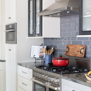
➢ All the interior doors were painted black to coordinate with the blacks and grays in the backsplash tile and countertop. This also adds a hint of tailored formality to an otherwise casual space.
➢ the use of WAC's Oculux small aperture LED units for the overhead lighting complimented with Diode LED strips for task lighting under the cabinets and inside the pantry and glass wall cabinets. All of the lighting applications are on separate dimmer switches.
Innovative uses of materials or construction methods by Realty Restoration LLC:
➢ Each 1-1/2” x 3” block of reclaimed end-grain black walnut that makes up the center island chopping block was hand milled and built in the shop. It was designed to look substantial and proportional to the surrounding elements, executed by creating the 4 inch tall top with a solid wood chamfered edge band.
➢ The metal doors on either side of the vent hood were also custom designed for this project and built in the Realty Restoration LLC shop. They are made 1x2, 11-gauge mild steel with ribbed glass. Weighing 60 lbs a piece, heavy duty cabinet hinges were added to support the weight of the door and keep them from sagging.
➢ Under-cabinet receptacles were added along the range wall in order to have a clean, uninterrupted backsplash.
Design obstacles to overcome:
➢ Because we were removing the demising walls between the kitchen and living room, we had to find a way to plumb and vent the new island. We did this by tunneling through the slab (the slab had post tension cables which prevented us from just trenching) to run a new wet vent through a nearby structural wall. We pulled the existing hot and cold lines between upper floor joists and ran them down the structural wall as well and up through a conduit in the tunnel.
➢ Since we were converting from wall overs to a gas range it allowed us to utilize the 220 feed for the wall ovens to provide a new sub panel for all the new kitchen circuits
➢ Due to framing deficiencies inherited from the original build there was a 1-1/2” differential in the floor-to-ceiling height over a 20 foot span; by utilizing the process of cutting and furring coupled with the crown moulding details on the cabinet elevations we were able to mask the problem and provide seamless transitions between the cabinet components.
Evidence of superior craftsmanship:
➢ uniquely designed, one-of-a-kind metal “X” end panels on the large island. The end panels were custom made in the Realty Restoration LLC shop and fitted to the exact dimensions of the island. The welding seams are completely indistinguishable - the posts look like they are cut from a single sheet of metal
➢ square metal posts on the small island were also custom made and designed to compliment and carry through the metal element s throughout the kitchen
➢ the beautiful, oversized end panels on the pantry cabinets which give the breakfast nook a tailored look
➢ integrating a large format 5 piece Versailles tile pattern to seamlessly flow from the existing spaces into the new kitchen space
➢ By constructing a custom cabinet that jogged around a corner we could not remodel (housing the entry way coat closet) we were able to camouflage the adjacent wall offset within the upper and lower cabinets. By designing around the existing jog in the structural walls we accomplished a few things: we were able to find the space to house, and hide, the microwave and toaster oven yet still have a clean cohesive appearance from the kitchen side. Additionally, the owners were able to keep their much needed coat closet and we didn’t have to increase the budget with unnecessary structural work.
 Tile Doctor Ltd
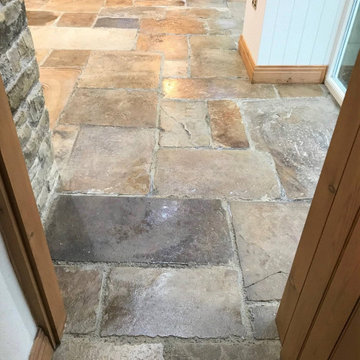
We had been to maintain this Sandstone floor about two years previously at a property in the pretty area of Windermere in the English Lake District. The client had run out of our Tile Doctor Neutral Tile Cleaner that we left after completing the job and had started using a standard cleaner instead (a well-known ecological cleaner). Unfortunately, this product has a 5% non-ionic surfactant in its chemical structure, which will strip a coat of stone sealer off the surface within 6 months, once that topcoat has been removed the sealed surface is only 50% as strong as it should be.
Readers of this article should be aware that even washing up liquid which is a degreaser will strip sealers although it will take many months of regular use before you will start to notice an issue. Stronger bleach-based cleaning products such as Flash and Domestos will cause instant damage to stone sealer which will often go an off-white colour as a result. So, the importance of using the right cleaner is imperative. Having used our services on this floor previously he client knew what to expect and was happy to go ahead with our quote.
My first task would be to clean the floor and completely remove what was left of the old sealer to ensure the floor would have a consistent appearance. On this occasion I used a strong 1:3 dilution of Tile Doctor Pro-Clean worked into the floor with a Black buffing pad fitted to a rotary buffing machine. The Sandstone floor was then rinsed with water, scrubbed again and then the waste extracted using a wet vacuum.
This was followed with acid rinse using a 1:5 dilution of Tile Doctor Grout Clean-Up, this is a Phosphoric Acid (not a Brick Acid). After being scrubbed into the tile it was rinsed off the floor as before using water and the wet vacuum. This process further cleans the stone and neutralises the floor after the use of the strong alkaline Pro-Clean used earlier.
Before leaving for the day I gave the floor one final rinse with water and then dried the floor as much as possible with the wet vacuum. The floor was now clean and free of sealer and left to fully dry off overnight.
I came back the following morning and started by testing the floor with the moisture meter. I always do this as I know from experience how important it is to ensure the floor is dry before applying a sealer.
Happy the Sandstone was dry I then proceed to apply the first of what would be four coats of sealer. For this I used Tile Doctor Seal and Go which leaves a nice low sheen finish. This product is specially formulated blend of acrylic polymers that provides will protect the floor from ingrained dirt and staining; it will make the floor easy to clean and has the added advantage of being water based so it doesn’t leave a solvent smell as it dries.
The client was left another complimentary bottle of Tile Doctor Neutral cleaner and hopefully the seal will last a long longer the 2nd time around. The client was pleased the floor had been restored and vowed to use nothing but Tile Doctor products on it in the future.
Heidi Taylor
South Cumbria Tile Doctor



 Five Star Tree Care
There are thousands of tree species all over the world and all these trees share the same anatomical features. All trees have trunks, branches, intricate rooting systems and leaves that make up their core systems. If you are curious about the anatomy and importance of each part, reading this guide by Five Star Tree Services is a great way to educate yourself.
Tree Branches & Twigs
The branches grow from the trunk of the tree and they help support the flowers, fruits and leaves the tree produces. The twigs and branches are also used as transport between the trunk and leaves. The top part of the tree along with the leaves is called the tree crown. This area filters dust and other debris from the atmosphere. In addition to cleaning the air, the crown also offers shade for animals and humans alike.
Tree Leaves
The leaves of a tree manage the photosynthesis process which ensures the tree has food and maintains its health. The leaves are also tasked with drawing in carbon monoxide and releasing oxygen for the rest of us to use. Many leaves have different edges which work to collect water, repel pests, and reduce wind resistance.
The Tree Trunk
The trunk of every tree has five layers. These layers consist of the inner bark, the outer bark, heartwood, sapwood, and cambium cell. The outer bark protects from harsh temperatures and pests, in addition to helping the tree retain moisture.
The inner bark, specifically the phloem is the digestive system that passes the food through to other parts of the tree. This part of the tree has a very short life, and it turns into cork before merging with the outer layer of bark when it dies. The cambium cell layer produces new tree bark and wood as the tree grows and this is generated from the hormones that come from the leaves and pass to the inner layer.
Sapwood is tasked with moving water to the leaves of the tree and as the wood ages, it transforms into heartwood, which is in the tree center. The heartwood is the main support of the tree structure and though it no longer grows, it won’t decay or become frail as long as it is protected by the outer layers.
The Tree Root System
One of the most important parts of the tree is its root system. These are found in the first three feet of soil around the tree and can extend as much as four times further away than the total circumference of the tree crown. The roots collect minerals and water from the ground, store food for the tree, and help secure it to its spot in the ground.
How Five Star Tree Services Can Help
Here at Five Star Tree Services, we care about the life and health of your trees. Our arborist offers 24-hour emergency services in addition to our regular tree and plant care services. If you are in need of trimming, tree assessment, deep root feeding, or tree removal in Toronto or the GTA, give us a call at (416) 990-3355 to set up an appointment.

 RAJ Kitchen and Bath, LLC
“Full apartment design”.
IF you have not yet seen this apartment conversion before, we strongly urge you to go to the bottom left of this page and click on the short 2-minutes video. It would put a lot of things into perspective when you come back and continue reading this.
It is true we were literally handed the keys and told a list of things that they wanted to have happen and we were to go into the apartment, look at the space and come up with a design that would satisfy all of that need. UNTIL we showed up! The unit had really seen some better days but we knew we had to look past that and come up with a concept that would work for them.
The immediate challenges were centered around 3 big ideas:
1. Adding a second bedroom to the already small footprint
2. Figuring out a way to make the kitchen bigger, better and brighter
3. Creating a master room walk in closet
It’s always difficult to add new rooms into existing footprint without expanding out or up and not incurring any opportunity cost. In this case, that was exactly what we had to do. Item one and two above had to be tackled as one. We went ahead and switched out the location of the dining room and eliminating an area where there was a “nook” type eat-in area. By doing so, we were able to cut right into that footprint and change the layout of the kitchen.
That one move allowed us to dig into the kitchen design because it was now the main focal point in the apartment. It was no longer an option to keep it in that tiny hole where it was, so we had to ensure that this design was functional and aesthetically pleasing at the same time. By adding the table into the space where an Island typically would go, we were able to both cut cost and still provide a dining experience. The Table serves as an Island as well when cooking.
We then proceeded to block in the existing doorway to the dining room. By doing this, we were able to create a full room which allowed us to put a door on the other side and called that room Bedroom #2. This was easier to do because all of the mechanicals were already in that space (light, heater and windows). By shifting things around, we also achieved a huge wall to wall closet from inside. PERFECT!
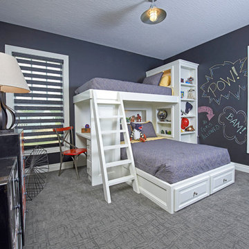
Then we moved into the Single bedroom. We thought it was a big room with a small closet, so by creatively adding an L shaped wall and steal some footprint into the bedroom side, we were able to put a door on that new room and design it for the walk-in closet. Even after this, the bedroom still holds a queen size bed with 2 night stands, a TV on the wall, a sitting chair and plenty of room to walk around. This was done by rethinking the location for the bed and night stands.
The bathroom was gutted to make sure there was no leaks and rebuild from the ground up. We kept all of the plumbing where it was, added a new vanity, medicine cabinet, tiles and lighting and it was done.
From there, the rest of the unit had new flooring all throughout, paint, and lighting. After completion and walk through, this project was handed over back to the clients.
Execution and collaboration between all the trades were: Reggie and his team from Premier Interiors and Rohan from RD Mechanical Services.
p.s. Please see our website to see the video.
 RAJ Kitchen and Bath, LLC
“Full apartment design”.
IF you have not yet seen this apartment conversion before, we strongly urge you to go to the bottom left of this page and click on the short 2-minutes video. It would put a lot of things into perspective when you come back and continue reading this.
It is true we were literally handed the keys and told a list of things that they wanted to have happen and we were to go into the apartment, look at the space and come up with a design that would satisfy all of that need. UNTIL we showed up! The unit had really seen some better days but we knew we had to look past that and come up with a concept that would work for them.
The immediate challenges were centered around 3 big ideas:
1. Adding a second bedroom to the already small footprint
2. Figuring out a way to make the kitchen bigger, better and brighter
3. Creating a master room walk in closet
It’s always difficult to add new rooms into existing footprint without expanding out or up and not incurring any opportunity cost. In this case, that was exactly what we had to do. Item one and two above had to be tackled as one. We went ahead and switched out the location of the dining room and eliminating an area where there was a “nook” type eat-in area. By doing so, we were able to cut right into that footprint and change the layout of the kitchen.
That one move allowed us to dig into the kitchen design because it was now the main focal point in the apartment. It was no longer an option to keep it in that tiny hole where it was, so we had to ensure that this design was functional and aesthetically pleasing at the same time. By adding the table into the space where an Island typically would go, we were able to both cut cost and still provide a dining experience. The Table serves as an Island as well when cooking.
We then proceeded to block in the existing doorway to the dining room. By doing this, we were able to create a full room which allowed us to put a door on the other side and called that room Bedroom #2. This was easier to do because all of the mechanicals were already in that space (light, heater and windows). By shifting things around, we also achieved a huge wall to wall closet from inside. PERFECT!
Then we moved into the Single bedroom. We thought it was a big room with a small closet, so by creatively adding an L shaped wall and steal some footprint into the bedroom side, we were able to put a door on that new room and design it for the walk-in closet. Even after this, the bedroom still holds a queen size bed with 2 night stands, a TV on the wall, a sitting chair and plenty of room to walk around. This was done by rethinking the location for the bed and night stands.
The bathroom was gutted to make sure there was no leaks and rebuild from the ground up. We kept all of the plumbing where it was, added a new vanity, medicine cabinet, tiles and lighting and it was done.
From there, the rest of the unit had new flooring all throughout, paint, and lighting. After completion and walk through, this project was handed over back to the clients.
Execution and collaboration between all the trades were: Reggie and his team from Premier Interiors and Rohan from RD Mechanical Services.
p.s. Please see our website to see the video.
 Pennsylvania Landscape & Nursery Association
Plantique, INC http://www.plantique.com
Entry Name: Classic Fireside Getaway
2014 PLNA Awards for Landscape Excellence Winner
Category: Hardscaping-Residential $30,000-$60,000
Award Level: Bronze
Photo Description:
The initial call from these homeowners was about a drainage issue. After having installed new roofing, siding, and a new porch enclosure, it was discovered that the original piping for the downspouts had failed. A few recent rainstorms had left a large pool of water behind the house. The new gutters and downspouts were now properly channeling water into a sub-surface piping system that no longer functioned. Obviously this had to be fixed, but after some further discussions, it was suggested that if a cost-effective solution could be found, perhaps a patio could be created along with the drainage solution. This would make the space between the porch and the pool more useful. The surfaces would have to be as kid-friendly as possible, as the homeowners foresaw frequent visits by their grandchildren. The flow of the spaces would have to be such that small bikes would be able to easily maneuver around chairs and tables.
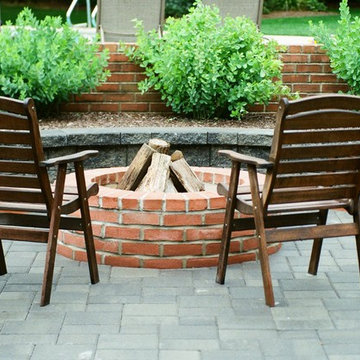
After a site study was conducted, several issues were discovered. Pertaining to the drainage issue, it was determined that the grade sloped directly toward the porch from the pool. This not only channeled water toward the house and porch, but created a dam in an already shallow drainage swale that trapped water off to the side of the porch. Since the soil in this area is predominantly clay, water could sit in that area for days until it drained away. On the aesthetic side, a good part of the house’s façade was brick, the porch floor was brick, the small patio and walkways were brick, and the seating wall next to the pool was brick; there was a lot of brick. The challenge would be to find a cost-effective material that would contrast will with the brick, while creating a functional patio space that also facilitated water drainage.
The solution involved a significant re-grading of the area between the pool and the house, along with the installation of a completely new drain system to channel roof water away from the area. Working with the fixed points of the porch and foundation levels of the home, the slope that pitched toward the house was cut into to create a positive pitch away from the house. This created 20 in. high cut at the furthest point from the porch. To retain this, a segmental retaining wall block was used to form a curved seating wall around a mortared brick fire ring, perfect for evening campfires and marshmallow roasting with the grandchildren. Prior to the patio construction, new subsurface PVC piping was installed to channel water away from the house, under the patio, and to daylight about 100 ft. further into the side yard where it could properly drain. To construct the patio, the existing dry laid brick walks and patio were recycled as a border around a gray colored concrete paver that mimics the look of more expensive PA Bluestone, an often used companion to brick. The smooth surface texture and tight joint provide a barefoot friendly walking surface that stays cooler in the hot summer sun. The patio itself is also pitched so as to drain runoff to the lower end of the yard in case of a failure in the drain piping.
Along with providing several clear pathways between the porch, pool, and driveway the new patio includes an open air dining area, a fire pit area, and a seating/lounging area (not yet furnished at the time of the photo) for larger family gatherings or more intimate dinners and fire-side relaxation.
Photo Credit: Plantique, Mike Wimmer
 RAJ Kitchen and Bath, LLC
“Full apartment design”.
IF you have not yet seen this apartment conversion before, we strongly urge you to go to the bottom left of this page and click on the short 2-minutes video. It would put a lot of things into perspective when you come back and continue reading this.
It is true we were literally handed the keys and told a list of things that they wanted to have happen and we were to go into the apartment, look at the space and come up with a design that would satisfy all of that need. UNTIL we showed up! The unit had really seen some better days but we knew we had to look past that and come up with a concept that would work for them.
The immediate challenges were centered around 3 big ideas:
1. Adding a second bedroom to the already small footprint
2. Figuring out a way to make the kitchen bigger, better and brighter
3. Creating a master room walk in closet
It’s always difficult to add new rooms into existing footprint without expanding out or up and not incurring any opportunity cost. In this case, that was exactly what we had to do. Item one and two above had to be tackled as one. We went ahead and switched out the location of the dining room and eliminating an area where there was a “nook” type eat-in area. By doing so, we were able to cut right into that footprint and change the layout of the kitchen.
That one move allowed us to dig into the kitchen design because it was now the main focal point in the apartment. It was no longer an option to keep it in that tiny hole where it was, so we had to ensure that this design was functional and aesthetically pleasing at the same time. By adding the table into the space where an Island typically would go, we were able to both cut cost and still provide a dining experience. The Table serves as an Island as well when cooking.
We then proceeded to block in the existing doorway to the dining room. By doing this, we were able to create a full room which allowed us to put a door on the other side and called that room Bedroom #2. This was easier to do because all of the mechanicals were already in that space (light, heater and windows). By shifting things around, we also achieved a huge wall to wall closet from inside. PERFECT!
Then we moved into the Single bedroom. We thought it was a big room with a small closet, so by creatively adding an L shaped wall and steal some footprint into the bedroom side, we were able to put a door on that new room and design it for the walk-in closet. Even after this, the bedroom still holds a queen size bed with 2 night stands, a TV on the wall, a sitting chair and plenty of room to walk around. This was done by rethinking the location for the bed and night stands.
The bathroom was gutted to make sure there was no leaks and rebuild from the ground up. We kept all of the plumbing where it was, added a new vanity, medicine cabinet, tiles and lighting and it was done.
From there, the rest of the unit had new flooring all throughout, paint, and lighting. After completion and walk through, this project was handed over back to the clients.
Execution and collaboration between all the trades were: Reggie and his team from Premier Interiors and Rohan from RD Mechanical Services.
p.s. Please see our website to see the video.

 Kustom Home Design
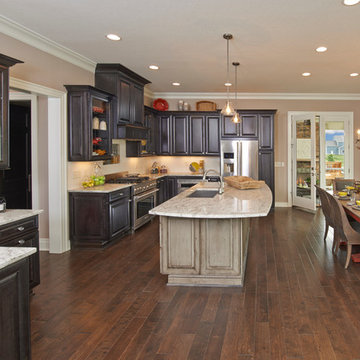
When Family comes first, you spend a lot of time surrounded by the family you were born into and the ones you “adopted” along the way. Some of your kids crawl, some walk on two legs and some on four. No matter how they get there, they always end up in the kitchen. This home needed a kitchen designed for an ever growing family.
By borrowing unused space from a formal dining room, removing some walls while adding back others, we were able to expand the kitchen space, add a main level laundry room with home office center and provide much needed pantry storage. Sightlines were opened up and a peninsula with seating provides the perfect spot for gathering. A large bench seat provides additional storage and seating for an oversized family style table.
Crisp white finishes coupled with warm rich stains, balances out the space and makes is feel like home. Meals, laundry, homework and stories about your day come to life in this kitchen designed for family living and family loving.
Kustom Home Design specializes in creating unique home designs crafted for your life.

 BathGems
The crisp Antique White finish of the Peruga Double Bath Vanity offers a light, airy feel to your bathroom. Featuring antique-style handles for each of the cabinet doors and 3 central drawers, this vanity screams Old World class in every direction. You'll love how sophisticated it will look in your home, especially when paired with any of the 5 beautiful top options to choose from. Add the beautiful matching linen cabinet to your bedroom decor and you'll never complain about not having enough space again. Made from the same top quality solid oak, this linen cabinet boasts a glass paneled top cabinet with frosted glass on each side, a middle drawer, and a lower cabinet with a gorgeous frame-like design. Each door is equipped with soft-close European hinges and the finish is made to match your vanity with a 12-step hand glazed finishing process.
Please note: the triple panel mirror in the main image is no longer available. Instead, a matching 47.25" Single panel mirror (see detailed images) is available from the drop-down menus.
Dimensions
Vanity
60"W x 23.5"D x 35.5"H
Optional Accessories
Large Mirror
47.25"W x 3.7"D x 41.5"H
Linen Cabinet
20.5"W x 16.25"D x 65"H
Features
Quality materials are important to the longevity of your bathroom vanity. Cheap vanities made with particle board or MDF tend to sag, warp, split, discolor, and expand over time. This is especially true in humid climates, such as the environment found in a normal bathroom. Since bathroom humidity is so common, bathroom vanities need to be extremely durable. They also need to be strong enough to endure lots of usage-based wear and tear. Vanities are typically made of MDF, birch, rubberwood, or natural oak. Generally, MDF is approximately 30 % the quality of oak, birch is 50% the quality of oak, and rubberwood is typically 90% the quality of oak, where "quality" is defined as the strength, integrity, and durability of the material. Solid oak is without question the strongest, most durable, and most resilient of all vanity materials. Only the highest-quality and best made vanities are manufactured from natural oak. Premier Collection
Vanities that are marked as Premier Collection are the best vanities in the industry where no expense has been spared. These are the best vanities money can buy made from small quantities of handpicked solid hard woods that are hand finished to perfection. To be considered part of the Premium Collection the vanity must get A+++ grades in: Wood used, Interior Construction, Counter Top, and Finish.
Wood Used:
Premier Collections uses Kiln dried wood in small batches to insure proper drying to prevent cracking and warping. All wood is cared for in great detail to prevent cracking and warping so that your vanity looks as good as they day it arrived for many years.
Vanity Tops:
Premier Collections vanities that have stone tops use a thicker stone, up to 3cm (1cm more than industry average), providing a more luxurious look. All of the vanities with stone tops are sealed to prevent watermarks and minor stains.
Construction:
Premium Collection vanities use hard wood box framed construction that provides strength and durability for decades. All vanities have working drawers with able storage made with slide ball bearing drawers and or soft close mounts. Center drawers are boxed and fitted around plumbing for additional storage.
Finish:
Premium Collection vanities are all hand stained, hand painted, using up to a 15 layer sealing and finishing process to avoid future fading, cracking, or peeling.
- 100% handmade and finished
- Grade A, solid kiln-dried oak construction
- Single-door cabinet on each side with antique-style handles
- Frame type construction with an Old World style joinery
- Full extension drawers with ball-bearing glides
- Hand-applied varnish in 3 layers to prevent warping
- Multi-layered hand glazed finish for a cabinet that is resistant to peeling, cracking and fading
- 5 Beautiful finishes to choose from!
- Choose from Cream Marble, Black Granite, Tropical Brown Granite, Carrera White Marble, or Travertine tops
- Pre-drilled for 8" faucet spread
- **Faucets Not Included**
Quality materials are important to the longevity of your bathroom vanity. Cheap vanities made with particle board or MDF tend to sag, warp, split, discolor, and expand over time. This is especially true in humid climates, such as the environment found in a normal bathroom. Since bathroom humidity is so common, bathroom vanities need to be extremely durable. They also need to be strong enough to endure lots of usage-based wear and tear. Vanities are typically made of MDF, birch, rubberwood, or natural oak. Generally, MDF is approximately 30 % the quality of oak, birch is 50% the quality of oak, and rubberwood is typically 90% the quality of oak, where "quality" is defined as the strength, integrity, and durability of the material. Solid oak is without question the strongest, most durable, and most resilient of all vanity materials. Only the highest-quality and best made vanities are manufactured from natural oak. Premier Collection
Vanities that are marked as Premier Collection are the best vanities in the industry where no expense has been spared. These are the best vanities money can buy made from small quantities of handpicked solid hard woods that are hand finished to perfection. To be considered part of the Premium Collection the vanity must get A+++ grades in: Wood used, Interior Construction, Counter Top, and Finish.
Wood Used:
Premier Collections uses Kiln dried wood in small batches to insure proper drying to prevent cracking and warping. All wood is cared for in great detail to prevent cracking and warping so that your vanity looks as good as they day it arrived for many years.
Vanity Tops:
Premier Collections vanities that have stone tops use a thicker stone, up to 3cm (1cm more than industry average), providing a more luxurious look. All of the vanities with stone tops are sealed to prevent watermarks and minor stains.
Construction:
Premium Collection vanities use hard wood box framed construction that provides strength and durability for decades. All vanities have working drawers with able storage made with slide ball bearing drawers and or soft close mounts. Center drawers are boxed and fitted around plumbing for additional storage.
Finish:
Premium Collection vanities are all hand stained, hand painted, using up to a 15 layer sealing and finishing process to avoid future fading, cracking, or peeling.
 RAJ Kitchen and Bath, LLC
“Full apartment design”.
IF you have not yet seen this apartment conversion before, we strongly urge you to go to the bottom left of this page and click on the short 2-minutes video. It would put a lot of things into perspective when you come back and continue reading this.
It is true we were literally handed the keys and told a list of things that they wanted to have happen and we were to go into the apartment, look at the space and come up with a design that would satisfy all of that need. UNTIL we showed up! The unit had really seen some better days but we knew we had to look past that and come up with a concept that would work for them.
The immediate challenges were centered around 3 big ideas:
1. Adding a second bedroom to the already small footprint
2. Figuring out a way to make the kitchen bigger, better and brighter
3. Creating a master room walk in closet
It’s always difficult to add new rooms into existing footprint without expanding out or up and not incurring any opportunity cost. In this case, that was exactly what we had to do. Item one and two above had to be tackled as one. We went ahead and switched out the location of the dining room and eliminating an area where there was a “nook” type eat-in area. By doing so, we were able to cut right into that footprint and change the layout of the kitchen.
That one move allowed us to dig into the kitchen design because it was now the main focal point in the apartment. It was no longer an option to keep it in that tiny hole where it was, so we had to ensure that this design was functional and aesthetically pleasing at the same time. By adding the table into the space where an Island typically would go, we were able to both cut cost and still provide a dining experience. The Table serves as an Island as well when cooking.
We then proceeded to block in the existing doorway to the dining room. By doing this, we were able to create a full room which allowed us to put a door on the other side and called that room Bedroom #2. This was easier to do because all of the mechanicals were already in that space (light, heater and windows). By shifting things around, we also achieved a huge wall to wall closet from inside. PERFECT!
Then we moved into the Single bedroom. We thought it was a big room with a small closet, so by creatively adding an L shaped wall and steal some footprint into the bedroom side, we were able to put a door on that new room and design it for the walk-in closet. Even after this, the bedroom still holds a queen size bed with 2 night stands, a TV on the wall, a sitting chair and plenty of room to walk around. This was done by rethinking the location for the bed and night stands.
The bathroom was gutted to make sure there was no leaks and rebuild from the ground up. We kept all of the plumbing where it was, added a new vanity, medicine cabinet, tiles and lighting and it was done.
From there, the rest of the unit had new flooring all throughout, paint, and lighting. After completion and walk through, this project was handed over back to the clients.
Execution and collaboration between all the trades were: Reggie and his team from Premier Interiors and Rohan from RD Mechanical Services.
p.s. Please see our website to see the video.
84