
Search results for "Longer time" in Home Design Ideas

 RAJ Kitchen and Bath, LLC
“Full apartment design”.
IF you have not yet seen this apartment conversion before, we strongly urge you to go to the bottom left of this page and click on the short 2-minutes video. It would put a lot of things into perspective when you come back and continue reading this.
It is true we were literally handed the keys and told a list of things that they wanted to have happen and we were to go into the apartment, look at the space and come up with a design that would satisfy all of that need. UNTIL we showed up! The unit had really seen some better days but we knew we had to look past that and come up with a concept that would work for them.
The immediate challenges were centered around 3 big ideas:
1. Adding a second bedroom to the already small footprint
2. Figuring out a way to make the kitchen bigger, better and brighter
3. Creating a master room walk in closet
It’s always difficult to add new rooms into existing footprint without expanding out or up and not incurring any opportunity cost. In this case, that was exactly what we had to do. Item one and two above had to be tackled as one. We went ahead and switched out the location of the dining room and eliminating an area where there was a “nook” type eat-in area. By doing so, we were able to cut right into that footprint and change the layout of the kitchen.
That one move allowed us to dig into the kitchen design because it was now the main focal point in the apartment. It was no longer an option to keep it in that tiny hole where it was, so we had to ensure that this design was functional and aesthetically pleasing at the same time. By adding the table into the space where an Island typically would go, we were able to both cut cost and still provide a dining experience. The Table serves as an Island as well when cooking.
We then proceeded to block in the existing doorway to the dining room. By doing this, we were able to create a full room which allowed us to put a door on the other side and called that room Bedroom #2. This was easier to do because all of the mechanicals were already in that space (light, heater and windows). By shifting things around, we also achieved a huge wall to wall closet from inside. PERFECT!
Then we moved into the Single bedroom. We thought it was a big room with a small closet, so by creatively adding an L shaped wall and steal some footprint into the bedroom side, we were able to put a door on that new room and design it for the walk-in closet. Even after this, the bedroom still holds a queen size bed with 2 night stands, a TV on the wall, a sitting chair and plenty of room to walk around. This was done by rethinking the location for the bed and night stands.
The bathroom was gutted to make sure there was no leaks and rebuild from the ground up. We kept all of the plumbing where it was, added a new vanity, medicine cabinet, tiles and lighting and it was done.
From there, the rest of the unit had new flooring all throughout, paint, and lighting. After completion and walk through, this project was handed over back to the clients.
Execution and collaboration between all the trades were: Reggie and his team from Premier Interiors and Rohan from RD Mechanical Services.
p.s. Please see our website to see the video.
 RAJ Kitchen and Bath, LLC
“Full apartment design”.
IF you have not yet seen this apartment conversion before, we strongly urge you to go to the bottom left of this page and click on the short 2-minutes video. It would put a lot of things into perspective when you come back and continue reading this.
It is true we were literally handed the keys and told a list of things that they wanted to have happen and we were to go into the apartment, look at the space and come up with a design that would satisfy all of that need. UNTIL we showed up! The unit had really seen some better days but we knew we had to look past that and come up with a concept that would work for them.
The immediate challenges were centered around 3 big ideas:
1. Adding a second bedroom to the already small footprint
2. Figuring out a way to make the kitchen bigger, better and brighter
3. Creating a master room walk in closet
It’s always difficult to add new rooms into existing footprint without expanding out or up and not incurring any opportunity cost. In this case, that was exactly what we had to do. Item one and two above had to be tackled as one. We went ahead and switched out the location of the dining room and eliminating an area where there was a “nook” type eat-in area. By doing so, we were able to cut right into that footprint and change the layout of the kitchen.
That one move allowed us to dig into the kitchen design because it was now the main focal point in the apartment. It was no longer an option to keep it in that tiny hole where it was, so we had to ensure that this design was functional and aesthetically pleasing at the same time. By adding the table into the space where an Island typically would go, we were able to both cut cost and still provide a dining experience. The Table serves as an Island as well when cooking.
We then proceeded to block in the existing doorway to the dining room. By doing this, we were able to create a full room which allowed us to put a door on the other side and called that room Bedroom #2. This was easier to do because all of the mechanicals were already in that space (light, heater and windows). By shifting things around, we also achieved a huge wall to wall closet from inside. PERFECT!
Then we moved into the Single bedroom. We thought it was a big room with a small closet, so by creatively adding an L shaped wall and steal some footprint into the bedroom side, we were able to put a door on that new room and design it for the walk-in closet. Even after this, the bedroom still holds a queen size bed with 2 night stands, a TV on the wall, a sitting chair and plenty of room to walk around. This was done by rethinking the location for the bed and night stands.
The bathroom was gutted to make sure there was no leaks and rebuild from the ground up. We kept all of the plumbing where it was, added a new vanity, medicine cabinet, tiles and lighting and it was done.
From there, the rest of the unit had new flooring all throughout, paint, and lighting. After completion and walk through, this project was handed over back to the clients.
Execution and collaboration between all the trades were: Reggie and his team from Premier Interiors and Rohan from RD Mechanical Services.
p.s. Please see our website to see the video.
 RAJ Kitchen and Bath, LLC
“Full apartment design”.
IF you have not yet seen this apartment conversion before, we strongly urge you to go to the bottom left of this page and click on the short 2-minutes video. It would put a lot of things into perspective when you come back and continue reading this.
It is true we were literally handed the keys and told a list of things that they wanted to have happen and we were to go into the apartment, look at the space and come up with a design that would satisfy all of that need. UNTIL we showed up! The unit had really seen some better days but we knew we had to look past that and come up with a concept that would work for them.
The immediate challenges were centered around 3 big ideas:
1. Adding a second bedroom to the already small footprint
2. Figuring out a way to make the kitchen bigger, better and brighter
3. Creating a master room walk in closet
It’s always difficult to add new rooms into existing footprint without expanding out or up and not incurring any opportunity cost. In this case, that was exactly what we had to do. Item one and two above had to be tackled as one. We went ahead and switched out the location of the dining room and eliminating an area where there was a “nook” type eat-in area. By doing so, we were able to cut right into that footprint and change the layout of the kitchen.
That one move allowed us to dig into the kitchen design because it was now the main focal point in the apartment. It was no longer an option to keep it in that tiny hole where it was, so we had to ensure that this design was functional and aesthetically pleasing at the same time. By adding the table into the space where an Island typically would go, we were able to both cut cost and still provide a dining experience. The Table serves as an Island as well when cooking.
We then proceeded to block in the existing doorway to the dining room. By doing this, we were able to create a full room which allowed us to put a door on the other side and called that room Bedroom #2. This was easier to do because all of the mechanicals were already in that space (light, heater and windows). By shifting things around, we also achieved a huge wall to wall closet from inside. PERFECT!
Then we moved into the Single bedroom. We thought it was a big room with a small closet, so by creatively adding an L shaped wall and steal some footprint into the bedroom side, we were able to put a door on that new room and design it for the walk-in closet. Even after this, the bedroom still holds a queen size bed with 2 night stands, a TV on the wall, a sitting chair and plenty of room to walk around. This was done by rethinking the location for the bed and night stands.
The bathroom was gutted to make sure there was no leaks and rebuild from the ground up. We kept all of the plumbing where it was, added a new vanity, medicine cabinet, tiles and lighting and it was done.
From there, the rest of the unit had new flooring all throughout, paint, and lighting. After completion and walk through, this project was handed over back to the clients.
Execution and collaboration between all the trades were: Reggie and his team from Premier Interiors and Rohan from RD Mechanical Services.
p.s. Please see our website to see the video.
Find the right local pro for your project
 RAJ Kitchen and Bath, LLC
“Full apartment design”.
IF you have not yet seen this apartment conversion before, we strongly urge you to go to the bottom left of this page and click on the short 2-minutes video. It would put a lot of things into perspective when you come back and continue reading this.
It is true we were literally handed the keys and told a list of things that they wanted to have happen and we were to go into the apartment, look at the space and come up with a design that would satisfy all of that need. UNTIL we showed up! The unit had really seen some better days but we knew we had to look past that and come up with a concept that would work for them.
The immediate challenges were centered around 3 big ideas:
1. Adding a second bedroom to the already small footprint
2. Figuring out a way to make the kitchen bigger, better and brighter
3. Creating a master room walk in closet
It’s always difficult to add new rooms into existing footprint without expanding out or up and not incurring any opportunity cost. In this case, that was exactly what we had to do. Item one and two above had to be tackled as one. We went ahead and switched out the location of the dining room and eliminating an area where there was a “nook” type eat-in area. By doing so, we were able to cut right into that footprint and change the layout of the kitchen.
That one move allowed us to dig into the kitchen design because it was now the main focal point in the apartment. It was no longer an option to keep it in that tiny hole where it was, so we had to ensure that this design was functional and aesthetically pleasing at the same time. By adding the table into the space where an Island typically would go, we were able to both cut cost and still provide a dining experience. The Table serves as an Island as well when cooking.
We then proceeded to block in the existing doorway to the dining room. By doing this, we were able to create a full room which allowed us to put a door on the other side and called that room Bedroom #2. This was easier to do because all of the mechanicals were already in that space (light, heater and windows). By shifting things around, we also achieved a huge wall to wall closet from inside. PERFECT!
Then we moved into the Single bedroom. We thought it was a big room with a small closet, so by creatively adding an L shaped wall and steal some footprint into the bedroom side, we were able to put a door on that new room and design it for the walk-in closet. Even after this, the bedroom still holds a queen size bed with 2 night stands, a TV on the wall, a sitting chair and plenty of room to walk around. This was done by rethinking the location for the bed and night stands.
The bathroom was gutted to make sure there was no leaks and rebuild from the ground up. We kept all of the plumbing where it was, added a new vanity, medicine cabinet, tiles and lighting and it was done.
From there, the rest of the unit had new flooring all throughout, paint, and lighting. After completion and walk through, this project was handed over back to the clients.
Execution and collaboration between all the trades were: Reggie and his team from Premier Interiors and Rohan from RD Mechanical Services.
p.s. Please see our website to see the video.
 RAJ Kitchen and Bath, LLC
“Full apartment design”.
IF you have not yet seen this apartment conversion before, we strongly urge you to go to the bottom left of this page and click on the short 2-minutes video. It would put a lot of things into perspective when you come back and continue reading this.
It is true we were literally handed the keys and told a list of things that they wanted to have happen and we were to go into the apartment, look at the space and come up with a design that would satisfy all of that need. UNTIL we showed up! The unit had really seen some better days but we knew we had to look past that and come up with a concept that would work for them.
The immediate challenges were centered around 3 big ideas:
1. Adding a second bedroom to the already small footprint
2. Figuring out a way to make the kitchen bigger, better and brighter
3. Creating a master room walk in closet
It’s always difficult to add new rooms into existing footprint without expanding out or up and not incurring any opportunity cost. In this case, that was exactly what we had to do. Item one and two above had to be tackled as one. We went ahead and switched out the location of the dining room and eliminating an area where there was a “nook” type eat-in area. By doing so, we were able to cut right into that footprint and change the layout of the kitchen.
That one move allowed us to dig into the kitchen design because it was now the main focal point in the apartment. It was no longer an option to keep it in that tiny hole where it was, so we had to ensure that this design was functional and aesthetically pleasing at the same time. By adding the table into the space where an Island typically would go, we were able to both cut cost and still provide a dining experience. The Table serves as an Island as well when cooking.
We then proceeded to block in the existing doorway to the dining room. By doing this, we were able to create a full room which allowed us to put a door on the other side and called that room Bedroom #2. This was easier to do because all of the mechanicals were already in that space (light, heater and windows). By shifting things around, we also achieved a huge wall to wall closet from inside. PERFECT!
Then we moved into the Single bedroom. We thought it was a big room with a small closet, so by creatively adding an L shaped wall and steal some footprint into the bedroom side, we were able to put a door on that new room and design it for the walk-in closet. Even after this, the bedroom still holds a queen size bed with 2 night stands, a TV on the wall, a sitting chair and plenty of room to walk around. This was done by rethinking the location for the bed and night stands.
The bathroom was gutted to make sure there was no leaks and rebuild from the ground up. We kept all of the plumbing where it was, added a new vanity, medicine cabinet, tiles and lighting and it was done.
From there, the rest of the unit had new flooring all throughout, paint, and lighting. After completion and walk through, this project was handed over back to the clients.
Execution and collaboration between all the trades were: Reggie and his team from Premier Interiors and Rohan from RD Mechanical Services.
p.s. Please see our website to see the video.
 RAJ Kitchen and Bath, LLC
“Full apartment design”.
IF you have not yet seen this apartment conversion before, we strongly urge you to go to the bottom left of this page and click on the short 2-minutes video. It would put a lot of things into perspective when you come back and continue reading this.
It is true we were literally handed the keys and told a list of things that they wanted to have happen and we were to go into the apartment, look at the space and come up with a design that would satisfy all of that need. UNTIL we showed up! The unit had really seen some better days but we knew we had to look past that and come up with a concept that would work for them.
The immediate challenges were centered around 3 big ideas:
1. Adding a second bedroom to the already small footprint
2. Figuring out a way to make the kitchen bigger, better and brighter
3. Creating a master room walk in closet
It’s always difficult to add new rooms into existing footprint without expanding out or up and not incurring any opportunity cost. In this case, that was exactly what we had to do. Item one and two above had to be tackled as one. We went ahead and switched out the location of the dining room and eliminating an area where there was a “nook” type eat-in area. By doing so, we were able to cut right into that footprint and change the layout of the kitchen.
That one move allowed us to dig into the kitchen design because it was now the main focal point in the apartment. It was no longer an option to keep it in that tiny hole where it was, so we had to ensure that this design was functional and aesthetically pleasing at the same time. By adding the table into the space where an Island typically would go, we were able to both cut cost and still provide a dining experience. The Table serves as an Island as well when cooking.
We then proceeded to block in the existing doorway to the dining room. By doing this, we were able to create a full room which allowed us to put a door on the other side and called that room Bedroom #2. This was easier to do because all of the mechanicals were already in that space (light, heater and windows). By shifting things around, we also achieved a huge wall to wall closet from inside. PERFECT!
Then we moved into the Single bedroom. We thought it was a big room with a small closet, so by creatively adding an L shaped wall and steal some footprint into the bedroom side, we were able to put a door on that new room and design it for the walk-in closet. Even after this, the bedroom still holds a queen size bed with 2 night stands, a TV on the wall, a sitting chair and plenty of room to walk around. This was done by rethinking the location for the bed and night stands.
The bathroom was gutted to make sure there was no leaks and rebuild from the ground up. We kept all of the plumbing where it was, added a new vanity, medicine cabinet, tiles and lighting and it was done.
From there, the rest of the unit had new flooring all throughout, paint, and lighting. After completion and walk through, this project was handed over back to the clients.
Execution and collaboration between all the trades were: Reggie and his team from Premier Interiors and Rohan from RD Mechanical Services.
p.s. Please see our website to see the video.
 RAJ Kitchen and Bath, LLC
“Full apartment design”.
IF you have not yet seen this apartment conversion before, we strongly urge you to go to the bottom left of this page and click on the short 2-minutes video. It would put a lot of things into perspective when you come back and continue reading this.
It is true we were literally handed the keys and told a list of things that they wanted to have happen and we were to go into the apartment, look at the space and come up with a design that would satisfy all of that need. UNTIL we showed up! The unit had really seen some better days but we knew we had to look past that and come up with a concept that would work for them.
The immediate challenges were centered around 3 big ideas:
1. Adding a second bedroom to the already small footprint
2. Figuring out a way to make the kitchen bigger, better and brighter
3. Creating a master room walk in closet
It’s always difficult to add new rooms into existing footprint without expanding out or up and not incurring any opportunity cost. In this case, that was exactly what we had to do. Item one and two above had to be tackled as one. We went ahead and switched out the location of the dining room and eliminating an area where there was a “nook” type eat-in area. By doing so, we were able to cut right into that footprint and change the layout of the kitchen.
That one move allowed us to dig into the kitchen design because it was now the main focal point in the apartment. It was no longer an option to keep it in that tiny hole where it was, so we had to ensure that this design was functional and aesthetically pleasing at the same time. By adding the table into the space where an Island typically would go, we were able to both cut cost and still provide a dining experience. The Table serves as an Island as well when cooking.
We then proceeded to block in the existing doorway to the dining room. By doing this, we were able to create a full room which allowed us to put a door on the other side and called that room Bedroom #2. This was easier to do because all of the mechanicals were already in that space (light, heater and windows). By shifting things around, we also achieved a huge wall to wall closet from inside. PERFECT!
Then we moved into the Single bedroom. We thought it was a big room with a small closet, so by creatively adding an L shaped wall and steal some footprint into the bedroom side, we were able to put a door on that new room and design it for the walk-in closet. Even after this, the bedroom still holds a queen size bed with 2 night stands, a TV on the wall, a sitting chair and plenty of room to walk around. This was done by rethinking the location for the bed and night stands.
The bathroom was gutted to make sure there was no leaks and rebuild from the ground up. We kept all of the plumbing where it was, added a new vanity, medicine cabinet, tiles and lighting and it was done.
From there, the rest of the unit had new flooring all throughout, paint, and lighting. After completion and walk through, this project was handed over back to the clients.
Execution and collaboration between all the trades were: Reggie and his team from Premier Interiors and Rohan from RD Mechanical Services.
p.s. Please see our website to see the video.
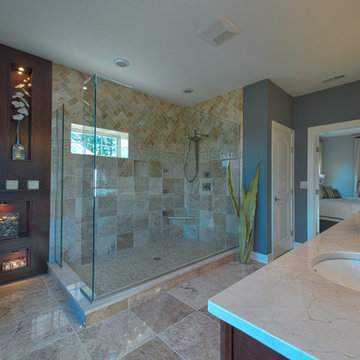

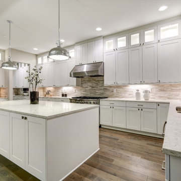
 Save home
Why are White Shaker Cabinets Still Considered a Classic?
Every few years, if you remodel your kitchen because it feels old, then white shaker cabinets are what you need. Most homeowners feel the need to revamp their kitchen not because the cabinets have worn out but because the interior is a bit old-fashioned. One of the best solutions to this issue is to utilize white shaker cabinets. These are classic, timeless kitchen elements that last longer complements everything, and rarely make your kitchen look outdated.
For this reason, in this article, we have discussed why you need white shaker cabinets in your kitchen and how you can style them.
What is a White Shaker Cabinet?
White shaker cabinets are not new. In fact, these cabinets date back to 1700 when this style was found in every home. These cabinets have a classic look because of recessed door panels, a five-piece door, and a traditional look of pine, maple, or chestnut. Of course. white shaker cabinets are unique and attractive at the same time.
The material used to make these cabinets also makes them durable. You can easily purchase it in less pricing than other wood cabinets, and you can clean it easily. The simplistic structure of white shaker cabinets also makes them complement every type of kitchen; modern or traditional. You can find these cabinets in other light finishes as well, such as peach, off-white, brown, wood brown, etc. The reason we are focusing on white is that this color is timeless and the design of the shaker cabinet is too, which together makes the best combination. You can perfectly strike a chord between every kitchen element if you pair it with white shaker cabinets .
Why White?
The color which is always in style is white. It is highly unlikely to ruin your interior with this color if well-coordinated and properly lit. This is why white shaker cabinets are highly preferred by users.
Here are some reasons to choose white shaker cabinets over other options:
Timeless
Over years, our idea of perfect design changes, and our understanding of the interior also modify. This changes the way we want our kitchen interiors. Hence, if you select vibrant kitchen cabinets and off colors for your countertop, flooring, and paint, then you may end up changing it every few years.
To avoid that from happening, just use white shaker cabinets. In multiple decades, white shaker cabinets have never ceased being classic. White is timeless and it never goes out of trend. Even when you need to change the paint or fittings, you can reduce the cost of cabinets for multiple years.
Versatile
White shaker cabinets are versatile because you have an array of options. You can incorporate multiple elements in your kitchen and tweak color coding and design of countertop, flooring, and paint. For instance, with white shaker cabinets, you can pair white textured back tiles. You can even pair your white cabinets with a black marble countertop; two timeless interior elements together!
Clean
White is the color of clean. In hospitals, bathrooms, and hotel rooms, we find a lot of white because it is clean, fresh, and peaceful. This is why everyone is automatically attracted to this color; it looks clean.
However, you may actually have to make efforts to keep these white shaker cabinets clean from dust and dirt.
Complements Everything
Since cabinets form a big portion of your kitchen, it is necessary to make cabinets complement other interior elements. With white shaker cabinets, you don’t even need to worry about that. White compliments every choice of appliance, countertop, artwork, and flooring. If you decide to get marble grey flooring with white cabinets, you can make that work. If you want colorful kitchen furniture, white complements that too. If you wish to use artwork or warm lighting in your kitchen, white automatically goes well with it.
How to Style White Shaker Cabinets?
If you are styling your kitchen with new white shaker cabinets, here’s what you should keep in mind:
• If your kitchen is small, then white is definitely your color. It reflects more light, hence, makes your space look larger and shinier.
• When you have an open kitchen, you need to follow the same theme to the adjoining rooms and slowly phase it out. This consistency won’t make anything look odd.
• If the rest of the house is filled with artwork and colors, you need the same for your kitchen as well. All white may steal away the classic of shaker cabinets.
• Pair your wall textures and flooring choices with appliances, white cabinets, knobs, and other elements for the best look.
• If the theme for the rest of the house is subtle, then you can even design an all-white kitchen with white shaker cabinets.
Conclusion
Whether you are planning to revamp your kitchen/house or sell your property, white shaker cabinets are always classic. They make a statement in your kitchen and offer a new and clean look all the time. Just focus on coordinating other interior elements of your kitchen and stop worrying about cabinets. White shaker cabinets are durable, beautiful, and timeless! Purchase these classic units now.
For this reason, in this article, we have discussed why you need white shaker cabinets in your kitchen and how you can style them.
What is a White Shaker Cabinet?
White shaker cabinets are not new. In fact, these cabinets date back to 1700 when this style was found in every home. These cabinets have a classic look because of recessed door panels, a five-piece door, and a traditional look of pine, maple, or chestnut. Of course. white shaker cabinets are unique and attractive at the same time.
The material used to make these cabinets also makes them durable. You can easily purchase it in less pricing than other wood cabinets, and you can clean it easily. The simplistic structure of white shaker cabinets also makes them complement every type of kitchen; modern or traditional. You can find these cabinets in other light finishes as well, such as peach, off-white, brown, wood brown, etc. The reason we are focusing on white is that this color is timeless and the design of the shaker cabinet is too, which together makes the best combination. You can perfectly strike a chord between every kitchen element if you pair it with white shaker cabinets .
Why White?
The color which is always in style is white. It is highly unlikely to ruin your interior with this color if well-coordinated and properly lit. This is why white shaker cabinets are highly preferred by users.
Here are some reasons to choose white shaker cabinets over other options:
Timeless
Over years, our idea of perfect design changes, and our understanding of the interior also modify. This changes the way we want our kitchen interiors. Hence, if you select vibrant kitchen cabinets and off colors for your countertop, flooring, and paint, then you may end up changing it every few years.
To avoid that from happening, just use white shaker cabinets. In multiple decades, white shaker cabinets have never ceased being classic. White is timeless and it never goes out of trend. Even when you need to change the paint or fittings, you can reduce the cost of cabinets for multiple years.
Versatile
White shaker cabinets are versatile because you have an array of options. You can incorporate multiple elements in your kitchen and tweak color coding and design of countertop, flooring, and paint. For instance, with white shaker cabinets, you can pair white textured back tiles. You can even pair your white cabinets with a black marble countertop; two timeless interior elements together!
Clean
White is the color of clean. In hospitals, bathrooms, and hotel rooms, we find a lot of white because it is clean, fresh, and peaceful. This is why everyone is automatically attracted to this color; it looks clean.
However, you may actually have to make efforts to keep these white shaker cabinets clean from dust and dirt.
Complements Everything
Since cabinets form a big portion of your kitchen, it is necessary to make cabinets complement other interior elements. With white shaker cabinets, you don’t even need to worry about that. White compliments every choice of appliance, countertop, artwork, and flooring. If you decide to get marble grey flooring with white cabinets, you can make that work. If you want colorful kitchen furniture, white complements that too. If you wish to use artwork or warm lighting in your kitchen, white automatically goes well with it.
How to Style White Shaker Cabinets?
If you are styling your kitchen with new white shaker cabinets, here’s what you should keep in mind:
• If your kitchen is small, then white is definitely your color. It reflects more light, hence, makes your space look larger and shinier.
• When you have an open kitchen, you need to follow the same theme to the adjoining rooms and slowly phase it out. This consistency won’t make anything look odd.
• If the rest of the house is filled with artwork and colors, you need the same for your kitchen as well. All white may steal away the classic of shaker cabinets.
• Pair your wall textures and flooring choices with appliances, white cabinets, knobs, and other elements for the best look.
• If the theme for the rest of the house is subtle, then you can even design an all-white kitchen with white shaker cabinets.
Conclusion
Whether you are planning to revamp your kitchen/house or sell your property, white shaker cabinets are always classic. They make a statement in your kitchen and offer a new and clean look all the time. Just focus on coordinating other interior elements of your kitchen and stop worrying about cabinets. White shaker cabinets are durable, beautiful, and timeless! Purchase these classic units now.
 RAJ Kitchen and Bath, LLC
“Full apartment design”.
IF you have not yet seen this apartment conversion before, we strongly urge you to go to the bottom left of this page and click on the short 2-minutes video. It would put a lot of things into perspective when you come back and continue reading this.
It is true we were literally handed the keys and told a list of things that they wanted to have happen and we were to go into the apartment, look at the space and come up with a design that would satisfy all of that need. UNTIL we showed up! The unit had really seen some better days but we knew we had to look past that and come up with a concept that would work for them.
The immediate challenges were centered around 3 big ideas:
1. Adding a second bedroom to the already small footprint
2. Figuring out a way to make the kitchen bigger, better and brighter
3. Creating a master room walk in closet
It’s always difficult to add new rooms into existing footprint without expanding out or up and not incurring any opportunity cost. In this case, that was exactly what we had to do. Item one and two above had to be tackled as one. We went ahead and switched out the location of the dining room and eliminating an area where there was a “nook” type eat-in area. By doing so, we were able to cut right into that footprint and change the layout of the kitchen.
That one move allowed us to dig into the kitchen design because it was now the main focal point in the apartment. It was no longer an option to keep it in that tiny hole where it was, so we had to ensure that this design was functional and aesthetically pleasing at the same time. By adding the table into the space where an Island typically would go, we were able to both cut cost and still provide a dining experience. The Table serves as an Island as well when cooking.
We then proceeded to block in the existing doorway to the dining room. By doing this, we were able to create a full room which allowed us to put a door on the other side and called that room Bedroom #2. This was easier to do because all of the mechanicals were already in that space (light, heater and windows). By shifting things around, we also achieved a huge wall to wall closet from inside. PERFECT!
Then we moved into the Single bedroom. We thought it was a big room with a small closet, so by creatively adding an L shaped wall and steal some footprint into the bedroom side, we were able to put a door on that new room and design it for the walk-in closet. Even after this, the bedroom still holds a queen size bed with 2 night stands, a TV on the wall, a sitting chair and plenty of room to walk around. This was done by rethinking the location for the bed and night stands.
The bathroom was gutted to make sure there was no leaks and rebuild from the ground up. We kept all of the plumbing where it was, added a new vanity, medicine cabinet, tiles and lighting and it was done.
From there, the rest of the unit had new flooring all throughout, paint, and lighting. After completion and walk through, this project was handed over back to the clients.
Execution and collaboration between all the trades were: Reggie and his team from Premier Interiors and Rohan from RD Mechanical Services.
p.s. Please see our website to see the video.

 Industrial Projects
Creating a comfortable outdoor living space is a priority for many homeowners and DIY enthusiasts. With rising summer temperatures, installing a shade tarp in your backyard offers an affordable and effective solution for sun protection. We’ve developed this detailed, step-by-step guide to help you confidently install a shade tarp that not only shields you from the sun but also adds aesthetic appeal to your outdoor area.
Benefits of Installing a Backyard Shade Tarp
Before diving into the installation process, let’s explore the key benefits of having a backyard shade tarp:
Provides UV Protection: Keeps your family and guests safe from harmful sun exposure.
Reduces Outdoor Temperatures: Creates a cooler, more enjoyable outdoor space.
Protects Outdoor Furniture: Extends the life of patio furniture by reducing sun damage.
Enhances Outdoor Aesthetics: Adds a modern, stylish look to your yard.
Budget-Friendly: More affordable compared to permanent structures like pergolas.
Materials and Tools You’ll Need
To begin your DIY backyard shade project, gather the following materials and tools:
Materials:
Shade tarp (UV-resistant and breathable)
Sturdy posts or existing structures (trees, fences, walls)
Mounting hardware (eye bolts, D-rings, turnbuckles, snap hooks)
Nylon or polyester rope, or stainless-steel wire
Concrete (if installing new posts)
Tools:
Power drill
Measuring tape
Level
Ladder
Wrench or adjustable spanner
Post hole digger (if installing new posts)
Step 1: Plan Your Shade Tarp Layout
The first step in installing your backyard shade tarp is careful planning. Take time to assess your outdoor area and answer these key questions:
Where is the sun’s path throughout the day?
What size and shape of tarp best suits your space?
Will you anchor the tarp to existing structures or install new posts?
What height do you want the tarp to sit at for maximum shade and airflow?
Pro Tip: Use string or garden hoses to visualize the tarp layout on the ground before making permanent decisions.
Step 2: Measure and Mark Anchor Points
Once you’ve determined the tarp’s location and orientation:
Measure the tarp dimensions.
Mark the exact points where each corner of the tarp will be anchored.
Ensure that the anchor points are at least 5–10% longer than the tarp size to allow for tensioning and slight adjustments.
Consider slope angles for water runoff. Aim for at least a 20-degree angle to prevent water pooling on the tarp.
Step 3: Install Support Posts (If Necessary)
If your backyard lacks existing anchor points like trees or fences, you’ll need to install sturdy support posts:
Dig post holes at least 24 inches deep and 8-12 inches wide for stability.
Set posts in concrete, making sure they remain plumb and level.
Allow the concrete to cure for at least 24–48 hours before applying tension from the tarp.
We recommend using pressure-treated wood, galvanized steel poles, or aluminum posts for longevity and strength.
Step 4: Install Mounting Hardware
With your anchor points ready, it’s time to install the necessary hardware:
Attach eye bolts or pad eyes securely into walls, posts, or other fixed structures.
For added flexibility and adjustability, install turnbuckles or tensioners to fine-tune the tarp’s tightness.
Connect snap hooks, D-rings, or carabiners to make assembly and disassembly easier.
Make sure all hardware is rated for outdoor use to prevent rust and corrosion.
Step 5: Attach and Tension the Shade Tarp
Now it’s time for the most satisfying part—mounting the shade tarp:
Begin by attaching one corner of the tarp to an anchor point.
Gradually attach the remaining corners, moving diagonally for even tension.
Adjust each connection point using your turnbuckles, ropes, or cables.
Pull the tarp tight enough to avoid sagging, but not so tight that it risks tearing.
Check that the tarp maintains the desired slope for rainwater runoff and adjust tension as needed.
Step 6: Final Adjustments and Safety Check
Before enjoying your new shaded area:
Inspect all anchor points and hardware for stability.
Test the tarp’s tension and make adjustments for even distribution.
Ensure that no sharp edges or loose connections remain that could damage the tarp or pose a safety hazard.
Confirm that the tarp is secure in windy conditions by giving it a gentle tug.
If you live in an area with frequent high winds, consider removing the tarp during storms to prevent damage.
Step 7: Enjoy Your Shaded Backyard Oasis
Once installed, your backyard shade tarp provides a comfortable and protective space for outdoor gatherings, relaxation, or family activities. You can decorate underneath with outdoor furniture, string lights, or potted plants to create a personalized outdoor retreat.
Maintenance Tips for Long-Lasting Shade Tarp Performance
To extend the life of your shade tarp, follow these maintenance guidelines:
Regularly check for wear and tear, especially around anchor points and seams.
Clean the tarp periodically with mild soap and water to prevent mildew buildup.
Store the tarp indoors during harsh weather seasons if it's not designed for year-round use.
Tighten hardware as needed to maintain proper tension and avoid sagging.
By following these simple care steps, your shade tarp will continue to deliver years of sun protection and outdoor comfort.
Conclusion: Upgrade Your Outdoor Space with a DIY Shade Tarp
Installing a shade tarp in your backyard is a cost-effective and rewarding DIY project. With careful planning, quality materials, and proper installation techniques, you’ll enjoy cool, shaded outdoor living all season long. This step-by-step guide ensures your project goes smoothly from start to finish.
 THE Remodel Group
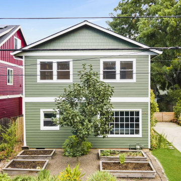
Sometimes the best solution isn't finding a bigger home, it's reimagining the one you already love. This Portland second-story addition demonstrates how strategic design-build planning can help a growing family gain the space they need while remaining in the neighborhood they never wanted to leave.
Originally, this home was a modest single-level residence with three bedrooms and two bathrooms. As the family's needs evolved, the layout no longer offered the functionality they required. Visiting relatives from California frequently stayed with them, yet the existing floor plan lacked a dedicated guest bathroom. The primary suite was undersized, storage was limited, and the main living room felt cramped for everyday family life. Complicating matters further, the narrow lot provided virtually no opportunity for expansion to the front, sides, or rear of the property. To create meaningful additional square footage, the only option was to build upward.
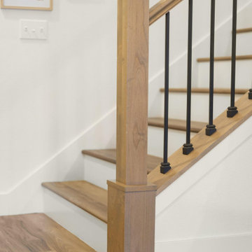
The transformation began with a complete rethinking of the home's interior organization. An existing bedroom, which had already transitioned into a home office, was removed to make way for a new staircase connecting the first and second floors. Rather than treating the staircase as simply a circulation element, the redesign used it to create a new living area while adding valuable storage beneath. The formerly enclosed dining room was opened to the kitchen and living spaces, resulting in a bright, cohesive great room that dramatically improved both sightlines and daily functionality.
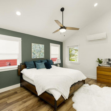
The newly added second floor became the centerpiece of the project. On one side of the addition, a spacious bonus room with vaulted ceilings provides a flexible space for family gatherings, movie nights, homework sessions, and creative projects. Dedicated workstation areas ensure the room can evolve alongside the family's needs while taking advantage of abundant natural light from multiple windows.
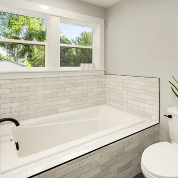
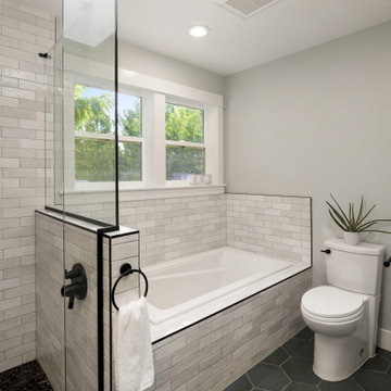
On the opposite side, the homeowners finally gained the private retreat they had been missing. The new primary suite features soaring vaulted ceilings, expansive windows, and a walk-in closet approximately six times larger than the home's original primary closet. The adjoining bathroom was designed to balance comfort, practicality, and timeless style, with a double vanity, dedicated linen storage, a separate tiled shower, and a soaking tub that creates a true spa-like experience within the home.
Throughout the renovation, a contemporary transitional aesthetic guided the design selections. New luxury vinyl plank flooring was installed across both the existing first floor and the newly constructed second level, creating visual continuity throughout the home. Matching custom stair treads provide a seamless transition between floors, while updated baseboards and door casings help unify the original structure with the addition so the entire home feels intentionally designed rather than pieced together over time.
The staircase became an architectural focal point, featuring warm wood handrails stained to complement the flooring and black metal balusters that introduce a subtle modern influence. This combination successfully bridges the homeowners' appreciation for contemporary design while respecting the overall character of the home.
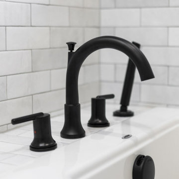
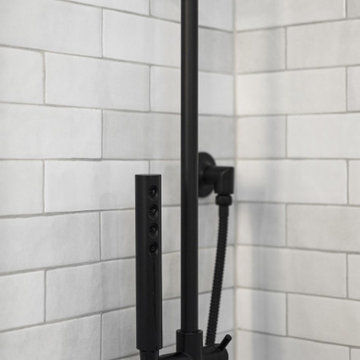
Material selections in the primary bathroom create depth through texture rather than bold color contrasts. Softly varied white wall tile ranges from crisp bright whites to subtle cloudy tones, while a gentle watercolor-like surface texture captures and reflects natural light throughout the day. Extending the same tile across both the shower walls and tub surround establishes clean architectural lines and emphasizes the room's spaciousness. Black marble pebble flooring in the shower, paired with matte black plumbing fixtures, mirrors, lighting, and trim details, adds contrast and sophistication without overwhelming the palette.
What makes this project especially meaningful is its ability to solve multiple challenges through a single integrated design-build solution. Through close collaboration with the homeowners and our architectural partner, Candid Design, every square foot was carefully considered to maximize functionality, comfort, and long-term livability. By building upward rather than outward, the homeowners gained a spacious primary suite, an additional living area, improved storage, a dedicated guest bath, and flexible family spaces while preserving the location, character, and community they already loved. The result is a home that feels larger, brighter, and better suited for the next chapter of family life without sacrificing the qualities that made it special in the first place.
 THE Remodel Group
Sometimes the best solution isn't finding a bigger home, it's reimagining the one you already love. This Portland second-story addition demonstrates how strategic design-build planning can help a growing family gain the space they need while remaining in the neighborhood they never wanted to leave.
Originally, this home was a modest single-level residence with three bedrooms and two bathrooms. As the family's needs evolved, the layout no longer offered the functionality they required. Visiting relatives from California frequently stayed with them, yet the existing floor plan lacked a dedicated guest bathroom. The primary suite was undersized, storage was limited, and the main living room felt cramped for everyday family life. Complicating matters further, the narrow lot provided virtually no opportunity for expansion to the front, sides, or rear of the property. To create meaningful additional square footage, the only option was to build upward.
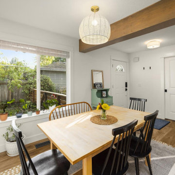
The transformation began with a complete rethinking of the home's interior organization. An existing bedroom, which had already transitioned into a home office, was removed to make way for a new staircase connecting the first and second floors. Rather than treating the staircase as simply a circulation element, the redesign used it to create a new living area while adding valuable storage beneath. The formerly enclosed dining room was opened to the kitchen and living spaces, resulting in a bright, cohesive great room that dramatically improved both sightlines and daily functionality.
The newly added second floor became the centerpiece of the project. On one side of the addition, a spacious bonus room with vaulted ceilings provides a flexible space for family gatherings, movie nights, homework sessions, and creative projects. Dedicated workstation areas ensure the room can evolve alongside the family's needs while taking advantage of abundant natural light from multiple windows.
On the opposite side, the homeowners finally gained the private retreat they had been missing. The new primary suite features soaring vaulted ceilings, expansive windows, and a walk-in closet approximately six times larger than the home's original primary closet. The adjoining bathroom was designed to balance comfort, practicality, and timeless style, with a double vanity, dedicated linen storage, a separate tiled shower, and a soaking tub that creates a true spa-like experience within the home.
Throughout the renovation, a contemporary transitional aesthetic guided the design selections. New luxury vinyl plank flooring was installed across both the existing first floor and the newly constructed second level, creating visual continuity throughout the home. Matching custom stair treads provide a seamless transition between floors, while updated baseboards and door casings help unify the original structure with the addition so the entire home feels intentionally designed rather than pieced together over time.
The staircase became an architectural focal point, featuring warm wood handrails stained to complement the flooring and black metal balusters that introduce a subtle modern influence. This combination successfully bridges the homeowners' appreciation for contemporary design while respecting the overall character of the home.
Material selections in the primary bathroom create depth through texture rather than bold color contrasts. Softly varied white wall tile ranges from crisp bright whites to subtle cloudy tones, while a gentle watercolor-like surface texture captures and reflects natural light throughout the day. Extending the same tile across both the shower walls and tub surround establishes clean architectural lines and emphasizes the room's spaciousness. Black marble pebble flooring in the shower, paired with matte black plumbing fixtures, mirrors, lighting, and trim details, adds contrast and sophistication without overwhelming the palette.
What makes this project especially meaningful is its ability to solve multiple challenges through a single integrated design-build solution. Through close collaboration with the homeowners and our architectural partner, Candid Design, every square foot was carefully considered to maximize functionality, comfort, and long-term livability. By building upward rather than outward, the homeowners gained a spacious primary suite, an additional living area, improved storage, a dedicated guest bath, and flexible family spaces while preserving the location, character, and community they already loved. The result is a home that feels larger, brighter, and better suited for the next chapter of family life without sacrificing the qualities that made it special in the first place.
 THE Remodel Group
Sometimes the best solution isn't finding a bigger home, it's reimagining the one you already love. This Portland second-story addition demonstrates how strategic design-build planning can help a growing family gain the space they need while remaining in the neighborhood they never wanted to leave.
Originally, this home was a modest single-level residence with three bedrooms and two bathrooms. As the family's needs evolved, the layout no longer offered the functionality they required. Visiting relatives from California frequently stayed with them, yet the existing floor plan lacked a dedicated guest bathroom. The primary suite was undersized, storage was limited, and the main living room felt cramped for everyday family life. Complicating matters further, the narrow lot provided virtually no opportunity for expansion to the front, sides, or rear of the property. To create meaningful additional square footage, the only option was to build upward.
The transformation began with a complete rethinking of the home's interior organization. An existing bedroom, which had already transitioned into a home office, was removed to make way for a new staircase connecting the first and second floors. Rather than treating the staircase as simply a circulation element, the redesign used it to create a new living area while adding valuable storage beneath. The formerly enclosed dining room was opened to the kitchen and living spaces, resulting in a bright, cohesive great room that dramatically improved both sightlines and daily functionality.
The newly added second floor became the centerpiece of the project. On one side of the addition, a spacious bonus room with vaulted ceilings provides a flexible space for family gatherings, movie nights, homework sessions, and creative projects. Dedicated workstation areas ensure the room can evolve alongside the family's needs while taking advantage of abundant natural light from multiple windows.
On the opposite side, the homeowners finally gained the private retreat they had been missing. The new primary suite features soaring vaulted ceilings, expansive windows, and a walk-in closet approximately six times larger than the home's original primary closet. The adjoining bathroom was designed to balance comfort, practicality, and timeless style, with a double vanity, dedicated linen storage, a separate tiled shower, and a soaking tub that creates a true spa-like experience within the home.
Throughout the renovation, a contemporary transitional aesthetic guided the design selections. New luxury vinyl plank flooring was installed across both the existing first floor and the newly constructed second level, creating visual continuity throughout the home. Matching custom stair treads provide a seamless transition between floors, while updated baseboards and door casings help unify the original structure with the addition so the entire home feels intentionally designed rather than pieced together over time.
The staircase became an architectural focal point, featuring warm wood handrails stained to complement the flooring and black metal balusters that introduce a subtle modern influence. This combination successfully bridges the homeowners' appreciation for contemporary design while respecting the overall character of the home.
Material selections in the primary bathroom create depth through texture rather than bold color contrasts. Softly varied white wall tile ranges from crisp bright whites to subtle cloudy tones, while a gentle watercolor-like surface texture captures and reflects natural light throughout the day. Extending the same tile across both the shower walls and tub surround establishes clean architectural lines and emphasizes the room's spaciousness. Black marble pebble flooring in the shower, paired with matte black plumbing fixtures, mirrors, lighting, and trim details, adds contrast and sophistication without overwhelming the palette.
What makes this project especially meaningful is its ability to solve multiple challenges through a single integrated design-build solution. Through close collaboration with the homeowners and our architectural partner, Candid Design, every square foot was carefully considered to maximize functionality, comfort, and long-term livability. By building upward rather than outward, the homeowners gained a spacious primary suite, an additional living area, improved storage, a dedicated guest bath, and flexible family spaces while preserving the location, character, and community they already loved. The result is a home that feels larger, brighter, and better suited for the next chapter of family life without sacrificing the qualities that made it special in the first place.
 THE Remodel Group
Sometimes the best solution isn't finding a bigger home, it's reimagining the one you already love. This Portland second-story addition demonstrates how strategic design-build planning can help a growing family gain the space they need while remaining in the neighborhood they never wanted to leave.
Originally, this home was a modest single-level residence with three bedrooms and two bathrooms. As the family's needs evolved, the layout no longer offered the functionality they required. Visiting relatives from California frequently stayed with them, yet the existing floor plan lacked a dedicated guest bathroom. The primary suite was undersized, storage was limited, and the main living room felt cramped for everyday family life. Complicating matters further, the narrow lot provided virtually no opportunity for expansion to the front, sides, or rear of the property. To create meaningful additional square footage, the only option was to build upward.
The transformation began with a complete rethinking of the home's interior organization. An existing bedroom, which had already transitioned into a home office, was removed to make way for a new staircase connecting the first and second floors. Rather than treating the staircase as simply a circulation element, the redesign used it to create a new living area while adding valuable storage beneath. The formerly enclosed dining room was opened to the kitchen and living spaces, resulting in a bright, cohesive great room that dramatically improved both sightlines and daily functionality.
The newly added second floor became the centerpiece of the project. On one side of the addition, a spacious bonus room with vaulted ceilings provides a flexible space for family gatherings, movie nights, homework sessions, and creative projects. Dedicated workstation areas ensure the room can evolve alongside the family's needs while taking advantage of abundant natural light from multiple windows.
On the opposite side, the homeowners finally gained the private retreat they had been missing. The new primary suite features soaring vaulted ceilings, expansive windows, and a walk-in closet approximately six times larger than the home's original primary closet. The adjoining bathroom was designed to balance comfort, practicality, and timeless style, with a double vanity, dedicated linen storage, a separate tiled shower, and a soaking tub that creates a true spa-like experience within the home.
Throughout the renovation, a contemporary transitional aesthetic guided the design selections. New luxury vinyl plank flooring was installed across both the existing first floor and the newly constructed second level, creating visual continuity throughout the home. Matching custom stair treads provide a seamless transition between floors, while updated baseboards and door casings help unify the original structure with the addition so the entire home feels intentionally designed rather than pieced together over time.
The staircase became an architectural focal point, featuring warm wood handrails stained to complement the flooring and black metal balusters that introduce a subtle modern influence. This combination successfully bridges the homeowners' appreciation for contemporary design while respecting the overall character of the home.
Material selections in the primary bathroom create depth through texture rather than bold color contrasts. Softly varied white wall tile ranges from crisp bright whites to subtle cloudy tones, while a gentle watercolor-like surface texture captures and reflects natural light throughout the day. Extending the same tile across both the shower walls and tub surround establishes clean architectural lines and emphasizes the room's spaciousness. Black marble pebble flooring in the shower, paired with matte black plumbing fixtures, mirrors, lighting, and trim details, adds contrast and sophistication without overwhelming the palette.
What makes this project especially meaningful is its ability to solve multiple challenges through a single integrated design-build solution. Through close collaboration with the homeowners and our architectural partner, Candid Design, every square foot was carefully considered to maximize functionality, comfort, and long-term livability. By building upward rather than outward, the homeowners gained a spacious primary suite, an additional living area, improved storage, a dedicated guest bath, and flexible family spaces while preserving the location, character, and community they already loved. The result is a home that feels larger, brighter, and better suited for the next chapter of family life without sacrificing the qualities that made it special in the first place.
 THE Remodel Group
Sometimes the best solution isn't finding a bigger home, it's reimagining the one you already love. This Portland second-story addition demonstrates how strategic design-build planning can help a growing family gain the space they need while remaining in the neighborhood they never wanted to leave.
Originally, this home was a modest single-level residence with three bedrooms and two bathrooms. As the family's needs evolved, the layout no longer offered the functionality they required. Visiting relatives from California frequently stayed with them, yet the existing floor plan lacked a dedicated guest bathroom. The primary suite was undersized, storage was limited, and the main living room felt cramped for everyday family life. Complicating matters further, the narrow lot provided virtually no opportunity for expansion to the front, sides, or rear of the property. To create meaningful additional square footage, the only option was to build upward.
The transformation began with a complete rethinking of the home's interior organization. An existing bedroom, which had already transitioned into a home office, was removed to make way for a new staircase connecting the first and second floors. Rather than treating the staircase as simply a circulation element, the redesign used it to create a new living area while adding valuable storage beneath. The formerly enclosed dining room was opened to the kitchen and living spaces, resulting in a bright, cohesive great room that dramatically improved both sightlines and daily functionality.
The newly added second floor became the centerpiece of the project. On one side of the addition, a spacious bonus room with vaulted ceilings provides a flexible space for family gatherings, movie nights, homework sessions, and creative projects. Dedicated workstation areas ensure the room can evolve alongside the family's needs while taking advantage of abundant natural light from multiple windows.
On the opposite side, the homeowners finally gained the private retreat they had been missing. The new primary suite features soaring vaulted ceilings, expansive windows, and a walk-in closet approximately six times larger than the home's original primary closet. The adjoining bathroom was designed to balance comfort, practicality, and timeless style, with a double vanity, dedicated linen storage, a separate tiled shower, and a soaking tub that creates a true spa-like experience within the home.
Throughout the renovation, a contemporary transitional aesthetic guided the design selections. New luxury vinyl plank flooring was installed across both the existing first floor and the newly constructed second level, creating visual continuity throughout the home. Matching custom stair treads provide a seamless transition between floors, while updated baseboards and door casings help unify the original structure with the addition so the entire home feels intentionally designed rather than pieced together over time.
The staircase became an architectural focal point, featuring warm wood handrails stained to complement the flooring and black metal balusters that introduce a subtle modern influence. This combination successfully bridges the homeowners' appreciation for contemporary design while respecting the overall character of the home.
Material selections in the primary bathroom create depth through texture rather than bold color contrasts. Softly varied white wall tile ranges from crisp bright whites to subtle cloudy tones, while a gentle watercolor-like surface texture captures and reflects natural light throughout the day. Extending the same tile across both the shower walls and tub surround establishes clean architectural lines and emphasizes the room's spaciousness. Black marble pebble flooring in the shower, paired with matte black plumbing fixtures, mirrors, lighting, and trim details, adds contrast and sophistication without overwhelming the palette.
What makes this project especially meaningful is its ability to solve multiple challenges through a single integrated design-build solution. Through close collaboration with the homeowners and our architectural partner, Candid Design, every square foot was carefully considered to maximize functionality, comfort, and long-term livability. By building upward rather than outward, the homeowners gained a spacious primary suite, an additional living area, improved storage, a dedicated guest bath, and flexible family spaces while preserving the location, character, and community they already loved. The result is a home that feels larger, brighter, and better suited for the next chapter of family life without sacrificing the qualities that made it special in the first place.
 THE Remodel Group
Sometimes the best solution isn't finding a bigger home, it's reimagining the one you already love. This Portland second-story addition demonstrates how strategic design-build planning can help a growing family gain the space they need while remaining in the neighborhood they never wanted to leave.
Originally, this home was a modest single-level residence with three bedrooms and two bathrooms. As the family's needs evolved, the layout no longer offered the functionality they required. Visiting relatives from California frequently stayed with them, yet the existing floor plan lacked a dedicated guest bathroom. The primary suite was undersized, storage was limited, and the main living room felt cramped for everyday family life. Complicating matters further, the narrow lot provided virtually no opportunity for expansion to the front, sides, or rear of the property. To create meaningful additional square footage, the only option was to build upward.
The transformation began with a complete rethinking of the home's interior organization. An existing bedroom, which had already transitioned into a home office, was removed to make way for a new staircase connecting the first and second floors. Rather than treating the staircase as simply a circulation element, the redesign used it to create a new living area while adding valuable storage beneath. The formerly enclosed dining room was opened to the kitchen and living spaces, resulting in a bright, cohesive great room that dramatically improved both sightlines and daily functionality.
The newly added second floor became the centerpiece of the project. On one side of the addition, a spacious bonus room with vaulted ceilings provides a flexible space for family gatherings, movie nights, homework sessions, and creative projects. Dedicated workstation areas ensure the room can evolve alongside the family's needs while taking advantage of abundant natural light from multiple windows.
On the opposite side, the homeowners finally gained the private retreat they had been missing. The new primary suite features soaring vaulted ceilings, expansive windows, and a walk-in closet approximately six times larger than the home's original primary closet. The adjoining bathroom was designed to balance comfort, practicality, and timeless style, with a double vanity, dedicated linen storage, a separate tiled shower, and a soaking tub that creates a true spa-like experience within the home.
Throughout the renovation, a contemporary transitional aesthetic guided the design selections. New luxury vinyl plank flooring was installed across both the existing first floor and the newly constructed second level, creating visual continuity throughout the home. Matching custom stair treads provide a seamless transition between floors, while updated baseboards and door casings help unify the original structure with the addition so the entire home feels intentionally designed rather than pieced together over time.
The staircase became an architectural focal point, featuring warm wood handrails stained to complement the flooring and black metal balusters that introduce a subtle modern influence. This combination successfully bridges the homeowners' appreciation for contemporary design while respecting the overall character of the home.
Material selections in the primary bathroom create depth through texture rather than bold color contrasts. Softly varied white wall tile ranges from crisp bright whites to subtle cloudy tones, while a gentle watercolor-like surface texture captures and reflects natural light throughout the day. Extending the same tile across both the shower walls and tub surround establishes clean architectural lines and emphasizes the room's spaciousness. Black marble pebble flooring in the shower, paired with matte black plumbing fixtures, mirrors, lighting, and trim details, adds contrast and sophistication without overwhelming the palette.
What makes this project especially meaningful is its ability to solve multiple challenges through a single integrated design-build solution. Through close collaboration with the homeowners and our architectural partner, Candid Design, every square foot was carefully considered to maximize functionality, comfort, and long-term livability. By building upward rather than outward, the homeowners gained a spacious primary suite, an additional living area, improved storage, a dedicated guest bath, and flexible family spaces while preserving the location, character, and community they already loved. The result is a home that feels larger, brighter, and better suited for the next chapter of family life without sacrificing the qualities that made it special in the first place.
 THE Remodel Group
Sometimes the best solution isn't finding a bigger home, it's reimagining the one you already love. This Portland second-story addition demonstrates how strategic design-build planning can help a growing family gain the space they need while remaining in the neighborhood they never wanted to leave.
Originally, this home was a modest single-level residence with three bedrooms and two bathrooms. As the family's needs evolved, the layout no longer offered the functionality they required. Visiting relatives from California frequently stayed with them, yet the existing floor plan lacked a dedicated guest bathroom. The primary suite was undersized, storage was limited, and the main living room felt cramped for everyday family life. Complicating matters further, the narrow lot provided virtually no opportunity for expansion to the front, sides, or rear of the property. To create meaningful additional square footage, the only option was to build upward.
The transformation began with a complete rethinking of the home's interior organization. An existing bedroom, which had already transitioned into a home office, was removed to make way for a new staircase connecting the first and second floors. Rather than treating the staircase as simply a circulation element, the redesign used it to create a new living area while adding valuable storage beneath. The formerly enclosed dining room was opened to the kitchen and living spaces, resulting in a bright, cohesive great room that dramatically improved both sightlines and daily functionality.
The newly added second floor became the centerpiece of the project. On one side of the addition, a spacious bonus room with vaulted ceilings provides a flexible space for family gatherings, movie nights, homework sessions, and creative projects. Dedicated workstation areas ensure the room can evolve alongside the family's needs while taking advantage of abundant natural light from multiple windows.
On the opposite side, the homeowners finally gained the private retreat they had been missing. The new primary suite features soaring vaulted ceilings, expansive windows, and a walk-in closet approximately six times larger than the home's original primary closet. The adjoining bathroom was designed to balance comfort, practicality, and timeless style, with a double vanity, dedicated linen storage, a separate tiled shower, and a soaking tub that creates a true spa-like experience within the home.
Throughout the renovation, a contemporary transitional aesthetic guided the design selections. New luxury vinyl plank flooring was installed across both the existing first floor and the newly constructed second level, creating visual continuity throughout the home. Matching custom stair treads provide a seamless transition between floors, while updated baseboards and door casings help unify the original structure with the addition so the entire home feels intentionally designed rather than pieced together over time.
The staircase became an architectural focal point, featuring warm wood handrails stained to complement the flooring and black metal balusters that introduce a subtle modern influence. This combination successfully bridges the homeowners' appreciation for contemporary design while respecting the overall character of the home.
Material selections in the primary bathroom create depth through texture rather than bold color contrasts. Softly varied white wall tile ranges from crisp bright whites to subtle cloudy tones, while a gentle watercolor-like surface texture captures and reflects natural light throughout the day. Extending the same tile across both the shower walls and tub surround establishes clean architectural lines and emphasizes the room's spaciousness. Black marble pebble flooring in the shower, paired with matte black plumbing fixtures, mirrors, lighting, and trim details, adds contrast and sophistication without overwhelming the palette.
What makes this project especially meaningful is its ability to solve multiple challenges through a single integrated design-build solution. Through close collaboration with the homeowners and our architectural partner, Candid Design, every square foot was carefully considered to maximize functionality, comfort, and long-term livability. By building upward rather than outward, the homeowners gained a spacious primary suite, an additional living area, improved storage, a dedicated guest bath, and flexible family spaces while preserving the location, character, and community they already loved. The result is a home that feels larger, brighter, and better suited for the next chapter of family life without sacrificing the qualities that made it special in the first place.
 THE Remodel Group
Sometimes the best solution isn't finding a bigger home, it's reimagining the one you already love. This Portland second-story addition demonstrates how strategic design-build planning can help a growing family gain the space they need while remaining in the neighborhood they never wanted to leave.
Originally, this home was a modest single-level residence with three bedrooms and two bathrooms. As the family's needs evolved, the layout no longer offered the functionality they required. Visiting relatives from California frequently stayed with them, yet the existing floor plan lacked a dedicated guest bathroom. The primary suite was undersized, storage was limited, and the main living room felt cramped for everyday family life. Complicating matters further, the narrow lot provided virtually no opportunity for expansion to the front, sides, or rear of the property. To create meaningful additional square footage, the only option was to build upward.
The transformation began with a complete rethinking of the home's interior organization. An existing bedroom, which had already transitioned into a home office, was removed to make way for a new staircase connecting the first and second floors. Rather than treating the staircase as simply a circulation element, the redesign used it to create a new living area while adding valuable storage beneath. The formerly enclosed dining room was opened to the kitchen and living spaces, resulting in a bright, cohesive great room that dramatically improved both sightlines and daily functionality.
The newly added second floor became the centerpiece of the project. On one side of the addition, a spacious bonus room with vaulted ceilings provides a flexible space for family gatherings, movie nights, homework sessions, and creative projects. Dedicated workstation areas ensure the room can evolve alongside the family's needs while taking advantage of abundant natural light from multiple windows.
On the opposite side, the homeowners finally gained the private retreat they had been missing. The new primary suite features soaring vaulted ceilings, expansive windows, and a walk-in closet approximately six times larger than the home's original primary closet. The adjoining bathroom was designed to balance comfort, practicality, and timeless style, with a double vanity, dedicated linen storage, a separate tiled shower, and a soaking tub that creates a true spa-like experience within the home.
Throughout the renovation, a contemporary transitional aesthetic guided the design selections. New luxury vinyl plank flooring was installed across both the existing first floor and the newly constructed second level, creating visual continuity throughout the home. Matching custom stair treads provide a seamless transition between floors, while updated baseboards and door casings help unify the original structure with the addition so the entire home feels intentionally designed rather than pieced together over time.
The staircase became an architectural focal point, featuring warm wood handrails stained to complement the flooring and black metal balusters that introduce a subtle modern influence. This combination successfully bridges the homeowners' appreciation for contemporary design while respecting the overall character of the home.
Material selections in the primary bathroom create depth through texture rather than bold color contrasts. Softly varied white wall tile ranges from crisp bright whites to subtle cloudy tones, while a gentle watercolor-like surface texture captures and reflects natural light throughout the day. Extending the same tile across both the shower walls and tub surround establishes clean architectural lines and emphasizes the room's spaciousness. Black marble pebble flooring in the shower, paired with matte black plumbing fixtures, mirrors, lighting, and trim details, adds contrast and sophistication without overwhelming the palette.
What makes this project especially meaningful is its ability to solve multiple challenges through a single integrated design-build solution. Through close collaboration with the homeowners and our architectural partner, Candid Design, every square foot was carefully considered to maximize functionality, comfort, and long-term livability. By building upward rather than outward, the homeowners gained a spacious primary suite, an additional living area, improved storage, a dedicated guest bath, and flexible family spaces while preserving the location, character, and community they already loved. The result is a home that feels larger, brighter, and better suited for the next chapter of family life without sacrificing the qualities that made it special in the first place.
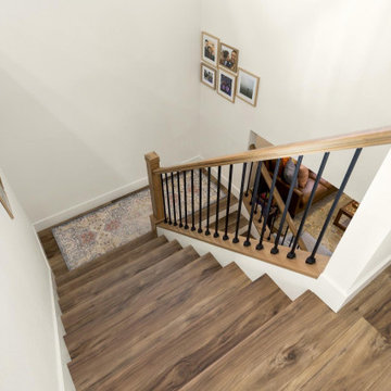 THE Remodel Group
Sometimes the best solution isn't finding a bigger home, it's reimagining the one you already love. This Portland second-story addition demonstrates how strategic design-build planning can help a growing family gain the space they need while remaining in the neighborhood they never wanted to leave.
Originally, this home was a modest single-level residence with three bedrooms and two bathrooms. As the family's needs evolved, the layout no longer offered the functionality they required. Visiting relatives from California frequently stayed with them, yet the existing floor plan lacked a dedicated guest bathroom. The primary suite was undersized, storage was limited, and the main living room felt cramped for everyday family life. Complicating matters further, the narrow lot provided virtually no opportunity for expansion to the front, sides, or rear of the property. To create meaningful additional square footage, the only option was to build upward.
The transformation began with a complete rethinking of the home's interior organization. An existing bedroom, which had already transitioned into a home office, was removed to make way for a new staircase connecting the first and second floors. Rather than treating the staircase as simply a circulation element, the redesign used it to create a new living area while adding valuable storage beneath. The formerly enclosed dining room was opened to the kitchen and living spaces, resulting in a bright, cohesive great room that dramatically improved both sightlines and daily functionality.
The newly added second floor became the centerpiece of the project. On one side of the addition, a spacious bonus room with vaulted ceilings provides a flexible space for family gatherings, movie nights, homework sessions, and creative projects. Dedicated workstation areas ensure the room can evolve alongside the family's needs while taking advantage of abundant natural light from multiple windows.
On the opposite side, the homeowners finally gained the private retreat they had been missing. The new primary suite features soaring vaulted ceilings, expansive windows, and a walk-in closet approximately six times larger than the home's original primary closet. The adjoining bathroom was designed to balance comfort, practicality, and timeless style, with a double vanity, dedicated linen storage, a separate tiled shower, and a soaking tub that creates a true spa-like experience within the home.
Throughout the renovation, a contemporary transitional aesthetic guided the design selections. New luxury vinyl plank flooring was installed across both the existing first floor and the newly constructed second level, creating visual continuity throughout the home. Matching custom stair treads provide a seamless transition between floors, while updated baseboards and door casings help unify the original structure with the addition so the entire home feels intentionally designed rather than pieced together over time.
The staircase became an architectural focal point, featuring warm wood handrails stained to complement the flooring and black metal balusters that introduce a subtle modern influence. This combination successfully bridges the homeowners' appreciation for contemporary design while respecting the overall character of the home.
Material selections in the primary bathroom create depth through texture rather than bold color contrasts. Softly varied white wall tile ranges from crisp bright whites to subtle cloudy tones, while a gentle watercolor-like surface texture captures and reflects natural light throughout the day. Extending the same tile across both the shower walls and tub surround establishes clean architectural lines and emphasizes the room's spaciousness. Black marble pebble flooring in the shower, paired with matte black plumbing fixtures, mirrors, lighting, and trim details, adds contrast and sophistication without overwhelming the palette.
What makes this project especially meaningful is its ability to solve multiple challenges through a single integrated design-build solution. Through close collaboration with the homeowners and our architectural partner, Candid Design, every square foot was carefully considered to maximize functionality, comfort, and long-term livability. By building upward rather than outward, the homeowners gained a spacious primary suite, an additional living area, improved storage, a dedicated guest bath, and flexible family spaces while preserving the location, character, and community they already loved. The result is a home that feels larger, brighter, and better suited for the next chapter of family life without sacrificing the qualities that made it special in the first place.
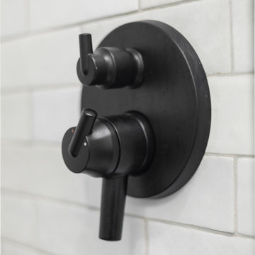 THE Remodel Group
Sometimes the best solution isn't finding a bigger home, it's reimagining the one you already love. This Portland second-story addition demonstrates how strategic design-build planning can help a growing family gain the space they need while remaining in the neighborhood they never wanted to leave.
Originally, this home was a modest single-level residence with three bedrooms and two bathrooms. As the family's needs evolved, the layout no longer offered the functionality they required. Visiting relatives from California frequently stayed with them, yet the existing floor plan lacked a dedicated guest bathroom. The primary suite was undersized, storage was limited, and the main living room felt cramped for everyday family life. Complicating matters further, the narrow lot provided virtually no opportunity for expansion to the front, sides, or rear of the property. To create meaningful additional square footage, the only option was to build upward.
The transformation began with a complete rethinking of the home's interior organization. An existing bedroom, which had already transitioned into a home office, was removed to make way for a new staircase connecting the first and second floors. Rather than treating the staircase as simply a circulation element, the redesign used it to create a new living area while adding valuable storage beneath. The formerly enclosed dining room was opened to the kitchen and living spaces, resulting in a bright, cohesive great room that dramatically improved both sightlines and daily functionality.
The newly added second floor became the centerpiece of the project. On one side of the addition, a spacious bonus room with vaulted ceilings provides a flexible space for family gatherings, movie nights, homework sessions, and creative projects. Dedicated workstation areas ensure the room can evolve alongside the family's needs while taking advantage of abundant natural light from multiple windows.
On the opposite side, the homeowners finally gained the private retreat they had been missing. The new primary suite features soaring vaulted ceilings, expansive windows, and a walk-in closet approximately six times larger than the home's original primary closet. The adjoining bathroom was designed to balance comfort, practicality, and timeless style, with a double vanity, dedicated linen storage, a separate tiled shower, and a soaking tub that creates a true spa-like experience within the home.
Throughout the renovation, a contemporary transitional aesthetic guided the design selections. New luxury vinyl plank flooring was installed across both the existing first floor and the newly constructed second level, creating visual continuity throughout the home. Matching custom stair treads provide a seamless transition between floors, while updated baseboards and door casings help unify the original structure with the addition so the entire home feels intentionally designed rather than pieced together over time.
The staircase became an architectural focal point, featuring warm wood handrails stained to complement the flooring and black metal balusters that introduce a subtle modern influence. This combination successfully bridges the homeowners' appreciation for contemporary design while respecting the overall character of the home.
Material selections in the primary bathroom create depth through texture rather than bold color contrasts. Softly varied white wall tile ranges from crisp bright whites to subtle cloudy tones, while a gentle watercolor-like surface texture captures and reflects natural light throughout the day. Extending the same tile across both the shower walls and tub surround establishes clean architectural lines and emphasizes the room's spaciousness. Black marble pebble flooring in the shower, paired with matte black plumbing fixtures, mirrors, lighting, and trim details, adds contrast and sophistication without overwhelming the palette.
What makes this project especially meaningful is its ability to solve multiple challenges through a single integrated design-build solution. Through close collaboration with the homeowners and our architectural partner, Candid Design, every square foot was carefully considered to maximize functionality, comfort, and long-term livability. By building upward rather than outward, the homeowners gained a spacious primary suite, an additional living area, improved storage, a dedicated guest bath, and flexible family spaces while preserving the location, character, and community they already loved. The result is a home that feels larger, brighter, and better suited for the next chapter of family life without sacrificing the qualities that made it special in the first place.
85