
Search results for "Love therefore" in Home Design Ideas

 Betty Wasserman Art & Interiors: The Hamptons
A newly built 2 bedroom, 2.5 bath home was in need of a refreshing design. As a second home for our clients, a newly retired couple, we wanted to make this space as relaxing as possible. Finding inspiration from elements of nature, we were able to incorporate a sunset color palette in the living area, using gorgeous hues of orange, burgundy, and red with a splash of neutrals—all highlighted in the beautiful drapery. The bedrooms showcase tranquil color schemes of navy, blue, and gray, a complementary contrast to the warmer hues used throughout the rest of the home.
Our team collaborated with many artisans to create custom furniture, cabinetry, lighting, wall finishes and artwork as well as utilizing exclusive furniture & fabric vendors. The use of such artisanal pieces not only create a one-of-a-kind look and feel, but all come together to create an artistic design throughout the whole space.
Another unique element of this space is the amazing 400 SF terrace, which oversees the Highline and the meticulous landscaping. The clients love to entertain, therefore, providing functional and comfortable custom outdoor furniture selections was critical. Finding fun fabrics to tie in the blues of the indoor space, provided a seamless transition. The sculptural element of the outdoors created a mini MOMA on the terrace and brought a lot of interest to the space though the installations of STORM KING artist, Joel Perlman.

 Reyes Creative Concepts LLC.
Living Room:
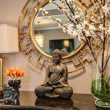
Our customer wanted to update the family room and the kitchen of this 1970's splanch. By painting the brick wall white and adding custom built-ins we brightened up the space. The decor reflects our client's love for color and a bit of asian style elements. We also made sure that the sitting was not only beautiful, but very comfortable and durable. The sofa and the accent chairs sit very comfortably and we used the performance fabrics to make sure they last through the years. We also wanted to highlight the art collection which the owner curated through the years.
Kithen:
We enlarged the kitchen by removing a partition wall that divided it from the dining room and relocated the entrance. Our goal was to create a warm and inviting kitchen, therefore we selected a mellow, neutral palette. The cabinets are soft Irish Cream as opposed to a bright white. The mosaic backsplash makes a statement, but remains subtle through its beige tones. We selected polished brass for the hardware, as well as brass and warm metals for the light fixtures which emit a warm and cozy glow.
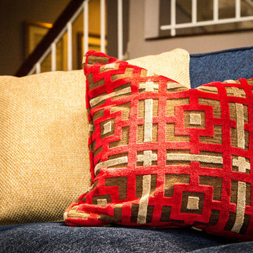
For beauty and practicality, we used quartz for the working surface countertops and for the island we chose a sophisticated leather finish marble with strong movement and gold inflections. Because of our client’s love for Asian influences, we selected upholstery fabric with an image of a dragon, chrysanthemums to mimic Japanese textiles, and red accents scattered throughout.
Functionality, aesthetics, and expressing our clients vision was our main goal.
Photography: Jeanne Calarco, Context Media Development
 Reyes Creative Concepts LLC.
Living Room:
Our customer wanted to update the family room and the kitchen of this 1970's splanch. By painting the brick wall white and adding custom built-ins we brightened up the space. The decor reflects our client's love for color and a bit of asian style elements. We also made sure that the sitting was not only beautiful, but very comfortable and durable. The sofa and the accent chairs sit very comfortably and we used the performance fabrics to make sure they last through the years. We also wanted to highlight the art collection which the owner curated through the years.
Kithen:
We enlarged the kitchen by removing a partition wall that divided it from the dining room and relocated the entrance. Our goal was to create a warm and inviting kitchen, therefore we selected a mellow, neutral palette. The cabinets are soft Irish Cream as opposed to a bright white. The mosaic backsplash makes a statement, but remains subtle through its beige tones. We selected polished brass for the hardware, as well as brass and warm metals for the light fixtures which emit a warm and cozy glow.
For beauty and practicality, we used quartz for the working surface countertops and for the island we chose a sophisticated leather finish marble with strong movement and gold inflections. Because of our client’s love for Asian influences, we selected upholstery fabric with an image of a dragon, chrysanthemums to mimic Japanese textiles, and red accents scattered throughout.
Functionality, aesthetics, and expressing our clients vision was our main goal.
Photography: Jeanne Calarco, Context Media Development
Find the right local pro for your project
 Reyes Creative Concepts LLC.
Living Room:
Our customer wanted to update the family room and the kitchen of this 1970's splanch. By painting the brick wall white and adding custom built-ins we brightened up the space. The decor reflects our client's love for color and a bit of asian style elements. We also made sure that the sitting was not only beautiful, but very comfortable and durable. The sofa and the accent chairs sit very comfortably and we used the performance fabrics to make sure they last through the years. We also wanted to highlight the art collection which the owner curated through the years.
Kithen:
We enlarged the kitchen by removing a partition wall that divided it from the dining room and relocated the entrance. Our goal was to create a warm and inviting kitchen, therefore we selected a mellow, neutral palette. The cabinets are soft Irish Cream as opposed to a bright white. The mosaic backsplash makes a statement, but remains subtle through its beige tones. We selected polished brass for the hardware, as well as brass and warm metals for the light fixtures which emit a warm and cozy glow.
For beauty and practicality, we used quartz for the working surface countertops and for the island we chose a sophisticated leather finish marble with strong movement and gold inflections. Because of our client’s love for Asian influences, we selected upholstery fabric with an image of a dragon, chrysanthemums to mimic Japanese textiles, and red accents scattered throughout.
Functionality, aesthetics, and expressing our clients vision was our main goal.
Photography: Jeanne Calarco, Context Media Development

 Victor Shade Company
Vignette® Modern Roman Shades feature consistent folds and no exposed rear cords, keeping windows uncluttered. Choose from different fold styles and sizes, and a horizontal or vertical orientation.

 'g' Green Design Center
Storage Pantry - We created this transitional style kitchen for a client who loves color and texture. When she came to ‘g’ she had already chosen to use the large stone wall behind her stove and selected her appliances, which were all high end and therefore guided us in the direction of creating a real cooks kitchen. The two tiered island plays a major roll in the design since the client also had the Charisma Blue Vetrazzo already selected. This tops the top tier of the island and helped us to establish a color palette throughout. Other important features include the appliance garage and the pantry, as well as bar area. The hand scraped bamboo floors also reflect the highly textured approach to this family gathering place as they extend to adjacent rooms. Dan Cutrona Photography
 Betty Wasserman Art & Interiors: The Hamptons
A newly built 2 bedroom, 2.5 bath home was in need of a refreshing design. As a second home for our clients, a newly retired couple, we wanted to make this space as relaxing as possible. Finding inspiration from elements of nature, we were able to incorporate a sunset color palette in the living area, using gorgeous hues of orange, burgundy, and red with a splash of neutrals—all highlighted in the beautiful drapery. The bedrooms showcase tranquil color schemes of navy, blue, and gray, a complementary contrast to the warmer hues used throughout the rest of the home.
Our team collaborated with many artisans to create custom furniture, cabinetry, lighting, wall finishes and artwork as well as utilizing exclusive furniture & fabric vendors. The use of such artisanal pieces not only create a one-of-a-kind look and feel, but all come together to create an artistic design throughout the whole space.
Another unique element of this space is the amazing 400 SF terrace, which oversees the Highline and the meticulous landscaping. The clients love to entertain, therefore, providing functional and comfortable custom outdoor furniture selections was critical. Finding fun fabrics to tie in the blues of the indoor space, provided a seamless transition. The sculptural element of the outdoors created a mini MOMA on the terrace and brought a lot of interest to the space though the installations of STORM KING artist, Joel Perlman.

 Reyes Creative Concepts LLC.
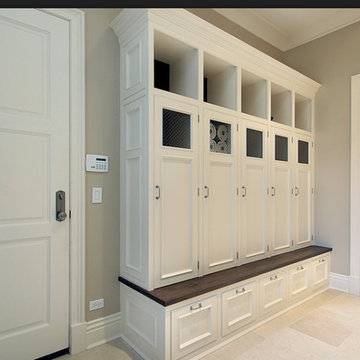
The owner wanted to update the family room and the kitchen of this 1970's splanch. By painting the brick wall white and adding custom built-ins we brightened up the space. The decor reflects our client's love for color and a bit of asian style elements. We also made sure that the sitting was not only beautiful, but very comfortable and durable. The sofa and the accent chairs sit very comfortably and we used the performance fabrics to make sure they last through the years. We also wanted to highlight the art collection which the owner curated through the years.
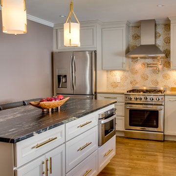
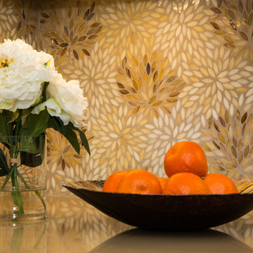
We enlarged the kitchen by removing a partition wall that divided it from the dining room and relocated the entrance. Our goal was to create a warm and inviting kitchen, therefore we selected a mellow, neutral palette. The cabinets are soft Irish Cream as opposed to a bright white. The mosaic backsplash makes a statement, but remains subtle through its beige tones. We selected polished brass for the hardware, as well as brass and warm metals for the light fixtures which emit a warm and cozy glow.
For beauty and practicality, we used quartz for the working surface countertops and for the island we chose a sophisticated leather finish marble with strong movement and gold inflections. Because of our client’s love for Asian influences, we selected upholstery fabric with an image of a dragon, chrysanthemums to mimic Japanese textiles, and red accents scattered throughout.
Functionality, aesthetics, and expressing our clients vision was our main goal.
Photography: Jeanne Calarco, Context Media Development
 Reyes Creative Concepts LLC.
Living Room:
Our customer wanted to update the family room and the kitchen of this 1970's splanch. By painting the brick wall white and adding custom built-ins we brightened up the space. The decor reflects our client's love for color and a bit of asian style elements. We also made sure that the sitting was not only beautiful, but very comfortable and durable. The sofa and the accent chairs sit very comfortably and we used the performance fabrics to make sure they last through the years. We also wanted to highlight the art collection which the owner curated through the years.
Kithen:
We enlarged the kitchen by removing a partition wall that divided it from the dining room and relocated the entrance. Our goal was to create a warm and inviting kitchen, therefore we selected a mellow, neutral palette. The cabinets are soft Irish Cream as opposed to a bright white. The mosaic backsplash makes a statement, but remains subtle through its beige tones. We selected polished brass for the hardware, as well as brass and warm metals for the light fixtures which emit a warm and cozy glow.
For beauty and practicality, we used quartz for the working surface countertops and for the island we chose a sophisticated leather finish marble with strong movement and gold inflections. Because of our client’s love for Asian influences, we selected upholstery fabric with an image of a dragon, chrysanthemums to mimic Japanese textiles, and red accents scattered throughout.
Functionality, aesthetics, and expressing our clients vision was our main goal.
Photography: Jeanne Calarco, Context Media Development

 Shapiro & Company Architects
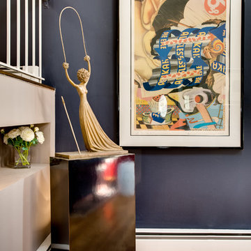
Our clients loved this tree-lined older, established neighborhood. They bought a house there that needed substantial renovations as it probably had not been updated in 30-40 years. They contacted Shapiro & Co in hopes that they would be able to transition an older, outdated house to a home that retained its character but was redesigned to meet the current needs of the family. The house foyer was very small and not accomodating for visitors so the architects relocated the entry and added a welcoming front porch. After an assessment of the existing conditions, it was determined that the kitchen, while serving its purpose in the 1940s, was completely out of character and in the wrong location for a modern family's needs. So the architects relocated and created an entirely new kitchen, and family and dining spaces. As indicative of homes in the ’40s and '50s, the master bedroom and bathroom were very small and not meeting current needs. Therefore we repurposed one bedroom into the master bath and dressing area and reorganized and enlarged the master bedroom area. The original second-floor plan was very small and confining. We captured some attic space and were able to create two bedrooms with ensuite bathrooms and a central common room for the children. By a sensitive assessment of the client’s needs and while maintaining the charm of the home, we were able to completely renovate and enlarge the house while keeping it in context with the beautiful neighborhood.
Contractor: RKA Construction, LLC
Interior: Lindsey Black Interiors
Photographer: Sélavie Photography
 Reyes Creative Concepts LLC.
Living Room:
Our customer wanted to update the family room and the kitchen of this 1970's splanch. By painting the brick wall white and adding custom built-ins we brightened up the space. The decor reflects our client's love for color and a bit of asian style elements. We also made sure that the sitting was not only beautiful, but very comfortable and durable. The sofa and the accent chairs sit very comfortably and we used the performance fabrics to make sure they last through the years. We also wanted to highlight the art collection which the owner curated through the years.
Kithen:
We enlarged the kitchen by removing a partition wall that divided it from the dining room and relocated the entrance. Our goal was to create a warm and inviting kitchen, therefore we selected a mellow, neutral palette. The cabinets are soft Irish Cream as opposed to a bright white. The mosaic backsplash makes a statement, but remains subtle through its beige tones. We selected polished brass for the hardware, as well as brass and warm metals for the light fixtures which emit a warm and cozy glow.
For beauty and practicality, we used quartz for the working surface countertops and for the island we chose a sophisticated leather finish marble with strong movement and gold inflections. Because of our client’s love for Asian influences, we selected upholstery fabric with an image of a dragon, chrysanthemums to mimic Japanese textiles, and red accents scattered throughout.
Functionality, aesthetics, and expressing our clients vision was our main goal.
Photography: Jeanne Calarco, Context Media Development

 J Design Group - Interior Designers Miami - Modern
Modern Interior Designs in Miami FL. by J Design Group in Miami.
Home is an incredible or lovely place where most of the people feel comfortable. Yes..! After a long and hectic day, house is the one place where you can relax. Gone are the days, when a “home” meant just a ceiling with four walls. Yes..! That's true, but nowadays a “house” is something beyond your expectation. Therefore, most of the people hire “premises decoration” services.
Nowadays, unlike old-age properties, various new apartments and homes are built to optimize the comfort of modern housing. Yes...! Everyone knows that “Home Decoration” is considered to be one of the most important and hottest trends all over the world. This is an amazing process of using creativity, imaginations and skills. Through this, you can make your house and any other building interesting and amazing. However, if you are looking for these kinds of services for your premises, then “J Design Group” is here just for you.
We are the one that provides renovation services to you so that you can make a building actually look like a house. Yes..! Other ordinary organizations who actually focus on the colors and other decorative items of any space, but we provide all these solutions efficiently. Creative and talented Contemporary Interior Designer under each and every requirement of our precious clients and provide different solutions accordingly. We provide all these services in commercial, residential and industrial sector like homes, restaurants, hotels, corporate facilities and financial institutions remodeling service.
Everyone knows that renovation is the one that makes a building actually look like a house. That's true “design” is the one that complement each and every section of a particular space. So, if you want to change the look of your interior within your budget, then Miami Interior Designers are here just for you. Our experts carefully understand your needs and design an outline plan before rendering outstanding solutions to you.
Interior design decorators of our firm have the potential and appropriate knowledge to decorate any kind of building. We render various reliable and credible solutions to our esteemed customers so that they can easily change the entire ambiance of their premises.
J Design Group – Miami Interior Designers Firm – Modern – Contemporary
Contact us: 305-444-4611
www.JDesignGroup.com
“Home Interior Designers”
"Miami modern"
“Contemporary Interior Designers”
“Modern Interior Designers”
“House Interior Designers”
“Coco Plum Interior Designers”
“Sunny Isles Interior Designers”
“Pinecrest Interior Designers”
"J Design Group interiors"
"South Florida designers"
“Best Miami Designers”
"Miami interiors"
"Miami decor"
“Miami Beach Designers”
“Best Miami Interior Designers”
“Miami Beach Interiors”
“Luxurious Design in Miami”
"Top designers"
"Deco Miami"
"Luxury interiors"
“Miami Beach Luxury Interiors”
“Miami Interior Design”
“Miami Interior Design Firms”
"Beach front"
“Top Interior Designers”
"top decor"
“Top Miami Decorators”
"Miami luxury condos"
"modern interiors"
"Modern”
"Pent house design"
"white interiors"
“Top Miami Interior Decorators”
“Top Miami Interior Designers”
“Modern Designers in Miami”
225 Malaga Ave.
Coral Gable, FL 33134
http://www.JDesignGroup.com
Call us at: 305.444.4611
Your friendly professional Interior design firm in Miami Florida.

 Drewett Works
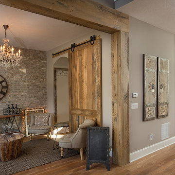
Believe it or not, this award-winning home began as a speculative project. Typically speculative projects involve a rather generic design that would appeal to many in a style that might be loved by the masses. But the project’s developer loved modern architecture and his personal residence was the first project designed by architect C.P. Drewett when Drewett Works launched in 2001. Together, the architect and developer envisioned a fictitious art collector who would one day purchase this stunning piece of desert modern architecture to showcase their magnificent collection.
The primary views from the site were southwest. Therefore, protecting the interior spaces from the southwest sun while making the primary views available was the greatest challenge. The views were very calculated and carefully managed. Every room needed to not only capture the vistas of the surrounding desert, but also provide viewing spaces for the potential collection to be housed within its walls.
The core of the material palette is utilitarian including exposed masonry and locally quarried cantera stone. An organic nature was added to the project through millwork selections including walnut and red gum veneers.
The eventual owners saw immediately that this could indeed become a home for them as well as their magnificent collection, of which pieces are loaned out to museums around the world. Their decision to purchase the home was based on the dimensions of one particular wall in the dining room which was EXACTLY large enough for one particular painting not yet displayed due to its size. The owners and this home were, as the saying goes, a perfect match!
Project Details | Desert Modern for the Magnificent Collection, Estancia, Scottsdale, AZ
Architecture: C.P. Drewett, Jr., AIA, NCARB | Drewett Works, Scottsdale, AZ
Builder: Shannon Construction | Phoenix, AZ
Interior Selections: Janet Bilotti, NCIDQ, ASID | Naples, FL
Custom Millwork: Linear Fine Woodworking | Scottsdale, AZ
Photography: Dino Tonn | Scottsdale, AZ
Awards: 2014 Gold Nugget Award of Merit
Feature Article: Luxe. Interiors and Design. Winter 2015, “Lofty Exposure”


 Ana Claudia Design
Most design showhouses are properties for sale, and each designer creates a space for viewing. It’s a great way to market the property and the designer. However, the Kingston Design Showhouse in the Fall of 2019 was at Historic Wiltyck House in Kingston, New York, that's partially used as an Airbnb and home for the owners. The room I designed is the homeowner's private dining room; therefore, we took their taste and needs into account, especially on architectural decisions.
The overall style is a mixture of modern and traditional, feminine and masculine, and moody and bright, lots of depth but not overwhelming. The architecture serves as a canvas for the furniture showcased during the exhibit and then the homeowner's furniture that will occupy the space afterward. Small details such as replacing or refinishing the doorknobs, replacing the switches and outlets were not forgotten. Then more significant details such as the wallpapered ceiling, new ceiling medallion, and light fixture make a tremendous impact on the space. The wall paint is neutral enough but adds depth with its medium tone gray. Then we added a white border and mauve painted trim as an interpretation of the crown molding that's missing.
During the exhibit, we had local makers from the Hudson Valley well represented through furniture, accessories, art, and floral arrangements. All are makers that I love and want to share with you; without them, the room wouldn’t be as lovely as it is.
 Reyes Creative Concepts LLC.
Living Room:
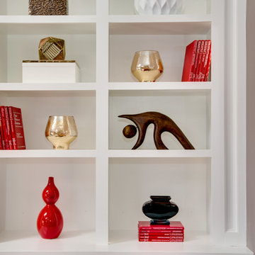
Our customer wanted to update the family room and the kitchen of this 1970's splanch. By painting the brick wall white and adding custom built-ins we brightened up the space. The decor reflects our client's love for color and a bit of asian style elements. We also made sure that the sitting was not only beautiful, but very comfortable and durable. The sofa and the accent chairs sit very comfortably and we used the performance fabrics to make sure they last through the years. We also wanted to highlight the art collection which the owner curated through the years.
Kithen:
We enlarged the kitchen by removing a partition wall that divided it from the dining room and relocated the entrance. Our goal was to create a warm and inviting kitchen, therefore we selected a mellow, neutral palette. The cabinets are soft Irish Cream as opposed to a bright white. The mosaic backsplash makes a statement, but remains subtle through its beige tones. We selected polished brass for the hardware, as well as brass and warm metals for the light fixtures which emit a warm and cozy glow.
For beauty and practicality, we used quartz for the working surface countertops and for the island we chose a sophisticated leather finish marble with strong movement and gold inflections. Because of our client’s love for Asian influences, we selected upholstery fabric with an image of a dragon, chrysanthemums to mimic Japanese textiles, and red accents scattered throughout.
Functionality, aesthetics, and expressing our clients vision was our main goal.
Photography: Jeanne Calarco, Context Media Development

 INSPIRED KITCHEN DESIGN
Perhaps the most impressive aspect of this IKEA wetbar is that they cut the butcher block countertops themselves.
She explains: “We started the journey thinking we will get a countertop from IKEA. However, we found out that IKEA doesn’t have a real butcher block and we had to have a specific type of sink for the real butcher block to work.”
Therefore, the couple had to adjust some of their layout plans, including having to reconsider the sink and still find butcher block for their countertops, which they eventually purchased from Home Depot.
To fully understand how to cut the countertops, Nastia’s husband watched YouTube videos and purchased some new tools to do the cutting as well.
“Since we bought an unfinished one, my husband also had to learn how to sand and oil our new butcher block. We used mineral oil on it, per instructions. Oiling it first every day, then once a week, then once a month. It was intimidating at first, to cut the hole for the sink. But, once we started and moved slowly it became less stressful,” she points out.
According to Nastia, the key to a successful IKEA project is simple: Don’t give up.
“The small hiccups we ran into were a bit too much, but it was on top of dealing with a flood. I really insisted on the blue cabinet doors and it was totally worth it, it made a huge difference,” she says.
She concludes: “Overall, I love the custom doors recommended by the designer (I would never have heard about Semihandmade otherwise). And I love the combination of Deep Blue with golden pulls. It creates a certain elegance in the entire space.”


Sponsored
Plain City, OH

Kuhns Contracting, Inc.
Central Ohio's Trusted Home Remodeler Specializing in Kitchens & Baths
 Shapiro & Company Architects
Our clients loved this tree-lined older, established neighborhood. They bought a house there that needed substantial renovations as it probably had not been updated in 30-40 years. They contacted Shapiro & Co in hopes that they would be able to transition an older, outdated house to a home that retained its character but was redesigned to meet the current needs of the family. The house foyer was very small and not accomodating for visitors so the architects relocated the entry and added a welcoming front porch. After an assessment of the existing conditions, it was determined that the kitchen, while serving its purpose in the 1940s, was completely out of character and in the wrong location for a modern family's needs. So the architects relocated and created an entirely new kitchen, and family and dining spaces. As indicative of homes in the ’40s and '50s, the master bedroom and bathroom were very small and not meeting current needs. Therefore we repurposed one bedroom into the master bath and dressing area and reorganized and enlarged the master bedroom area. The original second-floor plan was very small and confining. We captured some attic space and were able to create two bedrooms with ensuite bathrooms and a central common room for the children. By a sensitive assessment of the client’s needs and while maintaining the charm of the home, we were able to completely renovate and enlarge the house while keeping it in context with the beautiful neighborhood.
Contractor: RKA Construction, LLC
Interior: Lindsey Black Interiors
Photographer: Sélavie Photography
 Shapiro & Company Architects
Our clients loved this tree-lined older, established neighborhood. They bought a house there that needed substantial renovations as it probably had not been updated in 30-40 years. They contacted Shapiro & Co in hopes that they would be able to transition an older, outdated house to a home that retained its character but was redesigned to meet the current needs of the family. The house foyer was very small and not accomodating for visitors so the architects relocated the entry and added a welcoming front porch. After an assessment of the existing conditions, it was determined that the kitchen, while serving its purpose in the 1940s, was completely out of character and in the wrong location for a modern family's needs. So the architects relocated and created an entirely new kitchen, and family and dining spaces. As indicative of homes in the ’40s and '50s, the master bedroom and bathroom were very small and not meeting current needs. Therefore we repurposed one bedroom into the master bath and dressing area and reorganized and enlarged the master bedroom area. The original second-floor plan was very small and confining. We captured some attic space and were able to create two bedrooms with ensuite bathrooms and a central common room for the children. By a sensitive assessment of the client’s needs and while maintaining the charm of the home, we were able to completely renovate and enlarge the house while keeping it in context with the beautiful neighborhood.
Contractor: RKA Construction, LLC
Interior: Lindsey Black Interiors
Photographer: Sélavie Photography

 Exclusive Home Interiors
A lovely motif
The decorative pattern of the floor-tile provides rhythm and naturality.
That is a new era in the development of Gres Porcelain as own-element.
The outline of a design that always modifies according to the laying side Whoever takes a look feel the power of something alive. The very first floor-tile styled by Petracer’s . An usual decorative theme. On fabrics, objects and structural home-ware such as banisters and window-sills, as well as building materials, iron, timber, fired-earth and aimed to decorative purposes like badges, frames or backgrounds, something very close and familiar for many cultures. Conceived as core of decoration, this outline had previously never been achieved on a floor. The development of this idea headed to creation of an innovative theme that let combine, while laying it down, a customized pattern free from pre-arranged schemes. In other words, all the tiles can be fixed to each other in any side without distinction and still providing the best coherence of the decorative pattern. Every laying-scheme gets therefore unique through the flexibility of its arrangements just like something alive. An important style concept that brings honour back to ceramic as ancient decorative element and Gres Porcelain that does not imitate any raw material but simply express itself through the harmony of style and shades.
31