
Search results for "Lower lasting" in Home Design Ideas
 B Street Design
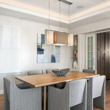
This power couple and their two young children adore beach life and spending time with family and friends. As repeat clients, they tasked us with an extensive remodel of their home’s top floor and a partial remodel of the lower level. From concept to installation, we incorporated their tastes and their home’s strong architectural style into a marriage of East Coast and West Coast style.
On the upper level, we designed a new layout with a spacious kitchen, dining room, and butler's pantry. Custom-designed transom windows add the characteristic Cape Cod vibe while white oak, quartzite waterfall countertops, and modern furnishings bring in relaxed, California freshness. Last but not least, bespoke transitional lighting becomes the gem of this captivating home.
 Archadeck of the Foothills
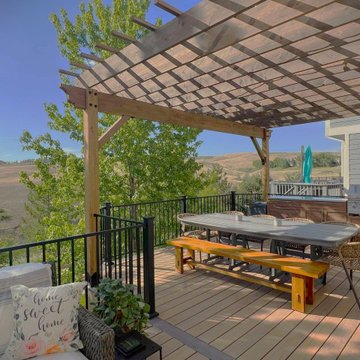
This upgraded deck gives this family a kitchen, dining area, and living space to enjoy the beautiful weather in Colorado.
Decking and stairs are made of composite decking by TimberTech Legacy in Tigerwood color. The picture frame color (boarder) is Expresso color.
The pergola chosen is a custom Cedar timber pergola in Hawthorne stain. RDI Excalibur railings in satin black give the deck a very contemporary feel. Archadeck also used an under-deck drainage system system including troughs, gutter, and sealed seams to keep rain, spills, and snowmelt from dripping trough to lower patio.

 Eldorado Stone
E.S. Johnson Builders faced a challenge to create an authentic Bucks County farmhouse on a narrow lot with a rear yard that has a steep fall-off. The design goal to create a home that looked as if it was added on to over the last 150 years was achieved by building the main structure with four wings, each wing having its own distinctive look appropriate to the time period.
This design created two courtyards, one rear and one front, and the rear second story terrace which overlooks a view of the pool on the lower level and outdoor living area. The sharp drop in the rear elevation gave an opportunity to cascade the outdoor living area. A large whirlpool cascades into the main pool; the main pool then drops again into another small pool complemented by a large arbor and exterior stone fireplace.
Despite its historic detailing, it is very functional for the modern family featuring a triple-entrance courtyard, a main entrance that leads to the foyer/gallery, and a study/home office that has a front porch entrance as well as an entrance that leads into a side hall.
Many of the interior walls are made of shiplap poplar, the beamed ceiling in the kitchen displays the exposed joists from the floor above, and open rafters in the recreation room are reminiscent of an old large gathering hall. All of the fireplaces are of authentic Pennsylvania fieldstone and the floors are reclaimed wide planks made of Appalachian Red Oak.
Eldorado Stone Profile Featured: Veneto Fieldledge with an Overgrout
Design Builder/Photographer: Eric Johnson, E.S. Johnson Builders
Website: www.esjohnson.com
Phone: (704)987-7950
Find the right local pro for your project

 Archadeck of Nova Scotia
At Archadeck of Nova Scotia we love any size project big or small. But, that being said, we have a soft spot for the projects that let us show off our talents! This Halifax house was no exception. The owners wanted a space to suit their outdoor lifestyle with materials to last far into the future. The choices were quite simple: stone veneer, Timbertech composite decking and glass railing.
What better way to create that stability than with a solid foundation, concrete columns and decorative stone veneer? The posts were all wrapped with stone and match the retaining wall which was installed to help with soil retention and give the backyard more definition (it’s not too hard on the eyes either).
A set of well-lit steps will guide you up the multi-level deck. The built-in planters soften the hardness of the Timbertech composite deck and provide a little visual relief. The two-tone aesthetic of the deck and railing are a stunning feature which plays up contrasting tones.
From there it’s a game of musical chairs; we recommend the big round one on a September evening with a glass of wine and cozy blanket.
We haven’t gotten there quite yet, but this property has an amazing view (you will see soon enough!). As to not spoil the view, we installed TImbertech composite railing with glass panels. This allows you to take in the surrounding sights while relaxing and not have those pesky balusters in the way.
In any Canadian backyard, there is always the dilemma of dealing with mosquitoes and black flies! Our solution to this itchy problem is to incorporate a screen room as part of your design. This screen room in particular has space for dining and lounging around a fireplace, perfect for the colder evenings!
Ahhh…there’s the view! From the top level of the deck you can really get an appreciation for Nova Scotia. Life looks pretty good from the top of a multi-level deck. Once again, we installed a composite and glass railing on the new composite deck to capture the scenery.
What puts the cherry on top of this project is the balcony! One of the greatest benefits of composite decking and railing is that it can be curved to create beautiful soft edges. Imagine sipping your morning coffee and watching the sunrise over the water.
If you want to know more about composite decking, railing or anything else you’ve seen that sparks your interest; give us a call! We’d love to hear from you.

 Alliance Home Remodeling
This traditional 1980's Texas kitchen was not only in need of a face lift, but was also in need of minor rearranging. The main issues were too many appliances jammed into one area and the homeowner needed to incorporate a home office into the kitchen as well. In order to keep a double oven, increase workspace, and allow for more food storage, we suggested replacing all the existing appliances with a 48" range, 42" built-in refrigerator, and built-in microwave. We also removed the peninsula and continued cabinets towards the breakfast area which opened up the kitchen to the eating area. We elongated the island adding more usable storage and working space, leaving open area on the end for seating. Lastly we integrated an office workspace by lowering the countertop, creating a seating area, and space for a pull out printer.
 Alliance Home Remodeling
This traditional 1980's Texas kitchen was not only in need of a face lift, but was also in need of minor rearranging. The main issues were too many appliances jammed into one area and the homeowner needed to incorporate a home office into the kitchen as well. In order to keep a double oven, increase workspace, and allow for more food storage, we suggested replacing all the existing appliances with a 48" range, 42" built-in refrigerator, and built-in microwave. We also removed the peninsula and continued cabinets towards the breakfast area which opened up the kitchen to the eating area. We elongated the island adding more usable storage and working space, leaving open area on the end for seating. Lastly we integrated an office workspace by lowering the countertop, creating a seating area, and space for a pull out printer.

 Kohn Shnier architects
This single family home sits on a tight, sloped site. Within a modest budget, the goal was to provide direct access to grade at both the front and back of the house.
The solution is a multi-split-level home with unconventional relationships between floor levels. Between the entrance level and the lower level of the family room, the kitchen and dining room are located on an interstitial level. Within the stair space “floats” a small bathroom.
The generous stair is celebrated with a back-painted red glass wall which treats users to changing refractive ambient light throughout the house.
Black brick, grey-tinted glass and mirrors contribute to the reasonably compact massing of the home. A cantilevered upper volume shades south facing windows and the home’s limited material palette meant a more efficient construction process. Cautious landscaping retains water run-off on the sloping site and home offices reduce the client’s use of their vehicle.
The house achieves its vision within a modest footprint and with a design restraint that will ensure it becomes a long-lasting asset in the community.
Photo by Tom Arban
Sponsored
Sunbury, OH

J.Holderby - Renovations
Franklin County's Leading General Contractors - 2X Best of Houzz!
 Alliance Home Remodeling
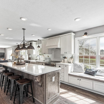
This traditional 1980's Texas kitchen was not only in need of a face lift, but was also in need of minor rearranging. The main issues were too many appliances jammed into one area and the homeowner needed to incorporate a home office into the kitchen as well. In order to keep a double oven, increase workspace, and allow for more food storage, we suggested replacing all the existing appliances with a 48" range, 42" built-in refrigerator, and built-in microwave. We also removed the peninsula and continued cabinets towards the breakfast area which opened up the kitchen to the eating area. We elongated the island adding more usable storage and working space, leaving open area on the end for seating. Lastly we integrated an office workspace by lowering the countertop, creating a seating area, and space for a pull out printer.
 B Street Design
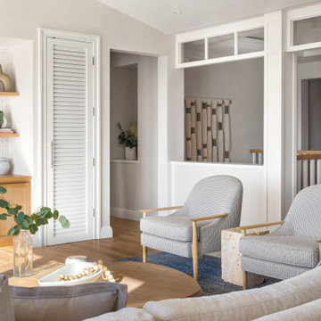
This power couple and their two young children adore beach life and spending time with family and friends. As repeat clients, they tasked us with an extensive remodel of their home’s top floor and a partial remodel of the lower level. From concept to installation, we incorporated their tastes and their home’s strong architectural style into a marriage of East Coast and West Coast style.
On the upper level, we designed a new layout with a spacious kitchen, dining room, and butler's pantry. Custom-designed transom windows add the characteristic Cape Cod vibe while white oak, quartzite waterfall countertops, and modern furnishings bring in relaxed, California freshness. Last but not least, bespoke transitional lighting becomes the gem of this captivating home.


 Sommi Wine Cellars
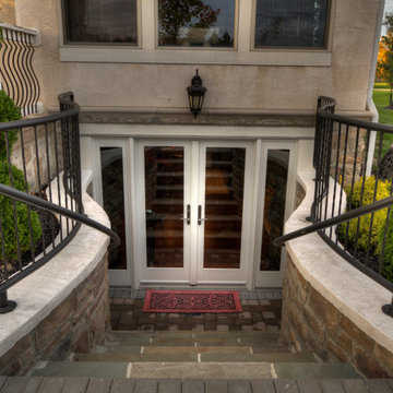
The builders of the historic Wilcox Mansion skimped on just one hallmark of luxury in our humble opinion — the wine cave. It was our pleasure to correct this small oversight by adding an underground wine cellar to the property’s basement when it was acquired by new owners last year.
When working with a historic property like this one, it’s important to respect the space and not modify any walls or materials of historic significance. Thankfully, the brick and stone basement already provided the perfect location for wine storage without the need for additional refrigeration. We added a custom bar top made from one of the property’s original doors (set under glass to protect it), lower shelves custom made from reclaimed barn wood, top wine racks by STACT, and some very dramatic lighting, for a truly one-of-a-kind wine storage system for this one-of-a-kind architectural masterpiece.

 Klopf Architecture
, Arterra Landscape Architects and Henry Calvert of Calvert Ventures Designed and built a new warm, modern, Eichler-inspired, open, indoor-outdoor home on a deeper-than-usual San Mateo Highlands property where an original Eichler house had burned to the ground.
The owners wanted multi-generational living and larger spaces than the original home offered, but all parties agreed that the house should respect the neighborhood and blend in stylistically with the other Eichlers. At first the Klopf team considered re-using what little was left of the original home and expanding on it. But after discussions with the owner and builder, all parties agreed that the last few remaining elements of the house were not practical to re-use, so Klopf Architecture designed a new home that pushes the Eichler approach in new directions.
One disadvantage of Eichler production homes is that the house designs were not optimized for each specific lot. A new custom home offered the team a chance to start over. In this case, a longer house that opens up sideways to the south fit the lot better than the original square-ish house that used to open to the rear (west). Accordingly, the Klopf team designed an L-shaped “bar” house with a large glass wall with large sliding glass doors that faces sideways instead of to the rear like a typical Eichler. This glass wall opens to a pool and landscaped yard designed by Arterra Landscape Architects.
Driving by the house, one might assume at first glance it is an Eichler because of the horizontality, the overhanging flat roof eaves, the dark gray vertical siding, and orange solid panel front door, but the house is designed for the 21st Century and is not meant to be a “Likeler.” You won't see any posts and beams in this home. Instead, the ceiling decking is a western red cedar that covers over all the beams. Like Eichlers, this cedar runs continuously from inside to out, enhancing the indoor / outdoor feeling of the house, but unlike Eichlers it conceals a cavity for lighting, wiring, and insulation. Ceilings are higher, rooms are larger and more open, the master bathroom is light-filled and more generous, with a separate tub and shower and a separate toilet compartment, and there is plenty of storage. The garage even easily fits two of today's vehicles with room to spare.
A massive 49-foot by 12-foot wall of glass and the continuity of materials from inside to outside enhance the inside-outside living concept, so the owners and their guests can flow freely from house to pool deck to BBQ to pool and back.
During construction in the rough framing stage, Klopf thought the front of the house appeared too tall even though the house had looked right in the design renderings (probably because the house is uphill from the street). So Klopf Architecture paid the framer to change the roofline from how we had designed it to be lower along the front, allowing the home to blend in better with the neighborhood. One project goal was for people driving up the street to pass the home without immediately noticing there is an "imposter" on this lot, and making that change was essential to achieve that goal.
This 2,606 square foot, 3 bedroom, 3 bathroom Eichler-inspired new house is located in San Mateo in the heart of the Silicon Valley.
Klopf Architecture Project Team: John Klopf, AIA, Klara Kevane
Landscape Architect: Arterra Landscape Architects
Contractor: Henry Calvert of Calvert Ventures
Photography ©2016 Mariko Reed
Location: San Mateo, CA
Year completed: 2016

 GO Painting
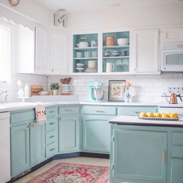
A little splash of colour can make any room more lively! Especially when that colour is Caliente!
Our involvement with this renovation included:
Painting ceilings, walls, trim, frames, doors of two story hallway, kitchen, family room, living room and office
Painting the kitchen cabinets two colours
Refinishing & painting the staircase
We also updated the colours on all exterior windows, doors and door frames, garage door and garage door frame
Providing a colour consult to help reflect the clients personal taste
This project took place over a 2 month period of time in the early spring of 2013 in order to coordinate with other trades.
We selected a mix of Dulux products, ranging from Melamine for the cupboards
& staircase to Diamond Eggshell for the walls.
And last, but not least; our favourite colours!
Kitchen lower half cabinets + family room accent wall: Benjamin Moore Caliente AF-290
Hallway walls: Benjamin Moore Metropolis CC-546
All Interior and Exterior Doors: Benjamin Moore Willow CC-542

 GO Painting
A little splash of colour can make any room more lively! Especially when that colour is Caliente!
Our involvement with this renovation included:
Painting ceilings, walls, trim, frames, doors of two story hallway, kitchen, family room, living room and office
Painting the kitchen cabinets two colours
Refinishing & painting the staircase
We also updated the colours on all exterior windows, doors and door frames, garage door and garage door frame
Providing a colour consult to help reflect the clients personal taste
This project took place over a 2 month period of time in the early spring of 2013 in order to coordinate with other trades.
We selected a mix of Dulux products, ranging from Melamine for the cupboards
& staircase to Diamond Eggshell for the walls.
And last, but not least; our favourite colours!
Kitchen lower half cabinets + family room accent wall: Benjamin Moore Caliente AF-290
Hallway walls: Benjamin Moore Metropolis CC-546
All Interior and Exterior Doors: Benjamin Moore Willow CC-542
 Kohn Shnier architects
This single family home sits on a tight, sloped site. Within a modest budget, the goal was to provide direct access to grade at both the front and back of the house.
The solution is a multi-split-level home with unconventional relationships between floor levels. Between the entrance level and the lower level of the family room, the kitchen and dining room are located on an interstitial level. Within the stair space “floats” a small bathroom.
The generous stair is celebrated with a back-painted red glass wall which treats users to changing refractive ambient light throughout the house.
Black brick, grey-tinted glass and mirrors contribute to the reasonably compact massing of the home. A cantilevered upper volume shades south facing windows and the home’s limited material palette meant a more efficient construction process. Cautious landscaping retains water run-off on the sloping site and home offices reduce the client’s use of their vehicle.
The house achieves its vision within a modest footprint and with a design restraint that will ensure it becomes a long-lasting asset in the community.
Photo by Tom Arban
 Kitchen Solvers of Grayslake
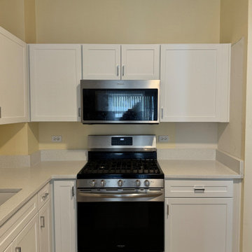
This Grayslake homeowner was ready for a kitchen update that felt fresh, functional, and timeless—without the need for a full tear-out. Using a hybrid approach that combined cabinet refacing with new cabinetry, we transformed the space into a beautiful transitional kitchen that blends modern simplicity with classic appeal.
The kitchen features a clean Shaker door style in a stunning Nordic SuperMatte finish, paired with Sparkling White quartz countertops for a bright, sophisticated look. To improve both the layout and functionality, we removed an existing pantry cabinet and added new upper and lower cabinets, creating valuable countertop workspace near the range.
Functionality was just as important as style. We installed all-new solid wood, dovetail drawers with heavy-duty undermount glides, providing smoother operation, better organization, and long-lasting durability.
The result is a kitchen that looks completely transformed, functions better every day, and reflects the homeowner's style—all without the cost and disruption of a full remodel.

 LaMantia Design and Remodeling
The previous award winning remodel of their Burr Ridge home brought these clients back to LaMantia and designers Jackie Prazak and Katie Suva, CKD, CBD when they decided it was time to build out their unfinished lower level. As before, their main objective was to create areas to accommodate their extended (and now grown) family.
During the 2013 main floor remodel, a bedroom and Powder Room had been given up to gain the large award winning kitchen, so recapturing those two spaces were high on the “list of desires.” Also on the list was the need for a pool table, a comfortable movie/TV space, lots of game storage and plenty of open area for grandchildren game playing.
The stairway into the lower level was the main challenge in this build-out; both the stair run and tread depth needed to be lengthened to perform to code. To create greater head room on the staircase the main beam was cut and a portion was relocated 18”. A second column at the end of the stair run was added to match the required structural column, allowing the last tread to wrap decoratively onto each side.
Throughout the design planning many details built-into the main level project were repeated to marry the main and lower levels together. The built-in cabinetry and the mirrored doors in the bedroom can also be found in the Guest Room on the main level. The mirrored element over the bed is actually an interior door glazed with mirrors and hung on its side. The parquet look tile flooring of the new bath is reminiscent of the main level wood parquet flooring while the carpenter built wainscoting also can be found in the main hall of the first floor.
The custom walnut stair spindles were fabricated from a photo the homeowner found and loved. In the Movie/TV area the theatre seats are fully powered to accept iPhones, iPads, Laptops, etc. Also note the large chalkboard scorekeeping area with seating for the game players. And, one very special detail can be found under the (now longer) staircase; a private room under the stairs was created with touch-lighting and bean bag chairs for anyone seeking a quiet space.
Sponsored
Delaware, OH

Buckeye Basements, Inc.
Central Ohio's Basement Finishing ExpertsBest Of Houzz '13-'21
 Kitchen Solvers of Grayslake
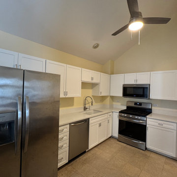
This Grayslake homeowner was ready for a kitchen update that felt fresh, functional, and timeless—without the need for a full tear-out. Using a hybrid approach that combined cabinet refacing with new cabinetry, we transformed the space into a beautiful transitional kitchen that blends modern simplicity with classic appeal.
The kitchen features a clean Shaker door style in a stunning Nordic SuperMatte finish, paired with Sparkling White quartz countertops for a bright, sophisticated look. To improve both the layout and functionality, we removed an existing pantry cabinet and added new upper and lower cabinets, creating valuable countertop workspace near the range.
Functionality was just as important as style. We installed all-new solid wood, dovetail drawers with heavy-duty undermount glides, providing smoother operation, better organization, and long-lasting durability.
The result is a kitchen that looks completely transformed, functions better every day, and reflects the homeowner's style—all without the cost and disruption of a full remodel.
 Alliance Home Remodeling
This traditional 1980's Texas kitchen was not only in need of a face lift, but was also in need of minor rearranging. The main issues were too many appliances jammed into one area and the homeowner needed to incorporate a home office into the kitchen as well. In order to keep a double oven, increase workspace, and allow for more food storage, we suggested replacing all the existing appliances with a 48" range, 42" built-in refrigerator, and built-in microwave. We also removed the peninsula and continued cabinets towards the breakfast area which opened up the kitchen to the eating area. We elongated the island adding more usable storage and working space, leaving open area on the end for seating. Lastly we integrated an office workspace by lowering the countertop, creating a seating area, and space for a pull out printer.
 Kitchen Solvers of Grayslake
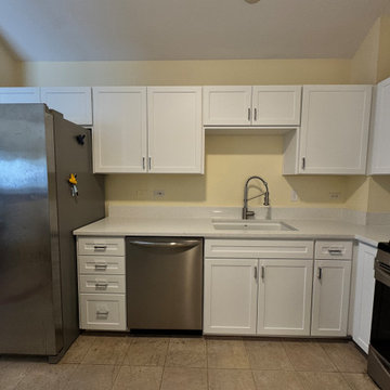
This Grayslake homeowner was ready for a kitchen update that felt fresh, functional, and timeless—without the need for a full tear-out. Using a hybrid approach that combined cabinet refacing with new cabinetry, we transformed the space into a beautiful transitional kitchen that blends modern simplicity with classic appeal.
The kitchen features a clean Shaker door style in a stunning Nordic SuperMatte finish, paired with Sparkling White quartz countertops for a bright, sophisticated look. To improve both the layout and functionality, we removed an existing pantry cabinet and added new upper and lower cabinets, creating valuable countertop workspace near the range.
Functionality was just as important as style. We installed all-new solid wood, dovetail drawers with heavy-duty undermount glides, providing smoother operation, better organization, and long-lasting durability.
The result is a kitchen that looks completely transformed, functions better every day, and reflects the homeowner's style—all without the cost and disruption of a full remodel.
52