
Search results for "Main action" in Home Design Ideas
 Terrain Construction Group
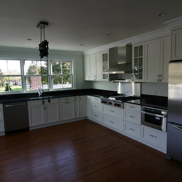
This kitchen was designed for multiple chef needs but the main feature was leaving room for a table in the center of the space. These homeowners like to be right in the midst of the cooking action.
 Isaman design, Inc.
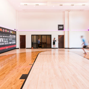
10 years after the completion of the apartment tenant improvement in the J. Carroll building, the owner approached Isaman Design to work on the design and permitting for a private basketball court located on the second floor adjacent to the residential space. With private stair access from the parking lot, and interior connection to the main living area, it functions completely independently from the business operations in the rest of the building. The signature red storefront and contemporary corrugated metal siding give the addition an eye-catching pop, separating it from the rest of the CMU structure while still maintaining a cohesive aesthetic relationship. The interior is finished out to an extremely high level with fun signage and neon lighting. There is also a comfy courtside lounge with a sliding glass door that enables spectators to be involved in the action from the sidelines. We look forward to working on more commercial infill projects in the future!
 Chi Renovation & Design
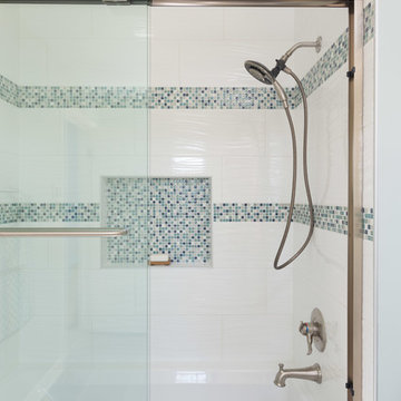
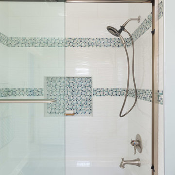
A remodeled master bathroom that now complements our clients' lifestyle. The main goal was to make the space more functional while also giving it a refreshing and updated look.
Our first action was to replace the vanity. We installed a brand new storage-centric vanity that stayed within the size of the previous one, wasting no additional space.
Additional features included custom mirrors perfectly fitted to their new vanity, elegant new sconce lighting, and a new mosaic tiled shower niche.
Designed by Chi Renovation & Design who serve Chicago and it's surrounding suburbs, with an emphasis on the North Side and North Shore. You'll find their work from the Loop through Lincoln Park, Skokie, Wilmette, and all of the way up to Lake Forest.
For more about Chi Renovation & Design, click here: https://www.chirenovation.com/
Find the right local pro for your project
 Mottram Architecture
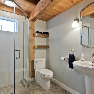
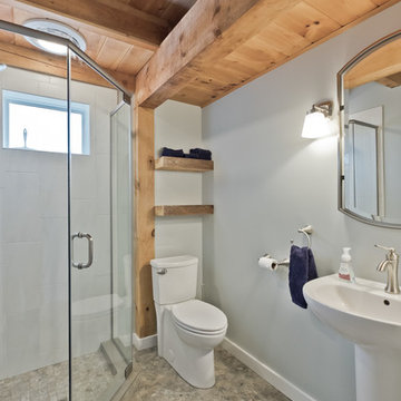
This half bath was converted into a full bath by adding a shower and changing the location of the existing fixtures. Now these homeowners have a first floor bedroom/bath space.
Timber frame homes offer unique challenges during a remodel. What often makes them beautiful and attractive to most homeowners, also makes them challenging for space requirements.
Context: The lovely couple that owned this home were struggling with some interesting floor plan challenges that just didn't work for their family. The loved the beautiful timbers and woodwork of their home, but the dramatically sloping ceilings on the second floor, particularly in the bathroom, just didn't work for this 1 1/2 bath home. Needing to use the skylight to approach the toilet was a less then ideal scenario. Although the bathroom footprint was more then adequate, the sloped ceiling only made half of the space useable. Check out the Before/After post on our blog to see the photos of the house pre-renovation. As much as they loved all the wood features in their home, another challenge they had was light. The wood ceiling made everything inside the house darker, even with a fantastic array of south facing windows, there were spaces in the home that felt dark and small. When they contacted us they wanted to know how could they make their brighter and more inviting, were there solutions to the 2nd floor sloped ceiling issues, and if they were going to do all of this work, how could they make their home more comfortable and efficient. A nagging water leak in the upstairs bathroom spurred them into action and here is how we solved their dilemma.
Conclusion: First, we added a little dormer to the rear of the house so we could get full headroom in nearly all of the upstairs bathroom! Then we decided to extend that dormer one more timber bay over to create a walk in closet with natural light and plenty of space. Since we were contemplating energy efficiency, we resolved a nagging issue that is present in a lot of timber frame construction, air tightness. Commonly found in timber frame construction, fiberglass insulation is installed in the rafter bays and board ceilings are installed over top. Unfortunately, board ceilings are anything but air tight, and fiberglass insulation needs to be in an airtight cavity for maximum effectiveness. So we were able to solve two issues at the same time for this homeowner. We removed the board ceiling and fiberglass insulation, we dense packed the rafter bays with cellulose insulation, and installed sheetrock in place of the boards. The boards were salvaged for re-use by the homeowner, and the space and light quality was dramatically improved. Some may think that losing the board ceiling took something away from the space, but what you'll see in the pictures is that it highly accentuates the heavy timbers and really makes them stand out in a beautiful way. Now with this added airtightness, better insulation, and brighter space, the homeowner hardly runs their wood stove, and it's so quiet in the space, an added bonus from changing the insulation. It became necessary to also add a sheetrock ceiling to the living room to hide the plumbing from the new bathroom layout above. Changing this ceiling gave the homeowner some real quality lighting that was lacking in the living room before. The brighter ceiling and new lighting layout completely transforms the living room into a space you want to hang out, even though the layout didn't change at all. When the homeowner saw the finished spaces she said "I can't believe this is my house, I want to live in this house"
Energy Efficiency: I touched a little on the efficiency above, but like all projects done with Mottram Architecture, we always want to leave you with a little extra. Timber frame construction with board ceilings and fiberglass insulation are notoriously leaky! If you want to know what we think about fiberglass insulation, check our our blog post on Why Fiberglass Insulation Sucks. By installing cellulose insulation and covering it with sheetrock we were able to greatly reduce the heat flowing out of this home. It not only improves cashflow it improves the comfort level in the space. Who wants to sit in their living room and feel a draft? Let us remind you, we are not saying cellulose insulation is an air barrier, we use the sheetrock to help with that, but it does significantly reduce the air flow over fiberglass insulation. And when we reduce the airflow, we reduce the heat flow. And when we reduce the heat flow, we reduce the need to re-heat that drafty air from outside. When it comes to energy efficiency the first and best place to start is air infiltration. We greatly reduced the air infiltration with the new insulation, but we also added a hat and warm boots. What I mean by that is, we improved the insulation in the roof, and we installed insulation in the basement. Maybe it's a silly analogy, but when you think about keeping warm, we always start with the hat and boots! With sustainability in mind, the next project will be to add a deck to the front of this house with rain catchment barrels from the metal roof. They are planning to plant a garden in the spring and the rain catchment system will help to irrigate the new garden.
Builder: East Shore Builders
Photographer: Michael Eric Berube
Michael Eric Berube, Maine Virtual Home Tours
 Reico Kitchen & Bath
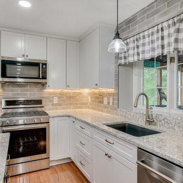
Designed by Carolina Maholik of Reico Kitchen & Bath in Chantilly VA, in collaboration with Victoriano Home Improvements, this transitional kitchen design features Merillat Masterpiece cabinets in the Martel Evercore door style in two finishes, Dove White (perimeter cabinets) and Riverbed (kitchen island). The kitchen countertops are Cambria Berywn.
The kitchen includes a tile backsplash in Elon Opal in Gray 3x12 with a Light Pewter grout and Maytag, Whirlpool and KitchenAid appliances.
“The clients were very big on the function of their space,” said Carolina. “The largest issue we faced was finding a balance between brightening and updating the look of the space while also not sacrificing the functionality of their daily lives. Many design iterations brought us back to classic beauty with an updated look that was the main gathering space of their home. My favorite aspect was seeing the once hated window box over the sink be transformed by updating the initial focal point of the space and create harmony with the rest of the space!”
“Every aspect of our kitchen was a pleasure, from start to finish. We knew the minute we met Carolina that she would be the right person to design our kitchen and guide us through the process,” said the client. “Because Reico truly values its customers, indicated by both their words and their actions, our confidence never wavered. Carrie responded to all communications nearly instantaneously, and like Carolina, she made us feel like we were the only customers in her world.”
“The care that the entire Reico team brought to the table and the patience Carolina extended were much appreciated. She really listens and has talent for sifting through all the talk to get to the best design. We love that our kitchen has a wide appeal and is very us. It is light and bright while remaining warm and inviting.”
Photos courtesy of BTW Images LLC.
 Isaman design, Inc.
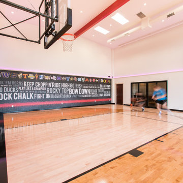
10 years after the completion of the apartment tenant improvement in the J. Carroll building, the owner approached Isaman Design to work on the design and permitting for a private basketball court located on the second floor adjacent to the residential space. With private stair access from the parking lot, and interior connection to the main living area, it functions completely independently from the business operations in the rest of the building. The signature red storefront and contemporary corrugated metal siding give the addition an eye-catching pop, separating it from the rest of the CMU structure while still maintaining a cohesive aesthetic relationship. The interior is finished out to an extremely high level with fun signage and neon lighting. There is also a comfy courtside lounge with a sliding glass door that enables spectators to be involved in the action from the sidelines. We look forward to working on more commercial infill projects in the future!
 Lyndsey Kampen
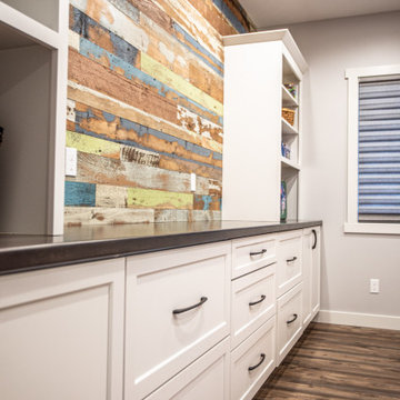
The playroom off of the main living area was planned to grow into a formal dining room as the kids age. For now, it offers functional storage for all the kids toys so they can be part of the action in the heart of the home. The open shelving & deep drawers all offer a place for every little thing now and in the future.
 Isaman design, Inc.
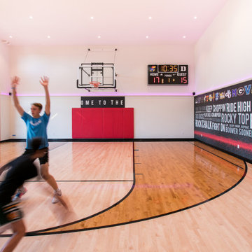
10 years after the completion of the apartment tenant improvement in the J. Carroll building, the owner approached Isaman Design to work on the design and permitting for a private basketball court located on the second floor adjacent to the residential space. With private stair access from the parking lot, and interior connection to the main living area, it functions completely independently from the business operations in the rest of the building. The signature red storefront and contemporary corrugated metal siding give the addition an eye-catching pop, separating it from the rest of the CMU structure while still maintaining a cohesive aesthetic relationship. The interior is finished out to an extremely high level with fun signage and neon lighting. There is also a comfy courtside lounge with a sliding glass door that enables spectators to be involved in the action from the sidelines. We look forward to working on more commercial infill projects in the future!
 Mottram Architecture
Michael Eric Berube, Maine Virtual Home ToursTimber frame homes offer unique challenges during a remodel. What often makes them beautiful and attractive to most homeowners, also makes them challenging for space requirements.
Context: The lovely couple that owned this home were struggling with some interesting floor plan challenges that just didn't work for their family. The loved the beautiful timbers and woodwork of their home, but the dramatically sloping ceilings on the second floor, particularly in the bathroom, just didn't work for this 1 1/2 bath home. Needing to use the skylight to approach the toilet was a less then ideal scenario. Although the bathroom footprint was more then adequate, the sloped ceiling only made half of the space useable. Check out the Before/After post on our blog to see the photos of the house pre-renovation. As much as they loved all the wood features in their home, another challenge they had was light. The wood ceiling made everything inside the house darker, even with a fantastic array of south facing windows, there were spaces in the home that felt dark and small. When they contacted us they wanted to know how could they make their brighter and more inviting, were there solutions to the 2nd floor sloped ceiling issues, and if they were going to do all of this work, how could they make their home more comfortable and efficient. A nagging water leak in the upstairs bathroom spurred them into action and here is how we solved their dilemma.
Conclusion: First, we added a little dormer to the rear of the house so we could get full headroom in nearly all of the upstairs bathroom! Then we decided to extend that dormer one more timber bay over to create a walk in closet with natural light and plenty of space. Since we were contemplating energy efficiency, we resolved a nagging issue that is present in a lot of timber frame construction, air tightness. Commonly found in timber frame construction, fiberglass insulation is installed in the rafter bays and board ceilings are installed over top. Unfortunately, board ceilings are anything but air tight, and fiberglass insulation needs to be in an airtight cavity for maximum effectiveness. So we were able to solve two issues at the same time for this homeowner. We removed the board ceiling and fiberglass insulation, we dense packed the rafter bays with cellulose insulation, and installed sheetrock in place of the boards. The boards were salvaged for re-use by the homeowner, and the space and light quality was dramatically improved. Some may think that losing the board ceiling took something away from the space, but what you'll see in the pictures is that it highly accentuates the heavy timbers and really makes them stand out in a beautiful way. Now with this added airtightness, better insulation, and brighter space, the homeowner hardly runs their wood stove, and it's so quiet in the space, an added bonus from changing the insulation. It became necessary to also add a sheetrock ceiling to the living room to hide the plumbing from the new bathroom layout above. Changing this ceiling gave the homeowner some real quality lighting that was lacking in the living room before. The brighter ceiling and new lighting layout completely transforms the living room into a space you want to hang out, even though the layout didn't change at all. When the homeowner saw the finished spaces she said "I can't believe this is my house, I want to live in this house"
Energy Efficiency: I touched a little on the efficiency above, but like all projects done with Mottram Architecture, we always want to leave you with a little extra. Timber frame construction with board ceilings and fiberglass insulation are notoriously leaky! If you want to know what we think about fiberglass insulation, check our our blog post on Why Fiberglass Insulation Sucks. By installing cellulose insulation and covering it with sheetrock we were able to greatly reduce the heat flowing out of this home. It not only improves cashflow it improves the comfort level in the space. Who wants to sit in their living room and feel a draft? Let us remind you, we are not saying cellulose insulation is an air barrier, we use the sheetrock to help with that, but it does significantly reduce the air flow over fiberglass insulation. And when we reduce the airflow, we reduce the heat flow. And when we reduce the heat flow, we reduce the need to re-heat that drafty air from outside. When it comes to energy efficiency the first and best place to start is air infiltration. We greatly reduced the air infiltration with the new insulation, but we also added a hat and warm boots. What I mean by that is, we improved the insulation in the roof, and we installed insulation in the basement. Maybe it's a silly analogy, but when you think about keeping warm, we always start with the hat and boots! With sustainability in mind, the next project will be to add a deck to the front of this house with rain catchment barrels from the metal roof. They are planning to plant a garden in the spring and the rain catchment system will help to irrigate the new garden.
Builder: East Shore Builders
Photographer: Michael Eric Berube
 N C R
N C RA remodeled master bathroom that now complements our clients' lifestyle. The main goal was to make the space more functional while also giving it a refreshing and updated look.
Our first action was to replace the vanity. We installed a brand new storage-centric vanity that stayed within the size of the previous one, wasting no additional space.
Additional features included custom mirrors perfectly fitted to their new vanity, elegant new sconce lighting, and a new mosaic tiled shower niche.
Designed by Chi Renovation & Design who serve Chicago and it's surrounding suburbs, with an emphasis on the North Side and North Shore. You'll find their work from the Loop through Lincoln Park, Skokie, Wilmette, and all of the way up to Lake Forest.
 Michael Nash Design, Build & Homes
2011 CAPITAL COTY AWARD HONORABLE MENTION AWARD WINNER
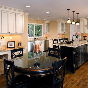
Built circa 1980, a young couple with three children originally purchased this home for their growing family. After four years of karate, soccer, piano and other activities, however, the home was becoming too small to meet their needs.
Problems started upon entering the front foyer. A 25-foot long dark hallway separated the family room and the kitchen, ending in a tiny powder room stuck in the middle of the layout. The kitchen was especially isolated, a cramped L-shaped design with a box bay breakfast bump out that was literally falling apart.
The new design started with the core of the problem—the maze and separation created by the long hallways.
First, the 25’ load bearing wall separating the foyer from family room was totally taken out and replaced with a long supporting beam. A French door replaced a small door and window leading to a screen porch . This action allowed lots of light to get into family and foyer. Then, the powder room was removed and the partition wall between the kitchen and family room was taken down. This created a large open concept design and greatly increased the size of the kitchen.
The box bay was demolished and replaced with new walls and a large window. The plumbing for main sink and dishwasher got relocated into this box bay allowing a total transformation of the space. Now there are cabinets and counters on all sides.
The doorway to the dining room was reconfigured to allow a butler area on its left. While the right side was occupied with new 36” gas range top with a decorative wood hood above it. The refrigerator, microwave/oven and pantries—the space’s tall elements—occupy one wall..
A large Island with a prep sink and beverage center for the kids occupies the center of the layout. Capable of seating up to four, family and friends can now keep the cook company. A large built-in desk area lets the kids do their homework so the parents can supervise while they prepare meals.
Light cabinetry with a touch of caramel glazing and exotic granite countertops by our designers contributed to this kitchen’s elegant design. The contrasting distressed island’s darker finish matches the dinette set and other furnishings.
New hardwood floors were installed throughout the first floor for a seamless look, while recess, pendant and task lighting make the space even brighter. Importantly, there’s plenty of space for parents and kids to hang out together. The kitchen is truly the heart of their home.
 Isaman design, Inc.
10 years after the completion of the apartment tenant improvement in the J. Carroll building, the owner approached Isaman Design to work on the design and permitting for a private basketball court located on the second floor adjacent to the residential space. With private stair access from the parking lot, and interior connection to the main living area, it functions completely independently from the business operations in the rest of the building. The signature red storefront and contemporary corrugated metal siding give the addition an eye-catching pop, separating it from the rest of the CMU structure while still maintaining a cohesive aesthetic relationship. The interior is finished out to an extremely high level with fun signage and neon lighting. There is also a comfy courtside lounge with a sliding glass door that enables spectators to be involved in the action from the sidelines. We look forward to working on more commercial infill projects in the future!
 Tile Doctor Ltd
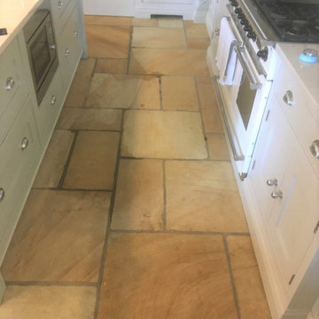
This is a large 17.2 m2 Sandstone Floor installed throughout the living and kitchen areas of a property in the beautiful village of Disley close to Lyme Park which is run by the National Trust. The floor had been installed four years ago and my client was unhappy with the original sealer which hadn’t lasted very long. Without the protection of a sealer dirt had become ingrained in the pores of the stone which was now difficult to clean. Another issue was the rough nature of the Sandstone meant it was impossible to mop as it shreds the mop! As a result, the floor was mainly cleaned with a hoover which was not ideal, especially in a kitchen.
I went over to survey the floor and before quoting I ran a small test clean in the kitchen which took the floor back to its natural pale colour and really showed how dirty the floor had become. Test cleans are great as it helps me to formulate an effective cleaning plan and provide an accurate quote. My client was impressed with the result and so I was booked to come back and deep clean and then reseal the whole floor. Due to its size I estimated the floor would take two days to deep clean and a further day to apply a new sealer, so three days in total.
Working in large sections I started by cleaning the floor and stripping off the old sealer with a strong dilution of Tile Doctor Remove and Go which is a coatings remover that is safe to use on stone. The solution was left to soak into the pores of the Sandstone for ten minutes before being worked in with a 200-grit diamond pad fitted to a rotary floor machine. This action not only removed the old sealer and cleaned the floor but the 200-grit pad being vey coarse removed a lot of the roughness from the surface of the Sandstone so it shouldn’t shred any more mops.
After rinsing the floor with water and removing the slurry with a wet vacuum I set about cleaning the grout with Tile Doctor Pro-Clean worked into the grout line with a stiff brush and assisted with steam from a professional steam cleaner with a grout attachment. Once done the floor was rinsed and extracted again to remove the soil from the grouting. There was also an area near one of the doors where the grout had become loose and needed replacing so I made up a batch of matching grout and filled this in. The floor was then left overnight to dry with assistance from a couple of air movers.
I returned the next day to finish the floor by applying a sealer. First, I double checked the floor was dry with the damp meter. The readings confirmed the air movers had done a good job and that the floor was within the accepted parameters, so I was ready to seal. The sealer I chose was Tile Doctor Seal and Go which being water based doesn’t leave a smell as it dries, it really works well on Sandstone and adds a nice subtle sheen to the stone.
Once finished the floor looked much cleaner, lighter in colour overall more inviting, you could even see the fossils in some of the tiles.
The surface was also smoother so the customer should find cleaning with a mop much easier in future. On that subject its worth pointing out that owners of sealed floors should always use a neutral pH tile cleaner on their floors as most supermarket products are simply too strong and will prematurely strip the sealer off a tile if used repeatedly. Tile Doctor sell a product called Tile Doctor Neutral Cleaner which is ideal for cleaning sealed Sandstone floors like this one.
My client was really happy with the results and sent me a message later saying: “the floor looks amazing!”
Kamila Logonzy
East Cheshire Tile Doctor
 Addition Building & Design, Inc.
Relationship: Client
Project Date: March 2014
Project Price Range: more than $100,000
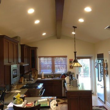
Having purchased our first house in Valley Glen, North Hollywood, we were aware it was in need of serious remodeling. A 1950s Ranch-style home, it came complete with peeling wallpaper, musty carpeting, and even some dilapidated walls. As first-time homeowners we were prepared to spend more money to improve it, but weary when we began meeting contractors. Buyer’s remorse already set in when we interviewed several contractors who were either aloof or unscrupulous.
Then we were fortunate enough to find Mike Ross. He immediately allayed our stress with his professional and forthright demeanor and his integrity was as rock solid from the day we met him through the several months it took to complete our large renovation.
While we had some specific things we wanted in our house, Mike and his team took our wish list and far exceeded our expectations to help truly realize the vision of our dream. Originally a three-bedroom, fourteen-hundred square foot home, our remodel brought an addition of a thousand square feet as well as an overhaul of the landscape; this prospect was particularly daunting for uninitiated owners such as us, but Mike’s consummate professionalism shone through and made the task exponentially less stressful for us.
As well as a new 850 sf Master Bedroom, including a fireplace, and a steam unit in the bath, we added a cozy home theater room, laundry room, and the once forgotten backyard brought a new deck and patio with a trellis. Furthermore, because we went green and made it a smart home, we’re already more energy efficient. In several rooms, as well as the main hallway, for example, Mike installed solar tubes and the amount of natural light that bathes the house is amazing. Even my mom, when she came to visit, was always looking for a light-switch.
As our contractor, Mike Ross took the reins to steer the project and keep it on course and he did so exceptionally. Mike and his team were as attentive to the quality of every nook and corner and he always sought our approval and happiness. Consistently communicative, he always kept us in the loop about progress and was always there to answer any questions and concerns. When an unforeseen contingency did arise, Mike assuaged our concerns by taking action ASAP to rectify the problem. Mike’s team, too, all take pleasure in their efforts. An eclectic group of skilled artisans and craftsmen, they are all polite, punctual, and proud of their work.
Thank you, Mike Ross, for your outstanding leadership, your impeccable standards, and your commitment to our happiness.
Dale & Helen Keis
 John Wieland Homes and Neighborhoods
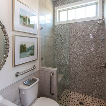
Visitors can refresh and rejuvenate in this main-floor guest bath.
Shower Accent Wall Tiles: Panaro Blend by Daltile
Side Wall Tiles: Action-Advance by Emser Tile
Shower Floor Tiles: Taro Blend by Daltile
 Isaman design, Inc.
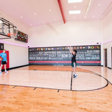
10 years after the completion of the apartment tenant improvement in the J. Carroll building, the owner approached Isaman Design to work on the design and permitting for a private basketball court located on the second floor adjacent to the residential space. With private stair access from the parking lot, and interior connection to the main living area, it functions completely independently from the business operations in the rest of the building. The signature red storefront and contemporary corrugated metal siding give the addition an eye-catching pop, separating it from the rest of the CMU structure while still maintaining a cohesive aesthetic relationship. The interior is finished out to an extremely high level with fun signage and neon lighting. There is also a comfy courtside lounge with a sliding glass door that enables spectators to be involved in the action from the sidelines. We look forward to working on more commercial infill projects in the future!
 Reico Kitchen & Bath
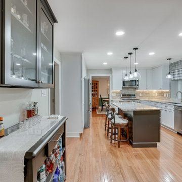
Designed by Carolina Maholik of Reico Kitchen & Bath in Chantilly VA, in collaboration with Victoriano Home Improvements, this transitional kitchen design features Merillat Masterpiece cabinets in the Martel Evercore door style in two finishes, Dove White (perimeter cabinets) and Riverbed (kitchen island). The kitchen countertops are Cambria Berywn.
The kitchen includes a tile backsplash in Elon Opal in Gray 3x12 with a Light Pewter grout and Maytag, Whirlpool and KitchenAid appliances.
“The clients were very big on the function of their space,” said Carolina. “The largest issue we faced was finding a balance between brightening and updating the look of the space while also not sacrificing the functionality of their daily lives. Many design iterations brought us back to classic beauty with an updated look that was the main gathering space of their home. My favorite aspect was seeing the once hated window box over the sink be transformed by updating the initial focal point of the space and create harmony with the rest of the space!”
“Every aspect of our kitchen was a pleasure, from start to finish. We knew the minute we met Carolina that she would be the right person to design our kitchen and guide us through the process,” said the client. “Because Reico truly values its customers, indicated by both their words and their actions, our confidence never wavered. Carrie responded to all communications nearly instantaneously, and like Carolina, she made us feel like we were the only customers in her world.”
“The care that the entire Reico team brought to the table and the patience Carolina extended were much appreciated. She really listens and has talent for sifting through all the talk to get to the best design. We love that our kitchen has a wide appeal and is very us. It is light and bright while remaining warm and inviting.”
Photos courtesy of BTW Images LLC.
 Reico Kitchen & Bath
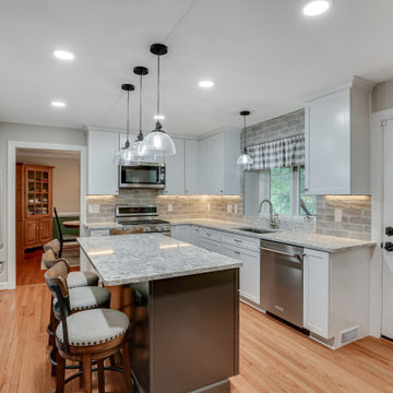
Designed by Carolina Maholik of Reico Kitchen & Bath in Chantilly VA, in collaboration with Victoriano Home Improvements, this transitional kitchen design features Merillat Masterpiece cabinets in the Martel Evercore door style in two finishes, Dove White (perimeter cabinets) and Riverbed (kitchen island). The kitchen countertops are Cambria Berywn.
The kitchen includes a tile backsplash in Elon Opal in Gray 3x12 with a Light Pewter grout and Maytag, Whirlpool and KitchenAid appliances.
“The clients were very big on the function of their space,” said Carolina. “The largest issue we faced was finding a balance between brightening and updating the look of the space while also not sacrificing the functionality of their daily lives. Many design iterations brought us back to classic beauty with an updated look that was the main gathering space of their home. My favorite aspect was seeing the once hated window box over the sink be transformed by updating the initial focal point of the space and create harmony with the rest of the space!”
“Every aspect of our kitchen was a pleasure, from start to finish. We knew the minute we met Carolina that she would be the right person to design our kitchen and guide us through the process,” said the client. “Because Reico truly values its customers, indicated by both their words and their actions, our confidence never wavered. Carrie responded to all communications nearly instantaneously, and like Carolina, she made us feel like we were the only customers in her world.”
“The care that the entire Reico team brought to the table and the patience Carolina extended were much appreciated. She really listens and has talent for sifting through all the talk to get to the best design. We love that our kitchen has a wide appeal and is very us. It is light and bright while remaining warm and inviting.”
Photos courtesy of BTW Images LLC.
 Isaman design, Inc.
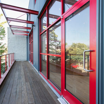
10 years after the completion of the apartment tenant improvement in the J. Carroll building, the owner approached Isaman Design to work on the design and permitting for a private basketball court located on the second floor adjacent to the residential space. With private stair access from the parking lot, and interior connection to the main living area, it functions completely independently from the business operations in the rest of the building. The signature red storefront and contemporary corrugated metal siding give the addition an eye-catching pop, separating it from the rest of the CMU structure while still maintaining a cohesive aesthetic relationship. The interior is finished out to an extremely high level with fun signage and neon lighting. There is also a comfy courtside lounge with a sliding glass door that enables spectators to be involved in the action from the sidelines. We look forward to working on more commercial infill projects in the future!
 Lyndsey Kampen
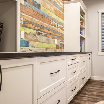
The playroom off of the main living area was planned to grow into a formal dining room as the kids age. For now, it offers functional storage for all the kids toys so they can be part of the action in the heart of the home. The open shelving & deep drawers all offer a place for every little thing now and in the future.
11