
Search results for "Maintain consistent" in Home Design Ideas

 ASR DESIGN STUDIO
Our mission was to create an ocean and California lifestyle-inspired space that would invite consistent clicks, bookings and five-star reviews.
To make the most of the great location, we designed Project 11 for travelling singles and couples searching for a cozy and welcoming condo within walking distance to downtown San Diego.
Project 11 would also be used by our clients when it was unoccupied, so it had to be practical, functional and beautiful, too.
Our clients had a limited budget, so we got thrifty and sourced furnishings from Target, Ikea, Amazon and Etsy.
The oversized art prints – which set the tone for our relaxing and soothing beachy theme – were hunted down and found at Etsy of California Lifestyle.
We made the most of layers, colors and texture to create spaces that conjured calming ocean vibes and felt wholeheartedly welcoming.
We couldn’t repaint the walls, but they gave us a neutral color palette to work with. We built on it by adding in pops of color while maintaining a minimalist approach to understated style.
Then we had some fun and added in cute touches like Cali and San Diego inspired mugs, an adorable Kerig to tie in the colors of the ocean again, a swivel chair to view the sunrise and sunset and a totally pimped-out kitchen with all the cooking accessories a guest would need to feel at home in Project 11.
By the time we were done, we were tempted to scoop up the first available booking for ourselves!
Finally, we invested our energy in designing for effortless functionality so our client’s guests had everything they needed during their stay.
Photography: Meg Marie

 Grandeur Hills Group,Inc.
At first sight you can notice that this apartment is decorated in a variety of colors most of which not only blend, but also contrast well with one another. All the main interior design elements are decorated in calm colors – white, grey and the like whereas multiple decorative elements – painting, pillows and the like add saturated bright colors to the entire interior.
Thanks to the use of such unusual contrasts, our interior designers tried to create an abstract ambience of some kind. Don’t miss the chance to radically change your home interior design with our outstanding experts!
 USI Design & Remodeling
Located in Argyle, Texas, this comprehensive whole-home renovation was conceived by USI Design & Remodeling who reimagined the home's interior architecture, transforming a collection of compartmentalized rooms into a cohesive environment designed for modern living, entertaining, and daily comfort. The project encompassed the kitchen, family room, dining room, lounge, office, primary bathroom, and supporting circulation spaces, creating a unified experience that feels both expansive and intentional. Throughout the home, refined materials, custom millwork, and carefully curated finishes establish a sense of understated luxury while maintaining warmth and livability.
At the heart of the renovation is a completely reconfigured kitchen and gathering space designed around functionality, hospitality, and visual connection. Architectural barriers were removed to improve sightlines and circulation, allowing the kitchen, dining, and family spaces to function as a single integrated living environment. A dramatic five-foot workstation sink anchors the kitchen, while custom cabinetry and furniture-inspired details elevate the space beyond conventional residential design. Adjacent to the kitchen, the former pantry, laundry, and service corridor were reimagined as a hybrid scullery and utility suite, creating a highly functional support space that discreetly accommodates food preparation, storage, organization, and household operations without compromising the elegance of the primary living areas.
The renovation extends beyond aesthetics to create a home tailored to the family's evolving needs. The primary bathroom was transformed into a spa-inspired retreat, while the lounge, office, and dining spaces were redesigned to support both everyday living and entertaining. Consistent architectural detailing, layered textures, and thoughtful proportions establish continuity throughout the residence, allowing each room to feel connected to the larger design narrative. The result is a sophisticated yet approachable home that balances practical performance with timeless design, delivering a renewed living experience that is both highly functional and distinctly luxurious.
Find the right local pro for your project

 Maison Birmingham
The main goal of this renovation was to update an authentic mid-century home to suit a modern lifestyle, while still maintaining the original character and aesthetic of the home.
To create a more open, family friendly space also suitable for entertaining, walls between the kitchen, dining room and living room were removed to create an open area to house the 360-sq.-ft. kitchen. Upon demolition, it was noted that some areas of the original tongue and groove ceiling had aged much differently than the rest of the ceiling. Rather than stain the areas and cause them to age differently, we opted to apply oil to darken the wood so that it will all continue to age at the same pace.
Balancing new materials and tones with the existing abundance of wood was challenging, but in the end the balance was achieved with custom cabinetry in both white and anthracite matte lacquer, which is complemented by a custom floating walnut buffet in the dining area. Keeping the island and perimeter base cabinet finishes the same made the space feel more open, and presented the opportunity to create a dark focal wall for the refrigerator and pantry. These custom anthracite matte lacquer cabinets provide a striking yet subtle contrast with the white and wood, while incorporating well concealed pantry storage with microwave, as well as a Sub-Zero refrigerator.
In lieu of a typical exhaust hood, downdraft ventilation was installed in the island, and pendants were omitted to keep the space open, but also more consistent with the original design of the home. Brass globe sconces were installed on either side of the sink to bring in warmth, and frame the view of the gorgeous greenery outside.
This Project was a fantastic collaboration with Lauren Combs of The Neat Method Michigan
Proudly Featured in Detroit Home October 2017
Photography by Boswell Hardwick
 ASR DESIGN STUDIO
Our mission was to create an ocean and California lifestyle-inspired space that would invite consistent clicks, bookings and five-star reviews.
To make the most of the great location, we designed Project 11 for travelling singles and couples searching for a cozy and welcoming condo within walking distance to downtown San Diego.
Project 11 would also be used by our clients when it was unoccupied, so it had to be practical, functional and beautiful, too.
Our clients had a limited budget, so we got thrifty and sourced furnishings from Target, Ikea, Amazon and Etsy.
The oversized art prints – which set the tone for our relaxing and soothing beachy theme – were hunted down and found at Etsy of California Lifestyle.
We made the most of layers, colors and texture to create spaces that conjured calming ocean vibes and felt wholeheartedly welcoming.
We couldn’t repaint the walls, but they gave us a neutral color palette to work with. We built on it by adding in pops of color while maintaining a minimalist approach to understated style.
Then we had some fun and added in cute touches like Cali and San Diego inspired mugs, an adorable Kerig to tie in the colors of the ocean again, a swivel chair to view the sunrise and sunset and a totally pimped-out kitchen with all the cooking accessories a guest would need to feel at home in Project 11.
By the time we were done, we were tempted to scoop up the first available booking for ourselves!
Finally, we invested our energy in designing for effortless functionality so our client’s guests had everything they needed during their stay.
Photography: Meg Marie
 ASR DESIGN STUDIO
Our mission was to create an ocean and California lifestyle-inspired space that would invite consistent clicks, bookings and five-star reviews.
To make the most of the great location, we designed Project 11 for travelling singles and couples searching for a cozy and welcoming condo within walking distance to downtown San Diego.
Project 11 would also be used by our clients when it was unoccupied, so it had to be practical, functional and beautiful, too.
Our clients had a limited budget, so we got thrifty and sourced furnishings from Target, Ikea, Amazon and Etsy.
The oversized art prints – which set the tone for our relaxing and soothing beachy theme – were hunted down and found at Etsy of California Lifestyle.
We made the most of layers, colors and texture to create spaces that conjured calming ocean vibes and felt wholeheartedly welcoming.
We couldn’t repaint the walls, but they gave us a neutral color palette to work with. We built on it by adding in pops of color while maintaining a minimalist approach to understated style.
Then we had some fun and added in cute touches like Cali and San Diego inspired mugs, an adorable Kerig to tie in the colors of the ocean again, a swivel chair to view the sunrise and sunset and a totally pimped-out kitchen with all the cooking accessories a guest would need to feel at home in Project 11.
By the time we were done, we were tempted to scoop up the first available booking for ourselves!
Finally, we invested our energy in designing for effortless functionality so our client’s guests had everything they needed during their stay.
Photography: Meg Marie
 Klopf Architecture
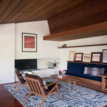
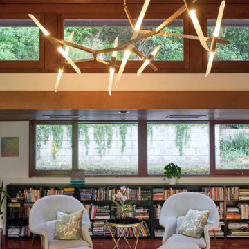
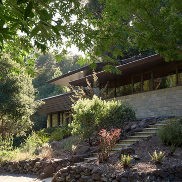
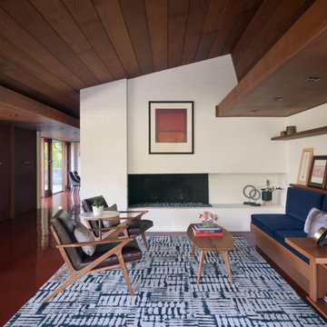
Nestled in the hills of Orinda, California, this 1951 residence is one of only seven extant homes, now known as “The Magnificent Seven”, designed by architect Olof Dahlstrand, a protégé of Frank Lloyd Wright. With its low-slung rooflines, natural materials, and deep integration with the sloping landscape, the home is a pristine example of mid-century modern design inspired by Wright’s organic principles. Over the years, prior homeowners have emphasized preservation, ensuring that the house remained relatively untouched. Each owner has respected the original architecture and stayed true to Dahlstrand’s intent. When a family of five—two college-aged sons and a middle school-aged daughter—acquired the property, they were captivated by its history, legacy of care, and architectural significance. While they appreciated Dahlstrand’s original vision, they also recognized the need to adapt the home for contemporary living while preserving its design integrity.
The remodel was conceived as a thoughtful response to the past—an effort to bring the house into the 21st century without compromising its soul. The primary mandate was to maintain architectural continuity while improving the functionality, comfort, and livability for a modern family. The design team—architects and contractor alike—worked with a shared reverence for the original architecture, allowing that mindset to guide even the most technical or pragmatic decisions.
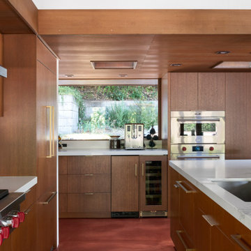
A key objective was to increase natural light in the kitchen—a departure from Wrightian principles of enclosed, intimate cooking spaces—while maintaining the home’s architectural language. The kitchen was reconfigured to foster a stronger connection to adjacent living spaces while retaining the underlying concept of spatial separation. One of the most transformative architectural changes was the removal of a ridge beam that was originally planned to remain visible through the kitchen. During construction, the team collaborated on a better solution: a wide-flanged steel beam concealed within the roof envelope. This subtle move preserved the clean lines and ceiling continuity, a modern update carried out with utmost respect for the existing framework.
The home’s original powder room, previously accessible only through the kitchen, was relocated for better flow and privacy. A new powder room was carved out of former kitchen cabinetry—a narrow, interior space that could have felt dark and enclosed. To avoid this, the design extended the line of original transom windows into the new powder room and added a skylight above the vanity. The result is a bright and airy space that feels consistent with the rest of the home. Other updates included the installation of new solid-core interior doors with veneers carefully matched to the original mahogany, enhancing the continuity of the interiors. Even smaller decisions, such as placing the door knobs at 42 inches high, mirrored the original proportions. Every choice reflected a shared belief between the architect, contractor, and client: that new work should serve the integrity of the old.
The home’s extensive interior redwood millwork and paneling was meticulously restored. Where new materials were introduced—such as the replacement redwood soffit paneling—the contractor took pains to find finish nails that matched the original, rather than using modern equivalents. This level of craftsmanship and collaboration defined the project. It extended even to the detailing of a blind door to the new powder room, which had to disappear into the existing redwood board-and-batten wall. It was a team effort: the owner found a suitable handle, the architects devised the custom in-swing mechanism, and the contractor executed it so the door aligned precisely with the battens. Throughout, the homeowners were deeply engaged in the design process. One, a meticulous design enthusiast, focused on aesthetic integrity and historic detail. The other brought a practical and function-driven perspective, ensuring that new fixtures and materials would be durable and require minimal maintenance.
While the home’s location posed no major site challenges, sustainability was a key concern. The team upgraded the roof insulation, installed solar panels with battery storage, and added ductless mini-split cooling systems. Lighting was another area where modern technology was woven into a historic framework: new square LED fixtures echo the original custom perimeter soffit lights, maintaining the design language while offering advanced performance.
A planned expansion of a bedroom into suite with a bathroom had to be shelved due to budget constraints and the high cost of below-grade foundation work. Still, the team focused their efforts on making the most of the existing footprint, resolving constraints through design ingenuity rather than adding square footage. This renovation represents a collaborative achievement in preserving and evolving a historically significant home. Every decision was shaped by a shared ethos among clients, architects, and contractor: to maintain the home’s architectural soul while updating it for contemporary life. The result is a timeless modernist residence that continues Olof Dahlstrand’s legacy, remaining grounded in nature, craftsmanship, and human-scale design.
Klopf Architecture Team: John Klopf, AIA, Klara Kevane, Fernanda Bernardes
Interior Architectural Design: Klopf Architecture
Structural Engineer: Daniel Bastiao
Contractor: Don Larwood, Larwood Construction
Photography: Mariko Reed
Year Completed: 2022
Sponsored
Sunbury, OH

J.Holderby - Renovations
Franklin County's Leading General Contractors - 2X Best of Houzz!
 Klopf Architecture
Nestled in the hills of Orinda, California, this 1951 residence is one of only seven extant homes, now known as “The Magnificent Seven”, designed by architect Olof Dahlstrand, a protégé of Frank Lloyd Wright. With its low-slung rooflines, natural materials, and deep integration with the sloping landscape, the home is a pristine example of mid-century modern design inspired by Wright’s organic principles. Over the years, prior homeowners have emphasized preservation, ensuring that the house remained relatively untouched. Each owner has respected the original architecture and stayed true to Dahlstrand’s intent. When a family of five—two college-aged sons and a middle school-aged daughter—acquired the property, they were captivated by its history, legacy of care, and architectural significance. While they appreciated Dahlstrand’s original vision, they also recognized the need to adapt the home for contemporary living while preserving its design integrity.
The remodel was conceived as a thoughtful response to the past—an effort to bring the house into the 21st century without compromising its soul. The primary mandate was to maintain architectural continuity while improving the functionality, comfort, and livability for a modern family. The design team—architects and contractor alike—worked with a shared reverence for the original architecture, allowing that mindset to guide even the most technical or pragmatic decisions.
A key objective was to increase natural light in the kitchen—a departure from Wrightian principles of enclosed, intimate cooking spaces—while maintaining the home’s architectural language. The kitchen was reconfigured to foster a stronger connection to adjacent living spaces while retaining the underlying concept of spatial separation. One of the most transformative architectural changes was the removal of a ridge beam that was originally planned to remain visible through the kitchen. During construction, the team collaborated on a better solution: a wide-flanged steel beam concealed within the roof envelope. This subtle move preserved the clean lines and ceiling continuity, a modern update carried out with utmost respect for the existing framework.
The home’s original powder room, previously accessible only through the kitchen, was relocated for better flow and privacy. A new powder room was carved out of former kitchen cabinetry—a narrow, interior space that could have felt dark and enclosed. To avoid this, the design extended the line of original transom windows into the new powder room and added a skylight above the vanity. The result is a bright and airy space that feels consistent with the rest of the home. Other updates included the installation of new solid-core interior doors with veneers carefully matched to the original mahogany, enhancing the continuity of the interiors. Even smaller decisions, such as placing the door knobs at 42 inches high, mirrored the original proportions. Every choice reflected a shared belief between the architect, contractor, and client: that new work should serve the integrity of the old.
The home’s extensive interior redwood millwork and paneling was meticulously restored. Where new materials were introduced—such as the replacement redwood soffit paneling—the contractor took pains to find finish nails that matched the original, rather than using modern equivalents. This level of craftsmanship and collaboration defined the project. It extended even to the detailing of a blind door to the new powder room, which had to disappear into the existing redwood board-and-batten wall. It was a team effort: the owner found a suitable handle, the architects devised the custom in-swing mechanism, and the contractor executed it so the door aligned precisely with the battens. Throughout, the homeowners were deeply engaged in the design process. One, a meticulous design enthusiast, focused on aesthetic integrity and historic detail. The other brought a practical and function-driven perspective, ensuring that new fixtures and materials would be durable and require minimal maintenance.
While the home’s location posed no major site challenges, sustainability was a key concern. The team upgraded the roof insulation, installed solar panels with battery storage, and added ductless mini-split cooling systems. Lighting was another area where modern technology was woven into a historic framework: new square LED fixtures echo the original custom perimeter soffit lights, maintaining the design language while offering advanced performance.
A planned expansion of a bedroom into suite with a bathroom had to be shelved due to budget constraints and the high cost of below-grade foundation work. Still, the team focused their efforts on making the most of the existing footprint, resolving constraints through design ingenuity rather than adding square footage. This renovation represents a collaborative achievement in preserving and evolving a historically significant home. Every decision was shaped by a shared ethos among clients, architects, and contractor: to maintain the home’s architectural soul while updating it for contemporary life. The result is a timeless modernist residence that continues Olof Dahlstrand’s legacy, remaining grounded in nature, craftsmanship, and human-scale design.
Klopf Architecture Team: John Klopf, AIA, Klara Kevane, Fernanda Bernardes
Interior Architectural Design: Klopf Architecture
Structural Engineer: Daniel Bastiao
Contractor: Don Larwood, Larwood Construction
Photography: Mariko Reed
Year Completed: 2022
 ASR DESIGN STUDIO
Our mission was to create an ocean and California lifestyle-inspired space that would invite consistent clicks, bookings and five-star reviews.
To make the most of the great location, we designed Project 11 for travelling singles and couples searching for a cozy and welcoming condo within walking distance to downtown San Diego.
Project 11 would also be used by our clients when it was unoccupied, so it had to be practical, functional and beautiful, too.
Our clients had a limited budget, so we got thrifty and sourced furnishings from Target, Ikea, Amazon and Etsy.
The oversized art prints – which set the tone for our relaxing and soothing beachy theme – were hunted down and found at Etsy of California Lifestyle.
We made the most of layers, colors and texture to create spaces that conjured calming ocean vibes and felt wholeheartedly welcoming.
We couldn’t repaint the walls, but they gave us a neutral color palette to work with. We built on it by adding in pops of color while maintaining a minimalist approach to understated style.
Then we had some fun and added in cute touches like Cali and San Diego inspired mugs, an adorable Kerig to tie in the colors of the ocean again, a swivel chair to view the sunrise and sunset and a totally pimped-out kitchen with all the cooking accessories a guest would need to feel at home in Project 11.
By the time we were done, we were tempted to scoop up the first available booking for ourselves!
Finally, we invested our energy in designing for effortless functionality so our client’s guests had everything they needed during their stay.
Photography: Meg Marie
 Klopf Architecture
Nestled in the hills of Orinda, California, this 1951 residence is one of only seven extant homes, now known as “The Magnificent Seven”, designed by architect Olof Dahlstrand, a protégé of Frank Lloyd Wright. With its low-slung rooflines, natural materials, and deep integration with the sloping landscape, the home is a pristine example of mid-century modern design inspired by Wright’s organic principles. Over the years, prior homeowners have emphasized preservation, ensuring that the house remained relatively untouched. Each owner has respected the original architecture and stayed true to Dahlstrand’s intent. When a family of five—two college-aged sons and a middle school-aged daughter—acquired the property, they were captivated by its history, legacy of care, and architectural significance. While they appreciated Dahlstrand’s original vision, they also recognized the need to adapt the home for contemporary living while preserving its design integrity.
The remodel was conceived as a thoughtful response to the past—an effort to bring the house into the 21st century without compromising its soul. The primary mandate was to maintain architectural continuity while improving the functionality, comfort, and livability for a modern family. The design team—architects and contractor alike—worked with a shared reverence for the original architecture, allowing that mindset to guide even the most technical or pragmatic decisions.
A key objective was to increase natural light in the kitchen—a departure from Wrightian principles of enclosed, intimate cooking spaces—while maintaining the home’s architectural language. The kitchen was reconfigured to foster a stronger connection to adjacent living spaces while retaining the underlying concept of spatial separation. One of the most transformative architectural changes was the removal of a ridge beam that was originally planned to remain visible through the kitchen. During construction, the team collaborated on a better solution: a wide-flanged steel beam concealed within the roof envelope. This subtle move preserved the clean lines and ceiling continuity, a modern update carried out with utmost respect for the existing framework.
The home’s original powder room, previously accessible only through the kitchen, was relocated for better flow and privacy. A new powder room was carved out of former kitchen cabinetry—a narrow, interior space that could have felt dark and enclosed. To avoid this, the design extended the line of original transom windows into the new powder room and added a skylight above the vanity. The result is a bright and airy space that feels consistent with the rest of the home. Other updates included the installation of new solid-core interior doors with veneers carefully matched to the original mahogany, enhancing the continuity of the interiors. Even smaller decisions, such as placing the door knobs at 42 inches high, mirrored the original proportions. Every choice reflected a shared belief between the architect, contractor, and client: that new work should serve the integrity of the old.
The home’s extensive interior redwood millwork and paneling was meticulously restored. Where new materials were introduced—such as the replacement redwood soffit paneling—the contractor took pains to find finish nails that matched the original, rather than using modern equivalents. This level of craftsmanship and collaboration defined the project. It extended even to the detailing of a blind door to the new powder room, which had to disappear into the existing redwood board-and-batten wall. It was a team effort: the owner found a suitable handle, the architects devised the custom in-swing mechanism, and the contractor executed it so the door aligned precisely with the battens. Throughout, the homeowners were deeply engaged in the design process. One, a meticulous design enthusiast, focused on aesthetic integrity and historic detail. The other brought a practical and function-driven perspective, ensuring that new fixtures and materials would be durable and require minimal maintenance.
While the home’s location posed no major site challenges, sustainability was a key concern. The team upgraded the roof insulation, installed solar panels with battery storage, and added ductless mini-split cooling systems. Lighting was another area where modern technology was woven into a historic framework: new square LED fixtures echo the original custom perimeter soffit lights, maintaining the design language while offering advanced performance.
A planned expansion of a bedroom into suite with a bathroom had to be shelved due to budget constraints and the high cost of below-grade foundation work. Still, the team focused their efforts on making the most of the existing footprint, resolving constraints through design ingenuity rather than adding square footage. This renovation represents a collaborative achievement in preserving and evolving a historically significant home. Every decision was shaped by a shared ethos among clients, architects, and contractor: to maintain the home’s architectural soul while updating it for contemporary life. The result is a timeless modernist residence that continues Olof Dahlstrand’s legacy, remaining grounded in nature, craftsmanship, and human-scale design.
Klopf Architecture Team: John Klopf, AIA, Klara Kevane, Fernanda Bernardes
Interior Architectural Design: Klopf Architecture
Structural Engineer: Daniel Bastiao
Contractor: Don Larwood, Larwood Construction
Photography: Mariko Reed
Year Completed: 2022
 Klopf Architecture
Nestled in the hills of Orinda, California, this 1951 residence is one of only seven extant homes, now known as “The Magnificent Seven”, designed by architect Olof Dahlstrand, a protégé of Frank Lloyd Wright. With its low-slung rooflines, natural materials, and deep integration with the sloping landscape, the home is a pristine example of mid-century modern design inspired by Wright’s organic principles. Over the years, prior homeowners have emphasized preservation, ensuring that the house remained relatively untouched. Each owner has respected the original architecture and stayed true to Dahlstrand’s intent. When a family of five—two college-aged sons and a middle school-aged daughter—acquired the property, they were captivated by its history, legacy of care, and architectural significance. While they appreciated Dahlstrand’s original vision, they also recognized the need to adapt the home for contemporary living while preserving its design integrity.
The remodel was conceived as a thoughtful response to the past—an effort to bring the house into the 21st century without compromising its soul. The primary mandate was to maintain architectural continuity while improving the functionality, comfort, and livability for a modern family. The design team—architects and contractor alike—worked with a shared reverence for the original architecture, allowing that mindset to guide even the most technical or pragmatic decisions.
A key objective was to increase natural light in the kitchen—a departure from Wrightian principles of enclosed, intimate cooking spaces—while maintaining the home’s architectural language. The kitchen was reconfigured to foster a stronger connection to adjacent living spaces while retaining the underlying concept of spatial separation. One of the most transformative architectural changes was the removal of a ridge beam that was originally planned to remain visible through the kitchen. During construction, the team collaborated on a better solution: a wide-flanged steel beam concealed within the roof envelope. This subtle move preserved the clean lines and ceiling continuity, a modern update carried out with utmost respect for the existing framework.
The home’s original powder room, previously accessible only through the kitchen, was relocated for better flow and privacy. A new powder room was carved out of former kitchen cabinetry—a narrow, interior space that could have felt dark and enclosed. To avoid this, the design extended the line of original transom windows into the new powder room and added a skylight above the vanity. The result is a bright and airy space that feels consistent with the rest of the home. Other updates included the installation of new solid-core interior doors with veneers carefully matched to the original mahogany, enhancing the continuity of the interiors. Even smaller decisions, such as placing the door knobs at 42 inches high, mirrored the original proportions. Every choice reflected a shared belief between the architect, contractor, and client: that new work should serve the integrity of the old.
The home’s extensive interior redwood millwork and paneling was meticulously restored. Where new materials were introduced—such as the replacement redwood soffit paneling—the contractor took pains to find finish nails that matched the original, rather than using modern equivalents. This level of craftsmanship and collaboration defined the project. It extended even to the detailing of a blind door to the new powder room, which had to disappear into the existing redwood board-and-batten wall. It was a team effort: the owner found a suitable handle, the architects devised the custom in-swing mechanism, and the contractor executed it so the door aligned precisely with the battens. Throughout, the homeowners were deeply engaged in the design process. One, a meticulous design enthusiast, focused on aesthetic integrity and historic detail. The other brought a practical and function-driven perspective, ensuring that new fixtures and materials would be durable and require minimal maintenance.
While the home’s location posed no major site challenges, sustainability was a key concern. The team upgraded the roof insulation, installed solar panels with battery storage, and added ductless mini-split cooling systems. Lighting was another area where modern technology was woven into a historic framework: new square LED fixtures echo the original custom perimeter soffit lights, maintaining the design language while offering advanced performance.
A planned expansion of a bedroom into suite with a bathroom had to be shelved due to budget constraints and the high cost of below-grade foundation work. Still, the team focused their efforts on making the most of the existing footprint, resolving constraints through design ingenuity rather than adding square footage. This renovation represents a collaborative achievement in preserving and evolving a historically significant home. Every decision was shaped by a shared ethos among clients, architects, and contractor: to maintain the home’s architectural soul while updating it for contemporary life. The result is a timeless modernist residence that continues Olof Dahlstrand’s legacy, remaining grounded in nature, craftsmanship, and human-scale design.
Klopf Architecture Team: John Klopf, AIA, Klara Kevane, Fernanda Bernardes
Interior Architectural Design: Klopf Architecture
Structural Engineer: Daniel Bastiao
Contractor: Don Larwood, Larwood Construction
Photography: Mariko Reed
Year Completed: 2022
 ASR DESIGN STUDIO
Our mission was to create an ocean and California lifestyle-inspired space that would invite consistent clicks, bookings and five-star reviews.
To make the most of the great location, we designed Project 11 for travelling singles and couples searching for a cozy and welcoming condo within walking distance to downtown San Diego.
Project 11 would also be used by our clients when it was unoccupied, so it had to be practical, functional and beautiful, too.
Our clients had a limited budget, so we got thrifty and sourced furnishings from Target, Ikea, Amazon and Etsy.
The oversized art prints – which set the tone for our relaxing and soothing beachy theme – were hunted down and found at Etsy of California Lifestyle.
We made the most of layers, colors and texture to create spaces that conjured calming ocean vibes and felt wholeheartedly welcoming.
We couldn’t repaint the walls, but they gave us a neutral color palette to work with. We built on it by adding in pops of color while maintaining a minimalist approach to understated style.
Then we had some fun and added in cute touches like Cali and San Diego inspired mugs, an adorable Kerig to tie in the colors of the ocean again, a swivel chair to view the sunrise and sunset and a totally pimped-out kitchen with all the cooking accessories a guest would need to feel at home in Project 11.
By the time we were done, we were tempted to scoop up the first available booking for ourselves!
Finally, we invested our energy in designing for effortless functionality so our client’s guests had everything they needed during their stay.
Photography: Meg Marie
 Futuro Futuro Kitchen Range Hoods
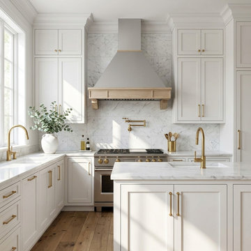
Discover a captivating fusion of tradition and modernity with the Futuro Futuro 36-inch Sphinx Wall Range Hood. Featuring a unique blend of stainless steel and wood, it adds a chic touch to any kitchen setup. The minimalist wooden frame comes unstained, offering you the flexibility to tailor it to your liking and match any kitchen design.
Equipped with a robust 940 CFM blower, this range hood effectively draws away cooking fumes, steam, and odors, ensuring a clean and fresh kitchen environment. The energy-efficient LED lights provide ample illumination to your cooking area, enhancing visibility and adding a warm ambiance.
In terms of functionality, this hood has a 4-speed control to adjust the extraction speed based on your cooking demands. The dishwasher-safe filters make maintenance a breeze, helping to keep your hood performing at its best while saving time and effort.
Versatility is at the heart of the Sphinx Wall Range Hood's design. It can be installed as a ducted or ductless unit, dependent on your kitchen's configuration. Moreover, it allows for usage with or without the chimney, providing various installation options to suit your aesthetic preferences.
Despite its powerful performance, the hood maintains quiet operation, thanks to Futuro Futuro’s innovative sound-absorbing technology. Plus, its automated reminders will notify you when it's time for filter cleaning, further enhancing the ease of maintenance. With a one-year US standard and two-year parts warranty, the Futuro Futuro 36-inch Sphinx Wall Range Hood assures you of quality and reliability. Add a touch of elegance to your kitchen while ensuring consistently effective performance with this range hood.
Sponsored
Sunbury, OH
J.Holderby - Renovations
Franklin County's Leading General Contractors - 2X Best of Houzz!
 Klopf Architecture
Nestled in the hills of Orinda, California, this 1951 residence is one of only seven extant homes, now known as “The Magnificent Seven”, designed by architect Olof Dahlstrand, a protégé of Frank Lloyd Wright. With its low-slung rooflines, natural materials, and deep integration with the sloping landscape, the home is a pristine example of mid-century modern design inspired by Wright’s organic principles. Over the years, prior homeowners have emphasized preservation, ensuring that the house remained relatively untouched. Each owner has respected the original architecture and stayed true to Dahlstrand’s intent. When a family of five—two college-aged sons and a middle school-aged daughter—acquired the property, they were captivated by its history, legacy of care, and architectural significance. While they appreciated Dahlstrand’s original vision, they also recognized the need to adapt the home for contemporary living while preserving its design integrity.
The remodel was conceived as a thoughtful response to the past—an effort to bring the house into the 21st century without compromising its soul. The primary mandate was to maintain architectural continuity while improving the functionality, comfort, and livability for a modern family. The design team—architects and contractor alike—worked with a shared reverence for the original architecture, allowing that mindset to guide even the most technical or pragmatic decisions.
A key objective was to increase natural light in the kitchen—a departure from Wrightian principles of enclosed, intimate cooking spaces—while maintaining the home’s architectural language. The kitchen was reconfigured to foster a stronger connection to adjacent living spaces while retaining the underlying concept of spatial separation. One of the most transformative architectural changes was the removal of a ridge beam that was originally planned to remain visible through the kitchen. During construction, the team collaborated on a better solution: a wide-flanged steel beam concealed within the roof envelope. This subtle move preserved the clean lines and ceiling continuity, a modern update carried out with utmost respect for the existing framework.
The home’s original powder room, previously accessible only through the kitchen, was relocated for better flow and privacy. A new powder room was carved out of former kitchen cabinetry—a narrow, interior space that could have felt dark and enclosed. To avoid this, the design extended the line of original transom windows into the new powder room and added a skylight above the vanity. The result is a bright and airy space that feels consistent with the rest of the home. Other updates included the installation of new solid-core interior doors with veneers carefully matched to the original mahogany, enhancing the continuity of the interiors. Even smaller decisions, such as placing the door knobs at 42 inches high, mirrored the original proportions. Every choice reflected a shared belief between the architect, contractor, and client: that new work should serve the integrity of the old.
The home’s extensive interior redwood millwork and paneling was meticulously restored. Where new materials were introduced—such as the replacement redwood soffit paneling—the contractor took pains to find finish nails that matched the original, rather than using modern equivalents. This level of craftsmanship and collaboration defined the project. It extended even to the detailing of a blind door to the new powder room, which had to disappear into the existing redwood board-and-batten wall. It was a team effort: the owner found a suitable handle, the architects devised the custom in-swing mechanism, and the contractor executed it so the door aligned precisely with the battens. Throughout, the homeowners were deeply engaged in the design process. One, a meticulous design enthusiast, focused on aesthetic integrity and historic detail. The other brought a practical and function-driven perspective, ensuring that new fixtures and materials would be durable and require minimal maintenance.
While the home’s location posed no major site challenges, sustainability was a key concern. The team upgraded the roof insulation, installed solar panels with battery storage, and added ductless mini-split cooling systems. Lighting was another area where modern technology was woven into a historic framework: new square LED fixtures echo the original custom perimeter soffit lights, maintaining the design language while offering advanced performance.
A planned expansion of a bedroom into suite with a bathroom had to be shelved due to budget constraints and the high cost of below-grade foundation work. Still, the team focused their efforts on making the most of the existing footprint, resolving constraints through design ingenuity rather than adding square footage. This renovation represents a collaborative achievement in preserving and evolving a historically significant home. Every decision was shaped by a shared ethos among clients, architects, and contractor: to maintain the home’s architectural soul while updating it for contemporary life. The result is a timeless modernist residence that continues Olof Dahlstrand’s legacy, remaining grounded in nature, craftsmanship, and human-scale design.
Klopf Architecture Team: John Klopf, AIA, Klara Kevane, Fernanda Bernardes
Interior Architectural Design: Klopf Architecture
Structural Engineer: Daniel Bastiao
Contractor: Don Larwood, Larwood Construction
Photography: Mariko Reed
Year Completed: 2022

 TVL Creative Ltd.
This project was such an incredible design opportunity, and instilled inspiration and excitement at every turn! Our amazing clients came to us with the challenge of converting their beloved family home into a welcoming haven for all members of the family. At the time that we met our clients, they were struggling with the difficult personal decision of the fate of the home. Their father/father-in-law had passed away and their mother/mother-in-law had recently been admitted into a nursing facility and was fighting Alzheimer’s. Resistant to loss of the home now that both parents were out of it, our clients purchased the home to keep in in the family. Despite their permanent home currently being in New Jersey, these clients dedicated themselves to keeping and revitalizing the house. We were moved by the story and became immediately passionate about bringing this dream to life.
The home was built by the parents of our clients and was only ever owned by them, making this a truly special space to the family. Our goal was to revitalize the home and to bring new energy into every room without losing the special characteristics that were original to the home when it was built. In this way, we were able to develop a house that maintains its own unique personality while offering a space of welcoming neutrality for all members of the family to enjoy over time.
The renovation touched every part of the home: the exterior, foyer, kitchen, living room, sun room, garage, six bedrooms, three bathrooms, the laundry room, and everything in between. The focus was to develop a style that carried consistently from space to space, but allowed for unique expression in the small details in every room.
Starting at the entry, we renovated the front door and entry point to offer more presence and to bring more of the mid-century vibe to the home’s exterior. We integrated a new modern front door, cedar shingle accents, new exterior paint, and gorgeous contemporary house numbers that really allow the home to stand out. Just inside the entry, we renovated the foyer to create a playful entry point worthy of attention. Cement look tile adorns the foyer floor, and we’ve added new lighting and upgraded the entry coat storage.
Upon entering the home, one will immediately be captivated by the stunning kitchen just off the entry. We transformed this space in just about every way. While the footprint of the home ultimately remained almost identical, the aesthetics were completely turned on their head. We re-worked the kitchen to maximize storage and to create an informal dining area that is great for casual hosting or morning coffee.
We removed the entry to the garage that was once in the informal dining, and created a peninsula in its place that offers a unique division between the kitchen/informal dining and the formal dining and living areas. The simple light warm light gray cabinetry offers a bit of traditional elegance, along with the marble backsplash and quartz countertops. We extended the original wood flooring into the kitchen and stained all floors to match for a warmth that truly resonates through all spaces. We upgraded appliances, added lighting everywhere, and finished the space with some gorgeous mid century furniture pieces.
In the formal dining and living room, we really focused on maintaining the original marble fireplace as a focal point. We cleaned the marble, repaired the mortar, and refinished the original fireplace screen to give a new sleek look in black. We then integrated a new gas insert for modern heating and painted the upper portion in a rich navy blue; an accent that is carried through the home consistently as a nod to our client’s love of the color.
The former entry into the old covered porch is now an elegant glass door leading to a stunning finished sunroom. This room was completely upgraded as well. We wrapped the entire space in cozy white shiplap to keep a casual feel with brightness. We tiled the floor with large format concrete look tile, and painted the old brick fireplace a bright white. We installed a new gas burning unit, and integrated transitional style lighting to bring warmth and elegance into the space. The new black-frame windows are adorned with decorative shades that feature hand-sketched bird prints, and we’ve created a dedicated garden-ware “nook” for our client who loves to work in the yard. The far end of this space is completed with two oversized chaise loungers and overhead lights…the most perfect little reading nook!
Just off the dining room, we created an entirely new space to the home: a mudroom. The clients lacked this space and desperately needed a landing spot upon entering the home from the garage. We uniquely planned existing space in the garage to utilize for this purpose, and were able to create a small but functional entry point without losing the ability to park cars in the garage. This new space features cement-look tile, gorgeous deep brown cabinetry, and plenty of storage for all the small items one might need to store while moving in and out of the home.
The remainder of the upstairs level includes massive renovations to the guest hall bathroom and guest bedroom, upstairs master bed/bath suite, and a third bedroom that we converted into a home office for the client.
Some of the largest transformations were made in the basement, where unfinished space and lack of light were converted into gloriously lit, cozy, finished spaces. Our first task was to convert the massive basement living room into the new master bedroom for our clients. We removed existing built-ins, created an entirely new walk-in closet, painted the old brick fireplace, installed a new gas unit, added carpet, introduced new lighting, replaced windows, and upgraded every part of the aesthetic appearance. One of the most incredible features of this space is the custom double sliding barn door made by a Denver artisan. This space is truly a retreat for our clients!
We also completely transformed the laundry room, back storage room, basement master bathroom, and two bedrooms.
This home’s massive scope and ever-evolving challenges were thrilling and exciting to work with, and the result is absolutely amazing. At the end of the day, this home offers a look and feel that the clients love. Above all, though, the clients feel the spirit of their family home and have a welcoming environment for all members of the family to enjoy for years to come.
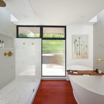 Klopf Architecture
Nestled in the hills of Orinda, California, this 1951 residence is one of only seven extant homes, now known as “The Magnificent Seven”, designed by architect Olof Dahlstrand, a protégé of Frank Lloyd Wright. With its low-slung rooflines, natural materials, and deep integration with the sloping landscape, the home is a pristine example of mid-century modern design inspired by Wright’s organic principles. Over the years, prior homeowners have emphasized preservation, ensuring that the house remained relatively untouched. Each owner has respected the original architecture and stayed true to Dahlstrand’s intent. When a family of five—two college-aged sons and a middle school-aged daughter—acquired the property, they were captivated by its history, legacy of care, and architectural significance. While they appreciated Dahlstrand’s original vision, they also recognized the need to adapt the home for contemporary living while preserving its design integrity.
The remodel was conceived as a thoughtful response to the past—an effort to bring the house into the 21st century without compromising its soul. The primary mandate was to maintain architectural continuity while improving the functionality, comfort, and livability for a modern family. The design team—architects and contractor alike—worked with a shared reverence for the original architecture, allowing that mindset to guide even the most technical or pragmatic decisions.
A key objective was to increase natural light in the kitchen—a departure from Wrightian principles of enclosed, intimate cooking spaces—while maintaining the home’s architectural language. The kitchen was reconfigured to foster a stronger connection to adjacent living spaces while retaining the underlying concept of spatial separation. One of the most transformative architectural changes was the removal of a ridge beam that was originally planned to remain visible through the kitchen. During construction, the team collaborated on a better solution: a wide-flanged steel beam concealed within the roof envelope. This subtle move preserved the clean lines and ceiling continuity, a modern update carried out with utmost respect for the existing framework.
The home’s original powder room, previously accessible only through the kitchen, was relocated for better flow and privacy. A new powder room was carved out of former kitchen cabinetry—a narrow, interior space that could have felt dark and enclosed. To avoid this, the design extended the line of original transom windows into the new powder room and added a skylight above the vanity. The result is a bright and airy space that feels consistent with the rest of the home. Other updates included the installation of new solid-core interior doors with veneers carefully matched to the original mahogany, enhancing the continuity of the interiors. Even smaller decisions, such as placing the door knobs at 42 inches high, mirrored the original proportions. Every choice reflected a shared belief between the architect, contractor, and client: that new work should serve the integrity of the old.
The home’s extensive interior redwood millwork and paneling was meticulously restored. Where new materials were introduced—such as the replacement redwood soffit paneling—the contractor took pains to find finish nails that matched the original, rather than using modern equivalents. This level of craftsmanship and collaboration defined the project. It extended even to the detailing of a blind door to the new powder room, which had to disappear into the existing redwood board-and-batten wall. It was a team effort: the owner found a suitable handle, the architects devised the custom in-swing mechanism, and the contractor executed it so the door aligned precisely with the battens. Throughout, the homeowners were deeply engaged in the design process. One, a meticulous design enthusiast, focused on aesthetic integrity and historic detail. The other brought a practical and function-driven perspective, ensuring that new fixtures and materials would be durable and require minimal maintenance.
While the home’s location posed no major site challenges, sustainability was a key concern. The team upgraded the roof insulation, installed solar panels with battery storage, and added ductless mini-split cooling systems. Lighting was another area where modern technology was woven into a historic framework: new square LED fixtures echo the original custom perimeter soffit lights, maintaining the design language while offering advanced performance.
A planned expansion of a bedroom into suite with a bathroom had to be shelved due to budget constraints and the high cost of below-grade foundation work. Still, the team focused their efforts on making the most of the existing footprint, resolving constraints through design ingenuity rather than adding square footage. This renovation represents a collaborative achievement in preserving and evolving a historically significant home. Every decision was shaped by a shared ethos among clients, architects, and contractor: to maintain the home’s architectural soul while updating it for contemporary life. The result is a timeless modernist residence that continues Olof Dahlstrand’s legacy, remaining grounded in nature, craftsmanship, and human-scale design.
Klopf Architecture Team: John Klopf, AIA, Klara Kevane, Fernanda Bernardes
Interior Architectural Design: Klopf Architecture
Structural Engineer: Daniel Bastiao
Contractor: Don Larwood, Larwood Construction
Photography: Mariko Reed
Year Completed: 2022
 Accent Florida Homes
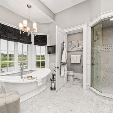
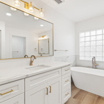
This full primary bathroom remodel refreshed both connected spaces with a cohesive palette of warm wood tones, white marble-look surfaces, and champagne bronze details, while preserving the existing plumbing locations for a more efficient renovation.
The larger bathroom area was designed as a calm, open retreat with two separate vanities and a freestanding soaking tub positioned in the corner. Wood-look floor tile brings warmth and texture underfoot, while white marble-look wall tile extends to vanity backsplash height to create a bright, polished backdrop. Champagne bronze fixtures and matching mirror frames add a soft metallic accent that ties the space together.
The adjoining toilet and shower room continues the same material story with a mix of white marble-look tile, warm wood-tone finishes, and a soft beige floor tile. Keeping the palette consistent across both rooms helps the entire bathroom feel connected, while the smaller space gains its own layered character through the combination of contrasting textures and tones.
All finishes were replaced as part of the renovation, including tile, cabinetry, countertops, mirrors, plumbing fixtures, and hardware. By maintaining the original plumbing locations, the remodel was able to achieve a completely updated look without unnecessary reconfiguration.
The finished bathroom feels warm, refined, and highly functional — blending classic marble-inspired surfaces with natural wood tones and champagne bronze accents for a timeless transitional result.
Design features: two-room primary bathroom, dual vanities, freestanding soaking tub, wood-look floor tile, white marble-look wall tile, champagne bronze fixtures, champagne bronze mirror frames, separate toilet room, separate shower room, beige bathroom floor tile, coordinated tile palette, updated bathroom cabinetry, full bathroom remodel, transitional bathroom design, and warm neutral finishes.
 Elite Empire Construction Inc.
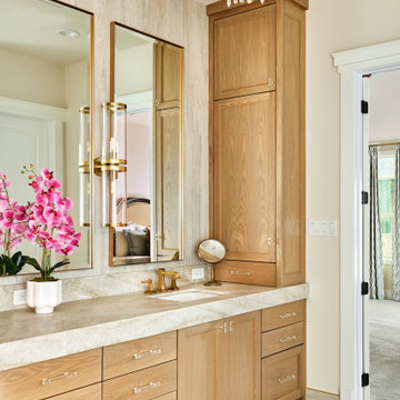
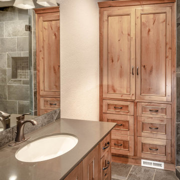
This daughter’s bathroom highlights our commitment to consistent, top-tier craftsmanship across every wing of the home. By pairing hand-selected Knotty Alder cabinetry with durable Italian porcelain stone, we created a space that is both visually stunning and engineered for longevity.
Signature Features & Technical Execution:
Custom Artisan Millwork: The centerpiece of the room is the expansive, floor-to-ceiling Knotty Alder linen tower and vanity suite. Featuring traditional Shaker-style door panels and multiple deep-storage drawers, the cabinetry provides high-capacity organization while showcasing the natural, rustic grain of the wood.
Polished Quartz Surfaces: We topped the vanity with a sleek, low-maintenance honed quartz countertop, featuring a clean undermount basin and professional-grade oil-rubbed bronze fixtures. The dark stone provides a sophisticated contrast to the warm wood tones.
Large-Format Stone Integration: The walk-in shower features the same large-format Italian porcelain tile found in the master suite, ensuring a cohesive design language. Note the integrated shampoo niche with a mosaic tile back—a small but "expensive" detail that adds depth and texture.
Precision Built-Ins: The cabinetry was precision-fit into the architectural alcoves, including a integrated baseboard vent to maintain the home’s efficient climate control without breaking the visual lines of the millwork.
Natural Ambiance: The warm wood casings around the doorways and the high-definition vanity mirror (reflecting the adjacent shower) ensure the room feels open and bright, perfectly suited for a high-end residential environment.
 ASR DESIGN STUDIO
Our mission was to create an ocean and California lifestyle-inspired space that would invite consistent clicks, bookings and five-star reviews.
To make the most of the great location, we designed Project 11 for travelling singles and couples searching for a cozy and welcoming condo within walking distance to downtown San Diego.
Project 11 would also be used by our clients when it was unoccupied, so it had to be practical, functional and beautiful, too.
Our clients had a limited budget, so we got thrifty and sourced furnishings from Target, Ikea, Amazon and Etsy.
The oversized art prints – which set the tone for our relaxing and soothing beachy theme – were hunted down and found at Etsy of California Lifestyle.
We made the most of layers, colors and texture to create spaces that conjured calming ocean vibes and felt wholeheartedly welcoming.
We couldn’t repaint the walls, but they gave us a neutral color palette to work with. We built on it by adding in pops of color while maintaining a minimalist approach to understated style.
Then we had some fun and added in cute touches like Cali and San Diego inspired mugs, an adorable Kerig to tie in the colors of the ocean again, a swivel chair to view the sunrise and sunset and a totally pimped-out kitchen with all the cooking accessories a guest would need to feel at home in Project 11.
By the time we were done, we were tempted to scoop up the first available booking for ourselves!
Finally, we invested our energy in designing for effortless functionality so our client’s guests had everything they needed during their stay.
Photography: Meg Marie
 Accent Florida Homes
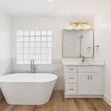
This full primary bathroom remodel refreshed both connected spaces with a cohesive palette of warm wood tones, white marble-look surfaces, and champagne bronze details, while preserving the existing plumbing locations for a more efficient renovation.
The larger bathroom area was designed as a calm, open retreat with two separate vanities and a freestanding soaking tub positioned in the corner. Wood-look floor tile brings warmth and texture underfoot, while white marble-look wall tile extends to vanity backsplash height to create a bright, polished backdrop. Champagne bronze fixtures and matching mirror frames add a soft metallic accent that ties the space together.
The adjoining toilet and shower room continues the same material story with a mix of white marble-look tile, warm wood-tone finishes, and a soft beige floor tile. Keeping the palette consistent across both rooms helps the entire bathroom feel connected, while the smaller space gains its own layered character through the combination of contrasting textures and tones.
All finishes were replaced as part of the renovation, including tile, cabinetry, countertops, mirrors, plumbing fixtures, and hardware. By maintaining the original plumbing locations, the remodel was able to achieve a completely updated look without unnecessary reconfiguration.
The finished bathroom feels warm, refined, and highly functional — blending classic marble-inspired surfaces with natural wood tones and champagne bronze accents for a timeless transitional result.
Design features: two-room primary bathroom, dual vanities, freestanding soaking tub, wood-look floor tile, white marble-look wall tile, champagne bronze fixtures, champagne bronze mirror frames, separate toilet room, separate shower room, beige bathroom floor tile, coordinated tile palette, updated bathroom cabinetry, full bathroom remodel, transitional bathroom design, and warm neutral finishes.
63