
Search results for "Maintaining wellness" in Home Design Ideas
 Drury Design
The Setup:
After purchasing this home, the homeowners faced a unique opportunity to reimagine their kitchen and nearby spaces. Water damage from a burst pipe had left much of the home’s interior in need of repair, and while the existing kitchen was functional and in relatively good shape, it didn’t align with the family’s vision for their new home. The layout included a peninsula that wasn’t ideal, and there were some druthers with the nearby pantry.
Since the space needed to be rebuilt anyway, the homeowners saw this as a chance to create a kitchen that was both highly functional for their four young children and timeless in its design. The project also included a refresh of the adjacent message center and dining room — spaces that play key roles in the family’s daily life. The goal was to create a cohesive flow between these areas, balancing modern functionality with the craftsman-inspired character of the rest of the home.
Design Objectives:
- Replace the outdated peninsula with a large island to maximize counter space and create new seating options.
- Open up the space visually by removing soffits and rethinking the cabinetry layout.
Incorporate concealed refrigeration and freezer units to provide significant storage for the family while maintaining a streamlined aesthetic.
- Integrate black cabinetry into the design without making the space feel harsh or heavy.
- Ensure the lighting plan balances functional task lighting with ambient accent lighting.
- Avoid visual clutter in the cabinetry design while still giving a nod to the craftsman aesthetic.
- Incorporate a slab backsplash as a key design feature.
Design Challenges:
- The outdated peninsula left dead space in the kitchen and lacked sufficient seating for the family.
- The cooktop wall was cramped, with small cabinets flanking the hood, limited storage, and soffits that made the space feel closed-in.
- The family needed significant refrigeration space (two refrigerators and a freezer) but wanted to avoid a cluttered look with visible stainless steel appliances.
- Adding black cabinetry risked making the space feel too dark or heavy.
- The original lighting plan was insufficient, particularly over the dining table where a decorative fixture proved too dim.
- The family wanted shaker-style drawer fronts to match the home’s arts-and-crafts design but worried that too much shaker cabinetry might look overly busy.
- Prioritizing a slab backsplash in the wish list priority planning.
The Renewed Space
Design Solutions:
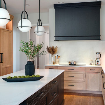
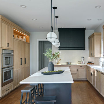
- A functional island: The peninsula was replaced with a large island that provides continuous countertop space for prepping and serving. The island also features seating for four people, creating a central hub for informal meals and activities.
- Streamlined cooktop wall: The soffits were removed, and the upper cabinets on the cooktop wall were eliminated to create a more open, streamlined design. A custom oversized hood became the focal point of the wall, with the blower unit offset inside it to align with the cooktop while maintaining exterior visual symmetry.
- Concealed refrigeration: Two column refrigerators and one freezer were integrated into the cabinetry, concealing them behind wood paneling that blends seamlessly with the overall design.
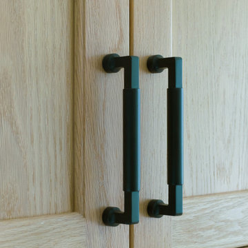
- Warm black cabinetry: The black cabinetry was crafted from hickory with a visible grain, softening its appearance and adding warmth. The grain detail gives the cabinetry a rich, textured look that avoids feeling stark or overpowering.
- Additional lighting: In the dining area, recessed can lights were added during an additional installation phase to supplement the gorgeous decorative fixture’s dim output. The new lighting plan creates a layered effect, combining functional task lighting with softer ambient lighting.
- Simplified cabinetry details: Slab drawer fronts were used on the upper drawers, while five-piece shaker fronts (with slightly less prominent rail and stile pieces) were reserved for the middle and lower drawers. This approach simplified the overall look while maintaining the craftsman-inspired aesthetic.
- Slab backsplash priority: The slab backsplash was prioritized by making thoughtful adjustments elsewhere, like opting not to extend cabinetry to the ceiling, which also helped visually prioritize the gorgeous slab backsplash. This decision also enhanced the kitchen’s furniture-like feel, aligning with the home’s craftsman character.
- This kitchen perfectly balances practicality with timeless style. By addressing the family’s functional needs — ample seating, smart storage, and effective lighting — while incorporating thoughtful design elements like warm black cabinetry and a striking slab backsplash, Alicia created a space that works beautifully for a busy household. The result is a cohesive, inviting kitchen that honors the home’s craftsman roots and will serve the family well for years to come.
 Bradford Custom Homes & Remodeling
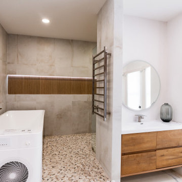
This modern spa-inspired bathroom showcases a luxury wellness retreat designed for comfort, recovery, and high-end daily living. Featuring a custom walk-in shower with oversized concrete-look porcelain tiles and integrated LED accent lighting, the space blends sleek contemporary design with warm natural textures. The pebble-style shower floor adds a spa-like feel and enhances drainage and foot comfort.
A built-in cold plunge tub anchors the wellness area, offering professional-grade hydrotherapy right at home—an increasingly popular feature in modern luxury renovations. The stainless-steel towel warmer, minimalist matte fixtures, and seamless layout further elevate the room’s functionality.
On the vanity side, a floating wood-grain cabinet with soft-close drawers and a clean white countertop provides ample storage while maintaining a minimal, modern aesthetic. A round mirror and soft natural lighting create the perfect balance of warmth and simplicity.
This project highlights Bradford Custom Homes & Remodeling’s expertise in luxury bathroom remodeling, home spa design, modern wellness spaces, cold plunge installation, and premium interior renovation in Atlanta—bringing resort-level relaxation into everyday living.
 Drury Design
The Setup:
After purchasing this home, the homeowners faced a unique opportunity to reimagine their kitchen and nearby spaces. Water damage from a burst pipe had left much of the home’s interior in need of repair, and while the existing kitchen was functional and in relatively good shape, it didn’t align with the family’s vision for their new home. The layout included a peninsula that wasn’t ideal, and there were some druthers with the nearby pantry.
Since the space needed to be rebuilt anyway, the homeowners saw this as a chance to create a kitchen that was both highly functional for their four young children and timeless in its design. The project also included a refresh of the adjacent message center and dining room — spaces that play key roles in the family’s daily life. The goal was to create a cohesive flow between these areas, balancing modern functionality with the craftsman-inspired character of the rest of the home.
Design Objectives:
- Replace the outdated peninsula with a large island to maximize counter space and create new seating options.
- Open up the space visually by removing soffits and rethinking the cabinetry layout.
Incorporate concealed refrigeration and freezer units to provide significant storage for the family while maintaining a streamlined aesthetic.
- Integrate black cabinetry into the design without making the space feel harsh or heavy.
- Ensure the lighting plan balances functional task lighting with ambient accent lighting.
- Avoid visual clutter in the cabinetry design while still giving a nod to the craftsman aesthetic.
- Incorporate a slab backsplash as a key design feature.
Design Challenges:
- The outdated peninsula left dead space in the kitchen and lacked sufficient seating for the family.
- The cooktop wall was cramped, with small cabinets flanking the hood, limited storage, and soffits that made the space feel closed-in.
- The family needed significant refrigeration space (two refrigerators and a freezer) but wanted to avoid a cluttered look with visible stainless steel appliances.
- Adding black cabinetry risked making the space feel too dark or heavy.
- The original lighting plan was insufficient, particularly over the dining table where a decorative fixture proved too dim.
- The family wanted shaker-style drawer fronts to match the home’s arts-and-crafts design but worried that too much shaker cabinetry might look overly busy.
- Prioritizing a slab backsplash in the wish list priority planning.
The Renewed Space
Design Solutions:
- A functional island: The peninsula was replaced with a large island that provides continuous countertop space for prepping and serving. The island also features seating for four people, creating a central hub for informal meals and activities.
- Streamlined cooktop wall: The soffits were removed, and the upper cabinets on the cooktop wall were eliminated to create a more open, streamlined design. A custom oversized hood became the focal point of the wall, with the blower unit offset inside it to align with the cooktop while maintaining exterior visual symmetry.
- Concealed refrigeration: Two column refrigerators and one freezer were integrated into the cabinetry, concealing them behind wood paneling that blends seamlessly with the overall design.
- Warm black cabinetry: The black cabinetry was crafted from hickory with a visible grain, softening its appearance and adding warmth. The grain detail gives the cabinetry a rich, textured look that avoids feeling stark or overpowering.
- Additional lighting: In the dining area, recessed can lights were added during an additional installation phase to supplement the gorgeous decorative fixture’s dim output. The new lighting plan creates a layered effect, combining functional task lighting with softer ambient lighting.
- Simplified cabinetry details: Slab drawer fronts were used on the upper drawers, while five-piece shaker fronts (with slightly less prominent rail and stile pieces) were reserved for the middle and lower drawers. This approach simplified the overall look while maintaining the craftsman-inspired aesthetic.
- Slab backsplash priority: The slab backsplash was prioritized by making thoughtful adjustments elsewhere, like opting not to extend cabinetry to the ceiling, which also helped visually prioritize the gorgeous slab backsplash. This decision also enhanced the kitchen’s furniture-like feel, aligning with the home’s craftsman character.
- This kitchen perfectly balances practicality with timeless style. By addressing the family’s functional needs — ample seating, smart storage, and effective lighting — while incorporating thoughtful design elements like warm black cabinetry and a striking slab backsplash, Alicia created a space that works beautifully for a busy household. The result is a cohesive, inviting kitchen that honors the home’s craftsman roots and will serve the family well for years to come.
Find the right local pro for your project
 Dale Sheppard
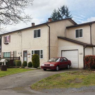
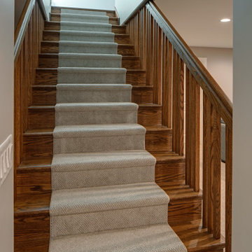
Well priced 1/2 duplex on a large lot with a large level yard. This home is 1166 sq/ft feet on two levels with 3 bedrooms and 1 1/2 baths. The main has a spacious livingroom and dining area and a low maintenance kitchen leading to a west facing 30'x32' patio and an large side yard with a garden and storage shed. Well maintained home with some updates, recent paint, laminate floors. Master bedroom with walk in closet. Small storage room up as well. Bonus single attached garage and lots of parking out front. Short walk to Langford town centre amenities, and schools and bus rote. Vacant so a quick possession is fine.
 Drury Design
The Setup:
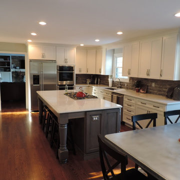
After purchasing this home, the homeowners faced a unique opportunity to reimagine their kitchen and nearby spaces. Water damage from a burst pipe had left much of the home’s interior in need of repair, and while the existing kitchen was functional and in relatively good shape, it didn’t align with the family’s vision for their new home. The layout included a peninsula that wasn’t ideal, and there were some druthers with the nearby pantry.
Since the space needed to be rebuilt anyway, the homeowners saw this as a chance to create a kitchen that was both highly functional for their four young children and timeless in its design. The project also included a refresh of the adjacent message center and dining room — spaces that play key roles in the family’s daily life. The goal was to create a cohesive flow between these areas, balancing modern functionality with the craftsman-inspired character of the rest of the home.
Design Objectives:
- Replace the outdated peninsula with a large island to maximize counter space and create new seating options.
- Open up the space visually by removing soffits and rethinking the cabinetry layout.
Incorporate concealed refrigeration and freezer units to provide significant storage for the family while maintaining a streamlined aesthetic.
- Integrate black cabinetry into the design without making the space feel harsh or heavy.
- Ensure the lighting plan balances functional task lighting with ambient accent lighting.
- Avoid visual clutter in the cabinetry design while still giving a nod to the craftsman aesthetic.
- Incorporate a slab backsplash as a key design feature.
Design Challenges:
- The outdated peninsula left dead space in the kitchen and lacked sufficient seating for the family.
- The cooktop wall was cramped, with small cabinets flanking the hood, limited storage, and soffits that made the space feel closed-in.
- The family needed significant refrigeration space (two refrigerators and a freezer) but wanted to avoid a cluttered look with visible stainless steel appliances.
- Adding black cabinetry risked making the space feel too dark or heavy.
- The original lighting plan was insufficient, particularly over the dining table where a decorative fixture proved too dim.
- The family wanted shaker-style drawer fronts to match the home’s arts-and-crafts design but worried that too much shaker cabinetry might look overly busy.
- Prioritizing a slab backsplash in the wish list priority planning.
The Renewed Space
Design Solutions:
- A functional island: The peninsula was replaced with a large island that provides continuous countertop space for prepping and serving. The island also features seating for four people, creating a central hub for informal meals and activities.
- Streamlined cooktop wall: The soffits were removed, and the upper cabinets on the cooktop wall were eliminated to create a more open, streamlined design. A custom oversized hood became the focal point of the wall, with the blower unit offset inside it to align with the cooktop while maintaining exterior visual symmetry.
- Concealed refrigeration: Two column refrigerators and one freezer were integrated into the cabinetry, concealing them behind wood paneling that blends seamlessly with the overall design.
- Warm black cabinetry: The black cabinetry was crafted from hickory with a visible grain, softening its appearance and adding warmth. The grain detail gives the cabinetry a rich, textured look that avoids feeling stark or overpowering.
- Additional lighting: In the dining area, recessed can lights were added during an additional installation phase to supplement the gorgeous decorative fixture’s dim output. The new lighting plan creates a layered effect, combining functional task lighting with softer ambient lighting.
- Simplified cabinetry details: Slab drawer fronts were used on the upper drawers, while five-piece shaker fronts (with slightly less prominent rail and stile pieces) were reserved for the middle and lower drawers. This approach simplified the overall look while maintaining the craftsman-inspired aesthetic.
- Slab backsplash priority: The slab backsplash was prioritized by making thoughtful adjustments elsewhere, like opting not to extend cabinetry to the ceiling, which also helped visually prioritize the gorgeous slab backsplash. This decision also enhanced the kitchen’s furniture-like feel, aligning with the home’s craftsman character.
- This kitchen perfectly balances practicality with timeless style. By addressing the family’s functional needs — ample seating, smart storage, and effective lighting — while incorporating thoughtful design elements like warm black cabinetry and a striking slab backsplash, Alicia created a space that works beautifully for a busy household. The result is a cohesive, inviting kitchen that honors the home’s craftsman roots and will serve the family well for years to come.
 Maison Birmingham
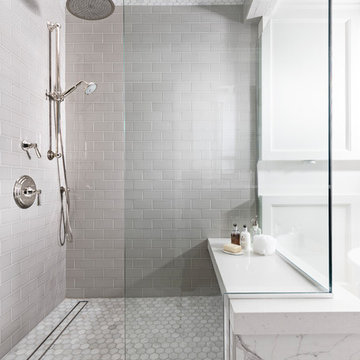
Challenged with creating an updated, more functional bath within this well-preserved 1937 Grosse Pointe home, our team began by reworking the layout in order to accommodate a separate soaking tub and shower (previously one bathtub with shower head), as well as a dual vanity (previously just one pedestal sink). The space was tight, but we were able to incorporate these new elements with a very efficient floor plan, and maintain a light airy feel by carefully selecting materials that would still bring a historic warmth to the space without creating darkness or heaviness.
Encasing the new shower in glass was the first step in allowing daylight to reach all the way back to the bathroom’s entrance. Beautiful polished nickel plumbing fixtures, lights, hardware, and pivot mirrors bring in a warm element that continuously bounces light and shine around the space. Wanting to stay true to classic materials, but also balance the homeowners’ desire for functionality and practicality, porcelain tile and quartz were used for the main floor tile and countertop, while a white marble hexagon mosaic is inlaid into the floor, shower floor, and shower ceiling. Five foot high wainscoting panels adorn the new bathroom walls to bring in light and warmth, as well as a nod to the previous pink tile that came up to the same height.
Photography by Martin Vecchio
 Gallery KBNY
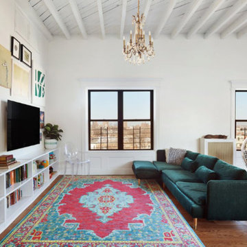
For this Brooklyn condo renovation, Gallery Kitchen and Bath updated the entire kitchen and both bathrooms, as well as painted and laid out new flooring throughout the entire apartment. The owners wanted to unite the seeming medley of the existing space into a cohesive design more representative of their own style. With its ultra-high ceilings and exposed joints and beams, the space already lent itself to the farmhouse look. The end result is a modernized, eclectic farmhouse style that we keenly carried throughout the home.
MORE DETAILS
Compelling textures and color combos reign supreme. The kitchen features semi-custom Shaker-style stone gray cabinets, a white subway tile backsplash running all the way up the wall, and white quartz countertops. We built the island in part to create a pleasing yet efficient flow from the kitchen into the living and dining areas as the space was opened up. We also painted the plumbing stack white to not make it stand out.
We also redesigned the bathrooms, giving each a unique treatment. In the master bath, we took a Victorian-goes-modern approach with coral walls, champagne fixtures, and a clawfoot tub. In the guest bathroom, we stuck to a transitional style that approaches modern without becoming contemporary, pairing herringbone marble floor tiles with a mix of subway and penny tiles on the walls and in the shower. Both maintain elements, such as tiles, fixtures, and colors, that coordinate with the overall eclectic farmhouse look.
HOW WE COLLABORATE
Collaboration with our clients to their desired degree is one of our core pillars. In this condo renovation, the clients wanted central air and were initially considering a true central air system. We advised against it, as not only would it take away from the unique beauty of unusually tall ceilings by adding unsightly ductwork, but it would also significantly detract from the farmhouse look. Instead, we suggested a mini-split system. Our recommended units were both cost-effective and much more complementary to the comprehensive theme. Of course, we ultimately always honor the clients’ choices but it’s just as important to us that we make sure to provide all the necessary information so our clients can make educated decisions that are best for their needs.
SPACE PLANNING
Another key element of the renovation process is space planning. From this perspective, we consider the placement and positioning of objects with regard to the overall flow of space. The building where this renovation took place is U-shaped at one end, which happens to be where this particular apartment is located. Uniquely-shaped spaces naturally require more concentration than those built in the standard rectangular shape. Questions we consider include: Where will people really spend time in this space? What will the flow of foot traffic be? Is there easy access to the kitchen island? Does it flow well into the hallways? Does the island protrude into anything? Working in New York, with its variety of homes and architectural styles, has greatly developed our experience with standard spaces and unconventional ones alike.
SOME HIGHLIGHTS
- Ultra-tall ceilings, allowing for stacked cabinets in the kitchen, as well as long pendant light fixtures and more chandeliers than usual throughout the home
- Completely refurbished cast iron clawfoot tub in one bathroom, with a 270-degree shower curtain around the tub
- Vibrant color choices, including an all-blue bedroom in various shades
- Treated exposed brick walls
Fun Fact: A client once showed us inspiration photos that they sourced online of this exact project, having no idea it was one of ours.
Thinking about renovating your condo? Contact us today to find out how you can benefit from our expertise in remodeling New York City condos. We are a design-and-build firm with a full-scale approach that handles every single aspect of your condo renovation from start to finish.

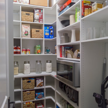 Drury Design
The Setup:
After purchasing this home, the homeowners faced a unique opportunity to reimagine their kitchen and nearby spaces. Water damage from a burst pipe had left much of the home’s interior in need of repair, and while the existing kitchen was functional and in relatively good shape, it didn’t align with the family’s vision for their new home. The layout included a peninsula that wasn’t ideal, and there were some druthers with the nearby pantry.
Since the space needed to be rebuilt anyway, the homeowners saw this as a chance to create a kitchen that was both highly functional for their four young children and timeless in its design. The project also included a refresh of the adjacent message center and dining room — spaces that play key roles in the family’s daily life. The goal was to create a cohesive flow between these areas, balancing modern functionality with the craftsman-inspired character of the rest of the home.
Design Objectives:
- Replace the outdated peninsula with a large island to maximize counter space and create new seating options.
- Open up the space visually by removing soffits and rethinking the cabinetry layout.
Incorporate concealed refrigeration and freezer units to provide significant storage for the family while maintaining a streamlined aesthetic.
- Integrate black cabinetry into the design without making the space feel harsh or heavy.
- Ensure the lighting plan balances functional task lighting with ambient accent lighting.
- Avoid visual clutter in the cabinetry design while still giving a nod to the craftsman aesthetic.
- Incorporate a slab backsplash as a key design feature.
Design Challenges:
- The outdated peninsula left dead space in the kitchen and lacked sufficient seating for the family.
- The cooktop wall was cramped, with small cabinets flanking the hood, limited storage, and soffits that made the space feel closed-in.
- The family needed significant refrigeration space (two refrigerators and a freezer) but wanted to avoid a cluttered look with visible stainless steel appliances.
- Adding black cabinetry risked making the space feel too dark or heavy.
- The original lighting plan was insufficient, particularly over the dining table where a decorative fixture proved too dim.
- The family wanted shaker-style drawer fronts to match the home’s arts-and-crafts design but worried that too much shaker cabinetry might look overly busy.
- Prioritizing a slab backsplash in the wish list priority planning.
The Renewed Space
Design Solutions:
- A functional island: The peninsula was replaced with a large island that provides continuous countertop space for prepping and serving. The island also features seating for four people, creating a central hub for informal meals and activities.
- Streamlined cooktop wall: The soffits were removed, and the upper cabinets on the cooktop wall were eliminated to create a more open, streamlined design. A custom oversized hood became the focal point of the wall, with the blower unit offset inside it to align with the cooktop while maintaining exterior visual symmetry.
- Concealed refrigeration: Two column refrigerators and one freezer were integrated into the cabinetry, concealing them behind wood paneling that blends seamlessly with the overall design.
- Warm black cabinetry: The black cabinetry was crafted from hickory with a visible grain, softening its appearance and adding warmth. The grain detail gives the cabinetry a rich, textured look that avoids feeling stark or overpowering.
- Additional lighting: In the dining area, recessed can lights were added during an additional installation phase to supplement the gorgeous decorative fixture’s dim output. The new lighting plan creates a layered effect, combining functional task lighting with softer ambient lighting.
- Simplified cabinetry details: Slab drawer fronts were used on the upper drawers, while five-piece shaker fronts (with slightly less prominent rail and stile pieces) were reserved for the middle and lower drawers. This approach simplified the overall look while maintaining the craftsman-inspired aesthetic.
- Slab backsplash priority: The slab backsplash was prioritized by making thoughtful adjustments elsewhere, like opting not to extend cabinetry to the ceiling, which also helped visually prioritize the gorgeous slab backsplash. This decision also enhanced the kitchen’s furniture-like feel, aligning with the home’s craftsman character.
- This kitchen perfectly balances practicality with timeless style. By addressing the family’s functional needs — ample seating, smart storage, and effective lighting — while incorporating thoughtful design elements like warm black cabinetry and a striking slab backsplash, Alicia created a space that works beautifully for a busy household. The result is a cohesive, inviting kitchen that honors the home’s craftsman roots and will serve the family well for years to come.
 Gallery KBNY
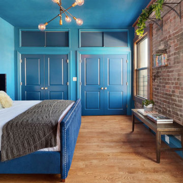
For this Brooklyn condo renovation, Gallery Kitchen and Bath updated the entire kitchen and both bathrooms, as well as painted and laid out new flooring throughout the entire apartment. The owners wanted to unite the seeming medley of the existing space into a cohesive design more representative of their own style. With its ultra-high ceilings and exposed joints and beams, the space already lent itself to the farmhouse look. The end result is a modernized, eclectic farmhouse style that we keenly carried throughout the home.
MORE DETAILS
Compelling textures and color combos reign supreme. The kitchen features semi-custom Shaker-style stone gray cabinets, a white subway tile backsplash running all the way up the wall, and white quartz countertops. We built the island in part to create a pleasing yet efficient flow from the kitchen into the living and dining areas as the space was opened up. We also painted the plumbing stack white to not make it stand out.
We also redesigned the bathrooms, giving each a unique treatment. In the master bath, we took a Victorian-goes-modern approach with coral walls, champagne fixtures, and a clawfoot tub. In the guest bathroom, we stuck to a transitional style that approaches modern without becoming contemporary, pairing herringbone marble floor tiles with a mix of subway and penny tiles on the walls and in the shower. Both maintain elements, such as tiles, fixtures, and colors, that coordinate with the overall eclectic farmhouse look.
HOW WE COLLABORATE
Collaboration with our clients to their desired degree is one of our core pillars. In this condo renovation, the clients wanted central air and were initially considering a true central air system. We advised against it, as not only would it take away from the unique beauty of unusually tall ceilings by adding unsightly ductwork, but it would also significantly detract from the farmhouse look. Instead, we suggested a mini-split system. Our recommended units were both cost-effective and much more complementary to the comprehensive theme. Of course, we ultimately always honor the clients’ choices but it’s just as important to us that we make sure to provide all the necessary information so our clients can make educated decisions that are best for their needs.
SPACE PLANNING
Another key element of the renovation process is space planning. From this perspective, we consider the placement and positioning of objects with regard to the overall flow of space. The building where this renovation took place is U-shaped at one end, which happens to be where this particular apartment is located. Uniquely-shaped spaces naturally require more concentration than those built in the standard rectangular shape. Questions we consider include: Where will people really spend time in this space? What will the flow of foot traffic be? Is there easy access to the kitchen island? Does it flow well into the hallways? Does the island protrude into anything? Working in New York, with its variety of homes and architectural styles, has greatly developed our experience with standard spaces and unconventional ones alike.
SOME HIGHLIGHTS
- Ultra-tall ceilings, allowing for stacked cabinets in the kitchen, as well as long pendant light fixtures and more chandeliers than usual throughout the home
- Completely refurbished cast iron clawfoot tub in one bathroom, with a 270-degree shower curtain around the tub
- Vibrant color choices, including an all-blue bedroom in various shades
- Treated exposed brick walls
Fun Fact: A client once showed us inspiration photos that they sourced online of this exact project, having no idea it was one of ours.
Thinking about renovating your condo? Contact us today to find out how you can benefit from our expertise in remodeling New York City condos. We are a design-and-build firm with a full-scale approach that handles every single aspect of your condo renovation from start to finish.
 Home Advertising
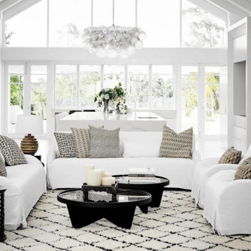
A Hampton style sofa has become a necessity in home decor as people become more familiar with the Hampton interior style. Hampton style sofas are a good choice for timeless design if you are replacing or buying a new one. When you are uncertain of what you want, buying a sofa can seem challenging. If you're trying to select La maison hampton furniture for one of your home's most important rooms, you have a lot to take into account. It maust suit your taste and function.
Couches require thought and consideration. It is important that you choose a style and a color that goes well with your living area, along with a durable material that meets your needs. The front door must also be able to accommodate the rug. So, don't forget to familiarize yourself with the different sizes, fillings, and textures before creating your budget. You don't have to spend a lot of money on a new sofa, but while there are some places where you can save money, there are others where you should invest.
First, Let's Talk about the Vibe of sofa style
First and foremost, you should consider the style of your sofa. Choose a sofa whose style fits the current theme of your home. It may seem very obvious, but many people simply buy whatever suits their fancy, and unfortunately, the style of the room is a lot of the time different from what suits their fancy.
If the rug or the art above the sofa don't go together, it might not work in the room. It's imperative to get the look right before adding the rest of these elements. Make sure you consider how you wish the room to feel when you're in it. If you're looking for something more colorful, or you have a particular style in mind, such as mid-century (then googling 'Hampton style sofas' will prove valuable). A sofa that looks great but is super-comfy might end up looking completely out of place if you skip this step.
Next, We will Discuss Functionality of sofas
It is important to consider what you will be doing with the sofa. Although I am convinced that the answer is "to sit on", we need to dig deeper. Can you, for instance, sit down for drinks in this formal sitting room when company comes over? Do you watch television in this room every day? There is a rumpus room upstairs for the kids to interact with their friends and eat and drink on it? There might be Hampton style sofas in the guest room.
For your convenience, I have compiled a full list of Hampton style sofas here. Depending on the situation, each sofa style needs to be different. Typically, formal couches tend to be less comfortable. They're usually more rigid and upright. Couches for watching TV should be cushier; they should be comfortable. We know that many teens are not concerned about Hampton style sofas maintenance, so kids zones need sofas that are able to withstand more wear and tear. This is something high schools should teach.
This story shows you the importance of not skipping this important ‘how will it be used? At this point, you should have an idea of how you'll use the Hampton style sofas. Consider, for instance, a sofa with a bold color and a formal feel for your living room. If you want a couch with a relaxed feel, choose a neutral shade with a cushy feel.
Dimensions of an ideal hamptons style sofa
Before you buy a Hampton style sofa, you must measure the size of your current living room. You will probably not fit it if you don't do this. A large one will either overwhelm the room and leave no room for a coffee table, or a small one will look dwarfed in comparison. When a pandemic strikes, scale is everything.
You should be able to fit the sofa into the room comfortably without it feeling too large or small. Measure the width of your La maison hampton furniture style sofas first with a tape measure. Consider if you'd like side tables beside your sofa. In that case, you would need to measure the width of either side of your sofa and add around 50cm to either side (most decent side tables have a width of about 50cm).
In addition to measuring Hampton style sofas depth, you should also measure the width. There are some sofas that can be as deep as a metre (from the front of the sofa cushion to its back). Since your sofa will need an allowance of 50cm from the edge of the coffee table to the front of the sofa, and a minimum of 50cm on the other side of the coffee table, you might want to measure your current coffee table to ensure it matches.
Another Important Factor is Height
In an open-plan living room, this element is particularly important if your sofa crosses the space. When you have a sectional sofa, for example, one of the ends will likely cut across the room, so the back should be low so your eye can still pass over the back.
One of the top 10 living room design mistakes I make is to place tall-backed Hampton style sofas across the room, a mistake that really cramps the style of the whole space. It happens way too often.
Although the height won't be a major issue if the sofa is backed up against a wall, it is still worth considering the size of the art you want to hang above it. If you want neck support whilst watching TV, a low-back sofa might not be for you. My neck tends to become less and less flexible as I get older. It's a sad fact, but true nonetheless. If you find yourself in the same situation, you should consider high-back Hampton style sofas.
Sofa Cushions: How Low are They?
Many people don't think about this dimension when purchasing a sofa online, especially if they're doing so for the first time. If you're road-testing the sofa in-store, you'll know if it's too low for you right away, but an online purchase is something else. Low-profile sofas have a seat height of 40 cm or less. The sofa's 60cm seat height will make it much more difficult to get up and out of it. The importance of this factor increases as we age or if we have mobility problems.
The seat you're sitting in should allow you to stand up comfortably, without feeling like you need assistance. Additionally, the height of your coffee table should not be higher than the seat cushions on the sofa, because the table should never be higher than the seat cushions on the sofa. They should never be higher than each other. Make sure you take notes!
What Else is There in the Room?
A good idea when choosing a sofa is to consider what other elements will be in the room. For a well-designed, elegantly-resolved living room, you'll need a sofa, rug, coffee table, side table/s, lamp, TV unit, and wall art. The room will not feel right if you buy a massive sectional sofa that takes up the entire room and leaves no space for a coffee table or side tables.
You should measure out your sofa, keeping in mind that the other pieces La maison hampton furniture and decor will also need to fit into the space. All pieces of furniture need to have enough space to breathe. It's best not to have all the furniture crammed into the point where sitting down means hitting your legs or feet against pieces. You probably now understand that choosing a couch is more about the couch itself than with how to choose it. So think of the big picture whenever you choose something.
Two Two-Seaters, or a Sectional Sofa?
People often have to wrestle with the question of whether they should buy two sofas or one sectional when figuring out how to choose a sofa. Sectionals are usually preferable to two separate two-seater sofas. However, the corner piece is rarely occupied anyway. Often, the corner piece of a sectional is so tiny that it is impossible for a person to sit there comfortably. Therefore, think about whether you actually need this over getting two x two-seater sofas and arranging them into an L-shape.
If you don't have a large living room, you might prefer 2 x two-seater sofas instead. Sectional sofas are best for larger rooms. With the visual break of all that fabric dominating the corner, it will do the room a world of good. Furthermore, you can use the space between your sofas to put a side table so you can place drinks, or a table lamp, there.
You may want to consider getting 1 x two-seater sofa and an armchair instead, if you have a really small living room. Even though you want to seat as many people as possible, you should let the room determine how many people the sofa can accommodate.
A Guide to Picking the Right Material
The material of the sofa is obviously very important when it comes to picking out the right one. The best advice I can offer is to consider who will use the sofa and how that will impact maintenance.
Leather sofas are easier to clean than fabric ones when kids or pets are present. Leather has the disadvantage of retaining heat in the winter and being cold in the summer. Cushions work well with leather sofas, but velvet ones work better with leather sofas. Leather will show up claw marks more easily on some pets (like my cats).
It is true that fabric sofas are softer and cozier, but they can also be more difficult to clean. Having a slipcover sofa is a godsend if you have pets or toddlers, but they're not too easy to maintain.
You should consider how much patience you have to keep the sofa clean and who uses it. That will make it easier to decide what material to use. I work with a sofa supplier who has bomb-proof fabric that is so easy to clean that you can literally serve dinner right onto the cushions without making an utter mess.
 Drury Design
The Setup:
After purchasing this home, the homeowners faced a unique opportunity to reimagine their kitchen and nearby spaces. Water damage from a burst pipe had left much of the home’s interior in need of repair, and while the existing kitchen was functional and in relatively good shape, it didn’t align with the family’s vision for their new home. The layout included a peninsula that wasn’t ideal, and there were some druthers with the nearby pantry.
Since the space needed to be rebuilt anyway, the homeowners saw this as a chance to create a kitchen that was both highly functional for their four young children and timeless in its design. The project also included a refresh of the adjacent message center and dining room — spaces that play key roles in the family’s daily life. The goal was to create a cohesive flow between these areas, balancing modern functionality with the craftsman-inspired character of the rest of the home.
Design Objectives:
- Replace the outdated peninsula with a large island to maximize counter space and create new seating options.
- Open up the space visually by removing soffits and rethinking the cabinetry layout.
Incorporate concealed refrigeration and freezer units to provide significant storage for the family while maintaining a streamlined aesthetic.
- Integrate black cabinetry into the design without making the space feel harsh or heavy.
- Ensure the lighting plan balances functional task lighting with ambient accent lighting.
- Avoid visual clutter in the cabinetry design while still giving a nod to the craftsman aesthetic.
- Incorporate a slab backsplash as a key design feature.
Design Challenges:
- The outdated peninsula left dead space in the kitchen and lacked sufficient seating for the family.
- The cooktop wall was cramped, with small cabinets flanking the hood, limited storage, and soffits that made the space feel closed-in.
- The family needed significant refrigeration space (two refrigerators and a freezer) but wanted to avoid a cluttered look with visible stainless steel appliances.
- Adding black cabinetry risked making the space feel too dark or heavy.
- The original lighting plan was insufficient, particularly over the dining table where a decorative fixture proved too dim.
- The family wanted shaker-style drawer fronts to match the home’s arts-and-crafts design but worried that too much shaker cabinetry might look overly busy.
- Prioritizing a slab backsplash in the wish list priority planning.
The Renewed Space
Design Solutions:
- A functional island: The peninsula was replaced with a large island that provides continuous countertop space for prepping and serving. The island also features seating for four people, creating a central hub for informal meals and activities.
- Streamlined cooktop wall: The soffits were removed, and the upper cabinets on the cooktop wall were eliminated to create a more open, streamlined design. A custom oversized hood became the focal point of the wall, with the blower unit offset inside it to align with the cooktop while maintaining exterior visual symmetry.
- Concealed refrigeration: Two column refrigerators and one freezer were integrated into the cabinetry, concealing them behind wood paneling that blends seamlessly with the overall design.
- Warm black cabinetry: The black cabinetry was crafted from hickory with a visible grain, softening its appearance and adding warmth. The grain detail gives the cabinetry a rich, textured look that avoids feeling stark or overpowering.
- Additional lighting: In the dining area, recessed can lights were added during an additional installation phase to supplement the gorgeous decorative fixture’s dim output. The new lighting plan creates a layered effect, combining functional task lighting with softer ambient lighting.
- Simplified cabinetry details: Slab drawer fronts were used on the upper drawers, while five-piece shaker fronts (with slightly less prominent rail and stile pieces) were reserved for the middle and lower drawers. This approach simplified the overall look while maintaining the craftsman-inspired aesthetic.
- Slab backsplash priority: The slab backsplash was prioritized by making thoughtful adjustments elsewhere, like opting not to extend cabinetry to the ceiling, which also helped visually prioritize the gorgeous slab backsplash. This decision also enhanced the kitchen’s furniture-like feel, aligning with the home’s craftsman character.
- This kitchen perfectly balances practicality with timeless style. By addressing the family’s functional needs — ample seating, smart storage, and effective lighting — while incorporating thoughtful design elements like warm black cabinetry and a striking slab backsplash, Alicia created a space that works beautifully for a busy household. The result is a cohesive, inviting kitchen that honors the home’s craftsman roots and will serve the family well for years to come.
 Bennett Contracting, Inc.
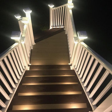
Our next project gave us an amazing opportunity to work with a delightful couple who wanted to breathe new life into their outdated and deteriorated 2-tier wooden deck. Upon assessing the space as well as the wants and needs of our clients, Project Manager, EJ Bonacker, knew it was evident that there was immense potential for improvement. He proposed to shift the deck to a single level and incorporate a Trex RainEscape system. This ingenious addition ensured the area below the deck would remain dry and usable no matter the weather conditions and would also maximize space for entertaining friends and family. Low maintenance TimberTech decking and Titan railings were used which will allow our clients to spend more time enjoying the deck rather than maintaining it. While the older deck did have some lighting, we proposed a comprehensive lighting upgrade which included lights around the perimeter as well as well-lit stairs leading to the ground level which enhanced not only the aesthetics but also the safety during evening gatherings. One of our favorite pieces of this project was designing a special nook for the grill as to not encroach on the primary entertainment area. Our clients were ecstatic we were able to complete their project just in time for the Fourth of July celebrations so they could share laughter, delicious food and create beautiful memories with their neighbors, kids and grandkids. We look forward to helping these clients with more projects for years to come!
 Columbia Roofing Inc.
Mr. Mescher – Home Owner Shares Story
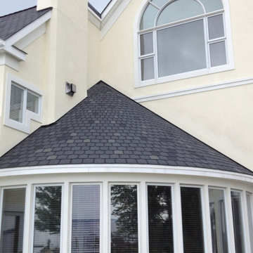
“I wanted to take this opportunity to tell you that I am extremely pleased with the work that Columbia Roofing did in replacing the roof on our Kent Island home. The house has a complicated roof structure with multiple gables and a quarter round conical roof which spans between two vertical walls in the back. We choose a 50 year Owens Corning shingle and to assure a good job, we only obtained quotes from roofing companies that received outstanding reviews.
We were pleased when the Columbia production crew roofed the house without issue and brought the full visual effect of slate using the 4 tab asphalt shingle with its distinctive keyway.
When it came to the conical roof, we were faced with the possibility of having to install a metal roof in lieu of maintaining the slate like appearance that was so prominent on the other roof sections of the house. Our preference was to maintain the appearance of slate on the conical section similar to that seen on the old slate roof cathedrals. While this is easy to say, I can now appreciate how difficult it is to do.
To honor our wishes, Ben Alsop came to the house and worked through the complicated layout necessary to use the same 4 tab shingles on the conical section. To do the job properly, every single 4 tab shingle had to be cut into individual tabs.
Each tab was then taken up on the roof where the keyway was aligned to vertical through a system of straight lines drawn from the point of the conical roof to the starter shingle at the roof’s edge. Each tab had to be cut again (often multiple times) after the tab alignment was complete. To assure the accuracy necessary to maintain the visual effect, Ben took it upon himself to personally perform the roofing of the conical section.
Ben is a manager for Columbia Roofing who no longer performs the physical roofing work after coming up through the ranks of the roofing trade. His personal dedication to getting this job done for us in a way that is simply stellar could not go without acknowledgement. Ben is not only a craftsman, he is an artisan whose skill set can clearly be seen in the pictures that I have attached.
I want to thank Columbia Roofing for a job well done and particularly I want to thank Ben for taking the time and putting in the effort to truly make this a stellar installation.”


 Vintage Cellars & Saunas
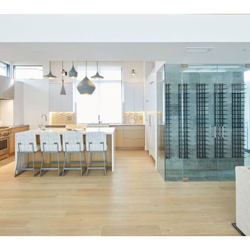
Completely enclosed in glass, this custom wine cellar in Hermosa Beach, Los Angeles, California, is sure to turn some heads. Located directly off of the kitchen and dining room, this custom wine room / glass wine cellar / modern wine cellar / contemporary wine cellar holds upwards of 200 bottles. Glass, Metal, and stone are all utilized in our favorite combination for a gorgeous contemporary masterpiece.
Double deep metal wine racks / metal wine racking is utilized here, placed a few feet off of the ground to allow for potential case storage space on the tile below. Black metal wine racking was also chosen, as opposed to silver metal wine racks in order to really make the space pop.
The glass here is single pane. Master Wine Cellar Builders and Design Build team at Vintage Cellars recommend using dual paned, thermally insulated glass in wine cellars to minimize potential for condensation, as well as making sure that your wine cellar is able to maintain proper temperature and humidity constantly. Single pane glass simply does not have a high enough R Value of insulation, though it can make the space look a bit more clean and elegant.
The cooling system was recessed and ducted into the ceiling to ensure the minimalist look was achieved for this wine cellar / glass wine cellar / modern wine room / modern glass wine cellar / modern glass wine room / contemporary wine room.
This home beautifully blends modern, contemporary, and traditional design features. Wood, marble, stone, glass, and metal all come together beautifully to make this space cool and sleek, but also warm and homey.
Here in Newport Coast, Newport Beach, Orange County, California, modern / contemporary architecture is THE design trend. In a home which mixes the best of traditional and contemporary, this custom wine cellar / custom wine room fits like a glove.
Double sided glass walls enclose this custom wine cellar, with one side visible from the living room, the other from the dining room. Floor to ceiling black metal wine racks line each wall - dual sided as to maximize horizontal label forward design and display.
Vintage Cellars, master wine cellar builders out of San Diego, California, were able to design a beautiful looking and equally utilitarian cellar here, fitting over 675 wine bottles with ease.
The cooling unit was an RM Coil, traditionally mounted into the racks - but in this instance was recessed into the ceiling. The cooling unit and heat load calculation took into account that there were two large walls of glass here - knowing fully that there would be substantial heat loss through the large single panes on either end.
Within the room, beige stone accentuates the contemporary / modern look and matches stunningly with the color scheme and other design features in the surrounding rooms as well. A wine cellar / wine room / wine vault / wine wall / wine closet / custom wine cellar / custom wine wall / custom wine room / custom wine closet / custom wine vault / custom wine storage room like this is a real jaw dropper when incorporated into the main living areas in the home. Wine as art is a beautiful thing.
Wine Cellars like this can be found all over Orange County, in areas such as Newport Beach, Newport Coast, Crystal Cove, Emerald Bay, Huntington Beach, Coto De Caza, Ladera Ranch, Laguna Niguel, Laguna Hills, Laguna Beach, Aliso Viejo, Costa Mesa, Irvine, San Clemente, Dana Point, Lake Forest, Mission Viejo, and more.
With so many different kinds of wine racks / wine racking / wine cellar designs and styles, you can really go in any and every direction in the discovery and design phase of a custom wine cellar project. The Custom wine cellar builder custom wine cellar builders team at Vintage Cellars make the entire process exciting, informative, and smooth from start to finish.
Vintage Cellars has built gorgeous custom wine cellars and wine storage rooms across the United States and World for over 32 years. We are your go-to business for anything wine cellar and wine storage related! Whether you're interested in a wine closet, wine racking, custom wine racks, a custom wine cellar door, or a cooling system for your existing space, Vintage Cellars has you covered!
We carry all kinds of wine cellar cooling and refrigeration systems, incuding: Breezaire, CellarCool, WhisperKool, Wine Guardian, CellarPro and Commercial systems.
We also carry many types of Wine Refrigerators, Wine Cabinets, and wine racking types, including La Cache, Marvel, N'Finity, Transtherm, Vinotheque, Vintage Series, Credenza, Walk in wine rooms, Climadiff, Riedel, Fontenay, and VintageView.
Vintage Cellars also does work in many styles, including Contemporary and Modern, Rustic, Farmhouse, Traditional, Craftsman, Industrial, Mediterranean, Mid-Century, Industrial and Eclectic.
Some locations we cover often include: Agora Hills, Alameda, Albany, Alhambra, Aliso Viejo, Altadena, Anaheim, Angwin, Arcadia, Aromas, Arroyo Grande, Atascadero, Atherton, Avila Beach, Balboa Terrace, Bel Air, Belmont, Belvedere, Benton, Berkeley, Bermuda Dunes, Beverly Hills, Big Sur, Bolinas, Boyle Heights, Bradbury, Bradley, Brea, Brentwood, Bridgeport, Brisbane, Buellton, Buena Park, Burbank, Burlingame, Calabasas, Calistoga, Cambria, Canoga Park, Cardiff, Carlsbad, Carmel, Carmel By The Sea, Carmel Valley, Carnelian Bay, Carpinteria, Casmalia, Castroville, Cathedral City, Cayucos, Chatsworth, Chualar, City of LA, City of SF, Coachella, Coleville, Colma, Corona Del Mar, Coronado, Coronado Island, Corte Madera, Costa Mesa, Coto De Caza, Creston, Crystal Cove, Cupertino, Cypress, Danville, Deer Park, Del Mar, Diablo, Duarte, Eagle Rock, East Palo Alto, East Pasadena, Echo Park, El Granada, El Monte, Emeryville, Encinitas, Encino, Fairfax, Foster City, Fountain Valley, Fremont, Fullerton, Garden Grove, Glendale, Golden Gate Park, Goleta, Gonzales, Granada Hills, Granite Bay, Greenbrae, Greenfield, Grover Beach, Guadalupe, Half Moon Bay, Hancock Park, Harmony, Hidden Hills, Hillsborough, Hollywood, Hollywood Hills, Huntington Beach, Indian Wells, Indio, Industry, Inner Richmond, Inverness, Irvine, Jolon, June Lake, Kentfield, King City, La Canada Flintridge, La Habra, La Honda, La Jolla, La Palma, La Quinta, Ladera Heights, Laguna Beach, Laguna Hills, Laguna Niguel, Laguna Woods, Lake Balboa, Lake Forest, Lake Tahoe, Lake View Terrace, Larkspur, Laurel Canyon, Lee Vining, Lockwood, Lompoc, Long Beach, Los Alamitos, Los Alamos, Los Altos, Los Altos Hills, Los Angeles, Los Gatos, Los Olivos, Los Osos, Malibu, Mammoth Lakes, Manhattan Beach, Marin, Marina, Marshall, Mayflower Village, Menlo Park, Mill Valley, Millbrae, Mission Hills, Mission Viejo, Mono, Monrovia, Montara, Montebello, Monterey, Monterey Park, Morro Bay, Moss Beach, Moss Landing, Mountain View, Napa, New Cuyama, Newark, Newport Beach, Newport Coast, Nicasio, Nipomo, North Hills, Northridge, Novato, Oakland, Oakville, Ocean Beach, Oceano, Orange, Orange County, Pacific Grove, Pacific Palisades, Pacoima, Palm Desert, Palm Springs, Palo Alto, Palos Verdes, Panorama City, Pasadena, Paso Robles, Pebble Beach, Pescadero, Piedmont, Pismo Beach, Placentia, Point Reyes Station, Pope Valley, Portola Valley, Presidio, Presidio Heights, Rancho Mirage, Rancho Santa Fe, Rancho Santa Margarita, Redondo Beach, Redwood City, Reseda, Rosemead, Russian Cliff, Rutherford, Saint Helena, Salinas, San Anselmo, San Ardo, San Bruno, San Carlos, San Clemente, San Diego, San Fernando, San Francisco, San Gabriel, San Gregorio, San Jose, San Juan Capistrano, San Leandro, San Lorenzo, San Lucas, San Luis Obispo, San Marino, San Mateo, San Miguel, San Rafael, San Simeon, Santa Ana, Santa Barbara, Santa Clara, Santa Clarita, Santa Margarita, Santa Maria, Santa Monica, Santa Ynez, Saratoga, Sausalito, Sea Cliff, Seal Beach, Seaside, Shadow Hills, Shandon, Sherman Oaks, Sierra Madre, Silver Lake, Solana Beach, Soledad, Solvang, Sonoma, South El Monte, South Pasadena, South San Gabriel, Spreckels, Squaw Valley, St Helena, Stanford, Stanton, Stinson Beach, Stough Park, Studio City, Summerland, Sun Valley, Sunland, Sunnyvale, Sylmar, Tahoe City, Tahoe Vista, Tarzana, Temple City, Templeton, Thousand Oaks, Thousand Palms, Tiburon, Toluca Lake, Topanga, Topaz, Torrey Pines, Tujanga, Tustin, Union City, Valencia, Verdugo Mountains, Vernon, Villa Park, Walnut, Walnut Creek, West Puente Valley, Westminster, Westwood, Whittier, Woodside, Yorba Linda, Yountville
San Diego Wine Cellars, Rancho Santa Fe Wine Cellars, Beverly Hills Wine Cellars, Bel Air Wine Cellars, Orange County Wine Cellars, Newport Beach Wine Cellars, San Francisco Wine Cellars, Napa Wine Cellars, Sonoma Wine Cellars, Los Angeles Wine Cellars, Santa Barbara Wine Cellars, Palm Desert Wine Cellars, La Jolla Wine Cellars, Del Mar Wine Cellars, Coronado Wine Cellars, Pacific Palisades Wine Cellars, Malibu Wine Cellars, Santa Monica Wine Cellars, Brentwood Wine Cellars, Laguna Wine Cellars, Crystal Cove Wine Cellars, Hollywood Wine Cellars, Bay Area Wine Cellars, South Bay Wine Cellars, LA Wine Cellars, SD Wine Cellars, OC Wine Cellars, SF Wine Cellars, Huntington Beach Wine Cellars, Carlsbad Wine Cellars, Palos Verdes Wine Cellars, Paso Robles Wine Cellars, Encinitas Wine Cellars, Manhattan Beach Wine Cellars, Marin Wine Cellars, Tiburon Wine Cellars, Coto De Caza Wine Cellars, Thousand Oaks Wine Cellars, Cardiff Wine Cellars, RSF Wine Cellars, San Marino Wine Cellars, Ladera Heights Wine Cellars, Westwood Wine Cellars, Hillsborough Wine Cellars, Luxury Wine Cellars, Custom Wine Cellars, High End Wine Cellars, Estate Wine Cellars, Modern Wine Cellars, Contemporary Wine Cellars, Rustic Wine Cellars, Traditional Wine Cellars
Contact Vintage Cellars today with any of your Wine Cellar needs!
(800) 876-8789
Vintage Cellars
904 Rancheros Drive
San Marcos, California 92069
(800) 876-8789
Traditional
Shabby Chic
Scandanavian
Contemporary
Modern
Beach
Desert
Transitional
Asian
Coastal
Rustic
Mediterranean
French Country
Farmhouse
Eclectic
Craftsman
Tropical
Southwestern
 Bennett Contracting, Inc.
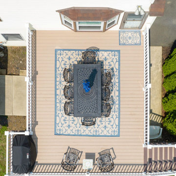
Our next project gave us an amazing opportunity to work with a delightful couple who wanted to breathe new life into their outdated and deteriorated 2-tier wooden deck. Upon assessing the space as well as the wants and needs of our clients, Project Manager, EJ Bonacker, knew it was evident that there was immense potential for improvement. He proposed to shift the deck to a single level and incorporate a Trex RainEscape system. This ingenious addition ensured the area below the deck would remain dry and usable no matter the weather conditions and would also maximize space for entertaining friends and family. Low maintenance TimberTech decking and Titan railings were used which will allow our clients to spend more time enjoying the deck rather than maintaining it. While the older deck did have some lighting, we proposed a comprehensive lighting upgrade which included lights around the perimeter as well as well-lit stairs leading to the ground level which enhanced not only the aesthetics but also the safety during evening gatherings. One of our favorite pieces of this project was designing a special nook for the grill as to not encroach on the primary entertainment area. Our clients were ecstatic we were able to complete their project just in time for the Fourth of July celebrations so they could share laughter, delicious food and create beautiful memories with their neighbors, kids and grandkids. We look forward to helping these clients with more projects for years to come!
 Drury Design
The Setup:
After purchasing this home, the homeowners faced a unique opportunity to reimagine their kitchen and nearby spaces. Water damage from a burst pipe had left much of the home’s interior in need of repair, and while the existing kitchen was functional and in relatively good shape, it didn’t align with the family’s vision for their new home. The layout included a peninsula that wasn’t ideal, and there were some druthers with the nearby pantry.
Since the space needed to be rebuilt anyway, the homeowners saw this as a chance to create a kitchen that was both highly functional for their four young children and timeless in its design. The project also included a refresh of the adjacent message center and dining room — spaces that play key roles in the family’s daily life. The goal was to create a cohesive flow between these areas, balancing modern functionality with the craftsman-inspired character of the rest of the home.
Design Objectives:
- Replace the outdated peninsula with a large island to maximize counter space and create new seating options.
- Open up the space visually by removing soffits and rethinking the cabinetry layout.
Incorporate concealed refrigeration and freezer units to provide significant storage for the family while maintaining a streamlined aesthetic.
- Integrate black cabinetry into the design without making the space feel harsh or heavy.
- Ensure the lighting plan balances functional task lighting with ambient accent lighting.
- Avoid visual clutter in the cabinetry design while still giving a nod to the craftsman aesthetic.
- Incorporate a slab backsplash as a key design feature.
Design Challenges:
- The outdated peninsula left dead space in the kitchen and lacked sufficient seating for the family.
- The cooktop wall was cramped, with small cabinets flanking the hood, limited storage, and soffits that made the space feel closed-in.
- The family needed significant refrigeration space (two refrigerators and a freezer) but wanted to avoid a cluttered look with visible stainless steel appliances.
- Adding black cabinetry risked making the space feel too dark or heavy.
- The original lighting plan was insufficient, particularly over the dining table where a decorative fixture proved too dim.
- The family wanted shaker-style drawer fronts to match the home’s arts-and-crafts design but worried that too much shaker cabinetry might look overly busy.
- Prioritizing a slab backsplash in the wish list priority planning.
The Renewed Space
Design Solutions:
- A functional island: The peninsula was replaced with a large island that provides continuous countertop space for prepping and serving. The island also features seating for four people, creating a central hub for informal meals and activities.
- Streamlined cooktop wall: The soffits were removed, and the upper cabinets on the cooktop wall were eliminated to create a more open, streamlined design. A custom oversized hood became the focal point of the wall, with the blower unit offset inside it to align with the cooktop while maintaining exterior visual symmetry.
- Concealed refrigeration: Two column refrigerators and one freezer were integrated into the cabinetry, concealing them behind wood paneling that blends seamlessly with the overall design.
- Warm black cabinetry: The black cabinetry was crafted from hickory with a visible grain, softening its appearance and adding warmth. The grain detail gives the cabinetry a rich, textured look that avoids feeling stark or overpowering.
- Additional lighting: In the dining area, recessed can lights were added during an additional installation phase to supplement the gorgeous decorative fixture’s dim output. The new lighting plan creates a layered effect, combining functional task lighting with softer ambient lighting.
- Simplified cabinetry details: Slab drawer fronts were used on the upper drawers, while five-piece shaker fronts (with slightly less prominent rail and stile pieces) were reserved for the middle and lower drawers. This approach simplified the overall look while maintaining the craftsman-inspired aesthetic.
- Slab backsplash priority: The slab backsplash was prioritized by making thoughtful adjustments elsewhere, like opting not to extend cabinetry to the ceiling, which also helped visually prioritize the gorgeous slab backsplash. This decision also enhanced the kitchen’s furniture-like feel, aligning with the home’s craftsman character.
- This kitchen perfectly balances practicality with timeless style. By addressing the family’s functional needs — ample seating, smart storage, and effective lighting — while incorporating thoughtful design elements like warm black cabinetry and a striking slab backsplash, Alicia created a space that works beautifully for a busy household. The result is a cohesive, inviting kitchen that honors the home’s craftsman roots and will serve the family well for years to come.
 Carlos Delgado Architect
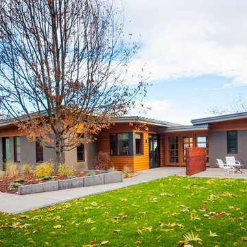
The imperative of this home design was twofold: to open up and accentuate the glorious views of the eastern and northern mountain range as well as to preserve and maintain the site by keeping the design within the footprint of an existing foundation with minimal expansion into the existing mature landscaping. Concepts included exaggerating the separation of the existing music room and great room with opposing roof slopes as well as opening the views through the dual sided east/west entry. The overall form of the roof framed long distance views on the street frontage and opened up light for the main front yard. By reducing the 2 story garage to a single story we exposed southeastern views to the foothills of Mt. Ashland. This 3000 SF home with basement had a primary energy reducing strategy of utilizing a pre-fabricated panelized wall system: the staggered stud walls with continuous rigid insulation on the exterior resulted in an energy efficient R-33 wall. Pre-fabrication offsite reduced on-site labor time as well as reducing wood waste.
Sponsored
Sunbury, OH

J.Holderby - Renovations
Franklin County's Leading General Contractors - 2X Best of Houzz!
 Bennett Contracting, Inc.
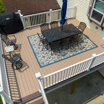
Our next project gave us an amazing opportunity to work with a delightful couple who wanted to breathe new life into their outdated and deteriorated 2-tier wooden deck. Upon assessing the space as well as the wants and needs of our clients, Project Manager, EJ Bonacker, knew it was evident that there was immense potential for improvement. He proposed to shift the deck to a single level and incorporate a Trex RainEscape system. This ingenious addition ensured the area below the deck would remain dry and usable no matter the weather conditions and would also maximize space for entertaining friends and family. Low maintenance TimberTech decking and Titan railings were used which will allow our clients to spend more time enjoying the deck rather than maintaining it. While the older deck did have some lighting, we proposed a comprehensive lighting upgrade which included lights around the perimeter as well as well-lit stairs leading to the ground level which enhanced not only the aesthetics but also the safety during evening gatherings. One of our favorite pieces of this project was designing a special nook for the grill as to not encroach on the primary entertainment area. Our clients were ecstatic we were able to complete their project just in time for the Fourth of July celebrations so they could share laughter, delicious food and create beautiful memories with their neighbors, kids and grandkids. We look forward to helping these clients with more projects for years to come!
 Gallery KBNY
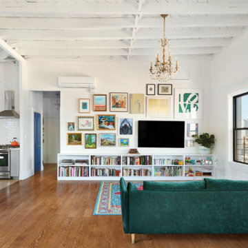
For this Brooklyn condo renovation, Gallery Kitchen and Bath updated the entire kitchen and both bathrooms, as well as painted and laid out new flooring throughout the entire apartment. The owners wanted to unite the seeming medley of the existing space into a cohesive design more representative of their own style. With its ultra-high ceilings and exposed joints and beams, the space already lent itself to the farmhouse look. The end result is a modernized, eclectic farmhouse style that we keenly carried throughout the home.
MORE DETAILS
Compelling textures and color combos reign supreme. The kitchen features semi-custom Shaker-style stone gray cabinets, a white subway tile backsplash running all the way up the wall, and white quartz countertops. We built the island in part to create a pleasing yet efficient flow from the kitchen into the living and dining areas as the space was opened up. We also painted the plumbing stack white to not make it stand out.
We also redesigned the bathrooms, giving each a unique treatment. In the master bath, we took a Victorian-goes-modern approach with coral walls, champagne fixtures, and a clawfoot tub. In the guest bathroom, we stuck to a transitional style that approaches modern without becoming contemporary, pairing herringbone marble floor tiles with a mix of subway and penny tiles on the walls and in the shower. Both maintain elements, such as tiles, fixtures, and colors, that coordinate with the overall eclectic farmhouse look.
HOW WE COLLABORATE
Collaboration with our clients to their desired degree is one of our core pillars. In this condo renovation, the clients wanted central air and were initially considering a true central air system. We advised against it, as not only would it take away from the unique beauty of unusually tall ceilings by adding unsightly ductwork, but it would also significantly detract from the farmhouse look. Instead, we suggested a mini-split system. Our recommended units were both cost-effective and much more complementary to the comprehensive theme. Of course, we ultimately always honor the clients’ choices but it’s just as important to us that we make sure to provide all the necessary information so our clients can make educated decisions that are best for their needs.
SPACE PLANNING
Another key element of the renovation process is space planning. From this perspective, we consider the placement and positioning of objects with regard to the overall flow of space. The building where this renovation took place is U-shaped at one end, which happens to be where this particular apartment is located. Uniquely-shaped spaces naturally require more concentration than those built in the standard rectangular shape. Questions we consider include: Where will people really spend time in this space? What will the flow of foot traffic be? Is there easy access to the kitchen island? Does it flow well into the hallways? Does the island protrude into anything? Working in New York, with its variety of homes and architectural styles, has greatly developed our experience with standard spaces and unconventional ones alike.
SOME HIGHLIGHTS
- Ultra-tall ceilings, allowing for stacked cabinets in the kitchen, as well as long pendant light fixtures and more chandeliers than usual throughout the home
- Completely refurbished cast iron clawfoot tub in one bathroom, with a 270-degree shower curtain around the tub
- Vibrant color choices, including an all-blue bedroom in various shades
- Treated exposed brick walls
Fun Fact: A client once showed us inspiration photos that they sourced online of this exact project, having no idea it was one of ours.
Thinking about renovating your condo? Contact us today to find out how you can benefit from our expertise in remodeling New York City condos. We are a design-and-build firm with a full-scale approach that handles every single aspect of your condo renovation from start to finish.
 Drury Design
The Setup:
After purchasing this home, the homeowners faced a unique opportunity to reimagine their kitchen and nearby spaces. Water damage from a burst pipe had left much of the home’s interior in need of repair, and while the existing kitchen was functional and in relatively good shape, it didn’t align with the family’s vision for their new home. The layout included a peninsula that wasn’t ideal, and there were some druthers with the nearby pantry.
Since the space needed to be rebuilt anyway, the homeowners saw this as a chance to create a kitchen that was both highly functional for their four young children and timeless in its design. The project also included a refresh of the adjacent message center and dining room — spaces that play key roles in the family’s daily life. The goal was to create a cohesive flow between these areas, balancing modern functionality with the craftsman-inspired character of the rest of the home.
Design Objectives:
- Replace the outdated peninsula with a large island to maximize counter space and create new seating options.
- Open up the space visually by removing soffits and rethinking the cabinetry layout.
Incorporate concealed refrigeration and freezer units to provide significant storage for the family while maintaining a streamlined aesthetic.
- Integrate black cabinetry into the design without making the space feel harsh or heavy.
- Ensure the lighting plan balances functional task lighting with ambient accent lighting.
- Avoid visual clutter in the cabinetry design while still giving a nod to the craftsman aesthetic.
- Incorporate a slab backsplash as a key design feature.
Design Challenges:
- The outdated peninsula left dead space in the kitchen and lacked sufficient seating for the family.
- The cooktop wall was cramped, with small cabinets flanking the hood, limited storage, and soffits that made the space feel closed-in.
- The family needed significant refrigeration space (two refrigerators and a freezer) but wanted to avoid a cluttered look with visible stainless steel appliances.
- Adding black cabinetry risked making the space feel too dark or heavy.
- The original lighting plan was insufficient, particularly over the dining table where a decorative fixture proved too dim.
- The family wanted shaker-style drawer fronts to match the home’s arts-and-crafts design but worried that too much shaker cabinetry might look overly busy.
- Prioritizing a slab backsplash in the wish list priority planning.
The Renewed Space
Design Solutions:
- A functional island: The peninsula was replaced with a large island that provides continuous countertop space for prepping and serving. The island also features seating for four people, creating a central hub for informal meals and activities.
- Streamlined cooktop wall: The soffits were removed, and the upper cabinets on the cooktop wall were eliminated to create a more open, streamlined design. A custom oversized hood became the focal point of the wall, with the blower unit offset inside it to align with the cooktop while maintaining exterior visual symmetry.
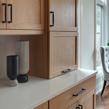
- Concealed refrigeration: Two column refrigerators and one freezer were integrated into the cabinetry, concealing them behind wood paneling that blends seamlessly with the overall design.
- Warm black cabinetry: The black cabinetry was crafted from hickory with a visible grain, softening its appearance and adding warmth. The grain detail gives the cabinetry a rich, textured look that avoids feeling stark or overpowering.
- Additional lighting: In the dining area, recessed can lights were added during an additional installation phase to supplement the gorgeous decorative fixture’s dim output. The new lighting plan creates a layered effect, combining functional task lighting with softer ambient lighting.
- Simplified cabinetry details: Slab drawer fronts were used on the upper drawers, while five-piece shaker fronts (with slightly less prominent rail and stile pieces) were reserved for the middle and lower drawers. This approach simplified the overall look while maintaining the craftsman-inspired aesthetic.
- Slab backsplash priority: The slab backsplash was prioritized by making thoughtful adjustments elsewhere, like opting not to extend cabinetry to the ceiling, which also helped visually prioritize the gorgeous slab backsplash. This decision also enhanced the kitchen’s furniture-like feel, aligning with the home’s craftsman character.
- This kitchen perfectly balances practicality with timeless style. By addressing the family’s functional needs — ample seating, smart storage, and effective lighting — while incorporating thoughtful design elements like warm black cabinetry and a striking slab backsplash, Alicia created a space that works beautifully for a busy household. The result is a cohesive, inviting kitchen that honors the home’s craftsman roots and will serve the family well for years to come.
53