
Search results for "Maintaining wellness" in Home Design Ideas
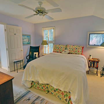
 Envision Web
Stuart Wade, Envision Virtual Tours
The second-largest and most developed of Georgia's barrier islands, St. Simons is approximately twelve miles long and nearly three miles wide at its widest stretch (roughly the size of Manhattan Island in New York). The island is located in Glynn County on Georgia's coast and lies east of Brunswick (the seat of Glynn County), south of Little St. Simons Island and the Hampton River, and north of Jekyll Island. The resort community of Sea Island is separated from St. Simons on the east by the Black Banks River. Known for its oak tree canopies and historic landmarks, St. Simons is both a tourist destination and, according to the 2010 U.S. census, home to 12,743 residents.
Early History
The earliest
St. Simons Island Village
record of human habitation on the island dates to the Late Archaic Period, about 5,000 to 3,000 years ago. Remnants of shell rings left behind by Native Americans from this era survive on many of the barrier islands, including St. Simons. Centuries later, during the period known by historians as the chiefdom era, the Guale Indians established a chiefdom centered on St. Catherines Island and used St. Simons as their hunting and fishing grounds. By 1500 the Guale had established a permanent village of about 200 people on St. Simons, which they called Guadalquini.
Beginning in 1568, the Spanish attempted to create missions along the Georgia coast. Catholic missions were the primary means by which Georgia's indigenous Native American chiefdoms were assimilated into the Spanish colonial system along the northern frontier of greater Spanish Florida. In the 1600s St. Simons became home to two Spanish missions: San Buenaventura de Guadalquini, on the southern tip of the island, and Santo Domingo de Asao (or Asajo), on the northern tip. Located on the inland side of the island were the pagan refugee villages of San Simón, the island's namesake, and Ocotonico. In 1684 pirate raids left the missions and villages largely abandoned.
Colonial History
As
Fort Frederica
early as 1670, with Great Britain's establishment of the colony of Carolina and its expansion into Georgia territory, Spanish rule was threatened by the English. The Georgia coast was considered "debatable land" by England and Spain, even though Spain had fully retreated from St. Simons by 1702. Thirty-one years later General James Edward Oglethorpe founded the English settlement of Savannah. In 1736 he established Fort Frederica, named after the heir to the British throne, Frederick Louis, prince of Wales, on the west side of St. Simons Island to protect Savannah and the Carolinas from the Spanish threat.
Between 1736 and 1749 Fort Frederica was the hub of British military operations along the Georgia frontier. A town of the same name grew up around the fort and was of great importance to the new colony. By 1740 Frederica's population was 1,000. In 1736 the congregation of what would become Christ Church was organized within Fort Frederica as a mission of the Church of England. Charles Wesley led the first services. In 1742 Britain's decisive victory over Spain in the Battle of Bloody Marsh, during the War of Jenkins' Ear, ended the Spanish threat to the Georgia coast. When the British regimen disbanded in 1749, most of the townspeople relocated to the mainland. Fort Frederica went into decline and, except for a short time of prosperity during the 1760s and 1770s under the leadership of merchant James Spalding, never fully recovered. Today the historic citadel's tabby ruins are maintained by the National Park Service.
Plantation Era
By the start of the American Revolution (1775-83), Fort Frederica was obsolete, and St. Simons was left largely uninhabited as most of its residents joined the patriot army. Besides hosting a small Georgia naval victory on the Fort Frederica River, providing guns from its famous fort for use at Fort Morris in Sunbury, and serving as an arena for pillaging by privateers and British soldiers, the island played almost no role in the war.
Following the war, many of the townspeople, their businesses destroyed, turned to agriculture. The island was transformed into fourteen cotton plantations after acres of live oak trees were cleared for farm land and used for building American warships, including the famous USS Constitution, or "Old Ironsides." Although rice was the predominant crop along the neighboring Altamaha River, St. Simons was known for its production of long-staple cotton, which soon came to be known as Sea Island cotton.
Between
Ebos Landing
the 1780s and the outbreak of the Civil War (1861-65), St. Simons's plantation culture flourished. The saline atmosphere and the availability of cheap slave labor proved an ideal combination for the cultivation of Sea Island cotton. In 1803 a group of Ebo slaves who survived the Middle Passage and arrived on the west side of St. Simons staged a rebellion and drowned themselves. The sacred site is known today as Ebos Landing.
One of the largest owners of land and slaves on St. Simons was Pierce Butler, master of Hampton Point Plantation, located on the northern end of the island. By 1793 Butler owned more than 500 slaves, who cultivated 800 acres of cotton on St. Simons and 300 acres of rice on Butler's Island in the Altamaha River delta. Butler's grandson, Pierce Mease Butler, who at the age of sixteen inherited a share of his grandfather's estate in 1826, was responsible for the largest sale of human beings in the history of the United States: in 1859, to restore his squandered fortune, he sold 429 slaves in Savannah for more than $300,000. The British actress and writer Fanny Kemble, whose tumultuous marriage to Pierce ended in divorce in 1849, published an eyewitness account of the evils of slavery on St. Simons in her book Journal of a Residence on a Georgian Plantation in 1838-1839 (1863).
Another
Retreat Plantation
large owner of land and slaves on St. Simons was Major William Page, a friend and employee of Pierce Butler Sr. Before purchasing Retreat Plantation on the southwestern tip of the island in 1804, Page managed the Hampton plantation and Butler's Island. Upon Page's death in 1827, Thomas Butler King inherited the land together with his wife, Page's daughter, Anna Matilda Page King. King expanded his father-in-law's planting empire on St. Simons as well as on the mainland, and by 1835 Retreat Plantation alone was home to as many as 355 slaves.
The center of life during the island's plantation era was Christ Church, Frederica. Organized in 1807 by a group of island planters, the Episcopal church is the second oldest in the Diocese of Georgia. Embargoes imposed by the War of 1812 (1812-15) prevented the parishioners from building a church structure, so they worshiped in the home of John Beck, which stood on the site of Oglethorpe's only St. Simons residence, Orange Hall.
The first Christ Church building, finished on the present site in 1820, was ruined by occupying Union troops during the Civil War. In 1884 the Reverend Anson Dodge Jr. rebuilt the church as a memorial to his first wife, Ellen. The cruciform building with a trussed gothic roof and stained-glass windows remains active today as Christ Church.
Civil War and Beyond
The
St. Simons Island Lighthouse
outbreak of the Civil War in 1861 put a sudden end to St. Simons's lucrative plantation era. In January of that year, Confederate troops were stationed at the south end of the island to guard the entrance to Brunswick Harbor. Slaves from Retreat Plantation, owned by Thomas Butler King, built earthworks and batteries. Plantation residents were scattered—the men joined the Confederate army and their families moved to the mainland. Cannon fire was heard on the island in December 1861, and Confederate troops retreated in February 1862, after dynamiting the lighthouse to keep its beacon from aiding Union troops. Soon thereafter, Union troops occupied the island, which was used as a camp for freed slaves. By August 1862 more than 500 former slaves lived on St. Simons, including Susie King Taylor, who organized a school for freed slave children. But in November the ex-slaves were taken to Hilton Head, South Carolina, and Fernandina, Florida, leaving the island abandoned.
After the Civil War the island never returned to its status as an agricultural community. The plantations lay dormant because there were no slaves to work the fields. After Union general William T. Sherman's January 1865 Special Field Order No. 15 —a demand that former plantations be divided and distributed to former slaves—was overturned by U.S. president Andrew Johnson less than a year later, freedmen and women were forced to work as sharecroppers on the small farms that dotted the land previously occupied by the sprawling plantations.
By
St. Simons Lumber Mills
1870 real economic recovery began with the reestablishment of the timber industry. Norman Dodge and Titus G. Meigs of New York set up lumber mill operations at Gascoigne Bluff, formerly Hamilton Plantation. The lumber mills provided welcome employment for both blacks and whites and also provided mail and passenger boats to the mainland. Such water traffic, together with the construction of a new lighthouse in 1872, designed by architect Charles B. Cluskey, marked the beginning of St. Simons's tourism industry. The keeper of the lighthouse created a small amusement park, which drew many visitors, as did the seemingly miraculous light that traveled from the top of the lighthouse tower to the bottom. The island became a summer retreat for families from the mainland, particularly from Baxley, Brunswick, and Waycross.
The island's resort industry was thriving by the 1880s. Beachfront structures, such as a new pier and grand hotel, were built on the southeastern end of the island and could be accessed by ferry. Around this time wealthy northerners began vacationing on the island.
Twentieth Century
The
St. Simons Island Pier and Village
opening in 1924 of the Brunswick–St. Simons Highway, today known as the Torras Causeway, was a milestone in the development of resorts in the area. St. Simons's beaches were now easily accessible to locals and tourists alike. More than 5,000 automobiles took the short drive from Brunswick to St. Simons via the causeway on its opening day, paving the way for convenient residential and resort development.
In 1926 automotive pioneer Howard Coffin of Detroit, Michigan, bought large tracts of land on St. Simons, including the former Retreat Plantation, and constructed a golf course, yacht club, paved roads, and a residential subdivision. Although the causeway had brought large numbers of summer people to the island, St. Simons remained a small community with only a few hundred permanent residents until the 1940s.
The
St. Simons Island
outbreak of World War II (1941-45) brought more visitors and residents to St. Simons. Troops stationed at Jacksonville, Florida; Savannah; and nearby Camp Stewart took weekend vacations on the island, and a new naval air base and radar school became home to even more officers and soldiers. The increased wartime population brought the island its first public school. With a major shipyard for the production of Liberty ships in nearby Brunswick, the waters of St. Simons became active with German U-boats. In April 1942, just off the coast, the Texas Company oil tanker S. S. Oklahoma and the S. S. Esso Baton Rouge were torpedoed by the Germans, bringing the war very close to home for island residents.
Due in large part to the military's improvement of the island's infrastructure during the war, development on the island boomed in the 1950s and 1960s. More permanent homes and subdivisions were built, and the island was no longer just a summer resort but also a thriving community. In 1950 the Methodist conference and retreat center Epworth by the Sea opened on Gascoigne Bluff. In 1961 novelist Eugenia Price visited St. Simons and began work on her first works of fiction, known as the St. Simons Trilogy. Inspired by real events on the island, Price's trilogy renewed interest in the history of Georgia's coast, and the novelist herself relocated to the island in 1965 and lived there for thirty-one years. St. Simons is also home to contemporary Georgia writer Tina McElroy Ansa.
Since
Epworth by the Sea
1980 St. Simons's population has doubled. The island's continued status as a vacation destination and its ongoing development boom have put historic landmarks and natural areas at risk. While such landmarks as the Fort Frederica ruins and the Battle of Bloody Marsh site are preserved and maintained by the National Park Service, and while the historic lighthouse is maintained by the Coastal Georgia Historical Society, historic Ebos Landing has been taken over by a sewage treatment plant.
Several coastal organizations have formed in recent years to save natural areas on the island. The St. Simons Land Trust, for example, has received donations of large tracts of land and plans to protect property in the island's three traditional African American neighborhoods. Despite its rapid growth and development, St. Simons remains one of the most beautiful and important islands on the Georgia coast.
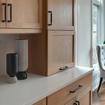
 Drury Design
The Setup:
After purchasing this home, the homeowners faced a unique opportunity to reimagine their kitchen and nearby spaces. Water damage from a burst pipe had left much of the home’s interior in need of repair, and while the existing kitchen was functional and in relatively good shape, it didn’t align with the family’s vision for their new home. The layout included a peninsula that wasn’t ideal, and there were some druthers with the nearby pantry.
Since the space needed to be rebuilt anyway, the homeowners saw this as a chance to create a kitchen that was both highly functional for their four young children and timeless in its design. The project also included a refresh of the adjacent message center and dining room — spaces that play key roles in the family’s daily life. The goal was to create a cohesive flow between these areas, balancing modern functionality with the craftsman-inspired character of the rest of the home.
Design Objectives:
- Replace the outdated peninsula with a large island to maximize counter space and create new seating options.
- Open up the space visually by removing soffits and rethinking the cabinetry layout.
Incorporate concealed refrigeration and freezer units to provide significant storage for the family while maintaining a streamlined aesthetic.
- Integrate black cabinetry into the design without making the space feel harsh or heavy.
- Ensure the lighting plan balances functional task lighting with ambient accent lighting.
- Avoid visual clutter in the cabinetry design while still giving a nod to the craftsman aesthetic.
- Incorporate a slab backsplash as a key design feature.
Design Challenges:
- The outdated peninsula left dead space in the kitchen and lacked sufficient seating for the family.
- The cooktop wall was cramped, with small cabinets flanking the hood, limited storage, and soffits that made the space feel closed-in.
- The family needed significant refrigeration space (two refrigerators and a freezer) but wanted to avoid a cluttered look with visible stainless steel appliances.
- Adding black cabinetry risked making the space feel too dark or heavy.
- The original lighting plan was insufficient, particularly over the dining table where a decorative fixture proved too dim.
- The family wanted shaker-style drawer fronts to match the home’s arts-and-crafts design but worried that too much shaker cabinetry might look overly busy.
- Prioritizing a slab backsplash in the wish list priority planning.
The Renewed Space
Design Solutions:
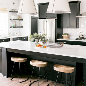
- A functional island: The peninsula was replaced with a large island that provides continuous countertop space for prepping and serving. The island also features seating for four people, creating a central hub for informal meals and activities.
- Streamlined cooktop wall: The soffits were removed, and the upper cabinets on the cooktop wall were eliminated to create a more open, streamlined design. A custom oversized hood became the focal point of the wall, with the blower unit offset inside it to align with the cooktop while maintaining exterior visual symmetry.
- Concealed refrigeration: Two column refrigerators and one freezer were integrated into the cabinetry, concealing them behind wood paneling that blends seamlessly with the overall design.
- Warm black cabinetry: The black cabinetry was crafted from hickory with a visible grain, softening its appearance and adding warmth. The grain detail gives the cabinetry a rich, textured look that avoids feeling stark or overpowering.
- Additional lighting: In the dining area, recessed can lights were added during an additional installation phase to supplement the gorgeous decorative fixture’s dim output. The new lighting plan creates a layered effect, combining functional task lighting with softer ambient lighting.
- Simplified cabinetry details: Slab drawer fronts were used on the upper drawers, while five-piece shaker fronts (with slightly less prominent rail and stile pieces) were reserved for the middle and lower drawers. This approach simplified the overall look while maintaining the craftsman-inspired aesthetic.
- Slab backsplash priority: The slab backsplash was prioritized by making thoughtful adjustments elsewhere, like opting not to extend cabinetry to the ceiling, which also helped visually prioritize the gorgeous slab backsplash. This decision also enhanced the kitchen’s furniture-like feel, aligning with the home’s craftsman character.
- This kitchen perfectly balances practicality with timeless style. By addressing the family’s functional needs — ample seating, smart storage, and effective lighting — while incorporating thoughtful design elements like warm black cabinetry and a striking slab backsplash, Alicia created a space that works beautifully for a busy household. The result is a cohesive, inviting kitchen that honors the home’s craftsman roots and will serve the family well for years to come.
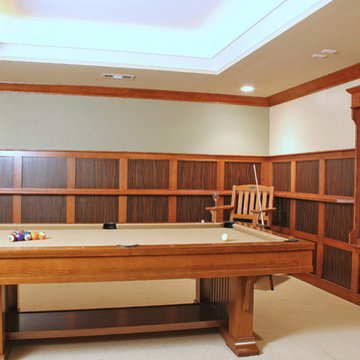
 CRC Builders Inc.
The homeowner wanted something different, out of the ordinary, as an entertainment center and bar combination that would add an unusual dimension to watching TV. It had to be in character with the rest of the residence, tastefully designed and executed to deliver the maximum effect.
A two-piece combination bar and seating, coupled with a fireplace and large screen TV was designed. A system was designed and custom built cabinet consisting of a radius front entertainment center houses a large flat screen TV and enclosed stereo speakers on the top level, and a gas log fireplace below.
A custom built see-through bar sports a matching radius front, plenty of storage, and room for three to eat, drink, and enjoy the warmth of the fireplace without missing any of the action on the TV. For even greater functionality, the TV is also viewable through the large opening in the bar while meals or snacks are prepared from the kitchen. Traffic flow is unique: access and egress between the bar front and TV can happen with ease around both sides of the bar, and the opening in the back of the bar provides for service both from and to the kitchen area. Because of the free and easy movement about the space, adequate lighting, and lack of combustibles at or on the fireplace, safety, as well as an ample use of space, are both achieved. Both pieces are custom fabricated from start to finish, and match each other identically in all respects. Both are constructed of clear cherry finish with a clear satin lacquer. Both enjoy chrome accents strips and custom crafted, glass cabinet doors with matching radii, and both are tastefully lit with accenting puck lights. The design and fabrication for both units shared issues in common as well as individually.
The entertainment center was fabricated in the shop in three units and then assembled onsite. The opening for the flat screen TV had to be carefully considered as it too had a radius and therefore had to be designed so that the TV would fit.
The entire bar system, except the countertop, had to be fabricated onsite due to the structural columns on either side between which the curved lower cabinets would rest. Then the countertop template was prepared, fabricated elsewhere, returned and installed. After the countertop was in place, the cabinetmaker had to wrap the two columns on either side as well as the overhead beam while making sure the joints at the columns and header maintained alignment. A complement of matching radii cabinet doors had to be constructed for both units. Radius glass inserts had to be ordered with precise dimensions to assure a perfect fit to openings with tight tolerances. Any mistake would have been expensive to correct. Because of the abundance of natural light into the space, the finishes had to be dead-on, otherwise every flaw would show. The custom walnut inlays were fabricated out of square stock, which protruded above the radius in each door. A jig matching the radius had to be designed and fabricated, then a router used to trim excess material and then sanded and finished.
Solving the multitude of challenges associated with the project was one of the parts that made the project fun and interesting. The homeowners now can entertain every night.
Find the right local pro for your project
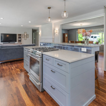
 Powell Construction
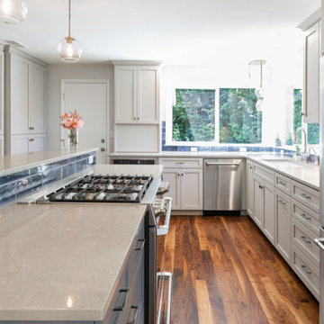
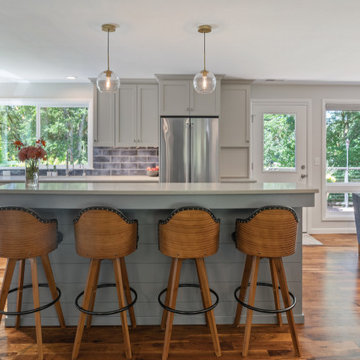
After undertaking a few minor updates over the years, these homeowners came to us ready to tear out their kitchen and start from scratch. The existing kitchen was large, but not laid out well for the everyday use it was getting. A bulky double fireplace in the center of the living space took up a lot of room and made the dining room feel disconnected from the kitchen, despite the substantial opening between the two. We removed the oversized wood burning fireplace and replaced it with a smaller gas one with shiplap above, creating a stylish featured piece. Meanwhile the kitchen was reimagined and reorganized into a functional space for a home chef that will work better for years to come.
These homeowners’ main concern was to update the style and function, as well as having quality materials that would stand the test of time. They wanted updated, gray cabinets; but didn’t want to lose any of the warm feeling of their home. Together with our design team they chose a light, warm gray for the perimeter cabinets and a darker gray to make the island a focal piece. The warm, light colored quartz countertops blend with the lighter gray and contrast nicely with the island. The textured dark blue backsplash tile adds a fun and exciting pop of color without stealing attention from any of the other pieces. To further maintain the warmth, they chose a rich walnut flooring with bold grain patterns.
When the homeowners fell in love with some contemporary brass colored light fixtures, they were nervous that they would compete with their stainless steel appliances and other silver toned pieces. By keeping all the lights in the same color family, we were able to achieve a look that feels intentional and modern. The corner 3-light pendant adds light and interest to the space. Not wanting to take up wall cabinet space with a bulky microwave, they opted for one built into a base cabinet. The other small appliances are neatly hidden away behind custom appliance garages.
For the fireplace, we focused on a clean, bright look that would stand out and look beautiful without competing with the neighboring kitchen. A small powder bathroom was also reorganized to better utilize the potential storage space and add counter space for guests. The style of the kitchen cabinetry was incorporated into the bathroom as well as into the dining room, which featured glass front cabinets to display dishes and mementos.
The redesigned space resulted in a warm and beautiful kitchen and dining area that will be enjoyed for years to come. The main floor living space now feels as cohesive as it was always meant to.
 Bennett Contracting, Inc.
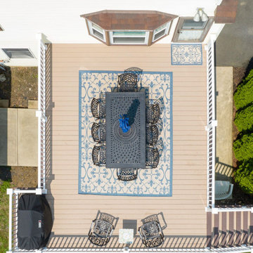
Our next project gave us an amazing opportunity to work with a delightful couple who wanted to breathe new life into their outdated and deteriorated 2-tier wooden deck. Upon assessing the space as well as the wants and needs of our clients, Project Manager, EJ Bonacker, knew it was evident that there was immense potential for improvement. He proposed to shift the deck to a single level and incorporate a Trex RainEscape system. This ingenious addition ensured the area below the deck would remain dry and usable no matter the weather conditions and would also maximize space for entertaining friends and family. Low maintenance TimberTech decking and Titan railings were used which will allow our clients to spend more time enjoying the deck rather than maintaining it. While the older deck did have some lighting, we proposed a comprehensive lighting upgrade which included lights around the perimeter as well as well-lit stairs leading to the ground level which enhanced not only the aesthetics but also the safety during evening gatherings. One of our favorite pieces of this project was designing a special nook for the grill as to not encroach on the primary entertainment area. Our clients were ecstatic we were able to complete their project just in time for the Fourth of July celebrations so they could share laughter, delicious food and create beautiful memories with their neighbors, kids and grandkids. We look forward to helping these clients with more projects for years to come!
 Powell Construction
After undertaking a few minor updates over the years, these homeowners came to us ready to tear out their kitchen and start from scratch. The existing kitchen was large, but not laid out well for the everyday use it was getting. A bulky double fireplace in the center of the living space took up a lot of room and made the dining room feel disconnected from the kitchen, despite the substantial opening between the two. We removed the oversized wood burning fireplace and replaced it with a smaller gas one with shiplap above, creating a stylish featured piece. Meanwhile the kitchen was reimagined and reorganized into a functional space for a home chef that will work better for years to come.
These homeowners’ main concern was to update the style and function, as well as having quality materials that would stand the test of time. They wanted updated, gray cabinets; but didn’t want to lose any of the warm feeling of their home. Together with our design team they chose a light, warm gray for the perimeter cabinets and a darker gray to make the island a focal piece. The warm, light colored quartz countertops blend with the lighter gray and contrast nicely with the island. The textured dark blue backsplash tile adds a fun and exciting pop of color without stealing attention from any of the other pieces. To further maintain the warmth, they chose a rich walnut flooring with bold grain patterns.
When the homeowners fell in love with some contemporary brass colored light fixtures, they were nervous that they would compete with their stainless steel appliances and other silver toned pieces. By keeping all the lights in the same color family, we were able to achieve a look that feels intentional and modern. The corner 3-light pendant adds light and interest to the space. Not wanting to take up wall cabinet space with a bulky microwave, they opted for one built into a base cabinet. The other small appliances are neatly hidden away behind custom appliance garages.
For the fireplace, we focused on a clean, bright look that would stand out and look beautiful without competing with the neighboring kitchen. A small powder bathroom was also reorganized to better utilize the potential storage space and add counter space for guests. The style of the kitchen cabinetry was incorporated into the bathroom as well as into the dining room, which featured glass front cabinets to display dishes and mementos.
The redesigned space resulted in a warm and beautiful kitchen and dining area that will be enjoyed for years to come. The main floor living space now feels as cohesive as it was always meant to.
 Columbia Roofing Inc.
Mr. Mescher – Home Owner Shares Story
“I wanted to take this opportunity to tell you that I am extremely pleased with the work that Columbia Roofing did in replacing the roof on our Kent Island home. The house has a complicated roof structure with multiple gables and a quarter round conical roof which spans between two vertical walls in the back. We choose a 50 year Owens Corning shingle and to assure a good job, we only obtained quotes from roofing companies that received outstanding reviews.
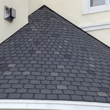
We were pleased when the Columbia production crew roofed the house without issue and brought the full visual effect of slate using the 4 tab asphalt shingle with its distinctive keyway.
When it came to the conical roof, we were faced with the possibility of having to install a metal roof in lieu of maintaining the slate like appearance that was so prominent on the other roof sections of the house. Our preference was to maintain the appearance of slate on the conical section similar to that seen on the old slate roof cathedrals. While this is easy to say, I can now appreciate how difficult it is to do.
To honor our wishes, Ben Alsop came to the house and worked through the complicated layout necessary to use the same 4 tab shingles on the conical section. To do the job properly, every single 4 tab shingle had to be cut into individual tabs.
Each tab was then taken up on the roof where the keyway was aligned to vertical through a system of straight lines drawn from the point of the conical roof to the starter shingle at the roof’s edge. Each tab had to be cut again (often multiple times) after the tab alignment was complete. To assure the accuracy necessary to maintain the visual effect, Ben took it upon himself to personally perform the roofing of the conical section.
Ben is a manager for Columbia Roofing who no longer performs the physical roofing work after coming up through the ranks of the roofing trade. His personal dedication to getting this job done for us in a way that is simply stellar could not go without acknowledgement. Ben is not only a craftsman, he is an artisan whose skill set can clearly be seen in the pictures that I have attached.
I want to thank Columbia Roofing for a job well done and particularly I want to thank Ben for taking the time and putting in the effort to truly make this a stellar installation.”

Sponsored
Columbus, OH

Hope Restoration & General Contracting
Columbus Design-Build, Kitchen & Bath Remodeling, Historic Renovations
 Vintage Cellars & Saunas
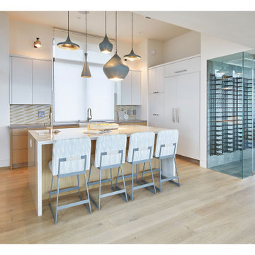
Completely enclosed in glass, this custom wine cellar in Hermosa Beach, Los Angeles, California, is sure to turn some heads. Located directly off of the kitchen and dining room, this custom wine room / glass wine cellar / modern wine cellar / contemporary wine cellar holds upwards of 200 bottles. Glass, Metal, and stone are all utilized in our favorite combination for a gorgeous contemporary masterpiece.
Double deep metal wine racks / metal wine racking is utilized here, placed a few feet off of the ground to allow for potential case storage space on the tile below. Black metal wine racking was also chosen, as opposed to silver metal wine racks in order to really make the space pop.
The glass here is single pane. Master Wine Cellar Builders and Design Build team at Vintage Cellars recommend using dual paned, thermally insulated glass in wine cellars to minimize potential for condensation, as well as making sure that your wine cellar is able to maintain proper temperature and humidity constantly. Single pane glass simply does not have a high enough R Value of insulation, though it can make the space look a bit more clean and elegant.
The cooling system was recessed and ducted into the ceiling to ensure the minimalist look was achieved for this wine cellar / glass wine cellar / modern wine room / modern glass wine cellar / modern glass wine room / contemporary wine room.
This home beautifully blends modern, contemporary, and traditional design features. Wood, marble, stone, glass, and metal all come together beautifully to make this space cool and sleek, but also warm and homey.
Here in Newport Coast, Newport Beach, Orange County, California, modern / contemporary architecture is THE design trend. In a home which mixes the best of traditional and contemporary, this custom wine cellar / custom wine room fits like a glove.
Double sided glass walls enclose this custom wine cellar, with one side visible from the living room, the other from the dining room. Floor to ceiling black metal wine racks line each wall - dual sided as to maximize horizontal label forward design and display.
Vintage Cellars, master wine cellar builders out of San Diego, California, were able to design a beautiful looking and equally utilitarian cellar here, fitting over 675 wine bottles with ease.
The cooling unit was an RM Coil, traditionally mounted into the racks - but in this instance was recessed into the ceiling. The cooling unit and heat load calculation took into account that there were two large walls of glass here - knowing fully that there would be substantial heat loss through the large single panes on either end.
Within the room, beige stone accentuates the contemporary / modern look and matches stunningly with the color scheme and other design features in the surrounding rooms as well. A wine cellar / wine room / wine vault / wine wall / wine closet / custom wine cellar / custom wine wall / custom wine room / custom wine closet / custom wine vault / custom wine storage room like this is a real jaw dropper when incorporated into the main living areas in the home. Wine as art is a beautiful thing.
Wine Cellars like this can be found all over Orange County, in areas such as Newport Beach, Newport Coast, Crystal Cove, Emerald Bay, Huntington Beach, Coto De Caza, Ladera Ranch, Laguna Niguel, Laguna Hills, Laguna Beach, Aliso Viejo, Costa Mesa, Irvine, San Clemente, Dana Point, Lake Forest, Mission Viejo, and more.
With so many different kinds of wine racks / wine racking / wine cellar designs and styles, you can really go in any and every direction in the discovery and design phase of a custom wine cellar project. The Custom wine cellar builder custom wine cellar builders team at Vintage Cellars make the entire process exciting, informative, and smooth from start to finish.
Vintage Cellars has built gorgeous custom wine cellars and wine storage rooms across the United States and World for over 32 years. We are your go-to business for anything wine cellar and wine storage related! Whether you're interested in a wine closet, wine racking, custom wine racks, a custom wine cellar door, or a cooling system for your existing space, Vintage Cellars has you covered!
We carry all kinds of wine cellar cooling and refrigeration systems, incuding: Breezaire, CellarCool, WhisperKool, Wine Guardian, CellarPro and Commercial systems.
We also carry many types of Wine Refrigerators, Wine Cabinets, and wine racking types, including La Cache, Marvel, N'Finity, Transtherm, Vinotheque, Vintage Series, Credenza, Walk in wine rooms, Climadiff, Riedel, Fontenay, and VintageView.
Vintage Cellars also does work in many styles, including Contemporary and Modern, Rustic, Farmhouse, Traditional, Craftsman, Industrial, Mediterranean, Mid-Century, Industrial and Eclectic.
Some locations we cover often include: Agora Hills, Alameda, Albany, Alhambra, Aliso Viejo, Altadena, Anaheim, Angwin, Arcadia, Aromas, Arroyo Grande, Atascadero, Atherton, Avila Beach, Balboa Terrace, Bel Air, Belmont, Belvedere, Benton, Berkeley, Bermuda Dunes, Beverly Hills, Big Sur, Bolinas, Boyle Heights, Bradbury, Bradley, Brea, Brentwood, Bridgeport, Brisbane, Buellton, Buena Park, Burbank, Burlingame, Calabasas, Calistoga, Cambria, Canoga Park, Cardiff, Carlsbad, Carmel, Carmel By The Sea, Carmel Valley, Carnelian Bay, Carpinteria, Casmalia, Castroville, Cathedral City, Cayucos, Chatsworth, Chualar, City of LA, City of SF, Coachella, Coleville, Colma, Corona Del Mar, Coronado, Coronado Island, Corte Madera, Costa Mesa, Coto De Caza, Creston, Crystal Cove, Cupertino, Cypress, Danville, Deer Park, Del Mar, Diablo, Duarte, Eagle Rock, East Palo Alto, East Pasadena, Echo Park, El Granada, El Monte, Emeryville, Encinitas, Encino, Fairfax, Foster City, Fountain Valley, Fremont, Fullerton, Garden Grove, Glendale, Golden Gate Park, Goleta, Gonzales, Granada Hills, Granite Bay, Greenbrae, Greenfield, Grover Beach, Guadalupe, Half Moon Bay, Hancock Park, Harmony, Hidden Hills, Hillsborough, Hollywood, Hollywood Hills, Huntington Beach, Indian Wells, Indio, Industry, Inner Richmond, Inverness, Irvine, Jolon, June Lake, Kentfield, King City, La Canada Flintridge, La Habra, La Honda, La Jolla, La Palma, La Quinta, Ladera Heights, Laguna Beach, Laguna Hills, Laguna Niguel, Laguna Woods, Lake Balboa, Lake Forest, Lake Tahoe, Lake View Terrace, Larkspur, Laurel Canyon, Lee Vining, Lockwood, Lompoc, Long Beach, Los Alamitos, Los Alamos, Los Altos, Los Altos Hills, Los Angeles, Los Gatos, Los Olivos, Los Osos, Malibu, Mammoth Lakes, Manhattan Beach, Marin, Marina, Marshall, Mayflower Village, Menlo Park, Mill Valley, Millbrae, Mission Hills, Mission Viejo, Mono, Monrovia, Montara, Montebello, Monterey, Monterey Park, Morro Bay, Moss Beach, Moss Landing, Mountain View, Napa, New Cuyama, Newark, Newport Beach, Newport Coast, Nicasio, Nipomo, North Hills, Northridge, Novato, Oakland, Oakville, Ocean Beach, Oceano, Orange, Orange County, Pacific Grove, Pacific Palisades, Pacoima, Palm Desert, Palm Springs, Palo Alto, Palos Verdes, Panorama City, Pasadena, Paso Robles, Pebble Beach, Pescadero, Piedmont, Pismo Beach, Placentia, Point Reyes Station, Pope Valley, Portola Valley, Presidio, Presidio Heights, Rancho Mirage, Rancho Santa Fe, Rancho Santa Margarita, Redondo Beach, Redwood City, Reseda, Rosemead, Russian Cliff, Rutherford, Saint Helena, Salinas, San Anselmo, San Ardo, San Bruno, San Carlos, San Clemente, San Diego, San Fernando, San Francisco, San Gabriel, San Gregorio, San Jose, San Juan Capistrano, San Leandro, San Lorenzo, San Lucas, San Luis Obispo, San Marino, San Mateo, San Miguel, San Rafael, San Simeon, Santa Ana, Santa Barbara, Santa Clara, Santa Clarita, Santa Margarita, Santa Maria, Santa Monica, Santa Ynez, Saratoga, Sausalito, Sea Cliff, Seal Beach, Seaside, Shadow Hills, Shandon, Sherman Oaks, Sierra Madre, Silver Lake, Solana Beach, Soledad, Solvang, Sonoma, South El Monte, South Pasadena, South San Gabriel, Spreckels, Squaw Valley, St Helena, Stanford, Stanton, Stinson Beach, Stough Park, Studio City, Summerland, Sun Valley, Sunland, Sunnyvale, Sylmar, Tahoe City, Tahoe Vista, Tarzana, Temple City, Templeton, Thousand Oaks, Thousand Palms, Tiburon, Toluca Lake, Topanga, Topaz, Torrey Pines, Tujanga, Tustin, Union City, Valencia, Verdugo Mountains, Vernon, Villa Park, Walnut, Walnut Creek, West Puente Valley, Westminster, Westwood, Whittier, Woodside, Yorba Linda, Yountville
San Diego Wine Cellars, Rancho Santa Fe Wine Cellars, Beverly Hills Wine Cellars, Bel Air Wine Cellars, Orange County Wine Cellars, Newport Beach Wine Cellars, San Francisco Wine Cellars, Napa Wine Cellars, Sonoma Wine Cellars, Los Angeles Wine Cellars, Santa Barbara Wine Cellars, Palm Desert Wine Cellars, La Jolla Wine Cellars, Del Mar Wine Cellars, Coronado Wine Cellars, Pacific Palisades Wine Cellars, Malibu Wine Cellars, Santa Monica Wine Cellars, Brentwood Wine Cellars, Laguna Wine Cellars, Crystal Cove Wine Cellars, Hollywood Wine Cellars, Bay Area Wine Cellars, South Bay Wine Cellars, LA Wine Cellars, SD Wine Cellars, OC Wine Cellars, SF Wine Cellars, Huntington Beach Wine Cellars, Carlsbad Wine Cellars, Palos Verdes Wine Cellars, Paso Robles Wine Cellars, Encinitas Wine Cellars, Manhattan Beach Wine Cellars, Marin Wine Cellars, Tiburon Wine Cellars, Coto De Caza Wine Cellars, Thousand Oaks Wine Cellars, Cardiff Wine Cellars, RSF Wine Cellars, San Marino Wine Cellars, Ladera Heights Wine Cellars, Westwood Wine Cellars, Hillsborough Wine Cellars, Luxury Wine Cellars, Custom Wine Cellars, High End Wine Cellars, Estate Wine Cellars, Modern Wine Cellars, Contemporary Wine Cellars, Rustic Wine Cellars, Traditional Wine Cellars
Contact Vintage Cellars today with any of your Wine Cellar needs!
(800) 876-8789
Vintage Cellars
904 Rancheros Drive
San Marcos, California 92069
(800) 876-8789
Traditional
Shabby Chic
Scandanavian
Contemporary
Modern
Beach
Desert
Transitional
Asian
Coastal
Rustic
Mediterranean
French Country
Farmhouse
Eclectic
Craftsman
Tropical
Southwestern
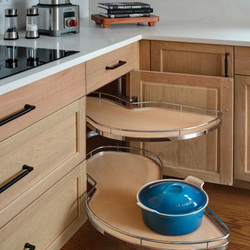 Drury Design
The Setup:
After purchasing this home, the homeowners faced a unique opportunity to reimagine their kitchen and nearby spaces. Water damage from a burst pipe had left much of the home’s interior in need of repair, and while the existing kitchen was functional and in relatively good shape, it didn’t align with the family’s vision for their new home. The layout included a peninsula that wasn’t ideal, and there were some druthers with the nearby pantry.
Since the space needed to be rebuilt anyway, the homeowners saw this as a chance to create a kitchen that was both highly functional for their four young children and timeless in its design. The project also included a refresh of the adjacent message center and dining room — spaces that play key roles in the family’s daily life. The goal was to create a cohesive flow between these areas, balancing modern functionality with the craftsman-inspired character of the rest of the home.
Design Objectives:
- Replace the outdated peninsula with a large island to maximize counter space and create new seating options.
- Open up the space visually by removing soffits and rethinking the cabinetry layout.
Incorporate concealed refrigeration and freezer units to provide significant storage for the family while maintaining a streamlined aesthetic.
- Integrate black cabinetry into the design without making the space feel harsh or heavy.
- Ensure the lighting plan balances functional task lighting with ambient accent lighting.
- Avoid visual clutter in the cabinetry design while still giving a nod to the craftsman aesthetic.
- Incorporate a slab backsplash as a key design feature.
Design Challenges:
- The outdated peninsula left dead space in the kitchen and lacked sufficient seating for the family.
- The cooktop wall was cramped, with small cabinets flanking the hood, limited storage, and soffits that made the space feel closed-in.
- The family needed significant refrigeration space (two refrigerators and a freezer) but wanted to avoid a cluttered look with visible stainless steel appliances.
- Adding black cabinetry risked making the space feel too dark or heavy.
- The original lighting plan was insufficient, particularly over the dining table where a decorative fixture proved too dim.
- The family wanted shaker-style drawer fronts to match the home’s arts-and-crafts design but worried that too much shaker cabinetry might look overly busy.
- Prioritizing a slab backsplash in the wish list priority planning.
The Renewed Space
Design Solutions:
- A functional island: The peninsula was replaced with a large island that provides continuous countertop space for prepping and serving. The island also features seating for four people, creating a central hub for informal meals and activities.
- Streamlined cooktop wall: The soffits were removed, and the upper cabinets on the cooktop wall were eliminated to create a more open, streamlined design. A custom oversized hood became the focal point of the wall, with the blower unit offset inside it to align with the cooktop while maintaining exterior visual symmetry.
- Concealed refrigeration: Two column refrigerators and one freezer were integrated into the cabinetry, concealing them behind wood paneling that blends seamlessly with the overall design.
- Warm black cabinetry: The black cabinetry was crafted from hickory with a visible grain, softening its appearance and adding warmth. The grain detail gives the cabinetry a rich, textured look that avoids feeling stark or overpowering.
- Additional lighting: In the dining area, recessed can lights were added during an additional installation phase to supplement the gorgeous decorative fixture’s dim output. The new lighting plan creates a layered effect, combining functional task lighting with softer ambient lighting.
- Simplified cabinetry details: Slab drawer fronts were used on the upper drawers, while five-piece shaker fronts (with slightly less prominent rail and stile pieces) were reserved for the middle and lower drawers. This approach simplified the overall look while maintaining the craftsman-inspired aesthetic.
- Slab backsplash priority: The slab backsplash was prioritized by making thoughtful adjustments elsewhere, like opting not to extend cabinetry to the ceiling, which also helped visually prioritize the gorgeous slab backsplash. This decision also enhanced the kitchen’s furniture-like feel, aligning with the home’s craftsman character.
- This kitchen perfectly balances practicality with timeless style. By addressing the family’s functional needs — ample seating, smart storage, and effective lighting — while incorporating thoughtful design elements like warm black cabinetry and a striking slab backsplash, Alicia created a space that works beautifully for a busy household. The result is a cohesive, inviting kitchen that honors the home’s craftsman roots and will serve the family well for years to come.
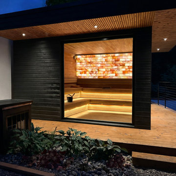
 Courtland Studio LLC
An authentic Northern European-style sauna, custom-manufactured in Estonia by Auroom Wellness, serves as a focal point within this Los Angeles landscape design. Rooted in traditional Nordic craftsmanship, the minimalist wood structure introduces a refined wellness element while maintaining a clean, contemporary aesthetic.
Thoughtfully integrated into the surrounding landscape, the sauna is positioned as a private retreat—balancing old-world tradition with modern outdoor living.
Landscape architecture and design by Courtland Studio LLC.
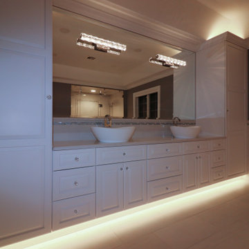
 Irene Designs
This dream bathroom has everything one can wish for an ideal bathroom escape. It doesn’t just look fabulous – it works well and it is built to stand the test of time.
This bathroom was designed as a private oasis, a place to relax and unwind. Spa-like environment is created by expansive double-sink custom vanity, an elegant free standing tub, and a spacious two-person barrier-free shower with a floating bench. Toilet is concealed within a separate nook behind a pocket door.
Main bathroom area is outlined by a tray ceiling perimeter. The room looks open, airy and spacious. Nothing interferes with the ceiling design and overall space configuration. It hasn’t always been that way. Former layout had serious pitfalls that made the room look much smaller. The shower concealed behind solid walls protruded into the main area clashing with the tray ceiling geometry. Massive shower stall took up significant amount of the room leaving no continuous wall space for a double sink vanity. There were two separate vanities with a dead corner space between them. At the same time, the toilet room was quite spacious with just one fixture in the far end.
New layout not only looks better, it allows for a better functionality and fully reveals the space potential. The toilet was relocated to occupy the former linen closet space slightly expanded into adjacent walk-in closet. Shower was moved into the bigger alcove, away from the tray ceiling area. It opened up the room while giving space for a gorgeous wall-to-wall vanity. Having a full glass wall, the shower extends the space even further. Sparkling glass creates no barrier to the eyesight. The room feels clean, breezy and extra spacious. Gorgeous frameless shower enclosure with glass-to-glass clamps and hinges shows off premium tile designs of the accent shower wall.
Free standing tub remained in its original place in front of the window. With no solid shower walls nearby, it became a focal point adorned with the new crystal chandelier above it. This two-tier gorgeous chandelier makes the bathroom feel incredibly grand. A touch of luxury is showing up in timeless polished chrome faucet finish selections as well.
New expansive custom vanity has his and her full height linen towers, his and her sink cabinets with two individual banks of drawers on the sides and one shared drawer cabinet in the middle containing a charging station in the upper drawer.
Vanity counter tops and floating shower seat top are made of high-end quartz.
Vessel sinks resemble the shape and style of the free-standing tub.
To make the room feel even more spacious and to showcase the shower area in the reflection, a full size mirror is installed over the vanity. Crystal sconces are installed directly into the mirror.
Crisp classic white tile gives the room a timeless sense of polish and luxury. Walls around the perimeter of the entire bathroom are tiled half way. Three rows of 12”x 24” porcelain tile resembling white marble are crowned with a thin row of intricate glass tiles with marble accents, and a chair rail tile.
Tile design flows into a spacious barrier-free two-person walk-in shower. Two more tile patterns of the same tile collection are brought into play. Rear wall is adorned with a picture frame made out of 12”x12” tiles laid at 45 degree angle within the same chair rail and glass tile border. Shower floor is made of small hexagon tiles for proper drainage.
Shower area has two hidden from plain sight niches to contain shampoo bottles and toiletries. The rear side of the niches is made of glass mosaics for a waterfall effect.
To showcase the picture frame inside the shower, the accent shower wall is washed with cascading light from a discrete LED strip tucked in a cove behind “floating” shower ceiling platform.
Multiple shower heads (two ceiling-mount rain heads, one multi-functional wall mount shower head, and a handheld shower) are able to provide a fully customizable shower experience.
Despite of many hard surfaces and shiny finishes, which can sometimes lead to a cold impersonal feeling, this bathroom is cozy and truly welcoming. This sense of warms is maintained by exclusive multi-functional layered lighting. Carefully designed groups of lights (all having a dimmer control) can be used simultaneously, in various combinations, or separately to create numerous different effects and perfect atmosphere for every mood and occasion. Some lights have smart controls and can be operated remotely.
Amazing effect can be achieved by dimmable toe kick perimeter lighting. With the ceiling lights turned off, the vanity looks as if it is floating in the air. Multifaceted crystal fixtures produce cascades of sparkling rainbow reflections dancing around the room and creating an illusion of a starry sky.
Programmable radiant heating floor offers additional warmth and comfort to the room.
This bathroom is well suited for either a quick morning shower or a night in for ultimate relaxation with a champagne toast and a long soak in the freestanding tub.
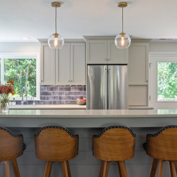 Powell Construction
After undertaking a few minor updates over the years, these homeowners came to us ready to tear out their kitchen and start from scratch. The existing kitchen was large, but not laid out well for the everyday use it was getting. A bulky double fireplace in the center of the living space took up a lot of room and made the dining room feel disconnected from the kitchen, despite the substantial opening between the two. We removed the oversized wood burning fireplace and replaced it with a smaller gas one with shiplap above, creating a stylish featured piece. Meanwhile the kitchen was reimagined and reorganized into a functional space for a home chef that will work better for years to come.
These homeowners’ main concern was to update the style and function, as well as having quality materials that would stand the test of time. They wanted updated, gray cabinets; but didn’t want to lose any of the warm feeling of their home. Together with our design team they chose a light, warm gray for the perimeter cabinets and a darker gray to make the island a focal piece. The warm, light colored quartz countertops blend with the lighter gray and contrast nicely with the island. The textured dark blue backsplash tile adds a fun and exciting pop of color without stealing attention from any of the other pieces. To further maintain the warmth, they chose a rich walnut flooring with bold grain patterns.
When the homeowners fell in love with some contemporary brass colored light fixtures, they were nervous that they would compete with their stainless steel appliances and other silver toned pieces. By keeping all the lights in the same color family, we were able to achieve a look that feels intentional and modern. The corner 3-light pendant adds light and interest to the space. Not wanting to take up wall cabinet space with a bulky microwave, they opted for one built into a base cabinet. The other small appliances are neatly hidden away behind custom appliance garages.
For the fireplace, we focused on a clean, bright look that would stand out and look beautiful without competing with the neighboring kitchen. A small powder bathroom was also reorganized to better utilize the potential storage space and add counter space for guests. The style of the kitchen cabinetry was incorporated into the bathroom as well as into the dining room, which featured glass front cabinets to display dishes and mementos.
The redesigned space resulted in a warm and beautiful kitchen and dining area that will be enjoyed for years to come. The main floor living space now feels as cohesive as it was always meant to.
 Drury Design
The Setup:
After purchasing this home, the homeowners faced a unique opportunity to reimagine their kitchen and nearby spaces. Water damage from a burst pipe had left much of the home’s interior in need of repair, and while the existing kitchen was functional and in relatively good shape, it didn’t align with the family’s vision for their new home. The layout included a peninsula that wasn’t ideal, and there were some druthers with the nearby pantry.
Since the space needed to be rebuilt anyway, the homeowners saw this as a chance to create a kitchen that was both highly functional for their four young children and timeless in its design. The project also included a refresh of the adjacent message center and dining room — spaces that play key roles in the family’s daily life. The goal was to create a cohesive flow between these areas, balancing modern functionality with the craftsman-inspired character of the rest of the home.
Design Objectives:
- Replace the outdated peninsula with a large island to maximize counter space and create new seating options.
- Open up the space visually by removing soffits and rethinking the cabinetry layout.
Incorporate concealed refrigeration and freezer units to provide significant storage for the family while maintaining a streamlined aesthetic.
- Integrate black cabinetry into the design without making the space feel harsh or heavy.
- Ensure the lighting plan balances functional task lighting with ambient accent lighting.
- Avoid visual clutter in the cabinetry design while still giving a nod to the craftsman aesthetic.
- Incorporate a slab backsplash as a key design feature.
Design Challenges:
- The outdated peninsula left dead space in the kitchen and lacked sufficient seating for the family.
- The cooktop wall was cramped, with small cabinets flanking the hood, limited storage, and soffits that made the space feel closed-in.
- The family needed significant refrigeration space (two refrigerators and a freezer) but wanted to avoid a cluttered look with visible stainless steel appliances.
- Adding black cabinetry risked making the space feel too dark or heavy.
- The original lighting plan was insufficient, particularly over the dining table where a decorative fixture proved too dim.
- The family wanted shaker-style drawer fronts to match the home’s arts-and-crafts design but worried that too much shaker cabinetry might look overly busy.
- Prioritizing a slab backsplash in the wish list priority planning.
The Renewed Space
Design Solutions:
- A functional island: The peninsula was replaced with a large island that provides continuous countertop space for prepping and serving. The island also features seating for four people, creating a central hub for informal meals and activities.
- Streamlined cooktop wall: The soffits were removed, and the upper cabinets on the cooktop wall were eliminated to create a more open, streamlined design. A custom oversized hood became the focal point of the wall, with the blower unit offset inside it to align with the cooktop while maintaining exterior visual symmetry.
- Concealed refrigeration: Two column refrigerators and one freezer were integrated into the cabinetry, concealing them behind wood paneling that blends seamlessly with the overall design.
- Warm black cabinetry: The black cabinetry was crafted from hickory with a visible grain, softening its appearance and adding warmth. The grain detail gives the cabinetry a rich, textured look that avoids feeling stark or overpowering.
- Additional lighting: In the dining area, recessed can lights were added during an additional installation phase to supplement the gorgeous decorative fixture’s dim output. The new lighting plan creates a layered effect, combining functional task lighting with softer ambient lighting.
- Simplified cabinetry details: Slab drawer fronts were used on the upper drawers, while five-piece shaker fronts (with slightly less prominent rail and stile pieces) were reserved for the middle and lower drawers. This approach simplified the overall look while maintaining the craftsman-inspired aesthetic.
- Slab backsplash priority: The slab backsplash was prioritized by making thoughtful adjustments elsewhere, like opting not to extend cabinetry to the ceiling, which also helped visually prioritize the gorgeous slab backsplash. This decision also enhanced the kitchen’s furniture-like feel, aligning with the home’s craftsman character.
- This kitchen perfectly balances practicality with timeless style. By addressing the family’s functional needs — ample seating, smart storage, and effective lighting — while incorporating thoughtful design elements like warm black cabinetry and a striking slab backsplash, Alicia created a space that works beautifully for a busy household. The result is a cohesive, inviting kitchen that honors the home’s craftsman roots and will serve the family well for years to come.

 Denver Mattress
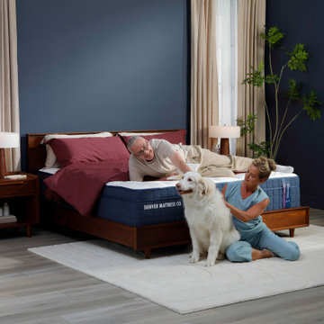
A truly restorative bedroom is designed around comfort, support, and the moments that make home feel like home. This welcoming space features the Doctor's Choice® Elite Soft Mattress from Denver Mattress, crafted for sleepers who prefer a softer feel while still benefiting from advanced support and pressure-relieving comfort.
As part of the premium Doctor's Choice® Collection, the Elite Soft is engineered to cushion key pressure points while helping maintain healthy spinal alignment throughout the night. Its combination of plush comfort and supportive design creates a sleep surface that helps reduce tossing and turning, promoting deeper, more restorative rest.
Surrounded by rich wood furnishings, calming colors, soft textures, and personal touches, this bedroom demonstrates how thoughtful design can support both relaxation and well-being. Whether enjoying a quiet morning, unwinding after a busy day, or sharing time with loved ones, the space is designed to help you feel comfortable, supported, and at ease.
 Drury Design
The Setup:
After purchasing this home, the homeowners faced a unique opportunity to reimagine their kitchen and nearby spaces. Water damage from a burst pipe had left much of the home’s interior in need of repair, and while the existing kitchen was functional and in relatively good shape, it didn’t align with the family’s vision for their new home. The layout included a peninsula that wasn’t ideal, and there were some druthers with the nearby pantry.
Since the space needed to be rebuilt anyway, the homeowners saw this as a chance to create a kitchen that was both highly functional for their four young children and timeless in its design. The project also included a refresh of the adjacent message center and dining room — spaces that play key roles in the family’s daily life. The goal was to create a cohesive flow between these areas, balancing modern functionality with the craftsman-inspired character of the rest of the home.
Design Objectives:
- Replace the outdated peninsula with a large island to maximize counter space and create new seating options.
- Open up the space visually by removing soffits and rethinking the cabinetry layout.
Incorporate concealed refrigeration and freezer units to provide significant storage for the family while maintaining a streamlined aesthetic.
- Integrate black cabinetry into the design without making the space feel harsh or heavy.
- Ensure the lighting plan balances functional task lighting with ambient accent lighting.
- Avoid visual clutter in the cabinetry design while still giving a nod to the craftsman aesthetic.
- Incorporate a slab backsplash as a key design feature.
Design Challenges:
- The outdated peninsula left dead space in the kitchen and lacked sufficient seating for the family.
- The cooktop wall was cramped, with small cabinets flanking the hood, limited storage, and soffits that made the space feel closed-in.
- The family needed significant refrigeration space (two refrigerators and a freezer) but wanted to avoid a cluttered look with visible stainless steel appliances.
- Adding black cabinetry risked making the space feel too dark or heavy.
- The original lighting plan was insufficient, particularly over the dining table where a decorative fixture proved too dim.
- The family wanted shaker-style drawer fronts to match the home’s arts-and-crafts design but worried that too much shaker cabinetry might look overly busy.
- Prioritizing a slab backsplash in the wish list priority planning.
The Renewed Space
Design Solutions:
- A functional island: The peninsula was replaced with a large island that provides continuous countertop space for prepping and serving. The island also features seating for four people, creating a central hub for informal meals and activities.
- Streamlined cooktop wall: The soffits were removed, and the upper cabinets on the cooktop wall were eliminated to create a more open, streamlined design. A custom oversized hood became the focal point of the wall, with the blower unit offset inside it to align with the cooktop while maintaining exterior visual symmetry.
- Concealed refrigeration: Two column refrigerators and one freezer were integrated into the cabinetry, concealing them behind wood paneling that blends seamlessly with the overall design.
- Warm black cabinetry: The black cabinetry was crafted from hickory with a visible grain, softening its appearance and adding warmth. The grain detail gives the cabinetry a rich, textured look that avoids feeling stark or overpowering.
- Additional lighting: In the dining area, recessed can lights were added during an additional installation phase to supplement the gorgeous decorative fixture’s dim output. The new lighting plan creates a layered effect, combining functional task lighting with softer ambient lighting.
- Simplified cabinetry details: Slab drawer fronts were used on the upper drawers, while five-piece shaker fronts (with slightly less prominent rail and stile pieces) were reserved for the middle and lower drawers. This approach simplified the overall look while maintaining the craftsman-inspired aesthetic.
- Slab backsplash priority: The slab backsplash was prioritized by making thoughtful adjustments elsewhere, like opting not to extend cabinetry to the ceiling, which also helped visually prioritize the gorgeous slab backsplash. This decision also enhanced the kitchen’s furniture-like feel, aligning with the home’s craftsman character.
- This kitchen perfectly balances practicality with timeless style. By addressing the family’s functional needs — ample seating, smart storage, and effective lighting — while incorporating thoughtful design elements like warm black cabinetry and a striking slab backsplash, Alicia created a space that works beautifully for a busy household. The result is a cohesive, inviting kitchen that honors the home’s craftsman roots and will serve the family well for years to come.
 Powell Construction
After undertaking a few minor updates over the years, these homeowners came to us ready to tear out their kitchen and start from scratch. The existing kitchen was large, but not laid out well for the everyday use it was getting. A bulky double fireplace in the center of the living space took up a lot of room and made the dining room feel disconnected from the kitchen, despite the substantial opening between the two. We removed the oversized wood burning fireplace and replaced it with a smaller gas one with shiplap above, creating a stylish featured piece. Meanwhile the kitchen was reimagined and reorganized into a functional space for a home chef that will work better for years to come.
These homeowners’ main concern was to update the style and function, as well as having quality materials that would stand the test of time. They wanted updated, gray cabinets; but didn’t want to lose any of the warm feeling of their home. Together with our design team they chose a light, warm gray for the perimeter cabinets and a darker gray to make the island a focal piece. The warm, light colored quartz countertops blend with the lighter gray and contrast nicely with the island. The textured dark blue backsplash tile adds a fun and exciting pop of color without stealing attention from any of the other pieces. To further maintain the warmth, they chose a rich walnut flooring with bold grain patterns.
When the homeowners fell in love with some contemporary brass colored light fixtures, they were nervous that they would compete with their stainless steel appliances and other silver toned pieces. By keeping all the lights in the same color family, we were able to achieve a look that feels intentional and modern. The corner 3-light pendant adds light and interest to the space. Not wanting to take up wall cabinet space with a bulky microwave, they opted for one built into a base cabinet. The other small appliances are neatly hidden away behind custom appliance garages.
For the fireplace, we focused on a clean, bright look that would stand out and look beautiful without competing with the neighboring kitchen. A small powder bathroom was also reorganized to better utilize the potential storage space and add counter space for guests. The style of the kitchen cabinetry was incorporated into the bathroom as well as into the dining room, which featured glass front cabinets to display dishes and mementos.
The redesigned space resulted in a warm and beautiful kitchen and dining area that will be enjoyed for years to come. The main floor living space now feels as cohesive as it was always meant to.

 safe ZOnea
Ask a kitchen designer in Chicago which countertop question comes up most and you will hear the same answer: white or off-white quartz, and which shade. Homeowners walk into showrooms with a photo saved on their phone, usually a bright, veined slab from a magazine spread, and leave an hour later realizing there are a dozen versions of that same look. The confusion is not about taste. It is about the fact that "white quartz" covers a huge range of patterns, undertones, and price points, and nobody explains the differences before the sale.
Older bungalows and newer builds alike are getting stripped of their dated laminate and butcher block in favor of quartz, and the reasons are practical rather than trendy. Quartz does not need sealing, resists the kind of staining that granite can suffer over decades, and holds up to the freeze-thaw humidity swings that Chicago basements and kitchens go through every year. Once a homeowner commits to quartz, though, the real decision starts: which white, and does the pattern justify the difference in cost.
This piece walks through three specific slabs that keep showing up in Chicago renovation projects, why designers reach for them in different rooms, and what actually separates a flat white surface from one with real depth. None of this requires a design background to follow. It is mostly about paying attention to how a slab behaves under kitchen lighting, how busy the vending gets, and how it photographs versus how it looks in person.
Why White Quartz Took Over Chicago Kitchens
Ten years ago, granite dominated Chicago kitchen remodels almost by default. It was durable, it looked expensive, and every fabricator in the metro area carried a wide range of colors. Quartz has since taken over that position, and the shift happened faster than most contractors expected. Engineered stone gave homeowners a more predictable surface, since natural granite varies slab to slab while quartz is manufactured to a consistent pattern batch after batch.
The other driver is light. Chicago winters are long and gray, and a lot of kitchens, especially in older two-flats and courtyard buildings, do not get much direct sun. A dark granite countertop in a dim kitchen can make the whole room feel smaller. White and light-toned quartz reflects what little natural light comes through the windows, and it makes a galley kitchen or a north-facing space feel noticeably brighter without touching the cabinetry or the layout.
There is also a resale argument that local real estate agents bring up constantly. White quartz photographs well for listings, reads as updated and low-maintenance to buyers touring in person, and does not compete visually with whatever cabinet color the next owner might prefer. It is a safer bet than a bold veined marble look or a colored quartz that might feel dated in five years.
Arctic White and the Cost Question
Among the flatter, more uniform whites, arctic white quartz price comes up constantly in budget conversations because the slab sits at a more approachable point than the heavily veined Italian-marble-inspired patterns. It reads as clean and bright without the busy movement that some homeowners find overwhelming in a small kitchen. Fabricators in the Chicago area tend to keep it in stock precisely because demand stays steady across both new construction and remodel projects.
Part of what keeps this slab affordable relative to its heavily patterned cousins comes down to manufacturing complexity. A quartz surface with minimal veining and a consistent white base is simpler to produce at scale than one that mimics the irregular, high-contrast movement of natural Calacatta marble. That production difference shows up directly in what a homeowner pays per square foot, and it is worth asking a fabricator to walk through that pricing before assuming every white quartz costs the same.
Homeowners planning a full kitchen, including an island, backsplash, and perimeter counters, often use a flatter white like this specifically because it lets other elements carry the visual interest. A patterned tile backsplash or a bold cabinet color reads more clearly against a calm countertop than against one already fighting for attention with heavy veining. Designers frequently pair simpler whites with statement lighting fixtures for exactly this reason.
What Makes Calacatta Patterns Different
Calacatta refers to a family of marble originally quarried in Italy, known for a bright white background broken up by bold, often gold-toned veining that moves in thick, dramatic streaks rather than thin gray lines. Natural Calacatta marble is soft, porous, and expensive to maintain, which is exactly why quartz manufacturers spent years developing engineered versions that replicate the look without the upkeep headaches.
The challenge with any Calacatta-style quartz is getting the veining to look organic instead of printed. Early generations of engineered stone struggled with repetitive patterns that gave away the fact the slab was manufactured rather than cut from actual marble. Modern digital printing and layering techniques have closed that gap considerably, and the better Calacatta-inspired quartz lines now vary the veining across each slab batch so two counters in the same kitchen do not look identical.
Chicago designers gravitate toward Calacatta patterns for kitchens that function as the visual centerpiece of an open floor plan, which describes a large share of the gut renovations happening in neighborhoods like Lincoln Park, Roscoe Village, and the North Shore suburbs. When the kitchen island is visible from the living room and dining area, a dramatic veined surface becomes part of the home's overall design language rather than a purely functional work surface.
Calacatta Arno Under Kitchen Lighting
One of the more popular options in this category, calacatta arno quartz, balances a warm white base with soft gray and gold veining that avoids looking too stark under the cooler LED lighting common in newer Chicago builds. Homeowners touring showrooms sometimes make the mistake of judging a slab entirely under warm incandescent lighting, then get surprised when the same surface looks slightly different once installed under their kitchen's actual fixtures.
What separates this particular pattern from flatter competitors is how the veining clusters rather than spreading evenly across the slab. That clustering mimics the way real quarried marble forms, with denser mineral deposits in some sections and cleaner stretches in others. Fabricators cutting a large island slab from a single piece will often orient the pattern intentionally so the busiest veining lands somewhere visually interesting rather than getting cut off at an edge.
Because the background reads warmer than a stark white, this pattern tends to pair well with brass or matte gold hardware, a combination that has been showing up repeatedly in Chicago kitchen remodels over the past few renovation seasons. Cabinet painters report a similar trend, with more clients requesting warm white or greige cabinet colors specifically because they complement this kind of veined quartz better than a cooler, blue-toned white would.
Silestone's Version of the Calacatta Look
Manufacturers compete directly in this Calacatta-inspired category, and silestone eternal calacatta gold represents one brand's specific take on the pattern, distinguished by richer gold veining set against a brighter white base than some competing slabs in the same family. Silestone has built a reputation around anti-bacterial surface treatments in addition to the standard quartz durability, a detail some homeowners specifically ask about for kitchens used heavily by families with young children.
The veining in this particular slab tends to run in longer, more continuous lines compared to the clustered pattern found in some other Calacatta-style options, which gives large island surfaces a sense of visual flow from one end to the other. Fabricators working with bigger islands, the kind increasingly common in open-concept Chicago remodels, often favor patterns like this because there is less need to worry about seams interrupting a busy, disconnected pattern.
Price positioning for this slab tends to sit toward the upper end of the engineered quartz category, reflecting both the brand's manufacturing process and the complexity of replicating that continuous gold veining consistently across production batches. Homeowners weighing this option against other Calacatta-style quartz should ask their fabricator directly about batch availability, since premium patterns sometimes have longer lead times than standard stock colors.
Living With Quartz Day to Day
Beyond how a slab looks in a showroom or a listing photo, the daily experience of owning quartz countertops matters more once the renovation dust settles. Quartz resists scratching far better than laminate and holds up to the acidic spills, hot pans, and general abuse of an active kitchen without the sealing maintenance that natural stone requires every year or two. That low-maintenance reputation is a large part of why quartz overtook granite in the first place.
Heat resistance is a detail that gets less attention than it should. While quartz handles moderate heat well, manufacturers generally recommend using a trivet or pad for very hot pots straight off the stove, since sudden temperature shock can occasionally cause stress marks in the resin binder that holds the engineered stone together. This is a minor precaution rather than a major limitation, but it is worth mentioning to anyone assuming quartz is entirely indestructible.
Cleaning routines stay simple across almost every pattern in this category. A damp cloth and mild soap handle daily messes, and the nonporous surface means wine, coffee, and tomato-based sauces do not soak in the way they can with unsealed granite or marble. Homeowners moving from an older stone counter often mention how much less they worry about everyday spills once quartz is installed, which is a quality-of-life change that rarely makes it into the initial design conversation.
Choosing Between the Three
There is no single correct answer among these three slabs, and that is exactly why they keep coming up together in the same design conversations across Chicago renovation projects. A flatter white with minimal veining suits kitchens where other elements need to carry the visual interest, while a bolder Calacatta-inspired pattern makes sense when the countertop itself is meant to be the centerpiece of an open floor plan.
Budget matters too, and it is worth having a direct conversation with a fabricator about where each option lands before falling in love with a specific slab in a showroom. Lighting, cabinet color, and how the kitchen connects to the rest of the home all play into which pattern will actually look right once installation is finished rather than just in a photo.
Whatever direction a homeowner leans, seeing a full slab in person under actual kitchen lighting remains the single most useful step before signing off. Photos only go so far once the countertop is sitting in the room it will live in for years.


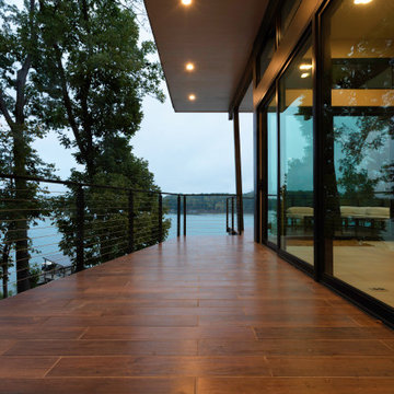
 HELT
HELTThis lakefront diamond in the rough lot was waiting to be discovered by someone with a modern naturalistic vision and passion. Maintaining an eco-friendly, and sustainable build was at the top of the client priority list. Designed and situated to benefit from passive and active solar as well as through breezes from the lake, this indoor/outdoor living space truly establishes a symbiotic relationship with its natural surroundings. The pie-shaped lot provided significant challenges with a street width of 50ft, a steep shoreline buffer of 50ft, as well as a powerline easement reducing the buildable area. The client desired a smaller home of approximately 2500sf that juxtaposed modern lines with the free form of the natural setting. The 250ft of lakefront afforded 180-degree views which guided the design to maximize this vantage point while supporting the adjacent environment through preservation of heritage trees. Prior to construction the shoreline buffer had been rewilded with wildflowers, perennials, utilization of clover and meadow grasses to support healthy animal and insect re-population. The inclusion of solar panels as well as hydroponic heated floors and wood stove supported the owner’s desire to be self-sufficient. Core ten steel was selected as the predominant material to allow it to “rust” as it weathers thus blending into the natural environment.
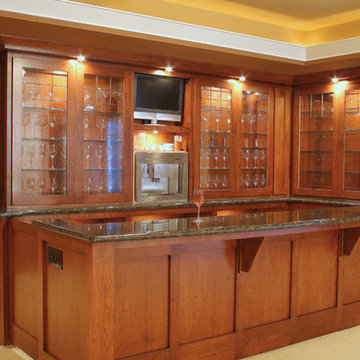 CRC Builders Inc.
The homeowner wanted something different, out of the ordinary, as an entertainment center and bar combination that would add an unusual dimension to watching TV. It had to be in character with the rest of the residence, tastefully designed and executed to deliver the maximum effect.
A two-piece combination bar and seating, coupled with a fireplace and large screen TV was designed. A system was designed and custom built cabinet consisting of a radius front entertainment center houses a large flat screen TV and enclosed stereo speakers on the top level, and a gas log fireplace below.
A custom built see-through bar sports a matching radius front, plenty of storage, and room for three to eat, drink, and enjoy the warmth of the fireplace without missing any of the action on the TV. For even greater functionality, the TV is also viewable through the large opening in the bar while meals or snacks are prepared from the kitchen. Traffic flow is unique: access and egress between the bar front and TV can happen with ease around both sides of the bar, and the opening in the back of the bar provides for service both from and to the kitchen area. Because of the free and easy movement about the space, adequate lighting, and lack of combustibles at or on the fireplace, safety, as well as an ample use of space, are both achieved. Both pieces are custom fabricated from start to finish, and match each other identically in all respects. Both are constructed of clear cherry finish with a clear satin lacquer. Both enjoy chrome accents strips and custom crafted, glass cabinet doors with matching radii, and both are tastefully lit with accenting puck lights. The design and fabrication for both units shared issues in common as well as individually.
The entertainment center was fabricated in the shop in three units and then assembled onsite. The opening for the flat screen TV had to be carefully considered as it too had a radius and therefore had to be designed so that the TV would fit.
The entire bar system, except the countertop, had to be fabricated onsite due to the structural columns on either side between which the curved lower cabinets would rest. Then the countertop template was prepared, fabricated elsewhere, returned and installed. After the countertop was in place, the cabinetmaker had to wrap the two columns on either side as well as the overhead beam while making sure the joints at the columns and header maintained alignment. A complement of matching radii cabinet doors had to be constructed for both units. Radius glass inserts had to be ordered with precise dimensions to assure a perfect fit to openings with tight tolerances. Any mistake would have been expensive to correct. Because of the abundance of natural light into the space, the finishes had to be dead-on, otherwise every flaw would show. The custom walnut inlays were fabricated out of square stock, which protruded above the radius in each door. A jig matching the radius had to be designed and fabricated, then a router used to trim excess material and then sanded and finished.
Solving the multitude of challenges associated with the project was one of the parts that made the project fun and interesting. The homeowners now can entertain every night.
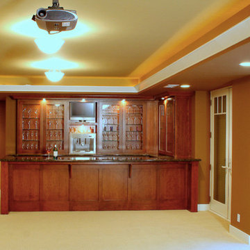 CRC Builders Inc.
The homeowner wanted something different, out of the ordinary, as an entertainment center and bar combination that would add an unusual dimension to watching TV. It had to be in character with the rest of the residence, tastefully designed and executed to deliver the maximum effect.
A two-piece combination bar and seating, coupled with a fireplace and large screen TV was designed. A system was designed and custom built cabinet consisting of a radius front entertainment center houses a large flat screen TV and enclosed stereo speakers on the top level, and a gas log fireplace below.
A custom built see-through bar sports a matching radius front, plenty of storage, and room for three to eat, drink, and enjoy the warmth of the fireplace without missing any of the action on the TV. For even greater functionality, the TV is also viewable through the large opening in the bar while meals or snacks are prepared from the kitchen. Traffic flow is unique: access and egress between the bar front and TV can happen with ease around both sides of the bar, and the opening in the back of the bar provides for service both from and to the kitchen area. Because of the free and easy movement about the space, adequate lighting, and lack of combustibles at or on the fireplace, safety, as well as an ample use of space, are both achieved. Both pieces are custom fabricated from start to finish, and match each other identically in all respects. Both are constructed of clear cherry finish with a clear satin lacquer. Both enjoy chrome accents strips and custom crafted, glass cabinet doors with matching radii, and both are tastefully lit with accenting puck lights. The design and fabrication for both units shared issues in common as well as individually.
The entertainment center was fabricated in the shop in three units and then assembled onsite. The opening for the flat screen TV had to be carefully considered as it too had a radius and therefore had to be designed so that the TV would fit.
The entire bar system, except the countertop, had to be fabricated onsite due to the structural columns on either side between which the curved lower cabinets would rest. Then the countertop template was prepared, fabricated elsewhere, returned and installed. After the countertop was in place, the cabinetmaker had to wrap the two columns on either side as well as the overhead beam while making sure the joints at the columns and header maintained alignment. A complement of matching radii cabinet doors had to be constructed for both units. Radius glass inserts had to be ordered with precise dimensions to assure a perfect fit to openings with tight tolerances. Any mistake would have been expensive to correct. Because of the abundance of natural light into the space, the finishes had to be dead-on, otherwise every flaw would show. The custom walnut inlays were fabricated out of square stock, which protruded above the radius in each door. A jig matching the radius had to be designed and fabricated, then a router used to trim excess material and then sanded and finished.
Solving the multitude of challenges associated with the project was one of the parts that made the project fun and interesting. The homeowners now can entertain every night.
55