
Search results for "Major focus" in Home Design Ideas
 JRP Design & Remodel
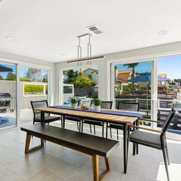
These repeat clients were looking for a relaxing getaway for their family of five young kids and themselves to enjoy. Upon finding the perfect vacation destination, they turned once again to JRP’s team of experts for their full home remodel. They knew JRP would provide them with the quality and attention to detail they expected. The vision was to give the home a clean, bright, and coastal look. It also needed to have the functionality a large family requires.
This home previously lacked the light and bright feel they wanted in their vacation home. With small windows and balcony in the master bedroom, it also failed to take advantage of the beautiful harbor views. The carpet was yet another major problem for the family. With young kids, these clients were looking for a lower maintenance option that met their design vision.
To fix these issues, JRP removed the carpet and tile throughout and replaced with a beautiful seven-inch engineered oak hardwood flooring. Ceiling fans were installed to meet the needs of the coastal climate. They also gave the home a whole new cohesive design and pallet by using blue and white colors throughout.
From there, efforts were focused on giving the master bedroom a major reconfiguration. The balcony was expanded, and a larger glass panel and metal handrail was installed leading to their private outdoor space. Now they could really enjoy all the harbor views. The bedroom and bathroom were also expanded by moving the closet and removing an extra vanity from the hallway. By the end, the bedroom truly became a couples’ retreat while the rest of the home became just the relaxing getaway the family needed.
 Nar Design Group
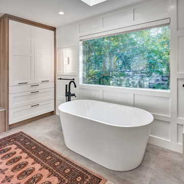
This house built in the 1990s never had renovations done prior to this whole house remodel. Filled with vibrant wallpaper and shiny brass finishes so indicative of the time the house was in need of a major upgrade and refresh.
The laundry room already had ample space and storage, but we tailored the storage for the family. An integrated shoe shelf allows for a clean space to store shoes in this no shoe household. A fold down, integrated ironing board provides functionality without crowding the space.
The powder bath is the only bath on the first floor, so is a full bath, but functions as a powder bath 90% of the time. We wanted to keep the focus away from the shower and keep the fun of a powder bath. A custom window pane patterned etched glass shower allows the shower to stay in the background.
In the master bath there was also ample space, but the design was in great need of an upgrade. With a decked-in tub and shower that you had to step up and then down into, the space needed a better flow and easier access. A freestanding tub allowed all of the decking to be removed and gave space for a larger, more luxurious shower. A huge linen storage with bench that double as a suitcase stand finishes out the space nicely. The room was given a clean, modern farmhouse feel to really freshen up the space.
The focus of this kitchen was to open up the workflow, creating a space for the family to work comfortably while also creating a beautiful and inspiring space. Placing a large refrigerator at the edge of the kitchen, adding a beverage refrigerator, using a Galley Workstation and having the island at a slightly lower height makes it highly functional for the whole family. It is rare to achieve a long line of symmetry, but with a feature wall created around the range top we were able to do so. We created an antique armoire feel with the panel ready refrigerator and custom panel design above.
A mixture of hardware was used, the gray stained hickory cabinets were paired with matte black hardware, while the designer white cabinets were paired with brass hardware. A very custom refrigerator cabinet was created that emphasized the armoire feel. A long wall of 9” deep tall cabinets created a very beautiful as well as highly functional pantry space.
 Klopf Architecture
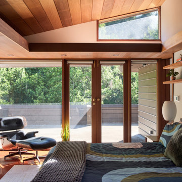
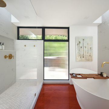
Nestled in the hills of Orinda, California, this 1951 residence is one of only seven extant homes, now known as “The Magnificent Seven”, designed by architect Olof Dahlstrand, a protégé of Frank Lloyd Wright. With its low-slung rooflines, natural materials, and deep integration with the sloping landscape, the home is a pristine example of mid-century modern design inspired by Wright’s organic principles. Over the years, prior homeowners have emphasized preservation, ensuring that the house remained relatively untouched. Each owner has respected the original architecture and stayed true to Dahlstrand’s intent. When a family of five—two college-aged sons and a middle school-aged daughter—acquired the property, they were captivated by its history, legacy of care, and architectural significance. While they appreciated Dahlstrand’s original vision, they also recognized the need to adapt the home for contemporary living while preserving its design integrity.
The remodel was conceived as a thoughtful response to the past—an effort to bring the house into the 21st century without compromising its soul. The primary mandate was to maintain architectural continuity while improving the functionality, comfort, and livability for a modern family. The design team—architects and contractor alike—worked with a shared reverence for the original architecture, allowing that mindset to guide even the most technical or pragmatic decisions.
A key objective was to increase natural light in the kitchen—a departure from Wrightian principles of enclosed, intimate cooking spaces—while maintaining the home’s architectural language. The kitchen was reconfigured to foster a stronger connection to adjacent living spaces while retaining the underlying concept of spatial separation. One of the most transformative architectural changes was the removal of a ridge beam that was originally planned to remain visible through the kitchen. During construction, the team collaborated on a better solution: a wide-flanged steel beam concealed within the roof envelope. This subtle move preserved the clean lines and ceiling continuity, a modern update carried out with utmost respect for the existing framework.
The home’s original powder room, previously accessible only through the kitchen, was relocated for better flow and privacy. A new powder room was carved out of former kitchen cabinetry—a narrow, interior space that could have felt dark and enclosed. To avoid this, the design extended the line of original transom windows into the new powder room and added a skylight above the vanity. The result is a bright and airy space that feels consistent with the rest of the home. Other updates included the installation of new solid-core interior doors with veneers carefully matched to the original mahogany, enhancing the continuity of the interiors. Even smaller decisions, such as placing the door knobs at 42 inches high, mirrored the original proportions. Every choice reflected a shared belief between the architect, contractor, and client: that new work should serve the integrity of the old.
The home’s extensive interior redwood millwork and paneling was meticulously restored. Where new materials were introduced—such as the replacement redwood soffit paneling—the contractor took pains to find finish nails that matched the original, rather than using modern equivalents. This level of craftsmanship and collaboration defined the project. It extended even to the detailing of a blind door to the new powder room, which had to disappear into the existing redwood board-and-batten wall. It was a team effort: the owner found a suitable handle, the architects devised the custom in-swing mechanism, and the contractor executed it so the door aligned precisely with the battens. Throughout, the homeowners were deeply engaged in the design process. One, a meticulous design enthusiast, focused on aesthetic integrity and historic detail. The other brought a practical and function-driven perspective, ensuring that new fixtures and materials would be durable and require minimal maintenance.
While the home’s location posed no major site challenges, sustainability was a key concern. The team upgraded the roof insulation, installed solar panels with battery storage, and added ductless mini-split cooling systems. Lighting was another area where modern technology was woven into a historic framework: new square LED fixtures echo the original custom perimeter soffit lights, maintaining the design language while offering advanced performance.
A planned expansion of a bedroom into suite with a bathroom had to be shelved due to budget constraints and the high cost of below-grade foundation work. Still, the team focused their efforts on making the most of the existing footprint, resolving constraints through design ingenuity rather than adding square footage. This renovation represents a collaborative achievement in preserving and evolving a historically significant home. Every decision was shaped by a shared ethos among clients, architects, and contractor: to maintain the home’s architectural soul while updating it for contemporary life. The result is a timeless modernist residence that continues Olof Dahlstrand’s legacy, remaining grounded in nature, craftsmanship, and human-scale design.
Klopf Architecture Team: John Klopf, AIA, Klara Kevane, Fernanda Bernardes
Interior Architectural Design: Klopf Architecture
Structural Engineer: Daniel Bastiao
Contractor: Don Larwood, Larwood Construction
Photography: Mariko Reed
Year Completed: 2022
Find the right local pro for your project
 Moris Construction
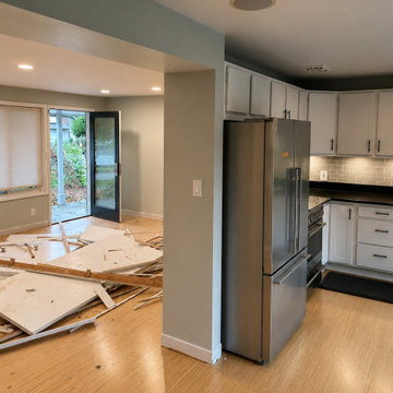
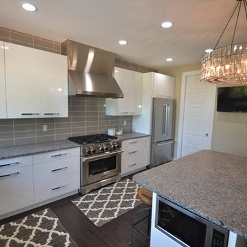
Before photo of an outdated kitchen prior to a major remodel and open-concept renovation. This Seattle home transformation included demolition, structural modifications, improved layout flow, and preparation for a custom kitchen redesign. The project showcases the early stages of a comprehensive whole-home renovation focused on creating a more functional and modern living space.
 Klopf Architecture
Nestled in the hills of Orinda, California, this 1951 residence is one of only seven extant homes, now known as “The Magnificent Seven”, designed by architect Olof Dahlstrand, a protégé of Frank Lloyd Wright. With its low-slung rooflines, natural materials, and deep integration with the sloping landscape, the home is a pristine example of mid-century modern design inspired by Wright’s organic principles. Over the years, prior homeowners have emphasized preservation, ensuring that the house remained relatively untouched. Each owner has respected the original architecture and stayed true to Dahlstrand’s intent. When a family of five—two college-aged sons and a middle school-aged daughter—acquired the property, they were captivated by its history, legacy of care, and architectural significance. While they appreciated Dahlstrand’s original vision, they also recognized the need to adapt the home for contemporary living while preserving its design integrity.
The remodel was conceived as a thoughtful response to the past—an effort to bring the house into the 21st century without compromising its soul. The primary mandate was to maintain architectural continuity while improving the functionality, comfort, and livability for a modern family. The design team—architects and contractor alike—worked with a shared reverence for the original architecture, allowing that mindset to guide even the most technical or pragmatic decisions.
A key objective was to increase natural light in the kitchen—a departure from Wrightian principles of enclosed, intimate cooking spaces—while maintaining the home’s architectural language. The kitchen was reconfigured to foster a stronger connection to adjacent living spaces while retaining the underlying concept of spatial separation. One of the most transformative architectural changes was the removal of a ridge beam that was originally planned to remain visible through the kitchen. During construction, the team collaborated on a better solution: a wide-flanged steel beam concealed within the roof envelope. This subtle move preserved the clean lines and ceiling continuity, a modern update carried out with utmost respect for the existing framework.
The home’s original powder room, previously accessible only through the kitchen, was relocated for better flow and privacy. A new powder room was carved out of former kitchen cabinetry—a narrow, interior space that could have felt dark and enclosed. To avoid this, the design extended the line of original transom windows into the new powder room and added a skylight above the vanity. The result is a bright and airy space that feels consistent with the rest of the home. Other updates included the installation of new solid-core interior doors with veneers carefully matched to the original mahogany, enhancing the continuity of the interiors. Even smaller decisions, such as placing the door knobs at 42 inches high, mirrored the original proportions. Every choice reflected a shared belief between the architect, contractor, and client: that new work should serve the integrity of the old.
The home’s extensive interior redwood millwork and paneling was meticulously restored. Where new materials were introduced—such as the replacement redwood soffit paneling—the contractor took pains to find finish nails that matched the original, rather than using modern equivalents. This level of craftsmanship and collaboration defined the project. It extended even to the detailing of a blind door to the new powder room, which had to disappear into the existing redwood board-and-batten wall. It was a team effort: the owner found a suitable handle, the architects devised the custom in-swing mechanism, and the contractor executed it so the door aligned precisely with the battens. Throughout, the homeowners were deeply engaged in the design process. One, a meticulous design enthusiast, focused on aesthetic integrity and historic detail. The other brought a practical and function-driven perspective, ensuring that new fixtures and materials would be durable and require minimal maintenance.
While the home’s location posed no major site challenges, sustainability was a key concern. The team upgraded the roof insulation, installed solar panels with battery storage, and added ductless mini-split cooling systems. Lighting was another area where modern technology was woven into a historic framework: new square LED fixtures echo the original custom perimeter soffit lights, maintaining the design language while offering advanced performance.
A planned expansion of a bedroom into suite with a bathroom had to be shelved due to budget constraints and the high cost of below-grade foundation work. Still, the team focused their efforts on making the most of the existing footprint, resolving constraints through design ingenuity rather than adding square footage. This renovation represents a collaborative achievement in preserving and evolving a historically significant home. Every decision was shaped by a shared ethos among clients, architects, and contractor: to maintain the home’s architectural soul while updating it for contemporary life. The result is a timeless modernist residence that continues Olof Dahlstrand’s legacy, remaining grounded in nature, craftsmanship, and human-scale design.
Klopf Architecture Team: John Klopf, AIA, Klara Kevane, Fernanda Bernardes
Interior Architectural Design: Klopf Architecture
Structural Engineer: Daniel Bastiao
Contractor: Don Larwood, Larwood Construction
Photography: Mariko Reed
Year Completed: 2022
 Jasper + Phoenix
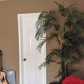
Amber works from home and was sacrificing a dining room for her home office. By utilizing the double wide closet space in her guest bedroom, she now walks into her home without the reminder of work, and can have guests over for a meal in her dining room (dining room reveal coming soon). The walls were freshly painted Sea Salt by Sherwin Williams. This gives the room a fresh, clean look and also adds contrast to the beige carpet.
Amber had her homework assignments cut out for her as she had to do some major purging in her throw all guest room. Once she started letting go, she was on a roll and continually surprised me as she cleaned out closets throughout the house. One dresser was filled with cds, dvds, books, albums, scrap-booking materials; items taking up precious real estate in her life that she didn't even know were there. There really wasn't a storage problem after-all, she was just holding on to a collection of things that no longer served her. Each time I would visit, and her space would become more open, I could see the weight lifting off her and her self love building. Amber had a recent breakup with her boyfriend and this makeover helped her not only focus on making a home sanctuary for herself, but helped her let go of the pains of the past and focus on the exciting future ahead. At one point when we were moving sofas in the living room (which we will also reveal soon), we found an ex's flip-flop. We were figuratively and literally sweeping away the past. Editing your home and your life makes room for your future; for new people and things. We are so happy to finally reveal the room to you! We can't wait to unveil the rest of Amber's home, once we complete the finishing touches.
Challenges:
Amber's home was filled with mix-matched furniture from family and college. She had no idea what her decorating style was. After shopping together and exchanging somepinterest boards, I was finally able to get a sense of what she loves.
I had to work on a tight budget, which meant really digging out the creativity and utilizing other items in the home. See how I transformed a table from the discard pile into a faux marble bedside table by clicking web link.
Amber's dad was able to help with the desk materials and building to cut costs.
We wanted to save the closet doors in the event she sold her home or no longer needed an office someday. There wasn't any extra space to store these closet doors, so I used them as a headboard.
The only items purchased were: Curtains, Curtain Rod, Bedspread Set, Throw Pillows, 2 Lamps and Paint.
 Nar Design Group
This house built in the 1990s never had renovations done prior to this whole house remodel. Filled with vibrant wallpaper and shiny brass finishes so indicative of the time the house was in need of a major upgrade and refresh.
The laundry room already had ample space and storage, but we tailored the storage for the family. An integrated shoe shelf allows for a clean space to store shoes in this no shoe household. A fold down, integrated ironing board provides functionality without crowding the space.
The powder bath is the only bath on the first floor, so is a full bath, but functions as a powder bath 90% of the time. We wanted to keep the focus away from the shower and keep the fun of a powder bath. A custom window pane patterned etched glass shower allows the shower to stay in the background.
In the master bath there was also ample space, but the design was in great need of an upgrade. With a decked-in tub and shower that you had to step up and then down into, the space needed a better flow and easier access. A freestanding tub allowed all of the decking to be removed and gave space for a larger, more luxurious shower. A huge linen storage with bench that double as a suitcase stand finishes out the space nicely. The room was given a clean, modern farmhouse feel to really freshen up the space.
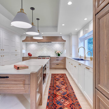
The focus of this kitchen was to open up the workflow, creating a space for the family to work comfortably while also creating a beautiful and inspiring space. Placing a large refrigerator at the edge of the kitchen, adding a beverage refrigerator, using a Galley Workstation and having the island at a slightly lower height makes it highly functional for the whole family. It is rare to achieve a long line of symmetry, but with a feature wall created around the range top we were able to do so. We created an antique armoire feel with the panel ready refrigerator and custom panel design above.
A mixture of hardware was used, the gray stained hickory cabinets were paired with matte black hardware, while the designer white cabinets were paired with brass hardware. A very custom refrigerator cabinet was created that emphasized the armoire feel. A long wall of 9” deep tall cabinets created a very beautiful as well as highly functional pantry space.

 Klopf Architecture
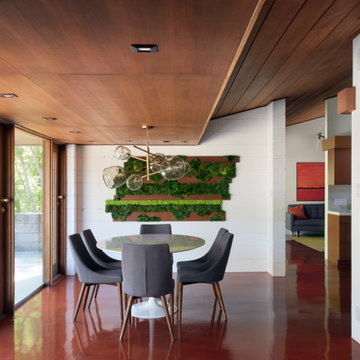
Nestled in the hills of Orinda, California, this 1951 residence is one of only seven extant homes, now known as “The Magnificent Seven”, designed by architect Olof Dahlstrand, a protégé of Frank Lloyd Wright. With its low-slung rooflines, natural materials, and deep integration with the sloping landscape, the home is a pristine example of mid-century modern design inspired by Wright’s organic principles. Over the years, prior homeowners have emphasized preservation, ensuring that the house remained relatively untouched. Each owner has respected the original architecture and stayed true to Dahlstrand’s intent. When a family of five—two college-aged sons and a middle school-aged daughter—acquired the property, they were captivated by its history, legacy of care, and architectural significance. While they appreciated Dahlstrand’s original vision, they also recognized the need to adapt the home for contemporary living while preserving its design integrity.
The remodel was conceived as a thoughtful response to the past—an effort to bring the house into the 21st century without compromising its soul. The primary mandate was to maintain architectural continuity while improving the functionality, comfort, and livability for a modern family. The design team—architects and contractor alike—worked with a shared reverence for the original architecture, allowing that mindset to guide even the most technical or pragmatic decisions.
A key objective was to increase natural light in the kitchen—a departure from Wrightian principles of enclosed, intimate cooking spaces—while maintaining the home’s architectural language. The kitchen was reconfigured to foster a stronger connection to adjacent living spaces while retaining the underlying concept of spatial separation. One of the most transformative architectural changes was the removal of a ridge beam that was originally planned to remain visible through the kitchen. During construction, the team collaborated on a better solution: a wide-flanged steel beam concealed within the roof envelope. This subtle move preserved the clean lines and ceiling continuity, a modern update carried out with utmost respect for the existing framework.
The home’s original powder room, previously accessible only through the kitchen, was relocated for better flow and privacy. A new powder room was carved out of former kitchen cabinetry—a narrow, interior space that could have felt dark and enclosed. To avoid this, the design extended the line of original transom windows into the new powder room and added a skylight above the vanity. The result is a bright and airy space that feels consistent with the rest of the home. Other updates included the installation of new solid-core interior doors with veneers carefully matched to the original mahogany, enhancing the continuity of the interiors. Even smaller decisions, such as placing the door knobs at 42 inches high, mirrored the original proportions. Every choice reflected a shared belief between the architect, contractor, and client: that new work should serve the integrity of the old.
The home’s extensive interior redwood millwork and paneling was meticulously restored. Where new materials were introduced—such as the replacement redwood soffit paneling—the contractor took pains to find finish nails that matched the original, rather than using modern equivalents. This level of craftsmanship and collaboration defined the project. It extended even to the detailing of a blind door to the new powder room, which had to disappear into the existing redwood board-and-batten wall. It was a team effort: the owner found a suitable handle, the architects devised the custom in-swing mechanism, and the contractor executed it so the door aligned precisely with the battens. Throughout, the homeowners were deeply engaged in the design process. One, a meticulous design enthusiast, focused on aesthetic integrity and historic detail. The other brought a practical and function-driven perspective, ensuring that new fixtures and materials would be durable and require minimal maintenance.
While the home’s location posed no major site challenges, sustainability was a key concern. The team upgraded the roof insulation, installed solar panels with battery storage, and added ductless mini-split cooling systems. Lighting was another area where modern technology was woven into a historic framework: new square LED fixtures echo the original custom perimeter soffit lights, maintaining the design language while offering advanced performance.
A planned expansion of a bedroom into suite with a bathroom had to be shelved due to budget constraints and the high cost of below-grade foundation work. Still, the team focused their efforts on making the most of the existing footprint, resolving constraints through design ingenuity rather than adding square footage. This renovation represents a collaborative achievement in preserving and evolving a historically significant home. Every decision was shaped by a shared ethos among clients, architects, and contractor: to maintain the home’s architectural soul while updating it for contemporary life. The result is a timeless modernist residence that continues Olof Dahlstrand’s legacy, remaining grounded in nature, craftsmanship, and human-scale design.
Klopf Architecture Team: John Klopf, AIA, Klara Kevane, Fernanda Bernardes
Interior Architectural Design: Klopf Architecture
Structural Engineer: Daniel Bastiao
Contractor: Don Larwood, Larwood Construction
Photography: Mariko Reed
Year Completed: 2022
 Jasper + Phoenix
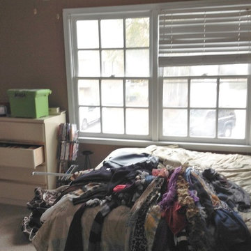
Amber works from home and was sacrificing a dining room for her home office. By utilizing the double wide closet space in her guest bedroom, she now walks into her home without the reminder of work, and can have guests over for a meal in her dining room (dining room reveal coming soon). The walls were freshly painted Sea Salt by Sherwin Williams. This gives the room a fresh, clean look and also adds contrast to the beige carpet.
Amber had her homework assignments cut out for her as she had to do some major purging in her throw all guest room. Once she started letting go, she was on a roll and continually surprised me as she cleaned out closets throughout the house. One dresser was filled with cds, dvds, books, albums, scrap-booking materials; items taking up precious real estate in her life that she didn't even know were there. There really wasn't a storage problem after-all, she was just holding on to a collection of things that no longer served her. Each time I would visit, and her space would become more open, I could see the weight lifting off her and her self love building. Amber had a recent breakup with her boyfriend and this makeover helped her not only focus on making a home sanctuary for herself, but helped her let go of the pains of the past and focus on the exciting future ahead. At one point when we were moving sofas in the living room (which we will also reveal soon), we found an ex's flip-flop. We were figuratively and literally sweeping away the past. Editing your home and your life makes room for your future; for new people and things. We are so happy to finally reveal the room to you! We can't wait to unveil the rest of Amber's home, once we complete the finishing touches.
Challenges:
Amber's home was filled with mix-matched furniture from family and college. She had no idea what her decorating style was. After shopping together and exchanging somepinterest boards, I was finally able to get a sense of what she loves.
I had to work on a tight budget, which meant really digging out the creativity and utilizing other items in the home. See how I transformed a table from the discard pile into a faux marble bedside table by clicking web link.
Amber's dad was able to help with the desk materials and building to cut costs.
We wanted to save the closet doors in the event she sold her home or no longer needed an office someday. There wasn't any extra space to store these closet doors, so I used them as a headboard.
The only items purchased were: Curtains, Curtain Rod, Bedspread Set, Throw Pillows, 2 Lamps and Paint.
 Stebnitz Builders, Inc.
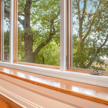
When our clients purchased their home on Lake Beulah near East Troy, they knew they wanted to make changes. The home had a mixed architectural style – rustic on the outside but traditional inside. Major renovations to the home focused on three main areas – the living room, the dining room and the master bedroom. Walls were removed to open up and better unify the living room and kitchen spaces. One window in the living room became nearly a wall of windows to allow for better views of the lake, and two skylights added more natural light.
In addition, all the cherry stained millwork, baseboards and window trim on the first floor were painted. Carpenters installed wood ceilings and stained the new posts and beam structures. Doors, window sills and seats also received fresh stain. To add to the rustic interior, we focused on details such as the laundry room door just off the kitchen. There a rustic, wooden sliding barn door became and interesting focal point.
 Klopf Architecture
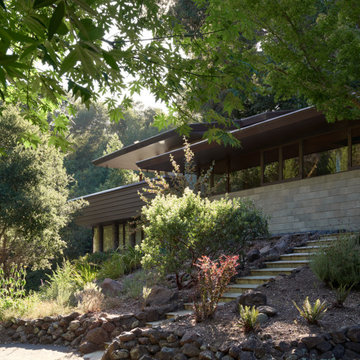
Nestled in the hills of Orinda, California, this 1951 residence is one of only seven extant homes, now known as “The Magnificent Seven”, designed by architect Olof Dahlstrand, a protégé of Frank Lloyd Wright. With its low-slung rooflines, natural materials, and deep integration with the sloping landscape, the home is a pristine example of mid-century modern design inspired by Wright’s organic principles. Over the years, prior homeowners have emphasized preservation, ensuring that the house remained relatively untouched. Each owner has respected the original architecture and stayed true to Dahlstrand’s intent. When a family of five—two college-aged sons and a middle school-aged daughter—acquired the property, they were captivated by its history, legacy of care, and architectural significance. While they appreciated Dahlstrand’s original vision, they also recognized the need to adapt the home for contemporary living while preserving its design integrity.
The remodel was conceived as a thoughtful response to the past—an effort to bring the house into the 21st century without compromising its soul. The primary mandate was to maintain architectural continuity while improving the functionality, comfort, and livability for a modern family. The design team—architects and contractor alike—worked with a shared reverence for the original architecture, allowing that mindset to guide even the most technical or pragmatic decisions.
A key objective was to increase natural light in the kitchen—a departure from Wrightian principles of enclosed, intimate cooking spaces—while maintaining the home’s architectural language. The kitchen was reconfigured to foster a stronger connection to adjacent living spaces while retaining the underlying concept of spatial separation. One of the most transformative architectural changes was the removal of a ridge beam that was originally planned to remain visible through the kitchen. During construction, the team collaborated on a better solution: a wide-flanged steel beam concealed within the roof envelope. This subtle move preserved the clean lines and ceiling continuity, a modern update carried out with utmost respect for the existing framework.
The home’s original powder room, previously accessible only through the kitchen, was relocated for better flow and privacy. A new powder room was carved out of former kitchen cabinetry—a narrow, interior space that could have felt dark and enclosed. To avoid this, the design extended the line of original transom windows into the new powder room and added a skylight above the vanity. The result is a bright and airy space that feels consistent with the rest of the home. Other updates included the installation of new solid-core interior doors with veneers carefully matched to the original mahogany, enhancing the continuity of the interiors. Even smaller decisions, such as placing the door knobs at 42 inches high, mirrored the original proportions. Every choice reflected a shared belief between the architect, contractor, and client: that new work should serve the integrity of the old.
The home’s extensive interior redwood millwork and paneling was meticulously restored. Where new materials were introduced—such as the replacement redwood soffit paneling—the contractor took pains to find finish nails that matched the original, rather than using modern equivalents. This level of craftsmanship and collaboration defined the project. It extended even to the detailing of a blind door to the new powder room, which had to disappear into the existing redwood board-and-batten wall. It was a team effort: the owner found a suitable handle, the architects devised the custom in-swing mechanism, and the contractor executed it so the door aligned precisely with the battens. Throughout, the homeowners were deeply engaged in the design process. One, a meticulous design enthusiast, focused on aesthetic integrity and historic detail. The other brought a practical and function-driven perspective, ensuring that new fixtures and materials would be durable and require minimal maintenance.
While the home’s location posed no major site challenges, sustainability was a key concern. The team upgraded the roof insulation, installed solar panels with battery storage, and added ductless mini-split cooling systems. Lighting was another area where modern technology was woven into a historic framework: new square LED fixtures echo the original custom perimeter soffit lights, maintaining the design language while offering advanced performance.
A planned expansion of a bedroom into suite with a bathroom had to be shelved due to budget constraints and the high cost of below-grade foundation work. Still, the team focused their efforts on making the most of the existing footprint, resolving constraints through design ingenuity rather than adding square footage. This renovation represents a collaborative achievement in preserving and evolving a historically significant home. Every decision was shaped by a shared ethos among clients, architects, and contractor: to maintain the home’s architectural soul while updating it for contemporary life. The result is a timeless modernist residence that continues Olof Dahlstrand’s legacy, remaining grounded in nature, craftsmanship, and human-scale design.
Klopf Architecture Team: John Klopf, AIA, Klara Kevane, Fernanda Bernardes
Interior Architectural Design: Klopf Architecture
Structural Engineer: Daniel Bastiao
Contractor: Don Larwood, Larwood Construction
Photography: Mariko Reed
Year Completed: 2022
 JRP Design & Remodel
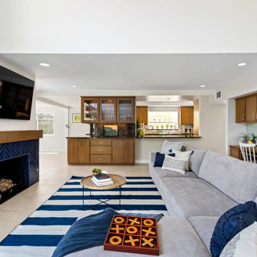
These repeat clients were looking for a relaxing getaway for their family of five young kids and themselves to enjoy. Upon finding the perfect vacation destination, they turned once again to JRP’s team of experts for their full home remodel. They knew JRP would provide them with the quality and attention to detail they expected. The vision was to give the home a clean, bright, and coastal look. It also needed to have the functionality a large family requires.
This home previously lacked the light and bright feel they wanted in their vacation home. With small windows and balcony in the master bedroom, it also failed to take advantage of the beautiful harbor views. The carpet was yet another major problem for the family. With young kids, these clients were looking for a lower maintenance option that met their design vision.
To fix these issues, JRP removed the carpet and tile throughout and replaced with a beautiful seven-inch engineered oak hardwood flooring. Ceiling fans were installed to meet the needs of the coastal climate. They also gave the home a whole new cohesive design and pallet by using blue and white colors throughout.
From there, efforts were focused on giving the master bedroom a major reconfiguration. The balcony was expanded, and a larger glass panel and metal handrail was installed leading to their private outdoor space. Now they could really enjoy all the harbor views. The bedroom and bathroom were also expanded by moving the closet and removing an extra vanity from the hallway. By the end, the bedroom truly became a couples’ retreat while the rest of the home became just the relaxing getaway the family needed.
 JRP Design & Remodel
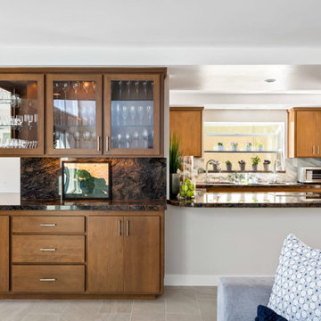
These repeat clients were looking for a relaxing getaway for their family of five young kids and themselves to enjoy. Upon finding the perfect vacation destination, they turned once again to JRP’s team of experts for their full home remodel. They knew JRP would provide them with the quality and attention to detail they expected. The vision was to give the home a clean, bright, and coastal look. It also needed to have the functionality a large family requires.
This home previously lacked the light and bright feel they wanted in their vacation home. With small windows and balcony in the master bedroom, it also failed to take advantage of the beautiful harbor views. The carpet was yet another major problem for the family. With young kids, these clients were looking for a lower maintenance option that met their design vision.
To fix these issues, JRP removed the carpet and tile throughout and replaced with a beautiful seven-inch engineered oak hardwood flooring. Ceiling fans were installed to meet the needs of the coastal climate. They also gave the home a whole new cohesive design and pallet by using blue and white colors throughout.
From there, efforts were focused on giving the master bedroom a major reconfiguration. The balcony was expanded, and a larger glass panel and metal handrail was installed leading to their private outdoor space. Now they could really enjoy all the harbor views. The bedroom and bathroom were also expanded by moving the closet and removing an extra vanity from the hallway. By the end, the bedroom truly became a couples’ retreat while the rest of the home became just the relaxing getaway the family needed.

 Stebnitz Builders, Inc.
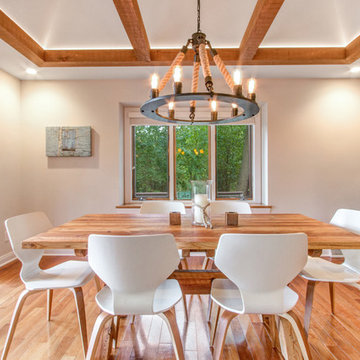
When our clients purchased their home on Lake Beulah near East Troy, they knew they wanted to make changes. The home had a mixed architectural style – rustic on the outside but traditional inside. Major renovations to the home focused on three main areas – the living room, the dining room and the master bedroom. Walls were removed to open up and better unify the living room and kitchen spaces. One window in the living room became nearly a wall of windows to allow for better views of the lake, and two skylights added more natural light.
In addition, all the cherry stained millwork, baseboards and window trim on the first floor were painted. Carpenters installed wood ceilings and stained the new posts and beam structures. Doors, window sills and seats also received fresh stain. To add to the rustic interior, we focused on details such as the laundry room door just off the kitchen. There a rustic, wooden sliding barn door became and interesting focal point.
 Drury Design
THE SETUP
When we first encountered this basement for a family with three boys, we saw a space with untapped potential. Though previously remodeled, it lacked a cohesive design strategy. The expansive area housed various entertainment pieces (a shuffleboard table, air hockey, foosball, etc.) scattered haphazardly throughout the space.
While the basement included a workout room and a rudimentary kitchen area, it lacked a dedicated game room or proper bar. Excessive storage closets along the back wall consumed valuable real estate that could be repurposed for more engaging uses.
In essence, the basement was spacious but disjointed—functional for family use but falling short as an entertainment hub. It didn’t align with the sophistication of the rest of the home. Our clients envisioned a transformation: a fresh, organized space that would not only serve their family’s needs but also shine as an inviting arena for entertaining friends and hosting gatherings – especially sports-focused gatherings!
Design Objectives:
Reimagine the basement layout, creating distinct zones for varied activities.
Expand the workout area to accommodate new equipment, including a Smith machine.
Implement a multi-screen setup inspired by high-end sports bars, allowing guests to follow multiple games while socializing.
Enhance existing features while developing new areas:
Optimize a workout space for all equipment needs
Establish a dedicated children’s space with guest room capabilities
Create an integrated bar and entertainment area
Retain and incorporate the existing projector setup
Design Challenges:
Navigate layout constraints in the new workout room due to fixed utility areas.
Carve out a distinct space for kids within the open plan.
Revitalize an underutilized section of the basement.
Elevate the existing big screen area with purposeful design elements.
Develop a full-fledged bar area while maintaining kitchen functions applicable for hangout snacking.
Work around immovable structural elements (soffits, load-bearing support columns)
THE RENEWED SPACE
Design Solutions:
Install a stylish barn door for the utility area of the new workout space, improving aesthetics and accessibility.
Repurpose the former workout room into a dedicated game room for kids, utilizing couches with pull-out beds so the area can double as overflow guest accommodations.
Transform the unused area into a vibrant pub-style area for card and table games.
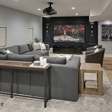
Enhance the big screen area with elegant wainscoting and ambient theatre-style lighting.
Design a multi-functional wet bar area featuring varied seating, prep areas, and a microwave.
Base the bar sink area width off the soffit above it.
In the big screen area, use the soffit to inform the width of a wainscoting section.
For the immovable support columns, dress one up to match the wainscoting of the nearby big screen wall. Hide the other one in a new wall.
Final Thoughts:
The reimagined basement has exceeded our clients’ expectations, evolving into the ultimate entertainment hub. With seven strategically placed screens, it’s perfect for gatherings focused on major sporting events and casual gatherings, as well. The space strikes a balance between adult sophistication and family-friendly functionality, featuring distinct zones for various activities.
The new design not only maximizes functionality for modern, multi-screen entertainment but also elevates the aesthetic appeal. It integrates flawlessly with the rest of the home’s transitional style while allowing each basement section to maintain its unique character. The result is a versatile space that caters to both intimate family time and large-scale entertaining.
 JRP Design & Remodel
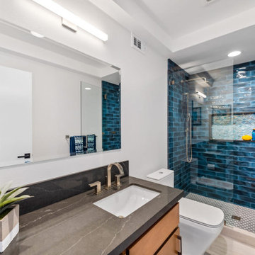
These repeat clients were looking for a relaxing getaway for their family of five young kids and themselves to enjoy. Upon finding the perfect vacation destination, they turned once again to JRP’s team of experts for their full home remodel. They knew JRP would provide them with the quality and attention to detail they expected. The vision was to give the home a clean, bright, and coastal look. It also needed to have the functionality a large family requires.
This home previously lacked the light and bright feel they wanted in their vacation home. With small windows and balcony in the master bedroom, it also failed to take advantage of the beautiful harbor views. The carpet was yet another major problem for the family. With young kids, these clients were looking for a lower maintenance option that met their design vision.
To fix these issues, JRP removed the carpet and tile throughout and replaced with a beautiful seven-inch engineered oak hardwood flooring. Ceiling fans were installed to meet the needs of the coastal climate. They also gave the home a whole new cohesive design and pallet by using blue and white colors throughout.
From there, efforts were focused on giving the master bedroom a major reconfiguration. The balcony was expanded, and a larger glass panel and metal handrail was installed leading to their private outdoor space. Now they could really enjoy all the harbor views. The bedroom and bathroom were also expanded by moving the closet and removing an extra vanity from the hallway. By the end, the bedroom truly became a couples’ retreat while the rest of the home became just the relaxing getaway the family needed.
 Drury Design
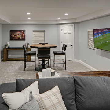
THE SETUP
When we first encountered this basement for a family with three boys, we saw a space with untapped potential. Though previously remodeled, it lacked a cohesive design strategy. The expansive area housed various entertainment pieces (a shuffleboard table, air hockey, foosball, etc.) scattered haphazardly throughout the space.
While the basement included a workout room and a rudimentary kitchen area, it lacked a dedicated game room or proper bar. Excessive storage closets along the back wall consumed valuable real estate that could be repurposed for more engaging uses.
In essence, the basement was spacious but disjointed—functional for family use but falling short as an entertainment hub. It didn’t align with the sophistication of the rest of the home. Our clients envisioned a transformation: a fresh, organized space that would not only serve their family’s needs but also shine as an inviting arena for entertaining friends and hosting gatherings – especially sports-focused gatherings!
Design Objectives:
Reimagine the basement layout, creating distinct zones for varied activities.
Expand the workout area to accommodate new equipment, including a Smith machine.
Implement a multi-screen setup inspired by high-end sports bars, allowing guests to follow multiple games while socializing.
Enhance existing features while developing new areas:
Optimize a workout space for all equipment needs
Establish a dedicated children’s space with guest room capabilities
Create an integrated bar and entertainment area
Retain and incorporate the existing projector setup
Design Challenges:
Navigate layout constraints in the new workout room due to fixed utility areas.
Carve out a distinct space for kids within the open plan.
Revitalize an underutilized section of the basement.
Elevate the existing big screen area with purposeful design elements.
Develop a full-fledged bar area while maintaining kitchen functions applicable for hangout snacking.
Work around immovable structural elements (soffits, load-bearing support columns)
THE RENEWED SPACE
Design Solutions:
Install a stylish barn door for the utility area of the new workout space, improving aesthetics and accessibility.
Repurpose the former workout room into a dedicated game room for kids, utilizing couches with pull-out beds so the area can double as overflow guest accommodations.
Transform the unused area into a vibrant pub-style area for card and table games.
Enhance the big screen area with elegant wainscoting and ambient theatre-style lighting.
Design a multi-functional wet bar area featuring varied seating, prep areas, and a microwave.
Base the bar sink area width off the soffit above it.
In the big screen area, use the soffit to inform the width of a wainscoting section.
For the immovable support columns, dress one up to match the wainscoting of the nearby big screen wall. Hide the other one in a new wall.
Final Thoughts:
The reimagined basement has exceeded our clients’ expectations, evolving into the ultimate entertainment hub. With seven strategically placed screens, it’s perfect for gatherings focused on major sporting events and casual gatherings, as well. The space strikes a balance between adult sophistication and family-friendly functionality, featuring distinct zones for various activities.
The new design not only maximizes functionality for modern, multi-screen entertainment but also elevates the aesthetic appeal. It integrates flawlessly with the rest of the home’s transitional style while allowing each basement section to maintain its unique character. The result is a versatile space that caters to both intimate family time and large-scale entertaining.
 Drury Design
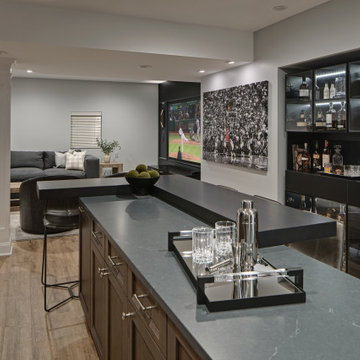
THE SETUP
When we first encountered this basement for a family with three boys, we saw a space with untapped potential. Though previously remodeled, it lacked a cohesive design strategy. The expansive area housed various entertainment pieces (a shuffleboard table, air hockey, foosball, etc.) scattered haphazardly throughout the space.
While the basement included a workout room and a rudimentary kitchen area, it lacked a dedicated game room or proper bar. Excessive storage closets along the back wall consumed valuable real estate that could be repurposed for more engaging uses.
In essence, the basement was spacious but disjointed—functional for family use but falling short as an entertainment hub. It didn’t align with the sophistication of the rest of the home. Our clients envisioned a transformation: a fresh, organized space that would not only serve their family’s needs but also shine as an inviting arena for entertaining friends and hosting gatherings – especially sports-focused gatherings!
Design Objectives:
Reimagine the basement layout, creating distinct zones for varied activities.
Expand the workout area to accommodate new equipment, including a Smith machine.
Implement a multi-screen setup inspired by high-end sports bars, allowing guests to follow multiple games while socializing.
Enhance existing features while developing new areas:
Optimize a workout space for all equipment needs
Establish a dedicated children’s space with guest room capabilities
Create an integrated bar and entertainment area
Retain and incorporate the existing projector setup
Design Challenges:
Navigate layout constraints in the new workout room due to fixed utility areas.
Carve out a distinct space for kids within the open plan.
Revitalize an underutilized section of the basement.
Elevate the existing big screen area with purposeful design elements.
Develop a full-fledged bar area while maintaining kitchen functions applicable for hangout snacking.
Work around immovable structural elements (soffits, load-bearing support columns)
THE RENEWED SPACE
Design Solutions:
Install a stylish barn door for the utility area of the new workout space, improving aesthetics and accessibility.
Repurpose the former workout room into a dedicated game room for kids, utilizing couches with pull-out beds so the area can double as overflow guest accommodations.
Transform the unused area into a vibrant pub-style area for card and table games.
Enhance the big screen area with elegant wainscoting and ambient theatre-style lighting.
Design a multi-functional wet bar area featuring varied seating, prep areas, and a microwave.
Base the bar sink area width off the soffit above it.
In the big screen area, use the soffit to inform the width of a wainscoting section.
For the immovable support columns, dress one up to match the wainscoting of the nearby big screen wall. Hide the other one in a new wall.
Final Thoughts:
The reimagined basement has exceeded our clients’ expectations, evolving into the ultimate entertainment hub. With seven strategically placed screens, it’s perfect for gatherings focused on major sporting events and casual gatherings, as well. The space strikes a balance between adult sophistication and family-friendly functionality, featuring distinct zones for various activities.
The new design not only maximizes functionality for modern, multi-screen entertainment but also elevates the aesthetic appeal. It integrates flawlessly with the rest of the home’s transitional style while allowing each basement section to maintain its unique character. The result is a versatile space that caters to both intimate family time and large-scale entertaining.
 Vetter Architects
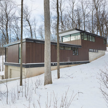
The client’s request was quite common - a typical 2800 sf builder home with 3 bedrooms, 2 baths, living space, and den. However, their desire was for this to be “anything but common.” The result is an innovative update on the production home for the modern era, and serves as a direct counterpoint to the neighborhood and its more conventional suburban housing stock, which focus views to the backyard and seeks to nullify the unique qualities and challenges of topography and the natural environment.
The Terraced House cautiously steps down the site’s steep topography, resulting in a more nuanced approach to site development than cutting and filling that is so common in the builder homes of the area. The compact house opens up in very focused views that capture the natural wooded setting, while masking the sounds and views of the directly adjacent roadway. The main living spaces face this major roadway, effectively flipping the typical orientation of a suburban home, and the main entrance pulls visitors up to the second floor and halfway through the site, providing a sense of procession and privacy absent in the typical suburban home.
Clad in a custom rain screen that reflects the wood of the surrounding landscape - while providing a glimpse into the interior tones that are used. The stepping “wood boxes” rest on a series of concrete walls that organize the site, retain the earth, and - in conjunction with the wood veneer panels - provide a subtle organic texture to the composition.
The interior spaces wrap around an interior knuckle that houses public zones and vertical circulation - allowing more private spaces to exist at the edges of the building. The windows get larger and more frequent as they ascend the building, culminating in the upstairs bedrooms that occupy the site like a tree house - giving views in all directions.
The Terraced House imports urban qualities to the suburban neighborhood and seeks to elevate the typical approach to production home construction, while being more in tune with modern family living patterns.
Overview:
Elm Grove
Size:
2,800 sf,
3 bedrooms, 2 bathrooms
Completion Date:
September 2014
Services:
Architecture, Landscape Architecture
Interior Consultants: Amy Carman Design
 Stebnitz Builders, Inc.
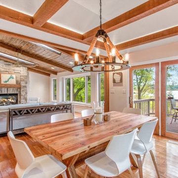
When our clients purchased their home on Lake Beulah near East Troy, they knew they wanted to make changes. The home had a mixed architectural style – rustic on the outside but traditional inside. Major renovations to the home focused on three main areas – the living room, the dining room and the master bedroom. Walls were removed to open up and better unify the living room and kitchen spaces. One window in the living room became nearly a wall of windows to allow for better views of the lake, and two skylights added more natural light.
In addition, all the cherry stained millwork, baseboards and window trim on the first floor were painted. Carpenters installed wood ceilings and stained the new posts and beam structures. Doors, window sills and seats also received fresh stain. To add to the rustic interior, we focused on details such as the laundry room door just off the kitchen. There a rustic, wooden sliding barn door became and interesting focal point.
14