
Search results for "Major intersection" in Home Design Ideas
 HU-235072162
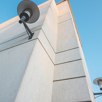
The Dental Studio is a highly intricate building that uniquely links two separate stands of two neighbourhoods and straddling a four metre broad municipal
servitude. The western part of the neighbourhood is an office precinct consisting of low scaled office buildings set around a communal access street and
parking. It was designed for a leading dental practice with state of the art equipment and progressive philosophy of service.
It presents itself as an uncomplicated rectangular structural mass that elegantly characterise an intersection of a major neighbourhood boulevard and is
notable along the eastern end with an upright circulation tower. The western end on the other hand, is characterised with vertical solar control screens
which serve a dual purpose, that is, sifting low down western sun rays as well as giving a serene appeal to the mass. The daring spotless form of the
building is a truthful reflection of the nature of the sterile dental environment that is housed within. This houses the central vestibule and reception with a
visual interface as well as pedestrian movements along the edge of the building.
Healing and healthcare is a paradox that requires architectural intervention. It is this same paradox that informed measures taken towards developing this
project as a revised prototype. Exacerbated by the need to research a building type that can promote healing environment, the Dental Studio attempts
to create a closer harmony with nature through views, landscape and daylight.
 HU-235072162
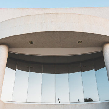
The Dental Studio is a highly intricate building that uniquely links two separate stands of two neighbourhoods and straddling a four metre broad municipal
servitude. The western part of the neighbourhood is an office precinct consisting of low scaled office buildings set around a communal access street and
parking. It was designed for a leading dental practice with state of the art equipment and progressive philosophy of service.
It presents itself as an uncomplicated rectangular structural mass that elegantly characterise an intersection of a major neighbourhood boulevard and is
notable along the eastern end with an upright circulation tower. The western end on the other hand, is characterised with vertical solar control screens
which serve a dual purpose, that is, sifting low down western sun rays as well as giving a serene appeal to the mass. The daring spotless form of the
building is a truthful reflection of the nature of the sterile dental environment that is housed within. This houses the central vestibule and reception with a
visual interface as well as pedestrian movements along the edge of the building.
Healing and healthcare is a paradox that requires architectural intervention. It is this same paradox that informed measures taken towards developing this
project as a revised prototype. Exacerbated by the need to research a building type that can promote healing environment, the Dental Studio attempts
to create a closer harmony with nature through views, landscape and daylight.

 Kraft Custom Construction
Located in the historic Fairmount Hills, in the shadow of the Oregon Governor’s mansion, this picturesque cottage feels like a little home in the woods. Featuring arch-top windows with stained-glass tulips, this home is aptly called the Tulip Cottage.
The homeowner wanted to add a master bedroom as well as extend the living room without losing the small, cottage-like feel of the home. For this major addition, seamless roof design was critical to assuring that the addition blended with the historic details of the original house.
The living space within the home was made to feel bigger through various techniques, such as raising the ceiling, adding windows and skylights, and opening up interior views. Available space was maximized for storage, such as the glass-front cabinet beside the dining room fireplace, the built-in dresser in the passageway separating the bedroom and bathroom in the guest suite, and the built-in bureaus in the guest bathroom. The ceramic tile work in both the guest bathroom and the kitchen stayed true to its original 1920s style.
One of our favorite details of this project is the unique corner block we custom-carved for the intersection of two crown moldings in the bedroom. This corner block made the transition between the two crown moldings cleaner and smoother.
Find the right local pro for your project

 Ky-Kan Coatings
Concrete can be made to look like any substance. Tile, stone, wood, brick, etc. With unlimited color options, Ky-Kan Coatings can transform any room in your home or business using lightweight, beautiful concrete.
 Studio 1200
While most people in town considered this building a "tear-down", the new homeowners wanted to revive the property with an ambitions renovation and addition project. Two major challenges needed to be overcome on this project: the first was preserving the integrity of the original 200 year old barn; the second was designing a complementary structure that would co-exist on the site without looking like a 21st century addition.
In order to achieve these goals, our team studied how farm buildings evolve on a site over time. Additions are usually constructed based on need and function. With this protocol in mind, a grain silo was designed to act as our entry tower and buffer the intersection of the two buildings. The silo acts as our focal point and allowed us to construct very simple buildings to house the balance of the owner’s program. The team paid very close attention to scale, use of materials (many of which were recycled) and developed a vocabulary of modern interior detailing that would complement the original house.
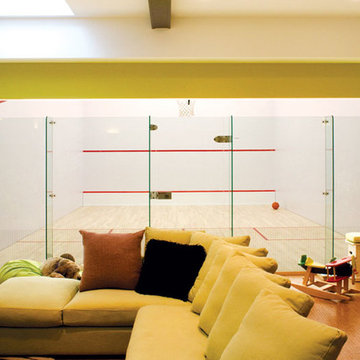
Specific program requirements for the project included: large entertainment spaces, gourmet kitchen with adjacent family room, a squash court, multiple bedrooms and bathrooms, master suite, and plenty of storage space. In addition, since both adults work from home and receive clients in their offices, two offices needed to be created and it was critical to separate the work areas for the more private family spaces. The new silo, with central stair, became the element that allowed these different program needs to coexist effectively.

 Zelaya Properties LLC
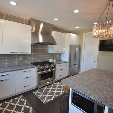
We used: Custom cherry cabinetry in Arts & Crafts Shaker style by Kabinart in Boulder and Espresso stains. Liberty Hardware Venetian bronze 1-1/2" cabinet knobs. KitchenAid Architect II Series 22 CF counter-depth French door refrigerator. KitchenAid Architect Series II 27" convection single wall oven. KitchenAid 36" 6-burner dual fuel freestanding commercial-style range. KitchenAid Architect II Series 24" dishwasher. Sharp Insight Pro Series 24" built-in microwave drawer (Model #KB6524PS). Crystorama Solaris 12" wide pendant lights in English bronze. Granite countertops in Brown Fantasy. 3"x6" polished marble backsplash.
Paint colors:
Walls: Glidden Silver Cloud 30YY 63/024
Ceilings/Trims/Doors: Glidden Swan White GLC23
Robert B. Narod Photography
 Studio 1200
While most people in town considered this building a "tear-down", the new homeowners wanted to revive the property with an ambitions renovation and addition project. Two major challenges needed to be overcome on this project: the first was preserving the integrity of the original 200 year old barn; the second was designing a complementary structure that would co-exist on the site without looking like a 21st century addition.
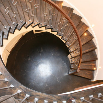
In order to achieve these goals, our team studied how farm buildings evolve on a site over time. Additions are usually constructed based on need and function. With this protocol in mind, a grain silo was designed to act as our entry tower and buffer the intersection of the two buildings. The silo acts as our focal point and allowed us to construct very simple buildings to house the balance of the owner’s program. The team paid very close attention to scale, use of materials (many of which were recycled) and developed a vocabulary of modern interior detailing that would complement the original house.
Specific program requirements for the project included: large entertainment spaces, gourmet kitchen with adjacent family room, a squash court, multiple bedrooms and bathrooms, master suite, and plenty of storage space. In addition, since both adults work from home and receive clients in their offices, two offices needed to be created and it was critical to separate the work areas for the more private family spaces. The new silo, with central stair, became the element that allowed these different program needs to coexist effectively.


 Moderne Builders
Gorgeous master bath with dramatic retro "wave" tile. Peak Photography
Example of a 1950s bathroom design in Los Angeles
Example of a 1950s bathroom design in Los Angeles
 Studio 1200
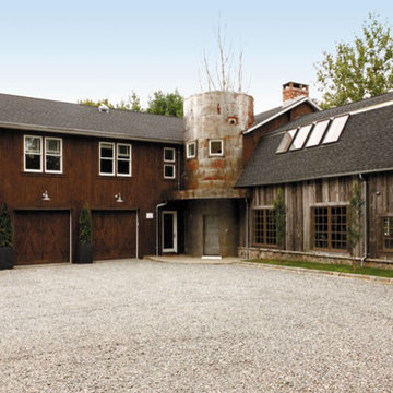
While most people in town considered this building a "tear-down", the new homeowners wanted to revive the property with an ambitions renovation and addition project. Two major challenges needed to be overcome on this project: the first was preserving the integrity of the original 200 year old barn; the second was designing a complementary structure that would co-exist on the site without looking like a 21st century addition.
In order to achieve these goals, our team studied how farm buildings evolve on a site over time. Additions are usually constructed based on need and function. With this protocol in mind, a grain silo was designed to act as our entry tower and buffer the intersection of the two buildings. The silo acts as our focal point and allowed us to construct very simple buildings to house the balance of the owner’s program. The team paid very close attention to scale, use of materials (many of which were recycled) and developed a vocabulary of modern interior detailing that would complement the original house.
Specific program requirements for the project included: large entertainment spaces, gourmet kitchen with adjacent family room, a squash court, multiple bedrooms and bathrooms, master suite, and plenty of storage space. In addition, since both adults work from home and receive clients in their offices, two offices needed to be created and it was critical to separate the work areas for the more private family spaces. The new silo, with central stair, became the element that allowed these different program needs to coexist effectively.
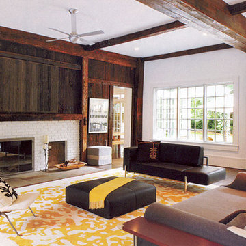 Studio 1200
While most people in town considered this building a "tear-down", the new homeowners wanted to revive the property with an ambitions renovation and addition project. Two major challenges needed to be overcome on this project: the first was preserving the integrity of the original 200 year old barn; the second was designing a complementary structure that would co-exist on the site without looking like a 21st century addition.
In order to achieve these goals, our team studied how farm buildings evolve on a site over time. Additions are usually constructed based on need and function. With this protocol in mind, a grain silo was designed to act as our entry tower and buffer the intersection of the two buildings. The silo acts as our focal point and allowed us to construct very simple buildings to house the balance of the owner’s program. The team paid very close attention to scale, use of materials (many of which were recycled) and developed a vocabulary of modern interior detailing that would complement the original house.
Specific program requirements for the project included: large entertainment spaces, gourmet kitchen with adjacent family room, a squash court, multiple bedrooms and bathrooms, master suite, and plenty of storage space. In addition, since both adults work from home and receive clients in their offices, two offices needed to be created and it was critical to separate the work areas for the more private family spaces. The new silo, with central stair, became the element that allowed these different program needs to coexist effectively.
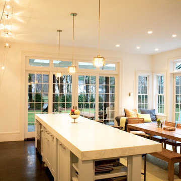 Studio 1200
While most people in town considered this building a "tear-down", the new homeowners wanted to revive the property with an ambitions renovation and addition project. Two major challenges needed to be overcome on this project: the first was preserving the integrity of the original 200 year old barn; the second was designing a complementary structure that would co-exist on the site without looking like a 21st century addition.
In order to achieve these goals, our team studied how farm buildings evolve on a site over time. Additions are usually constructed based on need and function. With this protocol in mind, a grain silo was designed to act as our entry tower and buffer the intersection of the two buildings. The silo acts as our focal point and allowed us to construct very simple buildings to house the balance of the owner’s program. The team paid very close attention to scale, use of materials (many of which were recycled) and developed a vocabulary of modern interior detailing that would complement the original house.
Specific program requirements for the project included: large entertainment spaces, gourmet kitchen with adjacent family room, a squash court, multiple bedrooms and bathrooms, master suite, and plenty of storage space. In addition, since both adults work from home and receive clients in their offices, two offices needed to be created and it was critical to separate the work areas for the more private family spaces. The new silo, with central stair, became the element that allowed these different program needs to coexist effectively.
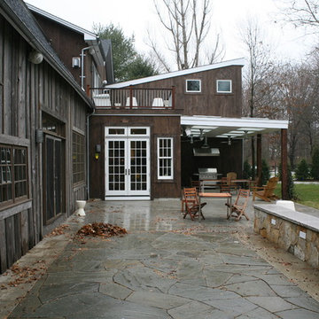 Studio 1200
While most people in town considered this building a "tear-down", the new homeowners wanted to revive the property with an ambitions renovation and addition project. Two major challenges needed to be overcome on this project: the first was preserving the integrity of the original 200 year old barn; the second was designing a complementary structure that would co-exist on the site without looking like a 21st century addition.
In order to achieve these goals, our team studied how farm buildings evolve on a site over time. Additions are usually constructed based on need and function. With this protocol in mind, a grain silo was designed to act as our entry tower and buffer the intersection of the two buildings. The silo acts as our focal point and allowed us to construct very simple buildings to house the balance of the owner’s program. The team paid very close attention to scale, use of materials (many of which were recycled) and developed a vocabulary of modern interior detailing that would complement the original house.
Specific program requirements for the project included: large entertainment spaces, gourmet kitchen with adjacent family room, a squash court, multiple bedrooms and bathrooms, master suite, and plenty of storage space. In addition, since both adults work from home and receive clients in their offices, two offices needed to be created and it was critical to separate the work areas for the more private family spaces. The new silo, with central stair, became the element that allowed these different program needs to coexist effectively.
 Studio 1200
While most people in town considered this building a "tear-down", the new homeowners wanted to revive the property with an ambitions renovation and addition project. Two major challenges needed to be overcome on this project: the first was preserving the integrity of the original 200 year old barn; the second was designing a complementary structure that would co-exist on the site without looking like a 21st century addition.
In order to achieve these goals, our team studied how farm buildings evolve on a site over time. Additions are usually constructed based on need and function. With this protocol in mind, a grain silo was designed to act as our entry tower and buffer the intersection of the two buildings. The silo acts as our focal point and allowed us to construct very simple buildings to house the balance of the owner’s program. The team paid very close attention to scale, use of materials (many of which were recycled) and developed a vocabulary of modern interior detailing that would complement the original house.
Specific program requirements for the project included: large entertainment spaces, gourmet kitchen with adjacent family room, a squash court, multiple bedrooms and bathrooms, master suite, and plenty of storage space. In addition, since both adults work from home and receive clients in their offices, two offices needed to be created and it was critical to separate the work areas for the more private family spaces. The new silo, with central stair, became the element that allowed these different program needs to coexist effectively.
 Studio 1200
While most people in town considered this building a "tear-down", the new homeowners wanted to revive the property with an ambitions renovation and addition project. Two major challenges needed to be overcome on this project: the first was preserving the integrity of the original 200 year old barn; the second was designing a complementary structure that would co-exist on the site without looking like a 21st century addition.
In order to achieve these goals, our team studied how farm buildings evolve on a site over time. Additions are usually constructed based on need and function. With this protocol in mind, a grain silo was designed to act as our entry tower and buffer the intersection of the two buildings. The silo acts as our focal point and allowed us to construct very simple buildings to house the balance of the owner’s program. The team paid very close attention to scale, use of materials (many of which were recycled) and developed a vocabulary of modern interior detailing that would complement the original house.
Specific program requirements for the project included: large entertainment spaces, gourmet kitchen with adjacent family room, a squash court, multiple bedrooms and bathrooms, master suite, and plenty of storage space. In addition, since both adults work from home and receive clients in their offices, two offices needed to be created and it was critical to separate the work areas for the more private family spaces. The new silo, with central stair, became the element that allowed these different program needs to coexist effectively.
 Studio 1200
While most people in town considered this building a "tear-down", the new homeowners wanted to revive the property with an ambitions renovation and addition project. Two major challenges needed to be overcome on this project: the first was preserving the integrity of the original 200 year old barn; the second was designing a complementary structure that would co-exist on the site without looking like a 21st century addition.
In order to achieve these goals, our team studied how farm buildings evolve on a site over time. Additions are usually constructed based on need and function. With this protocol in mind, a grain silo was designed to act as our entry tower and buffer the intersection of the two buildings. The silo acts as our focal point and allowed us to construct very simple buildings to house the balance of the owner’s program. The team paid very close attention to scale, use of materials (many of which were recycled) and developed a vocabulary of modern interior detailing that would complement the original house.
Specific program requirements for the project included: large entertainment spaces, gourmet kitchen with adjacent family room, a squash court, multiple bedrooms and bathrooms, master suite, and plenty of storage space. In addition, since both adults work from home and receive clients in their offices, two offices needed to be created and it was critical to separate the work areas for the more private family spaces. The new silo, with central stair, became the element that allowed these different program needs to coexist effectively.
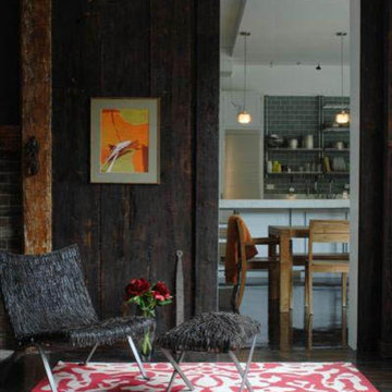 Studio 1200
While most people in town considered this building a "tear-down", the new homeowners wanted to revive the property with an ambitions renovation and addition project. Two major challenges needed to be overcome on this project: the first was preserving the integrity of the original 200 year old barn; the second was designing a complementary structure that would co-exist on the site without looking like a 21st century addition.
In order to achieve these goals, our team studied how farm buildings evolve on a site over time. Additions are usually constructed based on need and function. With this protocol in mind, a grain silo was designed to act as our entry tower and buffer the intersection of the two buildings. The silo acts as our focal point and allowed us to construct very simple buildings to house the balance of the owner’s program. The team paid very close attention to scale, use of materials (many of which were recycled) and developed a vocabulary of modern interior detailing that would complement the original house.
Specific program requirements for the project included: large entertainment spaces, gourmet kitchen with adjacent family room, a squash court, multiple bedrooms and bathrooms, master suite, and plenty of storage space. In addition, since both adults work from home and receive clients in their offices, two offices needed to be created and it was critical to separate the work areas for the more private family spaces. The new silo, with central stair, became the element that allowed these different program needs to coexist effectively.
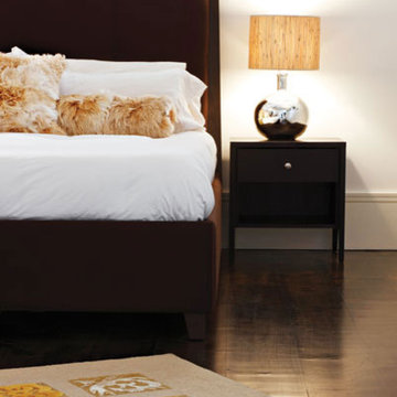 Studio 1200
While most people in town considered this building a "tear-down", the new homeowners wanted to revive the property with an ambitions renovation and addition project. Two major challenges needed to be overcome on this project: the first was preserving the integrity of the original 200 year old barn; the second was designing a complementary structure that would co-exist on the site without looking like a 21st century addition.
In order to achieve these goals, our team studied how farm buildings evolve on a site over time. Additions are usually constructed based on need and function. With this protocol in mind, a grain silo was designed to act as our entry tower and buffer the intersection of the two buildings. The silo acts as our focal point and allowed us to construct very simple buildings to house the balance of the owner’s program. The team paid very close attention to scale, use of materials (many of which were recycled) and developed a vocabulary of modern interior detailing that would complement the original house.
Specific program requirements for the project included: large entertainment spaces, gourmet kitchen with adjacent family room, a squash court, multiple bedrooms and bathrooms, master suite, and plenty of storage space. In addition, since both adults work from home and receive clients in their offices, two offices needed to be created and it was critical to separate the work areas for the more private family spaces. The new silo, with central stair, became the element that allowed these different program needs to coexist effectively.
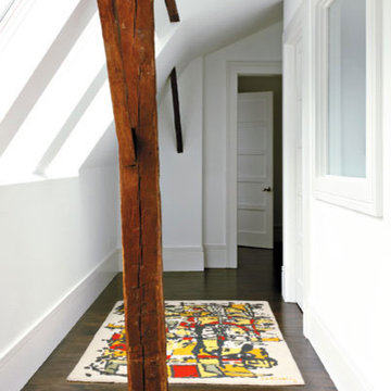 Studio 1200
While most people in town considered this building a "tear-down", the new homeowners wanted to revive the property with an ambitions renovation and addition project. Two major challenges needed to be overcome on this project: the first was preserving the integrity of the original 200 year old barn; the second was designing a complementary structure that would co-exist on the site without looking like a 21st century addition.
In order to achieve these goals, our team studied how farm buildings evolve on a site over time. Additions are usually constructed based on need and function. With this protocol in mind, a grain silo was designed to act as our entry tower and buffer the intersection of the two buildings. The silo acts as our focal point and allowed us to construct very simple buildings to house the balance of the owner’s program. The team paid very close attention to scale, use of materials (many of which were recycled) and developed a vocabulary of modern interior detailing that would complement the original house.
Specific program requirements for the project included: large entertainment spaces, gourmet kitchen with adjacent family room, a squash court, multiple bedrooms and bathrooms, master suite, and plenty of storage space. In addition, since both adults work from home and receive clients in their offices, two offices needed to be created and it was critical to separate the work areas for the more private family spaces. The new silo, with central stair, became the element that allowed these different program needs to coexist effectively.
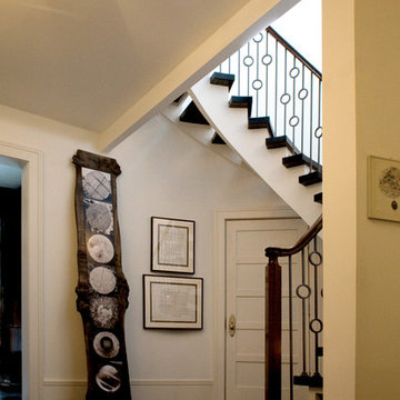 Studio 1200
While most people in town considered this building a "tear-down", the new homeowners wanted to revive the property with an ambitions renovation and addition project. Two major challenges needed to be overcome on this project: the first was preserving the integrity of the original 200 year old barn; the second was designing a complementary structure that would co-exist on the site without looking like a 21st century addition.
In order to achieve these goals, our team studied how farm buildings evolve on a site over time. Additions are usually constructed based on need and function. With this protocol in mind, a grain silo was designed to act as our entry tower and buffer the intersection of the two buildings. The silo acts as our focal point and allowed us to construct very simple buildings to house the balance of the owner’s program. The team paid very close attention to scale, use of materials (many of which were recycled) and developed a vocabulary of modern interior detailing that would complement the original house.
Specific program requirements for the project included: large entertainment spaces, gourmet kitchen with adjacent family room, a squash court, multiple bedrooms and bathrooms, master suite, and plenty of storage space. In addition, since both adults work from home and receive clients in their offices, two offices needed to be created and it was critical to separate the work areas for the more private family spaces. The new silo, with central stair, became the element that allowed these different program needs to coexist effectively.
 Kraft Custom Construction
Located in the historic Fairmount Hills, in the shadow of the Oregon Governor’s mansion, this picturesque cottage feels like a little home in the woods. Featuring arch-top windows with stained-glass tulips, this home is aptly called the Tulip Cottage.
The homeowner wanted to add a master bedroom as well as extend the living room without losing the small, cottage-like feel of the home. For this major addition, seamless roof design was critical to assuring that the addition blended with the historic details of the original house.
The living space within the home was made to feel bigger through various techniques, such as raising the ceiling, adding windows and skylights, and opening up interior views. Available space was maximized for storage, such as the glass-front cabinet beside the dining room fireplace, the built-in dresser in the passageway separating the bedroom and bathroom in the guest suite, and the built-in bureaus in the guest bathroom. The ceramic tile work in both the guest bathroom and the kitchen stayed true to its original 1920s style.
One of our favorite details of this project is the unique corner block we custom-carved for the intersection of two crown moldings in the bedroom. This corner block made the transition between the two crown moldings cleaner and smoother.
3