
Search results for "Major issues" in Home Design Ideas

 Vetter Architects
The client’s request was quite common - a typical 2800 sf builder home with 3 bedrooms, 2 baths, living space, and den. However, their desire was for this to be “anything but common.” The result is an innovative update on the production home for the modern era, and serves as a direct counterpoint to the neighborhood and its more conventional suburban housing stock, which focus views to the backyard and seeks to nullify the unique qualities and challenges of topography and the natural environment.
The Terraced House cautiously steps down the site’s steep topography, resulting in a more nuanced approach to site development than cutting and filling that is so common in the builder homes of the area. The compact house opens up in very focused views that capture the natural wooded setting, while masking the sounds and views of the directly adjacent roadway. The main living spaces face this major roadway, effectively flipping the typical orientation of a suburban home, and the main entrance pulls visitors up to the second floor and halfway through the site, providing a sense of procession and privacy absent in the typical suburban home.
Clad in a custom rain screen that reflects the wood of the surrounding landscape - while providing a glimpse into the interior tones that are used. The stepping “wood boxes” rest on a series of concrete walls that organize the site, retain the earth, and - in conjunction with the wood veneer panels - provide a subtle organic texture to the composition.
The interior spaces wrap around an interior knuckle that houses public zones and vertical circulation - allowing more private spaces to exist at the edges of the building. The windows get larger and more frequent as they ascend the building, culminating in the upstairs bedrooms that occupy the site like a tree house - giving views in all directions.
The Terraced House imports urban qualities to the suburban neighborhood and seeks to elevate the typical approach to production home construction, while being more in tune with modern family living patterns.
Overview:
Elm Grove
Size:
2,800 sf,
3 bedrooms, 2 bathrooms
Completion Date:
September 2014
Services:
Architecture, Landscape Architecture
Interior Consultants: Amy Carman Design

 Scott Springer Architect LLC
Built in 1948 on a hill high above Compo Cove and Sherwood Millpond, the original bungalow underwent a major renovation in 2000 during which a second story was added in a contemporized Nantucket style vocabulary. In 2015, Scott Springer Architect was hired to design an expansion of the second floor. The directive of the clients was to closely match the massing and details of the existing structure and allow the addition to appear as if it had always been a part of the house.
The addition is comprised of a new bathroom and corridor over the vaulted entrance hall—which remained undisturbed during construction—and two bedrooms and a laundry room over the existing garage. Windows at the east side of the addition allow for spectacular views of Long Island Sound while the windows on the other side overlook a patio and garden.
The house is featured in the April 2016 issue of Connecticut Cottages & Gardens ( http://www.cottages-gardens.com/Connecticut-Cottages-Gardens/April-2016/Westport-Real-Estate-Long-Island-Sound/).

 Milgard Windows & Doors
The Kiguchi family moved into their Austin, Texas home in 1994. Built in the 1980’s as part of a neighborhood development, they happily raised their family here but longed for something more contemporary. Once they became empty nesters, they decided it was time for a major remodel. After spending many years visiting Austin AIA Home Tours that highlight contemporary residential architecture, they had a lot of ideas and in 2013 were ready to interview architects and get their renovation underway.
The project turned into a major remodel due to an unstable foundation. Architects Ben Arbib and Ed Hughey, of Arbib Hughey Design were hired to solve the structural issue and look for inspiration in the bones of the house, which sat on top of a hillside and was surrounded by great views.
Unfortunately, with the old floor plan, the beautiful views were hidden by small windows that were poorly placed. In order to bring more natural light into the house the window sizes and configurations had to be addressed, all while keeping in mind the homeowners desire for a modern look and feel.
To achieve a more contemporary and sophisticated front of house, a new entry was designed that included removing a two-story bay window and porch. The entrance of the home also became more integrated with the landscape creating a template for new foliage to be planted. Older exterior materials were updated to incorporate a more muted palette of colors with a metal roof, dark grey siding in the back and white stucco in the front. Deep eaves were added over many of the new large windows for clean lines and sun protection.
“Inside it was about opening up the floor plan, expanding the views throughout the house, and updating the material palette to get a modern look that was also warm and inviting,” said Ben from Arbib Hughey Design. “Prior to the remodel, the house had the typical separation of rooms. We removed the walls between them and changed all of the windows to Milgard Thermally Improved Aluminum to connect the inside with the outside. No matter where you are you get nice views and natural light.”
The architects wanted to create some drama, which they accomplished with the window placement and opening up the interior floor plan to an open concept approach. Cabinetry was used to help delineate intimate spaces. To add warmth to an all-white living room, white-washed oak wood floors were installed and pine planks were used around the fireplace. The large windows served as artwork bringing the color of nature into the space.
An octagon shaped, elevated dining room, (named “the turret”), had a big impact on the design of the house. They architects rounded the corners and added larger window openings overlooking a new sunken garden. The great room was also softened by rounding out the corners and that circular theme continued throughout the house, being picked up in skylight wells and kitchen cabinetry. A staircase leading to a catwalk was added and the result was a two-story window wall that flooded the home with natural light.
When asked why Milgard® Thermally Improved Aluminum windows were selected, the architectural team listed many reasons:
1) Aesthetics: “We liked the slim profiles and narrow sightlines. The window frames never get in the way of the view and that was important to us. They also have a very contemporary look that went well with our design.”
2) Options: “We liked that we could get large sliding doors that matched the windows, giving us a very cohesive look and feel throughout the project.”
3) Cost Effective: “Milgard windows are affordable. You get a good product at a good price.”
4) Custom Sizes: “Milgard windows are customizable, which allowed us to get the right window for each location.”
Ready to take on your own traditional to modern home remodeling project? Arbib Hughey Design advises, “Work with a good architect. That means picking a team that is creative, communicative, listens well and is responsive. We think it’s important for an architect to listen to their clients and give them something they want, not something the architect thinks they should have. At the same time you want an architect who is willing and able to think outside the box and offer up design options that you may not have considered. Design is about a lot of back and forth, trying out ideas, getting feedback and trying again.”
The home was completely transformed into a unique, contemporary house perfectly integrated with its site. Internally the home has a natural flow for the occupants and externally it is integrated with the surroundings taking advantage of great natural light. As a side note, it was highly praised as part of the Austin AIA homes tour.
Find the right local pro for your project

 A.J. McCullough Carpentry
Bathroom Remodel completed in Auburn Massachusetts.
Layout and design by Andrew.
J.V. Mechanical plumbing.
Faux Wood ceramic tile transitioned to stone tile.
Mosaic Niche. Claw foot tub with oil rubbed bronze finishes. Glass mosaic installed on the windowsill. No casing around the window.
Aldo Nolle electrical.
All work completed in house by Andrew and our talented crew.
Original floor had major structural issues. Leveled and sistered all the joists. Greenboard installed on the walls with first coat on seams. Kerdiboard installed on tile walls.

 Design Group Three
Lake views, daylight and a private master suite were the primary goals of this second floor remodel. Having started as a lake cottage, several previous remodels resulted in an awkward floor plan and major structural issues. New beams were added in the floor and ceiling and both were completely re-framed to level the nearly 4” of sag. The master bedroom was moved to the lakeside with large windows, a vaulted ceiling and private master bath. An addition made space for two more bedrooms filled with daylight.
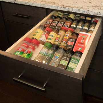
 Performance Kitchens & Home
The cost of kitchen cabinets is a major consideration when designing a new kitchen. There are so many things that need to be evaluated including the materials, the color and finish. What most kitchen designers don't mention are all of the issues relating to the fit and use of your new cabinets. At Performance Kitchens & Home, our roots come from fine craftspeople like George Nakashima and George Brauntrager, who pioneered many of the techniques that we integrate into our kitchen cabinets.
We believe that every kitchen deserves cabinets that are beautiful, well-built, functional and that are designed to stand up to the test of time. We hope that some of these finely crafted kitchen cabinets will spark some ideas for you!
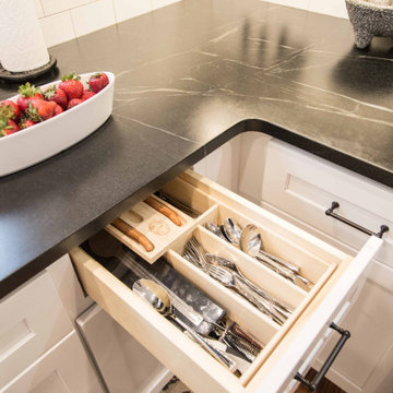 Performance Kitchens & Home
The cost of kitchen cabinets is a major consideration when designing a new kitchen. There are so many things that need to be evaluated including the materials, the color and finish. What most kitchen designers don't mention are all of the issues relating to the fit and use of your new cabinets. At Performance Kitchens & Home, our roots come from fine craftspeople like George Nakashima and George Brauntrager, who pioneered many of the techniques that we integrate into our kitchen cabinets.
We believe that every kitchen deserves cabinets that are beautiful, well-built, functional and that are designed to stand up to the test of time. We hope that some of these finely crafted kitchen cabinets will spark some ideas for you!


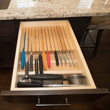 Performance Kitchens & Home
The cost of kitchen cabinets is a major consideration when designing a new kitchen. There are so many things that need to be evaluated including the materials, the color and finish. What most kitchen designers don't mention are all of the issues relating to the fit and use of your new cabinets. At Performance Kitchens & Home, our roots come from fine craftspeople like George Nakashima and George Brauntrager, who pioneered many of the techniques that we integrate into our kitchen cabinets.
We believe that every kitchen deserves cabinets that are beautiful, well-built, functional and that are designed to stand up to the test of time. We hope that some of these finely crafted kitchen cabinets will spark some ideas for you!
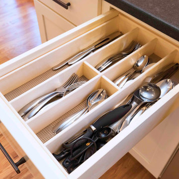 Performance Kitchens & Home
The cost of kitchen cabinets is a major consideration when designing a new kitchen. There are so many things that need to be evaluated including the materials, the color and finish. What most kitchen designers don't mention are all of the issues relating to the fit and use of your new cabinets. At Performance Kitchens & Home, our roots come from fine craftspeople like George Nakashima and George Brauntrager, who pioneered many of the techniques that we integrate into our kitchen cabinets.
We believe that every kitchen deserves cabinets that are beautiful, well-built, functional and that are designed to stand up to the test of time. We hope that some of these finely crafted kitchen cabinets will spark some ideas for you!

 Landscape Projects, Inc.
We first met our clients when a home renovation project was almost complete. The front of the house had undergone a dramatic facelift with the addition of an extension of the façade and a deep covered porch, and the landscape needed major help. A range of disparate issues faced us: post-construction soil on the site, an existing bed of massive boulders near the new entrance walk, and a badly-eroded culvert area on the side of the property on County land. Existing plantings were badly damaged or overgrown. The most serious issue, though, was a massive drainage problem due to the site’s topography; in heavy rainstorms a river literally tumbled downhill past the front of the house, cutting a trench on either side of the walkway.
We turned the site’s challenges into its solutions to give the owners the beautiful garden they wanted. Using the line of the existing swale, we created a dry streambed to direct rainwater towards the existing culvert, which we also filled with river jacks and boulders. The streambed area is planted with plants that can withstand periodic flooding as well as occasional drought, and that provide seasonal color. At the end, we had transformed the owners’ front yard experience into the garden of their dreams.
©Melissa Clark Photography. All rights reserved.

 Luminosus Designs LLC
custom curved sofa, custom furniture, custom window treatment, custom-built-in bar & bookcase, custom area rug, custom window treatment, blue, cream, white, black, silver,
 A.J. McCullough Carpentry
Bathroom Remodel completed in Auburn Massachusetts.
Layout and design by Andrew.
J.V. Mechanical plumbing.
Faux Wood ceramic tile transitioned to stone tile.
Mosaic Niche. Claw foot tub with oil rubbed bronze finishes. Glass mosaic installed on the windowsill. No casing around the window.
Aldo Nolle electrical.
All work completed in house by Andrew and our talented crew.
Original floor had major structural issues. Leveled and sistered all the joists. Greenboard installed on the walls with first coat on seams. Kerdiboard installed on tile walls.

 Drury Design
The homeowners were seeking a major renovation from their original master bath. The young family had completed several remodeling projects on the first floor of their 1980’s era home and the time had finally come where they wanted to focus on the second floor, particularly their master bath which was cramped and overpowered by a Jacuzzi-style tub.
After multiple design meetings spent choosing the right hardware and materials, everything was set, and the transformation began! Drury designer, Diana Burton, began by borrowing some space from the bedroom this way they were able to reconfigure the whole layout, which made a big difference to the homeowner. The floating vanity cabinets paired with quartz counters, wall-mounted fixtures, and mirrors featuring built-in lighting enhance the room’s sleek, clean look.
 A.J. McCullough Carpentry
Bathroom Remodel completed in Auburn Massachusetts.
Layout and design by Andrew.
J.V. Mechanical plumbing.
Faux Wood ceramic tile transitioned to stone tile.
Mosaic Niche. Claw foot tub with oil rubbed bronze finishes. Glass mosaic installed on the windowsill. No casing around the window.
Aldo Nolle electrical.
All work completed in house by Andrew and our talented crew.
Original floor had major structural issues. Leveled and sistered all the joists. Greenboard installed on the walls with first coat on seams. Kerdiboard installed on tile walls.
 A.J. McCullough Carpentry
Bathroom Remodel completed in Auburn Massachusetts.
Layout and design by Andrew.
J.V. Mechanical plumbing.
Faux Wood ceramic tile transitioned to stone tile.
Mosaic Niche. Claw foot tub with oil rubbed bronze finishes. Glass mosaic installed on the windowsill. No casing around the window.
Aldo Nolle electrical.
All work completed in house by Andrew and our talented crew.
Original floor had major structural issues. Leveled and sistered all the joists. Greenboard installed on the walls with first coat on seams. Kerdiboard installed on tile walls.
 A.J. McCullough Carpentry
Bathroom Remodel completed in Auburn Massachusetts.
Layout and design by Andrew.
J.V. Mechanical plumbing.
Faux Wood ceramic tile transitioned to stone tile.
Mosaic Niche. Claw foot tub with oil rubbed bronze finishes. Glass mosaic installed on the windowsill. No casing around the window.
Aldo Nolle electrical.
All work completed in house by Andrew and our talented crew.
Original floor had major structural issues. Leveled and sistered all the joists. Greenboard installed on the walls with first coat on seams. Kerdiboard installed on tile walls.
 Design Group Three
Lake views, daylight and a private master suite were the primary goals of this second floor remodel. Having started as a lake cottage, several previous remodels resulted in an awkward floor plan and major structural issues. New beams were added in the floor and ceiling and both were completely re-framed to level the nearly 4” of sag. The master bedroom was moved to the lakeside with large windows, a vaulted ceiling and private master bath. An addition made space for two more bedrooms filled with daylight.
 Design Group Three
Lake views, daylight and a private master suite were the primary goals of this second floor remodel. Having started as a lake cottage, several previous remodels resulted in an awkward floor plan and major structural issues. New beams were added in the floor and ceiling and both were completely re-framed to level the nearly 4” of sag. The master bedroom was moved to the lakeside with large windows, a vaulted ceiling and private master bath. An addition made space for two more bedrooms filled with daylight.
 Design Group Three
Lake views, daylight and a private master suite were the
primary goals of this second floor remodel. Having started as a lake cottage, several previous remodels resulted in an awkward floor plan and major structural issues. New beams were added in the floor and ceiling and both were completely re-framed to level the nearly 4” of sag. The master bedroom was moved to the lakeside with large windows, a vaulted ceiling and private master bath. An addition made space for two more bedrooms filled with daylight.
 Design Group Three
Lake views, daylight and a private master suite were the primary goals of this second floor remodel. Having started as a lake cottage, several previous remodels resulted in an awkward floor plan and major structural issues. New beams were added in the floor and ceiling and both were completely re-framed to level the nearly 4” of sag. The master bedroom was moved to the lakeside with large windows, a vaulted ceiling and private master bath. An addition made space for two more bedrooms filled with daylight.
6