
Search results for "Master achieve" in Home Design Ideas

 In Detail Interiors
Cozy and Colorful Beach House Remodel!
When you think funky little house by the beach – images like what you are about to see may not be what you would have anticipated. This furnishings project aimed to capture a colorful, fun, active space for a family who wanted to feel at home .Thus, creating casual and comfortable but not boring in the least. A little traveled, a lot of texture, and not much clutter!
From the start, the space was not much to write home about!
The common living areas were boxy with lower ceilings. Quirky ins and outs needed to be optimized. Overall, this project was a prime opportunity for us to really dig in. From treating each room top to bottom and finding the client’s mojo when it came to wallcoverings. Selecting funky lighting and the right mix and match of bold colors and more natural, organic textures.
We came in too late to get involved with the kitchen but helped the client with a few little accents and color choices. Thus, acting as a jumping off point for the large dining space featuring a beautiful (and resilient!) wooden trestle table. We created a mix of seating that offers a little funk, and the fun additional cabinet storage to each end which offered a hideaway. We loved that this vista had such opportunity for great lighting and art, also!
A Colorful, Cozy Living Room
We knew we needed a cozy, lower profile seating area but also some sort of great reading nook by the fireplace. With the large windows and the main entry just off this space, a traffic pattern was delianted that helped guide decisions with the furniture. A funky, nubbier woven fabric on the sectional that hinted towards mid-century modern. The irregular shaped, petrified wood coffee table. The bold statement and colors carried through in the wallcovering and area rug. Jumping to the fireplace area where you can lounge or read with those gorgeous cognac leather recliners. This space needed to feel separate and the same all at once. The balance of scale and colors really helped achieve this!
Can’t forget the bedrooms!
Of course we can’t get by without mentioning a little bedroom love, either.
In the master the overall designs dictated by a bold, saturated woven wood cloth on the headboard wall. We love the mix of color and pattern in here. The bold, sexier mood is 100% a byproduct of the level of rich colors and unusual combinations. Those bold hand-glazed ceramic lamps against those strict geo-pattern bed pillows – so good!
Our sweet tween bedroom that should grow with her for a good, long time. All in all, filled with original art and layered in a softer palette. There was a lot of matching in here at first, but once we convinced her to trust us she started to understand why adding in the unexpected hit of bright coral and spring green made everything sing!

 Irene Designs
This dream bathroom has everything one can wish for an ideal bathroom escape. It doesn’t just look fabulous – it works well and it is built to stand the test of time.
This bathroom was designed as a private oasis, a place to relax and unwind. Spa-like environment is created by expansive double-sink custom vanity, an elegant free standing tub, and a spacious two-person barrier-free shower with a floating bench. Toilet is concealed within a separate nook behind a pocket door.
Main bathroom area is outlined by a tray ceiling perimeter. The room looks open, airy and spacious. Nothing interferes with the ceiling design and overall space configuration. It hasn’t always been that way. Former layout had serious pitfalls that made the room look much smaller. The shower concealed behind solid walls protruded into the main area clashing with the tray ceiling geometry. Massive shower stall took up significant amount of the room leaving no continuous wall space for a double sink vanity. There were two separate vanities with a dead corner space between them. At the same time, the toilet room was quite spacious with just one fixture in the far end.
New layout not only looks better, it allows for a better functionality and fully reveals the space potential. The toilet was relocated to occupy the former linen closet space slightly expanded into adjacent walk-in closet. Shower was moved into the bigger alcove, away from the tray ceiling area. It opened up the room while giving space for a gorgeous wall-to-wall vanity. Having a full glass wall, the shower extends the space even further. Sparkling glass creates no barrier to the eyesight. The room feels clean, breezy and extra spacious. Gorgeous frameless shower enclosure with glass-to-glass clamps and hinges shows off premium tile designs of the accent shower wall.
Free standing tub remained in its original place in front of the window. With no solid shower walls nearby, it became a focal point adorned with the new crystal chandelier above it. This two-tier gorgeous chandelier makes the bathroom feel incredibly grand. A touch of luxury is showing up in timeless polished chrome faucet finish selections as well.
New expansive custom vanity has his and her full height linen towers, his and her sink cabinets with two individual banks of drawers on the sides and one shared drawer cabinet in the middle containing a charging station in the upper drawer.
Vanity counter tops and floating shower seat top are made of high-end quartz.
Vessel sinks resemble the shape and style of the free-standing tub.
To make the room feel even more spacious and to showcase the shower area in the reflection, a full size mirror is installed over the vanity. Crystal sconces are installed directly into the mirror.
Crisp classic white tile gives the room a timeless sense of polish and luxury. Walls around the perimeter of the entire bathroom are tiled half way. Three rows of 12”x 24” porcelain tile resembling white marble are crowned with a thin row of intricate glass tiles with marble accents, and a chair rail tile.
Tile design flows into a spacious barrier-free two-person walk-in shower. Two more tile patterns of the same tile collection are brought into play. Rear wall is adorned with a picture frame made out of 12”x12” tiles laid at 45 degree angle within the same chair rail and glass tile border. Shower floor is made of small hexagon tiles for proper drainage.
Shower area has two hidden from plain sight niches to contain shampoo bottles and toiletries. The rear side of the niches is made of glass mosaics for a waterfall effect.
To showcase the picture frame inside the shower, the accent shower wall is washed with cascading light from a discrete LED strip tucked in a cove behind “floating” shower ceiling platform.
Multiple shower heads (two ceiling-mount rain heads, one multi-functional wall mount shower head, and a handheld shower) are able to provide a fully customizable shower experience.
Despite of many hard surfaces and shiny finishes, which can sometimes lead to a cold impersonal feeling, this bathroom is cozy and truly welcoming. This sense of warms is maintained by exclusive multi-functional layered lighting. Carefully designed groups of lights (all having a dimmer control) can be used simultaneously, in various combinations, or separately to create numerous different effects and perfect atmosphere for every mood and occasion. Some lights have smart controls and can be operated remotely.
Amazing effect can be achieved by dimmable toe kick perimeter lighting. With the ceiling lights turned off, the vanity looks as if it is floating in the air. Multifaceted crystal fixtures produce cascades of sparkling rainbow reflections dancing around the room and creating an illusion of a starry sky.
Programmable radiant heating floor offers additional warmth and comfort to the room.
This bathroom is well suited for either a quick morning shower or a night in for ultimate relaxation with a champagne toast and a long soak in the freestanding tub.

 Advance Design Studio, Ltd.
Quinn and Paige, residents of this tired 1960’s tri-level home hated their kitchen. As a matter of fact, prior to making plans to renovate the first floor - they considered selling the home, but were reluctant because of its enviable location near the heart of downtown Barrington which was within walking distance to local stores and all their favorite places. So instead they contacted Advance Design Studio after hearing about them from a neighbor, to rescue their tired home and give it new life.
The very first plan was to remove the constricting walls surrounding the original kitchen, and open the expansive first floor living room and dining area to the new heart of the space; a stunning state of the art coastal designed kitchen. Exposing attractive beams in the vaulted ceiling created an interesting structural detail that suits the open plan and salutes the original architecture of the home, further emphasizing the height of the new space enjoyed now by the family as a great room.
The stage was set for the seaside feel of this kitchen by pairing crisp white painted maple cabinets with Dura Supreme’s one of kind hand weathered finish on the island in soft blue-green finish. But the authentic feeling of being on your favorite beach was supremely achieved by the matching of unique Mt. Claire marble on the island and the specialty Wareham acid washed stone on the perimeter counter tops. Pictures don’t do justice to the feel of this stone under your hand; its water-washed texture reminds instantly of summer vacations collecting rocks softly etched by hundreds of waves.
Stainless steel appliances and satin nickel hardware shine brightly against the backdrop of bright white subway tiles accentuated by subtle grey grout lines contributing to the nautical feel of this comfortable kitchen. Seeded glass door cabinetry reminiscent of beach grasses dress up the space just enough, and a proud 6” stacked crown molding extends above 36” wall cabinets into the expanse of the now taller space; balancing this kitchen nicely within its newly integrated home.
Features in this kitchen include a built in standard depth refrigerator, pull out spice racks, tall tray dividers and wood super Susan with double pull out trash and recycling. A cutlery divider holds sharp knives, and an angled cabinet was customized to hold a secret USB charging station. The bright white Kohler farm sink is graced by an elegant bridge faucet in brushed nickel. This now airy and spacious kitchen has room for guest and family to congregate around the large island, complete with stools and attractive hidden storage for seldom used entertainment pieces.
“I was sold when I saw the drawings. My designer nailed it, down to every last storage idea and coastal detail I envisioned, it was all in there. It was unbelievable how accurate her interpretation was of what was in my head; working with her made my kitchen renovation so easy, it’s as if she literally read my mind”, said Paige enthusiastically.
The woman of the house expressed upon completion not only her love for her fantastic new cooking space, but how renovating her kitchen has given new life to the entire home. Talk of moving has been relegated to the recycling bin, and instead the family is discussing plans to renovate the master bath now that they’ve decided to stay for the long term. Friends who visit the home do a double-take as they recognize the new space’s dramatic transformation from original cramped and closed spaces - to the now amazingly fresh open kitchen that has become the center of every gathering and family meal.
Designer: Nicole Ryan
Photographer: Joe Nowak
Find the right local pro for your project

 RAJ Kitchen and Bath, LLC
“Full apartment design”.
IF you have not yet seen this apartment conversion before, we strongly urge you to go to the bottom left of this page and click on the short 2-minutes video. It would put a lot of things into perspective when you come back and continue reading this.
It is true we were literally handed the keys and told a list of things that they wanted to have happen and we were to go into the apartment, look at the space and come up with a design that would satisfy all of that need. UNTIL we showed up! The unit had really seen some better days but we knew we had to look past that and come up with a concept that would work for them.
The immediate challenges were centered around 3 big ideas:
1. Adding a second bedroom to the already small footprint
2. Figuring out a way to make the kitchen bigger, better and brighter
3. Creating a master room walk in closet
It’s always difficult to add new rooms into existing footprint without expanding out or up and not incurring any opportunity cost. In this case, that was exactly what we had to do. Item one and two above had to be tackled as one. We went ahead and switched out the location of the dining room and eliminating an area where there was a “nook” type eat-in area. By doing so, we were able to cut right into that footprint and change the layout of the kitchen.
That one move allowed us to dig into the kitchen design because it was now the main focal point in the apartment. It was no longer an option to keep it in that tiny hole where it was, so we had to ensure that this design was functional and aesthetically pleasing at the same time. By adding the table into the space where an Island typically would go, we were able to both cut cost and still provide a dining experience. The Table serves as an Island as well when cooking.
We then proceeded to block in the existing doorway to the dining room. By doing this, we were able to create a full room which allowed us to put a door on the other side and called that room Bedroom #2. This was easier to do because all of the mechanicals were already in that space (light, heater and windows). By shifting things around, we also achieved a huge wall to wall closet from inside. PERFECT!
Then we moved into the Single bedroom. We thought it was a big room with a small closet, so by creatively adding an L shaped wall and steal some footprint into the bedroom side, we were able to put a door on that new room and design it for the walk-in closet. Even after this, the bedroom still holds a queen size bed with 2 night stands, a TV on the wall, a sitting chair and plenty of room to walk around. This was done by rethinking the location for the bed and night stands.
The bathroom was gutted to make sure there was no leaks and rebuild from the ground up. We kept all of the plumbing where it was, added a new vanity, medicine cabinet, tiles and lighting and it was done.
From there, the rest of the unit had new flooring all throughout, paint, and lighting. After completion and walk through, this project was handed over back to the clients.
Execution and collaboration between all the trades were: Reggie and his team from Premier Interiors and Rohan from RD Mechanical Services.
p.s. Please see our website to see the video.

 Dynamic Garage Door
 specializes in Tuscan Architectural beautification in the Newport Beach, CA through our custom designed and hand made architectural shutters, garden gates and garage doors. This Newport-Mesa Tuscan home was exquisitely decorated with a combination of custom gates, decorative shutters and balcony barn door style shutters all handcrafted out of authentic, century-old reclaimed barn wood specifically harvested for this custom project.
Beginning with the balcony shutters which actually slide from side to side like a real barn door we worked a charming rustic shutter design that would typically be seen in the Tuscan Riviera. We opted for sliding shutters as the balcony spacing limited the swing action of even bi-folding shutters. Incorporating real barn door hardware railing and crowing it behind the faux reclaimed wood beam made an excellent statement while adding functional shutters that can be shut close for comfort during the summer morning when the sun beats down into the master suite. The four shutter leafs are decorated with real hand forged dummy straps that were hammered and crafted by hand to achieve that gorgeous rustic charm typical of Tuscan architecture. The reclaimed barn wood from a century-old barn gives off a timeless appearance that increase in characters as the years go by. Because rustic barn wood has already aged beautifully over hundreds of years, the next century will only increase its authentically gorgeous appearance. The culmination of this project has been a meticulous collaborative input of our in-house head designer and the clients themselves. Although the completion of this project is lengthy and intricate, the results speak volumes and the wait simply justifies the outcome.
The rest of thew windows on this Tuscan home have been accessorized with rustic barn wood as well and accentuated with our custom designed and handmade dummy iron hinge straps. Our dummy hardware is so authentically done in the same tradition used for hundreds of years in Europe to create shutter hardware that looks authentic and functional although it is only decorative. The details of our custom shutters is evident in the slightest of details including the bolts used to hold the shutter straps in place. Each of the shutter also has a decorative ring pull with a hand-hammered back plate which enhances the appearance of true functional shutters and defining that authentic Tuscan look.
The beauty of this Tuscan home is visible throughout the entire property including the garden gates, garage doors and entry door. Again, for the garden gates, we went with rustic barn wood carefully crafted to preserve the original surface that has aged over hundreds of years but building the gates on galvanized steel frames that will ensure structural durability for the next few hundred years. The gates are highly secure, sound and can definitely hold back a crowd with authentic rustic charm. Don't be fooled with the simple-looking gate design. It is quite intricate with its 45 degree angle cuts around the perimeter of the trim which deviates water away from crevices that would otherwise make the gates vulnerable to the accumulation of moisture from the elements, sprinkler system or simply air humidity since the home is located near the ocean. Each one of the garden gates is equipped with European style mortise lock mechanisms and roller catches. Dynamic Garage Door gates are not your typical garden gates, they are truly made with quality and durability in mind as well as aesthetic attention to detail. Everything, from the hardware used, the core steel frame and overlay material used is hand selected and approved individually for maximum beauty and timeless appreciation.
At Dynamic Garage Door, we specialize in multiple facet projects that include garden gates, driveway gates as well as barn doors and shutters. It is very important because these are the accessories that can make or break the beauty and continuity of your home's architectural style and authenticity.
Increase your curb appeal and home value with Dynamic Garage Door's gates, shutters and automatic custom garage doors. Our in-house designers would love to speak with you today!
Design Consultation Center: (855) 343-3667
 RAJ Kitchen and Bath, LLC
“Full apartment design”.
IF you have not yet seen this apartment conversion before, we strongly urge you to go to the bottom left of this page and click on the short 2-minutes video. It would put a lot of things into perspective when you come back and continue reading this.
It is true we were literally handed the keys and told a list of things that they wanted to have happen and we were to go into the apartment, look at the space and come up with a design that would satisfy all of that need. UNTIL we showed up! The unit had really seen some better days but we knew we had to look past that and come up with a concept that would work for them.
The immediate challenges were centered around 3 big ideas:
1. Adding a second bedroom to the already small footprint
2. Figuring out a way to make the kitchen bigger, better and brighter
3. Creating a master room walk in closet
It’s always difficult to add new rooms into existing footprint without expanding out or up and not incurring any opportunity cost. In this case, that was exactly what we had to do. Item one and two above had to be tackled as one. We went ahead and switched out the location of the dining room and eliminating an area where there was a “nook” type eat-in area. By doing so, we were able to cut right into that footprint and change the layout of the kitchen.
That one move allowed us to dig into the kitchen design because it was now the main focal point in the apartment. It was no longer an option to keep it in that tiny hole where it was, so we had to ensure that this design was functional and aesthetically pleasing at the same time. By adding the table into the space where an Island typically would go, we were able to both cut cost and still provide a dining experience. The Table serves as an Island as well when cooking.
We then proceeded to block in the existing doorway to the dining room. By doing this, we were able to create a full room which allowed us to put a door on the other side and called that room Bedroom #2. This was easier to do because all of the mechanicals were already in that space (light, heater and windows). By shifting things around, we also achieved a huge wall to wall closet from inside. PERFECT!
Then we moved into the Single bedroom. We thought it was a big room with a small closet, so by creatively adding an L shaped wall and steal some footprint into the bedroom side, we were able to put a door on that new room and design it for the walk-in closet. Even after this, the bedroom still holds a queen size bed with 2 night stands, a TV on the wall, a sitting chair and plenty of room to walk around. This was done by rethinking the location for the bed and night stands.
The bathroom was gutted to make sure there was no leaks and rebuild from the ground up. We kept all of the plumbing where it was, added a new vanity, medicine cabinet, tiles and lighting and it was done.
From there, the rest of the unit had new flooring all throughout, paint, and lighting. After completion and walk through, this project was handed over back to the clients.
Execution and collaboration between all the trades were: Reggie and his team from Premier Interiors and Rohan from RD Mechanical Services.
p.s. Please see our website to see the video.
 Gallery KBNY
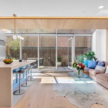
For our full gut renovation of this Manhattan loft penthouse, we partnered with architecture firm Todd Zwigard Architects. Many of our clients know us as experts in the full design-build approach, where we handle every aspect of the project. But in this case, architectural plans were already drawn, the full schedule was finished, and our clients needed a partner to execute on the architectural plans – enter Gallery. Construction management is as vital to a project as the design phase, so we’re happy to offer our expertise in this type of scenario.
A DIFFERENT APPROACH
Construction and design are often the face of most renovations, but the planning and follow-through are naturally just as necessary to make it all come together. The project itself was a fairly straightforward gut renovation of the loft. Everything was included: new floors, a new kitchen, new bathrooms, new lighting. Our task was to manage every aspect of the construction, ensuring that the planning work of Todd Zwigard Architects was executed to the exact vision imagined for this Manhattan loft renovation.
CONTEMPORARY GOES ECLECTIC
Although we didn’t contribute to the aesthetic of the interior design in this project, we did carry out the plans that brought it life. The tone was very modern, with some eclectic touches. The kitchen, featuring an island with a baby blue lacquered finish, blends contemporary clean lines into an industrial-tinged, almost futuristic aesthetic. Reclaimed wooden doors and art pieces collected throughout the years are an ode to the client's travels, an artistic touch from Todd Zwigard Architects.
LET’S TALK
Quality of work is of course important, but there are several components of construction management that are equally vital: communication; processes that make sure you're able to adhere to schedules; protocols with both safety and communication. You might say this is the nerding out of the construction process. It’s not often the face of a project, but it’s absolutely massive in terms of carrying out a successful renovation, whether it’s a penthouse loft in Manhattan, a condo in Prospect Heights, or a kitchen in a Brooklyn brownstone. Quality construction management is probably one of the biggest ways to separate professional contractors from those who aren’t.
ART FROM CHAOS
This was such a large project, so our ability to procure and source all the finishes and fixtures was hugely important to our clients. The sheer number of floors, tiles, and plumbing fixtures alone that need to be ordered, in addition to everything else, plus figuring out lead times, shipments, deliveries, and inspections. It can quickly become chaotic, but there’s an art to the planning and organization, and we’ve mastered it.
The larger a project is, the more likely that havoc will rear its head. The antidote is not only really proper planning and construction management, as we achieved in this Manhattan loft penthouse renovation, but also a great working relationship with everyone else involved in the project: contractors, architect, and clients alike.
GET IN TOUCH
Is a loft renovation in New York in your future? We’re experts in renovating New York homes, from apartment combinations in managed buildings to kitchens and bathrooms in co-ops and condos to gut renovations of historic spaces and landmark renovations.
Contact us to learn more about our approach as a design-and-build firm, where all aspects of your project are handled under the same roof. In addition to construction management, you’ll get our in-house architect in-house and the added renovation benefits of experts in design, material selection, and paperwork.
Sponsored
Columbus, OH

Wannemacher Interiors
Customized Award-Winning Interior Design Solutions in Franklin Cnty OH

 Finesse, Inc.
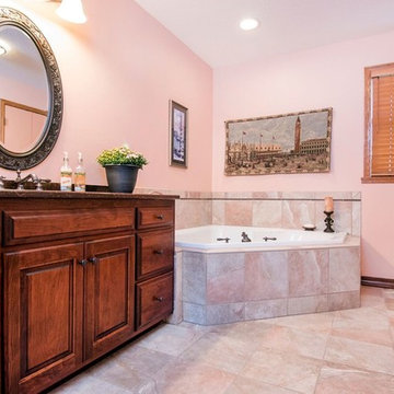
Recessed flat-panel cabinetry and mirrors in rich woods are set off by beautifully veined marble, white penny tiles with contrasting accents, and modern light fixtures that reflect Craftsman style.
Photo: Jessica Abler, Los Angeles, CA
 Advance Design Studio, Ltd.
Quinn and Paige, residents of this tired 1960’s tri-level home hated their kitchen. As a matter of fact, prior to making plans to renovate the first floor - they considered selling the home, but were reluctant because of its enviable location near the heart of downtown Barrington which was within walking distance to local stores and all their favorite places. So instead they contacted Advance Design Studio after hearing about them from a neighbor, to rescue their tired home and give it new life.
The very first plan was to remove the constricting walls surrounding the original kitchen, and open the expansive first floor living room and dining area to the new heart of the space; a stunning state of the art coastal designed kitchen. Exposing attractive beams in the vaulted ceiling created an interesting structural detail that suits the open plan and salutes the original architecture of the home, further emphasizing the height of the new space enjoyed now by the family as a great room.
The stage was set for the seaside feel of this kitchen by pairing crisp white painted maple cabinets with Dura Supreme’s one of kind hand weathered finish on the island in soft blue-green finish. But the authentic feeling of being on your favorite beach was supremely achieved by the matching of unique Mt. Claire marble on the island and the specialty Wareham acid washed stone on the perimeter counter tops. Pictures don’t do justice to the feel of this stone under your hand; its water-washed texture reminds instantly of summer vacations collecting rocks softly etched by hundreds of waves.
Stainless steel appliances and satin nickel hardware shine brightly against the backdrop of bright white subway tiles accentuated by subtle grey grout lines contributing to the nautical feel of this comfortable kitchen. Seeded glass door cabinetry reminiscent of beach grasses dress up the space just enough, and a proud 6” stacked crown molding extends above 36” wall cabinets into the expanse of the now taller space; balancing this kitchen nicely within its newly integrated home.
Features in this kitchen include a built in standard depth refrigerator, pull out spice racks, tall tray dividers and wood super Susan with double pull out trash and recycling. A cutlery divider holds sharp knives, and an angled cabinet was customized to hold a secret USB charging station. The bright white Kohler farm sink is graced by an elegant bridge faucet in brushed nickel. This now airy and spacious kitchen has room for guest and family to congregate around the large island, complete with stools and attractive hidden storage for seldom used entertainment pieces.
“I was sold when I saw the drawings. My designer nailed it, down to every last storage idea and coastal detail I envisioned, it was all in there. It was unbelievable how accurate her interpretation was of what was in my head; working with her made my kitchen renovation so easy, it’s as if she literally read my mind”, said Paige enthusiastically.
The woman of the house expressed upon completion not only her love for her fantastic new cooking space, but how renovating her kitchen has given new life to the entire home. Talk of moving has been relegated to the recycling bin, and instead the family is discussing plans to renovate the master bath now that they’ve decided to stay for the long term. Friends who visit the home do a double-take as they recognize the new space’s dramatic transformation from original cramped and closed spaces - to the now amazingly fresh open kitchen that has become the center of every gathering and family meal.
Designer: Nicole Ryan
Photographer: Joe Nowak

 Chapman Design Group, Inc.
Established in 2005, Stonebridge at Rankin’s Lake is proud to be Duke Energy’s “First All-Electric Energy Star Certified Community” in South Carolina. Each home has been constructed with strict guidelines to insure each individual home will receive it’s own Energy Star certificate which in turn results in a reduced rate from Duke Energy on the energy bill for the life of the home.
Through a partnership between the architecture firm, Chapman Design Group, Inc. and it’s construction arm, Icon Construction of South Carolina, Inc., special emphasis is placed on quality construction, methods and design details a well as a stringent construction quality control standard. The total efforts, skills, resources provide unyielding commitment directed toward building superior homes that will bring our homeowners many years of comfortable and carefree living.
This 107 home community was created on a 43 acre property that was planned into two phases. Approximately 17 of these acres are to be left natural, providing the feel of an established neighborhood from the very beginning. The featured attraction is Rankin’s Lake. It is approximately 4 acres in size and was once a well-known fishing lake in Anderson in the 1940s and 50s. A stone bridge will adorn its spillway and will be constructed during the second phase of the project.
The traditional style streetscape is enhanced with grass medians separating curb lines and sidewalks. This feature is accentuated in intermittent Alee Elm Trees and decorative post streetlights throughout the neighborhood. Every front and side lawn as well as all common areas continue to be maintained on a weekly basis by a private landscape maintenance company. This perpetual maintenance provided through the Homeowner’s Association insures a constant harmonious look throughout the entire community.
From day one, several development principles were established and achieved:
• The development’s concept was designed with all water front lots facing into Rankin’s Lake to have the street running between the homes and the lake. With this concept, it allows all of the neighborhood residents and their guest to take advantage of the pathways as well as enjoy to natural scenery of the lake each time the upon entering and exiting the neighborhood. This became a positive selling point as it encouraged the selection of building sites deeper into the development once you passed the lake.
• The design concept of the development was to create a variation of the traditional home neighborhood where the homes, all with front porches are intentionally built closer to the sidewalk lined streets to encourage neighborly interaction.
• Plans were designed with the garages at the rear of the lot as to make the neighborhood less about cars and more about the home and it’s residents. This was prioritized due to many subdivisions today are designed in such a way the home’s primary feature is a front facing garage which often have two cars in the driveway… hence, Stonebridge at Rankin’s Lake want to provide an alternative.
• Each home design includes a spacious front porch, a screened porch and or a sunroom to encourage neighborly interaction and casual living.
• The floor plans include both 2 and 3 bedroom plans with 2 to 3.5 baths with all master suites remaining on the main level.
The entire development would have only Energy Star Certified homes.
 RAJ Kitchen and Bath, LLC
“Full apartment design”.
IF you have not yet seen this apartment conversion before, we strongly urge you to go to the bottom left of this page and click on the short 2-minutes video. It would put a lot of things into perspective when you come back and continue reading this.
It is true we were literally handed the keys and told a list of things that they wanted to have happen and we were to go into the apartment, look at the space and come up with a design that would satisfy all of that need. UNTIL we showed up! The unit had really seen some better days but we knew we had to look past that and come up with a concept that would work for them.
The immediate challenges were centered around 3 big ideas:
1. Adding a second bedroom to the already small footprint
2. Figuring out a way to make the kitchen bigger, better and brighter
3. Creating a master room walk in closet
It’s always difficult to add new rooms into existing footprint without expanding out or up and not incurring any opportunity cost. In this case, that was exactly what we had to do. Item one and two above had to be tackled as one. We went ahead and switched out the location of the dining room and eliminating an area where there was a “nook” type eat-in area. By doing so, we were able to cut right into that footprint and change the layout of the kitchen.
That one move allowed us to dig into the kitchen design because it was now the main focal point in the apartment. It was no longer an option to keep it in that tiny hole where it was, so we had to ensure that this design was functional and aesthetically pleasing at the same time. By adding the table into the space where an Island typically would go, we were able to both cut cost and still provide a dining experience. The Table serves as an Island as well when cooking.
We then proceeded to block in the existing doorway to the dining room. By doing this, we were able to create a full room which allowed us to put a door on the other side and called that room Bedroom #2. This was easier to do because all of the mechanicals were already in that space (light, heater and windows). By shifting things around, we also achieved a huge wall to wall closet from inside. PERFECT!
Then we moved into the Single bedroom. We thought it was a big room with a small closet, so by creatively adding an L shaped wall and steal some footprint into the bedroom side, we were able to put a door on that new room and design it for the walk-in closet. Even after this, the bedroom still holds a queen size bed with 2 night stands, a TV on the wall, a sitting chair and plenty of room to walk around. This was done by rethinking the location for the bed and night stands.
The bathroom was gutted to make sure there was no leaks and rebuild from the ground up. We kept all of the plumbing where it was, added a new vanity, medicine cabinet, tiles and lighting and it was done.
From there, the rest of the unit had new flooring all throughout, paint, and lighting. After completion and walk through, this project was handed over back to the clients.
Execution and collaboration between all the trades were: Reggie and his team from Premier Interiors and Rohan from RD Mechanical Services.
p.s. Please see our website to see the video.
 Advance Design Studio, Ltd.
Quinn and Paige, residents of this tired 1960’s tri-level home hated their kitchen. As a matter of fact, prior to making plans to renovate the first floor - they considered selling the home, but were reluctant because of its enviable location near the heart of downtown Barrington which was within walking distance to local stores and all their favorite places. So instead they contacted Advance Design Studio after hearing about them from a neighbor, to rescue their tired home and give it new life.
The very first plan was to remove the constricting walls surrounding the original kitchen, and open the expansive first floor living room and dining area to the new heart of the space; a stunning state of the art coastal designed kitchen. Exposing attractive beams in the vaulted ceiling created an interesting structural detail that suits the open plan and salutes the original architecture of the home, further emphasizing the height of the new space enjoyed now by the family as a great room.
The stage was set for the seaside feel of this kitchen by pairing crisp white painted maple cabinets with Dura Supreme’s one of kind hand weathered finish on the island in soft blue-green finish. But the authentic feeling of being on your favorite beach was supremely achieved by the matching of unique Mt. Claire marble on the island and the specialty Wareham acid washed stone on the perimeter counter tops. Pictures don’t do justice to the feel of this stone under your hand; its water-washed texture reminds instantly of summer vacations collecting rocks softly etched by hundreds of waves.
Stainless steel appliances and satin nickel hardware shine brightly against the backdrop of bright white subway tiles accentuated by subtle grey grout lines contributing to the nautical feel of this comfortable kitchen. Seeded glass door cabinetry reminiscent of beach grasses dress up the space just enough, and a proud 6” stacked crown molding extends above 36” wall cabinets into the expanse of the now taller space; balancing this kitchen nicely within its newly integrated home.
Features in this kitchen include a built in standard depth refrigerator, pull out spice racks, tall tray dividers and wood super Susan with double pull out trash and recycling. A cutlery divider holds sharp knives, and an angled cabinet was customized to hold a secret USB charging station. The bright white Kohler farm sink is graced by an elegant bridge faucet in brushed nickel. This now airy and spacious kitchen has room for guest and family to congregate around the large island, complete with stools and attractive hidden storage for seldom used entertainment pieces.
“I was sold when I saw the drawings. My designer nailed it, down to every last storage idea and coastal detail I envisioned, it was all in there. It was unbelievable how accurate her interpretation was of what was in my head; working with her made my kitchen renovation so easy, it’s as if she literally read my mind”, said Paige enthusiastically.
The woman of the house expressed upon completion not only her love for her fantastic new cooking space, but how renovating her kitchen has given new life to the entire home. Talk of moving has been relegated to the recycling bin, and instead the family is discussing plans to renovate the master bath now that they’ve decided to stay for the long term. Friends who visit the home do a double-take as they recognize the new space’s dramatic transformation from original cramped and closed spaces - to the now amazingly fresh open kitchen that has become the center of every gathering and family meal.
Designer: Nicole Ryan
Photographer: Joe Nowak
 RWH Architect PLLC
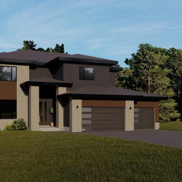
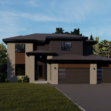
The Whistle Hill Lot 9 Residence is a defining example of RWH Architect’s vision for a new architectural era in Southern New Hampshire. With its bold geometry, refined material palette, and thoughtfully layered rooflines, this home embodies contemporary living while setting a fresh design standard for the region.
From the moment you approach the residence, the interplay of stone accents, vertical elements, and expansive windows establishes a striking yet inviting presence. Inside, a two-story entryway welcomes guests with light and volume, introducing an interior designed for both comfort and sophistication. The open-concept first floor seamlessly integrates the kitchen, great room, and dining/breakfast area, all flowing naturally toward a covered patio that extends the living space outdoors. A walk-in pantry, a private den, and a mudroom with built-in bench and hooks—conveniently located off the two-car attached garage, one bay featuring an oversized door—enhance the home’s functional rhythm. An expansive basement provides room for future recreation or storage, ensuring the home continues to evolve with the family who lives in it.
The second floor hosts four well-proportioned bedrooms, including a master suite designed as a private retreat. The suite features a generous walk-in closet and a luxurious soaking tub, paired with thoughtfully arranged natural light to create a sense of calm and rejuvenation. Two full bathrooms and one half bathroom support the needs of modern family living while maintaining architectural cohesion throughout the home.
Designing this residence presented several challenges that ultimately pushed the architectural expression forward. One key challenge was blending multiple rooflines into a unified modern aesthetic without losing the clarity of the home’s form. RWH resolved this by composing a series of carefully layered planes, each one calibrated to complement the others, resulting in a dynamic yet harmonious silhouette. Another challenge involved balancing the mix of exterior materials—such as stone, horizontal siding, and broad window openings—while maintaining a sense of order and visual stability. This was achieved by aligning materials with structural elements and strengthening vertical features, creating rhythm and cohesion across the façade. A further challenge was delivering an open, light-filled interior despite the structural demands of a two-story entry and several cantilevered forms. RWH overcame this through advanced framing techniques and discreet structural steel placement, allowing for expansive glazing and generous interior spans while preserving the home’s clean, uncluttered aesthetic.
The Whistle Hill Lot 9 Residence stands as a testament to forward-thinking residential design and the evolution of architectural expectations in the area. Through innovative solutions, intentional detailing, and a commitment to elevating everyday living, RWH Architect has created a home that not only meets the needs of modern families but also sets a new benchmark for contemporary architecture in the region.

 RWH Architect PLLC
The Whistle Hill Lot 9 Residence is a defining example of RWH Architect’s vision for a new architectural era in Southern New Hampshire. With its bold geometry, refined material palette, and thoughtfully layered rooflines, this home embodies contemporary living while setting a fresh design standard for the region.
From the moment you approach the residence, the interplay of stone accents, vertical elements, and expansive windows establishes a striking yet inviting presence. Inside, a two-story entryway welcomes guests with light and volume, introducing an interior designed for both comfort and sophistication. The open-concept first floor seamlessly integrates the kitchen, great room, and dining/breakfast area, all flowing naturally toward a covered patio that extends the living space outdoors. A walk-in pantry, a private den, and a mudroom with built-in bench and hooks—conveniently located off the two-car attached garage, one bay featuring an oversized door—enhance the home’s functional rhythm. An expansive basement provides room for future recreation or storage, ensuring the home continues to evolve with the family who lives in it.
The second floor hosts four well-proportioned bedrooms, including a master suite designed as a private retreat. The suite features a generous walk-in closet and a luxurious soaking tub, paired with thoughtfully arranged natural light to create a sense of calm and rejuvenation. Two full bathrooms and one half bathroom support the needs of modern family living while maintaining architectural cohesion throughout the home.
Designing this residence presented several challenges that ultimately pushed the architectural expression forward. One key challenge was blending multiple rooflines into a unified modern aesthetic without losing the clarity of the home’s form. RWH resolved this by composing a series of carefully layered planes, each one calibrated to complement the others, resulting in a dynamic yet harmonious silhouette. Another challenge involved balancing the mix of exterior materials—such as stone, horizontal siding, and broad window openings—while maintaining a sense of order and visual stability. This was achieved by aligning materials with structural elements and strengthening vertical features, creating rhythm and cohesion across the façade. A further challenge was delivering an open, light-filled interior despite the structural demands of a two-story entry and several cantilevered forms. RWH overcame this through advanced framing techniques and discreet structural steel placement, allowing for expansive glazing and generous interior spans while preserving the home’s clean, uncluttered aesthetic.
The Whistle Hill Lot 9 Residence stands as a testament to forward-thinking residential design and the evolution of architectural expectations in the area. Through innovative solutions, intentional detailing, and a commitment to elevating everyday living, RWH Architect has created a home that not only meets the needs of modern families but also sets a new benchmark for contemporary architecture in the region.
 Advance Design Studio, Ltd.
Quinn and Paige, residents of this tired 1960’s tri-level home hated their kitchen. As a matter of fact, prior to making plans to renovate the first floor - they considered selling the home, but were reluctant because of its enviable location near the heart of downtown Barrington which was within walking distance to local stores and all their favorite places. So instead they contacted Advance Design Studio after hearing about them from a neighbor, to rescue their tired home and give it new life.
The very first plan was to remove the constricting walls surrounding the original kitchen, and open the expansive first floor living room and dining area to the new heart of the space; a stunning state of the art coastal designed kitchen. Exposing attractive beams in the vaulted ceiling created an interesting structural detail that suits the open plan and salutes the original architecture of the home, further emphasizing the height of the new space enjoyed now by the family as a great room.
The stage was set for the seaside feel of this kitchen by pairing crisp white painted maple cabinets with Dura Supreme’s one of kind hand weathered finish on the island in soft blue-green finish. But the authentic feeling of being on your favorite beach was supremely achieved by the matching of unique Mt. Claire marble on the island and the specialty Wareham acid washed stone on the perimeter counter tops. Pictures don’t do justice to the feel of this stone under your hand; its water-washed texture reminds instantly of summer vacations collecting rocks softly etched by hundreds of waves.
Stainless steel appliances and satin nickel hardware shine brightly against the backdrop of bright white subway tiles accentuated by subtle grey grout lines contributing to the nautical feel of this comfortable kitchen. Seeded glass door cabinetry reminiscent of beach grasses dress up the space just enough, and a proud 6” stacked crown molding extends above 36” wall cabinets into the expanse of the now taller space; balancing this kitchen nicely within its newly integrated home.
Features in this kitchen include a built in standard depth refrigerator, pull out spice racks, tall tray dividers and wood super Susan with double pull out trash and recycling. A cutlery divider holds sharp knives, and an angled cabinet was customized to hold a secret USB charging station. The bright white Kohler farm sink is graced by an elegant bridge faucet in brushed nickel. This now airy and spacious kitchen has room for guest and family to congregate around the large island, complete with stools and attractive hidden storage for seldom used entertainment pieces.
“I was sold when I saw the drawings. My designer nailed it, down to every last storage idea and coastal detail I envisioned, it was all in there. It was unbelievable how accurate her interpretation was of what was in my head; working with her made my kitchen renovation so easy, it’s as if she literally read my mind”, said Paige enthusiastically.
The woman of the house expressed upon completion not only her love for her fantastic new cooking space, but how renovating her kitchen has given new life to the entire home. Talk of moving has been relegated to the recycling bin, and instead the family is discussing plans to renovate the master bath now that they’ve decided to stay for the long term. Friends who visit the home do a double-take as they recognize the new space’s dramatic transformation from original cramped and closed spaces - to the now amazingly fresh open kitchen that has become the center of every gathering and family meal.
Designer: Nicole Ryan
Photographer: Joe Nowak
 RAJ Kitchen and Bath, LLC
“Full apartment design”.
IF you have not yet seen this apartment conversion before, we strongly urge you to go to the bottom left of this page and click on the short 2-minutes video. It would put a lot of things into perspective when you come back and continue reading this.
It is true we were literally handed the keys and told a list of things that they wanted to have happen and we were to go into the apartment, look at the space and come up with a design that would satisfy all of that need. UNTIL we showed up! The unit had really seen some better days but we knew we had to look past that and come up with a concept that would work for them.
The immediate challenges were centered around 3 big ideas:
1. Adding a second bedroom to the already small footprint
2. Figuring out a way to make the kitchen bigger, better and brighter
3. Creating a master room walk in closet
It’s always difficult to add new rooms into existing footprint without expanding out or up and not incurring any opportunity cost. In this case, that was exactly what we had to do. Item one and two above had to be tackled as one. We went ahead and switched out the location of the dining room and eliminating an area where there was a “nook” type eat-in area. By doing so, we were able to cut right into that footprint and change the layout of the kitchen.
That one move allowed us to dig into the kitchen design because it was now the main focal point in the apartment. It was no longer an option to keep it in that tiny hole where it was, so we had to ensure that this design was functional and aesthetically pleasing at the same time. By adding the table into the space where an Island typically would go, we were able to both cut cost and still provide a dining experience. The Table serves as an Island as well when cooking.
We then proceeded to block in the existing doorway to the dining room. By doing this, we were able to create a full room which allowed us to put a door on the other side and called that room Bedroom #2. This was easier to do because all of the mechanicals were already in that space (light, heater and windows). By shifting things around, we also achieved a huge wall to wall closet from inside. PERFECT!
Then we moved into the Single bedroom. We thought it was a big room with a small closet, so by creatively adding an L shaped wall and steal some footprint into the bedroom side, we were able to put a door on that new room and design it for the walk-in closet. Even after this, the bedroom still holds a queen size bed with 2 night stands, a TV on the wall, a sitting chair and plenty of room to walk around. This was done by rethinking the location for the bed and night stands.
The bathroom was gutted to make sure there was no leaks and rebuild from the ground up. We kept all of the plumbing where it was, added a new vanity, medicine cabinet, tiles and lighting and it was done.
From there, the rest of the unit had new flooring all throughout, paint, and lighting. After completion and walk through, this project was handed over back to the clients.
Execution and collaboration between all the trades were: Reggie and his team from Premier Interiors and Rohan from RD Mechanical Services.
p.s. Please see our website to see the video.
 RAJ Kitchen and Bath, LLC
“Full apartment design”.
IF you have not yet seen this apartment conversion before, we strongly urge you to go to the bottom left of this page and click on the short 2-minutes video. It would put a lot of things into perspective when you come back and continue reading this.
It is true we were literally handed the keys and told a list of things that they wanted to have happen and we were to go into the apartment, look at the space and come up with a design that would satisfy all of that need. UNTIL we showed up! The unit had really seen some better days but we knew we had to look past that and come up with a concept that would work for them.
The immediate challenges were centered around 3 big ideas:
1. Adding a second bedroom to the already small footprint
2. Figuring out a way to make the kitchen bigger, better and brighter
3. Creating a master room walk in closet
It’s always difficult to add new rooms into existing footprint without expanding out or up and not incurring any opportunity cost. In this case, that was exactly what we had to do. Item one and two above had to be tackled as one. We went ahead and switched out the location of the dining room and eliminating an area where there was a “nook” type eat-in area. By doing so, we were able to cut right into that footprint and change the layout of the kitchen.
That one move allowed us to dig into the kitchen design because it was now the main focal point in the apartment. It was no longer an option to keep it in that tiny hole where it was, so we had to ensure that this design was functional and aesthetically pleasing at the same time. By adding the table into the space where an Island typically would go, we were able to both cut cost and still provide a dining experience. The Table serves as an Island as well when cooking.
We then proceeded to block in the existing doorway to the dining room. By doing this, we were able to create a full room which allowed us to put a door on the other side and called that room Bedroom #2. This was easier to do because all of the mechanicals were already in that space (light, heater and windows). By shifting things around, we also achieved a huge wall to wall closet from inside. PERFECT!
Then we moved into the Single bedroom. We thought it was a big room with a small closet, so by creatively adding an L shaped wall and steal some footprint into the bedroom side, we were able to put a door on that new room and design it for the walk-in closet. Even after this, the bedroom still holds a queen size bed with 2 night stands, a TV on the wall, a sitting chair and plenty of room to walk around. This was done by rethinking the location for the bed and night stands.
The bathroom was gutted to make sure there was no leaks and rebuild from the ground up. We kept all of the plumbing where it was, added a new vanity, medicine cabinet, tiles and lighting and it was done.
From there, the rest of the unit had new flooring all throughout, paint, and lighting. After completion and walk through, this project was handed over back to the clients.
Execution and collaboration between all the trades were: Reggie and his team from Premier Interiors and Rohan from RD Mechanical Services.
p.s. Please see our website to see the video.

 Advance Design Studio, Ltd.
Quinn and Paige, residents of this tired 1960’s tri-level home hated their kitchen. As a matter of fact, prior to making plans to renovate the first floor - they considered selling the home, but were reluctant because of its enviable location near the heart of downtown Barrington which was within walking distance to local stores and all their favorite places. So instead they contacted Advance Design Studio after hearing about them from a neighbor, to rescue their tired home and give it new life.
The very first plan was to remove the constricting walls surrounding the original kitchen, and open the expansive first floor living room and dining area to the new heart of the space; a stunning state of the art coastal designed kitchen. Exposing attractive beams in the vaulted ceiling created an interesting structural detail that suits the open plan and salutes the original architecture of the home, further emphasizing the height of the new space enjoyed now by the family as a great room.
The stage was set for the seaside feel of this kitchen by pairing crisp white painted maple cabinets with Dura Supreme’s one of kind hand weathered finish on the island in soft blue-green finish. But the authentic feeling of being on your favorite beach was supremely achieved by the matching of unique Mt. Claire marble on the island and the specialty Wareham acid washed stone on the perimeter counter tops. Pictures don’t do justice to the feel of this stone under your hand; its water-washed texture reminds instantly of summer vacations collecting rocks softly etched by hundreds of waves.
Stainless steel appliances and satin nickel hardware shine brightly against the backdrop of bright white subway tiles accentuated by subtle grey grout lines contributing to the nautical feel of this comfortable kitchen. Seeded glass door cabinetry reminiscent of beach grasses dress up the space just enough, and a proud 6” stacked crown molding extends above 36” wall cabinets into the expanse of the now taller space; balancing this kitchen nicely within its newly integrated home.
Features in this kitchen include a built in standard depth refrigerator, pull out spice racks, tall tray dividers and wood super Susan with double pull out trash and recycling. A cutlery divider holds sharp knives, and an angled cabinet was customized to hold a secret USB charging station. The bright white Kohler farm sink is graced by an elegant bridge faucet in brushed nickel. This now airy and spacious kitchen has room for guest and family to congregate around the large island, complete with stools and attractive hidden storage for seldom used entertainment pieces.
“I was sold when I saw the drawings. My designer nailed it, down to every last storage idea and coastal detail I envisioned, it was all in there. It was unbelievable how accurate her interpretation was of what was in my head; working with her made my kitchen renovation so easy, it’s as if she literally read my mind”, said Paige enthusiastically.
The woman of the house expressed upon completion not only her love for her fantastic new cooking space, but how renovating her kitchen has given new life to the entire home. Talk of moving has been relegated to the recycling bin, and instead the family is discussing plans to renovate the master bath now that they’ve decided to stay for the long term. Friends who visit the home do a double-take as they recognize the new space’s dramatic transformation from original cramped and closed spaces - to the now amazingly fresh open kitchen that has become the center of every gathering and family meal.
Designer: Nicole Ryan
Photographer: Joe Nowak
 Advance Design Studio, Ltd.
Quinn and Paige, residents of this tired 1960’s tri-level home hated their kitchen. As a matter of fact, prior to making plans to renovate the first floor - they considered selling the home, but were reluctant because of its enviable location near the heart of downtown Barrington which was within walking distance to local stores and all their favorite places. So instead they contacted Advance Design Studio after hearing about them from a neighbor, to rescue their tired home and give it new life.
The very first plan was to remove the constricting walls surrounding the original kitchen, and open the expansive first floor living room and dining area to the new heart of the space; a stunning state of the art coastal designed kitchen. Exposing attractive beams in the vaulted ceiling created an interesting structural detail that suits the open plan and salutes the original architecture of the home, further emphasizing the height of the new space enjoyed now by the family as a great room.
The stage was set for the seaside feel of this kitchen by pairing crisp white painted maple cabinets with Dura Supreme’s one of kind hand weathered finish on the island in soft blue-green finish. But the authentic feeling of being on your favorite beach was supremely achieved by the matching of unique Mt. Claire marble on the island and the specialty Wareham acid washed stone on the perimeter counter tops. Pictures don’t do justice to the feel of this stone under your hand; its water-washed texture reminds instantly of summer vacations collecting rocks softly etched by hundreds of waves.
Stainless steel appliances and satin nickel hardware shine brightly against the backdrop of bright white subway tiles accentuated by subtle grey grout lines contributing to the nautical feel of this comfortable kitchen. Seeded glass door cabinetry reminiscent of beach grasses dress up the space just enough, and a proud 6” stacked crown molding extends above 36” wall cabinets into the expanse of the now taller space; balancing this kitchen nicely within its newly integrated home.
Features in this kitchen include a built in standard depth refrigerator, pull out spice racks, tall tray dividers and wood super Susan with double pull out trash and recycling. A cutlery divider holds sharp knives, and an angled cabinet was customized to hold a secret USB charging station. The bright white Kohler farm sink is graced by an elegant bridge faucet in brushed nickel. This now airy and spacious kitchen has room for guest and family to congregate around the large island, complete with stools and attractive hidden storage for seldom used entertainment pieces.
“I was sold when I saw the drawings. My designer nailed it, down to every last storage idea and coastal detail I envisioned, it was all in there. It was unbelievable how accurate her interpretation was of what was in my head; working with her made my kitchen renovation so easy, it’s as if she literally read my mind”, said Paige enthusiastically.
The woman of the house expressed upon completion not only her love for her fantastic new cooking space, but how renovating her kitchen has given new life to the entire home. Talk of moving has been relegated to the recycling bin, and instead the family is discussing plans to renovate the master bath now that they’ve decided to stay for the long term. Friends who visit the home do a double-take as they recognize the new space’s dramatic transformation from original cramped and closed spaces - to the now amazingly fresh open kitchen that has become the center of every gathering and family meal.
Designer: Nicole Ryan
Photographer: Joe Nowak
 RAJ Kitchen and Bath, LLC
“Full apartment design”.
IF you have not yet seen this apartment conversion before, we strongly urge you to go to the bottom left of this page and click on the short 2-minutes video. It would put a lot of things into perspective when you come back and continue reading this.
It is true we were literally handed the keys and told a list of things that they wanted to have happen and we were to go into the apartment, look at the space and come up with a design that would satisfy all of that need. UNTIL we showed up! The unit had really seen some better days but we knew we had to look past that and come up with a concept that would work for them.
The immediate challenges were centered around 3 big ideas:
1. Adding a second bedroom to the already small footprint
2. Figuring out a way to make the kitchen bigger, better and brighter
3. Creating a master room walk in closet
It’s always difficult to add new rooms into existing footprint without expanding out or up and not incurring any opportunity cost. In this case, that was exactly what we had to do. Item one and two above had to be tackled as one. We went ahead and switched out the location of the dining room and eliminating an area where there was a “nook” type eat-in area. By doing so, we were able to cut right into that footprint and change the layout of the kitchen.
That one move allowed us to dig into the kitchen design because it was now the main focal point in the apartment. It was no longer an option to keep it in that tiny hole where it was, so we had to ensure that this design was functional and aesthetically pleasing at the same time. By adding the table into the space where an Island typically would go, we were able to both cut cost and still provide a dining experience. The Table serves as an Island as well when cooking.
We then proceeded to block in the existing doorway to the dining room. By doing this, we were able to create a full room which allowed us to put a door on the other side and called that room Bedroom #2. This was easier to do because all of the mechanicals were already in that space (light, heater and windows). By shifting things around, we also achieved a huge wall to wall closet from inside. PERFECT!
Then we moved into the Single bedroom. We thought it was a big room with a small closet, so by creatively adding an L shaped wall and steal some footprint into the bedroom side, we were able to put a door on that new room and design it for the walk-in closet. Even after this, the bedroom still holds a queen size bed with 2 night stands, a TV on the wall, a sitting chair and plenty of room to walk around. This was done by rethinking the location for the bed and night stands.
The bathroom was gutted to make sure there was no leaks and rebuild from the ground up. We kept all of the plumbing where it was, added a new vanity, medicine cabinet, tiles and lighting and it was done.
From there, the rest of the unit had new flooring all throughout, paint, and lighting. After completion and walk through, this project was handed over back to the clients.
Execution and collaboration between all the trades were: Reggie and his team from Premier Interiors and Rohan from RD Mechanical Services.
p.s. Please see our website to see the video.
204