
Search results for "Master condition" in Home Design Ideas
 USI Design & Remodeling
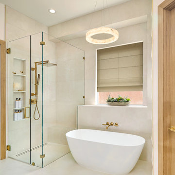
This master bathroom renovation in Frisco was completed for a repeat USI Design & Remodeling client as part of a larger first-floor transformation of the home. The original bathroom reflected a very typical North Texas layout of its era — dark stained cabinetry, granite countertops, compartmentalized vanities, a built-in tub adjoining a framed shower, and separated spaces that no longer aligned with how the homeowners wanted to live. As their aesthetic evolved toward a more transitional and contemporary direction, the goal became less about replacing finishes and more about redefining the experience of the room itself. The project needed to feel calmer, more architectural, and far more intentional in how the space functioned visually and emotionally.
One of the most important changes was removing the original shower curb and pony wall in favor of a fully open curbless shower with ultra-clear ½-inch heavy glass. Achieving that look required recessing the slab, re-floating the shower floor toward a linear drain, and engineering the space so the room would read as visually uninterrupted from end to end. Throughout the project, many of the design decisions were rooted in restraint rather than excess. The oversized 24x48 Porcelanosa flooring carries very little shade variation, creating a quieter visual field, while the cabinetry was executed in rift-sawn white oak specifically because it produces a far more controlled and consistent finish outcome than more common cuts of wood. In luxury projects, consistency itself becomes part of the refinement.
The floating vanity was designed more like custom furniture than traditional cabinetry, utilizing waterfall mitered edges and fully reworked plumbing locations so both homeowners could share in having generous functional countertop space. The original makeup station was repurposed into integrated storage with powered drawers and concealed organization for everyday items such as blow dryers and flat irons. Along the vanity wall, wall-mounted plumbing fixtures were paired with ribbed natural marble surfaces — a detail that required intentional planning long before construction began. Rather than allowing the ribbed material to terminate awkwardly behind the fixtures, the backsplash and stone transitions were specifically designed to resolve those conditions cleanly. Those are the types of details that distinguish highly coordinated design-build work from projects that simply assemble materials together.
While the room contains a significant amount of luxury detailing — from the freestanding tub and geoprism marble focal wall to the custom rift-sawn white oak closet doors and elongated mirrors that leverage the 11-foot ceiling heights — the project was always guided by quiet luxury rather than visual competition. Even the water closet enclosure was handled with restraint through the use of a satin-etched glass door rather than another heavy solid opening. The intent throughout was to create a bathroom that feels restorative and serene rather than overdesigned. In our view, the best luxury spaces are the ones that feel composed long after the initial impression wears off.

 TVL Creative Ltd.
These wonderful clients returned to us for their newest home remodel adventure. Their newly purchased custom built 1970s modern ranch sits in one of the loveliest neighborhoods south of the city but the current conditions of the home were out-dated and not so lovely. Upon entering the front door through the court you were greeted abruptly by a very boring staircase and an excessive number of doors. Just to the left of the double door entry was a large slider and on your right once inside the home was a soldier line up of doors. This made for an uneasy and uninviting entry that guests would quickly forget and our clients would often avoid. We also had our hands full in the kitchen. The existing space included many elements that felt out of place in a modern ranch including a rustic mountain scene backsplash, cherry cabinets with raised panel and detailed profile, and an island so massive you couldn’t pass a drink across the stone. Our design sought to address the functional pain points of the home and transform the overall aesthetic into something that felt like home for our clients.
For the entry, we re-worked the front door configuration by switching from the double door to a large single door with side lights. The sliding door next to the main entry door was replaced with a large window to eliminate entry door confusion. In our re-work of the entry staircase, guesta are now greeted into the foyer which features the Coral Pendant by David Trubridge. Guests are drawn into the home by stunning views of the front range via the large floor-to-ceiling glass wall in the living room. To the left, the staircases leading down to the basement and up to the master bedroom received a massive aesthetic upgrade. The rebuilt 2nd-floor staircase has a center spine with wood rise and run appearing to float upwards towards the master suite. A slatted wall of wood separates the two staircases which brings more light into the basement stairwell. Black metal railings add a stunning contrast to the light wood.
Other fabulous upgrades to this home included new wide plank flooring throughout the home, which offers both modernity and warmth. The once too-large kitchen island was downsized to create a functional focal point that is still accessible and intimate. The old dark and heavy kitchen cabinetry was replaced with sleek white cabinets, brightening up the space and elevating the aesthetic of the entire room. The kitchen countertops are marble look quartz with dramatic veining that offers an artistic feature behind the range and across all horizontal surfaces in the kitchen. As a final touch, cascading island pendants were installed which emphasize the gorgeous ceiling vault and provide warm feature lighting over the central point of the kitchen.
This transformation reintroduces light and simplicity to this gorgeous home, and we are so happy that our clients can reap the benefits of this elegant and functional design for years to come.

 kimberly peck architect
photos by Pedro Marti
This large light-filled open loft in the Tribeca neighborhood of New York City was purchased by a growing family to make into their family home. The loft, previously a lighting showroom, had been converted for residential use with the standard amenities but was entirely open and therefore needed to be reconfigured. One of the best attributes of this particular loft is its extremely large windows situated on all four sides due to the locations of neighboring buildings. This unusual condition allowed much of the rear of the space to be divided into 3 bedrooms/3 bathrooms, all of which had ample windows. The kitchen and the utilities were moved to the center of the space as they did not require as much natural lighting, leaving the entire front of the loft as an open dining/living area. The overall space was given a more modern feel while emphasizing it’s industrial character. The original tin ceiling was preserved throughout the loft with all new lighting run in orderly conduit beneath it, much of which is exposed light bulbs. In a play on the ceiling material the main wall opposite the kitchen was clad in unfinished, distressed tin panels creating a focal point in the home. Traditional baseboards and door casings were thrown out in lieu of blackened steel angle throughout the loft. Blackened steel was also used in combination with glass panels to create an enclosure for the office at the end of the main corridor; this allowed the light from the large window in the office to pass though while creating a private yet open space to work. The master suite features a large open bath with a sculptural freestanding tub all clad in a serene beige tile that has the feel of concrete. The kids bath is a fun play of large cobalt blue hexagon tile on the floor and rear wall of the tub juxtaposed with a bright white subway tile on the remaining walls. The kitchen features a long wall of floor to ceiling white and navy cabinetry with an adjacent 15 foot island of which half is a table for casual dining. Other interesting features of the loft are the industrial ladder up to the small elevated play area in the living room, the navy cabinetry and antique mirror clad dining niche, and the wallpapered powder room with antique mirror and blackened steel accessories.
Find the right local pro for your project

 SDM Design, Inc.
This house was designed for a couple and their son. One of the design program requirements was to have two master suites on the main level. They enjoy cooking and entertaining so the public and food prep. areas are functional, attractive and conducive to people gathering around. Consequently, the square footage of the main level is large.
The house is also on a very steep slope which didn't help with the required footprint. In order to minimize the related costs of building with this site condition, the footprint of the house is long and not deep as it reaches down the slope.
The scale of the existing homes in the neighborhood are unimposing. In order to play down the size as viewed from the street, the facade is broken up into several different masses with low sloping roofs.
Once you're inside, the house opens up with 14 foot ceilings in the entry and living areas. The ceiling height of other spaces on the main level are 10 feet. Universal design was implemented on the main level to provide inherent accessibility for everyone.
The lower level accommodates several guest rooms and baths, an exercise room, a guest den with wet bar and a man cave.
Another design program requirement was to make the house as maintenance-free as possible. Exterior materials include stucco, Pennsylvania Blue Stone and a new aluminum siding product called Longboard. The siding comes in many wood grain finishes and to everyone that has seen it, they think it's real wood. It's also made from heavy gauge aluminum so it doesn't ding like traditional aluminum siding. The roofs are metal standing seam.
The house is energy efficient. It's fully insulated with spray foam insulation-lots of it. The exterior walls were designed with 2x6 studs and roof rafters are 2x12 to provide plenty of space for the insulation, exceeding the required R-values. Windows and doors of course are energy efficient as well. All lighting is LED.
The decking around the exterior is locust, a very hard native wood which is naturally insect and rot resistant.
The best part of the whole project are the owners who love their new home. They initially had plans to live in this house during the summer months and Florida during the winter. They are now seriously considering living here full-time.
 Lionel F Bailey AIA Architect LLC
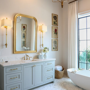
This Baton Rouge home, in The Settlement at Willow Grove, has a style inspired by a California Coastal vocabulary. It is a 2-story with 3 bedrooms, 2 full baths and a powder room. The square footage for the conditioned spaces is 4,340 sq ft and the total under roof is 5,343 sq ft. It is designed with the main living spaces having views and access to a comfortable side porch, patio and pool. The exterior style is cleverly woven into the interior design with architectural detailing and choices in finishes, fixtures and furnishings.
As you enter the home through a steel and glass door unit, the coffered ceiling foyer opens to a stair and then leads you down a hallway with white oak beams that becomes the main circulation spine to most of the first-floor spaces in the house. One of those unique spaces is the wet bar that is integrated into a space below the stairs in such a way that the steps are expressed in the ceiling design.
The kitchen, dining and living room form a great room with each space defined by white oak beams supported by corbelled pilasters. White oak accents are implemented throughout this area in cabinetry and in floating shelves on one entire wall in the living room. The kitchen features a large island and provides serving access to the side porch through counter height sliding window units. Access is also provided to a spacious butler pantry behind the kitchen.
Along the main hallway, one can access the garage, a drop off area and the laundry room. Further down around the corner you’ll find the master suite with a beautifully appointed bathroom featuring a footed tub as the focal point with views through a large window to a small, landscaped area. The his and her closet is designed for each’s needs with an island.
Upstairs you’ll find a large landing that can also serve as an exercise area and then find 2 more bedrooms, which share a bathroom. One of the bedrooms serves as a study but can also become a bedroom when needed with a murphy bed. This study/bedroom cantilevers off the corner of the house, providing spectacular views through a spray of windows to a community park down the street. A large playroom accessed of the landing is provided for family fun.
 SDM Design, Inc.
This house was designed for a couple and their son. One of the design program requirements was to have two master suites on the main level. They enjoy cooking and entertaining so the public and food prep. areas are functional, attractive and conducive to people gathering around. Consequently, the square footage of the main level is large.
The house is also on a very steep slope which didn't help with the required footprint. In order to minimize the related costs of building with this site condition, the footprint of the house is long and not deep as it reaches down the slope.
The scale of the existing homes in the neighborhood are unimposing. In order to play down the size as viewed from the street, the facade is broken up into several different masses with low sloping roofs.
Once you're inside, the house opens up with 14 foot ceilings in the entry and living areas. The ceiling height of other spaces on the main level are 10 feet. Universal design was implemented on the main level to provide inherent accessibility for everyone.
The lower level accommodates several guest rooms and baths, an exercise room, a guest den with wet bar and a man cave.
Another design program requirement was to make the house as maintenance-free as possible. Exterior materials include stucco, Pennsylvania Blue Stone and a new aluminum siding product called Longboard. The siding comes in many wood grain finishes and to everyone that has seen it, they think it's real wood. It's also made from heavy gauge aluminum so it doesn't ding like traditional aluminum siding. The roofs are metal standing seam.
The house is energy efficient. It's fully insulated with spray foam insulation-lots of it. The exterior walls were designed with 2x6 studs and roof rafters are 2x12 to provide plenty of space for the insulation, exceeding the required R-values. Windows and doors of course are energy efficient as well. All lighting is LED.
The decking around the exterior is locust, a very hard native wood which is naturally insect and rot resistant.
The best part of the whole project are the owners who love their new home. They initially had plans to live in this house during the summer months and Florida during the winter. They are now seriously considering living here full-time.

 MATHISON | MATHISON ARCHITECTS
A primary project goal was to reimagine the relationship of the house to its surroundings while remaining sensitive to the communal context of the neighboring properties. The design seed of the new project included rotating the footprint of the existing house 90 degrees to open the long side of the home toward the lake, maximizing views and gaining optimal benefit of the linear site. Drawing inspiration from the traditional lake vernacular of the neighboring houses, the two principal roof forms of the new house reciprocate the setting -- the modern, clean lines of the upper gable roof upholds the clarity and tradition of the neighborhood, while the lower roof mimics the extension of the landscape and invites improvisational use. The horizontal flat roof allows use of the deck in all weather and cantilevers the most used public spaces into the landscape in a band of captured horizontal space. A wood-clad retaining wall refines a cut into the earth and harbors a transitional, outdoor room between the water and the basement.
At 2200 finished square feet, the conditioned building envelope is compact. And like the exterior, the interior form responds directly to its use. The upper floor is a monastic repetition of modest sleeping cells and bathrooms with unique directional views, combined with a grand central stair and master bedroom at each corner that captures myriad views of the water, over the trees, in all directions.
The main floor utilizes a core of small, functional spaces to shield the adjacent road, and forms a backdrop to the open interior spaces. Aided by the reaching, cedar-bellied roof, the living, dining, and kitchen spaces spill to the outdoors through an unusually porous exterior wall. Three sliding glass doors–including one at 20 feet wide–and a finished, surrounding ground plane cohere the landscape to the main living level.
Super-insulated wood-framed walls, triple-paned aluminum-clad wood windows, and a structurally insulated roof panels make-up the core of the building envelope, and additional exterior high-performance design features include geothermal heating/cooling and a green roof. Cementitious lap siding, concrete panels, hardwood decking, cedar soffits, and river rock comprise the exterior finish. In addition to cedar ceilings, interior finishes include porcelain ceramic tile, cork flooring, tight pile wool carpet, and neutral painted walls -- designed in quiet tones to highlight the most important interior ingredient: views outside.
Sponsored
Sunbury, OH

J.Holderby - Renovations
Franklin County's Leading General Contractors - 2X Best of Houzz!

 Nautilus Architects
Located on a marsh in the upper reaches of the Lieutenant River in Old Lyme, the existing house was well-sited and well-built, but the design failed to exploit the views and more importantly was a confused combination of contemporary and traditional elements. The new homeowners, a successful businesswoman and an accomplished artist and photographer, were interested in creating a fully-contemporary environment to open up space, connect indoors with outdoors, display artwork and showcase the husband’s distinctive photographs.
One glaring deficiency was the curb appeal and approach sequence: the grade sloped down and the path to the house followed, but this led to an uncomfortable dip and abrupt rise to the front door. By creating a virtual “moat,” occupied by a grid of raised-bed grasses contained in aluminum-clad boxes, and spanning the moat with an ipe bridge, the approach becomes level and engaging. The façade of the existing house was blank and bland, and with no cover. Adding a deep overhang with a wide porch creates a welcoming, covered condition, accentuated by a 6’ wide pivoting front door that feels more like a moving piece of wall.
Another deficiency was the connection to the outdoors. By adding glass to the front and back of the house, and removing interior walls selectively, the house takes on a diaphanous quality that allows one to see through to the marsh beyond, even when in the driveway. The raised-bed grasses act as abstract, geometric versions of the marsh beyond. A large, pyramidal skylight establishes a spatial hierarchy around which the rooms revolve.
The house featured several tray-ceilinged spaces – living room, kitchen, and master bedroom – that were poorly-proportioned and with panels at the top that resembled inset flat panel doors. The solution was to use a different strategy for each: the bedroom turns the ceiling into an eggshell through the use of a creative trim detail; the living room has an oversized sculptural, backlit lighting element; and the kitchen has a collage of painted rectangular forms that support or include lighting pieces.
A palette of concrete, blackened steel, stainless steel and colors carefully chosen by homeowner and architect create an interior and exterior environment punctuated by moments that are as artistic as the featured works in the black-ceilinged gallery.
 TVL Creative Ltd.
These wonderful clients returned to us for their newest home remodel adventure. Their newly purchased custom built 1970s modern ranch sits in one of the loveliest neighborhoods south of the city but the current conditions of the home were out-dated and not so lovely. Upon entering the front door through the court you were greeted abruptly by a very boring staircase and an excessive number of doors. Just to the left of the double door entry was a large slider and on your right once inside the home was a soldier line up of doors. This made for an uneasy and uninviting entry that guests would quickly forget and our clients would often avoid. We also had our hands full in the kitchen. The existing space included many elements that felt out of place in a modern ranch including a rustic mountain scene backsplash, cherry cabinets with raised panel and detailed profile, and an island so massive you couldn’t pass a drink across the stone. Our design sought to address the functional pain points of the home and transform the overall aesthetic into something that felt like home for our clients.
For the entry, we re-worked the front door configuration by switching from the double door to a large single door with side lights. The sliding door next to the main entry door was replaced with a large window to eliminate entry door confusion. In our re-work of the entry staircase, guesta are now greeted into the foyer which features the Coral Pendant by David Trubridge. Guests are drawn into the home by stunning views of the front range via the large floor-to-ceiling glass wall in the living room. To the left, the staircases leading down to the basement and up to the master bedroom received a massive aesthetic upgrade. The rebuilt 2nd-floor staircase has a center spine with wood rise and run appearing to float upwards towards the master suite. A slatted wall of wood separates the two staircases which brings more light into the basement stairwell. Black metal railings add a stunning contrast to the light wood.
Other fabulous upgrades to this home included new wide plank flooring throughout the home, which offers both modernity and warmth. The once too-large kitchen island was downsized to create a functional focal point that is still accessible and intimate. The old dark and heavy kitchen cabinetry was replaced with sleek white cabinets, brightening up the space and elevating the aesthetic of the entire room. The kitchen countertops are marble look quartz with dramatic veining that offers an artistic feature behind the range and across all horizontal surfaces in the kitchen. As a final touch, cascading island pendants were installed which emphasize the gorgeous ceiling vault and provide warm feature lighting over the central point of the kitchen.
This transformation reintroduces light and simplicity to this gorgeous home, and we are so happy that our clients can reap the benefits of this elegant and functional design for years to come.
 Robert M. Cain, Architect
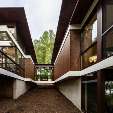
Holly Hill, a retirement home, whose owner's hobbies are gardening and restoration of classic cars, is nestled into the site contours to maximize views of the lake and minimize impact on the site.
Holly Hill is comprised of three wings joined by bridges: A wing facing a master garden to the east, another wing with workshop and a central activity, living, dining wing. Similar to a radiator the design increases the amount of exterior wall maximizing opportunities for natural ventilation during temperate months.
Other passive solar design features will include extensive eaves, sheltering porches and high-albedo roofs, as strategies for considerably reducing solar heat gain.
Daylighting with clerestories and solar tubes reduce daytime lighting requirements. Ground source geothermal heat pumps and superior to code insulation ensure minimal space conditioning costs. Corten steel siding and concrete foundation walls satisfy client requirements for low maintenance and durability. All light fixtures are LEDs.
Open and screened porches are strategically located to allow pleasant outdoor use at any time of day, particular season or, if necessary, insect challenge. Dramatic cantilevers allow the porches to project into the site’s beautiful mixed hardwood tree canopy without damaging root systems.
Guest arrive by vehicle with glimpses of the house and grounds through penetrations in the concrete wall enclosing the garden. One parked they are led through a garden composed of pavers, a fountain, benches, sculpture and plants. Views of the lake can be seen through and below the bridges.
Primary client goals were a sustainable low-maintenance house, primarily single floor living, orientation to views, natural light to interiors, maximization of individual privacy, creation of a formal outdoor space for gardening, incorporation of a full workshop for cars, generous indoor and outdoor social space for guests and parties.
 Lionel F Bailey AIA Architect LLC
This Baton Rouge home, in The Settlement at Willow Grove, has a style inspired by a California Coastal vocabulary. It is a 2-story with 3 bedrooms, 2 full baths and a powder room. The square footage for the conditioned spaces is 4,340 sq ft and the total under roof is 5,343 sq ft. It is designed with the main living spaces having views and access to a comfortable side porch, patio and pool. The exterior style is cleverly woven into the interior design with architectural detailing and choices in finishes, fixtures and furnishings.
As you enter the home through a steel and glass door unit, the coffered ceiling foyer opens to a stair and then leads you down a hallway with white oak beams that becomes the main circulation spine to most of the first-floor spaces in the house. One of those unique spaces is the wet bar that is integrated into a space below the stairs in such a way that the steps are expressed in the ceiling design.
The kitchen, dining and living room form a great room with each space defined by white oak beams supported by corbelled pilasters. White oak accents are implemented throughout this area in cabinetry and in floating shelves on one entire wall in the living room. The kitchen features a large island and provides serving access to the side porch through counter height sliding window units. Access is also provided to a spacious butler pantry behind the kitchen.
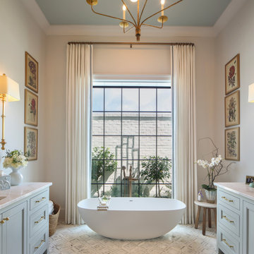
Along the main hallway, one can access the garage, a drop off area and the laundry room. Further down around the corner you’ll find the master suite with a beautifully appointed bathroom featuring a footed tub as the focal point with views through a large window to a small, landscaped area. The his and her closet is designed for each’s needs with an island.
Upstairs you’ll find a large landing that can also serve as an exercise area and then find 2 more bedrooms, which share a bathroom. One of the bedrooms serves as a study but can also become a bedroom when needed with a murphy bed. This study/bedroom cantilevers off the corner of the house, providing spectacular views through a spray of windows to a community park down the street. A large playroom accessed of the landing is provided for family fun.
 USI Design & Remodeling
This master bathroom renovation in Frisco was completed for a repeat USI Design & Remodeling client as part of a larger first-floor transformation of the home. The original bathroom reflected a very typical North Texas layout of its era — dark stained cabinetry, granite countertops, compartmentalized vanities, a built-in tub adjoining a framed shower, and separated spaces that no longer aligned with how the homeowners wanted to live. As their aesthetic evolved toward a more transitional and contemporary direction, the goal became less about replacing finishes and more about redefining the experience of the room itself. The project needed to feel calmer, more architectural, and far more intentional in how the space functioned visually and emotionally.
One of the most important changes was removing the original shower curb and pony wall in favor of a fully open curbless shower with ultra-clear ½-inch heavy glass. Achieving that look required recessing the slab, re-floating the shower floor toward a linear drain, and engineering the space so the room would read as visually uninterrupted from end to end. Throughout the project, many of the design decisions were rooted in restraint rather than excess. The oversized 24x48 Porcelanosa flooring carries very little shade variation, creating a quieter visual field, while the cabinetry was executed in rift-sawn white oak specifically because it produces a far more controlled and consistent finish outcome than more common cuts of wood. In luxury projects, consistency itself becomes part of the refinement.
The floating vanity was designed more like custom furniture than traditional cabinetry, utilizing waterfall mitered edges and fully reworked plumbing locations so both homeowners could share in having generous functional countertop space. The original makeup station was repurposed into integrated storage with powered drawers and concealed organization for everyday items such as blow dryers and flat irons. Along the vanity wall, wall-mounted plumbing fixtures were paired with ribbed natural marble surfaces — a detail that required intentional planning long before construction began. Rather than allowing the ribbed material to terminate awkwardly behind the fixtures, the backsplash and stone transitions were specifically designed to resolve those conditions cleanly. Those are the types of details that distinguish highly coordinated design-build work from projects that simply assemble materials together.
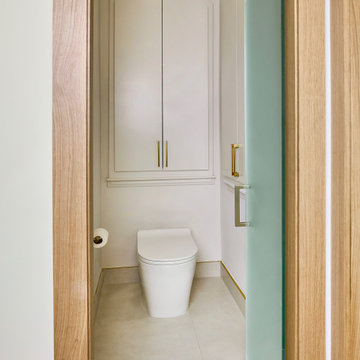
While the room contains a significant amount of luxury detailing — from the freestanding tub and geoprism marble focal wall to the custom rift-sawn white oak closet doors and elongated mirrors that leverage the 11-foot ceiling heights — the project was always guided by quiet luxury rather than visual competition. Even the water closet enclosure was handled with restraint through the use of a satin-etched glass door rather than another heavy solid opening. The intent throughout was to create a bathroom that feels restorative and serene rather than overdesigned. In our view, the best luxury spaces are the ones that feel composed long after the initial impression wears off.
 MATHISON | MATHISON ARCHITECTS
A primary project goal was to reimagine the relationship of the house to its surroundings while remaining sensitive to the communal context of the neighboring properties. The design seed of the new project included rotating the footprint of the existing house 90 degrees to open the long side of the home toward the lake, maximizing views and gaining optimal benefit of the linear site. Drawing inspiration from the traditional lake vernacular of the neighboring houses, the two principal roof forms of the new house reciprocate the setting -- the modern, clean lines of the upper gable roof upholds the clarity and tradition of the neighborhood, while the lower roof mimics the extension of the landscape and invites improvisational use. The horizontal flat roof allows use of the deck in all weather and cantilevers the most used public spaces into the landscape in a band of captured horizontal space. A wood-clad retaining wall refines a cut into the earth and harbors a transitional, outdoor room between the water and the basement.
At 2200 finished square feet, the conditioned building envelope is compact. And like the exterior, the interior form responds directly to its use. The upper floor is a monastic repetition of modest sleeping cells and bathrooms with unique directional views, combined with a grand central stair and master bedroom at each corner that captures myriad views of the water, over the trees, in all directions.
The main floor utilizes a core of small, functional spaces to shield the adjacent road, and forms a backdrop to the open interior spaces. Aided by the reaching, cedar-bellied roof, the living, dining, and kitchen spaces spill to the outdoors through an unusually porous exterior wall. Three sliding glass doors–including one at 20 feet wide–and a finished, surrounding ground plane cohere the landscape to the main living level.
Super-insulated wood-framed walls, triple-paned aluminum-clad wood windows, and a structurally insulated roof panels make-up the core of the building envelope, and additional exterior high-performance design features include geothermal heating/cooling and a green roof. Cementitious lap siding, concrete panels, hardwood decking, cedar soffits, and river rock comprise the exterior finish. In addition to cedar ceilings, interior finishes include porcelain ceramic tile, cork flooring, tight pile wool carpet, and neutral painted walls -- designed in quiet tones to highlight the most important interior ingredient: views outside.
Sponsored
Columbus, OH
Free consultation for landscape design!

Peabody Landscape Group
Columbus' Reliable Landscape Design & Contracting
 Lionel F Bailey AIA Architect LLC
This Baton Rouge home, in The Settlement at Willow Grove, has a style inspired by a California Coastal vocabulary. It is a 2-story with 3 bedrooms, 2 full baths and a powder room. The square footage for the conditioned spaces is 4,340 sq ft and the total under roof is 5,343 sq ft. It is designed with the main living spaces having views and access to a comfortable side porch, patio and pool. The exterior style is cleverly woven into the interior design with architectural detailing and choices in finishes, fixtures and furnishings.
As you enter the home through a steel and glass door unit, the coffered ceiling foyer opens to a stair and then leads you down a hallway with white oak beams that becomes the main circulation spine to most of the first-floor spaces in the house. One of those unique spaces is the wet bar that is integrated into a space below the stairs in such a way that the steps are expressed in the ceiling design.
The kitchen, dining and living room form a great room with each space defined by white oak beams supported by corbelled pilasters. White oak accents are implemented throughout this area in cabinetry and in floating shelves on one entire wall in the living room. The kitchen features a large island and provides serving access to the side porch through counter height sliding window units. Access is also provided to a spacious butler pantry behind the kitchen.
Along the main hallway, one can access the garage, a drop off area and the laundry room. Further down around the corner you’ll find the master suite with a beautifully appointed bathroom featuring a footed tub as the focal point with views through a large window to a small, landscaped area. The his and her closet is designed for each’s needs with an island.
Upstairs you’ll find a large landing that can also serve as an exercise area and then find 2 more bedrooms, which share a bathroom. One of the bedrooms serves as a study but can also become a bedroom when needed with a murphy bed. This study/bedroom cantilevers off the corner of the house, providing spectacular views through a spray of windows to a community park down the street. A large playroom accessed of the landing is provided for family fun.

 Braswell Design+Build
This client sought to update their recently purchased home in Alexandria. A gourmet kitchen that complemented the size of the home and property was a top priority. They wanted more light-filled and connected living spaces for their growing family. Updating the finishes throughout the home was also a necessity.
Design challenges included an existing utility space that occupied a large portion of the kitchen footprint, making the kitchen cramped and narrow. In addition, the foyer was dark, confined and uninviting as a result of its organization and enclosed nature of the main stair.
To overcome the challenges, we relocated the utilities, creating a more usable footprint for the kitchen. The aging furnace was replaced with a high efficiency furnace located in a newly insulated and conditioned crawl space. A new hot water heater was placed in the finished attic, and the electrical panel was also relocated. Then, we designed a portion of the kitchen to mask the need for dropped structural headers: the refrigerator, freezer and pantry were placed under the area that necessitated a drop bulkhead, creating a sleek built-in area for the appliances.
Once the utilities were moved, the kitchen could be opened up to a large family room and designed with a much-improved layout. Two new four-panel exterior doors replaced small doors at the family room to connect the main living space with the beautiful yard. In addition, white bead board was added to the family room ceiling, creating more visual continuity with the adjacent white kitchen.
To transform the foyer into a grand and welcoming entry, a small amount of space was taken from a large second floor bedroom, and the entire second floor structure was supported with a series of flush beams to allow the stair to be opened and expose the rail. New glass doors to the den, relocated at an angle from the main stair provide the foyer with more natural light and a wider, more inviting path to the kitchen.
In the master suite, the bedroom and bathroom entry doors were relocated to improve the room’s layout and offer more bathroom privacy and space for a walk-in closet. A room forgotten by the previous owner was turned into a family mudroom with built-ins and wainscoting to keep the family organized in style.
Photography by Greg Hadley
 TVL Creative Ltd.
These wonderful clients returned to us for their newest home remodel adventure. Their newly purchased custom built 1970s modern ranch sits in one of the loveliest neighborhoods south of the city but the current conditions of the home were out-dated and not so lovely. Upon entering the front door through the court you were greeted abruptly by a very boring staircase and an excessive number of doors. Just to the left of the double door entry was a large slider and on your right once inside the home was a soldier line up of doors. This made for an uneasy and uninviting entry that guests would quickly forget and our clients would often avoid. We also had our hands full in the kitchen. The existing space included many elements that felt out of place in a modern ranch including a rustic mountain scene backsplash, cherry cabinets with raised panel and detailed profile, and an island so massive you couldn’t pass a drink across the stone. Our design sought to address the functional pain points of the home and transform the overall aesthetic into something that felt like home for our clients.
For the entry, we re-worked the front door configuration by switching from the double door to a large single door with side lights. The sliding door next to the main entry door was replaced with a large window to eliminate entry door confusion. In our re-work of the entry staircase, guesta are now greeted into the foyer which features the Coral Pendant by David Trubridge. Guests are drawn into the home by stunning views of the front range via the large floor-to-ceiling glass wall in the living room. To the left, the staircases leading down to the basement and up to the master bedroom received a massive aesthetic upgrade. The rebuilt 2nd-floor staircase has a center spine with wood rise and run appearing to float upwards towards the master suite. A slatted wall of wood separates the two staircases which brings more light into the basement stairwell. Black metal railings add a stunning contrast to the light wood.
Other fabulous upgrades to this home included new wide plank flooring throughout the home, which offers both modernity and warmth. The once too-large kitchen island was downsized to create a functional focal point that is still accessible and intimate. The old dark and heavy kitchen cabinetry was replaced with sleek white cabinets, brightening up the space and elevating the aesthetic of the entire room. The kitchen countertops are marble look quartz with dramatic veining that offers an artistic feature behind the range and across all horizontal surfaces in the kitchen. As a final touch, cascading island pendants were installed which emphasize the gorgeous ceiling vault and provide warm feature lighting over the central point of the kitchen.
This transformation reintroduces light and simplicity to this gorgeous home, and we are so happy that our clients can reap the benefits of this elegant and functional design for years to come.
 TVL Creative Ltd.
These wonderful clients returned to us for their newest home remodel adventure. Their newly purchased custom built 1970s modern ranch sits in one of the loveliest neighborhoods south of the city but the current conditions of the home were out-dated and not so lovely. Upon entering the front door through the court you were greeted abruptly by a very boring staircase and an excessive number of doors. Just to the left of the double door entry was a large slider and on your right once inside the home was a soldier line up of doors. This made for an uneasy and uninviting entry that guests would quickly forget and our clients would often avoid. We also had our hands full in the kitchen. The existing space included many elements that felt out of place in a modern ranch including a rustic mountain scene backsplash, cherry cabinets with raised panel and detailed profile, and an island so massive you couldn’t pass a drink across the stone. Our design sought to address the functional pain points of the home and transform the overall aesthetic into something that felt like home for our clients.
For the entry, we re-worked the front door configuration by switching from the double door to a large single door with side lights. The sliding door next to the main entry door was replaced with a large window to eliminate entry door confusion. In our re-work of the entry staircase, guesta are now greeted into the foyer which features the Coral Pendant by David Trubridge. Guests are drawn into the home by stunning views of the front range via the large floor-to-ceiling glass wall in the living room. To the left, the staircases leading down to the basement and up to the master bedroom received a massive aesthetic upgrade. The rebuilt 2nd-floor staircase has a center spine with wood rise and run appearing to float upwards towards the master suite. A slatted wall of wood separates the two staircases which brings more light into the basement stairwell. Black metal railings add a stunning contrast to the light wood.
Other fabulous upgrades to this home included new wide plank flooring throughout the home, which offers both modernity and warmth. The once too-large kitchen island was downsized to create a functional focal point that is still accessible and intimate. The old dark and heavy kitchen cabinetry was replaced with sleek white cabinets, brightening up the space and elevating the aesthetic of the entire room. The kitchen countertops are marble look quartz with dramatic veining that offers an artistic feature behind the range and across all horizontal surfaces in the kitchen. As a final touch, cascading island pendants were installed which emphasize the gorgeous ceiling vault and provide warm feature lighting over the central point of the kitchen.
This transformation reintroduces light and simplicity to this gorgeous home, and we are so happy that our clients can reap the benefits of this elegant and functional design for years to come.
Sponsored
Columbus, OH
Free consultation for landscape design!
Peabody Landscape Group
Columbus' Reliable Landscape Design & Contracting
 InteriorArt Ltd
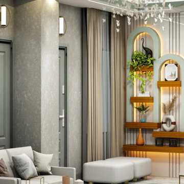
Hasan Ali's Apartment Interior Design – Pallabi, Mirpur, BD
InteriorArt Ltd is currently completing a 1,748 sqft residential interior design and renovation project for Mr. Hasan Ali in Pallabi, Mirpur — one of Dhaka's busier residential pockets where older apartment layouts often no longer match how families actually live today. This project is a strong example of our approach to home interior design: not just decorating existing rooms, but rethinking the floor plan itself to solve real everyday problems.
Rebuilding the Layout
The original apartment had four bedrooms, but the layout felt tight and disconnected. Rather than preserving every room by default, our design team made the call to remove one bedroom entirely, freeing up space to give the remaining rooms — and the shared living areas — room to breathe. This kind of structural rethinking is central to how we approach every residential interior design project, where the floor plan matters as much as the finishes.
A Hotel-Style Master Suite
The bathroom adjoining the primary bedroom was expanded and merged into the sleeping area, creating a single connected master suite. This upgrade reflects our broader bedroom interior design philosophy — treating the bedroom not as an isolated box, but as part of a larger, more functional living experience.
A Kitchen Built for Dhaka's Climate
The kitchen was rebuilt from scratch with an efficient galley layout and premium, low-maintenance finishes — a necessity in Bangladesh's humid conditions where materials face constant wear. You can see how this fits into our wider kitchen interior design approach, where every cabinet run and work surface is planned around how a family actually cooks, not just how it photographs.
One Consistent Design Language
Across the drawing room interior design and dining room interior design, we carried a unified neutral material palette — flooring, wall tone, and finish quality — so the apartment reads as one cohesive home rather than a set of unrelated rooms stitched together.
The Result
What began as an aging, awkwardly divided apartment is becoming a light-filled, modern home with a layout that genuinely supports daily family life. Completed on a 70-day build schedule, the project reflects InteriorArt Ltd's structured, end-to-end process — from first site visit through 3D visualization, material selection, and final handover.
Explore more of our work across Dhaka on our residential portfolio, or browse our full interior design services to see how we approach projects like this one from concept to completion.
 Lionel F Bailey AIA Architect LLC
This Baton Rouge home, in The Settlement at Willow Grove, has a style inspired by a California Coastal vocabulary. It is a 2-story with 3 bedrooms, 2 full baths and a powder room. The square footage for the conditioned spaces is 4,340 sq ft and the total under roof is 5,343 sq ft. It is designed with the main living spaces having views and access to a comfortable side porch, patio and pool. The exterior style is cleverly woven into the interior design with architectural detailing and choices in finishes, fixtures and furnishings.
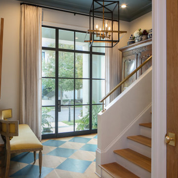
As you enter the home through a steel and glass door unit, the coffered ceiling foyer opens to a stair and then leads you down a hallway with white oak beams that becomes the main circulation spine to most of the first-floor spaces in the house. One of those unique spaces is the wet bar that is integrated into a space below the stairs in such a way that the steps are expressed in the ceiling design.
The kitchen, dining and living room form a great room with each space defined by white oak beams supported by corbelled pilasters. White oak accents are implemented throughout this area in cabinetry and in floating shelves on one entire wall in the living room. The kitchen features a large island and provides serving access to the side porch through counter height sliding window units. Access is also provided to a spacious butler pantry behind the kitchen.
Along the main hallway, one can access the garage, a drop off area and the laundry room. Further down around the corner you’ll find the master suite with a beautifully appointed bathroom featuring a footed tub as the focal point with views through a large window to a small, landscaped area. The his and her closet is designed for each’s needs with an island.
Upstairs you’ll find a large landing that can also serve as an exercise area and then find 2 more bedrooms, which share a bathroom. One of the bedrooms serves as a study but can also become a bedroom when needed with a murphy bed. This study/bedroom cantilevers off the corner of the house, providing spectacular views through a spray of windows to a community park down the street. A large playroom accessed of the landing is provided for family fun.
 SDM Design, Inc.
This house was designed for a couple and their son. One of the design program requirements was to have two master suites on the main level. They enjoy cooking and entertaining so the public and food prep. areas are functional, attractive and conducive to people gathering around. Consequently, the square footage of the main level is large.
The house is also on a very steep slope which didn't help with the required footprint. In order to minimize the related costs of building with this site condition, the footprint of the house is long and not deep as it reaches down the slope.
The scale of the existing homes in the neighborhood are unimposing. In order to play down the size as viewed from the street, the facade is broken up into several different masses with low sloping roofs.
Once you're inside, the house opens up with 14 foot ceilings in the entry and living areas. The ceiling height of other spaces on the main level are 10 feet. Universal design was implemented on the main level to provide inherent accessibility for everyone.
The lower level accommodates several guest rooms and baths, an exercise room, a guest den with wet bar and a man cave.
Another design program requirement was to make the house as maintenance-free as possible. Exterior materials include stucco, Pennsylvania Blue Stone and a new aluminum siding product called Longboard. The siding comes in many wood grain finishes and to everyone that has seen it, they think it's real wood. It's also made from heavy gauge aluminum so it doesn't ding like traditional aluminum siding. The roofs are metal standing seam.
The house is energy efficient. It's fully insulated with spray foam insulation-lots of it. The exterior walls were designed with 2x6 studs and roof rafters are 2x12 to provide plenty of space for the insulation, exceeding the required R-values. Windows and doors of course are energy efficient as well. All lighting is LED.
The decking around the exterior is locust, a very hard native wood which is naturally insect and rot resistant.
The best part of the whole project are the owners who love their new home. They initially had plans to live in this house during the summer months and Florida during the winter. They are now seriously considering living here full-time.
107