
Search results for "Master determine" in Home Design Ideas
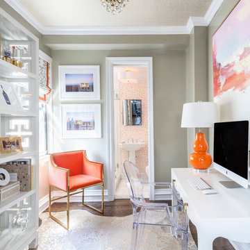
 The Rinfret Group
Example of a mid-sized transitional freestanding desk dark wood floor and brown floor study room design in New York with beige walls and no fireplace
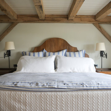
 Maple Hill Design
Bedroom with timber frame exposed beams.
- Maaike Bernstrom Photography.
Inspiration for a mid-sized cottage guest bedroom remodel in Providence with white walls
Inspiration for a mid-sized cottage guest bedroom remodel in Providence with white walls
 Renovisions
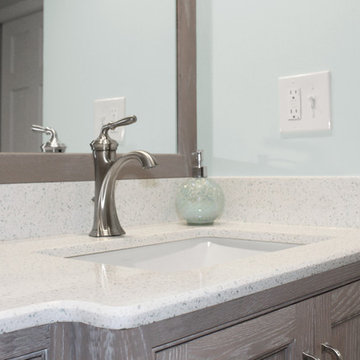
This South Shore of Boston couple reached out to Renovisions to design and build a beautiful, maintenance free and easy to use ‘his and hers’ master bathroom with plenty of storage. The former bath which had a single sink, one mirror, a vanity cabinet with not enough storage and a tired fiberglass shower stall was the last room in their home to be remodeled. They envisioned a more spa-like feel with a brighter walk-in shower and stylish cabinetry with double sinks and more storage.
Renovisions re-designed this bath with a fresh approach to a classic style; boasting two sinks and framed mirrors that match the custom oak cabinetry with a grey stain and cherused finish (a process that allows raising of the wood grain, creating a beautiful texture).
Choosing a white and grey palette with Carrara-look tiles in the shower opened up the space, tied in nicely with the weathered grey vanity and exemplified the feeling of casual luxury. The bright and airy walk-in shower with double recessed niches and dual shower heads affords both his and hers showering needs. Stunning and dramatic chevron patterned mosaic glass tile defines the niche spaces and lends a pretty, decorative touch to the overall look. The soft blue-green hue on the walls match perfectly with this tile and continue the serene and spa-like appeal throughout the bath.
Replacing the existing double-hung window with a smaller, decorative cut glass casement window not only provided a stunning focal point to the bathroom, but also allowed for additional cabinetry that includes a pull-out hamper and two deep drawers. Silestone’s stunning ‘white diamond’ quartz looks great with the color scheme and provides more countertop space for make-up and cosmetics.
The clients were thrilled with their ‘Renovision’ that imparts clean aesthetic and beautifully appointed classic details.
"Just wanted to say thank you for a job well done. We absolutely love our bathroom. From start to finish you were all so pleasant and professional. The fact that Ed is determined to come up with a solution for our bathroom door shows your commitment to your clients and the pride you take in your work. I can say from experience that not all contractors would care to or be as determined as Ed to say “I will come up with a solution just give me some time” especially after being paid in full. So thank you again. I would highly recommend your company to anyone looking for a bathroom ‘Renovision’! All the best!"
- Dan & Deb S. (Hanover)
Find the right local pro for your project
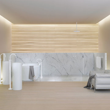
 Studio41 Home Design Showroom
YOU DON'T CHANGE A CLASSIC. YOU REFINE IT. | Tara is the contemporary interpretation of a design icon. Evolution in design, in architecture, new finishes and colors. These are small changes, fine details. But it is precisely these details that determine the class of Tara. Tara looks even more elegant. The extended body formally straightens up the fitting. The rosettes and handles are more streamlined, and the overall contours are sharper. All this is done to put even greater emphasis on the perfect, geometric, symmetric and clear use of form and to concentrate and refocus. TARA has set the standard for more than a decade. Tara will set the standard for the future. | Available at www.shopstudio41.com
 Dependable Renovations Ltd
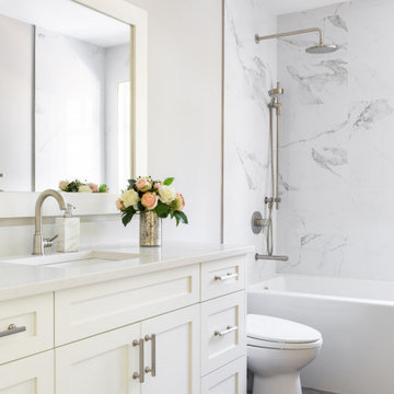
Alcove bathtub - transitional white tile gray floor and single-sink alcove bathtub idea in Calgary with shaker cabinets, white cabinets, gray walls, an undermount sink, white countertops and a built-in vanity

 Metropolis Drafting and Construction Inc
Master suite addition to an existing 20's Spanish home in the heart of Sherman Oaks, approx. 300+ sq. added to this 1300sq. home to provide the needed master bedroom suite. the large 14' by 14' bedroom has a 1 lite French door to the back yard and a large window allowing much needed natural light, the new hardwood floors were matched to the existing wood flooring of the house, a Spanish style arch was done at the entrance to the master bedroom to conform with the rest of the architectural style of the home.
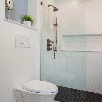
The master bathroom on the other hand was designed with a Scandinavian style mixed with Modern wall mounted toilet to preserve space and to allow a clean look, an amazing gloss finish freestanding vanity unit boasting wall mounted faucets and a whole wall tiled with 2x10 subway tile in a herringbone pattern.
For the floor tile we used 8x8 hand painted cement tile laid in a pattern pre determined prior to installation.
The wall mounted toilet has a huge open niche above it with a marble shelf to be used for decoration.
The huge shower boasts 2x10 herringbone pattern subway tile, a side to side niche with a marble shelf, the same marble material was also used for the shower step to give a clean look and act as a trim between the 8x8 cement tiles and the bark hex tile in the shower pan.
Notice the hidden drain in the center with tile inserts and the great modern plumbing fixtures in an old work antique bronze finish.
A walk-in closet was constructed as well to allow the much needed storage space.

Sponsored
Columbus, OH

Hope Restoration & General Contracting
Columbus Design-Build, Kitchen & Bath Remodeling, Historic Renovations
 Landis Architects | Builders
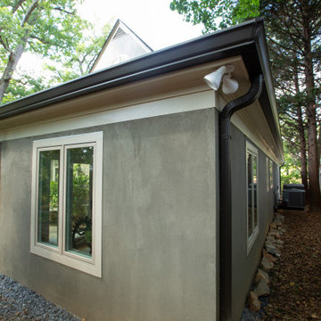
The main goal for the owners of this 1926 house was an addition to gain more closet space near their main floor master bedroom. During the design stage, they also decided to create a zen home office for one of the owner’s reiki business that had direct access for visitors from the backyard, rather than walking through the house. In assessing the feasibility of the project, the first thing the designer did was to check the zoning regulations. After a thorough study, it was determined that a 7-foot side addition was possible. This 7-foot addition was adequate for a built-in cabinetry storage and a new powder room. The design proposal also included a rear wraparound 13ftx13ft home office, that gave the existing rear patio a courtyard feel. Painted stucco was used on the new addition to match a previously added sunroom at the other side of the house. Matching windows were also added.
The proposed design featured a simple shed roof at the side addition and a hip roof at the front and back. View of addition from the back corner of the yard.
 Golden Visions Design
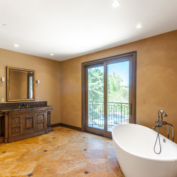
The master bathroom has its own balcony overlooking the front yard - not a bad view from the tub!
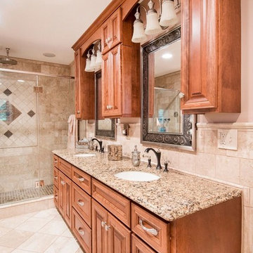
Huge tuscan master beige tile and stone tile terra-cotta tile freestanding bathtub photo in San Francisco with recessed-panel cabinets, medium tone wood cabinets, beige walls and granite countertops
Huge tuscan master beige tile and stone tile terra-cotta tile freestanding bathtub photo in San Francisco with recessed-panel cabinets, medium tone wood cabinets, beige walls and granite countertops
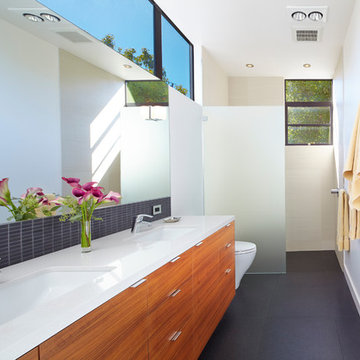
 ODS Architecture
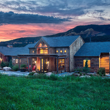
Originally a nearly three-story tall 1920’s European-styled home was turned into a modern villa for work and home. A series of low concrete retaining wall planters and steps gradually takes you up to the second level entry, grounding or anchoring the house into the site, as does a new wrap around veranda and trellis. Large eave overhangs on the upper roof were designed to give the home presence and were accented with a Mid-century orange color. The new master bedroom addition white box creates a better sense of entry and opens to the wrap around veranda at the opposite side. Inside the owners live on the lower floor and work on the upper floor with the garage basement for storage, archives and a ceramics studio. New windows and open spaces were created for the graphic designer owners; displaying their mid-century modern furnishings collection.
A lot of effort went into attempting to lower the house visually by bringing the ground plane higher with the concrete retaining wall planters, steps, wrap around veranda and trellis, and the prominent roof with exaggerated overhangs. That the eaves were painted orange is a cool reflection of the owner’s Dutch heritage. Budget was a driver for the project and it was determined that the footprint of the home should have minimal extensions and that the new windows remain in the same relative locations as the old ones. Wall removal was utilized versus moving and building new walls where possible.
Photo Credit: John Sutton Photography.

 Phoenix Home Remodeling
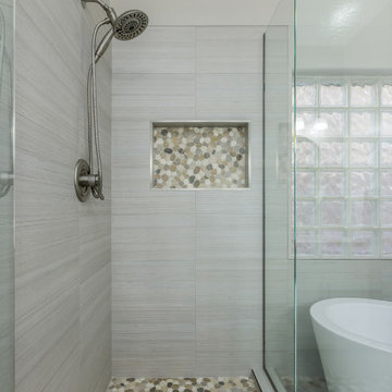
Our designer worked with Eric and Alexandra on their master bathroom remodeling project. After hearing their desires and the goals. We determined the desired look would be a monochromatic modern but functional space.
By removing the outdated shower walls and pony wall covered in cultured marble, we created a custom shower using the Shibusa 12x24 collection from Arizona Tile.
The color is Bianco, we laid the tile in a horizontally stacked pattern allows for a clean and modern detail. We continued the tile along the back wall seamlessly for the tub surround.
Paired with the white tile the brushed nickel finishes add to the modern feel by using it in the shower clips, handle and in the plumbing fixtures.
The finishing selections include a shower head from The Delta Faucet company. It is called the In2uition, a dual showering system with a build in diverter.
This shower head offers 9 different shower settings. We also installed two new tilting oval mirrors and numerous bathroom accessories a new frameless tempered glass enclosure with a swinging door were installed.
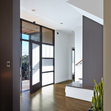 ODS Architecture
Originally a nearly three-story tall 1920’s European-styled home was turned into a modern villa for work and home. A series of low concrete retaining wall planters and steps gradually takes you up to the second level entry, grounding or anchoring the house into the site, as does a new wrap around veranda and trellis. Large eave overhangs on the upper roof were designed to give the home presence and were accented with a Mid-century orange color. The new master bedroom addition white box creates a better sense of entry and opens to the wrap around veranda at the opposite side. Inside the owners live on the lower floor and work on the upper floor with the garage basement for storage, archives and a ceramics studio. New windows and open spaces were created for the graphic designer owners; displaying their mid-century modern furnishings collection.
A lot of effort went into attempting to lower the house visually by bringing the ground plane higher with the concrete retaining wall planters, steps, wrap around veranda and trellis, and the prominent roof with exaggerated overhangs. That the eaves were painted orange is a cool reflection of the owner’s Dutch heritage. Budget was a driver for the project and it was determined that the footprint of the home should have minimal extensions and that the new windows remain in the same relative locations as the old ones. Wall removal was utilized versus moving and building new walls where possible.
Photo Credit: John Sutton Photography.

 ByHome LLC.
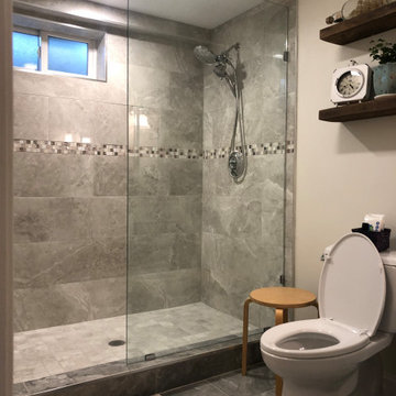
The best way to figure out how to put your finished basement to use is to determine what your home is missing. Working out and keeping on track can be very time consuming and the thought of working out in a crowded gym does not make the situation any better
No excuses if you have a workout room with your own bathroom and refrigerator –right?
 Jaeger & Ernst Custom Cabinetmakers
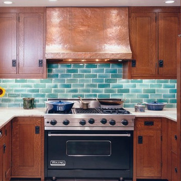
The kitchen features a hand-hammered, copper, range hood, and hand-made ceramic tile. A closer look at the refrigerator panels highlights the ‘butterfly’ dovetails employed to join individual boards. In the hands of Jaeger & Ernst’s master cabinetmakers, such functional, woodworking details become captivating decorative elements. This celebration of traditional skills is a hallmark of the Arts & Crafts movement’s emphasis on the highest standards of craftsmanship. Trees with great age produce boards both lighter and stronger; nowhere is this more apparent than with American quarter sawn white oak. The quality of a board may determine the end uses effectiveness and durability. A good cabinet maker chooses wisely. Project: 6232.1
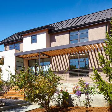 ODS Architecture
Originally a nearly three-story tall 1920’s European-styled home was turned into a modern villa for work and home. A series of low concrete retaining wall planters and steps gradually takes you up to the second level entry, grounding or anchoring the house into the site, as does a new wrap around veranda and trellis. Large eave overhangs on the upper roof were designed to give the home presence and were accented with a Mid-century orange color. The new master bedroom addition white box creates a better sense of entry and opens to the wrap around veranda at the opposite side. Inside the owners live on the lower floor and work on the upper floor with the garage basement for storage, archives and a ceramics studio. New windows and open spaces were created for the graphic designer owners; displaying their mid-century modern furnishings collection.
A lot of effort went into attempting to lower the house visually by bringing the ground plane higher with the concrete retaining wall planters, steps, wrap around veranda and trellis, and the prominent roof with exaggerated overhangs. That the eaves were painted orange is a cool reflection of the owner’s Dutch heritage. Budget was a driver for the project and it was determined that the footprint of the home should have minimal extensions and that the new windows remain in the same relative locations as the old ones. Wall removal was utilized versus moving and building new walls where possible.
Photo Credit: John Sutton Photography.
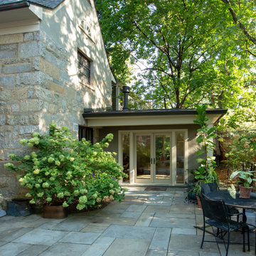 Landis Architects | Builders
The main goal for the owners of this 1926 house was an addition to gain more closet space near their main floor master bedroom. During the design stage, they also decided to create a zen home office for one of the owner’s reiki business that had direct access for visitors from the backyard, rather than walking through the house. Painted stucco was used on the new addition to match a previously added sunroom at the other side of the house. Matching windows were also added.
The proposed design featured a simple shed roof at the side addition and a hip roof at the front and back. View of addition from the back of the house – the French doors lead into the office. We extended the existing flagstone patio to the addition and office entry.
In assessing the feasibility of the project, the first thing the designer did was to check the zoning regulations. After a thorough study, it was determined that a 7-foot side addition was possible. This 7-foot addition was adequate for a built-in cabinetry storage and a new powder room. The design proposal also included a rear wraparound 13ftx13ft home office, that gave the existing rear patio a courtyard feel. The proposed addition was accessed from both the existing master bedroom and another bedroom that was converted into a family/ TV room. The main access to the home office addition was through the backyard.
Sponsored
Fredericksburg, OH

High Point Cabinets
Columbus' Experienced Custom Cabinet Builder | 4x Best of Houzz Winner
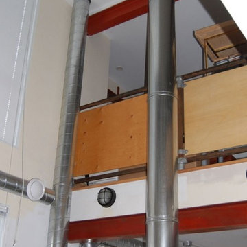
 Architects DCA
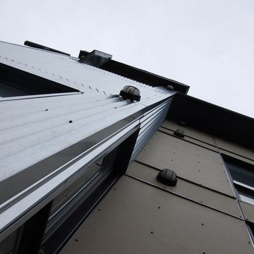
The owner of this home had purchased an early 20th Century house that had been carved up into apartments and otherwise unsympathetically modified and added on to over the years. After careful review, it was determined that there was little value in the existing structure. A new design, based on the existing foundation, was created. The existing foundation was added onto, increasing the height of the basement to create useable space. The new three storey home, building off the owner’s theatre background, incorporates a double height living room, dramatic open riser stairs and abundant natural light. The finished house includes three bedrooms, two bathrooms, open plan kitchen and dining space, walk out rear terrace and second level balcony. The third floor master retreat is tucked into the low slope roof, maintaining the character of the street; the industrial type cladding creates a contextual reinterpretation of the original community’s blue collar background. Featured in the Ottawa Citizen on several occasions including Glebe house tour.
 Architects DCA
The owner of this home had purchased an early 20th Century house that had been carved up into apartments and otherwise unsympathetically modified and added on to over the years. After careful review, it was determined that there was little value in the existing structure. A new design, based on the existing foundation, was created. The existing foundation was added onto, increasing the height of the basement to create useable space. The new three storey home, building off the owner’s theatre background, incorporates a double height living room, dramatic open riser stairs and abundant natural light. The finished house includes three bedrooms, two bathrooms, open plan kitchen and dining space, walk out rear terrace and second level balcony. The third floor master retreat is tucked into the low slope roof, maintaining the character of the street; the industrial type cladding creates a contextual reinterpretation of the original community’s blue collar background. Featured in the Ottawa Citizen on several occasions including Glebe house tour.
 Evensen Design
Aaron Dougherty Photo
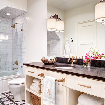
Small tuscan 3/4 black tile and cement tile terra-cotta tile alcove bathtub photo in Dallas with an undermount sink, shaker cabinets, white cabinets, granite countertops, a one-piece toilet and white walls
Small tuscan 3/4 black tile and cement tile terra-cotta tile alcove bathtub photo in Dallas with an undermount sink, shaker cabinets, white cabinets, granite countertops, a one-piece toilet and white walls
13