
Search results for "Master relation" in Home Design Ideas
 Drury Design
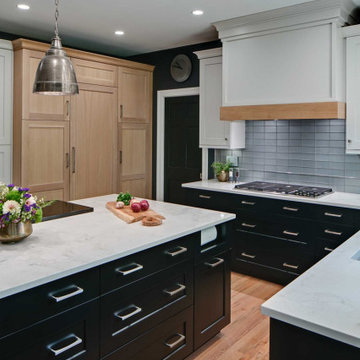
The original intent of this project was to replace the island, hood, countertops, and a few appliances. A primary bath remodel was the main priority. But once the couple realized certain features would enhance the functionality of the kitchen – not to mention completely change the aesthetic – they put the master bath on hold and decided to remodel the entire kitchen first.
Design objectives:
-Omit separate table, plan for a larger island that would seat 7 people
-Simple, clean lines – no rounded corners or weird angles
-Nothing trendy – use modern classic details
-Uncluttered countertops
-Better pantry storage for food & small appliances
-Integrated major appliances
-Coffee bar
-Avoid “1 color on perimeter with second color on island”
-Integrate a harmonious variety of finishes
-Integrate black & handmade metals
Design challenges:
-Island shape to fit within confines of existing half wall between kitchen & family room & bay window/door to backyard
-Narrow kitchen with major walkway
-Planning for 7 seats at the island
-Keep guest social area away from the cook’s zone
-Place appliances according to use
-Point-of-use storage for an avid cook within a relatively small space
-Integrate colors without looking too busy
THE NEW KITCHEN
-While the island is mostly rectangular, the seating area utilizes the bay extension without interfering with the exterior door
-All seating is placed on the outside perimeter of the island, giving the cook dedicated prep space
-The L-shaped seating area & adjacent coffee bar encourage guests to gather on the outside edge of the kitchen where they can still interact with the cook
-Island prep space includes 5 feet of versatile drawer storage, double waste basket and an open paper towel dispenser
-One pantry designated for food; the other for small appliances & bulk storage; creates visual armoire look
-Microwave drawer in island faces refrigerator for easy access & less interference with cook’s zone
-Appliance garages avoid clutter on the countertops
-Off-white upper cabinets make the kitchen look larger while the black bases offer contrast without closing in the space
Once the client committed to remodeling her entire kitchen, she had a good idea of the direction she wanted the space to take. Even so, there were many details that remained open to explore & contemplate. The end result is modern, clean and ultimately transitional – a creative vision anchored in functionality and artistry!
A powder room remodel was added to the project that beautifully compliments the kitchen aesthetic. The entire staircase, all trim & doors were painted in the same tones as the kitchen, transforming the entire first floor into a cohesive & welcoming space. It was a great collaborative partnership!
 Drury Design
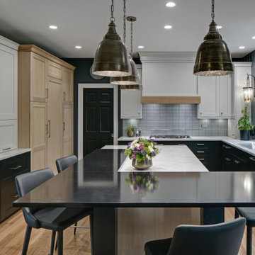
The original intent of this project was to replace the island, hood, countertops, and a few appliances. A primary bath remodel was the main priority. But once the couple realized certain features would enhance the functionality of the kitchen – not to mention completely change the aesthetic – they put the master bath on hold and decided to remodel the entire kitchen first.
Design objectives:
-Omit separate table, plan for a larger island that would seat 7 people
-Simple, clean lines – no rounded corners or weird angles
-Nothing trendy – use modern classic details
-Uncluttered countertops
-Better pantry storage for food & small appliances
-Integrated major appliances
-Coffee bar
-Avoid “1 color on perimeter with second color on island”
-Integrate a harmonious variety of finishes
-Integrate black & handmade metals
Design challenges:
-Island shape to fit within confines of existing half wall between kitchen & family room & bay window/door to backyard
-Narrow kitchen with major walkway
-Planning for 7 seats at the island
-Keep guest social area away from the cook’s zone
-Place appliances according to use
-Point-of-use storage for an avid cook within a relatively small space
-Integrate colors without looking too busy
THE NEW KITCHEN
-While the island is mostly rectangular, the seating area utilizes the bay extension without interfering with the exterior door
-All seating is placed on the outside perimeter of the island, giving the cook dedicated prep space
-The L-shaped seating area & adjacent coffee bar encourage guests to gather on the outside edge of the kitchen where they can still interact with the cook
-Island prep space includes 5 feet of versatile drawer storage, double waste basket and an open paper towel dispenser
-One pantry designated for food; the other for small appliances & bulk storage; creates visual armoire look
-Microwave drawer in island faces refrigerator for easy access & less interference with cook’s zone
-Appliance garages avoid clutter on the countertops
-Off-white upper cabinets make the kitchen look larger while the black bases offer contrast without closing in the space
Once the client committed to remodeling her entire kitchen, she had a good idea of the direction she wanted the space to take. Even so, there were many details that remained open to explore & contemplate. The end result is modern, clean and ultimately transitional – a creative vision anchored in functionality and artistry!
A powder room remodel was added to the project that beautifully compliments the kitchen aesthetic. The entire staircase, all trim & doors were painted in the same tones as the kitchen, transforming the entire first floor into a cohesive & welcoming space. It was a great collaborative partnership!
 Drury Design
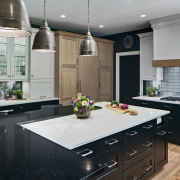
The original intent of this project was to replace the island, hood, countertops, and a few appliances. A primary bath remodel was the main priority. But once the couple realized certain features would enhance the functionality of the kitchen – not to mention completely change the aesthetic – they put the master bath on hold and decided to remodel the entire kitchen first.
Design objectives:
-Omit separate table, plan for a larger island that would seat 7 people
-Simple, clean lines – no rounded corners or weird angles
-Nothing trendy – use modern classic details
-Uncluttered countertops
-Better pantry storage for food & small appliances
-Integrated major appliances
-Coffee bar
-Avoid “1 color on perimeter with second color on island”
-Integrate a harmonious variety of finishes
-Integrate black & handmade metals
Design challenges:
-Island shape to fit within confines of existing half wall between kitchen & family room & bay window/door to backyard
-Narrow kitchen with major walkway
-Planning for 7 seats at the island
-Keep guest social area away from the cook’s zone
-Place appliances according to use
-Point-of-use storage for an avid cook within a relatively small space
-Integrate colors without looking too busy
THE NEW KITCHEN
-While the island is mostly rectangular, the seating area utilizes the bay extension without interfering with the exterior door
-All seating is placed on the outside perimeter of the island, giving the cook dedicated prep space
-The L-shaped seating area & adjacent coffee bar encourage guests to gather on the outside edge of the kitchen where they can still interact with the cook
-Island prep space includes 5 feet of versatile drawer storage, double waste basket and an open paper towel dispenser
-One pantry designated for food; the other for small appliances & bulk storage; creates visual armoire look
-Microwave drawer in island faces refrigerator for easy access & less interference with cook’s zone
-Appliance garages avoid clutter on the countertops
-Off-white upper cabinets make the kitchen look larger while the black bases offer contrast without closing in the space
Once the client committed to remodeling her entire kitchen, she had a good idea of the direction she wanted the space to take. Even so, there were many details that remained open to explore & contemplate. The end result is modern, clean and ultimately transitional – a creative vision anchored in functionality and artistry!
A powder room remodel was added to the project that beautifully compliments the kitchen aesthetic. The entire staircase, all trim & doors were painted in the same tones as the kitchen, transforming the entire first floor into a cohesive & welcoming space. It was a great collaborative partnership!
Find the right local pro for your project
 Drury Design
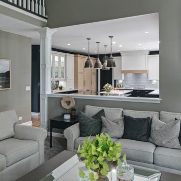
The original intent of this project was to replace the island, hood, countertops, and a few appliances. A primary bath remodel was the main priority. But once the couple realized certain features would enhance the functionality of the kitchen – not to mention completely change the aesthetic – they put the master bath on hold and decided to remodel the entire kitchen first.
Design objectives:
-Omit separate table, plan for a larger island that would seat 7 people
-Simple, clean lines – no rounded corners or weird angles
-Nothing trendy – use modern classic details
-Uncluttered countertops
-Better pantry storage for food & small appliances
-Integrated major appliances
-Coffee bar
-Avoid “1 color on perimeter with second color on island”
-Integrate a harmonious variety of finishes
-Integrate black & handmade metals
Design challenges:
-Island shape to fit within confines of existing half wall between kitchen & family room & bay window/door to backyard
-Narrow kitchen with major walkway
-Planning for 7 seats at the island
-Keep guest social area away from the cook’s zone
-Place appliances according to use
-Point-of-use storage for an avid cook within a relatively small space
-Integrate colors without looking too busy
THE NEW KITCHEN
-While the island is mostly rectangular, the seating area utilizes the bay extension without interfering with the exterior door
-All seating is placed on the outside perimeter of the island, giving the cook dedicated prep space
-The L-shaped seating area & adjacent coffee bar encourage guests to gather on the outside edge of the kitchen where they can still interact with the cook
-Island prep space includes 5 feet of versatile drawer storage, double waste basket and an open paper towel dispenser
-One pantry designated for food; the other for small appliances & bulk storage; creates visual armoire look
-Microwave drawer in island faces refrigerator for easy access & less interference with cook’s zone
-Appliance garages avoid clutter on the countertops
-Off-white upper cabinets make the kitchen look larger while the black bases offer contrast without closing in the space
Once the client committed to remodeling her entire kitchen, she had a good idea of the direction she wanted the space to take. Even so, there were many details that remained open to explore & contemplate. The end result is modern, clean and ultimately transitional – a creative vision anchored in functionality and artistry!
A powder room remodel was added to the project that beautifully compliments the kitchen aesthetic. The entire staircase, all trim & doors were painted in the same tones as the kitchen, transforming the entire first floor into a cohesive & welcoming space. It was a great collaborative partnership!

 Sure Foot Builders Inc.
houzz
remember the project description details (3 components)?
We developed a steep infill lot with double frontage and changed the address and access to Westchester Dr. The home has superior wall foundation with a bath in the basement, but designed for a future bedroom and the living is on main with three bedrooms and 2 baths upstairs. We added mini balcony off the master and large covered deck off of the kitchen. The home is Greenbuilt and Energy Star certified.
West Asheville custom home, Asheville green builder, steep lot construction Asheville, urban infill home Asheville, Green Built home Asheville, Energy Star certified home, Superior Wall foundation, custom home Asheville NC, hillside home builder, covered deck design, West Asheville infill construction, sustainable home builder Asheville, modern mountain home Asheville, energy efficient custom home, double frontage lot design, Asheville design build contractor, high performance home Asheville, custom home on steep lot, Asheville home builder, Westchester Drive Asheville nedd shortened by 157 characters
re write description: remember this format: HOUZZ Project description 1. why hired, 2 what we did, 3. takeaway for company and client/value proposition . 1 paragraph
this home is in kenilworth, not West Asheville. rewrite keywords, these are for the photos, should keywords reflect the project or photos? custom home, Asheville green builder, steep lot construction, urban infill home, Green Built home, Energy Star certified home, Superior Wall foundation, hillside home builder, covered deck design, sustainable home builder, modern mountain home, energy efficient custom home, double frontage lot design, Asheville design build contractor, high performance home Asheville
400 character limit
description
remember what we have been doing. this is all related to the houzz profile and photo description. we are working in the same vein until i change it
?
106 Logan Ave West Asheville. title, keywords, description
dont want street address in the title
keywords 400 character max greenbuilt energy star mid century modern site milled wood: West Asheville custom home, contemporary home design, modern mountain home, timber frame entry, exposed wood beams, custom front entry, contemporary exterior, Asheville green builder, modern craftsman exterior, covered entry porch, horizontal siding design, modern Asheville home, custom home builder Asheville, energy efficient custom home, architectural entry design
description
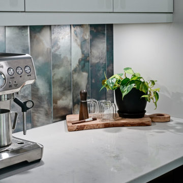 Drury Design
The original intent of this project was to replace the island, hood, countertops, and a few appliances. A primary bath remodel was the main priority. But once the couple realized certain features would enhance the functionality of the kitchen – not to mention completely change the aesthetic – they put the master bath on hold and decided to remodel the entire kitchen first.
Design objectives:
-Omit separate table, plan for a larger island that would seat 7 people
-Simple, clean lines – no rounded corners or weird angles
-Nothing trendy – use modern classic details
-Uncluttered countertops
-Better pantry storage for food & small appliances
-Integrated major appliances
-Coffee bar
-Avoid “1 color on perimeter with second color on island”
-Integrate a harmonious variety of finishes
-Integrate black & handmade metals
Design challenges:
-Island shape to fit within confines of existing half wall between kitchen & family room & bay window/door to backyard
-Narrow kitchen with major walkway
-Planning for 7 seats at the island
-Keep guest social area away from the cook’s zone
-Place appliances according to use
-Point-of-use storage for an avid cook within a relatively small space
-Integrate colors without looking too busy
THE NEW KITCHEN
-While the island is mostly rectangular, the seating area utilizes the bay extension without interfering with the exterior door
-All seating is placed on the outside perimeter of the island, giving the cook dedicated prep space
-The L-shaped seating area & adjacent coffee bar encourage guests to gather on the outside edge of the kitchen where they can still interact with the cook
-Island prep space includes 5 feet of versatile drawer storage, double waste basket and an open paper towel dispenser
-One pantry designated for food; the other for small appliances & bulk storage; creates visual armoire look
-Microwave drawer in island faces refrigerator for easy access & less interference with cook’s zone
-Appliance garages avoid clutter on the countertops
-Off-white upper cabinets make the kitchen look larger while the black bases offer contrast without closing in the space
Once the client committed to remodeling her entire kitchen, she had a good idea of the direction she wanted the space to take. Even so, there were many details that remained open to explore & contemplate. The end result is modern, clean and ultimately transitional – a creative vision anchored in functionality and artistry!
A powder room remodel was added to the project that beautifully compliments the kitchen aesthetic. The entire staircase, all trim & doors were painted in the same tones as the kitchen, transforming the entire first floor into a cohesive & welcoming space. It was a great collaborative partnership!
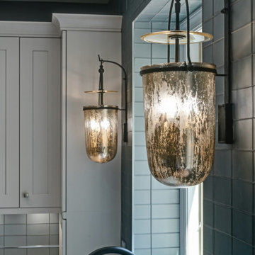 Drury Design
The original intent of this project was to replace the island, hood, countertops, and a few appliances. A primary bath remodel was the main priority. But once the couple realized certain features would enhance the functionality of the kitchen – not to mention completely change the aesthetic – they put the master bath on hold and decided to remodel the entire kitchen first.
Design objectives:
-Omit separate table, plan for a larger island that would seat 7 people
-Simple, clean lines – no rounded corners or weird angles
-Nothing trendy – use modern classic details
-Uncluttered countertops
-Better pantry storage for food & small appliances
-Integrated major appliances
-Coffee bar
-Avoid “1 color on perimeter with second color on island”
-Integrate a harmonious variety of finishes
-Integrate black & handmade metals
Design challenges:
-Island shape to fit within confines of existing half wall between kitchen & family room & bay window/door to backyard
-Narrow kitchen with major walkway
-Planning for 7 seats at the island
-Keep guest social area away from the cook’s zone
-Place appliances according to use
-Point-of-use storage for an avid cook within a relatively small space
-Integrate colors without looking too busy
THE NEW KITCHEN
-While the island is mostly rectangular, the seating area utilizes the bay extension without interfering with the exterior door
-All seating is placed on the outside perimeter of the island, giving the cook dedicated prep space
-The L-shaped seating area & adjacent coffee bar encourage guests to gather on the outside edge of the kitchen where they can still interact with the cook
-Island prep space includes 5 feet of versatile drawer storage, double waste basket and an open paper towel dispenser
-One pantry designated for food; the other for small appliances & bulk storage; creates visual armoire look
-Microwave drawer in island faces refrigerator for easy access & less interference with cook’s zone
-Appliance garages avoid clutter on the countertops
-Off-white upper cabinets make the kitchen look larger while the black bases offer contrast without closing in the space
Once the client committed to remodeling her entire kitchen, she had a good idea of the direction she wanted the space to take. Even so, there were many details that remained open to explore & contemplate. The end result is modern, clean and ultimately transitional – a creative vision anchored in functionality and artistry!
A powder room remodel was added to the project that beautifully compliments the kitchen aesthetic. The entire staircase, all trim & doors were painted in the same tones as the kitchen, transforming the entire first floor into a cohesive & welcoming space. It was a great collaborative partnership!
Sponsored
Delaware, OH

Buckeye Basements, Inc.
Central Ohio's Basement Finishing ExpertsBest Of Houzz '13-'21

 Ehrlich Yanai Rhee Chaney Architects
The ground floor volumes wrapped in an elongated hand-fired brick, emphasizing the horizontality of the architecture that lays solidly on the land.
(Photography by: Matthew Millman)
 Dimensions in Wood Inc
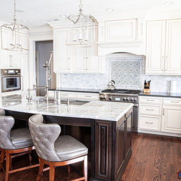
This client’s vision for their kitchen/hearth room remodel was to create a harmonious space for gathering and socializing with family and friends. Without the before and after photos, you would scarcely believe this was the same home.
This huge home renovation perfectly illustrates that Dimensions In Wood’s expert team can handle every aspect of your remodeling project. Plumbing, flooring, electrical wiring, custom cabinets, structural engineering, appliances, windows, interior and exterior doors, entertainment and more. Contact us today to discuss Translating Your Visions into Reality
The client was interested in new appliance technology, cabinetry to the ceiling, and an Island large enough to seat 3. They also wanted a built-in breakfast nook, improved pantry space, more functional storage on either side of their fireplace, and a built-in appearance for the TV above the mantel. The original built-in desk was not used, and they preferred for that space to serve as a small bar area with refrigeration and a place to store their printer. We designed several plans for the space before selecting the final layout.
The new design required the removal of the soffit over the old sink, as well as a small wall beside the old refrigerator. The wall beside the stairwell had to be shortened 13 inches and a new beam installed to carry the load of the home’s 2nd story to gain enough space for the large central island. The existing closet pantry walls were also reconfigured as per the new plan.
This serves as a great reminder that Dimensions In Wood is much more than just custom cabinets.
Central to the entire custom kitchen is an 8-foot Walnut island. The huge island, which comfortably seats three, is topped with Essenza Blue quartzite. The stone’s natural striations are beautiful. Quartzite is harder than granite, and less likely to stain than other stones because of its density. The couple had to look through multiple slabs to find a piece they LOVED. The island’s custom Walnut cabinetry, built to resemble a piece of custom furniture, was stained Bronzed Walnut by Sherwin Williams.
The 4-foot Galley Workstation in the island, handles all the kitchen’s prep, serving, and cleanup needs. The Galley’s culinary tools include an upper tier cutting board, upper tier drying rack, 2 lower tier platforms, 11″ colander with non-slip handles, and 11” mixing bowl with lid and non-slip bottom. Learn more about the amazing Galley Workstation here. A Waterstone gantry faucet in a pewter finish combines a pull-down sprayer for maximum mobility and a articulated swivel spout. A water tap with reverse osmosis filter provides the highest quality drinking water. To keep a clean and sleek counter we installed a raised air switch for the garbage disposal and integrated soap dispenser. The island also houses the Thermador Sapphire 7-Program Dishwasher with a hidden touch control panel and a custom Walnut wood front. The cabinetry under the Galley Workstation features a trash roll out, as well as storage for the culinary tools.
Shortening the stairwell wall, and reframing around the stairs, which included shortening the handrail, also made room for a bi-fold door walk-in pantry with extra roll out storage and space for a small microwave. Above the panty doors is a remote controlled, electric motor powered, lift up cabinet door which hides a flat screen TV, used while the family is cooking.
To the right of the walk-in pantry is cold food storage. The Thermador, 30-inch Freedom Collection refrigerator and 24-inch built-in freezer column with internal ice maker are covered with matching cabinetry fronts. An open display space was designed above the units, creating an aesthetically beautiful wall. To the right of the refrigerator & freezer columns is a tall cabinet designed for the built-in Thermador steam and convection oven. The convention steam oven is a relatively new technology for homes, but its versatility and food quality is amazing. To the right of this is a pull-out appliance pantry which provides easy access and storage for a stand mixer, blender, and any other appliance you do not want to clutter the counter.
The most visible wall of the kitchen features the 36-inch Thermador Professional Series Harmony Gas Range with Griddle. Between the range and custom designed wood hood, a framed mosaic tile accent in the backsplash, creates a focal point. To clear the air, the Professional Series Thermador 42-inch ventilation insert provides excellent exhaust capabilities, as well as providing multi-level, vivid LED lights for beautiful illumination.
The wall cabinetry symmetrically flanks the custom hood, utilizing deeper wall cabinetry on each end, allowing for storage of oversized dishware. The base cabinetry on this wall is made up of drawers, except for the corner, which is a Kesseböhmer LeMans II. This specially designed shelf system allows ease of access in underutilized blind corners. The dual action articulation system with soft close mechanism ensures a smooth open and close.
Rounding the corner to the outside wall, the base cabinetry was built to a narrower depth, providing additional space for the island, as well as easier access to the new larger pass-thru window which serves the screen porch. The client selected Black Vermont granite countertops with an ogee edge to contrast the Linen White painted cabinetry.
The door to the screen porch was replaced with a Marvin Exterior Door with a raised panel at the bottom of the 3⁄4 glass door.
Marvin Windows replaced the other windows in the space increasing the energy efficiency and value of the home. To establish the breakfast nook, a bench with drawers and an upholstered seat was built into the bay area of the room.
Custom bookshelves were built with open shelves, cabinet doors, and drawers on either side of the fireplace. A new stone hearth and fireplace surround were installed. Above the existing mantel we built a recessed space for the flat screen television hiding all wiring inside the walls for a completely clean look.
The space that was once a desk was transformed into a bar area. The glass shelves and glass cabinet front liquor cabinet stand out. But this bar area has hidden secrets. Tucked beneath the black granite is a Thermador under-counter double drawer refrigerator with matching wood front panels. They blend in perfectly with the cabinets. A wireless printer is easily accessed on a slide out drawer. Plus, what looks like merely wooden panels on the wall are concealing recessed storage for more bottles and glasses!
Overhead recessed lighting and speaker system provide illumination and entertainment through the entire space.
This luxury home had original, solid oak flooring through most of the first floor which the homeowner obviously wanted to keep but were in desperate need of repair and refinishing. Our master craftsmen wove in new wood flooring to match the old where needed, particularly where walls had been changed and where the floor was damaged. We sanded the floors, smoothing away years of wear and tear. The entire wood floor was then uniformly stained, making it impossible to differentiate where any repairs were made.
If this renovation has inspired you, then contact us today! There is no limit to our Dimensions.
 Drury Design
The original intent of this project was to replace the island, hood, countertops, and a few appliances. A primary bath remodel was the main priority. But once the couple realized certain features would enhance the functionality of the kitchen – not to mention completely change the aesthetic – they put the master bath on hold and decided to remodel the entire kitchen first.
Design objectives:
-Omit separate table, plan for a larger island that would seat 7 people
-Simple, clean lines – no rounded corners or weird angles
-Nothing trendy – use modern classic details
-Uncluttered countertops
-Better pantry storage for food & small appliances
-Integrated major appliances
-Coffee bar
-Avoid “1 color on perimeter with second color on island”
-Integrate a harmonious variety of finishes
-Integrate black & handmade metals
Design challenges:
-Island shape to fit within confines of existing half wall between kitchen & family room & bay window/door to backyard
-Narrow kitchen with major walkway
-Planning for 7 seats at the island
-Keep guest social area away from the cook’s zone
-Place appliances according to use
-Point-of-use storage for an avid cook within a relatively small space
-Integrate colors without looking too busy
THE NEW KITCHEN
-While the island is mostly rectangular, the seating area utilizes the bay extension without interfering with the exterior door
-All seating is placed on the outside perimeter of the island, giving the cook dedicated prep space
-The L-shaped seating area & adjacent coffee bar encourage guests to gather on the outside edge of the kitchen where they can still interact with the cook
-Island prep space includes 5 feet of versatile drawer storage, double waste basket and an open paper towel dispenser
-One pantry designated for food; the other for small appliances & bulk storage; creates visual armoire look
-Microwave drawer in island faces refrigerator for easy access & less interference with cook’s zone
-Appliance garages avoid clutter on the countertops
-Off-white upper cabinets make the kitchen look larger while the black bases offer contrast without closing in the space
Once the client committed to remodeling her entire kitchen, she had a good idea of the direction she wanted the space to take. Even so, there were many details that remained open to explore & contemplate. The end result is modern, clean and ultimately transitional – a creative vision anchored in functionality and artistry!
A powder room remodel was added to the project that beautifully compliments the kitchen aesthetic. The entire staircase, all trim & doors were painted in the same tones as the kitchen, transforming the entire first floor into a cohesive & welcoming space. It was a great collaborative partnership!
 TKS Design Group
Download our free ebook, Creating the Ideal Kitchen. DOWNLOAD NOW
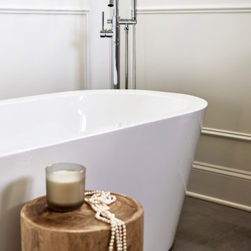
A tired primary bathroom, with varying ceiling heights and a beige-on-beige color scheme, was screaming for love. Squaring the room and adding natural materials erased the memory of the lack luster space and converted it to a bright and welcoming spa oasis. The home was a new build in 2005 and it looked like all the builder’s material choices remained. The client was clear on their design direction but were challenged by the differing ceiling heights and were looking to hire a design-build firm that could resolve that issue.
This local Glen Ellyn couple found us on Instagram (@kitchenstudioge, follow us ?). They loved our designs and felt like we fit their style. They requested a full primary bath renovation to include a large shower, soaking tub, double vanity with storage options, and heated floors. The wife also really wanted a separate make-up vanity. The biggest challenge presented to us was to architecturally marry the various ceiling heights and deliver a streamlined design.
The existing layout worked well for the couple, so we kept everything in place, except we enlarged the shower and replaced the built-in tub with a lovely free-standing model. We also added a sitting make-up vanity. We were able to eliminate the awkward ceiling lines by extending all the walls to the highest level. Then, to accommodate the sprinklers and HVAC, lowered the ceiling height over the entrance and shower area which then opens to the 2-story vanity and tub area. Very dramatic!
This high-end home deserved high-end fixtures. The homeowners also quickly realized they loved the look of natural marble and wanted to use as much of it as possible in their new bath. They chose a marble slab from the stone yard for the countertops and back splash, and we found complimentary marble tile for the shower. The homeowners also liked the idea of mixing metals in their new posh bathroom and loved the look of black, gold, and chrome.
Although our clients were very clear on their style, they were having a difficult time pulling it all together and envisioning the final product. As interior designers it is our job to translate and elevate our clients’ ideas into a deliverable design. We presented the homeowners with mood boards and 3D renderings of our modern, clean, white marble design. Since the color scheme was relatively neutral, at the homeowner’s request, we decided to add of interest with the patterns and shapes in the room.
We were first inspired by the shower floor tile with its circular/linear motif. We designed the cabinetry, floor and wall tiles, mirrors, cabinet pulls, and wainscoting to have a square or rectangular shape, and then to create interest we added perfectly placed circles to contrast with the rectangular shapes. The globe shaped chandelier against the square wall trim is a delightful yet subtle juxtaposition.
The clients were overjoyed with our interpretation of their vision and impressed with the level of detail we brought to the project. It’s one thing to know how you want a space to look, but it takes a special set of skills to create the design and see it thorough to implementation. Could hiring The Kitchen Studio be the first step to making your home dreams come to life?

 MESA Contracting, LLC
The Challenge: Create a rugged yet warm farmhouse feel in a high rise tower. Start with an entire 9600 gross square foot penthouse floor of raw concrete floor, walls and ceiling. Devise inventive ways to address intractable existing conditions including a plumbing layout inconsistent with our Client program, a relatively low ceiling and a massive elevator core and yet take of advantage of panoramic views of the city from all sides.
For example, rather than make a bulky drywall enclosure for existing pipes that poke thru the kitchen counter, they are wrapped with antique painted galvanized sheet metal to keep sight lines around the corner as open as possible. Or, transform an unattractive and inconveniently located 24” diameter vertical duct in the middle of Samantha’s and Hannah’s (grandchildren’s) guest bedroom into part of a lovely arched top bed nook. Or, disguise a chase for above floor plumbing runs as the base for an open buffet counter. The oppressive elevator lobby was shortened; terminating in handmade glass and steel garden doors at both ends. Custom details include a groined vaulted ceiling and arched openings with stone pilasters (for future trompe-l’oeil images of a Tuscany countryside). To maximize a feeling of height, the ceilings start low and get higher as they progress to the outside walls.
The Program: Create a five bedroom condo for an elderly couple with specific and different needs. Mr. likes his privacy and to stay up late into the night on the internet. He likes order. Mrs. has some physical limits that have been addressed in various ways such as shorter travel distances, a step down shower, raised dishwasher and custom cast (to ensure that they won’t rust) iron grab bars. She prefers more disorder.
Spaces should be visually arresting, full of detail and easy to maintain. Private spaces include separate master bathrooms, his and her offices and a multi screened Media Room. The balance of the floor must link spaces into one continuous open room along the south and east elevations using large elements yet keeping an intimate scale, sound control and privacy. For example, a substantial fireplace made of old barn timber framing, country stone and a hammered iron grill is strategically located at the critical Southeast corner. Above, black iron offset pintel hardware allow custom double doors to hide a large flat screen TV.
High technology is in place for inconspicuous yet easy use. Icon driven key pads operate lighting, window treatments, audio visual systems with multiple sources and access to movie and music databases and five HVAC zones with independent humidity controls.
Outstanding Features: Exterior masonry walls have stone culled from five quarries. Sprinkled throughout are surprises - bricks with words as messages from the past, wood trimmed niches and colored glass. Glass pieces set in window corners offer bursts of color when backlit by the sun. These materials are assembled in a rough irregular fashion to look like the work of a mason from the Italian countryside. Interior ceilings and walls have overlapping layers of two plaster colors. Perimeter ceilings are made of smooth random width cedar. Rough planed cedar beams hide ductwork and allow the maximum ceiling height between them.
Custom details are everywhere-consider the ten foot barn doors on overhead track at the service elevator, cedar benches/storage areas that run below window banks, antique air registers, acid washed piano hinges and transom window operators and existing concrete piers that are featured instead of hidden. The floors are made of random width wide plank old oak with hand planed faces and edges. Overall, the elements were carefully selected or painted/stained to form a soft muted gray palate
The Country kitchen features an old fashioned style ice box appearance for the refrigerator/freezer, a tin ceiling, a distressed assortment of cabinets in multiple heights, colors and woods such as the cherry wood buffet cabinet with sliding glass doors on both sides. A backlit breakfast counter, a hammered copper hood and chicken wire inserts are part of the effort to make a comfortable, eclectic old fashioned looking Kitchen while containing the latest appliances and storage systems.
Awards:
This project has won several kitchen and bath awards:
Felman Kitchen Awards
2009 St. Louis Homes and Lifestyles Kitchen of the Year – Gold Award
2008-2009 SubZero Wolf Kitchen Design Contest – Regional Winner, Regional Designer’s Choice
2010 NKBA Art of the Industry – Pinnacle of Design Award
2010 NKBA Art of the Industry – First Place Medium Kitchen
2010 NKBA Art of the Industry – Consumer’s Choice Award
2010 K&BB Kitchen of the Year Award
Felman Bath Awards
2010 Ladue News Award—Master Bathroom

 CaliScape Landscape Services
Succulents are an easy low maintenance way to spruce up your outdoor, or indoor, spaces. These plants require very low water usage making them a perfect plant for the southwestern United States, or for the plant lover who is constantly forgetting their watering can.
Sponsored
Delaware, OH
Buckeye Basements, Inc.
Central Ohio's Basement Finishing ExpertsBest Of Houzz '13-'21

 Living Gardens Landscape Design
Inspiration for a small contemporary full sun front yard gravel landscaping in Orange County for spring.

 Stonelace Designs
Originally, the exterior of the Napa ranch residence was a standard knocked down stucco finish. We covered over the entire exterior of the house with a natural plaster product that has been made in Italy for centuries, known as Rialto or Vero. This product is a combination of slaked lime mixed with 60% reconstituted crushed marble dust. Quarried from the legendary Carrara marble mines. The finish itself is a vertically combed striated texture embedded into the plaster. While it cures, a transparent group of patinas are applied to the stone-like plaster substance to create a look of an aged villa.

 Edgewater Design Group
Our clients had purchased a lot on Lake Charlevoix and they hired us to help them design their family vacation home and that is what we did.
You are welcomed into the home by a traditional double column gabled entry
porch. This classic cottage design features an open floor plan with cathedral
ceilings in the living room and plenty of natural light to capture views. The
fireplace with built-ins serves as a beautiful focal point. The home has a
master suite on the main level as well as another guest suite. The kitchen is
warm and welcoming with a central island and plenty of counter space. A 3/4
bath is located off the mudroom / laundry area which also features a beach
entry to minimize sand coming into the home. Ship-lap finish is throughout
the first floor living spaces. The second floor has two guest bedrooms with
dormers facing the view, a full bathroom, loft area and plenty of storage. We
employed an efficient use of space with four bedrooms and four baths in just
under 3000 square feet. The 2 1/2 car garage has stairs leading to a bonus
room. The exterior finishes are low maintenance using a mixture of lap siding,
shake siding and board and batten detailing. Standing seam metal roofing
emphasizes the window seat and highlights exterior porches. Raised panels
also highlight bump outs and other exterior details.


Sponsored
Delaware, OH
Buckeye Basements, Inc.
Central Ohio's Basement Finishing ExpertsBest Of Houzz '13-'21
 MESA Contracting, LLC
The Challenge: Create a rugged yet warm farmhouse feel in a high rise tower. Start with an entire 9600 gross square foot penthouse floor of raw concrete floor, walls and ceiling. Devise inventive ways to address intractable existing conditions including a plumbing layout inconsistent with our Client program, a relatively low ceiling and a massive elevator core and yet take of advantage of panoramic views of the city from all sides.
For example, rather than make a bulky drywall enclosure for existing pipes that poke thru the kitchen counter, they are wrapped with antique painted galvanized sheet metal to keep sight lines around the corner as open as possible. Or, transform an unattractive and inconveniently located 24” diameter vertical duct in the middle of Samantha’s and Hannah’s (grandchildren’s) guest bedroom into part of a lovely arched top bed nook. Or, disguise a chase for above floor plumbing runs as the base for an open buffet counter. The oppressive elevator lobby was shortened; terminating in handmade glass and steel garden doors at both ends. Custom details include a groined vaulted ceiling and arched openings with stone pilasters (for future trompe-l’oeil images of a Tuscany countryside). To maximize a feeling of height, the ceilings start low and get higher as they progress to the outside walls.
The Program: Create a five bedroom condo for an elderly couple with specific and different needs. Mr. likes his privacy and to stay up late into the night on the internet. He likes order. Mrs. has some physical limits that have been addressed in various ways such as shorter travel distances, a step down shower, raised dishwasher and custom cast (to ensure that they won’t rust) iron grab bars. She prefers more disorder.
Spaces should be visually arresting, full of detail and easy to maintain. Private spaces include separate master bathrooms, his and her offices and a multi screened Media Room. The balance of the floor must link spaces into one continuous open room along the south and east elevations using large elements yet keeping an intimate scale, sound control and privacy. For example, a substantial fireplace made of old barn timber framing, country stone and a hammered iron grill is strategically located at the critical Southeast corner. Above, black iron offset pintel hardware allow custom double doors to hide a large flat screen TV.
High technology is in place for inconspicuous yet easy use. Icon driven key pads operate lighting, window treatments, audio visual systems with multiple sources and access to movie and music databases and five HVAC zones with independent humidity controls.
Outstanding Features: Exterior masonry walls have stone culled from five quarries. Sprinkled throughout are surprises - bricks with words as messages from the past, wood trimmed niches and colored glass. Glass pieces set in window corners offer bursts of color when backlit by the sun. These materials are assembled in a rough irregular fashion to look like the work of a mason from the Italian countryside. Interior ceilings and walls have overlapping layers of two plaster colors. Perimeter ceilings are made of smooth random width cedar. Rough planed cedar beams hide ductwork and allow the maximum ceiling height between them.
Custom details are everywhere-consider the ten foot barn doors on overhead track at the service elevator, cedar benches/storage areas that run below window banks, antique air registers, acid washed piano hinges and transom window operators and existing concrete piers that are featured instead of hidden. The floors are made of random width wide plank old oak with hand planed faces and edges. Overall, the elements were carefully selected or painted/stained to form a soft muted gray palate
The Country kitchen features an old fashioned style ice box appearance for the refrigerator/freezer, a tin ceiling, a distressed assortment of cabinets in multiple heights, colors and woods such as the cherry wood buffet cabinet with sliding glass doors on both sides. A backlit breakfast counter, a hammered copper hood and chicken wire inserts are part of the effort to make a comfortable, eclectic old fashioned looking Kitchen while containing the latest appliances and storage systems.
Awards:
This project has won several kitchen and bath awards:
Felman Kitchen Awards
2009 St. Louis Homes and Lifestyles Kitchen of the Year – Gold Award
2008-2009 SubZero Wolf Kitchen Design Contest – Regional Winner, Regional Designer’s Choice
2010 NKBA Art of the Industry – Pinnacle of Design Award
2010 NKBA Art of the Industry – First Place Medium Kitchen
2010 NKBA Art of the Industry – Consumer’s Choice Award
2010 K&BB Kitchen of the Year Award
Felman Bath Awards
2010 Ladue News Award—Master Bathroom

 ZeroEnergy Design
This LEED Platinum certified house reflects the homeowner's desire for an exceptionally healthy and comfortable living environment, within a traditional neighborhood.
INFILL SITE. The family, who moved from another area of Wellesley, sought out this property to be within walking distance of the high school and downtown area. An existing structure on the tight lot was removed to make way for the new home. 84% of the construction waste, from both the previous structure and the new home, was diverted from a landfill. ZED designed to preserve the existing mature trees on the perimeter of the property to minimize site impacts, and to maintain the character of the neighborhood as well as privacy on the site.
EXTERIOR EXPRESSION. The street facade of the home relates to the local New England vernacular. The rear uses contemporary language, a nod to the family’s Californian roots, to incorporate a roof deck, solar panels, outdoor living space, and the backyard swimming pool. ZED’s careful planning avoided to the need to face the garage doors towards the street, a common syndrome of a narrow lot.
THOUGHTFUL SPACE. Homes with dual entries can often result in duplicate and unused spaces. In this home, the everyday and formal entry areas are one and the same; the front and garage doors share the entry program of coat closets, mudroom storage with bench for removing your shoes, and a laundry room with generous closets for the children's sporting equipment. The entry area leads directly to the living space, encompassing the kitchen, dining and sitting area areas in an L-shaped open plan arrangement. The kitchen is placed at the south-west corner of the space to allow for a strong connection to the dining, sitting and outdoor living spaces. A fire pit on the deck satisfies the family’s desire for an open flame while a sealed gas fireplace is used indoors - ZED’s preference after omitting gas burning appliances completely from an airtight home. A small study, with a window seat, is conveniently located just off of the living space. A first floor guest bedroom includes an accessible bathroom for aging visitors and can be used as a master suite to accommodate aging in place.
HEALTHY LIVING. The client requested a home that was easy to clean and would provide a respite from seasonal allergies and common contaminants that are found in many indoor spaces. ZED selected easy to clean solid surface flooring throughout, provided ample space for cleaning supplies on each floor, and designed a mechanical system with ventilation that provides a constant supply of fresh outdoor air. ZED selected durable materials, finishes, cabinetry, and casework with low or no volatile organic compounds (VOCs) and no added urea formaldehyde.
YEAR-ROUND COMFORT. The home is super insulated and air-tight, paired with high performance triple-paned windows, to ensure it is draft-free throughout the winter (even when in front of the large windows and doors). ZED designed a right-sized heating and cooling system to pair with the thermally improved building enclosure to ensure year-round comfort. The glazing on the home maximizes passive solar gains, and facilitates cross ventilation and daylighting.
ENERGY EFFICIENT. As one of the most energy efficient houses built to date in Wellesley, the home highlights a practical solution for Massachusetts. First, the building enclosure reduces the largest energy requirement for typical houses (heating). Super-insulation, exceptional air sealing, a thermally broken wall assembly, triple pane windows, and passive solar gain combine for a sizable heating load reduction. Second, within the house only efficient systems consume energy. These include an air source heat pump for heating & cooling, a heat pump hot water heater, LED lighting, energy recovery ventilation, and high efficiency appliances. Lastly, photovoltaics provide renewable energy help offset energy consumption. The result is an 89% reduction in energy use compared to a similar brand new home built to code requirements.
RESILIENT. The home will fare well in extreme weather events. During a winter power outage, heat loss will be very slow due to the super-insulated and airtight envelope– taking multiple days to drop to 60 degrees even with no heat source. An engineered drainage system, paired with careful the detailing of the foundation, will help to keep the finished basement dry. A generator will provide full operation of the all-electric house during a power outage.
OVERALL. The home is a reflection of the family goals and an expression of their values, beautifully enabling health, comfort, safety, resilience, and utility, all while respecting the planet.
ZED - Architect & Mechanical Designer
Bevilacqua Builders Inc - Contractor
Creative Land & Water Engineering - Civil Engineering
Barbara Peterson Landscape - Landscape Design
Nest & Company - Interior Furnishings
Eric Roth Photography - Photography
 ZeroEnergy Design
This LEED Platinum certified house reflects the homeowner's desire for an exceptionally healthy and comfortable living environment, within a traditional neighborhood.
INFILL SITE. The family, who moved from another area of Wellesley, sought out this property to be within walking distance of the high school and downtown area. An existing structure on the tight lot was removed to make way for the new home. 84% of the construction waste, from both the previous structure and the new home, was diverted from a landfill. ZED designed to preserve the existing mature trees on the perimeter of the property to minimize site impacts, and to maintain the character of the neighborhood as well as privacy on the site.
EXTERIOR EXPRESSION. The street facade of the home relates to the local New England vernacular. The rear uses contemporary language, a nod to the family’s Californian roots, to incorporate a roof deck, solar panels, outdoor living space, and the backyard swimming pool. ZED’s careful planning avoided to the need to face the garage doors towards the street, a common syndrome of a narrow lot.
THOUGHTFUL SPACE. Homes with dual entries can often result in duplicate and unused spaces. In this home, the everyday and formal entry areas are one and the same; the front and garage doors share the entry program of coat closets, mudroom storage with bench for removing your shoes, and a laundry room with generous closets for the children's sporting equipment. The entry area leads directly to the living space, encompassing the kitchen, dining and sitting area areas in an L-shaped open plan arrangement. The kitchen is placed at the south-west corner of the space to allow for a strong connection to the dining, sitting and outdoor living spaces. A fire pit on the deck satisfies the family’s desire for an open flame while a sealed gas fireplace is used indoors - ZED’s preference after omitting gas burning appliances completely from an airtight home. A small study, with a window seat, is conveniently located just off of the living space. A first floor guest bedroom includes an accessible bathroom for aging visitors and can be used as a master suite to accommodate aging in place.
HEALTHY LIVING. The client requested a home that was easy to clean and would provide a respite from seasonal allergies and common contaminants that are found in many indoor spaces. ZED selected easy to clean solid surface flooring throughout, provided ample space for cleaning supplies on each floor, and designed a mechanical system with ventilation that provides a constant supply of fresh outdoor air. ZED selected durable materials, finishes, cabinetry, and casework with low or no volatile organic compounds (VOCs) and no added urea formaldehyde.
YEAR-ROUND COMFORT. The home is super insulated and air-tight, paired with high performance triple-paned windows, to ensure it is draft-free throughout the winter (even when in front of the large windows and doors). ZED designed a right-sized heating and cooling system to pair with the thermally improved building enclosure to ensure year-round comfort. The glazing on the home maximizes passive solar gains, and facilitates cross ventilation and daylighting.
ENERGY EFFICIENT. As one of the most energy efficient houses built to date in Wellesley, the home highlights a practical solution for Massachusetts. First, the building enclosure reduces the largest energy requirement for typical houses (heating). Super-insulation, exceptional air sealing, a thermally broken wall assembly, triple pane windows, and passive solar gain combine for a sizable heating load reduction. Second, within the house only efficient systems consume energy. These include an air source heat pump for heating & cooling, a heat pump hot water heater, LED lighting, energy recovery ventilation, and high efficiency appliances. Lastly, photovoltaics provide renewable energy help offset energy consumption. The result is an 89% reduction in energy use compared to a similar brand new home built to code requirements.
RESILIENT. The home will fare well in extreme weather events. During a winter power outage, heat loss will be very slow due to the super-insulated and airtight envelope– taking multiple days to drop to 60 degrees even with no heat source. An engineered drainage system, paired with careful the detailing of the foundation, will help to keep the finished basement dry. A generator will provide full operation of the all-electric house during a power outage.
OVERALL. The home is a reflection of the family goals and an expression of their values, beautifully enabling health, comfort, safety, resilience, and utility, all while respecting the planet.
ZED - Architect & Mechanical Designer
Bevilacqua Builders Inc - Contractor
Creative Land & Water Engineering - Civil Engineering
Barbara Peterson Landscape - Landscape Design
Nest & Company - Interior Furnishings
Eric Roth Photography - Photography
127