
Search results for "Master start" in Home Design Ideas

 House of George LLC
This 1980's home started out looking more like a cabin in the woods rather than the ocean front beach house it is. It had cedar wood ceilings, walls, wood-look laminate flooring, oak cabinets, and very outdated tile everywhere else. Almost everything was torn out with only the ceiling and some of the walls remaining, which were painted out in white and light gray to open up and brighten the space. Existing walls were smooth plastered to remove the dated heavy texture and the floors were replaced with a very beach friendly and practical wood-print porcelain tile in a herringbone pattern. Everything beach was the inspiration without becoming too kitschy. And the one rule was "no lighthouses", but there are corals, sea shells, coral, and a sail boat for good measure.

 User
Craftsman Corners fit well with Pac Trim's Pioneer Series PIO190
Entryway - entryway idea in Sacramento
Entryway - entryway idea in Sacramento

 VIRTUOSO INTERIOR DESIGN STUDIO
Example of a trendy bathroom design in Los Angeles with multicolored walls
Find the right local pro for your project


 Renovisions
This master bath ‘Renovision’ came with three main requests from the homeowner: more storage, a larger shower and a luxurious look that feels like being at an upscale hotel. The Renovisions team accomplished these wishes and exceeded the clients expectations.
Request number 1: more storage. The existing closet was reconfigured to accommodate better storage for towels and bath supplies making it both functional and attractive. The custom built pull-out hamper was perfect. The long vanity and center tower offers much more cabinet space and drawer storage compared to what they had, especially with the increased vanity height.
Request number 2: A larger shower. Working within the existing footprint we were able to build a shower that is nearly a foot deeper as space was available. Creating a large rectangular cubby provides plenty of space for shampoos and soaps. The frameless sliding glass shower enclosure keeps the space open and airy while allowing the beautiful Carrera-look porcelain wall tiles to be the focus of this master bath.
Request number 3: a luxurious look. Turning their once boring, builder grade bathroom into an upscale hotel-like space was challenging, however, not a problem for the Renovisions team and their creative ways of resolving design snags along the way. Re-locating the doorway to the bathroom was one way to create a more spacious flow in and out of the space. Having the right design to start was half the battle – installing the beautiful products right the first time to ensure a proper fit and finish worthy of the upscale feel is the other half. The delicate tile detail in the shower cubby is the ‘jewelry’ in the room – the soft curves of this 2-tone wave design tile adds a dramatic feel and enlightened mood this client loves.
Overall, the homeowner was happy with every solution-based approach to all requests – their once dated builders bath is now bright, open and airy with a soft grey wall color adding to the soothing feel of this master bath.

 Anna O Design
The homeowners of this Marblehead residence wished to remodel their master bathroom, which had been redone only a few years prior. The previous renovation, however, was not a pleasant experience and they were hesitant to dive-in again. After an initial conversation, the homeowners agreed to meet with me to discuss the project.
listened to their vision for the room, paid close attention to their concerns, and desire to create a tranquil environment, that would be functional and practical for their everyday lifestyle.
In my first walk-through of the existing bathroom, several major issues became apparent. First, the vanity, a wooden table with two vessel sinks, did not allow access to the medicine cabinets due to its depth. Second, an oversized window installed in the shower did not provide privacy and had visible signs of rot. Third, the wallpaper by the shower was peeling and contained mold due to moisture. Finally, the hardwood flooring selected was impractical for a master bathroom.
My suggestion was to incorporate timeless and classic materials that would provide longevity and create an elegant environment. I designed a standard depth custom vanity which contained plenty of storage. We chose lovely white and blue quartzite counter tops, white porcelain tile that mimic the look of Thasos marble, along with blue accents, polished chrome fixtures and coastal inspired lighting. Next, we replaced, relocated, and changed the window style and shape. We then fabricated a window frame out of the quartzite for protection which proved to give the shower a lovely focal point. Lastly, to keep with the coastal theme of the room, we installed shiplap for the walls.
The homeowners now look forward to starting and ending their day in their bright and relaxing master bath. It has become a sanctuary to escape the hustle and bustle of everyday life.

 Charleene's Houses, LLC
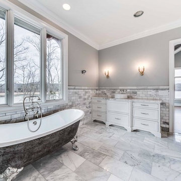
Carrera marble in all its glory is the big show stopper in this Bolton Hill rowhome master bath renovation. What started as a cramped, chopped up room was opened into a sparkling, luxurious space evocative of timeless Old World mansion baths. The result demonstrates what’s possible when mixing multiple marble tile shapes, colors and patterns. To visually frame the bathroom, we installed 6” x 12” honed Carrera marble tiles laid in a herringbone pattern for wainscotting, and carried the same marble pattern into the shower stall in order to create depth and dimension. The wainscotting is set off by beautifully-detailed Carrera marble chair rail and black tile pencil moulding. Carrera hex shower tiles, marble sills and bench, and intricate Carrera and black mosaic flooring complete the marble details. The crisp white double vanity and inconspicuous builtins tastefully compliment the marble, and the brass cabinet hardware, mirrors and plumbing and lighting fixtures add a burst of color to the room.
Sponsored
Fredericksburg, OH

High Point Cabinets
Columbus' Experienced Custom Cabinet Builder | 4x Best of Houzz Winner
 MSI
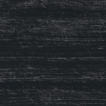
Reminiscent of the linear pattern of natural wood grain, stunning Zebrino Black Polished offers a truly timeless look in refined black-hued marble. Bring a bit of chic to your space with Zebrino Black Polished.
 Abed's Flooring Co.
This is a floating installation of Provenza hardwood. Note that we do not use T-Molds, but manufacture custom transition moldings for all our projects.

 Interiors by Natasha
My client hired Interiors by Natasha to redesign her master bedroom, sitting room and master bathroom. She was enthusiastic about having us create a peaceful and glamorous room for her to sleep and lounge in. The scope of the project was as follows: with the exception to the master bed, we purchased new furniture, new bedding, dressers, nightstands, chandeliers, sofa, rugs, mirror and accessories. We also decided to install wallpaper on the walls as a focal point in the room.
The challenges we faced with this project was making sure we designed a room that had some luxe, glitz and glam. We had to design the space around the bed that my client purchased prior to starting the design process. The color scheme within the room included gray, blush, and cream. The other challenge we faced was creating a room around the glam style without over doing it. Although my client was fine with glam, she did not want to much of it represented in the room. I believe we were able to redesign her space creating a luxe atmosphere for her to sleep and lounge in.
Photography Haigwood Studios

 TVL Creative Ltd.
This project is an incredible transformation and the perfect example of successful style mixing! This client, and now a good friend of TVL (as they all become), is a wonderfully eclectic and adventurous one with immense interest in texture play, pops of color, and unique applications. Our scope in this home included a full kitchen renovation, main level powder room renovation, and a master bathroom overhaul. Taking just over a year to complete from the first design phases to final photos, this project was so insanely fun and packs an amazing amount of fun details and lively surprises. The original kitchen was large and fairly functional. However, the cabinetry was dated, the lighting was inefficient and frankly ugly, and the space was lacking personality in general. Our client desired maximized storage and a more personalized aesthetic. The existing cabinets were short and left the nice height of the space under-utilized. We integrated new gray shaker cabinets from Waypoint Living Spaces and ran them to the ceiling to really exaggerate the height of the space and to maximize usable storage as much as possible. The upper cabinets are glass and lit from within, offering display space or functional storage as the client needs. The central feature of this space is the large cobalt blue range from Viking as well as the custom made reclaimed wood range hood floating above. The backsplash along this entire wall is vertical slab of marble look quartz from Pental Surfaces. This matches the expanse of the same countertop that wraps the room. Flanking the range, we installed cobalt blue lantern penny tile from Merola Tile for a playful texture that adds visual interest and class to the entire room. We upgraded the lighting in the ceiling, under the cabinets, and within cabinets--we also installed accent sconces over each window on the sink wall to create cozy and functional illumination. The deep, textured front Whitehaven apron sink is a dramatic nod to the farmhouse aesthetic from KOHLER, and it's paired with the bold and industrial inspired Tournant faucet, also from Kohler. We finalized this space with other gorgeous appliances, a super sexy dining table and chair set from Room & Board, the Paxton dining light from Pottery Barn and a small bar area and pantry on the far end of the space. In the small powder room on the main level, we converted a drab builder-grade space into a super cute, rustic-inspired washroom. We utilized the Bonner vanity from Signature Hardware and paired this with the cute Ashfield faucet from Pfister. The most unique statements in this room include the water-drop light over the vanity from Shades Of Light, the copper-look porcelain floor tile from Pental Surfaces and the gorgeous Cashmere colored Tresham toilet from Kohler. Up in the master bathroom, elegance abounds. Using the same footprint, we upgraded everything in this space to reflect the client's desire for a more bright, patterned and pretty space. Starting at the entry, we installed a custom reclaimed plank barn door with bold large format hardware from Rustica Hardware. In the bathroom, the custom slate blue vanity from Tharp Cabinet Company is an eye catching statement piece. This is paired with gorgeous hardware from Amerock, vessel sinks from Kohler, and Purist faucets also from Kohler. We replaced the old built-in bathtub with a new freestanding soaker from Signature Hardware. The floor tile is a bold, graphic porcelain tile with a classic color scheme. The shower was upgraded with new tile and fixtures throughout: new clear glass, gorgeous distressed subway tile from the Castle line from TileBar, and a sophisticated shower panel from Vigo. We finalized the space with a small crystal chandelier and soft gray paint. This project is a stunning conversion and we are so thrilled that our client can enjoy these personalized spaces for years to come. Special thanks to the amazing Ian Burks of Burks Wurks Construction for bringing this to life!


 User
Mid-sized farmhouse single-wall linoleum floor and brown floor open concept kitchen photo in Columbus with an undermount sink, flat-panel cabinets, dark wood cabinets, quartz countertops, white backsplash, stainless steel appliances, an island and ceramic backsplash


 Klopf Architecture
, Arterra Landscape Architects and Henry Calvert of Calvert Ventures Designed and built a new warm, modern, Eichler-inspired, open, indoor-outdoor home on a deeper-than-usual San Mateo Highlands property where an original Eichler house had burned to the ground.
The owners wanted multi-generational living and larger spaces than the original home offered, but all parties agreed that the house should respect the neighborhood and blend in stylistically with the other Eichlers. At first the Klopf team considered re-using what little was left of the original home and expanding on it. But after discussions with the owner and builder, all parties agreed that the last few remaining elements of the house were not practical to re-use, so Klopf Architecture designed a new home that pushes the Eichler approach in new directions.
One disadvantage of Eichler production homes is that the house designs were not optimized for each specific lot. A new custom home offered the team a chance to start over. In this case, a longer house that opens up sideways to the south fit the lot better than the original square-ish house that used to open to the rear (west). Accordingly, the Klopf team designed an L-shaped “bar” house with a large glass wall with large sliding glass doors that faces sideways instead of to the rear like a typical Eichler. This glass wall opens to a pool and landscaped yard designed by Arterra Landscape Architects.
Driving by the house, one might assume at first glance it is an Eichler because of the horizontality, the overhanging flat roof eaves, the dark gray vertical siding, and orange solid panel front door, but the house is designed for the 21st Century and is not meant to be a “Likeler.” You won't see any posts and beams in this home. Instead, the ceiling decking is a western red cedar that covers over all the beams. Like Eichlers, this cedar runs continuously from inside to out, enhancing the indoor / outdoor feeling of the house, but unlike Eichlers it conceals a cavity for lighting, wiring, and insulation. Ceilings are higher, rooms are larger and more open, the master bathroom is light-filled and more generous, with a separate tub and shower and a separate toilet compartment, and there is plenty of storage. The garage even easily fits two of today's vehicles with room to spare.
A massive 49-foot by 12-foot wall of glass and the continuity of materials from inside to outside enhance the inside-outside living concept, so the owners and their guests can flow freely from house to pool deck to BBQ to pool and back.
During construction in the rough framing stage, Klopf thought the front of the house appeared too tall even though the house had looked right in the design renderings (probably because the house is uphill from the street). So Klopf Architecture paid the framer to change the roofline from how we had designed it to be lower along the front, allowing the home to blend in better with the neighborhood. One project goal was for people driving up the street to pass the home without immediately noticing there is an "imposter" on this lot, and making that change was essential to achieve that goal.
This 2,606 square foot, 3 bedroom, 3 bathroom Eichler-inspired new house is located in San Mateo in the heart of the Silicon Valley.
Klopf Architecture Project Team: John Klopf, AIA, Klara Kevane
Landscape Architect: Arterra Landscape Architects
Contractor: Henry Calvert of Calvert Ventures
Photography ©2016 Mariko Reed
Location: San Mateo, CA
Year completed: 2016
 Charleene's Houses, LLC
Carrera marble in all its glory is the big show stopper in this Bolton Hill rowhome master bath renovation. What started as a cramped, chopped up room was opened into a sparkling, luxurious space evocative of timeless Old World mansion baths. The result demonstrates what’s possible when mixing multiple marble tile shapes, colors and patterns. To visually frame the bathroom, we installed 6” x 12” honed Carrera marble tiles laid in a herringbone pattern for wainscotting, and carried the same marble pattern into the shower stall in order to create depth and dimension. The wainscotting is set off by beautifully-detailed Carrera marble chair rail and black tile pencil moulding. Carrera hex shower tiles, marble sills and bench, and intricate Carrera and black mosaic flooring complete the marble details. The crisp white double vanity and inconspicuous builtins tastefully compliment the marble, and the brass cabinet hardware, mirrors and plumbing and lighting fixtures add a burst of color to the room.

 L.A. Carpet & Tile Inc.
Home Builder Havana Homes
Inspiration for a mid-sized country carpeted l-shaped mixed material railing staircase remodel in Edmonton with carpeted risers
Inspiration for a mid-sized country carpeted l-shaped mixed material railing staircase remodel in Edmonton with carpeted risers
 User
Having been so thrilled with their recent kitchen renovation, (See Dog Days Kitchen) a couple returned to Kitchen Elements to update and refresh their 20 year old bathroom.
The selected design grabbed square footage from the master bedroom entryway. The clients were intrigued with creating individual “his and her” vanity locations. The captured space from the bedroom allowed for one vanity recess and the other vanity recess was placed in the old shower location.
The new shower found its home where the old vanity stood, allowing for a significant increase of the shower footprint. A luxurious soaking tub replaced the dated built-in Jacuzzi. As a result, the space looks bigger, brighter and a much more inviting place to start and end the day.
Sponsored
Columbus, OH
Free consultation for landscape design!

Peabody Landscape Group
Columbus' Reliable Landscape Design & Contracting


 ACP EXPRESS™
Aluminum composite panel application ideas
Example of an urban metal exterior home design in New York
Example of an urban metal exterior home design in New York

 Rug Depot
This stairrunner project was something very special. Using 100% wool Stair Runner
From Stanton Carpet (Item 21592 Alexander 31” width), we had to create a custom Stair-runner to fit a landing featuring a 90% miter, a Hollywood style step installation and then starting and ending with end caps.
The U-Shaped landing area was created by matching two ends of the stair runner. This customer wanted a matching area rug which was not ready available. Our master installer seamed 3 – 31” runners lengths together to create the desired length and then added the borders to finish the look. The completed size was 5.8 x 8.6.
Once again – a very satisfied customer.
Click Here to see this product:- http://bit.ly/1bxkzdb
220