
Search results for "Maximizing power" in Home Design Ideas
 Drury Design
THE SETUP
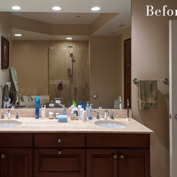
This client lives in a great high-rise condo in downtown Chicago. Alicia has already remodeled a few areas of her home, including her kitchen and home office. The bathroom is one of the last big places the client wanted to update. The existing bathroom had a large, outdated whirlpool tub in the corner. It was a darker space that had a lack of natural light. There are no windows (due to the bathroom’s location within the high-rise building). So, the idea was to brighten up the space and give the client an updated, elegant primary bathroom that is more her style and tailor-made for her routines.
Design Objectives:
- Make the space brighter.
- Create different daily routine stations to maximize functionality while keeping things clutter-free – a makeup station, a blow-dry station, and a sink-needs station.
- Achieve the client’s specific style and function needs while also keeping the look and design open to future possibilities: different users of the space/resale clients.
Design Challenges:
- Toilet cannot be moved. (In a high-rise, you can’t really move plumbing around too much when reimagining a space)
- Existing bathroom had a soffit that hid a lot of electrical wiring, so completely removing the soffit wasn’t an option.
- The blow-dry station needs to accommodate the client’s preference for standing up.
- Finding a place for the make-up station, which the client wants oriented for sitting.
- Create storage within the shower that can eliminate the clutter of personal care products that are actually needed every day. Do this, while keeping the client’s favorite things about the existing shower: the shower bench, a tub filler faucet (for rinsing shaving cream when shaving legs) and a low niche for placing her foot when shaving her legs.
THE RENEWED SPACE
Design Solutions:
- Extended a bit of wall near the toilet to give the commode its own area within the space, but without closing it off into a claustrophobic WC.
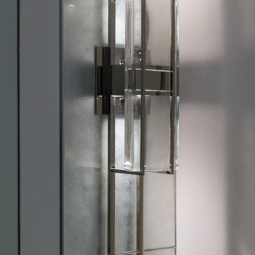
- Worked within the reality of the existing soffit situation, reshaping it to align with the new shower. Can lights were also added. Installed a beautiful ceiling light fixture that works within the new soffit shape, commanding attention and adding light, as if the sofit shape was chosen for it.
- Created a nice, furniture-looking 42”-high cabinet with pullout drawers to be the blow-dry station, complete with a mirror and a nice top. The pullout drawers are all powered, concealing a Dyson dryer and curling iron (and all the accoutrements) while keeping them plugged in, which is ideal for easy usage and put away. A stylish mirror on the wall above the cabinet, and proper lighting, make this the perfect blow-dry station. The top has a grommet that can accommodate a power cord should the client ever want to have a powered device on top of the cabinet.
- Put the sit-down makeup station where the tub used to be, putting the mirror back into a new recessed wall just a bit, allowing the area to have more room.
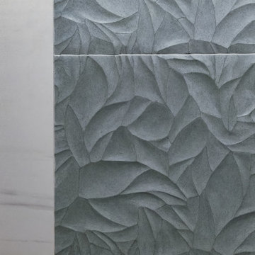
- Created a niche in the shower’s inner wall so that you can’t see it unless you are literally inside the shower. At the client’s request, it also has a hook so she can hang her loofa. Hiding the utility niche in this way allowed us to use the full main wall of the shower as a canvas for a beautiful accent stripe of raised decorative tile. The new shower has her old favorites, too: the tub filler, foot niche and bench.
Alicia’s client loves her new primary bathroom, especially the blow dry area. It is very accommodating for her, as a tall lady, while being very easy to use. The drawers store everything. Being powered, they make using already-plugged in appliances very easy to use and put away.
Her previous makeup station was a freestanding vanity with a single drawer, so beauty products were all over the surface top. With her new makeup station, everything is nicely tucked away and organized in drawers.
The new lighting is fantastic and the colors are light and soft. The clients loves the overall look and feel of her new bathroom and raves about how well the functionality-minded design makes her morning routine – and her life – easier and enjoyable!
 Artisan Kitchen & Bath GC License #107583
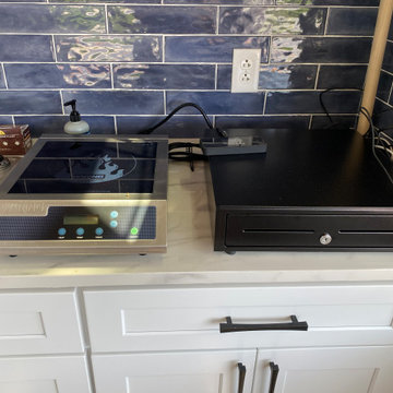
The Tiny Farmhouse Kitchen is by far one of the most complex, rewarding, and unforgettable projects we’ve ever completed. Designed to be fully mobile and 100% solar-powered, this one-of-a-kind kitchen on wheels pushed our creativity, craftsmanship, and problem-solving skills to new heights. Every time we transported it through town, it turned heads—people would literally stop in their tracks just to get a closer look.
Building a fully functional commercial kitchen in such a small footprint required precision in every detail. We carefully selected each piece of equipment to minimize electrical draw, including a commercial refrigerator and four recessed induction food warmers—all powered entirely by solar energy. Onboard water storage, filtration, and gray water management were meticulously engineered to maximize both functionality and space.
The Tiny Farmhouse Kitchen features:
• Custom handcrafted cabinetry
• Granite countertops
• Vaulted ceilings with dimmable LED lighting
• A full POS system with a built-in Wi-Fi hotspot
• A gas-shock lift service window with a live-edge oak flip-down counter, finished with crystal-clear epoxy for a stunning, natural look
Every inch of this mobile kitchen was designed for both beauty and efficiency, blending farmhouse charm with modern utility. It’s a project we are immensely proud of—and one that perfectly captures the spirit of what we do at Artisan Kitchen & Bath: bringing bold ideas to life with craftsmanship, innovation, and heart.
 User
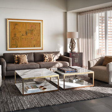
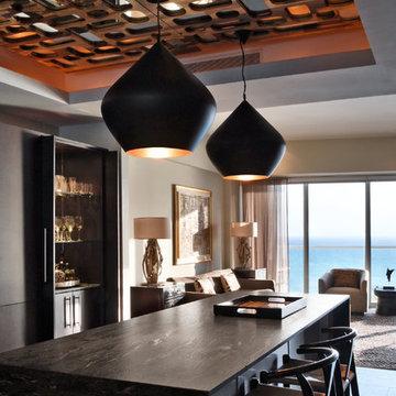
UserEvery design decision for this Caribbean beach residence was guided by the desire to maximize the views of the property’s breathtaking natural surroundings.
To connect the spaces and reveal the views from every vantage point, the team reconfigured the layout to create vistas, and installed window film to reduce solar heat gain. These modifications increased efficiencies, reused 90% of the interior envelope and did not impact the exterior structure of the building. In addition to providing incredible views, opening up the plan allows cross ventilation, maximizing the use of ocean breezes to cool the interior. The result is an effortless flow and maximization of space.
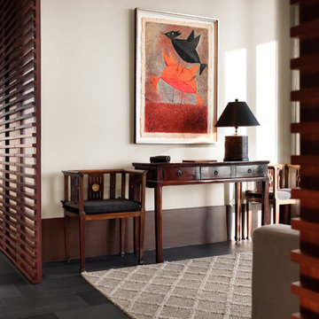
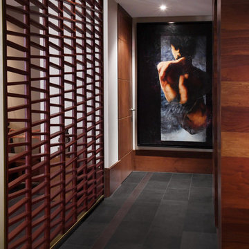
Throughout the interior, dark materials express the concept of respite in the shade, and emphasize the sweeping views of the Caribbean Sea. Millwork crafted by local artisans from local materials establishes hierarchy – providing a clear understanding of the layout – and filters light to create privacy and drama. Screens help define the spaces and create suspense.
Varying screen opacities serve specific functions: nearly opaque screens build suspense, translucent screens provide privacy, and reflective screens – as seen in the kitchen ceiling – create mystery in the core where light and views
are challenged. Referencing the seaside location, the baseboards create a sense of being in a deep shallow. The 16” tall baseboards create a pool effect, engaging the walls with Cradle to Cradle certified Mosa tile flooring. The irregular height also conceals power and data cabling. The resulting space is a contemporary oasis that offers a high-level of comfort and functionality.
Anne Rausch Photography
Find the right local pro for your project
 User
UserEvery design decision for this Caribbean beach residence was guided by the desire to maximize the views of the property’s breathtaking natural surroundings.
To connect the spaces and reveal the views from every vantage point, the team reconfigured the layout to create vistas, and installed window film to reduce solar heat gain. These modifications increased efficiencies, reused 90% of the interior envelope and did not impact the exterior structure of the building. In addition to providing incredible views, opening up the plan allows cross ventilation, maximizing the use of ocean breezes to cool the interior. The result is an effortless flow and maximization of space.
Throughout the interior, dark materials express the concept of respite in the shade, and emphasize the sweeping views of the Caribbean Sea. Millwork crafted by local artisans from local materials establishes hierarchy – providing a clear understanding of the layout – and filters light to create privacy and drama. Screens help define the spaces and create suspense.
Varying screen opacities serve specific functions: nearly opaque screens build suspense, translucent screens provide privacy, and reflective screens – as seen in the kitchen ceiling – create mystery in the core where light and views
are challenged. Referencing the seaside location, the baseboards create a sense of being in a deep shallow. The 16” tall baseboards create a pool effect, engaging the walls with Cradle to Cradle certified Mosa tile flooring. The irregular height also conceals power and data cabling. The resulting space is a contemporary oasis that offers a high-level of comfort and functionality.
Anne Rausch Photography
 User
UserEvery design decision for this Caribbean beach residence was guided by the desire to maximize the views of the property’s breathtaking natural surroundings.
To connect the spaces and reveal the views from every vantage point, the team reconfigured the layout to create vistas, and installed window film to reduce solar heat gain. These modifications increased efficiencies, reused 90% of the interior envelope and did not impact the exterior structure of the building. In addition to providing incredible views, opening up the plan allows cross ventilation, maximizing the use of ocean breezes to cool the interior. The result is an effortless flow and maximization of space.
Throughout the interior, dark materials express the concept of respite in the shade, and emphasize the sweeping views of the Caribbean Sea. Millwork crafted by local artisans from local materials establishes hierarchy – providing a clear understanding of the layout – and filters light to create privacy and drama. Screens help define the spaces and create suspense.
Varying screen opacities serve specific functions: nearly opaque screens build suspense, translucent screens provide privacy, and reflective screens – as seen in the kitchen ceiling – create mystery in the core where light and views
are challenged. Referencing the seaside location, the baseboards create a sense of being in a deep shallow. The 16” tall baseboards create a pool effect, engaging the walls with Cradle to Cradle certified Mosa tile flooring. The irregular height also conceals power and data cabling. The resulting space is a contemporary oasis that offers a high-level of comfort and functionality.
Anne Rausch Photography
 User
UserEvery design decision for this Caribbean beach residence was guided by the desire to maximize the views of the property’s breathtaking natural surroundings.
To connect the spaces and reveal the views from every vantage point, the team reconfigured the layout to create vistas, and installed window film to reduce solar heat gain. These modifications increased efficiencies, reused 90% of the interior envelope and did not impact the exterior structure of the building. In addition to providing incredible views, opening up the plan allows cross ventilation, maximizing the use of ocean breezes to cool the interior. The result is an effortless flow and maximization of space.
Throughout the interior, dark materials express the concept of respite in the shade, and emphasize the sweeping views of the Caribbean Sea. Millwork crafted by local artisans from local materials establishes hierarchy – providing a clear understanding of the layout – and filters light to create privacy and drama. Screens help define the spaces and create suspense.
Varying screen opacities serve specific functions: nearly opaque screens build suspense, translucent screens provide privacy, and reflective screens – as seen in the kitchen ceiling – create mystery in the core where light and views
are challenged. Referencing the seaside location, the baseboards create a sense of being in a deep shallow. The 16” tall baseboards create a pool effect, engaging the walls with Cradle to Cradle certified Mosa tile flooring. The irregular height also conceals power and data cabling. The resulting space is a contemporary oasis that offers a high-level of comfort and functionality.
Anne Rausch Photography
 User
UserEvery design decision for this Caribbean beach residence was guided by the desire to maximize the views of the property’s breathtaking natural surroundings.
To connect the spaces and reveal the views from every vantage point, the team reconfigured the layout to create vistas, and installed window film to reduce solar heat gain. These modifications increased efficiencies, reused 90% of the interior envelope and did not impact the exterior structure of the building. In addition to providing incredible views, opening up the plan allows cross ventilation, maximizing the use of ocean breezes to cool the interior. The result is an effortless flow and maximization of space.
Throughout the interior, dark materials express the concept of respite in the shade, and emphasize the sweeping views of the Caribbean Sea. Millwork crafted by local artisans from local materials establishes hierarchy – providing a clear understanding of the layout – and filters light to create privacy and drama. Screens help define the spaces and create suspense.
Varying screen opacities serve specific functions: nearly opaque screens build suspense, translucent screens provide privacy, and reflective screens – as seen in the kitchen ceiling – create mystery in the core where light and views
are challenged. Referencing the seaside location, the baseboards create a sense of being in a deep shallow. The 16” tall baseboards create a pool effect, engaging the walls with Cradle to Cradle certified Mosa tile flooring. The irregular height also conceals power and data cabling. The resulting space is a contemporary oasis that offers a high-level of comfort and functionality.
Anne Rausch Photography

 User
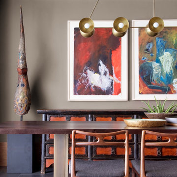
UserEvery design decision for this Caribbean beach residence was guided by the desire to maximize the views of the property’s breathtaking natural surroundings.
To connect the spaces and reveal the views from every vantage point, the team reconfigured the layout to create vistas, and installed window film to reduce solar heat gain. These modifications increased efficiencies, reused 90% of the interior envelope and did not impact the exterior structure of the building. In addition to providing incredible views, opening up the plan allows cross ventilation, maximizing the use of ocean breezes to cool the interior. The result is an effortless flow and maximization of space.
Throughout the interior, dark materials express the concept of respite in the shade, and emphasize the sweeping views of the Caribbean Sea. Millwork crafted by local artisans from local materials establishes hierarchy – providing a clear understanding of the layout – and filters light to create privacy and drama. Screens help define the spaces and create suspense.
Varying screen opacities serve specific functions: nearly opaque screens build suspense, translucent screens provide privacy, and reflective screens – as seen in the kitchen ceiling – create mystery in the core where light and views
are challenged. Referencing the seaside location, the baseboards create a sense of being in a deep shallow. The 16” tall baseboards create a pool effect, engaging the walls with Cradle to Cradle certified Mosa tile flooring. The irregular height also conceals power and data cabling. The resulting space is a contemporary oasis that offers a high-level of comfort and functionality.
Anne Rausch Photography
 User
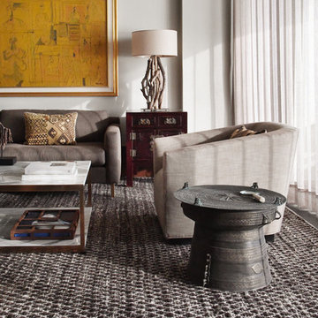
UserEvery design decision for this Caribbean beach residence was guided by the desire to maximize the views of the property’s breathtaking natural surroundings.
To connect the spaces and reveal the views from every vantage point, the team reconfigured the layout to create vistas, and installed window film to reduce solar heat gain. These modifications increased efficiencies, reused 90% of the interior envelope and did not impact the exterior structure of the building. In addition to providing incredible views, opening up the plan allows cross ventilation, maximizing the use of ocean breezes to cool the interior. The result is an effortless flow and maximization of space.
Throughout the interior, dark materials express the concept of respite in the shade, and emphasize the sweeping views of the Caribbean Sea. Millwork crafted by local artisans from local materials establishes hierarchy – providing a clear understanding of the layout – and filters light to create privacy and drama. Screens help define the spaces and create suspense.
Varying screen opacities serve specific functions: nearly opaque screens build suspense, translucent screens provide privacy, and reflective screens – as seen in the kitchen ceiling – create mystery in the core where light and views
are challenged. Referencing the seaside location, the baseboards create a sense of being in a deep shallow. The 16” tall baseboards create a pool effect, engaging the walls with Cradle to Cradle certified Mosa tile flooring. The irregular height also conceals power and data cabling. The resulting space is a contemporary oasis that offers a high-level of comfort and functionality.
Anne Rausch Photography
 User
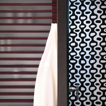
UserEvery design decision for this Caribbean beach residence was guided by the desire to maximize the views of the property’s breathtaking natural surroundings.
To connect the spaces and reveal the views from every vantage point, the team reconfigured the layout to create vistas, and installed window film to reduce solar heat gain. These modifications increased efficiencies, reused 90% of the interior envelope and did not impact the exterior structure of the building. In addition to providing incredible views, opening up the plan allows cross ventilation, maximizing the use of ocean breezes to cool the interior. The result is an effortless flow and maximization of space.
Throughout the interior, dark materials express the concept of respite in the shade, and emphasize the sweeping views of the Caribbean Sea. Millwork crafted by local artisans from local materials establishes hierarchy – providing a clear understanding of the layout – and filters light to create privacy and drama. Screens help define the spaces and create suspense.
Varying screen opacities serve specific functions: nearly opaque screens build suspense, translucent screens provide privacy, and reflective screens – as seen in the kitchen ceiling – create mystery in the core where light and views
are challenged. Referencing the seaside location, the baseboards create a sense of being in a deep shallow. The 16” tall baseboards create a pool effect, engaging the walls with Cradle to Cradle certified Mosa tile flooring. The irregular height also conceals power and data cabling. The resulting space is a contemporary oasis that offers a high-level of comfort and functionality.
Anne Rausch Photography
 User
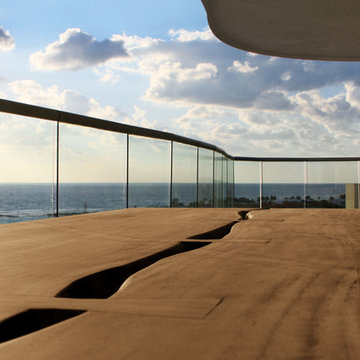
UserEvery design decision for this Caribbean beach residence was guided by the desire to maximize the views of the property’s breathtaking natural surroundings.
To connect the spaces and reveal the views from every vantage point, the team reconfigured the layout to create vistas, and installed window film to reduce solar heat gain. These modifications increased efficiencies, reused 90% of the interior envelope and did not impact the exterior structure of the building. In addition to providing incredible views, opening up the plan allows cross ventilation, maximizing the use of ocean breezes to cool the interior. The result is an effortless flow and maximization of space.
Throughout the interior, dark materials express the concept of respite in the shade, and emphasize the sweeping views of the Caribbean Sea. Millwork crafted by local artisans from local materials establishes hierarchy – providing a clear understanding of the layout – and filters light to create privacy and drama. Screens help define the spaces and create suspense.
Varying screen opacities serve specific functions: nearly opaque screens build suspense, translucent screens provide privacy, and reflective screens – as seen in the kitchen ceiling – create mystery in the core where light and views
are challenged. Referencing the seaside location, the baseboards create a sense of being in a deep shallow. The 16” tall baseboards create a pool effect, engaging the walls with Cradle to Cradle certified Mosa tile flooring. The irregular height also conceals power and data cabling. The resulting space is a contemporary oasis that offers a high-level of comfort and functionality.
Anne Rausch Photography
 F9 Productions Inc.
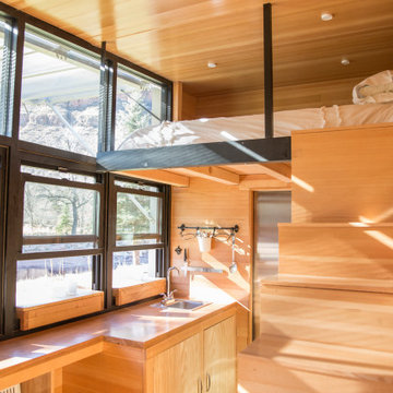
Envision a tiny home that packs adventure into every inch, inspired by rainy park days and built for nature lovers. Atlas Tiny House by F9 blends old-school straw ideas with modern mobility, creating a sustainable escape that's compact yet feels wide open to the world.
Client and Brief
Born from RV frustrations, the vision was a movable home with real craftsmanship – solar for power, rain collection for water, and a glass wall for endless views. It's designed for simple, off-grid living that connects you to the outdoors.
Problems Solved
Traditional RVs lack charm and eco-friendliness; Atlas fixes that with strong materials and green systems, making it durable, fire-safe, and self-reliant for worry-free travels.
Design Concept and Form
The core draws from nature – steel for a tough frame, wood for warmth, glass for immersion. Fold-out deck and awning turn it into an outdoor room, maximizing space and connection.
Construction and Materials
Tube steel keeps it light yet sturdy, with wood accents and sustainable features like filtered rainwater storage for practical, planet-friendly living.
Interior Design
Main level flows with futon, kitchen, bath, and clever storage including batteries. Loft upstairs holds a queen bed with extra room, all efficient and inviting.
Outcome
Showcased on HGTV, Atlas redefines tiny homes with sustainability and style. It's a mobile haven that brings freedom, nature, and comfort together for inspired, eco-conscious adventures.
 Drury Design
THE SETUP
This client lives in a great high-rise condo in downtown Chicago. Alicia has already remodeled a few areas of her home, including her kitchen and home office. The bathroom is one of the last big places the client wanted to update. The existing bathroom had a large, outdated whirlpool tub in the corner. It was a darker space that had a lack of natural light. There are no windows (due to the bathroom’s location within the high-rise building). So, the idea was to brighten up the space and give the client an updated, elegant primary bathroom that is more her style and tailor-made for her routines.
Design Objectives:
- Make the space brighter.
- Create different daily routine stations to maximize functionality while keeping things clutter-free – a makeup station, a blow-dry station, and a sink-needs station.
- Achieve the client’s specific style and function needs while also keeping the look and design open to future possibilities: different users of the space/resale clients.
Design Challenges:
- Toilet cannot be moved. (In a high-rise, you can’t really move plumbing around too much when reimagining a space)
- Existing bathroom had a soffit that hid a lot of electrical wiring, so completely removing the soffit wasn’t an option.
- The blow-dry station needs to accommodate the client’s preference for standing up.
- Finding a place for the make-up station, which the client wants oriented for sitting.
- Create storage within the shower that can eliminate the clutter of personal care products that are actually needed every day. Do this, while keeping the client’s favorite things about the existing shower: the shower bench, a tub filler faucet (for rinsing shaving cream when shaving legs) and a low niche for placing her foot when shaving her legs.
THE RENEWED SPACE
Design Solutions:
- Extended a bit of wall near the toilet to give the commode its own area within the space, but without closing it off into a claustrophobic WC.
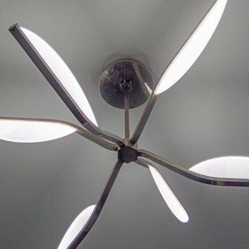
- Worked within the reality of the existing soffit situation, reshaping it to align with the new shower. Can lights were also added. Installed a beautiful ceiling light fixture that works within the new soffit shape, commanding attention and adding light, as if the sofit shape was chosen for it.
- Created a nice, furniture-looking 42”-high cabinet with pullout drawers to be the blow-dry station, complete with a mirror and a nice top. The pullout drawers are all powered, concealing a Dyson dryer and curling iron (and all the accoutrements) while keeping them plugged in, which is ideal for easy usage and put away. A stylish mirror on the wall above the cabinet, and proper lighting, make this the perfect blow-dry station. The top has a grommet that can accommodate a power cord should the client ever want to have a powered device on top of the cabinet.
- Put the sit-down makeup station where the tub used to be, putting the mirror back into a new recessed wall just a bit, allowing the area to have more room.
- Created a niche in the shower’s inner wall so that you can’t see it unless you are literally inside the shower. At the client’s request, it also has a hook so she can hang her loofa. Hiding the utility niche in this way allowed us to use the full main wall of the shower as a canvas for a beautiful accent stripe of raised decorative tile. The new shower has her old favorites, too: the tub filler, foot niche and bench.
Alicia’s client loves her new primary bathroom, especially the blow dry area. It is very accommodating for her, as a tall lady, while being very easy to use. The drawers store everything. Being powered, they make using already-plugged in appliances very easy to use and put away.
Her previous makeup station was a freestanding vanity with a single drawer, so beauty products were all over the surface top. With her new makeup station, everything is nicely tucked away and organized in drawers.
The new lighting is fantastic and the colors are light and soft. The clients loves the overall look and feel of her new bathroom and raves about how well the functionality-minded design makes her morning routine – and her life – easier and enjoyable!
Sponsored
Fredericksburg, OH

High Point Cabinets
Columbus' Experienced Custom Cabinet Builder | 4x Best of Houzz Winner
 Robeson Design
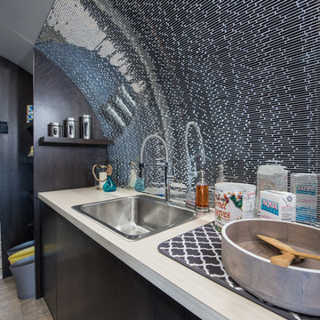
Designing a completely round home is challenging! Add to that, the two tubes are merely 8' wide. This requires EVERY piece of furniture to be custom built to fit the continuous rounding walls, floors and ceiling. We used every possible inch to provide storage for our clients personal belongings and household needs... sustainable for 3 years!
Solid walnut wood paneling and custom built shelving was used throughout as well as tons of hidden storage... in, under and atop every possible inch of this project was locate and utilized! Backsplash above the Kitchen sink is super thinly cut mosaic tile made out of MIRROR! It's reflective, creates an illusion of space and light, It sparkles and looks AMAZING!
MMM Photography
 Toronto Interior Design Group
Gillian Jackson
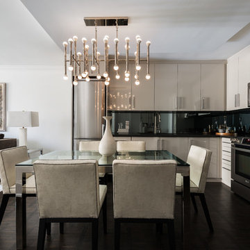
Inspiration for a small contemporary l-shaped dark wood floor and brown floor open concept kitchen remodel in Toronto with an undermount sink, flat-panel cabinets, gray cabinets, quartz countertops, stainless steel appliances, no island and black backsplash
Inspiration for a small contemporary l-shaped dark wood floor and brown floor open concept kitchen remodel in Toronto with an undermount sink, flat-panel cabinets, gray cabinets, quartz countertops, stainless steel appliances, no island and black backsplash
 Drury Design
THE SETUP
This client lives in a great high-rise condo in downtown Chicago. Alicia has already remodeled a few areas of her home, including her kitchen and home office. The bathroom is one of the last big places the client wanted to update. The existing bathroom had a large, outdated whirlpool tub in the corner. It was a darker space that had a lack of natural light. There are no windows (due to the bathroom’s location within the high-rise building). So, the idea was to brighten up the space and give the client an updated, elegant primary bathroom that is more her style and tailor-made for her routines.
Design Objectives:
- Make the space brighter.
- Create different daily routine stations to maximize functionality while keeping things clutter-free – a makeup station, a blow-dry station, and a sink-needs station.
- Achieve the client’s specific style and function needs while also keeping the look and design open to future possibilities: different users of the space/resale clients.
Design Challenges:
- Toilet cannot be moved. (In a high-rise, you can’t really move plumbing around too much when reimagining a space)
- Existing bathroom had a soffit that hid a lot of electrical wiring, so completely removing the soffit wasn’t an option.
- The blow-dry station needs to accommodate the client’s preference for standing up.
- Finding a place for the make-up station, which the client wants oriented for sitting.
- Create storage within the shower that can eliminate the clutter of personal care products that are actually needed every day. Do this, while keeping the client’s favorite things about the existing shower: the shower bench, a tub filler faucet (for rinsing shaving cream when shaving legs) and a low niche for placing her foot when shaving her legs.
THE RENEWED SPACE
Design Solutions:
- Extended a bit of wall near the toilet to give the commode its own area within the space, but without closing it off into a claustrophobic WC.
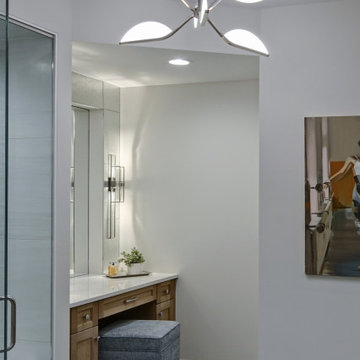
- Worked within the reality of the existing soffit situation, reshaping it to align with the new shower. Can lights were also added. Installed a beautiful ceiling light fixture that works within the new soffit shape, commanding attention and adding light, as if the sofit shape was chosen for it.
- Created a nice, furniture-looking 42”-high cabinet with pullout drawers to be the blow-dry station, complete with a mirror and a nice top. The pullout drawers are all powered, concealing a Dyson dryer and curling iron (and all the accoutrements) while keeping them plugged in, which is ideal for easy usage and put away. A stylish mirror on the wall above the cabinet, and proper lighting, make this the perfect blow-dry station. The top has a grommet that can accommodate a power cord should the client ever want to have a powered device on top of the cabinet.
- Put the sit-down makeup station where the tub used to be, putting the mirror back into a new recessed wall just a bit, allowing the area to have more room.
- Created a niche in the shower’s inner wall so that you can’t see it unless you are literally inside the shower. At the client’s request, it also has a hook so she can hang her loofa. Hiding the utility niche in this way allowed us to use the full main wall of the shower as a canvas for a beautiful accent stripe of raised decorative tile. The new shower has her old favorites, too: the tub filler, foot niche and bench.
Alicia’s client loves her new primary bathroom, especially the blow dry area. It is very accommodating for her, as a tall lady, while being very easy to use. The drawers store everything. Being powered, they make using already-plugged in appliances very easy to use and put away.
Her previous makeup station was a freestanding vanity with a single drawer, so beauty products were all over the surface top. With her new makeup station, everything is nicely tucked away and organized in drawers.
The new lighting is fantastic and the colors are light and soft. The clients loves the overall look and feel of her new bathroom and raves about how well the functionality-minded design makes her morning routine – and her life – easier and enjoyable!
 Dimensions in Wood Inc
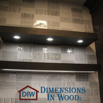
This display features River Run Cabinetry, a factory line of cabinets which Dimensions in Wood offers as an inexpensive alternative to 100% custom cabinetry.
This kitchen display showcases an available spice pull out on the left, a pull out a trash can drawer on the right. A tall pantry showcases the very versatile adjustable rollout system with soft close trays to maximize your food storage space.
Laminate countertop features a crescent edge, complimented by an integrated, stainless steel Karran sink.
Above the sink are two floating shelves which feature LED Task Lighting beneath them to display your aesthetic pieces.
The sink front has a Rev-a-Shelf tip out tray for out of sight, convenient storage of kitchen items like sponges, sink stoppers, or anything.
The wall cabinet sports an under-mount Task Lighting angled power strip with USB power ports to charge all your devices.
The black and white 3 inch by 6 inch gloss backsplash tiles, installed in a stacked pattern, add a little whimsy to the overall space.
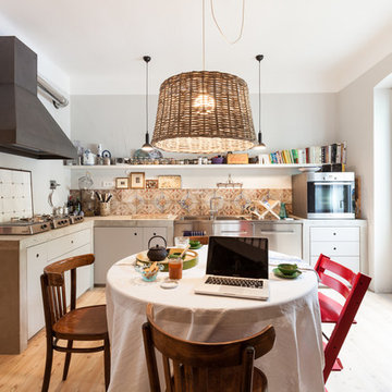
Eat-in kitchen - eclectic u-shaped light wood floor eat-in kitchen idea in Other with flat-panel cabinets, white cabinets, concrete countertops and stainless steel appliances
 Drury Design
THE SETUP
This client lives in a great high-rise condo in downtown Chicago. Alicia has already remodeled a few areas of her home, including her kitchen and home office. The bathroom is one of the last big places the client wanted to update. The existing bathroom had a large, outdated whirlpool tub in the corner. It was a darker space that had a lack of natural light. There are no windows (due to the bathroom’s location within the high-rise building). So, the idea was to brighten up the space and give the client an updated, elegant primary bathroom that is more her style and tailor-made for her routines.
Design Objectives:
- Make the space brighter.
- Create different daily routine stations to maximize functionality while keeping things clutter-free – a makeup station, a blow-dry station, and a sink-needs station.
- Achieve the client’s specific style and function needs while also keeping the look and design open to future possibilities: different users of the space/resale clients.
Design Challenges:
- Toilet cannot be moved. (In a high-rise, you can’t really move plumbing around too much when reimagining a space)
- Existing bathroom had a soffit that hid a lot of electrical wiring, so completely removing the soffit wasn’t an option.
- The blow-dry station needs to accommodate the client’s preference for standing up.
- Finding a place for the make-up station, which the client wants oriented for sitting.
- Create storage within the shower that can eliminate the clutter of personal care products that are actually needed every day. Do this, while keeping the client’s favorite things about the existing shower: the shower bench, a tub filler faucet (for rinsing shaving cream when shaving legs) and a low niche for placing her foot when shaving her legs.
THE RENEWED SPACE
Design Solutions:
- Extended a bit of wall near the toilet to give the commode its own area within the space, but without closing it off into a claustrophobic WC.
- Worked within the reality of the existing soffit situation, reshaping it to align with the new shower. Can lights were also added. Installed a beautiful ceiling light fixture that works within the new soffit shape, commanding attention and adding light, as if the sofit shape was chosen for it.
- Created a nice, furniture-looking 42”-high cabinet with pullout drawers to be the blow-dry station, complete with a mirror and a nice top. The pullout drawers are all powered, concealing a Dyson dryer and curling iron (and all the accoutrements) while keeping them plugged in, which is ideal for easy usage and put away. A stylish mirror on the wall above the cabinet, and proper lighting, make this the perfect blow-dry station. The top has a grommet that can accommodate a power cord should the client ever want to have a powered device on top of the cabinet.
- Put the sit-down makeup station where the tub used to be, putting the mirror back into a new recessed wall just a bit, allowing the area to have more room.
- Created a niche in the shower’s inner wall so that you can’t see it unless you are literally inside the shower. At the client’s request, it also has a hook so she can hang her loofa. Hiding the utility niche in this way allowed us to use the full main wall of the shower as a canvas for a beautiful accent stripe of raised decorative tile. The new shower has her old favorites, too: the tub filler, foot niche and bench.
Alicia’s client loves her new primary bathroom, especially the blow dry area. It is very accommodating for her, as a tall lady, while being very easy to use. The drawers store everything. Being powered, they make using already-plugged in appliances very easy to use and put away.
Her previous makeup station was a freestanding vanity with a single drawer, so beauty products were all over the surface top. With her new makeup station, everything is nicely tucked away and organized in drawers.
The new lighting is fantastic and the colors are light and soft. The clients loves the overall look and feel of her new bathroom and raves about how well the functionality-minded design makes her morning routine – and her life – easier and enjoyable!
 Drury Design
THE SETUP
This client lives in a great high-rise condo in downtown Chicago. Alicia has already remodeled a few areas of her home, including her kitchen and home office. The bathroom is one of the last big places the client wanted to update. The existing bathroom had a large, outdated whirlpool tub in the corner. It was a darker space that had a lack of natural light. There are no windows (due to the bathroom’s location within the high-rise building). So, the idea was to brighten up the space and give the client an updated, elegant primary bathroom that is more her style and tailor-made for her routines.
Design Objectives:
- Make the space brighter.
- Create different daily routine stations to maximize functionality while keeping things clutter-free – a makeup station, a blow-dry station, and a sink-needs station.
- Achieve the client’s specific style and function needs while also keeping the look and design open to future possibilities: different users of the space/resale clients.
Design Challenges:
- Toilet cannot be moved. (In a high-rise, you can’t really move plumbing around too much when reimagining a space)
- Existing bathroom had a soffit that hid a lot of electrical wiring, so completely removing the soffit wasn’t an option.
- The blow-dry station needs to accommodate the client’s preference for standing up.
- Finding a place for the make-up station, which the client wants oriented for sitting.
- Create storage within the shower that can eliminate the clutter of personal care products that are actually needed every day. Do this, while keeping the client’s favorite things about the existing shower: the shower bench, a tub filler faucet (for rinsing shaving cream when shaving legs) and a low niche for placing her foot when shaving her legs.
THE RENEWED SPACE
Design Solutions:
- Extended a bit of wall near the toilet to give the commode its own area within the space, but without closing it off into a claustrophobic WC.
- Worked within the reality of the existing soffit situation, reshaping it to align with the new shower. Can lights were also added. Installed a beautiful ceiling light fixture that works within the new soffit shape, commanding attention and adding light, as if the sofit shape was chosen for it.
- Created a nice, furniture-looking 42”-high cabinet with pullout drawers to be the blow-dry station, complete with a mirror and a nice top. The pullout drawers are all powered, concealing a Dyson dryer and curling iron (and all the accoutrements) while keeping them plugged in, which is ideal for easy usage and put away. A stylish mirror on the wall above the cabinet, and proper lighting, make this the perfect blow-dry station. The top has a grommet that can accommodate a power cord should the client ever want to have a powered device on top of the cabinet.
- Put the sit-down makeup station where the tub used to be, putting the mirror back into a new recessed wall just a bit, allowing the area to have more room.
- Created a niche in the shower’s inner wall so that you can’t see it unless you are literally inside the shower. At the client’s request, it also has a hook so she can hang her loofa. Hiding the utility niche in this way allowed us to use the full main wall of the shower as a canvas for a beautiful accent stripe of raised decorative tile. The new shower has her old favorites, too: the tub filler, foot niche and bench.
Alicia’s client loves her new primary bathroom, especially the blow dry area. It is very accommodating for her, as a tall lady, while being very easy to use. The drawers store everything. Being powered, they make using already-plugged in appliances very easy to use and put away.
Her previous makeup station was a freestanding vanity with a single drawer, so beauty products were all over the surface top. With her new makeup station, everything is nicely tucked away and organized in drawers.
The new lighting is fantastic and the colors are light and soft. The clients loves the overall look and feel of her new bathroom and raves about how well the functionality-minded design makes her morning routine – and her life – easier and enjoyable!
9