
Search results for "Mistake" in Home Design Ideas

 Applied Roofing Services
Roofing mistakes can lead to water leakage. But how to avoid commercial roofing mistakes to avoid water leakage? This is a question that has been answered in detail in this blog. Click on the link to know more.
http://www.appliedroofingservices.com/blog/avoid-commercial-roofing-mistakes-to-prevent-water-leakage/

 Prunin Arboriculture & Landscape
Save your lawn with avoiding common lawn care mistakes. Prunin shares lawn care mistakes you need to avoid for better lawn.
Inspiration for a modern home design remodel in Orange County
Inspiration for a modern home design remodel in Orange County
 Applied Roofing Services
Applying quick and easy techniques is not always the best way to deal with a roofing repair or replacement problem. Many inexperienced roofing contractors tend to do this without thinking about the after- effects of the techniques used. Here is a guide to help you avoid residential roofing mistakes. http://bit.ly/2aYyikt
Find the right local pro for your project
 Amazing Cabinetry & Bath
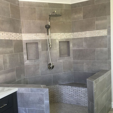
Learn from the experts and avoid common bathroom remodeling mistakes. Our professionals share valuable insights to help you navigate the renovation process smoothly. From poor layout choices to inefficient fixtures, gain the knowledge you need to create a stunning design.
#bathroom_design
#bathroom_decor
#bathroom_remodel
#bathrooms
#Mission_Viejo
#bathroom_renovation

 Alcala Renovations & Landscape
Bathroom - small contemporary kids' blue floor and single-sink bathroom idea in San Francisco with flat-panel cabinets, gray cabinets, quartz countertops, white countertops and a freestanding vanity
 M Atelier
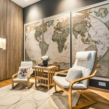
If there is one big mistake that homeowners make when carrying out the decoration tasks of their interior design project, that would be over-accessorising. Indeed, experts in interior design in Singapore agree that there are styles where “more is more,” and there are also those where “less is more.”
While as a homeowner you may choose either of these two style directions, you should first think about the different aspects of interior design and make sure that your style choice fits with these elements. Not doing so may not only result to a poorly executed renovation, but a home that you will find uncomfortable to live in.
So how do you avoid the tendency of over-accessorising? You may want to follow these pieces of advice coming from professionals in interior design in Singapore:
Mistake #1: Using the same fabric on almost all surfaces.
It is common practice among most homeowners to use almost the same fabric on all table surfaces, and sometimes even on sofa covers and drapes. Indeed, this can be cost effective, but it does not contribute to the development of the home’s overall design.
This is because there are fabrics are created to meet specific purposes. For example, lace is often used as table runners, as they give more definition and style to these specific furniture pieces. However, they do not do your windows any favours when used as curtains.
Opaque and heavy fabrics are often intended for curtains and drapes for rooms that require more privacy; in contrast, sheer and fabric materials are more suited for living room windows as they allow natural light and ventilation to move around the house.
Mistake #2: Placing more accents than you actually need.
Another mistake which homeowners are prone to make when decorating their home is placing more accents than needed. There are homes you can see side tables that are overpopulated with picture frames, trinkets, and fancy souvenirs that do not have any connection to each other. Sometimes, you can find numerous throw pillows occupying almost the entire sofa, to the point that all the seats are already occupied.
These are classic examples of “fear of empty spaces,” which is prevalent in most Asian societies, and even in some Western countries. But while it is common practice to occupy empty spaces, you may also want to think about what to do with the space first.
Instead of piling up all your memorabilia in the side tables of your bedroom or living room, why not use a tiered stand so that they can be presented in an organised manner? You may also want to choose a designated area for your trinkets, such as a wall or an unoccupied corner in your room.
Mistake #3: Overdoing the lighting fixtures.
Some homeowners want to imitate the homes of the celebrities they see on TV, and apart from following the same colour schemes and choice of furniture, they also choose to add more lights in their rooms than necessary.
Well, you should understand that the purpose of lighting fixtures is to illuminate the rooms of the house, but this doesn’t mean that you have to brighten up your home all the time. You may want to use lamps that spread the light across the room, rather than several smaller bulbs. The latter only lights up specific parts of the room, and when all these bulbs are lit simultaneously, they only spike up your electric bill.
It would be better to choose lighting fixtures according to your need and the function of the room. Doing so not only illuminates your home properly, but also creates an ambiance that gives you the comfort you are looking for in a dwelling space.
 Ferriss - Architectural Renderings
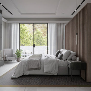
7 mistakes in bedroom design and ways to avoid them.
ERROR # 1 - Incorrect bed size.
This is a problem with any furniture in principle. When, according to the plan and ergonomic calculations, it becomes size to size, but in fact, it looks cumbersome, visually overflowing the space or, on the contrary, turns out to be too small and looks awkward.
How to avoid: Always be guided by the proportions of the size of the furniture in the room. Try to choose as big a bed as possible, but stay realistic. The main thing is that the width of the passageways in the bedroom should not be less than 70cm, and for comfortable movement, it is better to do everything 100cm.
ERROR # 2 - Poor lighting and switches.
Even in a small bedroom, you need multiple light sources. A single chandelier in the center of the ceiling is not enough, because it creates the effect of darkening the corners, and the room seems uncomfortable.
How to avoid: Hang a sconce over your headboard. Don't forget to light up the space next to the mirror and wardrobe. And be sure to place switches close to the bed so that you don't have to go to the other end of the room after an evening with a book in bed.
Do not forget about a sufficient number of outlets, this should be done even at the planning stage.
ERROR # 3 - Few storage locations
The fewer well-thought-out cabinets and shelving, the more things are visible. And the clutter spoils even the most stylish and expensive interior.
How to avoid: In addition to bedside tables, a chest of drawers (for storing small things) and a built-in wardrobe can be placed in a small bedroom: unlike a usual one, it takes up space from floor to ceiling, thereby accommodating more items. In addition, the built-in structure looks more solid and often merges with the walls, making the setting complete.
ERROR # 4 - Carpet of the wrong size.
The carpet in the bedroom is a great addition, and sometimes the final touch of the whole composition. But often people choose the wrong size or do not use it at all.
How to avoid: Choosing the right size can be guided by the unspoken rule, according to which the carpet should be 1 meter larger than the bed, both lengthwise and across. If the room is large, then it is recommended that the indentation of the carpet from the wall is 45-50 cm, if it is small, then 20-30 cm can be dispensed with.
ERROR # 5 Typical design.
If you buy a typical bed, bedside tables, and wardrobe from one manufacturer, then the interior will turn out to be formulaic and impersonal. No accessories and color schemes will help him.
How to avoid: The interior should reflect the character of its owner, and the person living in it will feel comfortable. Explore different collections of furniture and try to assemble a capsule in the same color scheme, but at the same time different in texture and shape.
ERROR # 6 Empty walls.
Even if the bedroom is a room for relaxation, it would be a mistake to make a space out of it that is intended solely for sleeping. Ascetic furnishings, unadorned walls, boring furniture, and bed linen - all this does not improve the mood at all, but, on the contrary, creates a gloomy mood.
How to avoid: The walls in the bedroom are a blank slate that you can transform into something original, beautiful, and unique to your liking. Even if you just paint one of the walls in a contrasting color, and decorate the other with several photos from the Internet, printed and inserted into frames, you can transform the atmosphere of the room as a whole.
ERROR # 7 Too dark interior.
One should not be deceived by the beauty of the thick dark tones of interior paint. It has long been known that dark blue, burgundy, blueberry, chocolate, and black for the bedroom should not be used in large quantities, since such an environment will have a tangible effect and interfere with a vigorous awakening in the morning.
How to avoid: If you like a rich range, try choosing derived shades a few tones lighter, for example, instead of black or graphite, choose gray-brown, dove-gray for the walls, and blue can be replaced with cornflower blue or azure.
Don't forget to combine dark tones with lots of whites, creams, complementing shimmery accessories, and vibrant décor.
https://www.ferriss.co/
#ferriss #We_bring_objects_to_life #3drendering #architecture #San_Francisco
 User
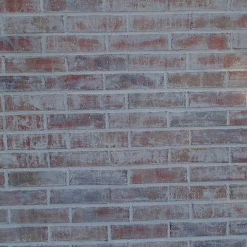
UserThis is an organic Lime Wash done with a true lime wash product as opposed to a brick mortar or concrete that is often seen on new houses. This product can be applied as a solid coating making the surface completely white, or can be applied and "washed off" in many artistic ways, as seen here. If you hate your brick or just want something unique this is a great option!
Photo credit: Jeff Murrey
 Robin Gonzales Interiors
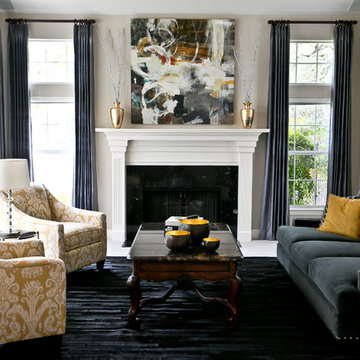
Contrast is the key to this gorgeous transitional family room. Soft greige walls are in contrast with the platinum silk draperies and charcoal sofa. Custom lounge chairs in gold ikat add a touch of glamour to this formal living space. Modern art keeps it fresh and fun.
 Kelly Brown Interiors
Photo Credit: Alex C. Tenser Photography
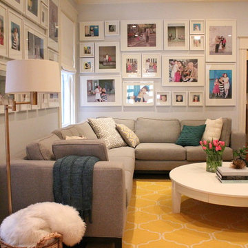
Living room - transitional medium tone wood floor living room idea in Richmond with gray walls
Living room - transitional medium tone wood floor living room idea in Richmond with gray walls
 Goggans Architecture & Interiors
Atlantic Archives, Inc./Richard Leo Johnson
Paragon Custom Construction LLC
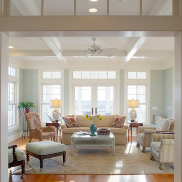
Large beach style formal and enclosed medium tone wood floor living room photo in Charleston with gray walls and no tv
Large beach style formal and enclosed medium tone wood floor living room photo in Charleston with gray walls and no tv
 Grounded Homes
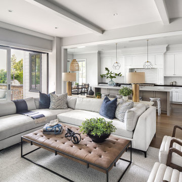
Example of a large transitional master and open concept light wood floor, brown floor and exposed beam living room design in Orange County with gray walls, a standard fireplace, a wood fireplace surround and a wall-mounted tv
 Clean Design
Donna Dotan Photography Inc.
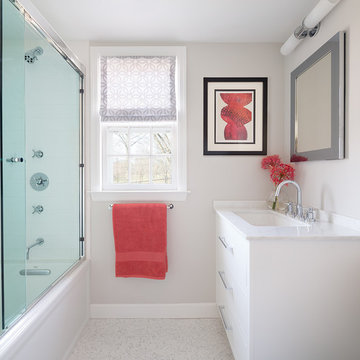
Example of a transitional mosaic tile floor alcove bathtub design in New York with white cabinets, flat-panel cabinets, marble countertops and beige walls
Example of a transitional mosaic tile floor alcove bathtub design in New York with white cabinets, flat-panel cabinets, marble countertops and beige walls


 Diskin Designs
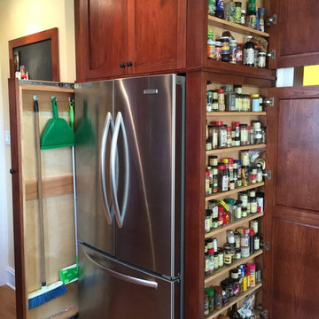
Encasing full depth fridge in paneling gives built-in appearance with greater storage. Hidden spice cabinets as side panel of refrigerator. Pull out broom storage.
 The Rinfret Group
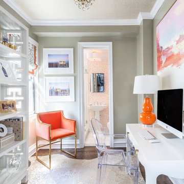
Example of a mid-sized transitional freestanding desk dark wood floor and brown floor study room design in New York with beige walls and no fireplace

 Altura Architects
Clean and bright modern bathroom in a farmhouse in Mill Spring. The white countertops against the natural, warm wood tones makes a relaxing atmosphere. His and hers sinks, towel warmers, floating vanities, storage solutions and simple and sleek drawer pulls and faucets. Curbless shower, white shower tiles with zig zag tile floor.
Photography by Todd Crawford.
 Scottsdale Design Center
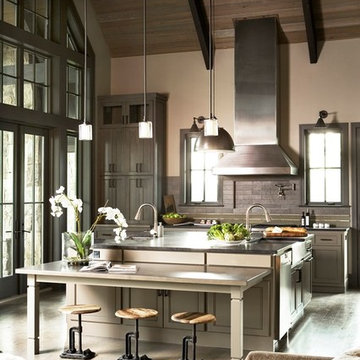
Don't Ignore the Paperwork -- Every detail of your project including the beginning date to the possible completion date, the type of fixtures to the price of plumbing, electrical, exterior work, and so on should be included in a contract. -- Sub Zero / Wolf, Gary Player Estates Residence -- Arizona Wholesale, Located in suite 107 + 115-117 of the SDC
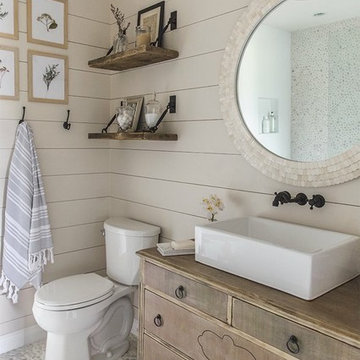
Example of a small beach style 3/4 pebble tile floor and gray floor bathroom design in Phoenix with distressed cabinets, a two-piece toilet, beige walls, a vessel sink, wood countertops, brown countertops and flat-panel cabinets
 Diane Durocher Interiors
Peter Rymwid Architectural Photography
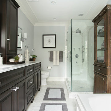
Example of a classic drop-in bathtub design in New York with an undermount sink, raised-panel cabinets, dark wood cabinets and gray walls
Example of a classic drop-in bathtub design in New York with an undermount sink, raised-panel cabinets, dark wood cabinets and gray walls
1