
Search results for "Model's profile" in Home Design Ideas

 ZeroEnergy Design
The first level bathroom includes a wood wall hung vanity bringing warmth to the space paired with calming natural stone bath and shower.
Photos by Eric Roth.
Construction by Ralph S. Osmond Company.
Green architecture by ZeroEnergy Design.

 Hoffman & Swinburne
Brendan McCarthy
Inspiration for a mid-sized contemporary 3/4 white tile and subway tile ceramic tile and white floor corner shower remodel in New York with gray walls, a hinged shower door and a trough sink
Inspiration for a mid-sized contemporary 3/4 white tile and subway tile ceramic tile and white floor corner shower remodel in New York with gray walls, a hinged shower door and a trough sink
 TKS Design Group
Download our free ebook, Creating the Ideal Kitchen. DOWNLOAD NOW
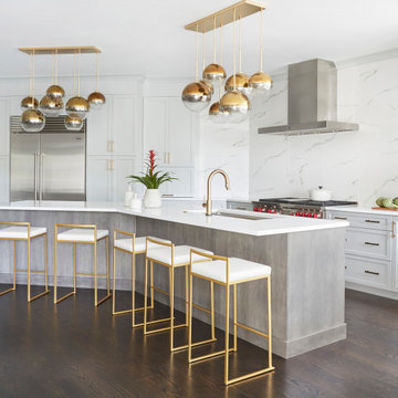
This client was referred to us from a past client. They are a busy 2-career household with young children and enjoy entertaining friends and family in their home. They have a beautiful open concept home but unfortunately the kitchen was not fitting for the rest of the home. They were not quite sure what to do with the space. We talked about trying to refresh it or do more of a minor remodel, but in the end they decided a full gut would get them to where they wanted to be.
One problem was there was no place for guests to hang out other than the large and awkward banquette area. The brick wall and tiled hood area were feeling a bit dated and tired. The space was just not functional for their lifestyle. There was no prep space near the cooktop and no landing area for items coming out of the ovens or refrigerator, plus a big dead zone in the center of the room.
Banquettes, like the one they previously had in the space, are great for small spaces, but when they get really large like this one, it makes getting in and out of the seating area awkward and uncomfortable. Plus, there was room for a large table, so we eliminated the awkward built in.
We started by removing the faux brick wall between the kitchen and back entry. We relocated the entry to the garage over a couple feet in order to get every last inch out of the new kitchen. We also made the decision to close up the primary window that faced the pretty ho hum brick wall of the neighbor’s house. There was plenty of light coming in from the seating area, so we just didn’t feel the window was adding much to the room.
Construction went smoothy. There was a bit of rework with electrical, flooring and HVAC, but in the end, we think it was well worth it.
The clients really wanted a sleek contemporary look, and we originally had planned for a full height slab backsplash, but due to it’s size, it was a budget buster. Instead, we got creative and settled on large format porcelain tiles that have a similar feel but were a fraction of the cost. We made sure the wall was plumb and level so that the fit and finish would mimic that of slab material.
The final space was quite a change. A large prep sink sits directly across from the new pro-style range with plenty additional prep space on the large island. The refrigerator and ovens now have miles of landing space, and a nice tight work triangle makes cooking a breeze.
Since we wanted a more contemporary feel, not many wall cabinets were included. Instead, we outfitted some of the drawers for dish storage with a peg system. Two large pantries flanking the refrigerator hold baking supplies and small appliances. Large drawers by the cooktop hold pots and pans, and an appliance garage tucked away to the left of the range hides away miscellaneous items. The large island also houses a microwave drawer and tons of storage, most of which is drawers offering maximum convenience.
The island now seats 5-6 people comfortably along with the new table in the seating area which can seat up to 8. Entertaining will be a breeze in this space. With such a clean backdrop, we knew we would need some drama with the lighting, so we chose two sets of staggered pendants, which we adjusted for the right visual balance above the island.
We also included a small coffee station to the right of the main kitchen, which helps keep the coffee clutter out of the kitchen proper. Two tones of complimentary gray are featured in this kitchen. The perimeter is a light gray that reads almost white. The island is a gray stain that adds some depth and interest with the visible wood texture. The countertops are clean white quartz, and the hardware, barstools and light fixtures add warm brass tones. I see lots of cooking and entertaining with family and friends in the near future in this bright and airy new space.
Designed by: Susan Klimala, CKD, CBD
Photography by: Michael Kaskel
For more information on kitchen and bath design ideas go to: www.kitchenstudio-ge.com
Find the right local pro for your project

 Living Stone Design + Build
Deceptively Simple
This house is an exercise in subtlety. The first things that draw the eye, both inside and outside, are the clean, low-profile lines and sleek, polished appearance. It seems to be a model of modern simplicity–until you look more closely.
Delightfully detailed
At every turn, this home has something fresh to inspire and delight. From the light fixtures, to the plumbing fixtures, to the artwork, the home’s smaller elements are its showpieces, infusing every space with art and vitality. .
The moody energy of the home was achieved with an abundance of warm wood accents, lighting, and warm pink wall colors. But there’s also a sense of playfulness in the wide mixture of smooth and rough textures, the expressive use of colors and patterns, and combination of modern and antique accents.
Practically perfect
This is a forever home, and the homeowners were focused on ensuring that the house would be fit for their practical needs throughout their lives. Everything from the zero-threshold entryways, to the elevator, to the fixtures, was chosen and installed with their possible future needs in mind, making the home as liveable as it is beautiful.
 Living Stone Design + Build
Deceptively Simple
This house is an exercise in subtlety. The first things that draw the eye, both inside and outside, are the clean, low-profile lines and sleek, polished appearance. It seems to be a model of modern simplicity–until you look more closely.
Delightfully detailed
At every turn, this home has something fresh to inspire and delight. From the light fixtures, to the plumbing fixtures, to the artwork, the home’s smaller elements are its showpieces, infusing every space with art and vitality. .
The moody energy of the home was achieved with an abundance of warm wood accents, lighting, and warm pink wall colors. But there’s also a sense of playfulness in the wide mixture of smooth and rough textures, the expressive use of colors and patterns, and combination of modern and antique accents.
Practically perfect
This is a forever home, and the homeowners were focused on ensuring that the house would be fit for their practical needs throughout their lives. Everything from the zero-threshold entryways, to the elevator, to the fixtures, was chosen and installed with their possible future needs in mind, making the home as liveable as it is beautiful.

 Living Stone Design + Build
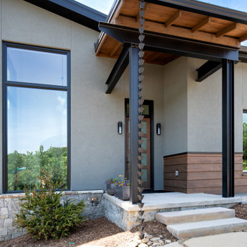
Deceptively Simple
This house is an exercise in subtlety. The first things that draw the eye, both inside and outside, are the clean, low-profile lines and sleek, polished appearance. It seems to be a model of modern simplicity–until you look more closely.
Delightfully detailed
At every turn, this home has something fresh to inspire and delight. From the light fixtures, to the plumbing fixtures, to the artwork, the home’s smaller elements are its showpieces, infusing every space with art and vitality. .
The moody energy of the home was achieved with an abundance of warm wood accents, lighting, and warm pink wall colors. But there’s also a sense of playfulness in the wide mixture of smooth and rough textures, the expressive use of colors and patterns, and combination of modern and antique accents.
Practically perfect
This is a forever home, and the homeowners were focused on ensuring that the house would be fit for their practical needs throughout their lives. Everything from the zero-threshold entryways, to the elevator, to the fixtures, was chosen and installed with their possible future needs in mind, making the home as liveable as it is beautiful.


 User
Rex Maximillian
Large island style two-story and attached stucco and two-car green garage photo in Hawaii with a hip roof and a metal roof
Large island style two-story and attached stucco and two-car green garage photo in Hawaii with a hip roof and a metal roof

 The Artisan Company
Inspiration for a transitional dark wood floor and brown floor kitchen remodel with beaded inset cabinets, gray cabinets, marble countertops, white backsplash, ceramic backsplash, paneled appliances and white countertops

Large beach style single-wall wet bar photo in Bridgeport with white cabinets, wood countertops, white backsplash, ceramic backsplash, stainless steel appliances, an island, an undermount sink, glass-front cabinets and brown countertops
 Living Stone Design + Build
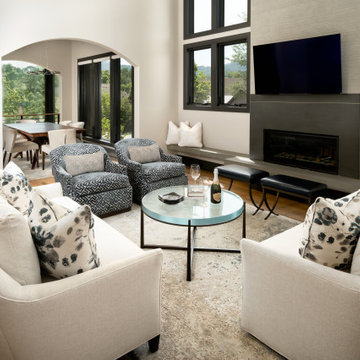
Deceptively Simple
This house is an exercise in subtlety. The first things that draw the eye, both inside and outside, are the clean, low-profile lines and sleek, polished appearance. It seems to be a model of modern simplicity–until you look more closely.
Delightfully detailed
At every turn, this home has something fresh to inspire and delight. From the light fixtures, to the plumbing fixtures, to the artwork, the home’s smaller elements are its showpieces, infusing every space with art and vitality. .
The moody energy of the home was achieved with an abundance of warm wood accents, lighting, and warm pink wall colors. But there’s also a sense of playfulness in the wide mixture of smooth and rough textures, the expressive use of colors and patterns, and combination of modern and antique accents.
Practically perfect
This is a forever home, and the homeowners were focused on ensuring that the house would be fit for their practical needs throughout their lives. Everything from the zero-threshold entryways, to the elevator, to the fixtures, was chosen and installed with their possible future needs in mind, making the home as liveable as it is beautiful.
 Living Stone Design + Build
Deceptively Simple
This house is an exercise in subtlety. The first things that draw the eye, both inside and outside, are the clean, low-profile lines and sleek, polished appearance. It seems to be a model of modern simplicity–until you look more closely.
Delightfully detailed
At every turn, this home has something fresh to inspire and delight. From the light fixtures, to the plumbing fixtures, to the artwork, the home’s smaller elements are its showpieces, infusing every space with art and vitality. .
The moody energy of the home was achieved with an abundance of warm wood accents, lighting, and warm pink wall colors. But there’s also a sense of playfulness in the wide mixture of smooth and rough textures, the expressive use of colors and patterns, and combination of modern and antique accents.
Practically perfect
This is a forever home, and the homeowners were focused on ensuring that the house would be fit for their practical needs throughout their lives. Everything from the zero-threshold entryways, to the elevator, to the fixtures, was chosen and installed with their possible future needs in mind, making the home as liveable as it is beautiful.

 Lewin Wertheimer
Douglas Hill
Luxe Family Home | Santa Monica
Inspiration for a transitional kitchen remodel in Los Angeles
Inspiration for a transitional kitchen remodel in Los Angeles
Sponsored
Columbus, OH

Snider & Metcalf Interior Design, LTD
Leading Interior Designers in Columbus, Ohio & Ponte Vedra, Florida

 Adrienne DeRosa
Bringing the inside out; The wide front porch eases the transition from outside to inside, creating an almost room-like feel. The Mohrman's play up this concept by incorporating a variety of furnishings including a former kitchen chair repainted gloss black. String lighting imbues summer evenings with a warm incandescent glow.
A colorful array of pillows adorn the swing on the front porch, making for a comfortable place to relax on balmy days. The couple gave new life to the existing swing with a refreshing lick of robin's egg blue.
Photo: Adrienne DeRosa Photography © 2014 Houzz

 MSA ARCHITECTURE + INTERIORS
Home theater - transitional light wood floor home theater idea in Austin with white walls and a wall-mounted tv

 Christian Rice Architects, Inc.
Coronado, CA
The Alameda Residence is situated on a relatively large, yet unusually shaped lot for the beachside community of Coronado, California. The orientation of the “L” shaped main home and linear shaped guest house and covered patio create a large, open courtyard central to the plan. The majority of the spaces in the home are designed to engage the courtyard, lending a sense of openness and light to the home. The aesthetics take inspiration from the simple, clean lines of a traditional “A-frame” barn, intermixed with sleek, minimal detailing that gives the home a contemporary flair. The interior and exterior materials and colors reflect the bright, vibrant hues and textures of the seaside locale.

 Alisberg Parker
Inspiration for a timeless gender-neutral carpeted dressing room remodel in New York with open cabinets and white cabinets


 Board & Vellum
Photo by Tina Witherspoon.
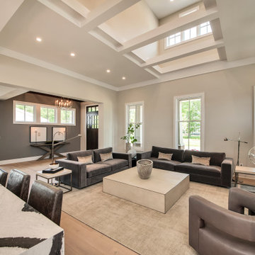
Example of a mid-sized trendy open concept and formal light wood floor and beige floor living room design in Seattle with white walls, a standard fireplace and a concrete fireplace
Example of a mid-sized trendy open concept and formal light wood floor and beige floor living room design in Seattle with white walls, a standard fireplace and a concrete fireplace

 Isla Homes
I built this on my property for my aging father who has some health issues. Handicap accessibility was a factor in design. His dream has always been to try retire to a cabin in the woods. This is what he got.
It is a 1 bedroom, 1 bath with a great room. It is 600 sqft of AC space. The footprint is 40' x 26' overall.
The site was the former home of our pig pen. I only had to take 1 tree to make this work and I planted 3 in its place. The axis is set from root ball to root ball. The rear center is aligned with mean sunset and is visible across a wetland.
The goal was to make the home feel like it was floating in the palms. The geometry had to simple and I didn't want it feeling heavy on the land so I cantilevered the structure beyond exposed foundation walls. My barn is nearby and it features old 1950's "S" corrugated metal panel walls. I used the same panel profile for my siding. I ran it vertical to math the barn, but also to balance the length of the structure and stretch the high point into the canopy, visually. The wood is all Southern Yellow Pine. This material came from clearing at the Babcock Ranch Development site. I ran it through the structure, end to end and horizontally, to create a seamless feel and to stretch the space. It worked. It feels MUCH bigger than it is.
I milled the material to specific sizes in specific areas to create precise alignments. Floor starters align with base. Wall tops adjoin ceiling starters to create the illusion of a seamless board. All light fixtures, HVAC supports, cabinets, switches, outlets, are set specifically to wood joints. The front and rear porch wood has three different milling profiles so the hypotenuse on the ceilings, align with the walls, and yield an aligned deck board below. Yes, I over did it. It is spectacular in its detailing. That's the benefit of small spaces.
Concrete counters and IKEA cabinets round out the conversation.
For those who could not live in a tiny house, I offer the Tiny-ish House.
Photos by Ryan Gamma
Staging by iStage Homes
Design assistance by Jimmy Thornton
78