
Search results for "Moving bulky" in Home Design Ideas
 Alair Homes Plano
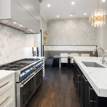
Our clients came to us wanting to update and open up their kitchen, breakfast nook, wet bar, and den. They wanted a cleaner look without clutter but didn’t want to go with an all-white kitchen, fearing it’s too trendy. Their kitchen was not utilized well and was not aesthetically appealing; it was very ornate and dark. The cooktop was too far back in the kitchen towards the butler’s pantry, making it awkward when cooking, so they knew they wanted that moved. The rest was left up to our designer to overcome these obstacles and give them their dream kitchen.
We gutted the kitchen cabinets, including the built-in china cabinet and all finishes. The pony wall that once separated the kitchen from the den (and also housed the sink, dishwasher, and ice maker) was removed, and those appliances were relocated to the new large island, which had a ton of storage and a 15” overhang for bar seating. Beautiful aged brass Quebec 6-light pendants were hung above the island.
All cabinets were replaced and drawers were designed to maximize storage. The Eclipse “Greensboro” cabinetry was painted gray with satin brass Emtek Mod Hex “Urban Modern” pulls. A large banquet seating area was added where the stand-alone kitchen table once sat. The main wall was covered with 20x20 white Golwoo tile. The backsplash in the kitchen and the banquette accent tile was a contemporary coordinating Tempesta Neve polished Wheaton mosaic marble.
In the wet bar, they wanted to completely gut and replace everything! The overhang was useless and it was closed off with a large bar that they wanted to be opened up, so we leveled out the ceilings and filled in the original doorway into the bar in order for the flow into the kitchen and living room more natural. We gutted all cabinets, plumbing, appliances, light fixtures, and the pass-through pony wall. A beautiful backsplash was installed using Nova Hex Graphite ceramic mosaic 5x5 tile. A 15” overhang was added at the counter for bar seating.
In the den, they hated the brick fireplace and wanted a less rustic look. The original mantel was very bulky and dark, whereas they preferred a more rectangular firebox opening, if possible. We removed the fireplace and surrounding hearth, brick, and trim, as well as the built-in cabinets. The new fireplace was flush with the wall and surrounded with Tempesta Neve Polished Marble 8x20 installed in a Herringbone pattern. The TV was hung above the fireplace and floating shelves were added to the surrounding walls for photographs and artwork.
They wanted to completely gut and replace everything in the powder bath, so we started by adding blocking in the wall for the new floating cabinet and a white vessel sink. Black Boardwalk Charcoal Hex Porcelain mosaic 2x2 tile was used on the bathroom floor; coordinating with a contemporary “Cleopatra Silver Amalfi” black glass 2x4 mosaic wall tile. Two Schoolhouse Electric “Isaac” short arm brass sconces were added above the aged brass metal framed hexagon mirror. The countertops used in here, as well as the kitchen and bar, were Elements quartz “White Lightning.” We refinished all existing wood floors downstairs with hand scraped with the grain. Our clients absolutely love their new space with its ease of organization and functionality.

 Beach Haus Interiors
This view shows the openness of the stair case - a mix of vertical white board and baton panelling coupled with horizontal shiplap moves the eye around the room.
A hint of color in the iridescent teal backsplash marries well with the textured vinyl finish on the bar stools. We made these in house and used brushed silver nail head trim to finish the leading edge. This saddle style stool is perfect for adding several in a row as they are not bulky.
 Caroline McCrea - DB Design & Uptown Design
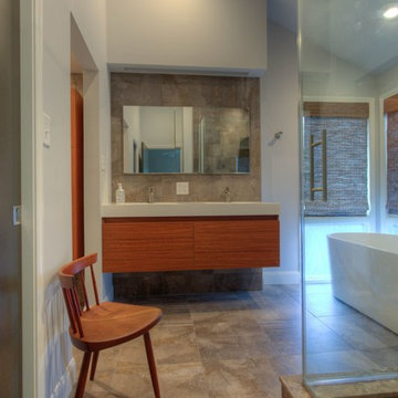
Challenging space including a toilet placed right in front of two large corner windows... because who doesn't want to sit on their toilet and wave to their neighbors? Yah, we pass on that and move the toilet plumbing and created a new space plan that was more functional and better utilized the available footprint.
Two great clients who knew this was a job for experts but also had a great eye for contemporary design, which can be both modern and classic all at once.
We hit that sweet spot on this one. A master bathroom with a very small foot print now appears much larger, way more stylish and is definitely more functional. Corner window toilet... you will not be missed.
Designer: Caroline McCrea
Builder: Lovell Renovation and Construction
Materials: DB Design and uptown Design
Photographer: Mark A. Tiberio with Katie Lynn Harris Photography
Find the right local pro for your project
 ALL Renovation & Design LLC
A 20-year old builder kitchen that desperately needed an update. That is why the Louds called us. A few years previously, we had completed a finished basement project for them that you can view here: https://www.allrd.com/project/loud-basement/
To connect the kitchen a little more with the dining room, we opened the doorway as wide and high as we could.
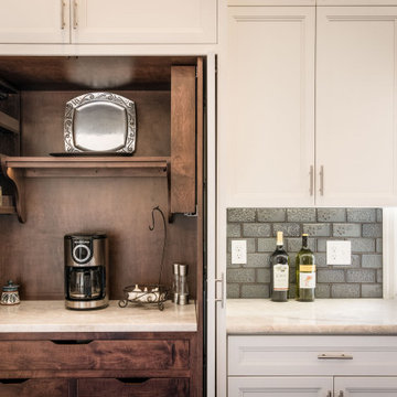
One special feature of the kitchen is the beverage pantry. It was something the homeowner had seen online and wanted to make practical. Because pull outdoors would have been in the way, we went with slide-in, fold-out doors like what you would see in an entertainment center.
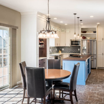
The other unique feature of the kitchen is the center island. The blue was chosen to match the color theme of the connecting living room. The solid wood countertop is a striking centerpiece that steals the show. The cooktop was moved to the island, but because the homeowner did not want a bulky range hood hanging from the ceiling, we had to get creative with a downdraft range vent and a fan mounted on the outside of the house to pull the air out.
Another interesting aspect to the cooktop is that we had originally recommended an induction cooktop instead of regular electric cooktop. The reason being that an induction cooktop cools instantly the moment the pot is removed whereas an electric cooktop stays hot but with no visual cue to warn you. The homeowner initially decided to go with the less expensive electric cooktop. But, before we had even finished construction, one of the family members slid their hand over the cooktop while walking by just after a pan had been removed and got burned. Immediately the homeowner requested we install the induction cooktop instead.
Soft Maple Cabinets painted Simply White, Taj Mihal Granite countertops, farmhouse sink, 3” x 6” Antiqua Ceramic tile backsplash in Feelings Grigio, 30” Dacor HoodDowndraft vent, Luxury Vinyl tile floor, and LED i-Lighting undercabinet lighting.
 ALL Renovation & Design LLC
A 20-year old builder kitchen that desperately needed an update. That is why the Louds called us. A few years previously, we had completed a finished basement project for them that you can view here: https://www.allrd.com/project/loud-basement/
To connect the kitchen a little more with the dining room, we opened the doorway as wide and high as we could.
One special feature of the kitchen is the beverage pantry. It was something the homeowner had seen online and wanted to make practical. Because pull outdoors would have been in the way, we went with slide-in, fold-out doors like what you would see in an entertainment center.
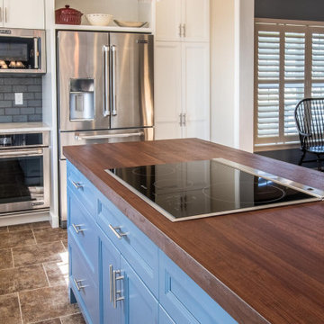
The other unique feature of the kitchen is the center island. The blue was chosen to match the color theme of the connecting living room. The solid wood countertop is a striking centerpiece that steals the show. The cooktop was moved to the island, but because the homeowner did not want a bulky range hood hanging from the ceiling, we had to get creative with a downdraft range vent and a fan mounted on the outside of the house to pull the air out.
Another interesting aspect to the cooktop is that we had originally recommended an induction cooktop instead of regular electric cooktop. The reason being that an induction cooktop cools instantly the moment the pot is removed whereas an electric cooktop stays hot but with no visual cue to warn you. The homeowner initially decided to go with the less expensive electric cooktop. But, before we had even finished construction, one of the family members slid their hand over the cooktop while walking by just after a pan had been removed and got burned. Immediately the homeowner requested we install the induction cooktop instead.
Soft Maple Cabinets painted Simply White, Taj Mihal Granite countertops, farmhouse sink, 3” x 6” Antiqua Ceramic tile backsplash in Feelings Grigio, 30” Dacor HoodDowndraft vent, Luxury Vinyl tile floor, and LED i-Lighting undercabinet lighting.

 KOZAK Hauling and Junk Removal
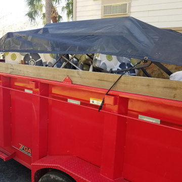
#1 JUNK REMOVAL KOZAK Hauling and Junk Removal is The Best New Port Richey Junk Removal Service! KOZAK Hauling and Junk Removal Is your local junk removal expert! Operating in the New Port Richey area, we are ready to help you reclaim your space! KOZAK Hauling and Junk Removal is a full-service junk removal company helping residential & commercial clients remove whatever type of junk you may have. Whether its junk removal, scrap metal recycling, mattress disposal, trash removal, electronics recycling, furniture disposal or a full office cleanout, whatever you call it, if you don't need it, we can take it! We do our very best to recycle and donate to local charities, keeping as much junk out of our landfills as possible. 727-455-5144
 Drury Design
THE SETUP
The original primary bathroom was characterized by a disjointed and segmented layout. The shower featured a bulky glass-block enclosure that overwhelmed the space visually. There was a considerable amount of open, unused space, and despite having a his and hers vanity, the arrangement lacked personal space for each user, as they shared the conjoined space between the sinks. The toilet was inconveniently located right by the door, with a half-wall partition meant to provide privacy but instead contributing to a cramped and unbalanced feel. Overall, the bathroom’s layout and design were fragmented, failing to make the most of the available space and lacking adequate storage solutions.
Design objectives:
- Reconfigure the layout to enhance functionality and flow.
- Create an elegant, upscale aesthetic that is light and bright.
- Incorporate specialized storage solutions for female hair care needs.
- Increase overall storage capacity.
- Develop a spa-like shower experience.
- Provide a significant wow factor to the space.
THE REMODEL
Design challenges to be solved:
- Repositioning the toilet to a more suitable location.
- Designing hair care storage solutions without cluttering the elegant space.
- Balancing an upscale, elegant design with a feminine touch in the color palette.
- Increasing the brightness of the room without adding windows.
- Completely replacing the existing shower to create a spa-like experience.
- Planning new storage solutions without adding bulkiness or clutter to the cabinetry.
THE RENEWED SPACE
Design solutions:
Toilet Relocation: Moved the toilet by the window, creating a better overall layout that also opened up two full walls for cabinetry and storage solutions.
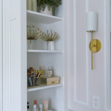
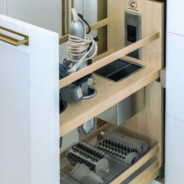
Specialized Vanity Storage: The left side of the left vanity is the wife’s. Open shelves facing across the vanity can be used for decorative or daily needs items. Pull-out docking drawers with power outlets and metal basins handle hot hair appliances.
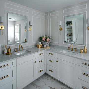
Bright and Elegant Color Scheme: White cabinets, countertops, floors, and shower walls keep the space bright. The just-off-white wall color with a hint of pink adds a feminine touch. Thin wainscoting with white trim offers traditional-leaning elegance.
Layered Lighting Strategy: Ceiling can lights, sconces, lighted mirrors, and toe-kick lighting were installed. Natural light-rated bulbs keep the space bright and natural-feeling.
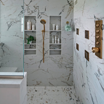
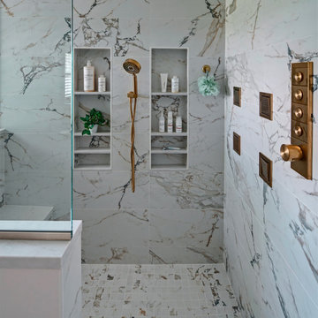
Spa-Like Shower: An extra-large shower was created using the same floor tile materials for continuity. Equipped with a Kohler Anthem system with a shower head, hand-held, and four body sprays. His and Hers niches for separate body care product storage.
Enhanced Storage Solutions: Added a linen cabinet within the vanity area for efficient storage of towels and bathroom essentials.
This elegant bathroom feels incredibly spacious now. The color palette and lights keep the room bright and cheery. Gold fixtures, the herringbone pattern on the floor, and exquisite trim work add an elegant touch. With the husband and wife having their own vanity wall sections joined at the corner, each user truly has their own space within the space. The clients are very happy with the final result.

 Riverwalk Contracting Group
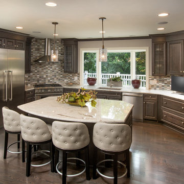
This 1920s home had a small dated kitchen. We opened the wall between the kitchen and dining room, moving the main kitchen footprint into the former dining room to be opened to the living area. A large series of kitchen windows were added to highlight the view, with the gas cooktop looking out. The former kitchen space was converted a butler's pantry to include the main farm sink and dishwasher, thus allowing closing off messy dishes during a party. The pantry was built with extra-large shelves to accommodate bulky Costco items and a small area for a coffee bar. The bulk of the budget was used to replace and reposition two staircases. The project also included sistering sagging ceiling joists from the upstairs.
 ALL Renovation & Design LLC
A 20-year old builder kitchen that desperately needed an update. That is why the Louds called us. A few years previously, we had completed a finished basement project for them that you can view here: https://www.allrd.com/project/loud-basement/
To connect the kitchen a little more with the dining room, we opened the doorway as wide and high as we could.
One special feature of the kitchen is the beverage pantry. It was something the homeowner had seen online and wanted to make practical. Because pull outdoors would have been in the way, we went with slide-in, fold-out doors like what you would see in an entertainment center.
The other unique feature of the kitchen is the center island. The blue was chosen to match the color theme of the connecting living room. The solid wood countertop is a striking centerpiece that steals the show. The cooktop was moved to the island, but because the homeowner did not want a bulky range hood hanging from the ceiling, we had to get creative with a downdraft range vent and a fan mounted on the outside of the house to pull the air out.
Another interesting aspect to the cooktop is that we had originally recommended an induction cooktop instead of regular electric cooktop. The reason being that an induction cooktop cools instantly the moment the pot is removed whereas an electric cooktop stays hot but with no visual cue to warn you. The homeowner initially decided to go with the less expensive electric cooktop. But, before we had even finished construction, one of the family members slid their hand over the cooktop while walking by just after a pan had been removed and got burned. Immediately the homeowner requested we install the induction cooktop instead.
Soft Maple Cabinets painted Simply White, Taj Mihal Granite countertops, farmhouse sink, 3” x 6” Antiqua Ceramic tile backsplash in Feelings Grigio, 30” Dacor HoodDowndraft vent, Luxury Vinyl tile floor, and LED i-Lighting undercabinet lighting.
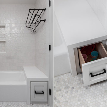
 Saikley Architects
This house was a very small mid-century bungalow with previous additions that resulted in a large but chaotic layout. The owners wanted to convert the house to a super-efficient, and charming Craftsman-style, 6 bedroom home for their large family and work at home.
We achieved the space needs by moving a few walls for a more efficient, organized layout, setting up spaces for overlapping uses, and making a small upstairs addition. Every bit of square footage was optimized to meet the goals of the project without making the house huge or adding unnecessary cost.
Much thought was given to the entry sequence near the front door. A large flow-through mudroom with storage for each family member, and adjacent laundry, make it easy for children to be taught to keep their things organized and to contribute to household chores. A mail station and central home admin area at the mudroom help keep clutter down at other areas and minimize home management tasks. A garage door near the kitchen gives quick access to bulk items.
The existing house had too much view to the street from the living room through large corner windows, and too little entry transition, to the extent that the family did not feel comfortable using the living room much without shades drawn. We raised the window sills and brought the new windows in from the corner of the house, allowing plenty of light while protecting privacy and a sense of enclosure in the living room. We enlarged the front porch to create a more graceful transition from the public to private space. We located the front door so that the circulation from entry into the house would allow for furnishing the living room with a sitting circle that is not intruded upon by people walking through the room.
Sight lines through the living spaces were an important consideration in the design. The owners wanted discreet spaces for living room, kitchen, dining and family room, but also wanted the living spaces to feel connected and to be able to easily watch their children. Being able to see the children playing in the yard while getting things done inside the house was also important. While largely working with the existing structure, we opened walls and rearranged the use of spaces to make a series of connected living spaces with long views through them.
The character of the remodeled house is a contemporary Craftsman with classic materials and cool, consistent colors. A few arches echo through the house to frame spaces and soften the feeling of the rooms.
Photography: Kurt Manley
https://saikleyarchitects.com/portfolio/bungalow-expansion/
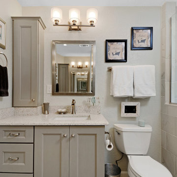
 AOFOTOS.com
AOFOTOS.com © 2016 Houzz
Designer: Brooke Eversoll, Bee Studios Design Build Group
Contractor: Norm Walters Construction
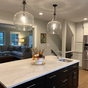 Riverwalk Contracting Group
This 1920s home had a small dated kitchen. We opened the wall between the kitchen and dining room, moving the main kitchen footprint into the former dining room to be opened to the living area. A large series of kitchen windows were added to highlight the view, with the gas cooktop looking out. The former kitchen space was converted a butler's pantry to include the main farm sink and dishwasher, thus allowing closing off messy dishes during a party. The pantry was built with extra-large shelves to accommodate bulky Costco items and a small area for a coffee bar. The bulk of the budget was used to replace and reposition two staircases. The project also included sistering sagging ceiling joists from the upstairs.
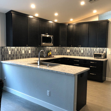
 Ranieri Construction LLC
The flow and function of this kitchen was completely transformed by simply moving the refrigerator and creating an appliance wall. Countertop prep space is maximized and the blue glass backsplash becomes the focal point of the kitchen, instead of the old bulky fridge. The overall look is sleek and modern for this homeowner that cooks and entertains often.

Sponsored
Columbus, OH

Wannemacher Interiors
Customized Award-Winning Interior Design Solutions in Franklin Cnty OH
 ALL Renovation & Design LLC
A 20-year old builder kitchen that desperately needed an update. That is why the Louds called us. A few years previously, we had completed a finished basement project for them that you can view here: https://www.allrd.com/project/loud-basement/
To connect the kitchen a little more with the dining room, we opened the doorway as wide and high as we could.
One special feature of the kitchen is the beverage pantry. It was something the homeowner had seen online and wanted to make practical. Because pull outdoors would have been in the way, we went with slide-in, fold-out doors like what you would see in an entertainment center.
The other unique feature of the kitchen is the center island. The blue was chosen to match the color theme of the connecting living room. The solid wood countertop is a striking centerpiece that steals the show. The cooktop was moved to the island, but because the homeowner did not want a bulky range hood hanging from the ceiling, we had to get creative with a downdraft range vent and a fan mounted on the outside of the house to pull the air out.
Another interesting aspect to the cooktop is that we had originally recommended an induction cooktop instead of regular electric cooktop. The reason being that an induction cooktop cools instantly the moment the pot is removed whereas an electric cooktop stays hot but with no visual cue to warn you. The homeowner initially decided to go with the less expensive electric cooktop. But, before we had even finished construction, one of the family members slid their hand over the cooktop while walking by just after a pan had been removed and got burned. Immediately the homeowner requested we install the induction cooktop instead.
Soft Maple Cabinets painted Simply White, Taj Mihal Granite countertops, farmhouse sink, 3” x 6” Antiqua Ceramic tile backsplash in Feelings Grigio, 30” Dacor HoodDowndraft vent, Luxury Vinyl tile floor, and LED i-Lighting undercabinet lighting.
 Drury Design
THE SETUP
The original primary bathroom was characterized by a disjointed and segmented layout. The shower featured a bulky glass-block enclosure that overwhelmed the space visually. There was a considerable amount of open, unused space, and despite having a his and hers vanity, the arrangement lacked personal space for each user, as they shared the conjoined space between the sinks. The toilet was inconveniently located right by the door, with a half-wall partition meant to provide privacy but instead contributing to a cramped and unbalanced feel. Overall, the bathroom’s layout and design were fragmented, failing to make the most of the available space and lacking adequate storage solutions.
Design objectives:
- Reconfigure the layout to enhance functionality and flow.
- Create an elegant, upscale aesthetic that is light and bright.
- Incorporate specialized storage solutions for female hair care needs.
- Increase overall storage capacity.
- Develop a spa-like shower experience.
- Provide a significant wow factor to the space.
THE REMODEL
Design challenges to be solved:
- Repositioning the toilet to a more suitable location.
- Designing hair care storage solutions without cluttering the elegant space.
- Balancing an upscale, elegant design with a feminine touch in the color palette.
- Increasing the brightness of the room without adding windows.
- Completely replacing the existing shower to create a spa-like experience.
- Planning new storage solutions without adding bulkiness or clutter to the cabinetry.
THE RENEWED SPACE
Design solutions:
Toilet Relocation: Moved the toilet by the window, creating a better overall layout that also opened up two full walls for cabinetry and storage solutions.
Specialized Vanity Storage: The left side of the left vanity is the wife’s. Open shelves facing across the vanity can be used for decorative or daily needs items. Pull-out docking drawers with power outlets and metal basins handle hot hair appliances.
Bright and Elegant Color Scheme: White cabinets, countertops, floors, and shower walls keep the space bright. The just-off-white wall color with a hint of pink adds a feminine touch. Thin wainscoting with white trim offers traditional-leaning elegance.
Layered Lighting Strategy: Ceiling can lights, sconces, lighted mirrors, and toe-kick lighting were installed. Natural light-rated bulbs keep the space bright and natural-feeling.
Spa-Like Shower: An extra-large shower was created using the same floor tile materials for continuity. Equipped with a Kohler Anthem system with a shower head, hand-held, and four body sprays. His and Hers niches for separate body care product storage.
Enhanced Storage Solutions: Added a linen cabinet within the vanity area for efficient storage of towels and bathroom essentials.
This elegant bathroom feels incredibly spacious now. The color palette and lights keep the room bright and cheery. Gold fixtures, the herringbone pattern on the floor, and exquisite trim work add an elegant touch. With the husband and wife having their own vanity wall sections joined at the corner, each user truly has their own space within the space. The clients are very happy with the final result.
 Drury Design
THE SETUP
The original primary bathroom was characterized by a disjointed and segmented layout. The shower featured a bulky glass-block enclosure that overwhelmed the space visually. There was a considerable amount of open, unused space, and despite having a his and hers vanity, the arrangement lacked personal space for each user, as they shared the conjoined space between the sinks. The toilet was inconveniently located right by the door, with a half-wall partition meant to provide privacy but instead contributing to a cramped and unbalanced feel. Overall, the bathroom’s layout and design were fragmented, failing to make the most of the available space and lacking adequate storage solutions.
Design objectives:
- Reconfigure the layout to enhance functionality and flow.
- Create an elegant, upscale aesthetic that is light and bright.
- Incorporate specialized storage solutions for female hair care needs.
- Increase overall storage capacity.
- Develop a spa-like shower experience.
- Provide a significant wow factor to the space.
THE REMODEL
Design challenges to be solved:
- Repositioning the toilet to a more suitable location.
- Designing hair care storage solutions without cluttering the elegant space.
- Balancing an upscale, elegant design with a feminine touch in the color palette.
- Increasing the brightness of the room without adding windows.
- Completely replacing the existing shower to create a spa-like experience.
- Planning new storage solutions without adding bulkiness or clutter to the cabinetry.
THE RENEWED SPACE
Design solutions:
Toilet Relocation: Moved the toilet by the window, creating a better overall layout that also opened up two full walls for cabinetry and storage solutions.
Specialized Vanity Storage: The left side of the left vanity is the wife’s. Open shelves facing across the vanity can be used for decorative or daily needs items. Pull-out docking drawers with power outlets and metal basins handle hot hair appliances.
Bright and Elegant Color Scheme: White cabinets, countertops, floors, and shower walls keep the space bright. The just-off-white wall color with a hint of pink adds a feminine touch. Thin wainscoting with white trim offers traditional-leaning elegance.
Layered Lighting Strategy: Ceiling can lights, sconces, lighted mirrors, and toe-kick lighting were installed. Natural light-rated bulbs keep the space bright and natural-feeling.
Spa-Like Shower: An extra-large shower was created using the same floor tile materials for continuity. Equipped with a Kohler Anthem system with a shower head, hand-held, and four body sprays. His and Hers niches for separate body care product storage.
Enhanced Storage Solutions: Added a linen cabinet within the vanity area for efficient storage of towels and bathroom essentials.
This elegant bathroom feels incredibly spacious now. The color palette and lights keep the room bright and cheery. Gold fixtures, the herringbone pattern on the floor, and exquisite trim work add an elegant touch. With the husband and wife having their own vanity wall sections joined at the corner, each user truly has their own space within the space. The clients are very happy with the final result.
 Drury Design
THE SETUP
The original primary bathroom was characterized by a disjointed and segmented layout. The shower featured a bulky glass-block enclosure that overwhelmed the space visually. There was a considerable amount of open, unused space, and despite having a his and hers vanity, the arrangement lacked personal space for each user, as they shared the conjoined space between the sinks. The toilet was inconveniently located right by the door, with a half-wall partition meant to provide privacy but instead contributing to a cramped and unbalanced feel. Overall, the bathroom’s layout and design were fragmented, failing to make the most of the available space and lacking adequate storage solutions.
Design objectives:
- Reconfigure the layout to enhance functionality and flow.
- Create an elegant, upscale aesthetic that is light and bright.
- Incorporate specialized storage solutions for female hair care needs.
- Increase overall storage capacity.
- Develop a spa-like shower experience.
- Provide a significant wow factor to the space.
THE REMODEL
Design challenges to be solved:
- Repositioning the toilet to a more suitable location.
- Designing hair care storage solutions without cluttering the elegant space.
- Balancing an upscale, elegant design with a feminine touch in the color palette.
- Increasing the brightness of the room without adding windows.
- Completely replacing the existing shower to create a spa-like experience.
- Planning new storage solutions without adding bulkiness or clutter to the cabinetry.
THE RENEWED SPACE
Design solutions:
Toilet Relocation: Moved the toilet by the window, creating a better overall layout that also opened up two full walls for cabinetry and storage solutions.
Specialized Vanity Storage: The left side of the left vanity is the wife’s. Open shelves facing across the vanity can be used for decorative or daily needs items. Pull-out docking drawers with power outlets and metal basins handle hot hair appliances.
Bright and Elegant Color Scheme: White cabinets, countertops, floors, and shower walls keep the space bright. The just-off-white wall color with a hint of pink adds a feminine touch. Thin wainscoting with white trim offers traditional-leaning elegance.
Layered Lighting Strategy: Ceiling can lights, sconces, lighted mirrors, and toe-kick lighting were installed. Natural light-rated bulbs keep the space bright and natural-feeling.
Spa-Like Shower: An extra-large shower was created using the same floor tile materials for continuity. Equipped with a Kohler Anthem system with a shower head, hand-held, and four body sprays. His and Hers niches for separate body care product storage.
Enhanced Storage Solutions: Added a linen cabinet within the vanity area for efficient storage of towels and bathroom essentials.
This elegant bathroom feels incredibly spacious now. The color palette and lights keep the room bright and cheery. Gold fixtures, the herringbone pattern on the floor, and exquisite trim work add an elegant touch. With the husband and wife having their own vanity wall sections joined at the corner, each user truly has their own space within the space. The clients are very happy with the final result.


 Sundling Studio
Sundling Studio
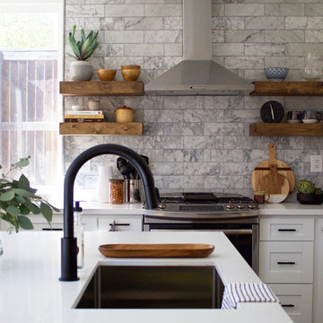
Inspiration for a cottage l-shaped laminate floor and brown floor eat-in kitchen remodel in Los Angeles with an undermount sink, shaker cabinets, white cabinets, quartz countertops, gray backsplash, marble backsplash, stainless steel appliances and an island
Inspiration for a cottage l-shaped laminate floor and brown floor eat-in kitchen remodel in Los Angeles with an undermount sink, shaker cabinets, white cabinets, quartz countertops, gray backsplash, marble backsplash, stainless steel appliances and an island

 Drury Design
THE SETUP
The original primary bathroom was characterized by a disjointed and segmented layout. The shower featured a bulky glass-block enclosure that overwhelmed the space visually. There was a considerable amount of open, unused space, and despite having a his and hers vanity, the arrangement lacked personal space for each user, as they shared the conjoined space between the sinks. The toilet was inconveniently located right by the door, with a half-wall partition meant to provide privacy but instead contributing to a cramped and unbalanced feel. Overall, the bathroom’s layout and design were fragmented, failing to make the most of the available space and lacking adequate storage solutions.
Design objectives:
- Reconfigure the layout to enhance functionality and flow.
- Create an elegant, upscale aesthetic that is light and bright.
- Incorporate specialized storage solutions for female hair care needs.
- Increase overall storage capacity.
- Develop a spa-like shower experience.
- Provide a significant wow factor to the space.
THE REMODEL
Design challenges to be solved:
- Repositioning the toilet to a more suitable location.
- Designing hair care storage solutions without cluttering the elegant space.
- Balancing an upscale, elegant design with a feminine touch in the color palette.
- Increasing the brightness of the room without adding windows.
- Completely replacing the existing shower to create a spa-like experience.
- Planning new storage solutions without adding bulkiness or clutter to the cabinetry.
THE RENEWED SPACE
Design solutions:
Toilet Relocation: Moved the toilet by the window, creating a better overall layout that also opened up two full walls for cabinetry and storage solutions.
Specialized Vanity Storage: The left side of the left vanity is the wife’s. Open shelves facing across the vanity can be used for decorative or daily needs items. Pull-out docking drawers with power outlets and metal basins handle hot hair appliances.
Bright and Elegant Color Scheme: White cabinets, countertops, floors, and shower walls keep the space bright. The just-off-white wall color with a hint of pink adds a feminine touch. Thin wainscoting with white trim offers traditional-leaning elegance.
Layered Lighting Strategy: Ceiling can lights, sconces, lighted mirrors, and toe-kick lighting were installed. Natural light-rated bulbs keep the space bright and natural-feeling.
Spa-Like Shower: An extra-large shower was created using the same floor tile materials for continuity. Equipped with a Kohler Anthem system with a shower head, hand-held, and four body sprays. His and Hers niches for separate body care product storage.
Enhanced Storage Solutions: Added a linen cabinet within the vanity area for efficient storage of towels and bathroom essentials.
This elegant bathroom feels incredibly spacious now. The color palette and lights keep the room bright and cheery. Gold fixtures, the herringbone pattern on the floor, and exquisite trim work add an elegant touch. With the husband and wife having their own vanity wall sections joined at the corner, each user truly has their own space within the space. The clients are very happy with the final result.
4