
Search results for "Much needed" in Home Design Ideas
 Stephanie Charest Interior Design
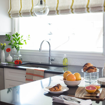
We completed this kitchen renovation for a SW. Calgary couple and as you’ll see, it was a much needed update after their 20+ years in the home.
Clearly the look of the cabinets needed to be brought up to date, but function was on the top of the list for this client. She enjoys cooking and often hosts several friends over for canning and other big cooking parties so countertop space was a priority. Seeing as they also host large family gatherings, the cook didn’t want to feel abandoned in the kitchen when everyone else was in the next room so opening up the space was crucial.
Here is what we did to change the way this space works for them…
We revised the layout of the appliances and cabinets and relocated the plumbing so she could look out the window while she stood at the sink. Taking the cabinets up to the ceiling also gave them more storage as does the large pantry next to the fridge. An island wouldn’t fit, so we added a peninsula which gave them a spot to sit to have their morning coffee and a significant amount of additional counter space. By removing the walls between the kitchen and dining room it eliminated a small hallway that separated the kitchen and dining room and allowed for an open concept in their 1960’s home.
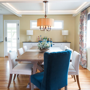
To add visual interest to the space and to define the dining room, we added a coffered celing. Now, typically a coffered ceiling is done when you have three or four walls to anchor it in. It was a bit of a risk to add a “floating” coffered ceiling! However, it turned out beautifully. It wasn’t without it issues but I’m glad we added this element as it wouldn’t have been as interesting with a typical flat ceiling.
In the dining room, a buffet was added for additional storage as well as new drapery panels, lighting and furniture. The peacock blue end chairs are stunning! Without that punch of color the dining room just wouldn’t be as outstanding. They are so lovely and really pushed the client out of her comfort zone – but she loves them and is glad she trusted us with that design decision.
The result is a much more usable space that is also classic in style and just darn pretty to look at and be in! And I know this client is enjoying her new kitchen day to day and on special family occasions.
Adrian Shellard Photography
 Sunny Interior Design
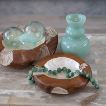
This small pied-a-terre got a major upgrade with a feature fireplace wall, statement lighting and coastal accents. The blue large scale porcelain gives the effect of marble. We added unique built in bench nooks on either side of the fireplace with cozy pillows to soften the light gray porcelain tile. We carried the light gray porcelain to the front of the fireplace that provides an interesting detail without taking up much space in this small space. We added lots of texture with wallpaper and a neutral checked rug that plays well off the coastal counter stools along the peninsula. Unique white coastal lighting used in sconces and dining room light adds nice contrast to the dark blue wallpaper and the ambient light that the sconces provide along with the glow of the fireplace makes this a romantic night time space. The dark blue pendant lighting over the kitchen peninsula ties in with the wallpaper color and provides a much needed pop of color this all white kitchen desperately needed.
 TOPOS Architects, Inc
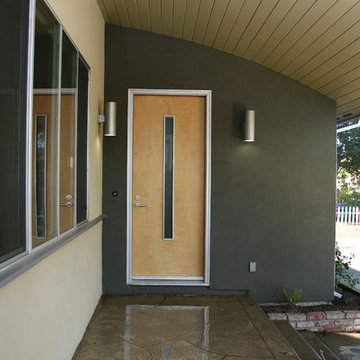
A dramatic upstairs addition to a simple 1950’s tract house provided much need space a growing family and a much appreciated transformation for a changing community. Some persuasion was needed to convince planning authorities that a curved roof was actually compatible with the neighborhood, yet the final home and front porch nestles comfortably under a towering redwood. The arc motif is echoed with a stainless steel inlay in clear maple cabinet doors.
Photos by Stuart Locklear
Find the right local pro for your project
 Highland Design+Build
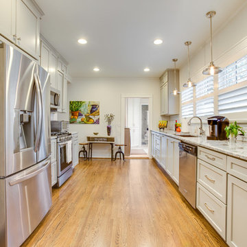
This Woodland Home, built in 1946, had beautiful charm from the exterior but needed more love on the inside. The lack of storage in the kitchen, a dark family room and underutilized attic space led them to remodel the rest of the home.
In the kitchen, walls were removed between the breakfast nook and kitchen and existing windows relocated and enlarged to maximize natural light. The cased opening into the dining was widened allowing better flow for serving dinner guests. Installing new hardwoods in the kitchen created a cohesive floorplan. Willow Gray cabinets installed to the ceiling, heightened the room and gave the homeowners much needed storage space. Bianco Ararus Granite and classic subway backsplash with dark grout added a finishing touch.
A large cased opening was created between the family room and existing sunroom. New aluminum clad casement windows and large French door unit was installed which enhanced the natural light throughout the space. Window sashes were replaced on the lower level of the home. The existing attic stairs with heavy, worn carpet were rebuilt to widen as much as possible. New oak stair treads were installed and finished, tying into the original hardwood flooring throughout the main level. Black iron railing gives the illusion of more space while adding simple elegance.
The attic, once used for storage, was updated with new windows, luxury vinyl plank flooring and cabinetry for seasonal clothing storage. The quaint space is especially enjoyed as a reading nook and quiet getaway.
205 Photography
 Stephanie Charest Interior Design
We completed this kitchen renovation for a SW. Calgary couple and as you’ll see, it was a much needed update after their 20+ years in the home.
Clearly the look of the cabinets needed to be brought up to date, but function was on the top of the list for this client. She enjoys cooking and often hosts several friends over for canning and other big cooking parties so countertop space was a priority. Seeing as they also host large family gatherings, the cook didn’t want to feel abandoned in the kitchen when everyone else was in the next room so opening up the space was crucial.
Here is what we did to change the way this space works for them…
We revised the layout of the appliances and cabinets and relocated the plumbing so she could look out the window while she stood at the sink. Taking the cabinets up to the ceiling also gave them more storage as does the large pantry next to the fridge. An island wouldn’t fit, so we added a peninsula which gave them a spot to sit to have their morning coffee and a significant amount of additional counter space. By removing the walls between the kitchen and dining room it eliminated a small hallway that separated the kitchen and dining room and allowed for an open concept in their 1960’s home.
To add visual interest to the space and to define the dining room, we added a coffered celing. Now, typically a coffered ceiling is done when you have three or four walls to anchor it in. It was a bit of a risk to add a “floating” coffered ceiling! However, it turned out beautifully. It wasn’t without it issues but I’m glad we added this element as it wouldn’t have been as interesting with a typical flat ceiling.
In the dining room, a buffet was added for additional storage as well as new drapery panels, lighting and furniture. The peacock blue end chairs are stunning! Without that punch of color the dining room just wouldn’t be as outstanding. They are so lovely and really pushed the client out of her comfort zone – but she loves them and is glad she trusted us with that design decision.
The result is a much more usable space that is also classic in style and just darn pretty to look at and be in! And I know this client is enjoying her new kitchen day to day and on special family occasions.
Adrian Shellard Photography
 Renovisions
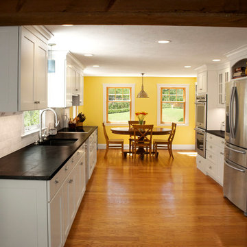
Our clients needed a much larger kitchen to accommodate their growing family and better functionality for their dream culinary haven.
They did not give it a moments notice to contact Cathy and Ed at Renovisions who designed and built a few recent projects and they were delighted with the overall experience. A design of an open floor plan in mind with relocated appliances totally transformed this kitchen space. Space was borrowed from the dining room allowing a much needed work flow and eat-in area for their two small children.
White painted cabinetry that boasts plenty of storage, deep drawers, pull-out trash drawer provided more functional space and the glass mullion doors created an attractive view. The stainless appliances, including a slim Meile hood, along with the stainless steel decorative diamond pattern backsplash reflected a sleek and contemporary style that the clients love for their transitional style home.
Soapstone with white veining countertops compliments the dark wood island with white marble Carrera-look quartz no-maintenance countertops.
The warmth of the hardwood flooring is stunning in contrast to the white painted kitchen cabinets and exudes a comfortable and most welcome feel when you enter the space.
These homeowners now enjoy more natural light from their existing dining room windows and beautiful views of their gardens from their table. This newly remodeled top notch kitchen is a delight for this homeowner’s top notch culinary skills.
 Advance Design Studio, Ltd.
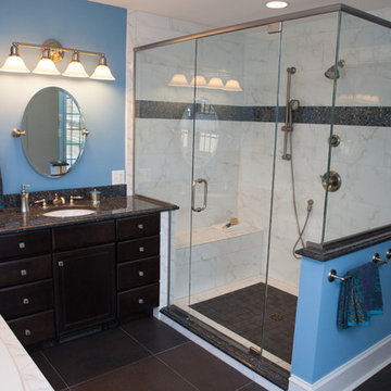
This well-loved home belonging to a family of seven was overdue for some more room. Renovations by the team at Advance Design Studio entailed both a lower and upper level addition to original home. Included in the project was a much larger kitchen, eating area, family room and mud room with a renovated powder room on the first floor. The new upper level included a new master suite with his and hers closets, a new master bath, outdoor balcony patio space, and a renovation to the only other full bath on in that part of the house.
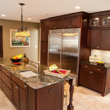
Having five children formerly meant that when everyone was seated at the large kitchen table, they couldn’t open the refrigerator door! So naturally the main focus was on the kitchen, with a desire to create a gathering place where the whole family could hang out easily with room to spare. The homeowner had a love of all things Irish, and careful details in the crown molding, hardware and tile backsplash were a reflection. Rich cherry cabinetry and green granite counter tops complete a traditional look so as to fit right in with the elegant old molding and door profiles in this fine old home.
The second focus for these parents was a master suite and bathroom of their own! After years of sharing, this was an important feature in the new space. This simple yet efficient bath space needed to accommodate a long wall of windows to work with the exterior design. A generous shower enclosure with a comfortable bench seat is open visually to the his and hers vanity areas, and a spacious tub. The makeup table enjoys lots of natural light spilling through large windows and an exit door to the adult’s only exclusive coffee retreat on the rooftop adjacent.
Added square footage to the footprint of the house allowed for a spacious family room and much needed breakfast area. The dining room pass through was accentuated by a period appropriate transom detail encasing custom designed carved glass detailing that appears as if it’s been there all along. Reclaimed painted tin panels were added to the dining room ceiling amongst elegant crown molding for unique and dramatic dining room flair. An efficient dry bar area was tucked neatly between the great room spaces, offering an excellent entertainment area to circulating guests and family at any time.
This large family now enjoys regular Sunday breakfasts and dinners in a space that they all love to hang out in. The client reports that they spend more time as a family now than they did before because their house is more accommodating to them all. That’s quite a feat anyone with teenagers can relate to! Advance Design was thrilled to work on this project and bring this family the home they had been dreaming about for many, many years.
Photographer: Joe Nowak

Sponsored
Columbus, OH

Hope Restoration & General Contracting
Columbus Design-Build, Kitchen & Bath Remodeling, Historic Renovations
 Alloy Architecture & Construction
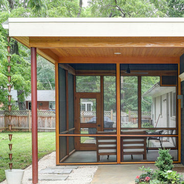
Our clients found themselves spending much more time at home than they were used to and needed a bit more space to spread out. We added much-needed indoor/outdoor space for enjoying the backyard, rain or shine. The new porch is often used as a home office and as a casual dining room. It is styled to be modern, functional, and easy to maintain. This was a cost-effective way to add informal living space without building an addition.
 H&P Building LLC
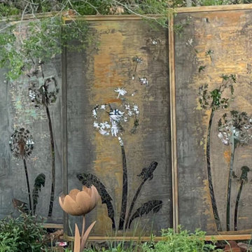
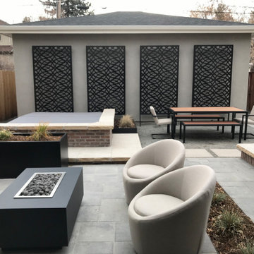
Our Privacy Screens are 100% Custom Made in the USA. We are located in Colorado but we can ship for all of the 50 states. We only use high quality American Made steel.
All of our Products are custom made. We can add frames, posts, brackets. There are also several designs available through our Etsy listings.
Or visit our website to see more options:
www.hnpbuilding.com
Benefits of our privacy screens:
1- Increased privacy – The nosy neighbors and odd passersby will have a much harder time seeing your own personal goings-on.
2- Shade – On a hot summer’s day, it is always nice to find a bit of shade, and when the sun is beating down on your patio, sometimes you have to bring the shade to you. A privacy screen can offer this much-needed respite from the heat of direct sunlight.
3- Hiding eyesores – Sometimes there are things we need to keep outside and they are not always aesthetically pleasing. Things like air conditioning units and water pumps can really distract from your yard’s scenery. Privacy screens are a good way of dividing and keeping things like this out of sight.
4- Attractive – The right screen can really accentuate your yard, making it a true sight to be seen.
What exactly do you do?
Driven by curiosity, we thrive on challenging creativity and what is expected when designing for a space.
We enhance experience through the creation and design of decorative screens. Ultimately, elevating spaces to bring people together.
 Advance Design Studio, Ltd.
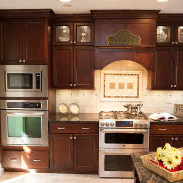
This well-loved home belonging to a family of seven was overdue for some more room. Renovations by the team at Advance Design Studio entailed both a lower and upper level addition to original home. Included in the project was a much larger kitchen, eating area, family room and mud room with a renovated powder room on the first floor. The new upper level included a new master suite with his and hers closets, a new master bath, outdoor balcony patio space, and a renovation to the only other full bath on in that part of the house.
Having five children formerly meant that when everyone was seated at the large kitchen table, they couldn’t open the refrigerator door! So naturally the main focus was on the kitchen, with a desire to create a gathering place where the whole family could hang out easily with room to spare. The homeowner had a love of all things Irish, and careful details in the crown molding, hardware and tile backsplash were a reflection. Rich cherry cabinetry and green granite counter tops complete a traditional look so as to fit right in with the elegant old molding and door profiles in this fine old home.
The second focus for these parents was a master suite and bathroom of their own! After years of sharing, this was an important feature in the new space. This simple yet efficient bath space needed to accommodate a long wall of windows to work with the exterior design. A generous shower enclosure with a comfortable bench seat is open visually to the his and hers vanity areas, and a spacious tub. The makeup table enjoys lots of natural light spilling through large windows and an exit door to the adult’s only exclusive coffee retreat on the rooftop adjacent.
Added square footage to the footprint of the house allowed for a spacious family room and much needed breakfast area. The dining room pass through was accentuated by a period appropriate transom detail encasing custom designed carved glass detailing that appears as if it’s been there all along. Reclaimed painted tin panels were added to the dining room ceiling amongst elegant crown molding for unique and dramatic dining room flair. An efficient dry bar area was tucked neatly between the great room spaces, offering an excellent entertainment area to circulating guests and family at any time.
This large family now enjoys regular Sunday breakfasts and dinners in a space that they all love to hang out in. The client reports that they spend more time as a family now than they did before because their house is more accommodating to them all. That’s quite a feat anyone with teenagers can relate to! Advance Design was thrilled to work on this project and bring this family the home they had been dreaming about for many, many years.
Photographer: Joe Nowak
 D.L. Rhein
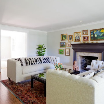
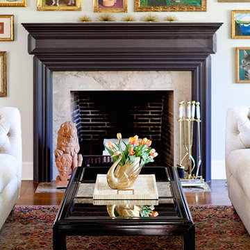
This living room was a blank slate, waiting to be filled in with texture and color. With a family room on the other side of the house for tv watching and game playing, we wanted to create a grown up space for when the Mr. and Mrs. entertain their friends. With white walls, a wood mantle and a single Shabby Chic white couch, this room was open to endless possibilities to update and sophisticate!
We choose a subtle grey for the walls which was soothing and neutral, but added a much needed warmth. Vintage chinoiserie pots we scored on one of our hunts are a work of art in themselves. Raised on wooden pedestals, these fig leaf trees make great house plants and will continue to grow filling out the space with fresh greenery.
The existing couch in the room was white with huge arms and big floppy cushions. It was in need of some TLC and updating. By modernizing the existing frame, it became a comfy Chesterfield in fresh natural woven linen. The tufting of the couch elevates the look without sacrificing the comfort. Our clients loved it so much, we did a second couch to match giving them plenty of seating to chat and enjoy cocktails. A vintage rug loaded with beautiful colors is grounded by the neutrality of the furniture. The mantle was painted in a rich dark grey that matched the veins in the marble hearth and looks like it’s own framed work of art.
When deciding on what to do with the blank walls, she showed us some of her daughter’s recent artwork. We were totally inspired with what we saw. What a treasure to have such talent! We suggested a gallery wall, framing each masterpiece, in different vintage frames. A mix of sizes and patterns look super chic when all done in a uniform color. With touches of brass throughout the room, gilded with gold was the way to go. One of our favorite finds – a brass swan, became the perfect unexpected vase for fresh tulips. A bone tray is a beautiful contrast to the vintage coffee table we lacquered in black and inlaid with beveled smokey mirror. The finishing touches were the pieces to finish off the fireplace. I always love a lion, a protector of the house. We snatched up this beautiful marble and brass fire tool set the minute we saw it and the rest is history. A beautiful space to relax and entertain, while showing off their very own art gallery. Foster the creativity within your children, and everyone will reap the benefits.
 Advance Design Studio, Ltd.
This well-loved home belonging to a family of seven was overdue for some more room. Renovations by the team at Advance Design Studio entailed both a lower and upper level addition to original home. Included in the project was a much larger kitchen, eating area, family room and mud room with a renovated powder room on the first floor. The new upper level included a new master suite with his and hers closets, a new master bath, outdoor balcony patio space, and a renovation to the only other full bath on in that part of the house.
Having five children formerly meant that when everyone was seated at the large kitchen table, they couldn’t open the refrigerator door! So naturally the main focus was on the kitchen, with a desire to create a gathering place where the whole family could hang out easily with room to spare. The homeowner had a love of all things Irish, and careful details in the crown molding, hardware and tile backsplash were a reflection. Rich cherry cabinetry and green granite counter tops complete a traditional look so as to fit right in with the elegant old molding and door profiles in this fine old home.
The second focus for these parents was a master suite and bathroom of their own! After years of sharing, this was an important feature in the new space. This simple yet efficient bath space needed to accommodate a long wall of windows to work with the exterior design. A generous shower enclosure with a comfortable bench seat is open visually to the his and hers vanity areas, and a spacious tub. The makeup table enjoys lots of natural light spilling through large windows and an exit door to the adult’s only exclusive coffee retreat on the rooftop adjacent.
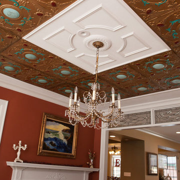
Added square footage to the footprint of the house allowed for a spacious family room and much needed breakfast area. The dining room pass through was accentuated by a period appropriate transom detail encasing custom designed carved glass detailing that appears as if it’s been there all along. Reclaimed painted tin panels were added to the dining room ceiling amongst elegant crown molding for unique and dramatic dining room flair. An efficient dry bar area was tucked neatly between the great room spaces, offering an excellent entertainment area to circulating guests and family at any time.
This large family now enjoys regular Sunday breakfasts and dinners in a space that they all love to hang out in. The client reports that they spend more time as a family now than they did before because their house is more accommodating to them all. That’s quite a feat anyone with teenagers can relate to! Advance Design was thrilled to work on this project and bring this family the home they had been dreaming about for many, many years.
Photographer: Joe Nowak
 H&P Building LLC
Our Privacy Screens are 100% Custom Made in the USA. We are located in Colorado but we can ship for all of the 50 states. We only use high quality American Made steel.
All of our Products are custom made. We can add frames, posts, brackets. There are also several designs available through our Etsy listings.
Or visit our website to see more options:
www.hnpbuilding.com
Benefits of our privacy screens:
1- Increased privacy – The nosy neighbors and odd passersby will have a much harder time seeing your own personal goings-on.
2- Shade – On a hot summer’s day, it is always nice to find a bit of shade, and when the sun is beating down on your patio, sometimes you have to bring the shade to you. A privacy screen can offer this much-needed respite from the heat of direct sunlight.
3- Hiding eyesores – Sometimes there are things we need to keep outside and they are not always aesthetically pleasing. Things like air conditioning units and water pumps can really distract from your yard’s scenery. Privacy screens are a good way of dividing and keeping things like this out of sight.
4- Attractive – The right screen can really accentuate your yard, making it a true sight to be seen.
What exactly do you do?
Driven by curiosity, we thrive on challenging creativity and what is expected when designing for a space.
We enhance experience through the creation and design of decorative screens. Ultimately, elevating spaces to bring people together.
Sponsored
Sunbury, OH

J.Holderby - Renovations
Franklin County's Leading General Contractors - 2X Best of Houzz!
 D.L. Rhein
This living room was a blank slate, waiting to be filled in with texture and color. With a family room on the other side of the house for tv watching and game playing, we wanted to create a grown up space for when the Mr. and Mrs. entertain their friends. With white walls, a wood mantle and a single Shabby Chic white couch, this room was open to endless possibilities to update and sophisticate!
We choose a subtle grey for the walls which was soothing and neutral, but added a much needed warmth. Vintage chinoiserie pots we scored on one of our hunts are a work of art in themselves. Raised on wooden pedestals, these fig leaf trees make great house plants and will continue to grow filling out the space with fresh greenery.
The existing couch in the room was white with huge arms and big floppy cushions. It was in need of some TLC and updating. By modernizing the existing frame, it became a comfy Chesterfield in fresh natural woven linen. The tufting of the couch elevates the look without sacrificing the comfort. Our clients loved it so much, we did a second couch to match giving them plenty of seating to chat and enjoy cocktails. A vintage rug loaded with beautiful colors is grounded by the neutrality of the furniture. The mantle was painted in a rich dark grey that matched the veins in the marble hearth and looks like it’s own framed work of art.
When deciding on what to do with the blank walls, she showed us some of her daughter’s recent artwork. We were totally inspired with what we saw. What a treasure to have such talent! We suggested a gallery wall, framing each masterpiece, in different vintage frames. A mix of sizes and patterns look super chic when all done in a uniform color. With touches of brass throughout the room, gilded with gold was the way to go. One of our favorite finds – a brass swan, became the perfect unexpected vase for fresh tulips. A bone tray is a beautiful contrast to the vintage coffee table we lacquered in black and inlaid with beveled smokey mirror. The finishing touches were the pieces to finish off the fireplace. I always love a lion, a protector of the house. We snatched up this beautiful marble and brass fire tool set the minute we saw it and the rest is history. A beautiful space to relax and entertain, while showing off their very own art gallery. Foster the creativity within your children, and everyone will reap the benefits.
 Advance Design Studio, Ltd.
This well-loved home belonging to a family of seven was overdue for some more room. Renovations by the team at Advance Design Studio entailed both a lower and upper level addition to original home. Included in the project was a much larger kitchen, eating area, family room and mud room with a renovated powder room on the first floor. The new upper level included a new master suite with his and hers closets, a new master bath, outdoor balcony patio space, and a renovation to the only other full bath on in that part of the house.
Having five children formerly meant that when everyone was seated at the large kitchen table, they couldn’t open the refrigerator door! So naturally the main focus was on the kitchen, with a desire to create a gathering place where the whole family could hang out easily with room to spare. The homeowner had a love of all things Irish, and careful details in the crown molding, hardware and tile backsplash were a reflection. Rich cherry cabinetry and green granite counter tops complete a traditional look so as to fit right in with the elegant old molding and door profiles in this fine old home.
The second focus for these parents was a master suite and bathroom of their own! After years of sharing, this was an important feature in the new space. This simple yet efficient bath space needed to accommodate a long wall of windows to work with the exterior design. A generous shower enclosure with a comfortable bench seat is open visually to the his and hers vanity areas, and a spacious tub. The makeup table enjoys lots of natural light spilling through large windows and an exit door to the adult’s only exclusive coffee retreat on the rooftop adjacent.
Added square footage to the footprint of the house allowed for a spacious family room and much needed breakfast area. The dining room pass through was accentuated by a period appropriate transom detail encasing custom designed carved glass detailing that appears as if it’s been there all along. Reclaimed painted tin panels were added to the dining room ceiling amongst elegant crown molding for unique and dramatic dining room flair. An efficient dry bar area was tucked neatly between the great room spaces, offering an excellent entertainment area to circulating guests and family at any time.
This large family now enjoys regular Sunday breakfasts and dinners in a space that they all love to hang out in. The client reports that they spend more time as a family now than they did before because their house is more accommodating to them all. That’s quite a feat anyone with teenagers can relate to! Advance Design was thrilled to work on this project and bring this family the home they had been dreaming about for many, many years.
Photographer: Joe Nowak
 Stephanie Charest Interior Design
We completed this kitchen renovation for a SW. Calgary couple and as you’ll see, it was a much needed update after their 20+ years in the home.
Clearly the look of the cabinets needed to be brought up to date, but function was on the top of the list for this client. She enjoys cooking and often hosts several friends over for canning and other big cooking parties so countertop space was a priority. Seeing as they also host large family gatherings, the cook didn’t want to feel abandoned in the kitchen when everyone else was in the next room so opening up the space was crucial.
Here is what we did to change the way this space works for them…
We revised the layout of the appliances and cabinets and relocated the plumbing so she could look out the window while she stood at the sink. Taking the cabinets up to the ceiling also gave them more storage as does the large pantry next to the fridge. An island wouldn’t fit, so we added a peninsula which gave them a spot to sit to have their morning coffee and a significant amount of additional counter space. By removing the walls between the kitchen and dining room it eliminated a small hallway that separated the kitchen and dining room and allowed for an open concept in their 1960’s home.
To add visual interest to the space and to define the dining room, we added a coffered celing. Now, typically a coffered ceiling is done when you have three or four walls to anchor it in. It was a bit of a risk to add a “floating” coffered ceiling! However, it turned out beautifully. It wasn’t without it issues but I’m glad we added this element as it wouldn’t have been as interesting with a typical flat ceiling.
In the dining room, a buffet was added for additional storage as well as new drapery panels, lighting and furniture. The peacock blue end chairs are stunning! Without that punch of color the dining room just wouldn’t be as outstanding. They are so lovely and really pushed the client out of her comfort zone – but she loves them and is glad she trusted us with that design decision.
The result is a much more usable space that is also classic in style and just darn pretty to look at and be in! And I know this client is enjoying her new kitchen day to day and on special family occasions.
Adrian Shellard Photography
 Highland Design+Build
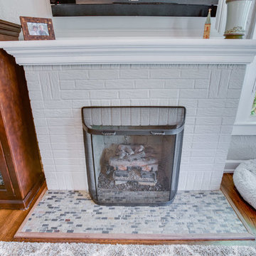
This Woodland Home, built in 1946, had beautiful charm from the exterior but needed more love on the inside. The lack of storage in the kitchen, a dark family room and underutilized attic space led them to remodel the rest of the home.
In the kitchen, walls were removed between the breakfast nook and kitchen and existing windows relocated and enlarged to maximize natural light. The cased opening into the dining was widened allowing better flow for serving dinner guests. Installing new hardwoods in the kitchen created a cohesive floorplan. Willow Gray cabinets installed to the ceiling, heightened the room and gave the homeowners much needed storage space. Bianco Ararus Granite and classic subway backsplash with dark grout added a finishing touch.
A large cased opening was created between the family room and existing sunroom. New aluminum clad casement windows and large French door unit was installed which enhanced the natural light throughout the space. Window sashes were replaced on the lower level of the home. The existing attic stairs with heavy, worn carpet were rebuilt to widen as much as possible. New oak stair treads were installed and finished, tying into the original hardwood flooring throughout the main level. Black iron railing gives the illusion of more space while adding simple elegance.
The attic, once used for storage, was updated with new windows, luxury vinyl plank flooring and cabinetry for seasonal clothing storage. The quaint space is especially enjoyed as a reading nook and quiet getaway.
205 Photography

Sponsored
Sunbury, OH
J.Holderby - Renovations
Franklin County's Leading General Contractors - 2X Best of Houzz!
 Jennifer Ryan Design
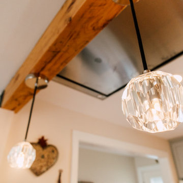
This smallish kitchen needed to be both updated and opened up. By taking out the wall where the peninsula is now and adding a garden window made the kitchen feels much bigger even though we didn't add any square footage! Opening up the wall between the kitchen and entry also added much needed light. 48 inch AGA range is the show stopper in the room. The flush mount hood vent keeps the sight line clear. We were even able to find a deck mount pot filler.
 Jennifer Ryan Design
This smallish kitchen needed to be both updated and opened up. By taking out the wall where the peninsula is now and adding a garden window made the kitchen feels much bigger even though we didn't add any square footage! Opening up the wall between the kitchen and entry also added much needed light. 48 inch AGA range is the show stopper in the room. The flush mount hood vent keeps the sight line clear. We were even able to find a deck mount pot filler.
 Sunny Interior Design
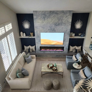
This small pied-a-terre got a major upgrade with a feature fireplace wall, statement lighting and coastal accents. The blue large scale porcelain gives the effect of marble. We added unique built in bench nooks on either side of the fireplace with cozy pillows to soften the light gray porcelain tile. We carried the light gray porcelain to the front of the fireplace that provides an interesting detail without taking up much space in this small space. We added lots of texture with wallpaper and a neutral checked rug that plays well off the coastal counter stools along the peninsula. Unique white coastal lighting used in sconces and dining room light adds nice contrast to the dark blue wallpaper and the ambient light that the sconces provide along with the glow of the fireplace makes this a romantic night time space. The dark blue pendant lighting over the kitchen peninsula ties in with the wallpaper color and provides a much needed pop of color this all white kitchen desperately needed.
102