
Search results for "Never before seen" in Home Design Ideas
 McKinney York Architects
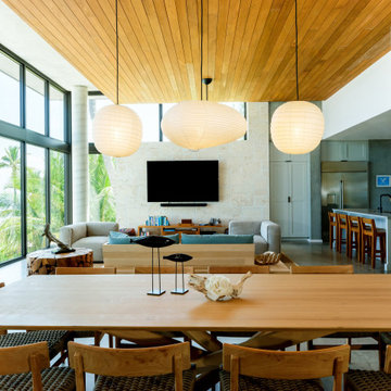
This vacation home was created for an avid saltwater fisherman and his family. As a coastal property, care was taken to capture breezes and views, encouraging inhabitants to slow down and soak in the ambiance. At the same time, the building is designed to withstand storms and the corrosive effects of salt air. Awareness of natural elements, including being kind to other inhabitants of the property, is evident in selections like turtle friendly exterior specialty LED lighting.
Careful compositions of color, material, opacity, and transparency create an exterior that is disciplined but playful. The building is layered in planes that accentuate shadow, forming a graceful backdrop to the palm trees, pool, and ocean beyond.
The local coral stone used on the exterior is also seen inside, thus reinforcing a sense of place. Pops of saturated color balance the soothing palette of materials, art, and furnishings, never distracting from the breathtaking setting. High light from clerestories washes across interior surfaces and opens up views to the sky. The luminous volumes are easy-going and simple, but contain a few surprises. In the primary bath, the architect and client created a unique pattern of custom handmade tile.
 Edgewater Design Group
As written in Northern Home & Cottage by Elizabeth Edwards
Sara and Paul Matthews call their head-turning home, located in a sweet neighborhood just up the hill from downtown Petoskey, “a very human story.” Indeed it is. Sara and her husband, Paul, have a special-needs son as well as an energetic middle-school daughter. This home has an answer for everyone. Located down the street from the school, it is ideally situated for their daughter and a self-contained apartment off the great room accommodates all their son’s needs while giving his caretakers privacy—and the family theirs. The Matthews began the building process by taking their thoughts and
needs to Stephanie Baldwin and her team at Edgewater Design Group. Beyond the above considerations, they wanted their new home to be low maintenance and to stand out architecturally, “But not so much that anyone would complain that it didn’t work in our neighborhood,” says Sara. “We
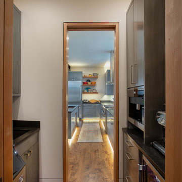
were thrilled that Edgewater listened to us and were able to give us a unique-looking house that is meeting all our needs.” Lombardy LLC built this handsome home with Paul working alongside the construction crew throughout the project. The low maintenance exterior is a cutting-edge blend of stacked stone, black corrugated steel, black framed windows and Douglas fir soffits—elements that add up to an organic contemporary look. The use of black steel, including interior beams and the staircase system, lend an industrial vibe that is courtesy of the Matthews’ friend Dan Mello of Trimet Industries in Traverse City. The couple first met Dan, a metal fabricator, a number of years ago, right around the time they found out that their then two-year-old son would never be able to walk. After the couple explained to Dan that they couldn’t find a solution for a child who wasn’t big enough for a wheelchair, he designed a comfortable, rolling chair that was just perfect. They still use it. The couple’s gratitude for the chair resulted in a trusting relationship with Dan, so it was natural for them to welcome his talents into their home-building process. A maple floor finished to bring out all of its color-tones envelops the room in warmth. Alder doors and trim and a Doug fir ceiling reflect that warmth. Clearstory windows and floor-to-ceiling window banks fill the space with light—and with views of the spacious grounds that will
become a canvas for Paul, a retired landscaper. The couple’s vibrant art pieces play off against modernist furniture and lighting that is due to an inspired collaboration between Sara and interior designer Kelly Paulsen. “She was absolutely instrumental to the project,” Sara says. “I went through
two designers before I finally found Kelly.” The open clean-lined kitchen, butler’s pantry outfitted with a beverage center and Miele coffee machine (that allows guests to wait on themselves when Sara is cooking), and an outdoor room that centers around a wood-burning fireplace, all make for easy,
fabulous entertaining. A den just off the great room houses the big-screen television and Sara’s loom—
making for relaxing evenings of weaving, game watching and togetherness. Tourgoers will leave understanding that this house is everything great design should be. Form following function—and solving very human issues with soul-soothing style.
 Cabinet Plant
See what our client say about working with us:
I started my search for a contractor about a year before I hired Paul to do a kitchen and bathroom renovation. This was my first time at the bat, and I really had no idea what to expect. I had many contractor proposals that swung wildly in price but for some reason I never felt inclined to hire any of the guys I met with. I happened to be looking at Houzz one day and came across Paul’s company and he had very good reviews. I gave him a call and he came to my apartment quickly. I liked him immediately when we met. I thought it was strange that he asked me for my budget and how much I wanted to spend but in hindsight, providing that information allowed Paul to come back to me with a very detailed proposal based on my budget. I soon realized that the lower proposals I had did not include many of the budget items that would be necessary to complete the job. Paul laid out the pricing and provided a very reasonable “allowance” based on your measurements for tile, toilet, sinks, etc. It is up to you to stay within that allowance.
Another reason I hired Paul was because of his design skills. Paul met me in the at tile stores several times and helped guide me in choosing tile and a style for the bathroom that really looks beautiful. I fought him a little but in the end, was glad I went with his recommendations. He also uses a kitchen cabinet maker so all the cabinets are custom to what you want. Paul also has a great customer website that allows you to see all the expenses, make choices, and easily communicate with him.
If you are planning to do a renovation, I think it helps to plan for the worst and hope for the best. I live in a co-op and we had a couple of little glitches and Paul was always quick to resolve issues as they arose. He was extremely responsive and really cared about the work and doing a good job. I would definitely hire Paul again if I needed a contractor.
Find the right local pro for your project
 DEWSON GROUP LLC
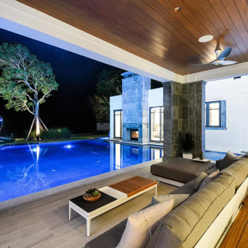
The only new construction direct Intracoastal home for sale in the entire Palm Beach Estate Section. Never lived in before, the only modern waterfront home currently for sale on all of Palm Beach Island. One of only two on all of Palm Beach Island with direct Intracoastal frontage and two docks on both the front and back yards.17,190 square feet of total indoor-outdoor living space on .89 acres. Includes $2,000,000 worth of personal property, furnishings, art, sculptures in the listing price.
 HouseHome
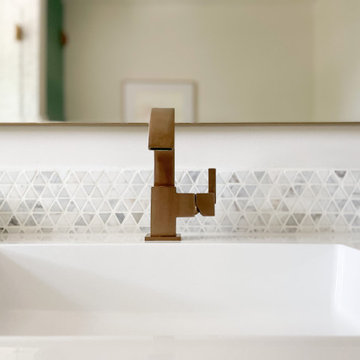
Although the Kids Bathroom was reduced in size by a few feet to add additional space in the Master Bathroom, you would never suspect it! Because of the new layout and design selections, it now feels even larger than before. We chose light colors for the walls, flooring, cabinetry, and tiles, as well as a large mirror to reflect more light. A custom linen closet with pull-out drawers and frosted glass elevates the design while remaining functional for this family. For a space created to work for a teenage boy, teen girl, and pre-teen girl, we showcase that you don’t need to sacrifice great design for functionality!
 Covered Bridge Cabinetry
A Fresh Traditional Kitchen
AS SEEN ON: SEASON 3, EPISODE 3 OF MASTERS OF FLIP
Soft pastels get a fresh, stylish update when paired with sparkling chandeliers and modern accents to create a space that shows why the party always ends up in the kitchen.
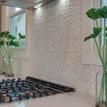
In this one-wall style kitchen, we paired our classic Colorado doors with Driftwood enamel and traditional glass-front upper cabinets against a textured white backsplash. The centrepiece of the space is the large eat-at island in Sugar White. Featuring a charming farm sink and capable of comfortably seating four, it provides plenty of space to prep or mingle.
Clever built-in additions, like an under-counter microwave unit, means that style is never sacrificed for function in this Kitchens by Foremost design!
This pantry wall was custom designed for the space it’s in, making sure that every bit of space is properly utilized. Using the same Colorado doors in Sugar White enamel as in the main kitchen ensures that this addition fits seamlessly into the space. The top hinged cabinet, custom wine rack, and stem glass holder also allows this pantry pull double duty as a impromptu bar.
 Rocky Tops Granite & Marble LLC
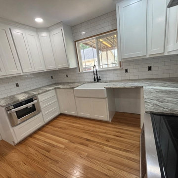
Fantasy Brown Leathered dolomite went into this West Columbia kitchen, and it's the kind of stone that changes how a room feels the second the light hits it. Leathered finish instead of polished, so you get texture under your hand instead of a mirror flat surface. It softens the brown and cream movement in the stone, gives it a low sheen, and hides fingerprints and water spots a lot better than a honed or polished slab would in a kitchen that actually gets used.
Dolomite has that soft, warm background movement, browns and creams drifting through each other, and it holds up well against everyday acids and scratching in a working kitchen. It's still a natural stone, so we sealed it properly, and the leathered texture actually helps there, it hides the wear that would show up fast on a glass-smooth surface.
Getting the veining to read right across the seams is the real work on a stone like this. We template the room, lay the slabs out, and take our time matching the movement across the corners and the seams before anything gets cut, so the pattern keeps flowing instead of jumping when you walk from one stretch of counter to the next. It's slower than pushing straight into fabrication, but it's the difference between a kitchen that looks like one slab and one that looks like pieces.
Edge came out eased, clean and simple, which is the right call on a stone with this much going on in the surface. You don't need a fancy profile competing with the leathering and the movement in the dolomite, the material carries the room on its own.
Day to day it lives well. Set a hot pan down and it takes it fine, though a trivet never hurts. It'll take the knocks of a working kitchen better than people expect, and the leathered texture keeps it looking good years in instead of showing every little scuff. That's the kind of project we like doing around West Columbia and the rest of the Midlands, matching the right stone to a kitchen that's going to get lived in, not just looked at.

 Che Interiors
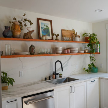
This project was a head-to-toe home renovation of a beautiful Pacifica single-family beach house. Our client bought this home 8+ years ago and had added on a master bathroom that features beautiful handcrafted Fire+Clay turquoise tiles. Little had been done, outside of painting the rooms, before we came along.
Every room in this home was hidden away, but by knocking down a few walls the kitchen, living room and dining space became one large open area with small dividing features. With a great deal of collaboration from the General Contractor, we added a skylight in the dining room, pulled up the windows in the kitchen to allow for the new cabinets to fit at a comfortable height, moved the sliding doors that were never used from the master bedroom to the dining room and replaced that opening with new large windows to flush the space with natural light. We updated the guest bathroom by repainting the walls, adding new fixtures and elements that spoke to the new language of the home.
Che Interiors, with the collaboration of our client, hand selected all the furnishings, window treatments, and decor throughout. We picked up on those blue and green hues of the master bathroom tiles and incorporated them throughout the rest of the home in custom furniture + home goods, area rugs, and more. By removing a useless closet in the dining room and adding a beautiful arch opening we created a perfect spot for the Turquoise custom buffet cabinet and carried the arch into the master bedroom to create a space for a home office that features a custom desk. Lastly, we put the cherry on top with The Shade Store’s woven beach style window treatments throughout the home.
What once was a disarray of colors and closed off spaces is now a lovely California-Chic beach home.
 Bricks Incorporated
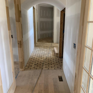
How amazing is this #reclaimed #brick used as #flooring?! These "Dark Pink" #Chicago common #bricks add warmth and #rustic, #oldworld charm to this #contemporary #residence in #Nashville's Hillwood neighborhood.
Homeowner Lee and his wife reviewed three different batches of #masonry before settling on the creamy pinks and beiges of this lot #salvaged from a #demolition site just down the road from our Kedzie yard. It's always fun to work with a #construction professionals on their own #homes — having seen and worked on hundreds of projects themselves, they're creative, patient, detail-oriented, and really appreciate unique and well-made materials!
Designer Emily Haraf of @eh_interiors came up with the #innovative choice of #floor #tile, which continues up and around the main #fireplace to accent the #hearth's #herringbone pattern of white fire brick. We also love the way she used pink cabinets and quirky #wallpaper to play off the colors of the #brick inside the #powderroom.
If you're based in #Tennesee, make sure to check out all the #smallbusinesses whose work on this project made our #commonbrick sparkle! #teamwork #shopsmall
@wr_newman
@kingdombuildersoftn
@eh_interiors
 HouseHome
Although the Kids Bathroom was reduced in size by a few feet to add additional space in the Master Bathroom, you would never suspect it! Because of the new layout and design selections, it now feels even larger than before. We chose light colors for the walls, flooring, cabinetry, and tiles, as well as a large mirror to reflect more light. A custom linen closet with pull-out drawers and frosted glass elevates the design while remaining functional for this family. For a space created to work for a teenage boy, teen girl, and pre-teen girl, we showcase that you don’t need to sacrifice great design for functionality!
 Klopf Architecture
Built for the Bluff, A Sea Ranch Home is Remade from the Inside Out
The house had always been grounded, on an ocean bluff at The Sea Ranch. It sits unencumbered, adjacent to one of the most dramatic stretches of the Sonoma coast with protected commons meadow to the east, uninterrupted Pacific views to the west, and a bluff trail running alongside. What it lacked was the feeling of home, one that could hold up its own against the natural landscape.
The owners are entrepreneurs with deep involvement across tech, real estate, and development and they know how things are built. The Sea Ranch house had been in their lives for years, a second residence and a place for family to gather. Built for a different time, it felt more compromising than comfortable. Sitting in a closed off nook, the kitchen fit one cook at a time and turned its back on the rest of the house. The entry was dim and compressed, divided by a structural column that presented itself at exactly the wrong moment. The primary suite was small relative to the view outside it. A large rear bedroom sat behind a lowered ceiling with a bathroom that had never been added. The house was certainly worth the trouble of doing it right.
What followed was not one project but four, each with its own design challenge, each addressed over a period of time.
Where the House Meets the Ocean
The most complex piece of the project, in both structural and spatial terms, was the kitchen expansion. The existing room was a single-person galley squeezed in as an afterthought with no meaningful connection to the dining room, the living space, or the deck outside. To make it useful for a family that cooks and gathers, it needed to grow outward into an existing patio and flow into the rooms around it.
A big challenge was the roofline. Several planes at different pitches and angles converged directly where additional volume was needed. A new form had to join that geometry without reading as a correction. The solution found the simplest possible connection between the existing angles, a roofline that from outside the structure, appears entirely original. From the bluff trail where the addition is visible, there is no discernible seam.
Inside, the kitchen is now open to the living and dining rooms without interruption. A large sliding glass door connects the space onto the rear deck. The deck itself was expanded and oriented so that the body of the house shields it from the coastal wind which is a common consideration that determines whether outdoor space at The Sea Ranch actually gets used. The result is a room that works for large family gatherings where no one feels cutoff, and one that makes the boundary between being inside and outside easy to ignore.
Welcoming Light
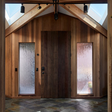
A structural column stood at the convergence of eight distinct roof planes in the entry. It was load-bearing, but it was also the reason the entry had always felt like a hallway rather than a welcoming arrival.
With the structural engineer, a custom steel connector was designed to receive beams from six separate directions, redistributing the load through a single new continuous beam. The column was surgically removed. Three triangular skylights were then cut into the roof above, their shapes drawn from the
existing geometry of the planes around them. The entry is now bright and open. The skylights feel native to the structure because they follow the logic already present in the roof.
Two Suites, Two Views
At opposite ends of the house, the two bedroom suites were each reconfigured, and each found a different way to introduce more of the landscape into the room.
An addition to the primary suite extended the structure outward to create a wraparound plan with a loop from the bedroom through bath and closet that had not been possible before. The expansion opened a slot view from the tub and shower toward the ocean. The view is precise and private. The ocean view is present and deliberate.
The rear bedroom absorbed an adjacent storage room to transform it into a full second suite with a vaulted ceiling, a large bathroom with a tub, a shower, and a sauna. A private fenced garden courtyard sits just beyond the glass bringing the outdoors inside. The tub was placed so that, looking past the courtyard and through the bedroom beyond, the ocean is visible at the far end. It is a long view and it makes the room feel larger and more settled than its footprint would suggest.
Glass on Four Sides, Fire at the Center
The main living and gathering room had always been caught between two competing facts: glass on four sides meant exceptional views but at The Sea Ranch, it also meant a cold room. A 360-degree cylindrical fireplace was added at the center on a raised stone base, providing radiant heat in every direction and giving the room a focal point around which a group naturally orients itself, whether that means two people at the end of the day or the whole family after dinner.
Owners Who Picked Up the Tools
The owner was not a passive client. they came with construction knowledge, specific ideas, and the desire to be an active part of the process, a dynamic that other architects may had found difficult, which Klopf Architecture accepted as an asset. They took it upon themselves to complete some of the work during construction, including the installation of a new radiant heating system beneath the floors.
The radiant system added to the older and less-desirable forced-air setup. At The Sea Ranch, that change matters as the house sits close enough to the ocean and moving air competes with the sound of it, where radiant heat does not. Solar panels were added to the roof as part of the new system. Insulation was upgraded throughout the walls, roof, and crawl space. The house that had always had the right setting now holds warmth the way a house on the bluff should.
They were also deeply involved in the design and selections throughout, and the finished house reflects both of them in ways that are specific rather than generic. The process took longer and moved through more iterations than a more arms-length relationship might have allowed. The result is more defined and personal because of it.
The Landscape Holds Priority
Every exterior decision was shaped by The Sea Ranch Design Standards, which require that buildings defer to the landscape around them rather than compete with it. Because this house sits on the bluff and is visible from the public trail, the additions faced a close review. Existing materials were matched. Geometries were resolved. The additions had to become indistinguishable from the original building.
From the trail, the house reads exactly as it always has — low, cedar-clad, secondary to the meadow and the water. The setting holds priority. Inside, the house has been remade.
Klopf Architecture Project Team: Geoff Campen and Trenton Jewett
Contractor: Shawn Bettega Construction
Photography: ©2025 Mariko Reed
Year Completed: 2023
Location: The Sea Ranch, CA
 Clothed In Majesty, LLC
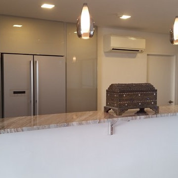
After knocking down two walls separating the kitchen from the Dining Room and Entry Hall, we have an expansive space open to fantastic views of the Bay towards the West and Mountain views towards the East. Now the Kitchen is something to behold. The custom cabinetry was designed with more storage space than before in-spite of adding a dishwasher which was not part of the original kitchen. The window behind the range was removed and replaced with a mosaic of glass and travertine. Because the owner enjoys cooking, a vent hood was a must and could not be placed within the window as the original layout. The reflective properties of both the glass and high gloss painted finish on the refrigerator wall bring natural light to the space. The granite has a rich color combination of browns and creams that are very calming and dramatic at the same time. The stone was chosen for its interest but not so powerful as to distract from the spectacular views.
Please leave a comment for information on any items seen in our photographs.
 Regency Custom Homes
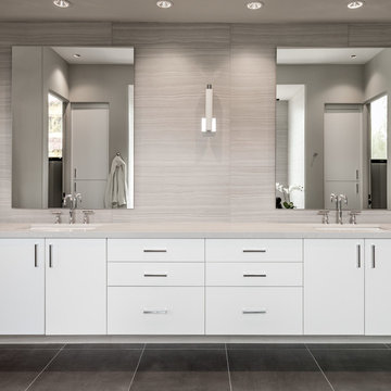
This dramatic contemporary complete home remodel in DC Ranch is a testament to the detailed vision of the client who had everything specified to a level rarely seen. We had a very tight timeline to bring this custom home remodel together from start to finish before the Holidays and we are proud to say we met our deadline! A complete gut and replacement of the kitchen, all bathrooms, laundry, and the casita was completed in about 11 weeks giving this 18-year-old home a new vibrant beginning.

 Barcelona Designs
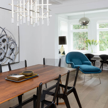
The Womb Chair & Ottoman by Barcelona Designs originally designed by Eero Saarinen continues to be one of the most recognized representations of mid-century modernism. This Saarinen-inspired womb lounge chair and ottoman set has both pieces attached with cushions for maximum comfort and support. Sitting down has never looked so stylish before. The womb chair is the bastion of neo-futuristic artwork, for which designer Eero Saarinen was well-established for.
Additionally, the Saarinen Womb Chair and Ottoman provides unmatched comfort with molded foam over a fiberglass shell. The designer was able to create a piece that provides a relaxed sitting posture. Introduced in 1948, the Womb Chair and Ottoman is one of the most popular designs to come out of the 1940s. Saarinen realized that people sit in many different ways; he designed a chair that is comfortable whether lounging, slouching, or sitting with a leg thrown over the armrest. Paired with the Womb Ottoman, you may find yourself in the lap of luxury. Our high-quality reproduction is crafted of a wool mixed fabric in a variety of colors
 Bianchi Design
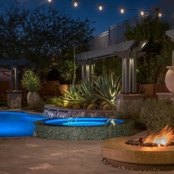
Previously, this yard was burdened by a typical boulder pile pool, that was heaped higher than typical, trying to hide the towering wall behind. At first, the clients sought merely to reconfigure the BBQ that was congesting the patio, but upon further analysis, they decided it was time to strip the entire yard, leaving only the pool shell. Bianchi’s solution introduced an array of four arbors to distract the eye from the wall behind, solving what the boulder waterfall could never do.
Additionally, the wall was painted a dark earth tone to add contrast and depth. This strategy enabled the wall to recede into the distance, while the agave blue grey arbors floated forward visually from the background. Previously, the patios were a hodgepodge of deck islands that were impossible to navigate, and were of insufficient size to arrange furniture on. A well organized patio streamlined the traffic flow and the living space, featuring a cast in place concrete fire pit and banco couch, as well as a new outdoor bistro, glowing with filtered light from the canvas shade sails overhead.
A turquoise glass overflow spa became the yards focal point, sharing the space between the pool and outdoor living. The striking symmetry of the spa and pot pedestal with regal cacti arrangement behind, flanked by the arbors on either side, created a stately first impression from the front door. This teaser was just a glimpse of what could not yet be seen serving as an invitation to explore and enjoy as the yard unfolds.
See more about this project & hear from the homeowner here: https://www.youtube.com/watch?v=7eT3RkLkg5w&feature=youtu.be
 Mom's Design Build
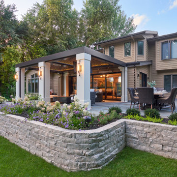
These clients wanted to connect their
new kitchen bump out to the outdoors
via a sheltered area that would block
bugs and rain but not the view of the
lake below. The NARI member
contractor exceeded those goals with a
design that actually makes the lake
appear closer and seamlessly integrates
indoors and out. It even expanded cool
weather use with strategically placed
heaters and a large fire table. The
project features an operable pergola
with motorized screen walls and
architectural columns over a bluestone
patio.
The client says it’s a lovely place for
open-air naps. “With the wall of Loewen
doors open and the pergola screens
down, our house has never been so
open. We love the design and the final
product. We definitely would hire the
company again and recommend
After Before them,” she said.
 Right Bath-A Mosby Building Arts Company
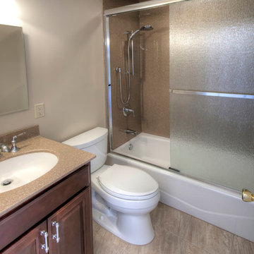
Before this bathroom received a modern update it was a late 60's bathroom that had seen it's last days. From old wall tile, small square floor tile and a tub/shower that needed some major TLC to a space that now lives up to its potential. The bathroom features "Tumbleweed" colored onyx on the vanity top and shower surround which encompasses the whole alcove including the ceiling. The flooring is Nociolla ceramic tile from the Florentine Collection found at Daltile. The bathroom is adorned with Devonshire Collection From Kohler fixtures including a Kohler Flipside Handheld Shower Head. Finally the gorgeous Harvest Square Maple vanity from Kohler brings an added punch to this fantastic space.
 Covered Bridge Cabinetry
A Funky Minimalist Kitchen
AS SEEN ON: SEASON 3, EPISODE 6 OF MASTERS OF FLIP
Crisp white makes the perfect blank canvas for this home, allowing the owner’s colourful accessories and fun modern furniture to shine and fill the entire home with a personality all its own!
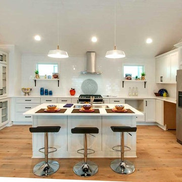
The spacious kitchen is no different. We paired our Colorado cabinets in Sugar White enamel with glass-front doors to create a custom hutch that divides the kitchen from the eating area and allows a collection of colourful ceramic dish ware to stand out. Floating shelves add more useful display areas, while maintaining the bright, airy feel of the space.
Beneath that glossy enamel, however, this kitchen contains several clever additions to create practical storage solutions. A blind corner lazy susan and pull-out base cabinet drawers means you’ll never forget about that can in the back of your cupboard and the alcove for a wine fridge makes it easy to reach your favourite red.
 FOUR POINT DESIGN BUILD INC
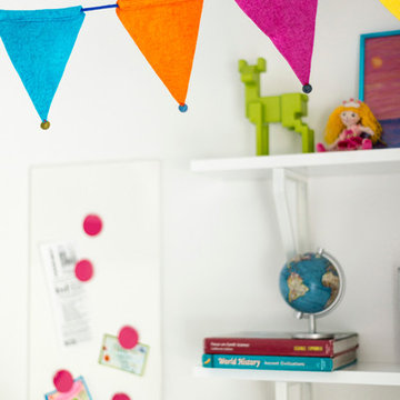
DESIGN BUILD REMODEL | Tween Bedroom Transformation | FOUR POINT DESIGN BUILD INC | Part Twelve
This completely transformed 3,500+ sf family dream home sits atop the gorgeous hills of Calabasas, CA and celebrates the strategic and eclectic merging of contemporary and mid-century modern styles with the earthy touches of a world traveler!
AS SEEN IN Better Homes and Gardens | BEFORE & AFTER | 10 page feature and COVER | Spring 2016
To see more of this fantastic transformation, watch for the launch of our NEW website and blog THE FOUR POINT REPORT, where we celebrate this and other incredible design build journey! Launching September 2016.
Photography by Riley Jamison
#TweenBedroom #remodel #LAinteriordesigner #builder #dreamproject #oneinamillion
 Cantoni Irvine
Design by Blue Heron in Partnership with Cantoni. Photos By: Stephen Morgan
For many, Las Vegas is a destination that transports you away from reality. The same can be said of the thirty-nine modern homes built in The Bluffs Community by luxury design/build firm, Blue Heron. Perched on a hillside in Southern Highlands, The Bluffs is a private gated community overlooking the Las Vegas Valley with unparalleled views of the mountains and the Las Vegas Strip. Indoor-outdoor living concepts, sustainable designs and distinctive floorplans create a modern lifestyle that makes coming home feel like a getaway.
To give potential residents a sense for what their custom home could look like at The Bluffs, Blue Heron partnered with Cantoni to furnish a model home and create interiors that would complement the Vegas Modern™ architectural style. “We were really trying to introduce something that hadn’t been seen before in our area. Our homes are so innovative, so personal and unique that it takes truly spectacular furnishings to complete their stories as well as speak to the emotions of everyone who visits our homes,” shares Kathy May, director of interior design at Blue Heron. “Cantoni has been the perfect partner in this endeavor in that, like Blue Heron, Cantoni is innovative and pushes boundaries.”
Utilizing Cantoni’s extensive portfolio, the Blue Heron Interior Design team was able to customize nearly every piece in the home to create a thoughtful and curated look for each space. “Having access to so many high-quality and diverse furnishing lines enables us to think outside the box and create unique turnkey designs for our clients with confidence,” says Kathy May, adding that the quality and one-of-a-kind feel of the pieces are unmatched.
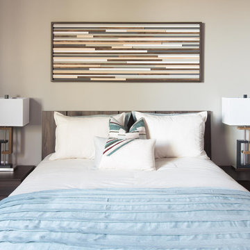
rom the perfectly situated sectional in the downstairs family room to the unique blue velvet dining chairs, the home breathes modern elegance. “I particularly love the master bed,” says Kathy. “We had created a concept design of what we wanted it to be and worked with one of Cantoni’s longtime partners, to bring it to life. It turned out amazing and really speaks to the character of the room.”
The combination of Cantoni’s soft contemporary touch and Blue Heron’s distinctive designs are what made this project a unified experience. “The partnership really showcases Cantoni’s capabilities to manage projects like this from presentation to execution,” shares Luca Mazzolani, vice president of sales at Cantoni. “We work directly with the client to produce custom pieces like you see in this home and ensure a seamless and successful result.”
And what a stunning result it is. There was no Las Vegas luck involved in this project, just a sureness of style and service that brought together Blue Heron and Cantoni to create one well-designed home.
To learn more about Blue Heron Design Build, visit www.blueheron.com.
131