
Search results for "Never before seen" in Home Design Ideas
 Kitchen Solvers of Spring Hill
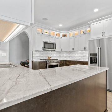
This Marine family of 7 needed to update their kitchen and wanted it to match their style and needs for their large family. We suggested taking the short divider wall at the left end of the sink cabinets down, along with removing the closet pantry. They loved that idea. After tearing out the old cabinets we got busy installing the new cabinets. They decided to go with our seamless shaker door in maple from our Kitchen Solvers Classic Collection line. The upper cabinets were done in an Alabaster color, while the lowers were done in Black Tea. This transitional look was enhanced with gorgeous quartzite countertops and hexagon-like tiles with dark grout. Another special feature we added is the glass door stacked cabinets with built in lighting to showcase all their special items they have never gotten to display before. It makes this space more than just a kitchen. It’s a statement kitchen!
 FOUR POINT DESIGN BUILD INC
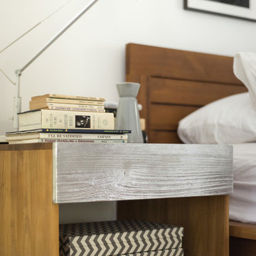
DESIGN BUILD REMODEL | Master Bedroom Suite Transformation | FOUR POINT DESIGN BUILD INC | Part Seven
This completely transformed 3,500+ sf family dream home sits atop the gorgeous hills of Calabasas, CA and celebrates the strategic and eclectic merging of contemporary and mid-century modern styles with the earthy touches of a world traveler!
AS SEEN IN Better Homes and Gardens | BEFORE & AFTER | 10 page feature and COVER | Spring 2016
To see more of this fantastic transformation, watch for the launch of our NEW website and blog THE FOUR POINT REPORT, where we celebrate this and other incredible design build journey! Launching September 2016.
Photography by Riley Jamison
#masterbedroom #walkincloset #dreamcloset #remodel #LAinteriordesigner #builder #dreamproject #oneinamillion
 TaylorPro Design and Remodeling, Inc.
"Kerry Taylor was professional and courteous from our first meeting forwards. We took a long time to decide on our final design but Kerry and his design team were patient and respectful and waited until we were ready to move forward. There was never a sense of being pushed into anything we didn’t like. They listened, carefully considered our requests and delivered an awesome plan for our new bathroom. Kerry also broke down everything so that we could consider several alternatives for features and finishes and was mindful to stay within our budget. He accommodated some on-the-fly changes, after construction was underway and suggested effective solutions for any unforeseen problems that arose.
Having construction done in close proximity to our master bedroom was a challenge but the excellent crew TaylorPro had on our job made it relatively painless: courteous and polite, arrived on time daily, worked hard, pretty much nonstop and cleaned up every day before leaving. If there were any delays, Kerry made sure to communicate with us quickly and was always available to talk when we had concerns or questions."
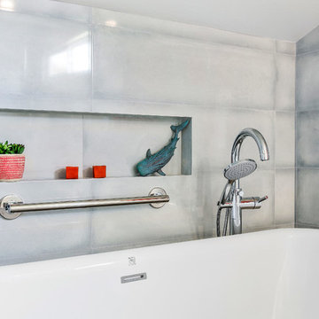
This Carlsbad couple yearned for a generous master bath that included a big soaking tub, double vanity, water closet, large walk-in shower, and walk in closet. Unfortunately, their current master bathroom was only 6'x12'.
Our design team went to work and came up with a solution to push the back wall into an unused 2nd floor vaulted space in the garage, and further expand the new master bath footprint into two existing closet areas. These inventive expansions made it possible for their luxurious master bath dreams to come true.
Just goes to show that, with TaylorPro Design & Remodeling, fitting a square peg in a round hole could be possible!
Photos by: Jon Upson
Find the right local pro for your project
 StoneUnlimited Kitchen and Bath Remodeling
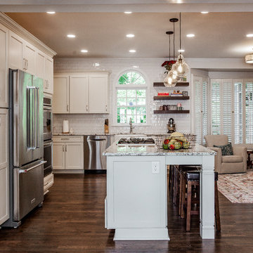
This newly renovated kitchen by Stoneunlimited Kitchen and Bath Remodeling is located in Roswell GA and will truly inspire those of you looking to change up your kitchen. We love EVERYTHING about this kitchen! From the visual impact of the subway tile counter to ceiling back-splash , to the contrasting open shelves, and the storage solutions of the cabinetry, the goal was to open up the space and create an open concept layout that would be aesthetically pleasing, efficient and spacious. Removing the wall between the kitchen and dining area has completely changed the ebb and flow of this living space. The kitchen is open and airy as the light is able to flow fluidly from the dining area to the window above the sink. Re-configuring the layout to allow the installation of a large kitchen island with range and ample seating has maximized the space and created a larger area for gathering. If you haven't seen the before and after pictures of this kitchen, please check them out, you'll be amazed!
Demo: Existing Wall dividing the kitchen from the dinning area, taking away the raised bar countertop and installing a kitchen island with range
Countertops: 3 CM White Galaxy Granite with 1/4 round edge
Sink: Kohler White Haven Apron front Cast Iron 30" Faucet: Delta Cassidy Kohler
Tile: 3"x6" Cobsa Granada Crackled White Subway Tile Floating Shelves: Custom Made
 Visbeen Architects
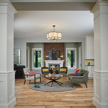
Graced with an abundance of windows, Alexandria’s modern meets traditional exterior boasts stylish stone accents, interesting rooflines and a pillared and welcoming porch. You’ll never lack for style or sunshine in this inspired transitional design perfect for a growing family. The timeless design merges a variety of classic architectural influences and fits perfectly into any neighborhood. A farmhouse feel can be seen in the exterior’s peaked roof, while the shingled accents reference the ever-popular Craftsman style. Inside, an abundance of windows flood the open-plan interior with light. Beyond the custom front door with its eye-catching sidelights is 2,350 square feet of living space on the first level, with a central foyer leading to a large kitchen and walk-in pantry, adjacent 14 by 16-foot hearth room and spacious living room with a natural fireplace. Also featured is a dining area and convenient home management center perfect for keeping your family life organized on the floor plan’s right side and a private study on the left, which lead to two patios, one covered and one open-air. Private spaces are concentrated on the 1,800-square-foot second level, where a large master suite invites relaxation and rest and includes built-ins, a master bath with double vanity and two walk-in closets. Also upstairs is a loft, laundry and two additional family bedrooms as well as 400 square foot of attic storage. The approximately 1,500-square-foot lower level features a 15 by 24-foot family room, a guest bedroom, billiards and refreshment area, and a 15 by 26-foot home theater perfect for movie nights.
Photographer: Ashley Avila Photography
 Reyes Creative Concepts LLC.
BEFORE
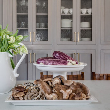
The homeowners waited a long time to renovate their kitchen. They were overwhelmed by all the choices and decisions they had to make. After our meeting we put their worries to rest. We reassured them that we would do our best to create their dream kitchen.
The original 1990’s kitchen desperately needed to be brought into the 21st century.
The homeowners hated the outdated cabinetry, narrow peninsula and overall layout. They wanted a small home office area, but most importantly they wanted a large island with plenty of seating. There was an issue with the width of the kitchen. It was tricky to fit the island in the narrow area without ample space to allow a nice flow around it.
However, we never want to disappoint our customers.
SOLUTION
In order to design a functional layout and give our customers their dream island, we went with shallow pantry units along the kitchen wall. That extra 12” allowed for just enough space for the island. Reworking the layout of the cabinetry on the perimeter of the kitchen opened up a space for a small home office area.
We had to work with the existing radiant heated flooring. Replacing it was out of the question because of the additional costs. The choices of cabinetry and color scheme had to correlate with it. Therefore we selected oak cabinets in driftwood oak finish with warm brushed brass hardware.
According to our customers we checked all the boxes on their dream kitchen wish list.
 Slotegraaf Built
As a rebuild from the ground floor, this house was converted from a 1980's bungalow to a stunning two-storey modern farmhouse. A growing family of five was looking for more living space with a clean and simple design that captured a better view of the outdoors. The renovation included the entire main floor plus a second floor with 4 bedrooms, a kids bathroom and master ensuite. The home's style offers a traditional farmhouse feel from the exterior architectural details and material to the bedroom shiplap ceiling. Modern influences can be seen in the large, black windows that reveal a more contemporary interior. An open-concept main floor connects a large double height foyer flanked with windows showcasing the baby grand piano, open riser stairs, living room, and the dining area which focuses onto the back landscape, pool, and cabana. By being able to bring the outdoors aesthetic indoors, the family was amazed by the transformation and how the dark shell exterior contrasted the bright interior spaces.

 Covered Bridge Cabinetry
A Funky Minimalist Kitchen
AS SEEN ON: SEASON 3, EPISODE 6 OF MASTERS OF FLIP
Crisp white makes the perfect blank canvas for this home, allowing the owner’s colourful accessories and fun modern furniture to shine and fill the entire home with a personality all its own!
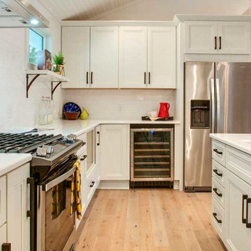
The spacious kitchen is no different. We paired our Colorado cabinets in Sugar White enamel with glass-front doors to create a custom hutch that divides the kitchen from the eating area and allows a collection of colourful ceramic dish ware to stand out. Floating shelves add more useful display areas, while maintaining the bright, airy feel of the space.
Beneath that glossy enamel, however, this kitchen contains several clever additions to create practical storage solutions. A blind corner lazy susan and pull-out base cabinet drawers means you’ll never forget about that can in the back of your cupboard and the alcove for a wine fridge makes it easy to reach your favourite red.
 VanWeelden Co.
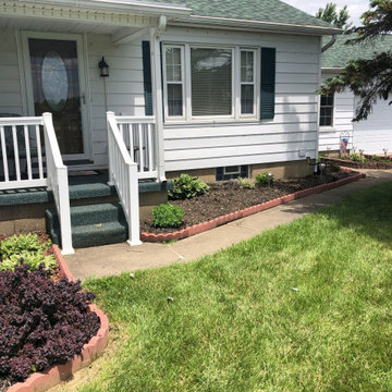
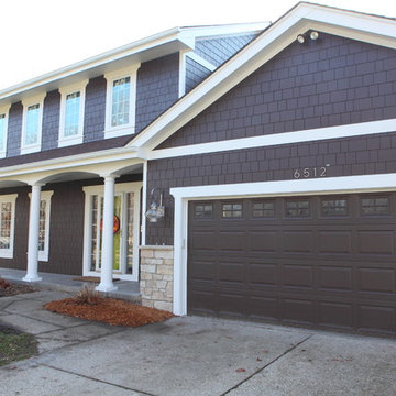
White house, black shutters, red brick. We've seen it before. Rather than rebuilding, look at all the options you have to give your home a makeover. That old white house looks brand new with shaker shingles, stone accents, and all new columns, trim and roofing.
 McKinney York Architects
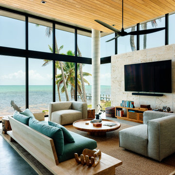
This vacation home was created for an avid saltwater fisherman and his family. As a coastal property, care was taken to capture breezes and views, encouraging inhabitants to slow down and soak in the ambiance. At the same time, the building is designed to withstand storms and the corrosive effects of salt air. Awareness of natural elements, including being kind to other inhabitants of the property, is evident in selections like turtle friendly exterior specialty LED lighting.
Careful compositions of color, material, opacity, and transparency create an exterior that is disciplined but playful. The building is layered in planes that accentuate shadow, forming a graceful backdrop to the palm trees, pool, and ocean beyond.
The local coral stone used on the exterior is also seen inside, thus reinforcing a sense of place. Pops of saturated color balance the soothing palette of materials, art, and furnishings, never distracting from the breathtaking setting. High light from clerestories washes across interior surfaces and opens up views to the sky. The luminous volumes are easy-going and simple, but contain a few surprises. In the primary bath, the architect and client created a unique pattern of custom handmade tile.
 Klopf Architecture
Built for the Bluff, A Sea Ranch Home is Remade from the Inside Out
The house had always been grounded, on an ocean bluff at The Sea Ranch. It sits unencumbered, adjacent to one of the most dramatic stretches of the Sonoma coast with protected commons meadow to the east, uninterrupted Pacific views to the west, and a bluff trail running alongside. What it lacked was the feeling of home, one that could hold up its own against the natural landscape.
The owners are entrepreneurs with deep involvement across tech, real estate, and development and they know how things are built. The Sea Ranch house had been in their lives for years, a second residence and a place for family to gather. Built for a different time, it felt more compromising than comfortable. Sitting in a closed off nook, the kitchen fit one cook at a time and turned its back on the rest of the house. The entry was dim and compressed, divided by a structural column that presented itself at exactly the wrong moment. The primary suite was small relative to the view outside it. A large rear bedroom sat behind a lowered ceiling with a bathroom that had never been added. The house was certainly worth the trouble of doing it right.
What followed was not one project but four, each with its own design challenge, each addressed over a period of time.
Where the House Meets the Ocean
The most complex piece of the project, in both structural and spatial terms, was the kitchen expansion. The existing room was a single-person galley squeezed in as an afterthought with no meaningful connection to the dining room, the living space, or the deck outside. To make it useful for a family that cooks and gathers, it needed to grow outward into an existing patio and flow into the rooms around it.
A big challenge was the roofline. Several planes at different pitches and angles converged directly where additional volume was needed. A new form had to join that geometry without reading as a correction. The solution found the simplest possible connection between the existing angles, a roofline that from outside the structure, appears entirely original. From the bluff trail where the addition is visible, there is no discernible seam.
Inside, the kitchen is now open to the living and dining rooms without interruption. A large sliding glass door connects the space onto the rear deck. The deck itself was expanded and oriented so that the body of the house shields it from the coastal wind which is a common consideration that determines whether outdoor space at The Sea Ranch actually gets used. The result is a room that works for large family gatherings where no one feels cutoff, and one that makes the boundary between being inside and outside easy to ignore.
Welcoming Light
A structural column stood at the convergence of eight distinct roof planes in the entry. It was load-bearing, but it was also the reason the entry had always felt like a hallway rather than a welcoming arrival.
With the structural engineer, a custom steel connector was designed to receive beams from six separate directions, redistributing the load through a single new continuous beam. The column was surgically removed. Three triangular skylights were then cut into the roof above, their shapes drawn from the
existing geometry of the planes around them. The entry is now bright and open. The skylights feel native to the structure because they follow the logic already present in the roof.
Two Suites, Two Views
At opposite ends of the house, the two bedroom suites were each reconfigured, and each found a different way to introduce more of the landscape into the room.
An addition to the primary suite extended the structure outward to create a wraparound plan with a loop from the bedroom through bath and closet that had not been possible before. The expansion opened a slot view from the tub and shower toward the ocean. The view is precise and private. The ocean view is present and deliberate.
The rear bedroom absorbed an adjacent storage room to transform it into a full second suite with a vaulted ceiling, a large bathroom with a tub, a shower, and a sauna. A private fenced garden courtyard sits just beyond the glass bringing the outdoors inside. The tub was placed so that, looking past the courtyard and through the bedroom beyond, the ocean is visible at the far end. It is a long view and it makes the room feel larger and more settled than its footprint would suggest.
Glass on Four Sides, Fire at the Center
The main living and gathering room had always been caught between two competing facts: glass on four sides meant exceptional views but at The Sea Ranch, it also meant a cold room. A 360-degree cylindrical fireplace was added at the center on a raised stone base, providing radiant heat in every direction and giving the room a focal point around which a group naturally orients itself, whether that means two people at the end of the day or the whole family after dinner.
Owners Who Picked Up the Tools
The owner was not a passive client. they came with construction knowledge, specific ideas, and the desire to be an active part of the process, a dynamic that other architects may had found difficult, which Klopf Architecture accepted as an asset. They took it upon themselves to complete some of the work during construction, including the installation of a new radiant heating system beneath the floors.
The radiant system added to the older and less-desirable forced-air setup. At The Sea Ranch, that change matters as the house sits close enough to the ocean and moving air competes with the sound of it, where radiant heat does not. Solar panels were added to the roof as part of the new system. Insulation was upgraded throughout the walls, roof, and crawl space. The house that had always had the right setting now holds warmth the way a house on the bluff should.
They were also deeply involved in the design and selections throughout, and the finished house reflects both of them in ways that are specific rather than generic. The process took longer and moved through more iterations than a more arms-length relationship might have allowed. The result is more defined and personal because of it.
The Landscape Holds Priority
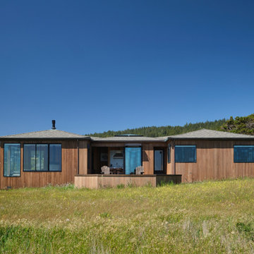
Every exterior decision was shaped by The Sea Ranch Design Standards, which require that buildings defer to the landscape around them rather than compete with it. Because this house sits on the bluff and is visible from the public trail, the additions faced a close review. Existing materials were matched. Geometries were resolved. The additions had to become indistinguishable from the original building.
From the trail, the house reads exactly as it always has — low, cedar-clad, secondary to the meadow and the water. The setting holds priority. Inside, the house has been remade.
Klopf Architecture Project Team: Geoff Campen and Trenton Jewett
Contractor: Shawn Bettega Construction
Photography: ©2025 Mariko Reed
Year Completed: 2023
Location: The Sea Ranch, CA
 Wolfgang Trost Architects
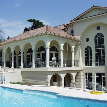
Wolfgang Trost of Wolfgang Trost Architects creates homes, whether new construction, or remodels that feel natural and easy. In the case of new construction, involving architects, home builders, contractors and general contractors, an architect plays a pivotal role in the process. Whether in searching for a building site, or placing a new home well on a building site, architects can give guidance so the end product feels fresh, inviting, and easy instead of forced or contrived. Many times, this is done through visual connections from different parts of the home. For example, an entry serves as a transition point. When I come in, I see a warm hearth with a fire going. I also see a bar where several people can gather. I see an extended view through the great room to the outdoor patio and pool. These visual connections are important to lead people through the home. Contractors involved in the construction process as well as home builders, general contractors and architects should all be adept at this philosophy and execution.
Now some architects may not view a project in this way, but I believe there can be "destinations" within a home. One may "discover" a sweet little quiet spot by a window to read, or an inviting outdoor living space. A contractor or home builders can be encouraged to develop these areas as a project evolves. After all, that's what makes a home have a certain feel.
Connections are created visually. As contractors install raised, architectural windows, this may allow for a visual connection to an outdoor living space, or natural feature such as a lake. The best designs incorporate some depth to both the yard and home from different viewing spots around the home. Have a general contractor rotate a bathroom wall slightly and you may catch a view you hadn't seen before.
All these small details add up to create a home with feel. That's what homeowners want, a great feel
Architect, architects contractors, architecture design, build a house, construction, custom homes, general contractor, General Contractors, Home, Home Builders, Home building, Home Design, home remodeling, home renovation, house designs, house plan, House plans, houses, Interior Design, interior designer, kansas city architect, kansas city architects, kansas city contractors, kansas city general contractors, kansas city home design, Kansas City Interior Design, New Homes
 User
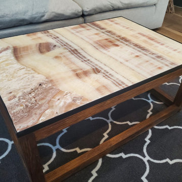
UserThis project showcases our lit onyx coffee tables that have been made at custom dimensions to show our versatility when it comes to designing a new table. These coffee tables are unlike anything you've seen before, creating a magical place wherever you put them, given that you will blend a stunning piece of artwork with a living space full of life!

 Milan Consi, LLC
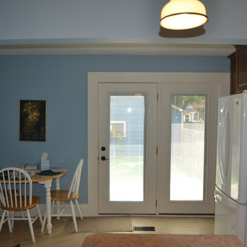
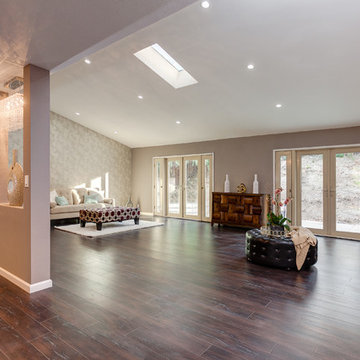
We purchased this home that hadn't had much of an opportunity to have been revitalized throughout the years, therefore, had grown old and tired. We were excited at the vision of what it could be! Through a 5 month process we renovated and refurbished this home with updated bathrooms, kitchen, flooring, ceilings, and exterior work, and fully new windows and french door to create the indoor/outdoor living. Added on a new guest bathroom and laundry room, skylights, and elegant chandeliers and further updated the electrical, plumbing and A/C and heating units. The end product was magnificently elegant with a breathtaking kitchen, modern bathrooms, with a distinct contrast in flooring materials used that left an impressive impression for everyone that toured the property. The before and after pictures of the facade of the property were so contrasting that people who had previously seen pictures of the property or the property itself had a hard time recognizing it when driving by. This project was a huge success for our company and created the elevated energy for all that were involved, including the upliftment of the neighborhood.
 Wren & Willow, Inc.
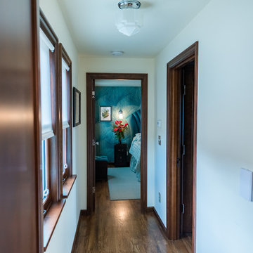
As can be seen in this before and after photo, some structural changes were necessary to make most of the space available in this house and to create a more natural flow from room to room. This included squaring out a corner at the end of the hallway, thus extending the master bedroom. The hallway also features hidden amenities, such as a port for the central vacuum system.
Photos by Aleksandr Akinshev
 Peter Jackson
Challenge: With a narrow yard steeply sloped from house to alley, what was even possible?
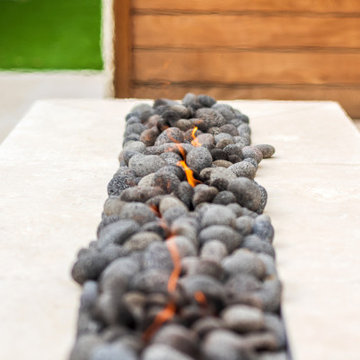
Solved: We created a seamless execution that blends indoor out and outdoor living with a masterfully executed interplay of materials and applications, shared and secluded spaces, the expected and unexpected. This puzzle-pieced tour de force of landscape architecture design, features multiple pools, waterfall curtains that magically appear from walls, and every accommodation for gracious entertaining and family life. Anyone who had seen the “before,” marvels at the “after” in disbelief.
 Talin Tropic Studio
"MIDNIGHT AT THE OASIS, SING YOUR CAMEL TO BED." That's what I always thought she said in this song. Just NOW when I looked up the lyrics, I see that I had it wrong ALL of these years!! HAHAH!
Just like that song "Just Call Me Angel In the Morning, Just Brushed My Teeth Before You Leave Me, Baby!"
HAHAHAH!!!,....it is "just brushed my CHEEK!"
TURNING A MUNDANE BATHROOM INTO A TENTED OASIS FANTASY!
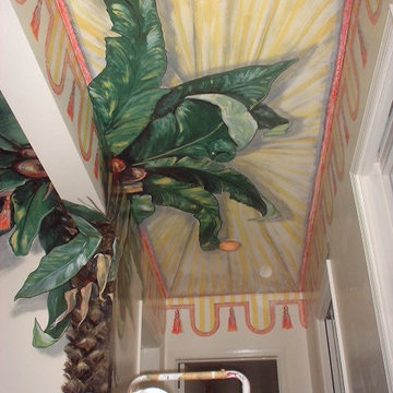
This client was an extremely FUN client! She wanted her bathroom to be a fantasy of tented fun. My suggestion was to have a palm tree as the "center weight bearing column", holding up the tent where the split in the ceiling was. Then I painted the "tasselled cornice" of the tent going around all of the walls. There are other walls that are not seen here, but they have the same palm trunk with ropes like a circus tent attached to the "stakes in the ground".
I enjoyed this mural project immensely! This client gave me artistic license to just RUN WITH IT!
" But you won't need no harem, honey
When I'm by your side
And you won't need no camel, no no
When I take you for a ride
Come on, Cactus is our friend
He'll point out the way
Come on, till the evening ends
Till the evening ends
Midnight at the oasis
Send your camel to bed
Got shadows painting our faces
And traces of romance in our heads"
What kind of lyrical fantasy could I create for your own OASIS?
call me to brainstorm: 561-573-0123
talin@talinsstudio.com
AS A FINISHING TOUCH, WE WOULDN'T BE COMPLETE WITHOUT A FLORIDIAN GECKO CRAWLING OVER THE DOORWAY, CHASING A FLY.
JUST PUTTING FINISHING TOUCHES...LADDER STILL IN THE PICTURE.
THIS SHOWS THE SPLIT IN THE CEILING WHICH I HAD TO WORK WITH TO STILL SHOW A "TENTED" CEILING.

 Drury Design
THE SETUP
Multiple ovens, multiple workspaces, multiple sinks – when you think about it, non-jewish kitchens have been adapting the criteria of kosher kitchens for years.
Gladys’ clients in West Rogers Park are Orthodox Jewish. The house they bought already had a kosher kitchen – it just wasn’t done that well. It needed some more things to be duplicated for the dairy side and the meat side. Plus, it was dark and the configuration wasn’t very conducive for a family of eight.
It was time for a remodel.
Design Objectives
Improve kosher kitchen
Add more storage in the island
Better lighting
More open, lighter feel
Change the wood floor in the kitchen to tile
THE REMODEL
Design Challenges
- We had originally planned on removing a wing wall by the breakfast area. During demolition, we learned it contained a support beam.
- The kitchen is a substantial size, but having two sinks, dishwashers, and ovens presented a challenge – how do we fit it all in and make it flow with the storage still accessible near the work areas?
Where do you stop the materials for the new space? - -- The right tile, paint, lighting, etc. would be needed to make the remodeled area cohesive with the rest of the main floor.
- An existing column limited cabinet options and thus, storage capacity. Could we conceal it without disrupting the cabinetry flow?
Design Solutions
- We had to keep the wing wall, but decided to continue the tile on the sides of the cabinets and maintain the height of the tile to line up with the rest of the backsplash. This actually presented a very nice and cohesive look, especially since the opposite side has a wing wall to the left of the refrigerator.
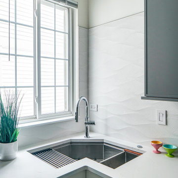
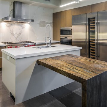
- We used “L-shaped” corner sinks instead of the rectangular ones set on an angle. This gave us more of the legs of the triangles versus the hypotenuse, which allowed for the two dishwashers, and the pullout utensil canisters and spice pullouts while still keeping the 3-drawer cabinets on either side of the range (by the sinks). The old island had the recess for stools which the family never used. By extending the width of the island 6” and utilizing this leg space, we were able to fit 18”-deep cabinets on this side – adding lots of accessible storage. The family can now work simultaneously on the dairy side (the side with the fridge) and the meat side (opposite) without getting in each other’s way. We separated the cooking by using the range oven for the meat and a built-in microwave in the base cabinet. The wall oven with built-in microwave on top is for dairy.
- Corner sinks opened up the middle area for a wider range – we went from a 30” to a 36”. Removing all the wall cabinets (on the range wall) made a big difference. That opened up the entire space while adding some visual impact. (Not pictured: We also made the cabinets directly opposite the range wall tall and removed the countertop, resulting in more room for rollouts and even more storage!) The kitchen now has more storage than it did before.
- We ended up painting the ceiling of the kitchen into the hallway that leads to the foyer. The living and dining rooms were separated by a soffit, so that became a natural boundary. We kept the tile in the kitchen by stopping it short of the hallway and lining it up with the pantry wall. This creates a border between the breakfast area and family room. The rest of the existing wood floors were refinished to refresh and make the hue darker. We also painted a dark accent wall and carried it into the breakfast area to make the rooms look deeper.
- The in-the-way column housed plumbing and couldn’t be moved. We still built cabinets in that spot – we just had to build a chase inside it to conceal the pipes. There was still plenty of room for new storage. We also took the cabinets all the way to the ceiling. The continuous tall cabinets added a functional elegance to the space.
THE RENEWED SPACE
The client’s long-awaited dream of a better kosher kitchen has finally been achieved, beautifully combining enhanced storage solutions with adherence to the family’s orthodox dietary laws. The kitchen’s standout feature, an expanded island, now offers a spacious and efficient workspace. This allows several family members to cook together comfortably, without the inconvenience of bumping into each other, ensuring a harmonious and productive cooking environment.
 Regency Custom Homes
This dramatic contemporary complete home remodel in DC Ranch is a testament to the detailed vision of the client who had everything specified to a level rarely seen. We had a very tight timeline to bring this custom home to remodel together from start to finish before the Holidays and we are proud to say we met our deadline! A complete gut and replacement of the kitchen, all bathrooms, laundry, and the casita was completed in about 11 weeks giving this 18-year-old home a new vibrant beginning.
141